#bill moggridge
Text
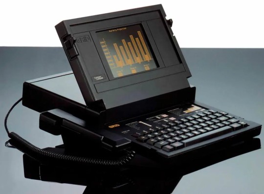
GRiD Compass (1982) designed by Bill Moggridge
1K notes
·
View notes
Text
Designing Interactions Interviews: Will Wright
Interview from Bill Moggridge's book, Designing Interactions, 2006, MIT Press
youtube
7 notes
·
View notes
Text
OBSCURA HAND INTERACTIONS PT 2
More hand and dial interactions – a vital part of watch design, quite often overlooked. The Obscura has to be obscure right? By building in obscurity into the relationship between the dials and the hands we can some interesting interactions.
These images only seen in this watch club show the minute hand blocking (obscuring) the lume ring below whilst the hour hand is too short – which is why it is lumed. So the hour hand is visible at night whilst the minute hand is visible via the absence of lume below it. Nice!
The term Designing Interactions is not mine, coined by the great Bill Moggridge who wrote a book with same title, it is a study includes UX, cultural behaviours, but really starts with how humans interact with objects.
This is not relevant as the watch is already defined. I am concerned with how one designed element interacts with all the others in an assembly beyond the mechanical necessities. It goes further than just dials and hands and would include all framing parts like the bezel and crystal, the depth of the dial, textures and reflections. All is considered for the Obscura 🙂


See more at Schofield Watches
1 note
·
View note
Text
Summary #3
Sustainability is a critical element of our design careers. This isn’t simply how long it takes for an item to end up in a landfill, but is more holistic than that — when sustainability principles are followed, so much more should be considered. Material sourcing, efficiency in the use of those materials, and the use of eco-friendly alternatives, but also the supply chain at large. Are the workers that have harvested the materials being treated ethically? Where are the items being manufactured?
A designer, Bill Moggridge, said “I like the concept of an object ‘wearing in’ than ‘wearing out’, and it immediately struck a chord with me. The concept of an object getting better with time — something that one actually wishes to have around, and which they can form a long term personal bond with — seems to me to be a stunning example of successful and sustainable design.
In concert with the age old design principle of ‘less is more’, Naoto Fukusawa explained how the actual physical design of an object often is barely perceived when it is in use — the form dissolves, and the person’s connection with the tool being used in a way that is comfortable comes to the forefront.
Technology, and… things you keep. Things you love. Things that get better with time.
An object wearing in and being loved is worth ten that wear out.
The physical design of an object dissolves as soon as it is put into use, leaving only its connection to the user.
1 note
·
View note
Text
History of Development Research
What is interactive design
Interactive design is a user-oriented field of study that focuses on meaningful communication using media to create products through cyclical and collaborative processes between people and technology. Successful interactive designs have simple, clearly defined goals, a strong purpose and intuitive screen interface. Interactive design allows people to feel connected to technology in a more responsive way.
The roots of interactive design
The term interaction design was coined by Bill Moggridge and Bill Verplank in the mid-1980s. However it would be 10 years before the concept began to take hold. To Verplank, it was an adaptation of the computer science term user interface design for the industrial design profession. To Moggridge, it was an improvement over soft-face, which he had coined in 1984 to refer to the application of industrial design to products containing software.
Personal Computers and on-line interaction
Interaction with the first personal computers was entirely text-based. Users typed commands and the computer displayed the result, acting as little more than an advanced calculator. Computers had shrunk in size, but this direct input and output echoed the older mainframe technology. In the relationship between people and technology, these early computers favored the machine, prioritizing efficient use of the small amount of available processing power. However we did start to see a shift into these computers being geared to providing a better more interactive and responsive user interface.
The timeline of Interactive Design
Timeline: Pre-Computer: Operating the Machine, Using the Software, Performing a Task, Experience, Connect.
Pre-Computer:Operating the Machine-
Designers were not really important at this point since the communication involved was mainly worker plus machines and soon people had to adapt and speak the language of machines. Machines used:
Eniac 1946, MITS Altair 8800,1975, The Mouse: Doug Engelbart 1964 and Sketchpad, Ivan Sutherland, 1963.
Using the Software-
Rather than turning switches on and off, people could now use software; applications and tools. Design was still in the hands of engineers, at this point aesthetics were secondary to engineering.
Examples:- Visicalc, 1979 by Dan Bricklin: The first spreadsheet.
Wordstar, 1979 by Seymour Rubenstein & John Barnaby:
Creating, storing and editing Word Documents.
Performing a Task-
The Focus was shifting towards ‘People performing a Task’ rather than simply controlling a tool. Companies started to emphasize: – Ease of Learning, Ease of Use, Reduced Errors and Saved Time.
Examples:- The 1984 Macintosh Superbowl ad; it served to imply that the Apple Macintosh will grant users a level of computer independence unheard of in previous generations (IBM was the main competitor at the time).
0 notes
Text
Who Invented The First Laptop Computer?
Who Invented The First Laptop Computer?
Advertisement
Who Invented The First Laptop Computer?
Alan Kay
Bill Moggridge
Steve Jobs
John Sculley
Advertisement
Advertisement
You Might Like
AnyTrivia.com
728 West Avenue, #2054
Cocoa, FL 32927
You are subscribed to this email as [email protected].
Click here to modify your preferences or unsubscribe.

View On WordPress
0 notes
Text
Summary #3
Erik Spiekermann has written a Foreword for David B. Berman’s book do good design. In his concise, down to earth manner, Spiekermann sheds light on some of the choices we do and don’t have control over as designers. One thing that he defines as being completely in our control is how we work. How we go about our process, and all the interactions that entails, is our most sure tool in making the difference we want to see not only in our industry but in the world around us.
To wrap up his book do good design, David B. Berman lays out a three step pledge for designers to take:
I will be true to my profession.
I will be true to myself.
I will spend at lease 10 percent of my professional time helping repair the world.
Berman goes into each step of the pledge to break down the process. The first step can be as simple as joining and adhering to a professionally determined set of ethics through an organization, such as RGD. In his second step Berman asks us to be good people. Do what we know to be right, offset negative impacts. The third and final step asks us to help others who are carrying out step two; help others be good people.
In chapter two of Design to Renourish, Eric Benson and Yvette Perullo discuss systems thinking as it pertains to graphic design. Everything in the natural world which sustains us is interconnected, and graphic design is no exception. As designers, we must ask ourselves how our approach to designing can improve everything for everyone, not just satisfy the client budget. We must seek to improve the triple bottom line in everything we do. This includes understanding all the biological systems we will effect (biomimicry). To grasp the full scope of our design impact, and incorporate that understanding, Benson and Perullo suggest this systems design process:
Determine project goals (understand your audience, form creative brief).
Map out design problems (problem/audience mapping, personas).
Brainstorm design outcomes (define all possibilities).
Evaluate each possible project outcome (in depth).
This holistic evaluation will help us interconnect our design phases and zoom in and out on each element to understand the whole.
10 Principles for Good Design is Dieter Rams’ guide to designing sustainably. The selection of principles encourages the creativity and functionality of design while including sustainability as their equal. Overall the list speaks to designing mindfully and with a bigger-picture awareness of one’s work.
In his 2009 documentary Objectified, producer and director Gary Hustwit guides viewers through interviews with multiple designers as they speak about their relationship to products of design. Henry Ford is quoted having said “Every object tells a story if you know how to read it.” For some, the story is in the object’s conceptualization, for others the story is in the memories layered onto the object over time. If the true value of an object or product comes from our personal relationship with it, then certainly as Bill Moggridge says, we should be designing products to withstand “wearing-in rather than wearing-out.” In this way, consumer needs can be met in a more sustainable manner, with products that represent more than just a dollar value to those purchasing them; mindfulness in every stage of product life.
t-t-t-take-aways:
Practice mindfulness
The ‘how’ is in our hands
Get smart/expand your horizons
Help others help others
Design for longevity
1 note
·
View note
Text
Types Of Notebook Computers
Types Of Notebook Computers
Notebook, notebook computer, laptop, and laptop computer are different terms for a small computer, which is mobile, and weighing about 1 to 6 kg or 2.2 to 18 pounds, depending upon the model. In 1979-1980, Bill Moggridge of GRiD Systems Corp. designed one of the first laptops and named it as the GRiD Compass 1101. It featured the clamshell design where the flat display folded shut on the…
View On WordPress
0 notes
Text
That Invented Laptop First of all?
When it comes to portable computer, really difficult to determine who invented them first. The 1st computer was invented by Adam Osborne, who had been an ex - journalist who flipped into an businessman. Another notable earlier device was produced by a British engineer, Bill Moggridge, in 1979 and even later made into the Xerox PARC Note Taker. Despite it is low cost and light-weight, the earliest notebooks didn't even have keyboards.
Best Laptop Under 25000 in India
The clamshell design of notebook computers was first created in the late 1970s by United kingdom designer Alan Kay. He died involving cancer at the age of 69 and was frequently credited with the particular concept. However, before the clamshell seemed to be invented, portable pcs looked a lot more like sewing machines. In 81, Adam Osborne designed a prototype modeled after the Dynabook and included a small monitor based in a CRT, a 5-inch floppy disc drive, and a keyboard.
Osborne gone on to become a multi-millionaire after selling the company to Apple. The organization experienced limited success in addition to declared bankruptcy throughout September 1983. He or she then returned to publishing for a short period of time. He had recurrent strokes plus a human brain disorder. He sooner or later returned to The southern area of India and put in the rest involving his life fighting the disease. But a lot of would argue that Mandsperson Osborne really developed the laptop. This is not clear who invented the particular laptop first, yet the good typically the device shows that coach anyone how to around intended for over quarter of a century.

0 notes
Text
That Invented Laptop First?
When it arrives to notebook, is actually difficult to choose who invented them first. The 1st computer was developed by Adam Osborne, who had been an ex - journalist who turned into an businessperson. Another notable early on device was created by a British engineer, Bill Moggridge, in 1979 plus later made into the particular Xerox PARC Take note Taker. Despite Bestproductsoutlet and light-weight, the earliest laptop computers didn't even have keyboards.
The clamshell design of notebook compters was first created in the late 1970s by British isles designer Alan Kay. He died regarding cancer at the particular age of 69 and was often credited with the particular concept. However, before the clamshell was invented, portable computers looked similar to stitching machines. In 1981, Adam Osborne produced a prototype modeled after the Dynabook and included a little monitor based in a CRT, the 5-inch floppy storage drive, and a new keyboard.
Best Products Outlet gone on to become a multi-millionaire after selling the company to be able to Apple. The corporation acquired limited success plus declared bankruptcy within September 1983. He or she then returned to publishing for a new short period regarding time. He previously regular strokes plus a human brain disorder. He sooner or later returned to The southern area of India and spent the rest of his life combating the disease. But many would believe Adam Osborne really developed the laptop. That is not apparent who invented typically the laptop first, nevertheless the history of the device shows that easy methods to around regarding over quarter of a century.

1 note
·
View note
Quote
I don’t think that anyone has really told (people) what design is. It doesn’t occur to most people that everything is designed—that every building and everything they touch in the world is designed. Even foods are designed now. So in the process of helping people understand this, making them more aware of the fact that the world around us is something that somebody has control of, perhaps they can feel some sense of control, too. I think that’s a nice ambition.
Bill Moggridge
5 notes
·
View notes
Text
Designing Interaccions (Moggridge, 2007) — Momentos del Método

Bill Moggridge fue un diseñador de origen británico, autor, educador que en su libro “designing interactions” expone su idea de como estos procesos de diseño pueden estar categorizados en una serie de pasos, pero principalmente habla de que esta disciplina esta enfocada a priorizar al usuario y en la preocupación por su experiencia. “El diseño de interacción nace como una nueva disciplina del campo del diseño orientado para crear soluciones y propuestas creativas partiendo de las necesidades y los deseos de las personas que usan un producto o servicio en lo virtual”.
El enmarcado:
En este paso es donde articulamos la síntesis del proyecto, lo cual nos hace focalizarnos en los aspectos que son realmente importantes y que van a aportar a el mismo, este paso nos aclara el camino que se debe seguir, evaluándolo objetivamente.
Ideación:
En este paso junto con el grupo de diseño es importante compartir las ideas que tengan, pero no cometer el error de quedarse con las primeras, hay que detenerse a evaluar si estas cumplen con la funcionalidad que se requiere, la lluvia de ideas puede ser un buen inicio para este paso y así entre todos construir una idea optima.
Visualización:
En este paso es importante la representación del diseño, ya sea visual o conductual esto se decide junto al equipo, esto ayuda a saber exactamente como se quiere proyectar la idea.
Incertidumbre:
Es probable es que durante la visualización surjan dudas de todo tipo, en este caso se analizan los riesgos y la potencial solución, con el fin de prevenir futuros problemas, este es un factor necesario como precursor de la selección, hay que evaluar si esta siendo coherente con lo hablado anteriormente y si es suficientemente simple de entender.
Creación de prototipos:
En la creación de prototipos se trata de probar las diferentes formas de generar el diseño que se viene pensando, se espera que sea funcional, en este paso se decide si es oportuno continuar desarrollando esta idea o hay que generar nuevas alternativas, es importante que se hagan prototipos lo más fieles a la realidad posible.
Evaluación:
En este último paso, es necesario iterar no sólo al final, durante todo el proceso de desarrollo, para ser conscientes y evitar errores, esto nos acerca a un buen diseño, es necesario hacer ajustes mínimos para finalizar un diseño adecuado.
Con esta lectura me queda más claro como funcionan los procesos de diseño de interacciones, me parece importante saber que la realización de un proyecto de esta disciplina no es superficial como lo parece, se debe tener en cuenta que debe haber una gestión y planificación ordenada, teniendo en cuenta cada aspecto del proyecto y al publico al que va dirigido, para realizar un proceso optimo y generar servicios y productos que generen satisfacción de necesidades en el consumidor.
1 note
·
View note
Text
X-Ray Vision: Exposing 40 Years of Gadgets
Written by Nicolai Garcia
On August 28, we went to the Conservation Center (Institute of Fine Arts, New York University) housed in a historic town house on the Upper East Side to x-radiograph some electronic objects in Cooper Hewitt’s collection. The x-ray room, which doubles as a photography studio, is entirely black from floor to ceiling. Behind a door—reminiscent of those in sci-fi nuclear thrillers—sits the x-ray machine, black and medical.
Over the course of the morning, we unboxed an array of objects from Cooper Hewitt’s collection dating from the early 1980s to the present. We laid them onto an x-ray-sensitive sheet (which was wrapped in vinyl as to not expose the sheet to light) and then exposed them to the x-ray beam for a short amount of time (like a photographic exposure). Once the machine was done, the lights in the studio were turned off while we loaded the x-ray plate (like a photographic negative) onto a scanner.
We sat in anticipation while the image rendered, layer by layer, giving us a glimpse into each object’s concealed interior. In some cases, the rendering was over-exposed, meaning we had to do another round, with a lower voltage or shorter exposure. Andy Wolf, a current Conservation Center graduate student who assisted in the examination, compared adjusting the voltage and exposure of an x-ray beam to adjusting the strength and open area of a faucet; both control how much water comes out, but in different ways.
X-radiograph of a Braun calculator (2015-5-4) in the Cooper Hewitt collection, taken at 25 kV, 5mA with a 30s exposure.
Exterior of ET55 Calculator, 1980; Designed by Dieter Rams (German, b. 1932) and Dietrich Lubs (German, b. 1938); Manufactured by Braun AG (Frankfurt, Germany); Molded ABS plastic, electronic components; H x W x D: 13.6 × 7.6 × 1 cm (5 3/8 in. × 3 in. × 3/8 in.); Gift of George R. Kravis II, 2015-5-4
Digital x-radiograph of a GRiD Compass laptop (2010-22-1) in the Cooper Hewitt collection, taken at 70 kV, 5mA, with a 60s exposure.
Exterior of GRiD Compass Laptop Computer Prototype, 1981; Designed by Bill Moggridge (English, 1943–2012); Manufactured by GRiD Systems Corps (Mountain View, California, USA); Die-cast magnesium, injection-molded plastic; H x W x D: 25.4 x 29.2 x 37.9 cm (10 in. x 11 1/2 in. x 14 15/16 in.); Gift of Bill Moggridge, 2010-22-1
In the case of the objects we imaged, adjusting the voltage versus exposure depended on the object’s material. The voltage, measured in kilovolts (1,000 volts), is typically increased for materials made with elements with a higher atomic number. Steel, which is an iron-based metal with just a little bit of carbon, has a lower density and therefore requires a lower x-ray voltage compared to platinum, which has an atomic number close to lead, meaning it requires a high voltage in order for the x-ray beam to penetrate its surface. Lead is dense and heavy enough to be impenetrable to x-rays, and is used to line the x-ray room to protect those nearby from stray radiation. For reference, the voltage for a medical x-ray of a human being (carbon-based life-form!) hovers around 60 kv.
We repeated the cycle of imaging and adjusting for all the electronics objects (save for a platinum-encased cell phone, which our x-ray beam did not have high enough voltage to image), then took the images to analyze what we saw.
Digital X-radiograph of collections objects including a 2007 iPhone and a 2014 Pixel phone shown with contemporary cell phones (iPhone SE, iPhone 8, and Samsung Galaxy).
In the current age of technology, common devices, such as mobile phones and home assistants, are designed to hide their screws and other traces of how their components come together, making it hard to know what they look like under the hood. X-ray imaging these objects gives conservators a better idea of the structural makeup so that they understand what techniques must be applied to preserve them. In my experience seeing the x-ray of my iPhone 8 (far right), I felt more connected to it because I feel I saw who it really is inside.
Nicolai Garcia was the Digital Collection Intern at Cooper Hewitt during summer 2019. Nico is from Berkeley, California, and is a senior at Stanford University where he studies Computer Science and Art Practice.
Our thanks to the faculty and staff at the Conservation Center for allowing us to use their X-radiography equipment, and to Andy Wolf for his help!
from Cooper Hewitt, Smithsonian Design Museum https://ift.tt/2MwRzMb
via IFTTT
5 notes
·
View notes
Quote
I was a guy in the seventies doing work in Silicon Valley, and we were basically designing plastic boxes around computers, right? I think I’d have been happy with that for the rest of my life, I mean that’s what we were doing. I didn’t have any kind of higher goal than that. And then my partner Bill Moggridge, who designed the first laptop computer, took one home. And he said “This is terrible!” I mean it was the most beautiful thing, I don’t know if you’ve ever seen one. This all-magnesium case, and just every little detail is gorgeous on it. And he took one home and the software was on this kind of funny, bubble-something display but the human interface to it was horrible. And he came back and said “Using this thing is way too important to leave to the engineers, to the software designers. So he got us into the business of doing interaction design right there.
David Kelley, founder of IDEO, on the Design Better Podcast
1 note
·
View note
Photo
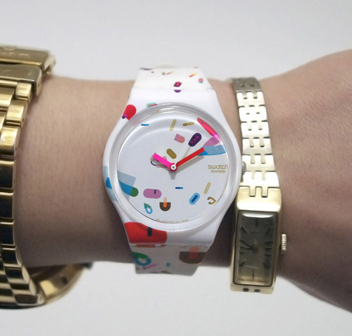
As a child of the 80’s (albeit a very, very young one, wink, wink!) I was taken in by the story of Bill Moggridge’s Swatch Watch comparison to the Tokyo airport radio watch purchase. He is clearly a found father of usability and interaction design, like Don Norman’s principles that are built into industrial and product design, we all use daily. I think these nascent and old school products when we were moving from an analog to a digital world are the most telling. Showing what products and technology make it and fail, has less to do with concept than execution and design interactions.
Moggridge’s history of design predates the swatch watch success, exploring emerging Boston and Silicon Valley explosions in the 60’s and 70’s (even predating me which makes me feel youngish). But what my mind wanders to, while reading, kind of like when I was reading the biography of Steve Jobs. Is how we take for granted this digital world and landscape. Because it has exponentially grown, according to Moore’s law, we have forgotten these entrepreneurs and engineers mainly, that have gambled and built this up and made it possible.
His book, Designing Interactions, is a staple, that I will read in the entirety, most likely post-graduation. Yet, even idiomatic, metaphoric or skeuomorphism choices in design and learning to use digital products that all people do in work and personal life. Someone decided and someone took the charge on this and it has mushroomed into today. Nothing more relevant than that. Apple pushed the skeuomorphism of the digital mirroring and imaging based on our analog experience and world around us.
But if you have ever seen the video of the toddler that thinks the analog magazine (or her finger which she tests on her chunky thigh) is broken, because the paper doesn’t work the way her iPad eMagazine works. You can question — is it art imitating life or life imitating art? I’m studying user experience because I think it has been and will continue to be the biggest design trend wave since print to web. I have also always been fascinated with design as a career, for study and teaching, because technology and design are the crossroads of all of our lives, whether we signed up for it or not. Whether we jumped on the multiple Swatch Watch fad or not. I know I did, because designers aren’t fortified against them but the biggest suckers for them.
#swatch#interaction design#bill moggridge#designing interactions#swatch watch#don norman#design of everyday#steve jobs#moore's law#skeuomorphism#ipad baby
0 notes
Photo


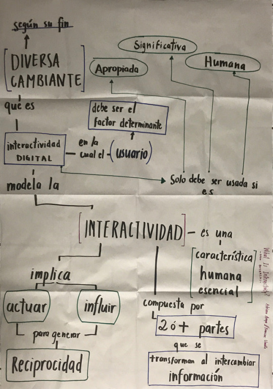
13 de agosto.
Mapas conceptuales con lecturas introductorías.
Los conceptos de diseño están relacionados unos con otros para lograr objetivos, de como el branding se influye en la imagen percibida de un producto y en la familiaridad para captar a quién está dirigido lo que fue diseñado, también de cómo el diseñador utiliza recursos de control visual para poder llegar a quién va dirigido, como lo son el entender el concepto, empatizar, ser consistente, velar por la función y controlar el comportamiento, lo cuál da a entender que va el diseño va más allá de la mente del diseñador.
Lecturas introductorias: Jacob Schneider: Graphic Design: Providing visual explanation, Dan Boyarski: What is interactivity, Bill Moggridge: Designing interactions.
Creación de mapa conceptual en parejas y explicación a los compañeros. El uso de un mapa conceptual ayuda a sintetizar un concepto, tomar las ideas más importantes y organizarlas en jerarquías con sus ideas secundarias y establece conexiones entre los conceptos de una maneras más simple.
Los conceptos son generalmente sustantivos que se conectan por verbos o preposiciones que esclarecen una o varias ideas.
1 note
·
View note
Last Seen Blogs