
uxuichopshop
Welcome to Val's UX/UI Design Chop Shop
44 posts
Don't wanna be here? Send us removal request.
Last Seen Blogs

spam-e
⚡️

thecatwars
Space Ace

qqtubereview
QQTube

tatyanab66
Simply Herbal Delight Artisan Soap

barnesandbarton
The Home of Clint and Bucky
Photo
Does prototype fidelity limit or increase usability testing?
I came across an interesting exploration of prototype fidelity by Jared Spool. I found this article very relevant to this week’s group work and discussion as each designer was at a different level of fidelity. I intentionally kept mine in Balsamiq, until the tail end, not sharing an InVision link, until the next to last post. I wanted to work out my navigation and receive and incorporate all of my feedback from the smaller groups and the larger class before moving into my most ‘interactive’ phase.
Mainly to prevent the demoralizing endless changes and tweaks that go along with redesign and finalization. But I wonder, did my intentional holding back into nascent stages of the software versus others who had almost complete and designed prototypes affect the reactions and assessments?
As far as straight interactions, NO. But as far as impressions and perceptions, YES. I didn’t start with paper prototypes as suggested. But according to the article: “the research is nuanced with studies generally showing paper and low-fidelity prototypes offering similar findings to full-fidelity prototypes and actual products.” I think it is safe to say that, any usability issues or faulty interaction design, is perceptible no matter the fidelity, low, medium or high.
As a production and visual designer I need ward off the pixel pushing and penchant to get carried away by artistry, alignment or other granular things of note, that I am accustomed to automatically addressing when I work. That second nature kicking in, reflexively needs to be curbed, in order to focus on the real task at hand which is functionality and best design of architecture. Consider all of the needed screens and (micro-)interactions is the key here. Not the look and feel. Best to not fall into our own traps, because at the end of the day, that doesn’t improve usability at all.
The colors to indicate live icons or success or failure are critical, but otherwise the logo or ‘darlings’ of design are simply the varnish over the wood. Users prefer high fidelity and I respond myself to the most complete or professional veneer as well, but if what lies underneath is wobbly the shining it up won’t help it not collapse.
0 notes
Photo
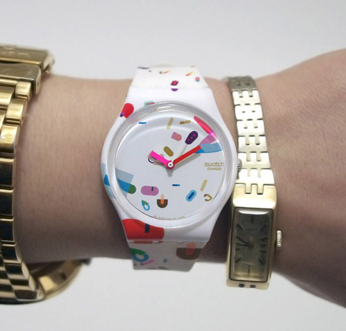
As a child of the 80’s (albeit a very, very young one, wink, wink!) I was taken in by the story of Bill Moggridge’s Swatch Watch comparison to the Tokyo airport radio watch purchase. He is clearly a found father of usability and interaction design, like Don Norman’s principles that are built into industrial and product design, we all use daily. I think these nascent and old school products when we were moving from an analog to a digital world are the most telling. Showing what products and technology make it and fail, has less to do with concept than execution and design interactions.
Moggridge’s history of design predates the swatch watch success, exploring emerging Boston and Silicon Valley explosions in the 60’s and 70’s (even predating me which makes me feel youngish). But what my mind wanders to, while reading, kind of like when I was reading the biography of Steve Jobs. Is how we take for granted this digital world and landscape. Because it has exponentially grown, according to Moore’s law, we have forgotten these entrepreneurs and engineers mainly, that have gambled and built this up and made it possible.
His book, Designing Interactions, is a staple, that I will read in the entirety, most likely post-graduation. Yet, even idiomatic, metaphoric or skeuomorphism choices in design and learning to use digital products that all people do in work and personal life. Someone decided and someone took the charge on this and it has mushroomed into today. Nothing more relevant than that. Apple pushed the skeuomorphism of the digital mirroring and imaging based on our analog experience and world around us.
But if you have ever seen the video of the toddler that thinks the analog magazine (or her finger which she tests on her chunky thigh) is broken, because the paper doesn’t work the way her iPad eMagazine works. You can question — is it art imitating life or life imitating art? I’m studying user experience because I think it has been and will continue to be the biggest design trend wave since print to web. I have also always been fascinated with design as a career, for study and teaching, because technology and design are the crossroads of all of our lives, whether we signed up for it or not. Whether we jumped on the multiple Swatch Watch fad or not. I know I did, because designers aren’t fortified against them but the biggest suckers for them.
#swatch#interaction design#bill moggridge#designing interactions#swatch watch#don norman#design of everyday#steve jobs#moore's law#skeuomorphism#ipad baby
0 notes
Photo
Serendipity! Micro-interactions is the theme of choice this week. This article happened into my inbox, while I was working on polishing my wireframes, and then I noticed it was also an assignment this week! I received a timely article The Devil In The Micro-Interactions and was assigned MICRO-INTERACTIONS Designing with Detail: WHAT IS A MICRO-INTERACTION?
Third times a charm, and I think the universe just might be trying to tell me something…I realized, when submitting my site map and my first draft of wireframes, that I hit most of the target points and main screens, but compared to my team mates, I had forgotten micro-interactions. These mini sticking or smoothing points in interaction design can make or break an app. I know as a user myself, if I’m not required to use something, and it is a pain in the neck or just won’t ‘work’ for me. I will delete it or find another work around myself.
The 3 Top Rules:
1. Sweat The Small Stuff
2. Details Make The Product
3. Kill Your Darlings: Don’t Get Too Cute
“Authentication is a piece of the design—what Dan Saffer would call a micro-interaction. (Dan coined the term and wrote a book on the topic, coincidentally named Micro-interactions.) Micro-interactions are small moments where the user and design interact. When well-designed they enhance the user’s experience with the design. When poorly-designed they hurt the experience.”
The article on way finding on the internet, how users are like travelers at an unknown destination, is very fitting. We follow the lead of those around us and follow the heard to baggage claim, even when we can’t read the signs language. Same in this case, we are prompted by the apps actions, to complete the transaction. And I think my design so far is strong, because I built a solid architecture and hit main points that I would like to see in a lunch app for my kids school, knowing the pickiness of young eaters, and very different eaters, I was able to (albeit dangerously) bring myself in as a persona, in addition to the built in persona’s. But even with this experience, or maybe because of it, I forgot the micro-interaction of the lunch voucher. My team mates both built this in, so I will add this micro-interaction into my app.
The app would be an epic fail, for the many users that are on lunch voucher. So I will add that micro-interaction into my needed extra screens. I think an app’s interactions is much like communication, it is so easy to fail at, too easy to miscommunicate, than to communicate properly. And the interaction that makes or breaks an app, in my opinion, is the micro-interaction, because like in communication, what you leave out is just as key as what you keep in.
“Dan Saffer has a framework that divides the design of micro-interactions into four components: feedback, modes and loops, triggers, and rules. When should the authentication request be triggered? What feedback should the system give? What rules should the system use to trigger the request or to let the user through? Under which conditions (modes) or how frequently (loops) should the system insist on authenticating the user.”
Article links:
https://medium.com/adventures-in-ux-design/the-devil-in-the-micro-interactions-83ad59399cb2
https://articles.uie.com/focusing-on-what-our-users-shouldnt-focus-on/
https://uxdesign.cc/the-dangers-of-delightful-design-bb5834a1b684
http://www.eamesoffice.com/blog/the-details-are-not-the-details/
http://microinteractions.com/what-is-a-microinteraction/
#microinteractions#user experience#wireframe#app design#dan saffer#charles eames#communication#feedback
0 notes
Photo
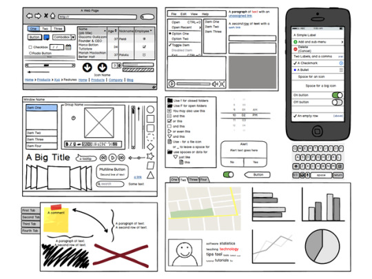
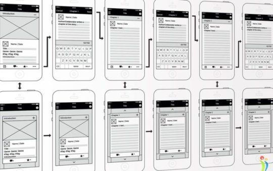
4 Stars: Wireframes in Balsamiq Mockups 3
I had a complete blast building these wireframes, and that was not anticipated! From the moment I downloaded Balsamiq with the sketchy smiley face icon and began sampling the software I knew instantly it was a keeper. I’m not exactly quite sure the logistics of how I will manage to bring my wireframes into InVision to prototype, or if I can simply leave it in the software and animate links there. But I have no doubt I can figure it out in this program or that I can export it and purpose my files just like Illustrator or Photoshop files.
One of the biggest liabilities with all of these downloads and software trials, like a student in a previous class, did all of her work in some such trial software, and then went to export it and had to upgrade for a fee to not lose her work. You never quite know what your getting yourself into with these. But, just like my first Sketch seminar training class, if you have a certain graphical interface level of experience and skillset, you can translate that to any program. If you can use Adobe software, then you can use Sketch or Balsamiq with ease and zero ramping up and ‘learning the software’ time.
It was intuitive, fun and what’s best about it? For fear of sounding like a commercial? I think it made my wireframes better, because in perusing the libraries of icons and exploring them I was inspired for ideas of how to handle interactions for my screens. As a software instructor teaching beginners, I know software can easily hindered or derail your work, not induce it. A bit like After Effects, it works with a project, but it is like a drag and drop Illustrator. I was going to analog sketch my wireframes, but my handwriting is fairly illegible, so I gave this a quick trial first, and I was richly rewarded.
I love it when I walk away, like my first card sort, with both a positive and unexpected outcome and this was my experience with Balsamiq and I would recommend unequivocally. The free 30-day trial will cover my course and I hope to use it in the future in the workplace.
Now I just have to get back to work and go from 11 frames to approximately 33, adding my in between interaction screens, not just my main site map frames.
0 notes
Photo
Looking Back: Then and Now
It’s an interesting experience going through the UXD experience again, from start-to-finish, of a mobile app, essentially at the tail end of my degree. While comparing it to the building of the UXD experience, from start-to-finish, at essentially, the beginning of my MS in UXD in the ‘UXD in Practice’ course when I built my notes app. It is clearly a measure of how far my progress has come. The first pass for the first class, there was a modicum of best educated guess at every stage. Now I have had experience, granularly and globally, at every stage of this process. For example, the site map, I had already practiced with the library website redesign.
It speaks to the success of the practical application and training of the degree, rather than gloating on my abilities. I was rather shaky and leaned hard on my significant others technology skills and computer science background for input and guidance when I felt frankly clueless. Now I can stand on my own two feet and go through all of the steps alone and concern myself with the nuances instead of the panic of just trying to get the readings and videos done and complete the assignment at all.
For example, Tom Green’s UXPin presentation, that there are low, medium and high-fidelity wireframes. He compares it to viewing the moon with the human eye, a telescope and through high-quality photography. I think we have moved through the equal stages in this degree arc and it is quite a sense of accomplishment. It isn’t all sorted and easy-peasy, there is much to be done, but at least at this stage of finality in the coursework, I’ve at bare minimum, got a clue.
0 notes
Photo
You don’t need a Lamborghini when a Flintstone’s car would suffice.
I started doing some research for this week’s site map submission and figuring out which software to go with is a mini-assignment in itself. The last site map I submitted, for Information Architecture, was done in Google draw, based on my group work and peer suggestion. It was easy to use, no worry of trial expiration or exporting the project fees. Like using the trial of Proto.io instead of relying on my pre-existing experience of InVision, I will most likely experiment with another software that I don’t have a lot of practice in just to get my feet wet.
This go around for site-mapping, the following software were suggested:
Omnigraffle (14-day trial free)
Axure (30-days free for teacher/students)
browser-based UX tool such as Mural.co (30-days free)
Keynote or PowerPoint (have unlimited)
Adobe Illustrator (have unlimited)
Keynote or PowerPoint as well as Illustrator, I have unlimited access and experience in. So there isn’t much challenge or learning there, so I will most likely pass. But software is really about finding the right tool for the right job, sometimes a software that can do too much for the task, is a bit overboard and gives unnecessary functionality. Mural is amazing and so cool. I may just try it in general because it applies to user experience design overall. It has moveable sticky notes, whats not to love? BUT…it seems this software of the collaborative future might be ideal for grander projects.
So that leaves Axure, as I previously used Omnigraffle with less than stellar results and some wonkiness for an Information Technology project. I went to establish a free student account but there was an error so I have contacted the company and they will review my student credentials. I would like to stretch my skills and get more software under my belt to have familiarity, but I will let you know how that goes, when I’m actually in the thick of things, because I may just end up circling back to Google draw, when I’m actually producing my deliverable.
Because for all the bells and whistles in the world, sometimes simplest is best AND easiest, as well. A drawing program by any other name is a drawing program — or is it? Or maybe I’m just overthinking it!
0 notes
Photo
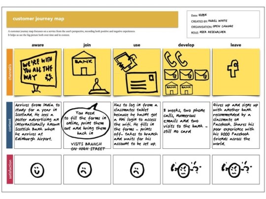
I’ve never met a sticky note I didn’t like....
This example of a user journey map is a great example of combining storyboarding style with the sticky note jamboree that is brainstorming in user experience circles. I may follow this example for my submission. Since this is an intended portfolio piece, that we are building the entire term on, I’m hesitant to not ‘get it right.’ The trouble with countless stickies (outside of my obscenely illegible handwriting) is that after a certain point they get messy and disorderly.
This structure, in addition to the notecard on poster board with sticky note contents transferred below, recommended in Chris Nodder’s UXD Techniques: Creating Scenarios and Storyboards might be the way to go with this nascent project. I’m still hemming and hawing over the right approach, but not unlike scenarios, going back and forth between viable and not-so-hot ideas, is the best way to find the keeper!
On another note, I’m including some noteworthy notes pulled from this week’s readings by Jonas Lowgren and the Interaction Design Foundation, that I found to illuminate what everyone is talking about when they say IxD. These terms, like UXD and Information Architecture or Content Strategy, get tossed about like jargon I think, when really they have such nuanced and different meanings, depending on the actual context of application and point in time or project, agile or waterfall.
____________________________________________________________________
“The aim of the following chapter is to provide an introductory overview of the concept and the field of interaction design, loosely grounded in historical developments.”
“The notion of shaping is used consciously to suggest a designerly activity (as opposed to, e.g., ‘building’ which suggests engineering, or ‘making’ or ‘creating’ that could refer to more or less anything). More specifically, I find it to be a distinctive trait of interaction design that the gestation process is a Design process, in the capital-D sense of the word. This in turn implies five major characteristics.”
“Designing Interactions, industrial designer and IDEO founder Bill Moggridge reminisces (p. 14):
“I felt that there was an opportunity to create a new design discipline, dedicated to creating imaginative and attractive solutions in a virtual world, where one could design behaviors, animations, and sounds as well as shapes. This would be the equivalent of industrial design but in software rather than three-dimensional objects. Like industrial design, the discipline would start from the needs and desires of the people who use a product or service, and strive to create designs that would give aesthetic pleasure as well as lasting satisfaction and enjoyment.”
The five major characteristics are:
Design involves changing situations by shaping and deploying artifacts
Design is about exploring possible futures
Design entails framing the ‘problem’ in parallel with creating possible ‘solutions'
Design involves thinking through sketching and other tangible representations
“When sketching snapshots or aspects of possible futures (such as a not-yet-existing product), the designer is not merely copying images from her inner eye. The drawings are micro-experiments that respond with insights into strengths, weaknesses and possible changes in a tight loop of thinking that involves the hand, the senses and the mind. The same notion applies for other sketching media used in design practice. For interaction design, there are particular implications to be observed from the temporal nature of our design material. One of them is that when designing innovative interaction techniques, it may be necessary to sketch in software and hardware rather than staying with lo-fi sketching media.”
“In general, the notion of sketching is more about the mindset of the designer than about the medium used. If a particular external representation serves to engage the designer in a conversation about the details and implications of a not-yet-finalized idea, and if it is quick, tentative and truly disposable, then it is a sketch. It could be anything from a napkin drawing to a piece of programming code, perhaps even written in the language that is normally used to build products for delivery - what matters is the purpose and intention.”
Design addresses instrumental, technical, aesthetical and ethical aspects throughout
“Interaction design as a designerly activity would insist that the aesthetical and ethical qualities can never be ignored or factored out. Whether something looks and feels good to use”
“To conclude, interaction design can be understood as shaping digital things for people’s use. The practice of interaction design is knowledge-intensive and multidisciplinary at heart. The chapters of this encyclopedia provide much of the relevant knowledge that forms the basis for interaction design practice as well as its scholarship.”
#user journey#user experience#sticky notes#chris nodder#storyboard#scenarios#jonas lowgren#interaction design
0 notes
Photo

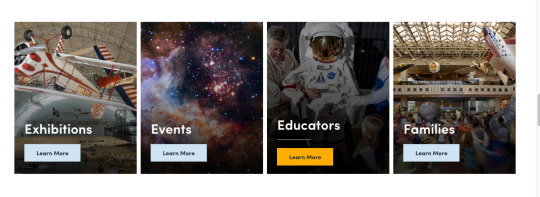
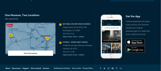
What are the right labels? A cornerstone of information architecture is the navigation label.
The Smithsonian National Air and Space Museum does a great job of labelling mounds of information: https://airandspace.si.edu/. This site’s labeling system is stellar, pun intended! It blew me away because the sheer magnitude of how much information the website contains, combined with the task oriented information architecture. This site sincerely enticed me to visit it, one of the choices between, visit, events and general but specific top down hierarchy. The coolest, experience-wise and helpful, navigation-wise, is that when you hover over this secondary navigation pops up. And they even include a good old fashioned search field in the upper right corner.
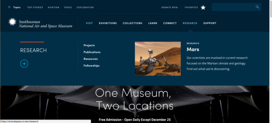
There is also a mini left-rail sub-menu that pops up for more specific and other types of navigation, insuring that however you think about your museum visit or research, they will supply you the answers on that home page. I would love to know who designed the and handled the information architecture of this website.
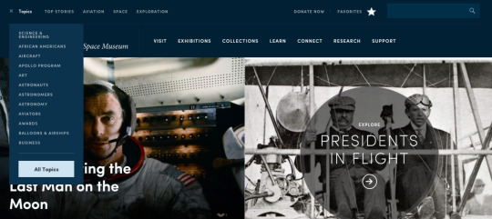
This site strikes a great balance of enticing imagery that also works as active navigation, as you scroll down, there is some repetition of top navigation subject but mixed in are the users, educators or families, outside of the exhibition and events, task orientated navigation. This equal mixture has ‘learn more’ buttons sending the user conveniently where they need to go! They hide the navigation in presentation and don’t overwhelm but guide.
Unlike other museum websites and physical locations, didn’t overwhelm me, even though it is ‘one museum two locations.’ This messaging is consistent throughout the website, including the most compact footer I have seen to date. Their 48pt bar footer is useful directing where to go for the ‘usual’ footer information as well as the social media bugs. Wow!
0 notes
Photo
The user’s problem is your problem “If the user is having a problem, it’s our problem.”—Steve Jobs [UX Quotes.com]
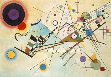
The eye tracking study analysis this week was very fascinating even if a bit tough to process end results from. All of the users in this study did think aloud feedback while they worked and watching their eye movements in action was very similar to viewing a Kandinsky painting. It’s beautiful and interesting to look at but how much information, outside of entertainment, can you glean from it?
The website we tested this week had a glut of too much information and poor information architecture. I would suggest an entire redesign of the site, bottom down, than simply restructuring the tasks. This site was an archive of an updated site so that it is less pressing than a usual study for development since it has already since been improved.
I think the experience of testing via eye tracking and studying previously recorded heat maps was a valuable experience, but I wouldn’t rest all results on it. It is interesting to see what participants eyes land on but honestly what they do and how they approach problem solving on the site during a non-eye tracking study is just as interesting.
The most valuable concept learned this week was “Retrospective Think After, which is the protocol that lets the user perform tasks without moderator interruption.” This is an ideal approach to usability testing. The concept of presenting the task and then letting the user go and discover on their own. Without interruption or leading was the most prominent lesson I learned these past few weeks.
1 note
·
View note
Photo

This week’s article was the most fascinating read, covering cognitive science, neurology of vision and a navel-gazing philosophical approach to what we see and process. This article had me at this trippy concept: “Many cognitive scientists believe that every moment of experience is a mental reconstruction of the world based on complex ‘calculations’ that combine a vast amount of environmental data.”1 I really enjoy exploring these ideas, but I do think, selling usability is one thing, but selling eye tracking, on top of that, is a reach. Maybe some people see differently? It kind of reminds me of the high school fireside camp late night conversation about how each person perceives color and if we ‘see’ colors the same. We really can’t ever know, empathy can’t fix that conundrum.
My eyes do deceive me, literally and figuratively. The idea that we ‘think’ our eyes are statically and stationary fixating but are readjusting and reassessing is also amazing. “Several times per second, the eye completes a cycle of fixation, saccade (the movement between fixations), fixation, saccade, and so on. On each fixation, the fovea gathers new detail about the visual field. Each saccade is a rapid adjustment of the fixation point so that the eye can gather data about a slightly different part of the visual field. Interestingly, this cycle is completed by a person’s eyes many times a second, even when he feels he’s staring at a single point.”1
Clearly, it is difficult to judge and assess our own vision, so I have some serious apprehension about the validity of judging a sampling of others vision. If you glance over heat maps, they appeal to me visually and artistically, but generally, with exception to the rule blips, the eye patterns seem to follow similar patterns irregardless of the website. I think piling on eye tracking studies, in addition to other forms of usability testing, and then iteratively testing those recommendations (requiring a big boy budget) would be the best way to assess the validity.
The concept that “eye movement is tightly linked to attention”1 and Jared Spool’s example of staring into the fridge, directly at the ketchup bottle and not being able to ‘see’ or find it. How many times has this happened to you? Then layer on the psychology of how people generally view a scantily clad woman, whether Venus De Milo on her half shell or Pamela Anderson’s latest lift, I think once you start getting into the artistic principles of layout and design, where the designer from Renaissance to Modern Day, guides the audience eye. In the annals of art history, design and the fine arts, already has its hands dirty in meddling with ‘the gaze’ and manipulating viewers, so on the other hand, this is a quantitative analysis of that. So I can both agree and disagree with it’s precepts.
1 Nicholas Gould, Jesse Zolna. Eye Tracking and Web Usability: A Good Fit? A look at the science and value behind eye tracking usability studies. Article No :509 | April 2, 2010. Pulled from http://uxmag.com/articles/eye-tracking-and-web-usability-a-good-fit on December 2, 2016.
0 notes
Photo
Touch Interfaces and Gestures? Mobile Versus Desktop?
I find the following quote very poignant and a significant way to interpret folding touch and gesture into technology, it is an immediate opportunity to take technological advances that overwhelm us all, back old school and slow it down:
“Why? Touch interfaces feel so completely intuitive because the sense of touch is quite possibly the most innate and intimate sense we humans possess. Our sense of touch develops before all other senses in embryos, and it is the main sense that newborn infants use to learn about their environment. It’s the sense that never turns off or takes a break, and it continues to work long after the other senses fail in old age. Throughout life, people use their sense of touch to learn, protect themselves from harm, relate to others, and experience pleasure.”6
This writing highlights a way to make the unfamiliar familiar in a way; the intersection of basic motion, not even requiring a mouse or other technical apparatus, and technology.
Don Norman, as he’s won’t to do, brings up many valid points. He directs designers to not just re-invent the wheel for the sake of reinventing the wheel. Just because you can, doesn’t mean you should. “Not with these new systems: Check boxes can work any way the whim of the developer decides, often to the distress of the poor person trying to use the system.”2 Any advances in technology can easily lead designers and developers down the slippery slope of bells and whistles for their own sake, keeping the end-user in mind, should be at the forefront of folding new technological capabilities into any updated system.
These are critical things to explore because mobile is far exceeding desktop as time progresses and worldwide. More people access websites on mobile devices and the trend is just continuing onward. Those without PCs are accessing on mobile devices as well, formerly unreached and untapped markets are mobile only in most remote areas. Those devices are primarily touch screen smart phones, though not all, surprisingly. Luke Wroblewski’s book Mobile First8 is a riveting read, that just goes to show, experimenting with mobile user testing is key to keeping user experience testing relevant and fresh.
Citations:
1Tech Degree. Usability Foundations video, pulled from https://teamtreehouse.com/library/usability-foundations/mobile-usability/touch-and-gestures, November 22, 2016.
2 Norman, Don. Gestural Interfaces: A Step Backwards In Usability, pulled from http://www.jnd.org/dn.mss/gestural_interfaces_a_step_backwards_in_usability_6.html, November 22, 2016.
3 Google, Gestures, mobile only, pulled from https://material.google.com/patterns/gestures.html#, November 22, 2016.
4 Wroblewski, Luke. Touch Gesture Reference Guide, pulled from http://www.lukew.com/ff/entry.asp?1071, November 22, 2016.
5 Arthur, Kevin. Evaluating Touch Gesture Usability, pulled from http://www.slideshare.net/kevinarthur/evaluating-touch-gesture-usability, November 22, 2016.
6 Hinman, Rachel. The Mobile Frontier, pulled from http://uxmag.com/articles/excerpt-from-the-new-book-the-mobile-frontier, November 22, 2016.
7 Nielsen, Jakob. Mouse vs. Fingers as Input Device, pulled from https://www.nngroup.com/articles/mouse-vs-fingers-input-device/ November 22, 2016.
8 Saffer, Dan. on Researching and Designing Interactive Gestures, IIT Design Research Conference, 2009, pulled from https://vimeo.com/8724094, November 22, 2016.
9 Wroblewski, Luke. A Book Apart: Mobile First. 2011.
#mobile testing#user experience#mobile gesture#don norman#luke wroblewski#kevin arthur#google gesture#rachel hinman#jakob nielsen#dan saffer
0 notes
Photo
To Sell or Not to Sell?
This week I’m going to try to unravel a complicated and thorny debate, by bringing together points from three seemingly disparate areas: Faculty chat with Patrick Neeman, Jimmy Chandler’s (of UX Principles) NYC+DA design-a-thon presentation and the Selling Usability: User Experience Infiltration Tactics by John Rhode’s book.
I found Patrick Neeman’s presentation apt and timely as I had just been embroiled in finishing my reading for Selling Usability by Rhodes. Not quite the few hour read as promised, I found the information contained in the book dense and rich, though supplied in quips and bit sized pieces, the reader really needs to think and keep a lot of balls in the air at the same time, to keep the ideas from sailing right past your head. Nemean’s presentation was apropos for the topics covered in this book, because he seems to live, eat and breathe them, successfully and effectively.
He straightforwardly applies the tenets of selling usability because it works and breeds successful business outcome. It’s not a political paradigm for him, it’s a practical application of good sense. He puts them into practice in his workplace and incorporates them into his workflow, not as an overt end game to sell usability as a UXD ninja, but just because these principles make good sense and have many practical applications. And I think in the end, the debate will get solved with good old fashioned numbers winning the day.
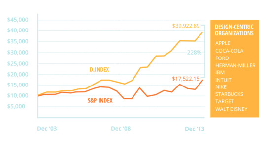
I attended a design-a-thon led by usability expert Jimmy Chandler, a bit similar to a hack-a-thon, at The New York Code + Design Academy, and as the time passes after the event, the fruitful lessons keep rolling in. This image above, credited to him, is from his presentation, he pointed out that these design centric companies, versus the non-design focused companies, rule the day with profits. Having spent the last 20+ years in advertising, I know for a fact, the bottom line and profits, win the day, everyday, hands down, in American business.
I think Jared Spool’s case study about the $300 million button will over time erode the mystery around what user experience testing is and the field itself. It’s just business smarts, if you like making money, you will succeed most at this, if you listen to and glean results from your users or as Rhode’s points out, just another word for customers.
#usability#selling usability jared spool#john s rhodes#jared spool#the new york code + design academy jimmy chandler#patrick neeman
0 notes
Photo
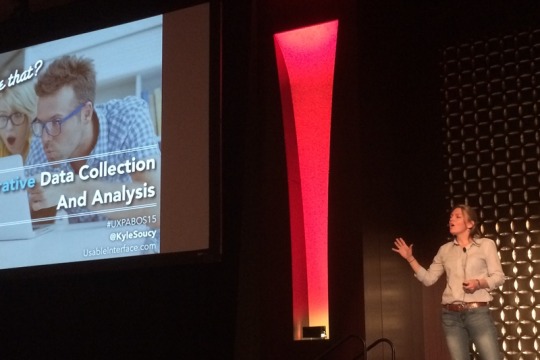
Unmoderated Remote Usability Testing: Good or Evil?
Kyle Soucy — 2011 IA Summit
This recording could really benefit from including the visuals Soucy refers to throughout her speech. She breaks down, for the layman or the unfamiliar UXD moderator the newest tools and ways of remote testing sans the moderator. She brings up the point that I second, “there is no way to say, stop, please think out loud.” This was my foremost concern for some dud remote usability studies that didn’t include any “think out loud” element to them, even when the audio was working, since participant typing was captured. This may have been preventable with further wording and reminders on each task screen. I did a dry run of the test and tasks before sending out and didn’t notice this myself. Interestingly, a user that I tested in person was fully thinking out loud, possibly from that prior experience thinking out loud in a face-to-face test.
She discusses the tools for unmoderated remote usability testing and she thinks the strongest point is metrics, quantitative data versus qualitative data. The web analytics are a key metrics that you get when you test remotely versus in person. Finding out when they abandon the task and survey. She purports the advantages of live intercept recruiting. There isn’t a whole lot in this that Nate Bolt doesn’t cover in his Remote Usability tome but she is very enthusiastic about the richness of and the actionable data delivered. She highlights, don’t send them on a scavenger hunt, and advises finding and exploring the content. During her example of the Lowe’s remote user testing, one of the tasks she wrote was very general, unlike my very specific tasks. She just put a destination out there and the user narrated how they would approach that task and how the site did or didn’t help accomplish this. The nuance may be open-ended questions.
The benefits of unmoderated tests are:
-shorter
-less tasks
-can supply big numbers
-test multiple websites simultaneously
-video recordings (but require time note taking)
-easy and rapid iterative testing
The disadvantages of unmoderated tests are:
-no spontaneity or adjusting the test or tasks
-difference of data
-possibly users only testing for honorarium
-don’t believe rating themselves
-research only is observation
-the recruiting process is not optimal
-who you test matters
0 notes
Photo
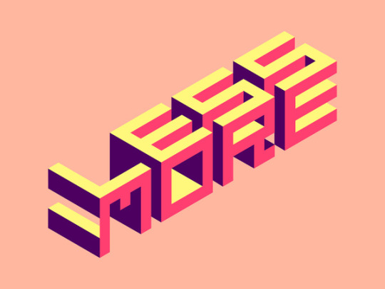
Less is More
What I learned in Usability 1, is that more in face-to-face in person studies increase your understanding, so I went from 3 to 5. What I’ve learned in Usability 2, from remote testing is that less is more. By that I mean less complications and ‘asks’ of the user is best. Since you are not there in person, the approach to designing remote question is the hinge the entire rest of your study is based on. In order to attain specificity I went really granular in my design of questions. A former fellow classmate, in the UXD program as well, gave me two thumbs up for my clever and inventive task design, which really gave me a shot in the arm, since I worked really hard at formulating them, but….
In trying to communicate I overshot my mark. Because the only map users have in hand with remote testing, is your task wording, take heed and be very, very careful in how complicated the ask is, to avoid task abandonment and don’t over-communicate. In order to be sure participants were using Chrome browser, I added an intro in task 1. This succeeded in only confusing people. Assuming anyone would create an account was a rookie move. As I wouldn’t complete the task if required that either. An alternative I thought of was, create a “dummy” account and supply that information. But frankly, I learned it wasn’t necessary to include the ‘purchase’ past the putting the item into the cart.
These things maybe avoidable in an authentic and not academic study, but for me, as I watched my sessions, of the very few responses. Another recruiting tip: overshoot by 10 times however many responses you need. Some people couldn’t get the link to work. Some thought they had completed it and there was no record of analytics in Validately, the test itself is here. Many situations I didn’t anticipate coming up, did in fact. I learned a lot, so that was useful, I would design my tasks differently in future but despite Nate Bolt’s very convincing argument in his book, I much prefer in person testing. He had me sold conceptually, after reading almost the entire book, Remote Research, but in practice it was very anticlimactic and I felt very removed and out-of-control of the practice.
Maybe I need practice and therein lies the weakness, but in face-to-face research sessions, you can adjust task or script, technology recording or prompt for “think out loud” responses as necessary. In remote research it is a dud or a success and that’s that. For example, recordings had no think out loud or the audio was so horrible I couldn’t hear anything and these sessions were lost, but for the typed comments. I know there is a practical necessity, international audiences for instance, but frankly many more studies need to be done to capture enough decent studies, using this method.
0 notes
Photo
I think the comparison of Mechanical Turk and Ethnio website’s for recruiting participants was an interesting pop quiz of covering if we did our readings this week. But more importantly, the summary of what we did read.
The bullets below cover what I found to be the most interesting takeaways and most novel approaches, from Remote Research: Real Users, Real Time, Real Research1:
•Experience sampling of 385 regarding happiness study
•Time aware studies
•Reverse screen sharing for Tokyo bank
•Gaming testing
•Simulated native environment since it matters for video game experience
•One-to-many moderating
•PENS
•Consideration of the Hawthorne effect and group think in testing
These areas are what I am most unfamiliar with and what captured my fancy the most research-wise and also because of their novelty. I think gaming would be most difficult to test for usability so the creative approaches of the faux living room set up and the communication through the gamer headset are some of the creative approaches that I find such a pull to become a UX designer and interview researcher.
Testing a product in the wild and most natural environment is the way to go. Axing the antiseptic environment for real is a great advance. When I was interviewing my participant in Usability I, there was a real sense of “I’m being tested” in the performance of the participant, no matter how sincerely the Steve Krug script is read to put the user at ease. So I think taking the laboratory out into the real world, like a scientist or a researcher doing a field study, is a valuable approach.
This book admits its flaws, it says what it does and doesn’t cover, and humbly admits it’s own subject matter strengths and weaknesses. But what is the most admirable attribute is the novel approach and clear experimental experience of the authors. It is an important work, simply because it catalogues what has been tried and done.
1 Bolt, N. & Tulathimutte, T. (2010). Remote Research: Real Users, Real Time, Real Research. Brooklyn, NY: Rosenfeld Media.
0 notes
Photo

If the Mechanical Turk is the city bus then Ethnio is a luxury car service.
I tried signing up on both websites to be a tester. It has been on my to do list since I started in this program, for learning purposes, to sign up at usertesting.com and become a paid tester, as a student, primarily to increase my familiarity with the practice and experience, since I have yet to land a job in the field of UXD. This research has dampened my enthusiasm of the idea. Because looking into the HITs it is ranging from $.01 to maximum of $20, primarily for transcription of either images or videos. But the “qualifications” seem byzantine to even get through, even after the approval process. Amazon is still vetting my application, which I found bothersome, until I read that it is rife with identity thieving potential. Much like the flyers on the subway for “work from home for $6k a month.” This promise high and deliver low isn’t new to the dangling carrot of work from home spiels and scams. The ones worth doing and pay enough, fairly gruesome transcription of videos would be a good deal, as compared to say, selling your blood platelets, like I knew some kids that did in undergraduate.
For rote or mechanicalized tasks, or busy work, Mechanical Turk, like de-duping spreadsheets or retyping mailing addresses, which it seems most of the work type is, would be great. For effectively recruiting participants? I’d judge a resounding NO! Unless I’m seriously misunderstanding something. I’m an around the clock worker, driven and not lazy, but would there even be a purpose, maybe if I was housebound without choice or other recourse this would be an employment solution. But still I feel like this tool would be a crapshoot, even after the vetting by Amazon, truly and the ratings and qualifications, what user testing would fit this bill? More like a survey or other work could be farmed out here, or international participant polling. But outside of that I can’t see how it’d be an ideal option. I like the concept but don’t see a viable or legit application. It has the Amazon name behind it but after that it seems the wild west, including what they have as a selling point, the no dice? No pay. That doesn’t seem right morally or ethically, so I wouldn’t brag about it, to a potential participant or user.
Now the Ethnio website, is immediately more friendly from a design standpoint and their company backing and case studies legitimize their brand and service. But interestingly, for all of this shebang coming into the discussion, I couldn’t find anywhere to sign up. I resorted to sending a good old fashioned email to contact them. This would be my choice, for recruiting participants, with the interceptor screen pop up on the website. If I had to choose from both of these. But why would I be limited? The catch with the internet, is the unlimited choices. For bringing in participants, as this week’s readings mentioned, who were already on task, self-motivated to be on my site for a purchase or product research, I’d invest. I’d run with the big boys on this one, IF I had the budget, and straight away, without reading the fine print, I know I’m going to have to pay for this. If the Mechanical Turk is the city bus then Ethnio is a luxury car service. They both get you home, but it’s a difference of experience and quality outcome. There is no babbling emotionally disturbed person in your luxury ride home, unless you’re stuck with an unfortunate driver. The city bus on the other hand? Anything can happen, it's the wild, wild west. That’s how I feel about the comparison of services between these two companies.
0 notes
Photo
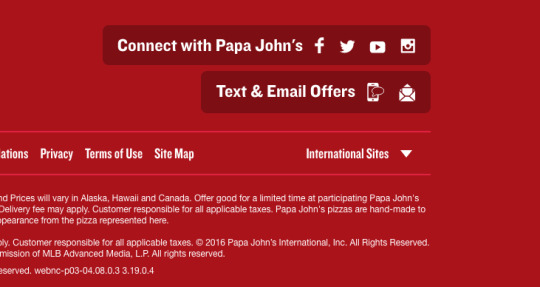
When the moon hits your eye like a big pizza pie...That's amore. I thought of this Dean Martin song while I was assembling my report findings. I presently can’t drive by Papa John’s again without thinking I may know way too much about the company, the website and it’s customers. It’s kind of like when you work on design and production of a piece in an advertising studio and you learn the client��s branding guidelines, logos and offers inside and out.
I found watching how people approach things, differently from me or from each other, the most fascinating aspect of reviewing this many studies. I would argue now, what I was unsure of when the course began, and what I waffled in my first assignment. I think 8-12 participants is bare minimum for usability studies effectiveness. I could find barely passable patterns or admissible information basing it on 3 participants, so I ended up including more user’s videos.
The question of how many participants are needed for a study becomes a whole lot less academic and more realistic when you are tasked with sitting down to write a comprehensive report like this Final Report for Papa John’s. Overall, I felt like there was a lot riding on how the information was assembled and filtered. It is a bit like writing a paper on a film, there is so much that transpires in that amount of time and consolidating the findings and summarizing this is a 5 on the difficulty Likert scale. There is so much data that each user passes on, that’s why I focused on quotes and their assessments of usability, rather than my own background.
For example when building digital buttons for html emails or banner ads, I would most certainly and instinctively build out two buttons and forms for a text icon and an email icon, not combine the two. Without thinking I would approach the design problem like this. I think in this case the site had one java form and built the design to accommodate the technology. Not the other way around like the above image. Especially, because each icon has an individual push interaction. But this is a key point that usability studies underscore, the way information and data shines through other users approaches and getting us out of our own heads, in a good way.
0 notes