#luke wroblewski
Text
Top UI/UX Designers: The Masters of User Experience
In the digital age, user experience (UX) and user interface (UI) design have become crucial elements in creating successful and engaging websites, applications, and digital products. The role of UI/UX designers is to ensure that users have a seamless and enjoyable experience when interacting with a product or service. As such, the demand for talented UI/UX designers has skyrocketed in recent years, leading to the emergence of a new generation of design professionals who are pushing the boundaries of what is possible in the digital realm.
Here, we take a look at some of the top UI/UX designers who are making waves in the industry and setting new standards for user experience design.
Don Norman Don Norman is a renowned UX designer and author who is best known for coining the term “user experience” and popularizing the concept of user-centered design. His book, “The Design of Everyday Things,” has become a seminal work in the field of UX design and has influenced countless designers and product developers around the world.
Brenda Laurel Brenda Laurel is a pioneer in the field of interactive media and has been at the forefront of UX design since the early days of the internet. She is known for her work on the concept of “computers as theatre” and her groundbreaking research on the emotional and psychological aspects of user experience.
Alan Cooper Alan Cooper is a leading figure in the field of interaction design and is the founder of Cooper, a renowned design consultancy. He is known for his work on the concept of “personas” and his influential book, “The Inmates Are Running the Asylum,” which has helped to shape the way designers approach user-centered design.
Kim Goodwin Kim Goodwin is a UX design expert and the author of “Designing for the Digital Age,” a comprehensive guide to creating user-centered design solutions. She is known for her work on the concept of “design thinking” and her advocacy for a holistic approach to UX design that takes into account the needs and goals of users.
Luke Wroblewski Luke Wroblewski is a prominent figure in the field of mobile and web design and is known for his work on the concept of “mobile first” design. He is the author of “Mobile First” and has been a vocal advocate for designing digital products with a focus on mobile users.
Irene Au Irene Au is a UX design leader who has held senior design roles at companies such as Google, Yahoo, and Udacity. She is known for her work on the concept of “design thinking” and her advocacy for a user-centered approach to product design.
Aarron Walter Aarron Walter is a UX design expert and the author of “Designing for Emotion,” a book that explores the role of emotion in user experience design. He is known for his work on the concept of “emotional design” and his advocacy for creating products that resonate with users on an emotional level.
Julie Zhuo Julie Zhuo is a prominent figure in the field of product design and is known for her work as the former VP of Product Design at Facebook. She is the author of “The Making of a Manager” and has been a vocal advocate for creating user-centered design solutions that prioritize the needs and goals of users.
Jared Spool Jared Spool is a UX design expert and the founder of User Interface Engineering, a leading research and consulting firm. He is known for his work on the concept of “usability” and his advocacy for creating products that are intuitive and easy to use.
Sarah Doody Sarah Doody is a UX design expert and the founder of The UX Portfolio Formula, a popular online resource for UX designers. She is known for her work on the concept of “user research” and her advocacy for a data-driven approach to UX design.
These top UI/UX designers are just a few examples of the many talented professionals who are shaping the future of user experience design. With their innovative ideas, groundbreaking research, and commitment to creating products that prioritize the needs and goals of users, they are setting new standards for what is possible in the digital realm. As the demand for talented UI/UX designers continues to grow, we can expect to see even more exciting developments in the field of user experience design in the years to come.
0 notes
Text
Mobile First
#ebooks #ebook #pdf #openbazaar #kindle #kindlebooks #mobilefirst #kindlebook
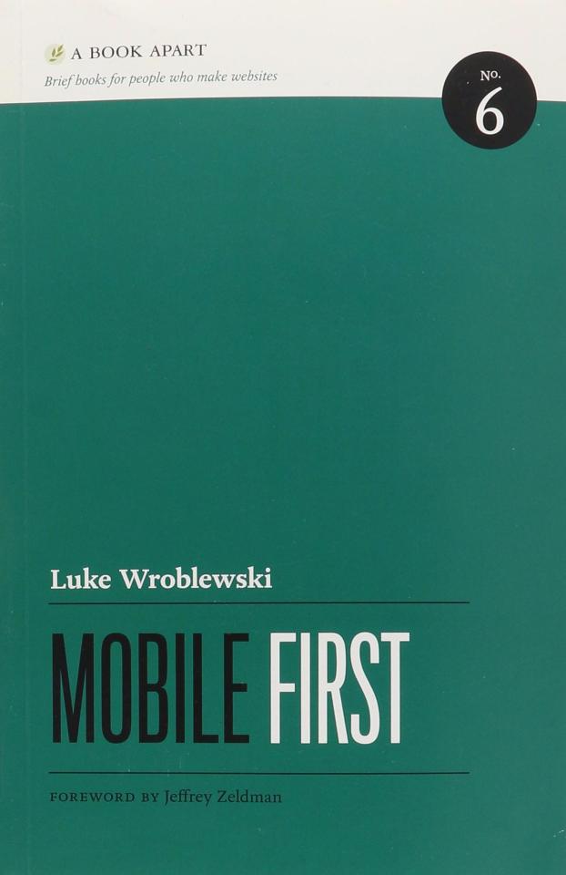

Price: 10 USD
Format : PDF ISBN : 9781937557027 Pages : 138
#9781937557027#pdf#luke wroblewski#mobile first#ebooks#ebook#kindle ebook#kindle ebooks#openbazaar#mobile web design
0 notes
Text
Visualizing the Applications of Augmented Reality
As part of a course delving into applications of AR for interactive experiences and installations, I was asked to conceptualize practical uses for augmented reality inspired by Luke Wroblewski’s 2017 take on the concept. Coming up with practical ideas was an interesting challenge!
For the purposes of the thought exercise, I presumed that the AR device would at minimum be a headset or glasses display with eye tracking and camera, audio input for control, and networking capabilities to connect to other devices such as the user’s phone. The device must also include basic gyroscopic elements and sensors to determine its orientation.
The concepts will be presented by the verbal command that would be used to activate them, with optional modifiers or qualifiers in [square brackets]. Any overlaid magenta circle should be interpreted as the system following the user’s gaze in its operation.
1. Bookmark
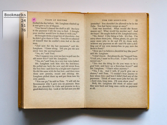
2. Compass
3. Tip [15%]
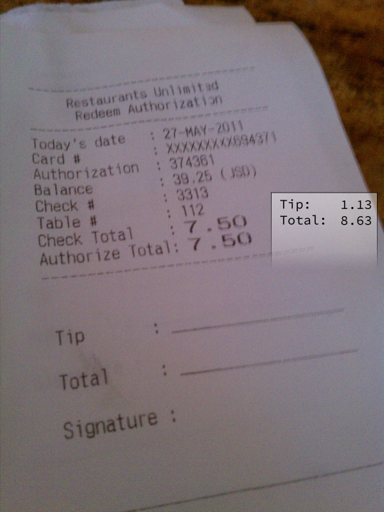
4. Find [My Phone]

5. Budget
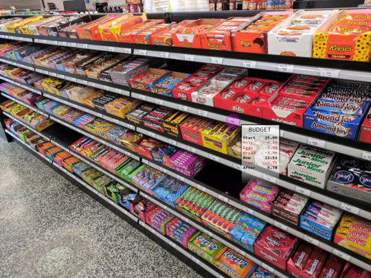
My lack of skill in Photoshop held me back a bit here, but I hope you can agree there are many interesting possibilities for consumer AR in the future. I for one would love to be directly shown where I left my keys by accident!
1 note
·
View note
Text
On Usefulness of Augmented Reality
In a recent class, our professor showed us a link to another blog by Luke Wroblewski, which is linked here: https://www.lukew.com/ff/entry.asp?1974
In his blog, Luke ruminates on just how useful true AR glasses would be, whether the information you gain is worth the charging and wearing of the glasses every day. To answer this question, he thought up a few different uses of AR headgear, and created a list with well-designed images to go along with this.
I thought the blog was very interesting, and his points and counterpoints thought provoking. So, why not create my own list of personalized use cases for AR headgear, except instead of product-worthy images I will use poor quality photos that I edited with Microsoft paint. Enjoy.
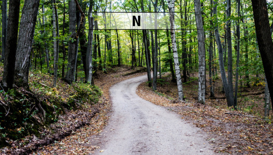
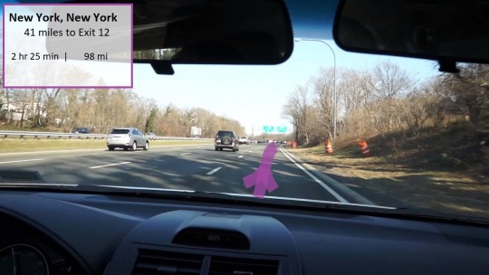
Command 1: “Drive to NY”
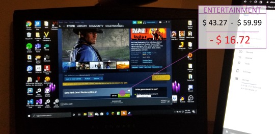
Command 2: “Budget”
Command 3: “Purchase”
Command 4: “Schedule”
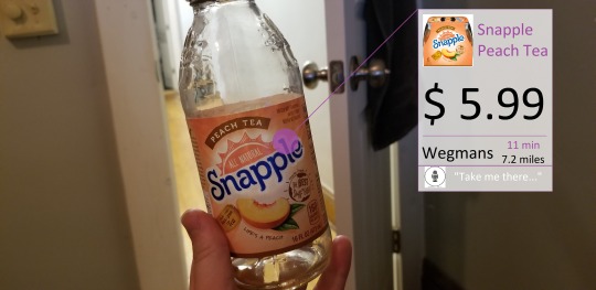
Command 5: “Identify”
1 note
·
View note
Link
“For the past six years, I've presented a walkthrough of the latest mobile data and design insights and solutions I've been exploring at Google's Conversions event in Dublin.”
0 notes
Text
Watch Luke Wroblewski's "Screen Time"
Screen time used to mean sitting in front of a TV. Today we move between screens of various sizes, proportions, and quality all day. The abundance and diversity of devices can overwhelm teams delivering software. We need practical ways to tackle the problems that come with this diversity of screens. Luke explores a deeper understanding of screen time today and ways to design effective…
View On WordPress
0 notes
Text
Mobile First ayuda a definir la esencia de un producto y a optimizar las visitas de nuestros usuarios.
Mobile First ayuda a definir la esencia de un producto y a optimizar las visitas de nuestros usuarios.
Mobile first es una filosofía que defiende que a la hora de afrontar la creación de un nuevo proyecto digital con un diseño de interfaz multidispositivo o adaptable a diferentes tamaños de pantalla, es necesario empezar a diseñar por la pantalla de menor tamaño (la del móvil) y luego adaptar ese mismo diseño al resto de formatos. La filosofía Mobile First explicada por su ideólogo Luke…
View On WordPress
#ai#app#diseño#first mobile#formatos de pantalla#inteligencia artificial#interfaz#interfaz de usuario#jakob nielsen#luke wroblewski#móvil#mercado de smartphones#mobile first#Mobile World Congress#netflix#portada#producto innovador#smartphone#streaming#tv#ui#usabilidad#usuarios#ux#web
0 notes
Photo
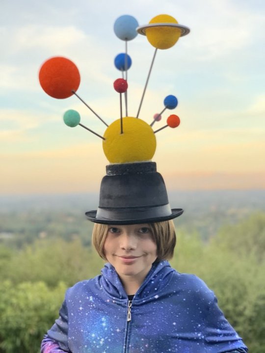
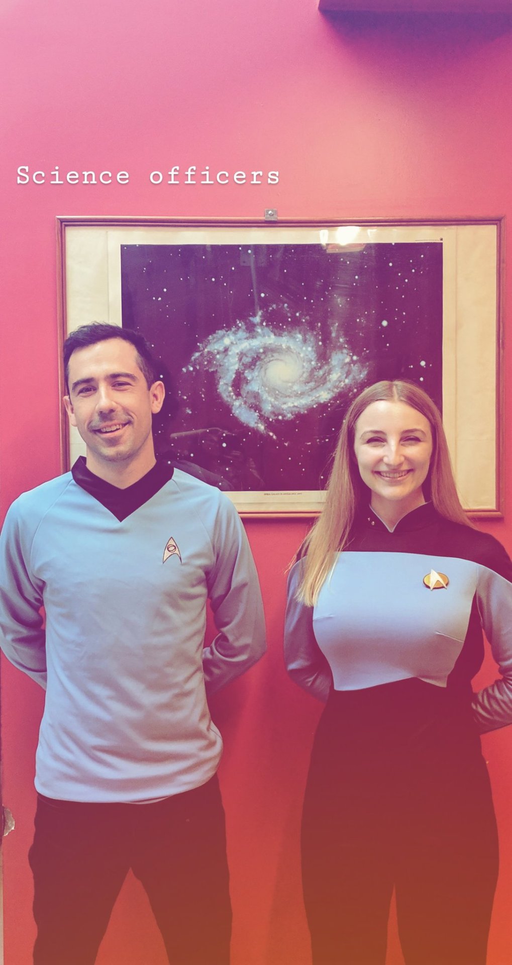

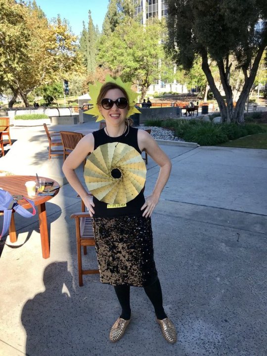
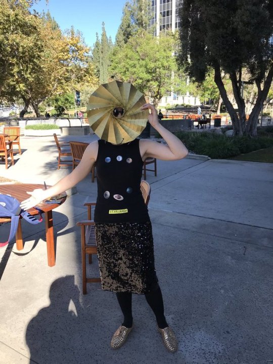


Here’s a Halloween round-up of some of the amazing space and science themed costumes we saw last week. Consider this your notice to start planning for next year. ;)
Luke Wroblewski’s son as the solar system (very Magritte-esque)
Columbia Astronomy grad students, Alex Teachey and Tiffany Jansen, as Star Trek science officers
The amazing Maia Weinstock, creator of the Women of NASA Lego set(!), as Margaret Hamilton (one of those Lego women). Please note that Maia’s stack is of Lego boxes of the set featuring Margaret Hamilton. Meta to the power of meta.
Liz Landau of NASA JPL as a star shade, a concept actively being researched at JPL for directly observing exoplanets. Talk about dressing your press.
Lastly, not one, but TWO costumes inspired by the James Webb Space Telescope! Rocket scientist Kellie Gerardi went for the partner costume with her daughter Delta as the JWST primary mirror and a clean room technician. And astrophysicist Ethan Siegel went all out embodying the entire telescope himself, sun shield and all! You too can dress up like the JWST with this DIY version from a few years ago.
Props to these superstars and all the others out there who are inspired by the Universe!
- Summer
#wednesdayinthewild#wednesday in the wild#halloween#costume#costumes#space costumes#solar system#planets#jwst#james webb#james webb space telescope#space telescope#star shade#jpl#nasa#jet propulsion laboratory#star trek#scienc#science officer#science officers#ethan siegel#kellie gerardi#liz landau#alex teachey#tiffany jansen#margaret hamiltion#computers#women computers#maia weinstock#lego women
28 notes
·
View notes
Text
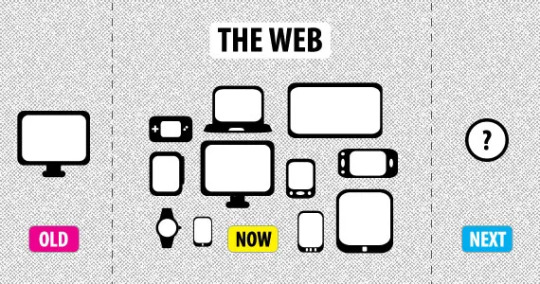
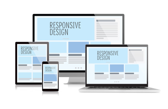
Your Complete Guide to Responsive Web Design
There are several firms that specialize in responsive and creative web design, particularly for website design in Littleton MA. Format, content, illustrations, site SEO, and conversion rate optimization are just a few of the factors that go into web design.
While the best creative web design is an important and fundamental component of your special initiatives, many institutions fail to recognise that it is only one component of a larger marketing strategy and should be consistent in look, feel, and logic with your other marketing efforts, such as pay per click advertising.
On the other hand, Web design has evolved significantly throughout the year. Initially, the major purpose of a best creative web design was to offer a seamless surfing experience for desktop users — after all, it was the only way individuals could access the internet. However, the mobile revolution has radically altered how we design for the web.
What is Responsive Web Design?
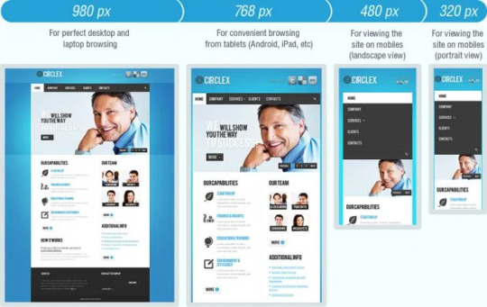
A responsive web design (RWD or simply “responsive design”) is a web design technique that ensures a best creative web design and functions properly across a wide range of devices and screen sizes. The graphic user interface is linked to responsive design (GUI).
A responsive web design scales the information and elements automatically, ensuring users see what they need to view — no missing bits or cropped photos — without the need to develop specific websites for smartphones or any of the other screen sizes available today.
Design elements in responsive design are created to scale across multiple device sizes. A responsive web design is simply one type of website that automatically changes to the size of the user’s screen . Responsive web design is faster and less expensive as a single design, but a single error in image sizing or padding can have an impact on user experience when adapting to smaller screens.
EFFECTIVE TIPS FOR RESPONSIVE WEBSITE-
Take the “mobile first” approach: Because mobile websites provide the most UX issues, developing for mobile and scaling “up” yields the best outcomes. Design for perceived size, knowing that larger designs on smaller displays are preferred to save pinching and zooming. Ensure your designs are intuitive at all layouts and sizes, especially the smallest mobile size.
Adopt a fluid grid and images: Create images with a 4 px basis to ensure that they scale to any percentage required in the fluid grid format. Test across common breakpoints for desktop displays, laptop displays, mobile displays (various), tablet displays, and other displays that may be of interest to your audience (e.g. tv or smartwatch).
Allow for touchscreens: The user interface varies according to the manner of interaction: mouse and keyboard vs touchscreen. Touchable items should be large enough to be usable on small displays, with simple navigation, responsive buttons and links, adequate swipe space, touch gestures, and optimization for the thumb zone.
Decide what elements to include on small screens: Responsive breakpoints are used by designers to determine what happens and what does not happen in each layout style. Determine what is functionally and visually required on the smallest screen to assist with support.
Apply design patterns: According to Luke Wroblewski, responsive web design patterns are divided into five categories: generally fluid, column drop, layout shifter, modest adjustments, and off-canvas. These patterns assist in determining when columns or blocks adapt from multi-column to single-column, the order of the items as these shifts occur, and whether elements become “hidden” in off-screen alternatives until exposed by a user.
Aim for accessibility: An accessible online design follows the four web accessibility principles: perceivable, operable, robust, and intelligible. Mobile accessibility should include adequate contrast (ratio 4.5:1 for normal text or 3:1 for large text), focusable active elements, design for large perceived text size, machine reading support, voice to text input fields, alternate navigation, and features that do not rely on color contrast to indicate function.
Try a pre-designed theme or layout: Pre-designed themes and layouts can be a tremendous help when building or converting a responsive website. Working with a theme entails making changes to colors, graphics, or material while adhering to the framework’s rules to guarantee that the alterations stay responsive. Many prominent web platforms, including WordPress, provide responsive themes.
Outsource your project
Consider outsourcing out to a team that has experience creating responsive web sites that check all of the above boxes to shorten your time to market with a custom responsive website. Look for an outsource partner who can provide advice on the full process, from technology stack and hosting to design to microservice development and integration. Make certain that only organizations with clear processes at each stage of the project are involved, and that testing is not left until the end.
CONCLUSION
Responsive and a best creative web design incorporates many different features. It is easy to make mistakes if you do not have a fundamental understanding of HTML and CSS.
However, by becoming acquainted with the various building components, evaluating the examples with web development tools, and testing as you go with the sample code, you should be able to make your website responsive without serious issues.
Source: https://www.bluebumble.com/your-complete-guide-to-responsive-web-design/
0 notes
Text
6 tips and tricks in Google applications that are worth knowing
6 tips and tricks in Google applications that are worth knowing
<
>
Google applications are an integral part of many smartphones, both iOS and Android. Experienced developer Luke Wroblewski, who is the leader of the iOS team at Google, therefore decided to show people 6 tips and tricks in "Google" applications that are worth knowing in a blog post on Google. So let's get to them.
You might be interested
Netflix Codes: How to Find Hidden Movies and…
View On WordPress
0 notes
Text
RESEARCH- RESPONSIVE WEB DESIGN
The defining challenge is how we develop sites that are able to cross the divide and straddle both mobile and PC, to provide a seamless transition from one device to another. This is the over-arching challenge, but there are thousands of other sub-challenges, such as how we enable the best conditions for reading, navigating, scrolling, resizing, panning, and so on in smaller devices.
ADABTIVE DESIGN- Resolution Dependent Design

Responsive Web Design Application
Responsive web designers employ images, fluid grids and media queries to adapt layout according to the screen size of a device, and they are able to exploit feature detection, primarily through the web client, to establish constraints and facilities. These constraints and facilities dictate responsive web design.
"...want layout adjustments across devices...[that] can live without complete optimisation for specific devices...[that] don't have access to server-side solutions...and [that] really don't trust device detection". - Luke Wroblewski
0 notes
Text
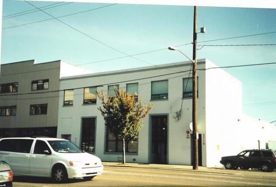
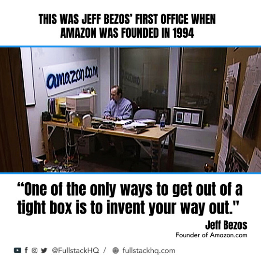
Amazon First Office Photo
Thank you for visiting the Museum
This museum celebrates the heritage of technology we've all grown up with. Please help us maintain and grow the museum by making a small donation -- buy us a coffee? Thank you so much!
Amazon Go is a chain of convenience stores in the United States and the United Kingdom, operated by the online retailer Amazon.The stores are partially automated, with customers able to purchase products without being checked out by a cashier or using a self-checkout station. Amazon's first gateway page. Download (jpg), 94 kb. Amazon's first office building. Download (jpg), 308 kb. Jeff Bezos and our 1 millionth customer. The company first hinted at a return to office-based work last year. Amazon announced last August that it would expand its physical offices in six major cities: Dallas, Detroit, Denver, New York.
Amazon later terminated Kiva's client relationships with retailers like Office Depot and the Gap in order to keep the technology to itself. 2013 Jeff Bezos announces intention to buy The. 850,000 square foot building (Amazon’s first fulfillment center was 86,000 square foot) The facility is the size of 14 football fields; Amazon Fulfillment Center in Bessemer. Photo by Jacob Blankenship for Bham Now. 4 stories tall; Gray Construction moved 1.7 million cubic yards of dirt to prepare the site; Poured over 8,000 cubic yards of.
Check out our YouTube video showing the history of the Amazon.com website! It has all the images and captions from this page, and is easy on the eyes.
Early Stage Amazon (1994-1995)
In 1994, Jeff Bezos witnessed the exponential growth of the World Wide Web and saw an opportunity to realize online commerce. Initially named Cadabra, Bezos changed the name when his attorney convinced him that it sounded too much like Cadaver. Bezos also considered the name Relentless for a while before opting for Amazon, which reflected the ideas of grandiosity and abundance. The company was founded on July 5th, 1994.
Original Amazon Website (1995)
Amazon.com was launched in July 1995. The logo was an abstract letter 'A' with a winding river flowing through it and the words Amazon.com, Earth’s biggest bookstore at the bottom. The color scheme of the site was typical for 1995 -- lots of gray and not terribly vibrant.
The company offered more than 1 million book titles, vastly outpacing any competition at the time. It featured a simple search engine to help find relevant books. Amazon also offered a free subscription to its personal notification service called 'Eyes and Editors,' enabling clients to proclaim their favorite authors and books. Whenever a new book of interest was added to the catalog, Amazon would automatically send the customer an email announcing the addition. Additionally, Amazon allowed clients to comment on books and exchange ideas with people around the world using review pages.
The original Amazon website (August 1995)
Source: Restored by Taran Van Hemert
TV Interview Footage (1997)
Amazon founder Jeff Bezos conducted many interviews in the early years, but this one in 1997 with KIRO 7 Seattle is notable because it had footage of the website at the time. The quality is poor, but still valuable to see Amazon in it's infancy. The computer in the closeup shots of the website appears to be an Apple Powerbook 1400, but the PC brand on Bezos' desk is unclear.
The first image below makes light of Amazon's massive collection of more than one million books. Amazon's Book of the Day link boasts 'a different title every day for the next 3,000 years.'
Amazon.com Homepage on TV broadcast (1997)
Source: KIRO 7 News
Amazon.com Search by Title, Author, or Subject (1997)
Source: KIRO 7 News
Jeff Bezos with Amazon.com (1997)
Source: KIRO 7 News
Logo Experimentation (1997)
The initial Amazon logo underwent several iterations, with changes in color scheme and fonts. With each iteration, the logo slowly came into shape, with the color palette becoming increasingly similar to the modern logo.
Amazon experiments with logo iterations (1997)
Source: fineprintart.com
Early Amazon Homepage (1997)
The company went public on May 15th, 1997 and raised $54 million in the process. Amazon's website underwent major changes, reflected in the design and more user-friendly interface. A left sidebar was introduced to enhance navigation, making the website more usable. Book covers and reviews were introduced to the experience to allow users to visualize the bookstore.
Amazon homepage image, restored by Version Museum (1997)
Source: ebaumsworld.com
Additional Logo Changes (1998)
In 1998, the Amazon logo went through additional iterations. A lowercase serif font served as the main logo for a short time, with the tag line 'Earth's Biggest Bookstore' underneath. But later that year, the company employed a sans serif all-caps logo with a bright yellow letter 'O' in the middle. This was also taken down in a few months; the logo soon morphed into the more familiar lowercase sans-serif logo with a slightly curved yellow line underneath. The motto 'Books, Music and More' floated above. With Amazon's ambitious expansion plans, the slogan was taken out after a couple of months.
Homepage with 'Earth's Biggest Bookstore' slogan (1998)
Source: blog.cake.hr
Introduction of Tabs & International Expansion (1998)
As Amazon's ambitions grew beyond selling books, tabs were introduced to the website. The site itself went through numerous alterations, with the search bar making its first prominent appearance to the top left of the homepage in the latter half of the year.
Furthermore, international expansion began, with acquisitions of online stores in the United Kingdom and Germany.
Product Expansion, Zshops, and Auctions (1999)
The use of tabbed navigation became more practical when toys, games, electronics, and auctions launched to shoppers as part of Amazon's hunger to expand service lines. A right sidebar was also added.
A market for third party sellers to showcase their products on Amazon was created, called zShops. Eventually, this evolved to become the Amazon Marketplace in 2000.
Amazon also experimented with Auctions in this timeframe, which later shut down in 2002.
The Modern Amazon Logo With a Smile (2000)
Design agency Turner Duckworth created the now-iconic logo for Amazon in the year 2000 with a custom typeface. Cleverly, designer Anthony Biles devised a smile that connects the letters A and Z. Jeff Bezos wanted something produced quickly, without the typical market research and focus group feedback process. Reportedly, Bezos jokingly claimed 'Anybody who doesn’t like that logo doesn’t like puppies!'
Amazon Letter A Logo (2000)
Source: vmastoryboard.com
Tab Insanity (2000)
As Amazon's catalog diversified to include categories such as art, kitchen, lawn & patio, tools, and beauty, the tabs expanded in turn -- sometimes to a comical degree. Luke Wroblewski documented this in his excellent piece on the history of Amazon’s tab navigation.
Amazon homepage with 15 tabs (2000)
Source: humanfactorsblog.org
Tabs Refined (2001-2003)
Amazon added additional categories such as eBooks, baby items, cell phones, and video games. With the growing number of product categories, the tabs couldn't grow infinitely to keep pace with the limited real estate in the top navigation area. The tabs were reined in and the categories were moved to the left sidebar area. The Amazon logo decreased in size to accommodate the changes.
In 2002 Amazon experimented with a limited number of prominent tabs at the top again, and added some graphic flair in the form of a shirt to announce the arrival of the apparel store. Additionally, Amazon began offering Gold Box deals, showcasing the best deals on the site.
Tabs moved to left sidebar (2001)
Source: the-digital-reader.com
Streamlined (2005)
The on-again off-again relationship with tabs continued, but this time they were severely curtailed. There were only tabs for the homepage, a personalized page of products called Your Store, and a link to all the product categories.
Amazon Prime began in February 2005, and prominent ads for the service were plastered on the homepage.
Interestingly, the category page that lists 30+ types of products also has some logos, that in retrospect, are fascinating to see. Amazon used to power the websites for Toys-R-Us, Babies-R-Us, and Target. Toys-R-Us and Babies-R-Us ended up going bankrupt, closing all their US and British stores in 2018. Target and Amazon are now fierce competitors in the retail sector. But back in 2005, online retail was a small slice of the pie and wasn't strategic enough for these companies to own themselves.
Amazon product categories with Toys-R-Us and Target (2005)
Source: archive.org
Tabs Begone! (2008)
The tab structure was completely discontinued in favor of the left sidebar. The site embraced a blue and orange color scheme, complementing the orange from the smile in the logo.
The Kindle ebook reader launched in 2007, and Amazon used the most valuable space in all of retail -- its own homepage -- to market the product to potential buyers. In the image displayed below, Jeff Bezos celebrates the fact that Kindle is back in stock and invites customers to view the Amazon shareholder letter to understand the product roadmap. This really illustrates the relationship Bezos' attempted to cultivate with Amazon users.
Amazon homepage with Kindle ad (2008)
Source: archive.org
iPods and Blackberries (2009)
Design-wise, 2009 didn't see many changes. But in a museum like ours, who doesn't like to see old favorites like iPods and Blackberry phones? These classics were still huge sellers in 2009. The iPhone came out in June 2007 and was still in its infancy. The first Android device, the T-Mobile G1/HTC Dream, was launched in September 2008.
Amazon homepage with iPods and Blackberries (2009)
Source: archive.org
Amazon First Office Photos
Amazon Blackberry Bold 9000 product page (2009)
Source: archive.org
Colorless Redesign (2012)
With a totally updated look, Amazon dropped almost all traces of bold colors in the borders and background. Orange fonts were used prominently to show prices and bolded text. A gray background gradient floated behind the top navigation area. Responsive web design elements started making their way into the site to allow phones, tablets, and desktops to all view the same webpage cleanly. Also, the left sidebar was eliminated.
Amazon product page for Lord Of The Rings (2012)
Source: archive.org
Minimalist, Responsive Design (2015)
The homepage moved to a modular design while still promoting all of Amazon's own product line.
Amazon First Office Pictures
Amazon selling itself (2016-2019)
Amazon continued to transform into a more spartan look with fewer items for sale on the homepage, but with more and more of those items being its own products and services.

In 2017, the site debuted the new products promotional banner ad at the top of the homepage. Clicking through this ad shows the customer a page full of unique and novel products the user presumably hasn't seen before.
Amazon First Office Photography
Amazon homepage in August (2019)
Source: Version Museum
Amazon First Office Photographs
Please help support our museum hosting costs by making a small donation -- buy us a coffee! Thank you so much!
Amazon First Office Image
Scroll up to the top.
0 notes
Text
Implementation of Skeleton Screens
Learn about what a skeleton screen UI is, and other types of skeleton screen libraries, along with their pros and cons. Traditionally, spinners and loaders have been a way of informing users that content would take a while to load. While that approach is fantastic, modern architecture is rapidly becoming obsolete.
Skeleton screens
are becoming the ideal substitute for conventional loaders, as they concentrate on progress rather than waiting times, reducing disappointment in loading-time.
The difference between a loader and a skeleton screen UI UI and UX experts tell us that we can keep them engaged while users wait for content to be loaded to a tab.The idea behind using spinners to engage users before content loads is great; however, the result could be less than ideal because most users may get bored staring at a dummy animated spinner like a clock is. That is what Luke Wroblewski elaborates about.Skeleton screens have a better user experience by raising annoyance with load-time. By concentrating on improvement rather than waiting times, it creates the impression for users that the information will be shown incrementally on the computer. This is confirmed by Bill Chung in his study. Define Skeleton Screen?A skeleton screen is a variant of the UI that does not contain actual content; rather, it imitates the layout of the page by showing its elements in a manner identical to the actual content as it loads and becomes accessible (i.e., when network latency allows).A skeleton screen is basically a website wireframe, with text and pictures in placeholder frames. Why is a Skeleton Screen different?A skeleton UI resembles the actual user interface on the website, so users can understand how soon the site or mobile device can load even before the content appears. Here are a few explanations of why you would want to consider using skeleton screens in your next project: • It's simpler to emulate a page's layout with a skeleton screen, • the material loads slowly (not all at once).Skeleton screens are often known as: • ghost components, • placeholders of content, • loaders of content.Blockchain.com, YouTube, Twitter, Medium, and other large-scale tech firms view skeleton screens as their content enhances the UX.
Types Of Skeleton ScreensThere are various types of screens with skeletons. The key ones are placeholders of text and placeholders of pictures (or color).Most developers tend to use text placeholders as the skeleton UI on their pages because they are easy to create, and the developer does not need any information about the actual content substance; instead, the skeleton imitates the UI.Color placeholders are more difficult to create since they require material information.Other common packages promote the implementation of skeleton screens in web apps. Let's take a closer look at Trigger Placeholder and Skeleton Reaction Ready.Before deciding which to use for our application, we will look at the pros and cons of each kit. React PlaceholderPROS • Components to the placeholder are used to build a custom skeleton UI.• Animation of the pulses (i.e. the effect of motion on the element) is assisted.• It comes with an API based on the components. CONS • Skeleton components are kept separately, so updating a component's styles can entail upgrading the skeleton component too. • The learning curve is not linear since multiple elements are required for different needs. React Loading SkeletonPROS• It is API-based and has one part for all customization with props.• It can be used as a separate part of the skeleton and also directly inside any part, so it is versatile.• Supports thematic and animated Pulse. CONS • For a basic skeleton UI it is easy to implement but difficult for more complex skeletons.• Having a different part of the skeleton would make it more difficult to manage as the UI and styles shift. How to create your own skeleton screen?Drawing the Skeletons in CSSNext, we will draw the basic shapes which will make up the skeleton of the deck. We can do this by adding various gradients to the image-background property. By nature, linear gradients extend from top to bottom, with various transitions to avoid colors. If we describe the only one-stop color and leave the rest translucent, we can draw shapes.Keep in mind that here are stacked on top of each other multiple background images, so the order is important. The last description of the gradient is at the back, the first at the top.
.skeleton { background-repeat: no-repeat; background-image: /* layer 2: avatar */ /* white circle with 16px radius */ radial-gradient(circle 16px, white 99%, transparent 0), /* layer 1: title */ /* white rectangle with 40px height */ linear-gradient(white 40px, transparent 0), /* layer 0: card bg */ /* gray rectangle that covers whole element */ linear-gradient(gray 100%, transparent 0); }
As with standard block-level components, these shapes extend to fill the entire room. If we want to change that, we need to define the dimensions explicitly for them. The value pairs set the width and height of each layer in background-size, keeping the same order we used in the background image:
.skeleton { background-size: 32px 32px, /* avatar */ 200px 40px, /* title */ 100% 100%; /* card bg */ }
The final step is the placement of the elements on the board. This works much like position: absolute, with values reflecting the property at the left and right. For example, we can simulate a 24px padding for the avatar and title, to suit the appearance of the actual content card.
.skeleton { background-position: 24px 24px, /* avatar */ 24px 200px, /* title */ 0 0; /* card bg */ }
Breaking it up with the Custom PropertiesIn a basic example, this works well-but if we try to create anything a little more complicated, the CSS quickly gets messy and very difficult to read. If that code had been given to another creator, they would have no idea where all those magic numbers come from. Having it sure would suck.Fortunately, we can now use custom CSS properties to write skeleton styles in a far more succinct, developer-friendly manner-and even take into account the relationship between different values:
.skeleton { /* define as separate properties */ --card-height: 340px; --card-padding:24px; --card-skeleton: linear-gradient(gray var(--card-height), transparent 0); --title-height: 32px; --title-width: 200px; --title-position: var(--card-padding) 180px; --title-skeleton: linear-gradient(white var(--title-height), transparent 0); --avatar-size: 32px; --avatar-position: var(--card-padding) var(--card-padding); --avatar-skeleton: radial-gradient( circle calc(var(--avatar-size) / 2), white 99%, transparent 0 ); /* now we can break the background up into individual shapes */ background-image: var(--avatar-skeleton), var(--title-skeleton), var(--card-skeleton); background-size: var(--avatar-size), var(--title-width) var(--title-height), 100% 100%; background-position: var(--avatar-position), var(--title-position), 0 0; }
Not only is this much more legible, it's also much easier to later change some of the values. Plus we can use some of the variables (think —avatar-size, —card-padding, etc.) to describe the individual card styles and keep it in line with the skeleton version at all times.It is now very easy to add a media question to change parts of the skeleton at different breakpoints too:
@media screen and (min-width: 47em) { :root { --card-padding: 32px; --card-height: 360px; } }
Adding AnimationsWe can animate our skeleton to make this even easier, and make it look more like a loading indicator. All we need to do is put a new gradient on top layer and then, with @keyframes, animate his location.
As a reputed Software Solutions Developer we have expertise in providing dedicated remote and outsourced technical resources for software services at very nominal cost. Besides experts in full stacks We also build web solutions, mobile apps and work on system integration, performance enhancement, cloud migrations and big data analytics. Don’t hesitate to
get in touch with us!
0 notes
Photo
Credit:• @design.avant.garde And here is the 100th post you were waiting for 🔥 Let's look for some inspirations ❤️ Shared by @design.avant.garde #Repost @ux.mars • • • • • • 8 Designer You Have to Know . by @ux.mars . . 1. Jonathan Ive - Apple 2. Chris Do - The Futur 3. Farai Madzima - Shopify 4. Luke Wroblewski - Google 5. Steve Krug - Don't Make Me Think 6. Irene Au - Google & Netscape & Udacity 7. Jakob Nielsen - Nielsen Group 8. Don Norman - Design of Everyday Things . . . . . #ux #uxui #uiux #uxclass #uxresearch #uxtips #designers #uxdesign #uidesign #ui #uxuidesign #uiuxdesign #uitips #website #web #webdesign #dailyux #dailyui #jonathanive #chrisdo #faraimadzima #lukewroblewski #stevekrug #ireneau #jakobnielsen #donnorman #uxbooks #designbooks #zero2herotraining (at London, United Kingdom) https://www.instagram.com/p/COGvNARAiN9/?igshid=tw8o2dqlpa5q
#repost#ux#uxui#uiux#uxclass#uxresearch#uxtips#designers#uxdesign#uidesign#ui#uxuidesign#uiuxdesign#uitips#website#web#webdesign#dailyux#dailyui#jonathanive#chrisdo#faraimadzima#lukewroblewski#stevekrug#ireneau#jakobnielsen#donnorman#uxbooks#designbooks#zero2herotraining
0 notes
Text
Implementation of Skeleton Screens
Learn about what a skeleton screen UI is, and other types of skeleton screen libraries, along with their pros and cons. Traditionally, spinners and loaders have been a way of informing users that content would take a while to load. While that approach is fantastic, modern architecture is rapidly becoming obsolete.
Skeleton screens
are becoming the ideal substitute for conventional loaders, as they concentrate on progress rather than waiting times, reducing disappointment in loading-time.
The difference between a loader and a skeleton screen UI UI and UX experts tell us that we can keep them engaged while users wait for content to be loaded to a tab.The idea behind using spinners to engage users before content loads is great; however, the result could be less than ideal because most users may get bored staring at a dummy animated spinner like a clock is. That is what Luke Wroblewski elaborates about.Skeleton screens have a better user experience by raising annoyance with load-time. By concentrating on improvement rather than waiting times, it creates the impression for users that the information will be shown incrementally on the computer. This is confirmed by Bill Chung in his study. Define Skeleton Screen?A skeleton screen is a variant of the UI that does not contain actual content; rather, it imitates the layout of the page by showing its elements in a manner identical to the actual content as it loads and becomes accessible (i.e., when network latency allows).A skeleton screen is basically a website wireframe, with text and pictures in placeholder frames. Why is a Skeleton Screen different?A skeleton UI resembles the actual user interface on the website, so users can understand how soon the site or mobile device can load even before the content appears. Here are a few explanations of why you would want to consider using skeleton screens in your next project: • It's simpler to emulate a page's layout with a skeleton screen, • the material loads slowly (not all at once).Skeleton screens are often known as: • ghost components, • placeholders of content, • loaders of content.Blockchain.com, YouTube, Twitter, Medium, and other large-scale tech firms view skeleton screens as their content enhances the UX.
Types Of Skeleton ScreensThere are various types of screens with skeletons. The key ones are placeholders of text and placeholders of pictures (or color).Most developers tend to use text placeholders as the skeleton UI on their pages because they are easy to create, and the developer does not need any information about the actual content substance; instead, the skeleton imitates the UI.Color placeholders are more difficult to create since they require material information.Other common packages promote the implementation of skeleton screens in web apps. Let's take a closer look at Trigger Placeholder and Skeleton Reaction Ready.Before deciding which to use for our application, we will look at the pros and cons of each kit. React PlaceholderPROS • Components to the placeholder are used to build a custom skeleton UI.• Animation of the pulses (i.e. the effect of motion on the element) is assisted.• It comes with an API based on the components. CONS • Skeleton components are kept separately, so updating a component's styles can entail upgrading the skeleton component too. • The learning curve is not linear since multiple elements are required for different needs. React Loading SkeletonPROS• It is API-based and has one part for all customization with props.• It can be used as a separate part of the skeleton and also directly inside any part, so it is versatile.• Supports thematic and animated Pulse. CONS • For a basic skeleton UI it is easy to implement but difficult for more complex skeletons.• Having a different part of the skeleton would make it more difficult to manage as the UI and styles shift. How to create your own skeleton screen?Drawing the Skeletons in CSSNext, we will draw the basic shapes which will make up the skeleton of the deck. We can do this by adding various gradients to the image-background property. By nature, linear gradients extend from top to bottom, with various transitions to avoid colors. If we describe the only one-stop color and leave the rest translucent, we can draw shapes.Keep in mind that here are stacked on top of each other multiple background images, so the order is important. The last description of the gradient is at the back, the first at the top.
.skeleton { background-repeat: no-repeat; background-image: /* layer 2: avatar */ /* white circle with 16px radius */ radial-gradient(circle 16px, white 99%, transparent 0), /* layer 1: title */ /* white rectangle with 40px height */ linear-gradient(white 40px, transparent 0), /* layer 0: card bg */ /* gray rectangle that covers whole element */ linear-gradient(gray 100%, transparent 0); }
As with standard block-level components, these shapes extend to fill the entire room. If we want to change that, we need to define the dimensions explicitly for them. The value pairs set the width and height of each layer in background-size, keeping the same order we used in the background image:
.skeleton { background-size: 32px 32px, /* avatar */ 200px 40px, /* title */ 100% 100%; /* card bg */ }
The final step is the placement of the elements on the board. This works much like position: absolute, with values reflecting the property at the left and right. For example, we can simulate a 24px padding for the avatar and title, to suit the appearance of the actual content card.
.skeleton { background-position: 24px 24px, /* avatar */ 24px 200px, /* title */ 0 0; /* card bg */ }
Breaking it up with the Custom PropertiesIn a basic example, this works well-but if we try to create anything a little more complicated, the CSS quickly gets messy and very difficult to read. If that code had been given to another creator, they would have no idea where all those magic numbers come from. Having it sure would suck.Fortunately, we can now use custom CSS properties to write skeleton styles in a far more succinct, developer-friendly manner-and even take into account the relationship between different values:
.skeleton { /* define as separate properties */ --card-height: 340px; --card-padding:24px; --card-skeleton: linear-gradient(gray var(--card-height), transparent 0); --title-height: 32px; --title-width: 200px; --title-position: var(--card-padding) 180px; --title-skeleton: linear-gradient(white var(--title-height), transparent 0); --avatar-size: 32px; --avatar-position: var(--card-padding) var(--card-padding); --avatar-skeleton: radial-gradient( circle calc(var(--avatar-size) / 2), white 99%, transparent 0 ); /* now we can break the background up into individual shapes */ background-image: var(--avatar-skeleton), var(--title-skeleton), var(--card-skeleton); background-size: var(--avatar-size), var(--title-width) var(--title-height), 100% 100%; background-position: var(--avatar-position), var(--title-position), 0 0; }
Not only is this much more legible, it's also much easier to later change some of the values. Plus we can use some of the variables (think —avatar-size, —card-padding, etc.) to describe the individual card styles and keep it in line with the skeleton version at all times.It is now very easy to add a media question to change parts of the skeleton at different breakpoints too:
@media screen and (min-width: 47em) { :root { --card-padding: 32px; --card-height: 360px; } }
Adding AnimationsWe can animate our skeleton to make this even easier, and make it look more like a loading indicator. All we need to do is put a new gradient on top layer and then, with @keyframes, animate his location.
As a reputed Software Solutions Developer we have expertise in providing dedicated remote and outsourced technical resources for software services at very nominal cost. Besides experts in full stacks We also build web solutions, mobile apps and work on system integration, performance enhancement, cloud migrations and big data analytics. Don’t hesitate to
get in touch with us!
0 notes
Last Seen Blogs

bcofl0ve
[◉"]

zoffyji
Gomu gomu no Love

pixiereblogs
Pixie Reblogs


wehadabeautifulmagiclovethere
I Wish You Would