#bookcoversalt
Note
will we ever see a bookcoversalt revival?
I was gonna say no, but if publishers keep showing their asses and using crusty looking AI art on covers, idk, maybe
7 notes
·
View notes
Note
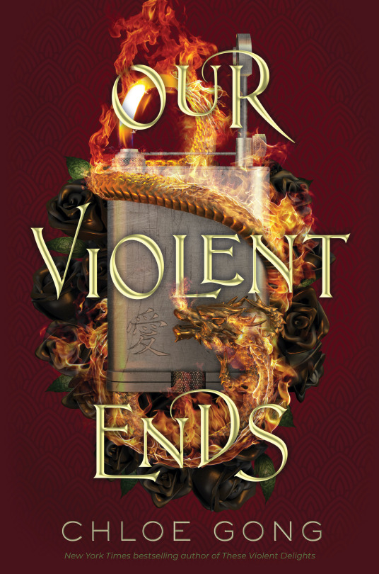
why is the cover for our violent ends so much... worse... than the cover for the previous book (these violent delights)
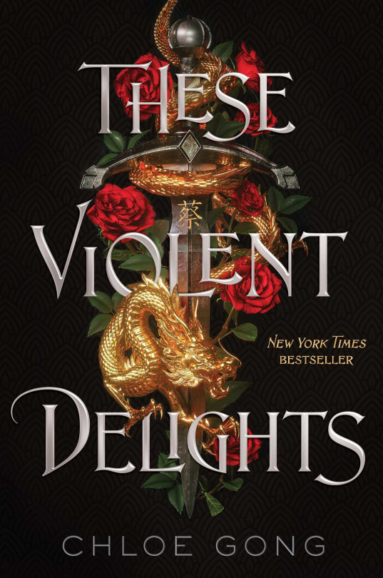
Well, to start with, an upright, flat rectangle isn’t the most visually dynamic or interesting shape in the world to anchor your design to, lol. It also commits the sins of:
A substantially more garish bevel on the text (bevel = metallic-ey dimensional effect). Also a drop shadow now? Why????? Why drop shadow????
The sort of pale, colder gold tone of the text also matches nothing in the illustration in terms of color, whereas the silver text on TVD was echoed in the silver of the sword metal. It provides a nice subtle little bit of cohesion on TVD that we’re missing on OVE.
.
A much weaker silhouette + overall visual language to the main illustrated lockup. The sword shape is clear on TVD, but the other elements are also thoughtfully placed to gave the impression of organic randomness, which nicely contrasts the rigidity of the sword without impeding readability. The colors and values of each item (dragon, sword, flowers) work together but are also individually appropriate and appealing. The edges create a clear and compelling shape that contrasts cleanly against the black background-- and that clean contrast is itself a contrast to the more dense and layered parts of the illustration. Inception but for contrast!
If you squint at OVE, on the other hand, it’s not immediately clear what you’re seeing, other than fire-- the flowers look like they’re made of mud, the lighter (?) at that suggested scale is kind of a visually ambiguous and blocky-looking item to put front and center, and the whole thing forms a distinct oval shape that undermines any sense of the organic we probably should be getting from the foliage and fire that might provide interest. The dragon’s body is also wrapped weirdly-- it looks very tight to the lighter, but its body curvature is more rounded than the lighter would be. It’s a small thing, but our brains do clock it as “off”. The flame coming from the upper left becoming the dragon’s body is a nice idea, but it isn’t reading nearly well enough to carry the awkwardness of everything around it.
.
A misguided background color change. Nearly identical, in fact, to the one executed by BLOOD & HONEY, with its red background compared to its predecessor SERPENT AND DOVE’S black one, which I talked about at length. But we actually have kind of the inverse problem: going from black to red for B&H introduced a new contrast that threw rendering flaws into relief and made the cover far more bright and “busy”, while here the red is far less contrasted with its illustration than the black was, putting murky midtones against murky midtones and washing out our aforementioned good contrast of TVD’s illustration/ text lockup against its black background.
And like, the thought process behind changing the background color is obvious and sensible-- how do you replicate a design as closely as possible for marketing/ visibility reasons but make it distinct enough not to be confused with the original? You leave the layout the same but change the color in a big bold way! And red is a very logical place to go from gold/silver/white/black. But changing a major component of your design, in theory, requires recalibration of other aspects in turn to make the whole cover as functional as the original. I would actually have liked to see this with a white background (and a whole different lockup, but--). It would have restored our ~ contrast and the duality/ stark opposites of black/white seems appropriate for the Romeo and Juliet thing.
To its credit, I appreciate the presence of the pattern on the background, and it has a Subtle Gradient which we usually love, but goddam, it just looks really bad against that art. There is so much cowardice in the dark murky colors on this thing.
.
Fire effects.......... not good
Our man Billelis did the TVD cover, and without googling I am........ pretty sure he did not do OVE. Look at the beautiful, crisp, glowing gold reflection of the dragon on the sword from TVD, the kind of realer-than-real-life metallic rendering that I think of as Bill’s signature:
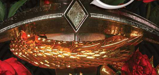
Vs..... whatever’s happening here:
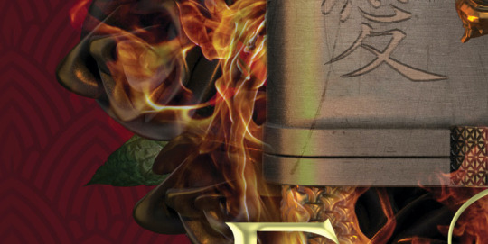
The execution is simply Not As Good on a technical level, duller and more ambiguous re: the illusion of objects interacting in physical space. Idk, maybe we couldn’t afford Bil for the sequel. Good, honestly. Bleed em dry, Bil.
And YES, that is the cruel prince font. 🥴
84 notes
·
View notes
Note
bookcoversalt tumblr com/post/619762786195652608/have-you-noticed-the-latest-edition-of-charlie
I mean, it is essentially just a more detailed compilation of things she’s discussed before and that I’ve also discussed on my own blog, re: book covers needing to Say Things About The Damn Book. And also about Charlie Bowater. And about Charlie Bowater’s covers all looking identical.
I disagree with BCS’s assertion that some nebulous “we” is at fault for Charlie Bowater’s samefaceyness, because even when she draws original artwork of characters of color.... they somehow end up looking much like her white characters, with few exceptions.
Also, that “we” is so, so white American and completely ignores the millions of readers of color who have been pleading with the industry to give us something other than “pretty” white girls. I am not part of that nebulous “we” and it’s Deeply Ironic, in context of the post.
13 notes
·
View notes
Note
I also love the sorcery of thorns and I think it’s very beautiful but yeah I agree Charlie’s humans just look all the same. I notice it even more now that I’ve seen more of Charlie’s work all together with the copycat people. I’m sure it’s more faerug if we see both of Margaret’s books back to back with the acotar covers. I do think the sorcery of thorns “model” looks more flexible and human like than the later aco covers - those models look so stiff and robot like ever notice that?
yeah, @bookcoversalt put this together to compare some of Bowater’s art:

and it’s just kinda hilarious tbh. she’s ofc a very talented artist, but she’s stuck on the faces for some reason. and i very much agree re: the models on the covers and how stiff those on sj/m’s look:

i mean the t0g covers are hardly anything to praise, but they are marginally better than the ac0tar ones. primary colors? seriously?
37 notes
·
View notes
Note
what are some of your favorite blogs? I desperately need cool people to follow!
UHM well that kind of depends on what kinda content you’re looking for? I truly mean it when I say I love too many things for this blog to be organized in any way, shape, or form.
But in no particular order, here’s some friends go follow them—
@waricka (WIFE, + best art, + devilishly dark aesthetic, + some cute boys)
@ignitesthestars (Smart and Cool, churns out fic like nothing else!, always willing to lend a listening ear bc she’s the best
@glitzandshadows (the most on point aesthetic!, villains!, metal music!, HER BOOK IS READY TO PRE-ORDER CLICK THIS LINK AND BUY IT)
@warriorqueenofsarcasm (ART!, Loki!!!, Phantom of the Opera!, all things vampirical)
@siderealscion (always super articulate, will make you want to level up your opinion piece writing game, sometimes art, + bonus sideblog @bookcoversalt for when you want someone to intelligently tear down that ugly book cover you secretly hate)
@stormstressed (you like critical role?, DnD in general?, the entire oeuvre of Brandon Sanderson?, follow this blog)
@notmadetopleaseprinces (all your cute kpop boy needs)
@shadowhimsy (Creepy forest aesthetic!, body horror galore, also occasionally writing snippets so gorgeous I want 2 cry)
@gizkasparadise (you like star wars??? you like amazing fanfics? right here folks!!!)
@starforged (also amazing adorable fics!! Voltron! Star Wars! The Grisha Trilogy! Good stuff right here friends)
also if you’ve gotten this far and somehow have thought ‘hey more cute boys please i liked that part and only that part’ i have a bts sideblog that’s literally just that @covertarmy lol
Here are some not-friend recs of people i endlessly admire from afar—
@notbecauseofvictories
@pyrrhiccomedy
@fahye
@wizzard890
#i love everyone in this boat#hope this helps anon!#these r the ppl i love and admire and you should have them on your dash#Anonymous
18 notes
·
View notes
Text
Thanks @wardens-oath for tagging me. Ye, this is my writing side-blog.
So I just hit 80k in my current WIP - Dictator - and feel like I ought to celebrate or something.
They'd opened the letter only to put it back together, even though it bore the seal of the High Overseer on the front of the envelope. Why?
I tag @bookcoversalt , @the-bookdevourer, @elliewritesstories and @lisa-writing for y’all to post the last sentence of your WIPs or just what you edited last.
3 notes
·
View notes
Text
I’m so angry about this
So this is Libba Bray’s Diviner’s series about a group of paranormally powered teens set in 1920′s New York City. The first book was amazing, with great characters and a great plot with a good mix of mystery and horror.
This was the cover of the first book:
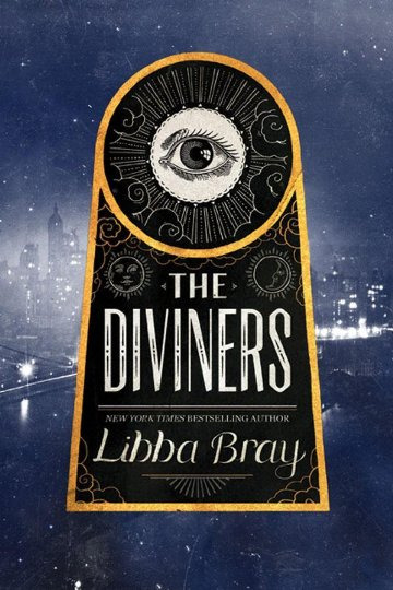
A great and intriguing cover that really reflects the feel and time period of the book with out beating you over the head.
I was really excited about the second book, Lair of Dreams, but this is the cover of it:
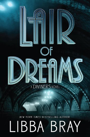
My biggest pet peeve with books is when publishers change covers in the middle of the series. It ruins the look of the books, they aren’t cohesive and it causes people to over look the series, thinking they’re two different books.
This cover is boring, it looks like any other mystery novel. This tunnel really tells you nothing about the book and doesn’t capture what the first cover does.
But I bought it anyway.
Next I found out the third book was coming out in October (which I assume will change because Lair of Dreams got pushed back four years)
The third book, Before the Devil Breaks You (terrible title for a lot of reasons) has this abomination as a cover:
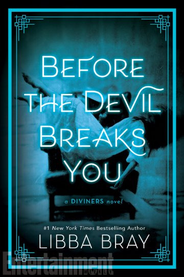
What The Fuck is the publisher thinking? This cover is so bad. They could have at least made it a different color than Lair of Dreams. The weird border, the floating girl, the super ugly font. I hate it all.
I’m going to get it, I like the series, but now I know that the fourth book with have a completely different cover than the rest of them and I’m going to be so salty about it.
I hate cover changes in the middle of the series.
Tagging @bookcoversalt because I want to know what she thinks.
#good greif#booklr#the diviners#lair of dreams#before the devil breaks you#libba bray#ugly books#feyre-cursebreaker#book rant
45 notes
·
View notes
Text
glitzandshadows replied to your photoset “THE HELL BOOK IS REAL THE HELL BOOK IS HERE”
what a bad cover
don’t you love girls and daughters, emily???
@bookcoversalt do u have thoughts
1 note
·
View note
Text
regrettably, i am a “booktuber” now
Well, i have sold my soul to another platform in order to Dispense Takes in a new format. I’m launching a youtube channel!
-> It is not about book covers. Bookcoversalt, this blog, will remain a distinct entity and the sole receptacle for my cover critique. Nothing about bookcoversalt's operation will change in the forseeable future, this is just something additional, and while I’ll post them here, this is a far more youtube/ twitter oriented avenue of content. (If you noticed that my twitter is “Claire Salz”, my name, just as much as “Bookcoversalt,” this planned expansion of the Brand was why.)
-> It IS about YA/ Fantasy/ Books. Just. The inside parts. The style of content will be very similar to bookcoversalt's more in-depth entries: longform explorations of trends, craft, and the IndustryTM, just in a video essay format, and focused on writing & storytelling rather than art & design. I love talking about covers, and I will continue talking about covers! But I’m a fiction writer, too, and I’m ready to be the thoughtful craft discussion (ft light roasting) I want to see in the world.
My first video will be up in the next few days (it’s ~ halloween appropriate), but in the meantime, you can find my channel here!
#Apologies to anyone who follows me here AND on twitter AND on patreon and has now gotten this announcement three times.#bookcoversalt
57 notes
·
View notes
Text
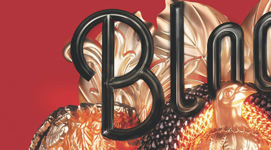
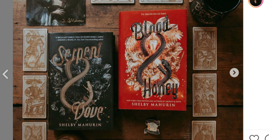
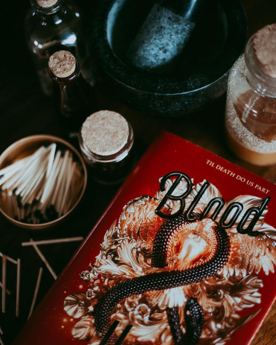
SERPENT & DOVE 2: ELECTRIC BOOGALOO (also blood and honey)
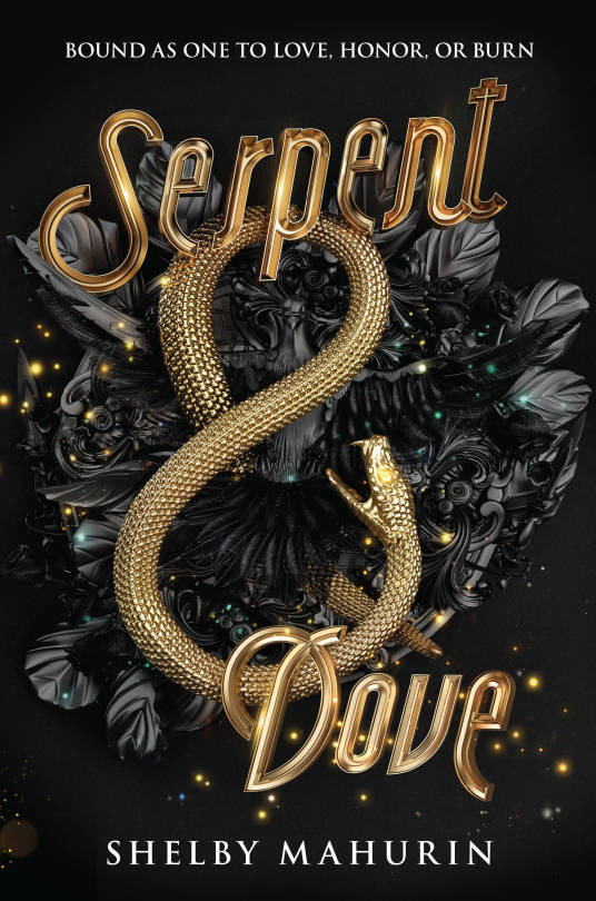
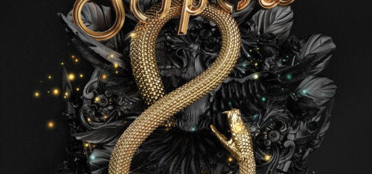
I originally covered (pun intended) SERPENT & DOVE in February 2019, and I wasn't complimentary. While the black and gold color scheme is appealing and there's a nice sense of depth and texture to the snake, beyond that, it is a hot mess. The rendering is plasticky, the imagery is mostly vague ~ AESTHETIC ~ nonsense, the whole thing has an off-center awkwardness, and what, for the love of god, is up with that midcentury typeface. An eagle-eyed blog reader even clocked weird crop mark.
Since then, I've been pointed to the online portfolio post of this cover by the designers, which has some very cool (and enlightening) process shots:
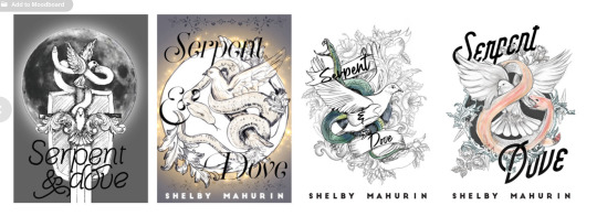
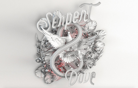
You may notice that this looks better than the actual cover! The serpent and dove figures actually share hierarchical dominance here as a single unit, and their overlap is dynamic and interesting as a focal point. So what happened? Since there's so little color in the comps, I have to assume that either it was originally intended to have a paler overall palette, or the question of color was intentionally punted down the line, but either way, this seems to have been created before the stark black and gold was decided upon. Because that's where we lose the dove completely.
She's also been pushed fully behind the snake, losing any sense of the interaction between them and making our general sense of depth and "physical" space sort of... confused. Knowing how design processes typically work, I would think they tried the dove in gold in that original lockup and for whatever reason, it didn't work: maybe it overwhelmed the cover with too much gold or maybe it interfered with readability too badly. This explains my original discomfort with the size of the snake and weird emptiness of the design between the dramatically spaced type: originally, it was supposed to be (more) filled, and it hasn't been adjusted for the loss of that element.
Full disclosure: the first time I made a post on this cover, I didn't even realize the dove was there. My eyeballs lost it in all the nondescript foliage and flourishes so badly that the meaning-making part of my brain didn't translate those shapes into a specific object. And I spend a lot of time looking at covers when I review them! So that's embarrassing for me, yes, but this is also a failing of the cover itself. Regardless of my other issues with it, I think it's really disappointing that the (interesting! relevant! aesthetique but in a good way!) visual focal point that the entire iterative process centered around ended up completely dismantled in favor of....... ugh, I dunno, the 1950s diner type? Pinterest board trimmings of leaves and sparkles, like turkey trimmings but even less appealing?
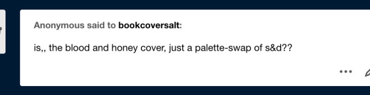
Because I didn't know the dove was there, I was, uh, confused when I first got asked about how EXTREMELY similar BLOOD & HONEY is, a sentiment I've heard a number of times now, because BLOOD & HONEY, shall we say, overcorrects on the "bird loss" front.
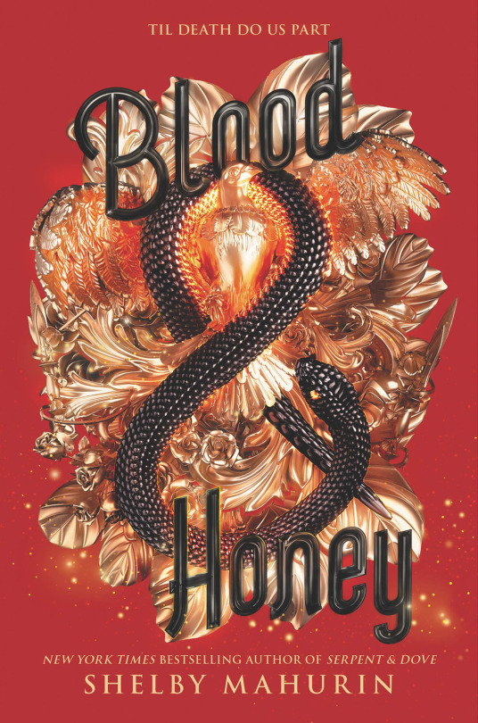
HELLO, SAM THE EAGLE. LET FREEDOM REIGN, BITCHES. MY COUNTRY TISSSSS OF THEEEEEE-
[Edit: I have been informed that this is probably still a dove, not an eagle, based on the face, but i’m not changing this joke.]
First of all, yes, the red is Bad. The black background of S&D matches the dark coloring of the objects, thereby hiding some of those Rendering Sins and lending a sort of subtlety to the mishmash of Aesthetique Things. It's all out in the open here and no less of a hot mess. The highlights are blindingly shiny and feel arbitrary as hell, like every single spear and leaf is being lit independently of anything else, and the almost pure black shadows that contrast them make my eyeballs burn-- it looks like it's a color being reflected from somewhere, rather than native shadow, because of how metallic objects reflect light, but there's nothing here but a perfectly flat, untextured field of red. I appreciate the emphasized presence of the bird (I'm ASSUMING it's an eagle, but I haven't read it, so correct me if I'm wrong) from a hierarchy and space-filling standpoint, but it is goofy as shit, and I have no idea why its chest has been so aggressively lit and filtered that it looks nearly on fire with saturation.
The primary offense of S&D's cover, that it's a tangled mess of meaningless and poorly crafted flourishes meant to be aimlessly Fancy that ends up being kind of ugly in the process, has been cranked up and the knob broken off here. An "Oooh, shiny!" from a dumb character who is about to trigger a trap manifested through a hypertrendy YA goth lens.
The text is also Still Bad. Compare the font to the one the Fairyloot book box uses for the book:
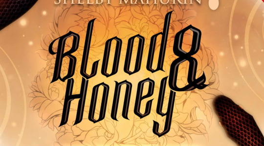
Although this isn't rendered in the metallic style, which it would have to be to match, it has a dramatic blackletter quality that matches the edgy medieval tone of the story far better than. Whatever the hell this B is doing.
So round!!!! So friendly!!!! So Un-witch-hunt-ey!!!!
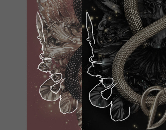
To be clear: no, B&H is not a full, exact recolor of the S&D cover-- most of the elements, though the same, are arranged differently, and that's a completely different bird and at least a nominally different snake.
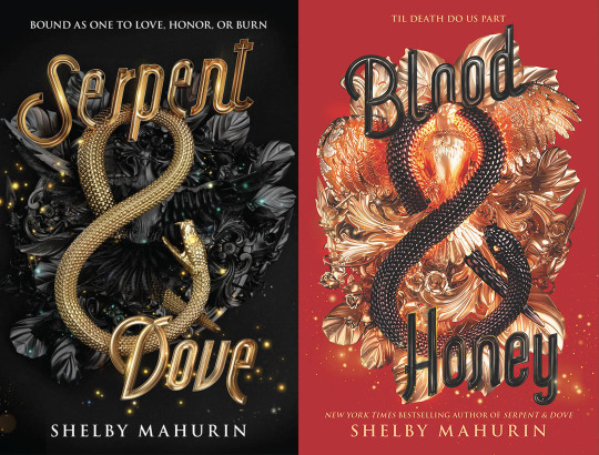
However comma I see why people think it is, because someone got lazy with the bottom left lol.
There is a Behance post for this one, too, although there's noticeably no process work, because the process was quite clearly "do it again but slightly to the left," and that doesn't involve much iterating.
Here's the thing, though; I'm not convinced any of this matters, because the truth is that hot, high-contrast messes photograph well.
Particularly when paired with a moody setting or editing, the red that comes across as kind of a nightmare in the jpeg pops, and the Escherian snarl of detail becomes more a texture nonspecifically indicating luxury and romance than an object theoretically representing something concrete about a story. And I personally may not Love This For Us, but honestly, that's half of a book cover's job these days: look pretty and do nothing.
If there's something to be learned from BLOOD & HONEY's cover, it's that better or worse, instagram filters matter. (Also true of Shelby Maurin's immaculately aesthetically curated, goth-trendy personal brand, which has increasingly been mimicked by other authors since S&D listed, although the author-brand-as-book-marketing-tool has always been a thing to some degree). A book isn't just a book, it's a prop for the countless ongoing performances of book-consumption-as-identity done both for fun and for clout in this particular subculture. I'm not passing moral judgement, here-- anyone buying a new YA fantasy book, no matter what they want to do with it or what my feelings on the book itself are, is a win. But this is the industry moment we live in, and it's savvy of publishers to have it in mind in regards to marketing and design.
Like what I do? Want early access? Support bookcoversalt on Patreon
39 notes
·
View notes
Text
Bookcoversalt Patreon!!!! aaaaa!!!
https://www.patreon.com/clairesalz
The super exciting news I promised: I’m launching a patreon!
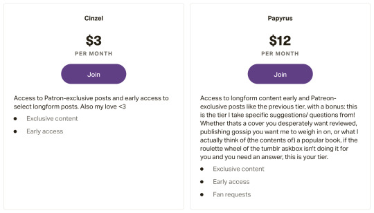
There are two tiers, both of which will get access to certain posts early and the odd patron-exclusive. The higher tier’s bonus is the request priority. My inbox here is a Big Fucking Mess, (and I operate on Whim,) so a request is never a guarantee I’ll cover something (pun intended)-- but if you pay me, it can be!
(I may potentially limit the number of those patrons or the number of requests they can make, but I’m waiting to see if anyone will join that tier, much less abuse the privileges of it lmao, so for now it’s unlimited!)
Also, my first patron-exclusive post is already up! Inspired by our recent brush with DIVERGENT, a retrospective on late aughts/ early-10s YA cover trends:

I'm hoping that joining patreon will not only give me a more direct connection with readers (posting on tumblr feels like flinging content into a void! Twitter is a hellscape!) but also be a monetary justification to devote time to updating the blog more frequently. To be clear, this tumblr page will continue to operate normally-- the Patreon is an addition, not a migration. But I’ve been consistently floored by people’s interest in this thing, I’ve learned a lot in the three years of running it, and I’m excited to have a closer pulse on what you guys are interested in. <3
https://www.patreon.com/clairesalz
25 notes
·
View notes
Text
Bookcoversalt has an official twitter now

good news! rather than tenuously linking to my personal twitter and hoping the entire publishing industry doesn’t blacklist me with the iron fury of a thousand one-star goodreads reviews, I’ve set BCS up with its own twitter account. I intend to mostly use it for alerting the more twitter-active of new posts on this blog + general announcements + assorted publishing/ book thoughts that don’t necessarily belong here. Also polls! Gauging interest in various topics via polls is a twitter feature I love, and hoping to use them to tailor some of the content here.
So far I’ve tweeted a) today’s post and b) the origins of my very excellent icon, from the blog’s olden days.
27 notes
·
View notes
Text
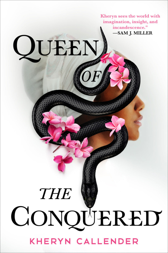
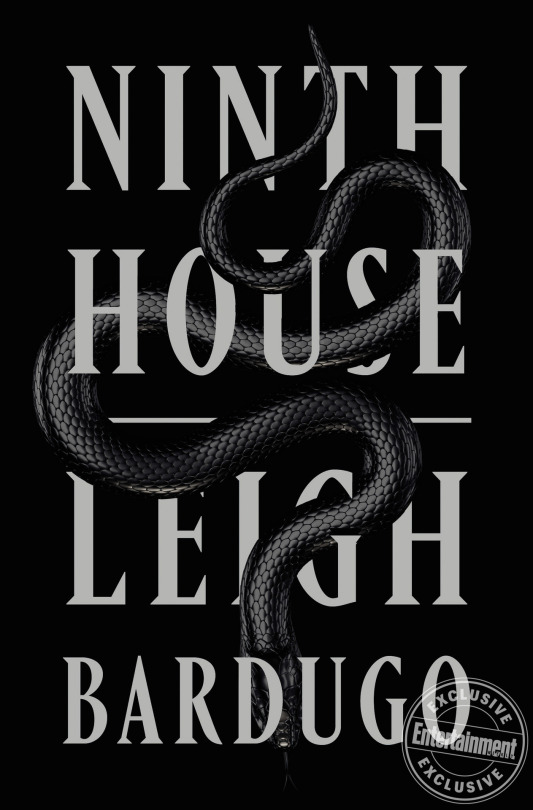

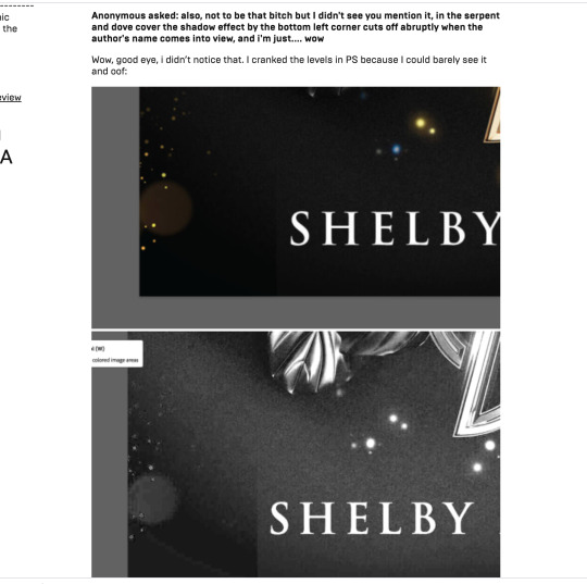
There’s few things I get more satisfaction out of on this blog than calling out shit that honestly, no one should notice, so it gives me a sort of beleaguered pleasure to check photoshop like i’m checking my watch and announce that the three high-profile snake-based cover drops from the past days/weeks that have everyone going “Lol so many snakes” in fact use the same snake. Either the same stock photo or 3D model, based on the identical shape and lighting patterns of the scales. The QUEEN OF NOTHING one had me fooled with the purple coloring, but the head and nose highlights still identifiably match the QUEEN OF THE CONQUERED snek which you can see in my highly professional mockup that took me approximately 15 seconds:
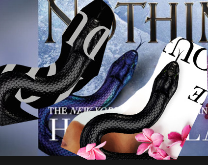
I’m not saying this is “bad”, just worth noting, although as with my Desire typeface spiel i do think blatant examples of design resource homogeny within such a small community (and in this case, within weeks of each other) are marginally embarrassing, but more than anything I’m curious how this happened! I can only assume it’s a new asset that was released on a common stock site and happened to be seen by three different designers* who rightfully all went “aw shit that’s dope gotta use that somewhere” and then promptly.... did.
(* tho both QUEEN books are published by Hachette, albeit different imprints. NINTH HOUSE is Little Brown/ Macmillan.)
3K notes
·
View notes
Link
New patron early access post has been up for about a day! This will go public + I will crosspost here on friday, but in the mean time ^^^
5 notes
·
View notes
Photo
New long post is in the works, but today I’m doing lightning requests for followers over on twitter!
4 notes
·
View notes
Last Seen Blogs

carladuquette
champagne problems

thy-bedchamber
Shakespeare And Classic Lit.

coloradoavalanche
Colorado Avalanche

im-not-a-pirate-i-swear
Owari No Homo