#deberny & peignot
Photo
Adrian Frutiger / Deberny & Peignot / Univers 53 / Printed Matter / 1963
128 notes
·
View notes
Photo


Adrian Frutiger, univers, Deberny et Peignot, Paris, ca. 1965 [Museum für Gestaltung Zürich]
#graphic design#typography#typeface#specimen#cover#adrian frutiger#deberny et peignot#museum für gestaltung zürich#1960s
16 notes
·
View notes
Photo
Le Giraldon Gras, Fonderies Deberny & Peignot #letterlibrary
16 notes
·
View notes
Photo

Adrian Frutiger / Deberny & Peignot / Univers 53 / Printed... https://ift.tt/SrseY54 Telegram: https://t.me/gdesignbot
25 notes
·
View notes
Text

Clichés & gravures v.1 by Fonderies Deberny & Peignot (1912).
0 notes
Text
Reading 2
critical Media #522
In the early 1980s, there was a debate in the academic design journal Visible Language between Stanford Professor Donald Knuth, who wrote about his software MetaFont, and mathematician Douglas Hofstadter, who challenged Knuth's view that the shape of a letterform is mathematically containable. Hofstadter argued that the shape of a letterform cannot be contained and that type design should allow for change and adaptation. Geoffrey Sampson, a linguistics professor, later weighed in, saying letterforms can be both closed systems (Knuth's A-shape) and open systems (Hofstadter's A-ness).
The history of typography has been marked by a desire for rationalization, starting with the invention of movable type in the 15th century. In the 17th century, Louis XIV commissioned the "King's Roman" in Paris to apply Enlightenment rationality to technical ends. It was a mathematically rigorous structure imposed on organic forms. With Herbert Bayer's Universal Alphabet, a pared-down sans-serif made up of lower-case characters, the Bauhaus revived this approach. TheBauhaus Stencil Alphabet by Josef Albers was also created using similar principles. Futura, a commercially successful typeface, toned down the hard geometry of the Bauhaus fonts. The letterform of the age cannot be created by one person alone, according to Tschichold, a prominent figure in the "New Typography."
Stanley Morison was a British type designer who was asked by The Times, London's newspaper, to publish a 1,000-page ad in the 1930s. The paper's typography had to be redesigned by Morison. The result was Times New Roman, a typeface that was amalgamated from various historical typefacesHis role was similar to that of a producer, editor,or or arranger. The foundry Deberny & Peignot released Adrian Frutiger's Univers in 1957 as an extended family of fonts, with 21 fonts at any given size. Frutiger later added more variants, bringing the total to 63. Univers was charted in a two-dimensional matrix, with the potential to expand in any direction, and Frutiger has kept the project open since its inception.
Donald Knuth created MetaFont, a font generation system, as a companion to his typesetting system TeX. He aimed to enhance the appearance of text by adjusting the details of a font based on the output device and to meet the need for variety in typefaces. However, he emphasized that typefaces should be a medium rather than a message and that they should have a clear appearance while being subliminal in their effect. Knuth did not expect the widespread use of novelty as an end in itself.
Walter Benjamin, a German cultural critic, wrote about the relationship between technology and writing in his 1928 book "One Way Street" and his 1936 essay "The Work of Art in the Age of Mechanical Reproduction." He believed that the increasing intimacy between the writer and technology would result in the writer composing work with a typewriter rather than a pen, leading to a closer connection between content and form and a new evolution of writing. Benjamin was a Marxist who believed that the means of production should be owned by the people who operate them. In "The Author as Producer," he demanded that artists transform the root-level means by which their work is produced and distributed, rather than just adopting political content. He offered Sergei Tretiakov and Bertolt Brecht as examples of artists who implicated themselves in their work and transformed the functional relationships between their work and production.
The essay "A Noton Type"e" discusses the relationship between writing and production in the arts. The author argues that artists, including writers, should not be limited by norms, job descriptions, and expectations, but instead should freely explore different mediums and methods of expression. The author uses the thMeta-The-Difference-Between-The-Two-Fontsnt (MTDBT2F) project, which is a revised version of Donald Knuth's MetaFont project. In the author's view, the difference between MetaFont and MTDBT2F is not easily discernible, but is related to time and intellectual backstory. MTDBT2F is not only a tool for generating PostScript fonts, but also a tool for thinking around and about MetaFont. Boris Groys argues that the new is not just a difference, but a difference without a difference, or a difference not recognizable because of the lack of preexisting structural code.
The concept of "letter vs. spirit" can be traced back to the "Visible Language" debate and was keenly foreseen by Douglas Hofstadter, who believed that typefaces could inspire readers to reflect on the intelligence of alphabets. The idea is also related to Walter Benjamin's "The Author as Producer," where he called for writers to reflect on their role in the production process. Several design critics have updated this notion to reflect the digital age, when code has replaced heavy machinery and hand tools as "tools of production." To reflect the influence of digital technology on religious practices, Boris Groys also updates Benjamin's title in his essay "Religion in the Age of Digital Reproduction." He argues that contemporary fundamentalism is grounded in the repetition of a fixed "letter" rather than a free "spirit," and this antinomy informs all Western discourse on religion.
This passage is discussing the evolution of media and how it affects the distribution of religious and philosophical ideas. The author argues that with the advent of digital media and the internet, the spread of idiosyncratic views has become easier. However, the author also argues that this has led to a lack of trust in the form of images and that meaning is no longer tethered to definite surfaces. The author proposes the creation of a shapeshifting typeface, called MTDBT2F4D, which would constantly move and change. Through cross-domain thinking, this would enable a more dynamic representation of ideas. An example of the "Hello World" script in a new programming language is used to illustrate the distinction between instructions and instances.
0 notes
Text
Catch the reader's eye
When the editorial design become the identity of a publishing house.
Dear reader, early in November, was open the Offprint fair, an event which gathered independent publishers around the theme of visual art, design and culture. During the same week-end, a second fair also began around those themes too, entitled Accident Book Fair, where there was a tremendous amount of exhibitors. The visitors found themselves in front of so many identities and books covers, each one more attractive and creative than the previous. Amidst visual abundance, how can a publisher differentiate himself thanks to his covers ? That question leads to an even bigger interrogation in the editorial design world : while the book trade is expanding more and more, what are the tools to attract readers ?
To this question, I discovered a viable answer : the case of Divergences publishing house. This exhibitor had directly attract my attention, in big part, thanks to the colored harmony of his covers… The Divergences is a young publishing house, created in 2016 by Johan Badour. The house has developed an editorial line to give the tools to understand and rebuild the world which we live in, through social and political criticism books. Moreover, with a strong editorial line, Divergences could only choose a powerful book design !

So what about the design ? The publishing house is immediately recognizable in the use of a uniform design cover. The books require a strong visual identity based on an editorial grid and two distinct typefaces. One is the Univers, the well known sans serif typeface designed by Adrian Frutiger for the Deberny & Peignot foundry in 1957. Here, the font used to write the author name. The second typeface is the Concorde, designed in 1990 by Günter Gerhard Lange for the Berthold Foundry, employed for all the over informations of the cover (like the headline, the subheading, the publisher name and also the summary). The two typefaces — used in capital letters for the headline and the author — suggest opposites shapes. The Concorde with its sharp serifs contrast with the round outline of the Univers sans serif.


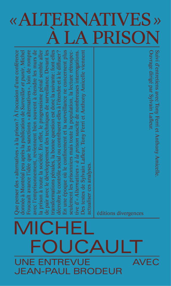
Concerning the layout of the cover, is used as a minimal design and only this two typefaces on a grid with apparent threads. The modular grid offers a variety of achievable designs while being binding. That grid could change depending on the density of information and space needed on the cover.
Lastly, the summary is an integral part of the cover, which is unusual and enables the reader to immerse himself inside the written text. What distinguishes this collection from other books is also the use of a flattened bright color, each assigned to one book, contrasting with the darker typeface.
The radically of editorial choices makes these books really noticeable. Besides, the modular system offered by the grid puts forward the typesetting of the inside book model — and not only an editorial design of covers — until it forms the entire communication of the publishing house : the website page and goodies used to that design… The idea of unifying designs allows a publisher to be more recognizable. Finally, it appears that the boundary between editorial design and brand identity is not so established…
Julia Ducretet, 04/12/22.
0 notes
Text
Univers typeface

Univers typeface series#
Apple used Univers on its laptop keyboards until switching to the VAG Rounded™ typeface in 2007. Univers has been employed in numerous applications including corporate branding, signage, maps, standardized testing and consumer electronics devices. The non-typographer‘s guide to Practical Typeface Selection The final iteration of the family, Univers Next – a complete upgrading of the design – was released in 2010. Frutiger did both.įrutiger has continued to improve and expand the Univers family, working with Linotype designers to add new weights and enlarging the character set to include many languages such as Greek, Cyrillic and Arabic. This could only be accomplished by determining the complete family range as part of the design process or by building the family within a strict modular framework.
Univers typeface series#
Frutiger wanted to create a series of related designs that were absolutely harmonious with each other. Script and brush fonts such as: Brush Script, Mistral, Ruling Script.īlackletter fonts such as: Duc De Berry, Grace, San Marco.Įven fun fonts such as F2F OCRAlexczyk, Linotype Red Babe, Linotype Seven."Ī very important aspect of the Univers family is its modularity. Slab serif fonts such as Egyptienne F, Serifa. Modern-stressed fonts such as: Linotype Centennial, Walbaum. Old style fonts such as: Janson Text, Meridien, Sabon, Wilke. Univers has the uncanny ability to combine well with fonts of many different styles and origins: With its sturdy, clean forms Univers can facilitate an expression of cool elegance and rational competence. The result: Univers Next - available with 59 weights and 4 Linotype Univers Typewriter weights. In 1997, Frutiger and the design staff at Linotype completed a large joint project of completely re-designing and updating the Univers family. Adrian Frutiger continues to do design work with Linotype right up to the present day. Stempel AG/Linotype collection in 1985/1989. The Deberny & Peignot type library was acquired in 1972 by Haas, and the Haas'sche Schriftgiesserei (Haas Type Foundry) was folded into the D. In 1957, the family was released by Deberny & Piegnot, and afterwards, it was produced by Linotype. Starting with his old sketches from his student days at the School for the Applied Arts in Zurich, he created the Univers type family. He wanted to instead make a new font that would, above all, be suitable for the typesetting of longer texts - quite an exciting challenge for a sans-serif font at that time. Adrian Frutiger, the foundry's art director, suggested refraining from adapting an existing alphabet. In 1954 the French type foundry Deberny & Peignot wanted to add a linear sans serif type in several weights to the range of the Lumitype fonts. The clear, objective forms of Univers make this a legible font suitable for almost any typographic need. The family has the advantage of having a variety of weights and styles, which, even when combined, give an impression of steadiness and homogeneity. The font family Univers? is one of the greatest typographic achievements of the second half of the 20th century.
0 notes
Text
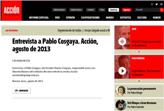
Deeper research into Pablo Cosgaya
Interview with Pablo Cosgaya, from Estudio Diseño Cosgaya, responsible together with Marcela Romero for the redesign of the Acción magazine website

Who is Pablo Cosgaya?
Pablo is a lecturer of Typography in the Graphic Design undergraduate program at FADU, Universidad de Buenos Aires.
He is a member of the director's board of the new post-graduate program of Specialization in Typeface Design at FADU (Buenos Aires University).
He was head of the team in charge of designing newspapers and periodicals in Argentina such as El Ciudadano (Rosario), La República (Corrientes), and Acción (Buenos Aires).
He is member of the Association Typographique Internationale (ATypI).
Information sourced from:
https://www.myfonts.com/collections/pablo-cosgaya

What is the Association Typographique Internationale (ATypI)?
ATypI is the global forum for type and typography, they are a non-profit organization and are known for their annual fall conference, held in a different global city each year. ATypI was founded in 1957 by Charles Peignot (from the French type foundry Deberny & Peignot). The members of the organisation come from the typographic community from all over the world and consist primarily of type designers, representatives of type foundries, graphic designers and typographers.
Information sourced from:
https://atypi.org/
https://www.linkedin.com/company/association-typographique-internationale-atypi-?original_referer=https%3A%2F%2Fwww.google.com%2F
https://en.wikipedia.org/wiki/ATypI
His Works:
Acción (Buenos Aires)

Interview with Pablo Cosgaya, from Estudio Diseño Cosgaya, responsible together with Marcela Romero for the redesign of the Acción magazine website


Editorial design: El Ciudadano. Editorial design for a new newspaper in Rosario, Argentina.

0 notes
Photo

Adrian Frutiger, Letraset instant lettering: 72pt. UNIVERS 67, Deberny et Peignot, Paris, Letraset Ltd., Ashford (Kent), 1980s [Museum für Gestaltung Zürich]
#graphic design#typography#typeface#alphabet#letraset#univers#adrian frutiger#deberny et peignot#letraset ltd#museum für gestaltung zürich#1980s
161 notes
·
View notes
Photo

Le Robur Tigré, Fonderies Deberny & Peignot #letterlibrary
6 notes
·
View notes
Photo

"Pupitre de Composition" de la Fonderie Deberny & Peignot (milieu XXe siècle) présenté à l'exposition "Édition Limitée. Vollard, Petiet et l’Estampe de Maîtres" au Petit Palais, Paris, juin 2021.
0 notes
Photo


Garamond is a group of many old-style serif typefaces, named for sixteenth-century Parisian engraver Claude Garamond (generally spelled as Garamont in his lifetime). His designs followed the model of an influential design cut for Venetian printer Aldus Manutius by his punchcutter Francesco Griffo in 1495, and helped to establish what is now called the old-style of serif letter design, letters with a relatively organic structure resembling handwriting with a pen, but with a slightly more structured and upright design.
Following an eclipse in popularity in the eighteenth and nineteenth century, many modern revival faces in the Garamond style have been developed. It is common to pair these with italics based on those created by his contemporary Robert Granjon, who was well known for his proficiency in this genre.
Many 'Garamond' revivals of the early twentieth century are actually based on the work of a later punch-cutter, Jean Jannon, whose noticeably different work was for some years misattributed to Garamond. The first revival was produced in 1912 by the Peignot foundry.
The most common digital font named Garamond is Monotype Garamond. Developed in 1922 and bundled with many Microsoft products, it is a revival of Jannon's work.
Contemporary versions[ based on Garamond's design are: Adobe Garamond, Garamond Premier, Stempel Garamond, Granjon, Sabon, Berthold Garamond, EB Garamond, Those based on Jannon's design are: ATF Garamond/Garamond No. 3, Monotype Garamond, Garamont, Simoncini Garamond, Jannon.
As one of the most popular typefaces in history, a number of designs have been created that are influenced by Garamond's design but follow different design paths. Among such related fonts are: ITC Garamond, Cormorant, Claude Sans.
It ranks at position 2 among The 100 All Time Best Fonts.
0 notes
Photo


Typography Tuesday
THE GROTESKS
San-serif typefaces, that is, letter forms that do not have serif extensions at the end of strokes, go by a variety of alternate names, but the most common is Grotesque, or in German, as we prefer, Grotesk. There seems to be some difference of opinion about the origin of the term, but the moniker was established in the 19th century, and the majority opinion seems to be because san serifs appeared so unseemly and poorly formed compared to the serif letter forms that Europeans had been used to reading for nearly two millennia. Wikipedia, citing Monotype Corporation, says that the term originates from the “Italian grottesco, meaning ‘belonging to the cave’ due to their simple geometric appearance,” which makes little sense to us.
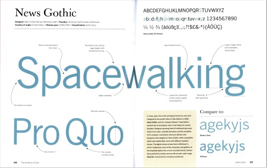
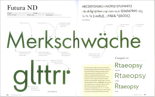
While serif typefaces remain predominant for most printed material, san-serifs have become most prevalent for digital display and public signage. San-serifs or Grotesks were used sparingly and for specific usages and effects for a century, but the second half of the 20th century saw a huge expansion in design and application. This week we feature some of the most recognized Grotesks designed before 1960, from the prolific, Milwaukee-born designer Morris Fuller Benton’s 1908 News Gothic, through the ultra-ubiquitous Helvetica designed by Max Miedinger in 1957, to our own favorite san serif, Hermann Zapf’s 1958 Optima. These specimens are drawn from our copy of American type designer, historian, and theorist Stephen Coles’s The Anatomy of Type, published in 2012 by Harper Design. From top to bottom they are:
1.) News Gothic, designed by Morris Fuller Benton, released 1908. Originally designed for American Type Founders (ATF), Coles notes that "this is the archetypal American sans serif" and "became the most popular sans in the States for several decades." The version shown here is Bitstream's updated design.
2.) Futura, designed by German designer Paul Renner and released by the Bauer Type Foundry in 1927. Influenced by Bauhaus design experiments, Renner began with straight lines and circular shapes, modifying it to the classic typeface we know today. The version shown here is one of many redesigns, this one by Marie-Thérèse Koreman.
3.) Gill Sans, designed by English artist and designer Eric Gill and released by Monotype from 1928-1932. This much utilized san serif is itself beholden to Edward Johnston's type for the London Underground. The lower-case g is distinctive, and Gill himself described it as "a pair of spectacles."
4.) Helvetica, conceived by Eduard Hoffmann and designed by Max Miedinger, released by the Haas Type Foundry as Neue Haas Grotesk in 1957, and renamed Helvetica in 1960 by the Stempel Type Foundry. Since its release, Helvetica has become the most widely known typeface because of its commanding ubiquity, and is both heralded and reviled for its universal utility. The version shown here is a 1980s redesign called Neue Helvetica designed for Linotype.
5.) Univers, designed by Adrian Frutiger and released by Deberny & Peignot in 1957, the same year as Helvetica. Much like Helvetica, Univers embodies Beatrice Warde's imperative that "type should be invisible." The design is spare and neutral, "delivering readable text while drawing very little attention to itself."
6.) Optima, designed by Hermann Zapf and released by D. Stempel AG in 1958. This is our favorite because the flares that Zapf utilizes create a san serif with the character of a serif font. Coles calls it "elegant serenity" and "tranquil beauty" but also "the stuff of the establishment."
View our post on Edward Johnston’s London Underground type.
View our post on Helvetica.
View our other Typography Tuesday posts.
#Typography Tuesday#typetuesday#san serif type#Grotesque type#Grotesk type#Stephen Coles#Harper Design#Typography Tuesday#News Gothic#Morris Fuller Benton#American Type Founders#Bitstream#Futura#Paul Renner#Bauer Type Foundry#Marie-Thérèse Koreman#Gill Sans#Eric Gill#Monotype#Helvetica#Eduard Hoffmann#Max Miedinger#Haas Type Foundry#Neue Helvetica#univers#Adrian Frutiger#Deberny & Peignot#Optima#Hermann Zapf#Stempel Type Foundry
78 notes
·
View notes
Photo

garadinervi: Adrian Frutiger, Deberny et Peignot, Paris,... https://ift.tt/2ByA2jE Telegram Design Bot > https://t.me/gdesignbot
33 notes
·
View notes
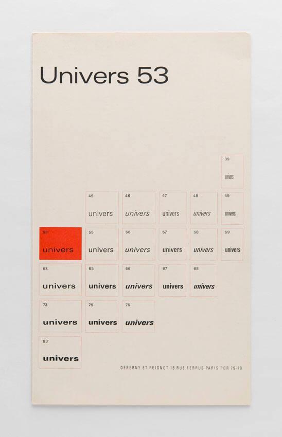
Photo

Foundry Univers
1968 :: Paris :: Deberny et Peignot
The type specimen booklet for Foundry Univers. While it was released by Deberny et Peignot and distributed in the United States by the American Type Founders, the type family itself was designed by Adrian Frutiger. The concept for the type family was to take advantage of the then new technology of phototypesetting, but it was also released as metal type.
Language: English
Publisher: American Type Founders (ATF)
Designer: Adrian Frutiger
1 note
·
View note
Last Seen Blogs

girlboypersonthingy
✨Chaotic Pansexual✨

in2workingout8
Untitled
pikesmattress
Pike's Mattress

guguseti
Cosas de jordi, blogs, webs y colaboraciones varias

aeonis
Simply Writing