#google noto color emojis
Text
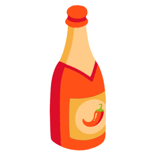
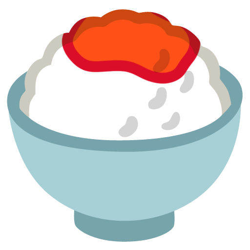
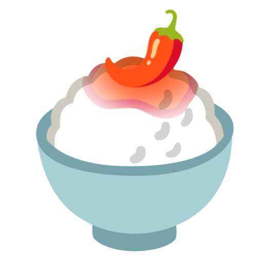
hot sauce on rice, and just hot sauce
#google noto#google emojis#google noto color#google noto color emojis#my emojis#custom emoji#custom emote#discord emoji#discord emotes#emoji#not a pride emoji#emote#not twemoji#food emojis#food tw#food cw#tw food#food#cw food#hot sauce#🍾#🌶️#🍾🌶️#🌶️🍾#🍚#🍚🌶️#🌶️🍚#no words#emotes#emojis
18 notes
·
View notes
Text
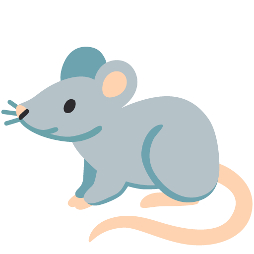
Today's rat is the Google Noto Color Emoji!
274 notes
·
View notes
Note
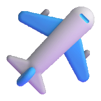
id be interested in seeing you rank plane emojis from different platforms (by their livery, or by whatever else) just for fun, if you want!
You're right. I WILL do this for fun, because this is fun. Not based on livery, since they're mostly white with blue wings - just how much I like them. I'll be adding a rating out of 10 for each one because I think that's the tradition for this sort of thing.
Apple - 4/10

I mean, because I have an iPhone this is my default conception of an airplane emoji - I think it's fine, I just find it a bit offputting how they model the individual flaps and cockpit windows but the rest of it is a white airbrushed tube. It's a weird contrast.
It's fine, I think. Acceptable. I maybe think emojis by default aren't the most aesthetically pleasing.
Google Noto Color Emoji - 4.5/10

I think this is a slight improvement over the Apple version because of the more consistent stylization. It's also a little more contemporary, since most airliners that are flying now have two engines. I like that they added a few windows and highlights to keep the cabin interesting, and I think it's a bit...something that they took off the flaps but added flap track fairings. Cockpit windows look awful though.
Samsung - 2/10

This is a bit more of a realistic shape for an airplane but for some reason I don't like it. Maybe it's the fact that you can barely recognize that there's a tailfin at all, or the cockpit window looking weirdly...shiny? I think what gets me the most, though, is that those engines look like Super Mario pipes.
Microsoft - 1/10

She's a little...phallic somehow. I just think a top-down view of an airplane is almost always going to look worse if you make it super round and blobby. On the bright side, it's still recognizable as a plane.
WhatsApp - 7.5/10

I really like the way this one is red. Way to stand out in a crowd. It's also quite realistic without giving up on being stylized. My one issue is with the cockpit windows, which look a bit out-of-place and weird. This seems to be a common point of failure for this sort of emoji. Also, I'm unsure if this is meant to be a two-engined 747, but if it is points off for those not existing.
Twitter - 6/10

I hate to ever hand it to Twitter but this is just solid. That's an airplane, just a very simplified and round one. Even the cockpit windows on this one look okay.
Facebook - 3.5/10

Maybe airplane emojis with airbrush shading just look bad to me. There's nothing fundamentally wrong with the shape of this but I don't think they differentiated the tailfin from the fuselage enough. It looks like a stub. Also, what is up with that miserably short wing chord?
Telegram - 7/10

I mean, it looks like a 3D version of the Apple one, but it's surprising how much making it 3D improves it. Plus, gotta hand it to them deciding their emoji was being flown by Tex Johnston. I admire that sort of verve.
Microsoft Teams - 0/10
On the flipside, animating this one and making it 3D makes it so much worse! It looks like it was made right when people just figured out that 3D animation was a thing that was possible to do, back in the 50s or something. And boy are those pixels crunchy - I wouldn't mind this if it weren't already heinous. Seriously, how is that tailfin even attached?
Skype - 10/10

Now this I really like. Most of these are impossible to assign a model to but this distinctly looks to me like one of the earlier, stubbier 737s, just really short with a pointy nose, and she's waving at you. Crisp, nice smooth animation, just fantastic.
Twitter Emoji Stickers - 0/10

Looks bad. One of the few of these which are very easy to recognize as a specific model of airplane - this is clearly a 747, based on the inclusion of the hump. There is a reason basically none of the others are trying to be a 747. Adding a weird lump to the front of your emoji doesn't really make it any less weird-looking, and rendering a plane from above tends to be weird-looking already. It looks like she was stung by a bee.
JoyPixels - 6.5/10

As with the WhatsApp red, I appreciate anything setting itself aside in color, so I have to compliment the choice of this sort of toothpastey green. This is one of the better simplified airplanes we've gone over today, and the only thing I really dislike is that it has the same issues with the tailfin Facebook does.
Toss Face - 0/10

I can barely tell this is supposed to be an airplane. It makes me want to, excuse the mental image, toss face.
JoyPixels Animations - 10/10

Now THIS is what I'm talking about! Just a nice little pixel aircraft, doing the same sort of smooth wriggling as the Skype airplane - no criticisms.
Sony PlayStation - small/10

Adequate, but too small to really assess further - but the fact that I don't dislike anything about it is honestly a credit at this point.
Noto Emoji Font - 3.5/10

This just looks like the Samsung emoji but rendered with plain lines. Removing detail from these tends to improve them.
OpenMoji - 0/10

Oh, no, I take it back! Too few details! It's like a torpedo with wings awkwardly stapled on. A really phallic one at that.
emojidex - what the hell/10

I think this more or less looks fine, and the livery it has also looks fine, but I'm so thrown off by the fact that I don't think this is a real airplane. I am obviously not an authority on every model of airplane ever built but I'm reasonably sure this isn't a real one. It most resembles a BAe 146/Avro RJ, the only four-engined t-tail plane intended for passengers rather than heavy cargo. But the 146/RJ has high wings, located above the cabin windows, so...what is this airplane? What does emojidex know that they're not telling us?
Messenger - 7/10

While not ugly per se, it's a bit futuristic for my taste. Still, the choice to model it from a position other than directly from the top avoids a lot of the pitfalls that make many of these so bad to look at.
LG - 4/10
Boring? Yeah, without question. But this is just a good representation of an airplane, and at this point I'll accept that. Does the tail thing, though.
HTC - 3/10

Something about the way this is shaped makes this look more like a rocketship than an airplane. Or a Convair Pogo.
SoftBank - 5/10

A decent pictoral representation of an airplane. See: LG. Fixes the tail thing.
Docomo - 5.5/10

Also a decent pictoral representation of an airplane, but I think rendering it in silhouette gets rid of many of the pitfalls associated with airplane emojis. No details to mess up, just the shape of an airplane. Why do the majority of these have four engines? Seriously, there are only three four-engine airliners in passenger service right now. Have the people designing these not flown since the early aughts?
au by KDDI - 2.5/10

Okay, I know I've been saying being a good representation of an airplane is good enough but this is just simplifying too far. This isn't an emoji, it's a unicode character.
Mozilla - 1/10

Why pointy but only sometimes? Why does the tail pinch in like that? It's ugly, Mozilla, you made an ugly one.
477 notes
·
View notes
Text
[ pt: jellyfish angel , a gender related to being an angellic jellyfish, a jellyfish-shaped angel, or just generally relating to angels and/or jellyfishes // end pt ]

┄ 🪼₊ jellyfish ⏖ angel


[ image ids : three identically shaped pride flags with 19 stripes. the three innermost stripes are horizontal lines while the rest of the outermost lines are ruffled. in the second flag, there is an image of the google noto color emoji jellyfish with two wings behind it. the colors of the wings are dark reddish orange and light yellowish orange. the colors of all of the lines from bottom/top to the center include: dark reddish orange, reddish orange, light reddish orange, offwhite orange, offwhite blue, lighter teal blue, light teal blue, teal blue, dark teal blue, and darker teal blue // end id ]

𓎟𓎟 。 a gender related to being an angellic jellyfish , a jellyfish-shaped angel , ou just generally relating to angels and ) ou jellyfishes
⠀ ⠀ ⠀ ⠀ ⤷ ⠀ 🪽 ⠀ ⌒ ⠀ req by anon

#❀﹒— 🌀 ⚢#❀﹒— 🩵 ⚢#🐧﹒isaac﹕just checked in﹗⚢#blue#orange#red#flag coining#liom flag#mogai flag#mogai gender#mogai#mogai coining#liom#liom term#liom coining#jellyfish#angel#angelgender
43 notes
·
View notes
Text
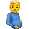
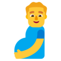
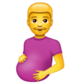
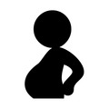
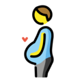
Rating Pregnant Men Emojis
Apple - 3/10
Art feels flat somehow. He feels like a stock image. Not sensing any paternal pride in his dead eyes. This is still technically an emoji some tech-illiterate grandpa could use after having a big meal.

Google Noto Color Emoji - 7/10
This one feels like it's on the right path. He's gentle, it feels like he's connecting to the baby. I like how he's not staring at me. Anatomy still leaves a little to be desired but it's still a solid emoji imo.
Samsung - 5/10
It's like the google noto one but worse. Oddly shiny. His expression feels less like a gentle smile and more like a smirk. Anatomy is fine but a little flat. I don't feel good about this one but at least it's not staring at me.
Microsoft - 1/10
What the fuck. Why is he looking at me. Why does he look way too happy. Where is his elbow. His belly looks like a staircase. This is awful. Combines the worst traits of the previous emojis somehow. Hate it.
Whatsapp - 2/10
His baby bump looks like he's hiding a watermelon and he's staring at me again. His expression feels uncertain, possibly afraid. But I like his moustache so he gets an extra point.

Twitter - 0/10
Somehow even more flat than the previous ones. This looks like my first attempt at drawing a human posing. Just bad anatomy all around (why do his hands look like paws??). He's not looking at anything. Flat, emotionless, not communicating anything, might as well be abstract.

Facebook - 1/10
This style is reminiscent of every mobile game ad I've ever seen. Slightly more detail =/= better. I feel like he's gonna ask me to match 3 baby supplies and the ad is gonna fuck it up badly so he's out in the cold while his wife is with a generic chad and he's gonna ask me to download his app to fix his life.

JoyPixels - 0/10
I don't hate it as much as I hate the Facebook one but it definitely feels worse somehow. It feels like it tried to be the google noto color one but it didn't stick the landing. It feels like a bootleg emoji.

Toss Face - 8/10
I'm grateful for the simplicity and lack of hyper realistic details here. He's a little pregnant emoji guy. What else is there to say.
Noto Emoji Font - 9/10
"MR GAME AND WATCH PREGNANCY" -my partner when I showed him this one. Anyway besides looking like a guy with a beer belly it's straight to the point. People will see what they need to see with this one.
Openmoji - 8/10
I'm not a fan of the style here, but I love the addition of the heart. He loves his baby. Other emojis could learn from this one.

Emojipedia - 0/10
My partner thinks he's sneaking food into the theatre. I think he's taking a shit.
139 notes
·
View notes
Text
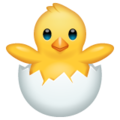
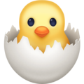
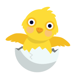
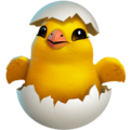
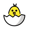
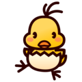
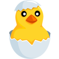
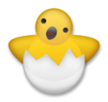
ranking every "hatching chick" emoji 🐣
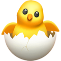
Apple: 6.5/10
A tad bald, and the rendering is (as per usual with Apple emojis) a little bit much. My friend says he looks like a Smash Bros trophy. He looks well-meaning, but a bit... hollow... Cute, but he makes me nervous. I like the little crack in his egg shell.
(More under the cut!)

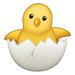
Google Noto Color Emoji: 6/10
Not very chick-shaped, and I'm not loving the greyness of his egg. The position of his wings is cute, I love that he appears to be hoisting himself out of the egg, but the image as a whole is so flat, and doesn't really register in my mind as an animal. He looks like a bath toy.
Samsung: 7/10
Looks more like a parrot than a chick, but it's a very cute parrot, so it's okay. Props to this little guy for having a cracked egg, I'll never get tired of it! He's the most animal-looking chick to me so far.

Microsoft: 6.5/10
An upgraded version of the Google Noto chick, really. He has the same flatness, the same grey egg, but a more vacant expression, which is actually pleasant here. The other stared into my soul.
Whatsapp: 5/10
Did they throttle him before taking this picture? He's shaped like a bowling pin. I'm upset. I like the rendering on the egg.

Twitter: 8/10
This is everything Google Noto and Microsoft wishes their chicks were. The artists over at Twitter have so perfectly captured the brainlessness of a newborn animal. The lights are on with this animal, but no one's home. I think it was a nice choice to omit his wings, the simplicity is charming. Shaped like a friend. I like the little feathers sticking out of his head.
Facebook: 6/10
She's cute, but she makes me anxious... Her eyes are so soulless. this is not a chick, this is something else masquerading as a chick. Unlike all of the other chicks thus far, she doesn't appear at all to have put any effort into hatching. I think someone else cracked her egg for her.; released her unto the world like a demon. She kind of looks like bread baked to look like a chick. TL;DR: Cute, but she'll steal your soul.
Skype: 1/10
... Scary. I don't like him. Stop starin at me with them big ol' eyes. He looks like that one coked-out bird from Animal Crossing. What the fuck? What were they thinking???
Twitter Emoji Stickers: 6/10
If you told me he was from a Farmville clone I'd believe you. I have no more thoughts on this one.

Joypixels: 6/10
He has a kind face; but that is, without a doubt, a man in the body of a chick. Get him out.

Toss Face: 9/10
asjhkgfawidjcnvdfhjbmawiofrdnfiubvmasjkcfvbndfuibjmsdjkfvbnerfiudjbmsdjkcnvsdfjkbm sdhjcfnasdiobnsdjkfnaskmbndjfkn. Cake decoration.

Sony Playstation: 8/10
So tiny!! So cute!! I want to hold him gently in my hands! He's fluffy and round, just as a chick should be; I like the thickness of his wings quite a lot. Little man I love you
Openmoji: 6.5/10
I like him!! I love how he shyly peeks out, it's his first day on Earth, so of course he's a little nervous! He definitely registers as a chick to me, I can especially picture this one pecking at the ground for bugs or whatever chicks do.
emojidex: 7.5/10
Cutie pie!! Looks like something you'd see on a low-budget but extremely charming animated children's show. They register more to me as a baby than a chick (the egg's shape being reminiscent of Vullaby Pokemon's... egg diaper thing?? is certainly the reason for this), but they're still really cute to me. Friend shaped!
Messenger: 3/10
This thing just got flashbanged. His eyes aren't even pointed in the same direction. This man is disturbed, he has seen some serious shit, he needs therapy yesterday. Please help him.
LG: 4/10
She looks like if Ming Ming from the Wonder Pets died and came back wrong. There's an eerie emptiness in this one's noggin. The smallness of the egg really isn't working for this one either; how did she ever fit in there? Upsetting. This one makes my hair stand on end.

HTC: 7/10
Very silly looking. Shaped like a friend. I love how big his forehead is, it really hammers home that this guy is a little baby. I'd like to gently stroke his head, he deserves it.

Softbank: 10/10! 🎊
Look at him!! He's just been born and he already has so much zest for life! This guy has burst from his egg and he's so excited to be here! His little smile, his raised arms, such a dynamic pose... Incredible. Softbank Chick, I love you.

Docomo / au by KDDI: 6/10
I'm personally not partial to uncolored emojis, but he's really cute. I love that he faces to the side, like he's really not sure what to do next and is looking for someone to hopefully give him some instructions.

Mozilla: 6/10
Eehhhh... This chick is a lot like Google Noto and co. He's not bad, but he's just so... flat. He looks like construction paper organized to be chick-shaped. Cute, but not bursting with life like some of the better-rated chicks on this list.

Windows 10: 7.5/10
In the words of my friend who helped me make this, this little beast is emerging from white fire, not an egg, and I welcome him. This chick is powerful. I fear what he could do, and respect him greatly for it.
61 notes
·
View notes
Text
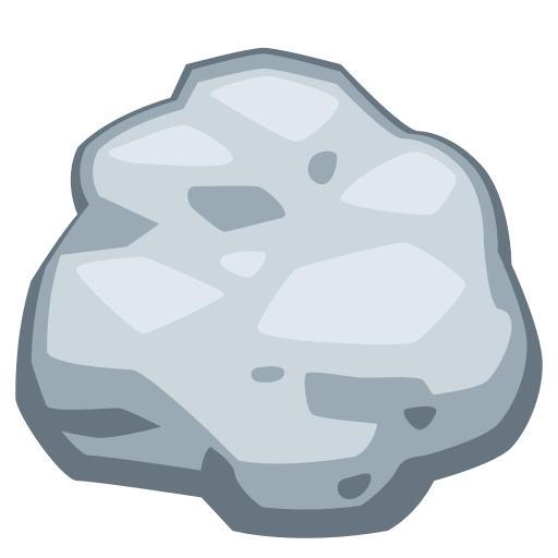
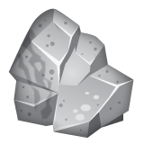
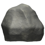
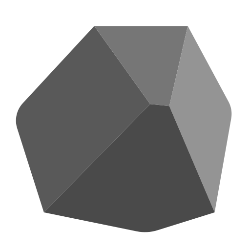
ROCK EMOJI RATING
I sent a rock emoji in Discord today and let me tell you i was stunned by what i saw. I needed to know if all rock emojis were that bad, or if it was a special stand-out. I won't spoil the answers, but here's my rating of ever rock emoji, as listed here: https://emojipedia.org/rock#designs
Since I started here, we'll start here together: This is the rock used on Twitter/X and also Discord:
it looks like a de-saturated blob of chewed gum. That's not a solid object, that's goop. 3/10
WhatsApp (2020-2023)
I see what they're going for here- it certainly looks like a rock, and I appriciate the attempt at giving it a kind of crag-y nature to it, but to me it ends up looking a bit disjointed. The texturing is nice, I like the wavy lines on the side- i'm not sure if real rocks would have a pattern like that but I see what they're going for. 8/10
Next up, Microsoft,... OH microsoft baby what are you doing DOING
the first one was fine!!! It was so fine!!!! The shading is ok, and the thick black outline was really helping to define it as an object. Without the outline its hardly there. It's not even a unique shape its just a slightly wonky triangle, and the shading makes NO sense on the newer ones. I don't like it. the past is in the past, they're being rated for their current sins: 2/10
Microsoft 3D fluent (2023)
this looks like the texture for an iron nugget in Minecraft, which sure, iron is a type of rock, i guess. it also looks like the free to earn currency in a sci-fi NFT game. Still identifiable as a type of rock, i guess. 5/10
Samsung (2020-2023)
This one is nice- its a rock. I like the gloss, it seems polished, which is maybe a bit funny because its simultaneously polished but also a bit mossy at the bottom, but these are all aspects that rocks have, and thus that makes it a good stand in for the concept of a rock. 8/10
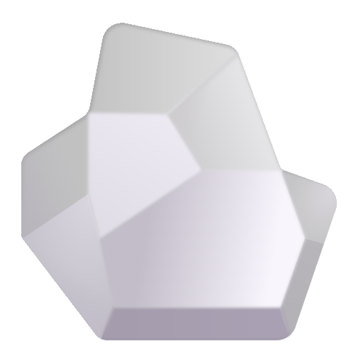
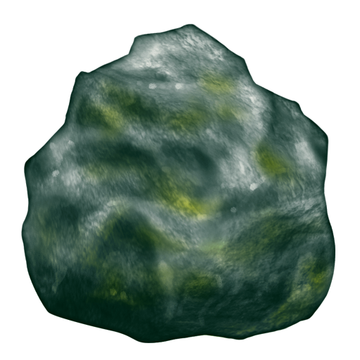
Google Noto Color Emoji (2020-2023)
Well, its a rock. I appreciate how it leans more into a warm grey as opposed to all the cool tone (or..straight up white????) rocks we've seen so far. My main issue is with the bit of shading in the center of it- I'm typing this on a computer and haven't seen this emoji in its native environment of being small on a phone screen, so I tried zooming out the webpage as far as it'd go (30%) and the shading certainly looks better small, but it still strikes me as a bit off- i wonder if it really needs to be there. Not a bad rock by any means though, 7/10
Noto Emoji Font (2023)

So, this is actually a black and white version of the previous emoji, and that makes me appreciate both more. I wish they followed the shape of the lines more with the color emoji, because here the shape is really spot on. It's both a rock and a mountain. 8/10
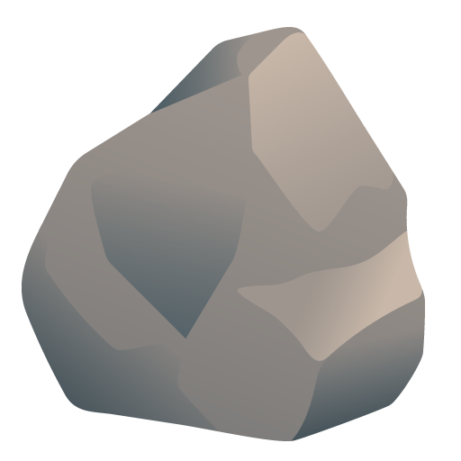
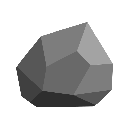
Apple (2020-2023)
This isn't just a rock, this is a CHUNK of EARTH. it's got DETAIL, its got STRIPES. it's a nice fucking rock. 10/10
Emojipedia Sample Images (2020)
"Sample emoji designs developed by Emojipedia for illustrative purposes." (Emojipedia)- hey quick question....sample of WHAT? Illustrative of WHAT? This looks like a chunk of ore from an old school RPG. This is ripped from Runescape (not actually). It's the only rock that's straight up green. It looks WORSE when its smaller. 7/10
Icons8 (2023)
Ok. I can't hate every single one of these kind of simplistic rock emojis that are just angular blobs of color...but with something as simple as a rock its just so hard to get it minimal in a satisfying way- but it's NOT impossible. This one isn't so bad, its just kinda...meh, I guess. 5/10
OpenMoji (2020-2023)
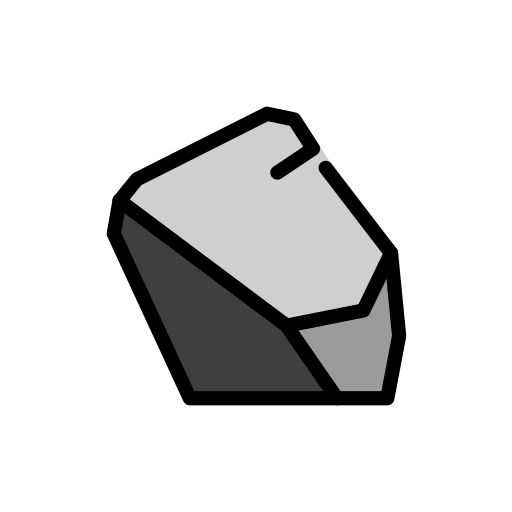
colorized Pictochat drawing. You could fight on this in Super Smash Bros. The last of the black outlined rocks (well, kinda)- though for some reason the lines don't fully connect. It almost looks like a face to me for some reason. 6/10
Sony Playstation (2021)

this is a minimal rock done well. The shading makes sense, its got a solid rock shape. 6/10
TossFace (2022-2023)
what the fuck is this. It looks like the doodles all over my school work after i learned what a vanishing point is. It's simultaneously popping out at you and receeding back into the screen. Lighting? Who is she. awful. 0/10
JoyPixels (2020-2023)

this one is battle scarred. This is a rock that's been through some shit. 3/10
Twitter Emoji Stickers (2022)
WHAT A LEGEND. This looks like an asset from a mobile game. Love the sheen and the perspective. It's even a warm grey! Such a fantastic Rock. 11/10
Microsoft Teams (3D Animated) (2023)
well I'll be damned, a competent Rock from Microsoft. I don't know why they lean so heavily into cold light greys, but hey at least this one isn't straight up white I guess. 5/10
Huawei (2023)
This looks like an unmoulded lump of clay- its even got divots that are roughly fingerprint shaped. Not bad though. 4/10
Facebook (2020-2023)
This looks like someone's 4th ever attempt at shading something realistically. Its an unblended circle, except it seems like they tried to blend a ,little bit in places and it looks...incredibly sloppy up close. what the fuck. 1/10
Well, that's my review of ever Rock emoji listed on Emojipedia, hope you...enjoyed? To finish things off heres my own drawing of a rock done in MS Paint

8 notes
·
View notes
Note
well, dandelions, where did you acquire such a dapper hat from?
the google noto color emoji font, and then i hue shifted the ribbon to be more purple :)
i also have an irl version of this dapper hat, which i stole from my mom :3
7 notes
·
View notes
Text
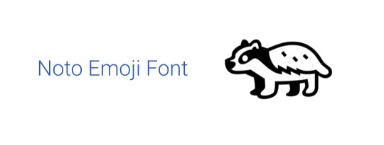
Rating badger emojis across platforms because i love badgers
1. Apple

not bad. slightly 3d. i just don't like the paws. they bother me. 4/10
2. Google Noto Color Emoji

classic lineless with no shading. cute and looks cuddly, but also includes the claws (deadly) (important). 10/10
2.5 Noto Emoji Font
cute!!! i like it a lot actually. loses the claws but otherwise perfect. 9/10
3. Samsung

trying too hard to be realistic. the 3d shading looks really off?? also just paws but no claws. not vibing with this at all. 3/10
4. Microsoft
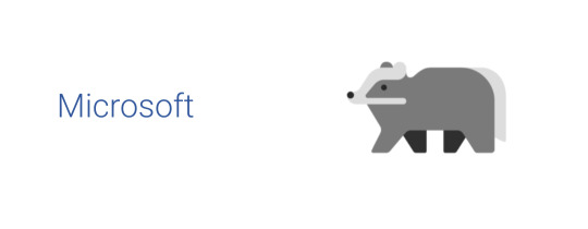
wtf. what is that. that's BARELY a badger. no. 0/10
4.5 Microsoft Teams

OH GOD IT'S NOW 3D AND IT MOVES. -1000/10
5. WhatsApp

Samsung but make it slightly more brown and more pleasant shading. i do like the blue eye. nice touch. with claws!!! 5/10
6. Twitter

okay there is such a thing as going TOO impressionistic. at least it got the basics down. i miss the claws. 2/10
7. Facebook

he's sitting down! a good lad. good claws. 7/10
8. Skype
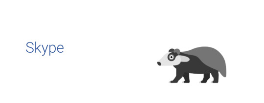
this badger has seen Some Shit. help him. 6/10
(to be continued in a reblog bc apparently the image limit is still 10 on the mobile app)
135 notes
·
View notes
Text
🐊Rating every crocodile emoji🐊
Fair warning, I am incredibly biased and cannot bring myself to be mean to any of these

Apple: I was going to say 10/10 for detail, but it's smooth... Why is it smooth... 6/10...
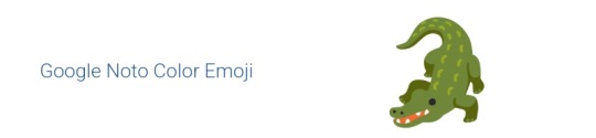
Google noto color emoji: A bit strange, but has charm. 8/10

Samsung: 9/10. I like it. Of course, I use a samsung device so idk

Microsoft: Not much to say about it. I don't hate it, though. 8/10
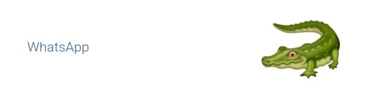
Whatsapp: ... Hehe. Hehehehehe. Funny little guy. Could use some teeth though. 8/10
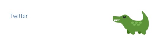
Twitter: 10/10. TEN OUT OF TEN. What is UP??? Small little thing??? Oh my god... I love it so much...

Facebook: Very realistic. I do feel like you should be able to see its other legs a bit at this angle, but idk. 8/10
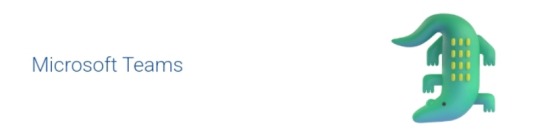
Microsoft teams: You can't tell, but it's animated. Just the microsoft one with some shading. Looks less like a crocodile and more like a normal lizard. 8/10. He's fine.
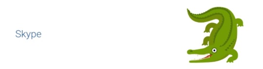
Skype: Looks a bit insane, which adds to the appeal. Legs seem a little off, but I still like it. 9/10.
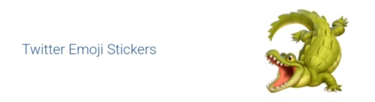
Twitter emoji stickers: 10/10 again, I love this little lad with my entire soul. They really know how to make a good gator.

Joypixels: I appreciate the stripes on the tail. They definitely looked at real picture for this one. Still a bit smooth, but the way it looks at me like a dog waiting to be pet is a plus. 9/10, seems friendly.

Toss face... (What the fuck is toss face?): Simple, but gets the point across efficiently. I appreciate it. 9/10
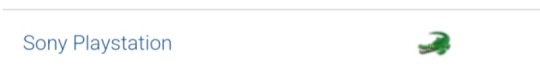
Sony playstation: FUCKING TINY??? 9/10
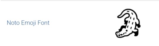
Noto emoji font: Why is he wearing boots? Looks good in them though. 9/10
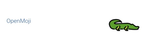
Openmoji: Well, it sure is there. 8/10, I don't hate it.

Emojidex: Idk what to say about it. Not bad though. Clearly traced off of a photo. 8/10
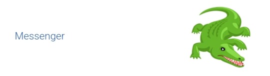
Messenger: I like its weird fnaf eyes. 10/10, it grew on me since I first saw it. Which was earlier today.

Lg: Extremely smooth. So horrendously smooth it circles back around to being likeable again. Looks like a pickle. 10/10, purely for pickle factor. I can smell the pickle juice from here.

Htc: 7/10 idk
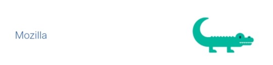
Mozilla: That is two men in a crocodile costume. 6/10, point deducted for being associated with firefox because I'm petty.
... And that's it. Thank you for reading.
19 notes
·
View notes
Text
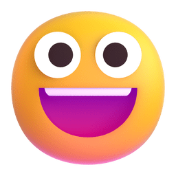
😀 Grinning Face 😀
Starting with the basics! This emoji was approved as part of Unicode 6.1 in 2012 and added to Emoji 1.0 in 2015
Apple
It looks so dead inside. I don't even want to know what it's gone through. This emoji doesn't fulfill their job as something joyful, it fills me with existensial terror. Solid 3/10.
Google Noto Color Emoji

Definitely better than the Apple one, I like the fact that it has some shine in its eyes and that it has a tongue. Pretty good, I'd say 6/10.
Samsung

Still better than Apple, but worse than Google. I've never been a fan of how "sharp" Samsung emojis look if that makes sense? It still does its job though, 5/10.
Microsoft

Just a little guy. Just a joyful lad. Either that or they're on something. 10/10, it's not perfect but makes me happy.
WhatsApp

This is also deeply unsettling, even though it has the features I like. Maybe it's the shiny ass forehead? 3.5/10.
Twitter

Simple, does it's purpose, kinda feels detached from the emotion that this emoji's supposed to convey and just feels like an image. 5/10.
Facebook

What the fuck is this. Why is it an actual sphere. Why are the eyes blue. 1/10.
Microsoft Teams
This is like the GrubHub ad version of the Microsoft one. 3/10.
Skype

This is an animated one, but I only have the image version. This face that the animation ends with is okay, though I don't like the weird white eye bags it has. The face it starts with is terrifying, google it if you want to. As a whole it would be like a 1/10 but just this one is like a 4.5/10. Let's say 2.5/10 as a compromise.
Twitter Emoji Stickers

This is just so much worse than the facebook one, it's so 3D and I hate how the head isn't completely round. Actual -3/10.
JoyPixels

It's just weird. I don't have anything else to say about it. 3/10.
TossFace

It looks like someone who just experienced an extremely traumatic event. Like I genuinely want to hug it and make sure it gets proper professional help. Poor guy. As an emoji though, 3/10.
Sony Playstation

I don't have a lot to say about this one, looks pretty similar to the older Microsoft one I have on my laptop. Also a 4/10.
Noto Emoji Font
Hard to say anything negative, but also anything positive. It's a very neutral emoji, conveys it's meaning well and isn't over the top. I actually really like this one, 6/10.
OpenMoji

It's so flat, and full of contrast, not very pleasant to look at. The eyes are also ever so slightly too small for my preference. 2/10
emojidex

I have many questions that I probably don't want an answer for, including but not limited to: Why is it red? Why is the mouth shaped like that? Why is the outline so thick? Why are the teeth like that? But like aside from me being extremely nitpicky, this is a pretty solid emoji. Like a 5/10 if I'm being generous.
Messenger

Okay so even though I heavily disagree with the shade of the eyes and other little things, I weirdly like it. Even though the shape is... weird..., I think it wasn't a bad decision this time. I like how it's in a 3/4 view instead of front view, which gives it character and originality. The shading is an interesting detail, and makes this a really good emoji. A surprising 8/10.
LG

Pretty basic, the style reminds me of the really old Apple emoji style in some way. This is like a definition of a middle of the ground emoji. 5/10
HTC

I don't like it, and I don't think it should have or even deserves to have separate teeth. The yellow used in this is a nice shade overall, but doesn't really fit the vibe of emojis. 2/10.
Mozilla

Kinda similar feelings like the HTC one, as in I don't think it should have ears. The extremely washed out colours make it look displeasing, and makes me want to turn my screen brightness up. 1/10.
Best ranking emoji: Microsoft, with a 10/10
Lowest ranking emoji: Twitter Emoji Stickers, with a -3/10
Average ranking: 3.75/10, rounding up to 4/10
Median: 3.25/10, rounding down to 3/10
Mode: Shared between 3/10 and 5/10
9 notes
·
View notes
Text
Leopardemojistelic
leopardemojistelic-
a constelic term for when one stels the leopard emoji (🐆)
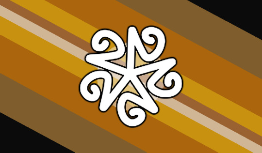

[ID: two rectangular flags that are almost the exact same aside from the centre symbol. each has 8 equally sized diagonal lines from left to right and 2 thinner ones in the middle. the colours are in this order from the top right corner to bottom left corner: black, medium brown, orangish brown, yellow brown, warm brown, tan, yellow brown, orangish brown, medium brown, black. in the centre of the first flag is a white symbol outlined in black. the symbol starts as a five-pointed star of lines; the ends of the lines curl right into a spiral. behind the symbol is a transparent white circle. the centre symbol of the second flag is the google noto color emoji leopard emoji. End ID]
Day 3 of @honey-makes-mogai 's 250 Followers and Birthday coining event (July 3rd - Something a friend would/does stel)
-🌪
#>quick dip into the fondue#leopardemojistelic#honeysbday250#honeybday250#theme: animals#theme: emojis#coining event#constelic#constel#stelic#stel#mogai coining#liom coining#mogai#liom
6 notes
·
View notes
Text
these are so fucking cute i think i might use thesee for my website actually.
3 notes
·
View notes
Text
Made 2 hand stim sequence emojis! (rq'd by noone, made by me)


f2u, creds not needed but appreciated!
Also, here's a useless fact: I based my emoji style off of Google's Noto Color Emoji font.
10 notes
·
View notes
Text
🍶: According to dictionary.com's analysis of this emoji's usage, "Some Western social-media users mistake the sake bottle and cup emoji as showing a milk carafe or drinking vessels for other beverages. As a result, sake bottle and cup emoji appears not infrequently in posts about breakfast and other lactic treats. That’s a breakfast of champions." I'm not sure sake sounds like it'd be great in cereal. If you've tried this and I'm wrong let me know I guess? But it seems to me like some Twitter users might want to double check what emoji they're using.
🗨️: Although this character was added to Unicode in 2014, prior to the introduction of the Emoji 1.0 standard in 2015, it was not originally designated as an emoji! It was considered a regular special character until three months later, when it got promoted to an emoji in the Emoji 2.0 release! Although it appears black and white on many platforms, you can tell it's actually a "color" character because the outline doesn't change to match the surrounding text color, and the interior is consistently filled in with white instead of the background color! (If you want it to match the text and background, there are black and white emoji fonts available that will do that for this or any character, such as the black and white version of Google's Noto Emoji.)
4 notes
·
View notes
Text
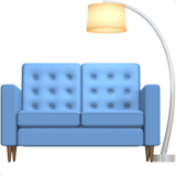
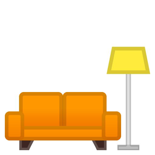
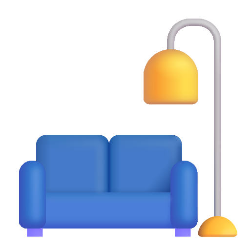
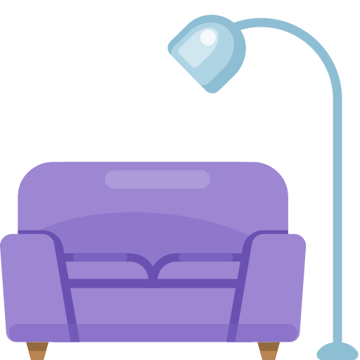
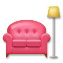
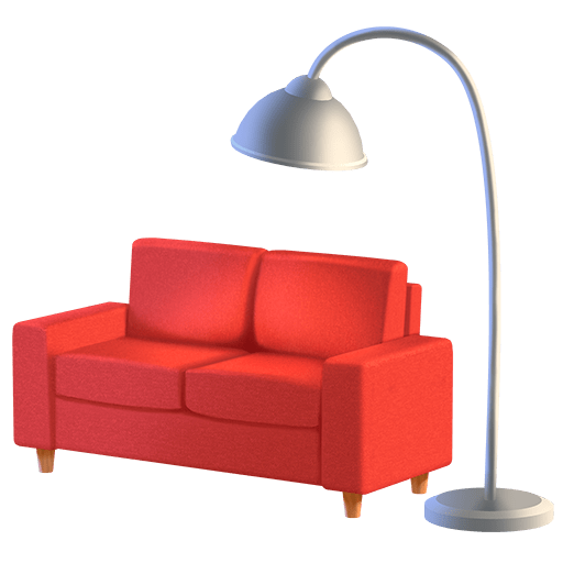
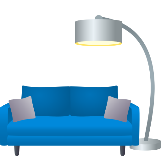
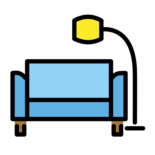
Ranking the couch emojis

iOS 10.0 I love the colors! Most of these toe the line between couch and sofa so I'm defaulting to couch- but this is definitely a sofa 9.5/10
iOS 10.2 perfect and spectacular only I wish the lamp weren't so close to the legs 9/10

Android 6.0 ew. 4/10
Android 8.0 somehow worse 3/10

Android 12.0 I hate this shade of blue and I hate that the lamp is behind the couch 5/10

Samsung
7/10
Microsoft Teams kind of like the exaggerated cloche of the lamp 6/10

Windows 10 I gasped 8/10

Windows 10 Anniversary Update Awful in a funny way 3/10

Windows 11 well it looks better than the clipart android one 6/10

Whatsapp this isn't a couch it's a sofa; I like the texture 7/10

Twitter/X yay green, the bottom of this one is terrifying though what happened to the legs 6/10
Facebook 2017 looks like a sex toy 4/10

Facebook 2018- lamp is at a much better distance than iOS but the texture simply isn't inviting 6/10

Huawei Woah! 8/10
LG really rough perspective on this one 5/10

Skype it's fine. I like the colors-as-shading of the lamp 7/10
Twitter emoji YOOOO 9/10
Joypixels We've got pillows! 8/10

토스페이스 horrible and I hate it 2/10

Playstation so awful to look upon it was demoted to the size of a pea 2/10

Google Noto 2/10
OpenMoji I normally hate openmoji but I'd actually find this one very charming if it weren't for the legs 6/10

Icons8 no room to sit, the shiny, almost pornographic texture of the cushions juxtaposed with the flatness of everything else is unnerving, and the lamp is blue. this is a couch that would feature in a nap nightmare 3/10

Emojidex pissing me off 2/10

SerenityOS 1/10
27 notes
·
View notes
Last Seen Blogs
queercelluloidjunkie
The Queer Celluloid Junkie
ivypie07
ivy's little corner 😗
catalinaacosta
Lots of Fandom Shit

bounderstyle
BOUNDERSTYLE