#i just like drawing kind of muddy & low contrast OKAY!!!!!!
Text
s1 to s2 will pipeline
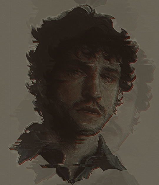
#my art#scritches#will graham#hannibal#hannibal nbc#nbc hannibal#be the evil you want to see in the world#behind every gay person is an eviler more gay person meme but its will to will#ohhhh he is so tortured<3333333#ONCE AGAIN SHE (my art) IS SO DARK!!!!!!!!!!!!! WHY!!!!!!!!!!!!!!!!!#future goal -> actually look at the drawing from a distance . if u cant see shit then maybe its too dark elena . have u considered this#sheesh#i just like drawing kind of muddy & low contrast OKAY!!!!!!#shdgfh no ones given me shit for this im just giving myself shit#and the tags are my rambly rambles place#slay
2K notes
·
View notes
Note
How hard is it to choose colours for your (and my favourite) art style?
Eheh, well I canonly speak for myself, not for whoever you’re flattering by callingyour favorite, so I’ll stick to that! ;)
I suppose theliteral answer is “Usually not too hard?” but that’s boring solets see what I can ramble about color choice and such! Also I’ll put some links to James Gurney’s stuff because he is amazing and I cannot recommend his books enough!
(This’ll be in 3 sections - Color schemes, Contrast and leading the eye, and picking colors for shadows~ from longest to shortest too)
Part 1: COLOR SCHEMES
So I used to bereally bad at this until I got really into pixel art where I learneda few important lessons. First, the entire color palette workingtogether is what’s most important, not any single color, and second,colors work together in surprising ways COMPLETELY dependent on what’s around them!
For example, this isthe color palette for the Commedore 64 from back in the day. All whopping 16 colors the system could possibly display:
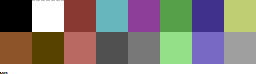
Individually thosecolors look pretty muddy, muted, and dull. But when you put them alltogether in an image they actually work pretty well together, because none of them completely break from the others. Usingmy own stuff as an example, I used the C64 palette to challengemyself with remaking a very colorful, very saturated screenshot from the Nintendo 64game Mischief Makers (because I love that game and both systems have“64” in the name so why not~)
So I turned this: (Nintendo 64 version, with waaay more colors available)
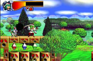
Into this:

Now, there’s clearly a BIG difference in the colors used, but I feel like everything still looks fine on its own. The muddy colors look a lot more harmonious when seen in an image than individually, with the brighter colors, such as the gems, even popping quite a bit.
For that second point I mentioned about colors working differently based on the colors around them, look at the character’s green hair, the green gem, and the green on the top of the blocks. They are all the exact same color. The green gem and hair, though, are shaded with a deeper, more saturated green and contrasted with a bright white, making it appear more saturated than the exact same green on the platforms, because the platforms’ green is surrounded by duller colors.
So it’s important to keep in mind that not only is each color important in the context of the whole, but also that what’s immediately around a color will massively impact how they appear, even when they are the exact same!
Important things to consider when picking colors is how close/far they are to each other in hue (the color itself, represented by the outer wheel in the image below), the saturation (how much gray is in the color, which effects how vibrant it is, which is the left->right in the box) and value (how much black is in the color, which is the top->bottom in the box).

Essentially the further away two colors are from the each other in any of these 3 directions the more they will stand out from each other. I’m not much of a teacher for color theory in general, so the best advice I can give is just to practice and to check out limited palettes other people have made and see how they handle it. In general, though, I try to keep most of the colors relatively close to each other in saturation and warm/cool colors, and then use one accent color that stands out in small amounts to make certain bits pop~
Links time!
Gurney’s post/video on Color Gamut, or manually limiting colors and how surrounding colors alters our perception of them (check out what appears as yellow in the cool colored image as opposed to the warm)
Gurney’s post on color in context and how many colors still register as bright yellow
Fun little tidbit about old cartoons made with limited palettes
Part 2: Contrast, and leading the eye!
Okay, so these other two might be a bit shorter. Basically, when you’re picking colors you want some to stand out and some to fall back. If everything is competing for attention it can be really hard to look at and the eye doesn’t know what’s important! One of the main things to look out for with this is contrast, as the eye is easily drawn to areas that are different than their surroundings.
Let me use two designs I’d had for my character Caelia - the left is her old color scheme and outfit and the right the new one:
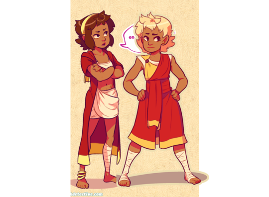
Now, aside from minor differences in saturation, they’re actually pretty similar, but the one on the right I think works a lot better. In both of them the yellow acts as a strong accent color that can pull the eye, but on the old design on the left it pulls your eye in two directions - towards the headband and the coat trim, neither of which are actually important. Almost the entire rest of the design lacks that yellow so your eyes are actually drawn -away- from the character’s face and body. Imagine the coat being blown behind her as she’s doing an action pose and, yeah, the accent color doesn’t actually help anything.
The new design, I think, fixes that. Even though it remains an accent color the yellow now appears throughout the design. Her hair is now a lighter shade of yellow which is distinguished from the yellow on the clothing while also framing her face. Her torso now has a yellow accent on it so it draws the eye and, combined with the hair, has a strong distinction between her upper half (which is more yellow) and her lower half (which is mostly red). And finally what was the coat now wraps around her with an additional little strip on a waist sash. Now the yellow trim can easily allow the eye to figure out how her legs are positioned by how they wrap around them, instead of just hanging behind them.
It’s also important to point out that the hair is less saturated along with being lighter than the rest of the yellow - it both looks a bit more natural, blends with her skin color more, and also doesn’t compete with the high saturation in the clothing.
None of this is to say the left one is necessarily a bad design or conveys information poorly, just that the right one is a more unified design that is easier to understand at a glance. It’s something to keep in mind, but not a hard rule or anything. But remember that if EVERYTHING tries to stand out you’ll just end up with a mess.
LINKS!
Gurney on leading the eye with contrast and why what everything I just said might be bunk but might not be and also I think what I said applies better to simplified, cartoon forms as opposed to realism, since lines and blocks of color read differently than natural forms and lighting.
Spokewheeling - a composition technique that can be applied to character design as well.
Shapewhelding - another composition technique to think about, and can be important to AVOID at times (happens a lot in pixel art - dont want things melding together accidentally)
Gurney on why all of that might be bunk for general art composition anyway but might not be, but again I believe is still important for more stylized art
Part 3: SHADOWS!
Okay, so it’s nearing 1am as I write this and I’ll be honest I have the absolute least technical knowledge on this part, so I’ll tell you how I go about it but I STRONGLY suggest reading Gurney’s information on it (Again, seriously, I love his books, and “Color and Light” in particular is amazing and contains many of these posts and more)
When it comes to shading I have a pretty quick and dirty way to figure out what to do:

in case the text isn’t legible:
Choose a color for all shadows to move towards (usually a purple or blue)
Grab the base color for the thing I’m adding shadow to
Shift the color towards the direction of the shadow color I chose, and then make it darker and more saturated
And I do the exact opposite for highlights - I move away from the shadow color and then make it lighter and less saturated
Usually, anyway. And this method works best on the kind of color wheel I have there, but it can be adapted to most anything. And how far you move towards the shadow color and how dark/saturated you make the shadows will change the mood of the piece a lot. The colors in the screenshots are for a pretty light colored, low contrast piece.
I would go on more about it but I don’t actually have solid reasoning behind it other than it tends to look alright and I don’t want to spread incorrect thinking. Just… for the love of all that is colorful, DONT just shift the color towards black or white. It looks muddy and gross. Please. I beg you~
ON THE PLUS SIDE, Here’s a slew of awesome links!
Gurney and Chromatic Shadows Part 1!
Chromatic Shadows Part 2!
Relative color on skin tones!
Complementary shadows!
Induced colors! (or how our eyes can make highlights appear as different colors)
And I cant stress enough how great Gurney’s Color and Light book is for this stuff. I just can’t explain much ‘cuz I’m bad at actually studying this stuff well enough to talk about it!
Anyway, that about does it for my waaay longer than I thought and hella reply to a single sentence question! Hope that helped you, or SOMEONE at least! It was fun to ramble on about regardless~ (oh geeze yeah maybe rambling after midnight was a bad plan? Hopefuly this actually makes sense lol. If anyone needs any clarification just let me know!)
Cheers! (ノ◕ヮ◕)ノ*:・゚✧
132 notes
·
View notes
Last Seen Blogs

softestpinkestplushiest
Untitled
phonification
local lesbian lost in midnight city

petyolo
Pet Yolo: Magazin für Tiere

tigirl-and-co
Blunt Force Ballerina
softestpinkestplushiest
Untitled