#i know this is a big chunk but i didn't want to seperate anything and deliver whole context
Text
— August 13, 1913 / Franz Kafka diaries
#i know this is a big chunk but i didn't want to seperate anything and deliver whole context#will post the letter too#August 13#1913#august#franz kafka#daily kafka#franz kafka diaries#quotes
1K notes
·
View notes
Text
(You can find the set that this gif belongs to here 💙)
From planning to posting, share your process for making creative content!
To continue supporting content makers, this tag game is meant to show the entire process of making creative content: this can be for any creation.
RULES: When your work is tagged, show the process of its creation from planning to posting, then tag 5 people with a specific link to one of their creative works you’d like to see the process of. Use the tag #showyourprocess so we can find yours
I was tagged by @aheartfullofjolllly. thank you so much Pat! it was really fun to reflect about my own process 💗 You can find her post here and @lan-xichens' post that started it all here :)
Also thank you @huigusu 🥰 (who tagged me for my nie brothers set) I'll get to that one in a few days!
Now Pat gave me two sets to chose from to show my process, so obviously I chose the more complicated one :P
I only work in Photoshop CC 2018. I know that there are programs out there for easier cutting and sharpening but I have only just figured out how to do that in PS and I am too lazy to figure out any other programs right now xD
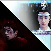
1. Idea and Planning
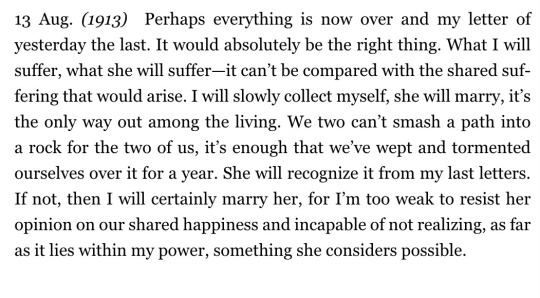
This set, like most of my sets with lyrics started with me reading the poem, clutching my heart and going "oh shit this fits my favourite characters!!". The idea actually started with me thinking that the first stanza of the poem would go really well with wwx during the burial mounds arc. Then I realized that the last stanza fits lwj better than him and from there came the idea to contrast the both of them next to each other. This is when I realized I wanted to do a dark-light contrast set, though I did not know that I would go with red and blue at that time. My idea in the beginning was just to do a black and white set
I was really impressed by how Pat said that she plans her sets around exact timestamps. Because I don't do that at all ^^ I just get ideas for which scenes would fit (in this case the wwx burial mounds scenes and lwj's kneeling and punishments scene) and then I watch the scenes to narrow them down.
Back when I made this set, I still used a screenrecorder (AceThinker Screen Grabber Pro to be precise. They have a test version that allows you to record up to 3 minutes) and recorded the scenes I needed from Netflix. This worked well enough but now I have the entire show saved on an external drive and it makes a world of difference when it comes to gif sharpness
Now, in this case I had to repeat this step once because when I was almost finished, I realized that I wanted a gif for the lwj corner but let's pretend I didn't do that and that's the way this gif was always going to look because otherwise this post will be way too long ^^
2. Creation
Short disclaimer: The creation process for this gifset was anything but linear. Multiple effects I used here were things I had never tried before. I just had a vague idea and tried to realize it through trial and error. So whenever I say "then I did xyz", it is implied that I ultimately went back to that step several times and changed stuff ^^
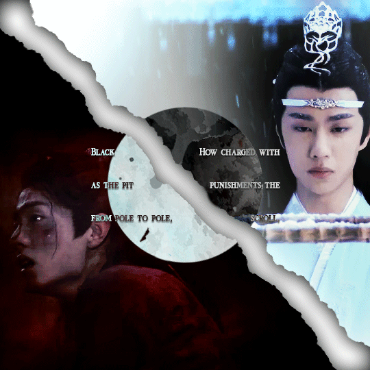
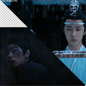
I started with the Wei Wuxian part of the gif. I usually use a frame rate of 0,06 (with some variation depending on gif length and size). I work in timeline so I converted all the layers to a smart layer. Then I resized the gif into a square, leaving big chunks of the gif empty (as can be seen below.) I flipped the gif horizontally, so he is looking inwards. This was simple because I felt it fitted the composition better. Then I imported the Lan Wangji part of the gif, again with a frame rate of 0,06. (Image 2)
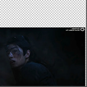
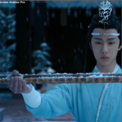
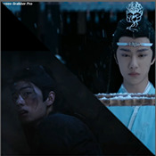
After that I created a layer for masking in a separate PS document by rotating a square until it was point down (is that a rhombus?). I sized it to match my gif (540x540 pxl) and copied it over. (Image 3) a bit of masking magic and ta da! There's the basic layout (Image 4)
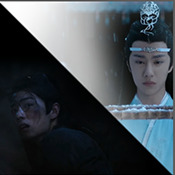
I put a layer of solid black behind wwx to get rid of the transparent bits (Image 5) and then started adding more white and black to both sides by adding solid whit and black layers that i put masks on and changed the opacity as i needed (Image 6)
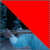
("reading" direction: from the upper left to the lower right corner)
Then I fiddled with the colours a bit. The first thing I always do is using the curves layer to get more contrast. Then I use the colour balance tool and the selective colouring tool to get rid of that cql-typical cyan tint after that it's just trying to have it look "natural" while the colours still fit the overall scheme. This was difficult here because wei Wuxian’s side of the gif was very dark and when i turned up the saturation to see which colour dominated it was a very weird mixture of multiple colours. That's when i decided that I'd just go with red on his side, since lwj's side was already so blue and those to look great as contrasts.
After that just came a lot of fiddling with selective colour layers and brightness and contrast unti I has happy. There really wasn't much to it ^^. (Image 1)
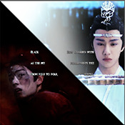
After that I added the text. I knew I wanted the two lines to for a square of some kind. So I tried different fonds until I arrived at the one below. The two lines are in seperate layers so I could move them around and change the spacing between the letters until I was happy with the layout. I also changed the layer mode for the text to "difference" (is that what it's called in english? my PS is set to german sorry ^^), keeping their colour white. (Image 2)
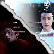
I originally hadn't planned adding anything else but I felt like the gifs (plural because I switched between the gifs of this set) was still kind of empty and lacking, so I added the tear down the middle (a tutorial for that is either coming up later or already posted. I recently got an ask for this :)) (Image 3)
It still felt empty after that, so I tried different overlays. Okay no, first I wasted a lot of time on different free image sides but then I tried out different ones until I chose the one you can see in the finished gif. I liked that one because a) I felt the round shape was a nice contrast to all the straight lines already there and b) because once I applied a black and white filter to it and switched the layer setting to "difference" (again, i hope this is the correct translation) it looked a bit like a moon. (Gif at the top)
("reading" direction: from left to right)
And that's it! :)
Although in general, these gifs took so much fiddling! I went back and forth between them a lot and sometimes almost redid the entire thing because I had no idea what I was doing in the beginning and by the time I noticed an error, the only way to fix it was ti redo everything. So yeah, this set definitely is the the one that took me the longest out of all the ones I've posted so far.
3. Posting
I save all my gifs to my drafts first to see what they look like put together and to check if they look any different on mobile. Usually i do this several times and change stuff until I'm happd enough with it to hit post. Once i am happy enough, i can't hold back. Doesn't matter if it's at a time when nobody is online, i hit post 😅
And that's it!
Tagging:
@lanwuxiann for this gifset (I adore it so much. I've looked at it and read it severat times since you posted it and the poem just kills me every time!)
@suibianjie for this gifset (The combination of static images and gifs in your gifs is always absolutely perfect! This one is only my favourite of yours because the light coming from behind wwx is just so pretty!!! ^^)
@sweetlittlevampire for this piece (It was soooo hard to pick a piece of yours because I have so many favourites! But this one is just so out if this world, I want to know how you worked that magic :D)
@wei-gege for this set (sparkling shijie! 😭 that set is so incredibly beautiful! I love how you matched the colour of the overlay with her dress!)
@purplexedhuman for this set (your gifs are always incredible! I chise this one because it showcases both your colouring skills and some really intricate effects)
If any of you have already been tagged or don't have the time or energy for this, obviously no pressure to do this at all! 🥰
(btw, I originally tried to place the actual text of this under a "read more" cut but somehow it always messed with the order of the images, so this ended up as a rather long post. sorry!)
39 notes
·
View notes
Last Seen Blogs
tuttacolpadellestelleedite
Il cielo su Torino

sejshomeocare
Sejs homeo care

slasherboyos
Your friendly neighborhood slasher simp


risewings-blog1
ASO Agency(Mobile App Marketing)