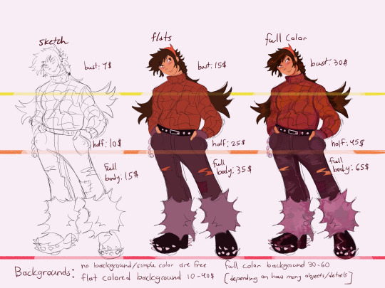
#like if you ask for a sketch that has like some monochrome colors thats gonna have a different price
Text


im opening up commissions!!!!!!!!! as it says up there i am taking cash through Paypal and cashapp! (which ill dm the usernames to you when the time comes of course!) you can either dm me here on tumblr, or you can ask me for my discord! whatever works best for you.
if you would not like me to post your commission art just let me know, and of course if theres any questions be sure to ask :]
my examples are under the cut, reblogs are appreciated ^_^


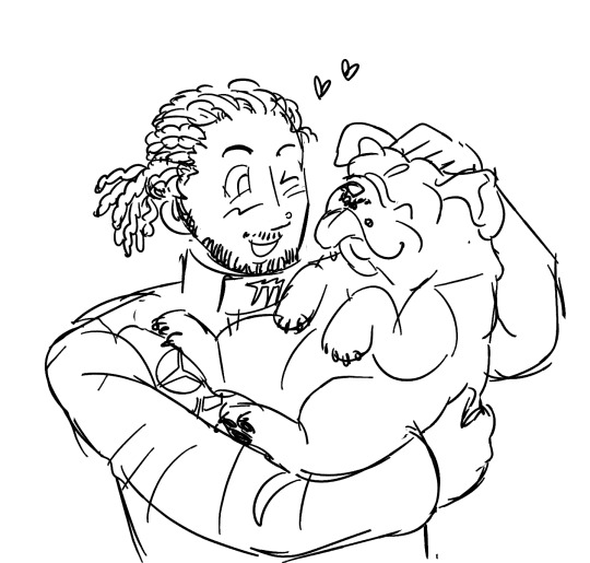
#mine#my art#AHHH OKAY. OK!!!!!!!!!!!! I THINK THATS EVERYTHING !! ^_^ my first time doing this sorta thing....#again rbs are appreciated!!!#i hope you can read my handwriting . apologies#and about the bugs you CAN ask for a nonhuman guy but like. it will probably cost you more. as it doesnt really translate into the baseykno#and i really emphasis sorry if i take a while! this is a family owned computer so i do not have access to it all of the time#and yeah price can change and stuff depending on what you ask#like if you ask for a sketch that has like some monochrome colors thats gonna have a different price#i think thats everything................. if not ask any questions.
143 notes
·
View notes
Note
i forgot to add: how do design ????!?!??????
So I’m not expert but this is how I think of character design! (also sry if you were asking about clothing/outfit design thats a little different)
under the cut because this is long im so sorry

So in my opinion there are three really important aspects for character design!
AESTHETIC: obviously everybody’s aesthetic is different, but this is more about what vibe the character has, what makes them THEM design wise.
INTENTION: who is the character supposed to be? this can range from their personality, their back story, their occupation, or their role in the story, but the design need to fit that intention.
COHESION: does the design go well together? or do certain aspects clash too much? obviously you can have disjointed parts of a character design, and if those serve a purpose then thats fine, but if its so disjointed its distracting from the character as a whole you might need to tweak things.

AESTHETIC: the contrasting part of the design (white flowers in dark hair, dark trim on dress, and dark shoes) provide interest to the eye. The mixing of round and sharp shapes also keeps the design from feeling “boring” even though its relatively simple.
INTENTION: so what role would this little doodle character have? according to her design elements, shes cute and friendly with her round shapes (bouncy balls, babies, etc), but could have a sharp/fast/active or even dangerous edge to her with the triangles (arrows, knives etc). of course the design doesn’t limit her possible roles. She could be a bubbly younger sister who teases the older protagonist, or maybe she’s the villain hiding in plain sight. the shape this character design doesn’t really have is squares(think bricks and rocks), which communicates that she might not be really strong, steady, or reliable.
COHESION: repeating the curves across her whole design builds cohesion, it communicates that “yes, these are all part of the same character”, it also allows the eye to “rest” on a familiar shape or line.
NOW LETS LOOK AT SOME DESIGNS

(Boku no Hero Academia) so both of these characters are super heroes, but have vastly different design elements. so lets analyze them.
OCHAKO(the pink one) is all rounds, with a few pointed shapes in hair mostly, but a little on her costume as well. Her personality is cute, bubbly, and friendly which perfectly suits her soft and bouncy design. Howevre she also has a very slight edge to her, which is seen her determination and drive to improve herself over the course of the anime.
KIRISHIMA(the red one) at first glance, seems to be super pointy!! shapes that are usually seen on villains or really dangerous characters, but while he IS sharp(literally sometimes) and sometimes aggressive, he is also made of squares, which perfectly suits his loyal “i gotchu bro” attitude towards most of the other characters in the anime.
ISSUE AREAS: so the only problems i have with Ochako and Kirishima’s designs is that their costumes each have one area that clashes a little too much for my taste. With Ochako, the belt over the color blocking stripes down her crotch are......questionable taste wise. I think the design would be better if the pink chest ended above the belt in a shallow v. not only would this mirror the triangle aspects of her hair, it would fit the belt outline, and continue the trend her costume has of being “grounded” or “heavy”. Kirishima has those.... gears??? around his shoulders??? and while the gear teeth are technically squares, the gear shape itself is a circle, which is a shape that isn’t present anywhere else in his design. I think changing the gears to something similar to his boots or his mask/headgear would create a more cohesive design(also the gears just look hard to move in)
These two characters are presented as individuals so their costumes don’t have to match at all even though they are still seen as “connected” because of the art style for the face, hair, and body.
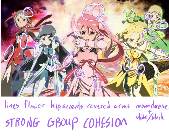
In a group giving the outfits cohesive motifs is an easy way to present a strong team image! In Yuki Yuna is a Hero, the girls all have colored lines(usually princess seam placement), armor or fabric hip accents, covered arms, and similar flower shapes in their hair. The Aesthetic of each girl is strong in a monochrome signature color, but not over whelming as the black+white connects them even in color so they aren’t out of place.
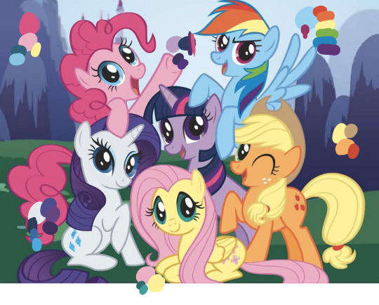
Speaking of color! if your characters are all similar looking (like same body for all of them) you can communicate their personality and aesthetic just with color! (only gonna talk about a few of the ponies) Pinkie Pie (the really pink one) is energetic and playful, so her color scheme is a variation of the primary colors(happy, child like), and have one of the more saturated colors(high energy, intense) of these characters in a large quantity. Apple Jack (the orange one) is a down to earth farm girl, and her color palette is accordingly, mostly earth tones, its also warm analogous colors, which makes her appear un-complicated and warm personality wise. the pop of red is a nice touch to add interest, but notice that its uses sparingly in her cutie mark and tail accessory. Rarity on the other hand is elegant and fussy, her high contrast scheme of white and dark blue/purples gives her more visual interest and is something that makes her appear more “complex” in addition to the gradient thats included in her hair. the colors are also all cool colors, bringing to mind cool glass or water which both have connotations of grace and beauty.
however all the characters here are unified by their colors being on the pastel side, which is also important for a cohesive cast.
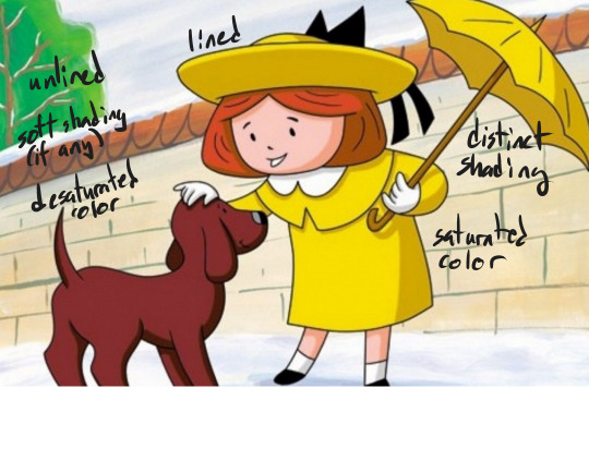
another, short, note on color; making the color/line/shading of your figure different from the background can help them stand out, this is used ESPECIALLY in children’s media, but can be applied to any illustration or animation as needed.
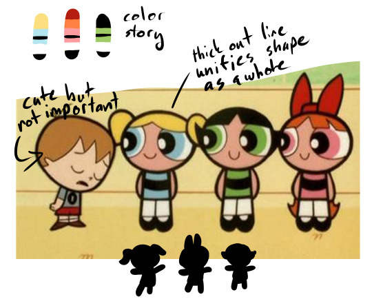
Color can also help your characters “read” quickly on screen, the powerpuff girls are a prime example, of having a distinct color blocking and silhouette. even the color blobs at the top and my crappy hand silhouettes STILL read as the characters despite being broken down into abstract elements. I also really enjoy the thick outline in the powerpuff girls, it really makes the characters pop to the foreground even though they have pretty simple designs and are often in a colorful setting.
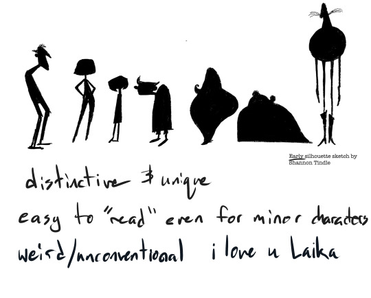
Also, for a lot of animation, silhouette is INCREDIBLY important for your characters, some designers sketch silhouettes and then design the particulars its so important to nail the shape. These examples from Coraline are some of my favorites (though Laika wins in my heart every time no matter what lmao) because the simple shapes are SO CLEAR and indicative of the character, you literally don’t need to have watched the movie to know these are each different characters with different personalities and roles.
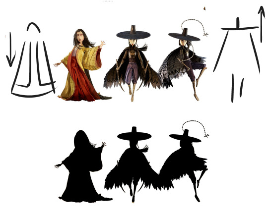
silhouette can also help tell the story. In Kubo and the two strings (another Laika film) the above three characters are sisters. One has chosen to leave her home in the heavens to live on earth, and the other two stay in their roles as “heavenly” warriors. This is even shown through their designs, the two sisters are weighted on top and their cloaks don’t even touch the ground, while the first woman has trailing, heavy sleeves, hair, and robes all grounding her and emphasizing her connection with the earth.
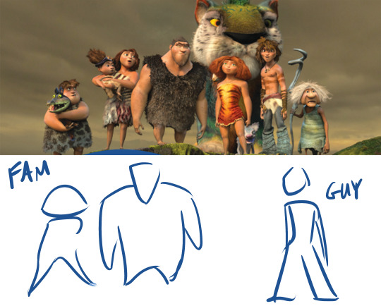
another example of shape/silhouette reflecting the story, In The Croods, the family of cavemen are for the most part very top heavy, with large torsos and arms, usually in a more hunched over position, while the newcomer, Guy, is bottom heavy with thin arms and stands more upright. In the plot, the family represents the old ways, the strength and rules that have helped them survive, they look like very stereotypical “cavemen”, while Guy resembles the modern man, and appropriately is associated with new ideas and forward thinking.

MORE SHAPES, in DC super hero girls each girl has a distinct personality emulated by her shape language. Zatana is dramatic curves and edges, Super girl is hard, straight edges against curves, giving her a solid muscular shape. Wonder Woman, though also strong, is taller and leaner, lending to a confident leader type. Green Lantern is slim, her lines all flow into each other giving her a go with the flow look. Bumble Bee is, of course, tiny, but her boots and gauntlets add weight and strength to her otherwise small frame. Batgirl is lanky and has a lot of pointed style lines, reminding the viewer of a skinny cat (ironic what with cat woman i know) or weasel which mirrors her preferred “sneaky” crime fighting style. (also yes this was just an excuse for me to gush abt how much i love the dcshg designs shut up)
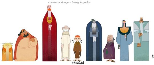
so in my opinion, Cartoon Saloon’s The Secret of Kells is PERFECT in aesthetic, intention, and cohesion. Kells focuses very strongly on creating silhouette WITHIN the larger figure shape via color and line, most of the characters pictured here have no neck, the one who does, Brendan, is the main character and the use of negative space that cuts into his shape is used to draw attention to him. Kells is also very strongly inspired by Medieval Illuminated manuscripts (namely, the book of kells lmao). The characters still manage to stand out against outrageously detailed backgrounds via their simple shapes and strong color blocking.

Aisling, a secondary but very important character, is not human, and has a totally different shape language from the rest of the characters. She is thin and pointy, while most of the others are round or square. Aisling also has the most negative space making up her silhouette, compare the triangles made by her arms and legs in the above picture to the figures in the first image where everybody’s body is self contained with no negative space. She is also very different color wise, very pale and cool colored, as opposed to the warm saturated colors of the human characters. (yes this was another excuse to gush abt one of my fave pieces of media deal with it)
hopefully that wasn’t too rambley and actually helps? if yall have more specific design questions lemma know lol
#askems#a-magical-human#design#art tutorial#tutorial#Character Design#boku no hero academia#yuki yuna is a hero#yuki yuna wa yusha de aru#my little pony friendship is magic#mlpfim#madeline#powerpuff girls#ppg#coraline#laika#kubo and the two strings#the croods#dc super hero girls#dcshg#the secret of kells#cartoon saloon
843 notes
·
View notes
Last Seen Blogs
absentia-veil
Absentia

starlordmatt
a cheap trick and a cheesy one-liner

theamityelf
Take a deep breath; relax your shoulders
numberonecodwomenfan
silly billy (commissions open for now!!)

l-shroom-l
Shroom