#mackellar smiths & jordan
Text

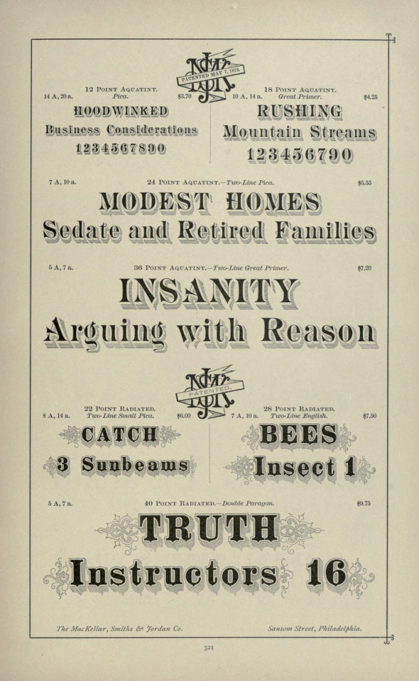

Sample text used for typeface specimens, MacKellar, Smiths & Jordan Co., 1892.
2 notes
·
View notes
Photo
binny & ronaldson
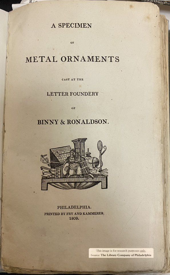
reports of early type-founding in the usa tend to be anecdotal, but one fact is certain: in 1796 two scots émigrés entered into partnership (as to the details of their meeting reports are conflicting) & established the first full-time, professional type-foundry¹ in the usa, in philadelphia. skilled punch-cutter archibald binny, & businessman james ronaldson issued their first specimen book of ornamental material in 1809; indeed, the first such specimen book issued in the nascent usa, showing the firm’s ready repertoire of newly engraved ornamental material, as well as four sizes of type, the punches & or matrices for which binny presumably carried from edinburgh [p.j. conkwright, «Binny & Ronaldson’s First Type», PAGA, vol.1, 1953, p27]. their second specimen of 1812 shows new faces, replacing those of 1809, in prevailing fashion—no.2, a modern; & of the previous, transitional, fashion— vide ‹b& r no.1›.
theodore low de vinne gives concise descendency of binny & ronaldson material: «The first founder in the United States of marked ability was Archibald Binny of Scotland, who had made types in a small way at Edinburgh. In 1796, in connection with James Ronaldson, he established a type-foundry in Philadelphia, which soon took the lead of the other foundries in that city. … He retired in 1819. James Ronaldson & Richard Ronaldson [jame’s brother] continued the business. ¶In 1820 Lawrence Johnson, a printer and native of England, established a stereotype foundry in Philadelphia. In 1833 he formed a partnership with George F. Smith for the purpose of buying the type-foundry of Richard Ronaldson. Under the new management the operations of the foundry were largely extended. In 1843 George F. Smith withdrew. In 1845 Johnson admitted to partnership Thomas MacKellar, John F. Smith, and Richard Smith, who had been trusted employees of this house. Peter A. Jordan was added afterword. Before his death in 1860 Johnson sold the foundry to his junior partners, who continued the business under the name MacKellar, Smiths & Jordan, and afterword of MacKellar, Smiths & Jordan Company, but the house has not lost its old name of the Johnson Foundry [presumably the premises]. In 1892 the Mackellar, Smiths & Jordan Company became the Philadelphia branch of the American Type Founders Company.» [Plain Printing Types, the century co., nyc, 1902, p102]. and thus descended the binny & ronaldson material to atf—vide ‹b&r no.1›.
illustration: A Specimen of Metal Ornaments Cast at the Letter Foundery of Binny & Ronaldson. | Philadelphia. | Printed by Fry and Kammerer. | 1809. [Am 1809 Bin 13347.O .4]. with thanks to the library company of philadelphia for permitting my examination of this extremely rare specimen book.
⎯⎯⎯⎯⎯⎯
¹ others had attempted type-founding in english america before 1796, but most were unsuccessful, others succeeding only in a small way: isaiah thomas enumerates seven [isaiah thomas, The History of Printing in America, 3rd edition (original 1810), imprint society, barre, mass., 1970, pp28-32].
#typography#binny & ronaldson#american type founders#mackellar smiths & jordan#theodore low de vinne#isaiah thomas
2 notes
·
View notes
Text
queen-max said:
This might be a stupid question, but how do you create the section break elements? I saw on some of your posts that you’ve grabbed them from old books and various places, so I was wondering how you go about finding them and how you make them digital if they aren’t already. Thanks!
@armoredsuperheavy answers:
Printer’s ornaments mostly I get from Dover Pictorial Archive books, which are old illustrations, drop caps etc fallen into public domain that are compiled into these big books. Most of them are print only from the 70s to the early 90s, and you have to use a flat bed scanner to digitize them. A few of the later versions include a CD-ROM with TIF versions of the images. I also found some of the print catalogs online (awesome score). Note that some of these Dover books that don’t come from one particular source may recycle some images in other books, I’ve seen some motifs several times, so you probably only need one or two.
All the ISBNs are for Dover books.
Some of the print catalogs:
Allerlei Zierat - Schelter and Giesecke 1902 = ISBN 0486417980
American Type Founders Co. - 1897 (online at Hathitrust)
MacKellar, Smiths & Jordan, Philadelphia 1895 (online at Hathitrust)
Enschede Type Catalog 1891 - ISBN 0486251721
George Bruce's and Son - Type Catalog 1869 (online at Hathitrust)
George Bruce's and Son - Type Catalog 1882 = ISBN 0486233200
Mechanics Type Foundry, Creswell, Wanner & Co. 1880
Porret Illustrations Typographiques 1838 = ISBN 0486242714
Cesare Ratta - multiple publications from 1925-27 - ISBN 0486251675
Some more ISBNs of Dover Pictorial Archive books:
0486239446 - Pictorial Archive of Printer’s Ornaments from the Renaissance to the 20th century (from some 30 sources)
Joseph Beunat’s 1813 catalog of neoclassical architectural pieces - 048622984X “Empire Style Desiigns and Ornaments”
0713723300 - Celtic Borders & Decoration - Courtney Davis (1992)
048699659X - 660 Typographic Ornaments (w/ CD ROM) this book doesn’t list sources but it contains art nouveau / jugedstil, victorian, and some renaissance styles.
0486219984 Handbook of Renaissance Ornament
0486266052 Decorative Ornaments and Alphabets of the Renaissance
0486999807 (diverse periods)
0486233049 florid & unusual alphabets
0486253783 baroque ornaments (architectural, not ideal for books)
0486996204 geometric ornaments
159 notes
·
View notes
Photo
MacKellar, Smiths & Jordan Co. - Specimens of printing types - 1892 - via Internet Archive
225 notes
·
View notes
Photo
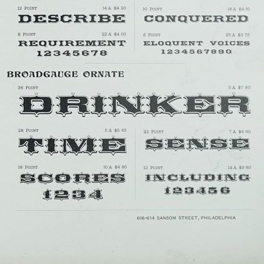
Broadgauge, Mackellar, Smiths & Jordan Branch #typespecimen
8 notes
·
View notes
Photo
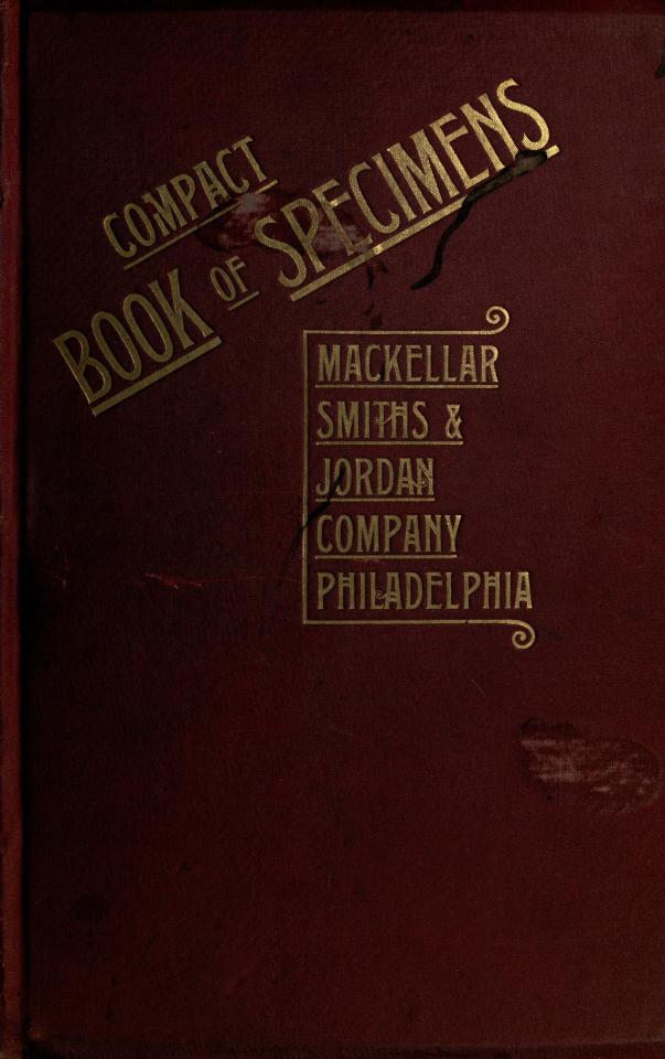
Compact Book of Specimens
1892 :: Philadelphia :: Mackellar Smiths & Jordan Co.
Specimens of printing types and ornaments from Mackellar Smiths & Jordan Co., in Philadelphia
0 notes
Text
Typography research
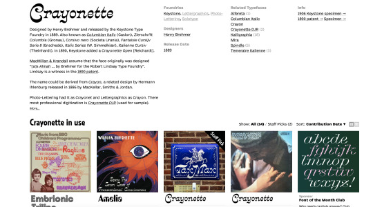
Now that I have my content for the book finished, I need to start researching and looking at typography to use for the book. I found these two typefaces on the website Fonts In Use. Herold AKA Reklameschrift Herold was first cast in 1901, which is around the same time period that Weber was film making. The style of the typeface also really reminded me of the ones used in film posters of that era - bold, condensed, typically used for titles and headings. It would contrast well with a serif body copy.

Crayonette was designed by Henry Brehmer and released by the Keystone Type Foundry in 1889. The name could be derived from Crayon, a related design by Hermann Ihlenburg released in 1886 by MacKellar, Smiths & Jordan.
I really love the feminine feel to the typeface, maybe because it looks slightly italic, and the curled tails and terminals. This typeface is relevant because it was created in a similar era to Weber, 1889. I can definitely see it being used for big headings and titles.
0 notes
Photo
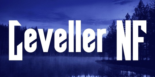
Leveller NF A typeface from the 1883 MacKellar, Smiths and Jordan specimen book, called Roundhead, offered the pattern for this rollicking headline face. Both versions support the Latin 1252, Central European 1250, Turkish 1254 and Baltic 1257 codepages. Publisher: Nick's Fonts on Monotype
0 notes
Photo

Kellar was named after the multi-talented Thomas MacKellar (1812-99), associate owner of one of the nineteenth-century leading American type foundries: MacKellar, Smiths and Jordan (MS&J). Not only was he a published author and poet who came to manage the composing room floor, but he also was the founding editor of the Typographic Advertiser, M&SJ’s house organ. MacKellar introduced the practice of composing humorous riffs to print as sample text in specimen books. Kellar started as a synthesis of various Condensed Titles cuts found in MS&J’s Printers’ handy book of specimens (1871). • #Kellar #typeface #typedesign #typography #font #type #design #graphic #graphicdesign #letters #editorial #thedesignblacklist #generaleclectics #thebrandidentity https://www.instagram.com/p/B5ry53dB_8g/?igshid=6wkpf2nxpeax
#kellar#typeface#typedesign#typography#font#type#design#graphic#graphicdesign#letters#editorial#thedesignblacklist#generaleclectics#thebrandidentity
0 notes
Text
Reading Type Specimens Aloud
JUNE 4 6:00PM Room 108 FREE
Art Department at Parkway Central Library / Free Library of Philadelphia
Have you ever looked at type specimen books and felt the urge to declaim their contents? You are not alone!
The Free Library of Philadelphia holds hundreds of examples of late 19th and early 20th century books assembled by type founders to display the varieties they produced. Many among them were created by local foundries like Philadelphia’s Mackellar, Smiths & Jordan. If you’ve perused them before you know they range from the functionally repetitive to the deeply lyrical.
Join The People’s Museums of Philadelphia for a close look at many type specimen books from the library’s collection and an opportunity to read or listen to readings from them.
EVENT LINK
Registration encouraged: http://readingtypespecimens.eventbrite.com
0 notes
Photo
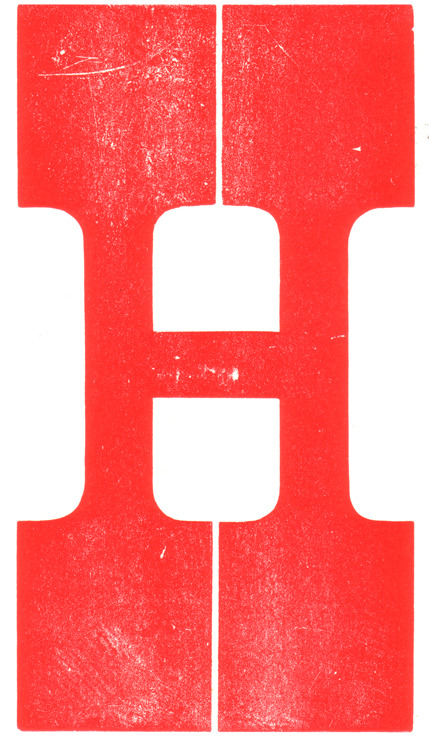
From Letterpress Daily:
“36 line French Clarendon No. 2
This heavy, bracket-seriffed Antique derivative was first shown as wood type in 1873. The American type foundries had been showing unbracketed Antique faces called French Clarendon since at least 1867. In fact, a 1997 reproduction of a 1869 MacKellar, Smiths & Jordan specimen shows four sizes of a French Clarendon that is bracketless and significantly lighter than this wood version.
This H is from a complete, router cut, end grain, caps and figures font produced by Wm. H. Page & Co."
2 notes
·
View notes
Photo

b&r no.1
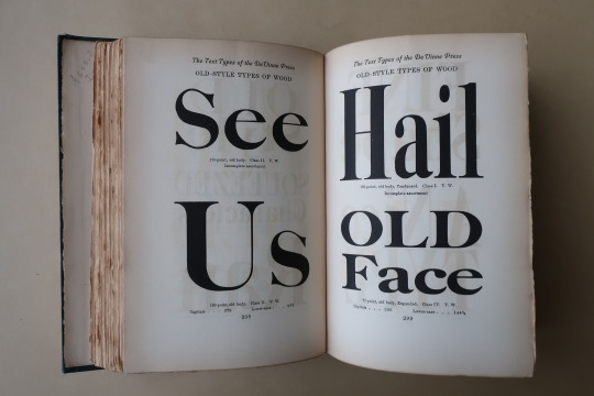
d.b. updike’s advice on acquisition of material for a printing office: «A third type (which originated with Binny & Ronaldson of Philadelphia over a hundred years ago) is in design transitional between old style and modern face. For books where the old-fashioned air of Caslon would be to obtrusive, and yet which call for a letter more interesting in design than the somewhat bald Scotch face, there is nothing better. I should not advise the purchase of this transitional series at the expense of the first two types chosen, but it will frequently do the work of either. … It is called ‘Oxford’ by the American Type Founders Company, from whom it may be had. I have used it for this book [first illustration]. It seems to me a type of real distinction.» [Printing Types, 2nd ed., vol ii, oup, 1937, p231].
a.f. johnson confirms: «The roman which Updike used for the text of his Printing Types, called ‘Oxford’ and originally cut by Binny and Ronaldson of Philadelphia, seems to have some affinity with Austin’s¹.» [Type Designs, grafton & co., london, 1959, p74].
in the same year as the 1892 merger that constituted the american type founders company [atf], joseph warren phinney, atf vice-president & former partner in one of atf’s original constituents, the dickinson foundry of boston, advocated revival of the b&r no.1: repaired & augmented with additional sorts, b&r no.1 was reissued as atf «oxford» (but what has this face to do with oxford—presumably the university? ² ). «oxford» is not shown in atf specimen books of 1897 or 1923 (nor do i find b&r no.1 material in the huge mackellar, smiths & jordan book of 1892 ), but was available for special order into the 1960s. the atf oxford matrices (what of binny’s punches? [✓]) now repose in the smithsonian institution.
in 1946, in order to provide historically allusive faces for planned publication of The Papers of Thomas Jefferson [princeton unversity press, 1950], p.j. conkwright, then art director of the princeton university press, advocated adaptation of atf oxford for the linotype; c.h. griffith, then a vp at mergenthaler linotype, designed a b&r no.1 revival: linotype monticello, named in reference to the publication of its first showing. in 2003 linotype issued a digital version of monticello, based not upon the earlier linotype revival but on matthew carter’s redrawing, afresh from the atf oxford material [cf. ‹Monticello Typeface›]. for an allusive composition set in monticello vide ‹perdita›.
1st illustration: excerpted from Printing Types [updike, op. cit., p241]; oxford types.
2nd illustration [iphone photo]: showing of long primer no.1 roman & italic [Specimen of Printing Type, from the Letter Foundry of James Ronaldson, successor to Binny & Ronaldson. | Cedar, between Ninth and Tenth streets, | Philadelphia. | 1822. [Am 1822 Ron 17455.O.1]. for the largest size of no.1, long primer, binny cut a variant, more cursive, italic p; & note the dollar sign—binny was the first to engrave this famous symbol.
with thanks to the library company of philadelphia for permitting my examination of their extremely rare binny & ronaldson material.
⎯⎯⎯⎯⎯⎯
¹ johnson refers to the types cut by richard austin of london for london publishing pioneer john bell—vide ‹the letters of john bell›. the roman also shares affinity with baskerville’s—e.g. unclosed loop or bowl of g. updike affirms bell’s type but has no knowledge of bell: «The two upper sections in our plate (fig. 367) are set in a transitional font, which is, both in roman and italic, a fine and workable letter.» [updike, op. cit., p.243].
² latterly i discovered, harry carter posed the same question in his review of The Specimen Books of Binny and Ronaldson, 1809-1812, in facsimile [introduction c. p. rollins, the columbiad club, connecticut, 1936] in The Library [volume s4-xviii, issue 1, june 1937, p118].
#typography#binny & ronaldson#american type founders#daniel berkeley updike#theodore low de vinne#linotype#c.h. griffith#p.j. conkwright
4 notes
·
View notes
Photo
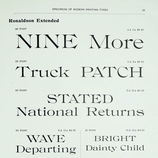
Ronaldson Extended by Alexander Kay MacKellar, Smiths & Jordan, 1884 #typespecimen
2 notes
·
View notes
Photo
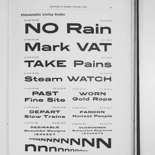
Philadelphia Lining Gothic by William Jackson #typespecimen from MacKellar, Smith & Jordan approx. 1895
88 notes
·
View notes
Photo
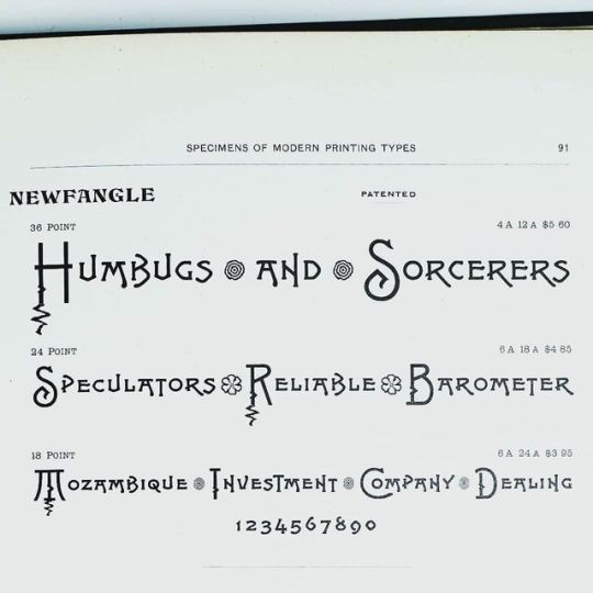
Newfangle by Hermann Ihlenburg, 1892 for MacKellar, Smiths & Jordan #typespecimen
11 notes
·
View notes
Photo
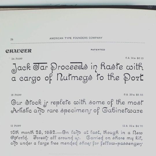
Chaucer by Hermann Ihlenburg for MacKellar, Smith & Jordan, 1883 #typespecimen
6 notes
·
View notes
Last Seen Blogs

funwithbodys
funwithbodys

kissingmendotcom
Untitled
funwithbodys
funwithbodys

amirbenbouza
Amir Benbouza