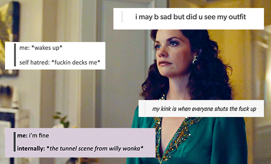
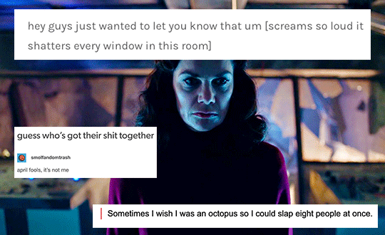
#photoshop gave up on me multiple times during this edit so it took me 2 days for something that shouldve taken me 2 hours
Text


Masriel + Tumblr text posts 2/?
(part 1)
#his dark materials#hdm#masriel#asriel x marisa#marisa coulter#asriel belacqua#shitpost#tumblr text posts#i decided to continue this travesty#if masriel were on social media it would look like this 😂#props to you if you can manage to read it all!#i couldn't choose so I just used them all that's why some of these are supertiny lmao#this is all way funnier to me than it should be#i should just make normal gifsets like a sane person#photoshop gave up on me multiple times during this edit so it took me 2 days for something that shouldve taken me 2 hours#hdm edit#mine#masriel edit#this looks more like a book than a gifset#ruth wilson#james mcavoy
144 notes
·
View notes
Text
#showyourprocess
From planning to posting, share your process for making creative content!
To continue supporting content makers, this tag game is meant to show the entire process of making creative content: this can be for any creation.
RULES: When your work is tagged, show the process of its creation from planning to posting, then tag 5 people with a specific link to one of their creative works you’d like to see the process of. Use the tag #showyourprocess so we can find yours!
Thank you so much to @cloudylotus and @wendashanren for tagging me for this set ❤ (please check out their respective posts here and here as well 🥰) and to the members of mdzsnet who started this!
1. Planning
I try to alternate between gifsets based on quotes and gifsets based on a single scene for the cql edits I create! This is because the ones based on quotes require significantly more thinking for me to come up with scenes to fit, alongside getting all of them to adhere to one colour scheme and then inserting the typography, rather than just me focusing on a single scene 😅 This time it was time for me to pick a quote, which I usually do from my #words tag on my tumblr where I like to collect poetry I resonate with.
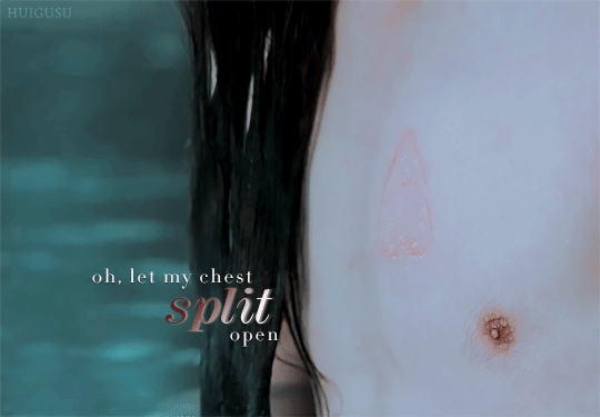
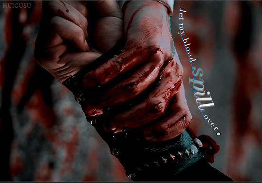
“Oh, let my chest split open, let my blood spill over, body be still! I’ve bled for you, and you won’t even show me your face.” - Yi Kwangsu (via skogenflicka)
For the quote used in this set, I had thought that it fit wangxian so I had already tagged it to find later 😄 I also searched it up to read a little more on the background of the story and author and was surprised to find that it was from a short story on gay, unrequited love, which made it somehow more appropriate as I wanted to fit lwj’s perspective during his mourning years.
To select the scenes, I split the quote up into four lines and wrote the summary of the the scenes that demonstrated them quite literally, as in the things lwj did for wwx out of love even when wwx was pushing him away, + ep number and timestamps for easier gif creation. I knew that I wanted to focus on text effects too so the 3rd gif was specially picked for the horizontal movement of lwj across the frame.
2. Creating
- oh, let my chest split open (wen brand at the cold springs)
- let my blood spill over (blood running down his hand as he holds onto wwx)
- body be still! (lwj holding the rods as punishment for visiting burial mounds)
- i’ve bled for you, and you won’t even show me your face. (wwx pushing lwj’s hand off his and turning away)
I use Handbrake to isolate the scenes I want and then Photoshop to import and pare down the number of frames. I favour larger gifs, especially so that there’s room for the typography, so these were the usual 540px ratio across for cropping. For the first gif in this set, I didn’t have the special episodes downloaded so I used a screen recorder to get the needed frames of lwj’s chest brand! I remember not being happy enough with the length/framing of the brand from the regular episodes. I didn’t cut out his nipple and so many tags I see talk about it 😂
Colouring
Okay so! I knew I wanted to try out a darker colouring as the ones I do are more bright, so I went to look for tutorials and I found this psd that had a good effect for what I wanted after I modified/removed many of the layers. I wanted to work with existing colours already within the chosen scenes rather than modifying or emphasising them to go with the muted, anguished mood of the quote. The colour scheme thus became dark, maroon red (wwx) from the blood and wwx’s tassel, as well as turquoise (lwj) from the water and lwj’s robe. I then added a channel mixer layer and selective colouring layers to make the turquoise of the waters that the psd had removed stand out more, and then another vibrance layer and an additional selective colour so that I could match the blues/reds across gifs. Thankfully, I could copy this colouring over to the other gifs with a few alterations of hue/saturation, curves and levels 😊 After colouring, I resize, denoise, and sharpen the gifs.

Typography
I really wanted to work with some text effects and get out of my comfort zone in this one. In line with the three parts of the first line of exclamation in the quote (and the parallel structure for the first two parts which I found hit so hard 😭), I wanted to highlight the alliteration I found in them - the words ‘split’, ‘spill’, and ‘still’. For the first two gifs, I decided on linear gradient overlays at 45 degrees + taupe drop shadows with the colour from the colour scheme other than the colour already in the gif. In the second gif, I used the pen tool to draw a line (in blue below!) that followed the curvature of their hands, then pasted the text in. I realised that I had to draw a separate line for the word ‘spill’, which after a lot of trial and error turned out to be much simpler after turning off the first pen layer visibility (the new line kept connecting to the first 😓)
As for the third gif, I initially thought of masking each frame to make the words appear as lwj moved from left to right, then I remembered that using the ‘overlay’ blend mode on the text hides it when it is on top of the colour black! 😄 In this case, lwj’s hair is black so I just had to position the words properly so that the words ‘body be’ would reveal themselves while giving time for the word ‘still’ to also have a nice effect after. (If you look closely you can see them a little in lwj’s hair 😅) The word ‘still’ took a lot longer to figure out, but in the end using ‘difference’ for the overall text layer and ‘pin light’ for the dark maroon colour overlay gave the clearest dark red effect as the camera panned.

Finally, in the last gif, I wanted to have the effect of the word ‘face’ change from a dark maroon gradient to turquoise with wwx’s hand moving lwj’s away to have it be a bit symbolic I guess 😅 of wwx’s leaving lwj? The ‘linear burn’ setting for the overall text layer (solid turquoise) and ‘difference’ for the gradient overlay (maroon) ended up working best to make the red disappear the moment wwx’s hand ran over the word, unlike other settings where the colour looked mixed/too messy.
3. Posting
I usually save the gifs and look at them on tumblr to see if I need to adjust any colours to match better or make them more vibrant (and ask yan what she thinks HAHA). These were fine, so I wrote the caption to summarise the source of the quote, added links to research and the op of the quote on tumblr, and wrote my tags. If it’s a post with translations of what the characters are saying/from the novel I typically take more time to edit the translations/do my own translation. I check if it is loading fine on mobile and edit the saved draft if necessary, then I post! 💕
Tagging but no pressure please!! 💗
@lanwuxiann for this amazing wangxian wedding night edit 🤧🤧🤧 that had me yelling into my pillow
@inessencedevided for this heartbreaking nie brothers set (which included manhua scenes!!)
@lan-xichens for this really lovely wwx + lotus pier edit, the colouring of which i think about from time to time
@mylastbraincql for this gorgeous jyl set with soup set with such pretty blending
@still-snowing for this beautiful piece of wangxian art about lwj holding wwx’s hands through the years that i teared up over multiple times
#showyourprocess#phew thank you for reading the whole way if you did!!#and thank you jasmin and ali for the tag#❤❤❤#tag game#tw blood#tw scars#gifmaking
17 notes
·
View notes
Text
The Top 10 Scariest REAL Ghost Pictures And The True Stories Behind Them That Will Make You Lie Down And Cry (Promise)
Proof.
We’ve spent hundreds of years looking for proof.
We’ve untangled paranormal theories, we’ve pieced together ghost stories, and some of us have even fabricated reality in the inexorable search for the evidence that there might just be more to this realm than first seems.
But the thing about the proof of the paranormal is that we can never be sure of what’s real, and what’s five minutes with a broken flash button and Photoshop.
Then again, there are some photos which stun even the most ardent non-believers into a haunted silence, in particular those images which bare no scars of editing.
The whispers of ghost stories and the murmurs of urban legends mean nothing when compared to the physical evidence of the afterlife, and that’s why these photographs documenting the paranormal - whether fake or fo’ real - have garnered so much attention, especially in the Internet Age.
Many have claimed to have captured footage of ghosts, sightings of demons, and the murmurs of the supernatural on camera, and many like to emblazon their efforts with the necessary clickbait needed to boost their subscriber count.
But there are some images of the paranormal that have stood out through history, even if they hadn't GONE SEXUAL GONE WRONG (PRANK).
There are some images of the paranormal we simply cannot explain.
But we can try, right?
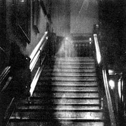
#1 - The Brown Lady Of Raynham Hall
It’s a dark, grainy image taken with the best technology this side of 1936 has to offer - and it’s one of the most famous pieces of evidence supposedly proving the existence of the paranormal.
On the evening of September 19th 1936, Captain Hubert Provand - a photographer for Country Life magazine - was taking photographs of Raynham Hall for the magazine. But while he was busy tending to another task, his assistant saw something rather peculiar.
It was a silvery vapour that took the shape of a woman. She was moving down the stairs towards them, and was in perfect alignment of the camera.
The assistant quickly told him to take a picture. He did.
But if the image alone isn’t enough to keep you having nightmares for the rest of lockdown, I’m sure the fact that this picture shows one of the most famous ghosts resident at Raynham Hall will certainly do the trick.
The Brown Lady was first seen in 1835 at Christmas.
Multiple sightings of the spectre were recorded by visitors to this Norfolk country house who’s history has spanned 400 years. It was her brown dress that gave the spirit her name, but it was the dark and empty eye sockets and glowing face that secured her reputation as one of the famous spirits in the UK.
It was shortly after this first set of sightings that a large portion of the staff left Raynham Hall, confirming this might not be the sole murmur of spirits at Raynham Hall. The next famous sighting took place in 1926, when the son of Lady Townshend, a noble of the family that had owned this house for the entirety of its existence, saw her on the staircase she would be seen on ten years later.
She would be the first person to identify the Brown Lady as Lady Dorothy Walpole, and she would be the first to point out the tragic reality of this haunting.
Walpole - born in 1686 - was known for being the second wife of Charles Townshend, a man infamous for his violent temper. This was to be revealed to her when he discovered she was having an illicit relationship with another man, Lord Wharton.
He locked her in a room in Raynham Hall, and it was here that she stayed until the day that she died.
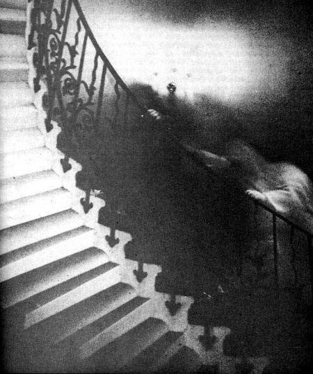
#2 - The Tulip Staircase Ghost
The Brown Lady is not the only supernatural entity that let her guard down whilst using a staircase.
Regardless of how those from beyond the grave like to traverse their former family homes, we can all agree that this is one of the most haunting images to make it to this list - and it’s all the more terrifying knowing that skeptics have proven this image has not been tampered with.
I repeat, not been tampered with.
Tulip staircases are an incredible feat of construction, and create a perfect swirl when seen from the top - but this spirit hit the jackpot of British architecture. They were haunting Queen’s House (Greenwich).
In 1966, a retired reverend and his wife visited the tourist destination. Upon their visit, they took a picture of the famous staircase known for its finesse and beauty - but little did they know this image would alter the course of paranormal investigation forever.
Having returned to their home nation of Canada, they developed the images they took. But in one of them was something odd:
A shrouded figure gripping the handrail and attempting to ascend the stairs began to emerge from its shadows.
Unfortunately, that’s about as much evidence of a potential spirit at queen’s house as we have. Seances have been conducted, vigils have occurred, and nights have been spent there to capture evidence of the spirit.
All we have is some bloke in 2002 seeing something in a white-grey dress glide across a balcony, and plunge headfirst through a wall.
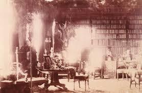
#3 - Lord Combermere Sits At His Desk
It’s an incredible image, isn’t it?
Shadows linger in the late afternoon sun, bright light reflects off the leather furnishings - it honestly took me a while to work out which spectre I was meant to be looking at. But there you can see him, sitting in the large chair on the left of the photograph.
This picture was taken in the library of Combermere Abbey in Cheshire, and it was taken by Lady Sutton who was renting the Abbey for a personal stay. She was able to take this one-hour exposure as the house was empty - the entire family and staff were at a funeral that day.
But it turns out the guy being mourned failed to turn up to the ceremony.
That’s him in the picture.
That’s Lord Combermere.
Once the image had been developed a year later and Lady Sutton had noted the translucent figure she showed the residents of the Abbey. They immediately noted its likeness to their late father. In fact, the spirit was sitting in his favourite chair.
The coincidence doesn’t end there, however; some claim we can only see his torso in this image and not his legs. It is believed that this is related to the manner of his death from which he was run over by a horse-drawn carriage, an accident that caused serious injury to his legs.
(Ouch.)
#4 - Freddy Jackson Is Pictured With His Squadron
This picture was taken in 1919 by Sir Victor Goddard of his squadron and appears to show a typical photograph from the early 20th century. But the translucent face appearing behind one of the squadron members in the back row makes this post-war image stand out in a whole new light.
Apparently this image shows the face of Freddy Jackson, a member of the squadron. But the thing is, he died a few days before the image was taken having walked into a moving propeller.
(Ouch.)
But this isn’t the spookiest thing about this picture.
Goddard was actually best known for his interest and experience with the paranormal - even outside of snapping this pic. The most famous experience he had was a clairvoyant episode in 1935:
He claimed he had a vision at RAF Drem - an airfield in Scotland - which showed it as an active airfield in operation despite it being abandoned at this time. By 1939 it was in use, confirming his prophecies. He also foresaw the death of an officer in 1946, a prophecy that not only came true, but also inspired the film The Night My Number Came Up (1955).
He would spend his post-war years lecturing on the existent of UFOs.
#5 - Madonna of Bachelor’s Grove
Sightings of the Virgin Mary have always piqued interest in us mere mortals, drawing together the potential for the believers in the paranormal and Christianity - but this image leans much closer to those seeking out the supernatural.
The Ghost Research Society Of America was investigating Bachelor’s Cemetry in 1991 when their equipment showed strange readings.
There was a spirit nearby.
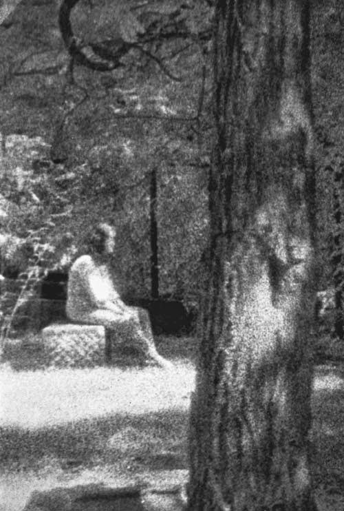
The researchers quickly took pictures in an attempt to catch a glimpse of the spirit in question, but at first saw nothing out of the ordinary. It was only when the image was exposed that a female spirit in white clothing was seen sitting on one of the graves.
(Photographs capturing the paranormal at graveyards often show spirits sitting on graves.)
But what makes this image a rather notable piece of evidence is that this isn’t the first time a woman in white has been seen at the cemetery. A variety of manifestations have been reported, including a phantom farmhouse, ghost monks, a two-headed ghost, but the White Madonna’s story is the most famous:
It is said she is most often seen walking the grounds during the night of the full moon and carries an infant around the gravestones.
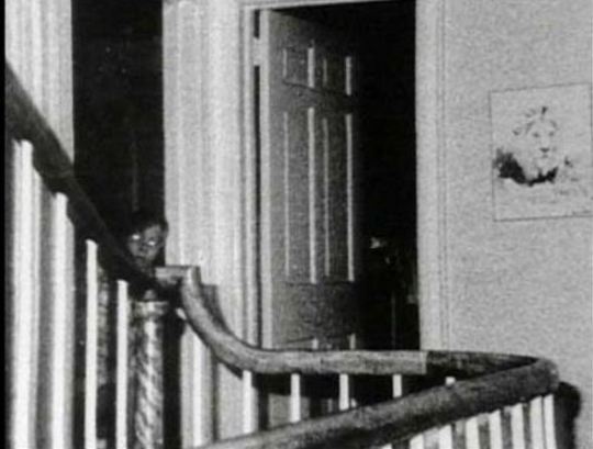
#6 - The Amityville Ghost Boy
It’s one of the most famous images documenting the paranormal - and it’s one the most disputed, too.
The story goes that in 1976 a picture was taken at 112 Ocean Avenue.
(For those new to the world of all things horror and haunted, this is the location of the Amityville Horror.)
This picture was taken by Gene Campbell, a photographer who was working with paranormal investigators - including Ed and Lorraine Warren - looking into the activity supposedly occurring at the house. As a part of his duties, he set up an automatic camera that took infrared pictures in an attempt to snap somethin’ supernatural.
He was successful.
This picture was taken on the second floor of the house, and it shows a young child in what appears to be pajamas with bright, glowing eyes.
It is believed that this is the spirit of John Defoe, one of the children murdered by his older brother only a few years before the next residents of the house - the Lutzes - moved in, and began to report paranormal activity.
On the other hand, some claim this photo shows an investigator working with the Warrens who happened to be captured by the camera. But given the size of the face and the height we can see, this appears to be the spirit of a child.

#7 - Waverly Hills Sanatorium
It’s the ultimate urban legend:
*Lights up face with torch*
An abandoned TB hospital is haunted by ghosts of its past, whether it’s the former patients who suffered at the hands of the illness, or the doctors and nurses caring for them.
*Turns off torch*
Bu rarely do these stories have any evidence to back up the stories. Until now.
This picture was taken in 2006 in Louisville, and it was taken in one of the US’ most famous haunted locations. This image doesn’t just echo the eerie atmosphere often experienced by those visiting this former hospital, however.
It shows Mary Lee, a nurse who used to work at the location. But there is a twist in the tale.
This nurse had a relationship with a doctor also working at the sanatorium and soon fell pregnant. Unfortunately, he was not interested in having a relationship with her, and so she hung her in the hospital in grief.
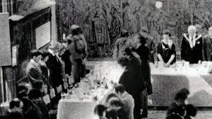
#8 - The Coventry Spectre
Coventry is a hotspot of horrors, from the dreary midlands skyline to the wasteland atmosphere engulfing all mortal souls that dare tread there. Trust me, I’ve lived there.
But it turns out there are more supernatural threats to those that might end up there that you’ll want to know about.
This picture was taken in 1985 and shows the Coventry Freeman Society in the midst of a lively event. But there, in the corner of the room, is a cloaked figure with his head bowed in unison with the rest of the attendees.
None of the attendees noted the presence of such a figure when this image was taken.
It is believed that this monk-like spirit could have been from the middle ages when the craftsmen association was founded. Indeed, the hall the photo was taken in goes back to the 14th century.

#9 - The Phantom of Newby Church
Just like that of Amityville, this image has been subject to a lot of debate given the figure’s costume-like appearance, as well as the claims that this figure is almost posing for the picture.
But the fact it was taken in 1963 when such technology was limited and that experts say it hasn’t been subject to a double exposure confirms this image might be showing us the dark side of historic location.
Also known as the Newby Monk, this entity is believed to be a 16th-century monk with a shroud over his face to disguise disfigurement. But this still isn’t the scariest thing about this image.
Given the height of the other objects including in the image, it is believed this figure would actually measure 9 feet tall, making him far bigger than even the tallest humans ever recorded, suggesting this entity might have been a much more inhuman entity that you’d expect to turn up in The Conjuring universe.

#10 - An Aboriginal Woman At Corroborre Rock
Some of the most striking ghost stories known to man are based on the details of our history. And this photograph gives a voice to a history often forgotten.
This photograph was taken in 1959, and features one of the most famous spots in Australian Aboriginal history. It is said brutal ceremonies were carried out by Aboriginal tribesmen at this location, perhaps explaining the forlorn figure in the picture.
The melancholy stance is especially true given that this image shows the spirit of a woman; this location was considered spiritually dangerous for women, children, and uninitiated men to attend.
Although many claim software could’ve manipulated the image, the lack of human activity around this location at the time still raises the eyebrows of believers and skeptics alike.
***
Evidence of the paranormal is still one of the most hotly debated topics on the planet, bringing together our firm trust in science and our personal beliefs regarding what might just exist.
But despite the debunking, the discussions, and the deliberate doctoring of images, one thing is for certain:
It was the dead that first used Facetune.
#snatched

Are you a ho’ for the haunted? Is you a slut for spooky? Follow this blog, and let’s bring shame to our societally-enforced gender roles together (and share ghost stories at the same time, obvs)!
#ghost pictures#ghost photos#ghost images#ghosts#paranormal#supernatural footage#the conjuring#real ghost pictures#real ghost stories#True Ghost Stories#haunted picture#amityville ghost picture#real ghost photos#real ghost images#spirit photography#horror ghost images#paranormal photos#ghosts caught on camera#paranormal caught on camera#real ghost caught on tape#paranormal proof#video evidence of paranormal#Best horror movies 2019#horror movies
34 notes
·
View notes
Text
Evaluation
Project Outline
For my personal project I wanted to produce a series of 10 images that represent the current covid-19 situation in relation to the feeling of being trapped in one’s home; the feelings of wanting to be outdoors again. I wanted to show this by combining the indoors and outdoors through editing techniques. The Brief is broken into 4 stages. Stage 1 (workbook exercise), stage 2 (plan), stage 3 (development) and stage 4 (evaluation).
Planning and Research
When originally thinking of my plan I was set on creating studio still life as I feel this is where my strengths are, and where I was genuinely interested in exploring. Covid-19 spread quickly and restrictions came into force just as fast. It soon became clear to me that studio was no longer an option and I had to create a plan with the knowledge that the UK could go into full lockdown.
My plan was created with this knowledge and understanding at the time, of the current covid-19 medical crisis. I Made the plan so that I could still work on my project even with the restrictions. Suddenly doing still life no longer interested me. I wanted to create something that was representative of what I, and many people across the world were feeling. In other words, I felt that this was a unique situation and It grasped my imagination more than natural daylight still life.
I had an interest in creating images with multiple exposures, so I began to research photographers that used these techniques. The main photographers that I was inspired by were Florian Imgrund, Christoffer Relander and Duane Michals. I picked these photographers for their artistic use of multiple exposures as it was the techniques that I wanted to apply to my images.
This gave me the idea to create the inside/outside contrast in my images. I thought it would be a good idea to shoot local parks and portraits of me inside to show that I was trapped and reminiscing.
When researching Duane Michals work I discovered that he often used series of images in such a way that tells a story. I knew that I wanted to tell a story with my images, I felt this made simple images interesting; each image unlocking a little bit more about the story.
Modifications/Plan
By the time I got my plan back even more restrictions where in place meaning I had to make modifications to my ideas.
I wanted to shoot in my local contrary parks however due to the new restrictions, public parks had been shut and only one hour of exercise a day was allowed. I knew that I had to modify my plan if I wanted to take natural texture shots and of trees like Christoffer Relander. I came to the decision to shoot in my back garden instead. This would be a safe environment for me to shoot. Although you’re technically allowed out for a walk everyday (I could go out a walk, bring my camera and take images of trees outside) I didn’t want to risk my health, or my households health for pictures of trees, and only wanted to go out if it was essential.
Modifications/Development
My first 3 shoots where heavily inspired by Christoffer Relander’s oil exposures. The technique Relander used, (multiple exposures) I set out to use in my aim for my project. The unhuman aspect of the images didn’t tell the story I wanted to tell. I noticed that I missed one key aim that I set out in my plan. I wanted to explore the feelings of being trapped in our own home. I knew that I had to incorporate a human element to the images, or this message will not come across. I then took more inspiration from Florain Imgrund and created portraits to add the human aspect into my images which followed my plan more effectively. The added restriction made my aim more relevant as the nation began to stay indoors.
When looking at my schedule in my original plan I strayed drastically from it. I created my timeline so that I would be taking a texture shoot with every main image shoot, back to back. However, when doing my first 3 shoots I noticed that I had more than enough texture images to work with. This meant that I was doing far less shoots than I originally thought I would. I had one other texture shoot after the first 3, and this was of the flowers that had newly bloomed in my garden. I did not set out to get pictures of flowers originally, but I felt they were to beautiful not to include.
I began taking portraits and liked the way that they where turning out without the multiple exposure. I changed my mind and set out to take images showing the feelings of being in isolation, but not specifically to the longing of wanting to be in nature (as I originally set out).
By the tenth shoot I decided to edit the nature texture shots over all my images to see how they would turn out, to honour my original idea, and because of feedback from peers. I was sure before editing that I didn’t want to add the natural textures on all my images. Once I was finished with editing I felt my images looked more coherent and interesting. I realised that my original idea was the way forward and decided to go down the path of natural multiple exposed images. I learned that even if you think something may not work, it can be worth trying it anyway because it could work out better than you thought it would.
Presentation and Finish
I partly edited my images as I shot. When reflecting on it, I’m glad I did. This gave me more time at the end of my project to consider presentation, as my images where already mostly edited. Should I have left all my editing to the very end of all my shoots, then edited my images all at once; I could have become tired of editing. Editing as I went along made the project more manageable for me.
I experimented with different sequencing for my final 10 images. I wanted the sequence that told the best story, as this was one of my aims from my plan. I am happy with the sequencing that I chose as I feel it makes the most sense.
Although our images will not be printed, I still thought deeply about what I would do if I was going to get them printed. I created some mock-up images on photoshop to show how my images may have looked in their target market. This looked effective and helped translate how my images would have presented in print. This made the images feel more real and three dimensional.
I considered the scale and paper type I would be using for the prints. I came to the conclusion that I would print all images A1. I think A1 would be most effective as it is large. The large image would catch the viewer’s attention therefor making more of a visual impact.
I also considered the three images which I would exhibit and what size/layout I would want them to be in. I opted for 2 A1s with no borders and on mount board, and one A0 with no boarder and on mount board. I am glad I consider these factors even though sadly I will not be printing my final images.
Obstacles
Not being able to use college facilities was by far the biggest obstacle in this project. I had to completely reconsider what I wanted to shoot and use what I had at home to create quality images. I am thankful that I have a good camera and some good lenses. However, the light I had available to me was mostly natural light or tungsten light. The way the light shines through my house was also an obstacle as I only had one well light area in my house which was the dining room. The other rooms windows where too small or in the shadow of the houses across the road; minimising the amount of light getting in. I worked round this and made sure to shoot at the time of day/sunny days where I was getting the brightest sunlight.
The other obstacle was technology. I was relying on my laptop for editing my images and struggled greatly with my laptop freezing and crashing. It runs photoshop extremely slow. I got over this by constantly saving my work to protect it in the event of my laptop crashing. I also made sure to only have one page open at once if I could on photoshop to make it a little faster.
Motivation was also a big obstacle. I struggled to have enthusiasm to experiment and take images as the current situation disrupted my usual routine. I was no longer working and attending classes my sleep schedule was all over the place. On top of that the constant Covid 19 updates on the news everyday makes being motivated difficult. I tried to view the graded unit work as something to do during quarantine and eventually it helped take my mind off things and I felt motivated to shoot again.
Skills Gained/Developed
Before the project I had never created works using multiple images before, so I was new to the technique. I have now learned how to digitally develop multiple images (multiple exposure) on photoshop.
I have learned a great deal about portraiture/figure photography. Before this Graded unit I was not confident with my portrait photography however the project has allowed me to understand how angles and perspective effects the portrait. I found that when taking images at a lower angle it created an unflattering perspective on my face, but if I was to use a lower angle on a figure shot it would make me look taller and more flattering.
I learned how to create mock-ups on photoshop. I had researched tutorials online and on YouTube. For my final presentation and consideration of print I wanted to show my images in their target market. To do so I knew I would have to create mock-ups on photoshop. I had never done this before and with some research I learned how to create them. I think they look highly effective and this is a skill I will use in projects to come.
I have developed my planning/researching skills in this project. I thought thoroughly about what exactly I wanted to shoot and why I wanted to shoot it in my plan. As well as researching some great photographers that relate back to my plan. In previous projects my planning was not as thorough and this caused me to struggle through the developing stages, I was not always completely set on an idea or where I wanted to go. I have developed my planning skills and it has greatly helped me throughout my entire project.
My conceptual ideas were something that I feel really flourished in this project. I have always considered myself to be creative however I found with most of my projects through the year I often struggled with concepts and ideas. This was something that I really wanted to develop. I was able to develop that in this project as I had many shot ideas. I organised my thoughts better and when an idea came to mind, I made sure to write it down in my notes so that I wouldn’t forget it.
Areas For Improvement
File management is an area I need to improve on as I did not always save all my shoots on the SD card and into a USB or on my computer. I also need to be more organised with folder management on my computer both in terms of labelling and clearing older file versions. I Feel this is something that I will always have to continually improve on as I know how important it is to have organised folders and backup copies of your work.
Time management is another area I feel I could improve as I often find myself working right up to deadlines. I am prone to procrastinate and this reduces the potential time and options for my final work. Improved time management would prevent me from getting overly stressed with deadlines.
Conclusion
In conclusion I am very happy with how my images turned out and I’m proud of myself for continuing to create work in this very unusual situation. When discovering that we would be required to create a project through these difficult times I felt stressed and overwhelmed as I knew I wouldn’t be able to do what I originally wanted to do with my project.
When I got the motivation and began creating images which I was proud of I couldn’t stop thinking and working on my project and the ideas I had for it, it soon became a great inspiration during the long period of lockdown.
I am happy with what I have learned throughout this project and I know I will be using all the new techniques in projects to come. I still have many areas that I would like to develop further to improve on and whilst I am proud of my work and my final 10 images there is always room for improvement.
Overall, I enjoyed this process and will continue to take more images throughout lockdown to pass the time.
1 note
·
View note
Text
20 Years.
Two-thirds of a lifetime ago, a ten-year-old boy in a scratchy wool sweater sat huddled under an old down blanket. The first proper snow of the season had come the week before, and the boy hadn’t been dressed for building forts. Now here he was - bored, sick and sweaty. His mother entered the room with a mug of undrinkably hot milk with honey and butter. In her other hand was an issue of GAME.EXE, a computer gaming magazine. The words “HALF-LIFE” were plastered across the bottom of the cover. The boy loved reading, and loved computers, and the milk needed time to cool off anyway. He opened the magazine and flipped to page 8 after finding it in the table of contents. The boy grew older and switched languages, countries and continents, but his favorite game never changed.
-
It’s hard to compress two decades into text, but I will attempt to do so when it comes to my relationship with the Half-Life series that began all those years ago, with that preview article in that magazine.
The article was written in a second-person perspective that really stuck out to me, and was filled with screenshots that would later turn out to be of an unreleased rough beta version of the game. It ran through several dramatized, episodic descriptions of events in the game, then listed out the weapons used in the game, the enemies you would face and the tactics to deal with them. Finally, there was an interview with Marc Laidlaw himself. This single article was sufficient to make me completely insufferable to my parents for the next few months. “I want to play Half-Life,” I would say. At first, this meant asking to go to an Internet cafe a few blocks away from home, and for money to pay by the hour and use one of their beefy gaming PCs. Later on, it meant asking for a copy of the game, and for time on the “main” home computer - the only machine that could run the game at all, in glorious 320x240 resolution that gave me headaches.
-
A couple of years passed. The move to the US threw everything into a pleasant state of disarray, but the one thing that hadn’t changed was having to ask my parents to use the computer to play Half-Life. I had found one of my own soon after arriving in the States, but it had no sound card. It was there, on my mother’s computer, that I finally beat the game. My thirteenth birthday present was a copy of the newly released Opposing Force expansion. My birthday cake featured an edible photo of myself playing in a fountain in downtown Chicago, which my mother doodled over with brightly colored frosting. I was now knee-deep in toxic green sludge, a crowbar in one hand, and a proud Lambda logo on my chest.
Most kids in my 8th and 9th grade classes didn’t share my enthusiasm for Half-Life. They played console games and were rightfully hyped about the Playstation 2 and X-Box. In search of like-minded people, I took to the Internet. My options for getting online in 2001 were limited to libraries - either during lunch at school, or at the Naperville Public Library, which was a hour-long walk from home. I discovered Planet Half-Life, an offshoot of the Gamespy network. Through it, I discovered the fact that my favorite game was designed from the ground up to be moddable. I learned of Counter-Strike, Team Fortress Classic, and Sven Co-op. I discovered the Handy Vandal’s Almanac and The Snarkpit, two communities focused on level design. Having no reliable internet at home, I downloaded the level editor - then called Worldcraft - onto a floppy drive and brought it home to install. For the first time, I wasn’t simply playing the game. My parents looked on as I worked to figure out the obtuse user interface, trying to remember what I’d read earlier in the day. They raised their eyebrows when I finally managed to compile and run my first level - a hollow, unlit concrete box 512 units across with a single prefab trashcan hovering in the center. There wasn’t much more I could do in the limited time I was allowed to use the good computer, but I had caught the bug. My notebooks were filled with doodles of level layouts, my mind filled with cheesy storylines to match.
Eventually my family moved to a house with proper internet access, and I got a set of hardware with enough power under the hood to run both the game and the editor. It could even produce sound! All the things I could only read and salivate about were now within my reach, and I gorged myself on them. Counter-Strike quickly fell by the wayside, but Team Fortress and Sven Co-Op did not. Natural Selection came out and blew me away with how different a Half-Life mod could look and feel from the original game. I stayed up past midnight, playing, building, and playing some more. I learned that projects can die - when the extremely tongue-in-cheek Scientist Slaughterhouse mod went silent.
The release of the Half-Life 2 trailer took everybody by surprise. I had called one of my like-minded friends and we synch-watched it together, pausing every few minutes to let the video buffer and gush about how amazing everything looked and how much we were looking forward to messing with the modding toolkit. The subsequent beta leak and resulting delays taught me to be patient.
The move to California was not long after, and my patience was immediately put to the test as most of my belongings were stuck with the moving company, including my computer. I must have gone through a full pack of printer paper in less than a month, drawing up concepts and layouts for Xen Rebels, a mod centered around a semi-peaceful human colonization of the realm set after the events of Half-Life. Once my computer arrived, it was right back to the late nights and groggy mornings for me. Our home Internet was bad but workable, and I spent countless hours with the new and more creative mods that were being released, including The Specialists - a strong attempt to recreate the gun-fighting and martial arts stylings of Hong-Kong action movies in a multiplayer game. Around the same time I was introduced to the strange new world of anime, and decided that I simply must change the two throwable knives offered by The Specialists into kunai and throwing needles. This of course required me to learn 3D modelling. At the time, this was done with Milkshape 3D, a model editor compatible with most contemporary game formats. Once again, countless hours of figuring out the interface and the workflow followed, set to the calming tones of the Unreal, Deus Ex and Half-Life soundtracks. Creating models felt a lot more freeform than levels as I wasn’t constrained to a unit grid or forced to use convex geometry, and one day the new throwing weapons were in. I published the modified models on a forum to exactly zero fanfare. Around the same time, I began learning the basics of Photoshop in school, so modelling and texturing went hand in hand. To say my early textures were atrocious would be an affront to honest, hard-working atrocious textures the world over, but I continued my studies. My experience with working in 3D even netted me a 2nd place award at the school art contest - money which I immediately put back into upgrading my computer.
Half-Life 2 came out in November of 2004, to universal praise and celebration. I received the collector’s edition as a present for New Year, along with a copy of Raising The Bar. I beat the game the same morning, without a wink of sleep between unwrapping my present and the final darkness of the credits screen. The SDK didn’t ship with the game, but as soon as it was released I dove in. Soon after, the modding community blossomed, bigger and more vibrant than the original game’s, driven by the incredible flexibility of the engine. One of the first mods that appeared was made by a British man named Garry, and was called simply that, “Garry’s Mod”. It let players interact with the physics engine, and slowly sprouted more and more features. Many players used these features to pose character ragdolls, eventually creating entire comic series with storylines ranging from the comedic non-sequitur to dark and serious. Of course I felt the need to try my hand at it. That lead to the creation of The Plane - the story of Beet, a Combine Elite who managed to break free of his overseers’ indoctrination and find friendship, love, and revenge on his old masters. The only redeeming feature of that story was that it taught me how not to write stories.
I began getting more attached to the Gmod community than the expressly level design one at The Snarkpit. The few levels I publicly released were designed specifically as sandboxes to play and build in. The most popular ones were gm_orbit and rp_bahamut, maps set in space and featuring zero gravity for physical objects, allowing players to build smaller spaceships, or roleplay as the crew of a salvage and exploration vessel. Posting teaser images on the forums taught me a valuable lesson - what it felt like to be the one creating hype, instead of experiencing it. The constant demands were overwhelming. Some would simply want more work-in-progress screenshots. Others would drop ultimatums that unless a certain feature was designed a certain way, they would refuse to use the map. Others yet attempted to worm their way into getting the map early, offering to test it and provide feedback. I had almost deleted each project multiple times before finally releasing it.
Life happened, and things with Half-Life slowed down. When the Orange Box came out in 2006, I attempted to get it at a five-finger discount at a local Target. I got caught. Indirectly thought it was, Half-Life taught me that idiocy often leads to consequences. Buying it legitimately later in the year and playing through Episode Two reminded me that some stories aren’t written to end neatly.
It was in 2007 that I bought a membership for the Something Awful forums, and discovered an avid and very exclusive community of Gmod players. Over the course of the following decade, most of these people remained in constant contact with me, and will probably remain so for the foreseeable future. I became an admin once we opened our serves to the public - moderating the newcomers and mentoring the unskilled. One of the people had a project in mind, and I began creating models again. Miraculously, Milkshape 3D remained compatible with the Source engine, so I worked with it until I learned Maya. This project would eventually become known as Armored Combat Framework, and be released to the Gmod community at large. I learned how to iterate designs based on feedback, and how it felt to work in a well organized team.
Frontier happened around 2010, and was another lesson in teamwork - specifically what happens when things break down without role redundancy. Ambitions ran high, and the hype mounted. The programmer eventually left, and all that remains of the project is the very videos and images that were used to hype it in the first place, and a folder full of now-useless models, maps and textures. That was probably what prompted me to start pulling away from Half-Life and Gmod in general.
Black Mesa came out in 2012 and breathed a new life into my old obsession. I played through the original Half-Life again, then through the remake, noting the differences and the tweaks to make the gameplay more palatable to modern-day players. It felt good, like putting on an old but comfortable jacket. I’d fire up the SDK now and then, mostly to help newer, more driven designers. Two of the guys from Team Frontier went on to work in the industry full-time. There were whispers of a new game in the works, minor leaks of file and folder names hidden away in Valve projects. Episode 3 turned into Half-Life 3. A full sequel, rather than another short episode, as originally planned. “HL3 Confirmed” became a meme, but the people at the top remained silent.
Life kept happening, as it does. I lost people, I found people. I left home. Every now and then I’d fire up HL or BM again, or drop by the old Gmod server. I’d build things and model things, and release none of it to the public. I watched as the Dota International became the most widely spectated event in gaming, making players, sponsors, and Valve millions. The realization slowly started settling in. Then Marc Laidlaw retired, and later posted the Epistle. The workers at Valve spoke of a lack of direction and stagnation that comes with a cornered market. Modding for an engine over a decade old, no matter how advanced, slowed down.
It’s a different world now. Unity and Unreal engines rule the scene. Survival and Battle Royale have become the new buzzwords. Microtransactions. Loot boxes. Streaming integration. Freemium. E-Sports. Mobile gaming. Virtual Reality. If a new Half-Life were to appear today, would it be changed by the zeitgeist, or would it stay the course set by its predecessors? I don’t know. But there’s one thing that the escapades of a mute, bespectacled research associate have taught me more than anything else: hope.
2 notes
·
View notes
Text
Reflection 24/03/2020: Middle Stages
So, here we are in the middle stages of the FMP, or as I call it, the TFMP. Here, I’m going to reflect on what I have done so far, and what I’m going to do in the next 6 weeks. While that may not be a lot of time, I’ll do my best to do as much as possible.
Week 1 - 03/02/2020 - Start

It all began with what everything starts out as... an idea. I started out doing some concept art, which is not one of my best features, but I gave it a shot anyway as I was going to have to make some at some point, because I wanted to.
Here is the concept art for my main character. The name in the top left “Darohn Terlex” is just a random name I came up with by combining multiple names together (Darren, John, Terry and Alex). I did this because I couldn’t think of a suitable name for my character who both has a male and female variant, as seen in the picture above.
But how about the actual design of it? Firstly, I chose to focus on an outfit style. I had ten in mind, five for both male and female individually. Each of them follow a different outfit (and hair style) that is worn by that, or both gender(s), excluding the headsets.
While the headset styles were wildly random ones I have thought of with no inspiration or facts, I chose to stick with the first one (Virtual Reality) as it is more realistic than the other ones. Like... have you ever seen anyone wear a headset that looks like a pair of bog-standard glasses? ...me neither.
As for colour schemes, I chose to stick with the grey, red and black one I mentioned in my Colour Schemes post. I have added those colours to the concept art, which is not a thing people normally do as concept art is mostly outlines and rough sketches. More on that in an upcoming post.
Week 2 - 10/02/2020 - Creating the character + base game logic
Creating the character in Adobe Photoshop proved to be tricky at times. Mostly because I didn’t know what outfit to pick. I chose to go with the Fashion style for the male character, and a mix of Summer and Fashion for the female. I have chosen to do this because I liked both designs, but didn’t feel comfortable with using just one. That, and I felt it was more appropriate.
As you can see, in the concept art, the character is wearing boots, while in the sprites, they’re barefoot. This is because I was originally going to give them jet-boots in the game, but decided to go with a more advanced approach instead, as I’m using this time to expand upon my skills. However, that doesn’t mean I’m going to keep them barefoot. I’ll probably give them basic shoes or something, but it all depends on if I feel like it or not.
After the characters were finished, I took to the game. This allowed me to experiment with animations and sound effects. During this time, I was using placeholder sound effects that were dumped from a video game called Undertale (more info on that in posts mentioning it), which I quickly removed shortly afterwards.
Unfortunately, I came down with an dizzy illness near the end of the week, causing me to feel dreadful throughout the majority of February half-term, unable to work on anything. I recovered just before the next week started, though.
Week 3 - 23/02/2020 - Enemy intelligence

What is a game without intelligence... ARTIFICIAL intelligence. Okay, granted, it is not programmed intelligence that lets a virtual being learn as things goes, it’s just hard-coded intelligence (meaning it cannot be edited without editing the source files).
During this time, I got to work on the first level of the game. While doing that, I also got to work on the parallax background (learn more about that in my 2.5D Platforming post).
You can also see that I have implemented a pie chart. But not just any pie chart... a life pie chart!

Basically, this pie chart is the artistic way of telling the player how many hits they can take before dying. More info on that in an upcoming post. Alongside the pie chart, there is a semi-transparent shape at the bottom of the screen with text on it. That is the game’s way of guiding you through what to do. It has been programmed to show for 6 seconds, after which it goes completely transparent, hidden from view.
You’re probably wondering how I keep track of every detail I have implemented... that is because I have been taking videos and screenshots of development! I won’t share any footage yet, but here is a picture of every video I have taken (as of 16/03/2020).

As you can see, I have captured over 13 hours of footage! I actually have over 17 hours now, as some of it has been recorded recently but isn’t shown in this image. I am not uploading these raw, but I will provide a link to an unlisted playlist on YouTube with these videos in, except for #5, which dragged on for too long. I’m putting all of these raw videos into an hour long time-lapse so you can see how this game was made from the ground up if these screenshots aren’t enough for you.
Week 4 was mostly bug fixes, I’ll post a video here when I have created it, and as such this section will be edited.
Week 5 to 6 - 09/03/2020 to 16/03/2020 - Sound design and playtesting
youtube
This video goes over what program I used to create the sounds. Adding them to the game wasn’t hard, as I knew exactly how to add sounds and trigger them to play on demand at random intervals.
The source code needed to play the sound isn’t hard to understand when looked at, but since I’m not posting source code online (apart from small extracts in images I’m posting here), I’m pointing out what does what, since you probably don’t understand source code anyway.
The Break... Out
As you’re probably already aware, the UK became part of a pandemic called the SARS-CoV-2 outbreak, which affected over 5,000 people in less than a month. To contain the spread of the virus, all schools, colleges and universities had to shut... including mine. I picked up everything digital and stored it online via Google Drive (except for the timelapse video, which I exported then uploaded it in private to YouTube for me to download it later on so I can still edit it), YouTube and GitHub (which is a development platform that I can upload and download my source code from), seeing as we may not be back in college until the summer holidays... which would be too late to do anything.
Now that I’m stuck in my house for goodness knows how long, I can still work on my project with ease seeing as I have a powerful computer to deal with the situation, as well as having all the software I use at college, which has been made free for students by the software developers so that we can temporarily work with them during this difficult time without having to pay a penny.
Soon, I will have my time-lapse video ready, as well as a full playthrough (and download link) of the game when it is finished. Keep an eye out as I will have more development posts coming soon.
0 notes
Text
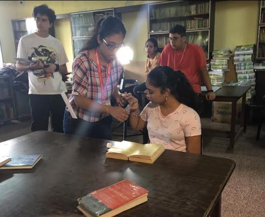
Week 8- Group one’s shoot
The final shot division and Vedanti and I completed Master-breakdown which was finished at the same time Diya (cinematographer) and Paarth(director) were working on the shot division accordingly. All of us worked together forward after complying with each other. With this finished, we needed to work on our locations for the shoot. We ended the class the other photoshop file menu, edit the menu and revised other things. We went on to have a small revision of component 4.

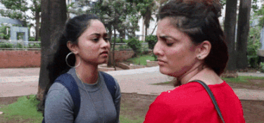
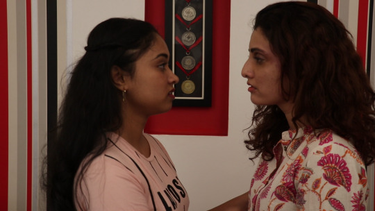
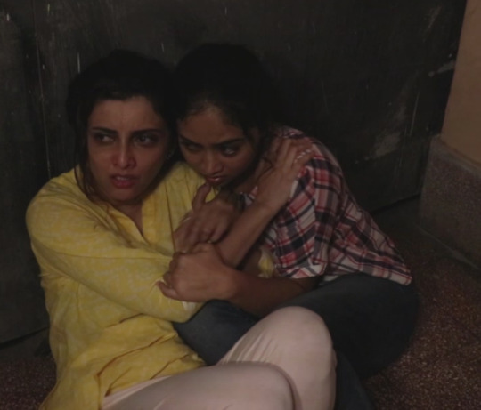
This week was the other group and we were assisting the other group for their shoot as their group was going to shoot first. The group consists of Production designer- Adrija, Director- keyosha, Editor- Vedant & cinematographer -Jaahnvi. Giving a little summary of the story which represents the LGBT issue in India where 2 women fall in love. 1 married and mistreated by her husband longing for love and the other college student who has been discovering herself. Their trailer not only represents the love but with the consequence of living with it.
Setting up for shoot:
We begin by helping Adrija by going through her checklist of items needed on the set. My duty on the set was to assist the production designer and click stills for the group. Before the shoot, the team required diffusers for the lights so the assisting team and I helped them out. I saw Adrija getting panicked with the documents and asked the team if I can help them with it so I took the responsibility of setting the documents properly and make a prop that was going to be used in the reading scene. I was supposed to type texts which represented the love between two characters as the character readers that text from the book in the library scene to emphasize longing love.
The class started out by the team and the assisting team having pre-production discussing to recheck all the requirements and materials before the shoot Iiket he teaming going through the schedule and the checklist to ensure the shoot is in order and the production designer gave each person on the group what to bring for tomorrow’s shoot. I asked the team if they needed help and took up the task of sort out, get the documents ready and bring makeup sponges and brushes for makeup.
Shoot day 1:

Before the shoot, sir suggested us to make 2 diffusers because we will be needing it during the shoot. A diffusion filter is used in front of a flash or studio light to soften the light on the object it is being fallen on. So we had some time in our hands before the shoot starts to finish making them.
On our way to the location, we made ourselves clear of what our jobs at the shoot were going to be. I was in charge of helping Adrija who was the production designer and take stills of the groups during the shoot.
Reaching the location we went through the schedules. The team was in constant contact with the actors on their location and the time. Another important piece of equipment which was would enhance the quality of the product was the lighting. This year we had rented lights for our shoots to learn more about this equipment and how to handle the lights and explained how to use them as well. He even went over its different functions and situations it would be needed to create what kind of effect.
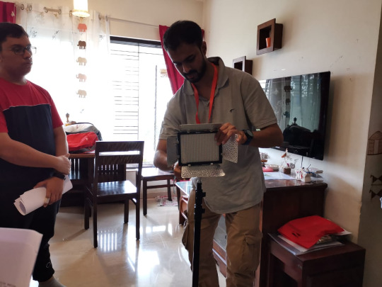
we were introduced to two kinds of lights:
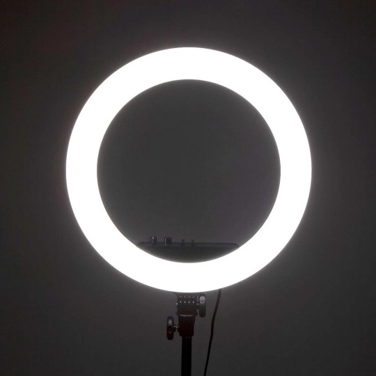
Ring lights have circular lights that have an amount in the centre, so the camera's point of view is identical to the direction from which the light is coming from. This light is mostly used by YouTubers while filming videos.
Flashpoint Shoe Mountable LED lights which are used to shoot professional video. Uses an LED panel that emits lights and the light colour can be made more yellow tone to give daylight effect or the panel can make the light harsher accordingly.
After the actors arrived they were offered any refreshments if they needed and then the teams introduced ourselves gave them an idea about their outcome they wanted and what the trailers we about (the basic idea).
Makeup, costumes, and characters' identity (the person characters) were briefed to the characters while they got ready. I helped Adrija iron press the costumes so it wouldn't look wrinkly on the camera and got the actors into the costume the meanwhile the rest of the crew went down to set up everything else. Adrija running around handling the makeup of both the actors I thought of helping her assist the makeup of one of the actors. With both of us working together. I helping Kia's makeup while Adrija guided me on how to go about it and she did an amazing job with the other actor's makeup.
Beginning of every shoot we have a little prayer and focus the camera on the photo frame of Lord Ganesh who is said to make us feel more powerful and not led down if any problems come in our way.
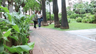
lights!camera!action the first shot was going around the two characters as they shoot in the park.
The location was very windy and the weather was unstable as it could rain anytime so we had to do things precisely and fast. There were scenes in the park where the two characters were seen holding hands and walking and sitting on the steps talking about how their relationship will not be accepted. The scene was designed well and the branding part was well established in these shoots eg; juices boxes and Balaji chips packet was seen well in the holding hand's scene.
Only after a short while, when we shot the last shoot for that scene the weather changed and it was raining quite heavily. We had to pick up the equipment and run inside to make sure there was no damage. We soon realized if we shoot further on the continuity would be an issue so the decision was then to pack up from this location and go to the next one which was the house. were scenes between the two character and one of the scenes of the main character between her husband and son were going to be shot.
Location 2 was the house had scenes between the two character and one of the scenes of the main character between her husband and son were going to be shot.
The actors from the previously seen had arrived with the team but we were waiting for the male actor who was one of the main character's husband. As soon as the character arrived they were taken for makeup and costumes.
I was assisting Adrija and helping her finish Kiara’s hair meanwhile the other actors get changed.
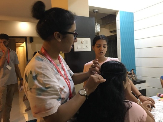
Going further with the makeup of the actors. Adrija was freaking out a little so I took in charge to help out in doing the makeup for the male actor.
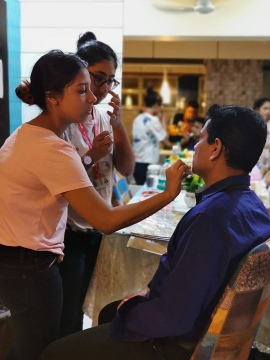
This was a good experience and would be really helpful for keeping my shoot coming up in mind. During the production process was going on the rest of the team was Checking the frame of the shot and setting up the room with lights in its position. At this location, we had only 3 scenes to shoot.
The first shot was of Preeti's husband screaming at her for the food not being good enough and a shot of her son in the bad ground. The shot was planned well and the cinematographer took a close up shot of her face to bring out her emotions which I thought was a good idea but however, I felt the lighting of the room did not suit the overall effect. The scene had good continuity as the next shoot was of the character sitting and cry venting out her feeling.

The scene was lovely as the two lovers come close together. The setting of the scene was well placed to bring out the playful effect of falling in love again.
Today's shot ended on a good note and the call time for day 2 was decided 8 in the morning at school.
PACK UP FOR DAY 1
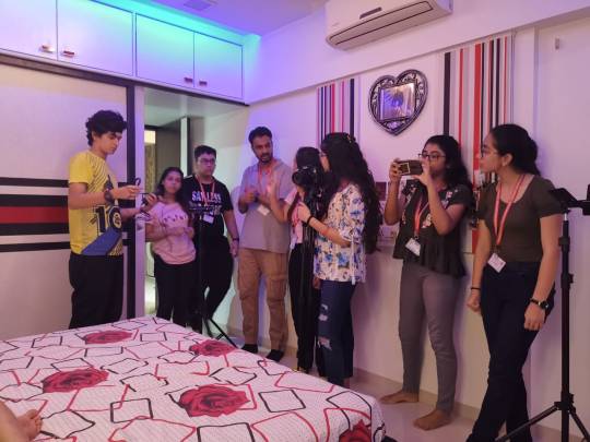
Shoot 2 :
We assembled at the location which was library of holy crossed high school which was one of Mumbai's oldest schools. The library looks very aesthetics very pleasing. We reached the school before the actors arrived to have run though with the shoots and set up the location before the first scene. As you can see above the team was in full motivation discussing the scenes. There was about 3-4 scene in the library.
The first scene the book scene where the two of them meet and express their unsaid feeling to each other through the action of highting a beautiful sentence in the book. I found this scene to be very creative and the production of the setting was wonderful. The old vintage look of the library with the placement of the area which was going to be shot.
Moving onto the next teardrop scene of the character which was a close-up shot of the actor got chills down the spine as it was not only well directed but the lighting added that effect well. In this scene thou, hey had decided to keep the makeup nature to give the worn outlook which was a good decision.

My job was in this shoot too was taking stills for my other team members and help to shift properties for the setting which was a fun task but shifting tables was difficult.
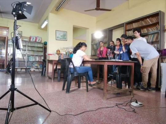
The last scenes that took a lot of time were the two characters hiding for the people who are behind them because they do not approve their love. Vedanti and I stood in the position just to take the focus.
This scene needed complete darkness so all of us stood against the windows to give that effect. The library had 4 big windows so Vedanti and I stood up against the window with a huge rug which did not let the light pass through.
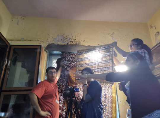
After multiple shots taken they finally found the shot they were looking for and our hands hurt a lot but the shot came out to look very good.
The shoot finally came to an end and we thanked each other for all the efforts that each one of us put in. The efforts surely paid off with a great output which achieved. The teamwork and nicely done scene planning made the shoot go smoother. This shot gave us good exposure to working with professional actors and how to deal with the different situation which we could overcome by just find a different way. We hope our shoot which was coming up goes as well like the other teams.
PACK UP FOR DAY 2

0 notes
Text
Section 10: Completion

Evaluation
For this project, I have designed and created a website for Student Vitals as well as 2 posters to go with it. While I am very adept in using photoshop and adobe cloud in general, using Wix to design a website was the most challenging part for myself, and learning all the tools on the program, as it was a lot more outside of my comfort zone, despite having brief experience in HTML coding. For this project I have used a variety of tools ranging from Adobe Photoshop, InDesign for poster layout, Wix, Adobe Typekit as well as Spark. One of the aspects that I did not expect to be doing yet enjoyed and found quite helpful to add to my experience, is merchandise photography that was used for the website, to showcase Speakers.
As the owner of Student Vitals and I, happened to live in the same building it was a lot easier for both of us to maintain contact and meet face to face in order to discuss our ideas, and what direction he might want his website and branding to be taken, which helped to brainstorm plenty of ideas on paper, to help visualise my ideas to the client. This project was very useful for myself, and as I do intend to go into digital marketing, many companies require basic experience in web design, which is incredibly useful to have for my portfolio, and to expand my skills overall.
Furthermore, this project has not only challenged my time management skills but as well as my overall communication and planning, to ensure that everything goes to plan and on time. I had to arrange meeting times with my client, plan and delegate tasks – such as what takes priority and what can be done after (such as posters, using all of the material that was gathered for the website to create them, to follow a consistent theme.)
However, I did have my worries when it came to the project, such as for some reason or another, my client may cease contact, or may not reply to any of messages on time. Additionally, that I may lose any of the progress with project, due to reasons outside of my control – such as technical issues, server crashes, etc. To prevent that, I did back up a lot of the images, and completed work on my external drives to ensure that I have back up files to work with, if any issues happen.
Process
The project begun with idea scoping, and me meeting my client for the first-time face to face to discuss what he might want for his website. I started by browsing multiple website to see what they have done, and what form of layouts they have that are functional and easy to navigate, as I wanted the website for Student Vitals to look as professional as possible. However, without inspiration it would have been a lot harder to work on. I have also done the same when it came to finding inspiration for the posters, to see what other businesses have done as I did not want something that is too text heavy or doesn’t look professional. I looked for inspiration on clean and minimalist designs, that would fit the minimalist design of the website too.
After I found designs, I begun brainstorming multiple layouts while familiarising myself with Wix, to make sure that I can bring my paper designs to life through Wix and if any of my designs were possible to implement to begin with, and not limited by existing tools. Additionally, once the designing process moved fully to Wix, me and my client arranged a few photo-shoot meetings, to take pictures of the products for me to edit and use on the website, rather than fully using images that he was provided by the suppliers of his packages. The product page was one of the hardest to do in terms of layout as I could not quiet find on what I liked and I found myself trying out several layouts, however, none of them matched the core aesthetic and theme of the homepage, which made it a challenge. I also had issues at first with formatting text for the page, as it kept going off the page, so it took some time to fix.
Once the website was done, I begun to create posters which were a lot easier for myself to do as I have great experience in Photoshop, but also basic knowledge of InDesign, but not being as familiar with it. However, I did primarily stick to photoshop to create the posters without relying on the existing poster templates that the program provided, as I wanted to challenge myself further. Before sending it to print, I wanted to make sure that the posters would print correctly by printing them myself on plain paper. It was a little challenging on finding a reliable printing service as I was not quite familiar with how they work, especially with my lack of budget – therefore the posters had to come out of my own pockets.
Overall, I was very pleased with how everything came out despite having quiet a bit of learning to do at first with Wix tools and what they are capable of, and how I could use them for the website. The website itself was the longest part of the production, especially gathering photographs and editing them – which did make me worry at first that I might spend too long on the editing, gathering and designing of the website. Which could of meant that I wont have enough time to fix any bugs or issues that may occur during later stages of production therefore not leaving me enough time to experiment and produce the posters.
I was also very sceptical about the printing of the posters, and how long it would take for them to be delivered, however, I did save them as pdf format and sent them to my client so that he always has them available to be printed and given to partnered student accommodations.
Difficulties and Challenges
One of the main challenges for myself, were time management and maintaining constant communication. I acknowledge my own weaknesses in communication, however the more my client and I exchanged messages and emails, it became a lot easier for me to seek his feedback and keep him updated on my process. It gave me a chance to come out of my shell and keep the contact going, even outside of emails (as my client did prefer to text message and maintain a less official tone).
Furthermore, it was challenging at first to balance this project with other deadlines and university work, however I did ensure to keep a list and a timetable to when I will fully dedicate my time on working on the project. Albeit, at first there were quiet a lot of late nights before I got a full grasp of what I was doing and got a better hang on how its best to prioritise certain tasks, and as I got better – it did get easier, and I’ve had plenty of time altogether to complete everything before the deadline, and even launch the website much earlier than planned.
However, the I could have done much better on fixing the loading times on the main homepage, but it does seem to be an issue with the server itself and out of my control as I have even tried changing images, size and file size altogether to check the loading, but nothing worked. Which is something that I know I could have done much better on and consider these issues in the future, but my client had no issue with it.
Conclusion
In conclusion, this was a great experience and I have gained a range of beneficial skills that will help my portfolio, especially the website and posters as a visual aid to show to potential employers. As I did work with a client who was beneficial to my experience, but who also benefited greatly from my own input – in which he does consider having me as a full-time member of his team, which is an amazing opportunity, especially to further improve the website and visuals in the future, and a great accomplishment overall as my client really enjoyed all of the work that has been done for him. I am also looking forward to going to the sky event organised by my client for the first anniversary of the business as part of the official team in the following summer.
If I had a chance to do the project again, I would focus more time on the photography side and hire out a student showroom within my building, as it would have been amazing to have a model interacting with the products to use for the sliders on the website and for the poster. I would also further check for all and any copyrights that may need to be credited to original owners., Overall, I hope I get to stay in further contact with my client and we have a chance to further improve Student Vitals branding in the coming future, and maybe even collaborate with more people to gather assets.
0 notes
Text
‘Talking Heads’ — Lip Synch Workshop
To expand on the rotoscope animation of Mo Farah, this workshop will look at the technique of ‘rigged’ animation. Rigged animation consists usually of characters made up of rigged parts which can all be edited individually. To start with, I explored a simple rigged animation using different mouth poses to imply speech which will then be synchronised to some audio to make it even more life-like. However, this technique can be applied to limitless amounts of things. Mainly with characters, their body parts can similarly be moved gradually to imply movement; it isn’t exclusive to the mouth animation I produced.
Process
The first task was to gather an audio clip of someone speaking about happiness. There was no real limitation to this, as long as it went along with the themes of the brief it would be a suitable thing to sync to. My audio clip was from a friend talking about how music brings him happiness. Subsequently, I used this to inspire the design of my character.
The animation process is usually broken down into two sub-processes. Creating the characters/environments/assets. Then making everything come to life through movement. The first part I was familiar with due to the numerous workshops practising character design I have done in the past. I started with sketching some rough ideas first, trying not to take a long time as the main focus of this workshop should be the animation stage. To match with the idea of music, I wanted the face to feature some headphones which also helped give the character a unique aspect. Once I had an idea I was happy with after 2 or 3 tries, I sketched a more finalised version thinking about how to simplify the face into as fewer assets as possible. This was only because if I wanted to expand on the animation by moving more parts it may get too complicated to understand for me if I had a lot of detail present. Animators will rarely draw detailed, complex characters because the workload goes up exponentially due to how many times they will have to redraw the same character. Keeping it simple means you can get much easier results faster.
Afterwards was the vectoring and rigging stage. I used Illustrator to visualise my sketch into a more refined character by restricting it to just simple shapes and line work. To rig the mouth, I had to create multiple poses which would correspond to all the sounds the mouth would make. The idea here was to make each mouth pose as close to each other as possible in terms of position/scale so when it is played back as a sequence there are no noticeable discrepancies.

Once I had all of the assets ready, I then started to synchronise the visibility of the lips with the audio clip. To do this, I used After Effects and put the voice on an audio layer, with the face layer and mouth poses both on top of this. To rig the mouth, I cropped the duration of the layers to only show when each sound is being said.
youtube
Extension
To extend this workshop, I wanted to experiment with combining previous skills I have learnt in animation with those that I have learnt in this one. To do so, I used the same principals of the rigged animation, but used keyframes to blend all of the poses together, before adding movement to the teeth and lips. To do this, I created keyframes for the lips which were made out of paths. This meant that between each key frame it would blend the two path shapes together to create a smooth transition between them. Because I had already placed the right mouth poses at the right time and had already synced the mouth and the voice clip, the process of blending the lips together was easy to do.

After I keyframed the paths of the lips in synch with the audio, the next step was to add the teeth and tongue. Because they had to remain inside the mouth, I did this by creating an ‘Alpha Matte’. This just meant that when I animated the teeth and tongue in a separate pre-composition, they were only visible inside the path of the mouth. To animate these parts, I used the original sheet of lip poses as my reference and simply added keyframes between their two positions (inside and outside the mouth). This then gave the illusion that they were moving inside the mouth separate from the lips, which is how the mouth would move in reality.
Lastly, to take advantage of the pre-composition feature in After Effects, I added some secondary animation to the eyebrows, glasses, eyes, eyelids and the shadow. I was able to do this because of the ability to animate one feature at a time. Whereas with the GIF timeline/video timeline in Photoshop (the programme I used for the ‘Runners’ workshop, although being more efficient for simple rigged animation, doesn’t allow me to focus on one feature at once. In Photoshop, making once adjustment to a layer will impact the rest of the layers; in After Effects, this won't happen.
youtube
Looking Back
In comparison to the Mo Farah Rotoscope animation, I preferred the more freedom I had during this workshop. From the initial designing factor of the character, to where I took the movement of each part, it was beneficial to expand on the fundamentals of moving image from Eadweard Muybridge’s work to a more modern outlook on animation. Rotoscoping is an easier technique to make something visually accurate as it just requires you to sketch over an already established subject. With rigged animation, it is necessary to not only think about the design of the character but also how it is built up in preparation for the animation stage. The “rigging” needs to be considered so the animation stage doesn’t become over-complicated with trying to make shapes move which weren't prepared to; I encountered this with my own outcome with the eyes. For the extension task, I made the eyes move which meant I had to separate the eye colours from the eye blacks so they could be moved separately. This is an example of how Rotoscoping can be a simpler process, but at the same time more time-consuming.
Moving Forward
Reflecting on this workshop, I feel like it was a success in terms of developing an idea and expanding my skillset by combining what I already know with a workshop. Learning about the earliest methods of motion graphics from the work of Eadweard Muybridge strengthened my knowledge of how to make things look convincing as well as providing another option for a method I could use. In the future I aim to use After Effects and especially the pre-composition feature to make more refined animations, at the same time as implementing other processes like I did in this workshop. Even if it may be subtly like adding texture from analogue processes. This is something I want to attempt moving on - using previous workshops which use a mixture of analogue and digital processes but using animation on top of all of this.
0 notes
Text
This Is Me, Tagged
Okay, get comfy – I got tagged twice, by talented Flickrites Mysi Anne and Sina respectively, so I’ve decided to do two sets of sixteen. The first set is mostly photography-related, and the second set is more personal. I tend to fill these things out thoroughly, so there’s a lot to read here, but since the internet gives most people the attention span of a flea on meth, I put some extra cleavage on display for those who feel the text is tl;dr. I hope you enjoy one or the other, or both.
—–
1. My favourite photographer in recent years is Nuri Bilge Ceylan. It was his work that made me believe it was possible to photograph Turkey in the way that I wanted to. I was sick to death of tourist-bait pictures of whirling dervishes, hookah bars, and belly dancers, because Turkey isn’t about any of those things.
2. If you asked me to name ten other photographers whose work turns me on, most of the names would be people whose work I discovered on Flickr. You don’t have to be famous to rock me.
3. I chuckle at equipment snobs and their strutting and posturing about what snazzy gear you "must" have and what techniques you "must" use, because for all their official know-how, 95% of the time their oh-so-technically-perfect shots leave me bored. Although I like buying new equipment as much as the next person, it’s certainly not required to take good pictures. There’s a person in my Flickr contacts who takes the most amazing photos with his mobile phone, and another who rocks my world with his Lomo. Some people never get it through their heads that it’s not about the camera. In the industry we call this "having more money than sense."
4. I also laugh at people who think that digital post-processing isn’t part of photography, or is "cheating." What, you think film photographers of the past didn’t post-process? Please, do your homework – half an hour of research on the web will wipe out that little fantasy. The great majority of tools in Photoshop are just computer adaptations of manual darkroom techniques that have been widely used for many decades by just about every photographer of note. I’m not saying it’s necessary to process the hell out of every photo you take, but refusing to use all the tools available to you because of some weird misinformed pride seems silly to me.
5. I have this strange skill for remembering exactly where I was standing when I took any given photo, even if I took it 20 years ago in a place I only visited for a day. This has made geotagging a lot easier.
6. If post-processing fell off the face of the earth tomorrow, I’d probably lose my interest in digital photography pretty quickly. If I’m out shooting and it’s going really well, my chief thought is always, I can’t wait to get home and play around with these.
7. On the other hand, I almost never post-process film shots, because most of my film cameras are ones that are known for their specific effects (Soviet cameras and so forth), and I don’t feel the need to mess with that. I will fix cracks and damage in old prints, unless the damage makes the photo more awesome, which it often does.
8. Go ahead, gasp in horror if you want… I don’t really like B&W photography, except in cases of faux-vintage or actual old photographs. That’s not to say that I can’t appreciate the beauty of B&W photos or the talent that goes into making them, and a few of my favourite photographers do shoot primarily in B&W, but when people post a B&W and a colour version of the same photo, I always like the colour one better. I hear people say how they think B&W tells a more dramatic story, but I just don’t see that at all.
9. I don’t keep multiple versions of the same photo. I find it unnecessary, and potentially confusing, as I only ever process a photo one time, and then I’m done with it forever. I trash both my raw files and my PSDs when I’m certain have the final version of the photo. I have never, ever felt the desire to rehash old, stale raw files that have already been done. I always take a fresh supply of new shots if I want something to work on.
10. I have a huge offline library of both digital and film photos from years past. This year I’m going to work on getting them all up on Flickr.
11. My eyes are black, and although I think they look nice in real life, in photos they tend to look like lumps of coal shoved in my eye sockets. So I almost always level them up in post. I also enjoy playing around with the colour of them – I don’t think making eyes green or blue in a photo is any different than people wearing coloured contacts for fun certain days of the week. This is one of the few photos where my eyes are completely natural, because I thought the lumps of coal thing worked well in that particular shot.
12. Some photographers get arrested for the photography itself… I’m more likely to get arrested for associated breaking and entering. If I see a place that I want to get to to take photos, I get like a pit bull about it, and regardless of locks or restricted access, it’s very unlikely that you’ll convince me not to break in there. I’ll just politely agree with you that it’s a bad idea, and then I’ll wait until you fall asleep and I’ll sneak out. I’ll be back before you wake up, with a memory card full of awesome. Or, you’ll get woken by a phone call and have to come bail me out. Whichever.
13. I don’t wear makeup except on very special occasions, so if you see makeup on me in a photo, you can be 100% sure it was post-processed. I can’t stand having all that chemical gunk on my face, but I do think it looks nice, especially in pictures.
14. I love it when my female friends e-mail me a snapshot of themselves and ask me to "please fix it up." I don’t think photos of women (or any other subject) always have to be about concrete reality – a little fantasy is nice sometimes. The women I associate with are smart enough not to compare themselves to an edited photo, or even to want to look like that in real life. We can teach young girls those same values without having to resort to censorship. It’s good for kids to see and learn the difference between fact and fiction, and to appreciate the merits of both. If we start banning things, they won’t get the opportunity to learn to distinguish.
15. If you gave me a $1,000 gift certificate from my local camera shop, I’d buy an old-skool original Lensbaby, a Sigma 10-20mm, and the new Nikkor fiddy (the 1.4 – G, not D).
16. If you sent me on a slow trip around the world and told me I could only take one camera and one lens, I’d be perfectly happy with my D40 and the 18-200mm VR. I don’t need anything fancier than that for traveling, and I sure as hell don’t need anything heavier or larger.
—-
1. Photography is something I enjoy doing, but I’m not a particularly visual person. Music is who I am. I made my debut as a professional pianist at the age of 9, and as a professional singer at the age of 14. My major in university was music composition, and the second time I went to uni I did a degree in recording arts with a specialty in critical aural analysis.
2. I’m left-handed, but I don’t write in that weird, contorted, hand-twisted-backwards way that most left-handers do. I write like a normal person, just with my left hand instead of my right.
3. You wouldn’t know it from my public presence on the internet, but my language habits in everyday life would make a sailor blush. You know how Debra in Dexter talks? Yeah, pretty much like that. I always laugh at that antiquated line about how people who swear a lot do so to cover up for a poor vocabulary. That’s a crock – believe me, I know plenty of words, and I know how to use them correctly. Many of them begin with C or F, so what?
4. I’m going to be 36 this month, and I think I’m better-looking and more attractive now than I have ever been.
5. Five years ago at this time I weighed 265 pounds. Don’t ask me for the magic secret, because you already know there isn’t one. If there were, everyone would have done it by now, and there would never be any fat people in the world.
6. I’ve traveled to four continents, and lived on three of them.
7. I’m compulsively goal-oriented, and one of my goals for 2009 is to buy a new outfit every month, as I haven’t had any new clothes at all in almost five years. The ensemble you see in the photo is my outfit for January.
8. A few years ago I tore my ulnar collateral ligament, and was told that without surgery I would never regain the use of my thumb. I decided to trust my gut feeling instead of the doctor, and didn’t have the surgery. My hand is fine now, and aside from some minor twinges in humid weather, I can’t tell the difference between the hand that was injured and the one that wasn’t.
9. I have the kind of hair that makes people want to punch me. I get it cut once a year (I’m almost due for my yearly salon visit), I wash it twice a week, and I don’t even own any styling products or tools. The last time I used a brush or comb was sometime during the Reagan administration. I don’t even comb it after I wash it. It just doesn’t tangle, and it looks however it looks straight out of bed. Some days it’s mostly straight, and other days it’s quite wavy. I never do anything to it in Photoshop aside from the occasional colour change for fun. What you see in the above photo is 100% natural.
10. I don’t think I’d ever have elective cosmetic surgery, but if you held a gun to my head and forced me to have something done, I’d get my lips plumped. It’s kind of a strange thing to say, because every time I plump them up in Photoshop, I think it looks stupid and I undo it. But when I look in the mirror, I think I wouldn’t mind if they were just a little more… robust.
11. I find cooking soul-destroyingly boring, not to mention a gigantic hassle. I avoid it whenever possible.
12. I’m a winter girl all the way. I absolutely do not see the appeal of summer, unless you have a fetish for sweat or stinky people. Or unless you live in a place where the summers are reasonable, like England. I did love summer in England – it’s one of the things I really miss about living there.
13. I’ve lived a stone’s throw from the beach for almost five years, and I’ve been down there maybe twice. I’m more into swimming pools – sticky salt hair and a crack full of sand just isn’t my idea of a good time, sorry. I do like going to the beach to take pictures, though.
14. I have a raging sweet tooth that cannot be tamed. When I come to your country, the first thing I want to see is the array of desserts your people have to offer me. So far, Italy has been the most spectacular in this respect, though it should be mentioned that I have not yet visited India, where I understand they start by making normal desserts for mortals and then soak them in syrup. Win.
15. I’m not into politics whatsoever, but it’s nice that the Obama administration is the first government that hasn’t implied I’m a filthy un-American traitor for choosing to live somewhere else. In fact, Obama’s web site has a whole section devoted to Americans abroad, and I was shocked to discover that they weren’t just talking about soldiers or people who were sent away to work for American companies. They mean everyone abroad, including me.
16. That said, if I were forced to go "back where I came from," I’d more likely go back to Europe than the United States. I don’t feel that preference shows any indication of a diminished love for the US. I’m just enjoying living on this half of the planet, that’s all. I don’t have any hate for the other half.
2009.187
Posted by Melissa Maples on 2009-02-03 15:24:39
Tagged: , antalya , turkey , türkiye , asia , 安塔利亚 , 土耳其 , 亚洲 , nikon , d40 , ニコン , 尼康 , nikkor , af-s , 18-200mm , f/3.5-5.6g , 18-200mm f/3.5-5.6g , vr , 1:1 , square , me , melissa , maples , self-portrait , woman , brunette , brown , window , long hair , brown hair , cleavage
The post This Is Me, Tagged appeared first on Good Info.
0 notes
Last Seen Blogs
levidu99
Fiti Vidal

azafinance12
AZA Finance
aesthetic-is-life
cloud addicted

cephissoartem
CephissoArtem

alectronadira-blog
Cerita Matahari