#very good example of how bad this trend of making every website and app the same is spotify
Text
hey guys, wanna hear me get pissed at youtube again? no? too bad they just added something so very stupid and i hate it
SO. today youtube added a very good contendor for "most useless and obnoxious feature to be ever added" and its..this thing.

"ah, but this isnt too terrible of an issue! its just on the homep-"No. this is on channels.

i sincerely, truthfully, do not understand this update. who asked for this? why do we need this on channel pages, of all things? is is just to try and compete with tiktok AGAIN? isnt that the entire point of shorts? why do we need this??
the worst part? you're put on the "for you" tab every time you open a channels videos. theres no setting to disable this as far as im concerned.
so uh..yeah. great update :)
#maybe im insane for hating this update idk#but like. i truly dont understand why every damn website that hosts content *has* to be similar to tiktok in some way#we dont *need* a homogeneous mixture of sites AND YET! AND! YET!!!!#very good example of how bad this trend of making every website and app the same is spotify#i dont know. if they rolled it out but like#they planned an update that changed the mobile layout to have short clips? of songs? with an infinite scroll?#take that with a factory's worth of salt though i dont remember the details(also i dont use spotify lol)#whatever man idk if this post even makes sense but like. i'm so mad this is pointless
2 notes
·
View notes
Text
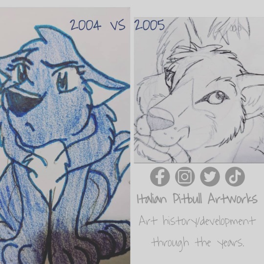
Finale for 2005! Again, the style shift was "toony/anime bad, pro = realism only" which was a trend at the time, however thats not true! Any style at ANY time is okay! Back then, I was pressured into thinking that I was only "worth it" if I tried for hyper realism AND did everything from memory, 0% references. ALSO NOT TRUE! Use photo/anatomy references no matter HOW GOOD or bad you are. Pro animators still use references, pro comic artists use references, STOP TELLING PEOPLE THAT REFERENCES ARE BAD. Stop telling yourself that too. All you're doing by beating yourself up over pulling up photos to study anatomy etc is creating low quality work and youre honestly wasting your efforts + not learning anything. You wont "magically figure it out". The human brain NEEDS a visual guide to understand how an object is constructed.
.
Also stop telling yourself that if you study anatomy that you HAVE to draw realism. No! Doing studies doesnt mean you "cant have a cartoon style". You're using those to learn "how to assemble" a skeleton, muscles, how an animal/human moves, and from there you can run wild with stylized lineart and caracatures/exaggerations. You want an example of this?? LOOK UP ALL THE ANIMATIONS JAMES BAXTER HAS MADE! Look at the wide variety of styles he has drawn! (Spirit, several Disney characters, Steven Universe *to name a few*) Anatomy and lines of motion/joints is NOT equal to style. SU still moves like a real human despite being that "CalArts" style! Also look up animators like Aaron Blaise and look at the variety of things he has worked on or Don Bluth (who makes very toony exaggerated animals!). Side note: A lot of these big animators have free tutorials they post to their social medias/websites and also very affordable/cheap online "classes" that you can take. Its super cool that they take time to teach new generations how to create things 🧡
.
Lastly- a reminder to NEVER use other people's drawings as your "anatomy" references. Every person draws things differently and even the "best"/most seasoned artist out there can still make mistakes. Everyone, including myself, will have something that they struggle with whether thats poses, perspective, lines of action, or just whatever. Anatomy comes from the physical real world. STYLE comes from the made up world. By using someone's art as your hard copy "anatomy reference", you will only repeat what flaws they have made. There are tooooons of stock photos on the internet these days. Use DeviantArt, use Shutterstock, there are just so many places to find stock photos of any kind! I even dump a lot of random photos on my DA for stock use. I upload higher quality stock photos to a site/app called Foap, but that doesnt mean that my lower resolution photos on DA arent good for drawing references! They just wouldnt be the best for photomanipulation or graphic design use. I really dont upload them with the intent of being useful for photo projects- I really post them because they're valuable drawing references. Head over to my linktree to find my links for those!
.
"But what about drawing tutorials?" Tutorials are a guide to show you the technique for how to build something. They are designed to help you keep proportions and learn how to use basic shapes to break up photos. These are good resources to have on hand and to research when you need to learn how to put something together. Again, there are different kinds of resources that are all parts of how an illustration is made. Each type is useful for its specific topic. Stop thinking theyre all the same and stop telling yourself that "everything" resource is for "anatomy only". Hunt down the appropriate resources for whatever it is you need to do!
.
"What about tracing? Does that help?"
Not really, no. Why? Because you arent doing the work. Its that simple. Tracing the lines of someone's finished art doesnt teach you how to draw something from the ground up. You didnt "make" anything- you just traced it. Guess what else can trace stuff and make an outline? A computer! There is no effort, no skill, no learning of any kind involved. Re-drawing (physically drawing from scratch) on the other hand DOES teach you how to physically create that thing. Just be sure to NOT post your redraw studies or claim them as your own art. While yes, you did draw that copy, it is still just that- a copy, a replica, a duplicate of the original. Only post things that you DID NOT copy from someone else UNLESS its one of those "Draw this in your style" challenges where the whole purpose is for you to copy what the artist drew. DTIYS contests are always announced as such and you will always see the person announcing who is hosting that challenge. The only other time you want to upload a "copy" is redraws of your old art and or screenshot redraws.
.
Remember, if you want to take drawing commissions, NEVER copy another artist just to undersell them. What does this mean? If someone comes to you and says "can you draw this for me in so and so's style because you're cheaper than them" or says "can you copy this person's drawing but make it my character instead"- THE ANSWER IS ALWAYS NO! Tell them that if they want art by that artist, they need to buy from that artist. If they want to buy from YOU, then they will get YOUR style etc. Its not fair to copycat someone just because youre cheaper. Yes, it might make you popular, but your following/fan base/popularity isnt created off of your own hard work. Instead, you gained a following at the expense of somebody else and people are only there for your copies. "But copying people pays the bills"- yeah well I've got news for you... SO DOES MAKING YOUR OWN ART. Dont be "that person". Think of it like copying someone elses homework- you may have passed the class, sure, but you didnt learn anything and if someone asks you about it later, you wont know any of the answers because you never actually did any of the work yourself! "But its hard"- no duh. Life is hard. Work is hard. Learning is hard. Welcome to the real world where nothing is easy. Anybody remember that Magic Broom short on Fantasia? Mickey didnt want to do the chores, so he used magic to get the brooms to do the chores for him. The moral of that story was real life doesnt come with shortcuts and in the end, you will need to do that work anyway.
1 note
·
View note
Text
The 6 Ways to create Effective UI Designs for your Website

What’s the first thing you notice about your favorite websites? The graphics and colors? The high-resolution photos?
A great user interface (UI) can make all the difference when it comes to engaging website visitors and attracting more customers. UI design should be at the forefront of any company’s web development efforts, but creating an effective UI can be tricky without the right tools and know-how, especially for beginners.
Here are some ways to create effective UI designs for your website:
1) Design should be simple
Designing a website or web application should be simple. If there are more than five different page layouts and many different elements, you’re probably doing it wrong.
The most successful websites make their users’ experiences as streamlined as possible. These sites have very few buttons and little text, letting design communicate its purpose rather than being verbose about it.
They also have exceptional navigation that lets users easily hop from one topic to another without getting lost along the way.
Let simplicity guide your next design project and you won’t regret it. No web designing company can deliver desired results with complex designs only.
2) Avoid Redundancy
A web designing company online service may sound redundant—and it is.
The problem here is that customers don’t see web designing companies online service as two separate companies—they see web designing companies, then they think, what services does a web design company offer?
Oh, they offer online services. And that can get confusing. Your readers also want to be able to quickly scan headlines and call-outs, so they need all their information up front.
4) Feedback is necessary
A website is a mirror of what you do and if it doesn’t look good, then you need to work on that aspect.
The only way of keeping up with changing trends is by getting feedback from people around you.
Feedback on website design ensures better conversion of viewers into customers or clients. You can ask friends and family, colleagues at work etc., who are close to you or visit a reputed website designing company in India.
A professional website designing company in India will also be able to guide and give tips about how not to ruin your website design.
3) Interaction should be easy and intuitive
The user interface design has become an important part of every product or website. You need to ensure that users have a good experience on your website or app, which means ensuring that you’ve made your website easy and intuitive.
Good UI design is essential as it can be used for better navigation and navigation plays a major role in deciding whether people use a product or not.
If you want more traffic on your site, you need to make sure that people can navigate easily through it. If they cannot do so, they will leave and go somewhere else.
Make sure that users do not have any trouble navigating through your site because if they do then it is considered bad user interface design.
5) Color must contrast
If a user has poor vision, he will probably not be able to view most colors accurately. Therefore, it is crucial that you choose colors that contrast each other in order to make an important message stand out.
For example, a red X on a yellow background would be very difficult for someone with poor vision to see clearly. Thus, you should avoid using them together in any type of design you create.
Keep colors low-contrast by using high-contrast colors, like white and black or blue and green.
Alternatively, you can use grayscale colors or shades of one color so that things remain simple and easy to read even if they aren't discernible from one another at first glance.
6) User Experience must be in mind.
User Experience is one of things which you should always keep in mind while working on a website.
It’s important that you make it as friendly as possible for users, so that they enjoy using it and come back often.
Let’s talk about how you can focus on user experience during each step of website designing services in India
Final wrap up
A strong user interface can make or break a website. A positive user experience, which can come in many forms, will make people feel comfortable with using a site and ensure they'll keep coming back.
With so many aspects that affect a design, it can be hard to know where to start when planning out one's own site.
Thankfully, there are some simple guidelines that anyone can follow when designing their own page.
#web designing company online service#web designing companies#website designing company in India#website designing services in India
0 notes
Text

What’s the first thing you notice about your favorite websites? The graphics and colors? The high-resolution photos?
A great user interface (UI) can make all the difference when it comes to engaging website visitors and attracting more customers. UI design should be at the forefront of any company’s web development efforts, but creating an effective UI can be tricky without the right tools and know-how, especially for beginners.
Here are some ways to create effective UI designs for your website:
1) Design should be simple
Designing a website or web application should be simple. If there are more than five different page layouts and many different elements, you’re probably doing it wrong.
The most successful websites make their users’ experiences as streamlined as possible. These sites have very few buttons and little text, letting design communicate its purpose rather than being verbose about it.
They also have exceptional navigation that lets users easily hop from one topic to another without getting lost along the way.
Let simplicity guide your next design project and you won’t regret it. No web designing company can deliver desired results with complex designs only.
2) Avoid Redundancy
A web designing company online service may sound redundant—and it is.
The problem here is that customers don’t see web designing companies online service as two separate companies—they see web designing companies, then they think, what services does a web design company offer?
Oh, they offer online services. And that can get confusing. Your readers also want to be able to quickly scan headlines and call-outs, so they need all their information up front.
4) Feedback is necessary
A website is a mirror of what you do and if it doesn’t look good, then you need to work on that aspect.
The only way of keeping up with changing trends is by getting feedback from people around you.
Feedback on website design ensures better conversion of viewers into customers or clients. You can ask friends and family, colleagues at work etc., who are close to you or visit a reputed website designing company in India.
A professional website designing company in India will also be able to guide and give tips about how not to ruin your website design.
3) Interaction should be easy and intuitive
The user interface design has become an important part of every product or website. You need to ensure that users have a good experience on your website or app, which means ensuring that you’ve made your website easy and intuitive.
Good UI design is essential as it can be used for better navigation and navigation plays a major role in deciding whether people use a product or not.
If you want more traffic on your site, you need to make sure that people can navigate easily through it. If they cannot do so, they will leave and go somewhere else.
Make sure that users do not have any trouble navigating through your site because if they do then it is considered bad user interface design.
5) Color must contrast
If a user has poor vision, he will probably not be able to view most colors accurately. Therefore, it is crucial that you choose colors that contrast each other in order to make an important message stand out.
For example, a red X on a yellow background would be very difficult for someone with poor vision to see clearly. Thus, you should avoid using them together in any type of design you create.
Keep colors low-contrast by using high-contrast colors, like white and black or blue and green.
Alternatively, you can use grayscale colors or shades of one color so that things remain simple and easy to read even if they aren't discernible from one another at first glance.
6) User Experience must be in mind.
User Experience is one of things which you should always keep in mind while working on a website.
It’s important that you make it as friendly as possible for users, so that they enjoy using it and come back often.
Let’s talk about how you can focus on user experience during each step of website designing services in India
Final wrap up
A strong user interface can make or break a website. A positive user experience, which can come in many forms, will make people feel comfortable with using a site and ensure they'll keep coming back.
With so many aspects that affect a design, it can be hard to know where to start when planning out one's own site.
Thankfully, there are some simple guidelines that anyone can follow when designing their own page.
0 notes
Text
Top 18 Best Free SEO Tools for Beginners in 2021
August 31, 2021
SHARE
POST A COMMENT
Top 18 Best Free SEO Tools for Beginners in 2021
August 31, 2021
Blogging,
by Sameh Alhammouri
Best Free SEO Tools for Beginners
Here are the best free SEO tools that help your website articles quickly rank on Google. Every blogger and small business website owners should have to use these SEO tools to increase traffic for their website.
These free Search Engine Optimization tools solve your SEO problem and save your time and money. Are you a beginner and you are not ready to spend money on the premium SEO tool like SEMrush. There are lots of free online SEO tools available for website owners. You can use these free tools to get more organic search traffic for your blog. This post will show you how to use it effectively to bring more visitors from Google search.
Let’s take a look at the top free SEO tools in 2021 list below.
The top best free SEO tools for beginners
1. Ubersuggest
Ubersuggest is one of the best free keyword research tools. If you are using Google Keyword Planner for keyword research, you can try it. You can use Ubersuggest tool for finding related search terms with your main keyword and getting better keyword ideas from competitors’ domain.
Just go ahead to neilpatel.com/Ubersuggest and type your main keyword, for example, digital marketing and then select a country you want to target press enter.
You will get hundreds of long tail keyword ideas with keyword difficulty score and CPC rate so you can easily optimize your articles keywords. If you want to find a competitor google ranking keywords just type your competitor website URL, you will get all keywords they are ranking on Google. You will get all search queries with keyword difficulty score. So this is the best free keyword research tool that help you find low competition keywords rank on Google.
2. SEO by Yoast
Yoast SEO is the best WordPress plugin for both beginners and advanced users. SEO by Yoast suggests on page SEO tips and solutions while you are writing blog post.
If you build your website or blog on the WordPress platform, you can’t ignore SEO by Yoast plugin. Yoast SEO solves your on-page SEO problem before you publish your post. This is a free plugin that comes with all essential features and advanced features like XML sitemap, robot text and more. It’s also available premium version, but free version fulfils all your on-page SEO needs.
It shows the readability score of your article. It is one of the important factors that you should consider when you write a post. The readability analysis uses an algorithm to determine how readable your post is.
It suggests many essential On-page SEO tasks that you have to complete before publishing the post like Focus keyphrase, article word length, internal links, outbound links, Meta description length and many more. If you are using WordPress, Yoast SEO must have a plugin for your site rank on Google and other search engines.
3. Keywords Everywhere
If you want to know keyword volume when you type a word on any search bar, Keywords Everywhere is the tool for you. Keywords Everywhere is a free Chrome extension for free SEO keyword research. This tool will provide keyword search volume more than 15 websites including Google Analytics, Google Search Console, Moz, YouTube, Majestic, Amazon & more.
4. Free On-Page SEO Checker
With sitechecker.pro, you can quickly analyze web pages on page SEO and get free reports to fix problems. The sitechecker provides detailed information for site auditing. You can easily find and eliminate errors in meta tags, images, links.
5. Google Trends
When you are looking to build a sensitive content website, Google Trends is the best free tool for bloggers. Google trends will show you current search popularity on topics you are looking. So that, bloggers can easily identify what types of topic and region they want to target when creating a website article.
Using Google trends is a great way to analyze specific search term current trends how likely people interact with related search over the years. Bloggers and small business owners can easily identify what types of topics and region they want to target when they are creating articles to reach local area or specific country.
6. Answer the public
Are you want to know what questions and queries your consumers have? Answer the public is the powerful tool for business who is looking content marketing. Also, it’s best for beginners to get content ideas for their website. Simply put your search terms on the search box and then the tool will give hundreds of question that people ask on the search engine.
7. Google Search Console
Google Search Console is one of the best free SEO tool for bloggers. If you are beginner to blogging world, you must deep dive into this tool, because it makes your blogging career easier.
You should use Google Search Console to get in-depth search queries ranking position and your site errors. It shows lots of information like click-through rate, the average position of the specific search query, internal and external links, top linking text and sites.
It also shows mobile usability and AMP version of the site errors so you can use this free tool you can improve your ranking on Google search page.
8. PageSpeed Insights
High webpage loading time will affect your site rank on Google. You need to eliminate unnecessary script or reduce image sizes. Google PageSpeed Insights tool gives handful report that what factors impact on your page loading in desktop and mobile devices. You can also check your site on tools like GTmetrix and Pingdom Tools.
Web page speed is one of the search engine ranking factor. Improving page load time will help boost SEO performance. GTMetrix is a great tool to analyze your site page load time. And also, you can use Google page speed tool to check your website page speed on the mobile and desktop.
9. Screaming Frog
You want to find and fix technical SEO issues in minutes. Screaming Frog is a free super technical SEO tool. The Screaming Frog SEO Spider software crawls websites’ links, images, CSS, script, and apps from an SEO perspective. This program is available for Windows PC or Mac computers so you can download for free. When you put a site URL, it crawls a website instantly and finds broken links, server errors, many other essential technical SEO issues.
10. Siteliner
Duplicate content will affect your site rank on Google. Siteliner is the best tool that scans duplicate content and other SEO problems like blocked pages, messed up redirects and broken links on your website.
11. MozBar
MozBar is a free all-in-one SEO toolbar Google Chrome extension. You can get domain authority and page authority metrics for any website on the SERPs. MozBar is one of the best free competitors analyse tools for beginners, so you are able to access and compare link metrics while viewing search results on the Google.
12. Free Backlink Checker
Analysing backlinks is essential because it helps you find a good and bad sites link to your site. Building quality backlink can boost website SEO. There are many free backlink checker tools available that give overall backlinks data for any websites.
13. Google Analytics
Google Analytics is an essential tool that you should integrate with your website. You can easily track your best performing contents, traffic source, adsense earning for each page, geo location of your visitors and other lots of features that you can use for optimizing your site to search engine.
14. Zadroweb.com/SEO-auditor
Zadro SEO Audit Tool provides overall SEO information for your site. It shows Page Authority, Domain Authority, load time, and Google page speed. So you can quickly analyze backlinks and load time issues. It’s gonna give you overall score success, warning and errors. If you see any errors, first you need to fix it in your site.
15. SimilarWeb
SimilarWeb is a free competitor analyze tool, you can get basic data of your site and competitors details with the free version. You can see your site global ranking and country ranking, traffic sources, referral sites detail, top five keywords so lots of detail you can analyze.
16. Google’s Mobile-Friendly Test
Your site has to get ready for Google’s Mobile-first Indexing. You might have heard that Google recently made a significant change to its algorithm. This change is officially called Mobile-First Indexing. If your website isn’t optimized for mobile devices, you will lose Google rank on the mobile version. your blog will get less mobile traffic.
17. Animalz Revive
Animalz Revive is a free tool that helps you analyzing old content to refresh. This online tool shows you accurately which posts on your blog needed to improve so you can maintain your traffic or get more traffic.
18.Conclusion
So these are the best and essential free SEO tools you should use every day to get rank number one on Google search page. If you are looking best all in one SEO tool to rank one on Google, SEMrush is the very best SEO tool for you, check out the link in the description.
1 note
·
View note
Text
Parler: Less Free Speech, More Analytics
The free speech social media platform that disallows dissenting opinions and promises to farm your data
In the summer of 2020, Youtubers started bring up the social media platform Parler as a new alternative to Twitter and Facebook, after many of the same creaters also promoted Minds, Gab.io, and Candid (the platform that was allegedly a front to run analytics on users that were likely to be troubling). The appeal: free speech. Free to say anything you want and defend your ideas.
Truth be told, I've been to these sites, and I've been disappointed by every one of them. I support free speech, but I have no patience for a platform with the majority of their users are explicitly trolls or seemingly crazy people. These platforms have a habit of rapidly devlolving into holocost and world order conspiracy theories. It's a fine thing to offer everyone to say their piece, but I think apealling to the people that normally can't stay civil on major platforms is a recipe for disaster. Parler, however, has moderation, which seems a bit counter intuitive to free-speech, but it offers a clean image for new members. It's going into it a bit further that reveals that there's a lot more going on than a bunch of conservatives and Trumpettes getting a platform to say their tagline of the week.
My Views on the Relationship between Privacy and Free Speech
This is important, as I am often seen as trying to get away with saying my own crazy spew and not answering for it. That is not my intention. Today the public forum is used by special interest groups for unethical studies on users and as targeting platforms for retaliation. All I want is to seperate speech from identity and livelihood. The express purpose for doing so is to allow people to know what is being said and argue with the ideas while avoiding violence and the distraction of ad hominem. I do not support the use of social media bots at all, and I appreciate removing harassing content, spam, and obvious trolling from a forum. I do not appreciate removing one's sincere opinion while of sound mind or tracking them across platforms and this does a disservice to everyone to either have things hidden from them about a person and their beliefs or reading too far into their behavior and even predicting their real-life behaviors which puts many individuals at risk of violence.
Their Problems with Privacy
When you sign up for Parler, just like Twitter, you have to provide a phone number. This phone number is attached to your account, and by extension, your activity. While this is a way to ensure that people are not easily making replacement, spam, or bot accounts, it's also a bit of you that they get to market. You likely use your cell phone for other social media, it's used for a lot services like shopping rewards programs as well.
Who's interested in your phone number and why? Well, we can take a look at Parler's own Privacy Policy. For them they want to market things to you, identify you along with more personal details if you want to be a part of their influencer network, and to sell as part of their company to whomever that may be. They also allow for 3rd party analytics just like Facebook allowed Cambridge Analytica to view users on their platform.
Now, depending on how you connect to the platform, either by their webpage or their app, you can expect more information to be taken about your device. If you're using their app, their Privacy Policy specifically states that they will collect your contacts if you permit them. It's already required when you install the app, so by installing it, you already permitted them. More on the app store, on Android, they request to read, modify, and delete the contents of your SD card and take pictures and video from your camera. While these can be used implemented selectively in the code for uploading videos and pictures to your post, it's concerning given their other behaviors, such as requesting other applications that you have installed.
Regardless of whether you're using the web or app, you can expect that 3rd party cookies like those from Google, Amazon, and Facebook will be used to track you while you use the website. This along with information about what posts you view, searches you make on the site, times that you're online and active, and the people you follow make a nice package for people interested in your data, such as Google and Facebook, meaning the same exact companies may still be able to track you and affect your experience browsing online through ad services.
Overall this Privacy Policy leaves a lot to the imagination but still emphasizes enough that they will collect data on you to monetize it as an asset and with 3rd party research and advertising analytics. It is the same problems as Google, Facebook, and Twitter, but now with a neat controlled group of a mostly conservative user base. This, in the wrong hands, might be an interesting petri dish for highly-targeted political research.
Just My Privacy? Is that so bad?
Their ToS is a garbage fire, and I highly encourage everyone to read it just for the audacity of what it says outright, and what it carefully leaves out.
The Censorship-Free Twitter Alternative: Now with Censorship!
Probably the goofies thing to come out of Parler is all of the stories of people's accounts getting deleted for sharing their opinions. To add to this, I was having trouble getting my account removed (more on that later, so I opted instead to use the trending hashtags and tag a few popular users in a post where I stated that the website had all of the hallmarks of being shady. I waited over two days to have my account deleted the normal way, but within ten minutes of posting that Parley, I was banned. Amazing. But don't take our words for it, they explicitly tell you that if they don't like you, they'll ban you in section 9 of their ToS!
Coming soon: Worthless Microtransactions!
Section 6 of their ToS describe their virtual items. Interestingly, they outright deny you the right to trade or sell any of the items on the site without their permission. This is interesting not only because they are explictly enforcing the worthlessness of their virtual items, but this also precludes anyone from exchanging their account, and thus all the associated virtual items for money, goods, or services. This means if you grew an engaging account on the platform and a company is interested in buying access to it, you have to ask Parler's permission, and then they may only allow it contingent upon you giving more personal information such as, in their own example of them buying items back from you, your social security number.
Old Issues: The Deleted Sections
Very recently, the ToS have been changed. As you can see in this reddit post from the time of Parler's launch, any user of their platform was legally bound to be ready to defend and idemnify Parler in court for actions you take on the platform, and you are already bound to pay their fees in court if you are defending yourself against them or anyone responsible for Parler. You also were not allowed to sue them or be a beneficiary of a class-action lawsuit against them.
Final Thoughts
Parler is yet another alternative social media site which is has attracted the worst users from other sites right away. This makes the platform less attractive to "normal" users. Interestingly, their banning practices seem to indicate that they only want the conservative, but not too edgy crowd, the kind that is of really big importance socially and politically right now; the middle of the road, fly-over state blue collar family type that got excited about Trump because of the chants and rallies without really understaning the greater policies.
Now, I'm not going to sit here and outright describe Parler's intentions like I know them, because I don't. But I know that if I wanted to do market and polling research on the group of people in Europe and America that fit this general trend of hyper politics, I would curate similarly to Parler, protect myself from litigation from the users, collect as much information as I could on them and share that information with other websites to get a holistic picture of the users. I would make their usage of the platform unempowering and worthless to see what they were willing to do for minimal incentive. I would attract A and B-list figures within the different movements thant have supported the shift in politics and have them promote it for me, as well as get the alternative media sites to do gushing admiration articles on it over and over while more generally well regarded sites scoff and criticize it to get this particular subset of users into this one place where I can observe them.
Bottom line: this website's policies and behaviors are antithetical to free speech. You cannot advocate for free speech and be so anti-privacy in my view. You cannot claim to be a legitimate alternative to other sites when you are curating an environment for a specific group. You cannot be against censorship and then censor users for the most mundane posts that go against your image. This website is DOA, worst than the ones that came before it, because where as the others had hope of being normal that just ran out, this place squashes it right away. Parler is an exclusive right-wing platform and my personal opinion is that it is also a petri dish for analytics for this political persuasion
#conservatism#trump#parler#social media#why are people so into this site#i was on it for two days and it was just like wow we have ted cruz#ted cruz#is a wax golem#politics#privacy#digital rights#free speech#long post#very long post#news#tech#technology
6 notes
·
View notes
Text
UX best practices
Core Web Vitals, or just Web Vitals, are a new set of performance metrics that help highlight aspects of web page development that affect User Experience (UX): page loading, interactivity, and visual stability. Google Core web vitals is set to make Core Web Vitals ranking factors as part of the Page Experience Update some time in 2021.
These metrics center on when certain events complete, including what is interactive or visually affected as these events take place, while pages load until a point of stability relative to user experience. That means score values can change as users interact with your page. You achieve better scores when events occur faster along stop-watch time intervals.
Core Web Vitals are a set of specific factors that Google considers important in a webpage’s overall user experience. Core Web Vitals are made up of three specific page speed and user interaction measurements: largest contentful paint, first input delay, and cumulative layout shift.
In short, Web Core Vitals are a subset of factors that will be part of Google’s “page experience” score (basically, Google’s way of sizing up your page’s overall UX).
A good user experience (UX) is essential for customer loyalty. It doesn’t matter what you sell online; paperclips, consultancy or vintage pottery – customers will desert you if you offer poor customer experience.
Back in the day, it was OK for you only to have a ‘web presence’. Many corporate websites were often like an online business card. They only contained bland corporate information and contact details. Today, though, your website must have a purpose and be functionally organised to meet your goals.
But web users can be fickle. And with so much competition for digital eyeballs, your website needs to be quick to load and easy to navigate. Today, there is plenty of UX data for how users surf the web – what keeps them on the page and what causes them to reach for the back button.
If UX has been somewhere on your to do list (but never made it to the top), it’s time for you to make a start. UX optimisation drives results – and a recent announcement from Google means that it’s about to factor more in the ranking of your website.
This article looks at the two of the biggest gripes web users have about UX – speed and navigation. Then we’ll finish with how Google intends to measure UX through new metrics it calls ‘Core Web Vitals’.
Implement Best Practices UX for Design
1. Introduction
In a Mendix App Team, the UX Designer’s job is to improve the user experience of applications in as many ways as possible. However, sometimes logical solutions from a development perspective are not the best solutions from a UX perspective. This set of best practices is for UX Designers to think carefully about what they can add to app development process.
2. Do Not Put Everything in a Single Screen
Putting all of the application’s menus, features, and buttons in a single screen is a bad UX practice, but one that is commonly seen. In this scenario, UX Designers and Developers start with a tight interface, but over time they add features that result in a screen full of buttons.
The arguments for putting everything onto a single screen include the following:
“Fewer clicks are needed”
“An overview is created”
“Users hate scrolling”
To a UX Designer, this kind of app looks like a Swiss Army knife with all the tools unfolded, but the only one being used is the bottle opener.
3. Do Not Put Everything in Drop-Down Menus
The arguments for using drop-down menus and packing them full of options often include the following:
“There will be more focus and less clutter”
“It will be easier for the end-user to find what they need”
4. Let the User Know Where They Are in the App
When your app has a consistent design system and brand style, all the pages may start to feel the same to the end-user.
The arguments for using a very consistent design system and brand style may include the following:
“The visual style must be entirely consistent and fully branded”
“Design systems drive design”
“We want efficient use of screen real-estate”
5. Avoid Long Lines and Tiny Text
Writing long lines of text and implementing tiny font sizes is another example of wanting to get the most out of your screen. Arguments for designing like this are some we have seen already:
“Users hate scrolling”
“We want efficient use of screen real-estate”
6. Do Not Double Up the Pop-Ups
Have you ever pressed a button in a mobile app that opens a notification pop-up window, and in that notification there is another button leading to another pop-up window?
The main argument for a UX Designer implementing something like this is the following:
“The user will have more context awareness”
7. Lay Your Cards on the Table
Cards are trending in the UX world at the moment. Single cards are nice, but what about a series of cards in another card?
An argument for implementing such a design would be the following:
“The cards are nested in order to create visual hierarchy”
8. Plan Your Forms Carefully
A UX Designer has to make a lot of decisions about forms. For example, should there be a long list of form inputs? Should the form be broken up in to multiple steps? Or maybe there should be three columns of form inputs, so that they all fit into a single screen?
The main argument for including a lot of form fields in one page is an argument we have seen before:
“Users hate scrolling”
9. Make the Purpose of Each Button Clear
When designing a series of app pages, a UX Designer should employ certain elements on each page that will help an end-user get oriented. As a parallel, you may think that buttons do not need to be consistent, because the end-user only needs to understand the button in the context of a particular page.
An argument for designing buttons inconsistently may be something like this:
“That’s the way Apple and Google do it”
10. Quick Summary
These are the basic UX best practices outlined in this document:
Do not use more than nine buttons on a page
Do not write more than nine words per line in the UI
Only use drop-down menus as a last resort to present options to the end-user
Give every page a header
When a page is more than one level deep, give it breadcrumb
When the end-user has to perform multiple steps, show the steps
Do not place pop-up window in another pop-up window
Do not nest a card in a card
Keep form fields in a single column
Give descriptive names to buttons
1 note
·
View note
Text
572
Where was the last place you drove to?
Other than home, I drove to Bonifacio Global City with Gab for a day out. I also drove to her dorm to drop her off after.
What is your favorite move franchise?
The Twilight Saga or Toy Story.
What was the last fast food you ate?
We had Wendy’s earlier. I was honestly kinda relieved to just have fast food for lunch because I just needed something greasy as fuck to shed off the hangover from last night, and something quick because I was so tired and was in no mood to even go out to begin with.
What is your zodiac sign?
Taurus.
Do you think you're a good dancer?
When I’m drunk enough and when it’s dark, yeah. Hahaha
What is the saddest book you've ever read?
I don’t know if I’ve read any sad fiction; AJ’s memoir was sad enough though. I remember having to take breaks every so often because some of the content was just too heavy to take in one go.
How old will you be this time next year?
I will be 22.
What subject do you think you are best at?
History. I have a number of relatives who have worked/are working as researchers and historians, so I’m not surprised I got bitten by the bug too.
Do you prefer heroes or villains?
Heroes, unless the villain’s story is endearing or if the role is played good enough. That’s the case with a number of heels (wrestling talk for bad guys) who are AMAZING at being assholes, like CM Punk or Triple H.
What is something you think is overrated?
I love milk tea, but it’s definitely hyped up way too much in the Philippines. A lot of people like to brag how they skip water in favor of milk tea and it’s just? what? How are you genuinely proud of that? I mean whatever floats your boat and all, but still?????
What political cause are you most passionate about?
The SOGIE/anti-discrimination bill that for some reason is being debated on to begin with. How anti-discrimination is still a cause of conflict is the most Filipino thing I’ve ever seen and it’s shameful.
What country would you most like to visit?
Morocco, Turkey, or India.
What is the worst job you've ever had?
I haven’t had any so there’s nothing to rank.
Who was your best friend as a child?
We would change sections every year so my best friends used to change often. There was Kaye, Jaynie, Raegan...but it was Angela for most of my childhood.
What is the hardest thing you've ever had to do?
Having to keep going when my grandfather died mere days before the UPCAT. That, or seeing Nacho in his coffin. His slight smirk made it easier to deal with, but I still had a good cry about it.
Have you ever considered having children?
Yeah, I’ve thought about it more and more as I got older - a far cry from my hatred of kids when I was a frustrated 13 year old lmao.
If you ever took field trips as a child, which was your favorite?
I’ve always been a museum lover so our field trip to Intramuros/various Manila museums in 5th grade, and our field trip to Ayala Museum/The Mind Museum in freshman year were amazing.
Do you have any weird family traditions?
Not really. I will say that my mom’s side has a very weird, very distinct humor that takes some getting used to (but once you do you’ll realize they’re all funny as fuuuuuuck on that side) but it doesn’t really count as tradition, so idk.
Have you ever considered acting?
Not at all. I never liked having to do it.
Who was the last person you slept next to?
Gab.
Do you think you can be in love and still cheat on your S.O.?
That’s messed up, dude.
Do you subscribe to any streaming services?
I have a Netflix and Spotify but other people pay for them.
Do you consider yourself a crafty person?
That’s a big fat nope for me.
What is your ideal weather?
Cold enough that I don’t need to turn on the electric fan. If there’s a thunderstorm, even better.
Have you ever been in a physical fight?
With my cousins when we were kids, yes.
What is the most embarrassing thing anyone has on video of you?
Angela has questionable footage of me when I got too drunk at Gabie’s party last year; she’s tried showing it to me but I’ve always refused to know what she caught on video lmao. She can keep it if she wants; I just don’t ever want to see it hahaha. Gab also took a video and photos of me all hunched at the toilet and throwing up after drinking too much from earlier this year.
I’m clearly not the best drunk; in the same way, my best friends clearly know their priorities lol.
Did you ever get lost as a child?
No. If I got ‘lost’ it was only because my parents would intentionally hide from me at malls to see what I would do when I realized I was lost/to mess with me.
What is your favorite condiment?
Mayonnaaaaaaise.
On a scale of 1-10, how attractive do you think you are?
I’d give myself an 8 tbh. Minus two points for my two crooked teeth and frizzy hair.
Do you prefer horror or romance movies?
When it comes down to it, romance. I feel like they have more leeway since romantic comedies (which if you still don’t know by now, is my favorite genre) is under that genre, whereas horror can be just right or way too corny or cheap for my liking.
What was the last film you saw in theaters?
Hello, Love, Goodbye last August(?). But I think that’ll change soon because I plan to see Charlie’s Angels this month - and can I just say, only for Kristen lol.
Have you ever been to a concert?
Sure, I’ve been to several, but I keep my ticket purchases to artists I have REALLY been wanting to see, like One Direction and Paramore. There’s a bunch of acts who’ve gone to Manila but I wasn’t religiously obsessed enough to want to see them, like Troye Sivan, The 1975, The Japanese House, etc.
Have you ever had an existential crisis?
No. I try not to think about that stuff.
Where is the farthest from home you've traveled?
Bali.
Do you like country music?
Ugh, no.
Can you play any instruments?
Other than the basic recorder, which I don’t really count, no.
What color are your eyes?
Black.
What color are the eyes of the person you love?
The same.
What is your favorite kind of flower?
Idk I don’t have one. Baby’s breaths are cute though.
Have you ever had your heart broken before?
For various reasons, yes.
What town were you born in?
I was born in, if I’m not mistaken, the district of Sta. Mesa in Manila.
Do you believe you had a good childhood?
I know my elders tried to shield me from harsher realities, and I’ll give them credit for that. I had the latest toys and gadgets and we had cable TV, so I had access to the cool shows of the time, to give a few examples. I’m grateful for all of those, but nothing could ever protect us from acknowledging the reality that I had alcoholic relatives who also happened to wake me up everyday with the smell of their cigarette smoke; and relatives who would resort to physical fights and screaming whenever they got too drunk, which always made our house a hot topic within the small neighborhood and a source of embarrassment for me, my siblings, and cousins.
What was the last dream you had?
I’m not sure. I think I was just hanging out with Gab in it.
Do you know how to play any card games?
Other than solitaire, no.
Have you ever taken a taxi before?
Yep but I can count those times on one hand. I’d rather use a ride-sharing app to get a driver than hail a Filipino taxi driver.
What is something about your childhood that you miss?
Half-days in school.
What are you currently most looking forward to?
Sleeping tonight, tbh. I want to stay up for a bit but I can’t wait to sleep too.
Did you ever have MySpace? Do you miss those days?
I had, very briefly. It was never a big trend in the Philippines so I didn’t see the big deal. I was more attached to Friendster (which I never got to have because of the 16-year-old signup requirement, which my parents made sure I followed) and Multiply.
What is the best television show you've ever watched?
Breaking Bad.
Are there any songs you can't listen to because they bring back memories?
I can’t listen to O by Coldplay anymore because it was the song I kept on repeat when I repeatedly harmed, starved, and tried to kill myself a couple of years ago.
Have you ever saved someone's life?
I hope I have in some form or another. I know I failed with Nach, though.
Do you tend to sleep well at night?
Sure, unless I had reason not to.
What do you believe is your weirdest habit?
I lock my car doors three times before I feel comfortable.
When was the last time you were sick?
This question is on almost every survey, along with the what-instruments-do-you-play one. Uhhhhhh 2017.
What color are your parents' eyes?
Black.
Do you have any credit cards?
I don’t.
Have you ever broken any major bones?
Nope, thank goodness.
Have you ever had a surgery before?
^ Same.
Are you ever afraid people will just stop talking to you one day?
I never thought about that, no.
Can you tell me the last deep thought you had?
Meh, it’s too triggering to go back to at the moment.
Are there any websites you've used for over 10 years?
Twitter, Wikipedia, and YouTube, for sure.
Do you have any siblings? If so, what are their ages?
Yeah, they’re 19 and 16.
What is the best movie you've seen this year?
Liway.
Did you ever make straight a's in school?
Sure.
What color is the shirt you are currently wearing?
White, with maroon text.
3 notes
·
View notes
Text
Tim Berners-Lee on 30 years of the world wide web: 'We can get the web we want' //cool article, Tim Berners-Lee father of the world wide web talks about his creation
https://www.theguardian.com/technology/2019/mar/12/tim-berners-lee-on-30-years-of-the-web-if-we-dream-a-little-we-can-get-the-web-we-want
”What started out as an idea for a way scientists could share information went on to change the world. Three decades later, its founder reflects on his creation
Thirty years ago, Tim Berners-Lee, then a fellow at the physics research laboratory Cern on the French-Swiss border, sent his boss a document labelled Information Management: A Proposal. The memo suggested a system with which physicists at the centre could share “general information about accelerators and experiments”.
“Many of the discussions of the future at Cern and the LHC era end with the question: ‘Yes, but how will we ever keep track of such a large project?’” wrote Berners-Lee. “This proposal provides an answer to such questions.”
His solution was a system called, initially, Mesh. It would combine a nascent field of technology called hypertext that allowed for human-readable documents to be linked together, with a distributed architecture that would see those documents stored on multiple servers, controlled by different people, and interconnected.
It didn’t really go anywhere. Berners-Lee’s boss, Mike Sendall, took the memo and jotted down a note on top: “Vague but exciting …” But that was it. It took another year, until 1990, for Berners-Lee to start actually writing code. In that time, the project had taken on a new name. Berners-Lee now called it the World Wide Web.
Thirty years on, and Berners-Lee’s invention has more than justified the lofty goals implied by its name. But with that scale has come a host of troubles, ones that he could never have predicted when he was building a system for sharing data about physics experiments.
Some are simple enough. “Every time I hear that somebody has managed to acquire the [domain] name of their new enterprise for $50,000 (£38,500) instead of $500, I sigh, and feel that money’s not going to a good cause,” Berners-Lee tells me when we speak on the eve of the anniversary.
It is a minor regret, but one he has had for years about the way he decided to “bootstrap” the web up to something that could handle a lot of users very quickly: by building on the pre-existing service for assigning internet addresses, the domain name system (DNS), he gave up the chance to build something better. “You wanted a name for your website, you’d go and ask [American computer scientist] Jon Postel, you know, back in the day, and he would give you a name.
“At the time that seemed like a good idea, but it relied on it being managed benevolently.” Today, that benevolent management is no longer something that can be assumed. “There are plenty of domain names to go around, but the way people have invested, in buying up domains that they think entrepreneurs or organisations will use – even trying to build AI that would guess what names people will want for their organisations, grabbing the domain name and then selling it to them for a ridiculous amount of money – that’s a breakage.”
It sounds minor, but the problems with DNS can stand in for a whole host of difficulties the web has faced as it has grown. A quick fix, built to let something scale up rapidly, that turns out to provide perverse incentives once it is used by millions of people and is so embedded that it is nearly impossible to change course.
But nearly impossible is not actually impossible. That is the thrust of the message Berners-Lee is aiming to spread. Every year, on the anniversary of his creation, he publishes an open letter on his vision for the future of the web. This year’s letter, given the importance of the anniversary, is broader in scope than most – and expresses a rare level of concern about the direction in which the web is moving.
“While the web has created opportunity, given marginalised groups a voice and made our daily lives easier,” he writes, “it has also created opportunity for scammers, given a voice to those who spread hatred and made all kinds of crime easier to commit.
“It’s understandable that many people feel afraid and unsure if the web is really a force for good. But given how much the web has changed in the past 30 years, it would be defeatist and unimaginative to assume that the web as we know it can’t be changed for the better in the next 30. If we give up on building a better web now, then the web will not have failed us. We will have failed the web.”
Berners-Lee breaks down the problems the web now faces into three categories. The first is what occupies most of the column inches in the press, but is the least intrinsic to the technology itself: “deliberate, malicious intent, such as state-sponsored hacking and attacks, criminal behaviour and online harassment”.
He believes this makes the system fragile. “It’s amazing how clever people can be, but when you build a new system it is very, very hard to imagine the ways in which it can be attacked.”
At the same time, while criminal intentions may be the scariest for many, they aren’t new to the web. They are “impossible to eradicate completely”, he writes, but can be controlled with “both laws and code to minimise this behaviour, just as we have always done offline”.
More concerning are the other two sources of dysfunction affecting the web. The second is when a system built on top of Berners-Lee’s creation introduces “perverse incentives” that encourage others to sacrifice users’ interests, “such as ad-based revenue models that commercially reward clickbait and the viral spread of misinformation”. And the third is more diffuse still: those systems and services that, thoughtfully and benevolently created, still result in negative outcomes, “such as the outraged and polarised tone and quality of online discourse”.
The problem is that it is hard to tell what the outcomes of a system you build are going to be. “Given there are more webpages than there are neurons in your brain, it’s a complicated thing. You build Reddit, and people on it behave in a particular way. For a while they all behave in a very positive, constructive way. And then you find a subreddit in which they behave in a nasty way.
“Or, for example, when you build a system such as Twitter, it becomes wildly, wildly effective. And when the ‘Arab Spring’ – I will never say that without the quotes – happens, you’re tempted to claim that Twitter is a great force for good because it allowed people to react against the oppressive regime.
“But then pretty soon people are contacting you about cyberbullying and saying their lives are miserable on Twitter because of the way that works. And then another few iterations of the Earth going around the sun, and you find that the oppressive regimes are using social networks in order to spy on and crack down on dissidents before the dissidents could even get round to organising.”
In conclusion, he says, “You can’t generalise. You can’t say, you know, social networks tend to be bad, tend to be nasty.”
For a creation entering its fourth decade, we still know remarkably little about how the web works. The technical details, sure: they are all laid out there, in that initial document presented to Cern, and in the many updates that Berners-Lee, and the World Wide Web Consortium he founded to succeed him, have approved.
But the social dynamics built on top of that technical underpinning are changing so rapidly and are so unstable that every year we need to reassess its legacy. “Are we now in a stable position where we can look back and decide this is the legacy of the web? Nooooope,” he says, with a chuckle. Which means we are running a never-ending race, trying to work out the effects of new platforms and systems even as competitors launch their eventual replacements.
Berners-Lee’s solution is radical: a sort of refoundation of the web, creating a fresh set of rules, both legal and technical, to unite the world behind a process that can avoid some of the missteps of the past 30 years.
Calling it the “contract for the web”, he first suggested it last November at the Web Summit in Lisbon. “At pivotal moments,” he says, “generations before us have stepped up to work together for a better future. With the Universal Declaration of Human Rights, diverse groups of people have been able to agree on essential principles. With the Law of Sea and the Outer Space Treaty, we have preserved new frontiers for the common good. Now too, as the web reshapes our world, we have a responsibility to make sure it is recognised as a human right and built for the public good.”
This is a push for legislation, yes. “Governments must translate laws and regulations for the digital age. They must ensure markets remain competitive, innovative and open. And they have a responsibility to protect people’s rights and freedoms online.”
But it is equally important, he says, for companies to join in and for the big tech firms to do more to ensure their pursuit of short-term profit is not at the expense of human rights, democracy, scientific fact or public safety. “This year, we’ve seen a number of tech employees stand up and demand better business practices. We need to encourage that spirit.”
But even if we could fix the web, might it be too late for that to fix the world? Berners-Lee’s invention has waxed and waned in its role in the wider digital society. For years, the web was the internet, with only a tiny portion of hardcore nerds doing anything online that wasn’t mediated through a webpage.
But in the past decade, that trend has reversed: the rise of the app economy fundamentally bypasses the web, and all the principles associated with it, of openness, interoperability and ease of access. In theory, any webpage should be accessible from any device with a web browser, be that an iPhone, a Windows PC or an internet-enabled fridge. The same is not true for content and services locked inside apps, where the distributor has absolute power over where and how users can interact with their platforms.
In fact, the day before I speak to Berners-Lee, Facebook boss Mark Zuckerberg published his own letter on the future of the internet, describing his goal of reshaping Facebook into a “privacy-focused social network”. It had a radically different set of aims: pulling users into a fundamentally closed network, where not only can you only get in touch with Facebook users from other Facebook products, but even the very idea of accessing core swathes of Facebook’s platform from a web browser was deprioritised, in favour of the extreme privacy provided by universal end-to-end encryption.
For Berners-Lee, these shifts are concerning, but represent the strengths as well as the weaknesses of his creation. “The crucial thing is the URL. The crucial thing is that you can link to anything.
“The web platform [the bundle of technologies that underpin the web] is always, at every moment, getting more and more powerful. The good news is that because the web platform is so powerful, a lot of the apps which are actually built, are built using the web platform and then cranked out using the various frameworks which allow you to generate an app or something from it.” All the installable applications that run on smartphones and tablets work in this way, with the app acting as little more than a wrapper for a web page.
“So there’s web technology inside, but what we’re saying is if, from the user’s point of view, there’s no URL, then we’ve lost.”
In some cases, that battle really has been lost. Apple runs an entire media operation inside its app store that can’t be read in normal browsers, and has a news app that spits out links that do not open if Apple News has been uninstalled.
But in many more, the same viral mechanics that allow platforms to grow to a scale that allow them to consider breaking from the web ultimately keep them tied to the openness that the platform embodies. Facebook posts still have permanent links buried in the system, as do tweets and Instagrams. Even the hot new thing, viral video app TikTok, lets users send URLs to each other: how else to encourage new users to hop on board?
It may be too glib to say, as the early Netscape executive Ram Shriram once did, that “open always wins out” – tech is littered with examples where a closed technology was the ultimate victor – but the web’s greatest strength over the past 30 years has always been the ability of anyone to build anything on top of it, without needing permission from Berners-Lee or anyone else.
But for that freedom to stick around for another 30 years – long enough to get the 50% of the world that isn’t online connected, long enough to see the next generation of startups grow to maturity – it requires others to join Berners-Lee in the fight. “The web is for everyone,” he says, “and collectively we hold the power to change it. It won’t be easy. But if we dream a little and work a lot, we can get the web we want”
4 notes
·
View notes
Text
UI vs UX: What’s the difference | Agency Partner Interactive
As a small business, it’s important to stay up to date on the latest trends in design for your company app and website. But what’s the difference between UI and UX design? What do these terms even mean? Let’s take a look at the details of each term and how they can benefit your business!
First things first…

What is UI Design?
User interface (UI) design is the methods and elements with which designers construct interfaces. It is all about the looks, style, and function of a product’s display. This focus on aesthetics includes the interaction between the user and icons, typography, buttons, colors, and beyond.
Examples:
Spotify’s pulldown animation
Starbucks’ color scheme usage
Domino’s’ order progress tracker
Duolingo’s consistent dashboard
What is UX Design?
User experience (UX) is all about what it’s like for the user when they interact with a product’s interface. The experience design is the method of designing how a product is integrated including respects to usability, branding, and function in a meaningful way.
Examples:
Marriott’s booking experience.
YouTube’s autoplay features.
Target’s password guidance.
Grammarly’s onboarding
How Are UI and UX Related?
UI and UX are two symbiotic terms, and UI designers and UX designers are used almost interchangeably for how closely related they are.
Both UI and UX are highly related design approaches but with very distinct nuances. UI design focuses on the visual and graphic aspects of design and the overall induced feeling. But UI design without consideration for complementary UX design and vice versa, however, will result in nothing but a bad experience for the user.
All UX designers know that the user’s experience is king and focus on the technical aspects. The ironic part? The most telltale sign of good UX design is that the good UX design goes completely unnoticed by the user. A conducive partnership between the two practices is what wins a user’s trust and engagement.
What’s the Difference Between UI and UX?
Here is where all the nuance we mentioned earlier comes into play.
At the heart of it, UI is a single piece of the user’s process, while UX is anything that affects the user’s process.
UI encompasses all the details that allow a user to engage with a site or app’s interface, while UX is the ultimate experience that user has with said site or app’s interface.
UI is the aesthetic and look, while UX is the feel.
How Does Good UI/UX Benefit Businesses?
The ultimate objective of every business is to make sales and grow the business. Strong UI/UX design can affect a business’ online presence and thus impact the success of the business itself in reaching those objectives.
Engagement
Improve your layout, menus, and navigation to harmoniously encourage ease of engagement with your site or app. A smooth flow of interaction will help support conversion rates which leads to increased revenue.
Brand Reputation
Understand what features are important to your users and what they dislike. A UI/UX design experience that matches a user’s expectations and preferences will inherently help establish a positive association with your brand in their mind.
Customer Satisfaction
Good UI/UX easily attracts customers and supports their retention, meaning the business stays both competitive and lucrative. A satisfied user leads to a satisfied customer!
Achieving good UI/UX can be tricky — it’s a balance of art and science that takes into account user feedback as well as analytical data. That’s why it’s so important to partner with an experienced web design agency like Agency Partner Interactive who understands the ins and outs of the entire development process for your business’ next design project!
#top_ui_ux_design_companies.#top_uiux_design_services_dallas#top_ui_ux_design_agency#web_design_company#web_design_dallas#web_design_agency web_app_agency#web_design_and_digital_marketing_dallas#dallas_best_web_consulting_firm#best_custom_design_agency_dallas#dallas_web_design_agency#web_design_and_development_agency_dallas#ui_ux_design_agency_dallas#web_design_agency_dallas#dallas_based_web_design_agency
0 notes
Text
How to Organize a Zine 101 #3
Hello~
I already talked about figuring out your zine and the zine’s schedule as well as what you should bring with you to successfully manage a zine.
I think the next step should be building up
Web Presence
I already talked a wee lil bit about it in Part 1 but I think I should elaborate a bit more on it as it’s basically the backbone of almost every fanzine nowadays.
A small disclaimer: Please take everything with a certain grain of salt as I am not a professional when it comes to social media managment. These are just some pointers I consider useful/helpful as they worked for me or other zines I had a brief overview of.
Where to post?
First of all, think about what platforms you want to use, and get familiar with them if you aren’t already. Learn “the way” of it to know which rules/guidelines to follow, because not every platform is the same in tonality or which kind of content spreads fastest.
The most common platforms that I’ve found to work with zines pretty well are Twitter and Tumblr. As both are available as apps for practically almost every phone, it’s also easy to check and keep updated with when you’re on your way.
Tumblr is quite interesting because it’s bascially like a website (and yes, you should keep in mind that the mobile version doesn’t support tumblr sites) and you can conveniently store all info to your zine, answer questions in public, and reblog post e.g. previews of zine entries. It’s easy to spread information quickly if you use the correct tags and post them in the best time frames for your audience.
Twitter is kind of like a news ticker, or gets used by many like this. It’s easier to engage with people and “spread the word” by tagging people who might be interested in the zine.
Also, think about where you as a manager have the bigger following so you can forward e.g. tweets or posts or make your own announcements about the zine to your following and potential customers.
What to post?
Obvious things are announcements like schedules, FAQ, details on the zine, application progress, previews, contributor lists, links to online shops, etc. This is kind of basic together with updates like if important e-mails to the contributors went out etc.
However, this isn’t everything at all. What I found great in other zines (which we completely ignored for our zine and I think that’s a very sad thing actually) was having specific dates (in fandoms stuff like characters’ birthdays, anniversaries etc.) or more general things like widespread holidays, or “event dates” (? - like world women’s day, labour day, you get the twist) that somehow correlate to your zine. For example, one zine I participated in was about the girls of a certain fandom, so they chose the Day of the Girl to start previews to kickstart the preorder phase - and I really loved that! It brings everything in another perspective because it’s not just a zine for a few little nerds to enjoy, but it conveys a much more pronounced message that way.
Including those kind of dates, whether it’s just a small post like “Happy New Year” with a small update on the zine progress, or a special sale because it’s xy character’s birthday and it happens to also fall perfectly into your schedule, it just makes your zine feel more honest and considerate of their passion for the zine’s content. It isn’t mendatory, but it definitely has a more lasting impression.
Also, you might want to think about what medium you want to choose - photos/pictures generally get more attention as it is highly visual (plus it’s easier to find on a twitter accound for example) and can be a nice addition to your text. This is where you definitely should think about some kind of corporate design for your zine that is eye-catching enough to get attention from a lot of people and still matches tone and intention of the zine. Gifs may give a post a bit more animated, funny, or simply emotional expression, so having a few sets of gifs/images (perhaps from the source material if it’s a fan zine) handy isn’t such a bad idea. It’s something we didn’t have and I basically have only regret about it.
How?
You also might think about the tonality of how you appear on the zine’s social media. Generally, fandoms are a rather friendly and casual place to be, so you can slip a small joke or something like that into your posts, however, you shouldn’t go all “LOLZ dat boi xDDDDDD” because you still want people to take you seriously and (if it’s a for-buy zine) pay real money for your zine. Keep a certain level of professionalism but don’t have a complete stick up your butt is all I’m saying as you don’t want to alienate people because of one thing or the other.
If you’re modding the zine with several mods (which I highly recommend!), also add signatures at the end of each post (we did it with -Mod [our name]) so it’s easier to clear up misunderstandings etc. as people know who they’re talking to and maybe one mod just didn’t read the memo or something. With tweets it’s just wasting precious characters but on tumblr you aren’t limited at all.
Also remember tagging: It feels like a science itself, and partly it is. First, tag what it’s about. You need to reach the fans, so if it’s about a certain ship or characters, tag those. Tag the fandom, and, very important, tag that it’s a zine. having those covered at first makes you pop up in e.g. tumblr search more as tumblr had changed that only the first 5 tags will be where you’ll appear. Some blogs which collect zine posts have a specific tag they’re tracking, so including some of these comes in quite handy. The rest is mainly to maintain a system on your blog, which everyone needs to figure out themselves.
Tagging on twitter is kind of different as you have a limit, I would always go with ships/content first, then perhaps fandom, and zine only if you’ve got some characters to kill. Also please don’t use completely unrelated tags only because they’re currently trending - this is just plain annoying and it’s more likely that people will ignore you instead of gaining some interest in your project.
When?
Do your research on what times are the best to post your content to get your target audience, especially as shipping can be very expensive so you want to have national interest in first place. Every social media has their own specific timeframes where content goes viral the fastest. There is no 100% correct formular, but some tendencies at least, so you can help your luck out a little bit.
Grooming Your Media
To most social media, the key to success is consistency, so you definitely shouldn’t sleep on this. Luckily, social media are (except for most forums but then again your phone usually also has a web browser) usually available as app version, meaning you’re quick to responst or check in. - That’s what you usually think but truth be told, apps also don’t always work perfectly, and especially the tumblr app is known to be rather wonky.
I also (this is a personal preference, though) find it easier to compose posts and pick the right pictures on my computer, so if you’re the same way as I, I would advise you to calculate half an hour up to maybe 3 per day/every two days to check in on all your zine’s accounts. It depends a bit on how active the current phase is and how many questions/inquiries people are sending your way.
Tumblr luckily has the queue option, and it definitely saves you a lot of time when you need to bring up an important post regularly. Through the queue, the blog also stays more active, thus has likely more traffic or is simply more noticible as it stays fresh in mind.
Twitter, however, doesn’t have this function (or I’m definitely not aware of it), and, truth be told, also isn’t concipated for this kind of thing. There aren’t really many updates you can post during certain phases of the zine, but there might help the above mentioned dates you might want to keep in mind. Tweeting about the occassion and connecting it with your zine might raise interest and more traffic on your account.
And yes, then there are the really busy phases where you simply can’t keep up with social media as the zine demands all your attention. However, sometimes people just want to know how busy you are, so tweet it! A sentence or two are probably enough, and then you’re basically good to go for the day. Just remember to retweet your tweet during your breaks.
And, again, checking on your media should be a regular thing because waiting for an answer for 1-2 days is a different thing than a month or so later (this accidentally happened to us because we didn’t get a notification), so don’t just check “does the system signal me that there are new messages” but actually go into all possible messaging systems directly to check because sometimes tech is a bit wonky. (Also check the message requests!!!)
To maintain a certain level of activity can be a pretty tough job and by now I’m actually inclined to believe that one of the mods should be responsible solely for the social media management while the others work on the actual zine. However, I can’t say I’ve had experience with handling stuff like this that way. It definitely would have gotten a lot of pressure off my shoulders (I mean there’s a reason why companies have a special department handling all this stuff.)
Also, when I say “post regularly,” you can determine what is regular. This can be 24/7, every other day, or once a week, maybe also every two weeks but I suppose no less than that or people might forget you even exist. It’s just important to keep that schedule up so people can build a habit of expecting and getting to see a new post at a certain time.
It feels a bit hypocritic for me to talk about this topic because I think I’m not doing a very great job at it myseld simply because I easily neglect stuff like this, but again this small series is about learning from our/my mistakes so you don’t have to make them with your zines.
Thank you for reading, I hope I’ll find the time to write the next installment soon!
<< last | next >>
Masterpost
#inky rambles#zines#fanzines#fandom zines#how to organize a zine 101#fan zines#long post#advice#art advice
120 notes
·
View notes
Text
The 6 Ways to create Effective UI Designs for your Website

What’s the first thing you notice about your favorite websites? The graphics and colors? The high-resolution photos?
A great user interface (UI) can make all the difference when it comes to engaging website visitors and attracting more customers. UI design should be at the forefront of any company’s web development efforts, but creating an effective UI can be tricky without the right tools and know-how, especially for beginners.
Here are some ways to create effective UI designs for your website:
1) Design should be simple
Designing a website or web application should be simple. If there are more than five different page layouts and many different elements, you’re probably doing it wrong.
The most successful websites make their users’ experiences as streamlined as possible. These sites have very few buttons and little text, letting design communicate its purpose rather than being verbose about it.
They also have exceptional navigation that lets users easily hop from one topic to another without getting lost along the way.
Let simplicity guide your next design project and you won’t regret it. No web designing company can deliver desired results with complex designs only.
2) Avoid Redundancy
A web designing company online service may sound redundant—and it is.
The problem here is that customers don’t see web designing companies online service as two separate companies—they see web designing companies, then they think, what services does a web design company offer?
Oh, they offer online services. And that can get confusing. Your readers also want to be able to quickly scan headlines and call-outs, so they need all their information up front.
4) Feedback is necessary
A website is a mirror of what you do and if it doesn’t look good, then you need to work on that aspect.
The only way of keeping up with changing trends is by getting feedback from people around you.
Feedback on website design ensures better conversion of viewers into customers or clients. You can ask friends and family, colleagues at work etc., who are close to you or visit a reputed website designing company in India.
A professional website designing company in India will also be able to guide and give tips about how not to ruin your website design.
3) Interaction should be easy and intuitive
The user interface design has become an important part of every product or website. You need to ensure that users have a good experience on your website or app, which means ensuring that you’ve made your website easy and intuitive.
Good UI design is essential as it can be used for better navigation and navigation plays a major role in deciding whether people use a product or not.
If you want more traffic on your site, you need to make sure that people can navigate easily through it. If they cannot do so, they will leave and go somewhere else.
Make sure that users do not have any trouble navigating through your site because if they do then it is considered bad user interface design.
5) Color must contrast
If a user has poor vision, he will probably not be able to view most colors accurately. Therefore, it is crucial that you choose colors that contrast each other in order to make an important message stand out.
For example, a red X on a yellow background would be very difficult for someone with poor vision to see clearly. Thus, you should avoid using them together in any type of design you create.
Keep colors low-contrast by using high-contrast colors, like white and black or blue and green.
Alternatively, you can use grayscale colors or shades of one color so that things remain simple and easy to read even if they aren't discernible from one another at first glance.
6) User Experience must be in mind.
User Experience is one of things which you should always keep in mind while working on a website.
It’s important that you make it as friendly as possible for users, so that they enjoy using it and come back often.
Let’s talk about how you can focus on user experience during each step of website designing services in India
Final wrap up
A strong user interface can make or break a website. A positive user experience, which can come in many forms, will make people feel comfortable with using a site and ensure they'll keep coming back.
With so many aspects that affect a design, it can be hard to know where to start when planning out one's own site.
Thankfully, there are some simple guidelines that anyone can follow when designing their own page.
0 notes
Text
Four Key Tactics The Good Qualities Use For BigCommerce
Digital marketing has had a impact that is major businesses all over the globe with traditional advertising models being replaced by innovative digital marketing which connects businesses along with their customers like nothing you've seen prior! Since digital media has such a massive impact on just how people live their lives, their buying decisions, how they think and even more, it’s essential for companies to own a suitable understanding of the way they can use this amazing tool to increase brand awareness. Partnering with an established digital marketing company in your town or any country may be the first step to accomplish this to be able to positively impact your business and improve sales into the run that is long.

Continue reading to find out more about the impact marketing that is digital change the manner by which brands and businesses operate! The field of digital marketing is continually evolving and in the event that you don’t partner with a knowledgeable SEO company in your area or any country, then you is supposed to be put aside! While research has shown that lots of people spend a lot of the time on social networking along with an effective marketing that is digital in place you are able to quickly and effectively communicate with your target audience, there has additionally been research done that suggests increasingly more teenagers are reducing time spent on social networking networks and are instead using messaging platforms more. With the aid of digital marketing companies, many companies are now opting for ways to communicate directly with existing customers and prospective customers through these kinds of applications. When working with a SEO that is reputable company businesses should be able to gather a treasure trove of information about their potential prospects with the aid of digital marketing tools that gather loads of analytical data. By collecting this valuable information, you will be able to better tailor your marketing campaigns to be appealing to certain target audiences you will probably have not even thought about. For example, in the event that you’ve been centering on senior citizens, using digital marketing you will probably find that millennials may also be your potential target audience! This might really work both ways as while digital marketing allows businesses to create their reputation by customers sharing good reviews on social networking etc, it simply one takes one review that is bad completely ruin a company if not handled well. This is the reason it is crucial which you partner with an electronic marketing company that actually understand what they’re doing in order to avoid your organization being negatively impacted and instead sustain your positive digital impact!
The time of traditional marketing has passed.
Always remember that it’s important to possess both praise and complaints treated alike and no messages must certanly be ignored, instead, all reviews must certanly be taken care of immediately in due time for the type that is best of reputation management online. Processing of payments is a significant part of any organization in today’s fast-paced business community - aside from the industry! The option of paying online for their service in an extremely secure and quick that sure beats the alternatives with digital marketing in place, now many businesses including schools and restaurants can now offer their customers! Apart from the benefits stated earlier, there are lots of other ways that digital marketing impacts businesses and as it’s constantly evolving, it is often hard for companies to keep abreast of the changing technology. To make certain you’re constantly updated and in front of the latest digital marketing trends, partner with an established digital marketing company in your area or any country that have proven results and within virtually no time, watch your earnings skyrocket! Please enable JavaScript to view the comments running on Disqus. Online shopping is increasing every year and this means that your competitors between businesses can also be regarding the rise. In order to get an advantage in business, e-commerce companies will need to adopt certain techniques for increasing traffic for their eCommerce sites and increasing conversion rates. People are spending more and more time on the net and it's also understandable that companies are taking this opportunity to market their products by meeting their clients that are prospective. Digital Marketing is making usage of all types of digital media and digital platforms to market your product, brand, or business. We see an upward trend in people going online to get information when it comes to real estate, like everything else. What Exactly Is SEO And Exactly Why Is It Essential For Your Organization? For people looking for answers to why SEO is important for your needs, particularly if you are interested in incorporating SEO for your business, this informative article explores why SEO services are very important, and looks at what an organization that claims to be the SEO company that is best should offer to their clients. Modern ındividuals are more often prepared to spend their funds on the web and they do it with pleasure. You will probably find your new customers on the Internet. The full time of traditional marketing has passed. Most people got fed up with paper leaflets and trust that is don’t marketing tool anymore. Online marketing offers you new methods to tell the planet regarding the brand or service. You will find billions of brainy people inhabiting the planet Earth. All of them have their own minds working in a very manner that is peculiar. By every passing second, these minds that are old replaced by the newest ones as you generation of individuals dies plus the next one got its spot. The present pandemic situation has impacted individuals and businesses all over the planet in a lot of different ways. As increasingly more businesses are struggling to keep afloat, measures are being taken to save money and make probably the most regarding the situation. Advanced promotion has established its power because the method that is main of and getting the message out about a brandname and its particular items. With that being the specific situation, an ever-increasing amount of organizations are inclining towards LinkedIn as their showcasing foundation of decision. Since customers are getting bored with the original modes and ways of advertisements, a forward thinking way always saves the day. Copyright 2005-2020 - ArticleCube, All rights reserved. Usage of our service is protected by our Privacy Policy and Terms of Service.
Level 1 PCI-compliance (a known that is little yet crucial element when launching a shop online)
Edgar Online - (EDG = 10Q, 10K)
10 Things CRM may do For your organization Growth
Cart: prepared to help you grow. Bigcommerce: Quick to penalize
Insightly CRM
Online retailers must improve the speed that is website
youtube
On BigCommerce, there’s none in the app store for Doba. Oberlo is more like a Shopify thing, so not for BigCommerce. Should your model involves print on demand, you ought to be fine with either - There’s PrintFul integration on both. If you want that badge that shows up in search ads, Google customer reviews do that, you could get them on BigCommerce unless of course you are regarding the Pro plan ($249.95). Shopify offers that integration on all plans. Although Shopify has a edge that is slight its many apps and more choices for integrations, they both offer the necessary integrations. If your end that is front is mess, visitors may well not stay long enough to enjoy one other features that you’ve used. The platform has an extensive a number of themes, including seven free ones. You will find categories for industries and designs. Each one is responsive and customizable. Shopify’s themes are responsive and fully customizable as well, and also the highest premium that is priced are cheaper than BigCommerce’s highest priced theme. Shopify’s price that is highest is $180, but BigCommerce is $235. Also, despite claiming to provide 7 templates that are free BigCommerce’s templates look more like variants of each and every apart from unique designs. Shopify pricing includes 10 themes with significant variation among them. With a coding that is little a good web developer, you are able to modify the themes from either platform to suit your needs. Both companies have a focus that is good design. The templates are modern and slick, but Shopify tops BigCommerce in mobile UX. I checked Google’s score and noticed that Shopify passed the average by about 2 points, but BigCommerce didn’t arrive at the average score. Shopify has an edge here because of the higher UX that is mobile score more free themes. Both platforms have user friendly interface. BigCommerce offers a tour that is quick help you to get started. One area Shopify is dominated by BigCommerce is on-page customization options. If you'd prefer the simplicity of use provided by a drag and drop builder, don’t glance at Shopify. The ecommerce cart doesn’t offer one. BigCommerce, however, has a drag that is user-friendly drop builder. Shopify is not difficult to use inspite of the not enough a builder though. If you’re more hands-on for tech details, you are able to edit the HTML and CSS code on both. When something goes wrong together with your online shop, you need a customer that is good team to give you installed and operating ASAP. BigCommerce and Shopify both offer numerous support options, but Shopify is more upfront with their contact information. The caliber of support you will get is roughly the exact same, however. Both are open 24/7 with live chat, email, and phone support, with support documentation and an community that is involved. For me, Shopify’s dashboard is a little easier to use. But that’s subjective. While both offer great 24/7 support, but Shopify has more apps and a community that is large of and developers. BigCommerce And Shopify: That Should You Select? As a whole, both store that is ecommerce meet up with the major requirements for an on-line shopping cart software, but BigCommerce is more prone to get inventory off your virtual shelves. Both platforms work with numerous payment gateways, have great support, provide a great amount of templates, are feature packed and gives more functionality through the ability to integrate widgets and apps, offer SEO optimization capabilities, and integrate with major e-mail marketing apps. Most of the features seem the exact same for BigCommerce vs. Shopify, but there’s one thing you need to bear in mind. Visibility. BigCommerce delivers more where it counts, with features that make your store that is online visible attractive to customers. If BigCommerce has got the features you'll need out-of-the-box: The Shopify plans that provide gift cards, reviews, and ratings as out-of-the-box features would be the more plans that are expensive. Product option customizability: The integrated product customization feature on BigCommerce offers more options and it has a better UX. You can find a cons that are few keep in mind before you rush out to contract BigCommerce. Browse the full post where I review Shopify. You want more apps and a more substantial support ecosystem: More ecommerce developers and marketers know Shopify. There’s no cut that is clear between your platforms, but both of those are winners over all other ecommerce solutions. But at the conclusion for the day, it comes down to preference that is personal your company model. You can’t go wrong with Shopify or BigCommerce.

Just be sure the features you need are in the platform you are considering. Wow! Great article! Your comparison charts are perfect. Thank you for saving me from making a bad decision. Many thanks a great deal for taking the right time and energy to try this. A year ago, Instagram Shippable posts have pushed me to want to make a switch after setting up my eCommerce site using WooCommerce. I was torn between Shopify and BigCommerce until looking over this article. Can someone please explain if you ask me some great benefits of BigCommerce SEO vs Shopify SEO tools? 42 vs 50? Or actually top 5,6? What exact advantages I gain by utilizing BigCommerce for higher google search ranking?
BigCommerce is transparent about pricing, however it’s beneficial to break up precisely what you are looking at as far as pricing goes (see BigCommerce’s pricing chart here). First, your monthly price - the car or truck you pay every month for a specific level of features. BigCommerce’s plans begin with the typical Plan at $29.95 USD per month and go up from there. Second, your platform transaction fees - the additional fee you pay to a platform as a percent of sales. Shopify used to charge these on each of their plans, and BigCommerce also used to charge 2% transaction fee on their Silver Plan. These aren’t huge (and a lot of platforms are doing away with them), but they can add up. Shopify and BigCommerce have removed them - however it’s something to keep in mind when platforms that are comparing. Third, your charge card fees - these used to be pretty standardized, but now more platforms (like Shopify) are setting up their particular bank card processing or partnering with 3rd parties (like BigCommerce & Stripe) to offer cheaper & more flexible payment solutions. And undoubtedly if you're building your personal store without a platform, they are likely to be a bigger and much more issue that is expensive. Fourth, your add-on fees - these are third party apps, plugins or items of software that you could purchase to produce your store better. Usually they are one-time purchases, but sometimes they run off transaction fees. So here’s how BigCommerce stacks up with pricing vs. With Shopify specifically, these are typically right on if you are an merchant that is online-only. Transaction fees - BigCommerce removed transaction fees in late 2015. That is something to take into account when you compare them to competitors like Volusion. Bank card fees - BigCommerce partners with Stripe for integrated payments. Which means that accepting credit cards are easy, and built into the platform. However, the direct rate are much less low as Shopify or direct agreements with your personal 3rd party processor. Though the fees aren’t much, they can mount up. Add-on fees - this area is where BigCommerce makes a comeback with pricing. They truly excel on value. Sure, they are doing little things such as unlimited disk space, nonetheless they also build-in a complete lot of useful features in to the platform for free. WooCommerce, PrestaShop, or Magento. All those platforms are likely to charge for essential add-ons. So for pricing, I’d say that BigCommerce is competitive enough for pure play online stores to make a decision based on value - not price. Should you choose offline sales; or have developer expertise to create your own personal store - then BigCommerce’s recurring & bank card fees may add up.
0 notes
Last Seen Blogs

akistrike
Atoms 2.0

purrplecatart
Percy’s Art

nitishdiwan
Nitish Diwan

intonightcity
what happens in night city...

zo0rua
Nico