#whimsical aart
Photo

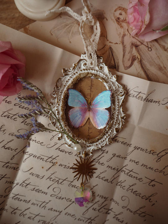

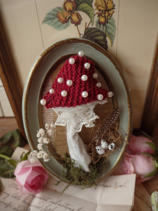
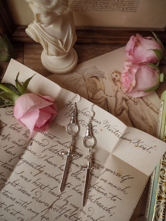

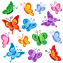
tiny tiny new update of my art on etsy, link here. please check it out, I did a special limited 10% off so you can grab your favourite piece. btw., the crystals on the handmade frames are little sun catchers, and are perfect for windows! // @everlinet
#cottagecore#cottage style#small shop#small business#cottagecore art#cosplay#dark academia#coquette#light academia#softcore#princesscore#support small business#women led shops#butterfly#swords#regencycore#jewelrx#jewelry#whimsical aart#fairytale
6K notes
·
View notes
Text


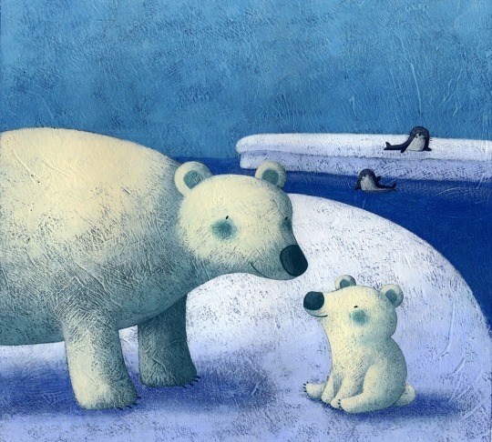
The left picture was done by Matt Chinworth, the soft sketches, textures and bold colours seem to leap from the screen when you first lay your eyes on Matt Chinworth's illustrations. I like how vibrant the colours are and the interesting textures they use in it. The work on the right was done by Mercedes deBellard. Mercedes deBellard is an illustrator from Madrid who specialises in portraits. You'll have spotted her work before, as her clients range from Warner Brothers and Random House to The Sunday Times. I think her work is really amazing, it’s almost got a hyper realistic feeling to it, yet there’s an element of cartoon in her illustrations as well which I think really cool and works nicely together.
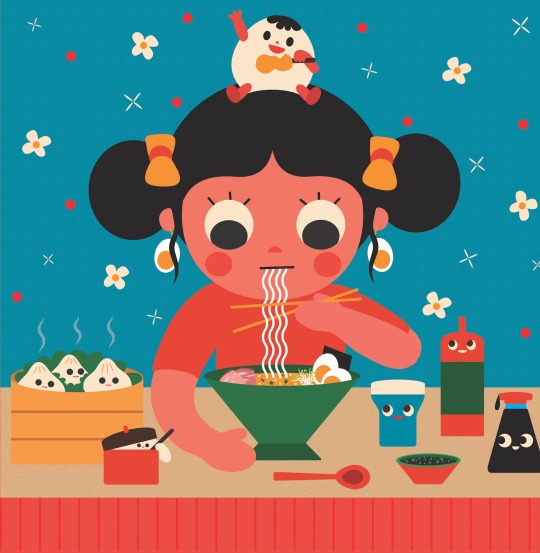
The work on the left was done by Jeremy Booth who was born and raised in Louisville, Kentucky, where he still lives. His work has a very simple art style to it, but it has a really nice neat aesthetic to it which I quite like. The one on the right was done by Francesca di Chiara. Children's books and whimsical editorial illustrations are the focus of Francesca di Chiara, an illustrator who mainly works with international and Italian publishers such as Fabbri Editori, RCS, Piemme, Einaudi, La Coccinella and Usborne Publishing. They have a very sweet art style that’s simple, but has a nice texture to it which brings the image alive a bit more.

The left one was made by Ruby Taylor. Bursting with bright colours and inspired by old printed ephemera, vintage illustration and hand-painted signage, Ruby Taylor's definitely has some fun artworks. I’m not a huge fan of her style, it’s a bit too in your face with the colours and the art style in itself I’m just not a fan of. The artwork on the right was done by Uijung Kim who’s originally from South Korea. Uijung Kim now lives and works in Brooklyn, New York. I really like how cute and simple her work is and I like the contrast of colours she uses and how vibrant they’re.


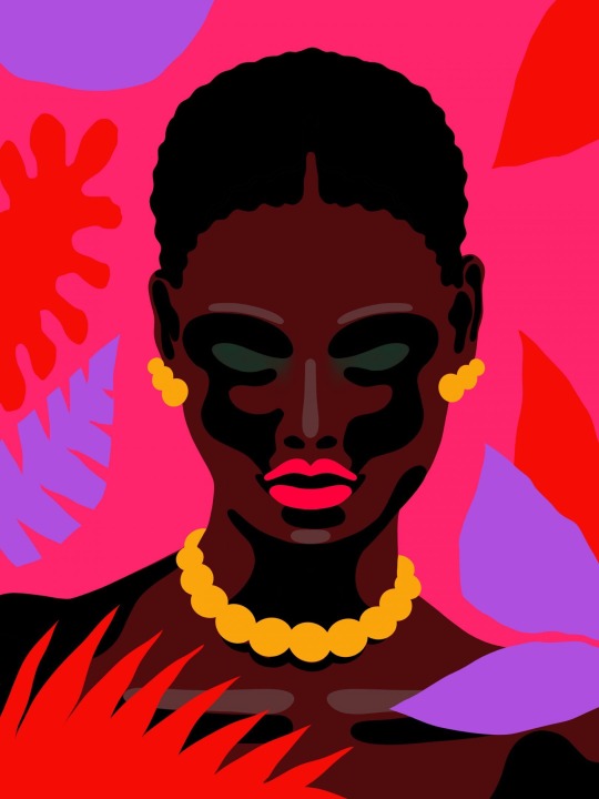
The one on the left was made by Aart-Jan Venema who uses digital and traditional painting techniques to create his multi-layered and fantastically coloured illustrations, anchored with a keen compositional eye. It has a bit of a messy style to it and has a lot going on which I’m not a fan of because I don’t really know what I’m supposed to be looking at. The one on the right is done by Victoria Borges who is quite the traveller. Born in Germany, she has lived in many places including Hawaii, Austria, and more recently, Richmond, Virginia. Her style is versatile, whimsical and textured and she can work in many different median which think is quite cool.

The picture on the left is done by James O'Brien. Represented by Rapp Art, James O'Brien is an illustrator and artist whose impressive client list includes American Express, Colgate and Microsoft. I’m not a fan of his work, I don’t like his art style and I’m not so keen on his colour palette either or the strange swirling effect he gives this specific piece. The work on the right is done by Lars Madsen who is an award-winning German artist based in Hamburg. He creates illustrations, animations, logos, and custom letterings for clients all over the world. His work has a great contrast of colours and is very vibrant as well, but it makes his work really eye catching. His style is very simple, but it works really well with the bright colours, but I think he could of put in a few more details. But I think that’s just because I like details.
0 notes
Last Seen Blogs
simluned
Simluned

newoneokay
Untitled
everythingismadeofchaos
The Very Idea
waleysblog
Daniel

banananoirblog
Molly🪩