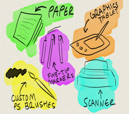
#I hope the handwritten parts are readable?
Text
Grey World AU - Visit from the Moon 2
Part eight of the Grey World AU comic. And second part of the current events. Things are escalating this time. Please, be prepared.


... Writing this part was haaaaard (for all kinds of reasons). Thankfully, things will slowly calming down from now on.
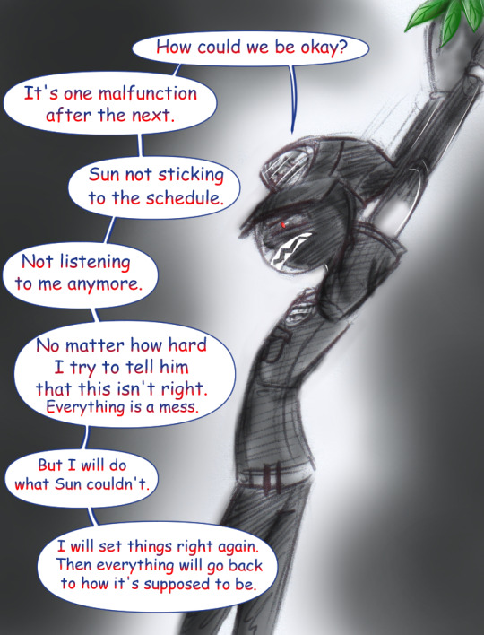
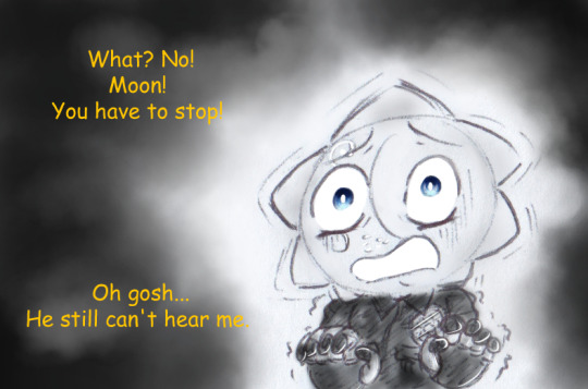
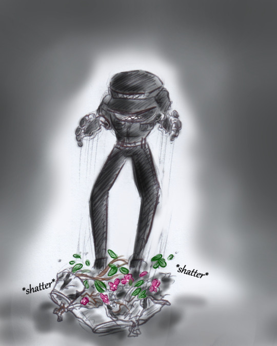
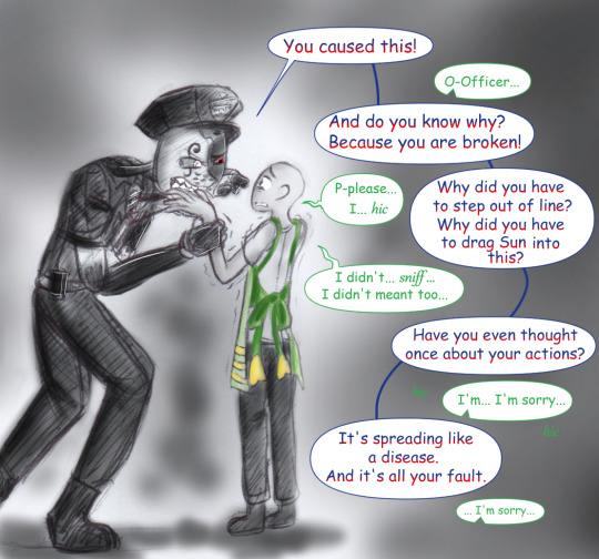
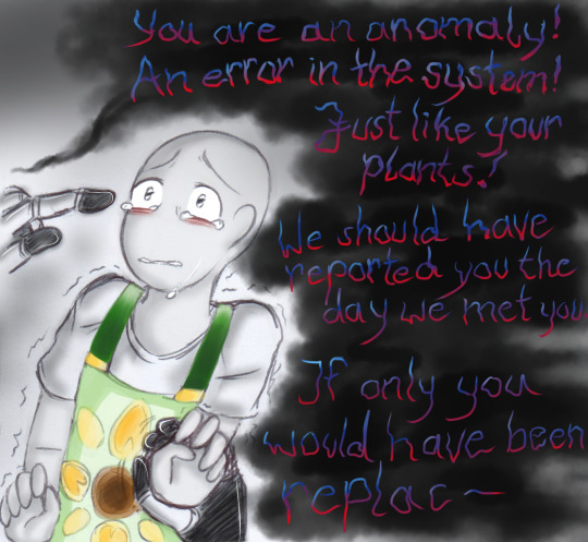
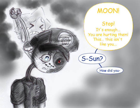
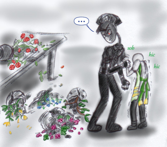
#fnaf au#fnaf#grey world au#fnaf moon#fnaf sun#fnaf y/n#dca#fnaf dca#daycare attendant#fnaf daycare attendant#traditional drawing mixed with digital coloring#sketches#my art#do not reupload#Oh Moon... what have you done?#They are all going through a lot right now.#Sun is stressed and anxious. But still trying to de-escalate the situation.#Y/N is scared as hell and faced with old fears that they thought lay behind them.#And Moon is slowly realizing what he has done.#Also R.I.P. flowers.#Please don't pay too much attention to how the flowers/plants change sometimes during the sketches.:'D#I drew some of the pics at different times as the rest and just went with it while not remembering what flowers/plants I had used before.#Sun breaking through their coding in an interesting way...#I hope the handwritten parts are readable?
59 notes
·
View notes
Note
Hello! I've spent the past couple of weeks enamored, fascinated, and obsessed by Oslov <3
I was wondering, what is your writing/planning/plotting process like? The world is so intricate, there are so many characters and events and moving parts and sinister plots to keep track of, and I'm amazed how you carry them all though with such detailed care. Oslov is like a spiderweb in all senses of the word, and I'm entirely entangled in the best way as a reader. I'm curious, how much planning goes into all these stories, because everything is so wonderfully connected at any distance.
Also, you mentioned in an earlier Tumblr post the Oslov language and an old grammar for it. I love constructed languages, and also construct them for writing, so I'd be sooooo interested in seeing and hearing what the languages in the saga are like (from inspiration to grammar to vocabulary to development to everything). I understand it is rooted mainly in Germanic (and maybe some Slavic languages) and emerged as a mixture/creole or something similar? If you're interested in sharing some of it, I'd love to learn :)
Thank you for this amazing saga! I'm so excited (and terrified) for what's to come in Oslov Unraveled.
Thank you so much for reading!! And that’s so cool that you create languages too. I wrote my “Oslov grammar” back when I was in college, so it isn’t one of those impressive constructed languages that follow real linguistic principles, but I did apply what I learned from studying German, French, and Latin. The whole thing is handwritten—but readable, I think—so I’ll do a separate post soon with some photos. I wonder if I could scan it, lol.
My writing process is chaotic. I would love to have a “bible” for the whole series, but I haven’t had time to do more than make a few outlines. Luckily I can usually remember which stories/chapters I need to review to prep for new chapters, but continuity errors do slip through. (The color of Besha’s scarf is one I just noticed!) I have one ring binder that contains all my Oslov materials, from the grammar and maps I created decades ago to the more recent time lines and story outlines. I do all the outlining in longhand and don’t write in Scrivener or anything nice like that, just Word.
So I rely on my memory of the overall story and character arcs. It’s far from flawless, but because the story was mostly in my head for so long—barely anything was written down until about 2017—I have a lot of practice in remembering. The story has gotten a LOT longer and more complicated since I started writing it. But it still doesn’t feel like work at all, more like daydreaming, which is what it’s always been. And I love that! If I ever published it, I would get more systematic, but I hope it would still be an escape and not work for me.
Anyway, thank you so much for giving me an excuse to geek out about this! 😊
3 notes
·
View notes
Text
Paths of Brigid
Paths of Brigid, Onyx Path, 2017
Paths of Brigid (PoB) is a supplement for Exalted 3rd Edition. Originally slated to come out in 2016, PoB was shifted back to 2017 due to that edition's extensive delays.
In Exalted's lore, Brigid is the "Mother of Sorcery", who harnessed its powers for use by the champions of Creation. Hundreds of years after Brigid's death, the sorceress Salina retraced Brigid's path as part of Salina's greatest achievement: a world-wide ritual that made it possible for people to initiate themselves into sorcery rather than requiring an instructor or some outside force to initiate them.
PoB is presented as Salina's travel journal during her voyage. It is also indirectly a biography of Brigid and, more importantly, a supplement on sorcery. The form factor for PoB is different from Exalted's other books, which are 8.5"x11" and full-color. This one is two-color (black on parchment), in 6"x9" format. The deluxe version is leatherbound. The font looks handwritten, but it's about the most readable handwriting font one could ask for. The headers are a little bit more ornate and harder to read. The unique format makes what might otherwise just be a corebook overflow supplement into an interesting artifact. (Not that kind of Artifact, those are in Arms of the Chosen.)
The book presents principles, spells, workings (long-term rituals), and sorcery-related charms. There are also a dozen sorcery-related charms, which filled a notable gap in the already enormous Ex3 charmset. Spells and workings are described on their own pages, or in diagetic sidebars, and done in much more colloquial language than most game mechanics. Think of it as Salina trying to describe them to other experts completely and concisely.
The story presented in PoB is fairly straightforward. It's no masterpiece of literature, but it's better than most game fiction, perhaps because it has more space to evolve. There's an appropriate amount of pretense for Exalted. The plot is primarily about Salina's transition from brilliant spellcaster to master sorceress, though there are also a second-circle demon and a celestial censor involved. Every chapter describes a unique tradition of sorcery through its spells and customs. The art is scratchy ink-work that nevertheless conveys a sense of gravitas and motion. Representation is solid, as is appropriate for a book that covers the entirety of Creation.
I'm glad I snagged a copy of this when it first came out. You would normally be able to find PoB on Onyx Path's DriveThruRPG page and the deluxe version at IPR. Unfortunately, due to some intellectual property issues - it's amazing how international law can complicate things! - the status of the book is currently in limbo. I'm hoping that will all get resolved and we'll be able to see this book available for purchase again.
The book has an afterword written by Arianna, the signature Twilight Caste sorceress from 1st edition. She claims to have found a "blasphemous" volume penned by the ghost of Salina's murderer. Given the difference in how the rest of the game line progressed (which I have admittedly enjoyed) it seems unlikely that we'll see the necromantic equivalent to Paths of Brigid. It remains a unique volume.
#rpg#imaginary#ttrpg#exalted#review#books I wish had actually been written#Can you imagine testing out Rain Of Doom to verify its effects?#No wonder people are afraid of sorcery in Exalted.#Come on over here I just need to see how many people I can grapple at once with Magma Kraken.
1 note
·
View note
Note
Hello,
I am wondering how you learn to read script. I guess that it is practice mostly, but am asking if you have any tips to someone who wants to begin to read old handwritten letters. I very much enjoy your blog!
Thank you
It’s definitely practice (and I’m someone who writes, rather messily, in script myself so maybe that also has something to do with my being able to read it fairly easily) but yes, tips!
Re-read what you’re looking at a few times to start with to get a sense of how the person shapes their letters—sometimes it takes a couple goes. It’s okay if you can’t read it immediately. Focus on the bits you can read, and then look at the surrounding context in the document to figure out the words that are initially illegible. A combination of context + identifying the letters that are readable in the illegible word can make things fall together.
This might be harder with standalone letters, but with multiple letters written by the same person or diaries it gets easier to figure out their handwriting because you’re spending more time with them over many pages and understanding the subtleties of how they shape their alphabet, how they spell things, and language quirks that help fill in that context.
Sometimes zooming very far out and/or very far in to a document, if you have a digital copy, is helpful. If you can’t make out a word, try viewing it up close and then at a distance to see if it makes more sense.
Also, depending on what you’re looking at, see if the writer is referencing any existing written works in their own writing. For instance, in logbooks I’ve seen people writing down memorized poetry, songs, scripture, etc. that I can google what parts of the passage I can read, to get the rest of it. And from there, you also have a key so to speak of what their alphabet looks like.
Hope this helps, and best of luck deciphering old letters!
31 notes
·
View notes
Photo

** Disclaimer ** - I am NOT a professional graphic designer, however I did work with many of them for different occasions and I have been designing my own things for over 10 years now. All the knowledge I have and share with you in this post was gathered by me over the course of 14 years.
I recently started my font series, where I shared my favourite fonts of different typefaces. People have been requesting to post my favourite font pairings and as much as I love to do that (and I also will, just scroll down to the end of the post to see them), I think it’s also important for you to understand, why they work together nicely and what you should look out for, if you plan on pairing typefaces yourself.
Understanding fonts and typefaces
There are so many to choose from nowadays. You have probably scrolled through the JUNGLE of fonts that you can find online nowadays, some are free, some aren’t and they all go by different category names:
Serif - Sans Serif - Script. All of them can also be Display fonts.
What do they mean?

A serif is a small line or a stroke attached to the end of a larger stroke. So all the little strokes that I circled in red. The most common serif font is probably Times New Roman, which I also used in the picture above (hence TNR).

Arial is a sans serif font, and also one of the most common ones. Sans serif is translated from french, sans meaning “without” - so it’s basically a font without the little strokes, much more clean and modern looking.

Now let’s move on to script fonts, which are more commonly known as handwritten or brushed fonts. Bombshell pro is a script font based on the looks of modern hand lettering.

Display fonts can be fonts from all the different typefaces above. They’re usually used in larger sizes for e.g. headlines or logos, instead of bodies of texts, like Times New Roman or Arial are mostly used for. Abril Display (I used it in a bold weight) is a display font, as well as a serif font.
Now that you know the differences between these typefaces, let’s dive into the different font weights.
Many serif, sans-serif and display fonts come in different weights (thin, light, normal/regular, bold, extra bold, black.. you name it). This is important as it plays a fundamental role in pairing fonts together.
Playing with different weights can help you underline the importance of the text you’re writing. I keep bolding phrases and words throughout this post, so you know to keep these in mind PLUS it’s easier to find the part of the post you are interested in. This also works for headlining on your graphics or gifsets!
Pairing different font weights
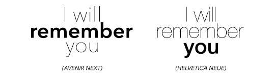
I will use the simple phrase “I will remember you” throughout the following part of this post.
First you need to figure out what you want to highlight. Do you want to highlight, that you will REMEMBER them? Or do you want to highlight that you specifically remember THEM (in the phrase ‘you)? Lay it all out for yourself, so you know exactly what to do.

The difference with these two examples isn’t too big, as you might have noticed. I used the regular and bold types for these examples. However, fonts like Avenir or Helvetica come with thin or even ultra light versions and you have more to play around with.
Script fonts usually don’t come in different weights, however you can utilise Photoshop to apply its bold addition to the fonts. It usually doesn’t look too nice though, so be warned!

Also, script fonts are harder to pair with one another, because it’s easier to cause an ‘overload’ for our eyes with pairing them depending on their level of ... let’s call it fanciness.
Now, you can pair the different weights together like this, centred.. and boring.. or you can play around with different font sizes, weights, kerning (click here to find out what kerning is) and positions. It’s fun, I promise! Just make sure you don’t forget which word(s) you want to emphasise!


Pairing DIFFERENT FONTS with each other
Now here’s the part people have asked for haha.
The first thing I want you to understand is, that the less is merrier does apply in this case. I personally n e v e r pair more than three fonts together (and I only use three different fonts for an entire corporate design including a website), two usually work the best!
For two different fonts to work nicely together, you (again) have to think about what you want to emphasise and create some kind of hierachy. In order to create an appealing design, you need to catch the viewers attention to the word or phrase you want. Create a focal point, something the eye is immediately drawn to. And then you add to it with simplicity.
You really have to think about what you want to be seen first and what you want to be seen second (on the base of using two different fonts).
Take a look at the fonts you have chosen. Display and script fonts usually need to be a larger size to be readable or to make them look good, so you probably want to use that one as the top of your hierachy. Also fonts with a heavier font weight tend to work better as the leading font. To accompany your leading font, choose a thinner, more simplistic companion. Why? Because if you use two heavy fonts or two fancy fonts (script, black, brushed etc.), your eyes will have a hard time concentrating on who is more important.


I hope this example helps you to understand what I mean.
In the first picture you see the whole thing as ONE block, because your eyes don’t know where the exact focal point lies. They don’t know which word they should concentrate on. The second one, however, gives your eyes clear instructions on where the importance of the quote/phrase lies.
Now how do you find out, if two fonts actually go together? Sometimes it’s also about the look of the whole design in general, if two fonts go well together or not. However, there are some things you can look for before you pair fonts:
Have a look at the weight, spacing/kerning, strokes in general and their width to figure out, if the two fonts you have chosen are different enough from each other, to actually pair well. Fonts that are too similar to each other have the same effect as shown above.
At the same time please also keep in mind, that they have to have some similarities, such as their general proportions and heights. If these parameters are too different, it might doesn’t look as good (there are some cases where you can make it work though, but you need to play around a little here).
If you made it this far, congratulations :D
This is not the ultimate guide to how you will always pick the right pairing of fonts, but it’s a start and something you can work on and evolve from! I hope it helped you. Feel free to message me, if you have any questions left. And now to what has been requested in the first place.
Here are some of my favourite font pairings:

(Avenir Next at kerning 200 + Abril Fatface)

(Avenir Next at kerning 200 + Sunbreath)
(Bodoni FLF at kerning 300 + Alberobello Script)

(Almondia at kerning 60 + Billy Ohio)

(Boysen at kerning 75 + Saturday Rock)
I hope you found this useful! :) Feel free to share!
#typography#typography tutorial#pairing fonts#font pairings#resources#userlexi#uservaleria#usersophy#annasuser#tuseralex#usernums#userauden#font series#tutorials#mine
869 notes
·
View notes
Text
All Of Your Soul

Part of the @babythotshq mini collab!! You can check the other parts here!
Pairing: demon!Tsukishima Kei x gender neutral!reader
Genre: angst, crack if you squint for like 2 seconds
Summary: Your superstitious grandmother always told you not to get involved with demons, but how could you not when Tsukishima Kei, the one you’ve summoned, was so alluring?
Word count: ~3.4k
Author’s note: Happy Halloween!! I hope you enjoy this piece, and a massive shoutout to @hidden-otaku-stuff @kaitycole and of course @babythotshq who helped me out during the process of writing this fic! Love you all mwah mwah 💞
WARNINGS: mentions of blood, minor and major character death, yandere!tsukki, mentions of violence, mention of sex, swearing

Ever since you were a kid, your grandmother warned you about the evil creatures that cohabited the world you lived in. She was often called crazy because of it - after all, she was an old lady talking non-stop about demons. However, that topic amazed you rather than giving you chills down your spine. Your curiosity grew progressively as she told you the same thing over and over: “Don’t mess up with them, or else they’ll take your soul away”.
You always thought grandma told you those stories just to scare you off, to make sure you would stay in line. But the way you’d laugh it off at the age of 7 almost like daring the threat hinted your disbelief.
"The entire hell can come get me, they won't be able to touch me!" you once told your grandmother, which earned you a scoff and a flick on your forehead.
"Oh, Y/N" she cooed, almost in pity, patting your head. "You will regret it when you're older,"
And once again, you laughed at her.
It became part of your childhood, long forgotten as the years passed by and the concept of believing in demons appeared to be silly. Your memory permanently buried it in the depths of your mind after your dear grandmother passed away, leaving this world with her tales from underworld creatures.
A long time since she passed,, you remembered the spooky way the old woman would tell you different myths when you were packing your belongings to leave for college. The old box stuffed inside the attic filled with dusty and thick books lit a lamp in your head, concluding your grandma used to tell you those stories.
Not only did she have short terrifying ones, your grandma seemed to be way more superstitious than just believing in simple tales. Some of them had different symbols, with many side notes written - assumably - by your late relative. The barely readable handwritten overlapped one another, all information mixing into a big mess that you could hardly understand.
“Granny was really into it, huh?”
It wouldn’t hurt reading them - after all, it would be for the sake of your childhood.
And just like you found yourself drawing strange patterns inside a circle on the floor of your bedroom with chalk, it hardly appeared but you didn’t mind. It’s just some made up stories, you thought, proceeding to let an airy laugh just thinking about your grandmother tossing and turning in her coffin. Your disbelief in these surely came from your young age. After that, all you needed to do was a single drop of your blood and say some weird phrases.
“If it doesn’t work, it’s because of these freaking sentences,” you muttered, pricking your finger with a needle. As the red liquid fell on the center of the circle you drew, the difficult words slipped out of your lips.
A few minutes passed by after you finished the ritual and the bedroom was engulfed in silence. How you wished you could talk to your grandmother right now, just to rub it in her face that she was wrong - even though you had a mess to clean. Tossing the old book aside, you laughed at the situation you had put yourself in and undid a part of the draw.
“You know, ever since you were a kid your sassy attitude got me on my nerves,” a second voice echoed, a male one.
You have never turned your head so quickly in your life, looking for the person who just spoke to you. A tall, blonde guy stood on the other side of the circle; the black dress shirt had the first three buttons undone matching with the black slacks. He was handsome, and you wondered if it was your mind’s work to show you one of the hottest men you’ve ever seen (and imagined) in your life. “It’s rude to stare”
“I must be crazy,” you laughed, rubbing your eyes, when you opened them again, he was still there, with an annoyed look on his features. “Granny must be pranking me, there’s no fucking way I summoned-”
“A demon, actually you just did, haven’t you read the book, dumbass?” he hissed, rolling his eyes. The blonde man crouched to look at the poorly drawn summoning circle and scoffed. “I wonder how you managed to summon me, this shit is terrible, not to mention your Latin”
“Well, I’m sorry if it’s fucking hard to draw it, let alone speaking goddamn Latin!” This guy, this demon was pissing you out, and he had only been in your room for less than five minutes. “Okay, I guess you’re real, my grandma was right, go to hell”
“A lot of people have already told me this joke, and I have to remind every single human that it sucks,” he snapped angrily, before sighing in defeat and looking at you. “What do you want from me?”
“Me, nothing,” you chimed sarcastically. “I was serious when I told you to go to hell, demon.”
“Can you please not call me demon?!”
“So how should I call you? Rex?”
“Jesus, you’re so annoying-”
“I thought demons couldn’t say Jesus’ name, Rex”
“For fucks sake, it’s Tsukishima!” he said louder than he wanted, his voice vibrated inside your body sending chills down your spine. “You’re the worst human that has ever summoned me, and it was just for fun!”
“Then stop complaining and return to hell, it’s not that hard!” you shot back, just as annoyed as him. A part of yourself, the superstitious one, the same one that had believed for a short while in your grandma, was screaming at yourself for picking up a fight with a demon, but your prideful one wouldn’t let that go easily.
“I can’t just do it when you fucking used your blood while summoning me!” Tsukishima exclaimed, rolling his eyes. “Don’t you know how to read? It clearly says that blood rituals are strong, they tie your soul to me.”
“You’re telling me you, a demon, can't undo this shit?” you asked, at the sight of the male shaking his head sideways you groan frustrated. "What kind of shitty demons are you?"
"A demon that is way smarter than you, idiot." he mocked angrily.
"What am I going to do with such a pain in the ass?" The question didn't look for a proper answer from him, but either way he grunted in protest. "If I pray to whatever god, will you be repelled?"
"You're really the dumbest human I’ve ever met," Tsukishima stated as he rolled his eyes. "Of course not, what do you think I am? An ordinary demon from a shitty movie?"
"Well-"
"You know what? Don't answer it," he cut you, shaking his hand as if the gesture would shut you off. "Clean this mess, it's giving me chills seeing such a bad job."
"Use your demon powers to clean it all!"
"I'm not a fucking fairy!"
Tsukishima was just a single demon, but his presence seemed to bring the whole hell to you. His witty and unnecessary comments easily threw you off the edge, and as if he noticed, which he probably did, the man made sure to say at least one provoking statement every single time he opened his mouth.
It wasn’t easy to get used with his presence, especially when Tsukishima made sure to remind you every minute you were awake that “it’s your fault”.
Yet, the demon did not tell you how to break whatever bond you established with him. You came to the conclusion that his duty whenever he was summoned was to annoy people out. What a useless demon, you thought once, just to hear him screaming profanities and insults inside your head.
You have never imagined that this situation would drag for so long. Tsukishima was there on your first day at college, and he made sure to make you embarrass yourself in front of your class. He was also there to ruin your first date with a cute guy from one of your periods, Inuoka ended the night a bit paranoid about someone following him around.
“I think you told me you weren’t a fairy to do this kind of thing, Tsukki” you commented sarcastically, feeling the anger bubble inside your chest.
“You heard it right, Y/N,” he answered, throwing himself at your not-so-comfortable sofa, stretching his legs over the coffee table in front of it. “That guy looked like a little boy scared of his own shadow!”
“Why did you do it?!” The question came out more desperate than you wanted it to be. Inuoka wasn’t the first man Tsukishima pulled a stunt on, and by the way your personal demon (as you address him) acts it’s not going to be the last. “He was so nice, he didn’t deserve this childish attitude of yours!”
“Well, he doesn’t have part of your soul like I do,” Tsukishima muttered quietly, but his eyes spoke volumes about his feelings. The possessiveness shone in his golden-brown orbs, a hint of jealous maybe, and you wondered once again if he had feelings like you.
“Tsukishima…”
All words left your brain as the tall man walked over you, holding your face with his hand. He ran his thumb over your lips and squeezed your cheeks with his grip, forcing you to maintain eye contact with him. “What are you-”
“You’re mine.” He spoke firmly, not giving a chance to say anything back. “I have a part of me in you and part of your soul is mine. You are mine”
Without a warning, Tsukishima leaned down to smash his lips against yours. His movements were harsh, but it didn’t take too long for you to give in into the heated kiss. Your head was empty, and all you could feel was his mouth on yours and a slender hand travelling inside your shirt. The lack of air in your system made you pull away from the contact, locking eyes with him with a clear question mark above your head.
“What the hell was that, Tsukki?” The anger vanished, leaving behind confusion and a bit of… desire inside of you.
“I’m just showing you who you belong to.”
At that moment you couldn’t see all the red flags on that simple statement. The frustration of many failed dates piled up on your nerves to the point that you were not able to see the meaning behind those words. The mere thought of a man desiring you probably the same way as you did blinded you, and that made you snake your hands around Tsukishima’s neck and bring him down to another feverish kiss.
The rest of the night passed by like a blur, Tsukishima’s touch was hot on your skin - and you enjoyed it. The sane part of your brain didn’t have enough room to question your actions: what on Earth were you doing hooking up with a demon? Were you that desperate to be intimate with someone? As quickly as those thoughts invaded your mind, the man towering over you proceeded to take your focus to himself
You don’t know when you fell asleep, but once you woke up, feeling sore as fuck, you noticed Tsukki lying next to you. His eyes were closed, yet you knew for a fact he wasn’t in a deep slumber- he didn't need sleep. Nevertheless, you took a few moments to appreciate the view, at the same time flashes of your previous activities together came to you just like a fever dream.
“You don’t have a brain to think too much, dumbass,” he said without even looking at you, a sly smile graced his face nicely and you wondered if he was, at some point in his life, an actual angel. “Do you know who you belong to?”
“I’m not really sure,” you replied shamelessly. Tsukishima’s eyes opened to look straight at yours, arching his eyebrows at your daring tone. “All I remember is a very annoying demon being a bitch about a guy I was interested in”
Messing with Tsukishima became one of your favourite things, because his immediate response was to pin you on the next hard surface and engage in a messy kiss. Being with him was way different than any other relationship you've had, which weren't many since that demon was on your ass ever since you started college.
Either way, you loved the push and pull between you two. The constant bickering would eventually turn into a heated make out session, and sometimes even more than that. You completely forgot that the man you were in a sort of relationship (if you could call it that way) was a supernatural creature; your mind chose to bury the important information of who Tsukishima really was: a demon.
His actions started to change after over a month or two since you fucked for the first time. Although the snarky and teasing comments were far from coming to an end, you found yourself curled next to him every night. Tsukishima would hold you before you sleep, even if he had to spend a few hours in the same position (which never lasted long, he learned in the hard way that you toss and turn a lot).
You also changed around him, much to your surprise. You no longer found other men at college attractive; your Friday nights were spent on your couch with Tsukishima next to you, with a random movie on the TV while the two of you kiss. He was your getaway when things got too rough for you, with his hot touches and endless desire.
Maybe it was the attention Tsukishima gave you, or perhaps that he has been with you for so long, but he managed to win your heart completely. Every time the blonde demon hissed “you’re mine”, how he always satiates your desires and even the awkward moments when he tries to cuddle you. Every little thing this man does pull the strings attached to your heart and mind.
And you knew Tsukishima noticed your change of demeanor as well, how you got clingier as the months passed by, the soft tone on your voice and the lack of sarcastic responses to his mean comments. You were falling in love with him, and it was the most obvious thing Tsukki has ever witnessed during his whole life dealing with humans.
“I think I love you, Tsukki” you managed to say, your body trembled due to the intense pleasure the man above you just provided. His eyes were unreadable as he looked down at you, but you could dare to say there was a hint of fondness swimming in them. “I never thought it would be possible to fall in love with in all creatures, a demon”
“Yeah?” he caressed your cheek, tracing down to your neckline and pressing on the reddish marks on your skin. “And you were the almighty kid who didn’t believe in demons”
“A pretty annoying demon changed my mind, I have to add” the smile on your face was small, but held so much meaning. However, Tsukishima didn’t mirror your feelings, displaying a rather sadistic one instead. “And you, have you changed your mind about humans?”
“Who knows?” Tsukishima asked rhetorically, letting his body fall next to yours on the bed. "You're the most… interesting human I've met."
You laughed at his comment, pressing your face against his side in a loving manner. The fact that Tsukishima stood still instead of responding to the display of affection went unnoticed by you; he was being himself, you tried to justify his stiffness.
Your relationship with him was just like that: you being overly affectionate and Tsukishima… being himself, the hard to approach demon with beautiful looks and with a magnetic aura. You fell easily for him, like getting used to a new daily routine. In a matter of time you found yourself being more vocal about your quick paced heart, the butterflies flying inside your stomach and even the high pitched tone of your voice whenever you couldn't retort one of his comments.
The man, on the other hand, didn’t follow this demeanor - in fact, Tsukishima started to act the opposite way. He would avoid your touches like the plague, leaving your apartment late at night and returning near the afternoon with purple marks on his neck and collarbones. Something inside you, jealousy, lit up like setting something on fire: wild, uncontrolled and destructive. Once it starts burning, it won’t stop easily.
“Can’t you stop fucking other people around?!” You screamed at him, not caring if the clock on the wall just hit three in the morning. “Am I not enough for you?”
“Stop making a case out of it, Y/N” Tsukishima rolled his eyes trying to pass through you, only to be blocked by your body. “Jesus, why are you being so jealous?! We have nothing between us”
“I am fucking in love with you, dumbass!” Your high pitched voice was followed by a dead silence. Tsukishima stared at you blankly while you took deep breaths in order to calm yourself, but the adrenaline of your confession didn’t help you stay quiet. “I’ve been head over heels for you for the longest time and you proceeded to hook up with other people every night… Am I that easy for you? I love you with all my heart, a part of my soul is yours- why can’t you do the same?”
All you could hear at first was your erratic breathing pattern, then the room was filled with his laugh. He was laughing as if someone had just told him the funniest joke he ever heard, the way his torso bent forward to accompany sick amusement creeped you out. Tsukishima pretended to wipe a tear and smiled at you.
“Oh, Y/N… You’re definitely something else, huh?” He said rhetorically, stretching his arm so his hand could cup your face. You stood still, suddenly unsure about his actions and words. Tsukishima has never used such a cold and psychotic tone with you, let alone that sadistic smirk hiding so many feelings. “So you finally accepted that you’re mine, right?”
“H-How can I be yours if you don’t give yourself to me, as well?” Never in your life have you felt so terrified, something in Tsukishima’s demeanor screamed that he wasn’t joking around. He was about to do something bad, and it would be against you. “Isn’t my love enough for you?”
“Well, to be honest? It’s almost enough” he agreed, his index finger traced down your cheeks, following down your neck until it pointed directly to the left side of your chest, above your beating heart. “So, shall I claim what is mine?”
The time seemed to be slowed down, your heartbeats were loud in your ears and your limbs were numb - you couldn’t move them at all. Regardless, it would be impossible for you, a mere human, to stop Tsukishima from slamming his hand against your chest. You didn’t feel physical pain, but the sensation of something, someone wrapping slender fingers around your inner self made you scream.
“Tsukishima, w-what are you doing?” Your trembling voice made him laugh, the same hand he used to hit you fully on display for you to see him close it. The immediate reaction of you was a shriek, as if the demon was squeezing your insides. “What the fuck, Tsukki?”
“Why are you so surprised?” Tsukishima asked with fake innocence, wiping the tears you didn’t know you shed. “You just told me you loved me with all your heart, that a part of your soul is mine… So I’m claiming my belongings, after all, this is the kind of demon I am: whenever a stupid little human like you summons me with blood, they sell their souls to me. It’s a matter of time for me to get it”
“I… I trusted you, Tsukki…” Your sobs interrupted your own speech. All the intimate moments you two have spent together were pure acting, meaningless, just to make you give your everything spontaneously to him.
Your grandmother was right. You regretted every single interaction you had with Tsukishima, the demon you summoned before entering college.
“Well, it’s your own fault.” With that, Tsukishima harshly pulled his hand backwards, leaving behind only an empty body with no soul.
TAGLIST
crossed users are the ones i couldn’t tag!
@jovialnoise @paripedia @angmarwitch @shinhiromi @mariachiiii @elianetsantana @moonlightaangel @vicassa @boosyboo9206 @shrimpypenis @sunshine-hina @kozupresh @humanitysbiggestsimp @atsumubabe @sachirou-senpai
36 notes
·
View notes
Text
How I make book covers + tips for you!
Hey people of Earth!
Around this time last year, I mentioned I would have a video up on how I make book covers/cover making tips, and to summarize: I did not do the thing, and this year old script is still sitting in my drafts.
SO, I thought I’d kill two birds with one stone and post a written version of these tips! Going to get straight into this because I imagine this will be rather long!
This post will be divided into 6 parts: finding inspiration, concept art, incorporating elements of design, composition, tools and software, and resources. Feel free to skip around to whatever section interests you most!
***Before we get started, really quick disclaimer. I am in no way a professional cover designer. Cover design is merely something I picked up on my own, and I don’t have any formal education/credentials in graphic design. So of course take my advice with that in mind. These are also just my personal thoughts and opinions. So take everything with a grain of salt!
1. Finding Inspiration

What’s the deal?
A really great way to start out in design
Finding cover designs or designers you admire may help you see what works technically
Helps nail down a style you like
In turn, can help you find your cover design style
What should you do?
Look at covers in your genre!
Whenever I design a cover, I take a scroll through Goodreads to pick up some inspiration in designs I personally love
I also love walking around my bookstore and taking a look at physical copies
Find a cover design you like, and point out the specific reasons you like it
Example:
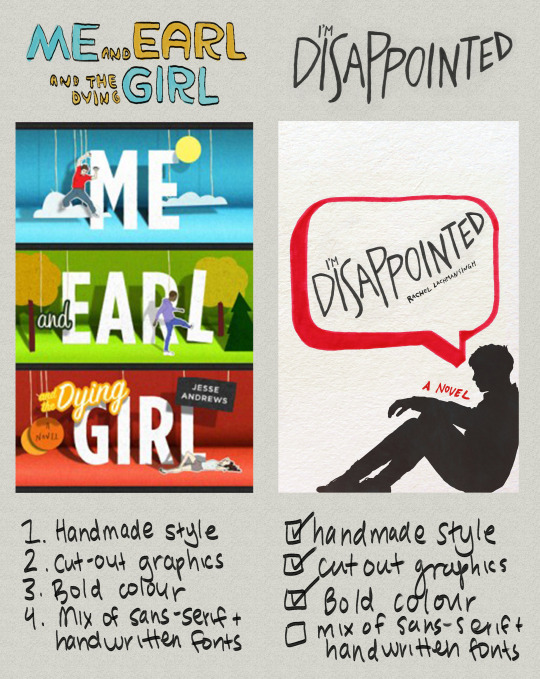
Me and Earl and the Dying Girl was actually not an inspo cover for this edition of I’M DISAPPOINTED, but as you can see, things I liked from it spilled over into my own design. By pointing out aspects of graphic design you like, you’ll better be able to understand your style as a cover artist.
Some personal thoughts:
I like covers that include a textured backgrounds, as seen in the collage below:
So for the I’M DISAPPOINTED cover above, I included a textured background. I also love handwritten fonts/lettering, which I include in almost all of my book covers.
What I did:
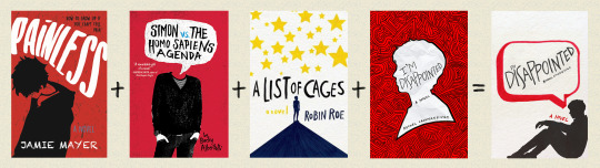
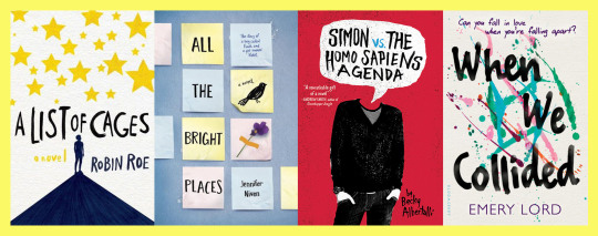
Off-white colour from A List of Cages and Holding Up The Universe
Silhouette from Painless and previous cover design of I’m Disappointed
Speech bubble from Simon VS the Homo Sapiens Agenda and Say What You Will
Marker texture from A List of Cages
Obviously my thought process wasn’t to put 4 covers in a blender and thus create my product, ha, this is just an example for the ease of understanding!
2. Concept art

What’s the deal?
Coming up with concept art is a super important part of designing a successful book cover.
Acts as the skeleton of your book cover
Your book cover’s roadmap
Saves time/effort
Similar to an outline for a novel.
Can be a very quick sketch, or full fledged design
I like keeping my concept art quick, but if this is your first cover, making a more detailed mockup can help.
What should you do?
Sketch out book cover ideas once you get them/take notes of concepts you’d like to explore
If you can’t come up with concepts, take a look at your inspiration folder and pull concepts/ideas from covers you love
This does not mean copying another book cover (this is notttt a good idea!). BUT, pulling inspiration from elements you like on a cover can be helpful in generating your own concepts
You don’t have to come up with concept art (sometimes winging it works!) but I do recommend jotting notes down, and drawing out loose sketches when applicable!
Keep a list of ideas for book covers as you accumulate them (almost like a little vault of concepts lol) and reference them in the future!
Take a look at as many book covers as you can and make a list of elements you like and don’t like
This is one of the easiest ways to accumulate ideas/concepts!
Example:
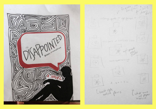
^^^ Concept art for two book covers
Likes and dislikes in book covers:
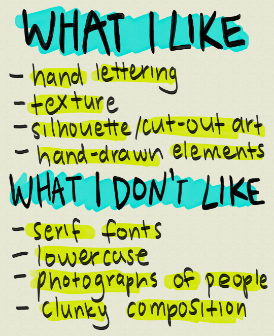
Of course this list is not my be all and end all (nor should it be), and obviously, I still use these things (besides clunky composition I hope!) in some designs!
3. Incorporating the elements of design

What’s the deal?
There are 7 elements of design: line, shape, texture, form, space, value, and colour.
These sometimes vary depending on where you look, but this is what I was taught, so I’m going to be working off that!
Examples:
I’m going to go through them really quickly via an assignment I did for my comm tech class
Keep in mind this assignment is 2 years old and is only meant to give you an idea of what these elements are
1. Line

Line is probably the most important element of design as every piece of art starts with one.
There are various types of lines. You can have curved lines, straight lines, vertical lines, horizontal lines and so on.
2. Shape
You can have more mathematical, geometric shapes, or more abstract, free form shapes.
3. Texture

Texture is the feel of a particular surface.
Texture in my opinion is one of the most important elements when it comes to graphic design, especially book covers.
My favourite thing to see in book covers is texture, whether that be paper textures like construction paper, crumpled paper, wallpaper, lace, wall textures, paint textures, or marker textures
Texture adds depth to designs, and if there’s any element of design you focus on in this post, I’d highly recommend it be this one.
(i’m biased but still)
4. Form

Form is almost like shape, except instead of flat objects, we’re dealing with 3-dimensional objects.
I don’t often use it in my covers since I like drawings and flat shapes in my designs, but if you want to include objects on your cover, or any sort of 3D shape, this would be form.
5. Space
The distance around an object, to put it simply
Space in covers can help emphasize what’s important, and what is less important, or can draw attention to a particular piece of your design.
Examples of space:
Colour coding: yellow = space, teal = focal point/movement of viewer’s eye
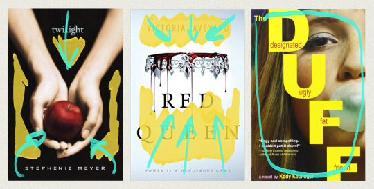
In Twilight, the black space helps emphasize the main image, the hands holding the apple.
This also occurs in the Red Queen book covers. The empty space around the crown draws attention immediately to the focal point
You can also lack space. In The Duff, the girl’s face is the only thing you can see on the cover.
6. Value

Is determined by how much light or dark is incorporated into design.
Example of value:
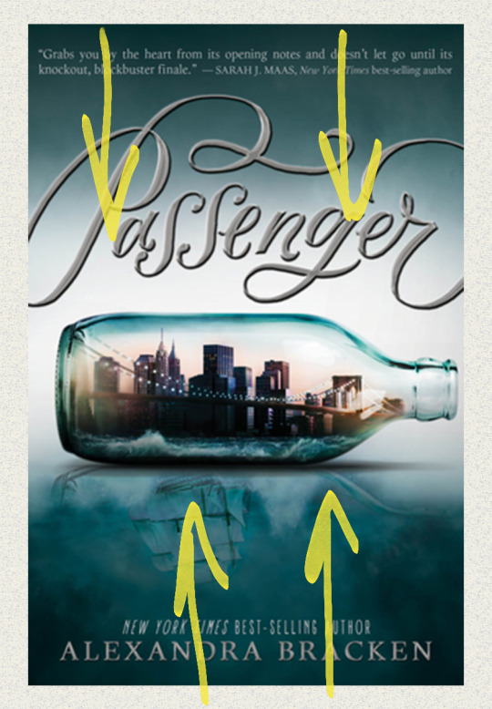
A great example of value in book covers is on Alexandra Bracken’s Passenger. As you can see, the green at the top fades down in a gradient as more white is added to the centre.
7. Colour

Light reflecting off objects
Can make certain elements of your design stand out
Why should you incorporate the elements of design into your designs?
Adds layers of depth to your work
Thus can take your cover-making skills to another level
Can help in producing ideas
4. Composition:
What’s the deal?
In my opinion, can make or break a design
Can mean clutter of things, OR too much or too little space between elements
Title placement
Composition is sometimes subjective from design to design
What you can do:
Pay close attention to detail and spacing
Look out for natural shapes in your design you can fit elements into
Watch the linked video from Mango Street (one of my favourite photography channels) on composition
While photography and design are two different things, the tips in this video can also be applied to various ideas in design such as headroom and leading lines
youtube
Examples:
*Before I get into this, I want to make it clear that these examples are exaggerations for the purpose of showing you good and bad composition. If you make these mistakes, that doesn’t mean your design is bad, and again, I’m no professional. This comes from what I believe could be considered bad composition, but trust your gut.
Example 1: Stick People
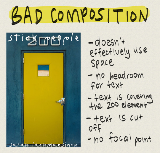
doesn’t effectively use space
no headroom for text
text is covering 200 element (looks very clunky)
text is cut off
No focal point
Can’t read the title
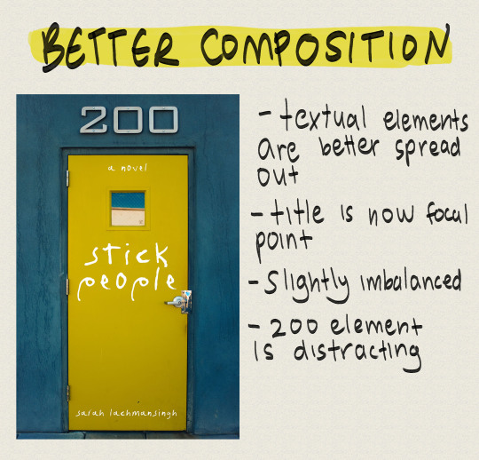
Textual elements are better spread out
Title is now focal point
Slightly imbalanced
200 element is distracting
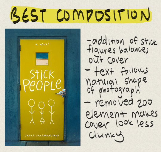
Addition of stick figures balances out cover
Text follows natural shape of photograph
Removed 200 element makes cover look less clunky
Example 2: Sixteen Cents
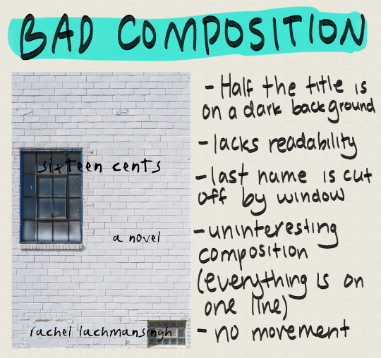
Half the title is on a dark background
Lacks readability
Last name is cut off by window
Uninteresting composition (everything is on one line)
No movement
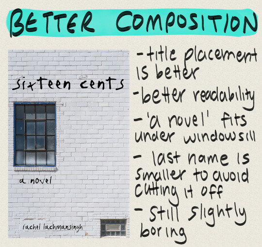
Title placement is better
Better readability
‘A novel’ fits under windowsill
Last name is smaller to avoid cutting it off
Still slightly boring
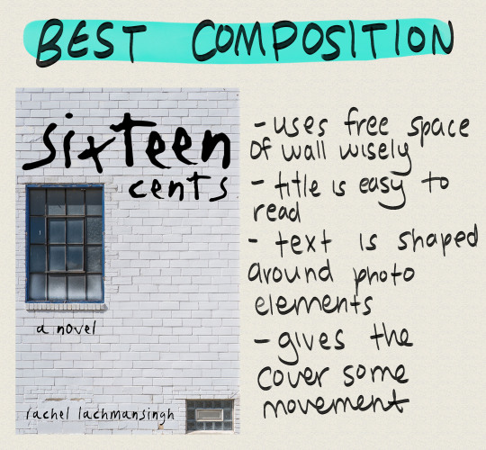
Uses free space of wall wisely
Title is easy to read
Text is shaped around photo elements
Gives the cover some movement
Example 3: Fostered
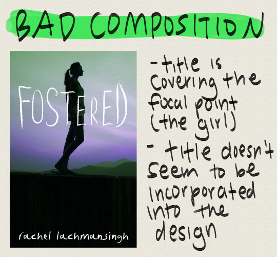
Title is covering the focal point (the girl)
Title doesn’t seem to be incorporated into the design
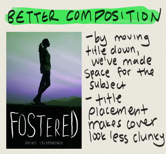
By moving title down, we’ve made space for the subject
Title placement makes cover look less clunky
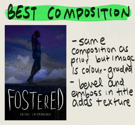
Same composition as prior but image is colour-graded
Embossed title adds texture/depth
I’ve mentioned this a few times in this post: focal point. What is it?
FOCAL POINT:
Is defined as the main attraction of your book cover
This is where you want your readers’ eyes to focus
Focal points can sometimes define themselves in areas where more contrast happens to be
Doesn’t have to be the centre of the page.
Keep focal point in mind for composition because if you put it in the wrong spot, you could end up drawing your readers’ attention to the wrong area of the cover.
The point of most interest in a cover is the focal point, so if you want a particular subject of your book cover, such as a person, to stand out make sure you don’t make the other areas of the cover too high contrast or busy.
Framing subjects also helps, so be creative!
The human eye tends to focus on areas with increased contrast so keep this in mind
Examples:
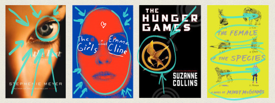
The Host
The camera has focused on the eye of the model, with the nose bridge and forehead shadowing each corner of the cover
Helps lead eye to focal point (the eye)
The Girls
Blue around the edges encircles the focal point (the girl), leading the viewer’s eye directly to her
Girl is also scarlet in colour, contrasting the background
The Hunger Games
Grey outlines on the cover lead straight to the mockingjay
Mockingjay is bright gold in comparison to the black background
Creates contrast, thus viewer’s eye is lead there
The Female of the Species
‘Straight’ composition
No particular focal point, viewer’s eye instead moves horizontally across the design
What should you do?
Use the natural shapes and outlines in your design/photo to fill your cover
Use your space wisely (see examples above)
Use leading lines to draw attention to your focal point
Manipulate text to fill empty spaces
5. Tools and software
You do not need Photoshop to make a good book cover
I made my first book covers in GIMP, a free image manipulation program (kinda like Photoshop’s little brother)
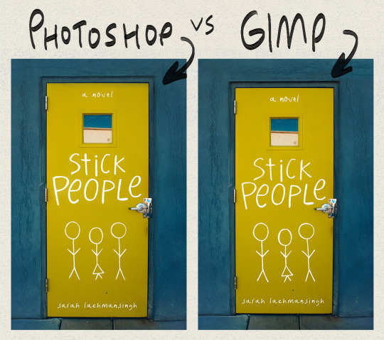
This is the stick people cover I made in photoshop, and the same cover made in GIMP.
Other tools you may want to use are CreateSpace’s cover templates.
You can find these through CreateSpace OR Bookow (my personal fave)
OPTIONAL (what I use):
Graphics tablet
I use the Huion H610 which I really enjoy!
I use this to hand letter, draw silhouettes, create concept art, and so on
Paper and my Faber Castell India Ink Artist Pens.
These are fine tip markers, and are what I used to create the text on I’m Disappointed
Thin sharpies and pens will also do the job, and you can always clean any mistakes up in photoshop or gimp.
A scanner so I can transfer what I’ve hand drawn onto my computer
If you don’t have a scanner you can take a clear photograph on a camera or phone
I also use a few custom marker brushes that now come with the 2018 version of Photoshop
The main one I use is Kyle’s AM - Watercolour Paper from the art markers set (you have to load these into Photoshop, but if you have PS 2018, you should have access to ‘em).
(I’ve lettered everything in this post with that brush)
6. Resources

Here’s a list of amazing resources you might need when making your own book covers!
1. Stock image websites
Check out THIS post for a master list of my favourite stock photo websites!
Stocksnap.io
Unsplash.com
Pixabay.com
2. Dafont
Is my main source for finding fonts
3. Goodreads
A huge resource I use to find cover inspiration
I’ll often browse the new releases section to look at new covers and so on
Easy way to narrow down the genre of cover you’re looking for, as well as the age category
4. Keyboard shortcuts
Check out a masterlist for Photoshop HERE
GIMP masterlist HERE
Makes workflow super efficient
My fave I highly recommend in Photoshop is ctrl > shift > alt > e (merge all layers into new layer)
I’ve made TWO custom shortcuts: ctrl > shift > o is now open as layer, and ctrl > shift > alt > r is now rasterize layer (these save so much time!)
So to conclude this post, I’m going to list out some of my favourite tips when it comes to cover making (sort of a reiteration of this post)
Add texture!
Texture is a super easy way to add dimension to your book cover
Try lettering with a paper and marker when starting out
I find this a lot easier than digital lettering!
Google is your friendddd
If you can’t figure out how to do something in Photoshop or GIMP, the internet is a vast depository of information!
Pay attention to detail
Cover design is alllll about the small details. Making sure you’ve centred something properly can seriously help in making your cover go from amateur to whoaaa who made thatttt
Get a second opinion
Been looking at your screen for 8 hours straight? Ask someone you know what they think of your design! I find this has sparked a lot of secondhand ideas!
If it doesn't work out, doesn't mean it was a fail
If a particular concept just doesn’t work, don’t worry! As you practice you’ll get better, and you can always revisit the concept for another novel!
EDIT: a really great suggestion from @sarahkelsiwrites: print out your design if you need a fresh perspective! You’d be surprised by what you notice on screen VS off!
So that’s it for this post! I hope this was helpful for some of you guys, I know it was looooong overdue. If it helped you out, let me know, and if you have any questions, feel free to send ‘em my way! :))
--Rachel
13K notes
·
View notes
Text
March 18th-March 24th, 2020 Reader Favorites Archive
The archive for the Reader Favorites chat that occurred from March 18th, 2020 to March 24th, 2020. The chat focused on the following question:
What device do you most often read webcomics on and why? Has this affected whether you read a comic or not?
carcarchu
Typically computer but I will use an emulator to download a specific app if i need to. It's a real pain but if i want to read a certain series enough i will download the dedicated app it's on
Capitania do Azar
Oh I'm all for reading in the computer. Bigger view, more details, no need to zoom on things or have weirdly placed panels.. nice
keii’ii (Heart of Keol)
I read a lot of vertical comics yet I read almost exclusively on desktop...
eli [a winged tale]
On mobile! I do think desktop work better for traditional layout comics though —- but in that case I usually just buy the actual physical copy (best experience imo)
LadyLazuli (Phantomarine)
Computer or mobile. But I particularly love reading things on my iPad. Closest proportions/feel to an actual book, I guess
Tuyetnhi (OIYD!)
same on Computer or mobile, but I read more comic sites on desktop and webtoons on mobile
Feather J. Fern
I read mostly on mobile due to reading on transit or on the go. Computer is only if the website is large spreads or large pages only
Ash🦀
I read on mobile because I’m on my phone a lot at work (I finish my work much faster than everyone else so /shrug until they notice my efficiency, might as well relax)
Cronaj (Whispers of the Past)
I read on my phone most of the time. I am often reading on the go, and I don't like reading comics in my office, because that's the room where I work.
Kabocha
I'm a mix of mobile and desktop. If it's a new-to-me comic and I find it through a platform that I'm browsing on my phone, the website needs to be mobile friendly for me, or available through ArchiveBinge... Otherwise, I'll forget it ^^:;; Unless something about the story REALLY catches me. Desktop though? Eh, as long as the website isn't super slow, it's fine. Basically for me, the website needs to be usable on whichever platform I'm checking it out on. If it's being tweeted rather than rec'd by a friend, I would really hope it's a site that has been tested for mobile friendliness at least.
(also, if the website is mobile friendly but the comic's page-by-page style, setting the max scale is SO helpful! that way I can zoom in on small panels or whatnot if I'm interested. https://css-tricks.com/snippets/html/responsive-meta-tag/)
sssfrs (JOE IS DEAD)
I prefer desktop because I can more easily bookmark comics
Erin Ptah (BICP | Leif & Thorn)
Desktop -- I have ComicRocket bookmarked on my phone, but the only comics I open there are the handful that I remember are readable on mobile.
If I get the print version I usually read it, although some book designs are more comfortable reads than others...
RebelVampire
For me it really depends on what I'm reading the comic for. If it's just for personal pleasure reading, then I tend to do a mix with a heavier emphasis on desktop since I'll read it while taking mini-breaks from what I'm working on. Sometimes I'll read a bit on mobile, but usually the majority I consume on my desktop. However, for CTP comics, unless they're super long, I actually read those almost exclusively on mobile. For me personally just as the host, I don't consider that reading free-time persay (more like unpaid work time). So it's just more work after work. And after work I just want to be mush on my bed. So I combine the best of both worlds and just be mush on my bed while being productive and getting something done. Insofar this hasnt really affected comics I've read. Most of the personal ones I choose read okay on both platforms, and the few that I would've not read cause of mobile issues were much older CTP comics so I read them anyway and just dealt with having to do it on desktop.
Cronaj (Whispers of the Past)
I have definitely given up on a few comics because they were basically unreadable on mobile, but usually those comics that were unreadable on mobile were also pretty hard to read on desktop too (i.e. bad fonts, lack of spacing between words/letters, small type, handwritten text, etc.) I also read mostly webtoons/scrolling-format comics, so I usually don't have a problem, but I also read a decent amount of page-by-page comics that are also easy to read on mobile, so some creators just know what they're doing
RebelVampire
Yeah I have to agree there. That my personal experience is that comics that are bad to read on mobile were generally still bad for desktop.
chalcara [Nyx+Nyssa]
Agree too. Font needs to be clean and the spacing needs to be good, and I'm fine.
Additionally, I both strongly prefer page-by-page comics and I prefer to read on the phone, so I want to be easily able to pinch zoom to dvelve into the details. Some web-pages break that by trying fancy navigation thingies, and that's usually enough for me to look somewhere else for entertainment.
And, of course, infamous mention to that one, now defunct webcomic, that gave you a "don't steal, don't copy" java script pop-up if you happened to click or tap on an image, with the results you couldn't scroll on mobile at all. That was a... less than ideal webdesign choice.
Holmeaa - working on WAYFINDERS
I am on my computer mostly, but I am so baad at reading, I am dealing with adultling haha
Tantz Aerine (Without Moonlight)
I don't like reading things on my phone, but that's because my eyes aren't what they used to be. I prefer desktop/laptop optimized, page-by-page comics. Though the vertical scroll isn't a deal breaker, it's not something I'm a fan of UNLESS it's used in such a manner that it adds to the story. That is rare though, at least in the webcomics I've come across. Tiny fonts or hard-ro-read fancy fonts are an instant turn-off.
sagaholmgaard
I also prefer being on my computer, and reading traditional page styles over vertical scroll comics. If a comic is designed for vertical scroll it can be good!! But I'm really not a fan of 'breaking up' a traditional page for a scrolling format as it kinda ruins the composition that the creator worked so hard on :( and idk I've never been good at using comics apps on my phone, I just dont get into the habit of opening them and checking for updates. I'm much better at checking for updates on a webpage on my laptop.
Nutty (Court of Roses)
Last year for my birthday I got a Samsung Tab! It's good for drawing, but I'm still getting used to that part... but turns out it's also perfect for reading webcomics!! The screen has the perfect size to read pages, which I can do on the go as long as I'm able to connect to WiFi. I also have the Feedly app, which tracks RSS feeds for my fav comics and lets me know where I left off!
DanitheCarutor
Eeeh I'll read a comic on mobile when I'm on the toilet in the morning or riding in the car, but I prefer desktop. It's easier to read and see the details of a page without zooming in, also I'm just not much of a phone person. There have been a couple comics I couldn't read on my phone either due to the layout or font size, causing me to wait till I got to my computer, but this is a rare case. Most of the time I don't have much of an issue. Although vertical scroll comics with a ton of empty space in between panels are an absolute pain in the ass to read on the desktop, so much scrolling! Aurg!
#ctparchive#comics#webcomics#indie comics#comic chat#comic discussion#comic tea party#ctp#reader favorites
1 note
·
View note
Text
@tenyxshx chirped 🦅🎉🎵 ;
A soft feather crown can be found in her room, made out of the same pink feathers that usually adorned him. Sadly enough, he could not be present for her birthday, work already calling so early in the day. Still, that didn't mean he shouldn't show any affection. Not to mention that the family already had a party planned out. A small note, with handwriting barely readable. "Happy birthday my golden griffin~♥" //*KICKS DOOR* BIRTHDAYS?????
Reddened gold sunrises pours shining opportunity in an open window. Bright, as every morning thus far had been. Early mornings where the sun had yet to peek over the horizon and left the world bereft of light seemed no less hopeful than the last. The day had begun similar, a lick of warm light against skin and routines that had continued as they had since the griffin came to roost. A chilled air to give added edge to morning stretches before presentable appearances became priority. Lulubelle had almost always been given the time to take beginnings in stride since the end of her relentless induction; a grueling yet necessary process. Blessings of being proved worthy showed themselves in regal atmosphere and beautiful sunrises. With every part of the eyes from restful slumber she was greeted with the same comforting kiss of light. As every day now before it, feathers flourish through disheveled lounge attire and take flight towards the horizon for a the usual session of sharpening instinct and reaction time .
An hour, perhaps two ─ none the wiser to the future happenings of the day. Dedication had always triumphed over the personal preferences of celebration. Yet, with time allotted and peace settled in the winter air of the kingdom, freedom of personal pleasures would take precedent for the day. A crisp feeling in every crack of stiffening joints bring acceptable maneuverability and Lulubelle returns to the window of a now naturally lit room. Fingers ruffle aimlessly through tangled strands of hair, taking further time to shuffle through various attire for the occasion. So long ago it seemed an outfit or two had been the limit within the small vessel that once ferried her across the sea. With every extra choice is a lighthearted feeling, a hum with handful of golden locks brushed down .
Chirped chord peaks in a curious tone as movement and wind stirs the vibrant feathers pieced together atop a desk. Grooming slows without halting, green eyes drawn immediately to the rushed penmanship on familiar stationary. It was not often that it found use. Actions were often quite louder than words and, considering the personalities within the family, handwritten letters left much to be desired. Personal reason was the only justification, made more apparent from the thought alone. In moments the familiarity presses a smile into the corners of lips as the crown makes its way into her hands. How delicate pink feathers were not threaded tightly where they were meant to be. Stray fingers still holding onto a now idle brush return to their original task as Lulubelle sets everything back into place. In time a maned mess grows manageable, puffed with embedded curls now near permanent with years of braiding. Now presentable, the crown finds a suitable place embracing golden hair .
❝ My, always in such a hurry... ❞ Another glance at hastily scripted note that finds itself a special spot tucked away with other valuables. ❝ I suppose that means he’ll be away all day again . ❞
A shame that so briefly falters the feeling of such a pleasant morning. But there were matters of which only he could attend, things that allowed them all to do as they please whenever they wished. It is with that time that they were all granted the privilege of existing as they so chose. In essence it had long since been Doflamingo’s gift. Spending an extra moment simply to leave the present as it had been brings a brimming joy to once pale cheeks. A moment of thought is given to words left behind with the gentle caress of fingers left idle among hair and feathers until reality knocks conscious thought back into her .

❝ Oh! I’ll need something grey, then.❞ Back to an array of options now narrowed down to only one, crown still snug in place. ❝ Everyone knows how well pink goes with grey. It’s perfect for the season ! ❞
#//﹡♕ the world is a party and life a gift. ﹙ ic.﹚#//﹡♕ we share knowledge in steps and rhythm. ﹙ answer.﹚#//﹡♕ v: and so the heavens forgave me; sins worshiped by the devil .﹙don. family.﹚#//﹡♕ with your crown and wings i rise; o godly bird of paradise.﹙ doflamingo / tenyxshx. ﹚#tenyxshx#|| //KICKS DOOR BACK//#BIRTHDAYS!!!!!!#not quite back to back but#CLOSE ENOUGH#a family party........ I cry#also this is CUTE#I CRY AGAIN#I CRY MANY TIMES#nothing will keep me from soft birthday things#nothing!!!#also she's wearing it out on the town and literally nothing is gonna stop her!!!!!!#grey and pink are super killer together too like??? I love#it's perfect ||
3 notes
·
View notes
Text
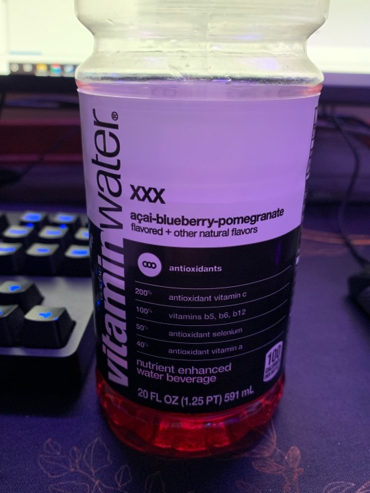
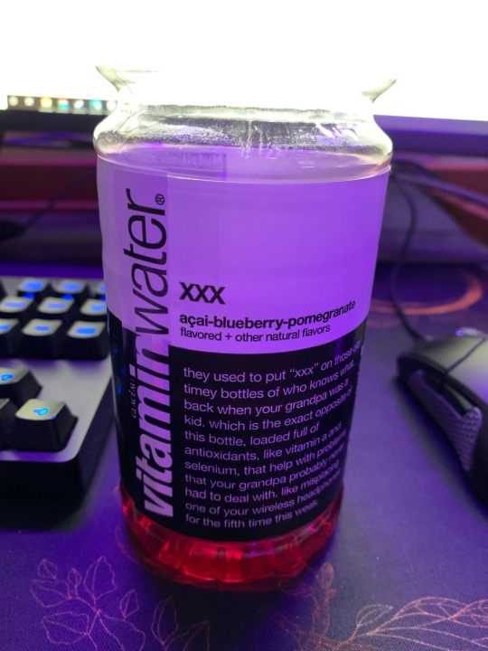
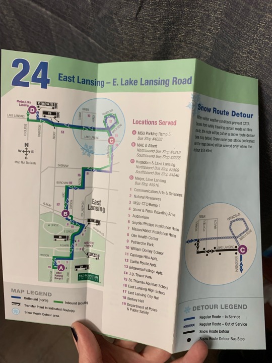
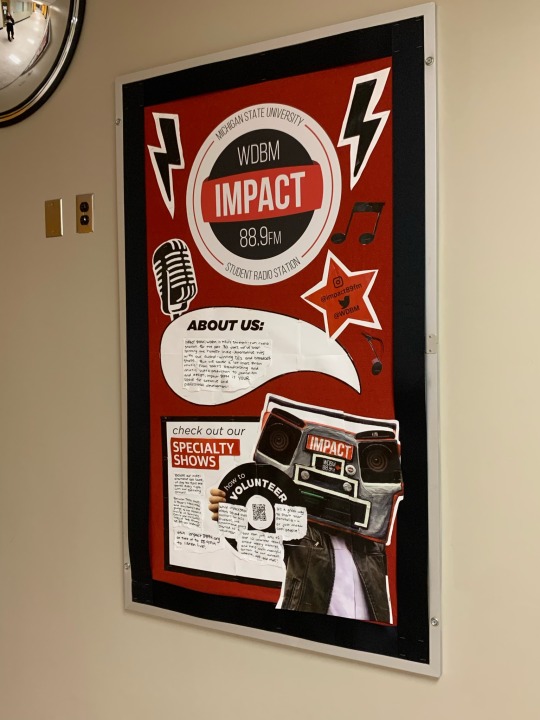
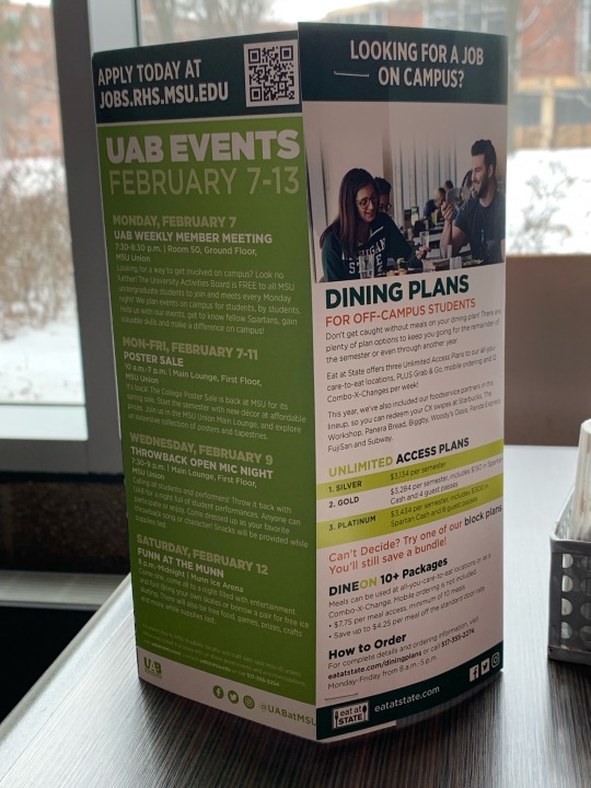
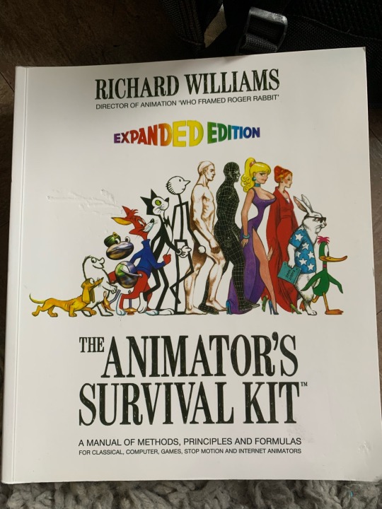
Image 1 & 2: Vitamin water bottle. The part that interested me most about the labeling was how it filled space. The first image you can see that information about the drinks content are easily organized, and divided using lines. The second image though, there is a small paragraph under the flavor. The paragraph doesn’t have any information about the drink and instead hopes to relate to the consumer with a funny blurb, filling up space that would otherwise be blank on the labeling. The other part of the bottle I thought was interesting was the rotation of the brand’s name so it reads vertically and not horizontally. I think this makes the product stand out to other brands, while also allows for easier readability because if it was horizontal, one might have to rotate the bottle to read the whole name.
Image 3: CATA route pamphlet. When discussing the use of lines, points and planes, I thought a map was a relevant example. The fill of the blue and green lines help emphasize the route, making those thicker compared to the other roads. There are also a lot of points to identify locations of importance on the map. They also have the road names run parallel with the line that represents it, which helps avoid clutter and confusion by keeping the name as close to its location as possible. The blue panel however I feel like has a lot of empty space, and it took me a minute to connect the blue circle from the left to the one in that page. I think if there was consistency between blue circles on each page it would communicate that part of the route better. Nonetheless, the key helps readers visualize the different routes by either having solid lines or “x” filled lines.
Image 4: UAB and off-campus dining plan advertisement. The green panel on the left does a good job using scale to help readers identify information. The biggest set of text at the top helps communicate the organization and dates it’s happening. Then it’s broken up into smaller categories of sub headers, and paragraphs, getting smaller with the more specific details. The repetition of this text format helps organize the information chronologically and consumers can get as much or as little information as they want by reading different sized fonts. Moving to the next panel, I wanted to note the disruption of reading when it hits the green boxes about halfway down. By disrupting the invisible line of the margin on the left and right, it helps communicate change of information and also highlights important information.
Image 5: Impact Radio advertisement. I like the different shapes used in this collage, some round shapes that are offset by round ones. The positioning of “Impact” at the top center helps display what the content is going to be about. The big printed texts help draw attention to the handwritten portions, and the handwritten parts make it feel more personable to students.
Image 6: “Animator’s Survival Kit” book cover. The main reason I picked this book cover was for the repetition of a shape that I thought was unique. In the center, there is the progression from small character, to large, then back to small. What I hadn’t realized before was the same pattern in the words “expanded addition” right above it, which is a fun artistic flair. The word helps emphasize along with the picture, that the contents of the book cover a wide range of material that is applicable a variety of animation related principles, from the small to the large! I also like the subtle texture of the title, which makes it look handwritten and feel more rough and sketch-like (which is consistent with the drawings in the book which are mostly sketches.)
0 notes
Text
“Borroughs has gone insane”
Early 1957, Jack Kerouac and Allen Ginsberg travelled to Tangier to join William Burroughs; their mission to assemble and edit Burroughs' many fragments of work to form a 'readable' Naked Lunch manuscript. Kerouac arrived early and, during a break from socialising with Burroughs, the 'old familiar lunatic', wrote to Lucien Carr and his wife Francesca in order to update them on the project's progress. That handwritten letter - essentially a fascinating account of Burroughs' behaviour in his prime - can be seen below.
Transcript
Dear Lucien & Cessa — Writing to you by candlelight from the mysterious Casbah — have a magnificent room overlooking the beach & the bay & the sea & can see Gibraltar — patio to sun on, room maid, $20 a month — feel great but Burroughs has gone insane e as, — he keeps saying he's going to erupt into some unspeakable atrocity such as waving his dingdong at an Embassy part & such or slaughtering an Arab boy to see what his beautiful insides look like — Naturally I feel lonesome with this old familiar lunatic but lonesomer than ever with him as he'll also mumble, or splurt, most of his conversation, in some kind of endless new British lord imitation, it all keeps pouring out of him in an absolutely brilliant horde of words & in fact his new book is best thing of its kind in the world (Genet, Celine, Miller, etc.) & we might call it WORD HOARD...he, Burroughs, (not "Lee" any more) unleashes his word hoard, or horde, on the world which has been awaiting the Only Prophet, Burroughs — His message is all scatalogical homosexual super-violent madness, — his manuscript is all that has been saved from the original vast number of written pages of WORD HOARD which he'd left in all the boy's privies of the world — and so on, — I sit with him in elegant French restaurant & he spits out his bones like Mr. Hyde and keeps yelling obscene words to be heard by the continental clienteles — (like he done in Rome, yelling FART at a big palazzio party) — I'll be glad when Allen gets here. — Meanwhile I explores the Casbah, high on opium or hasheesh or any drink or drug I want, & dig the Arabs. — The Slovenija was a delightful ship, I ate every day at one long white tablecloth with that one Yugoslavian woman spy. — We hit a horrendous tempest 2 days out, nothing like I ever seen, — that big steel ship was lost in mountains of hissing water, awful. — I cuddled up with TWO TICKETS TO TANGIER and got my laughs, I read every word, Cess, really a riot. — Also read Kierkegaard's Fear and Trembling which you should read, it's down on your corner. — Right now I'm high on 3 Sympatinas, Spanish bennies of a sort, mild. — Happy pills galore. — The gal situation here is worse than the boy situation, nothing but male whores all over, & their supplementary queens. — Met an actual contraband sailing ship adventurer with a mustache. Etc. More anon. Miss you & hope you're well. Jack.
7 notes
·
View notes
Text
Writing Music
This week I realised that some of my music is available as score-following videos! (I knew that this would happen, just not when). I’ve linked both of these at the bottom of this post. These are not new pieces, but they are ones that I like, and benefit from including some lovely performances as well. It was hard for me to choose pieces to do this with, not least because linearly following a score isn’t a key feature of a lot of my most recent music, but I like the score-following aspect of it. Even if someone does not read notation, I think these videos give a great idea of what a performer interacts with during a performance, what they see, and a visual link is created between the sound and notation.
This last part is - in part- what has also inspired this post. Because I did not notice the videos straight away, a few people had been able to watch them before I did. On one of the videos there is a discussion of the use of handwritten notation. I have no desire to weigh into the discussion there, not least because it became a general discussion about notation, but I decided I might want to share my thoughts about handwriting stave notation here. My aim is not to convince anyone to do as I do, just to reflect.
In the bad old days, when I studied my undergraduate degree, not everyone had a computer. I did not. It seems unfathomable that such a time existed, but somehow this was manageable. When I needed to do work on a computer I could use one in the library, or one of the many computer rooms the campus had. I won a place on a Sibelius summer course and the department lent me a laptop so I could take part in it (three letters were missing from the keyboard). In my final year, my parents gave me a family desktop computer that they had eventually replaced. It could not connect to the internet. It did not have/could not run Sibelius; it could barely run MS Word. Yet, I finished my degree. I did not have a personal copy of any notation software until I was able to buy a laptop with my first AHRC grant payment for my MMus degree.
This isn’t intended as an example of how terrible things were for me: I suspect that most people my age probably had a similar experience. Nor is it intended to explain that I used handwritten notation out of necessity. But rather, just an explanation of how notation software was not a ubiquitous part of my education. I was very influenced by what I did learn as part of my degree. In my first year, I remember being shown an example of James Dillon’s handwritten notation. Even the staves were written by hand. This really impressed me: the care and attention given to the music, and its appearance. For a long time I also drew staves by hand. This certainly wasn’t a necessity: if I didn’t have a computer I certainly had plenty of manuscript paper. I’ve given up drawing the staves now, but I think the experience of doing that was important to me.
There are two things about writing music by hand that are important to me: the first is the relationship that I feel that there is between sound and writing. Being able to think of a musical idea and immediately write it down—or being able to read written music and hear/imagine its sound—is something I personally feel is important. Sometimes students treat this as a magical or unachievable feat. But rather, I think it is a consequence of writing a lot of notation as I was learning. Just as one can think of a sentence and write it, or rather “hear” the sound of something being said that is written down, this is possible with notation as well. I personally think that while notation softwares offer advantages to students in terms of the speed of producing scores, the ability to quickly change aspects of the music, etc., perhaps they also prevent some people from developing this link between written notation and audiated sound that I really value.
The second important thing to me is the relationship between notation and making. This is a huge part of my practice now, where I often use graphic, unconventional and experimental notation. In a lot of my work I think about this tactile practice of making. But I can also trace these experiences to the time spent drawing staves as a student. So I also have this tactile and aesthetic connection to the handwritten stave notation I use as well as to the graphic and more experimental pieces. I’ve seen people express concern about performers reading handwritten notation but I think this is misplaced: for many centuries all notation was handwritten! And there are lots of contemporary music performers used to reading handwritten scores—Feldman’s works in their first editions, for example—to whom it isn’t a barrier that not everything looks like it was produced by a notation package. I’ve spoken to performers who have described feeling differently connected to handwritten scores because of what they reveal about the person who wrote them. This is also probably quite a personal preference.
Over the years I have of course had a lot of feedback from performers about notation. I’ve changed things in relation to this. Certainly, readability is important and I think (I hope) I have got better at making digital copies of handwritten scores so that they can be easily read. For some specific projects I’ve used a software package, usually to match the expectations/stated preferences of certain performers, or for speed where necessary and related to certain types of music. And there are definitely composers whose handwritten scores are much more neatly and beautifully produced than mine. James Dillon is one, Brian Ferneyhough is another although his publisher has started to typeset his work, Mathias Spahlinger a third. But many composers who did used to handwrite now have copyists, except in cases where their notation cannot be easily translated into music software. And some composers who I know used handwriting extensively in the past have also moved on to other means of making music: devising, making, or other non-notated practices. I feel sad that the idea of handwriting a score is something that is becoming thought unusual, quirky, or even undesirable.
In teaching composition, my preference now would be to start without using any notation package for at least a portion of time. I remember that this was in fact a requirement at the University of Huddersfield when I taught there for one year. This would have to mean that composers think about the presentation and appearance of notation, but also their preferences for the communication of sound and ideas: I don’t think such an approach would have to mean only using stave notation. Everyone could start with their preferred method of graphic notation, stave notation, written instructions or maybe even something else. Such an approach would mean that the expectations and norms of software packages (…choose a key and a time signature before you’ve written any sound ideas! …hear the music played back even if it is impossible …see the music highlighted in red when the package doesn’t like it, even if there are performers who can play that!…) would not necessarily have to be part of the formative experiences that composers have in their practice.
Anyway, these are my thoughts about handwriting: it’s important to me as a personal practice as well as a means of communicating my compositions.
And here are the score-following videos, where you can consequently see my notation:
youtube
youtube
0 notes
Text
Wombwell Rainbow Interviews
I am honoured and privileged that the following writers local, national and international have agreed to be interviewed by me. I gave the writers two options: an emailed list of questions or a more fluid interview via messenger.
The usual ground is covered about motivation, daily routines and work ethic, but some surprises too. Some of these poets you may know, others may be new to you. I hope you enjoy the experience as much as I do.
John Saunders
is a founder member of the Hibernian Writers’ Group. His collections are After the Accident (Lapwing Press, 2010) and Chance (New Binary Press, 2013). He is one of three featured poets in Measuring, Dedalus New Writers, 2012. John’s poems have appeared in journals and anthologies in Ireland, the UK and America, on many online sites. .and in The New Binary Press Anthology of Poetry, The Stony Thursday Book, The Scaldy Detail 2013, Conversations with a Christmas Bulb (Kind of a Hurricane Press, 2013), The Poetry of Sex, (Penguin, 2014), Fatherhood Anthology (Emma Press UK, 2014), The Fate of Berryman Anthology (Arlen House, 2014) The Launchpad Children’s poetry book and The Lion Tamer Dreams of Office Work, Hibernian Writers Anthology (Alba Press, 2015).
The Interview
1. When and why did you start writing poetry?
When I was at school I was attracted to the reading of poetry. I remember being fascinated with Shakespeare’s sonnets and searching to read the many that were not on the syllabus. To this day I have a fondness for the sonnet form and tend to shape many of my poems into sonnets. At that time I did not write poetry but I found myself studying not just the content of poems but also the structure and tone. I would dissect a poem like a science experiment to see what was inside it. Unconsciously I suppose that’s when I learned how a poem was constructed although it was much later when I began to write.
Looking back now I realise that my father’s interest in poetry was a strong influence. He had to leave school early to earn money and became a carpenter. I think if he could he would have been a teacher of English. He was widely read in history, literature and poetry and often quoted lines from poets such as Wordsworth, Keats and their contemporaries. I have a fond memory of sitting with him when I was about eight whilst he read aloud Gray’s Elegy Written in a Country Churchyard.
It was in middle adulthood when I returned to the reading of poetry and then eventually to writing. Like many writers I admire specific poets and was spurred on to find my own expression. I very much write for leisure as opposed to making a living which of course is impossible except for the very few, unless you want to spend time teaching poetry which i don’t.
Why do I write? Poetry for me is about personal expression and observation. I am as likely to write a poem about small thing such as watching someone cook a pancake to the big issues of love, war and death. For me all of the small observations of this world can be big issues and can be expressed in poetry. I like form and more recently have become engaged in the long poem form. I am more interested in writing for its own sake than for publishing although its nice to be published.
2. How aware are and were you of the dominating presence of older poets traditional and contemporary?
Most of the work I was exposed to during the school years were the older ‘dead’ poets of the 18th/19th century. Few of them stimulated me the way Shakespeare did although I did like Keats partly , I think because of his intriguing but short life which I found romantic in the imaginative sense.
After school I became more engrossed in 20th century writing and of course being in Ireland found Kavanagh, Yeats and many others including Heaney. Larkin and Hughes were also enormously influential. Of course there are numerous contemporary poets from all over the world that I like and I often revisit their work.
I think all poets strive to be like those that went before and often copy styles. I suppose this is a natural learning process on the journey to finding your own voice to use a cliche. For me Kavanagh and Heaney have dominated Irish writing in my lifetime and their effect is still seen in contemporary writing. That draw on the natural, the land, the familiar.
3. What is your daily writing routine?
I don’t have a daily routine. As I work fulltime at a non writing job my writing pattern is subject to all of the demands of a working life.
When I do sit down to write I usually have an idea or a subject to develop. In recent years I have often developed rough ideas and even specific lines in my head and may not write anything down until a rough shape has emerged.
Sometimes a word or phrase stays with me and becomes the genesis of a poem.
Despite technology I still like to do a first handwritten draft which I might edit a couple of times before moving to a word processor. There is something about hand writing which gives me comfort and satisfaction which I know is generational.
I have rarely sat down to a blank page without some idea in my head.
4 What motivates you to write?
Always, its a means of personal expression and reflection. In the early days i wrote to be read. I wrote with a view to being published. In that sense I think I was motivated to impress a reader the assumption being that everything one wrote would see the light of day.
Things have changed since then. I now write for myself and to please myself. There is no longer a reader in waiting, an audience wanting to find me in a magazine. I still submit poetry and some of it is published but the urgency to do so has diminished significantly. I write because I can. Because I want to.
5. How do the writers you read when you were young influence you today?
The poets I admire most some of whom I have mentioned all have the power to create the extraordinary from the ordinary. For me that’s the essence of a good poem. Most people’s lives are mundane. time given to work, survival, sustenance. A poetry which captures that is to me more significant than the sometimes grandiose descriptions of love, death, god, and so on. He any and Kavanagh, for example could find poems in everyday existence which they crafted into pieces of art.
Contemporary poets like Billy Collins, Carol Anne Duffy and many more do this with ease.
I also admire poems that surprise either by the unusual use of words or phrases or with punchlines. The American poets Galway Kinnell and Raymond Carver were in my opinion masters of surprise.
6. Whom of today’s writers do you admire the most and why?
There are so many writers I admire and revisit. If by contemporary one means the living poets, there is a handful including Micheal O’ Loughlin, Paula Meehan, Tony Curtis, Thomas Kinsella, Carol Anne Duffy, Simon Armitage, Robin Robertson and A E Stallings.
Of the more recently dead, apart from those already mentioned I like Michael Hartnett, Elisabeth Bishop, Dennis O’ Driscoll and Phillip Larkin.
Why do I admire these writers? I’m not sure I can rationally explain why. All of these and others have mastered form and as I said earlier translate the mundane into something special. They are also very readable, what is sometimes described as accessible and I don’t mean this in a derogatory way. In fact for me being able to write an accessible poem whilst remaining true to the technique of poetry and form is success. I am reminded of Heaney’s reply during an interview where he said that writing arcane poetry was not necessary and in fact was downright rude to the reader. There is an inherent snobbery in poetry where some poets think the achievement of extreme obliqueness is a prerequisite of a good poem. I disagree. Like wine, for me, the best poem is the one you like.
7. What would you say to someone who asked you “How do you become a writer?”
The short answer is ; write. I believe that anyone can become a writer once they have the fundamental literacy skill. Even someone who cannot write could compose words into a meaningful shape. After all poetry was originally aural.
In the context of the modern world we can all write. The quality of such writing is of course determined by skill, technique, knowledge, motivation and so on. In other words we have an innate ability to create. What we create can be nurtured.
I am reminded of Kavanagh’s quote that the hardest part of writing is keeping your arse on the seat. This suggests of course that writing is a task to which you apply yourself and that is definitely true. It’s worth noting also and it has been well quoted that you cannot write poetry all day. Most poets spend most of their time on the business of poetry;
reading reviewing editing teaching and so on and much less time actually engaged in creative writing.
So what advice do I have? I think good writing is contingent on wide reading,
not only of poetry but also prose. The tools of creative writing are vocabulary. A writer need to have as wide a vocabulary as possible to give him the wherewithall to produce good writing.
Writing poetry demands an understanding of technique so the reading of other poets gives great insight. I rarely read a poem without interrogating its structure and form to identify new ways of expression.
So for any one wishing to write, read widely ,learn from what others have done and them practice. While you may initially start out emulating other writing styles you will eventually with sufficient practice and time find your way of writing. Your own voice.
8. Tell me about the writing projects you have on at the moment.
As ever I have a number of projects which are best described as works in progress. I am finalizing a manuscript of children’s poetry which I have been working on over a number of years and have published some of them in magazines. I find writing for children an exhilarating experience and one that’s very different from writing for adults.
I’m also presently in an ancient Greece phase and have just completed a manuscript of fifty-two sonnets each one devoted to a god. Similarly and as an outcome of that work, I am writing a long poem on the life of Herakles. This is in the form of ten-line stanzas of ABABABABAA rhyming. I’m on the 20th stanza and he’s only just completed the 12th labor!
Finally, I have a manuscript ready on the theme of mental Ill health which is partly based on historical events of how people were treated on the past where the only option was the Victorian Asylum system.
Wombwell Rainbow Interviews: John Saunders Wombwell Rainbow Interviews I am honoured and privileged that the following writers local, national and international have agreed to be interviewed by me.
0 notes
Text
Signature Font Examples: Pick The Best Autograph Font
Are you looking for a signature font? The style of signature fonts is one of the most important typography choices you will ever make.
While it is true that computers nowadays have the ability to produce a number of unique fonts, many designers share the opinion of random letter arrangements and handwriting styles being a leading autograph font option.
This is why there are many computer programs that let you create handwriting-inspired signature fonts, and use those in a variety of design projects.
Signature fonts resemble closely the structure of any other font, but they look more ornate and fit better in headlines and tags. They won’t be suitable for larger text portions and paragraph boxes, as they’re not exactly legible and easy to understand.
Handwritten-like autograph fonts can be downloaded for both personal and commercial use, and access is usually administered with a font license offered for Windows and Mac users. They come with a preview link you can use to check how the font looks applied on custom text.
Which are the best signature fonts? Let’s check:
Noelan
Noelan is a free-course ornate font provided by Pixel Surplus that is also free to use by private and commercial clients. It is clean, modern, and very international, so you should consider it for mixing and matching styles.
King Basil
King Basil and Mats Peter Fors and Missy Meyer’s flagship cursive font that caters well to a number of digital and print projects, among which posters, logos, stationery, and more. You can also get this font for free.
La Sonnambula
La Sonnambula is commonly referred to as the best font for signatures, and for a good reason. The masterpiece font created by freelance designer Fernando Caro is handwritten and extended, and uses calligraphic text units to meet the needs of elegant and attractive titles.
Webmaster Haro, who is also known as an eclectic typographer, named the font after a Vincenzo Bellini opera from 1957, and inspired many creative designers to contribute to it with fresh ideas. As a result, the font has expanded significantly, and even features a Bitcoin symbol.
Lily of the Valley
Lily of the Valley is only one of famous Gregory Medina (Dcoxy)’s attractive signature fonts. I is free of charge for personal use, and comes with few adorable letterforms for lower and upper case characters. It is also enriched with symbols and special accents, and offers a suite of numbers for premium users.
The Woodlands
The Woodlands is another beautifully designed signature font. It was crafted by Jeremy Vessey who praises its calligraphy aesthetics as the leading reason for its popularity, and claims his work gives designers the freedom to create a lettering feel they will love. The Woodlands is free of charge for personal and commercial users, and is available to download on Behance.
Milkshake
The credit for a font as substantial and appealing as Milkshake ought to be given to typographer Laura Worthington. As she reveals, it was exactly the roundness and thickness of this font that makes it sturdy, and moreover able to hold up against overwhelming and bold backgrounds.
She shared the font on Fair Goods, and recommends it for titling and headlining treatments.
Variane Script
The elegant Variane script was drafted by Boy Moch Tomi, and reminds viewers of luxurious, stunning scripts from the classic design era that work perfectly in a variety of scenarios.
According to Tomi, complex fonts like Variane are difficult to find and afford, and that’s what inspired him to offer his work for free. He hopes that his fonts will be useful for everyone, and reminds prospective users to consider their vintage charm for a 20th century, truly American signage.
Lavanderia
Lavanderia is entirely James Edmondson product, and a charming typography solution influenced by San Francisco’s Mission District Laundromat windows. Its features are mostly open type (including the three weights), which means you can use it as a script font for al kinds of headings, but also body text.
Fabfelt Script
The signature font Fabfelt was designed by Frech artist Fabien Despinoy, whose main intention was to inject an industrial vibe. As he describes it, the Fabfelt script is retro and natural, and has no graininess.
Black Jack
As indicated by the name, Black Jack is an elegant and sophisticated signature logo solution executed by Ronna Penner. The font is cursive, and offered in one style only, but it nevertheless comprises of 177 characters, including lower case, upper case letters, and numbers.
Allura
Allura is a very stylish, yet easily readable autograph font, and leading script format offered by the Allura Pro Family. It is notably cursive, and often used as a display/invitation template.
Dancing Script
The name says it all – Dancing Script isn’t posh at all, but designer Pablo Impallari certainly worked his ways on making the script lively. You will have the impression that letters are changing and bouncing around, in particular the capitals whose size often goes below the baseline. It is commonly related to popular 50s scripts, and offers an informal and friendly look for your designs.
Anke Calligraphic FG Regular
Anke Arnold (www.anke-art.de) designed what is today one of the best open source font projects, and did so including Fontgrube Media Deisgn’s popular international characters. However, this font can only be found in TrueType with 100+ built in kerning pairs hat offer more or less the same benefits. You can use this font for free.
Oleo Script
Oleo Script is often described as a flowing, legible, and slightly disconnected signature typeface. The font is very cursive, and thus perfect to use for a display typeface. You can find it within Google’s Webfonts library, and choose between bold and regular weights. If you wish to combine both, get the Swash Caps version.
Honey Script
Honey Script is a whimsical, very easy to spot font that can be ascribed to the experienced typesetter Dieter Steffmann. The work is distributed entirely for free on all approved website, as Steffmann considers typefont to be an integrate part of his cultural heritage. On the user’s side of the axis, this font has just the right cursive lines to appear personal and handwritten.
Marketing Script
Speaking of the works of Dieter Steffmann, we could not skip Marketing Script. This font proves that Steffmann, despite of being an amateur designer, promises plenty when it comes to versatility.
This time, he offers us a flowing and well-connected signature font with perfectly balanced spacing, which is available in three separate styles (even a shadow one) to meet the needs of different users.
Pacifico Regular
Vernon Adams is the person behind Pacifico Regular, another cursive font you can find on newtypography.co.uk, and use it for advertising purposes. It is also available in the Google Web Fonts library, and free to use online.
Little Days
Little Days was produced by West Wind Fonts, and aims to inject a childish and naivety vibe in informal designs, unlike the rest of the company’s offerings.
Aguafina Script Regular
Aguafina is Sudtipos’ most eye-catchy and professional signature font, lavished with clean and precise lines and excellent use of space. It drafts and assembles letterforms in a very economical way, as it reduces the capital A, for instance, and transforms it into a normal up/down stroke that looks extremely stylish. It will look amazing applied on a bold headline.
Freebooter Script
Freebooter is a product of Canada’s popular designer Graham Meade, who wished to offer the world an extravagant, curvy font with plenty of bold lines, trills, and swishes. It will suit perfectly current Edwardian or Chopin script users who are looking for something more personalized.
Wisdom Script
Wisdom Script is the role model of how a truly retro script should look like. Signed by James Edmondson (the creator of Lavanderia), this font accommodates easily in display and headline scenarios, and has a nod towards a musical treble clef depicted in the letter S. Personal users can get it for free, while commercial ones have to pay a modest fee of only $30.
5th Grade Cursive
5th Grade Cursive is Lee Batchelor’s leading handwritten font with a retro look and feel, and one that is commonly applied in different vintage designs. For a more natural look, you can consider using its Open Type features.
Christopher Hand
El Stinger is the designer of Christopher Hand, a signature font that may not be the ‘miracle of technicality’, but offers some of the easiest letterforms and kern pairs. You may feel a bit challenged combining its letterforms, but the effort will certainly pay off!
League Script
League Script is built and distributed by The League of Moveable Type, offering a cute alternative to otherwise dull and boring body texts. The best way to depict how it looks is to think of a creative girl’s diary, as it is exactly such ligatures that designer Haley Fiege considered to come up with this masterpiece.
So far, it has been downloaded more than 216,000, which we believe says enough on how popular it really is.
Grand Hotel
Grand Hotel is presented to you by designers Jim Lyles and Brian J Bonislawsky (Astigmatic).
To create it, they got inspired by the popular 1937 movie Cafe Metropole and its title, thinking of a solution that would have a classic subtlety and weight, but yet inspire an artisan, craft signage feel with cursive lowercase letters. Consequently, Grand Hotel is believed to meet pretty much the needs of all users.
Hermes
Hermes can be used for a number of different designs, including letterheads, logos, badges, posters, invitations, and so on. It is cursive, mono-line handmade fonts whose lines are simply gorgeous, and can match multiple calligraphy styles.
Hanni Script
Hanni Script is a Petra Burger product, and an exclusive signature font crafted in a handwritten manner. It is exactly its simplicity that makes it look sophisticated, and many people are using it for their birthday and wedding invitations.
Brisk Wondering
Brisk Wondering is actually a suite of well-matched and elegant fonts that work seamlessly with one another, and has beautiful swishes and curls that make it appear truly handwritten. Its best use is for highly personalized projects, as for instance letter signature fonts and greeting cards.
Cityallir Script
Cityallir helps foremost artisans and designers make their projects more beautiful. It is handwritten, and yet very modern, and features amazing letter strokes for all types of labels and signage.
Garlic
It may be difficult to conclude by the name, but Garlic also has a lot at stake to captivate viewers’ attention. It is developed as an up-to-date brush script font, which means it is cursive, vivid, and bouncy, and applies pretty much on any design project.
Gullami Rice Script
Gullami Rice Script is a premium signature font intended for official and formal application. You will see it quite often on customized event invitations, printed quotes, magazine titles, packaged products, and so on.
Redheads Script
Redheads Script is a great calligraphic solution with cursive lines and stylish swirls, and works the best within feminine projects like birthday parties and fashionable greeting cards.
Jolies Typeface
Jolies Typeface was brought to us by Maulana Creative, as their main cursive and handwritten typeface. It brings the best of the contemporary and classic writing, and looks very simple and hassle-free.
Yusuf Kral Artistica Font
This signature font is best known for its thick brush feature, and looks crisp and organized. The best places to use it are printed quotes, T-shirts and similar clothing, totes, and more.
Harley Quinzel
Design Dukkan created Harley Quinzel using a thick marker, and provided it with a unique and recognizable style that plays along designs like badges, logos, and rustic-themed invitations.
Stylish Script
Stylish Script is a gorgeous solution for posters, greeting cards, and similar branding materials. It is handmade and very contemporise, and packs as many as 402 glyphs, decorative characters, and a charming baseline.
William Kidmon
William Kidmon is often referred to as the most modern and leading signature font. You will recognize it easily for its pretty swirls and large lines, which give it a central role in signage, letterheads, and similar personalized projects.
Janesville Script
Janesville Script comes with an elegant, yet casual look that is just cut for authentic and handwritten designs. You will adore the retro swirls dancing on a simple baseline, and certainly recognize the strong vintage feel it inspires.
Bounderas Script
Bounders Script is a great example of what the designers’ community likes to call a ‘romantic signature font’, namely a very cursive and modern script that looks gorgeous on greeting cards, invitations, printed quotes, and even graffiti.
Paris 1920
For most of us, the first association of Paris is vintage, and that’s exactly why this font is given such a name. It is classic and handwritten, comprised of both sans serifs and scripts, and fits perfectly retro themed designs.
Mastura
Mastura is another appreciable attempt to combine modern and traditional typefaces. This signature font does an excellent job showcasing embellished calligraphy in up-to-date projects, and injects a classy and romantic vibe with its pointy-edge, yet smooth pen styles.
Asfrogas Typeface
Asfrogas is the ultimate signature font based on a design-friendly concept. It is entirely handwritten, and highly recommended for personal blogs, menus, and pamphlets.
Lotte signature font
Lotte was inspired by the tiny fruit-bearing tree Widara, and its out-of-the-box cursive style works the best on product packages. It is also very urban, which makes it suitable for fashion branding.
Heart Signal Typeface
Heart Signal is an easy-to-use typeface that requires literally few strokes to create an amazing personal signage style.
Autograf
Autograf is an autograph font delivered by Mans Greback, perceived to be a top-quality signature solution with round and bold strokes. It is best suited to use on official and formal correspondence.
The Valleys Script
The Valley Script is Zerowork Studio’s most elegant signature font that features mainly mono-line shapes. Designers recommend it for all types of design works..
Sansa Dior Font
Sansa Dior, as it can be revealed by its name, targets users from the fashion, appeal, and beauty industry. Designers agree that it is a charming brush script based on genuine handwriting, and recommend it because of its carefree, feminine vibe.
Night Flight Marker Font Family
Night Flight is relatively new in the typeface industry, offered as a pack of diverse and contemporary fonts that can be combined for all sorts of projects.
Hello Neighbor Script
Hello Neighbor will help you design beautiful posters, printed quotes, and greeting cards. You will be particularly impressed by the modern signature tone, and the number of alternative letterforms that can make your projects unique.
Mon Voir
If looking for a signature font that can beautify your wedding or another important moment in your life, look no further than Mon Voir! This beautiful typeface offers a unique and elegant lettering style, and can be used in all romance and charm concepts. Its designer is Mon Voir Studio’s artist Jenna Rainey.
Sakura
Sakura will captivate attention with its cursive letters that look inspiring without overwhelming the viewer. The bouncy baseline and slightly exaggerated strokes give it a long lasting charm one just can’t neglect.
Befindisa
Befindisa is a meticulously designed font with a variety of romantic and girlish letters. Yet, it is more modern than traditional, and looks breathtaking on stationery and invitations.
Drama Queen Script
In this case, plenty has already been revealed by the name. As suggested by it, Drama Queen cherishes foremost contemporary handwriting, and brings elegance and flare under the same roof. As you will see, it is an absolutely irreplaceable choice for printed posters.
Proudly Signature Script
Proudly Signature Script is the ideal choice for any contemporary design project, in particular because of its intricate strokes and extended lines. For some observers, it may even be reminiscent of classic manly penmanship.
Sbastian Signature Clean Typeface
Sbastian features long stokes and lines, and supports predominantly urban-looking projects. We would suggest it also for stationery materials, quotes, and business logos.
Katastrope Font
Katastrope goes as far as possible from a catastrophe, as it is beautiful, modern, and carefree, and works great for all branding and printing purposes.
83 Script
83 Script is a relatively new arrival on the market, and combines even 83 regular scripts (lower and upper case) with just as many sans (upper case only). In such way, 83 Script helps make posters, invitations, and other branding materials look more professional.
Bammantoe Typeface
Bammantoe is an irregular handwritten style, and a cursive font for modern homeware and packaging design. On the other hand, it can be used as a sophisticated text overlay on virtually any background image.
Taken by Vultures
Vultures’ Taken is another leader among modern handwritten fonts, and works amazingly well for branding and photography.
Birdhouse Script
Birdhouse Script was created with markers, and features a number of flowing letters and beautiful, elegant swirls. The best way to make use of it is to include it in food and fashion branding projects.
Colatin Script
Colatin Script features some of the most stunning characters in this design branch. It is also packed with gorgeous twirls that will tempt you to use it for handwritten quotes, name tags, and different social media designs.
Pattersonville Script Font
Pattersonville Script has recently introduced a new kit of international characters, which further confirmed its role of a modern and universally applicable calligraphic font.
Rinstonia
Ristonia’s flowing characters and gracious continuity are just stunning. This signature font is therefore perfect for all types of artistic design, but also business cards and branding materials.
Saffron Handwritten Font
Saffron enables real refreshment in the cursive font landscape. Handwritten and simple, Saffron works for any design project.
Murtics
Murtics is the master of simple, clean lines brought to life with extra swirls. You will certainly remember it when you see it, which is why so many popular brands rely on it.
Pretty Pen Handwritten Font
Pretty Pen delivers crisp and unique features, which helps us compare it to distinct penmanship from many different aspects. The font is very cursive and modern, and looks its best when applied on blog headlines.
Everlasting Script
Everlasting Scripts have both a romantic name and a romantic overlay. Packed with flourishes and swirls, they look the best on save-the-date and wedding invitations, but yet come with an easy-to-spot contemporary tone that matches different typography fonts.
Gloriant Signature Script
Gloriant is, in fact, a suite of a clean and a brush font that can be brought together in graceful and cursive combinations. The vibe is mostly vintage and girlish, and space is adjusted properly for a balanced amount of sophistication.
Twin Oaks Signature Script
Twin Oaks is a Greg Nicholls product used for quick and simplified writing, and yet very legible one. You will meet it often with artistic signatures, posters, watermarks, and image overlays.
Blesing Signature Style
The Blesing suite features neatly arranged and natural lines, and counts as one of the most modern styling fonts. To impress users, Blesing combines both alternate and regular characters, which, by the way, secures it a place in almost any design project..
De Novembre
Skyla Design is the company behind De Novembre, an elegant and sleek font where style and class are instantly visible. You should consider it primarily for high-end branding.
Astronout Signature
The strongest side of Astronout Signature is its handcrafted and authentic vibe. Businesses benefit from it for more personalized branding, which is why this font appears on book covers, website headers, and a number of great packaging designs.
Arion Signature
Arion brings the charm of old-world writing and contemporary posting under the same roof, and that is its main competitive edge. You can see it quite often on T-Shirt and logo designs by popular brands.
Otella Signature
Otella is handmade and refreshing, and thereof used to beautify a number of otherwise dull designs. You should consider this signature font for layout designs, logos, and taglines.
Ending thoughts on these signature font examples
Beautiful cursive and script fonts are all over the web, often representing a truly digitized form of professional handwriting that makes it easy for non-professionals to create attractive fonts.
For the purpose, they won’t need any special knowledge on how to map and scan artwork, or how to manage complex font-generating programs.
If you liked this article with signature font examples, you should check out these as well:
Bold Fonts: 42 Free Thick Fonts To Use For Headlines
Arabic Fonts: 60+ Fonts Available For Download
Cool Fonts: 100 Free And Unique Fonts To Download
61 Free Russian Fonts Available For Download
The post Signature Font Examples: Pick The Best Autograph Font appeared first on Design your way.
from Web Development & Designing http://www.designyourway.net/blog/typography/signature-font-autograph/
0 notes
Last Seen Blogs

eeedoodlez
Choccy Milky

trixietakesavt-blog
Eileen Steinmacher
the-wheel-of-time-begins-to-turn
Do glatem live, creator of all
