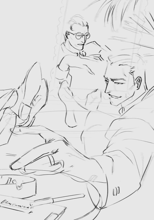
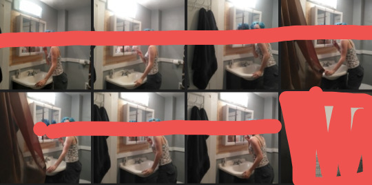
#THE COLOR SCHEMES... THE COMPOSITION.... THE VIBES!!!!!
Text
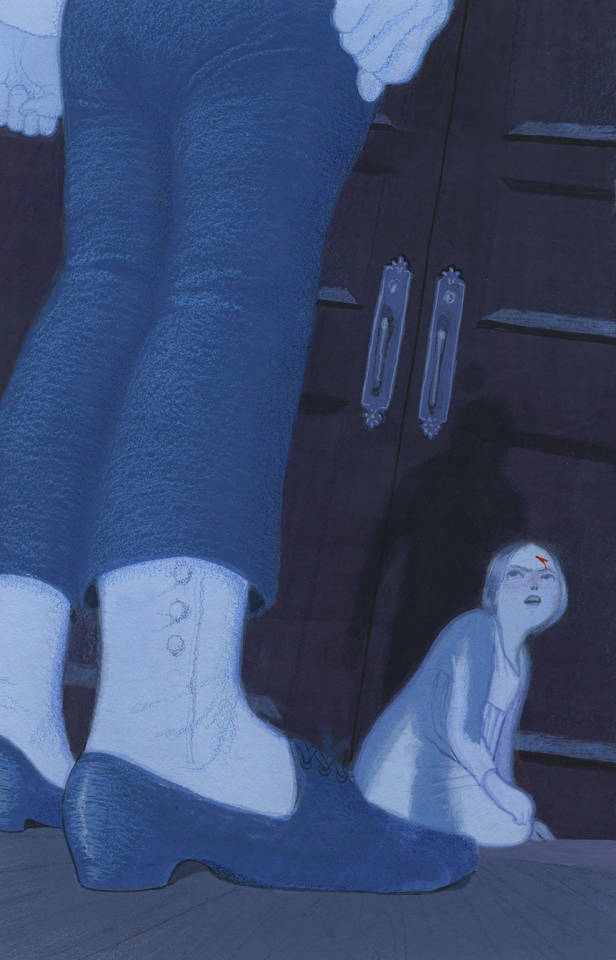
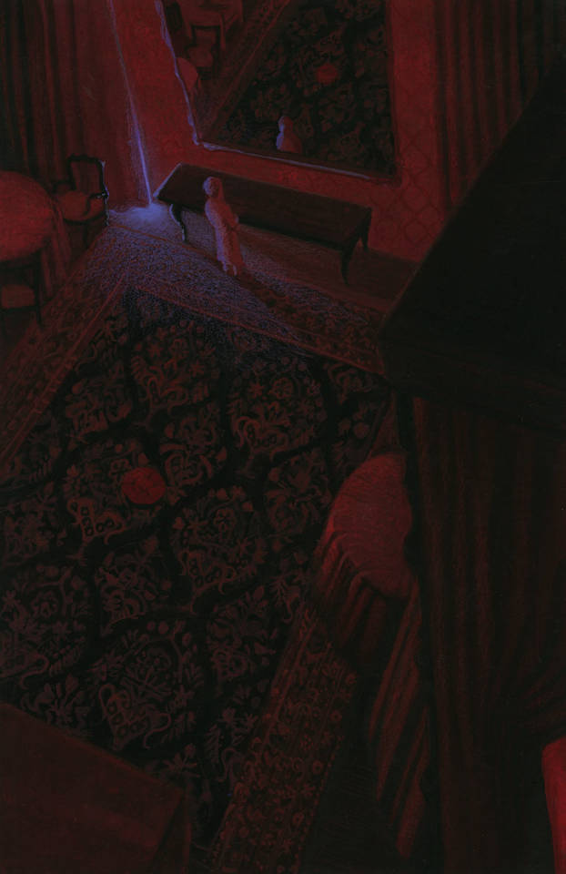
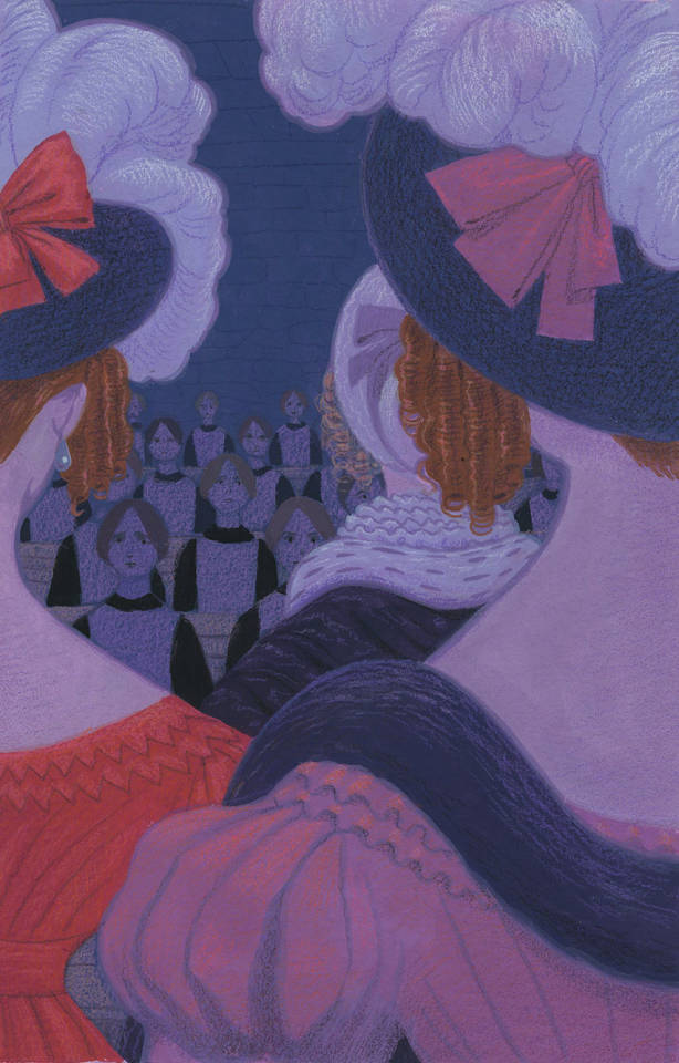
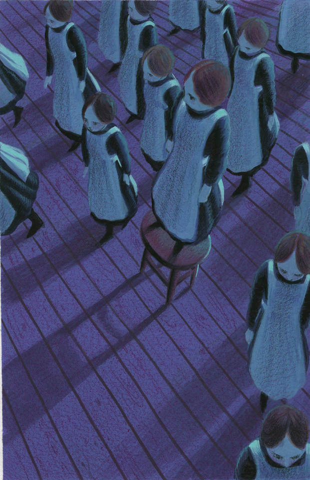
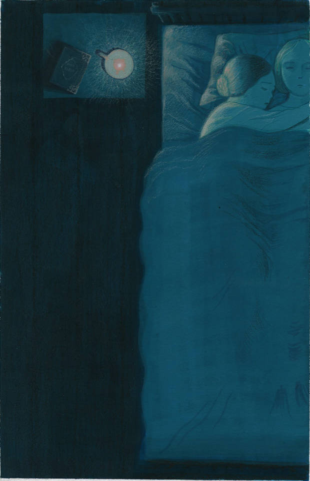


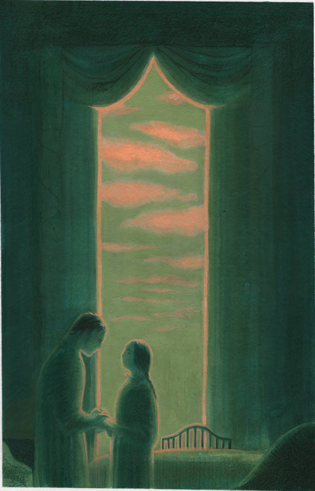


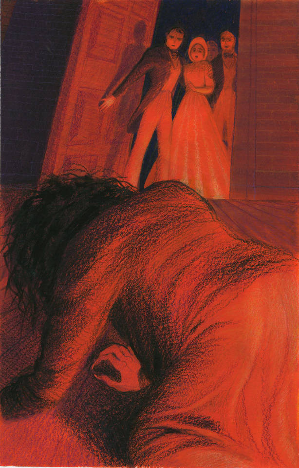
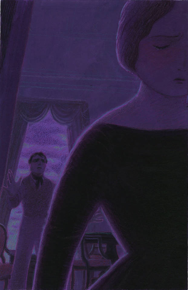
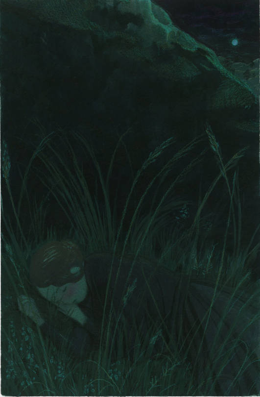
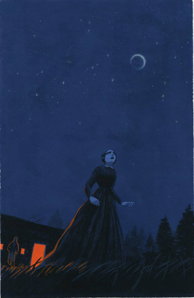
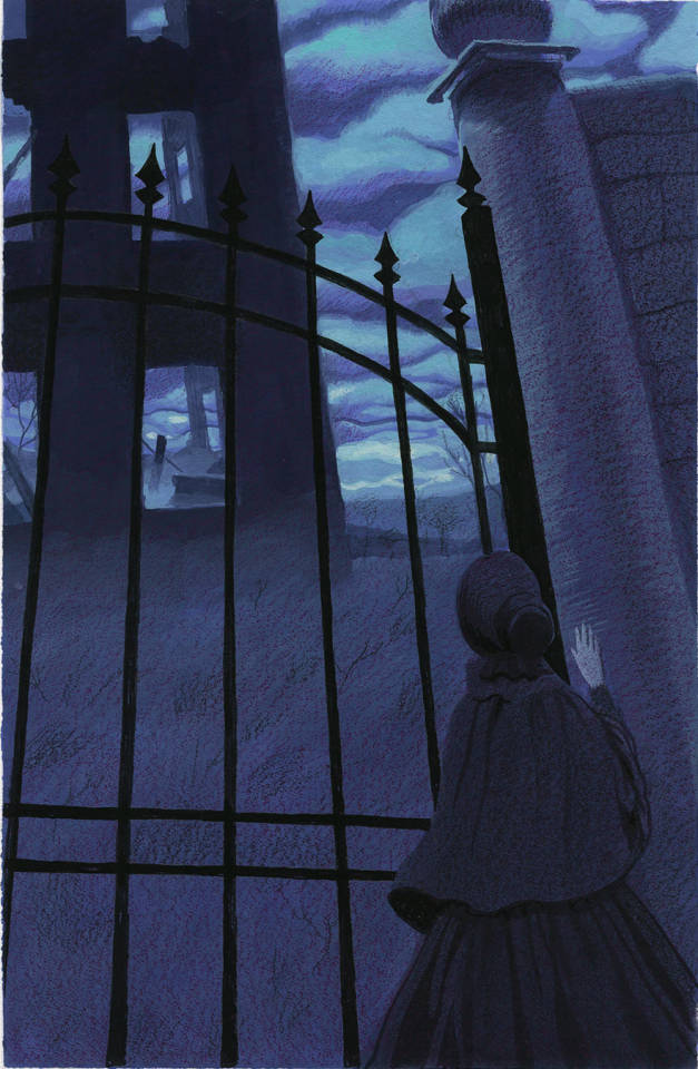

Illustrations by Sophie Margolin for Charlotte Brontë's Jane Eyre.
#THE COLOR SCHEMES... THE COMPOSITION.... THE VIBES!!!!!#IM OBSESSED WITH THESE#I may delete this though bcs I don't have her permission to post these#anyways!#jane eyre#illustrations#mine
9K notes
·
View notes
Text
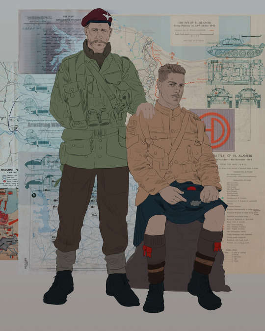
Ok! I've finally decided to put together a (somewhat) comprehensive tutorial on my latest art~
Please enjoy this little step-by-step 💁♀️
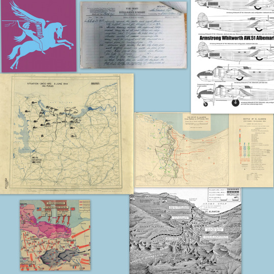
First things first--references!
Now I'm not saying you have to go overboard, but I always find that this is a crucial starting point in any art piece I intend on making. Especially if you're a detail freak like me and want to make it as realistic as possible 🙃
As such, your web browser should look like this at any given point:

Since this is a historical piece, it means hours upon hours of meaningless research just to see what color the socks are, but...again. that isn't, strictly, necessary 😅
Once I've compiled all my lovely ref pics, I usually dump them into a big-ass collage ⬇️
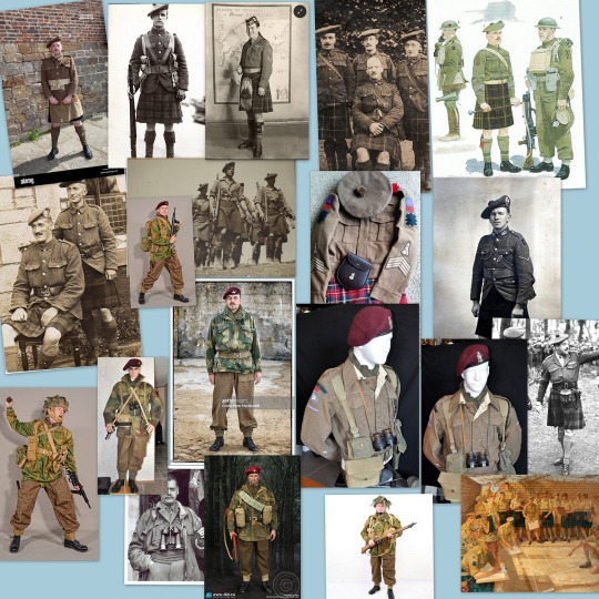
(I will end up not using half of these, alas :'D)
Another reference search for background material, and getting to showcase our models of choice for this occasion~
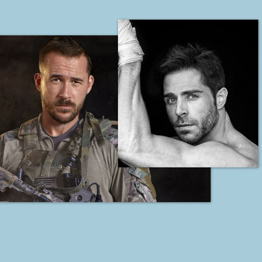
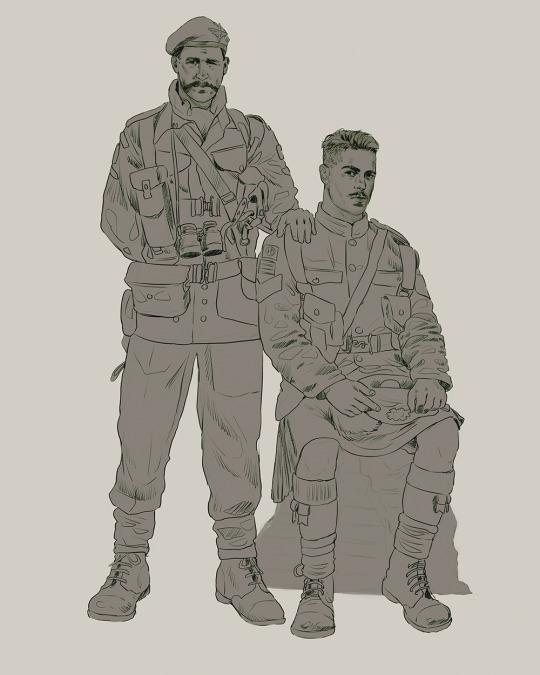
When picking a reference for an actor or model, the main thing I keep in mind (besides prettiness 🤭) is lighting and orientation. Because I already kinda know what pose I'm gonna go with for this piece, I can look for specific angles that might fit the criteria. I should mention that I am a reference hound, and my current COD actor ref folder looks like this:
Also keep in mind, if you're using a ref that you need to flip, make sure you adjust accordingly. This especially applies to clothing, as certain things like pants zippers and belt buckles can be quite specific ☝️
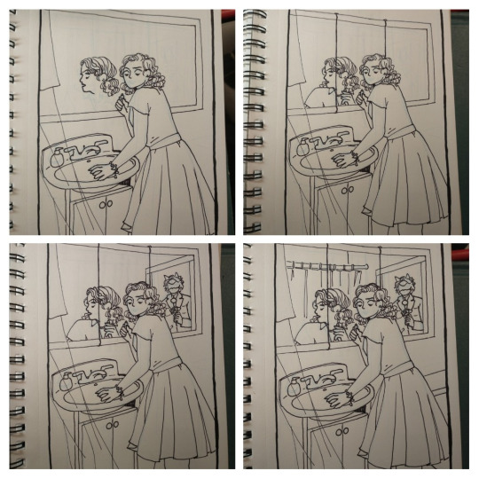
Now that we've spent countless hours googling, it's time to start with a rough sketch:
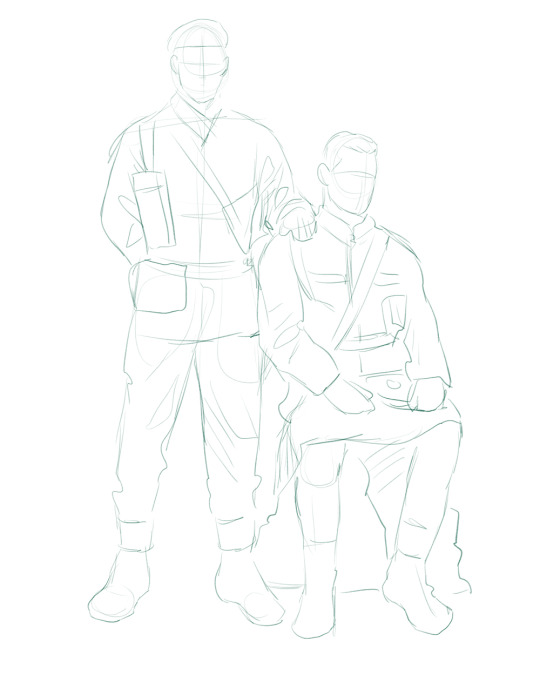
It doesn't have to be pretty, folks, just a basic guideline of where you want the figures to be.
The next step is to define it more, and I know this looks like that 'how to draw an owl' meme, but I promise--getting from the loose sketch above to below is not that difficult.
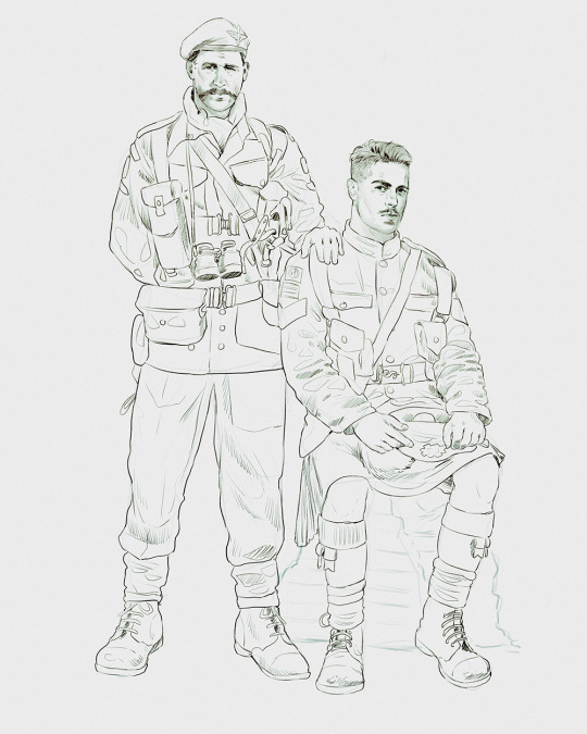
Things to keep in mind are--don't go too in-depth with the details, because things are still subject to change at this point. In terms of making a suitable anatomically-correct sketch, I would suggest lots of studying. This doesn't even have to be things like figure drawing, I genuinely look at people around me for inspiration all the time. Familiarize yourself with the human form, and things like weight, proportions, posing will seem a little more feasible.
It's also important at this stage to consider your composition. Remember to flip the canvas frequently to make sure you're not leaning to one side too often. I'm sure something can be said for the spiral fibonacci stuff, which I don't really try to do on purpose, but I think keeping things like symmetry and balance in mind is a good start ✌️
Next step is just blocking in the figures. Standard. No fuss 👍
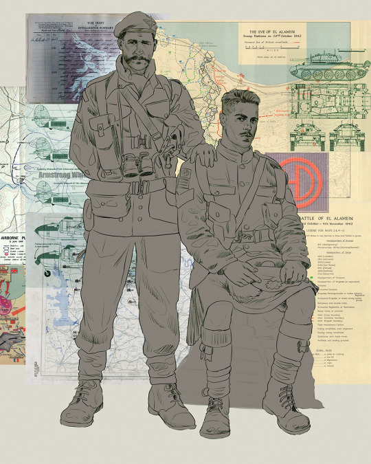
Now onto the background!
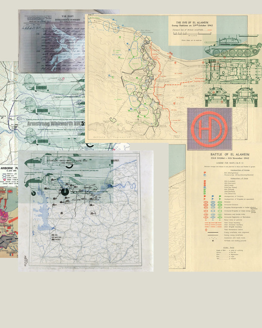
It's frankly hilarious how many people thought I was *hand-drawing* these maps and stuff 😂😂 I cannot even begin to comprehend how insanely difficult that would be. So yeah, we're just taking the lazy copy and paste way out 🤙
I almost always prepare my backgrounds first, and this is mostly to get a general color scheme off the bat. For collage work, it's really just a matter of trial and error, sticking this here, slapping this there, etc. I like to futz around with different overlay options until I've found a nice arrangement. Advice for this is just--go nuts 🤷♀️
Next, I add a few color adjustments. I tend to make at least 2 colors pop in an art piece, and low and behold, they usually tend to be red and blue ❤️💙There's something about warm/cool vibes, idk man..
Now we move on to coloring the figures. This is just a basic block and fill, not really defining any of the details yet.
Next, we add some cursory values. Sloppy airbrush works fine, it'll look better soon I promise 🙏
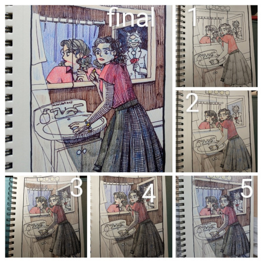
And now--rendering!
I know a lot of beginner artists are intimidated by rendering, and I can totally understand why. It's just one of those things you have to commit to 💪
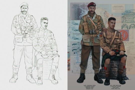
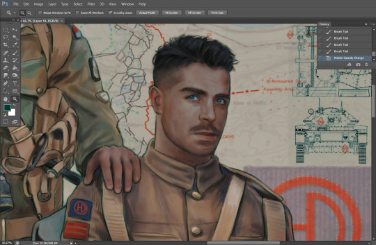
I've decided to show a brief process of rendering our dear Johnny's face here:
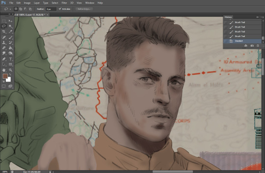
Starting off, I usually rely on the trusty airbrush just to get some color values going. Note--I've kept my sketch layer on top, but feel free to turn it on and off as you work, so as to not be too bound to the sketch. For now, it's just a guideline.
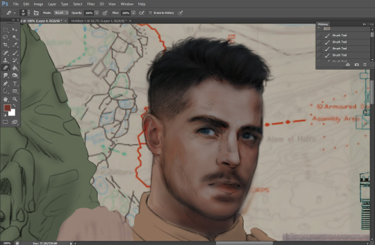
This next stage may look like a huge jump, but it's really just adding more to the foundation. I try to think of it like putting on make-up in a way~ Adding contours, accentuating highlights. This is also where I start adding in more saturation, especially around areas such as ears, nose and lips. Still a bit fuzzy at this point, but that's why we keep adding to it 💪
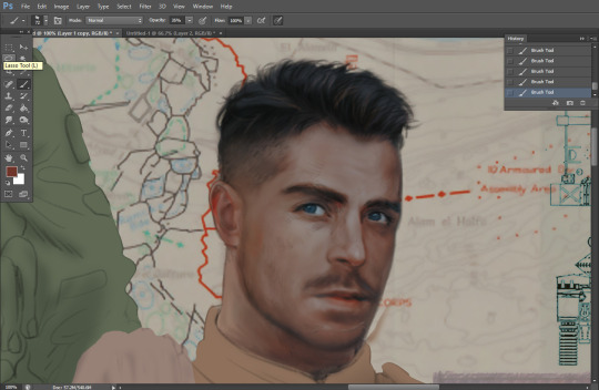
A boy has appeared! See--now I've removed most of the line layer, and it holds up on its own. I'll admit that in order to achieve this realistic style, you'll need lots and lots of practice and skill, which shouldn't be discouraging! Just motivate yourself with the prospect of getting to look at pretty men for countless hours 🙆♀️
I'll probably do a more in-depth explanation about rendering at some point, but let's keep this rolling~
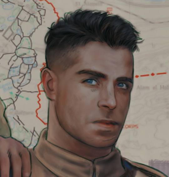
Moving forward is just a process of adding to the figures bit by bit. I do lean towards filling in each section from top to bottom, but you can feel free to pop around to certain parts that appeal to you more. I almost always do the faces first though, because if they end up sucking, I feel less guilty about scrapping it 😂 But no--I think he's pretty enough to proceed 😚
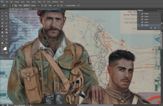
They're coming together now 🙆♀️ Another helpful tip--make sure you reuse color. By that, I mean--try to incorporate various colors throughout your piece, using the eyedropper tool to keep a consistent palette. I try to put in bits of red and blue where I can
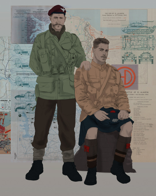
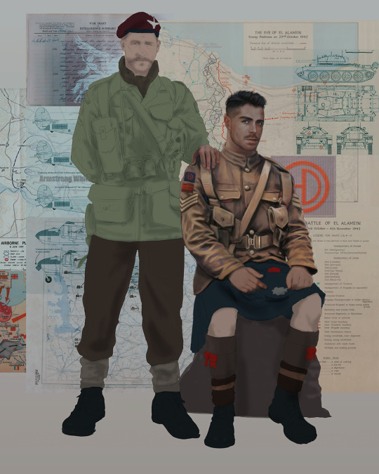
Here they are fully rendered! Notice I've made a few subtle changes from the sketch, like adjusting the belt buckles because I made a mistake 😬 Hence why you shouldn't put too much stock in your initial sketch~
The next step is more of a stylistic choice, but I usually go over everything with an outline, typically in a bright color like green. Occasionally, I can just use my initial line layer, but for this, I've made a brand new, cleaner line 👍
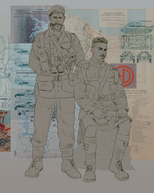
And the final step is adjusting the color and adding some text:
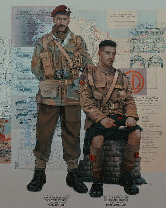
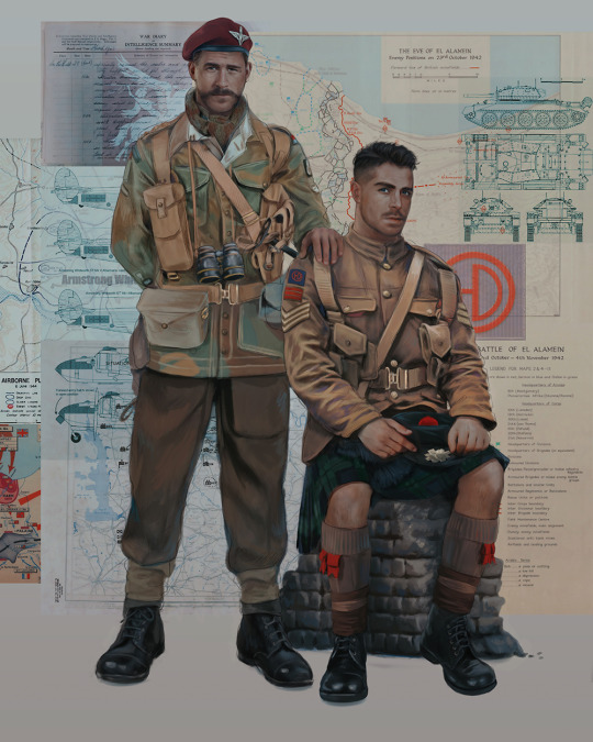
Tada!! It's done!
All in all, this took me the better part of a week, but I have a lot of free time, so yeah ✌️
I hope you appreciated that little walkthrough~ I know people have been asking me how I do my art, but the truth is--I usually have no clue how to explain myself 😅 So have this half-assed tutorial~
As a bonus, here is a cute (cursed) image of Johnny without his mustache:
A baby, a literal infant child !!! who put this wee bairn on the front lines ??! 😭
Anyway! peace out ✌️
#tutorial#my art#art tutorial#since people have been asking#I remembered to save my process from this latest work~#enjoy 🙆♀️
1K notes
·
View notes
Text
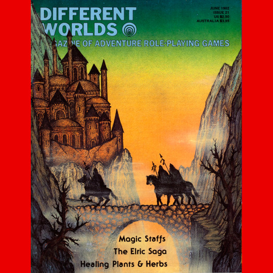
Different Worlds 21 (June, 1982). A two month break! Alan Burton on the cover. Absolutely adore this one. Great color scheme, great composition, very late ‘70s fantasy fan art vibe. There is something in this that reminds me of some of the stranger art in the David Day Tolkien books.
#roleplaying game#dungeons & dragons#tabletop rpg#rpg#d&d#ttrpg#Chaosium#Different Worlds#Alan Burton#noimport
162 notes
·
View notes
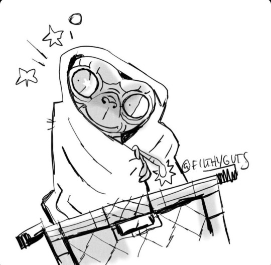
Text
It's October and that's all the reason I need to celebrate Izzy lets go!!!
I could talk for an hour about how Izzy's art and playlists spoke to me and why I just HAD to have him do our art, but that's another post for another day. For now lets talk about a few of the early pieces.
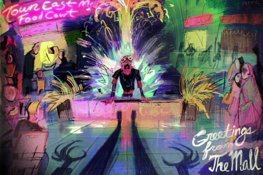
THE MALL
his first official piece for us. The bonus episodes and the corresponding postcards was a it of an experiment (it's experiments all the way down) and we were all so impressed with this that we just had to figure out a way to hire him. I was on the phone with Pacific when he saw it and I could practically feel the shock when the colors hit him.
More under the cut, don't forget to follow @filthyguts!
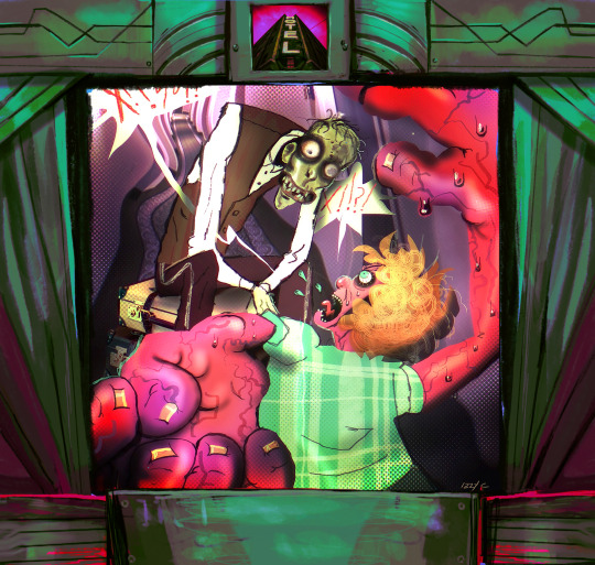
4.10 Audrey Burns
(I AM WORKING ON THE LETTERING) the fisrt normal episode piece. I had no idea what was coming my way, Izzy's style is strong at its core, but the fringes and fiddly bits have such nuance and flavor. Popping colors, photobashing, giant expressions and poses, and a rare smile from our boy. He's dressed in the Hilton uniform because that's what this Hotel was based on. This one has a real Stinky Cheese Man vibe.
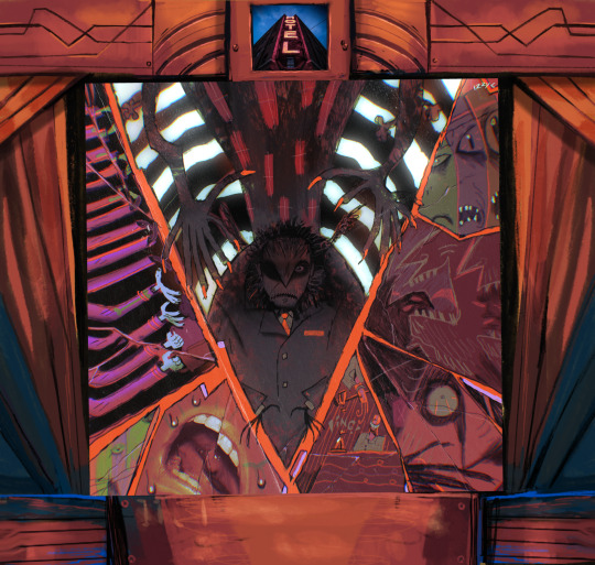
4.11 The Owner - V
a rare sequel episode that ties in directly with S1. Izzy really got to play with the composition, breaking it apart with the characters themselves (notice the V shape!) and infusing it with the chaos of the episode, but unified by color scheme. More photobashing (is that what its called?) and a rare view of his Hotel herself design. I love the his Owner so much. Them little grabbers!

4.12 X - X
Originally titled "? - ?" but changed because that's unpronounceable, this one is very popular on our store. Lobby Boy clutching the title and the Owner made of Hotel photos (ELEVATOR BUTTON ARM!) reinforcing the helpless power the characters have over their environment. That smiling crazed face is exactly what I pictured in season 1, and something about the colors and texture reads as fish scales to me it's like the Manager is here too (fish!Manager enjoyers unite)
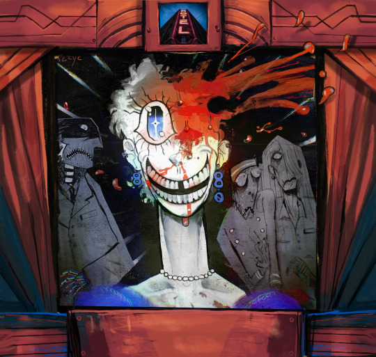
4.12 Judy Blashy
One of my very very very favorites. The whole cast together, and though they all wear masks of fear you can still get their character dynamic in an instant (i like how the LB is in front of the Manager--Izzy has always understood that he is not fragile fine china that could shatter at any moment, but a mongoose under the house who doesn't like loud noises). Madam Hotel's mad, gap toothed grin, her room number earrings, her NECK LOOK AT HER NECK!!! and of course a great big splash of blood where the Owner smooshed her (mirroring the Managers head getting bonked in S3, and don't get me started on people losing eyes) I love that when we added the Goosebumps frame he drew some more blood flying out over it, always reinforcing that breaking of what seems like real boundaries effortlessly.
That's it for now, go follow Izzy anywhere you can, he posts art all the time and it's always incredible (I don't even know who Kira is but I sure like the way Izzy draws him)
Thank you Izzy, you are a rock star and I cannot and will not imagine what the Hotel looks like without you!
#The Hotel podcast#filthyguts#he also has great taste in movies#fashion icon#animator#a professional and delightful guy
94 notes
·
View notes
Note
hihi! srry if youve answers this but mobile isnt making it easy to search. what's your general process for making moodboards? it's weird bc I have nooo problem making stim boards! but mbs are rly difficult for my brain evn though I wanna. how do you do it?
Hello hello! I haven't answered this before, but it's a great question!!
I usually start with either an original idea or a request that I feel like doing (sorry people who've been waiting a long time), and at that point I usually have some idea in my head of the color scheme or vibes that I want it to have and set out to Pinterest!
I gave my list of go-to items to search in a previous ask, which can be found here!
Once I've found at least 9 pictures (sometimes more than 9 for extra options) I crop them all to a 1:1 ratio so they appear as a grid of squares instead of rectangles, and sometimes make minor alterations to the color temperature (warm or cool tones) so the pictures all look coherent!
After that I play around with the composition of the picture, which can take a while depending on how many colors I'm working with. Here are 2 examples of what I mean!
This one has 2 main focus colors (as most of my moodboards do), green and brown, so the composition of it alternates between the two colors the whole time! I would also do this if it had 3 main colors. This just makes it look more even overall; to me, at least.
This one, on the other hand, is just 1 focus color, which is grey! So I didn't worry as much about the composition of it. I could move anything here to any other place, and it would be approximately the same! I treat moodboards with more than 3 focus colors the same way as moodboards with just 1, so those are less deliberately structured.
After all of that, I choose which dni banner I think fits best with what I made, write my tags out, and I'm done!! This process usually takes 20 minutes to an hour and a half, depending on how long it takes me to find the right pictures!
I hope this walkthrough of my process was helpful, and obviously there's no singular correct way to make moodboards!! Good luck Anon!
#i have Internet again!#i think I'm going to just get back to my regular schedule tomorrow#anyway#this was fun!!#my process is pretty rigid#i do it basically the same way every time#sometimes it's time consuming other times it's not#i don't have much time to work on original ideas these days#though i do still make some#anyway i really hope this helps you!#if you can make stimboards your page is already so different from mine!!#i can't make them#despite popular demand#this got so long#again#whoops#Pip's barks
21 notes
·
View notes
Note
What shameless related piece of art are you most proud of?
Also, when you start a piece do you have a specific colour scheme in mind?
this is hard!!! i work in a few different styles and so i have a favorite for each type of way i work i guess. which i think makes perfect sense. but uuhhmm ...i guess one of those favorites is still smokey mickey. its getting warm out and i hate it. i need the wintery ntw vibes back please (im not a summer person🥲)
i was gonna say usually but then thinking about each thing i've drawn in the last year....uhm actually... i tend to have a plan but that plan often changes a least a little bit before im satisfied. the sbb verona grand artwork though i had NO clue it was gonna be red and green. that was a weird one as the whole color scheme fell into place after i had drawn pretty much the whole composition.
10 notes
·
View notes
Note
I *love* the motif deck; the composition, the flexibility, your watercolors are wonderfully done, and while I'm hoping to be able to buy it eventually, I'm desperately poor and can't rn (if I can sell some earrings I maybe can though lol) but every time you post a sample reading it's... also dragging me to filth, and strangely tiding me over, so thank you and also wtf how do you do this
I'll be honest, I don't know how I do anything. I'm just trying to make it to Friday.
The Motif Deck was born from an idea I had a couple years ago, which was an oracle deck with no words attached to the cards so that the reader was encouraged to free-associate. But when I was sketching out the thumbnails I only had four colors in my pen set and I was working on it while at a laundromat so I couldn't get more because someone might steal my laundry. But I ended up really enjoying the simplicity of the color scheme so that got stuck in my head for a bit.
The drive to do an oracle deck with no standard meaning came from doing tarot for like six years (at that point, it's more like 10 now). I've always been a really talented reader and I picked up on the concept right away, but the symbols in tarot seemed a little hard to connect with (which lead me to make @thesweeneytarot ). So I started reading based on vibes. Like... what colors do I see most of in this spread, where are the cards facing, what seems out of place, how do we create a story based on what we have in front of us.
Proved effective! I was doing really well on tarot readings. It felt less like divination this way and more like a puzzle, like a story, like a game.
So what if there was a deck that was made for this style of reading? How do you even start that? What would it look like? Could I make something like that? Where do I start?
Then my friend introduced me to a game called Dixit, and it's sister game Mysterium, which uses untitled surreal art cards to tell a story. And I noticed that sometimes the art cards would have similar objects in them, like red ribbons or gold keys or blue fish. And it was interesting to me how the person in the storytelling position would make different associations than I did and I considered this a feature, not a bug.
I toyed a bit with doing divination with Dixit cards, but I found them a bit too obtuse for my liking and there were too many details to get caught up in.
So I was like... okay, I like this. What do I like about this? Let's do this but make it simpler.
...then covid.
So the idea sat on the backburner for awhile.
Then i got back into doing tarot readings and got the itch to try something new, started thinking about That oracle deck again, but now I'm thinking about those primary colors and how I tried like four different color combinations in my thumbnails and couldn't remember what they were meant to mean between them.
Then thinking about color theory. Like actual color theory but also the meme. And how the red ribbons in Dixit could be the strings of fate or they could be streaks of blood, or the red design on the hospital floor could be 'energetic and positive' or they could be... streaks of blood...
Like... sure, colors might have set meanings... to some people. But they also have meanings in their context. The color of a thing tells a story just like the thing itself.
So this is how I came up with the idea of repeating the images in different colorways.
So now we have my elements: no words, no inherent meaning, simple images, repeating objects interacting with each other, and cards repeating in different colorways.
And then the hard part, which was making it. I do actually have an art degree, so making the paintings wasn't difficult for me, but the logistics was hard. Because I had to decide which objects were common enough to be understood by everyone, and I had to pare the number down to something reasonable because this deck was bound to be massive.
Which took another year.
And now it's done! The slow parts go slow and the fast parts go fast.
I'm the kind of person who like... if I get into my head that I want to make something, I'll find a way to make it. And like... my philosophy for making things has always been that I intend to sell one, and that's to myself. But if I like it, someone else might, so I make it available for other people.
But I'm really glad that other people like it or are even just curious. Like, when you're making a 'product' (which almost feels rude to call something that I did for myself) the hardest part is getting people interested in it. So the fact that so many people think it's cool makes me so happy. (Am I cool now???)
Thank you!! And sorry for the overshare. I just got really excited.
45 notes
·
View notes
Photo
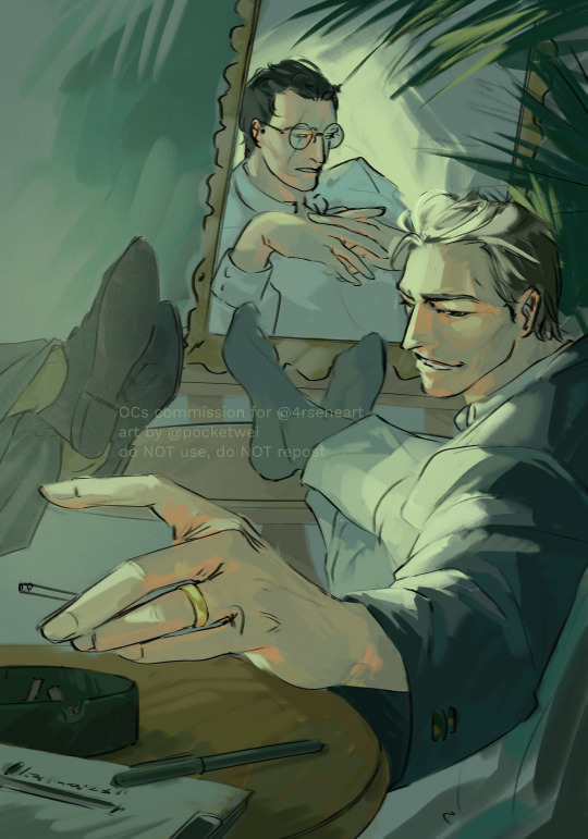
commission for @/4rseneart on twitter!! absolutely LOVED working on this one..... the OCs’ names are Siegfried (in the mirror) & Anslem (on the right)... they’re stylish lads and I dig their vibe So Much...!!!
progress under the cut, it was a fun one!
1) rough concept:

2) line, figuring out placement
3) color scheme, placing lights and overlays (OLs). Tentative shape placement

4) rendering, here you can see that I was starting to lose the C-shape composition (dark background behind the mirror + dark shoes on the left) -> in the final image I had to bring down the contrast in those areas to free up this area so these shapes wouldn’t clash with the main line of action!

24 notes
·
View notes
Note
https://twitter.com/DailyRodrigo/status/1680652780233433091?s=20
I said this before but I think there is a stark difference between carrying themes over in an adjacent but not-the-exact same way but you can tell they're thematically aligned, and just not creating enough difference where they feel awkward next to each other.
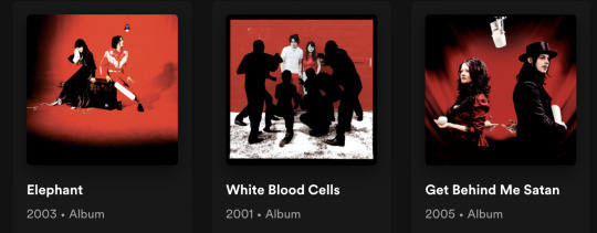
these are the white stripes albums she's referencing: see how they're, yes, the same color scheme and vibe, but SO compositionally different, the poses are SO different and so distinct, in a way that feels like they're telling a story and pulls you in?
these, conversely, are Olivia's too artworks side-by-side:
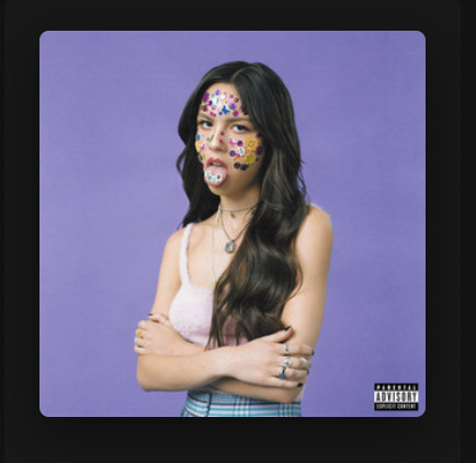
I simply don't get that when I look at hers. If the background was the same shade of purple and the pose was distinctly different or vice versa, I would completely get what she's saying and think it's successful, but a SLIGHTLY different pose and SLIGHTLY different lighting and SLIGHTLY different composition (still a torso-up shot where she occupies 1/3 of the frame with her arms in front of her and something happening with her mouth is the visual focal point) just registers as awkward to me still. It looks like a b-side shot from the same day when they were unsure where they wanted to go conceptually, as opposed to either an equal standout from the SAME shoot, which is what I feel looking at the white stripes art, or a true cohesive evolution of the idea.
it comes down to what I said it was in the beginning: interesting idea, poor execution due to what seems like a lack of ability to hard-commit full-stop to a distinct vision and really go there, which is the same way I felt about the crop on the vampire art.
also obligatory disclaimer: I'm not being a hater I literally do this for a living it is fun for me to talk about okay ANYWAYS.
12 notes
·
View notes
Text
Colors in Never Let Me Go - the Discordant Colors
I’ve listed some of the discordant color(s) against the more regular color palette(s) in the show here. Now I’m going to add some of my thoughts on those color(s), focusing on the scenes of my interest. When I need to interpret the possible meaning of the colors, I will do so based on this reference.
1. Shades of red/orange. So many instances of the reddish shade were found throughout the first three episodes. Some of them emphasize the presence of someone or something (e.g., the teacher, Neung’s books), while others probably imply an event (e.g., the red protest texts). And we also have these few shots, which I thought might tell us something.
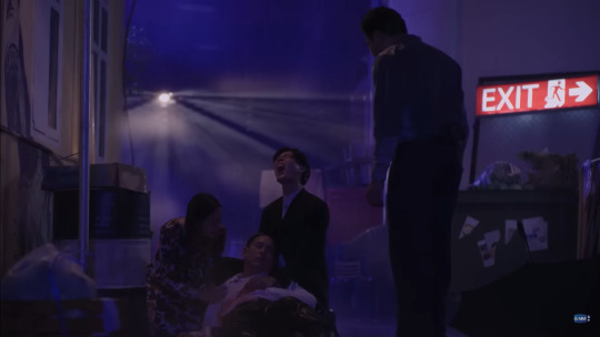
Neon red on the (emergency) exit signage, amidst the blue lighting, can automatically assumed to mean ‘danger’ (why would you go for an emergency exit otherwise). Now, this scene actually bothered me for two reasons. My inner architect itched a little. The first one is the outdoor placement of the exit sign (as it is more commonly used inside a building to guide people out). The second one is why they would exit the building through the back area, not the front (except taking into consideration that they stayed until pretty late).
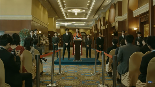
This one here is pretty obvious: red symbolizes power. Thanya was in red outfits as she declared stepping up to the CEO position in place of Phiphop. The red straps directed our view to Thanya. Now, on the left, we also note a woman in a red outfit/dress. We know from the episode that nothing had happened involving the woman. So, it could be just a random additional drop of red in the scene, or maybe something will happen in future episodes that would refer back to this part of the episode.

This scene catches my eye as the lamps behind Neung gave a more reddish vibe compared to other scenes whenever he was in his room (and the light was more of pinkish vibe). However, I feel the spectrum of Nueng’s emotions here was quite complex and not necessarily associated with the color red. It could be ranged from worries, fear, stress, frustration, and to some extent, maybe also anger. Truthfully, I’m not sure. What I know, they put Nueng in the center, giving a sense of double ‘pressure’ from all sides.

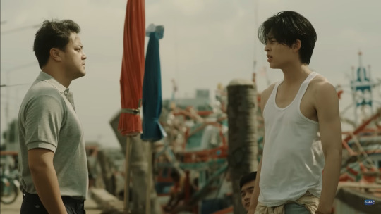
Another I’m not sure. This is the scene where Khit learns about Palm, and also where Chopper knows Palm lives in Neung’s house. The muted red (the car’s rear lamp and Palm’s sleeveless shirt) might indicate a possible future relation between Palm and either or both of them based on their power dynamics and/or connection to Nueng and his family. But again, as of now, I’m not sure how it will turn out.
2. Red/orange + blue.

I think the second picture above, the ‘scoring board,’ is more of a reaffirmation. It shows the combination of muted red and blue as a complementary color scheme representing an opposition, as it was in a basketball game. Now, taking this reference to the first picture, does it suggest that Palm and Chanon would eventually end up as opposition? (By “opposition”, I don’t mean a normal fight between father and son with differing views.) Or maybe the colors are there as a contrast, for a composition purpose. We need to see further into the next episodes.
3. Yellow + blue (darker or lighter).

At its first appearance, this room feels like Nueng’s safe space in the school. It uses a different color tone compared to the other parts of the school. More specifically, the combination of muted yellow and blue is another set of complementary color schemes. Some keywords that match the colors imply different sides of Nueng. Yellow represents insecurity, naivety, and, to some extent, obsession. Blue represents isolation and melancholy. They might not be 100% accurate, but briefly, Nueng might have given off those vibes.
4. Shades of green.

The green here is subtly placed between Thanya and Khit and seems to blend well with the dark colors of their outfits. Green is another representation of danger, which also implies corruption and darkness. Another thing to note, while plants (or nature in general) generally lean more on representing softness, it serves as a clear divider between Thanya and Khit here. We already see the hostility between them, yet we might need to wait some more to see where that ‘competition’ will lead to.
#never let me go#never let me go the series#nlmg 🧡#never let me go colors#cinematography#color#color palette#color scheme#color interpretation#why am i so last minutes into the new episode
20 notes
·
View notes
Note
I’m intrigued, you gotta elaborate on that
HELL YEAH OKAY these thoughts are largely unorganized and don't necessarily imply heavy meaning but again pattern recognition makes brain go brrrrr so color theory time! Easy start is Tim and Jay having complimentary color schemes, they are opposites both in Canon and on the color wheel, and yet they go so well together and are always paired (Jay also wears a lot of red and brown((red+green)) in canon). they are different and yet so painfully similar
Hoody and alex were very close to being compliments (yellow and purple/ blue and orange) but just slightly missed the mark with blue and yellow. However they are both needed simultaneously to create green i.e: dragging Jay into this. all of these intermixing colors are surrounded by the threat of the operator, that which is black and white.
tim/masky and hoody are toften referred to as "the twins"(better represented when tim is in the masky jacket matching hoody's yellow) and are also analogous (close by on the color wheel, red orange and yellow are all analogous), however one color stands between them on the wheel/ Brian hiding his identity and Tim's memory issues prevents them from true connection.
jay and alex are also analogous, having been close before and jay still harboring some type of connection towards alex which has been separated by alex going off the deep end. while both alex and hoody have no compliments, alex is the most isolated in his journey, never working with anyone (like hoody teaming up with masky) and only using others as a way to tie up loose ends.
In entry 86, Tim and alex swap colors as Tim wears a blue flannel and alex gets covered in blood lol
I didn't have a way to fit it into the composition but also masky's palette of a black and white mask + yellow jacket (back to the twins bit and also his history with the operator) kinda gives conflicting vibes at first which matches how we perceive them early on, unclear (for both hoody and masky) if theyre working for or against the operator
OH and Tim Alex and hoody are all primary colors (cant mix anything to create them) and have heavy connections to the operator while Jay is a secondary color (still affected but somewhat less involved, makes sense considering how protagonists are often stand-ins for the audience)
#lane speaks#ask the alien#okay i think that's it it for now fghkdjhk#elfgrunge#marble hornets#mh#i lov colors :]
12 notes
·
View notes
Text
Day 26: Chat Blanc
Welcome! Enjoy the nighttime photograph and auto-generated collages ;)
Because I am a perfectionist and also sometimes insane, I drew like 12 different thumbnails of this piece before I had one I liked. I really reallyyy wanted a horror movie-esque vibe to this, where Marinette knows she’s being stalked, but isn’t looking in the right place yet, but WE can see Chat Blanc. (I’ve been irrevocably affected by @shameboree‘s bad vibes AU, if it didn’t show.) It was hard to succinctly invoke that though, with such limited space and detail.
I was talking to my sister about it, and she suggested the use of a compact mirror or something to reveal Blanc to Mari, which wasn’t quite what I went with, but once the idea of a mirror as a reveal device was in my head I could NOT let it go. Unfortunately mirrors make things everything 10x more complicated, and I couldn’t figure out a good setup. I finally brute-forced my way through the problem of composition by setting up my phone in the shower caddy and taking some reference pictures. This was also the stage where the idea of smearing the lipstick came in; since there needed to be a reason behind her using the mirror, I decided she was applying makeup, and I thought lipstick would be a striking and symbolic option. It would also show how quickly she had startled and turned!
And then sketching! I used a light blue for the sketch because I wanted the whole image to be very chilling and unfriendly from the outset. I was having a really tricky time nailing down marinette’s expression in the sketch, so I drew a couple references on the facing page to refer to as I was inking it.

Next was inking. I started with the main figures, added the surroundings outside the mirror, filled in the second figure, and finished with other background details. Once again, I left the mouth and eyes for later, in case I needed to adjust the expressions to a changed mood in the piece.
I colored Marinette first, because she’s the key figure. I chose red for her shirt because in the show, red seems to be symbolic of Marinette’s deeper self, past the secrets and lies she tells. I also wanted her to be vivid and colorful, the only living thing in the room. Everything else needed to be cool, threatening, and unfriendly; any warmer colors, or colors that weren’t blue-based, I chose to be organic - ie, a color that could come from a human body. (Because it’s just a little gross and creepy that way imo!) Almost immediately, I decided it was TOO Ladybug-red, so I dimmed it a little with some blue and brown. I wanted the truest reds to be her mouth and the rose. The window curtain was white as a decoy Chat Blanc to catch her attention, and also because my bedroom curtain is sheer and white, so I had an easy reference on hand haha. I made the shower curtain blue to keep the overall color scheme cold.
Then, I just kept adding layers of shadows and color until I liked it! I don’t usually use such blue shadows, because it tends to layer with warm skin tones in a green way, which I don’t love, but I combined it with a dark violet for Marinette’s skin, and blue everywhere else. I kept adding more and more ink shadows, because I wanted them to be kinda dense and threatening.
Final piece
If you read all of this, thank you! :))) xoxoxo
49 notes
·
View notes
Note
how do you go about choosing your artworks’ color palettes? there’s a lot i love about your art (textures, composition, subject matter, themes, etc), but im always so specifically blown away by your color choices (esp in the gritted teeth patreon preview) do you look at/color drop insp pieces or just vibe with it till it looks cool? perhaps a secret third thing?
a mix of all three! there's sometimes where i see something (whether its other illustrations, films, stuff i see in real life, etc), and that inspires colors; there are other times where i Think i know what colors i want, and then through the process of creating that idea sort of shifts (sometimes i use adjustment layers + they create a color scheme i wasn't expecting, but prefer...and then with actual physical paint there are times where once the paint hits the surface my idea of how i want it to look changes)...and then there are plenty of times where i start a piece without really knowing what colors i want, and i have to fight my way through it basically LOL. in those instances i try to focus on the values first and worry about color later, either through gradient maps or other adjustment layers
i have a hard time explaining exactly how i go about picking my colors because to me its just a really intuitive process (especiallyyyy with real paint, im so particular about what goes onto my surfaces), but generally i kind of thing about hue contrast (opposites on the color wheel, usually), saturation contrast (really bright vs really dull), and value contrast (that ones honestly the least important to me, i mess up my values scales all the time LOL)
#asks#sorry if this isnt like super helpful 😭 colors the one thing thats just vibes to me#also tend to go thru color phases. more subconsciously than anything#and THANK U for the kind words about my art <3
11 notes
·
View notes
Text
Does Stable Diffusion 1.4 Know Its Planes?
Today I collaborated with someone else (who requested to remain anonymous) in a little experiment. It was his first foray into generators more advanced than Craiyon (we used Simple Stable); essentially, this was mostly his doing with a little help from me with prompt engineering and walking him through the settings.
Something I love about image synthesis AI is that it...absolutely sucks at engineering. I mean this 100% unironically - I love what it illustrates about the priorities of the models. I love how it stands as a reminder that these things run on what we as humans might describe as Vibes. It understands what makes an image represent what it depicts in terms of what pixels tend to go near each other; it doesn't understand weight, or balance, or anything like that except strictly in terms of artistic composition - it doesn't understand what makes a structure Work. That's why, when you go for architecture, it often gives you impossible geometry - which I consider to be a feature that is extremely fun to play with.
And that is also why we had an amazing time generating rainbow airplanes today.
Or, well, trying to.
First iteration: we wanted to see if it knew what a DC-10 was without any further context.
It did not.
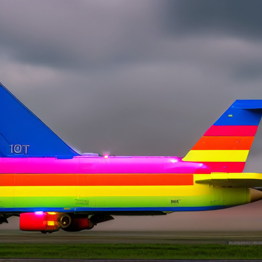
So, okay. We determined that it needed more context. Which we kind of figured might happen, since "DC-10" is a string that might show up in a lot more contexts than just planes...though a vertical striped board wasn't the confused result we were expecting. So, our initial prompt of "rainbow DC-10 psychopop" turned into "rainbow McDonnell-Douglas DC-10 trijet airplane psychopop".
Which gave us entirely too much landing gear on a body that looks more like a Boeing 737 than a DC-10.

No, Stable Diffusion, the "tri" in "trijet" is about the ENGINES, not the landing gear!
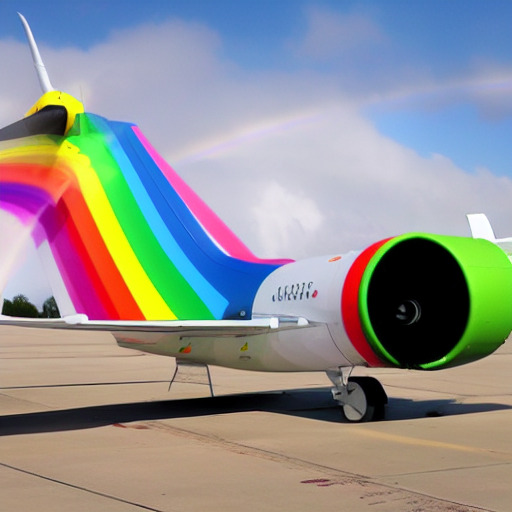
Then things got even more interesting when we decided to try adding "S-duct" to the prompt.
We kept getting tail profiles (some with wonky "dorsal fins" like this), indicating that it knows where an S-duct is supposed to be...but none of them had the #2 engine of a trijet.
After this we took a break from trying to get a unique color scheme - especially since its interpretation was pretty universally just sharp blocky stripes - and switched just to seeing if we could get a good picture of a trijet solely from a text prompt.
The prompt "trijet airplane" gave us, uhhhh.....

Well, that is three engines, I guess...I'm genuinely tempted to try making a 3D model of this beast, 3D printing it, and seeing if I can force it to actually fly with strategic use of weights. (I know already that the answer is probably no, but it will be extremely funny.)
We began to figure out that it might not know specifically what a trijet is, so instead we tried to describe it. "Airplane with three engines" and "airplane with tail-mounted engine" got us...

In his words: "last time I saw a plane taking off after throwing an underwing engine it didn't end well" - in my words, image synthesis AIs continue to suck at counting

What appears to be two planes stuck together at the butt with a disembodied wheel, weirdly hybridized with a space shuttle

"And THAT is what we call an uncontained engine failure"

A tiny disembodied fuselage with one singular hyperextended nose gear, somehow managing to take off.
Then, despite our continued failure to get what we were looking for, we got curious and decided to add the rainbow color prompts back in, just to see what would happen, and...

Not quite...
A little closer...

...fuck it! Good enough!
2 notes
·
View notes
Note
Top five zero escape character designs go
I completely forgor to post this one! Fuck!! but here you go these were extremely fun to write honestly, these are in order of favorites so most of them are from 999 lol
Santa!! Duh!!! The first thing that stands out to me is how monochrome it is, everyone has a bit of color to them even if muted but he's clad in all this high contrast black and white and it makes him clash a little next to the others which works with how he's supposed to subvert the standoffish and brazen shallow youth kind of character who's just there to cause conflict. Something I always remember too is how some people went all in on analysing the way reds and blues are color coded for transmitters and receivers too pointing out the Field's designs as an example of that color dichotomy and then making a point of how Akane is associated with both at the same time with her purples and how looking at it that way could be a way to communicate that Aoi simply has no access to either ability at this point even if back in their tiny designs he had a blue scarf and her a red tie but Okay that's not even getting into what he's actually wearing I love how no one can quite pin down what style he's going for aside from somewhat punk? Somewhat sporty? I think the closest I've found was techwear? But yeah I like his arm warmers and stupidly thin scarf I like how they're both black in a way that matches with Akane's outfit composition and he has those cool shoes™ which have no shoelaces so it's more practical and a fuck ton of pockets on his bulky ass pants which again very practical given he's got a bunch of stuff to keep track of like he clearly lies about finding the bookmark on the sofa and he keeps a whole gun in them too like yeah I like how the abundance of pockets is pretty purposeful for a change
June!! I probably like it a lot because it looks like such a comfy look for me but also it's so good at what it intends to communicate about her, like, all the multicolor stripes on the long sleeves and socks and the little curls in her hair that are animated when she emotes give her the quirky girl vibe and obviously the whole sweet childhood friend look with the dress and floral patterns make her look sweet which wasn't only the archetype they wanted to subvert but also what turns out to be how the character wants to present herself very purposefully also I like her bun It's such a specific way to decorate her hair and I like how it shows her as having a level of conscientiousness and attention to detail when it comes to her appearance that stays intact during the whole franchise, she never has her hair down completely
999 Junpei, I like his floaty looking jacket :3 No but for real I was shocked that those were actual notes in his character design concepts that the vest makes him fit into the setting because they look like floats like??? I can't believe I picked up on that when I first got into the series like I thought I was joking, but okay, he also has a ton of flannels and layers that give him a back to the future cosplayer look and I love that for him but I think what makes it sell so much of the just a college guy thing he's got going on is the casual and slightly mismatched pants and shoes like what are those shoes colors doesn't matter it's just what he put on that day probably rushing not to be late, his hair I like too it's not very anime it's just a guy with medium length brown hair but in a way that's still a very distinctively him kind of look! Now that I think about it don't his shoes match with the fucking bracelet lol
Luna! I don't know she just looks so nice!! Fighting for her life there as the only girl in the main cast not being needlessly sexualized I guess (I like vlr Alice and Clover in theory just look at their hair and color schemes but we'll y'know,,, And I love love Phi but having both her wear the shortest skirt ever and having her wear an oversized coat to represent her ''immaturity'' from what I've read,,, just. yikes. Also they all seem like they should be uncomfortable, Lotus complained about not being dressed for the situation at least) but yeah I like how she still has maid elements on her design like in her concepts but instead of just giving her a black dress and white apron which is a look that personally really bores me they incorporated the apron into something more full of life! The purplish pink sleeves with fancy cuffs and a dark purple skirt with pretty patterns and ribbons tying it together and a very proper looking braided hair, also of course her pendant is nice and full of importance
ZTD Phi, because I'm a lesbian... I wish I was joking but like what do you want from me it's ztd aksbsk it's a weird choice to decide she's suddenly a red head who dyes her hair but not her eyebrows it's a weird choice to decide she's suddenly wearing glasses when what it implies is that she's wearing them for fashion purposes since she never once complained during vlr hm at best it's a neat idea for her and Sigma to have their color schemes be the inverse of each other? I don't know but I look at it and even if the model is. not the best nonetheless I go omg bless this character designer she's just holy shit those shorts and that blouse with the blue accents so so so pretty hhhhhhhh
#I forgot to post this like. twice#shame on me cause I loved this it was so fun#I could ramble about these and other designs more still lol#a tag for asks#tag game
7 notes
·
View notes
Text
Unveiling The Timeless Elegance: Terrazzo Look Tiles In Sydney
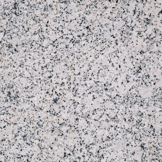
Terrazzo has long been revered for its timeless elegance and versatility in architectural design. Originating in Italy centuries ago, this composite material is renowned for its unique blend of marble, granite, quartz, or other aggregates embedded in a cementitious or resinous matrix. While traditional terrazzo installation can be costly and labour-intensive, modern advancements have made it possible to achieve the same luxurious look with terrazzo look tiles. In this blog, we'll explore the allure of terrazzo look tiles in Sydney, highlighting their beauty, durability, and versatility in contemporary design.
1. Captivating Aesthetic Appeal
Authentic Resemblance: Terrazzo look tiles faithfully replicate the intricate patterns and textures of traditional terrazzo flooring, capturing the timeless beauty and sophistication of this coveted material. From subtle speckles to bold aggregates, terrazzo look tiles offer a range of design options to suit various aesthetic preferences and architectural styles.
Versatile Color Palette: Terrazzo look tiles are available in a wide range of colors, from classic neutrals to vibrant hues, allowing homeowners and designers to create customised looks that complement their space. Whether you prefer the understated elegance of white terrazzo or the striking contrast of black terrazzo, there's a color option to suit every taste.
2. Durability and Longevity
High-Quality Materials: Terrazzo look tiles are crafted from high-quality porcelain or ceramic materials, making them durable, resilient, and resistant to scratches, stains, and moisture. Unlike traditional terrazzo flooring, which requires periodic sealing and maintenance, terrazzo look tiles are virtually maintenance-free, making them an ideal choice for busy households and commercial spaces.
Long-lasting Beauty: With proper care and maintenance, terrazzo look tiles can maintain their beauty and lustre for decades, providing long-lasting value and investment in your property. Their durable nature makes them suitable for high-traffic areas such as kitchens, bathrooms, entryways, and living spaces, where they can withstand the rigours of daily use without compromising on aesthetics.
3. Design Versatility
Endless Design Possibilities: Terrazzo look tiles offer endless design possibilities, allowing homeowners and designers to unleash their creativity and imagination. Whether used as flooring, wall cladding, countertops, or backsplashes, terrazzo look tiles add a touch of luxury and sophistication to any space, elevating the overall aesthetic and ambience.
Mix and Match: Terrazzo look tiles can be mixed and matched with other materials such as wood, metal, glass, and stone to create striking visual contrasts and focal points in interior design. Whether you prefer a modern, minimalist aesthetic or a more eclectic, bohemian vibe, terrazzo look tiles can be seamlessly integrated into any design scheme.
4. Environmental Sustainability
Eco-Friendly Choice: Terrazzo look tiles are an environmentally sustainable choice for eco-conscious homeowners and designers. Made from natural materials such as clay and minerals, terrazzo look tiles are inherently eco-friendly and contribute to a healthier indoor environment.
Energy-Efficient Production: The production process of terrazzo look tiles is energy-efficient and minimizes waste, resulting in a lower environmental impact compared to traditional terrazzo installation methods. Additionally, terrazzo look tiles are recyclable at the end of their lifespan, further reducing their environmental footprint.
Conclusion
Terrazzo look tiles embody the timeless elegance and versatility of traditional terrazzo flooring while offering modern advancements in durability, affordability, and design flexibility. With their captivating aesthetic appeal, durability, longevity, design versatility, and environmental sustainability, terrazzo look tiles have become a popular choice for homeowners and designers seeking to elevate their spaces with luxurious and enduring flooring solutions. Whether used in residential or commercial settings, terrazzo look tiles in Sydney add a touch of sophistication and style to any interior design scheme, making them a timeless investment that enhances the beauty and value of your property for years to come.
0 notes
Last Seen Blogs

151317
Untitled
l-crimson-l
Here Be Cute Things
shepherdsbone
Shepherds' Bone

ebaru
hear me

lincoln-lawrence-solicitors
Untitled