#UI Design
Text
Okay, so: there's a local restaurant whose online ordering process involves various selecting various sauces to be included with one's order – so many units of teriyaki sauce, so many units of hot sauce, so may units of peanut sauce, and so forth.
The idea is supposed to be that you can select any combination of sauces you want, as long as it adds up to no more than four units. However, what the app actually required is that you select exactly four units of sauces; it wouldn't let you submit the ordering form if the total wasn't exactly four.
Just today I discovered that they seem to have fixed it... not by correcting the errant validation rule, but by adding a "no sauce" option, which counts toward the required total of four.
Thus, it's now possible to place an order with, say, two units of teriyaki sauce rather than four by entering 2x "teriyaki sauce" and 2x "no sauce". Similarly, an order with no sauce at all is 4x "no sauce".
This is quite possibly the least intuitive ordering process I've ever encountered, and I've literally worked in e-commerce.
19K notes
·
View notes
Text

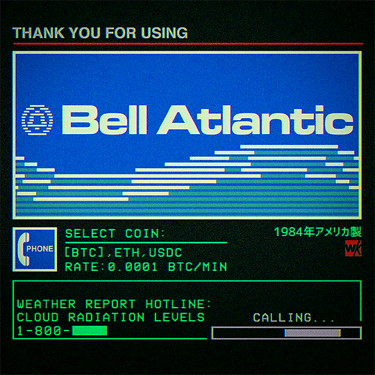
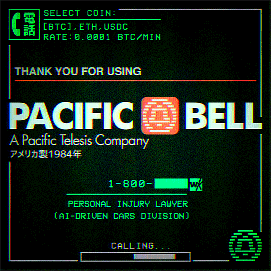
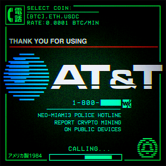
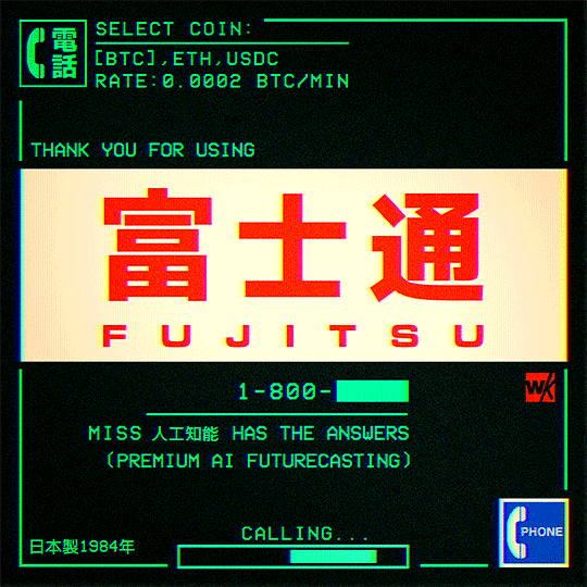
Cyberspace Telephone
#cyberpunk#bladerunner#retrofuturism#neotokyo#scifi#retro computer#pop art#retro computing#science fiction#dystopian#post internet#ui design#interface#phone#cyberspace#cyberart#animation#looping#80s#1000
2K notes
·
View notes
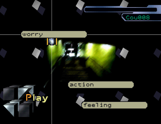
Text

#motion graphics#art#graphic design#ui design#animation#scifi art#cyberpunk#cyberpunk art#futuristic#ui#ui ux design#uidesign#black and white#monochrome#gif#dark aesthetic#dark scifi
636 notes
·
View notes
Text
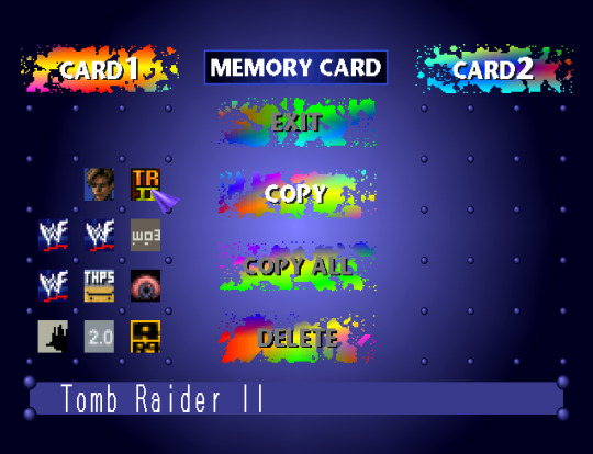
PlayStation 1 (1994/1995) - Memory Card
#psxui#ps1 aesthetic#bios#memory card#playstation#ps1#psx#psone#playstation 1#sony#ui design#retro gaming
489 notes
·
View notes
Photo

My UI design work for Bomb Rush Cyberfunk, Dec 2020
1K notes
·
View notes
Text
@staff The new layout is appalling and the least you could do is let people opt out of it.
Get that "Check out these blogs" and "Radar" crap out of here. I know how to find people to follow and you are cluttering up my dash.
#staff#tumblr#layout#ui design#tumblr layout#if this is what Twitter users need to live then let them perish
221 notes
·
View notes
Text
Found it again! Very interesting article originally by Microsoft UX researcher Kent Sullivan about the development of Windows 95's UI.
#windows 95#win95#microsoft#ui design#ui#tech#i remember reading this in the original and i think i remember it also talked about the graphical tricks employed#to make interactable objects look like 3d buttons you can push and grab and pull and drag#by simply adding two lighter and two darker pixel strips on the sides of the objects (the bevelled win95 look)#but it seems i read that in another article. but that's the main reason i love win95 ui so much#anyway this article is cool too! it talks about the development of the task bar!
618 notes
·
View notes
Text
Discord, what the fuck is this UI update in the phone app. You took a perfectly good UI and made it uglier, bigger (more magnified, less information per screen), less responsive and made it require more actions to navigate. What the actual fuck?
77 notes
·
View notes
Text
Having loud thoughts again, but you know what would be an absolutely baller idea for tumblr's layout? Everything being a full widget system, especially on the dashboard.
I'm just using this as an example, but the old UI for deviantart, dated as it is now by website standards visually, worked off a widget like system where you had so much control over how your profile page was displayed. Certain elements/boxes could be dragged and placed on your page and then adjusted via preset options or through a bit of light coding shenanigans.
Imagine that, but with the tumblr dashboard. Instead of being stuck in just one format, you could drag your navigation bar to the left or right or if you don't like that you could pull it up top instead. Or you could have a widget on the side bar like xkit does for tag tracking, or trending tags or just not have any of that on the dashboard. Or how about a widget purely to keep track of recent mutuals that will take you directly to a full list in one click or a widget listing your current que ect ect. All of these being movable pieces yeah? The main point being the ability for a user to rearrange their dashboard to their liking for the best personal navigation with the least amount of clicks.
I think the idea of drag and dropping UI elements is taken for granted on most current social media sites even though it's extremely intuitive once you understand it's a feature that exists and how clunky things feel when you don't have it or it's taken away. There's personal website builders that already use widgets pretty frequently, so why not extend that to bigger websites that rely on plenty of consistent user navigation daily? Like imagine updates that could be about adding in highly requested new widgets or adjusting functionality of current widgets to perform better based on user feedback.
I am not a coder so I don't know how difficult it would be to implement a robust widget system for a large scale social media website, but it's been on my mind for years now with trying out all kinds of beta art sites before. I really think something like that would be worth the investment for a place like tumblr and potentially cut down on a lot of discontent over layout changes.
#tumblr#tumblr layout#tumblr dashboard#dashboard#tumblr ui#ui design#ux desgin#personal#personal ramblings#long post#I think about this A LOT in some of my friend groups#talking about failed or struggling art websites mostly#widgets are so dope and they should be the standard for desktop layouts
119 notes
·
View notes
Text


Check out the new app icon designs for Praxis — a blend of neo-brutalist color schemes and network concepts
join the praxis discord - praxis github
#open source#praxis#free software#typescript#nodejs#foss#ui design#logo design#design#app design#mobile app design#ux design
71 notes
·
View notes
Note
Would you happen to know what game established the color-coded rarity for items? What made the industry as a whole accept and adopt universally the white, green, blue, yellow/purple/orange?
This topic actually came up fairly recently on our discord server. Back in 1990, some University of Warwick students built a game named Angband, a LOTR-based roguelike named for the fortress of Morgoth. The items players could find were color-coded based on power. Angband inspired the creators of Diablo (1997) who are generally regarded as the first ones to have different colors indicating quality. Magic the Gathering added rarity colors to its printed cards in its Exodus set shortly after (1998), and Diablo 2 solidified the color-coded quality (e.g. normal, magic, rare, unique, set) in 2000. I believe World of Warcraft conquering the world in 2004 was what solidified the grey > white > green > blue > purple > orange color power progression that everyone knows today.
[Join us on Discord] and/or [Support us on Patreon]
Got a burning question you want answered?
Short questions: Ask a Game Dev on Twitter
Long questions: Ask a Game Dev on Tumblr
Frequent Questions: The FAQ
103 notes
·
View notes
Text
Like, I'm not saying that this is a good thing, but it's kind of bleakly entertaining how over the course of my life my skill set as an online researcher has gone from being:
Hugely valuable in the late 1990s and early 2000s because the discoverability of information in public-facing databases was fucking terrible and nobody knew how to organise anything; to
Effectively useless throughout the 2010s because search engines enormously and rapidly improved and computer literacy was at an all-time high; and
Back to being hugely valuable once again because SEO bullshit and the proliferation of AI-generated content have degraded online discoverability back to pre-2000 levels and computer literacy is in accelerating decline due to mobile devices deliberately obfuscating basic functionality so that app vendors can sell it back to you with embedded advertising.
25K notes
·
View notes
Text
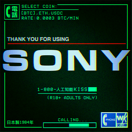
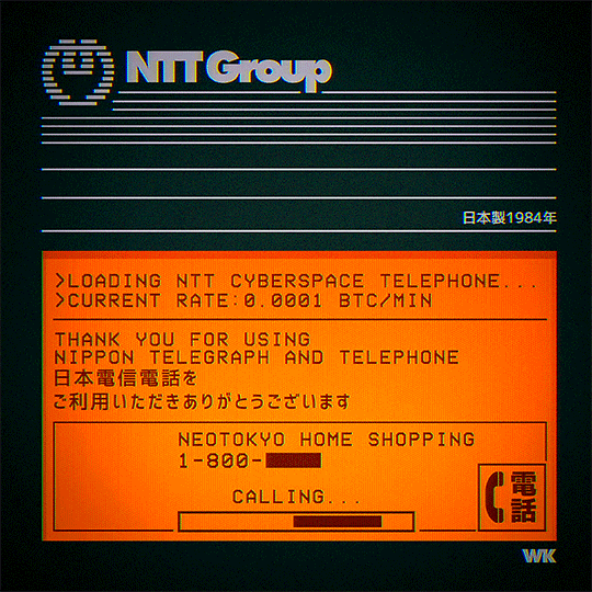
Sony Cyberspace Telephone
#cyberpunk#bladerunner#retrofuturism#scifi#retro computer#retro computing#science fiction#dystopian#post internet#photoshop#ui design#interface#phone#cyberspace#cyberart#cyberwave#neotokyo#80s#animation#1000
1K notes
·
View notes
Text
#motion graphics#art#graphic design#animation#scifiart#scifi art#cyberpunk#scifi#cyberpunkart#digital art#typography#type design#minimalism#futuristic#ui#ui design#uidesign
489 notes
·
View notes
Text
Serial Experiments Lain (1998) - Interface
231 notes
·
View notes
Photo

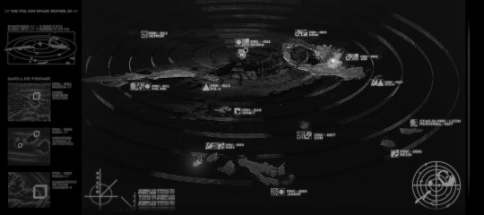
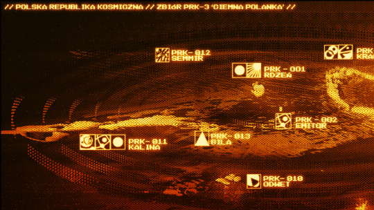

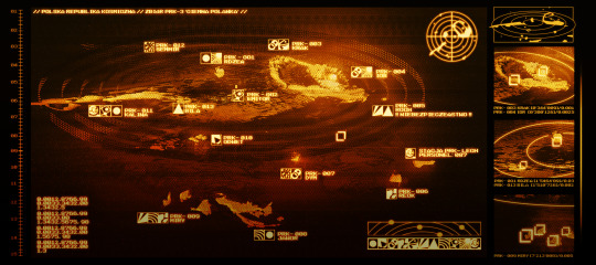


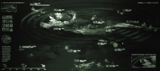
I can finally post my finished space systems / constellation maps done for a school assignment.
It was a really nice experience doing something I would never even think of doing on my own, it made me discover so many cool possibilites of the digital medium. These were done in photoshop with the planet shapes made in alchemy, it was very challenging but very rewarding to put all the pieces of these maps together. I quite like how they look even though they are far away from my usual aesthetic.
The files are a bit big in size, I recommend clicking on them to see them better!
#space#space art#ui design#map design#environment art#environment design#digital#digital art#my art#mostrovska
220 notes
·
View notes
Last Seen Blogs

kaiserkeller
snowqueen of texas

dowenlatragedia
D.Owen La TrapGedia

an-end-to-an-ending
The Denouement

selfpublishingnews
Self Publishing News