#art supplies are expensive
Text
Hey hey, post your codes in the comment and lets help each other out, yeah? My code is 252857222
#temu code#temu link#help lol#art supplies are expensive#lets help each other#cute#creepy#basic necessities should be affordable#aromantic#coding#share around#reblog#rebel#a little break from all reality
0 notes
Note
forgive me if you've been asked this before or if its annoying, but how did you learn to use colored pencils like that? your art is so special to me.
ty :) I took an art class for a few years where our teacher had us buy prismacolor pencils as one of the art supplies and had us use them kinda like paints, pressing down hard right away and blending the colors together. its not how youre supposed to use them she was just trying to teach us to use color and ig this was more to the point. I picked them up again years after i stopped going to that class just bc they were there and i wanted to play around w them a bit and ended up actually enjoying it when doing it on my own terms lol
#it was a weird class#it was just this russian lady doing private lessons in her house that my mom learned about somehow#I did NOT like those classes all we did was still life and they were hours long which is esp rough when im in high school and busy#and she wanted us to stand while working the whole time bc tradition i guess?#she did allow me to work sitting but thought i was lazy for it. idk dude i dont want to exhaust myself fast for no reason#standing is a lot more tiring than walking#i def did still benefit from those classes just from learning to accurately draw from life#did not like the teacher tho#on one hand shed paid for the art supplies for kids whos families were too poor to (and these are nice expensive supplies)#which is very nice#but on the other she was very homophobic and open about it#like when they legalized gay marriage she went on a rant about how horrible it is that they can adopt kids now#and also kind of racist#she was telling me how she got blocked from a facebook group bc she made a post asking if she could speak to a white person#and she didnt realize she was posting that publicly she thought it was a private message to the group owner#im honestly still not sure i heard/understood her correctly bc it was so bizzare and the only time i ever remember her being racist#she talked abt it like she genuienly was unaware it was racist#she described it as a misunderstanding bc she accidentally posted it publicly instead of privately#like it wouldnt have been racist to ask that at all#also one time she talked about how she saw demons in her home once#also she doesnt vaccinate her kids bc of microchips#she was like a walking russian stereotype lol#anyway heres some ink the artist lore
149 notes
·
View notes
Text
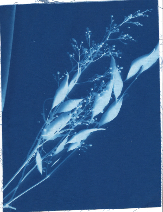

cyanotypes
#cyanotype#floral#cassette#traditional art#i wasted so many sheets trying to figure out this medium ugh.. i dont wanna think about it. art supplies are so expensive :'O
206 notes
·
View notes
Note
just read your tax benefita marriage thing and had this sudden image of the older endless (destiny and death and maybe destruction) pulling dream as ide to ask if he at least got a prenup & dream, in all his infinite wisdom, going 'what's a prenup?'
Dream: well frankly I think it's fine if Hob gets half my inheritance, he deserves it :)
The rest of the endless: 😶
Death: dream you're going to be paying alimony for the rest of your life
Dream: first of all, we're not getting divorced, so jot that down. Secondly (*slurping instant ramen out of a cup while sitting on the falling apart couch he and hob definitely picked up on the side of the road) I'm clearly not using it.
-
Hob after he finds out: just so you know, if we ever get divorced I AM taking you for all your worth in court
Dream: I'll sign whatever you want idc
Hob: ....
Dream: also we're not getting divorced :) because you love me
Hob: yeah unfortunately I do
Dream: (was joking) what.
#dream only uses his money for 2 things: eccentric art supplies and clothes#he's painting with gold leaf while drinking franzia straight from the box etc#he also buys extremely expensive clothes bc he hates shitty fabric#desire is constantly teasing him like 'how are you wearing balenciaga living in a hovel'#dream of the endless#hob gadling#dreamling#ask#anonymous
608 notes
·
View notes
Text


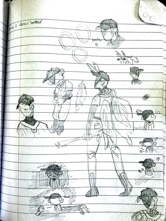


som sketchbook doodles
i got an eraser today after not having one for a month yippie (if u can see where i tried to erase and failed uh no you cant<3
+ me having to use my computer as a light to see my sketchbook
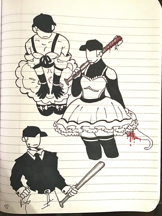
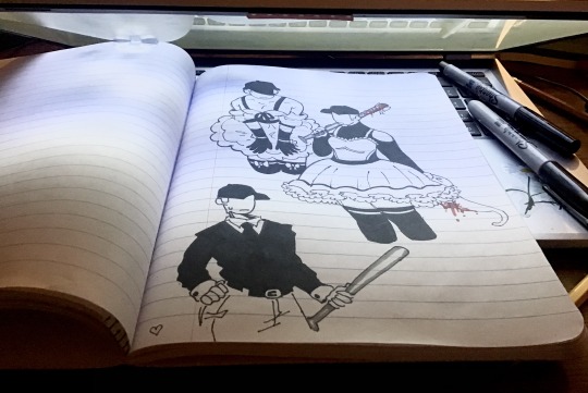
#bird guy is my dnd character#hes a old immortal crow man who was a renowned plauge doctor#ive been playing alot of sindec recently#love using the batter to play dress up#ah now to tag good lord#off game#off the batter#off#off the queen#off oc#batter oc#off bad batter#i have so many ashley drawings to ink#i say ink its just sharpies i found in my closet#if anyone tells you you need expensive art supplies to make good art theyre lying#all my stuff is from the dollar store (barring digital art#oc#oc art#scotcharts#traditional art#doodle#sketchbook#sketch#art#artists on tumblr#do i need to tag gore for the middle one?#i dont think so
70 notes
·
View notes
Text


Feb 1 2024 Hourlies -> first day of my period -> my sleep schedule is backwards and I did it 12am to 12am style even though it technically is part of my yesterday and not all of my today
#hourly comics day#im a little mad bc i have my perios rn but im tired of people complaining about art being too cliquey or gentrified oe whatever#like calling hourly comics day something for rich kids. grdjjgkdmd#you can do it ugly. let yourself try. you dont need the expensive supplies and lots of time#i had fun drawing this bad and not editing it#it doesnt have to be a masterpiece to be worthwhile or enjoyable#hourlies#2024 hourlies
51 notes
·
View notes
Text
kind of a dumb headcanon BUT i think whenever lance actually has some spare time (arceus knows he rarely has any of that) whenever he's not out and about with one of his Various Kids (kanto trio and johto quartet), i think he likes to knit. Specifically so that he can make stuff for the baby dratini in the dragon's den for the winter + stuff like hats and scarves for his own pokemon team. clair does the nearly the Exact Same Thing (crotcheting instead though), however, unlike lance, who would likely be calm about it being discovered (especially since silver would be the most likely to discover it since dad lance is real in my heart), clair would just Drop Kick the discoverer into oblivion (also likely silver. this time because it's funny)
#pokemon#champion lance#gym leader clair#this leads into my headcanon of over time silver getting into art. as a way to express and discover himself and as a form of healing and as#a way of showing vulnerability#so he sees lance knitting for the first time like Huh. You're The Champion what the FUCK are you doing#and eventually when he gets comfortable enough to express an interest in art lance goes out and gets silver the Fanciest most Expensive art#supplies because of course he's going to support silver's passions and help him grow and become a better artist. why wouldn't he#not pictured is lance also knitting scarves hats blankets etc for silver because Stubborn child who Doesn't Wanna bundle up vs. guy who#trains dragons that are Weak to ice#oh also it's funny to imagine clair and lance making each other gag gifts#clair crotchets lance a gag cape that says DONT ASK ME ABOUT DRAGONS (let's be fr lance has the dragon autism) and he wears it for april#fools at the league#i can't Sleep. as you can tell#rival silver#<- for the tags mainyl#MAINYL#.#not trying a 3rd time
25 notes
·
View notes
Text
FUCK THE AM AND THE PM 🎸
(Please click for better quality!!)
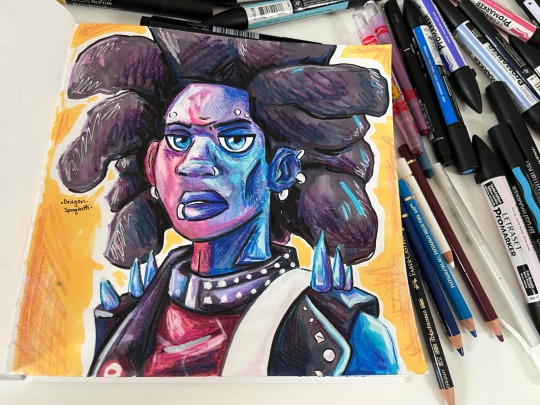
#drag's art#spiderman across the spiderverse#atsv#atsv hobie#hobie brown#spider punk#spider-punk#across the spiderverse#atsv fanart#across the spider verse fanart#i did this on a complete whim#it is a mix of expensive ass supplies#and. crayola twistables wHEEZE
96 notes
·
View notes
Note
What markers do you use and what kind paper? The textures are so Delicious
Very basic paper, actually! I find I overthink when using expensive stuff and it makes my sketches worse.
As for markers, I use Copics! Not that this is an endorsement (my first set were a very nice gift), but I have really liked using alcohol based markers over water based ones; lovely texture, good blending, and less streaking. However, the price can be *brutal*, and you can very easily get by with other markers + pencil crayons.
#ask#art faqs#fancy supplies are nice but the dont really help THAT much for art skills. Consistancy and persistance does.#I balked the first time I needed to go in to buy a few new ones to fill out my roster.#if you are going to invest; my strategy was to make those fancy new supplies a reward for drawing X amount of days in a row#that way one doesnt buy a bunch of stuff for a soon to be abandoned hobby#Art is a relatively cheap hobby at its basics. You do not need the fanciest and most expensive things.#I think watercolour is the only exception for me; that paper better be high grade. The paint mix also matters#but I digress. Buy what you need and not what you want. Save your money.#Guilt will make you stop drawing. Hoarding supplies and never using them is wasteful#when I drop money on new colours I'm going in with a list of what I want#and looking through the swatchpad for hours until i get the right colour.#cant emphasize enough how fortunate I am to have been gifted my copics. I never would have bought them on my own.
62 notes
·
View notes
Text
Me when I finally use my copics 🤯
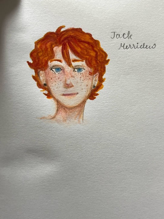
Copics and colour pencils (both of which I don’t really use)
#lord of the flies#lotf#art#lotf fandom#lotf fanart#fan art#fanart#lotf jack#copic markers#copic art#copic and colour pencils#jack lotf#lord of the flies jack#jack merridew#goofy ass art supplies#wtf are copics so expensive#like thank god I don’t use em anymore
37 notes
·
View notes
Text
if i'm sparse online i'm still working on coms but we're moving!! exciting but also...so much packing lol
#its good tho bc its gonna be much more affordable so hopefully i wont have to keep opening comms and have a big backlog#that being said i'm probs gonna open for feb a little bit tomorrow bc a few ppl who asked for holds fell through#and yk. moving expenses#why are trash bags and cleaning supplies so pricey *skull emoji*#no art here
25 notes
·
View notes
Note
Hi ! I love your art and took inspiration from you to do the front page of my notebook for my theater lessons !
I unfortunately had to do it on the paper from the notebook directly instead of drawing paper so I'm a little disappointed with the results but I like what I did when I was figuring it out, on the drawing paper (and also on tracing paper for some reason ?)
Overall I'm so happy I could kind of replicate your technique for the light while using cheap wax pencils (stinginess wins 💪)
Anyway, thank you for posting your art it altered my brain chemistry 👍
YEAAAAAÁHÆHHHHH WOOO THE COLORS!!!!!!!!!!
#500% support using cheap tools#they are harder to use typically but if u take some time to figure them out u can make sick art#im talking abt crayola supplies like theyre some complex machine lmao#they are just harder to use bc they have more filler and less pigment than Expensive Artist Pencil so its harder to get color out of them#kinda counterintuitive that art supplies for children are harder to use than art supplies for Serious Artists lol
146 notes
·
View notes
Note
silly question but what sort of pencil do u use for yr art?
not a silly question! i primarily use a mechanical pencil from muji for my sketches (w/ 0.5 HB pilot brand lead) for a good range of lines, but i'll occasionally use tombow HB wooden pencils too if i want a bit of a bigger stroke. those are the main two - nothing all that fancy!
#💌#very much a believer in the idea that ur supplies don't have to be expensive to have fun + make fulfilling art#obviously if you have the disposable income for it there's lots of neat supplies out there to try and enjoy#but they're not a necessity if you're trying to figure out what you like :-)
10 notes
·
View notes
Text
i really like this compromise and how they are fixing things, if they lower the price of the subscription at all i'll subscribe because i know how much it costs to be an artist and to make what you want. i want them to be able to make the content they want to create without having to rely on the general public
#ive had to spend over $400 in the past school year on required art supplies#and thats with cutting corners and using what i already hand AND buying bulk with the whole class#the reality of art is that it is expensive#and i wish that wasnt the truth#watcher#mega.exe
13 notes
·
View notes
Note
please tell me about the pigments i would love nothing more than to hear you talk about that one shade of red you like and the process it took too recreate it
... oh, op. you have no idea what you've unleashed.
alright. here we go.
OKAY SO THE RED PIGMENT. pr206. my beloved. my dearest friend. it was an absolute bastard to find because there are so many of these. however many you think there are, there are MORE, and that's only if you don't count the many many scenarios where colors are known to be multi-pigment mixes, usually varying in tone/shade/intensity depending on the brand and manufacturing style. some colors are more consistent than others, but there are situations where a color can be named the same and contain the same pigments and STILL look wildly different depending on the ratio, binder, and paper you use. and that's not accounting for the way the pigment is processed. some pigments (like pv19 for example) can come in so many shades it's frankly kind of ridiculous.
anyway, my quest begins when i am, admittedly, in an edgier phase. i want a blood red, but not specifically because of that—no, i want it because it is THE IDEAL COLOR (to me) for a perfect, warm, slightly muted but still intense shade to add to a muted autumn watercolor palette. and... if you look at my whole theme, you probably know how much i love warm colors. i want to paint mushrooms. i want to dim down some of the brighter greens to make them autumnal. i want the perfect red to put as an undertone.
the search starts in earnest.
the immediate issue is this: reds (and purples and pinks) have horrifically bad lightfastness. not all of them, mind, but many are NOTORIOUS for fading under uv light, which means they will also fade if exposed to sunlight even in passing should it happen often enough. and—in especially bad cases where they're essentially working with dye and not pigment—they can even fade inside your notebook. inside of a drawer.
so not only are we working with an unfortunate pigment base (i'm simplifying here, there's way more nuance to this but shh) but we are working with one that skews heavily toward floral pinks or oranges. the red i'm searching for is warm, but not orange. dries dark but not brown. is transparent, not opaque. that last part is agonizing, because i also desperately do not want a color that will fade on me or generally destabilize, and most of the stable dark red pigments are EARTH pigments like red ochre (pr101) or the like. which, while fascinating because of their historical usage in things like pottery and even cave paintings that last to the modern day, are VERY OPAQUE. this is an issue with my preferred style of watercolor painting specifically, because opaque pigments tend to lift easier off the page and limit layering.
the search continues. pigment after pigment breaks my heart for one reason or another, drying too close to the cooler purpleish-red tint of wine at best. i think i find it in perylene maroon, but the drying shift (the difference between how a color looks wet vs after it dries on the paper) is so extreme that it loses the luminosity AND it's more opaque than most. i languish.
for a while my search turns to creation. i try and mix as many of my single pigment colors as i can into something that vaguely resembles what i'm looking for—so i take quinacridones and mix them with napthols, with nickel azos, with dashes of ultramarines and burnt sienna. everything turns out either just a bit too opaque, just a bit too muddy (that happens with multi-pigment mixtures, and is why so many people swear by single pigment colors. it's personal preference, really, great art can be made either way.)
still, nothing works. failure haunts me. i sit before a pile of used up watercolor paper that is literally covered edge to edge in nothing but similar red squares with various gradients and blooms as evidence of when i tried and failed to convince myself my efforts were close enough. i admit defeat.
in the meantime i shift my focus. i try and appreciate different color palettes and profiles, experimenting with things like fully transparent palettes (personal favroite) to fully opaque ones that function more like gouache. but despite finding appreciation for it, i still think about the damn red that i could never recreate. it kills me.
and then one day, a youtube video. a pigment is being discontinued, and the watercolor community is distressed. this happens a lot, because pigments are actually not always popular because of artists—sometimes beloved colors are put out of production because larger markets like car companies no longer find them popular enough to invest in. this time, the casualty is pr206, aka brown madder, aka quinacridone burnt scarlet.
let me tell you a little about quinacridones. they are genuinely remarkable colors. they have their own cult followings because of how bright and abnormally stable they are under uv light. they're transparent. they're luminous. they come in mostly shades of red and pink and purple, though there are a couple oranges and yellows in there. (there are no quinacridone blues, as far as i'm aware, but the phthalo blues have that category covered.) they also rewet beautifully, so you can put them on your palette and let them dry and not worry about it turning into a useless little rock of color that you can't get any pigment from anymore.
quinacridone magenta (pr122) is probably the most popular of these, the most often used besides maybe quinacridone violet (pv19). a few years prior we suffered the loss of quinacridone gold (po49) and since then people have been On Alert when it comes to losing these colors. i am one of them, because i never got the chance to even see po49 in person, and now the tubes are so stupid expensive that even the student grade versions go for Ridiculously High Prices on ebay, and the professional brands are being hoarded like (ironically) gold by anyone lucky enough to have a tube left over.
but back to our main character. not me, the pigment. pr206. i have legitimately never heard of this one, which to be fair is probably because i try to limit the random colors i fixate on since the hobby can easily get VERY expensive if you aren't careful. but it's a quinacridone, and that catches my eye.
i open the video.
now, i'm sure any artist out there will be familiar with the fact that screens don't display color consistently. it depends on your device, but most can agree that something that looks cooler on one may be warmer on the other, it's just what happens. but i see this color being swatched, and my brain implodes.
it's almost a perfect match.
it could work. it could. years of thinking that same thought have left me bereft and mistrustful of this specific quest marker, but the thought refuses to leave me. probably because the 'discontinued' label flashes like a neon sign.
i resist for about six months, and then i cave. at this point i have genuinely been trying and failing to find this color for upwards of five years. i am desperate, and the color might not be available anymore soon anyway, and apparently i am weak to sales pitches. (note: the color IS now unavailable in some brands, but others bought a decent supply and should have it available for at least a little while, alongside po48 which is quinacridone burnt orange, a favorite of mine and probably one of the only oranges i use regularly. both are discontinued officially, but they'll still be on sale till those supplies run dry.)
the color arrives. i grab my favorite brush. i pull out my stash of paper that i save for special occasions.
it's almost perfect.
i mix it with quinacridone burnt orange.
the result is, i swear, a perfect match for what i have been searching for.
it's warm. it dries dark but not dark enough to look brown. it keeps its luminosity (thank you quinacridones). it's fully transparent (thank you quinacridones). i genuinely feel the urge to weep, but i don't because i am clinging at last to the dredges of my sanity and also salt makes watercolor pigments behave differently and i will not risk this glorious moment. finally, after all these years, bill cipher has a gun i found the goddamn COLOR.
i mix it with warm yellows and with my favorite blues. with the pinks, just to laugh. life is beautiful and i am painting its sunsets, and i do not care if they look ridiculously messy. i have won.
the moral of the story is to never give up. or maybe it's to remember you never actually know everything about even the fields you love the most, because this color totally blindsided me despite being much more common than i expected. or maybe it's that i seriously needed to chill out for a while.
but yes. that is the tale of one (1) of the colors that has taken up residence in my soul. i hope you don't regret asking now lmao.
#ney's art tips (art questions)#ney's chatter (ask answers)#so also i said that a good alternative to pr206 is pr175#but i'm actually not totally sure about that because i've never tried it myself#watercolor is an expensive hobby and that's part of why i swapped to digital orz#BUT! from comparisons i've seen they are at least similar enough to scratch the itch#ironically i think i still USE po48 more than i do pr206#but that one is also In Discontinued Limbo where you can buy it but supply is indeterminately limited lmao#still a gorgeous color though.#... wow. this was incredibly niche and probably barely coherent i am so sorry LMAO#but thank you for indulging my color madness. it was the only hobby i had for *ages*.#long post#very very long post#good god is this my longest text post? aside from maybe a hive story?
20 notes
·
View notes
Note
Sorry to just drop into this, but another thing to consider with handmade good and the ‘overpriced’ idea is that you also have to factor in how much stock might sell at any given time.
For example, if you make 100 pairs of earrings in a month but might only sell 30 (because you need to give people options etc.) then the profit from those 30 should reasonably cover the time you spent making all 100.
Also, it should pay for the time you spend at craft fairs, replying to any commissions/ purchase requests, packaging time and going to the post office, any online marketing you might do (tumblr posts etc).
Peolle don’t often factor these in when thinking about the value of crafts they buy, which is a bit unfair.
yes there are other overheads but the thing is. basically all of those to some extent also apply to fibre arts
but sure. to be thorough. i spend 10h a week at my market stall and an hour... let's say 2 be generous with it... updating the shop
if i made 50 pairs of earrings and sold 15, the "materials" cost of 1 pair, to cover their unsold breathren, goes from 42p to £1.40
earrings are far from the only thing though, and account for less than half of the sales. so. we can say that about 5h of stall/shop time is covered by those
(plus the hour it took to make them)
sale price - materials cost but split over 6 hours of labour instead of 1.5 is still £12 an hour
#but then. i don't charge for the time organising crochet commissions either#so even charging for labour on jewellery that i DON'T charge for in fibre arts#and more than triple the material cost#which really is fudging the numbers as much as possible in one direction to try and even them out#i can get it down to oh. just over double the hourly rate for crochet#the reason i dont charge for that labour in fibre arts is bc it's expensive enough as is#the reason i dont count 'market time' as paid labour for the other stuff is bc i am doing the exact same thing i would be at home#(making stuff and talking shit)#but downstairs instead of up here#it's a 5h craft hang but occasionally someone hands you money#which i think is a lot of the reason most [makers] dont count it#especially if it's a regular stall setup like mine and not a one-off craft fair#there's no set up/take it down again time it just stays there#i walk downstairs i make jewellery with my friends for 5h and then i go back upstairs again#(hell quite honestly me and babs dont count the money we spend on supplies for the simple reason of We Would Be Buying Them Anyway)#crafting is a disease with no known cure
20 notes
·
View notes
Last Seen Blogs