#but the pixel tool is so FIDDLY
Text
Jumpscares you with more attempted Undertale pixel art LOL
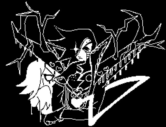

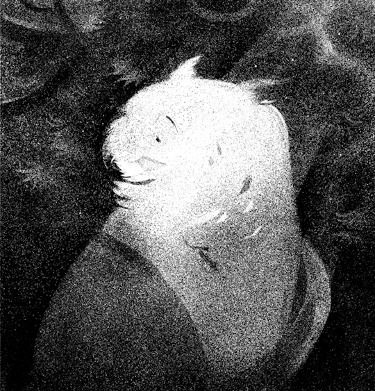
#featuring my au mettaton design bc I can and I did#the last one is NOT a finalised overworld sprite LMAO#I drew over base overworld sprite Mettaton just to see if I can make the design simplified#I'll get around to doing a proper overworld sprite for him eventually#UHHH also the first one was originally gonna be a highly detailed one like the second one#but I didn't like how it was turning out so I just made it black and white LOL#mettaton#hapstablook#undertale au#undertale oc#oh yeah did I ever mention I named him Hapsta in my au?#well uh#now I did so :)#mettaton ex#mettaton neo#hes still meant to be an inbetween of neo and ex so tagging them both AAAAAA#these sprites are so fun to make#but the pixel tool is so FIDDLY#my art#oc art
140 notes
·
View notes
Text
@centrally-unplanned - replying here since OP of that post seems pretty upset and I don't want to bother them any more:
Why DO anime production lines produce in 720 for the production art? I have heard that before but it never made a lot of sense to me - sure sure I get that some of it might be broadcast in 720p, but surely it would make better art to produce at higher resolutions. Is it just a “in 2008 720p was all any TV was doing and we just haven’t updated since and so now are a bit behind”? Or is maybe “honestly most of them have adapted already and *our* sources for this knowledge are outdated?” Or is there a real art reason for that choice?
I honestly don't know! To me it seems like often you get really nice drawings at the genga stage and then they lose a lot of their character at douga, and I wish I knew why. But I have done guesses about technical reasons.
One is computer memory. Animation software can be a real memory hog since it has to hold just so many pixels uncompressed at once. Using indexed colour helps a lot (one byte instead of four bytes per pixel per layer for 256 indexed colours vs 8-bit RGBA). For older computers, this may have been a consideration perhaps.
That said, I find it hard to believe that's the whole reason. I hit my RAM limit when drawing a ridiculously overcomplicated cut in Krita with hundreds of frames and dozens of layers at like 1440p res, and most anime cuts do not have anything like that much.
Another reason may be to save time and costs. The higher your res the more time you have to spend fixing stuff - small gaps, times when the fill tool won't get into those fiddly little corners.
Outside of that though, I don't know. Maybe it's just when the norm wasn't to watch anime on a computer screen near your face, blurry lines and low detail bg characters weren't as noticeable? One day maybe I'll be able to ask someone in the industry about this lol...
There's other stuff that's common in modern compositing I just don't get. e.g. a haze effect using a blurry white shape in the foreground seems to be common (there's a brief bit in Shirobako where you see a character apply it), and that just seems to be going to extra effort make the picture worse to me. I generally do not love gradients, though that's a matter of taste. A lot of colour design in mainstream shows seems to be either very flat or overly contrasting hdr-like pseudo-photorealism, even though the indie scene - stuff like Eve's videos - has been pushing into some really cool spaces.
And like OK, some stuff, like digital backgrounds with very obvious textures and artefacts, can be explained by the fact that the industry is strained to breaking point and taking every shortcut it can to release on time, or the training crisis hitting the layout system. But I do feel like if I pull out a random 80s anime, it will probably have much nicer colours than a recent one, and I don't really know why that is. (Selective memory maybe lol)
All that said, things do seem to be looking up a bit... I feel like I've been seeing an uptick in shows with good colour design and more thoughtful compositing in the last few years. So here's hoping that will continue...
32 notes
·
View notes
Text
A few quick ones that I didn't spend super long with, and then maybe after this I'll do the last one from the end of last year I haven't gotten to yet...or maybe keep putting it off until tomorrow if I'm too eepy.
I like the idea of TENS! more than I like playing it, or I guess I like playing it fine, but not enough to finish the entire adventure mode. I have no idea if the arranging dice in rows/columns to add to ten is original to this or not, but it's at least something I haven't run into before, and I appreciate it for that. Something about it just didn't quite grab me enough to get me to keep going.
The Shape of Things is also a great idea that didn't quite stick for me. It's surprisingly satisfying for such a simple idea, just twisting and turning and sliding bits of an object to make it whole again, and I probably would've played more if it weren't so fiddly. The controls and stuff are good enough I guess, but some of the objects are really finicky about how precisely you have to line stuff up for it to register, like there can be no obvious visible problem with it but you still have to cycle through all the pieces repeatedly nudging them half a pixel in one direction or rotating them one degree the other direction until it finally acknowledges you did the thing.
And then Art Sqool actually managed to be the jankiest but most fun of them. I found all these reviews of it complaining that the drawing tools suck and the controls for them are bad, or that the grades are randomly generated and meaningless, and it's like...that's the point? It gives you nonsensical prompts and a shittier version of MS Paint and lets you do whatever you want, and the entire point is that no matter what you end up making or what anyone thinks of it you were creative and did an art. I engaged with it totally on its own terms and drew whatever abstract stuff came to mind that made me happy, which I'm usually not as comfortable doing because I sit there and judge myself instead, but the framing of this made it feel ok to just do anything and see what happens. I don't know if I'll go through all of the prompts to see if it gives me a diploma at the end or something, but even if I don't I already got plenty out of the experience.
0 notes
Text
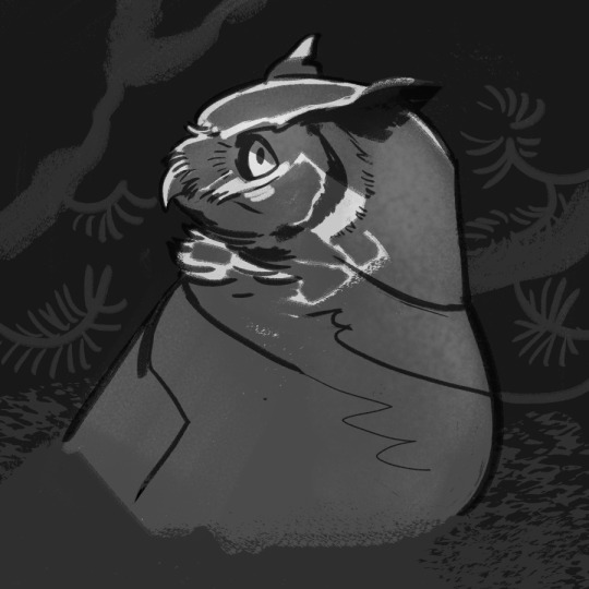
@calonarang I adore these! I also really loved the seagull ones. Any chance we can see a process video? For study but also I think it would be super calming to watch haha
Unfortunately, I don’t record my process. But I can offer a step-by-step for this one, on account of it being a commission.
@ink--it #i genuinely thought this was traditionally done #love how good digital brushes have become at mimicking physical materials #awesome art
@paperbirds #OP. THIS IS. STIPPLING? OH MY GOD. OH MY GOD??#FAV #OP THIS IS FUCKING INSANE IM. HOLY SHIT THAT'S INCREDIBLE. AND YOU STIPPLED THIS!! #owls #NO SERIOUSLY THIS IS SO FUCKING COOL
I don’t want to mislead you, so here is as succinct a break down as I could manage. I’m usually more chaotic when doing art. I don’t tend to plan ahead much, unless it’s a commission or a larger project of sorts.
Firstly, I make a simple line sketch and plan the values. With stippling, the illusion of a darker shade is determined by the concentration of dots in one area -- with ‘white’ having no dots, and black having only dots.
1) Simple sketch

2) Value sketch
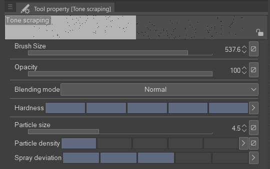
In Clip Studio Paint (go here for free trial) there is a default airbrush tool called Tone scraping. I believe most painting programs have something similar to this, including the airbrush in MS Paint. The only thing it does, is create many small dots.
You can vary the size and spread of the particles in the tool menu. Here are my settings for the owl, which was drawn at ~4000x4000 pixels and 300dpi. Vary the brush size to focus the intensity of the spray. The smaller the brush, the more concentrated tones you’ll get.
3) Draw the rest of the fucking owl
I’m bad with layers. I constantly merge them throughout and honestly prefer to paint on only one, if I can choose. However, this is fiddly work, and if you make a mistake, it’s easier to correct if you keep the main elements separate.
I used three layers here (background, owl, and shadows), and I still managed to draw on the wrong one a couple of times. I used the lasso tool to section off areas in which I wanted a sharper edge.
I didn’t use any solid white while for this, only black dots. I recently learned that to “erase” with the same brush, you can switch from the colour swatches to the transparent square underneath. I’m sure this was common knowledge to most Clip user, but it was news to me. This makes “digital stippling” a whole lot easier.
Hope this was helpful. If any of you do something similar, I’d love to have a peek!
377 notes
·
View notes
Note
I recently noticed that, through no intent of my own, I had filled up my Switch library with indie metroidvanias that are good and I love them very much but they all happen to be just a little bit more difficult than I really want to deal with. It's a post Dark Souls world I guess. But I don't always want to play games where you die over and over (looking at you Hollow Knight). Any recs for good metroidvanias that don't derive so much of their challenge from unforgiving combat and traversal?
I don’t think Dark Souls is the culprit here -- very difficult Metroidvanias have always been a part of the landscape. I mean, Castlevania II: Simon’s Quest is one of the genre’s founding titles, and that was a. up to here with fiddly traversal and unforgiving melee combat, and b. published way back in 1988! It’s more that very difficult contemporary Metroidvanias tend to name-check Dark Souls because it’s a point of reference that folks who are maybe new to the genre will readily recognise.
That said, casual-friendly Metroidvanias aren’t a novelty, either. There are a couple of ways we can go here: titles that adhere to the standard format and simply don’t try to kick your ass terribly hard, and titles that dispense with violence entirely. I’m going to cover first the one, and then the other. The focus will be on PC recs, though many of these titles have Switch ports available via the Nintendo eShop; I’ll put an asterisk (*) on those that do.
In terms of traditional Metroidvanias with a shallow difficulty curve, you might have a look at any of the following;
Iconoclasts* - This one’s an edge case difficulty-wise. Platforming execution is not challenging for the most part, and the boss fights provide ample opportunities for health recovery, at least on standard difficulty. However, it does demand a very thorough understanding of your tools’ mechanics, and it will kick your ass if you miss a trick. Content warning for a few scenes of fairly extreme body horror.
Shantae and the Pirate’s Curse* - This one is arguably the best casual Metroidvania of its generation, gameplay-wise. It’s also very horny -- like, breast-physics-on-a-forty-pixel-sprite horny. Fair warning! (There’s a recent sequel, Shantae and the Seven Sirens, that apparently returns to the Metroidvania format -- the intervening titles are more Mega Man-esque -- but I haven’t yet had the opportunity to play it.)
Song of the Deep - A spiritual sequel to 2007′s Aquaria, which is not included here on account of being hard as balls. Includes a bit of Blaster Master style switching between vehicle mode and on foot (well, flipper) mode, though the latter is largely restricted to puzzles rather than combat. A couple of conspicuous difficulty spikes with some of the late game bosses, but nothing too major.
SteamWorld Dig 2* - A cross between a Metroidvania and a 2D arcade-style mining sim; basically, imagine if Dig Dug had a story mode and you’ll have the right general idea. Combat can get hairy if you try to rush your objectives, but quickly becomes trivial if you’re willing to grind for upgrades a bit. Whether the near-mandatory grinding is going to be a dealbreaker will depend on how much you enjoy the mining gameplay.
Yoku’s Island Express* - This one’s another edge case. Its combat and traversal mechanics are based on pinball, so if pinball is a game that clicks for you, it’s likely to be a breeze -- but if it doesn’t, the potential frustration factor is very high. I’d recommend checking out the free PC demo via Steam before taking the plunge; you’ll know pretty quickly whether it’s for you or not!
As for Metroidvania-like games that dispense with violence entirely, you might give some of these a try:
Dreaming Sarah - An upgrade-collecting dream logic exploration game in the style of Yume Nikki, except swapping the pseudo-RPG gimmick for a side-scrolling 2D platformer format. No peril to speak of, outside of a single timed escape sequence (which just boots you back to the last door you passed through if you fail), but content warnings for injury, self-harm, and generally disturbing imagery.
The Moonstone Equation - More of an adventure game than a Metroidvania in terms of its gameplay structure, this one mixes light platforming with reasonably tricky block-pushing puzzles. The big idea here is that the in-game time of day matches your system clock, so if you customarily play at night, all of the NPCs will be asleep! (It’s technically not mandatory to talk to any of them, but they do offer useful clues.)
Seasons after Fall - A non-violent exploration game with a season-swapping gimmick. Owing to its hub-and-spokes world design with long linear stretches, it’s sometimes been characterised as more of a walking sim with light Metroidvania elements, which is honestly a completely fair criticism -- don’t go into this one expecting a densely interconnected world map.
Songbird Symphony* - A puzzle-platformer mashed up with a rhythm game. This one’s difficulty is tough to assess because, while the rhythm game sections can be extremely difficult to do well on, particularly in the late game, doing poorly doesn’t actually stop you from progressing -- you just miss out on a few achievements. If you’re a perfectionist, this game will annoy you so much.
Waking Mars - Here’s an unusual one -- a Metroidvania/gardening sim hybrid. This one’s not 100% non-violent, as it’s completely possible for hostile wildlife to kill you if you’re incautious, but there’s no combat per se; violent encounters are a hazard to avoid, not a challenge to be sought out. The true ending criteria are a little obtuse; I’d recommend hitting up a guide after you’ve completed it once.
In terms of forthcoming titles, you might also keep an eye on Heart Forth, Alicia, HomeGrove, Rune Fencer Illyia, Tiny Thor, or Vivid!. I’m just going on developer statements about these ones’ difficulty level, as they haven’t been released yet, so take them with a grain of salt.
(Tagging @adeptarcanist, since they submitted a similar question at very nearly the same time -- might as well kill two birds with one stone!)
#gaming#video games#video game recommendations#violence mention#death mention#body horror mention#injury mention#self harm mention#swearing#alexonyx64
226 notes
·
View notes
Photo

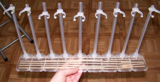
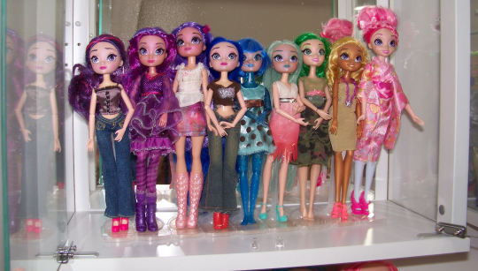
Progress! I added stand number 9 (the 10th waist holder snapped) and it’s ugly but not exactly visible once the dolls are on. It was really fiddly to get each doll in and not have everybody’s hair up in their business. I was able to lift it by the edge dolls and put it above my head into the display, no bending or snapping 😎.
Here’s my recommendations to get yours neater looking:
do it all at once instead of adding bits,
use a ruler to mark lines first,
dissassemble the stand’s base and stem: glue them back together for stability,
decide a width based on your largest doll’s shoulder width (the hasbro bodied gals in this case with their deceptively slim feet and jutting out arms)
don’t use heavy duty scissors* as they make the plastic shatter into jagged edges
Test the glue you use on a tiny piece just in case they react badlky (sometimes abs melts in contact with e6000, others melt in contact with uhu)
*I get scared of my rotary tool’s disk cutter and use it as little as possible because it’s all offbrand with no protection parts. Don’t be like me: invest in a proper rotary tool with a protective piece, compatible bits, heavy duty gloves and goggles. That’s one of my 2021 goals: a proper rotary tool instead of the cobbled together (it’s literally glued into the power converter, folks) junk I have. To be fair to past!me, I never thought I’d be using a power tool as part of the hobby and now can’t imagine working without it.🤣
Notes: if you’re working with heavier dolls you’re going to want to consider the center of gravity: they may topple forwards or backwards depending on the doll type. I recommend adding something to hold the stand stems together in back and gluing something heavy to the base. I mean you could add a bunch of stainless steel metal pieces to give it weight with e6000, I have 3 Pullips on barbie stands reinforced with an upcycled hard drive disk base - they’re like really heavy CDs. What matters more than aesthetics is that they don’t come crashing down by the dozen and make your heart stop for a second.
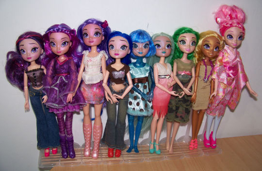
Libby-Pink will move to the far left when orange and red dolls are ready. I’m not following a light spectrum rainbow but pink to red which is my personal fave when doing rainbow reroots, pixels or image editing.
I’m still bitter that the pale mint green “nymph” saran got changed to a greyer colour, my girl Anise has some nice saturated pastel green in front but the bulk of the hair done with the new stuff is washed out. It’s saran so it won’t dye so I may try seafoam green streaks someday to add colour. Juniper-blue needs new makeup and I want to give her an eye design that’s less about blue eyeshadow and more about changing her lash shape so she looks different from Scarlet and maybe give her hair some volume or a nice updo (it’s poly so not so simple)
11 notes
·
View notes
Text
Best Email Marketing Software: GetResponse reviews:
Hey Guys, In this GetResponse Review, you will know if GetResponse is the best for your Business. The Pros and Cons, Features, Pricing, Is Get Response Perfect for beginners?
what is GetResponse?
GetResponse is an all-in-one marketing platform which, as well as email marketing, offers landing pages, a CRM and advanced automations. We rank them pretty favorably due to their range of advanced features. Their entry plan is reasonably priced and they offer a generous discount to NGOs.

what Getresponse allows you to do?
create a mailing list and capture data onto it
create newsletters that can be sent to the subscribers on your mailing list
automate your emails to subscribers via use of ‘autoresponders’
view and analyse statistics related to your email marketing campaigns — open rate, click through, forwards etc.
In recent years however, Getresponse has shifted its emphasis considerably: the product now aims be more of an 'all-in-one' e-commerce and marketing solution rather than just an email marketing tool.
youtube
more information about Getresponse:
Getresponse has been in business since 1998 and, according to the company, over 350,000 individuals and businesses now use the platform for their email marketing. Whilst this userbase is not as big as those for some other email marketing tools (notably Mailchimp), it is large enough to provide confidence that the company is well-established and is not likely to disappear any time soon.
Getresponse pricing:
There are four Getresponse plans:
Basic — starting at $15 per month to send an unlimited number of emails to up to 1,000 subscribers
Plus — starting at $49 per month for up to 1,000 subscribers
Professional — starting at $99 per month for up to 1,000 subscribers
Max — negotiable.

Significant discounts are available if you pay upfront for 12 or 24 months of service (18% and 30% respectively).
In addition to the paid plans, a 30-day free trial is also available, which you can access via this link.
Pros and cons of Getresponse:
Pros of using Getresponse:
It’s pretty user friendly.
So long as you are happy to use a 'Basic' plan, Getresponse is cheaper than many of its key competitors (in certain cases, significantly so) whilst offering just as much, if not more functionality as them.
The discounts you receive when paying upfront for one or two years of service are extremely generous — you'll be hard pressed to find similar discounts from key competitors.
You get really advanced features when it comes to marketing automation.
Its flexible approach to data segmentation makes list management really straightforward — it outshines many competing products on this front.
Getresponse’s webinar functionality is great, and a genuine USP — I haven’t come across this functionality on similar products.
Its ‘Conversion Funnel’ feature is potentially useful for small businesses who want to manage all aspects of their social media ads, sales funnels and e-commerce activity under one roof.
Its reporting features are comprehensive.
Getresponse is transparent about deliverability rates, publishing figures on its website and providing deliverability statistics for the e-newsletters you send.
Support is provided in a wide variety of languages.
It integrates nicely with Google Analytics and other metrics tools.
With the exception of adequate cookie consent features on its landing pages, it’s pretty good at meeting GDPR requirements.
You can try out all the Getresponse features free for 30 days without the need to enter credit card details.
Cons of using Getresponse:
The drag and drop interfaces for creating landing pages and forms are a bit fiddly and need improvement.
. Although you can use the Facebook pixel with Getresponse’s landing page feature, you can’t do so in a GDPR compliant way.
Improvements could be made to how data capture forms work, so that users have the option to switch them on or off on mobile devices.
There’s no 2-factor authentication at login.
There’s a hard limit of 500 webinar attendees.
No phone support is provided (unless you’re on a “Max” plan).
Quite a lot of the integrations for Getresponse involve a third-party syncing tool like Zapier.
1 note
·
View note
Note
Hi, hope you're ok, if it's alright to ask, what art program do you use? I was wondering because you draw your art without lineart and you and I seem to have the same opinion about Illustrator ...pure evil!!
Howdy! i’m doing well and hope you are too ^_^

Predominantly I use the pen tool in Photoshop. It works using paths similar to Illustrator but with pixels instead of vectors. So the shapes cannot be scaled infinitely but you get the same smooth shapes. So while I’d call it vector art it’s technically not XD
Though recently I’ve started drawing lineless shapes freehand using programs like ProCreate on iPad which is so lush and allows for a lot of smoothing that Photoshop does not have. I also bought Designer for Ipad which it like Illustrator but SOOOOOO MUCH EASIER TO USE OMG. I mean Designer is still a pretty heavy program but it doesn’t make me hate life the way Illustrator does XD
Really the you can do the lineless style by hand in any program; it just takes a steady hand a lot of ctrl+Z (in my case!).
So yeah, boo to Illustrator. It’s so needlessly complicated and fiddly. get Designer instead, use the Photoshop Pen Tool or do it freehand :)
3 notes
·
View notes
Text
Best Email Marketing Software For Free

Best Email Marketing Software: GetResponse reviews:
Hey Guys, In this GetResponse Review, you will know if GetResponse is the best for your Business. The Pros and Cons, Features, Pricing, Is Get Response Perfect for beginners?
what is GetResponse?
GetResponse is an all-in-one marketing platform that, as well as email marketing, offers landing pages, a CRM, and advanced automation. We rank them pretty favorably due to their range of advanced features. Their entry plan is reasonably priced and they offer a generous discount to NGOs.
what does Getresponse allow you to do?
create a mailing list and capture data onto it
create newsletters that can be sent to the subscribers on your mailing list
automate your emails to subscribers via the use of ‘autoresponders’
view and analyze statistics related to your email marketing campaigns — open rate, click-through, forwards, etc.
However, Getresponse has shifted its emphasis considerably in recent years: the product now aims to be more of an 'all-in-one' e-commerce and marketing solution rather than just an email marketing tool.
more information about Getresponse:
Getresponse has been in business since 1998 and, according to the company, over 350,000 individuals and businesses now use the platform for their email marketing. Whilst this userbase is not as big as those for some other email marketing tools (notably Mailchimp), it is large enough to provide confidence that the company is well-established and is not likely to disappear any time soon.
Getresponse pricing:
There are four Getresponse plans:
Basic — starting at $15 per month to send an unlimited number of emails to up to 1,000 subscribers
Plus — starting at $49 per month for up to 1,000 subscribers
Professional — starting at $99 per month for up to 1,000 subscribers
Max — negotiable.
Significant discounts are available if you pay upfront for 12 or 24 months of service (18% and 30% respectively).
In addition to the paid plans, a 30-day free trial is also available, which you can access via this link.
Pros and cons of Getresponse:
Pros of using Getresponse:
It’s pretty user-friendly.
So long as you are happy to use a 'Basic' plan, Getresponse is cheaper than many of its key competitors (in certain cases, significantly so) whilst offering just as much, if not more functionality as them.
The discounts you receive when paying upfront for one or two years of service are extremely generous — you'll be hard-pressed to find similar discounts from key competitors.
You get really advanced features when it comes to marketing automation.
Its flexible approach to data segmentation makes list management really straightforward — it outshines many competing products on this front.
Getresponse’s webinar functionality is great, and a genuine USP — I haven’t come across this functionality on similar products.
Its ‘Conversion Funnel’ feature is potentially useful for small businesses who want to manage all aspects of their social media ads, sales funnels, and e-commerce activity under one roof.
Its reporting features are comprehensive.
Getresponse is transparent about deliverability rates, publishing figures on its website and providing deliverability statistics for the e-newsletters you send.
Support is provided in a wide variety of languages.
It integrates nicely with Google Analytics and other metrics tools.
With the exception of adequate cookie consent features on its landing pages, it’s pretty good at meeting GDPR requirements.
You can try out all the Getresponse features free for 30 days without the need to enter credit card details.
Cons of using Getresponse:
The drag and drop interfaces for creating landing pages and forms are a bit fiddly and need improvement.
. Although you can use the Facebook pixel with Getresponse’s landing page feature, you can’t do so in a GDPR-compliant way.
Improvements could be made to how data capture forms work so that users have the option to switch them on or off on mobile devices.
There’s no 2-factor authentication at login.
There’s a hard limit of 500 webinar attendees.
No phone support is provided (unless you’re on a “Max” plan).
Quite a lot of the integrations for Getresponse involve a third-party syncing tool like Zapier.
getresponse#getresponse pro#best email marketing software#email marketing for beginner
1 note
·
View note
Photo


I DID AN ART. My sister wanted a NZ parrot so I finally managed to sit down and draw properly, and I deliberately chose a more complicated reference photo (all photos are mine, mostly from the zoo), rather than a simple headshot, because it was a gift so I had to finish it.
I also played myself by leaving all the really fiddly feathers to last, so I couldn’t skimp on them or decide I couldn’t be bothered with a background. Which is how I ended up staring down four hours of feathering earlier today with no escape.
And when I was finally done, it felt like I couldn’t be finished yet, so I added a mountain daisy.
Anyway, this is a kea, they live in the mountains in the South Island, and are very inquisitive and basically are the crows of New Zealand.
Drawn in digital pencil in ArtRage 5, no other tools except the eraser and palette knife for smudging and blending. It took me eleven hours of nearly nonstop colouring and my hand hurts. Also it’s pretty huge, the original is 4000 pixels wide, which is a lot when you have to colour every inch with a pencil. But I wanted to make sure it could be printed as a large poster.
But also, I’ve been able to add it to my RedBubble gallery, and maybe I will manage to update other sites too at some point, and now I just want to order all the things.
#kea#artrage#birds#new zealand#digital art#digital pencil#realism#my artwork#feathers#so many feathers
2 notes
·
View notes
Text
“Along For The Ride”, a reasonably complex demo
It's been a while since I've been anticipating people finally seeing one of my demos like I was anticipating people to see "Along For The Ride", not only because it ended up being a very personal project in terms of feel, but also because it was one of those situations where to me it felt like I was genuinely throwing it all the complexity I've ever did in a demo, and somehow keeping the whole thing from falling apart gloriously.
youtube
The final demo.
I'm quite happy with the end result, and I figured it'd be interesting to go through all the technology I threw at it to make it happen in a fairly in-depth manner, so here it goes.
(Note that I don't wanna go too much into the "artistic" side of things; I'd prefer if the demo would speak for itself on that front.)
The starting point
I've started work on what I currently consider my main workhorse for demomaking back in 2012, and have been doing incremental updates on it since. By design the system itself is relatively dumb and feature-bare: its main trick is the ability to load effects, evaluate animation splines, and then render everything - for a while this was more than enough.
Around the summer of 2014, Nagz, IR and myself started working on a demo that eventually became "Háromnegyed Tíz", by our newly formed moniker, "The Adjective". It was for this demo I started experimenting with something that I felt was necessary to be able to follow IR's very post-production heavy artstyle: I began looking into creating a node-based compositing system.
I was heavily influenced by the likes of Blackmagic Fusion: the workflow of being able to visually see where image data is coming and going felt very appealing to me, and since it was just graphs, it didn't feel very complicated to implement either. I had a basic system up and running in a week or two, and the ability to just quickly throw in effects when an idea came around eventually paid off tenfold when it came to the final stage of putting the demo together.

The initial node graph system for Háromnegyed Tíz.
The remainder of the toolset remained relatively consistent over the years: ASSIMP is still the core model loader of the engine, but I've tweaked a few things over time so that every incoming model that arrives gets automatically converted to its own ".assbin" (a name that never stops being funny) format, something that's usually considerably more compact and faster to load than formats like COLLADA or FBX. Features like skinned animation were supported starting with "Signal Lost", but were never spectacularly used - still, it was a good feeling to be able to work with an engine that had it in case we needed it.
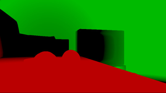
Deferred rendering
During the making of "Sosincs Vége" in 2016, IR came up with a bunch of scenes that felt like they needed to have an arbitrary number of lightsources to be effecive; to this end I looked into whether I was able to add deferred rendering to the toolset. This turned out to be a bit fiddly (still is) but ultimately I was able to create a node type called the "G-buffer", which was really just a chunk of textures together, and use that as the basis for two separate nodes: one that renders the scenegraph into the buffer, and another that uses the buffer contents to light the final image.
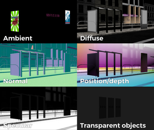
The contents of a G-buffer; there's also additional information in the alpha channels.
Normally, most deferred renderers go with the tile-based approach, where they divide the screen into 16x16 or 32x32 tiles and run the lights only on the tiles they need to run them on. I decided to go with a different approach, inspired by the spotlight rendering in Grand Theft Auto V: Because I was mostly using point- and spot-lights, I was able to control the "extent" of the lights and had a pretty good idea whether each pixel was lit or not based on its position relative to the light source. By this logic, e.g. for pointlights if I rendered a sphere into the light position, with the radius of what I considered to be the farthest extent of the light, the rendered sphere would cover all the pixels on screen covered by that light. This means if I ran a shader on each of those pixels, and used the contents of the G-buffer as input, I would be able to calculate independent lighting on each pixel for each light, since lights are additive anyway. The method needed some trickery (near plane clipping, sphere mesh resolution, camera being near the sphere edge or inside the sphere), but with some magic numbers and some careful technical artistry, none of this was a problem.
The downside of this method was that the 8-bit channel resolution of a normal render target was no longer enough, but this turned out to be a good thing: By using floating point render targets, I was able to adapt to a high-dynamic range, linear-space workflow that ultimately made the lighting much easier to control, with no noticable loss in speed. Notably, however, I skipped a few demos until I was able to add the shadow routines I had to the deferred pipeline - this was mostly just a question of data management inside the graph, and the current solution is still something I'm not very happy with, but for the time being I think it worked nicely; starting with "Elégtelen" I began using variance shadowmaps to get an extra softness to shadows when I need it, and I was able to repurpose that in the deferred renderer as well.
The art pipeline
After doing "The Void Stared Into Me Waiting To Be Paid Its Dues" I've began to re-examine my technical artist approach; it was pretty clear that while I knew how the theoreticals of a specular/glossiness-based rendering engine worked, I wasn't necessarily ready to be able to utilize the technology as an artist. Fortunately for me, times changed and I started working at a more advanced games studio where I was able to quietly pay closer attention to what the tenured, veteran artists were doing for work, what tools they use, how they approach things, and this introduced me to Substance Painter.
I've met Sebastien Deguy, the CEO of Allegorithmic, the company who make Painter, way back both at the FMX film festival and then in 2008 at NVScene, where we talked a bit about procedural textures, since they were working on a similar toolset at the time; at the time I obviously wasn't competent enough to deal with these kind of tools, but when earlier this year I watched a fairly thorough tutorial / walkthrough about Painter, I realized maybe my approach of trying to hand-paint textures was outdated: textures only ever fit correctly to a scene if you can make sure you can hide things like your UV seams, or your UV scaling fits the model - things that don't become apparent until you've saved the texture and it's on the mesh.
Painter, with its non-linear approach, goes ahead of all that and lets you texture meshes procedurally in triplanar space - that way, if you unwrapped your UVs correctly, your textures never really stretch or look off, especially because you can edit them in the tool already. Another upside is that you can tailor Painter to your own workflow - I was fairly quickly able to set up a preset to my engine that was able to produce diffuse, specular, normal and emissive maps with a click of a button (sometimes with AO baked in, if I wanted it!), and even though Painter uses an image-based lighting approach and doesn't allow you to adjust the material settings per-textureset (or I haven't yet found it where), the image in Painter was usually a fairly close representation to what I saw in-engine. Suddenly, texturing became fun again.

An early draft of the bus stop scene in Substance Painter.
Depth of field
DOF is one of those effects that is nowadays incredibly prevalent in modern rendering, and yet it's also something that's massively overused, simply because people who use it use it because it "looks cool" and not because they saw it in action or because they want to communicate something with it. Still, for a demo this style, I figured I should revamp my original approach.
The original DOF I wrote for Signal Lost worked decently well for most cases, but continued to produce artifacts in the near field; inspired by both the aforementioned GTAV writeup as well as Metal Gear Solid V, I decided to rewrite my DOF ground up, and split the rendering between the near and far planes of DOF; blur the far field with a smart mask that keeps the details behind the focal plane, blur the near plane "as is", and then simply alphablend both layers on top of the original image. This gave me a flexible enough effect that it even coaxed me to do a much-dreaded focal plane shift in the headphones scene, simply because it looked so nice I couldn't resist.
The near- and far-fields of the depth of field effect.
Screen-space reflections
Over the summer we did a fairly haphazard Adjective demo again called "Volna", and when IR delivered the visuals for it, it was very heavy on raytraced reflections he pulled out of (I think) 3ds max. Naturally, I had to put an axe to it very quickly, but I also started thinking if we can approximate "scene-wide" reflections in a fairly easy manner. BoyC discovered screen-space reflections a few years ago as a fairly cheap way to prettify scenes, and I figured with the engine being deferred (i.e. all data being at hand), it shouldn't be hard to add - and it wasn't, although for Volna, I considerably misconfigured the effect which resulted in massive framerate loss.
The idea behind SSR is that a lot of the time, reflections in demos or video games are reflecting something that's already on screen and quite visible, so instead of the usual methods (like rendering twice for planar reflections or using a cubemap), we could just take the normal at every pixel, and raymarch our way to the rendered image, and have a rough approximation as to what would reflect there.
The logic is, in essence to use the surface normal and camera position to calculate a reflection vector and then start a raymarch from that point and walk until you decide you've found something that may be reflecting on the object; this decision is mostly depth based, and can be often incorrect, but you can mitigate it by fading off the color depending on a number of factors like whether you are close to the edge of the image or whether the point is way too far from the reflecting surface. This is often still incorrect and glitchy, but since a lot of the time reflections are just "candy", a grainy enough normalmap will hide most of your mistakes quite well.

Screen-space reflections on and off - I opted for mostly just a subtle use, because I felt otherwise it would've been distracting.
One important thing that Smash pointed out to me while I was working on this and was having problems is that you should treat SSR not as a post-effect, but as lighting, and as such render it before the anti-aliasing pass; this will make sure that the reflections themselves get antialiased as well, and don't "pop off" the object.
Temporal antialiasing
Over the last 5 years I've been bearing the brunt of complaints that the aliasing in my demos is unbearable - I personally rarely ever minded the jaggy edges, since I got used to them, but I decided since it's a demo where every pixel counts, I'll look into solutions to mitigate this. In some previous work, I tried using FXAA, but it never quite gave me the results I wanted, so remembering a conversation I had with Abductee at one Revision, I decided to read up a bit on temporal antialiasing.
The most useful resource I found was Bart Wroński's post about their use of TAA/TSSAA (I'm still not sure what the difference is) in one of the Assassin's Creed games. At its most basic, the idea behind temporal antialiasing is that instead of scaling up your resolution to, say, twice or four times, you take those sub-pixels, and accumulate them over time: the way to do this would be shake the camera slightly each frame - not too much, less than a quarter-pixel is enough just to have the edges alias slightly differently each frame - and then average these frames together over time. This essentially gives you a supersampled image (since every frame is slightly different when it comes to the jagged edges) but with little to no rendering cost. I've opted to use 5 frames, with the jitter being in a quincunx pattern, with a random quarter-pixel shake added to each frame - this resulted in most edges being beautifully smoothed out, and I had to admit the reasonably little time investment was worth the hassle.
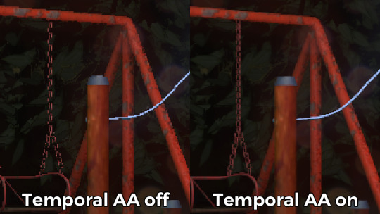
Anti-aliasing on and off.
The problem of course, is that this works fine for images that don't move all that much between frames (not a huge problem in our case since the demo was very stationary), but anything that moves significantly will leave a big motion trail behind it. The way to mitigate would be to do a reprojection and distort your sampling of the previous frame based on the motion vectors of the current one, but I had no capacity or need for this and decided to just not do it for now: the only scene that had any significant motion was the cat, and I simply turned off AA on that, although in hindsight I could've reverted back to FXAA in that particular scenario, I just simply forgot. [Update, January 2019: This has been bugging me so I fixed this in the latest version of the ZIP.]
There were a few other issues: for one, even motion vectors won't be able to notice e.g. an animated texture, and both the TV static and the rain outside the room were such cases. For the TV, the solution was simply to add an additional channel to the GBuffer which I decided to use as a "mask" where the TAA/TSSAA wouldn't be applied - this made the TV texture wiggle but since it was noisy anyway, it was impossible to notice. The rain was considerably harder to deal with and because of the prominent neon signs behind it, the wiggle was very noticable, so instead what I ended up doing is simply render the rain into a separate 2D matte texture but masked by the scene's depth buffer, do the temporal accumulation without it (i.e. have the antialiased scene without rain), and then composite the matte texture into the rendered image; this resulted in a slight aliasing around the edge of the windows, but since the rain was falling fast enough, again, it was easy to get away with it.

The node graph for hacking the rainfall to work with the AA code.
Transparency
Any render coder will tell you that transparency will continue to throw a wrench into any rendering pipeline, simply because it's something that has to respect depth for some things, but not for others, and the distinction where it should or shouldn't is completely arbitrary, especially when depth-effects like the above mentioned screen-space reflections or depth of field are involved.
I decided to, for the time being, sidestep the issue, and simply render the transparent objects as a last forward-rendering pass using a single light into a separate pass (like I did with the rain above) honoring the depth buffer, and then composite them into the frame. It wasn't a perfect solution, but most of the time transparent surfaces rarely pick up lighting anyway, so it worked for me.
Color-grading and image mastering
I was dreading this phase because this is where it started to cross over from programming to artistry; as a first step, I added a gamma ramp to the image to convert it from linear to sRGB. Over the years I've been experimenting with a lot of tonemap filters, but in this particular case a simple 2.2 ramp got me the result that felt had the most material to work with going into color grading.
I've been watching Zoom work with Conspiracy intros for a good 15 years now, and it wasn't really until I had to build the VR version of "Offscreen Colonies" when I realized what he really does to get his richer colors: most of his scenes are simply grayscale with a bit of lighting, and he blends a linear gradient over them to manually add colour to certain parts of the image. Out of curiousity I tried this method (partly out of desperation, I admit), and suddenly most of my scenes began coming vibrantly to life. Moving this method from a bitmap editor to in-engine was trivial and luckily enough my old friend Blackpawn has a collection of well known Photoshop/Krita/etc. blend mode algorithms that I was able to lift.
Once the image was coloured, I stayed in the bitmap editor and applied some basic colour curve / level adjustment to bring out some colours that I felt got lost when using the gradient; I then applied the same filters on a laid out RGB cube, and loaded that cube back into the engine as a colour look-up table for a final colour grade.
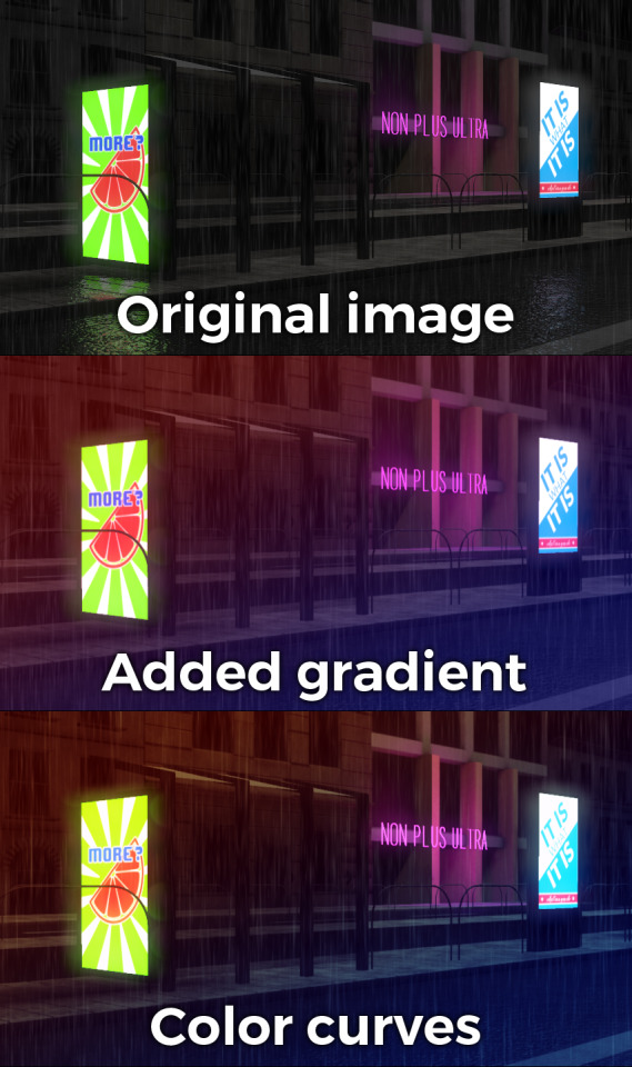
Color grading.
Optimizations
There were two points in the process where I started to notice problems with performance: After the first few scenes added, the demo ran relatively fine in 720p, but began to dramatically lose speed if I switched to 1080p. A quick look with GPU-Z and the tool's internal render target manager showed that the hefty use of GPU memory for render targets quickly exhausted 3GB of VRAM. I wasn't surprised by this: my initial design for render target management for the node graph was always meant to be temporary, as I was using the nodes as "value types" and allocating a target for each. To mitigate this I spent an afternoon designing what I could best describe as a dependency graph, to make sure that render targets that are not needed for a particular render are reused as the render goes on - this got my render target use down to about 6-7 targets in total for about a hundred nodes.

The final node graph for the demo: 355 nodes.
Later, as I was adding more scenes (and as such, more nodes), I realized the more nodes I kept adding, the more sluggish the demo (and the tool) got, regardless of performance - clearly, I had a CPU bottleneck somewhere. As it turned out after a bit of profiling, I added some code to save on CPU traversal time a few demos ago, but after a certain size this code itself became a problem, so I had to re-think a bit, and I ended up simply going for the "dirty node" technique where nodes that explicitly want to do something mark their succeeding nodes to render, and thus entire branches of nodes never get evaluated when they don't need to. This got me back up to the coveted 60 frames per second again.
A final optimization I genuinely wanted to do is crunch the demo down to what I felt to be a decent size, around 60-ish megabytes: The competition limit was raised to 128MB, but I felt my demo wasn't really worth that much size, and I felt I had a chance of going down to 60 without losing much of the quality - this was mostly achieved by just converting most diffuse/specular (and even some normal) textures down to fairly high quality JPG, which was still mostly smaller than PNG; aside from a few converter setting mishaps and a few cases where the conversion revealed some ugly artifacts, I was fairly happy with the final look, and I was under the 60MB limit I wanted to be.
Music
While this post mostly deals with graphics, I'd be remiss to ignore the audio which I also spent a considerable time on: because of the sparse nature of the track, I didn't need to put a lot of effort in to engineering the track, but I also needed to make sure the notes sounded natural enough - I myself don't actually play keyboards and my MIDI keyboard (a Commodore MK-10) is not pressure sensitive, so a lot of the phrases were recorded in parts, and I manually went through each note to humanize the velocities to how I played them. I didn't process the piano much; I lowered the highs a bit, and because the free instrument I was using, Spitfire Audio's Soft Piano, didn't have a lot of release, I also added a considerable amount of reverb to make it blend more into the background.
For ambient sounds, I used both Native Instruments' Absynth, as well as Sound Guru's Mangle, the latter of which I used to essentially take a chunk out of a piano note and just add infinite sustain to it. For the background rain sound, I recorded some sounds myself over the summer (usually at 2AM) using a Tascam DR-40 handheld recorder; on one occasion I stood under the plastic awning in front of our front door to record a more percussive sound of the rain knocking on something, which I then lowpass filtered to make it sound like it's rain on a window - this eventually became the background sound for the mid-section.
I've done almost no mixing and mastering on the song; aside from shaping the piano and synth tones a bit to make them sound the way I wanted, the raw sparse timbres to me felt very pleasing and I didn't feel the sounds were fighting each other in space, so I've done very little EQing; as for mastering, I've used a single, very conservatively configured instance of BuzMaxi just to catch and soft-limit any of the peaks coming from the piano dynamics and to raise the track volume to where all sounds were clearly audible.
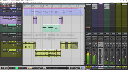
The final arrangement of the music in Reaper.
Minor tricks
Most of the demo was done fairly easily within the constraints of the engine, but there were a few fun things that I decided to hack around manually, mostly for effect.
The headlights in the opening scene are tiny 2D quads that I copied out of a photo and animated to give some motion to the scene.
The clouds in the final scene use a normal map and a hand-painted gradient; the whole scene interpolates between two lighting conditions, and two different color grading chains.
The rain layer - obviously - is just a multilayered 2D effect using a texture I created from a particle field in Fusion.
Stuff that didn't make it or went wrong
I've had a few things I had in mind and ended up having to bin along the way:
I still want to have a version of the temporal AA that properly deghosts animated objects; the robot vacuum cleaner moved slow enough to get away with it, but still.
The cat is obviously not furry; I have already rigged and animated the model by the time I realized that some fur cards would've helped greatly with the aliasing of the model, but by that time I didn't feel like redoing the whole thing all over again, and I was running out of time.
There's considerable amount of detail in the room scene that's not shown because of the lighting - I set the room up first, and then opted for a more dramatic lighting that ultimately hid a lot of the detail that I never bothered to arrange to more visible places.
In the first shot of the room scene, the back wall of the TV has a massive black spot on it that I have no idea where it's coming from, but I got away with it.
I spent an evening debugging why the demo was crashing on NVIDIA when I realized I was running out of the 2GB memory space; toggling the Large Address Aware flag always felt a bit like defeat, but it was easier than compiling a 64-bit version.
A really stupid problem materialized after the party, where both CPDT and Zoom reported that the demo didn't work on their ultrawide (21:9) monitors: this was simply due to the lack of pillarbox support because I genuinely didn't think that would ever be needed (at the time I started the engine I don't think I even had a 1080p monitor) - this was a quick fix and the currently distributed ZIP now features that fix.
Acknowledgements
While I've did the demo entirely myself, I've received some help from other places: The music was heavily inspired by the work of Exist Strategy, while the visuals were inspired by the work of Yaspes, IvoryBoy and the Europolis scenes in Dreamfall Chapters. While I did most of all graphics myself, one of the few things I got from online was a "lens dirt pack" from inScape Digital, and I think the dirt texture in the flowerpot I ended up just googling, because it was late and I didn't feel like going out for more photos. I'd also need to give credit to my audio director at work, Prof. Stephen Baysted, who pointed me at the piano plugin I ended up using for the music, and to Reid who provided me with ample amounts of cat-looking-out-of-window videos for animation reference.
Epilogue
Overall I'm quite happy with how everything worked out (final results and reaction notwithstanding), and I'm also quite happy that I managed to produce myself a toolset that "just works". (For the most part.)
One of the things that I've been talking to people about it is postmortem is how people were not expecting the mix of this particular style, which is generally represented in demos with 2D drawings or still images or photos slowly crossfading, instead using elaborate 3D and rendering. To me, it just felt like one of those interesting juxtapositions where the technology behind a demo can be super complex, but at the same time the demo isn't particularly showy or flashy; where the technology behind the demo does a ton of work but forcefully stays in the background to allow you to immerse in the demo itself. To me that felt very satisfactory both as someone trying to make a work of art that has something to say, but also as an engineer who tries to learn and do interesting things with all the technology around us.
What's next, I'm not sure yet.
3 notes
·
View notes
Text
Amazon Spot Perth Reviews
Echo Spot floreat Reviews
Amazon's variety of Echo gadgets are anywhere. In just a few short years audio products like the Dot as well as the Echo have actually gone from appealing uniqueness to house important - also amongst those that typically aren't usually fussed concerning the most recent tech.
The Amazon Echo Spot is one of the later
additions to the line up, adding a brand-new type factor, which is perhaps the best-looking of the bunch.
Amazon Echo Spot at Amazon AU for $179.
We think that the 2017 revamp of the Echo is an excellent suitable for many areas, while the industrial-looking tube of the Echo Plus makes it one to tuck into a gadgety shelf. The Echo Program has a big display, which is excellent for culinary videos for the kitchen area, however the Echo Spot, with its round shape and also built-in display, could rest anywhere.
Certain it's subjective and relies on the design of your residence, but our team believe that it's a natural suitable for a bedside table or desktop computer, but this futuristic-looking window right into the globe of Alexa would certainly excite guests anywhere they locate it in your house and even your office.
But although it could look wonderful, does the performance build up? Is a display that tiny as well as rounded in fact valuable? Can its speaker meet the high quality of the remainder of the variety? Read our complete Echo Spot review to figure out.
Layout of the Echo Spot in Western Australia
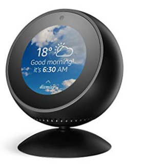
Although when it concerns functions and also performance it may be way more than a smart alarm, that's exactly what the Spot appears like. This suggests that for lots of people that might become its default usage, however actually it's method a lot more functional than that.
The Amazon Echo Spot is unlike other Echo tool which's a good thing. Its rounded shell does sufficient making for its sibling's style failings.
Where the big, cumbersome and also bold Amazon Echo Show took control of any location you put it in, no thanks to its brutalist black slab appearance, the Echo Spot is a lot more fine-tuned in its circular design.
Remarkably, it transforms out that the most effective method to do a desk-based video clip device is to discard the TV-lite appearance and just go with something that's compact and also looks excellent. Technology companies, make note.
But if you needed to place the Dot somewhere in the Echo line-up, it's a cross between an Echo Dot and also a smaller sized variation of the Amazon Show.
This is no Echo Dot replacement, though - the price puts it out of opinion for that, as well as it's also a great deal better, so to claim it is would certainly be doing it an alexa amazon echo injustice.
Size-wise, it's the matching of a mango. Mangos typically aren't the most clinical method to measure points, sure, however at the very least it offers you a sign that it's a rather small gadget with a rounded back and also screen that's angled up, makings it easy to view.

It's a great-looking tool, definitely something you won't mind carrying show in your residence unlike the, emergency room, Program.
Attributes and also configuration.
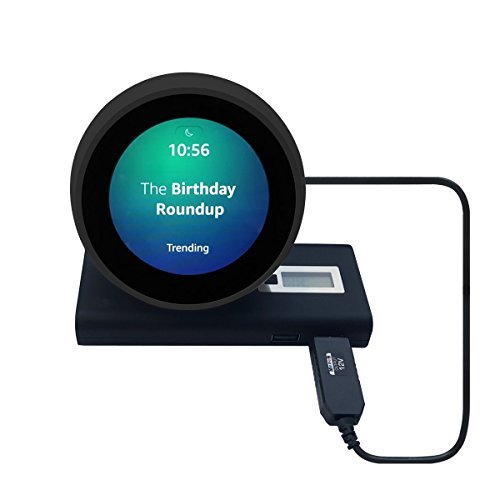
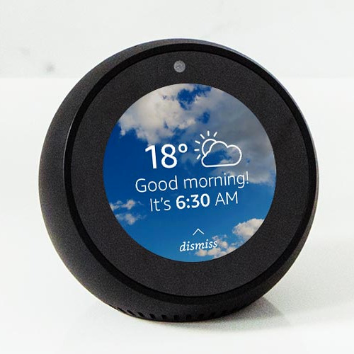
The unit we examined was black but there's also a white one offered. The display is little, at 2.5 inches (480 × 480 pixels).
On the top of the screen there is area for a video camera and on the top of the device in its entirety there are 3 buttons, which all rest flush against the surface for a really streamlined appearance.
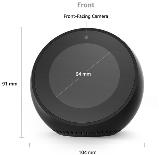
Anybody accustomed to the Echo range will recognize what they are: volume up, down and mute for the mic - this will certainly also disable the video camera. There are also 4 small pin-prick openings. These house the four-array mics that listen out for the wake word and for you barking commands at Alexa.
On the back you have Amazon branding, a slot for power as well as a 3.5 mm jack.
The audio speaker grill for the Spot is right at the base of the device, that makes it undetectable when seeing the Spot face-on. Bluetooth capability is additionally offered.
Configuration resembles other Echo gadgets, other than for this you could key in your Wi-Fi information directly on the screen, rather of undergoing the Alexa app.
It's a little fiddly placing in your details in this way (it will certainly request your Amazon account password, too) however the entire procedure will certainly take much less than five mins.
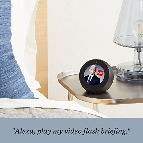
When your Spot is working, you have the alternative to enjoy Amazon's promo video, which informs you what you could do with the device. It's not a work of art but it deserves sitting via so you get a suggestion regarding exactly what you have actually simply gotten.
After that you obtain that warm chime noise, which suggests Alexa is on the internet and prepared to take orders. Once this appears it's a great time to review our ideal Amazon Alexa Abilities post or you can follow the motivates that turned up on the screen. Conversely, you can swipe right on the display which will raise an entire load of Alexa commands you could make use of. It's a truly good means to discover exactly what to do with Alexa. If you're looking for some enjoyable and ridiculous additionals, offer our Alexa Easter Eggs list a try, also.
These triggers could be switched off in the Spot's setups. It's right here in the settings where you can toggle house cards on an off as well. The house cards are information that comes up on the house screen.
2 notes
·
View notes
Text
[Review] Axiom Verge 2 (PS4)

This follow-up six years on is... surprisingly different. Spoilers ahead!
I enjoyed Axiom Verge 1 greatly, full of ideas as it was. The sequel drops a lot of them, but has new ones to play with. For instance, rather than a modular gun you now have a greater focus on melee combat, initially with an ice pick. AV2 strays more from the Metroid inspiration (although the music track from Happ’s student/fan project Orn is reused in this game), which allows it to strike out in its own new direction.
The “glitch gun”, one of the big USPs of the first game, is gone. In its place is a hacking mechanic; many of the enemies in the main world are robotic drones, and if you get close to them you can change their behaviour, picking from a list of modifiers. Some you can only slow down, while others can be converted to fight for you. The mechanic also acts as a key for progression, or to activate platforms for optional pickups. To be honest I forgot to use it in combat a lot of the time; it’s a concept with potential, but just a bit fiddly in practice, especially with the very mobile enemies this game features.
The Breach as a glitchy aesthetic and plot point does return, with a new purpose. There’s now a “two worlds” mechanic, with the 8-bit-ish pixellated Breach dimension being overlaid on the higher resolution map of Kiengir with its Mesopotamian-inspired iconography, ancient stone ruins, and remnants of human research teams who have found their way to this alternate world via a portal in Antarctica. The drone gameplay has been expanded on, as only its smaller form can enter the Breach areas through various scattered tears in reality. It’s very fun to use now with an elastic sawblade attack and a mechanic for grappling onto ledges, not to mention the instant switching you’re able to do... after a story event where your body gets stolen and you can only play as the drone for a while.
The creepy transhumanist and dystopic themes do return, with lore uncovered about the background of this new world and its war with an unseen aggressor, aided by another mysterious AI. The new key concept is Arms, artificial weapons made from converted human minds and bonded to host warriors. These tools/characters give you new abilities, rebuilding your body from nanomachines, but also one becomes the antagonist. Questions of identity, wartime/peacetime ethics, and religion are all raised but, even more so than AV1, there are many loose ends and imponderables, making for a mighty intriguing but potentially less than satisfying story, particularly if you were hoping for expansions or tie-ins to the first game outside of a few nods.
I appreciated this approach to a sequel. It doesn’t feel strictly bound to its predecessor, so it’s free to explore new horizons. Indra is an unusual protagonist, reacting in a sarcastic, foul-mouthed way to her surreal circumstances, a billionaire on a personal quest with a turn or two along the way. There aren’t many required boss fights but what feel like mini-bosses are sprinkled through the map and are largely optional, awarding more flasks (also found hidden over both maps) to contribute skill points to boost your powers as you choose. The detailed map is also fun to get around as your mobility improves, with new locales and excellent music tracks to enjoy, plus a highly useful fast travel system. AV2 doesn’t have the same aesthetic and mechanical appeals of 1, but is strong in its own ways and worth playing.
1 note
·
View note
Text
Amazon Spot floreat Reviews
Echo Spot floreat Reviews
Amazon's variety of Echo tools are all over. In just a few brief years audio items like the Dot and also the Echo have gone from promising novelty to house crucial - also among those that aren't generally fussed about the most current technology.
The Amazon Echo Spot is among the later
enhancements to the line up, adding a new type factor, which is perhaps the best-looking of the bunch.
Amazon Echo Spot at Amazon AU for $179.
We believe that the 2017 revamp of the Echo is an excellent suitable for a lot of rooms, while the industrial-looking tube of the Echo Plus makes it one to put onto a gadgety shelf. The Echo Program has a big screen, which is fantastic for cookery video clips for the kitchen area, yet the Echo Spot, with its round shape as well as built-in display, might rest anywhere.
Sure it's subjective and amazon depends on the style of your residence, but we believe that it's an all-natural fit for a night table or desktop computer, but this futuristic-looking window into the world of Alexa would excite visitors anywhere they find it in your residence or perhaps your office.
Yet although it may look fantastic, does the efficiency accumulate? Is a display that small and also rounded actually useful? Can its audio speaker meet the top quality of the remainder of the array? Review our complete Echo Spot review to learn.
Design of the Echo Spot in Western Australia
Although when it comes to functions and also performance it could be way greater than a smart alarm clock, that's exactly just what the Spot looks like. This implies that for many individuals that could become its default use, yet in truth it's way much more flexible compared to that.
The Amazon Echo Spot differs from any other Echo device as well as that's an excellent thing. Its rounded shell does sufficient to earn for its brother or sister's layout failings.
Where the big, large and also brash Amazon Echo Show took over any location you place it in, no many thanks to its brutalist black piece look, the Echo Spot is a lot more refined in its round layout.
Remarkably, it ends up that the finest means to do a desk-based video gadget is to give up the TV-lite appearance and just opt for something that's small as well as looks great. Technology firms, bear in mind.
But if you needed to put the Dot somewhere in the Echo line-up, it's a cross between an Echo Dot as well as a smaller sized version of the Amazon Show.
This is no Echo Dot replacement, though - the cost places it out of opinion for that, as well as it's additionally a whole lot much more valuable, so to state it is would certainly be doing it a disservice.
Size-wise, it's the matching of a mango. Mangos aren't one of the most scientific method to gauge things, sure, but at the very least it offers you an indication that it's a rather compact device with a bent back as well as screen that's angled up, that makes it easy to check out.
It's a great-looking tool, certainly something you will not mind having on show in your residence unlike the, emergency room, Program.
Functions and arrangement.
The system we examined was black however there's also a white one offered. The display is small, at 2.5 inches (480 × 480 pixels).
On the top of the screen there is area for a camera and on the top of the tool as a whole there are three switches, which all rest flush against the surface for a truly streamlined look.
Anybody acquainted with the Echo range will certainly know just what they are: volume up, down and also mute for the mic - this will certainly also disable the video camera. There are likewise 4 little pin-prick openings. These home the four-array mics that pay attention out for the wake word and also for you barking commands at Alexa.
On the back you have Amazon branding, a slot for power and also a 3.5 mm jack.
The audio speaker grill for the Spot is right at the base of the device, that makes it unnoticeable when checking out the Spot face-on. Bluetooth performance is additionally offered.
Configuration resembles various other Echo gadgets, other than for this one you can type in your Wi-Fi information directly on the display, rather than experiencing the Alexa application.
It's a bit fiddly placing in your details that way (it will certainly request your Amazon account password, as well) but the entire procedure will certainly take less compared to five mins.
As soon as your Spot is operating, you have the alternative to see Amazon's discount video, which tells you just what you can do with the device. It's not a masterpiece but it deserves resting through so you get an idea about just what you have actually just purchased.
After that you obtain that warm chime audio, which indicates Alexa is on the internet and also prepared to take orders. Once this appears it's an excellent time to review our finest Amazon Alexa Skills article or you could adhere to the triggers that shown up on the display. Additionally, you could swipe right on the display and also that will certainly raise an entire load of Alexa commands you could use. It's a truly great means to learn exactly what to do with Alexa. If you're looking for some fun and silly bonus, offer our Alexa Easter Eggs listing a try, also.
These triggers could be shut off in the Spot's setups. It's here in the settings where you could toggle home cards on an off also. The house cards are information that comes up on the house screen.
1 note
·
View note
Text
Amazon Echo Spot Review
Amazon Spot Reviews
Amazon's variety of Echo tools are all over. In just a few short years audio items like the Dot as well as the Echo have gone from promising novelty to house necessary - also among those that aren't normally fussed about the most up to date tech.
The Amazon Echo Spot is just one of the later enhancements to the line up, including a new kind factor, which is arguably the best-looking of the number.
Amazon Echo Spot at Amazon AU for $179.
We assume that the 2017 overhaul of the Echo is a great fit for a lot of areas, while the industrial-looking tube of the Echo Plus makes it one to tuck onto a gadgety shelf. The Echo Program has a big display, which is terrific for cookery videos for the cooking area, but the Echo Spot, with its round form and built-in display, could sit anywhere.
Certain it's subjective and also depends upon the design of your house, however we think that it's a natural fit for a night table or desktop, yet this futuristic-looking home window right into the world of Alexa would certainly impress visitors anywhere they discover it in your house and even your workplace.
However although it could look fantastic, does the efficiency add up? Is a display that little and also round actually valuable? Can its audio speaker live up to the quality of the rest of amazon echo the range? Review our full Echo Spot review to figure out.
Design.
Although when it concerns features and also efficiency it may be way greater than a wise alarm system clock, that's precisely what the Spot looks like. This implies that for lots of people that could become its default usage, but in truth it's means a lot more versatile compared to that.
The Amazon Echo Spot differs from other Echo device and also that's an advantage. Its curved shell does sufficient to earn up for its brother or sister's design failings.
Where the big, large and bold Amazon Echo Program took over any kind of area you place it in, no thanks to its brutalist black slab look, the Echo Spot is far more refined in its circular design.
Surprisingly, it ends up that the very best means to do a desk-based video tool is to give up the TV-lite appearance and just go with something that's small as well as looks good. Tech business, keep in mind.
However if you needed to position the Dot someplace in the Echo line-up, it's a cross in between an Echo Dot and a smaller variation of the Amazon Program.
This is no Echo Dot replacement, though - the rate puts it from opinion for that, and also it's additionally a lot a lot more helpful, so to claim it is would be doing it a disservice.
Size-wise, it's the matching of a mango. Mangos aren't one of the most clinical way to measure points, sure, however at the very least it provides you a sign that it's a very small gadget with a curved back as well as display that's angled up, which makes it very easy to see.
It's a great-looking gadget, certainly something you won't mind having on program in your house unlike the, emergency room, Program.
Functions and also setup.
The unit we evaluated was black however there's likewise a white one available. The display is tiny, at 2.5 inches (480 × 480 pixels).
On the top of the display there is area for an electronic camera and also on the top of the tool in its entirety there are 3 buttons, which all sit flush against the surface area for a really structured appearance.
Anybody acquainted with the Echo array will certainly understand exactly what they are: quantity up, down as well as silence for the mic - this will additionally disable the camera. There are likewise 4 small pin-prick holes. These house the four-array mics that listen out for the wake word and for you barking commands at Alexa.
On the back you have Amazon branding, a slot for power and a 3.5 mm jack.
The speaker grill for the Spot is right at the base of the tool, that makes it invisible when viewing the Spot face-on. Bluetooth capability is also readily available.
Arrangement resembles other Echo gadgets, with the exception of this one you could key in your Wi-Fi information straight on the screen, as opposed to experiencing the Alexa app.
It's a little bit fiddly placing in your details this way (it will certainly ask for your Amazon account password, as well) yet the whole procedure will certainly take less compared to five minutes.
When your Spot is operating, you have the alternative to view Amazon's coupon video clip, which tells you what you could do with the gadget. It's not a work of art but it deserves resting with so you obtain a suggestion concerning just what you've simply bought.
After that you get that warm chime audio, which means Alexa is on the internet and all set to take orders. Once this appears it's a great time to read our finest Amazon Alexa Abilities write-up or you can comply with the prompts that shown up on the display. Conversely, you can swipe right on the screen and that will raise a whole lots of Alexa commands you can use. It's a really wonderful way to discover just what to do with Alexa. If you're looking for some enjoyable and also foolish extras, provide our Alexa Easter Eggs list a shot, too.
These motivates can be shut off in the Spot's settings. It's right here in the setups where you can toggle house cards on an off too. The house cards are info that comes up on the home display.
Buy today at http://amazonecho.tobeamazon.com
1 note
·
View note
Text
WordPress Cookie Plugin
I promised last week that I would let you know my favourite WordPress Cookie plugin.
In short, a cookie is a small text file that is downloaded into your website browser (Google Chrome, Mozilla Firefox, Edge and Safari are examples of browsers) when you visit a website. This file stores some data about your preferences or past actions.
Website cookies divide into two main categories: “Necessary Cookies” and “Analytics Cookies”. The necessary cookies enable core features such as security, accessibility and network management. You can disable these cookies in your browser but if you do it may affect how the website functions.
Analytic Cookies collect information about your internet usage. This information is used to improve your experience on a particular website. Of course, I’m sure you’ve noticed that these cookies are also used to show you adverts on social media. This data should be collected anonymously. When I check this data for my website I can see that a 1000 people have clicked on a particular link but I don’t know who these people are. The Google Analytics tracking code and the Facebook Pixel are examples of analytic cookies.
As I said previously I have tried lots of plugins for cookies and although they did what was needed they weren’t that easy to use. But as usual I kept researching. And I have recently found the Surbma GDPR Cookie Plugin.
What does the Surbma GDPR Cookie Plugin do?
In essence, when this plugin is installed, it will let website visitors turn off the Analytic Cookies. I do this often, in particular I’m finding that I disable this type of tracking cookie for news organisations. Having said that some online newspapers don’t make it easy. When I look at my local paper online I have to disable the tracking cookies each time and I’m not even sure that it is disabling them.
Setting up this Cookie plugin is really easy. What is even better is that it doesn’t have too many bells and whistles to make things complicated. I don’t like it when bits of tech, whether its hardware or software, try to be all things to all people. I am of the opinion that it is better to do 1 thing very well rather than many things at just an OK level.
What do you need to setup the Surbma GDPR Cookie Plugin?
You will need your Google Analytics Tracking Code and your Facebook Pixel ID if you are using Facebook ads. The developers of this plugin are going to add more tracking services such as Google Adwords Remarketing, Hotjar and Clicky.
What are the Major Features of the Surbma GDPR Cookie Plugin
Settings
In the settings tab you enter your Google Analytics tracking code and Facebook Pixel ID. You can also customise the text people see in the popup. To see an example you can look at my training website.
You are also able to link to your Cookie Policy Notice page (or your Privacy Policy Notice page).
Cookie Scan
I’ve another post written a while ago showing you how to find a list of the cookies used on your website. The techniques mentioned in “How to Find your Cookies” still works but it is a bit fiddly.
So, I was delighted to see that this plugin will scan your website and list the cookies. You may want to list these cookies in your Privacy Policy Notice.
So you can see it is really easy to setup this WordPress Cookie plugin and it won’t break the bank either as you can see on their plugin website.
You can install the free version first to see how to works on your website. I do recommend upgrading to the premium version though as you get a few additional features that I think are worth the $19.99.
Warning!
Using this plugin does not negate your legal responsibilities regarding GDPR compliance – it is a tool to help you manage them.
P.S.
Yes, I know I need to change my cookie plugin on this website – it’s on my to do list.
Some of the links in this post are affiliate links and if you go through them to make a purchase I will earn a commission. Keep in mind that I link to these companies and their products because of their quality and not because of the commission I receive from your purchases. I only recommend products and services that I have used myself. The decision is yours, and whether or not you decide to buy something is completely up to you

The post WordPress Cookie Plugin appeared first on Wicked Spider.
source https://wickedspider.com/wordpress-cookie-plugin/
from Wicked Spider https://wickedspideruk.blogspot.com/2020/05/wordpress-cookie-plugin.html
0 notes
Last Seen Blogs

radpapersportswagon
radwilliewagon

xivow36002-blog
The Basics of Puppy Care

ideaztech
Ideaz Tech

redstar07
Sans titre