#felt like drawing.. but not doing lineart
Text
guys with pauldrons and like 5 colors
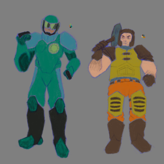
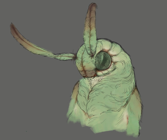
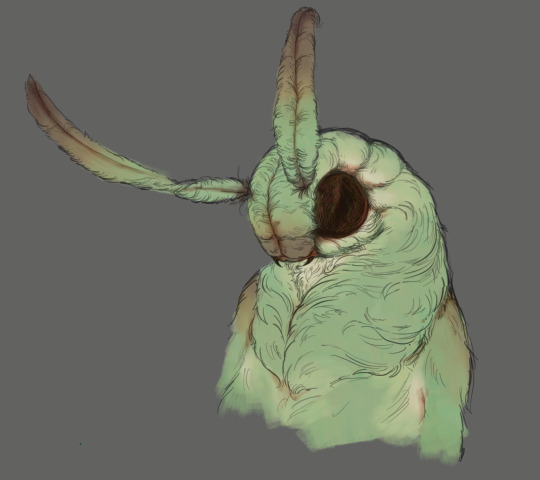
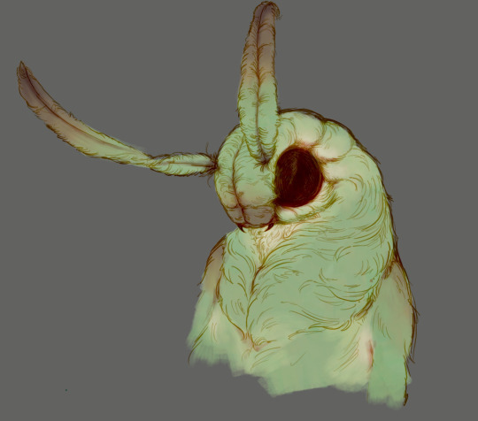
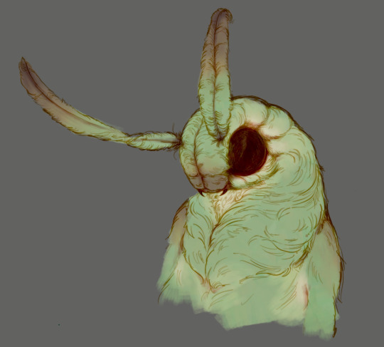
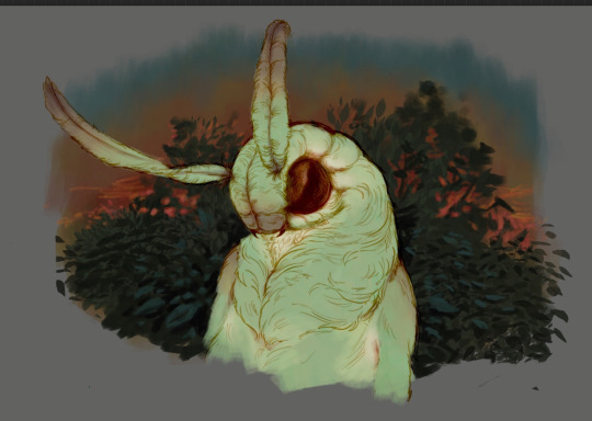
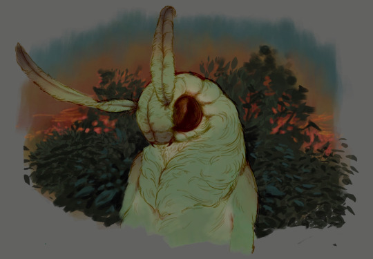
#guys who had games release in 1996. guys who had music done by a band#guys who have 1 melee option but also shotguns and a rocket launcher and grenades#felt like drawing.. but not doing lineart#so! you get these 2 in the pencil brushes i got when i moved computers#quake ranger#mjolnir recon 54#quake#marathon#marathon game#the boots for mjolnir are based on the ones they have in m1 and sort of modified to look like the m2/∞ boots
3 notes
·
View notes
Text
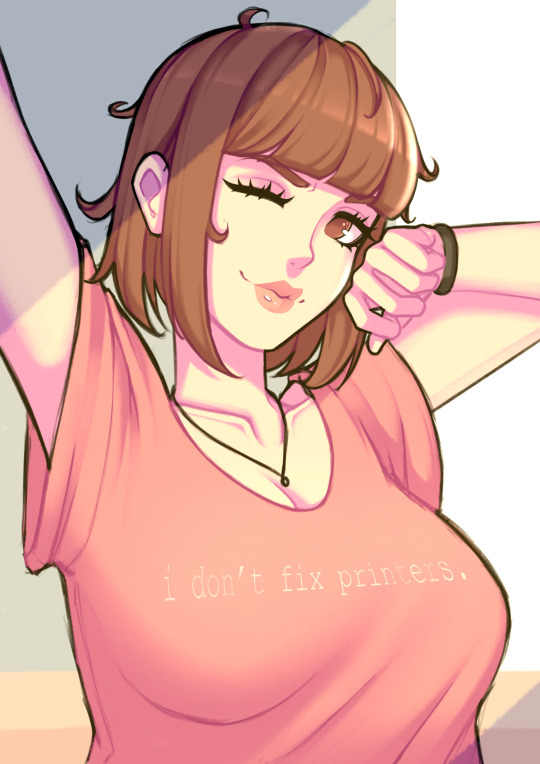
I hope you're all having a slayful day✨
Started this yesterday and finished today! Watched the entirety of Fionna and Cake and AAAAH MY FEEELIIINGS!!!
Also have this Simon sketch i love this man ok bye
#my art#def need to rewatch and finish AT bc i felt there wasn't enough context for me in some scenes#also tried lasso tool for the lineart and i rlly like it#even if i still need to practice line weight#and somehow stop my hands from shaking while doing it#art#drawing#digital art#digital drawing#fanart#cartoon#cartoon art#fionna and cake#hbo max#hbo#adventure time#adventure time fanart#ice king#winter king#simon petrikov#glasses#slay
161 notes
·
View notes
Text
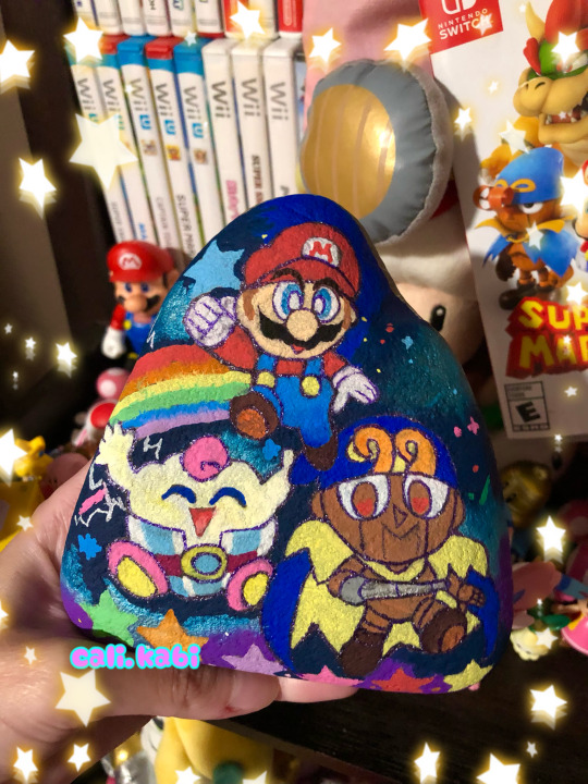
~ Super Mario RPG Trio🌟💫🍄
wanted to paint a rock related to some Mario <3 and a piece of decoration for my desk🎉 :) I love how everything came out so much I was going for the chibi with my posca style hehe ;w;🍬🎨
#my art#sydney’s art#geno super mario rpg#geno smrpg#mallow smrpg#poscapaintmarkers#poscamarkers#posca illustration#rock painting#traditional drawing#chibi Mario#chibi style#super mario rpg#mario rpg#i love the trio so much I hope Nintendo makes more merch of Geno and mallow in the future I would so buy them ;w;#used a glitter pen instead of a black marker for the lineart I usually do cuz I felt like this needed stars and sparkles:)
78 notes
·
View notes
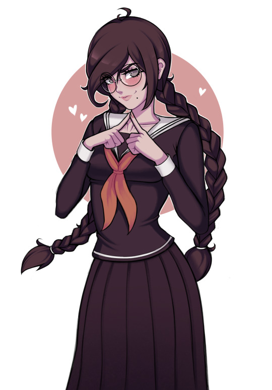
Text

#cael anselm#ye xuan#for all time emerald#lovebrush chronicles#artists on tumblr#fanart#my art#I went through all the stages of grief for this man and yet he's still my favorite 😭#Anyway for now I'll probably mostly draw in this art style#'cause the whole drawing process is more fun to me than drawing in the style of my previous art#But hopefully I'll come back to the previous style eventually 'cause I still really like how I did the lineart there#It's just that it takes too long to lineart in that style 'cause I'm kinda specific with my line weight#and when I tried doing lineart like that again I just felt drained#but in this style doing lineart is fun somehow#…until I decide to be specific with my line weight in this style too or something dunno 😅
23 notes
·
View notes
Text
SQAOI ON MAIN?!?!? WHAT!!!!!!!!
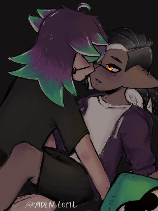
#my art#splatoon oc#splatoon#chat… im ngl….. i am scared to post this….. but first finished piece of my ocs ever… milestone….#<- he is very embarrassed#anyway i was gonna yap about how i hope this one flops but i shant instead ill yap about the drawing process hurray!#anyway so like i just felt super silly and did 3 sketches in total (the jump from stickpeople to lineart goes crazy) the rendering beat my#ass so bad since i never work w muted pallettes and this also made me reconsider one of the characters designs too…#SO I NEED TO REDRAW HIM AGAIIN BELGHHHHHH#anyway i got lazy and didnt feel like doing anything w the bg or like lighting or wtv so now we’re here
7 notes
·
View notes
Text
Mitsuba sketch dump - I'm really liking purple these days ^v^ <3
#fanart#owari no seraph#seraph of the end#mitsuba sangu#digital art#my art#I felt like drawing Mitsuba in modern clothes#kinda went for Misa from death note fashion vibes?#and I keep seeing super cute stuff in little boutique shops around Bangkok so ^v^#I kinda drew her hair a bit more layered in these sketches hehe#does she look like Mitsuba? No#Do I love her anyway? Yes#also Mitsu with hair buns instead of twin tails!#there's gonna be more purple lineart/sketches over Aug I'm really loving the colour rn
11 notes
·
View notes
Text

liu mingyan wip 🌸
#i have been finding it SO HARD to do art lately#maybe its just. Everything that is happening in the world on top of personal stuff but drawing has felt frustrating and like a chore lately#even tho its something i used to find a lot of joy in!!! im glad i was able to finish this lineart tho :) it took forever#sketches#misty.art#im planning to color her with ace and lesbian flag colors :) was going to post the finished piece during pride month smh
11 notes
·
View notes
Text
I wanna draw unit swap vbs' online personas but also I kinda wanna have all of their online nicknames decided on first.... I know I want Kohane's to be K.O. but idk abt anyone else rn unfortunately 😔
#rat rambles#sekai posting#unit swap au#also idk if I should draw them in the artstyle Im imagining or not#I think I mighhhht be able to but the thin lineart could be a problem#kohane and akito designed them all together as a sort of back and forth kohane making a simple but distinct sillouette and then akito#designing outfits for tgem and then kohane stylising the clothes more then akito adjusting the stylisation and so on and so forth#theyre all based on animals because fuck you I can make them furries if I want to#I know that an's will be based off of deer kohane's hampster and toya's bunny but ngl idk what to do for akito's#thats the other big thing holding me back which is a shamr since I have detailed ideas for everyome else's dhekdhkfh#I also should design some of kohane's ocs since theyre also pretty important to their music since they have a few story song series running#basically an used to run their cannel by herself but after kohane make a fan amv of one of her songs she was like oh fuck yeah thats sick#so after that kohane would make the official mvs with said characters and they started turning it into a story of sorts#I say of sorts because up until the first story they actually werent very good on communication with eachother in this regard#thats why kohane started feeling more distant from the group and the project as a whole and started considering quitting#and the others also were feeling it too as akito and toya both felt a kind of imposter syndrome abt being there and an didnt know how to#bring up her ambitions of taking their music beyond the web to the others#dw they talked it through eventually and figured shit out and then kohane and akito designed the new sonas with the other two's imput and#they rebranded the channel a bit to include a lot more of their own personal passion projects and allowed the whole crew to have more of a#presense on the channel#this didnt like solve everything for them ofc but it was a big step forward for all of them#also their sekai is a night club btw not rly relevant but just thought Id say dhsjhdjd#initially their sekai has flower one and ia but they also get gumi soon after their first story#ia has a constant headache lol
4 notes
·
View notes
Text
Gosh it has been a long ass time since I did some proper line art
#I mean I’ve definitely done rlly clean lines on a few occasions but not with like. an actual lineart brush#I think the last time was somewhere around fall/winter of last year#normally I don’t like doing line art bc I don’t like the way it looks for my art style#but idk it felt fitting for this piece#and this brush is fun so whatever#I’ll live through the tedious process for the sake of drawing friend oc 🙏#☀️
1 note
·
View note
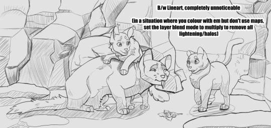
Text
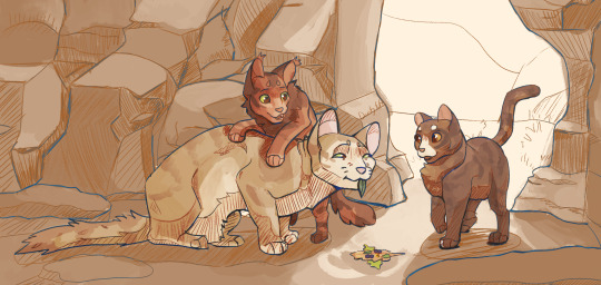
Leafkit and Squirrelkit make "travelling herbs" for Sandstorm before she goes for a walk. They're delicious, she assures the kits, through tears in her eyes. They run away proudly, she rushes out of camp for the nearest creek to wash her mouth in. Nasty, she mouths, but she'll eat whatever they make. The kits' smiles make it worth a wet face.
~~~
Had a ton of fun with this one but don't wanna bog down the main post. A lot of unrelated-to-wc process talk below the cut!
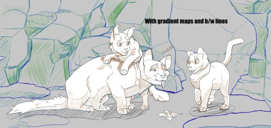
So this was a bit of experimentation with a new brush which turned into exploration into gradient maps.
The original idea was simply to modify csp's mechanical pencil brush into something that felt a bit more natural. It started with simply turning on a bit of tilt-controlled thickness and setting my colour to about 80% grey, rather than black. It didn't quite feel right, but setting the brush to blend with the subcolour on each tip, setting the subcolour to the 80% grey and the main colour to the canvas' colour, then setting the brush's blend mode to darken gave me a brush that felt like it had FAR finer line control.
The lines themselves look like this (on a more saturated bg to show how the values layer/fade in and out with pressure and tilt):
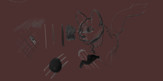
(edit to pic: completely unnoticeable when on the intended base colour*)
This is where the gradient maps come in. The way I usually change my linearts' colours is to make a new layer, mask over it, and manually paint. It gives a lot of control to your end result, but it's time consuming and often takes many adjustments to make it feel like it has enough contrast to make the drawing actually *readable.* If I wanted to add a gradient map to the lineart, it would be unable to read the transparency and would pick from the single value that the lineart is (usually black), then the transparency would take over. This gives me a dull result.
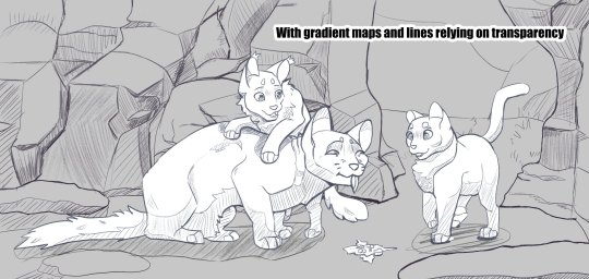
With the "transparency" being an actual colour, that gives it an actual value for the gradient map to read. So instead of having your lines fade from black to the colour behind it (often desaturating as it goes), it'll go from something like dark blue -> reddish-grey -> orange -> yellow. It adds a little something i think, and while I absolutely don't have this down pat, it could be something interesting to explore!
I also wanted to go further with this piece, namely painting it rather than a shading layer set on overlay with the aforementioned gradient maps all over it but ... it wasnt happening. The art skills clocked out for the day. That said, I definitely want to explore how this would look if I coloured everything for realsies rather than doing the fallback method. Could be where they really shine!
#warriors#warrior cats#squirrelflight#leafpool#sandstorm wc#btw. the post did get bogged. i talked a lot but damn it was fun to doodle around with !! give it a shot if u want!#2023 art
1K notes
·
View notes
Note
i’ve been trying to teach myself how to draw and your art has been a huge inspiration for me, do you have any tips on how to do line art like you do?
to be quite honest i try to avoid doing proper lineart whenever possible! it used to be a prominent feature of my art but I realized i just kinda felt miserable doing it. any lines you see are either painted on top, the sketch, or im doing something heavily stylized so I'll just show my process & share some general tips!
I try to stay as loose as possible and let myself leave in some mistakes as if I were inking with a real pen and paper. Another thing I recommend is playing around with whatever brushes and seeing what sticks! I prefer a much more textured gritty line over something super smooth but that isnt for everyone so playing around with different options is ideal
Also will leave some external resources under the cut!
FRAMED INK: book about comic/storyboarding composition but still has some bits in there about how different inking techniques can change the mood of a scene.
GUIDE TO SPOTTING TANGENTS: Self explanatory. Tangents can be a real pain when it comes to lineart so its best to learn What they are and How to spot them
SPOTTING BLACK AREAS: going more in depth with laying down your black areas
#art help#if theres something more specific you'd like lemme know! i just went over bits that are specifically style oriented#and less so of the basics cuz there are a lot of guides out there for lineart that are way more cohesive than I could make
592 notes
·
View notes
Text
HERMIT A DAY MAY - DAY 18
JoeHillsTSD x Where the Sidewalk Ends
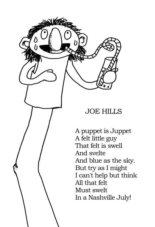
For Joe Hills I chose Where the Sidewalk Ends by Shel Silverstein!
I loved this book along with A Light in the Attic when I was a kid. It was one of my earliest exposures to poetry and since Joe is a poet himself, I thought this would suit them well!
In addition to doing a drawing for Joe, I also tried my hand at an original Joe Hills poem in the style of Silverstein. Writing poetry is pretty far outside of my usual wheelhouse, so I hope it turned out suitably Silverstein-esque! I'm proud of it regardless. :)
Here is the text of the poem:
-
JOE HILLS
A puppet is Juppet
A felt little guy
That felt is swell
And svelte
And blue as the sky.
But try as I might
I can't help but think
All that felt
Must swelt
In a Nashville July!
-
To learn more about Where the Sidewalk Ends and see my style references, continue below the cut!
(Happy Hermitcraft stream weekend! A fine weekend to donate to Gamer's Outreach)
Where the Sidewalk Ends is a 1970s book of poetry by Shel Silverstein. Each poem is accompanied by a whimsical ink drawing also done by Silverstein.
The poetry is fantastical and imaginative, often written from a child-like perspective. Though the poetry sometimes touches on darker themes, it does so from a thoughtful place and the collection is enjoyable for people of all ages.
Even if you aren't someone who likes poetry, I highly recommend picking up Where the Sidewalk Ends or A Light in the Attic. They are both wonderful.
Style references:
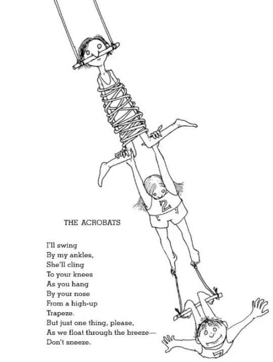
Every poem in the book has a cute drawing to accompany it. Here is the poem from the above image:
THE ACROBATS
I'll swing
By my ankles,
She'll cling
To your knees
As you hang
By your nose
From a high-up
Trapeze.
But just one thing, please,
As we float through the breeze-
Don't sneeze.
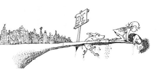
The illustrations for Where the Sidewalk Ends are whimsical with sparse, stippled shading and cartoonish characters
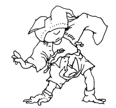
The lineart of these drawings is thick and a little messy but still easily readable even when the subject of the drawings is unusual (which is pretty much all of them)
#Poetry is art too!#It's just not an art I have a lot of experience in#I'm happy I took on the challenge of writing for Joe#And that I still found a way to include a drawing as well#This is one of my favourite entries so far#and I'm proud of myself for giving it a shot!#joehillstsd#joe hills#hermitaday#hermitcraft
155 notes
·
View notes
Note
Just wanted to ask, please forgive me if you've already answred this, what program do you use? Your art fucks HARD and like. I was looking at your art of the two moths over the city they die in and I was hit with the wave of "oh that looks really fucking fun actually." Like i know my art program can't do some of those effects and like, I'd love to try fucking about with them.
hi there, thank you! all my art is done in procreate and paint tool sai
because you mentioned that drawing in particular i thought it would be fun to break it down and show ppl what exactly went into each part of it so check this out
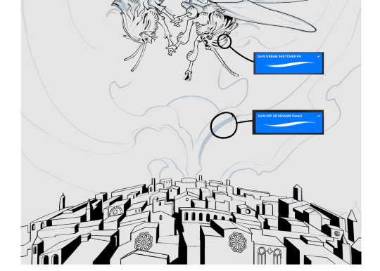
sketch & lineart - the brushes come from georgbrush.club and the urban sketcher is my most commonly used lineart brush, it has a nice irregular shape. the square brush is nice for big blocky sketches.
the cityscape was REALLY hard but basically I got a photo of the skyline of florence, traced some basic building shapes, then bullshitted the rest using the vertical symmetry/mirror tool to cut down on the amount of work (so i only had to sketch one half of the city). then for lineart I turned off vertical symmetry, turned on the two-point perspective tool, and got this:
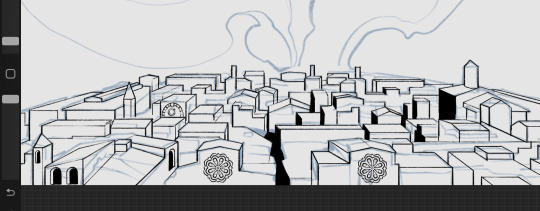
the rose windows were made using the radial symmetry tool.
I didn't like it being so flat, so I used the liquify tool to make a kind of fish-eye effect (limited success tbh). I liked how it looked but the buildings in front needed something to cover them up to make the liquification less obvious...
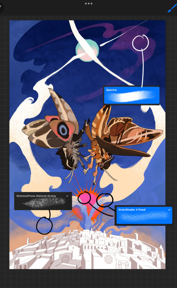
first pass colours. I felt they were very washed out, aside from the sun which i loved. I use the spectra brush (default procreate) for skyscapes a lot, I love the texture. Although the clouds were filled in using the lasso selection tool, I softened the edges using the square pencil again and added texture using true grit sampler grainy brushes. The translucency effect comes from my setting the brush as an eraser. The sun rays come from the radial symmetry tool.
Blocking in the moths' colours was done with the urban sketcher again.
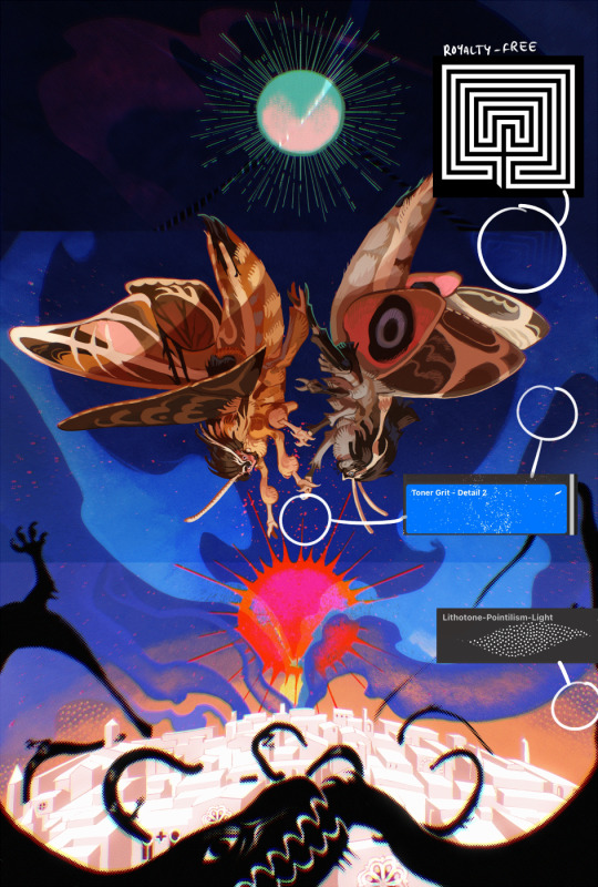
Something people may not have noticed is the labyrinth hidden in the sky! yeah I had a bunch of versions where it was more obvious but I found that it clashed a bit and was too busy, so I made it subtle. But yes. I searched for "royalty free labyrinth" and picked one.
The toner grit brush is one you've seen before if you've looked at any art on tumblr lately (this is such a popular brush) and it's from the true grit fast grit set. The pointillism brush is from the true grit free sampler pack, like my grain brushes.
I added shadows to the moths, increased saturation overall, and changed the clouds to a translucent blue (you can even see in the sun where I forgot to block in the sun itself because the clouds over it used to be opaque lol). Moon rays were drawn using the radial symmetry tool but this time with rotational symmetry off. I also moved the moon down closer to the moths because I felt that it was a bit far away, and this served to visually divide the drawing into three equal parts, so I chose to lean into that and divide the sky colours too, to show passing time, or an endless moment - morning, evening, night, etc.
And then the oroborous, I tried a few different effects on it because I wanted it to be very clearly separate from the main scene - I settled on a dot matrix newsprint texture, using procreate's onboard tool, and some heavy chromatic aberration. This is because the oroborous isn't real, it's purely symbolic and the moths' demise started when they became photographers so I liked the print media aspect there as well. The story itself is about grief without closure, cyclical violence, and sunk cost fallacy, while everyone explores an endless labyrinth, so an oroborous fits I think
what makes art fun to me is thinking up ways I can tell a story using just a single image. and sure a lot of it will be lost to an audience who isn't familiar with the characters or backstory but i want to leave enough in there that even complete strangers to my work will be able to construct a narrative about what's happening here, rather than it just being a cool image. that's my goal.
Finally I exported it to sai on my pc to give it a once-over. this is really important because the retina display on an ipad is oversaturated on purpose, to make everything look amazing and vibrant. but what this means is that on other screens, your work might look washed out. it's especially bad at displaying yellows! so i look at it in sai on my pc and i make minor adjustments, in this case I actually added another multiply layer on the moths and an overlay on their non-shadowed parts to increase the contrast there.
finally if you've read this far, I played a little trick with the caption of the drawing. yeah, THEY die... but only one of those moths is a theythem pronoun haver... the other has to survive. he isn't given a choice in the matter.
#fr you will never catch me trying to mystify my process i will explain literally everything#brushes
454 notes
·
View notes
Text
Coloring tutorial I guess
That's my most default shading style, a hybrid of line drawing and painted shadows, and I'll tell you exactly how to get this look.
But before we start, you need a weapon
This is my main brush for basically anything, including line art on days when I don't feel like switching to something actually intended for inking. It's a lightly textured square brush with color variation on every stamp. Intended for Procreate but you can always just rip the alpha texture out of the file and use it for a brush in any drawing program.
That out of the way, let's go. I'll use the same line art as the one in fluff tutorial.
Set the line layer to ~60 or so opacity and get to blocking in the base colors of your character. The jitter brush will introduce some color variation on it's own, but changing the color occasionally will add more visual interest.
After this I add a multiply layer on top and dab orange or red in places where we might be able to see the base of the hairs or peek at the carapace underneath.
It's places where hair parts and where it's shorter. This accent color works great on joints as well. Example of the thing I'm going for in real life:
Especially visible behind the head. It's not present on every moth to be fair, but I like to add these accents even where it wouldn't make sense, just because it looks nice. Even on insects without hair.
Block in the eyes and mandibles now, best if it's on separate layer.
Now, the actual funny tricks begin. If you're one of the people who only use multiply or add blend modes, stop it, get some help
Understanding the math behind blend modes is gonna get you a long way.
My lineart is set to subtract more often than not. I find it produces juicier and more colorful results than multiply. I want to give this picture a warm orange feeling, so the color of my lines should be the opposite - blue.
And, subtract.
Perfect, but not quite. We can push the lines to an even softer feeling. Take the line layer, copy it, invert the color and set to multiply. I then throw gaussian blur on the resulting copy and reduce opacity until the lines bleed into the surroundings just a little bit.
On to actual shading. People who shade without getting in some background first scare me, so let me throw something together real quick.
A simple gradient will also suffice for this use. We just need some information on which colors are present in the surroundings.
Copy your background, bring it on top of your character layers and gaussian blur it real hard. Set it to multiply, remove all parts of the layer that go beyond the pixels of the base color layer. Adjust opacity until the character fits in the background.
Let's identify the light sources. In this case it's only the sky, but it produces two distinct colors - soft blue lighting comes from the top, slightly stronger red comes from behind.
The blue light I set to exclusion blend mode because it felt most appropriate in this case. Both add and screen looked too strong to be the light coming from such dark sky.
In this lighting context the lower part of the body will receive less light that the upper part. I use the green of the bushes set to multiply to darken the bottom.
The character is surrounded by all kinds of soft light, but it can't get everywhere. It's time to add ambient occlusion, or contact shadows, for those without a 3d background. Anywhere where there is a crevice or surfaces almost touch, a soft shadow will form.
I do it on a multiply layer with a neutral gray-green color. Gray because any color light isn't really getting in there and green because the fluff is somewhat transparent and whatever light does pass through it gains a greenish hue.
Last step, red rim light from the fading sunset behind the character.
Since it's rim light I just work with normal blending mode. Setting it to add or something of the sort would make the rim light brighter than the source of the light. And it'd be odd.
And that's it. I usually throw on some post processing in Snapseed. Pull some curves, throw on a bit of grain, etc. But it's a topic for another time.
In conclusion, try to think about the environment more when shading. What route does light go through to reach where you're coloring? Did it reflect off of any colored surface? Did it pass through something transparent to gain a different hue? What color shadow would this ambient lighting produce?
Go have fun with your colors now.
214 notes
·
View notes
Text
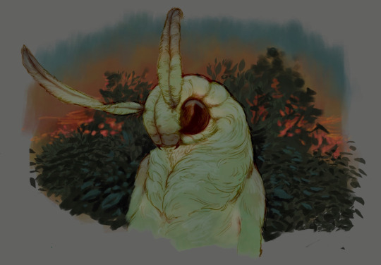
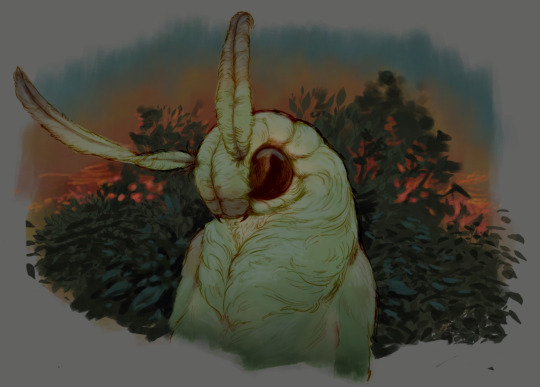
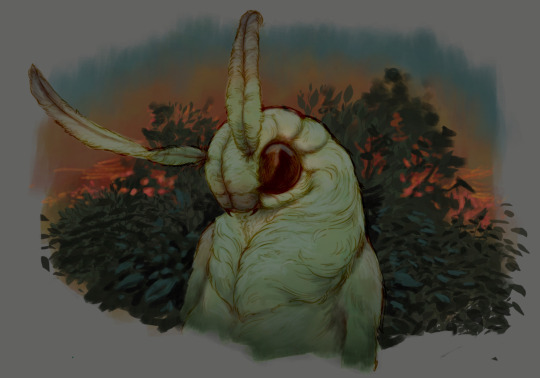
EVIL ART STYLE CHALLENGE
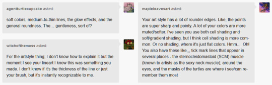

@agentturtlecupcake @witchofthemoss @mapleleavesart
I kinda forgot how to draw before doing this LMAO I hope I managed to follow the assignment anyway. You guys are so insightful I was BLOWN AWAY, thank you so much!!! Despite these asks being primarily observations, they feel like compliments for some reason and y'all have made me really soft ;3;
I have to disagree about the cell shading though because in the last year I've only done two cell-shaded pics (+ used it in Leonardo's new prosthetic)
But Moss. Moss your bit about my lineart genuinely made me tear up oh my god I don't really know why but I Sure Felt Emotions ;_;<3
#leonardo reminds me of moominpappa in the regular style version and now i love him even more..... i don't need to love him any more sjdhf#I love drawing his little under chin fat and it felt so weird leaving that one line out of the evil version#asks#rottmnt#rottmnt fanart#nqk#nqk adjacent#peepaw leo#peepaw leonardo#future leo#future leonardo#tervdraws#art style challenge
178 notes
·
View notes
Text

a handful of my favourite drawings this year
gonna just bury a personal post in here too, give it a read if you fancy:
as i've said a few times, this is the first year in a long time where art has had no monetary component for me, and it still took a little while, but i feel like this is the year where i've actually managed to de-program myself from years of being a Twitter Artist, and switch over my mentality from drawing what i think people want to see, to what i want to make, and also learn not to force myself not to draw if i don't want to, and on that note i dunno if i'm just feeling residual burnout from the years of grinding out for twitter or what, but i was kinda surprised how small my appetite for drawing actually was
that said, when i do draw now, i know it's because i'm actually really excited to be doing it and i feel like it's shown in the results tbh, there's way less drawings this year where i felt like i'm just going through the motions and drawing for the sake of getting something out there, and i look back at basically everything i've drawn like "yeah, that was cool, and i had a lot of fun making it"
part of that is that i've also discovered just how important it is to actually enjoy every part of my art process, i've sorta just cut out parts i don't enjoy - i'm way more willing to just leave things looking slightly wonky, and i haven't done any fuckin lineart this year at all, i've cut that shit out entirely because i don't like doing it, instead i just spend 10 minutes cleaning up my sketches and go straight to colouring and it feels like nobody's even noticed, it rules lol, and i've put a bit more focus on making things that feel like "scenes" rather than just "pretty girl in white void (with optional background circle)", not that all my art needs to be that, but it's been satisfying taking the time to just draw little simple backgrounds or focus on building an overall vibe, rather than just the character
tl;dr dumbass girl learns to have fun drawing again by not giving a fuck
love u lot <3
340 notes
·
View notes
Last Seen Blogs

wkmusic
无标题

wader
Wade's Tumblr

izzizz-art-blog
Izzizz_art
hollowsart
X---|[ WELCOME TO LIMBO ]|---X

quadrantmodelquotes
Quadrant Model Quotes from 2013 Lectures