#i like textured brushes a lot lol
Text
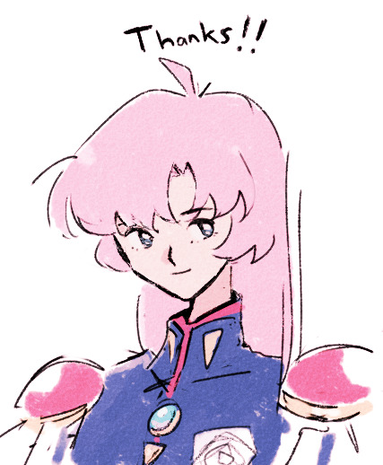
i had a conversation with a classmate about one piece + i’ve had these corset pants on my mind for a while which lead to this drawing 👍
(click the img for better quality!! preview’s blurry as hell wtf)
#my art#the pants were like $300 on aliexpress or etsy or sumn#crazyyyyyyyyyy#but i’m glad i cld draw them lol#i also ref’d one of d.o’s comeback stage outfits for cream soda teehee#i need to up my bg skills tho rahhhho#i’ll figure it out#(i hope)#kinda on the fence w the colouring on this one#but i think i like it!#i like textured brushes a lot lol#i also made this like#a3 print size#so maybe a personal print for me? who knows#scribs#artists on tumblr#fanart#digital art#procreate#sanji#vinsmoke sanji#one piece#one piece fanart#one piece sanji#i never know how to tag stuff here man#uhhhhhhhhh
32 notes
·
View notes
Text
Repostober day 12: Saihate
I hope this song reaches you on the other side.
#repostober#ritte draws stuff#vocaloid#hatsune miku#saihate#i was a lot more adventurous with brush textures back then huh? LOL#i can't seem to find it anymore but i remembered there was an acoustic cover i really liked#editing this really made me miss this song ; - ;
37 notes
·
View notes
Text
Moonlit Melody
#Snufkin#and he has a tail :D#woods#the trees are actually birch trees if you noticed the patterns at the bottom Idk kind of hard to see shading and all but yeah-#Why do I like birch trees so much Idk#Moomins#moonlight#Made some crappy texture brushes#like crosshatching type thing#and some more#so this was a test for those basically and then I added the usual a lot to too much lighting lol#The flowers on his hat and tail are purple roses#pretty sure that’s a thing right#so yeah#purple roses#roses#ALSO SNUfMIn ELEMENT#it’s very vague and minor but he has a blue ribbon around his tail#all small beasts should have bows on their tails#after all#But yeah ribbon because I’ve read some fanfics where they exchange ribbons and that’s just so cute so of course I added that lol#Snufmin?#Not really but it’s mentioned sort of#if you don’t ship it it can also just be taken as a friendship bow of course like how there’s friendship bracelets#Or just a ribbon ig#Idk I like symbolism ok#wow this is a lot of tags sorry#My art
65 notes
·
View notes
Text
they deserve each other (derogatory) yadda yadda
#don lothario#daniel pleasant#ts2#the sims 2#it's fun to post this while for some reason my mary sue / cassandra piece is getting attention lol#anyway. fun fact#daniel's name in italian is marco bartolini#whenever i tag him as daniel pleasant i'm like#who?#Ids are back because i'm not as worried about my english as i was#idk life is strange and ive had to speak lots of english lately#watch me become self conscious again#tomorrow#anYWAY#MORE COLOR!#MORE TEXTURED BRUSHES!#MORE ART!!!
5 notes
·
View notes
Note
re: the tags in your last art post
https://eirian.tumblr.com/post/701872759520772096/
no but fr it's okay to have a constantly changing artstyle/multiple artstyle!! it's really cool to see the different stuff and experimentation!!
btw your utena art is fucking smashing i love it!!!! take care <3
#asks#this is so so so late and ur very very very sweet sorry sorry sorry thank u thank u thank u#i cant even be consistent in ths doodle LOL whathewever#hmmmmmm i guess the hair is usually the same ?#i dont rlly change the textures for brushes all that often either#ohhhhhhhh i do reuse poses..like a lot. which is BAD. thats deffinitely#someting that should be LESS consistent : I#IDK#something to work on next year#ohhhhhhhhhhhhhhhhhhh right happy new year!!!!!!!!!!!#i dont rlly have anything besides this atm sowwy#ive been soooo distracted by other .......things..............
93 notes
·
View notes
Text
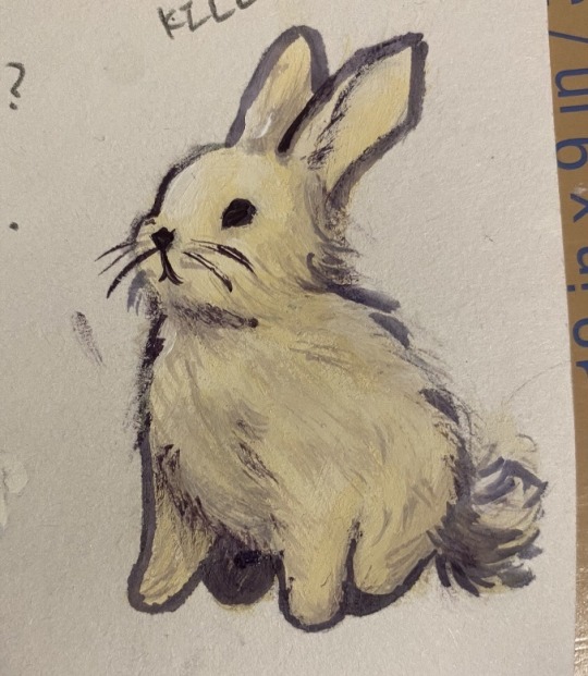
Ok fuck. I know only post digital art but I just tried gouache for the first time and look at how cute this little motherfucker is.
#my art#LOOKATHIMHES JUST A LITTLE GUYYYYYY#I think it’s pretty good considering I haven’t picked up a physical paintbrush in probably what like#I’ll give it a solid five years (not exaggerating!)#someone insulted a painting I did as a kid and I just mentally blocked all forms of painting#but I did take an art class in highschool and make some shoddy acrylic paintings -w-#as far as physical media goes I’ve always been more into inks and pencils#only decided to try out goache because I hear the process is similar to how I do digital#starting with mid tones and then working in shadows and light#and the handfeel (???) the… traction…? feels a lot better than acrylic#and I’m REALLY into the textured look a dryer brush gives. I’ve always been bad at experimenting with digital brushes lol#I always think they look cool but I forget which ones are which -3-#why do I always write full essays in the tags… I just can’t stop myself.
87 notes
·
View notes
Text

keeping your thoughts to yourself is ✨hard✨ sometimes ngl
#long and unhinged rant (that has become typical of wednesdays) incoming—#i just really really reallyyyyyy wanna tell certain people to shut up lol#and i really want to tell some people that their works aren’t as good as they think and that they’re actually pretty incompetent#and i superrrrr wanna tell someone that they should just. at least put in the effort to appear to be doing their work properly???#(i may or may not be talking about a certain intern at my workplace. keyword: may)#(a while back she was capping samples,left some samples uncapped bc ‘i couldn’t find their caps lol’)#(but when i checked in actuality she had??? used the ‘missing’ caps to cap other samples instead????)#(pls that task was the most basic of basic tasks. if she can’t even do that i’m worried about the other work she has done)#(tbf to her she’s a really friendly intern. she just. needs to be a lot more careful with her work)#but aside from that the temptation to shove slow walkers on the escalators is very hard to resist#especially when they stop walking in the middle of the ‘walking side’ of the escalator. like???? yo??? we’ll miss the next train bc of you??#oh! and i also find it really really tempting to slap every single person who swings their arms widely when they walk#why do people swing their arms when they walk anyway? you’re just gonna end up hitting someone else in the solar plexus or something#(that someone is me btw. some arm swinger smacked my inner thigh and didn’t apologise >:( the salt remains)#and also!!!!! those ladies with long (and dry) untied hair who like to brush said hair up against other commuters? can you not???#i never knew how much i despised the texture of someone else’s dry hair until the hair of this random lady brushed against my throat#but being touched by other people in gen just. isn’t fun tbh. but no one cares bc ‘lol you’re a girl you should be fine with random hugs’#lady coworkers whyyyyyyy ಥ‿ಥ y’all don’t hug/touch the dude coworkers unnecessarily so?? why meeee? ಥ‿ಥ#covid quarantine turned me into a haphephobe (real)#wait this was supposed to be about me wanting to scream at the people i know#how did it turn into an admission of wanting to inflict physical harm onto complete strangers who annoy me during my commute#it is suiyoubi my dudes#inedible blubbering
11 notes
·
View notes
Text

I think there's a possessed Kiwi bandwagon right now so I'm jumping on it
Definitely not my best drawing but not horrible ¯\_(ツ)_/¯
I forgot the chapter 3 wound bandages I always draw them with though jdsgdgfdjkh
Oh yeah and I impulsively decided to start using the Langtree color palette
#wandersong#kiwi#kiwi wandersong#is there a possessed kiwi tag#no there is not#welp#art#firealpaca#btw the brush i used for the shading/lighting is Watercolor Marker (Round)#i've been meaning to find a new shading style and i really like this one#it's very fun and kind of chaotic but it still looks pretty#it also has a lot more texture than the airbrush lol
8 notes
·
View notes
Text
I wish I knew how to knit gloves or smth. I just got a shitload of this really nice soft rainbow yarn for cheap when I was out thrifting the other week but now I don't really know what to do with it
#so far ive mostly been cutting it up into short segments and turning it into little hair tufts#what i usually do is just bunch a lot of short segments together like im gonna tie them into a hat pompom#and then beat the crap out of them with a wire cat brush until all the yarn texture is gone#acrylic yarn works best for it from what ive found! it gets real soft and wispy. kinda reminds me of troll doll hair#ive also tried the same method with cotton yarn but it mostly just got all stringy and fragile :(#either way its kind of a fun stimmy thing! but i really need to be more careful with the wire brush lol#i have a bunch of bandaids on my offhand bc i kept accidentally scratching myself on it yesterday 😅#ace screams into the void
2 notes
·
View notes
Text
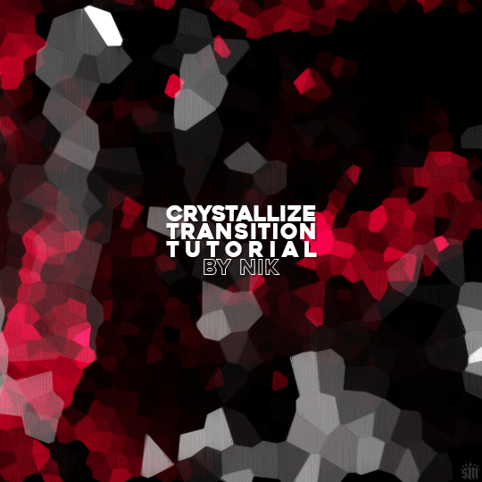
HOW TO: Do A Crystallize Gif Transition
Hi! I was asked to explain how I did the transition effect in this gifset, so here's a quick tutorial! Disclaimer: This tutorial assumes you have an intermediate understanding of gif-making in Photoshop using Video Timeline and requires the use of keyframes.

PHASE 1: THE GIFS
1.1 – Determine how many frames you need.
Since you need at least 2 scenes for a transition, consider limiting the amount of frames you'll use per scene. For a transition between 2 scenes that's 540x540px, I would recommend no more than 30 frames per scene (for a final gif that's 60 frames). Even that may be pushing it depending on your coloring. Just be sure to consider the dimensions and colors of your gifs in relation to the amount of frames to keep your final gif under Tumblr's 10MB limit.
1.2 – Import frames, crop, resize, convert to smart object for Video Timeline, color, blend, etc.
Do this as you normally would! If you need a tutorial for the basics, here's my tutorial. :) Please note, the methods in this tutorial only work with gifs that are converted into smart objects in the Video Timeline workspace.
Tip A: I recommend using scenes where there's a lot of one color (or scenes where you can manipulate it to look like that). The crystallize filter on a gif creates A LOT of movement that can feel a bit chaotic. Having your gif be primarily one color reduces the eye strain a bit imo.
Tip B: I like how this effect looks with blended scenes because it allows me to use different "crystal" sizes (more on this in Step 2.2). Check out the USERGIF Resource Directory for plenty of blending tutorials!
1.3 – Move all your gifs into one document, group into folders, and arrange.
Once everything's in one doc, keep everything organized in a group folder! I have just two scenes, so that's Folder 1 & 2. Within those folders are the gifs I blended, which I labeled by gif color. Then, simply drag Folder 2 so it continues right after Folder 1. (Make sure none of your adjustment layers from Folder 2 accidentally affect Folder 1! You can do this by clipping your adjustment layers to match the length of the gif as I did, or using clipping masks.)
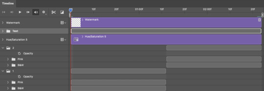
(Ignore that lone Hue/Saturation layer lol. I decided last-minute that I wanted my gif to lean more pink than red.)
PHASE 2: THE FILTERS
2.1 – Duplicate each scene.
We're going to use opacity keyframe animations on these duplicated scenes that allow it to go from "normal" to "effect" and vice versa. The filters will only be applied to the duplicates. In the screenshot below, all of my duplicates are highlighted:

2.2 – Apply the Crystallize Filter.
Above your sharpening settings, apply this filter by going to Filter → Pixelate → Crystallize. On the pink gifs, I made the crystals bigger (cell size: 45), and on the black and white gifs, I did a cell size of 25.
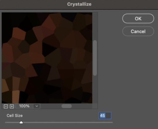
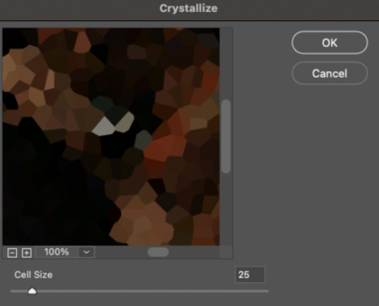
The different sizes help break up the uniformity of the crystals imo, creating more of a mosaic-like look, which is what I wanted to match my gifset concept.
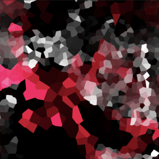
2.3 – Apply the Oil Paint Filter (Optional).
Filter > Stylize > Oil Paint. Here are my settings (they're the same for both crystal cell sizes):
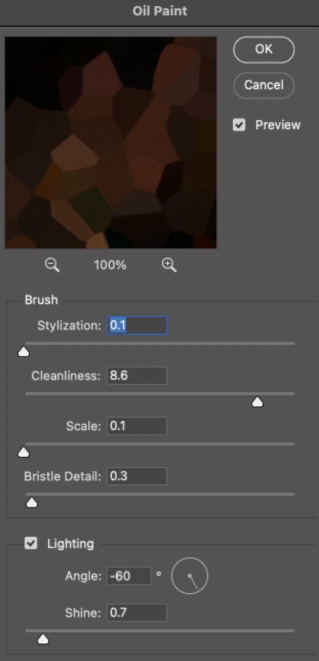
Brush – Stylization: 0.1, Cleanliness: 8.6, Scale: 0.1, Bristle Detail: 0.3
Lighting – Angle: -60, Shine: 0.7
This filter helps soften the cells a bit while adding some texture (left: no oil paint; right: with oil paint):

2.4 – Repeat steps 2.2 & 2.3 on all duplicated scenes.
PHASE 3: THE KEYFRAMES
3.1 – Add opacity keyframes.
The very start and end of each scene needs an opacity keyframe set to 100% opacity. Move 0.09 seconds from each of those points, and place another opacity keyframe, this time set to 0% opacity. We're basically making the crystals fade in and out. Please reference the screenshot below for keyframe placement:

If you need more info on opacity keyframes, check out Phase 2 from this fade transition tutorial I did on usergif.
3.2 – Repeat step 3.1 on all duplicated scenes.
All the keyframes in Folder 1 should line up exactly and all the keyframes in Folder 2 should line up exactly!
PHASE 4: THE DUPLICATES
4.1 – Convert back to Frame Animation.
If you're not sure how to do this, I've written out the steps here. I rec the action linked in my general gif tutorial which I shared earlier!
4.2 – Delete duplicate frames.
Whenever you use keyframe animations, you'll get duplicate frames. That's just how it works, unfortunately. If you follow my steps exactly (specifically the 0.09-second spacing, which follows my tried-and-true 0.03-second rule), you'll have a total of 12 duplicate frames exactly — 3 duplicates per keyframe section. Just manually delete them! You can spot the duplicates by eye, but with this spacing, it's usually the 2nd, 5th, and 8th frame for each transition section. The selected frames below were my duplicates:
If you want to learn more about why there are duplicates and the math behind it all, I explained it in more detail in this ask.
4.3 – Export and you're done!
I hope this tutorial helps! Let me know if you have any questions :)
#gif tutorial#completeresources#usershreyu#usernanda#useryoshi#userzaynab#userrobin#usersalty#userhella#alielook#uservivaldi#tuserabbie#useraish#userabs#tuserlucie#mialook#resource*#gfx*
280 notes
·
View notes
Text


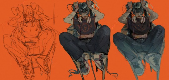
Another one of these since i haven't done it in a while! Sketch -> finished illustration
Thoughts & process below the cut :>
Out of Bounds: i deleted the sketch of this off my ipad because i didn't like it, and for months it only existed as a screenshot on discord. finally in january of this year i was like Wait Actually and decided to keep working on it. I didn't achieve the look I was going for (kind of foggy and vague. It came out too sharp and high contrast) but it was fun to throw the kitchen sink at it for an afternoon and then call it done finally. I don't remember which horse this was originally supposed to be, I think Macha?
I reused the pose, you'll find the same one in my Pascal sketchbook from the section on gait studies. That's the cool thing about doing 30 sketches at once, you can finish them up any time you like for a different drawing
The Fool ft Islin: the original concept for this is from [takes a moment to decipher the american date system on discord] January 2022
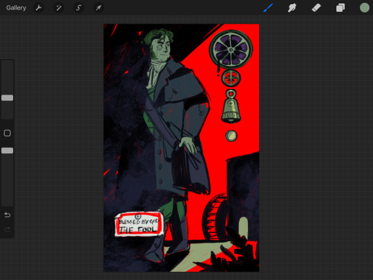
It wasn't dynamic enough, but I've had this on the backburner for sooo long. I think I completed like 4 cards in between this sketch and the final version lol. But, for a bit of background, this is from my series of major arcana based in Inver, and in particular the events of the 1860s-era book series, Moth Viper Foal (a demo of the first book, Said The Black Horse, is available for free/pwyw in my shop). This scene is a companion to Said The Black Horse, depicting the aftermath of the traumatic fight that caused Islin to storm off. He had been working at the mill as a semiprofessional back alley surgeon when he received an offer to join the church and work as a trained surgeon in their hospital. But when he brought the good news back to his friends it was met with utter rejection, driving him to basically run away to join the church. while gay and trans. thus the card.
he didn't actually bring a bag with him when he ran out but for the sake of the card i drew him with one
Gryfon and Pantera: This is how 99% of holy beast drawings start out, even the super stylised ones. I struggle a lot to draw them in procreate so they start in sai and then i transfer them over. The story of this is already explained in the caption of the original post so I'll just talk about the process which was... honestly torturous. I actually don't like too much textures and effects on things (wild, I know) and this one and Out of Bounds are ones where I kind of preferred it pre-texturising.
The text on the side is the official in-universe report of the event, detailing the casualties, the valiant actions of Gryfon's knight before he died and so on. There's also spoilers in there :>
My main struggle with this art style is how it always ends up slightly TOO sharp and crisp in a way the just a blur filter never can correct. There's not a lot of immersion to break, to be fair, but I think this still does it a little. I need to get more comfortable doing the lines with larger and softer brushes, and allowing imperfections.
1K notes
·
View notes
Text
unpalatable.

⋯⁂ summary.
suffering with disordered eating, you try your best to brush it off as being picky (as many others in your life have done before.) but, your beloved doesn't think it's mere pickiness anymore.
⋯⁂ a/n.
short and sweet post here; so im not really worried about small grammar errors, word count, formatting, or what have you. i just need to get this icky feeling off my mind, ok? for the record as well: i'm writing all of this on tumblr post editor and not in gdocs like i normally do. so there's gonna be things lacking compared to my normal, "formal" works.
⋯⁂ characters.
neuvillette. zhongli. wriothesley. gn reader.
⋯⁂ cw.
reader has disordered eating (this is different from eating disorders, pls read further about it online if you want/must!) reader has poor self-esteem. characters being very very sweet. fluff. might be some hurt/comfort and panic. reader's weight is NOT described. there might be occasional OOC moments, but i tried my best to avoid it lol.

neuvillette.
he doesn't think anything of it at first. he understands the life of being..."picky" as some so rudely put it. he prefers his foods very moisturized, any dryness can be too much for his senses at times (most of the time.) the texture when it comes to something dry or even spicy can be very unpleasant; he swears if he ate sandpaper, that's what it'd taste and feel like.
when he starts noticing the worse..."quirks" about your eating habits, he's not sure how to word his concerns to you. he gets around to it and he can only hope he isn't too horribly late about it. he isn't, but he feels like he's late to saying something anyway.
once you both talk it over, he's already helping out. even if he's not quite sure exactly what he's doing. he's the type to fill your head and heart with sweet reassurances and even sweeter praises for doing your best, his smiles are the sweetest treat of all when he tells you these things, though.
even if he's stiff or awkward about the subject and tackling the problem at the root, he's as supportive as he can be. although, don't mistake this support as letting you get away without eating for long periods of time. he can and will pester you frequently about whether you've properly ate (and hydrated) recently. do your best to not damage his lover, alright?
zhongli.
believe it or not, he entirely gets the feeling of uneasiness and the occasional nausea behind a lot of dishes. fish is his worst enemy, for starters. his species doesn't really require tons of food to live off of, unlike your average human. so, when he first started "indulging" in more human dishes, he soon discovered what a gag reflex was. he won't admit to it, but he really hated it back then.
of course, that was so many centuries ago. he's adjusted fine enough to more dishes these days. and when you tell him about your struggles with eating, you initially write it off as you being childish.
he thinks not.
he doesn't let you get away with calling yourself childish—or any sort of derogatory statement that spits out of your mouth.
his hand slides up to yours, giving it a reassuring squeeze. and a promise that he'll do his absolute best to help you conquer these problems with food and eating. even when you start to branch out and eat a bit more than you usually do, he feels so proud of you.
he gives you a shining smile, a peck to the forehead, and holds your sweet, cute face with his big hands; while also filling your mind with praises and affirmations about how well you're doing so far. he loves you so dearly, don't push him away.
wriothesley.
you try your absolute best to hide it from him, the man who is maybe the least bothered by most foods. at least, the one man from fontaine, that is. he really doesn't care too much about what he's eating, as long as it's edible. call it a habit from being an orphan. of course, he has his preferences, but who doesn't?
so, when he catches you eating less or being a little too selective (he's observant enough, don't test him), he brings it up right away in private—he makes sure it's with only you two in the room. he'll ask if you're feeling sick or anything lately, promising you that sigewinne can help out.
when you skirt around the subject, he pouts just a little. it's enough to get you to break down in front of him. you call yourself some nasty things over being rather selective about food, feeling incompetent and weird compared to him.
and he really can't believe what he's hearing at first.
his icy eyes go wide and he blinks on repeat like a broken record. he's still registering what you just said about yourself—his darling cutie. he smiles bittersweetly and shakes his head, it's the most he can muster at first. he's still in disbelief.
your heart sinks into the depths of your gut at the response, burning alive and leaving behind literal heartburn in your throat. before you can leave the room, he scurries up behind you and wraps his arms around you, imprisoning you in the softest way.
he tells you he'll help out if you want it and allow him to, mentioning that he hates to see you suffer. he gives you a loving but tight squeeze (one that's perhaps a little suffocating.) he promises to you to help you suffer, at least, less than before.
he loves you too much to see you in any type of pain, external or internal.
you're a prisoner of your own mind while also a cruel warden to yourself. and if it's the last thing he'll ever do, he swears he'll change at least that much.
#🌠— my works#🌠— fluff#🌠— hurt/comfort#💕— multi#zhongli x reader#💕— zhongli#genshin x reader#💕— neuvillette#neuvillette x reader#💕— wriothesley#wriothesley x reader
645 notes
·
View notes
Note
i am FASCINATED by how you implement textures into your art - esp like for walls n shit lol. everything feels spicey n crunchy... i know you use procreate but are there any specific brushes or otherwise that you use for your effects?
Hi ty! A lot of ppl ask about textures so here's a quick demo along with the brushes I use. I just go over the solid color in low opacity in different colors with different brushes most of which are default in procreate: Salamanca, gouache and fresco for streaks, stains and general textural and color variances in the material. I also use this splatter brush for specks which can be emulated with brushes that already exist within procreate, but you can find the pack im using here: https://www.truegrittexturesupply.com/products/krafttone
And I do it on a clipping layer right above bc i feel it's easiest to let me select certain areas of the texture and resize it depending on if there's a plane change or smth else that needs to be done. Hope this helps !
293 notes
·
View notes
Note
I'm sorry this isn't a commission, but I just have a question about your art. Feel free to ignore this, of course. I was really amazed by your Miku drawing from December 16th. Seeing such a high-level piece, I wanted to achieve something similar, but no matter how much I try, I can't replicate your shading and highlights. I was so genuinely curious that I couldn't sleep. Could you possibly give me any hints or advice?
Hey, sorry for making you wait so much for this answer, i've been finishing some projects and i barely had free time. Anyways i'll try to do my best on explaing my coloring and lighting methos and you also asked me to explain how i create the folings of the clothes. Please take in consideration that 1 i am not native in english so it's a bit difficult for me to explain myself sometimes in this language and i may have some misspelings, sorry about that, and also 2 i am not great at explaing my drawing process bc i kind of turn off my brain when i draw lol, but i can explain the fundamentals that i know and help me create! Last thing i want to let you know is that i've started glazing my art, this is a metho to protect the images for AI images generators and it leaves a kind of pattern /effect on the image that i did not put there during the drawing process.
with all of this said let me start explaining things!
Learn the basics:
This may come as a cliche i guess, but yes my first ever advise to anyone is learn the basic theory on lighting and colors (on anything related to art tbh). You don't really need to spend a lot of money on books and such as there are lots of resources online like videos and documents you can read for free. It's not necesary to be an expert and even the smallest mount of knoledge is enought to inpruve your art a lot! , i find it very interesting to learn the way things work too so don't think you'll get bored of it!
To be frank, i am actually not very good at lighting lol. My lights and shadows are not very correct, but since i do have a lot o control over my colors and i know very well how to used them it kind of compensates and creates a very recognisable (i think) style.
just u know basic shitty advise that everyone is going to give you but it works! if you have free time try watching some videos or reading some documents about color theory shadow and lighting!
Your working space:
So this is something that works FOR ME not everyone likes it, you can try it see if you like it and if you do, cool! if you don't … that's cool too! When drawing on digital i prefer it when my base layer is grey instead of white. It helps with my headaches too but it's more about the fact that starting in a middle tone when coloring (in my opinion) makes the process of briging out both shadows and lights easier, let me give you an example:
Drawing from complete light (white) to compplete darkness (black) may condicion you to actually lose control in the contrast betwen these areas, i prefer staring in a middle place (grey) and that way is i want to show darkness i'll use a darkr color and if i want to show light i'll use a lighter color, but if i start on white i can't use anything lighter. I think i did a HORRIBLE job explaing myself there, but yeah it just helps me control my color valius a bit more lol.
this is the color that i used:

Another inportant thing about your woking space is you brushes, in my case i prefer using textured brushes that mix well, and i prefer using very thick strokes, if it's too think i'll just color pick the transparent color and ease it! I work in CSP i don't know what you use, but just in case i'll give you the setiings of the brushes i use the most with their codes so you can find them


Sculpting with lights and shadows
As i said before, i am not very good with light yet, so this is something that i do to help me with the process. When you think about it, lighting is used in art to give volume to the piece, not in every case bc rules in art are not there to be followed but to asist us when we need to take a creative decision. The way that we can start with our Sculpting is by creating a very easy first guide othe the shadows and lights and to do it with very big block, so that we get the general shape first,we don't neet to get lost in the detailds yet
The actual coloring
When drawing my process is divided in three stages. I first create the doodle/lineart, that doesn't neet to be super neat as i will fix it during the rendering. The basic colors, and the rendering.
During the preparation for the rendering when doing the base colors i recomend that you give special atention to the focal points of your illustration, in this case for example that's her face and the top of the hair, that's why i gave so much more atention for this part in comparation to the shirt, that it's literally not shadowed yet. Then another step that i use normally before rendering and that i can NOT RECOMEND ENOUGHT!!!! GO WILD WITH THE COLOR CURVES!!!! OMG!!!! THAT STUPID LITTLE TOOL IS SO FUCKING COOL!!!!!!!!! like for real, it gives effects that i have not been able to achive in any other way and omggggggg use the fucking color curves pleaaaaaaseeeeee
ok i'm notmal again , lets continue.
For the rendering i usually convine all the layers of the drawing on one layer, then use a textured brush that has low opacity of mixes very well fot the actual work. Tbh here is very i can't really help you a lot, bc i have no idea what i'm doing when i render i just don't know, the only thing i recognise is that i try to esare or clean the lines from the doodle/lineart, and i focus a lot on creating volume in the places that are more important.
Skins
An specific thing that i do a lot when it comes to coloring skin is using an undertone in red (literally) I will put the basi color, use the brush to mark where i want shadows to be in a very vibrant red and then use a blue / green / pruple (depends on the skin) to finish the shadowing. Thios metho is nice for lots of occasions, but take in consideration that it doesnt work for example for very dark scenarios where the character is suppoused to be in the shadows, as that red tone works as a outline for the light. It just depends on the situation.
Clothes foldings:
Ok so here the only thing i can give you an advise with is to remember that the way that clothes fold dependes on gravity and that gravity works in curves most of the time that have two (or more) attachment points that are going to determinate theit trajectory. Example:
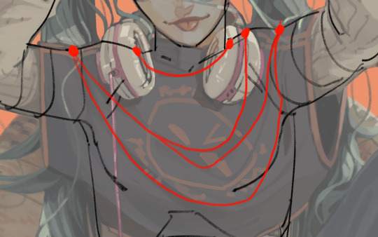
And remeber that this creates (again) a volume, that there is an inside part, that it's probably going to be draker, and an outside part, that it's going to be lightter. With this info you can start practicing with images of clothes.

this is as much information as i am able to recolect on my coloring process bc i am horrible explaining , spacially on text and in english, and i am also not very much aware when i draw, i kind of disconect. I still hope this is enough to help you a bit on your learning journy.
I may try doing a video at some point if i ever have the time so i can explain my coloring while i actually do it bc if not in that situation i'm not sure i'll be able to remeber what it is that i did.
My last piece of advise is to watch speedpaints and livestreams of artists you like during their drawing process and maybe even tray to imitate them while they are drawing to see what it is that they do exccly.
hope you have a good day and lot of lucks ! be proud of being able to create and be proud of being an artist!
#my art#art advice#color and light#aaa i'm reading and i have lots of missplesings sorry about that aaaa
212 notes
·
View notes
Text
Once again turning my Lioden King into an OC, heres Flowering Wisteria!
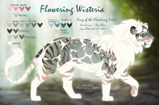
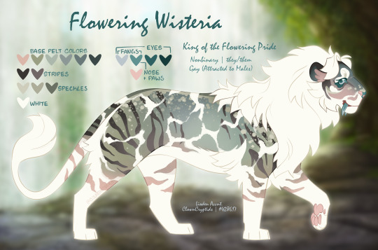
I really like how this design turned out! I used a textured brush instead of my usual solid brush for coloring this time and I think it looks really good for this kind of complex design!!
This is my beloved Ra based king of my main account! I spent SO MUCH time saving for them, and I have finally filled up (almost) all their marking slots! I just need the thrashed face mark and their design will be complete!!
They've actually turned out to be a pretty good money maker bec I've gotten a lot of studs for them! Love that!
Just like with my Prev. King, when it comes to making my lions into OCs I choose to ignore a lot of in game stuff, like who their parents actually are and their exact ages. Which I did even more of for Wisteria's story lol
I wrote a lot for them so I don't want to add it to this post sooo if you wanna read their backstory I wrote and stuff like that you can see it on their Toyhouse page HERE!
bonus: Heres what they look like in game

(removed some of the decor that covers them too much so u can see them easier)
193 notes
·
View notes
Note
I love your style and how you utilize halftones and textures and colours. It’s just so tasty! I’m curious if you’d be willing to show a bit of your process on how a comic page comes together?
Ah, thank you! ; w ; And sure, I can try, at least! Usually I start with some kind of a script. Sometimes it's a bit more detailed, like this:
... And other times they look more like this.
It just depends on my mood! But either way, I typically have a pretty good idea in my mind's eye of what the comic is generally going to look like. Once I know what I'm making, I do all the rough sketch pages.

... And then I line it!. For Gemini, I go for a dark blue rather than black 'cause I like the way it feels, and it lends to the overall 'papery' vibe. I usually lay down a grid pattern at this stage, which helps a lot with keeping panels and dialogue straight, and with perspective. I always do the gutters and the words first, then the figures and backgrounds. I been leaning a lot into really heavy shadows recently-- one of my professors in college told me once that a black-and-white comic page should be about 50% black and 50% white, and I've been trying to bring that to the table, lol.

I can ditch the grid at this point, and I put down a really light, pale-gray 'wash' on all the panels. It's a pretty subtle effect, but helps separate the panels from the 'background' of the gutters/negative space, and also just adds texture.
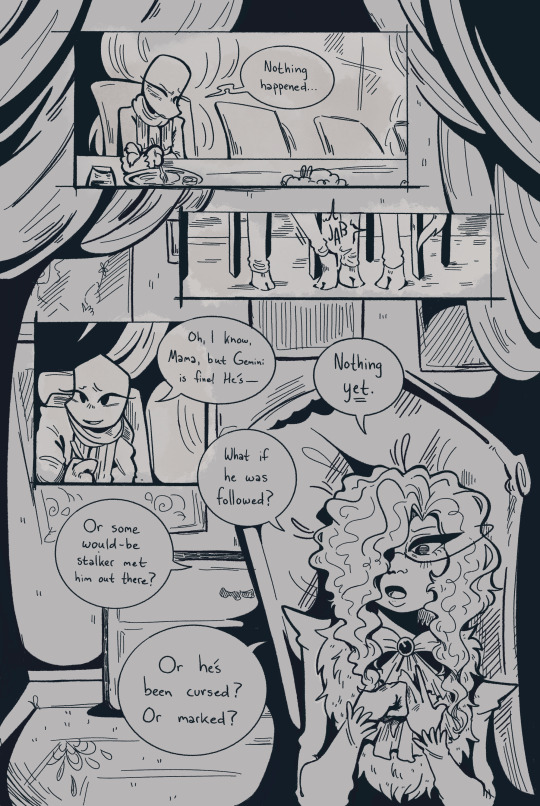
I lay down all the color next. Flat colors first, then a second pass over some parts to add depth/shadow, and then all the spot-colors like Leo's red stripes, light gray eyes, etc.

I use a pretty fine-grain half-tone brush for the background, and then a slightly more defined one (layer set to overlay) on the characters.

Once that's done I go back in and add highlights and such (white shine to eyes, hair, etc.) and go and add light outlines to any areas that need a little help being defined-- like Big Mama's arms and hands, for example.

And then the absolute last step is adding paper grain textures and gradient overlay over the top of everything!
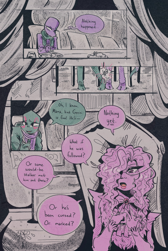
(A lot of the brushes I'm using for this comic I got from True Grit Texture Supply, just by the by for anyone who's curious.)
... With Swanatello I kinda tend to just. Go for it. I (sometimes) start with a vague script and then I just draw it. 🤷🏻♂️ No thumbnails, no sketches, no heroes, no gods--
Just Swanatello.
#asks#fidgetwing#i hope this makes sense/is helpful? ; w ; ive never done a lil step by step like this before lol
188 notes
·
View notes
Last Seen Blogs

mohammedhadji
Artist.

dorkthyon
Dork Thyon
drazillion
Draz
victorscrown
panem et circenses
c4tc4k3
c4tc4k3