#rainbow effect tutorial
Text
Iridescent Skin Tutorial by Fruitegg
#art#digital art#iridescent#iridescence tutorial#painting iridescence#how to paint iridescent#digital painting tutorial#fruitegg#rainbow effect tutorial
697 notes
·
View notes
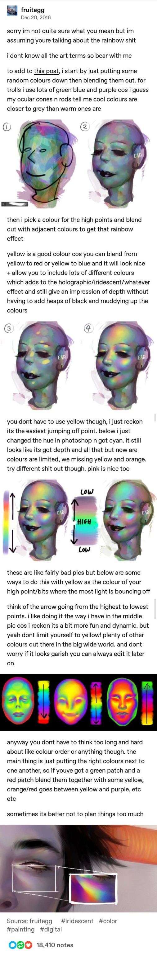
Text
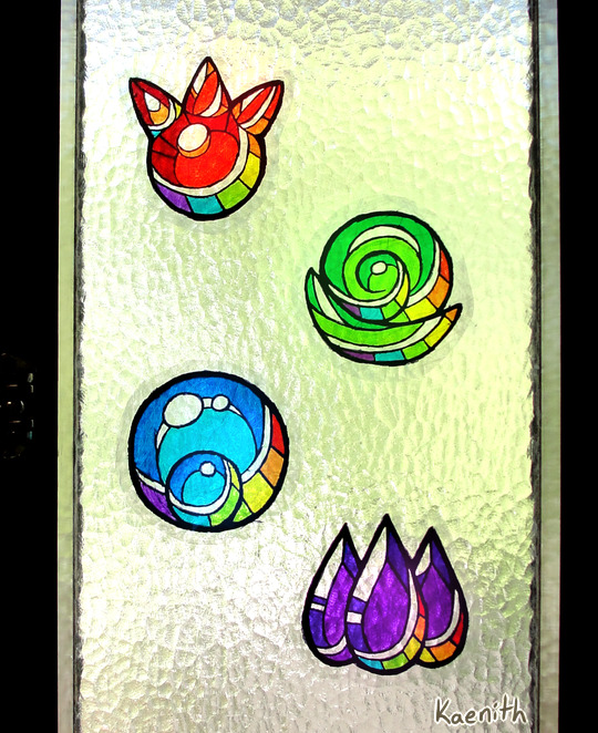
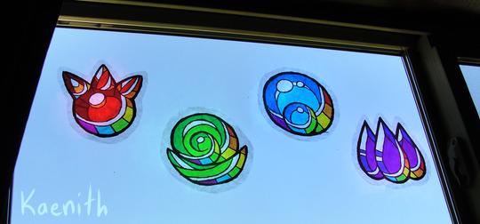
I've been making window clingies of the elemental gems from Minish Cap and Four Swords (plus rainbows because pride month) and I thought I'd put together a tutorial :)
Materials needed:
Permanent markers
Clear cellophane wrap
Scisors
Paper to sketch or print your design on
Not strictly necessary but useful:
Tape (for holding your pattern in place)
Something with a straight edge, like a ruler or bone folder (for smoothing out the plastic)
Step one:
Decide on a design. I drew mine digitally and printed it out. The printer had an issue, but eh, I can still see the lines, it's good enough ¯\_(ツ)_/¯

Step two:
Fold a sheet of cellophane wrap in half to make a double-layered sheet that is a little bigger than your intended design. Try your best not to get it too crumply and wrinkled, but in my experience a little bit of crinkling is unavoidable. Best not to get too perfectionist about it, and just embrace it as part of the stained-glass look!
Unfortunately, cellophane being clear, this step is hard to photograph ^^;;
Step three:
Lay the double-sided cellophane sheet over the top of your design. The best way I found to keep everything in place was to tape the pattern to a smooth surface and stick the plastic down around it.
Starting with the lightest colors first to avoid color bleed, start coloring your design, leaving the lineart for last.
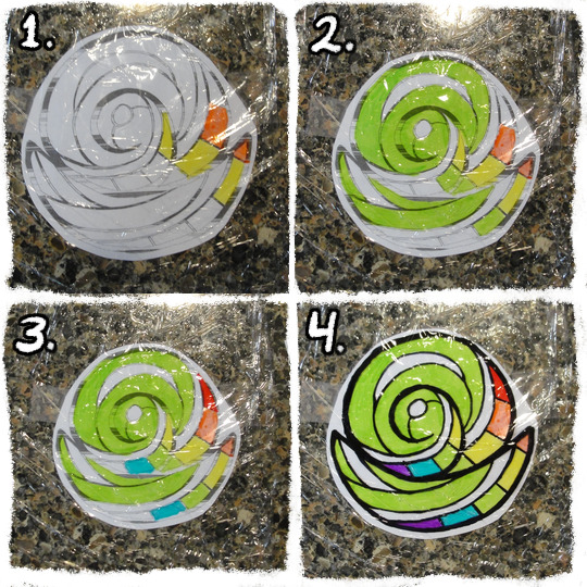
Step four:
At this point, the colors might look nice and vibrant against the white paper, but when you pick the plastic up and hold it up to the light, it will likely look washed-out and/or streaky.
To build up the colors more, fold another layer of cellophane and place it on top of the inked side of your current sheet. Then go over the colors and lines again, once again in order from lightest to darkest.
Keep adding layers until you're satisfied with the darkness of the colors. You can even get some interesting effects and shading by combining layers of different colors!

Step five:
When you're done, add one final layer of cellophane to the top to protect the inks. If you have a ruler or bone folder, I recommend using it now to smooth out the plastic and press the layers together as much as possible.
Then just trim around the edges and slap it on your window! :D
#legend of zelda#four swords#minish cap#tutorial#tutorials#craft project#craft projects#to pluralize or not? it seems I have done both in the past#pretty colors#my art#fanart
659 notes
·
View notes
Text
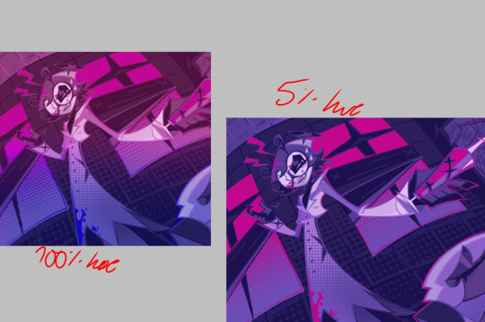
alright, here it is: ZENO'S COLOR GUIDE 3.0 !
here, i'll have three "chapters" regarding color:
CH1: how i color in illustrations
CH2: color and character design (in zeno's case)
CH3: how zeno makes his colors cooler
CH1: HOW I COLOR IN ILLUSTRATIONS
it must be noted that, as of lately, i heavily use halftones in my art and the way i use them for gradients effects my color choices. of course you don't need to use halftones if you don't want to, as it's just my personal choice, but anything regarding halftones here could (probably) also apply to regular gradients!
when choosing colors in an illustration, i usually have three things in mind: mood, character, and contrast. we'll be using "gloomy bunny naptime" as an example here.
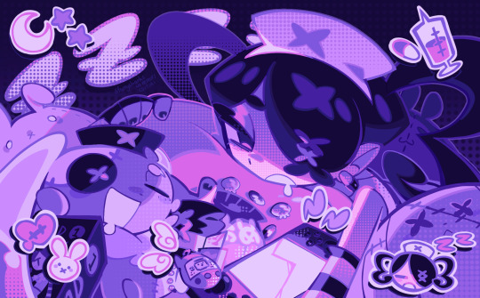
MOOD: what's the vibe of the piece? for example, here in "gloomy bunny naptime", wanted a mellow, sleepy vibe, so purples and pinks seemed like the best choice. these colors also have a dreamy effect due to being common in real-life early mornings/summer nights - basically, i tend to use associative colors in illustrations.
i usually only use a pallete of 3-7 colors, though of course more characters calls for more colors. for multi-character pieces, i would actually make a "rainbow" of colors based on the mood of the piece - essentially, a bank of colors to use for your colorful casts based on the actual rainbow. you can alter this based on the saturation levels you want! hope that makes sense. i'm not the best at this though, so i would heavily recommend looking for guides from artists who are more skilled in that department.
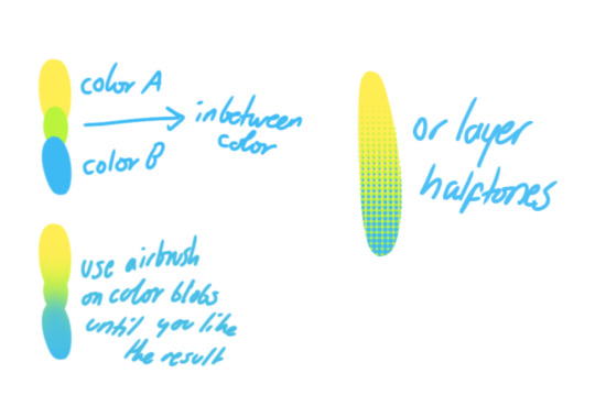
CHARACTER: velvet is the focus of the piece, and as a character her palette is made up of many purples and pinks. of course, it's easier because she and ribbon both have similar designs, but i would still recommend using colors based on/complementary to the focus character's pallete, though this is a rule that can and should be broken if needed. gradients can be used to provide a smooth transition from color-to-color and add depth to the piece, as well as showcase velvet's pallete. when making any gradient, you probably want to have a vibrant middle color. this is difficult to achieve in most art programs, so i'd do it like this:
you can use gradients in lots of cool ways to make stuff pop! (i think this collage shows i use too much purple and pink though.)

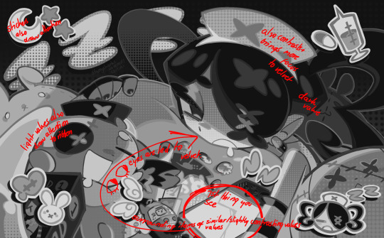
CONTRAST: the context of the piece also aids the color through contrast. (that's a lot of Cs!)- we see that velvet is just waking up, and the light from her switch is glowing brightly. i wanted to convey something like her switch suddenly turning on in the middle of the night, waking her up - so the console emits "light" in the form of illuminating the contrasting color of pink against the purples. it might seem specific to this piece, but what i'm trying to say is that contrasting colors can lead the eye to the focal point of the piece, that being velvet herself. because a great deal of the rest of the piece is dark, we look at the contrasting switch screen - the brightest thing in frame - and our eyes move around and up to take in the focal point character. at least that's how i wanted it to be ;w; i guess you could convey it as something like this?
CH2: COLOR AND CHARACTER DESIGN (IN ZENO'S CASE)
this is where i start to get annoying, so stand back! when deciding on colors for a cast of characters, there are many factors: time period, variety, personality, and more that i can't think of.
TIME PERIOD: this one is simple. for example, a futuristic time period (such as that in x-calibur) calls for colder colors, such as greens and blues. for characters involved in futuristic professions such as space exploration, this works incredibly well. for modern time periods, less focus can be on colors and more on the shapes of the clothes, but this is not a shapes tutorial! i don't have any ancient times oc stories, but i'd probably use earthy and warm tones.
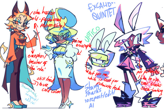
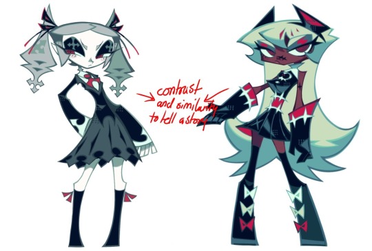
VARIETY: this is also rather simple. i try to be aware of the palletes that i used, and the similarities they might have with other characters. i try to use similar colors for characters who belong to certain organisations or have a uniform, but of course, it's not like catholic school students adhere their entire look to their uniform, so this is a rule that can be broken yet again. art is all about learning things and breaking them, remember that!!!
color can also be used for symbolism. my absolute fav example for this is vivica and octavia - the amount of red in their designs is supposed to represent the amount of freedom/passion/anger/confidence they have or are allowed to express under their different circumstances. as vivica belongs to a strict organisation, she has far less red in her design, showing her emotions are stifled - meanwhile octavia has it as her main complementary color because of her freedom to express her emotions, though those emotions may be destructive because of her circumstances.
PERSONALITY: what colors are associated with your character's personality? i actually usually refer to magical girl groups to see what's commonly associated with different colors. here's the main trend:
red: hot-headed, passionate, firey
orange/yellow: bright, happy-go-lucky, sunshine personality
green: wise, mellow, kind
blue: serene, graceful, elegant
purple: magical, regal, fancy
pink: usually the main character (though this because magical girl anime tends to be marketed towards young girls), sweet, relatable, determined
of course these are only stereotypes from one genre of anime, and different colors have tons of different meanings. color theory is the best way to learn this! these colors can also express different moods, which ties into ch1. i myself constantly ignore these rules - v-con, a bombastic hyper DJ, is purple (though he does have yellow accents) for example. basically, i just take them as a general rule and try to have them in mind while drawing.
CH3: HOW ZENO MAKES HIS COLORS COOLER
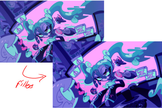
this might be the most important part of this guide. once again, there are a few things to consider here: filters, hue, overlays, and more!
FILTERS: for ibispaint, you can use an adjustment layer on your whole piece to use a filter. i usually only use brightness/contrast here - upping the brightness (or darkening it based on the mood of the piece) and upping the contrast. this helps to better express values and intensify the colors if that's what you want. i often use it in all my pieces to some extent.
hue/saturation/lightness is also helpful in moderation. you can alter the hue - though it usually only helps if you bring it back or forward by just a few points, or the entire pallete will change. saturation is what it sounds like, and slightly over/desaturating the piece can help with atmosphere. lightness is what it sounds like - lightens the colors in the piece. i don't use it at all.
posterize and sharpen mask are some that i've used recently. posterize can add some crazy effects to your art, but i'd probably need to edit it slightly after using it because it can mess with certain colors.
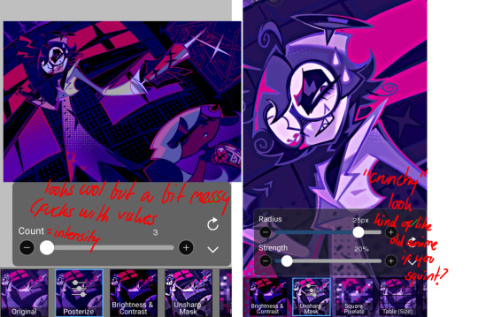
HUE: it's a layer type that can change the overall hue of the piece. i usually use it at a low percentage for atmosphere. kind of like a gradient map but nothing like it? idk
and OVERLAYS: i just use a very saturated blue/purple color over the entire piece at a very low percentage, around 5-10%. it can wash out the piece at too high a percentage.
and that's basically it! sorry it kind of derailed at the end i spent like 2 hours on this and got super tired. goodnight i'm going to sleep please also look at other artists etc etc. bye.
#zeno's art#long post#color tutorial#liar by korn is actually a really catchy song yea the lyrics are weird but its so good tbh#peak drums and bass and guitar and vocals and then the lyrics are hot booty. this is what nu metal's all about people#ask questions if you want#about nu metal or art i dont care
327 notes
·
View notes
Text
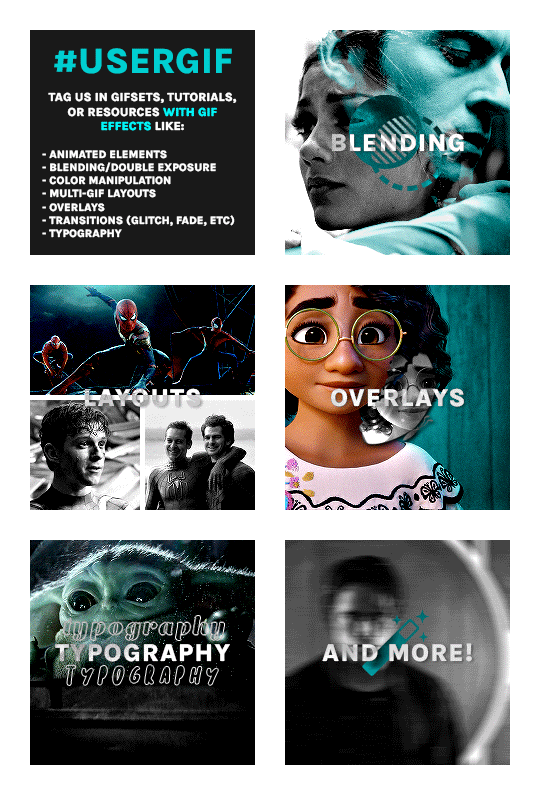
Hello! Just a friendly reminder that USERGIF is a blog for GIF EFFECTS only.
Q: WHAT CAN I TAG #USERGIF IN?
A: GIFSETS, TUTORIALS, & RESOURCES WITH EFFECTS LIKE:
Animated elements (moving text, zoom-in, etc.)
Blending/double exposure
Color manipulation (rainbow sets, color palette sets, etc.)
Filters (neural filters)
Multi-gif layouts
Overlays (textures, shapes, etc.)
Transitions (glitch, fade, linear wipe, motion blur, etc.)
Typography
And more effects!
We've noticed lots of users tagging us in gifsets without gif effects and, while we appreciate you as creators, we encourage you to tag other source blogs since we won't reblog those posts. Keeping our tracked tag effects-exclusive makes the queuing process simpler and less time-consuming for our queue managers. We hope you understand. Thanks!
212 notes
·
View notes
Text
Just like last time, my thoughts for Pokemon Legends are immediately subsumed by potential futures rather than the immediate present
This time it's because the title is "Z-A", confirming that the titles are not directly named after the associated Legendary while also giving the impression that unused titles like Z are being revisited. Since that won't be applicable to every generation, though, they may also draw from concepts, places, times, people, etc.
With that in mind
Gen 1: Legends Rainbow - the player is a Rocket Scientist (not a literal one, but one that works for a not-yet-totally-evil Team Rocket) working in the Pokemon Mansion and the project to clone Mew; the first major story beat after the tutorial is the discovery of a Mew sample, with the rest being further research and gathering materials needed for the cloning process/raising process for Mewtwo; named Rainbow in reference to being a part of the color generation and as a nod to Team Rocket's eventual evolution into Team Rainbow Rocket
Gen 2: Legends Brass - focuses on the Brass Tower and the events leading up to the creation of the Beast Trio; possibly the only game that doesn't somehow involve the player being part of a to-be villainous team; may introduce a new "Brass" or "Copper Legendary" to complement Ho-Oh and Lugia's Gold and Silver
Gen 3: Legends Meteor - the player chooses between being on the Magma or Aqua research team and investigates the ecological effects of a recently fallen meteor that, unbeknownst to anyone, carries Deoxys; may also be fun to call it "Legends Peridot," as generation 3 was the gem generation and peridot are found in meteors
Gen 5: Legends Grey - the player is a Plasma Knight under the Twin Heroes; halfway through the game, the Heroes have a falling out that splits the Original Dragon, and the player must choose who to side with (though they will likely end up seeing the other half of the story later cus the idea will be to understand both sides)
Gen 7: Legends Stars - the player begins as a resident of Ultra Megalopolis and member of the Ultra Recon Squad, with Poipole and two other Ultra Beasts as their possible starters, exploring Ultra Space. At the midpoint of the game, the player goes on a recon mission to Alola, where they capture a new "starter" to help blend in
Gen 8: Legends Darkness - leads up to the events of the Darkest Day; rather than being a part of an equivalent to Team Yell, the player is part of the group that one day becomes the Macro Cosmos conglomerate; could also be called "Legends Armor" or "Legends Arrow" or something to that effect if they want to complete the Hero Trio with a "Zayellow"
Gen 9: Legends Zero - covers the events of the Area Zero expedition with Heath and has the player being flung between the past and future, possibly getting branched evolutions for their starter based on which time period they evolve in
40 notes
·
View notes
Note
Random questions if you don't mind! <3
1- How you do these gradient colours in the title?
2- Where you do these headers for your hcs?
Thanks if you answer! You are very creative! :D
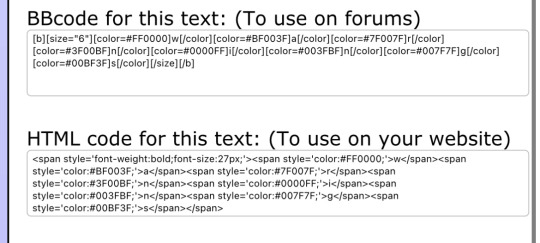
Heyy! thank you for the asks<3
1- the gradients is something very complicated to explain but ill try my best to just give a quick summary.
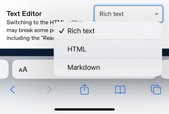
I first go and create my title without writing anything else, just the title, go to chrome and open the Tumblr website (make sure its in "PC version" if ur on mobile or else it wont work)
i edit the drabble and go to the settings, there are a "rich text" box, click on it and then click HTML.
ok, this is where it gets complicated
you will open another page called "text colorizer" write the title you want in the writing box.
there will be a box with "one color" click on it and there will be alot of options, click on the three or the other version you desire of the type of gradient.
there will be two codes when ur done picking the colors.
(tip: if you have a specific banner with specific colors, sometimes to make the title match the banners colors i go to color picker website and upload the image that i used on the banner)
ok, back to the code, you copy the last one.
i recommend you to go to text replacer and put ";" to replace with nothing, but its just a recomendation because it can bug :C
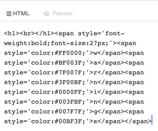
then you copy the replaced text go back to the Tumblr page, there will be a "<p> TEXT <p>" replace that with the code
and boom! ur done.
(it may appear a little "code not supported" but dont worry, it still works)
after that you can go back to the Tumblr app to add some details.
2- i do it on Alight Motion, i go to the custom size and put "1500 x 500" and then i put the images i want with some details! ✨ (i use the transparent background)
thats all and thank you for the compliment, i appreciate it<3
the websites i talked about:
if my explanation is too confusing about the gradient, theres a tutorial on YouTube! if your on mobile just do everything the person says in the "Pc version" option that chrome has.
xoxo<3
10 notes
·
View notes
Note
re: your mention of ai bullshit earlier, have you tried using glaze and does it work?
I haven't had a chance to use it just yet for my own work, but a friend of mine uses it and it works very well for them!
For now, it's enough to fuck with the pool of art used for training. Sure, they might try to figure something out to go around that, but hey, more time for them to waste!
I'd say give it a try, though. It does a really good job with coating your work and still keeps it looking very much like the original. Other suggestions I have would be to Almost Never upload full resolution art pieces + be as obnoxious as you want about watermarks. Blur your signature slightly on your artwork, give it a rainbow effect. There's plenty ideas out there, but those are what I've been using ^^
There's also this tutorial my friend had made a while back for how to make big watermarks for your pieces: link
Hope this helps!
13 notes
·
View notes
Text
youtube
Ice dyeing is a fun way to create colorful patterns on fiber using natural color. Freezing fresh or exhaust dyes into ice cubes welcomes a diffused watercolor palette. Adding a layer of dried dye flowers to the frozen mix will invite punches of vivid hues on top. The combination is a lovely way to create tie dye effects to your favorite textiles. Plus, with the help of some common household products, colors can be shifted to expand the rainbow of hues. This tutorial will show you how to ice dye with frozen exhaust dyes & dried flowers, shift color with pH modifiers as well as the resulting effect on cotton.
CHAPTERS
0:00 Intro - Ice dyeing with exhaust
1:22 Ice & natural color
2:37 Exhaust dyes
2:57 Making ice
3:38 Cotton fiber
4:20 Color modifiers
4:53 Studio set-up
5:34 Ice cube build
7:30 Midway thaw
8:27 Exhaust reveal
12:18 Dried flowers
13:42 Second ice build
15:41 Final thaw results
18:11 Ice dye comparison
19:58 Wrap up
20:48 Sneak peek of next tutorial
21:19 Blooper
SUPPLY LIST
Exhaust dyes - madder, sulfur cosmos, marigold, logwood & hollyhock
Dried dye matter - calendula, dyer's chamomile, yarrow, scabiosa/pincushion, hollyhock, madder root, logwood
Ice
Ice molds
Strainer
Pot
Modifiers - citric acid, washing soda & ferrous sulfate used in video
Mordant - alum acetate used in video
Textile of choice - cotton featured
#Margaret Byrd: Color Quest#solarpunk#how to#how to dye#natural dye#dye#ice dye#diy#do it yourself#exhaust dyes#dried flowers#cotton#cotton fiber#madder#sulfur cosmos#marigold#logwood#hollyhock#calendula#dyer's chamomile#yarrow#scabiosa#pincushion#madder root#citric acid#washing soda#ferrous sulfate#alum acetate#Youtube
6 notes
·
View notes
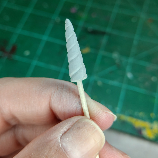
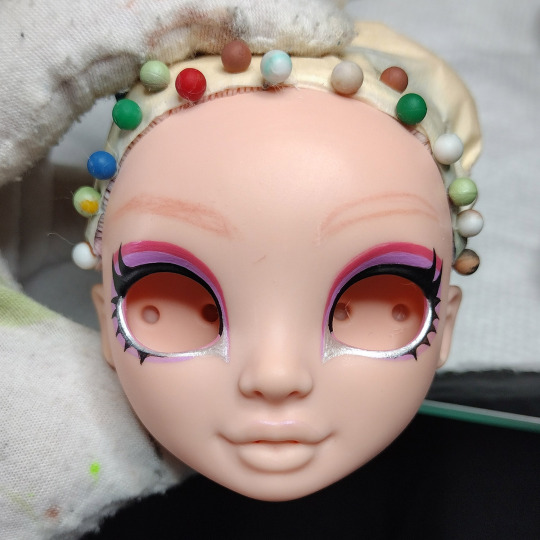
Text
WIP Unicorn Bella
Some WIPs of the recent unicorn Rainbow High commission. For full behind the scenes, you can visit my Patreon. /selfpromotion
Started off with a Pacific Coast Bella Parker. Funny how after awhile eyeless dolls are no longer off putting.

Time for unicorn horn making with Apoxie Sculpt:

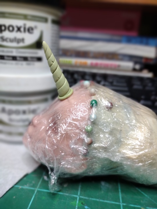

(featuring my own Bella as a model)
Commissioner felt it was too long so it was cut down a bit:
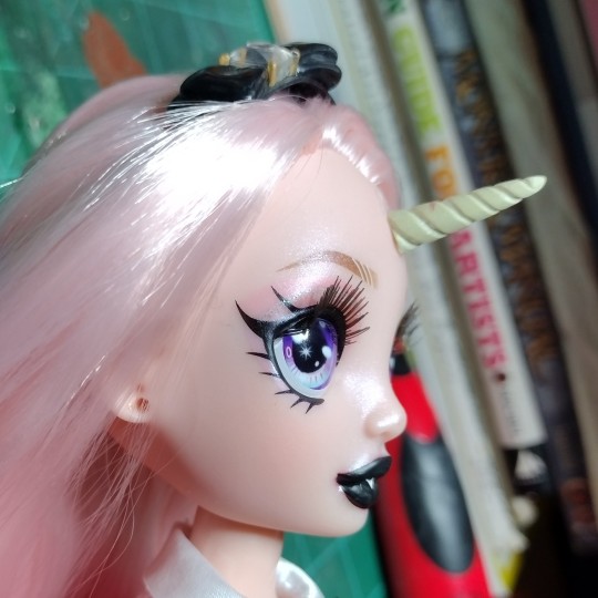
Starting the face up with watercolor pencils:
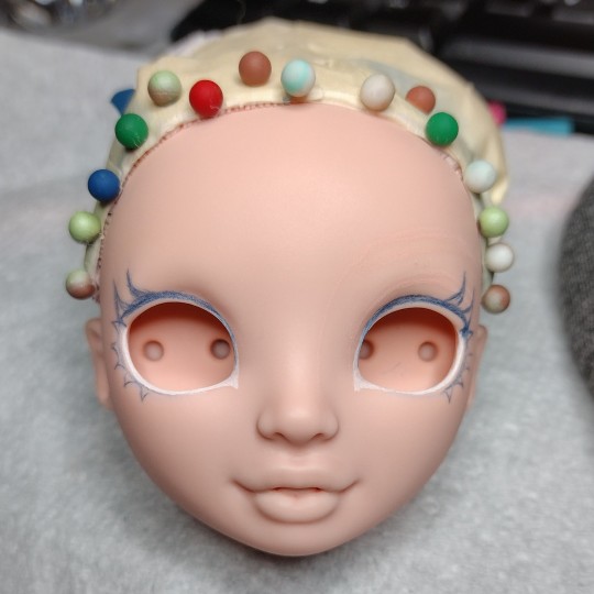

Began adding thinned acrylic paint and some light blushing:

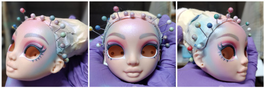
But it turned out I hated the eye makeup. Not so much the colors, but the order in which they were layered. So I decided to wipe it all off and start over.
But first, I wanted to test out reinserting the eyes and see how much damage that would cause:

Surprisingly, not that much! Felt better about the durability of the paint.
I also decided to smooth and round out the eyes a bit in hopes it would facilitate reinsertion next time:

Yeah?
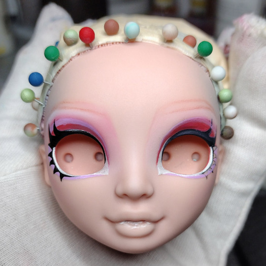
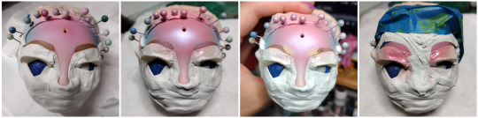
Anyway, back to the faceup:
I planned (and tried) just using soft/ chalk pastels for the gradient effect, but it was going to take forever and use up too many precious MSC layers which would probably end up in cracking around the eyes. So airbrush times:

Not bad so far.
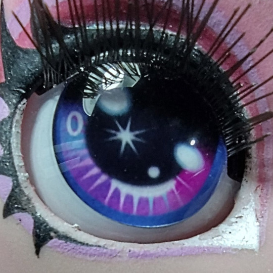
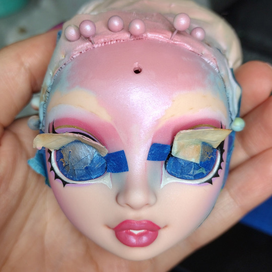
At this point, the eye makeup was pretty much finished so I decided to reninsert the eyes at this time and mask them:

The problem isn't so much the eyes themselves, but the eyelashes which get in the way.
Pique photography skillz:

And then I thought, "Huh, I sure am close to finishing this doll up. But you know what I should do? I should try to do a simple soft gradient to her inner eyebrows!":
"Oh, that's not working. The airbrush isn't enough. I'll lightly sand and buff the inner brows first."

"I can fix this."

"I swear I can fix this."


Anyway, lots of tears and screaming were involved.
But then, I had a little mishap with some rubbing alcohol right at the end and some of the paint around the horn bubbled up a bit. Can't be seen too well in photos but could definitely be seen and felt in person:

More tears and screaming and flipping of tables.

At this point I was using the absolute last drops of custom mixed paint. Could absolutely not afford anymore mistakes.
And thankfully there weren't!
Finished it off with a light dusting of glitter:

And that's how you repaint a Rainbow High doll.* 🙃
------
*not an actual tutorial
144 notes
·
View notes
Note
There's so much happening on screen all at once it overwhelms me ༎ຶ‿༎ຶ and I might give it another try and see if it bothers me less
Also I I don't understand all the different types of notes, I think?
Ooooww yeah, this game isn't exactly beginner friendly. I see how it could be overwhelming to someone new to rythm games. There are no Easy mode songs, and the music in general doesn't have a very clear beat. Maybe this will help a little.
To make the screen a little easier to process:
- Turn off all the card effects in graphics.
- Go here
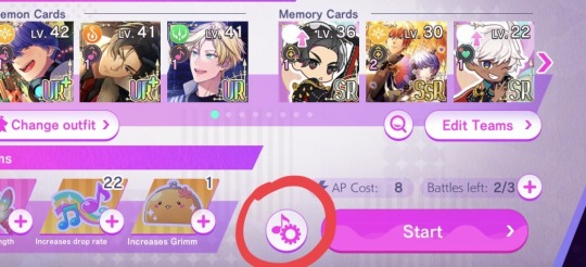
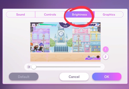
- Adjust the brightness of the background by sliding it all the way to the right.
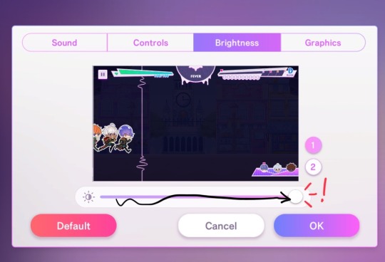
(Hit "OK" so the change stays)
I won't go over the quality of taps, or card colours or abilities, this will complicate things, and they are pretty straightforward, you can ignore them for the time being.
Now, the "types of notes".
As far as I've seen, I think there are only 2, if I understand you correctly. First of all it will make things a lot easier if you ignore the little objects in place of each note (the donnuts/bottles/balloons/gifts/sharks/rainbow karasu/etc.) They 100% do not matter, so don't worry about them, they are just like that to contribute to the visual clutter really. You will barely look at them enough to know what they are. I'll cover them with circles here for clarity.
I do not know how you chose to map your controls so, instead of left and right or up and down, let's call them A and B (and you will read according to your own settings).
Normal Taps:

As it says, just normal taps that will line up with the vertical line there in rythm with the beat. Sometimes the notes will show up from other sources than just the right side of the screen. Don't freak out and just watch them, they will take their place as A or B pretty quickly.
Double tap:

Tap both A and B at the same time.
Double Press:

Tap both A and B at the same time and keep them pressed until the notes end.
Press and Tap:

Tap one and keep it pressed, tap the other if/when signaled to.
Dodge:

The outlier. Tap A to avoid the Danger Slime. (jump over it, be mindful that just because the demons will hover in the air for a bit, doesn't mean they'll hit A notes close after the dodge, you will need to tap to hit them)
Boss notes:

When the boss is a Little D, their notes will move through the screen much like everything else, you will just have a little less time to see them on the screen.

When the boss is another character, like Lucifer in this example, he may throw some notes that move seemingly erraticaly through the screen, if you aren't used to rythm games, this might be scary. But don't worry, they will need to be hit in a pattern you've done before, trust the rythm and patterns you've been following so far. The first couple times could be troublesome, but with a bit of practice it'll be easy to tell when the notes are A or B at the time to tap them.
(if you don't want to play the tutorial stage, Belphegor's song "Dreamscape" in Normal mode is pretty beginner friendly, no trick notes or anything, pretty consistent beat)
I've hit the image limit now but I think that should be all. I hope this was at least a little bit helpful.
29 notes
·
View notes
Text
The first part of my fursuit project collab with @keeyasnowtail is done and I've got a very fluffy rainbow tail!
It's a "super-motion" design based on tutorials by Neffertity and Adamoshi, with a base made of upholstery foam, the fur is BigZ Ecoshag, and it has a built-in LED strip for an extra rainbow effect at night. 🌈
7 notes
·
View notes
Note
do you have any editing tuts/tips? i love your style so much but as a photoshop beginner i’m kind of lost as to how you get such beautiful results. especially with the rainbow-y light-leak effects you do? do you hand draw all the highlights? love your blog 💙
heyy so i have an edit tutorial tag here and you can totally request a specific tutorial if its not already there BUT it is helpful for me if u send me a picture of what exactly ur referring to. so im not sure what the rainbowy light leak effects r exactly but come back with a pic of what ur talking about and ill hook u up. aa for highlights yea for skin and stuff i just draw them myself 🥰
4 notes
·
View notes
Note
Hi San. First of, I so much love the layouts, banners and aesthetic of all your fics. You put good effort into them and it shows 🫶🩵.
Can you tell me how you add gradient of colors into the title like this one? 🫢 am sorry if I come across as dumb 😭

it’s kinda a tedious process but I’m not a gatekeeper so I’ll give a quick tutorial
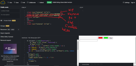
first I use this website to get the colors I want:
it gives option to upload pic so usually I upload my banner and pick colors off there
you’ll copy and paste the HEX

this is the actual we site for the gradient text that I use:
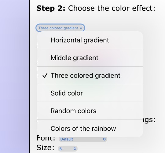
in step 1, you’ll put in the text and in step 2 you’ll click which sort of gradient you want:
and you’re gonna need to copy and paste everything in the HTML box
sorry y’all this is where it gets complicated
so you’re going to go to tumblr desktop and create a post [or add to what you have but I don’t recommend doing it like this till you’re comfy]
you’re going to click on the settings bar

then text editor swift it from RICH TEXT to HTML
then you’ll copy and paste the HTML color link into the draft
and save draft and then:

BOOM
10 notes
·
View notes
Note
YOU ARE SO UNDERRATED GRRR--I love your art so much! By the way, I noticed you add a couple other colors to the base color of any given object usually, creating a kinda rainbow-y look--I was wondering, how do you do that? :0
AHH TYSMMM!!! I really appreciate it!!
I really suck at explaining things(like I am realllyyyy bad so I am so sorry in advance)
Disclaimer: This is not a real tutorial lol + I am not a professional at all and I am just playing with colors/experimenting so it may not make sense. Nevertheless I am open to sharing my method :)
I doodled Stormbringer Chuuya and wanted to use him as reference because I like coloring orange hehe (and drawing Chuuya in general)

I laid out the base colors. I also added a bit of shade to the rest of the picture so this wasn’t solely base colors minus hair rendering lol


Okay, so this is very hard to explain but I will try. I take a few colors but the main concept is to softly blend the colors into the base. To clarify somewhat(or at least try to clarify), I take another color that differs from the base color and softly “paint” onto the base without pressing down too hard.
Softly paint: Low pen pressure
Hard paint: High(?) pen pressure
(I hope that makes sense ahh)

(first thing should say is: “the colors on the outside are blues I used” not “the colors one the outside are blues I used” sorry for typo)
When you do all that soft blending into base stuff, you get something to that effect. I blend the blues into the orange softly. Sometimes I do press down harder for more color.(this sounds so confusing omg)
Just to note: I will take other colors, and also blend them into the shades. For example, I will blend the blues into the pink shades

Bonus!! I slightly rendered this! I’m working on something else so when I finish that I will finish this at a later timeee
I apply this same process for the rest of the picture!!
Also one more note: I don’t really think the brush matters as long as you are using a brush at low capacity, but it would be easier if you are using a tool that is geared towards blending/painting + has pen pressure sensitivity features.
I hope this somewhat makes sense!! :( I kept thinking if I should’ve just recorded a short video process but then that would be equally confusing or potentially harder to explain haha
I need to draw SB art I miss it so much.
3 notes
·
View notes
Note
Gradient tutorial love ?
i got you! so you want your font to look like this
to look like this!
(btw this is how i do it; if u dont like it sorry it worked for me :)
also i do alllll this on computer or laptop but never mobile i dont think u can but i show u on computer
alright so first step is i type out everything first. put it in big, small, italics, whatever you want. but i first type it out.
then once i type it out i copy what text i want from what i typed. so for this example we are going to be using marry had a little lamb. so i copy that and i use two websites. to find my code for color i use this website.
(you dont nesscarily need to use this website it just helps me find the correct code of color i want.)
so we are going to be doing pink and green for this example.

see so i just use the step 3 part to find my colors and u can use and do any color and mix match whatever u want go crazy.
then when you have ur codes you see there in this case its pink=FF69E1 and the green =00FF2A. so now we go to another website.
this website is going to actually give you the link/code to put for ur tumblr. so we wanna take the codes we made of our colors and put them where it says first and last in the code. (remeber for the codes to work that hashtag must stay there)
so you put your codes in and then you click in the top left corner the button that says run.

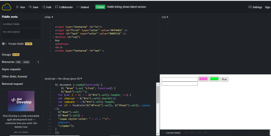
on the mid bottom right side there u see our two colors. the pink and green, what we want. now you put your text in the top box there next to the colors.
once you put your text, you click the button run next to the colors there and on the bottom box under your text you will get a link code.
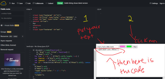
now you want to copy that code link and go to your tumblr post. when you go to your draft or post go to the top right corner of your draft to a settings symbol.

once you click the box that says rich text its gonna say HTML click that and its gonna look really confusing i know. but if you look close enough you will see your text in there.
so you want to put that code link we copied and you're gonna post it behind your text.
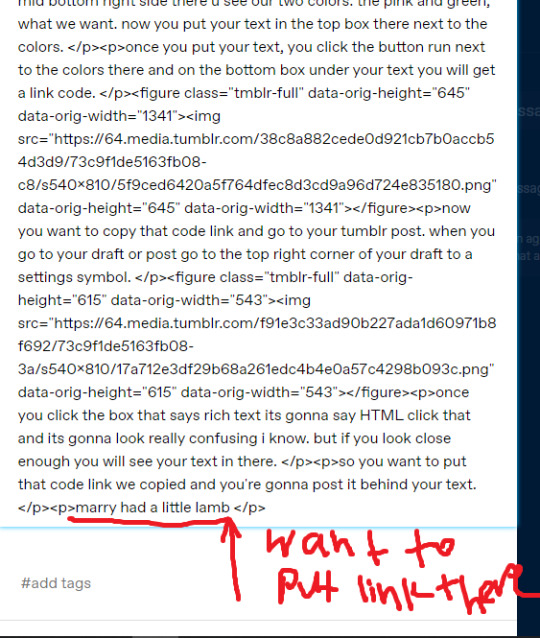
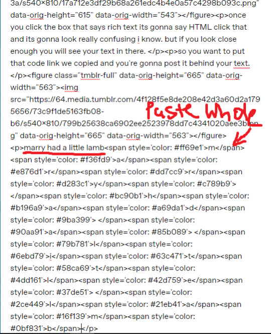
once you do that you want to erase the marry had a little lamb in this case or your text and just leave it to look like <p><span.....and your whole link. once you do that check it thru changing your post from HTML to rich text again.
and it should look a little something like this
marry had a little lamb
now for small text or any text its the same thing so small marry had a little lamb you will do the same thing except leave the word small because thats what makes the text small.
marry had a little lamb
i hope this helped you nonnie and if you ever need help more w this or anything else pls dont hesitate to ask me thru inbox or dm personally i will gladly help! i hope this helps and i know ur blog will look amazing!
#angels asks.#bby anon🐰.#gradient text tutorial#gradient text#tutorial#tumblr tutorial#writing tutorial#blog theme#blog tutorial
145 notes
·
View notes
Note
How did you make a beautiful rainbow effect that you did in your header and icon?
Hii, so I made a little tutorial, I think that way I can explain it better

After choosing your header size (I use 640 x 360)
First step: I choose two colors pink and blue, since mixing these two will give purple in the center, go to 'gradiant tool'(circled in green (2)) and choose a direction I usually do it horizontally.

Second step: create a new layer (circled in red (3) ) then choose the yellow color (it's the same button where we had chosen the pink and purple color) go to 'gradient tool' again and select 'grandient editor' select the second option (circled in red in the image below)

Then just place the yellow gradient over the blue, which will give the green and yellow colors together.
It's not the best tutorial, but it's the best I could explain, if you have any questions just send them and I'll try to explain in more detail 🖤
9 notes
·
View notes
Last Seen Blogs
diabolicallittledemi
demi

celebloving
Untitled

dragon61085
Untitled
underkomori
˚✧₊⁎❝᷀ົཽ≀ˍ̮ ❝᷀ົཽ⁎⁺˳✧༚

lone-wolf-97-blog
A State of Flux