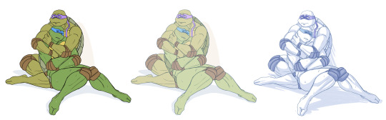
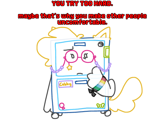
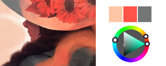
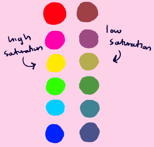
#the very limited color palette was so fun to work with too
Text

A Gabe from the Ultrakill whiteboard :>
cleaned up and added a border to the thingy that took me almost a whole day to draw on the whiteboard >:]
#ultrakill#gabriel ultrakill#but the comments everyone left around this thing made my day ;w; <3#I love working with 5 or 6 colors so I was in my element >:]#I know some proportions are a lil whacky but there's not much I could do :cry:#I friggin love how this turned out tho#I am SO gonna draw more stuff in this style- this time on csp tho lmfao#the very limited color palette was so fun to work with too#limited color palette#digital art#my art#the eraser is hell to work with#akans art
1K notes
·
View notes
Text
✨ Big Comic Recommendation List! ✨
I’ve been wanting to compile some of my favorite comics into one big list in no particular order for a while. Again, I just want to reiterate that I’m in no way any sort of comic critic and all of these are just books that I personally enjoy, and if they seem up your alley I hope you’ll enjoy them too!
I also want to state that these are definitely more adult oriented books and not for kids. A lot of these stories have pretty graphic violence and tackle more adult topics like sexual or physical assault, so I’ll also be putting content warnings for where it applies.
1. Afternoon at McBurger’s by Ana Galvañ
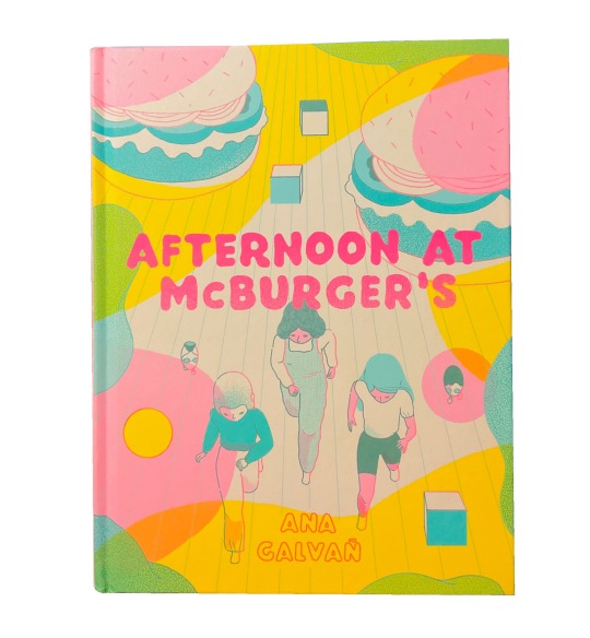
Afternoon at McBurger’s takes place in a bright, colorful future where a group of young girls finally have the opportunity to participate in the Once Party provided by McBurger’s, a fast food restaurant. The Once Party offers a fantastical opportunity for anyone who turns eleven years old: the chance to visit themselves in the future!
The limited color palette of pink, teal, and yellow make for a very nice aesthetic that lends itself to the strange, futuristic world you get just a glimpse into. For such a short story there is a lot to keep track of that makes rereading fun and I felt like I discovered something new every time I went through it again.
CW: physical abuse
2. No One Else by R. Kikuo Johnson
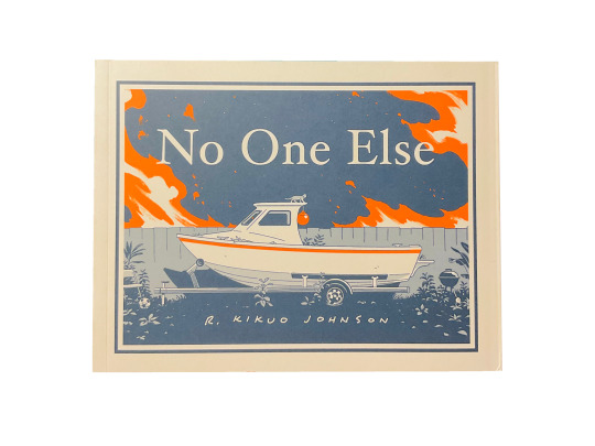
Another short one but is definitely one of the more impactful. No One Else is about a woman (a nurse and full time caretaker for her elderly father) and her brother (a musician who has a much more strained relationship with their father) trying to process the sudden, accidental death of their father while also looking after her son. A very honest, holds-no-punches look at family, abuse, and neglect as each character struggles to cope with this sudden situation they find themselves in.
The artwork is beautifully done and the use of blues with a splash of orange makes for a great visual impact. I’m a big fan of character driven stories, and this book provides an interesting and messy glimpse into these characters lives. Very down to earth, very honest, and nicely tied together.
CW: physical abuse
3. Birds of Maine by Michael DeForge

A fun and meandering story about a society of birds that migrated to the moon to form their own world, away from human involvement. Birds of Maine follows both a group of young birds trying to find their place in this giant, complex world as well as gives glimpses of the many different facets of bird society and how they function.
This comic gives a very funny, matter-of-fact look into the absurd world of birds! It’s overall a great read if you like world building, and it’s presented with beautiful line work, bright pops of color, and abstract shapes that make up the bustling world and characters. The story overall feels like a stroll: it generally follows along a specific story with certain characters, but isn’t afraid to wander off to other points of interest.
4. Coyote Doggirl by Lisa Hanawalt
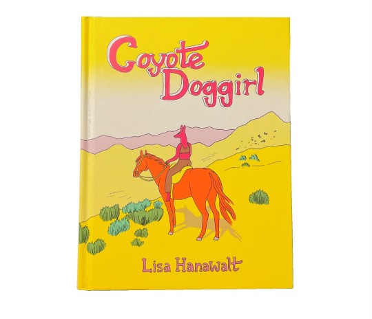
Set in the wild west, Coyote Doggirl follows said character as she tries to escape a group of bandits after she kills their leader’s brother. Along the way she meets new allies and has to decide to confront the past she is trying desperately to get away from or keep on running. It’s a funny yet honest book set in the beauty of the desert.
The story and characters in Coyote Doggirl are both hilarious and crude, which makes the more serious and genuine moments even more impactful. The loose style of the watercolors throughout this comic perfectly match the beautiful colors of the desert landscape. This comic also has probably one of my favorite endings (which I’m not going to spoil here).
CW: nudity, sexual assault, graphic violence
5. Eight-Lane Runaways by Henry McCausland
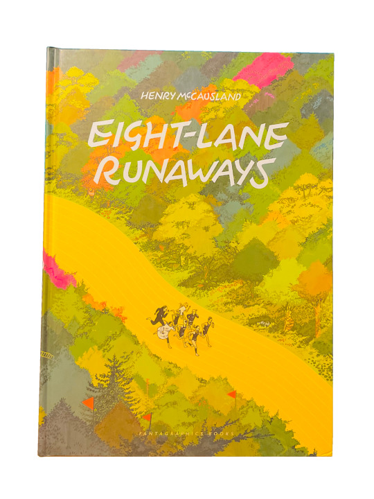
Eight-Lane Runaways follows a group of runners participating in a marathon through a fantastical and lively world. Each have their own motivations and desires for entering the race, and we get to see how each resolves as the race goes on.
The quirky and oddball characters and their ever-changing, winding landscape go perfectly hand-in-hand. It’s always amusing when clearly bizarre fantasy worlds, characters, and events are treated very plainly within the story. The characters are simple but fun to follow along with, from a character who is a frog, to a character who follows the instructions of a magical coat, to a character simply looking for two missing cats. Along with the beautifully done artwork and sprawling pages of landscapes, it feels as though you are only getting the smallest look into this big, wild world you want to learn more about.
6. The Book Tour by Andi Watson
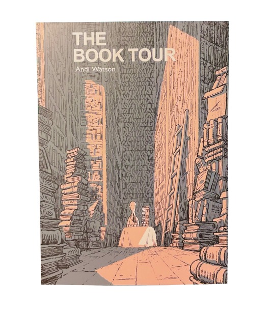
The Book Tour follows a rather unlucky new author as, not only is his debut book not selling well, but a string of murders is following his exact tour route, leaving all signs pointing at him as the culprit.
It’s a very dry but still incredibly entertaining and suspenseful story. It’s hilarious, quaint, and baffling to watch the poor man get hit with bad luck after bad luck, only for him to be very proper, if not completely lost, about the whole ordeal. There are also many moving parts and details going on in the background that make for a great murder mystery story, definitely deserving of a reread to connect all the pieces that might have been missed on the first read through (I know I definitely did).
7. Heaven No Hell by Michael DeForge
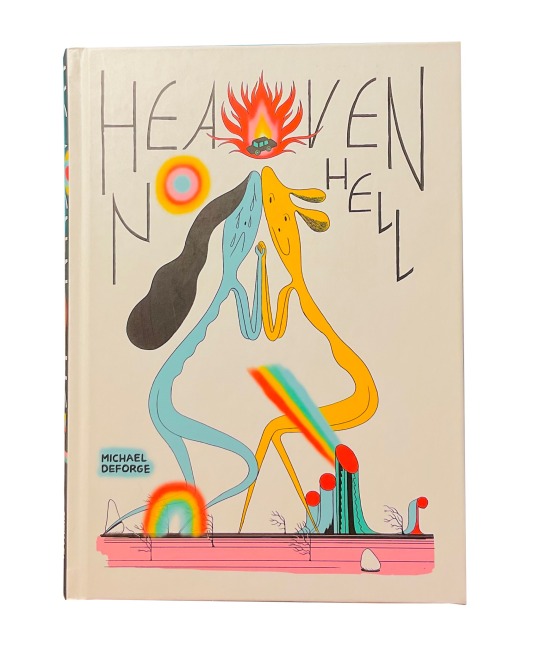
A collection of 17 amazing short stories looking at a variety of characters and concepts. Everything from a woman pretending to be a surgeon, a karaoke party, a family killed in a car crash, and the creation of a hypothetical child.
My favorite stories of the bunch are “One Of My Students Is A Murderer… But Which?”, “Surprise Party”, “Album”, “Road Trip”, and “Soap Opera.” All of the stories in this comic are perfectly bite-sized looks into a variety of interesting visuals and concepts that keep you engaged from segment to segment.
CW: mild nudity
8. Flavor Girls by Loïc Locatelli-Kournwsky and Angel De Santiago

In Flavor Girls, a mysterious alien ship appears in Earth’s orbit, and its passengers cause death and destruction for life on earth. Luckily, a group of women dubbed “Flavor Girls” by their fans are gifted magical, fruit themed powers that aid them in fighting off the alien army. The newest, unexpected member of the group, however, is having trouble catching up.
By far one of the most visually stunning comics I have ever read. Very, very reminiscent of Sailor Moon in its characters, aesthetic, and story. This comic has some of my favorite character designs, the alien designs in particular are extremely fun to look at. Unlike the other comics on this list, it is not a complete story but at least it gives you something to look forward to!
CW: mild graphic violence
9. Beautiful Darkness by Fabien Vehlmann and Kerascoët
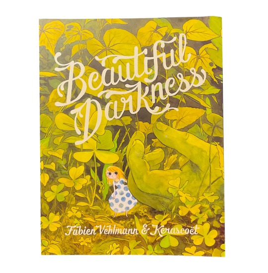
Last but absolutely not least, Beautiful Darkness is a surprisingly horrifying and violent story about cute and fun looking fairy-like characters trying to survive out in the woods. The less you know going in to this comic, the better.
The incredible beauty and meticulous detail of the environment in this comic lends itself well as a stark contrast to the horrific deaths littered throughout this story. It is bizarre watching how unfeeling and unbothered these cutesy fairytale creatures are with their friends dropping around them like flies, but it’s impossible to look away. Seeing how all of it shapes and warps the genuinely kind main character, Aurora, and the darker implications going on in the background make this a must read. By far one of the best openings to any comic I have ever read.
CW: gore, body horror
(That’s all I have for now! Hope to recommend more in the future ✌️)
#text#long post#excuse any typos I have been staring at this for too long#comic recommendations#book recommendations#beautiful darkness#flavor girls#Heaven no hell#birds of Maine#the book tour#eight lane runaways#coyote doggirl#afternoon at mcburgers#no one else
729 notes
·
View notes
Note
Well I really love your art, may I ask how do u color? I struggle with coloring turtles and I wasn't to know how do u do that?
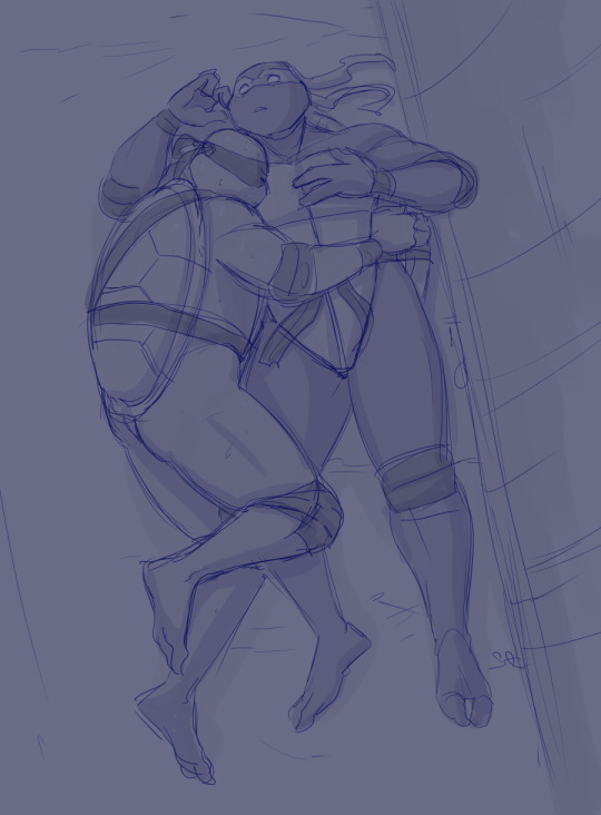
Hi anon! That's a very broad question, so you've given me a great excuse to ramble anything I want about my coloring, eehehehee~!
This will be in two parts and I'll start with talking about my simpler coloring style.
As in, when I color characters on a white background, with a limited or light palette.
The driving force behind this style is me being lazy. My time, energy, and attention span are pretty limited, so if I want to finish anything, I gotta do it fast. And with fanart, I'm usually just doing it for fun and relaxation, so there's no need to push myself to polish it too much.
Despite that, I rarely post just black and white sketches or line arts. I always try to add at least a little bit of toning or shading, because that makes the image easier to read. The characters and their shapes pop out and catch the eye of the viewer better.
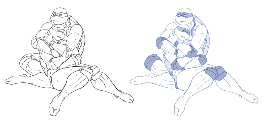
However, in this particular example, just the couple toning colors don't quite do the job. The way Don and Leo are entangled makes the center area of this illustration very busy and hard to read.
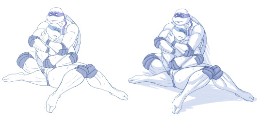
As a comparison; this pic has only one tone + mask colors, and it works. This is because all the characters are standing separately and their poses are very stationary and simple.
So for the Don + Leo pic, adding some shadows helps in bringing out shapes and depths. Also in general, if you don't feel like drawing BGs, it's good to at least add a shadow below the characters. It grounds them and makes them feel like they exist within a space.
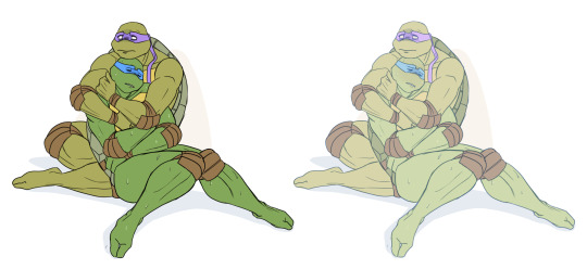
Sometimes if the posing looks too complex and busy, it might just be best to color in the characters fully.
However, even if I do full flat colors, I tend to use a lighter palette. Putting characters in their neutral/default color on a white BG can look a bit jarring as if they're floating in a void. It feels less immersive and like the picture is unfinished.
Using lighter colors makes the image more cohesive, and fits the characters into the white environment a bit more naturally.
If I'm too lazy to draw a BG, I prefer using stylized and limited colors. It feels deliberate and that the whiteness is just part of the palette, whereas the character-accurate colors on white don't match as well, even if they're more pastel.
That being said, there's nothing wrong with just slapping the flat-colored characters on a white background. As you know, I do it too. I'm just exposing my 'fancy coloring style' for what it is; me being lazy, hah!
Limited and monochromatic palettes are a nice shortcut even when you do actual backgrounds. It's faster and you don't have to worry about clashing colors. And you can still convey atmosphere and mood.
Also, on the topic of conserving your time and efforts; I think it's very common among younger/less experienced artists to think that the amount of time you spend on your art piece = how good and well received that piece will be.
Which has some merit to it of course, but it can lead to putting too much effort into areas where it's not necessary. E.g. filling the piece with tons of details and clutter that don't serve an actual purpose, but rather make the image hard to read. Or doing really complicated shading for a meme/comic, where simplicity would deliver the joke better.
So whenever I'm drawing something I intend to publish, whether it's a quick doodle or a more polished piece, I try to follow these two principles:
Make it easily readable and do the bare minimum that needs to be done to convey what I want to convey.
Putting time into practice is important, but if you draw for work, it's also crucial that you know how to prioritize and use your time efficiently!
Anyway, thanks for reading! In the next part I'll go into how I do my fully colored pieces, so stay tuned for that!
143 notes
·
View notes
Note
Hiii I want to know something about the mcyt su au! The way you assign gems to each person, does their personality influence the choice?? Or are you just going for the visual vibes of he gemstone? How do you choose
honestly it depends! some designs like bdubs was definitely more based on visuals, nephrites are green and have that one big eye so i was like, omg, that's very bdubs so i went with that for his gem.
others i feel are more personality-based, like scar as a spinel. or role-wise with mumbo as a peridot. it honestly depends on what grabs me more.
but the most important thing for me though is that for base designs (non-fusions) i try as much as i can to stick to ONLY canon designs/gems we've seen in the show, this is so i can pretty much directly pull color palettes from those characters and keep it as loyal-looking to the show as possible. it makes them more recognizable as SU designs in my mind, i did this with both gemcyt and gemstuck with only a couple exceptions (nepeta as a cat's eye, docm as bloodstone, etc.) i think a part of the fun challenge is trying to conform with these baseline designs while also trying to make the character recognizable. it's why some troll gemstuck designs have horns, and others don't. it depends on if i feel it was vital for their design aspects as most gems (unless corrupted) don't have horns.
with fusions i'm a lot more free-form with it, but for base designs i like to have at least 1 solid reference to compare the design to so i can try to match the show as close as possible. obviously this means i'm limited on what gems i can make people, and sometimes that puts me in a tricky spot because i also dislike doing too many repeats of the same gem, exceptions in both gemstuck/gemcyt being that i have multiple pearls (kanaya/eridan/jane in gemstuck, joel/pearl in gemcyt)
because let's be honest if we did this only on gem societal roles, the majority of the hermits would be either peridots as redstoners or bismuths/lapis lazulis as builders
so as far as choosing gems, that's sorta my mindset going into it! it's a mix of things but there's restrictions i give myself and i try to work within those when i can! :D
#so for example for gemcyt i havent made any designs with jades yet#so if i designed someone in the future#there's a good chance whoever it'd be i'd find a way to make them a jade#gemcyt#chris talks#hope this makes sense!
199 notes
·
View notes
Note
hey! i was just curious if i could use your art in an artist study? i looked over your faq and i didn't see any mention of it so i just wanted to ask. it's okay if the answer is now, no pressure :)
( ꈍᴗꈍ) sure, if you credit me! i would be incredibly flattered!!
now that being said, i would also like to share with you some artists whose work i've enjoyed doing studies of! i find it's very useful to "follow the money" with artists you like, and go along the chain of inspiration to see how ideas and styles can change from person to person.
vincent van gogh is my BIGGEST inspiration in terms of color and composition! his unique style of brush work is what he's best known for, but i recommend looking at his works holistically too, and seeing where the eye is led and how he plays with light, color, and mood. if you want to go further, he was very inspired not only by prior impressionists, but also by japanese ukiyo-e artwork— try comparing "starry night" to "great wave off kanagawa" and seeing the similarities in the grand, sweeping movements they convey.
i'm sure i've said this a million times, but genndy tartakovsky has probably my favorite cartoonist style. it's at its peak in samurai jack— opinions are mixed about the narrative quality of season 5, but if nothing else, the art direction is absolutely jawdropping. one of my favorite scenes is the bit in the tomb, where jack is hiding in a sarcophagus, because the music and visuals are paying homage to a scene at the climax of "the good the bad and the ugly"!
in a totally different direction from those two... i'm a huge fan of gil elvgren's pinup girls! i've had a few different pinup calendars over the years, and at the end of the year, i like to cut up the pages individually for mini posters— i've covered pretty much all my available wall space in his illustrations. i love it when artists don't feel the need to sacrifice expressiveness for realism; his girls are SO DARN CUTE and they all look like they're having so much whimsical, cartoonish, flirty fun!
here's a post where i talk about more inspirations!
here's a post listing some other tumblr artists i like!
i'm also just very heavily inspired by 50s-60s print illustration... things like advertisements, "clip art" (which you had to physically clip out of a book and paste onto the page), and of course, tv cartoons. one big trend i love with that "googie" art style is how incredibly limited the palettes were, and how efficient the economy of line was. as much as i love the bold, blocky, dynamic shapes of styles like tartakovsky, who takes insp
also, please remember i'm entirely self taught and am NOT an expert, so just be aware of that if you see any weird stylistic choices in my work... i admire the work of a lot of professionally trained artists, but that doesn't mean i have any training or real right to go around teaching people stuff. i'm just some guy from a big crazy family full of artists, only some of whom went to school for it.
okay, that got way longer than i meant it to, SORRY! here's a pic of my cat Carmen as a thanks for reading this far ^_^
31 notes
·
View notes
Note
if you’re reviewing neopets, could you review my favorite color, 8bit?
8-bit gets a lot of slack from some people, on the grounds that none of the 8-bit pets are technically 8-bit. I'm not a pixel artist so I don't feel qualified to talk about the specifics, but basically 8-bit sprites have specific size and color limitations that none of the 8-bit Neopet designs do. Some pets also have other issues, like having half-pixels or uneven pixel sizes, which shouldn't happen for obvious reasons (see: the Kacheek's face below).
Personally, I don't think this is a problem, seeing as it's just a color and most of the issues with it aren't noticeable to non-pixel artists—but I do think the color should have been named "pixel" instead of 8-bit, which would've at least been more accurate.
Another issue with 8-bit pets tends to be inconsistency. Some are forward-facing. Some are in profile. Some don't wear clothes. Some wear clothes but just a t-shirt and pants. Some have clothes but it's an entire fantasy outfit. Some have shading. Some don't. Some have detailed pixel work. Some have very simple pixel work. You get the point. Every color is going to be variable depending on what artist worked on it, but usually there's more of an attempt to have some consistency with the style.
Overall, though, I do like it as a color. It's fun, it's interesting, and it's very unique compared to literally any other pet colour.
Favorite Species:

Uni: I hear a lot of people say that the 8-bit Uni is awful, but I don't care. I love it and its stupid little grin and stupid little pose. It's by no means the best looking 8-bit pet, but it's by far the most charming in my book. My only nitpick is that the perfectly square butt is a bit strange compared to the rest of the body.

Cybunny: While once again not the most technically impressive 8-bit pet, i do really like this one. It's super cute, and while it's obviously not accurate to real 8-bit sprites I do feel like it gives off a really nice retro vibe. All of the pixel sizes seem to be pretty correct as well, and the colors are nice. No clothes, but then again, do you really need them?

Tonu: When I say there are more impressive 8-bit pets out there, this is what I'm referring to. The recently released 8-bit Tonu has an incredible amount of detail in its sprite work, including multiple layers of shading and very small, detailed pixels. It's completely different compared to the Uni and Cybunny above, and while not as charming or half as retro, it is quite beautiful.
The other thing that's really nice about the 8-bit Tonu is that it has a very pretty rainbow palette, with a completely different horn and tail than the species usually sports. I honestly have no clue why, but it's very unique and keeps it from being too "Neopet but slightly pixelated"-ish. As a bonus, the rainbow parts are removable if you really don't vibe with them.

BONUS: hehe clown :)
Least Favorite Species:

Korbat: Why is the shading so weirdly detailed on the face but not on the feet or tail. Why does the dress not match the palette of anything else in the design. Why the colored outlines. Why does it look like Piglet from Winnie the Pooh. These questions and more will not be answered.
25 notes
·
View notes
Text
since I posted smth silly abt people liking cabby but being too lazy/lh to draw her
I felt the need to contribute to that


Man when fucking springy said this I was so freaking angry
YOU UNFUNNY PIECE OF—
anyways uhh take my shitty ass art (I was too much of a coward to color it in since it would take me years to finish this)
I’ll just hope I get to color it in soon :p
oh yeah since inanimate insanity keeps making fun of her I thought I’d let her flex her cool bracelet that shows how fucking disabled she is. GOD. WAKE UP AE.
cool tip: I used the limited colors that’s on whiteboard fox and drew with it on ibis since having a wide variety of a strict color palette works very well for me
. . . . . . . . . . . . . . . . . . . . . . . . . . . . . . . . . . . . . . .
. . . . . . . . . . . . . . . . . . . . . . . . . . . . . . . . . . . . . . .
Shitty alts:
#ii cabby#osc#cabby ii#cabby#inanimate insanity#my art#osc art#object show art#object show community#object shows#cabby inanimate insanity#inanimate insanity fanart#inanimate insanity cabby#fanart#artists of tumblr
32 notes
·
View notes
Note
okay so feel free to delete this message for asking you about TP crimes. but I'm curious if you have any purely aesthetic thoughts about the Link + Zelda designs, as well as the Zora designs, in TP? like how do you feel about the designs on their own, even apart from your distaste for the general atmosphere + story. again feel free to ignore this for TP crimes and no harm done!
yeah ok. disclaimer for those who don't know. i don't like twilight princess and i think the art direction was almost as bad as the story. do not argue with me about this. let's get into it. link first
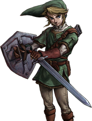
from a purely character-design standpoint I don't think this design is bad, but I don't think it's all that special either. it's very evocative of oot link, which I'm SURE was intentional based off everything else in the game. it does a decent job of complicating the outfit to the standards of tp's setting without going too overboard in terms of little details. the long hat looks stupid but i understand what they were going for. my biggest critique of the design itself is the desaturated color scheme, which I understand was present in the game at large but. I don't like it. I honestly do think that taking away the vibrance and colorfulness of loz takes a lot of the fun out of it. these games were originally for the NES. we're working off of 8-color pixel graphics. link's tunic should be eye-searingly green no matter how dark and brooding you want his story to be, because without that brightness and vibrance the games cease to feel like loz imo.
anyway. the real PROBLEM with this design, and with most of the art direction in tp, lies in how it was actually handled in-game. twilight princess was a game for the wii & gamecube, released in 2006. while advancements in graphics were GETTING THERE, the models were still relatively low-poly. The franchise had already seen a lot of success working with low-poly models in oot and ww, specifically because they leaned into the limitations of low-poly graphics and went for a more cartoonish, unrendered art style which made the blocky models seem purposefully stylized instead of limiting. twilight princess, however, did a complete 180 with the art direction and decided to attempt to HIDE the low-poly graphics behind over-rendered textures. this combined with the desaturated color palette of the character designs makes everything look very flat and lifeless.


in every close shot of link throughout this game i was constantly distracted by how awful the textures made the model look. the rendered folds of his tunic being slapped onto a flat surface, the rendering in his hair being an obvious coverup for the fact that it's one mass on the model with no physics, etc etc. the textures seldom rendered perfectly smoothly on the wii either, so the painted rendering would be strangely pixelated or blurry compared to the model's sharp edges. the game's lighting also seems to operate entirely in harsh black gradients, making the color and rendering choices on the model all the more obvious. Again, I understand that these are limitations of the medium the devs were working with, but i think that art direction that takes the medium into account and works WITH it instead of AGAINST it is almost always more successful than attempts to cover your ass after the fact, and i think that twilight princess could have been a more visually pleasing game if the art direction hadn't been so focused on covering the flatness of the models with hyper realistic textures.
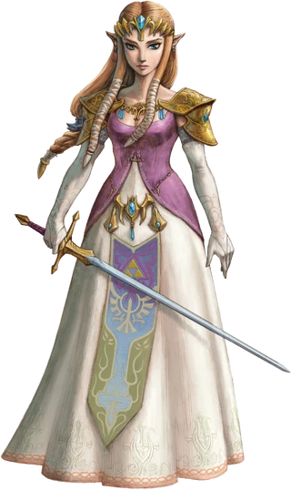
onto zelda. again, we have a theme here of taking the oot design and overcomplicating it. i think the color choices are better here than they are with link, but i would have liked a brighter pink on her bodice. I also think that the dress's neckline was... pretty obviously a sexualization attempt. there's a reason men love this zelda. imo if they were going to keep oot zelda's shoulder armor they should also have kept the breastplate-ish piece in the middle and the high neckline from that dress. you cant say ooh look shes a swordfighter see she has armor!! and then leave her fucking jugular exposed. no wonder she got possessed by ganon immediately. other than my general complaints with the over-rendering i don't have much else to say about her tho. shes fine


the zora tho... this is where i start to get pissed off. HOW ARE YOU GONNA DESIGN A SPECIES OF FISH PEOPLE BASED ON TROPICAL FUCKING FISH AND THEN REFUSE TO PUT A SINGLE SATURATED COLOR INTO ANY OF THEIR DESIGNS. the way these designs could all be improved by about a hundred percent if you just TURNED UP THE GODDAMN SATURATION. GIVE ME A REAL RED. IM BEGGING. UGGHHHHHHHHHH. i also think the ugly rendering REALLY shows through on these guys because they don't have a lot of detail on them to cover it all up. someone needs to explain to these designers that you don't shade with black. like. god. the designs truly are not bad in terms of like creature design i dont think but they are so DESPERATELY in need of color that it's fucking distracting. color is not your enemy guys please
#tp critical#twilight princess art direction my detested. bane of my fucking existence#COLOR IS NOT EVILLLL YOU CAN PUT SATURATED COLORS IN YOUR DESIGNS ITS OK. ITS NOT GOIGN TO BITE YOU#asks
65 notes
·
View notes
Text
“Ethereal Paintings”
14~ Be my muse co-artist☂️ | Word Count-> 1,465
Scaramouche x Reader Smau

Scaramouche has only ever been nervous and worried about two things in his life, one was his mothers approval and receiving love when he was younger. The second was when he started his rise to becoming happier, if he truly deserved the friends he now holds dear.
So this kind of useless bustling of nerves irritated his skin scorching pink neck up. He could tell himself that it was merely a meet-up to talk from one artist to the other.
Except he was dreading his fake facade of an artist title.
He was no artist. He was a coward who wanted the approval of one. With nothing but a computer screen to show.
Scaramouche eyed the clock hands tick as his restlessness increased with it. He ruffled a hand through his hair now anxiously biting his fingernails.
If he kept up with this any longer he would very much back out like the moron he is.
The button ringed from the inside of the studio echoing as anticipated steps clack more sensible towards the door between them. It swung open and your face greets him with a smile.
Scaramouche likes how easily your smile comes, but also hates how melty he feels towards you when it hasn't even been a whole 2 months since you both met.
“Glad you can make it Scara! Welcome to my studio” You wave him in quickly while the door closed shut and you ran back to the large empty canvas stand.
He hms at the loft-like studio. The opposite wall of the front door was fully windowed providing lots of natural light perfect for an artist. The second floor wasn't visible to where he stood since it was overhead, but he could imagine that's where your prized works were and maybe even a rest area where you could sleep in. The studio probably seemed very minimalistic when you first entered, but now the walls and floor have been coated in beautiful color splashes of paint.
Scara was in fact very impressed and in awe with how an artist like you worked, how your art studio is so bright and gorgeous. Truly a manifestation of creativity soaring past its limit.
When your friends told him that you dabbled in every art they weren’t lying.
White tarps laid out of the floors underneath the several canvases stands you had plus a large standing table you held a pc and drawing tablet on. The table held many other art mediums for your disposal.
You were shifting stuff around, hobbling the canvas stand and a few stools as well as more materials for paint and other materials.
“Scara, what medium would you like to try out here? I have every art imaginable” Busy looking through the shelves of art supplies, you couldn’t notice his subtle fear in his stiff movements.
“...Acrylic paint i guess.” He peered at your metal drying rack and saw the recent acrylic painting and choose that as his safe option.
You turn to him with a grin holding them up in a woven bucket, “That’s my preferred medium too”
He gave a slight sigh of relief.
Moving around to place the three stools, one stool for each of your canvases and the third stool for the basket of paint. Gesturing him to sit you gave him his painting palette tray, water cup if he so needed, as well as his brushes and palette knife.
“Let’s just have some fun painting whatever comes to mind, yeah? Whatever you feel like right now. Art therapy time if you will.” You laugh in joy, having a new art friend who would paint with you was nice in its own right.
He nods quietly enjoying your sunshine and the un-desired purpose in this painting.
As he squeezes the needed paint onto his paint tray his ability to color coordinate fails him. A murky purple was made instead of his wanted light pink.
His face narrows and scrunches up as the scraping of his palette knife grinds harder against the wooden tray.
Your iridescent laughter seems to erupt into the room and it draws Scaramouche’s attention away from his threatening stare down with his paint.
“Aren't you an artist?? Hahaa, are you not skilled in the painting area mouchie?”
He jolted at your unintended nickname where both you turned away to collect yourselves for a second. “Well— …yeah, but, i’m still not good.” He cleared his throat to feint embarrassment when he really was swimming in his own remorse.
“What color do you need then? I can make them for you.” He peered at your palette which consisted of pretty pastels. He didn’t want you to mix fresh new paint for his pathetic ass.
“I can just use some of yours. I wanted a small canvas anyways.” You nodded as he scraped some of your hefty mixed paint onto his tray. You got started on applying paint to the blank canvas and he followed along.
Chimes of piano music fill the room from your ongoing playlist playing on your computer. It was rather peaceful.
One of the rare moments Scara can feel at peace.
“If you don’t mind my idle chatter—having a nice chat while drawing is nice to me.” You put down the paintbrush for a second to look at Scaramouche.
“—would you like to hear the story about my parents? It’s one where thinking about it always fuels my art drive and how I'm so immersed in drawing all 99% of the time” His attention is pointed at you in obvious interest. Your fingers pick up the paintbrush and continue light strokes of paint, a bit abashed at his sudden attention to you. Starting off your story, Scaramouche attempts to multitask but finds himself staring off at you instead of his canvas.
“My mother was and IS an artist, my father was just a politician who loved good debates. Y’know like those old aged stuck-up political men.” Chuckles emerged from both sides.
“Father had strong feelings towards art since he thought it was but pointless. He couldn't find the meanings of art. So when he and mother met for the first time they butted heads a lot in debates. Father was that one stubborn lawyer man.”
“Their arguments were real heated and well put out points were favored on my moms side. When mom got an offer for a large project that caused her presence to be in Sumeru, dad was a little empty without the debate over art and how useless it is. He grew so used to the debates every week when he was able to see her working as they bumped heads. But he was too stubborn and high on his horse to even ask one of her friends when would she come back.”
“Years passed, like a good 3 years, and she came back to Inazuma as well as many of her paintings to show off her success. When they met again at a politically invested museum he saw mom again after weeks of her return. He saw her showcasing her works with the most grandiose and genuinely happy-in-life smile. Compared to her lesser smiles when she wasn’t profound in the arts.”
“It was then where he fell in love with mother. Her strong will for her crafts, her hands that hide all her calluses from hours of work. And the smallest detail on the piece even caught a mile away, he fell for it all. He told her of his admiration, though awkward with being in touch with his emotions, she was glad she got through to him finally. Mother always admired his stance of his opposing opinion, it was the big push for her to compose such a grand choice of risking a lot for art which gave her no stable income. Without him, her hopes to prove to the world that art is needed, she would have stayed hidden as ‘one of those disgraceful artists with no real job.”
“When they got married she taught him how to paint and they were so much in love. Still the debater, he challenges her to art history and how he knows the most about her large contribution to opening up the art world. The amount of times i asked them to repeat the story to me, haha i think I might have high standards now.”
“Enemies to lovers…”
“Hm? I don't know, having an enemy is kinda.. clique, no? And i honestly don’t think i can ever date an enemy i hate.”
Scaramouche shrugs as he attempts to brush up his awful attempt of a painting. “I don’t think I would be able to bear an enemy either.”
You smile and got up brushing your apron. “I have a bunch of snacks in my pantry. Let me fetch them.”


Previous | Masterlist | Next
Synopsis{2}-> Many study dates and flirting over weeks drew you both close. Awkwardness still drew a line between you both but it was enough for a start. Admiring him from the sidelines wasn't enough, however, pieces of the false facade start to shred; and fate has ways of twisting your heartstrings — Is he really– …
We love parents in love🫶and y/n following in their footsteps🤭
The plot is finally moving🥹🥳
Un-Ooc(ing) scara when the plot thickens
//Taglist//
@akagism2 @pokidot @feiherp @kyouzki @rmiyuki @infe-risk0 @sakurapeach @bluebelony @kichiyoshi @mikctp @kur44pika @cupids-chamber @crucnhice @neigesprincess @scaramoo @gojoandelsalovechilde @childeslegstrap @sakiimeo @d4y-dr3am3r @m3gitsune @scarletttcroww @sashiette @beriiov @rizakari @xiaossocksniffer @lxry-chxn @bryai003 @eunchaeluvr @goj0h
#genshin fic#genshin impact#genshin x reader#genshin smau#text fic#genshin impact smau#genshin screenshots#genshin x y/n#scara smau#scaramouche x you#scara social media au#genshin scara#genshin scaramouche#scara x you#scara x y/n#scaramouche x reader#scaramouche x y/n#scara x reader#scaramouche
103 notes
·
View notes
Text
mes's webcomic recommendations
do YOU like webcomics or want to read some ? here are some i think are good NO im not gonna put my own here even if i think its good. -_-
starting with . i Think these ones are popular and well known..?
Paranatural - A story about paranormal ghosts and stuff. It's a real fun time, and the story is really good. The author's art progression is really impressive, truly skilled with paneling and such. It does eventually shift into a webnovel format with drawings as the author couldn't keep up with doing pages like before, and the quality of goodness of the story stays strong 👍👍
Tiger, Tiger - Story about the importance of sea sponges. Also a fun time, sea faring adventure about, again, sea sponges and how important they are nothing else OK? promise. (liar) PHENOMENAL artwork, very pretty to look at.... 👍👍
The Property of Hate - I need to reread it because i forgetted a lot but its such a cool looking comic and sooo interesting OK?! i swear. It's about a kid being a hero.
Vainglorious - a fun comic about a dragon facing Hubris Consequences. The main trio is real fun, the world is cool, all in all fun comic okie !!
Sakana - Slice-of-life comic about some folks working at a fish stall in a fish market. Real fun. Been on hiatus for four years, but is gonna make a comeback soon (author is working on building up buffer pages And then... ! ) But yeah! real fun.
Witchy - ... one i have to reread, it's been on hiatus since forever as the author was working on another comic (thatllbe out... in a while?), though i assume when that's done they'll come back to this...? Anyhow, I remember it being a very gripping story, and beautifully drawn... Also it's about witches. if. you . couldnt tell by the.. title...
NOW, onto ones that ... i dont Think are super well known ... ?
EcopportunityX - An interactive stick figure limited color palette comic about a facility where bad shit has happened ! uhoh! What the hell happened here! Follow the protagonist on their journey of learning what happened, and escaping the facility. Also, space pinball and ball pit beast is there. 👍👍👍
Eye in the Sky - And it only feels right to bring it up as well, but this is a fancomic of ecopportunityX ! ... Contains eox spoilers, so perhaps read the original first! This one features original characters and takes place a bit before eox, it's nice ok i like it :]
Gold Scissors - One of my all time favourites TBH. The art is nice, I love the story, the world is so cool i love it a lot... do yourself a favor and read it...
Midnight Connection - Finished! by the author of Gold Scissors, it's a short comic that takes place in the same universe, you can get through it in one sitting!! sniffles.
Brainchild - Comic about girl seeing weeeeeird stuff. Ghosts?! who knows. Tis a cool one OK read it...
Fairmeadow - "i hate being on the hippee comune they are always telling me Peace and Love on planet earth , orc lady, Peace and Love, and they do not leave me alone" - true real 100% words said. you can read it and youll see. Very pretty looking, ...
Holly & Macy and Everyone Else - comic about two teens learning about HOMOSEXUALITY and being a witch and its a very sweet .. i like it ok? it's also on tumblr @/ hollymacycomic
Falling to Far - i thiiink? its kinda just getting started, its about two star kids that just arrived to the planet of Far, and they are just checking how things are here rn. okie! its nice ITS ON TUMBLR! my fellow tumblr-hosted webcomicers lets gooooo
Daisy in DREAMLAND - ........ not a .. webcomic. Tis more a webnovel, i believe. It has pictures. Very cool looking guys, love the style, someone drench this cat in a bucket of water.
Needleminder - because fuck it we put webnovels here too I GUESS. it has pictures sometimes. haven't caught up with it recently tho BUT it's Very interesting and gets weird with it in cool ways...
Star Impact - comic about boxing! fighting! and people have gloves that give them a gimmick power tis pretty fuckin cool!
Kitty Corner - Comic about someone who sees ghosts. this ones kiiinda just getting started i think..? put its been promising so far, i like it ANOTHER TUMBLRHOSTED WEBCOMIC LETS GO BABY!
PISS HOLE - The greatest comic ever drawn with a broken trackpad.
Going Home - a comicabout a kid who has t *red dot appears on forehead* *sweats**starts to go get the link to the comic* *snipers pull the t
#THIS HAS BEEN. MES'S RECOMMENDATIONS.#moth talk#EDIT I M LINKING GOING HOMEBECAUSE GENO IS HURTING ME!!!!!!!! WITH HAMERS!!!!!!!!!!!!#ALL GENOS FAULT OK? BLAME MY FRIEND GENO
52 notes
·
View notes
Text
Devlog #8: QA and Q&A
(all the screenshots i have left are spoilers. while i take more, have a meme)
Hello everyone! Welcome to this month’s devlog!
If you just stumbled upon this, I am Adrienne, also known as insertdisc5! I’m the developer, writer, artist, main programmer, etc of the game. The game being In Stars and Time, which is the next and final game in the START AGAIN series, following START AGAIN: a prologue (available here!). You can find out more about In Stars and Time here!!!
LET’S GET TO IT
With the game’s alpha finished, I didn’t do anything much worth talking about this month. QA is underway! I’m fixing bugs! I’m writing changelogs that say stuff like “At the hallway before that one room, getting to the edge 2+ times wont softlock anymore if you do it between the wall and a column”!!!! I’m also resting because September was a LOT!!!
So, since I have very little to say, I asked people on Twitter to ask me questions, so I could answer them. Q&A time!
@ItsMeLilyV asks:
1. I really have been in love with monochrome & limited palette styles recently :3 How did you figure out the art style for ISAT? Are there any distinct challenges or walls you've run into?
2. did you get to take any good naps. how would you rank the naps on a 10-pt scale
1. The TLDR is: it’s more fun to draw in black and white. And it’s faster. And it looks cool as hell!!!
I did run into some challenges especially when it came to UI- how do you draw the eye of the player to a selection, or something they need to interact with, when you can’t use an eye-catching color to draw them in?!? I ended up relying a lot on level design to do that… And animations, too, especially in the House where everything is frozen! Keeping a very limited palette also helps, I think I mostly used black, white, and maybe 5 shades of grey in between… It’s all about contrast! And not having a big muddy grey mess!!!
2. I got some good naps in, yeah. I’m a big fan of naps after lunch, so I eat, wait for the sleep to kick in, and sleep for 2-3 hours. Solid 8/10 naps. That’s heaven babes!!!
@gertritude asks:
I am curious about what your writing process is for the game!! Like, what is your planning process (if you have one) and how do you approach actually writing for it?
My writing process… It’s a little all over the place to be honest!
I had the big strokes of ISAT figured out from beginning to end before I even finished the prologue, but then I had to really sit down a bunch of times and really figure out how to get from point A to point B. So it involved a lot of writing, and also rewriting, to Foreshadow some Cool Stuff. Also, early on I was really struggling with some plot points, so I sat down for a whole day and wrote down the entire plot from beginning to end, and tried to get really granular and write down those middle point A to point B things! If I didn’t know what would happen I just invented something on the spot! As long as the whole story was written!!! It took a while, but I’m really glad I did this, because this saved me a lot of time later on hehe
Apart from the big plot events, the smaller events that are conversations between the characters usually just come out of nowhere, like “ok I have a table here and I put cookies on it. How would everyone react?”. I try to strike a balance between “this is how people talk” and “does it say anything new about those characters”, whether it’s a character’s favorite food, or a nice foreshadowing moment that you’ll reread later and go “OH DAMN… ALL ALONG THIS WAS HERE…”
My big go-to technique to actually write is that every day 1. I decide I’m going to work for 15mn and I start a timer 2. I put my headphones on 3. I start my concentrate playlist, which is full of instrumental electro/dubstep/wub wub adjacent music 4. ????? 5. Writing accomplished. The 15mn goal is just because it’s easy to write for 15mn. I always write for longer, but I just need to get started with an easy goal!
@_blade0fgrass_ asks:
Is it hard coming up with such immaculate puns
I would like to thank punpedia from the bottom of my heart. And also google. Thanks punpedia thanks google!
@kayleighdotjpeg asks:
keeping spoilers in mind, who are your favorite characters to write? which character dynamics are your favorite? did any of them surprise you?
This is THE question. Thank you so much.
I loved to write Siffrin (especially when they’re all depressed teehee), but Odile ended up being my Actual Favorite to write. Most characters are either 1. Full of secrets or 2. Pushovers and/or oblivious, so it’s very nice to have Odile be the one to say “Alright, enough of this. We will talk about the elephant in the room Right Now”. She’s very blunt and doesn’t care about anything and she is so useful as a plot device and I love her.
Siffrin and Odile is my favorite dynamic, followed closely by Siffrin and Loop! As for surprising character dynamics, I reaaaaally enjoyed writing Odile and Isabeau… I didn’t get to write them often, but they are so fun to write together. Please ask me this question again once the game comes out so I can say more.
@novvclutchmate asks:
How do you go about finding a balance between levity and seriousness? Would you say your story tips more in one direction than the other; if so, was it on purpose and why?
What a good question! Hmm, for me and my writing style personally, it’s less about finding a balance, and more that One Cannot Exist Without The Other. It’s like adding sweetness to a savory dish- adding them together elevates the whole thing!!!
If I have a serious scene, I like to add some levity to kind of bring the characters back to earth. I don’t know about you, but when I have a serious conversation for too long, I automatically laugh or tell a joke to break the tension! I get uncomfortable when it’s too serious! It’s normal! I’m normal!!!! It’s also a way for the audience to breathe out- don’t worry player, we’re good! We’re back to the usual stuff! Plus, I find that funny scenes right after a serious emotional scene hit harder.
As for seriousness to levity, I think it’s fun when you have a funny slice of life scene and then the story reminds you that this scene is Serious Actually. Like having everyone talking happily and the narrator saying “it makes you sad when your friends keep repeating the very same lines every time.” :)
ISAT tips more towards levity I’d say, because of the reasons listed above! If you’re used to funny cute scenes and then I give you a Serious Emotional scene it makes you go Σ(っ °Д °;)っ
@gala_ksyz
is there any words youd like to tell aspiring/young indie devs?
Just make the dang thing!!! Stop putting it off!!! Just do it!!! Buy a simple game maker thing like rpgmaker or renpy or whatever and make the thing!!! Yes it’ll take time!!! Yes it won’t be as good as you imagined in some ways!!! Yes making games is hard!!! But you gotta just do it!!! It’ll be so much better than you imagined in other ways!!! It’ll be real!!! You’re the only one who can make it!!! It’s yours!!! It comes from your heart!!! It IS your heart!!! No one else can make it but you!!! So just make the dang thing!!! I believe in you!!! JUST MAKE IT!!!!!!!!!!!!!!!!
That’s all I have to say for today! Let me know if you have any questions, or if there’s any aspect of the game development struggle you’d like me to talk about! See you next time!!!
AND DON’T FORGET TO WISHLIST THE GAME ON STEAM ALSO IT REALLY HELPS BECAUSE STEAM’S ALGORITHM IS MORE LIKELY TO SHOW OFF GAMES WITH A HIGH AMOUNT OF WISHLISTS THAT’S THE REASON WHY GAME DEVS ALWAYS ASK TO WISHLIST!!! OKAY BYE!!!!
159 notes
·
View notes
Note
i've been following you for a very very long time (the snk askblog days !) and your art still blows me away every time. i just love your colors and painterly style. do you have some art tips, tutorials, brush recommendations etc ? i really want to improve my digital painting skills and i'm curious about your process
Oh no! Not the ask blogs..... but thank you so much for your continued support of my work 🥺♥
I think the most important things I always keep in mind is colour theory though I can't say im always successful each time I do it 😂 Honestly when I see guides it all never makes sense to me?? What do they want me to do even!!

These guys explain things pretty well though and much more professional than me:
Emel's Colour theory notes
Gigi's colour/lighting notes
And also this image right here
Honestly main things are
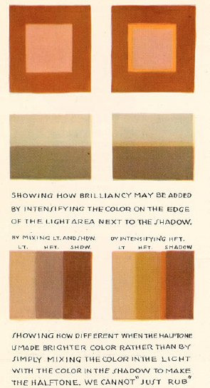
limit your palette - use a colour fill set to low opacity overlay or 10% opacity normal for the mood you want for the piece, your character might be wildly coloured but this brings it together
split/complementary palettes are great, saturate one side, desaturate the other for contrast (looks teal but its actually a grey if you swatch it )
don't you dare use white grey or black to shade! dont you dare!!!!
add a slightly more saturated colour in the middle of your shading gradient for some pop
personal taste but i like to dab some colour elsewhere where it might not belong 🤷♀️
my personal pet peeve is that i dont actually like swatching from character sheets im sorry the cat is out of the bag whats the fun if you cant play around with lighting and mood
most important skill is to not be scared to try things that are hard that you think wont work out!! trust in the process!! itll look like ass the whole way through!! use colour balance at the end if you need to!!
also colour theory relies on the ryb wheel rather than rgb which really messes with you in digital settings... thats something i still need to memorise more... awful
Also tosses this out here too: Jing's brushes are my current go to since I work more in procreate now
Anyways half the time I dont even listen to myself and forget the stuff i should be doing and i have to go back and ref my own art style so who knows!!! take this all with a lot of salt
107 notes
·
View notes
Text
talking abt the drawings
ok so.
i've had chronic pain for as long as i can remember. in high school i literally walked around with a wrist brace on each hand 24/7
despite this, i really wanted to go into art. and i did. i managed to get into art school, studied for 5 years, and earned my degree.
my chronic pain was always there, but when i was on T, weirdly, it lessened. that made it easier to do studio work. with T, though, i had a lot of other medical issues, and decided to stop it in my final year.
regardless of pain, i've always had a "craft" issue. that's what professors referred to it as. it's like... you struggle to color in the lines. when you fold a paper it's crooked. when you trim a print it isn't a perfect rectangle. and anyone who has ever received a wrapped present from me will know. it's like, the messiest thing you've ever seen.
i've always had some kind of like. fine motor difficulty. and that never went way even with my training. in many cases, it resulted in lower grades. but i just kept going.
and i'm unsure if it's due to craft or something else, but i was never a strong illustrator. and that's not too uncommon for some graphic designers. illustration and graphic design are different tracks, even. a lot of us rely on shapes, typography, and patterns instead of very elaborate drawings.
the pandemic (and other circumstances) uprooted my life. instead of going right into a graphic design internship, i was jobless and stuck at home. i sank into a deep depression, and my pain worsened to the point where making art even for fun hurt my body too much.
i think the first time i bothered to try traditional art again was when i made a portrait of my ex boyfriend a couple of years ago, but then i stagnated again.
and right now, i'm in a period of my life where choosing to live each day is very, very hard. but i want to. and i want to try to make art. so i am challenging myself to draw as much as possible. i'm being mindful of my pain and stopping when i need to. and i'm trying to be kind to myself. even if the craft is bad (it will be) and if the end result is Bad Art. because making Bad Art is okay, and because i'm trying to regain muscle memory i lost years ago, and improve upon it.
this is a new medium, too. i have never worked with markers previously. my traditional 2D art was always pencils, pens, charcoal, or acrylic paint. the markers i have are very cheap, and marketed as highlighters for books, not as drawing materials. i'm taking advantage of the pastels, and challenging myself with the limited color palette.
i'm having fun so far. i was always scared of markers for some reason. maybe because "real" brush markers are expensive. maybe because markers have a reputation through bleeding through paper (which i've since learned is often a paper issue, not a marker one.) and i think the permanence, too. i can't erase a mark after i make it. but that's letting me sit with my mistakes.
6 notes
·
View notes
Note
any tips on lineart or coloring? I adore your art style!!!!!
thank you! this post might be a little rambley because i'm not the best at explaining things
ok for starters, i don't want to go into my own personal preferences for choosing colors too much. when i started drawing i really stuck with what other artists said was the "correct" way to do things and that can really hinder your art a lot, so i'm going to give general descriptions of colors and color schemes and let you decide which ones you find the most appealing or enjoyable to use. i think choosing colors comes down to personal preference most of all. don't take anything i (or any other artist) say as law, drawing is a lot more fun when you make your own decisions about it. if you want to use a lot of super bright/dull colors, or no colors at all, go for it! your art should be what you want it to. this post is more for people who want to know more about color schemes than for people who want to draw exactly how i do lol
also you can use solid black and white in your art its not illegal and it doesn't always look bad idk why this is such a common thing people say in tutorials/tips about colors

color schemes can be monochromatic or polychromatic, with my art i usually use different colors but i like to use monochromatic schemes sometimes too, art can look very nice with both of them. characters with multiple colors (like kirby) can be drawn with monochromatic palettes as long as you have varying values of the color.
with polychromatic color schemes, remember that less is more! limit your colors and try not to use way too many, it makes things less confusing. reuse colors for different things instead of adding new ones
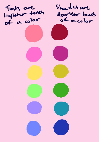
value is how light or dark a color is. i like to use color schemes with a lot of tints (or pastel colors), usually with a few darker colors in order to define shapes a little better. value is Very important to make the thing you're trying to draw clear to see and separate details from each other, so i'd study this before learning about picking colors individually.
saturation is how "intense" a color is. it's different from value, and it works alongside it (saturated/desaturated colors have tints and shades.) i don't use many very saturated or destaturated colors, and a lot of my art kind of lies in the middle. when i do use them, i try not to put very saturated and very desaturated colors together in the same color scheme, as using all of one or the other can make things more cohesive. (also, don't make dark skintones too desaturated. they should be in the middle)
the most important thing to remember about color schemes is that colors don't work independently, they look best when they're cohesive with other colors. think about how you want something to look before you color it, consider if it's supposed to look cute or have a gloomy/dark feel, if its daytime or night, etc. try not to follow a character's reference sheet colors too strictly, and change them as needed given what you want your finished art to look like.
lineart is a lot more simple (at least to me). i usually use a dark blue or whatever color i associate with the character for it, and i like to keep the stablization setting very low, as that helps it make look more sketchy/painterly. (i use clip studio paint, so if anyone wants these brushes let me know and i'll put them in a different post)

hopefully this was a little helpful and not too much of a pain to read! i've gotten a Lot of asks about this so i felt like i should make this post as detailed as i can. do look for other resources if you want to learn more about this stuff, there's people way better at explaining things than i am lol
#i don't like those ''this is wrong and this is right'' kinds of art tutorials/tips so i hope this doesn't feel like that#except the cym and ryb thing. use cyan yellow magenta its infinitely better alway;s#asks#not daily#long post
26 notes
·
View notes
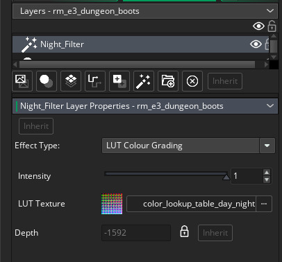
Text
How to use GameMaker's filters for lighting!
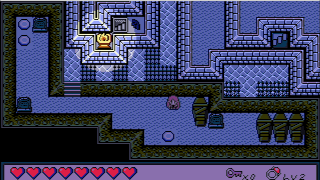
Got a new lighting system for ProtoDungeon 3. Take a look!
I had a similar effect in 1 and 2:
The difference? Now I'm using GameMaker's new filter system, and it seems to make things run much more performantly. I wanted to share with you how it was done!
First, a little on how the effect works:
Behold a daytime scene from ProtoDungeon 3!

For a cool nighttime effect, instead of just making things darker, let's employ a Hollywood trick and shift everything blue:
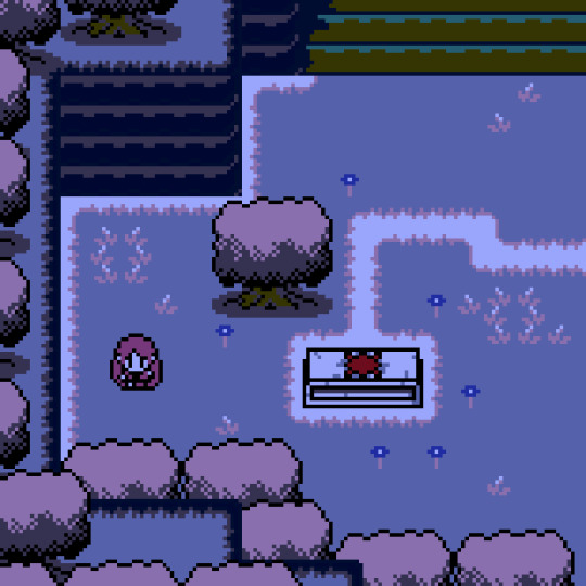
Okay and now the fun part: lighting! For that we just don't do the blueshift in a particular area (if you've tried this before, you know it's easier said than done)

Here's how it's done!
Part 1 - The Filter
ProtoDungeon and The Waking Cloak already use palette shifting to represent nighttime thanks to Pixelated Pope's excellent palette swap shader, (which I still highly recommend for individual layers or sprites!), but there are some limitations when trying to apply a palette swap effect to the entire game, and I kept bumping up against those limitations.
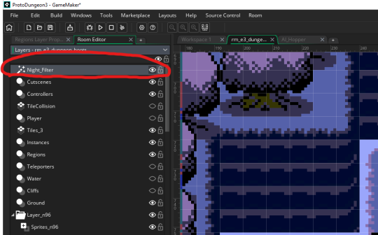
Cue GameMaker's new filter layers! Filter layers are basically just built-in shaders that apply to everything below them.
There's a lot of kinds of filters. Here's an example of a Contrast/Brightness filter (which I will eventually be using to replace my existing janky shader):

So how did I get Night_Filter working? What I've got above isn't an out-of-the-box filter
I tried a few methods here. Color Balance, Color Filtering, and Colorize all do neat things and are more than capable of making a nice "blueshift" (and I may still use them for tweaks later). However, I wanted to stick strictly to my palette, meaning when I blueshift the daytime colors to nighttime colors, all those nighttime colors are also in my palette. Very recently, the LUT Color Grading filter was added to GameMaker, and this provided a perfect opportunity.
Okay, so what is LUT Color Grading? LUT stands for "lookup table." You have an image, the LUT Texture, that contains a HECKTON of colors--in this case our table is 512x512 pixels = 262,144 colors. Each color maps via its RGB values to a specific location on the table.

There are a lot more than 262,144 colors (RGB supports 16.7 million), but the filter's shader handles the "in between" colors too. It looks up the color's position on the table and changes it to whatever color is actually there. If we used the table above, it wouldn't actually do anything, because when it looks up the position of each color, it finds... that color. What we need for a palette swap is something more like this:

This is what I made by taking the original LUT image (which I found in a secret GameMaker folder), opening it up in Aseprite, selecting the colors I wanted to change, and then doing a color replace at about 30% tolerance:
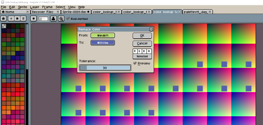
And then did that for all the colors!
You could use any image editor if you wanted to do a simple palette swap this way. (Also, technically, it doesn't have to be at 30%. It can be much lower, but I found it could be a little finicky for some colors.)
Once you're done, you add it as a sprite in GameMaker, then select that sprite in the LUT Colour Grading filter, and voila.
Part 2 - The Lighting
Okay, so that works! Now for the lighting! Remember above where I mentioned not doing the blueshift in a particular area?
Well, the issue is... you can't punch holes in layers for the lighting (I tried). I also tried a similar method to what I had before: each light is an almost-invisible, translucent circle that alters the colors just enough to not trigger the palette swap. Unfortunately, with the color lookup table, this was finicky and unreliable.
The answer? Don't do any of that. Use surfaces instead! (It's always surfaces, somehow)
So the basic idea: copy the lighted (unfiltered) areas below the LUT Color Grading filter layer to a surface before the filter is applied, then paste that surface after the filter is applied.
I know that sounds wild but bear with me.
We'll need a few things for this.
2A - Light Objects
Mine are a fair bit more complicated since I have a state machine and all kinds of activation/deactivation code. The main thing we'll be using for this is pretty simple though: keeping track of a radius and having a position (with x, y position being built in, of course).
I called it obj_light. If you wanted, you could just have the Create event do "radius = 16;" (or whatever number) and just put one of them wherever you want light to show up.
For an extra flicker effect, I use random_range every five frames between radius - 0.5 and radius + 0.5, but I'll let y'all figure that out.
2B - Light Manager
Next, we'll create an object to kinda just set stuff up. We'll call it obj_light_manager. I made it visible and persistent. In its Create event, we'll create two surfaces, one for lighting and one for masking (I'll explain that in a bit). Initially, I just made them both the same size as my base resolution (320w, 180h).
global.lightingSurface = surface_create(320, 180);
global.maskLightingSurface = surface_create(320, 180);
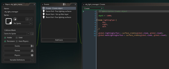
Then we'll add a few cleanup events (always clean up your surfaces so you don't have memory leaks). I put this in both Room End and Game End events:
if (surface_exists(global.lightingSurface))
surface_free(global.lightingSurface);
if (surface_exists(global.maskLightingSurface))
surface_free(global.maskLightingSurface);
Now for the magic part: in the Room Start event, we'll hook into the layer's events with layer_script_begin and layer_script_end.
var _nightFilterLayerID = layer_get_id("Night_Filter");
layer_script_begin(_nightFilterLayerID, lights_surface_create);
layer_script_end(_nightFilterLayerID, lights_surface_draw);
2C - Layer begin/end scripts
Alright let's make those scripts now, lights_surface_create and lights_surface_draw. I'll drop these in pastebins with some comments since they're a bit lengthy and tumblr's code formatting is nonexistant:
lights_surface_create
lights_surface_draw
The explanation for how they work is all in there. Basically, we'll copy the light areas (not filtered yet) to a surface before the night filter takes effect in lights_surface_create, and then in lights_surface_draw we'll paste them on top of the night filter, and voila, lights!
Note: since I'm using subpixels, this method produced non-subpixel lights, which was pretty jarring. In order to make this work with subpixels, I made the lighting surface the base resolution multiplied by the zoom factor, 1280x720 with a 4x default zoom. When I draw the mask surface to the lighting surface, I have to use draw_surface_stretch. Finally, instead of using layer_script_end, I had to draw global.lightingSurface stretched in the Post-Draw event after the application_surface is drawn.
Let me know what you think! Thanks for reading!
#GameMaker#tutorial#lighting#pixel graphics#ProtoDungeon#the waking cloak#game development#pixel art#gamedev#indiedev#zelda#surfaces#shaders#filters
117 notes
·
View notes
Note
Hi, I went to see if there were more witch woods chapters and I noticed that au technoid's name was there so I would like to know if it will become just writing and you will continue the comics
Because your comics were very good even the images were a little blurry I liked it a lot then I got it in my head and I would like to know
(And another question will any of your fics have your comics too)
Hoi!
I do plan to continuing Technoid’s comic, right now I’m working on writing the entire thing down and scripting it for when I do start drawing it again. There’s a lot of backgrounds and structures that I want to have and I am taking the time to 3D model them so they will stay the same, which takes a lot more time than I expected it too (should have known cus I don’t do 3D modeling often).
There have been some story changes too, so havin to hammer those out.
I think Technoid is going to be 9-11 chapters long comic wise.
Plus solving the blurry issues.
I think the blurry is because I upload pretty much everything through my phone or tablet, but idk. I’ve tried going through computer and run into the same issue so it might also be a sizing problem. Idk, but working on it.
And yes I plan for Thermonuclear to have a comic, it will be a whole lot different from anything I’ve made in the past. And I think it’s one of the darkest stories of the group which is saying a lot considering. It’s got a super limited color palette too which you’re gonna get to see soon with a pic I’m working on for Witch Woods. I think it’s pretty. But I’m not used to working with extremely restricted palettes so who knows ^^
There is a short comic I’m making for the Zombie AUs intro, but I have yet to finish it.
Ivory Academy and Under Grand Central will eventually start back up. But those are not as important. UGC is very focused on mental health and some of my own struggles.
I’ve put Feral back on hiatus cus, I’ll be honest, Im not a huge fan of the story. I know people like feral and I do to, but his story just doesn’t hit the way I originally intended it to.
As for stories like Witch Woods, Twin Fin, Haunted and West Valley, this are going to stay written. I may make little one off shorts every once in a while, but it’s not going to be often. These are my favorites that I’m working on too funny enough.
I do have a short comic that I’m working on right now that is based in the zodiac au but I’m not sure when it will be finished.
Oh and I have a few chapters of Witch Woods ready to go, just rewriting chapter 11 cus I was not happy with it. Lots of Dreams chapters are actually done, I just can’t put them out yet cus ✨timing✨.
I’m really glad you like my comics, they are really fun to do.
I just wish I was faster at drawing.
And finished what I started >>
#anon ask#story update#comic update#lots of words#I’ve been sick the last few days#and have had to slow down#I’m working on answering ask between sleeping#hopefully I’ll be back to par soon#thank you for being patient with me#thank you guy#for everything
9 notes
·
View notes
Last Seen Blogs
blueangelhearts
˚ʚ blue angel ɞ˚
n-quadrat
N Quadrat

coastersaesthetic
Coastersaesthetic

nhacaiuytin10
Top 10 nhà cái uy tín
socialistsephardi
Kvetching Is The Path Towards Tikkun Olam