aapstra
aapstra
Hi, Thanks for stopping by. I'm Joscha, an Amsterdam-based story artist. I Have been drawing for as long as I can remember. I still love to draw today, mostly storyboards and comics.
This is the place where I share the stuff I love. To see some of my own work please visit my other tumblr
907 posts
Don't wanna be here? Send us removal request.
Last Seen Blogs
zircon9zy
🍌I'm sorry your honor...🍌

goodluckclove
The Clover Field
blackroseribbon-blog
Eithne Sullivan

joshbillings-blog
random things

oliviaxlongwise
cursing your name
Photo


to read chapter 1
to read chapter 2
to read chapter 3
to read chapter 4
tp read chapter 5
to read french version
Thank you so much Christian Vargas, graphic designer, a very generous and dynamic volunteer, who helped me translating in english this chapter. please visit his linkedin page.
if you want to volunteer to help me translating in english, please write me on private message! your help is very welcome!
of course if you see some english mistakes sometimes, don’t hesitate to tell me through PM !
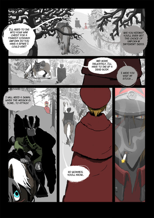
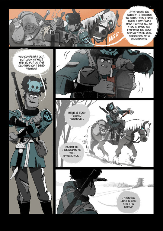
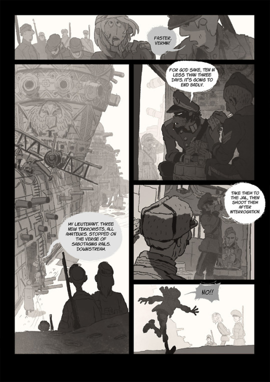
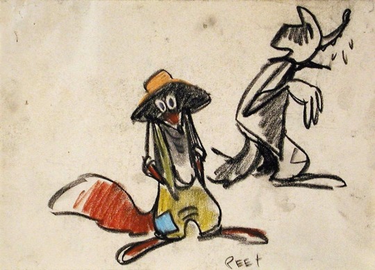
About this chapter : It took me forever to make it, because it is a new era of the story. New background design. I will not pretend it is not a pain in the ass to draw (and a pleasure^^). The real start is now. Before this part, I was just setuping the protagonists of the story. This armored train is a very important background in my story. A lot of very fucking rad action sequence is coming inside of it hell yeah.
Yes I m doing exactly the story that what I want to do. Yes I m fucking pleasing myself :D I hope you will too, please be patient, it will be cool :D
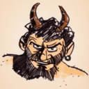
May I introduce the kantserov tsarist lieutenant. He knows he is in hell but alcohol helps him to not give a shot about it… normal..
Your moral support is very welcome, so please if you like this project, reblog it. I would be grateful! I m doing that for free for the hell of it and because I want to share it with you, I want to improve myself a lot through it. I have so much to learn, but I m convinced this story is great and must be told no matter what.
I also want to tell you that this project helped me a lot to improve and certainly had a great part in my career and my job at Pixar. Because when you do exactly what you love, you are yourself and are certainly better than usual. so I hope it can inspire you into your own projects. It always worth it and will lead you somewhere great.
543 notes
·
View notes
Photo

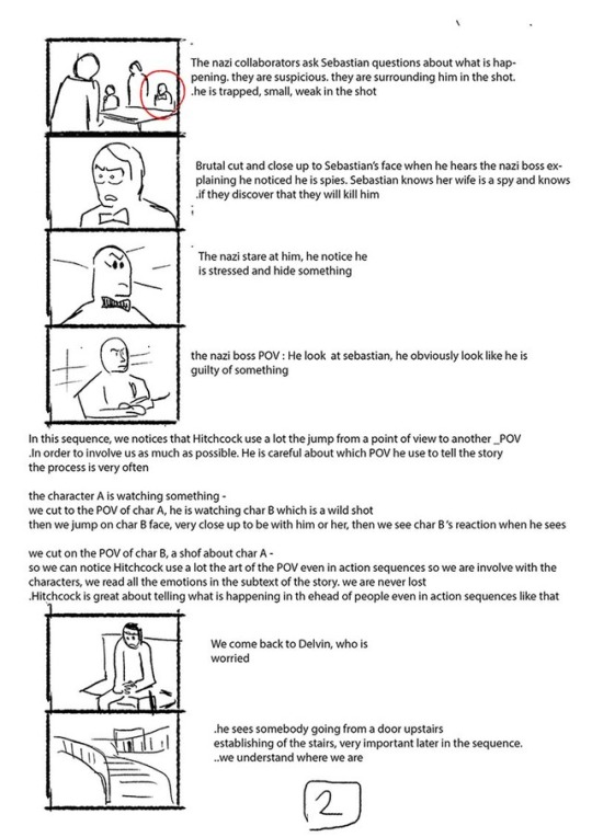


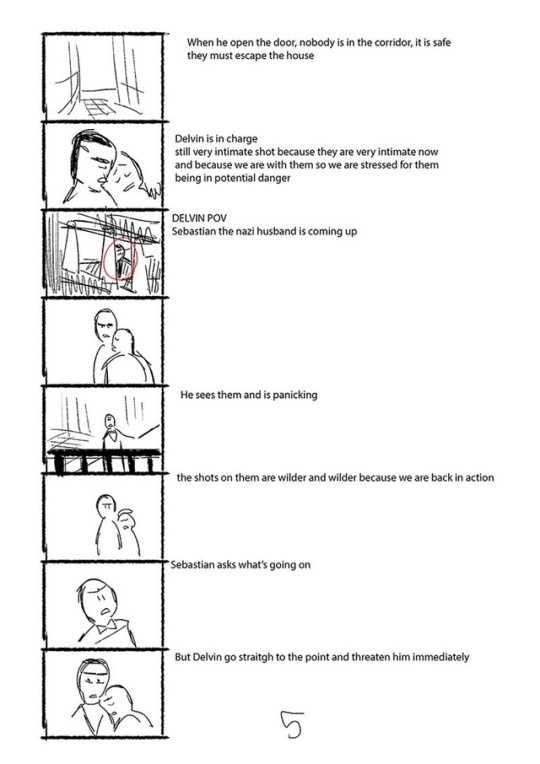
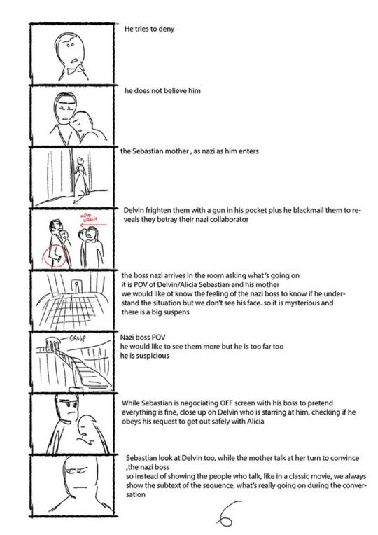
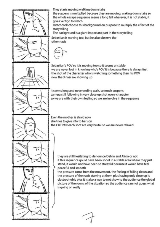


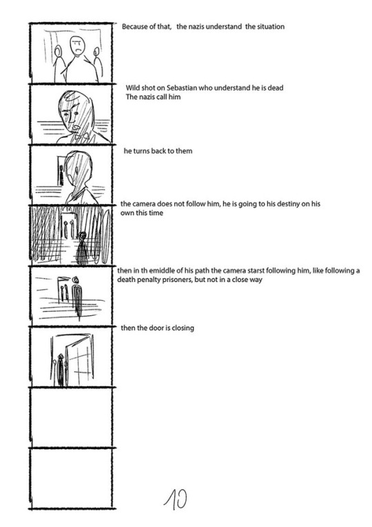
I ve just did this film sequence study from Notorious from Alfred Hitchcock because I really love the ending
I have learnt a lot doing this study
I storngly recommend to watch first the seq (the movie if possible) before reading this!
I tried to analyzed what is going on in the sequence and why Hitchcock is the best for that kind of sequence
here is the youtube link to the sequence of the movie
https://youtu.be/SdqFT7hFZ2U?t=1h31m18s
441 notes
·
View notes
Video
youtube
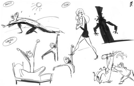
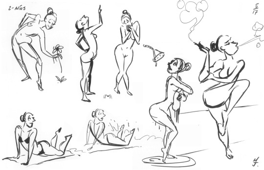
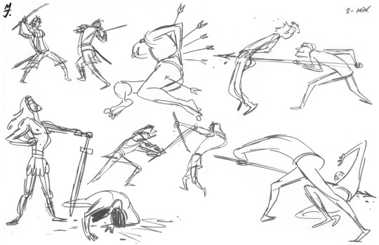
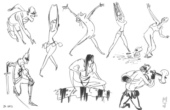
A great introduction to some of the fundamentals of gesture drawing by Matt Jones.
This video starts as a little demonstration of the gesture basics and then, at around 3:45 minutes into the video, Matt shows how these principles can be used to have a little fun with a pose.
On his YouTube channel Matt has more videos in which you can see him doing gesture studies. As well as these two horror videos of him demonstrating gesture foundations, while wrecking one of his sketchbooks by drawing construction lines over his original sketches.
Matt Jones knows a thing or two about gesture drawing, he used to teach a gesture class at Pixar. He also made a very good book about gesture drawing, it’s out of print but you can still buy a digital version here.
Below is a selection of gesture sketches he shared on his blog.


118 notes
·
View notes
Text
Storyboard portfolio - what should I put in my story portfolio?
I’ve recently gotten this question a lot and thought I might take some time to go over what you might put into a story portfolio.
Storyboarding is not a job that a lot of people talk about, so the requirements of what goes into a portfolio are a bit more obscure. I also spent some time talking to my supervisor, who worked on the Incredibles, to give you guys some of his insights as well.
Always, before giving you guys any information, I always like to put a disclaimer that my input is only an opinion. Please don’t feel bad if you disagree with anything I say, I’m just trying to share knowledge from my experience. Even though I’m working in animation, I think we are all students when it comes to art and we can always keep learning. So don’t hesitate to get as much input as possible when it comes to your work and your portfolio and take what you can learn from everyone :)
So lets get started.
What kind of drawings should you put into your portfolio?
Even though storyboarding traditionally is not about pretty drawings, storyartists nowadays should show strong drawing skills. As a storyboard artist you don’t really get to render your work. Instead you mainly draw with lines. You often have to work fast and your drawings don’t have to be clean, but they have to communicate clearly. That is the most important thing! Therefore any drawings that can showcase the above skills would be great.
Some examples would be full body cafe sketches or lifedrawings that showcase your drawing skills. You could put a page of hands and a page of feet to emphasise that you know how to draw both. Any animal drawings that you might have could add to your portfolio. Especially if you know that the studio you’re applying to has a project coming up that is using animals. It would be great if your drawings could show weight, movement and communicate some story or emotion. A child playing in a water fountain; a mother carrying a million bags on her way home, while she is on the phone with the babysitter; two business men out for coffee, one is a confident man that has been at the job for 20 years, the other an upstart waiting to impress. The possibilities of what you might see are endless :)
But besides your drawing skills you will also want to show your storytelling skills.
For a storyboard artists there are often 2 paths, feature storyboarding and TV storyboarding.
I know most people want to get into feature animation, but it’s always great to mention not to discount TV animation as well. For example in feature animation, weather or not you are an animator or a storyboard artist you will potentially have to redo your work again…..and again……and again…..and again. You’re not worse or better because you can or cannot do this, it’s just a reality that this is not for everyone. One of my coworkers had to redo a storyboard sequence in a feature film about 20 times. The sequence kept changing again and again….and again. Now he LOVES his job, but by the end, he just couldn’t look at it anymore. It’s good to note that this doesn’t happen all the time, but you have to be ok with throwing out your work, and starting over again. In TV animation you don’t have this issue as much. When you do a TV-storyboard the deadlines are often times very tight. This means that you get to do the storyboard once and maybe if there is time, one set of revisions. The great thing about TV storyboarding is that you get to do a lot of work in a short amount of time. This practice and repetition really lets you experiment and lets you make mistakes. You get to learn a lot in a short amount of time. Of course TV Storyboarding also has positives and negatives as well. For example you might not get to delve as deeply into characters emotions in TV Storyboarding. Sometimes you can’t do the kind of camera work that features might be able to do, or you might be limited to the amount of shots your allowed to have in your storyboard.
I just wanted to mention this, because I don’t think you should ever feel the need to justify yourself if you wanted to work in either TV or in Feature animation. Both are different and both have things that are great about them. :)
It’s also good to note that you can learn so much about storyboarding in TV animation, so if you don’t get into feature storyboarding right away don’t worry! You’ll learn a lot in every job you do and it will help you in the next job ^^.
So let’s go over what recruiters would look for in a Feature storyboard. Again, the more input you can get on this the better :).
Firstly about Presentation. There are 2 ways that you can present your storyboard. One is “a single sheet with 3 panels next to each other”, the other is to create “one image per page”.
For FEATURE STORYBOARDS, it is better to create a PDF that has one image per page. As the recruiter or the head of story will flip through the images, they will truly be able to feel the story and the emotions that your trying to tell, because each image flips to another image just like animation. Toby Shelton’s blog has lots of examples of this. If you don’t have time to search through his blog, this is a great example:
https://tobyshelton.blogspot.ca/2012/02/pig-who-cried-werewolf-2010.html
As you can see you can really feel the movement of the characters and their emotions. That is your main job as a feature board artist…..to convey emotion. Of course you need to know about composition and about shot choices and how to cut between shots, but all those things should be natural once your storyboarding (if they’re not yet, don’t worry, that will come :)). What a feature storyboard should really show is character and emotion. What is a character feeling, why are they feeling this way, how does that effect the situation, how does it effect the other characters?
Disney in particular has said that they’re looking for character moments from their storyboard applicants. You don’t need to do something big, or you don’t even need to do a full story. It’s ok just to choose a moment in a characters life and to truly make us feel what the character is going through. You do want to have a beginning and an end to the sequence that you’re doing, but it doesn’t have to be something epic.
If however you’re creativity leans more towards doing action, that is great too. But even in action, your storyboard should be character based. My supervisor, who boarded on “The Incredibles” said that when he looks at an action storyboard he can tell right away if he would or would not hire that person. If the action is just about action, he would not be interested to hire the person. But if the action is motivated and routed in true character moments and motivation, then he would be interested.
Lastly, most Feature storyboards are done in Photoshop, or proprietary software that studios provide.
Now for TV STORYBOARDING. If you can get your hands on Storyboard Pro, that would be very helpful. This is what TV productions currently use to create their storyboards. Also within Storyboard pro, there is a setup which will automatically organize your boards in 3 panels per page. This is how you want to present a TV- Storyboard. The Storyboard pro setup also has action notes and dialogue boxes that you can fill out. Presenting your board this way, will show the studio that you can be put directly into production.
Another difference between Feature storyboarding and TV storyboarding is in the amount of drawings you might do to convey an action. In Feature storyboarding you might flush out an action to show what kind of acting the characters are doing and you might do some really subtle animation/acting to show how slowly emotions are unfurling and what the characters are feeling. All of these drawings are made so that once the editor creates an animatic (a storyboard that is timed and has dialogue and sometimes music), that you can really feel the pacing and emotions that are happening. A TV storyboard will still have a lot of drawings, but often less acting then a feature board might have. Instead they will communicate movement with red arrows. For example, they will use red arrows to indicate the direction a character might walk, or if a character will exit a screen.
I did a quick search and found this storyboard test that someone did for Star and the Forces of Evil. You’ll be able to see how the storyboard artist used arrows and how the dialogue is displayed.
https://www.scribd.com/document/283152280/Star-vs-the-Forces-of-Evil-Storyboard-Test
A TV Storyboard artist also has to consider if he is storyboarding for a 2D show or a 3D show. In a 2D show there might be a limit to the amount of backgrounds that they can have in the entire show. So you might choose to reuse some angles. For example you could have a far away shot, and then later in the episode cut to a closer version of the same angle. A 3D show might not have to worry about the amount of backgrounds they can use as much.
Both 3D TV animation and 2D TV animation have to be conscious of how many characters you have in a shot. They call this “character count”. So you might be told that you can only have twenty 10 character shots in your storyboard. (I’m just using random numbers here)
Also when you are applying to a studio -> Always know who you are applying to and cater your portfolio to each individual studio. For example, Sony does not have the same sense of humor as Disney, nor does Bluesky. Also know if you’re applying to a studio that has a 3D shows or 2D show. If you have time try to cater what you do to the place that you’re applying to.
My supervisor told me that “You only need one great board to get a job, you don’t need more.” He personally makes the interns at our studio do one of two assignments. They’re called
1) The chase
2) The waiting room
ad1) The chase can be anything. You get to create the scenario and the characters involved. Is it about a husband that is chasing after his wife who got on the bus angry, trying to apologize for their fight this morning. Whatever you do, this assignment is not only about the chase. That is only a small part of the assignment. Probably the smallest. What the assignment is really about, is character. How are the characters interacting, what are the characters feeling, what are they going through. Every storyboard should be about evoking an emotion. What emotion am I trying to make the audience feel, what emotion am I communicating.
ad2) The waiting room
My supervisor mentioned that he does not really love this assignment. But let me explain the scenario. This story is about two or more people in a room. You get to choose the characters and what they are doing. Because you are limited to one room, this assignment shows your creativity in staging and in storytelling. A good film example of this assignment is the 1957 version of 12 Angry Men
My supervisor did say however, that the only successful waiting room assignments that he’s seen went way above the waiting room creatively. Unfortunately he did not elaborate so I’m a bit in the dark for this as well lol.
A few more notes that my supervisor gave were:
- good comedy always sells.
- Even though boarding is not about drawing, pretty drawings impress. As does good compositions. People will stop to look at pretty pictures.
I also asked him if you might be able to use an existing scripts to help you if you don’t have a story.
He said, yes you can totally do that. He recommended that, if this board is meant to go into your portfolio, rather then just to be a study piece that you should stay away from animated film. More then likely if you re-board an animated film, your work will simply not be as good as the version of the film. But if you take something like the life action GI - Joe, if you think you can do that better, then go for it. You might also be able to use the script as a launching point to get yourself an idea.
These are two websites where you can find scripts.
http://www.imsdb.com/
http://www.script-o-rama.com/snazzy/table.html
Also note that, if you are a student and your school lets you make a film, your film doesn’t have to be your portfolio. Sometimes you’re trying to accomplish so much with your film that it ends up not being the best piece to represent yourself. You might have a small personal project that you’ve done on your own time that feels really authentic that represents your skills better.
Ok that’s all the information I could think of for now.
Please let me know if you guys have any more questions. There is so much to go over with storyboarding, it’s hard to know where to begin and where to end :)
Wishing you guys all the best
Bianca
162 notes
·
View notes
Video
Here is my work on Sing directed by Garth Jennings and Christophe Lourdelet at Illumination Mc Guff in Paris as a story artist. It was released almost one year ago in december, 2016.
Click here to watch the sequence in the movie.
Click here to watch the sequence frame by frame.
1K notes
·
View notes
Photo
Louis Gonzales has a new tumblr full of amazing story panels like this one!
Boards from his work at Pixar, but also work from Osmosis Jones, Iron Giant and personal projects.
Check it out: mrlousworld.tumblr.com
Monsters University Storyboard
#art#storyboard#storyboarding#animation#film#Louis Gonzales#Pixar#Monsters University#mike wazowski#concept-art
45 notes
·
View notes
Photo

Some TIPS for a successful recruitment session by Christophe ‘ZEBE’ Lourdelet.
Illumination | Mac Guff handout form last week’s Annecy Animation festival.
www.zebeblog.blogspot.com
#art#animation#illumination#macguff#film#minions#despicable me#reference#portfolio tips#christophe lourdelet#Zebe
38 notes
·
View notes
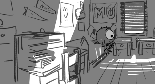
Photo
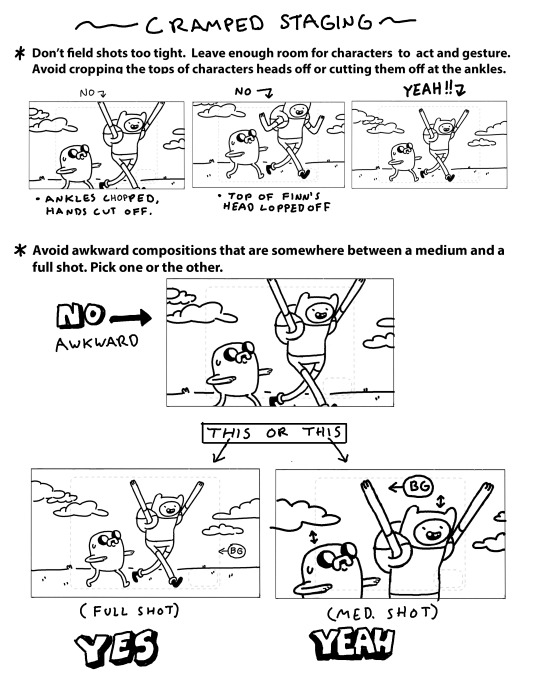
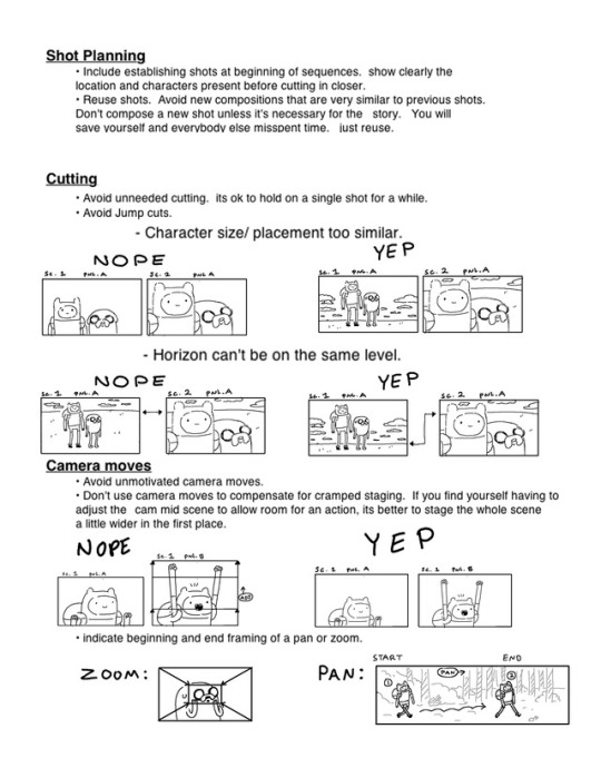
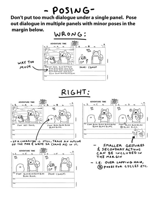

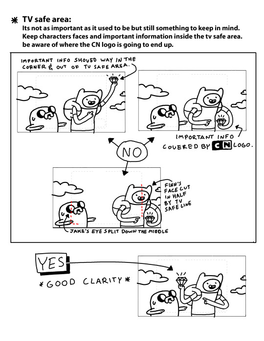

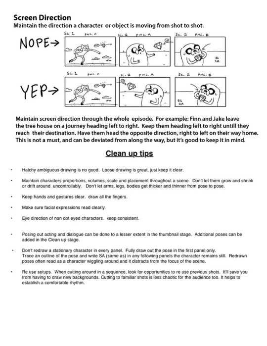
by storyboard supervisor Erik Fountain
A few years ago, Erik put together these updated AT storyboard guidelines for new board artists and revisionists.
123K notes
·
View notes
Photo


Hi! no I m not dead \o/ I was just extremely busy to work on Incredibles 2 and to watch a ton of movies these last months :) (89 since january, yolo!)
you can find my favorite movie list here if you are interested, I know this is a french list but you can find the original movie titles below each title :) it worth it!
https://www.senscritique.com/liste/Alert_top_50_masterpiece/1602212
What are these thubnail beat boards about ? A little teaser :) : I m making a storyboard exercise , short story for a Mark Andrew workshop that I have the chance to participate, just for fun and to train myself :)
I must admit that I have improved a lot since I m at Pixar surrounded by so much great artists , but I m not satisfed, it is just the beginning that’s why I want to train more. Plus I want to do more personal stories, more experimentations.
I m also working on two side projects , personal, for fun, beside my Revolution comicbook, more news in the following months, especially september :) One is an illustration project named clyde vanilla for the youtuber Antoine Daniel (What the cut), one later with a friend but I don’t want to talk about until it is concistant!
Thank you for following me and forgive me for the super late post! I ll post the final exercise soon I promess!
467 notes
·
View notes
Photo

Blade Runner 2049 composition studies by Matt Jones
On his YouTube channel Matt Jones has been sharing videos of him doing digital composition studies of Roger Deakins cinematography in the Blade Runner 2049 Trailer. You can watch them here and here.
In these videos Matt also shares some of the thoughts with which he approaches these studies. I found those very interesting. You get to see how he looks at these images, what information he focuses on and how he builds up his panels. It’s like you can actually read his thoughts.
Most of these captions are very specific to the frame he is working from, but some of his remarks can also be read as more general thoughts on composition and storyboarding.
Now, since I’m such a nice guy I, wrote all of them out for you. You can read all of them below!
Screen-grab the new trailer . . .
Make a template to match the screen ratio of the film
Don’t TRACE the images. Try to match the composition by EYE
Holding down SHIFT while drawing snaps your brush to the horizontal (or vertical)
Simple gradient to suggest atmosphere
GAUSSIAN BLUR filter to add depth
High angle- the extreme perspective distorts the ATARI logo
The perspective lines draw the eye to the moving element
The film-makers are not afraid to have the moving elements of a shot TINY in frame
Horizon line placed just below the center of frame
Many of the wide shots in this trailer are symmetrical while character shots are asymmetrical
Again, the point of interest, the figures, are TINY but read because they’re placed at the point of HIGH CONTRAST
Again, a symmetrical composition with the horizon line just below the center of frame
No need to draw EVERY step- just SUGGEST steps
Isolate background and ‘knock it back’ by blurring and reducing the opacity
Use light grey to highlight those figures
Use white for the highest point of contrast: the female figure
Blur background elements and bring down opacity so the character has the highest contrast values
Again, the character is framed off center, high angle and close
Off centered framing & minimal background focuses on the character
VERY minimal background; it’s all about the character
Symmetrical composition, horizon line on lower third of the frame. Surreal image; reminds me of Jonathan Glazer’s ‘Under the Skin’.
For perfect ellipses use the ELLIPSE tool!
Again, character framed screen right with VERY minimal background
High angle, over the shoulder, fore-ground figure ‘owns’ the frame
- - -
Rough in perspective lines as a guide
Establish foreground element (heaviest black)
Establish character (focal point of shot)
Elements in background are lighter
Always remember CONTRAST in values
Background elements should not be distracting
Distant lights can be simple
Sci-fi establishing shot! Amazing architecture
Rough in the perspective (high angle)
Block in tonal shapes
A suggestion of background buildings adds DEPTH
Blur gives more depth
Low contrast in this shot since it seems to be obscured by weather
2 shot but focused on foreground character
Background detail sparse and blurred
Block in the lighting simply
Insert shot, high angle- over the shoulder, close on gun
Focal point of shot is the hand and the weapon
Foreground shoulder & background blurred. Shallow depth of field
Deakins uses simple highlights to bring elements forward
Single shot, high angle and close
Very simple background elements
Block in simple tone
With linework think about drawing SHAPES and PLANES. Not overly detailed.
Keep lighting simple and clear
Establish perspective. Wide shot, low angle
This is a vertical camera move so the cropped holographic ballerina looks a little odd here
Use blurring and lower opacity for simple hologram effect.
Horizon appears to be almost on the actor’s eyeline
Also, a shot behind an actor’s head strangely puts us in their shoes
Deakins loves to use silhouettes!
Again, keep background elements simple.
Use shapes, contrast and overlapping forms to suggest DEPTH.
The BLUR tool is your friend- as long as it is used to contrast with something in SHARP focus
It doesn’t take much to SUGGEST figures. Umbrellas help too!
Wide shot. Horizon appears to cut the frame in half giving a symmetry to the shot
Rough in a perspective guide
Block in main planes: foreground, mid-ground figures
I tend to always use grey as a base color for most boards
Again, the background only needs as much detail to SUGGEST an environment. Don’t distract from the point of interest- the FIGURES
Adjust scale of figures. Deakins is not afraid to have tiny figures in frame
Notice all lines of perspective lead the eye to the characters
Same scene. Medium shot. Horizon central but technically a low angle.
Block in the shapes- it’s easy in silhouette!
Background can be loose. Focus is on the characters.
Linework just needs to communicate ‘two figures look at each other’
Silhouette but there is some detail in there; subtle light on the faces
Subtle highlights to bring them forward
#storyboarding#storyboard#Matt Jones#blade runner 2049#blade runner#cinematography#roger deakins#composition#film
108 notes
·
View notes


Photo
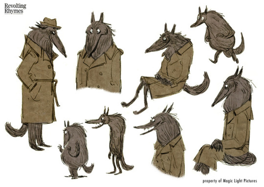
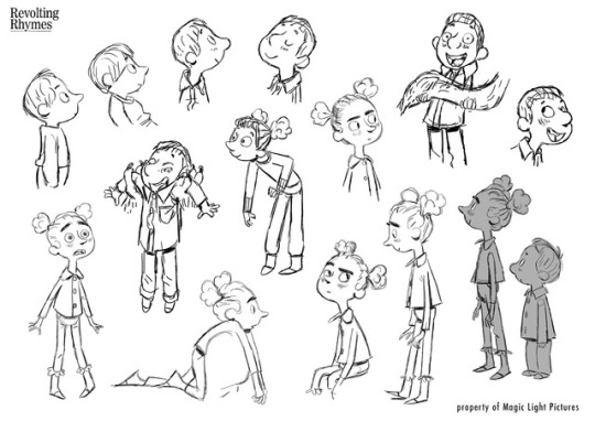

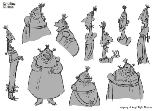

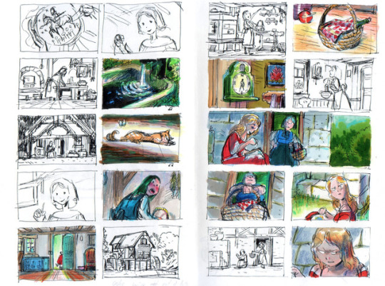
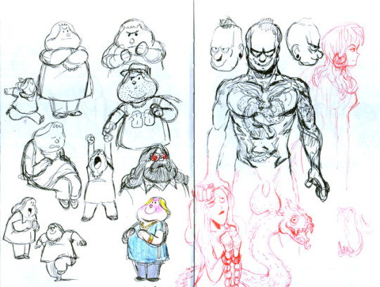
Magic Light Pictures produced an animated adaption of Roald Dahl’s Revolting Rhymes, directed by Jakob Schuh, Jan Lachauer and Bin Han To.
I had the pleasure to design some of the characters.
1K notes
·
View notes
Photo


“But the rewards are eternal.”
Pearls of story wisdom by Ronnie del Carmen.
Covering story and character is mission one in this job. Tone and composition must serve the story.
Story jobs are very painful. You have to invest of yourself. Ready to discard. But the rewards are eternal. It's writing of another level. But make no mistake. It is writing another draft.
Via twitter.
169 notes
·
View notes
Photo
A repost from some time ago. I was browsing my archives and rand into this baby. Man, I really love this little board. Only 26 panels, but wow... So good!
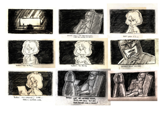


Batman Storyboards by Mike Thomas.
A little traditional story test Mike Thomas posted on his blog back in ‘09. I’ve posted a few of these panels a couple of years ago but I really wanted to post this awesome thing in its entirety.
I love Mike’s take on Batman and Robin. And man do I love these dirty old-school story sketches!
www.sketchmt.blogspot.com
32 notes
·
View notes