
Last Seen Blogs

keedster
Thrift store sweater with the holes

jinmukangwrites
fluff? never heard of her

elpappy1
Untitled

vaulina20
Без названия

sirtravisjacksonoftexas
Untitled
Photo
Wasn’t it Forrest Gump who said “Stupid Gives as Stupid Dies?” I dunno - something like that. @NYTimes 7/24/20
0 notes
Photo

In the long-term care facilities the coronavirus finds what it likes. And takes it. #NYTimes 5/10/20
1 note
·
View note
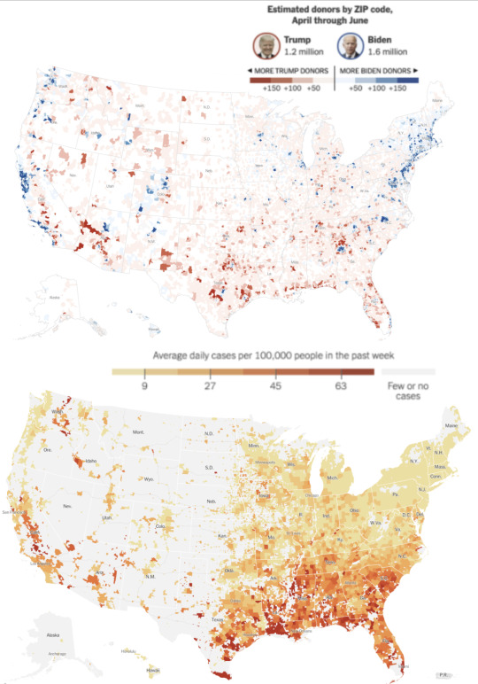
Photo

The improbable dearth of death as one moves east into the blue. The similarity to a health data transparency map would be conspicuous if such a thing existed. #reddit 5/10/20
0 notes
Photo

#covid19 list of contact tracing tech. MIT Technology Review 5/10/20
0 notes
Photo
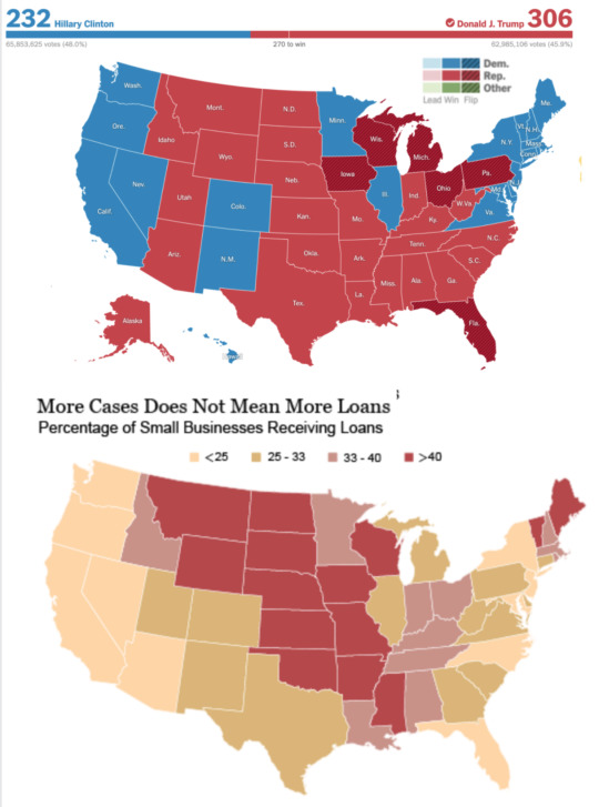
#PPP #CARESAct #COVID19 That shape again, though this time looks like someone mis-addressed the checks intended for the Southeast + sent them to the NORTHeast. Payouts to #RedStates to delay #ReOpening would make sense, but the exact opposite? Go figure. @NewYorkFed @warren 5/7/20
#ppp#paycheck protection program#coronavirus#red states#reopening#federal reserve of new york#liberty street economics
0 notes
Photo
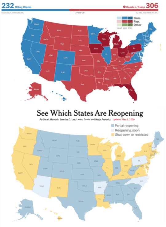
@NYTimes Once again that uncanny resemblance, and so evocative: “Sow the wind...” , “Fool me once...”, or perhaps, “Men are punished by their sins, not for them.” @smervosh @LazaroGamio @PopovichN 5/5/20
11 notes
·
View notes
Photo

@apple #MobilityTrends as an array of all US states sorted bottom left > top right showing suppressed movement since the #march2020 #covidcrash and unfolding #releaseVariability. Tourist economies NV/FL/HI show their pain more nakedly in context apple maps 5/4/20
1 note
·
View note
Photo

Plucked from @apple, an evolving typology of mobility trends for major countries trying to re-mobilize out of #Covid19 paralysis. Color stamps contain region abbreviations and iso 3166-2 country ids. As always, no China.
0 notes
Photo
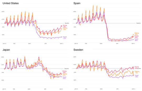
@apple maps #MobilityTrends crowdsourcing the #CovidCrash and the tentative crawl back to baseline. Did Sweden do it right? 5/3/20
0 notes
Photo
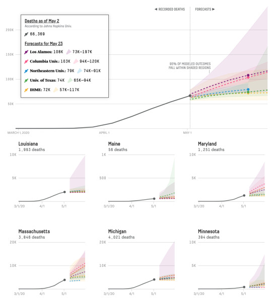
@NateSilver538 presenting the terrifying uncertainties in aggregated state level #Covid19 forecast comps for 3 weeks out. @FiveThirtyEight, awesome as always. 5/3/20
0 notes
Photo

@NPR dispenses with complexity and presents trailing 21 day #Covid19 cases and deaths by absolute intensity. More simple and honest than the growth rate + doubling time versions that have taken over everywhere else. 5/3/20
0 notes
Photo
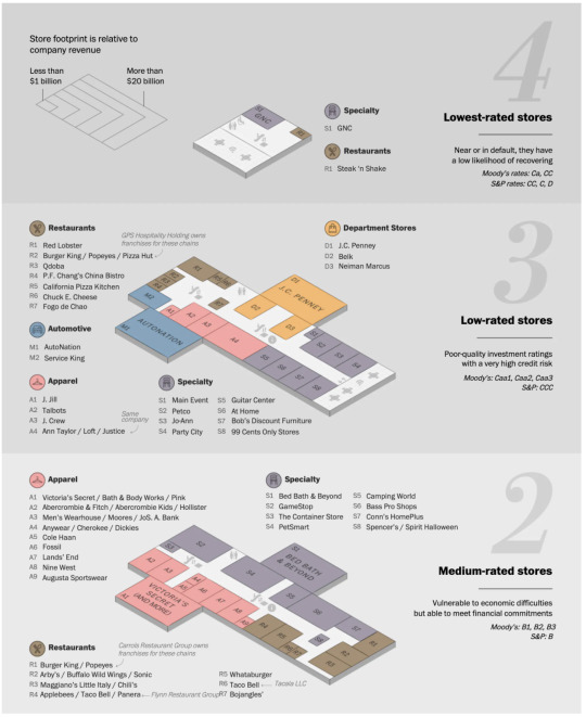
@washingtonpost presents relative vulnerability of high profile mall tenants as… a mall. In the midst of #RetailApocalypse, what brands can survive an actual apocalypse? 5/3/20
0 notes
Photo
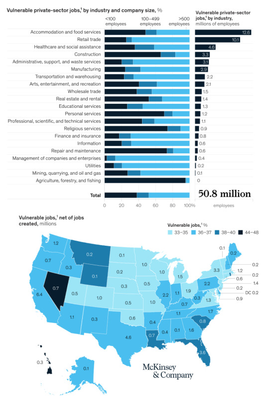
@mckinsey assessing industry and employment vulnerability. Anticipating the pain and quantifying latencies in #ReopeningAmerica 5/3/20
0 notes
Photo

purple = blue + orange :: covid = black + hispanic. approximately. @NYCHealthSystem here + @NYTimes here. @lpolgreen 4/30/20
0 notes
Photo

Another persistent @FT chorplethic data staple: Anti-Covid regulatory #stringency by country. The animation is enlightening. Not likely it will relax as quickly as it constricted, unfortunately. 4/28/20
0 notes
Photo
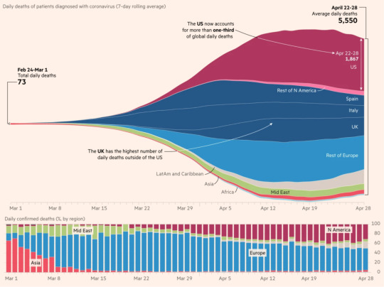
The staple @FT #StreamGraph morphs from #DeathFunnel to wineglass, but… do we really believe this is its shape yet? It has a nose of Anglo American sample bias and finishes lean for lack of #ExcessDeath. @sdbernard 4/28/20
0 notes
Photo
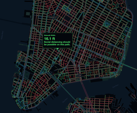
Simple and delicious @tranopticon @mapbox. While providing more detail than the typical pedestrian will probably be using to find her way around town, the whole NYC walkable landscape is articulated here from the city’s sidewalk database. Beautiful. 4/28/20
0 notes