Text
AUDIO
Hi. How are you? Kinda hot out, huh? Not too bad though. Nice jacket… Yeah… Oh, are you waiting for me? Oh man I’m sorry I was just — you know. Anyways, yeah I’m Evan, you know me, I draw them pictures but that’s not all I do, no sir, I am multidimensional, like an egg, insofar as an egg got the old xyz axes what tell it what volume it occupy within cartesian space, but it’s also got them eggy subcomponents what create division WITHIN the larger organizing dimensional paradigms of space and time. So like the egg I do persist in reality but I simultaneously occupy different spacial organizations. I draw them pichahs, shuah mistah j, I also write words as I’m sure you’ve noticed, but that’s just the shell and the whites, down there somewhere is a runny yolk comprised not of lines, color, or hallucinations of meaning but of SOUND.
I also do audio is what I’m saying. More pertinently I sometimes do audio for Thetics stuff. Nearly all of it is under wraps but recently we bashed together a little low-stakes actual play podcast pilot and I thought it might be fun to show you how the intro music happened. Walk with me. (Character art part 3 is still in the pipes, up next.)
The current intro music for our little podcast Argent.
Now this is an odd bit of work for me because I'm normally a cahhhmpahsishin* fellow but for this piece I did nearly everything but write the parts. It’s really a kitbash of musical ideas from various things that I arranged and recorded.
*composition. If you can tell me why I’m doing this bullshit, please do, I’d really love to know.
When we were first tossing the idea for this podcast around (way before we started putting it together or anything) Sasha sent me a little melody they imagined on guitar, and I recorded it and sent it back to them with a little expansion.
Music is often an early thought for us in our projects. Having themes or motifs or ideas about instrumentation can help us create a visceral sense of feelings we’re aiming for. In long writing or design stretches, they act like anchors, a place to return to, or verify our current work with.
Here, there was this lovely sense of troubadour-ish-ness with the single guitar, an intimate kind of feeling, like someone was there in the room with you, playing in this very stripped down yet melodic manner you might characterize as vaguely renaissance pastiche. Anchor set, it had something to it musically and it married well with the nature of the program, relatively light, a little trope-y, that good ol’ mixolydian brightness lighting up a sense of majesty and adventure. That being said, we knew it wouldn’t be the whole picture. There was more to find.
Dinky lil things. I like sketching with dinky sounds cause it sorta takes expressivity out of the equation, makes you focus on the notes.
I did a lot of sketches with little dinky music box noises and strings and whatnot, tried expanding out the guitar sections with folk-isms and fingerpicky stuff, but nothing really clicked. To my ear we were missing something, a feeling of expanse and motion. The main character in our podcast is a courier traveling the country, after all.
Thinking about travel put me in mind of music I’d been listening to from West Africa. I’d gone down a little guitar douche rabbit hole, having gotten introduced to Oumou Sangare and lapping up projects featuring her guitarist and then out into more work by your Ali Farka Touré, your Tinariwen, etc. I imagine this is the kind of thing every guitar guy does when they’re confronted by “desert blues” stuff, and it’s for good reason. It’s a bridge between many different traditions, and it’s produced a style of guitar playing that is both very interpretable to anyone who’s learned the blues scale and very different in it’s rhythmic priorities and ornamentation.
youtube
Afel Bocoum's Niger stuck out to me as a really wonderful picture of motion, expressed through it's rhythmic motifs and groove. It is, as you may imagine, a song about the Niger river, and I find it hard not to imagine walking beside a great river when I hear it, especially when it kicks into the higher tempo and you get the little triplet figure on top of the 16th note engine -- just the perfect amount of syncopation to give it a real spring in its step. It's also worth noting that these dudes are all real good musicians, and their improvisation and interplay gives all their music so much life and unpredictability. Listening to artists like this convinced me utterly that the core of music for the podcast had to be something played live, that we should really minimize elements like synths or samples.
To be fair, that's usually a thing I want. I tend to write a lot of guitar-forward stuff for projects as a result, but there are things which always wind up compromised when working alone. For example I am not a drummer, I do not own a drumkit and software drums trying to sound real nearly always wind up sounding pretty lame. In all my time doing music production the best drum sounds i've gotten out of software have been leaning into their un-reality. But then you hear musicians like this and you remember oh man live percussion is just a thousand times better. John Bonham is just a thousand times better.
youtube
Easily in my top 5 of all time
Led Zeppelin's Swan Song is nearly never not in mind when thinking about acoustic guitar music. It is possibly one of the most important tracks in my life and god damn it it's only on bootlegs! If Afel Boucoum nailed a feeling of motion through nature with Niger, Jimmy Page nailed a feeling of pastoral majesty and myth with Swan Song. It's one of them DADGAD tunes with that rich, ringing openness to the guitar. In the late 60s-early 70s rock vernacular, songs with this tuning are usually heavily blues based, and you hear a lot of inflections like that here but it's all cast in this much more regal light through more complex harmony. Contrasts. The V chord that opens the section around 1:20 sounds so welcome and grand contrasted to the flighty major 7s running around, the song dancing modally between major* and mixolydian. Really, a V chord has never sounded better, contrasted with the heaviness of the low D5.
*yeah if you wanna use modal terminology it's ionian. Hush, I'm trying to write.
Now this is what was floating around in my head like a year ago when we were discussing the project. It's really quite fertile ground for music making, but! As it sometimes goes, other projects took precedence. DT2 became kind of a full time gig for us and if we were gonna be doing audio for things we ought to be doing audio things for that. So Argent got shelved, and further musical explorations with it.
Which is why it was kind of bizarre to pick it back up when we decided to pitch it. Back in those early discussions we'd recorded a couple test episodes, real barebones affairs with awful audio and a very shakey gameplay system, that we were gonna use for our submission. It seemed pretty apparent we needed to sorta class the joint up a bit so my plan was to score some of the episode and bash together an intro as quick as possible.
What does an intro need, really? In my estimation, it needs a bed for voice-over, a section where the music takes the forefront that is distinctive and hooky, and some kind of dismount. Not a whole lot really. I spent a bit of time writing stuff trying to pull together the influences noted above into that format, but it became apparent that it was just gonna take more time than we had to get a thing I was really happy with.
Scoring also wound up being a bit of a dud. I wrote a billion little sections on guitar that I was quite happy with but with the awful audio quality of the actual episode, and what wound up being a pretty mediocre setup for acoustic guitar recording, the production just wound up being distracting, the voices and guitar competing for already shakey auditory real estate. We'll have to try that again with better equipment.
So. Compromise. Temporary stopgap measure. I can't make the bulk of the show sound particularly pleasing, I don't have time to compose an intro that really does the thing musically, and I can't record my acoustic guitar to a high standard. I CAN WORK WITH THIS!
Step 1: solve for the guitar.
I know the piece will still have more personality if the acoustic guitar is the main feature. So, ok, time to try a bunch of shit out. I am no stranger to fucked ass audio solutions (you can go look at my old band STRIDER's insta page https://www.instagram.com/strider.tunes/ to understand the depravity) so I know at the very least I can get something to work.
Hypothesis 1: record using my phone.
I've actually had some luck recording with my phone before. Most phones have really aggressive compression going on that can sometimes work to bring up the detail with acoustic guitar, and you also get some nice lo-fi credibility with it.
The lo-fi thing is a double edged sword though cause while the tonality is livable, a lot of noise is not, and I could not get a recording that didn't have a pretty sizable hiss. Add on further compression in the mix and it's a dealbreaker.
Hypothesis 2: weird mic placement
Conventional wisdom regarding acoustic guitar mic placement does not and has never worked with my acoustic guitar. I love that guitar, I've had it since I was like 14, but god damn it doesn't like to be recorded, and especially not with an SM7b which is the best I got right now. So time to just try everything, put the mic in the sound hole, fuckin put it behind me, above me, next door.
The best one I found is kind of over the guitar in front of my shoulder, sort of where my head would be if I got real hunchy when playing. Still sorta sounds weak, but it's better! This is progress.
Hypothesis 3: Double everything
Jacob Collier mentioned in one of his gigantic logic session breakdowns that a voice that sounds kinda corny can sound really legit if it's doubled or tripled or whatever. This guitar is a little reedy, a little thin on it's own but if I just double track everything...
Now that somehow sounds authoritative. Bam!
Step 2: Grab the parts.
If I'm not gonna have the time to compose a new thing that's really unique and speaks to all our influences, why not just use the influences? Not like we're selling this or anything, this is just to legitimize a pitch. Sasha's initial melody fits the bill for narration bed, Niger fits as the hook, and Swan Song really amps it up for the dismount.
Step 3: Arrange/Produce/Record/Mix
With the melodic and harmonic side basically in place, it's time to figure out the supporting instrumentation. That means settling on things like percussion and bass, drones or textural things, and little odds and ends.
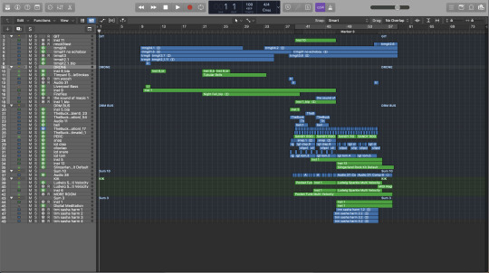
Quite a manageable mix, overall.
I'll spare you a full session breakdown, but let's take a look at some lil details you might miss.
When I was putting together the percussion section I quantized pretty hard at first, getting everything very close to the grid, but these lil bongo and scrape guys had a completely different feel. The loop was from a previous project, played by like a real human, and it's all quite wonky, a lot of it hits very early relative to the grid but it sounds totally natural. So rather than trying to smooth that out, I just made everything else mirror it's wonkiness. It was tedious work scooting all those notes around to mimic those imperfections but the track is much livelier for it.

Speaking of the percussion, there are actually four distinct kick drum sounds on this track (plus some very quiet timpani in the opening). They got very different functions, too. The first is like the core kick drum sound. It's supposed to be pretty acoustic sounding, have some nuance in it's dynamics, but not have too much beef or midrange complexity, because the second is the big boy with that huge low end, you know what brings the grandeur to the proceedings, and then there's the third fellow who hangs out with the first one and marries it with the texture of the snare drum. Fourth is the little knocky fellow who closes things out with the guitar at the very end.
Lastly, lets note the final plagiarism in this piece. The vocal line that comes in at the end (which Sasha sang wonderfully and I aggressively pitch shifted and modulated) is from a piece by Goldfrapp called Crystalline Green.
youtube
There you have it folks! That's a track! I'll leave you with a final thingy: The outtro! I accumulated a lot of drone-y things trying stuff out for the intro, so I took the percussion sections and some of those drone-y things and blasted this out in like half an hour.
7 notes
·
View notes
Text
Let's Talk ENGINES
“If DT2 is a visual novel,” you might ask, “why are you bothering to build it in Unity? why not something like Ren’py, that’s specifically built for visual novels?”
Well, I’m glad you asked. Thank you for asking. It’s really sweet of you to set up the premise of this post for me.
The short answer is: we’re doing stuff in the dialogue that requires more from the engine than Ren’py can really offer out of the box, and i would rather learn C# than Python.
the long answer goes a little like this:
I really did give Ren’py a run for its money. But Ren’py’s organization is really designed for a straight linear story with a couple of gentle variations in it. Multiple branching paths, especially branches that affect the story in really meaningful ways, are incredibly clumsy in Ren’py’s code interface:
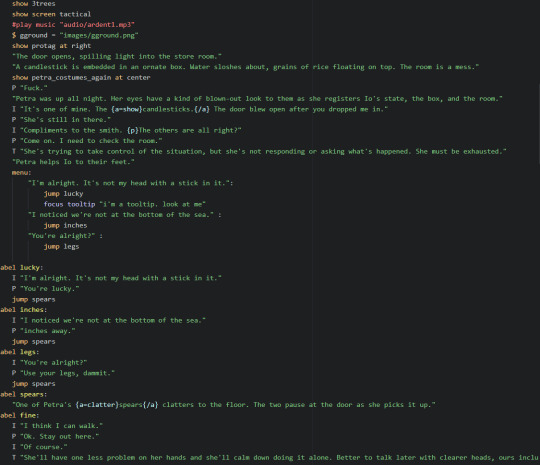
This is what the code looks like for a very simple, small branch, like this:
a
/ | \
1 2 3
| | |
4 5 6
\ | /
b
…which immediately loops back into the linear plot regardless of what you choose. Now, imagine hand-coding that for a tree that looks more like this:
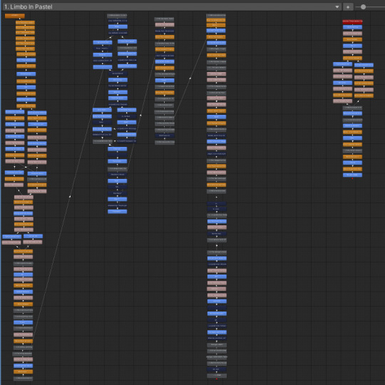
Terrifying, right? This looks intimidating in its simplest form, much less as raw strings of code. I needed something more self-evident or I was going to lose track of things very quickly.
(We also wanted a few UX features, such as a dynamic mouseover tooltip system, that Ren’py was just not equipped to handle gracefully.)
Now, technically, Unity doesn’t have everything we need out of the box either. But what Unity has going for it is flexibility, a vast user base, and dev products specifically made to solve problems within it. Dialogue System for Unity was exactly what we were looking for: node based organization akin to twine’s Harlow layout (which i’m very familiar with from working on You Will Surely Go Mad many a year ago), deep documentation, a formidable pedigree including Disco Elysium, an active forum and a very helpful developer, and even a chapter style organization so that a conversation can have a flowchart all to its own. I had money at the time, so I sprang for it.
The mouseover itself…remains a bit of a headache. But it works! No one can tell me it doesn’t work. Well, they can, and probably should if it’s bugging out, and then I’ll go and have a good cry about it, because it was so much effort to get it functioning as it is. A good portion of that is due to my friend C.C.’s expertise and eternal patience helping with code tricks I ain’t never even heard of before.
But that’s enough technobabble for the moment. You made it to the end! Here’s a cozy Io.
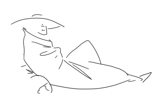
-Sasha
9 notes
·
View notes
Text
Drawing People 2
Expecto patronum, my dude. It’s me, Evan! I am but a humble visitor in your land of tumbling, so I do not mean to presume, but perhaps the “long post” tag applied to my last missive means verbosity hath claimed my tongue, once again. Let me see if I can make the second act of this drama a little snappier.
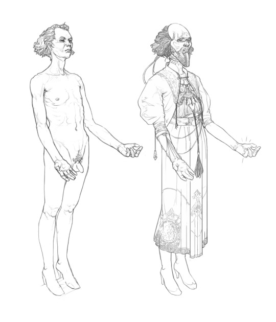
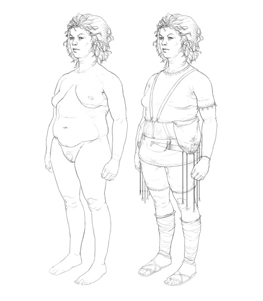
these folks got basic, boring poses so I could use them as simple mannequins. Drawing like this out of my head is fun, but kind of time consuming. Doing a thorough job of the figure before clothing it shortens the time a good bit, and keeping the pose pretty simple removes any demand of the fabric to do difficult things.
Who this? Can’t tell you. Why this? Experimentation! These drawings were great test beds to answer questions about rendering: what kinda stuff works with characters in this idiom, what kind of linework, what level of detail, etc. But on the other side of the arbitrary distinction I’ve just decided to conjure are compositional questions. God I love that word. Composition — The sum of a picture.
Art history, and particular commercial art history has so many good answers to compositional questions, and a lot of their answers make a lot of sense for visual novels, what with commercial art often needing to wrangle decoration and flatness with representational stuff. I’m partial to the solutions of your Muchas Alphonse and kin, but that sort of density and curation of parts is only possible when you’re working with a single picture at a time. Duh, you say and I concur. We have to do more modular stuff, especially if we're going for a high level of detail, and we’re splitting up character and background duties. We needed to find ways of simplifying, modularizing and keeping things unified.
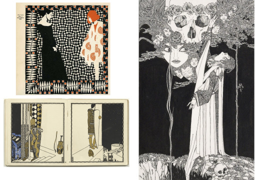
Western commerical art in the late 1800s is really a zenith of single-picture making in my books. It seems to me that there was an endless variety of exciting design exploration supported by real chops.
Luckily commercial art has some answers to this as well. Ya’ll heard of the Weiner Werkstatte? How about John Austen? Oh you’re a connoisseur are you? You’re a quite hip individual? Well then, you heard of Carl Otto Czeschka? (I dunno if that’s actually a deep cut.) Here are some common themes between them. Flatten space, use only a few distinct values and colors and use heavy blacks to unify the picture.
Aside from these general ideas, we were specifically interested in Austen’s use of orthogonal perspective. It seemed like a really natural fit — centering the picture on the characters with the world as framing, it’s flatness generating less friction with textual and decorative elements and giving us a pretty consistent format to interface foreground and background elements. Hypothetically it gave us a tremendous amount and demanded less work… Hypothetically.

Pyrga didn’t wind up actually featuring in the prototype but I still love the big weirdo. A compositional feature you might not notice unless you a comp dweeb is that they're not fully balanced pictorially. They very much need an answer to their left, preferably above their shoulder. I tried to carry this compositional incompleteness forward with every asset so they would mesh well with one another and even if they were solo, there would be a visual relation with the background.
So bam. heavy blacks, less variety in the linework, very few colors and orthogonal perspective. There are things that work well here: being attentive to the turning edge of the shadows gives it a flavor I don’t see many places, and aiming for more naturalism gets it out of the Hades/Hellboy sorta cartoony zone that it was trending toward initially.
There are problems, too. I’m not good enough to get that level of naturalism out of my head with any kind of speed so I needed reference. With this character, that’s sort of ok. They're kindof an amorphous blob of fabric and that’s just fine for kit bashing different references and imagined bits and whatnot, but other characters have much more, let’s say definite garments. Secondly the spot blacks pose a real issue for decoration, they wind up needing to override any kind of patterning, and the linework on turning edges winds up noising up and cluttering things. The lack of line opacity and overall brush size is also making some detail work challenging, but I wasn’t quite sure how else to get the linework readable with the asset scaled at different sizes.
Now all this stuff shoulda given me pause, but there were a lot of plates to keep spinning. We were in the thick of writing, I was bouncing between finishing up other designs and trying to get the UI on track, yada yada. Petra was on the mind, as well. We were missing some key things for her — A mask and a cloak.
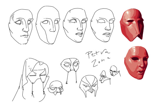
Designing this mask coincided with a push for more overtly greek looking stuff, so I was thinking of how to style a sort of blank face after typical greek statue face forms.
What good is a mask to a very overpowered warrior? Our answer was threat display, what with Petra often fighting enemies that wouldn’t be repelled by armor. This was something to stop hapless goons from running into the three toothed meatgrinder. So the question is what’s scary, then? What’s badass enough you don’t wanna fuck with the person wearing it?
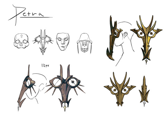
It’s nice to do a little painting every now and then. 90% of this project h linework and flat color. Here the painting was particularly useful to communicate the form to future me who’d have to draw it from a lot of angles.
Turns out neither of us wanna fuck with the Hydratic's eponymous Hydra. It’s a pretty obvious subject in retrospect, what with Petra being a state zealot, but the thought of making that her mask didn’t come up till quite late, likely because in my head the Hydratics were a fundamentally 2d people — wouldn’t you know, turning a 2d idea 3d gave it a lot of personality.
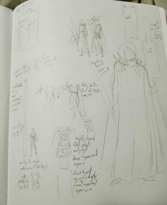
A sasha sketch page. They had a lot of really fascinating ideas about Hydratic garments that made so much sense for their history.
The mask design was pretty straightforward all things considered. But the cloak… Sasha and I had been trading sketches of just what to do with that fuckin thing for like months. It was a complex problem because there were a lot of bases to hit. The Hydratics are modern, sporty, military, brand heavy, decorative, flat, uninterested in veneration. Petra is workmanlike, zealous, uncharmed by culture, physical, and at a pinnacle of hydratic military service. We need some indications of greek-ness no matter what, but we shouldn’t be too greek cause reasons. Getting these competing elements to all work together became a very interesting puzzle. How would you solve this?
For us the answer actually came outta watching 1917 a while back. Both Petra and Io are supposed to have a couple cues that liken them to ww1 soldiers, their experience in the apocalyptic conflict sharing some character with 1917’s hellish proceedings. This got me thinking about more dedicated military gear, and a slightly different character to Hyrdratic warriors. What of instead of hoplites, they were more like riflemen?
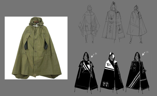
This almost looks like concept art!
In research, I’d found a genre of eastern european military poncho/cape thingies that really worked. They got armholes so the soldier can handle their firearms while still wearing it, it doubles as a tent, it’s rugged, it’s got kind of a rigid silhouette but it can be worn in interesting ways to break up the figure, and importantly, it’s got a whole lot of real estate what you could jam Hydratic Icons on. It’s a perfect fit for Petra who’s traveled Greece fighting monsters and champions. Her spears even work as tentpoles!
I can’t say I’m 100% happy with the final design (pictured at the front of part 1) but good golly it’s a hellofalot closer to the goal than what we were cooking up before. So I think we can call this a draw. Some problems on the style front, some solutions on the character design front. But the damoclesian sword of asset-completion hangs large above our heads, dear reader. Oh dam I think that means there gonna be a part 3! Good golly! Check back in soon for the laborious conclusion to this junk where I do a full process breakdown of an asset.
13 notes
·
View notes
Text
2 Weeks in 3D
Hey, it’s Sasha again. What have I been up to? I’m so glad you asked, gentle reader, because we’ve been doing some visual explorations of what this game should look like, and in pursuit of that I have been learning Blender, and I am now prepared to make that everyone’s problem.
My recollection of the formal education I got in 3D modeling is unpleasant, rudimentary, and I wasn’t really paying attention at the time, so most of my work nowadays involves squinting and swearing at a computer program, and then looking up “[x] tutorial” on youtube. There are some solid guides! I keep a playlist as I go along so I can return to them when I need to. Reading the titles in order as I fumble my way through game development is a fun little instance of environmental storytelling.
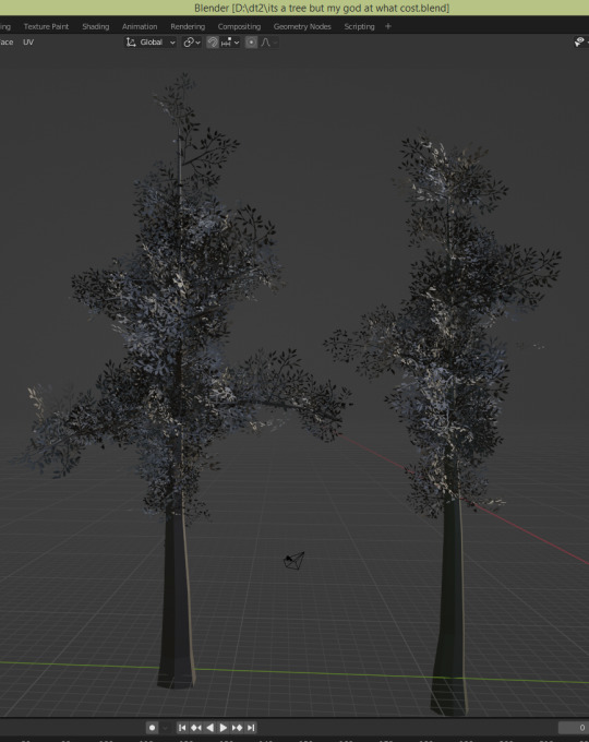
My first forays were just trying to build a good looking low poly tree. We’re keeping things low poly because 3D is not my thing and if it looks wonky it should be a charming kind of wonk, and low poly is good for that. (there are some folks who are really, really good at making low poly look expensive as fuck, and I respect the hell out of them. But I am not one such creature. I went to art school for comics.) It turns out there’s a lot of ways to build a low poly tree, and I was feeling a little listless working on such a solved problem, one I wasn’t super passionate about, and one that didn’t apply immediately to something we were going to publish.
So I switched tacks to bringing the Oneiric into 3D.
You’ll recall I wrote a bit about the process of designing the Oneiric here. I have a very good sense of what I want this boat to look like, and it is guaranteed to be an important place in the game, no matter where the crew land– the game’s Starship Enterprise, to steal a useful parallel from Evan. But how to build such a thing…?
I gave it a shot just running at it. I have a top-down drawing to work off of, after all. It was going alright until I had to make anything other than the deck, and then my brain just fizzled out trying to figure out how to wrap the bulwark around the edges, much less build out the bottom of the boat.
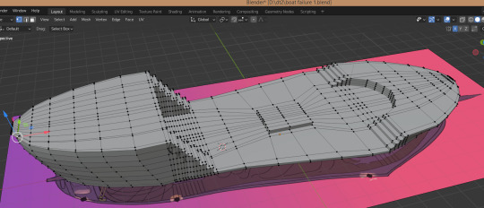
So I looked up a tutorial for how to model a ship. And, wouldn’t you know, just like any other artistic endeavor, the answer is not to start with the details and work your way out, but to get the big shapes in first, refine those until you’re happy, and then break it down into slightly smaller shapes, get those to a good place, and so on. Which I already knew about, but frequently forget; I think here I got so caught up in thinking about the details as person-sized and interactable, and thought I ought to start building from that scale.
The second go around went a lot better.


Ropes are very legitimizing, aren’t they? I’m about 70% sure these are the right ties for this particular kind of ship. Then again, it’s kind of a bastard of a boat anyway, so who can say what “accurate” even means in this context?
That was last week’s work. This week, the foray I had into Blender was a bit more personable. I wanted to test the Oneiric as an environment a character could run around in, but I need a character to do that! Axioche’s design is the most stable, so I gave them a try:
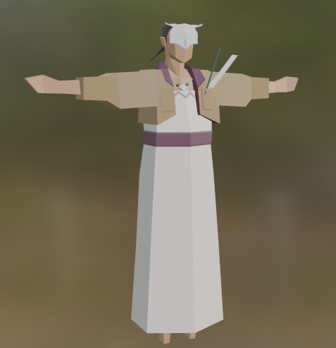
…and then spent a full day wrestling with rigging.
If you’ve used Blender before, you might know about Rigify, the built in plugin that gives you a gorgeous rig right off the bat. It’s supposed to be as one-click plug-and-play as they come, but naturally I ran into all sorts of haranguing bugs and issues about it. I won’t get into it here because it was equal parts infuriating and boring. But look!! They can pose now!!
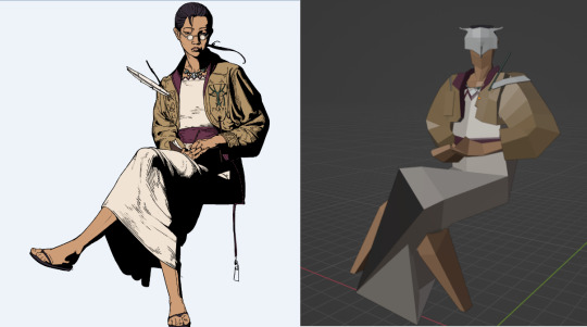
There are still a lot of issues with the model and rig that I need to iron out, but that’s work for next week. I watched this video on “Rigging a Wizard” hoping for some tips on rigging Axioche’s dress (tutorialtube has yet to let me down, no matter how obscure my request) and then tried out a really simple wonky walk cycle, and then followed yet another tutorial for putting it in Unity and attaching it to a player character who can walk around.
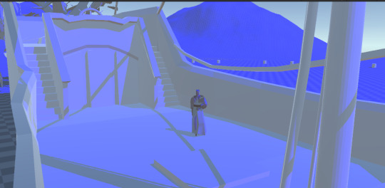
Considering I started the day with just a T-pose I think I had a pretty successful Thursday all in all.
Quoth Evan upon seeing a little Axioche running around on the Oneiric: “THAT’S A GAME”
-Sasha
8 notes
·
View notes
Text
Drawing People
Eeyyy its ya boi. We probably don't know each other. I'm Evan. Real quick, lemme borrow your eyes, please. Look at this. This look like anything?
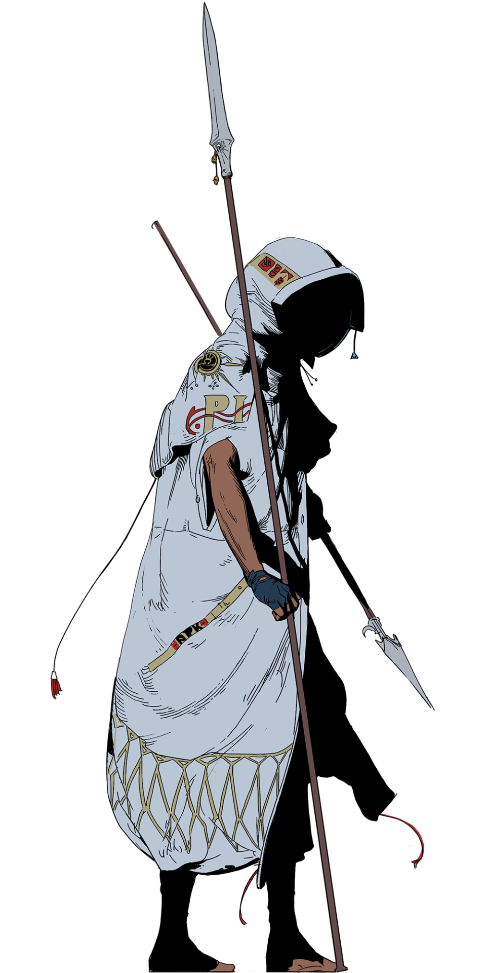
a character sprite for the prototype we submitted to indiecade
... Yeah, you're thinking what I'm thinking. It’s not there yet… Getting There is a whole thing isn’t it? Getting Here sure was. Difference is I can talk about Here. I can’t talk about There yet. There is a mythic place. Here's charted waters.
Who this, anyways? I tell. This is Petra, the protagonist’s war buddy and a three pronged pain in my ass for months. This is the story of how she came to be.
We knew very little about her when we started writing. The basic prompt was as follows: Got 3 spears and sort of an absolutist. This kind of setup begs so many questions. What do you do with 3 spears? Is it extraordinary that someone uses them? Is it practical? Absolutist about what? Why? Our initial instincts said this was either some kind of self-destructive twentysomething wunderkind or a soried fellow getting past his prime.
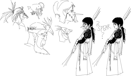
literally the second ever sketch page for this project
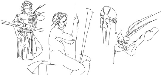
Sasha remarked how tenderly I drew this nude fellow. This made me happy. I'm a classical art guy, I've spent a lot of time trying to make nude people evoke some emotion.
We imagined you'd have to put in a lot of work if you were going to fight with three spears, so no matter what, this person had been doing this a long time. To us, the age difference spoke to the society that allowed and incentivized this work. Did we want to put a point on the mechanisms that enabled a young person to get really very good at war, or did we want to investigate someone’s ability to perform in that society past their expiration date? So much of our interest pointed to the society, and martial prowess as an extension of the state’s will, so dressing Petra as a warrior of the Hydratic state made a lot of sense.

The Hydratics are a weird bunch. They faced down a real apocalyptic threat and they did it as a people. This is utopian in some ways and deeply freaky in others. For a people to be that ready to repel an anime scale war of extermination, I reckon they’ve gotta be a little borked. I found this really fascinating in concert with our discussions of their politics and aesthetics. The Hydratics are all about community, the individual being the result of a community, and local politics and commerce being dependent on the network of people who support or enable an individual. “It takes a village” as Sasha is fond of saying.
The hydratics don't really like hero worship, or really idolizing anybody if they can help it. So how do you respect the influence of a community and an individual's contribution to it without building up any one individual too much? Their aesthetic solution is baffling and self-contradictory and I love it. They do iconoclasm by just spamming icons. Hydratic people all have an individual story that’s written for them at birth, and from that story they pull an image, an icon which they will identify them for life. The assembly of these icons implies a community, a Polis. And if more people affect your life, you add them to your Polis. Simple.
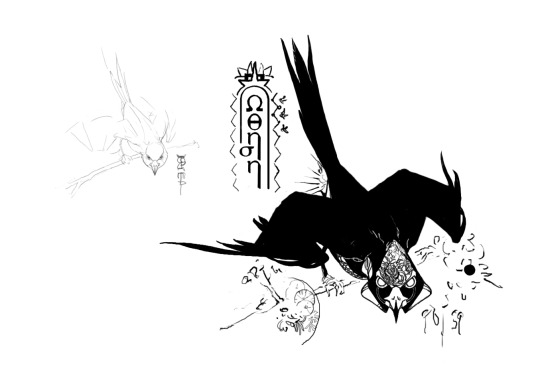
I really love birds but I don't draw em much. It shows.
We decided Petra’s icon was gonna be some sort of raptor. I really wanted something that communicated inertia, or driving force, drawn with an art nouveau sort of density. But this posed a problem. We’d decided that the Hydratics' big industries were war, food and textiles, and this was supposed to push them into a more modern look. Icons had become more like brands than illustration. This sort of style didn’t fit. Moreover the overall direction of her clothing wasn't quite right.
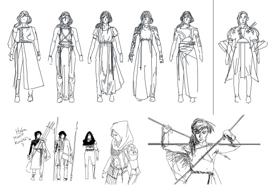
I'm not a concept artist at all, so this is the fidelity I can get when going for maximum speed.
Trying to aim at sort of greek flavored warrior junk was just making boring things. More charitably, we wanted something with a bit more specificity and personality. Something that felt uniquely Hydratic. Well a warrior is the same as anything else Hydratic, it’s a job supported by people. And being a big hero means working on behalf of a lot of people. There was something interesting about portraying Petra as the ideal Hydratic hero, wreathed in all this meaning, being reverent of and caring about all those icons, but underneath all that being sort of one dimensional, workmanlike, doing the damn job of heroing without fanfare.
I say one dimensional with love. A life lived in dedicated, high-skill service is a life without a lot of variety or a lot of time for anything else. After some work we found that the twentysomething hypothesis gelled a bit better with all this. We liked thinking about a very absolutist character in the prime of their life, having accomplished their great mission needing to reflect on their internal makeup. Petra is one dimensional in that she is absolutely dedicated to her craft, wholly zealous for the state, and the problem is that stuff's not entirely working for her now. She's got to address those ingrained values and reassess her self image to move forward.
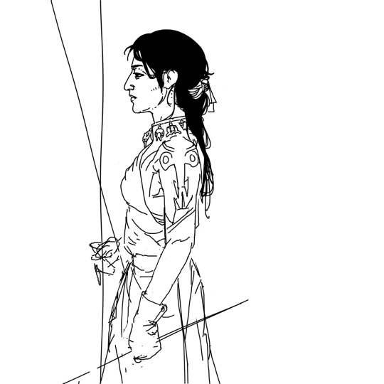
I'm really happy with her portrait here. It's so much the women in my family when they were young, absolutely fuckin stone cold driven.
It put me in mind of my mom and my aunties growing up. Women doing an insane amount of family work without any fanfare, who never really had a chance to stop, reflect or just break down for a good while. I liked the idea of portraying an indian woman who was absolutely regarded as a hero for her work and abilities, and who could just suck for a while without it being a blemish on her person or her achievements. After all, DT2 takes place after the big apocalyptic event. Petra's legacy is already enshrined in Hydratic history.
Having those ideas in place helped a lot. She’s a workman with an important uniform. She doesn’t need to be this ceremonial greek hero looking creature, she just needs stuff she can fight in and places to wear the most important people and communities in her life.
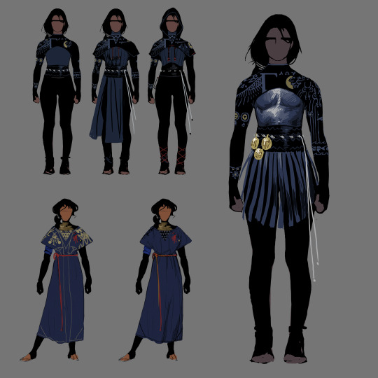
While the armored version is definitely more developed, there was something more interesting to me about keeping it covered with that almost t-shirt like form. It was understated. She could wear as many overstatements as her societal role dictated on top of that.
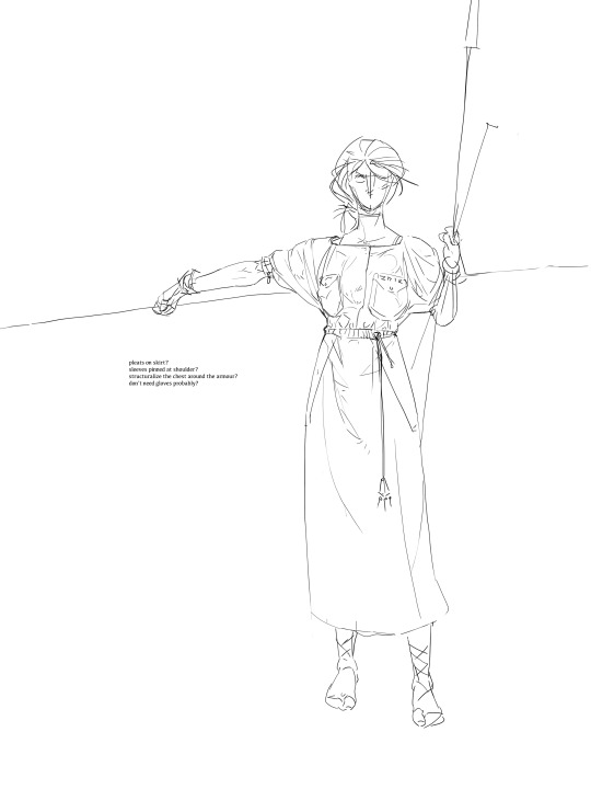
Fabric is hard. I wish I didn't like the way it looked so much.
This is where the design actually settled. Modern = pockets. That’s my big takeaway. More pockets, more fastenings. Weirder cuts. Simpler overall shapes. It’s still trying to evoke the silhouette of greek wrapping but trying to break up that form in more angular, modern ways. It also turns out adding more overall form to clothing makes it more interesting to decorate. Rather than just deforming a tapestry across the body, there's architecture to highlight, things to accentuate. That's conversation for another time though.
You might have notice another pass at her icon in those previous drawings. In trying to get her closer to a modern aesthetic it turned out I needed to reduce and simplify a whole lot.
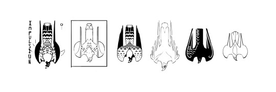
Even with their more modern mutations, I wanted Hydratics to have an old-world fascination with the natural world. If you look at animal drawings across cultures, you see a lot of odd fixations. People really wanna draw every feather on the bird or show the wildness of it's patterning, or some odd crook of its neck and most of the time it is weirdly complex for how utterly inaccurate it is. With these designs I wanted to get a little bit of that flavor by fixating on the pattern of a falcon's underside, and the strange tilt of the head.
Now here’s the thing. This is a solid design base but it’s got a ways to go before its an asset… Maybe this is a part two kind of thing. Check back in and I can tell you where it all went wrong and maybe we can talk about what I learned. Getting it There might be mythic but gently faceplanting Here sure gave me some real good compass headings.
55 notes
·
View notes
Text
Shipshapes for dt2
We’re working on a video game! It’s called DT2, and it’s a visual novel that takes place after the business of averting the apocalypse. One of the questions it demanded we answer is: what kind of ship would you sail into the underworld?
For Io, our protagonist, it's the Oneiric, a gift they received many years ago from a king they instated. It's a luxury ship, a symbol of gratitude and flagrant wealth. It's also the home base of the crew, where they player departs and returns, and which weathers the journey alongside them. This one constant is very important! So what does it look like?

I did a fair amount of exploration with tall ships and the traditional Greek square sheeted sailboats, but the ones that resonated the most were triangular lateen sails akin to Indian dhows or Egyptian fellucas. The Styx is a river of a sort, after all, and the trip is ostensibly a victory lap with a small crew, so something between a river boat and a voyager isn’t the most unreasonable choice.
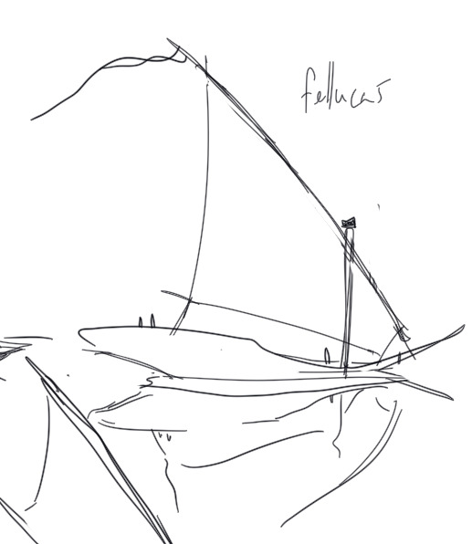
It started to come together with the sketch below. I told Evan sometimes twelve good lines is all you need:

The ship itself makes...well, let's be generous and say, a variable amount of sense. I'm not really worried about it as a real place in the interior; it's a goofy enough shape already, very broad-shouldered and alternately sitting very low in the water and hanging very high above it. It would probably be a very slow and annoying boat to steer! It's primarily driven by the rule of cool. I like the way this wheel mechanism works, so it takes up the whole of the top deck. I want the back of the boat to have a captain's quarters like a tallship, and I want the floors below deck to have pretty high ceilings. This thing probably looks like an iceberg under the surface! At least it's probably pretty stable.
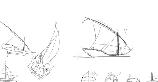
It was the primary thing I illustrated in the prototype we sent to Indiecade, for both interiors and exteriors, and one of the first assets I designed over the course of the project.
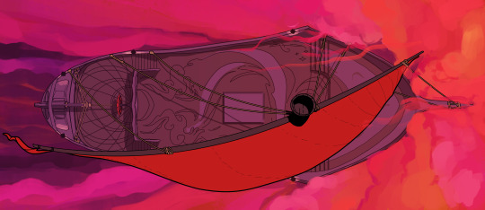
Right now, in the uneasy limbo between submission and acceptance (c'mon Indiecade! be cool!) the Oneiric has been my testing ground for styles. All of that is still cooking, so keep an eye out for that in future updates.
-Sasha
23 notes
·
View notes
Text
Hey Evan,
Have you ever seen a hagfish open its mouth? The hinge of its jaw never moves the direction I expect it to--nor are the teeth pointed the right direction. It's just got the one set, you see. Well, just the one jaw, more accurately, it's got plenty of rows of teeth. But the jaw (or tongue, as it's sometimes called?) is more a prickly grip than a serrated cutting edge; hagfish tie their limbless bodies into an overhand knot for leverage against the outside of the corpse so they can tear free a biteful of the rotting meat inside. It's kind of goofy, actually, because a hagfish absorbs much more nutrients through its skin than it does through its mouth, but it just likes the action of eating so dang much. Slimy seadogs worrying their whalehide bones.
Oh, I have shown you that video?
Well, okay--but what about the whalefall the E/V Nautilus revisited last year? Look how svelte it got over the course. It hardly even resembles the animal anymore. Sure, a spine's a clear roadmap to what a critter's supposed to be, but a whale head is mostly tasty cartilage and blubber so what's left of the skull won't help you much, and look: all the ribs've fallen over. It's just a line at the bottom of the ocean now, a hangout stop for the local crabs and isopods, lightly fuzzy with boneworms (osedax--lovely things, mostly nested inside the bone to eat the collagen, but if you pluck the red feather free you'll see a bustle of organs like a lady's ballgown).
This time last year it was covered in octopi and grenadier fish & all sorts from all over--hey, good eats is good eats, even a deer will eat what it hunts if by some miracle it manages to catch anything; only the top predators like orcas get to be picky, eating only a whale's tongue and leaving the rest to the abyss. But now that the gristle's been licked clean, even the sleeper sharks have moved on, and those drowsy couch surfers only move as much as they have to, to maintain momentum towards the next floormeat shindig.
What do you usually do when the party starts to die down? To be honest, sometimes I like those moments better than the night's peak. Cleaning up plates and cups with the host, reeling in cables and returning tables and chairs to their more practical positions, and finding places for the snacks left over (a host eager to rehome a lightly-noshed party platter is a godsend for my chronically empty fridge). Conversations would move from shouting across couches to lingering in doorways, on porches, leaning against the trunk of a car with my arms crossed against the cold. Maybe it's gauche to reminisce on such things right now, with the Before feeling just as hazy and palpable as the After. But the closing door made those chats possible, the driving need to have a good time replaced by tidying rituals and seeing-to's as the night drawing to an end.
Whalefalls are busy places for months and months, a year-round party with no locks on the doors. It's rough stuff, feeling jealous of a couple crabs kicking up sand on their way into the dark.
-Sasha
10 notes
·
View notes