#I've just been playing with more textures and watercolor effects
Note
how do you do the “cut out of a piece of cardstock or paper or something” effect
i'm gonna do an image guide, if that's okay!
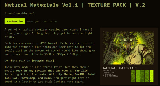
i use these texture overlays - i've been planning to make a post that credits all these sorts of assets i use that i can link in my pinned post, but i keep forgetting...
so, well, i'll credit them now! and you can get them yourself, too! they're quite handy. it's a name your price thing, so you can download it for free, or be kind and donate to the creator!
-> Natural Materials Vol. 1 by TOMB of NULL
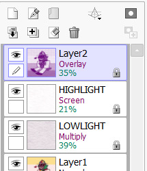
guzma art guide underneath all this, it does get a little long, but it should cover my whole process for getting this effect!
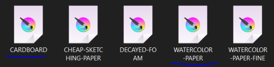
you download the thing above and unzip it, and get some handy files to open in basically any art program that can handle PSD files. there's other material packs, but i only use this one! and out of these, i really only ever use the ones i lined with blue. (CARDBOARD and WATERCOLOR-PAPER)
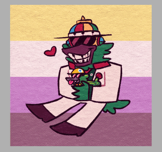
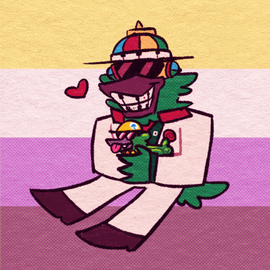
the idea is, that you draw a drawing and paste it within these folders. however, i don't do it this way, as you can see! it's a very different result. as an example, i'm gonna use the non-textured version of my old icon .
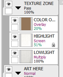
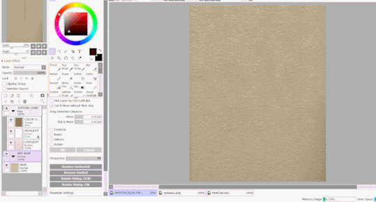
you can do this and get a nice effect, especially if you use more fitting colors for this sort of style, but again, this isn't what i do! i actually copy specific layers and paste THOSE into my actual pieces. (specifically "LOWLIGHT" and "HIGHLIGHT" from "WATERCOLOR-PAPER")
i paste LOWLIGHT first, and set it to MULTIPLY. then, i paste HIGHLIGHT on top of it, and i set it to SCREEN.
then, i lock the layers for both and either paint over or bucket-tool fill them with a different color that fits my piece more. i adjust the opacity of each layer. i don't get the color first try always, i spend some time to play around with it - but for demonstration i stuck with what i picked at the moment.
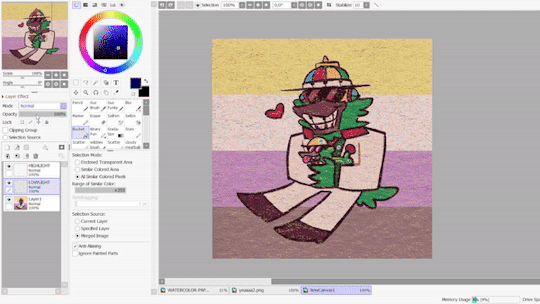
but that isn't all! i sometimes use "LOWLIGHT" from "CARDBOARD" as well, set on top of both of these layers, but instead set to OVERLAY. due to some scratches in the texture i don't like, i may move the position slightly. unless you draw really big, the texture will cover up your whole pieces and allow for some movement. if not, re-sizing is okay!
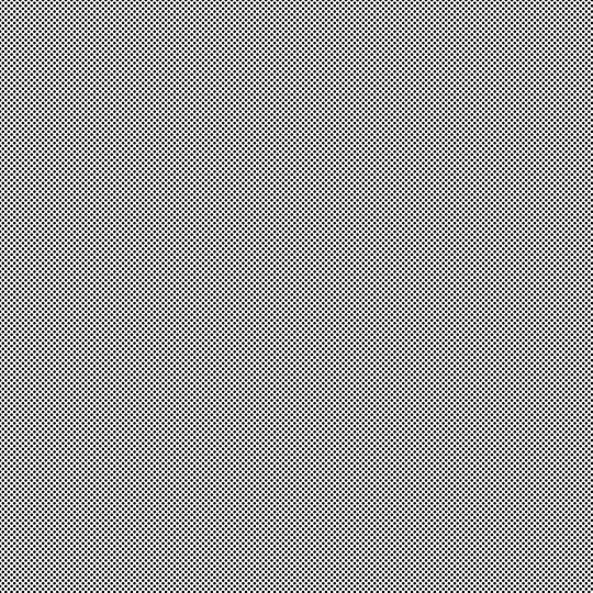
but i don't use that one always - what i use MOST of the time, and what i've done before i began using any paper overlays - were dot/halftone overlays! i either use these ones below, that are a specific, same size. (i resize for canvases all the time, that doesn't matter.)

...or i also use another method! it requires krita.
you open up krita, and paste your whole piece into it. (what i do, is flatten my current piece, copy it, then undo to get all my layers back. then i paste the image into krita)
once i'm there, i go to FILTERS -> ARTISTIC -> HALFTONE. i adjust as i think it looks good, and then copy that.

then, i paste that back into sai. however! it may be off by a few pixels! zoom in and move it slightly left or right - turn the opacity down slightly to help you figure it out. once you do that, set that layer to OVERLAY. you can play with the opacity - or even do fun things! it makes it look better, so hang on a minute!
the "fun things" i mentioned is going over to LAYER and selecting "CONVERT LUMINACE TO TRANSPARENCY". in this case, it makes the white transparent and removes it, while it keeps the halftone! then i can change it's colors to be more fitting to my piece. (like we did with the texture layers!)
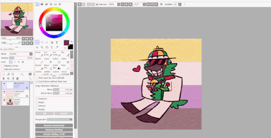
i used a purple overlay - so it makes the picture feel more purple and it ties the colors together a little bit more, without the use of an layer on top that's just one color set to OVERLAY or MULTIPLY to give it a different color hint. i usually do that, but set to super low opacity. but not always!
a lot of these are just done by "feeling it" and trial-and-error! just messing around and seeing what looks nice, after all, these are usually my final details i add to a piece once it's done to give it a more finished, uniform look. plus, the texture looks nice, and it's great to make more flat colored pieces just POP OUT !!
and of course, i use either the image half-tone overlay or the krita method depending on just what i think looks good. i don't really have a specific method!
and sometimes, i add different overlays on top and mix and match - sometimes from actual scanned paper textures! i've downloaded some from this google drive i'm going to link below. i use them rarely, but it's worth the credit, too.
-> PAPER TEXTURES GOOGLE DRIVE (not mines!) (unfortunately, i lost the tumblr post i got these from.)
------------------------------------------------------------------------
few other things i tend to do, also: i tend to add extra saturation once a piece is done. i like bright colors.
i also tend to copy the original drawing underneath all these effect layers, and paste it over all these other layers. i set it to OVERLAY and set it to low opacity. (or rarely, without the layer effect!) it helps gets a bit of the "original" feel out, while brightening/saturating the colors out a bit... i always play with the opacity here a bit.
and so, here's the layers again + the final piece!

admittedly, this was supposed to be a softer looking piece from the get-go, so saturating it may make it look a bit goofy when the flag in the background has been made brighter previously... but it makes the characters stand out! still looks nice! i'd definitely tweak this a bit, but it's definitely the kind of result you may be looking for!
i did use sai as an example, but if you use krita, medibang paint, fire alpaca, csp or photoshop... this all should work there as well! i've done this in ibis paint as well - using textures from the app itself! using what you learned here could help you figure that out for your own.
------------------------------------------------------------------------
well, i hope this was helpful and somewhat comprehensive! if anything's a bit messy here, i can admit i made this while in a call, so that may be why. feel free to ask follow-up questions! thanks for reading!!!
7 notes
·
View notes
Text
HEY there's new folks here since I last rambled about Rebelle, and they've got a HUGE sale going on for the preorder of the next version, SO
TL;DR: amazing traditional-paint-emulating drawing program on huge preorder discount, $30 for Pro version GO GET YOU YOURS
I've been using the digital art program Rebelle for a bit over a year, and it is SO GOOD at emulating the feel of working with traditional paints, pencils, and pastels! It's got thick (or thin) impasto texture for oils/acrylics, water physics (!!) for watercolors, and can actually use the texture of your canvas to affect both wet and dry media brushes. It feels SO MUCH better than hooking a texture into a brush and working on a canvas that just...doesn't match it, or applying a texture afterward.
BUT ALSO they're gonna be updating it soon, and adding not just standard digital niceties, but also METALLIC. PAINTS. Plus more texture stuff you can control, and even better texture reactivity, but METALLIC! PAINTS!! USING THE BUILT-IN LIGHTING AND TEXTURE SHENANIGANS, INSTEAD OF HAVING TO MESS AROUND WITH WRANGLING/OUTSOURCING EFFECTS YOURSELF
And the pre-order price from now until November 30th is ONLY $30 for the Pro version (which I absolutely recommend!), when the price is usually $150 (!!). The Pro preorder price will increase to $50 from December 1st to the 13th, then full price when it releases on December 14th. And they don't do subscription! Just free updates (typically good and/or requested features, as well as bugfixes), in between full upgrades like this that have been HUGELY discounted on release.
You can check out further info on Version 7's upgrade features, as well as the link to buy it, via the link at the top of the post. BUT if you wanna test out basic watercolor simulation, and/or test the trial version of Rebelle 6 (I think) to see if you like how it feels? You can check out this link: https://www.escapemotions.com/products/rebelle/try/
(Also they often do this sort of thing with the free bonus papers for spreading the word, as mentioned at the beginning of the Version 7 info link. I think it's happened...at least each time they've done a version upgrade, maybe once or twice in between? And it's been a different set of papers each time. But I already did my shared-post earlier. This post is genuinely just 'cause I think stuff like the feel of brushes reacting to visible texture and water physics (which you can pause!) are SO NICE, and the preorder price is bonkers-cheap. I still need side stuff like Affinity for like...fonts, but Rebelle is my current favorite for actual drawing and painting.)
PERSONAL EXAMPLE TIME
Playing around with watercolor drips, because you can control the "tilt" of the canvas (via either a tablet's features if it can, or a disk in the UI if not): Bakuratober Ghost prompt
Using canvas texture to get a RAD cracked-paint look on a dark canvas (I used the Straw canvas from the "Mulberry Coconut & Straw" purchasable paper set): Bakuratober Vampire prompt
Taking advantage of thick acrylic texture (plus watercolor which flowed into the brush streaks for emphasis), to simulate both muscle and sand texture (body horror warning): Bakuratober bonus prompt (Nightmare)
Combining a mildly textured pencil with a subtly textured canvas to emulate how I use physical colored pencils (plus layer effects for glowy ghosties): Bakuratober Dancer prompt
Combining wet canvas and watercolors to let the pigment feather out to create a "blurry" foreground effect (plus setting lineart as a masking fluid layer to keep colors contained): Disco (Elysium) Harmony
#rebellle#rebelle 7#art programs#get you some fancy digital paint#that uses 3d-type features to make the canvas and thick paint look legit#and feel so much closer to traditional art than any other program I've used#except I can actually work well with watercolors because I can pause the physics or cleanly erase#there's more neato features but I've already rambled so much#I've done some other stuff but most of my experimentation was with Bakuratober prompts okay#and I did those in Rebelle 5 but they would've been easier in 6#because that added clipping masks and suchlike#but otherwise they would've looked the same#I'm kinda glad I've been too burned out to do an upgraded/Rebelle iteration of Dr. Armitage yet#(as is my wont every time I find a new drawing program)#because now I'll be able to use the TYPOGRAPHY PAPER since I can change its color#and NOT HAVE TO SWAP PROGRAMS TO ADD THE GRADIENT#and shiny new unique bonus of LEGIT-SILVER PEN NIB FINGERNAILS
1 note
·
View note
Photo
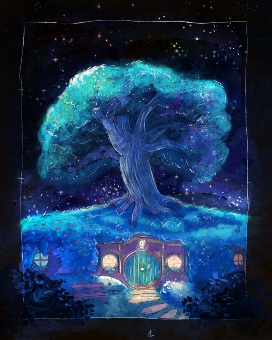

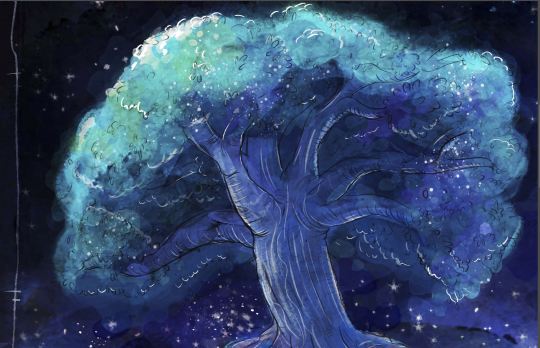
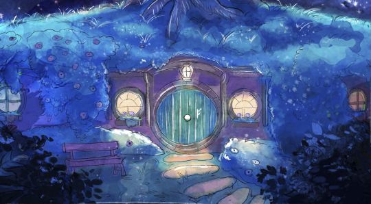
Bag End at night 💙. still working on my Hobbit comic :3
#lotr#lord of the rings#the hobbit#tolkien#comics .......r hard ;________:#BUT YEAH#the next chapter is finished actually#I've just been playing with more textures and watercolor effects#because I've always wanted it to look hand-drawn/watercolorish#and think I sorta figured out how to do it#the next chapter also involves the long-awaited Art Style Shift (tm)#but yeah!#I was thinking of maybe finishing Chapter 8 before I posted chapter 7#but who knows#Comixs....... take so much time :_;
1K notes
·
View notes
Last Seen Blogs
paopao1118
Nobuhiro "PAO" Yamazaki
vixylust-blog
Bun

fitmindsworld
Fitmindz
darker-than-yours-blog
What once was light can be tainted dark