#bionicle gwp
Text
Ride the Crab?

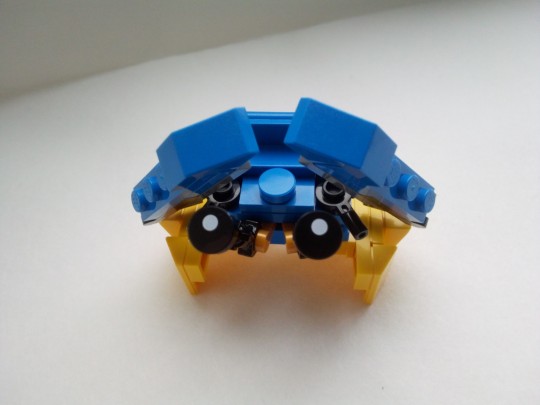
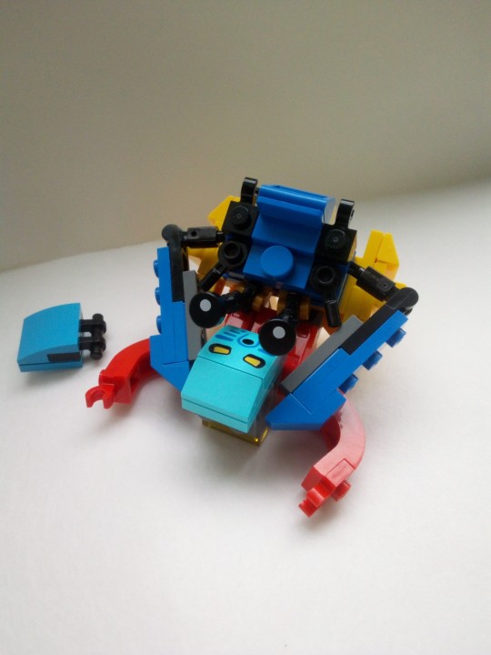
Pewku GWP style. I've got really limited parts in terms of system bricks so I'm really happy I was able to build her!
236 notes
·
View notes
Text
Tiny matoran team based on the GWP style lol
Matoro, Jaller and Hahli

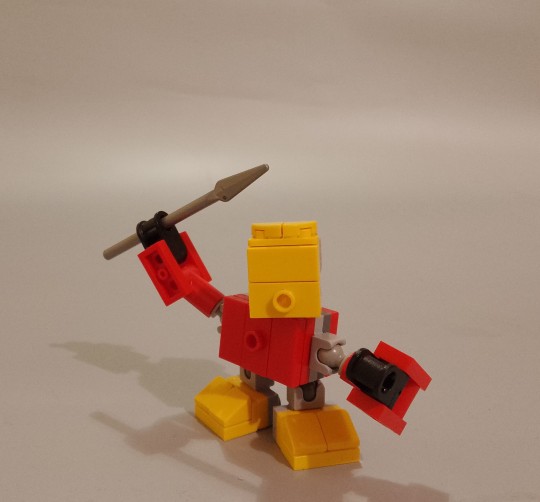

#bionicle#bonkle#bionicle moc#matoran#bionicle matoran#matoro#jaller#hahli#lego moc#lego photography#bionicle gwp#brickonicle#bionicle system
221 notes
·
View notes
Text
decided to use the new Bionicle GWP as a base to make the characters we REALLY wanted
108 notes
·
View notes
Text
Tahu's waist be so small like what do u need that small of a waist for? For other men to grab it? Whore
- me assembling GWP Tahu's body
81 notes
·
View notes
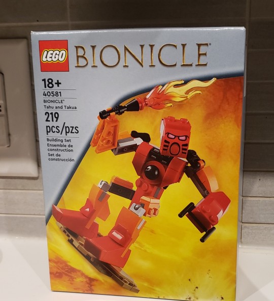
Text

Guess who's $114 poorer and 219pcs richer?!
11 notes
·
View notes
Text

Gathered friends....
15 notes
·
View notes
Text
Good (Guy) Comes In Many Forms

Happy (belated) 810NICLE day. I wanted to draw the beloved Good Guy '06 in many incarnations (save for the actual LEGO set photo and the Minecraft skin made by flyingpiggles10)
You can see the art of the GG06's individually on my art Twitter.
#lego#bionicle#lego bionicle#good guy 2006#bionicle good guy#810nicle day#multiverse#lego 90th anniversary#bionicle gwp#bionicle g2
6 notes
·
View notes
Text
Merry Christmas to everyone, & have a amazing 2024!🎄🔥

24 notes
·
View notes
Text
So I've seen at least one post talking about a G3 bionicle in system(1) that said it would be more expensive due to the smaller parts.
This is probably not true. Or not inherently so, at least(2).
The GWP set is 219 pieces. Compared to the (admittedly licensed) 75892-1 McLaren Senna at the same piece count, it should retail around 15$. That's comparable to the smaller(3) Masters line of 2015.
However, we can break this down further. The GWP set also features Takua, the Mata Nui & Makuta stones, a lava board and pedestal with lava. Presumably, an actual system style Bionicle wouldn't include all of that in a set.
That leaves Takua at 37 (not including backpack/disc, which would bring him up to 41) and Tahu at a mere 84 (Anyone want to double-check my counting here, go ahead.)
None of these use unique pieces(4), which leaves Takua squarely in the polybag range. Which retail for like. 5$ USD.
Tahu lands roughly equivalent to 9440 Venomari Shrine, which was a whopping 7$ USD.
These are all comparisons, but I think they're fair ones.
Tldr; the price could be equivalent at worst, but would likely end up cheaper then the previous generations.
#Bionicle#(1) when I say system I mean like the GWP set. If the post I saw meant minifigures instead that's my bad#(2) original themes tend to be priced cheap. That said lego will charge higher if they want to.#(3) by which I mean Pohatu Gali and Lewa.#(4) to be fair most themes don't get unique pieces until year two or later#Side note but if lego released polybag matoran I would buy so many. Hahli looks adorable in the mocs I've seen of her.#Edit: I personally can't really see lego doing anything for g3 other then the gwp style.#Edit 2: assuming a gwp style anyways
38 notes
·
View notes
Text

smolvia
8 notes
·
View notes
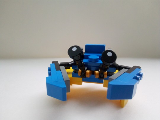
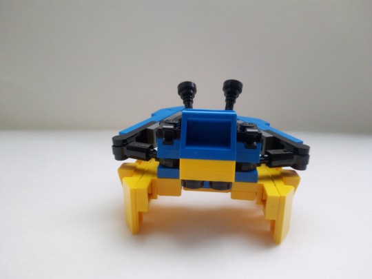
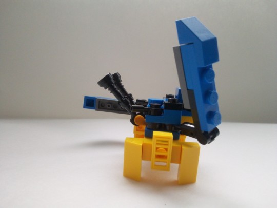
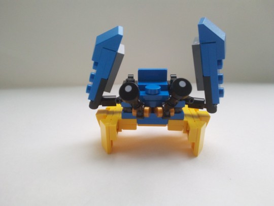
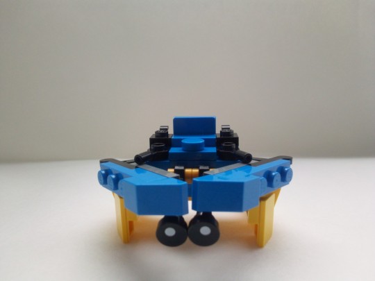
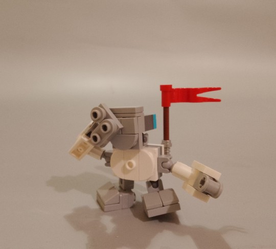
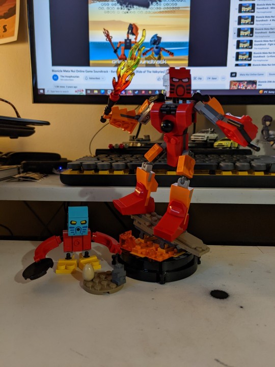
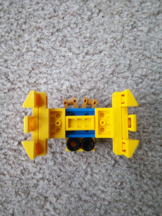
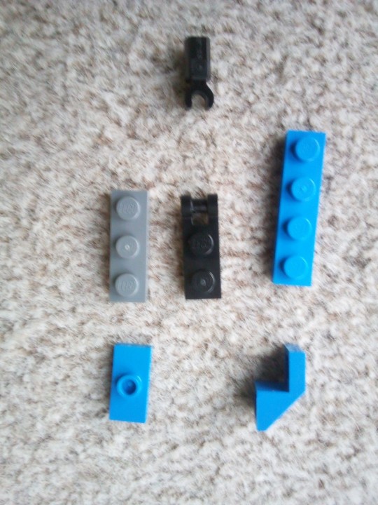
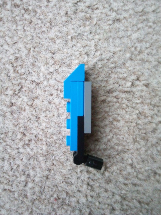
Note
Can I have some breakdown pics of your GWP style Ussal Crab, please?
Sure! Never had to instructions before, so let me know if any of this is unclear:
Main body:

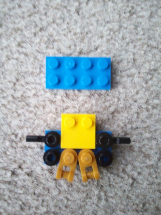

Legs (X2):

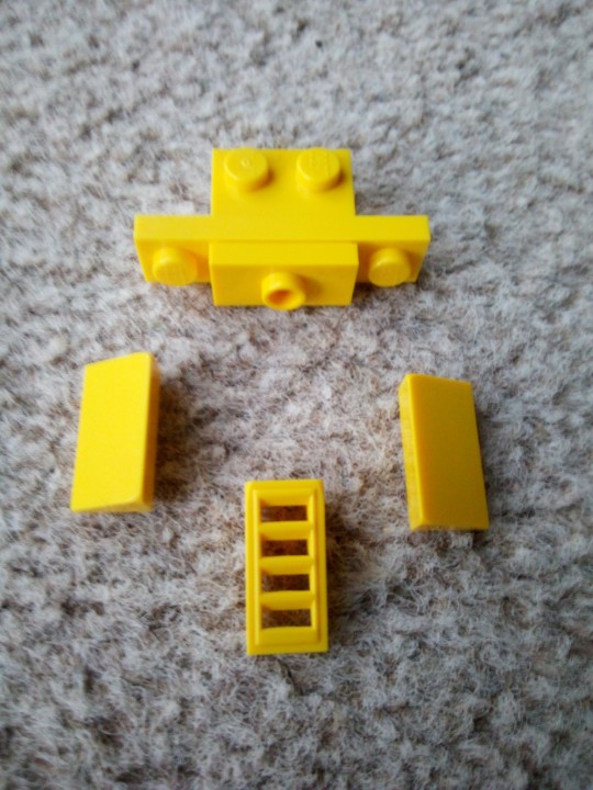
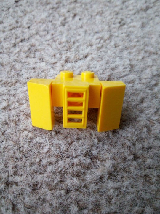

Claws (X2):
Rest of the instructions are in the next reblog as I hit the image limit
77 notes
·
View notes
Text
Surf's Up!
Purple Dave November 22, 2001

A MoD reader from the McRae family (who never left his first name…) submitted a MOC surfboard for TAHU. I hadn’t ever given any thought to this type of accessory, but since he’s hanging ten in the video clip from the TOA mini-CD, it certainly fits with the story.
source
10 notes
·
View notes
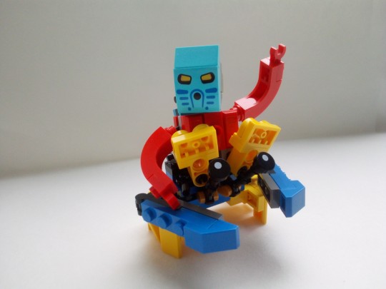
Text
Its him
The Bionic Man
#bionicle#lego#i wish this GWP wasn't limited to just a handful of themes so I could've gotten the Starry Night set AND this#but that Creator Viking ship was actually really cool so I'm happy overall!
8 notes
·
View notes
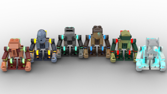
Text


Duckbricks was cool enough to share a whole folder of concepts and MOCs made by Lego's designers while they were developing the Bionicle GWP, and I just HAD to have the Metrui Nui map MOC'd by one of the set designers. I spent a couple hours feverishly modeling it in Studio, and so here it is! Folder down below if anybody wants the .io model. Looks like I'm due for another Bricklink order or two...
329 notes
·
View notes
Text
Alright, I get to be the favorite older brother-in-law, and I get to relive my childhood 👍

13 notes
·
View notes
Text

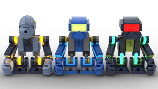
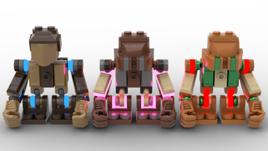

Given how much I bent normal Lego building and euclidean space into a pretzel with these masks, would you believe me if I said the main purpose of this was just to fiddle with color palettes and placement? Rambling details below:
But yeah, test designs of a more MoL-esque take on the GWP System Matoran design
I figure a proper do of system Bionicle would at least still have custom mask molds, so that's part of why that's so fucky
(Also, apparently it turns out the ball pieces I used for the shoulders and legs are long discontinued by lego and not actually compatible with mixel joints, RIP)
(Like I figured these were physically unbuildable anyway because I quickly gave up on trying to make the masks align with conventional euclidean space, and the coloration of pieces reinforce that further, but the problem goes deeper than I realized ^^; Ah well, this is more an aesthetic exercise at the end of the day.)
Rule was everyone has a primary color, a secondary color, a translucent/glow color, a metallic color, and an eye color
And those can double up in function, it doesn't have to be a full palette of five, but still that idea
And then like, the layout of said colors differs based on team:
---
For the Metru, the metallic color doubled as the secondary color and the eye and glow colors were also the same, cutting the five down to three, but then of course some Metru Grey at the joints as a pseudo-tertiary. The primary Metru Elemental color as more of a baseline, with the metallic secondary given a fair bit of prominence in reflecting their LomN and turaga designs, and then the glow kept to like, accents with low surface area. (In a more full figure I'd want that as like, basically Tron lines to add just a bit of cyberpunk to the Art Deco/Alien Dieselpunk vibes of Metru Nui.)
Also hadn't gone fully off the rails with the masks yet, so Onewa's Komau and Matau's Mahiki are still pretty simple at least, and the rest aren't too egregious yet. Decided to integrate Nuju's scope as a toa into his noble Matatu design, but it's easily removable if I copy-paste that mask over to others.
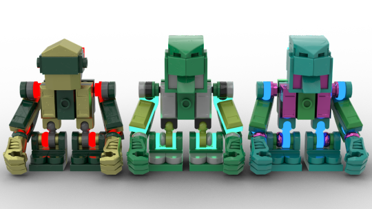
---
The Mata are pretty obviously influenced by their G2 incarnations. Particularly the like, three-pairs of shared metallic colors, (Gali and Pohatu with Gunmetal, Onua and Tahu with Pearl Gold, and Kopaka and Lewa with HF's Flat Silver,) and the like, glow color being the secondary while the secondary was relegated to more of an accent role. I just really love the idea of these six being so powerful compared to typical Toa that it shines out through the seams in their armor. For G2's other faults, I think it was a success on the character design front. (Also added their metallic color to the toes for a more armored look.)
(Decided on pink for Pohatu instead of G2's lime on a whim, but I think it works. Pink bands in a canyon wall, the sunset over a desert, and his love for his friends and villagers.)
Still, also brought things back to their original selves as well, with the eye colors, the use of black as a tertiary the same way I used grey for the Metru, the original brighter shades of their main for Gali, Pohatu, and Lewa, and similarly bringing back lime and tan as the latter two's accents.
As for how the accents were handled, I kinda split the team into two groups of three there; Tahu, Gali, and Onua, where the accent is from their G2 sets and thus goes for more of a high-contrast vibe, I relegated to the small parts again, to stand out without standing out too much. Meanwhile, with Pohatu, Lewa, where I brought back their G1 colors that are more of a light-shade complement to their primary rather than a contrast against it, I let occupy bigger pieces on their limbs, swapping position with the primary on their arms, and with their metallic on the legs. I also applied this layout to Kopaka, despite sticking with the Metru Blue from his G2 design, both for an even team split, and because I felt it wouldn't feel as weird with more prominence due to contrasting with the primary by being darker than it instead of brighter.
I kinda went nuts with the masks lmao. I feel like the Pakari in particular is kinda my crowning achivement, but probably not worth having spent so much time on it alone yesterday, and frustrating because I ultimately can't build it IRL from all the clipping. Still kinda like the moleman/gas mask vibes of how the eyes turned out. (Also went back and changed the Hau and Kakama near the end, to align better with the rest.)
---
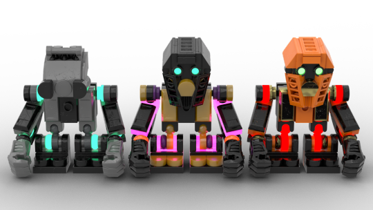
With the Mahri, I was originally going to do the same three-pairs setup with their metallics, but then wound up opting to make those all fully personalized again like the Metru. Their main trick there instead, is being all chrome colors. Idk if it entirely lands for all of them, (I have mixed feelings on Kongu's pink instead of sharing blue with Matoro per original plan, but I didn't want to double up on only two of them and leave the rest more scattered, and I was already too married to my choices for all them) but I kinda like how it turned out.
Instead, the three-pairs setup applied to their glow colors, which I pulled from their Inika forms; the Zamor spheres and the flashing lights on their weapons. The one case where adherence to this also feels like a mixed bag is Hewkii's red going with the green chrome I gave him, giving a bit of accidental christmas vibes instead of the copper patina look I was trying to invoke, but ah well. In general, focused their glow in the shoulders and legs, both as a reference to Jaller and Matoro's translucent Inika "bone" pieces, and as a midpoint between the Metru's subtler use and the Mata's prominence.
---
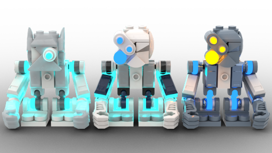
Also on that note, in comparison to the prior two teams, I averted using any tertiaries like black or grey, made the metallics the most minimal parts, and really emphasized their flat secondaries as secondaries instead of accents. Same as the Mata, I split them into two different layouts for that, (which wound up falling along the same lines, not intentionally but that's how it worked out) based on whether their elemental color or personal color was the darker/brighter of the two.
(On that note, mostly went back to their Matoran color schemes with the more exotic colors, though for Hahli and Jaller favored their Mahri color schemes instead, and tweaked Kongu's lime to be Apple Green instead. Those, and Hahli's mask, are the cases where I permitted myself to not force an even split among the team, for the sake of everyone looking best individually instead.) For all of them, the brighter color always went to the stripe on the chest, while the darker went to the hands and feet; mainly the arms and masks where they're different.
For the left-hand side, where their personal color was bright and their elemental color was very dark, I opted to downplay the personal a little more on the arms, since it was instead prominent on their masks. Hahli being the exception, because a big block of lime would not have been a good look, and I really wanted its brightness to pop out from the underlayer of her otherwise very dark colors.
Also like what I did with Nuparu, having his orange mask intact overall, but keeping the sort of "internal" area of the sidevents and eyes black for contrast, again a bit of that moleman look to go with his gremlin inventor personality.
Then the other side, where the personal color and the color on the mask was darker, I instead let the brighter elemental one take prominence on their arms and the back of the torso, which also just ties in nice with the original clean mctoran color layout. Not as much to really comment on with them.
Also, I played fast and loose with their eye colors, since those were always homogenized some amount in each of their incarnations but inconsistent across them, and I wanted to maintain everyone having their own separate eye colors like the other two teams. (And the eyes being different from the glow color like the Mata.)
So Jaller now has dark blue and Kongu has azure; Hewkii's supposed to be apple green, (though as with Whenua, I had to use the same color as Onua's dark green, since this was the only green glow shade aside from lime that didn't just look washed out and/or too blue) while Nuparu is lime, since he alone was mostly pretty consistent in that. Hahli got red for her later Barbarian arc, while Matoro got a softer orange, both for contrast with the frosty blues of Nuju and Kopaka, and just cozy vibes to match his kinder personality.
---
So, yeah. Clearly a good use of the past two and a half days lmao.
May also do Takua and the Chronicler's Company, the Disk Metrutoran, and maybe even the Voya Nui resistance team at some point? Though for now, need to focus on other stuff I'd been distracted from by this.
60 notes
·
View notes
Last Seen Blogs

emily-fox-the-artist
Where the magic happens...
an-au-blog
AUs and stuff

jcnxnxnxnxnxnxnnxnxx
Untitled

curucuru2
제목 없음
brokebat
BrokeBat