#bottom two drawings are both redraws of one i made i think in 2019 and probably posted to my old and since deleted art blog
Text


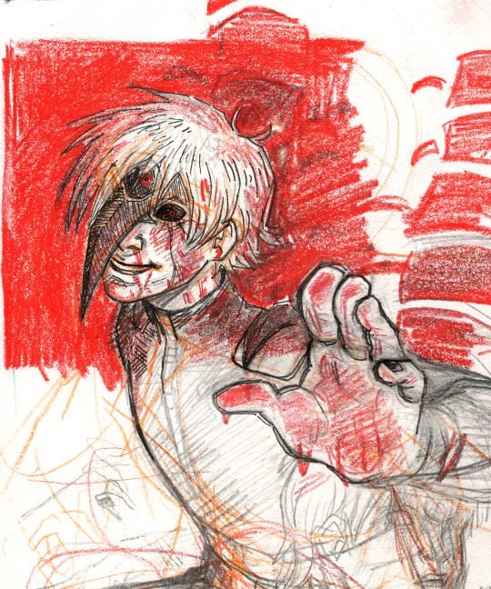
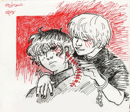

thought about Tokyo Ghoul for like three days straight in December, drew these and stopped thinking about Tokyo Ghoul again
#my art#tokyo ghoul re#tokyo ghoul#tokyo ghoul :re#tg:re#ken kaneki#haise sasaki#<-aka my favourite dude in that series#tg#bottom two drawings are both redraws of one i made i think in 2019 and probably posted to my old and since deleted art blog#is anybody even browsing these tags in 2024. i don't think so. whatever#it's 4:20 am goodnight popolo di tumblr!!!!!!
142 notes
·
View notes
Link
SKIP TO CONTENTSKIP TO SITE INDEX Best of 2019 Television Movies Books Albums Songs Recipes SHOW US YOUR WALL Collecting to Explore ‘Origin, Culture, Form, Function and Race’ This Washington couple has floor-to-ceiling art as well as wearable creations and folk art curiosities. Tony Gyepi-Garbrah and Desirée Venn Frederic at their residence in Washington. Tony Gyepi-Garbrah and Desirée Venn Frederic at their residence in Washington.Credit...Ting Shen for The New York Times By Audrey Hoffer July 31, 2019 WASHINGTON — Desirée Venn Frederic and Tony Gyepi-Garbrah live in a light-filled apartment in the Trinidad neighborhood of Northeast Washington that is small in size but grand in scope. The charcoal walls, stretching up to 15-foot ceilings, hold dozens of paintings, prints, photographs, 100-year-old textiles, collages, drawings, pastels, ceramics and antiques, conferring a museumlike aura on the home. Ms. Venn Frederic is wearing art as well. Her floor-length slip dress, by the Brooklyn-based designer Fe Noel and the Chicago painter Harmonia Rosales, incorporates the image of a Yoruba deity, Oshun. Ms. Venn Frederic said the appeal of the dress was in its “fanciful and disruptive” character. When the couple met four years ago, they were acquiring art individually. “One of the reasons I took an interest in Tony was because he understood legacy-building with art,” she said. She and Mr. Gyepi-Garbrah, 39, plan to marry later this year. ADVERTISEMENT Continue reading the main story “Our environment is a reflection of the ethos and the curiosities we carry individually and as a couple, who we are at our core and what it means to be transcultural,” Ms. Venn Frederic, 37, said. He is a first-generation American born to Ghanaian parents who works as an information technology engineer. He is also a photographer and painter. You have 3 free articles remaining. Subscribe to The Times She is of Geechee and Maroon ancestry. She was born in Freetown, Sierra Leone, and raised in Montgomery County, Md. Through her company, Combing Cotton, she pursues her interest in social equity. Image“God Head” (2011), top, and “Untitled (Red and Black)” (2010), by Victor Ekpuk. “God Head” (2011), top, and “Untitled (Red and Black)” (2010), by Victor Ekpuk.Credit...Ting Shen for The New York Times She also envisions creating a museum of fashion and related ephemera. These are edited excerpts from the conversation. ADVERTISEMENT Continue reading the main story You recently hosted a private tour of your art collection as part of the 2019 Collector’s View series sponsored by Transformer [a gallery in Washington]. What was that like? TONY GYEPI-GARBRAH In true salon style, 75 art aficionados, collectors and artists stood shoulder-to-shoulder talking art, art, art. How do you select works to buy? DESIRÉE VENN FREDERIC Meticulously. I don’t merely collect what I like. I’m attracted to works that challenge the linear understandings of origin, culture, form, function and race. I call these aesthetic triggers. ADVERTISEMENT Continue reading the main story GYEPI-GARBRAH We buy from galleries, art fairs and auctions. We also scour estate sales and private vintage collections. Often we buy directly from the studios of artists with whom we build friendships. I do a lot of research before acquisitions. Is there a piece with an interesting back story? GYEPI-GARBRAH The two mixed-media works by Victor Ekpuk. I went oversees to Galerie SANAA in Utrecht, the Netherlands, to acquire “God Head.” During that time I discovered that Ekpuk was represented by Morton Fine Art [in Washington]. They had “Untitled (Red and Black),” so I bought it too. Now the pair is in conversation. Ekpuk lives in Washington and we’ve become friends. Image Figurative wood sculptures, made in Ivory Coast. Figurative wood sculptures, made in Ivory Coast.Credit...Ting Shen for The New York Times Image Top, “Chocolate City” (2010), by Steven M. Cummings, and “Inventions & Patents” (2014), by Charles Philippe Jean Pierre. Top, “Chocolate City” (2010), by Steven M. Cummings, and “Inventions & Patents” (2014), by Charles Philippe Jean Pierre.Credit...Ting Shen for The New York Times ADVERTISEMENT Continue reading the main story Those little wood statues lined up against the wall on the floor look like toys. VENN FREDERIC They’re Colon figurative sculptures depicting occupations — policeman, doctor, baker — held by colonists in the Ivory Coast between 1893 and 1920. I have a collection of 150. Your photos capture images that span decades and can be read as a history of our times. How do you think photography represents both society today and in the past? GYEPI-GARBRAH Photography is a visual documentation of fleeting moments and changing landscapes, and, in this vein, we believe Steven M. Cummings is a master. “Chocolate City” speaks to forced migrations and the displacement of African-Americans from their native lands. “Fred Meets Fred” is an oversized black-and-white double image of Frederick Douglass that contrasts past and present. A chain dangling lengthwise from top to bottom of the picture separates the two Douglasses. The bicycle wheel symbolizes change and continuance of time. ADVERTISEMENT Continue reading the main story Image A sofa in the apartment by Sharla Hammond. A sofa in the apartment by Sharla Hammond.Credit...Ting Shen for The New York Times Your couch material is unusual. Did you commission the design? VENN FREDERIC We acquired the couch from the visual and textile artist Sharla Hammond, who was inspired by “Afro Blue” [a jazz composition recorded by John Coltrane]. The fabric depicts the heads of five Afro-clad icons — Angela Davis, Betty Davis, Pam Grier, Minnie Riperton and Diana Ross. Above the couch that black-and-white painting seems very in-your-face. VENN FREDERIC It’s “Cow in the Field” by Andrew Cressman. We operated a gallery in Washington and exhibited his works. I continually approached this painting with a sense of wonder and bought it after the show [in 2015]. It takes up a lot of our wall real estate. I appreciate that some pieces overwhelm, and this is one. A version of this article appears in print on Aug. 2, 2019, Section C, Page 12 of the New York edition with the headline: It’s Home, With the Aura of a Museum. Order Reprints | Today’s Paper | Subscribe Show Us Your Wall Art collectors, and what they collect. Olusanya Ojikutu at his house in Bowie, Md., with, left, a detail of one of his own paintings, “Labyrinth of Imagination” (2015), and right, a painting on a wood pallet by Dapo Ojoade. ‘Love at First Sight’ Inspired This African Art Collection 6h ago Left, Olivier Widmaier Picasso, left, and his partner, Matthew Drushel, in their Miami Beach apartment with a Gilles Bensimon photograph “Flowers in the Water” (2011). But Does He Have a Picasso? Dec. 18 Candace Carmel Barasch at home with, from left, “Alex Israel, Self Portrait (Multiples),” 2017 and, on table, his “Syz’s Frozen Yogurt,” 2017. Hollywood at Home in New York Dec. 12 More in Art & Design Shahidul Alam at the Rubin Museum of Art, which is presenting “Truth to Power,” his first museum retrospective in the United States. Christopher Gregory for The New York Times Using His Camera as a Witness and Weapon Dec. 23 Mr. Monkman’s “Resurgence of the People,” from 2019, references art history, from “Washington Crossing the Delaware” to Delacroix’s “The Natchez.” The artist’s alter ego, Miss Chief Eagle Testickle, stands tall, based on a gender non-binary figure in Indigenous cultures. A Cree Artist Redraws History Dec. 19 “In a Cloud, in a Wall, in a Chair: Six Modernists in Mexico at Midcentury” includes weavings by Sheila Hicks made in Mexico in the 1960s, foreground and center wall. Transformed by Mexico, Six Women Broke Barriers Between Art and Design Dec. 22 Editors’ Picks In “The Morning Show,” on Apple TV Plus, Alex Levy (Jennifer Aniston) has to navigate treacherous TV network waters after her co-host, Mitch Kessler (Steve Carell), is fired for sexual misconduct. Hilary B Gayle/Apple The Sexual Predator’s TV Wife Dec. 23 A selection of dishes at Nom Wah Tea Parlor, which has been serving dim sum since the early 20th century. Chinese Restaurants Are Closing. That’s a Good Thing, the Owners Say. Dec. 24 Deepak K. Prasad, left, collected a water sample, while Rishabh Shukla, right, checked the temperature of the Ganges at Byasi, India, in the Himalayas. The Ganges Brims With Dangerous Bacteria Dec. 23 ADVERTISEMENT Continue reading the main story International readers subscribe for $1 a week. Ends soon. See My Options Site Index Go to Home Page » NEWS OPINION ARTS LIVING LISTINGS & MORE Site Information Navigation © 2019 The New York Times Company NYTCoContact UsWork with usAdvertiseT Brand StudioYour Ad ChoicesPrivacyTerms of ServiceTerms of SaleSite MapHelpSubscriptions
0 notes
Text
August 10th-August 16th, 2019 Creator Babble Archive
The archive for the Creator Babble chat that occurred from August 10th, 2019 to August 16th, 2019. The chat focused on the following question:
What is your process for planning out the paneling/layout of each comic page?
kayotics
I’ve finally gotten my process down to a process that works for me. For Ingress Adventuring Company https://www.ingress-comic.com/ I start with scripting the whole chapter out. Step two is thumbnailing the whole chapter out, so I can figure out pacing and paneling. I started to do thumbnailing on sheets of printer paper, which has been easier to figure out my drawings and to see how the comic flows on paper. Once that’s done it’s pretty straight forward. Panel borders in pencils > rough sketch & balloon placement > letters and tight sketch in pencils > ink letters > ink bubbles and borders > ink the rest of the page. Then I scan it and do the colors. With the thumbnail process I kind of do the chapter twice in pencils but it ended up being way easier in the long run, since I hate doing panel layouts and doing that work in the beginning is way easier.
Steph (@grandpaseawitch)
Afraid there's no scripting for https://oldmanandtheseawitch.tumblr.com/. It's all pretty much in my head but I go over it literally every day, and I have a few roleplays archived to keep things on the right track, but that's about it. Thumbnails are done in big batches. Last batch was about 20+ pages done at once. Thumbnailing is also where I figure out composition and such. Just detailed enough to give me the idea of what I want, with enough leeway to do as I please on the page itself. Thumbnails done, I make a batch of empty pages, and go in and make all the panels for the 20+ pages. Since I already know the composition from the thumbnails and I have digital guides set up on each page, that's super easy. With all of those done, then I just go back in, do rough sketches for each page. Cleaner than the thumbnails but not too clean yet. Once the rough sketches are done, this is actually where I'll add text and balloons, so that I know what the bubbles will be hiding and don't have to waste extra time. After that, I do as much in large batches as I can, usually cleanup sketches, then inks, maybe flat colors. But after that point, I just have to sit down to work on individual pages until they're done. And voila!
authorloremipsum
http://signsofthreecomic.webcomic.ws/comics/ For Signs of Three, I always start with the script, get the basic idea of what I'm going for in the page. Then panel layout and gesture sketches of people and the environment. THEN! BEFORE I START DETAIL SKETCHING! I LAY IN THE SPEECH BUBBLES. Seriously speech bubbles are critical to controlling how readable your page is and so so many people don't seem to see that. They must lead from one bubble and panel to the next in an easy to understand way or your reader will get lost and confused. So I always make sure to put bubbles in during thumbnailing. After that it's just basic refining the sketch, lining, coloring, and shading.
AntiBunny
Typically in AntiBunny http://antibunny.net/ I thumbnail a page first to decide what needs to happen. After that I look at those event and decide panel layout based on how best to depict them, factoring in what needs to fit, who needs to be there, and how time will pass. I'd say time is the most important aspect, followed by emphasis, and then content. Typically bigger panels depict more time passing, but that's not a concrete rule. A big panel can depict a very short moment in time. The amount of population has a big play in that as well. A lot of action in a big panel can be a short moment in time that's just heavily emphasized. A big panel with very little movement depicted is great for dwelling on a single moment, which is great for slowing down the pace of reading.
heroesofcrash
I used to not have a script at all, but now I tend to write out scripts in advance. I keep a four-panel format in mind (2x2) when I write a strip, but I'll sometimes combine or split panels depending on the flow of the story. (I'll place some sample strips below, showing a "default" 2x2 strip, and a few that combine or split panels based on that structure) I then draw guidelines in Manga Studio (I have the CD, not the digital version that became Clip Studio Paint) for where each panel will be. I put the dialogue in each panel, sometimes editing for space or to fit it nicer in a speech bubble. I can usually visualize how a speech bubble will generally fit in a scene; it's easier for me to draw around the bubble than to draw first and add the words later. After I sketch out the panels, I may move the words around to fit in the scene a little better. I may even tweak it a little when I draw the speech bubble around the text, if I don't like how the text fits in the bubble or how the bubble fits in the scene. As I mentioned earlier, here's two strips. One has four panels (which is the most common for me), the other has six. The latter is made by splitting the upper right panel into two skinny panels, and breaking the bottom half into three panels rather than two. Not only does it give me enough panels to do a complicated visual gag, but having panels with a similar layout next to each other makes the action easier to follow, and thus makes the gag flow better.
Desnik
For http://ask-a-warlock.tumblr.com/, I make tiny thumbnails to quickly go through layouts. I tend to have a few different ideas and doing small/quick is a lot easier on the revisions
LadyLazuli
For Phantomarine (http://www.phantomarine.com/) I've gotten into the habit of thumbnailing each chapter extremely roughly in a sketchbook, then bringing the pages into Photoshop and shifting the panels around to improve the flow throughout the chapter. I put in rough dialogue bits to anticipate balloons, then I get going on rough sketches and color placement in Procreate, then clean up and paint the sketches, then bring them back into Photoshop to finalize the page. It's honestly really haphazard, just because I tend to change details and dialogue around a lot, depending on what I feel is working/failing - but that core chapter flow doesn't change too much, just so I don't get caught needing more pages in one part. So... I keep the roughs very rough, but I adhere to them quite strongly? The details are where things get experimental (edited)
JUNK
I am a fool who hasn't been doing thumbnails lately, so my process is the typical script>sketch>inks>tone.
MJ Massey
I start with my storyboards, which are just skethcy first drafts of the pages in a sketchbook. I have a vague genreal story outline, but this is where I really figure things out--both the layouts and the script.
In my head, I tend to see things as if they were an animation, so I am usually trying to catch that sense of movement in the comic panels. I try to keep things interesting and thinking outside the typical grid layout, usually resulting in some pretty crazy stuff. It's easier with action scenes, but I try to mix up everything. I do my final pages on 9x12 bristol (I used to work on 11x14 but that was...too big for markers), but there are many times where I will scrap the storyboard and do something totally different for the final page, or add or take away things. But it's good to have that first draft down as an idea, it's easier to adjust from there if I need to
FeatherNotes
@LadyLazulii love your process ahhh!!!
LadyLazuli
@FeatherNotes MERCIIII
Nutty (Court of Roses)
For Court of Roses http://courtofroses.thecomicseries.com/ I mostly sketch out thumbnails, scan them in, and lineart/color. Like most of y'all, I have a general story outline, and specific scenes get more detail as I work closer to them. If there's a scene that has emotional hits and I want the right dialogue for it, I'll script it. If there's lots of exposition and detail, I'll script it. Just, largely winging it on my end!
Tuyetnhi
I usually work from loose script dialogue for a chapter, to get the feel for the page, then start thumbnailing. After thumbnailing tho, I redraw the thumbnails on csp, sketch, then change/define panel layout or render till finish. Often, my thumbnails don't give me enough info till I start the page. And that's good for me since it's still under a set guideline but I don't feel rigid on "Oh gotta make it exactly like this" or some sorts. Same goes with dialogue/scripts too since I tend to go back and correct panel layout if i don't think it was strong enough on the first go. Idk, I treat it more of a fluid process that I can go back and fix due to how I digitally paint/render things. Still the process depends on the page i'm working on, how strong the thumbnails are, dialogue, and color scheme theme I had with certain pages. Most of it is 40% gut feeling tho. Images shown here how I got OIYD! Ch. 2 - Page 15 to be to its finished form. [thumbnail-> Rough sketch -> add with color -> final render with dialogue]
ErinPtah (Leif & Thorn | BICP)
I took scans/notes about each step of the BICP page-making process back during chapter 5: http://www.bicatperson.com/comic/step-by-step/ ...and then again, seven years later, during chapter 28: http://www.bicatperson.com/comic/the-webcomic-page-making-process/ The art has gotten better, but the actual workflow...basically hasn't changed. (If it ain't broke...)
snuffysam
First I have the script for the entire book, which I'll have finished ahead of time. At the start of each chapter, I'll divide the upcoming script into pages based on how I want the comic to be paced - e.g. making sure the setup and punchline to a joke aren't on different pages, making sure there's not too much dialogue to read on a single page, etc. Then, when it comes time to do the page, I'll split things up into panels. That's pretty easy - I generally want to keep things to one line of spoken dialogue per panel, or one "action" per panel. Sometimes there'll be beat panels, sometimes two people will talk in one panel, but that's the general rule. Next I... put together the panels. I don't really use thumbnails to work this stuff out - important panels or panels with more dialogue are bigger, less important panels or ones with less dialogue are smaller. I try to make sure panels don't intrude on each others' vertical space, because i've always found that complicates things in a web medium - but that just means there's less for me to worry about. I make sure the panel layout is different from the previous page, and if there's an action I need to emphasize I'll do something weirder than just a rectangle. If there's not enough space on one page for the panel sizes I want, I'll make it a double-length or triple-length page. As for the actual artwork - I try to make sure the reader's eye line is led along the page. So panels on the left would have the characters generally facing to the right, and panels on the right would have the characters generally facing downward and to the left. I try to leave enough space for word bubbles - and in general, the characters on right panels will be placed lower than characters on left panels, because i want the speech bubbles to move downward as you read across a row. And, well, that's basically it!(edited)
authorloremipsum
finally someone who considers the eyeflow (am joking, mostly)(edited)
snuffysam
i didn't always, but a reviewer once told me how one specific action scene was really difficult for him to parse because the eye flow was just completely in the wrong direction, nearly every panel. so since then i've been making a conscious effort about it :p it's tough when there's two characters up against a wall and you need the page to flow the other direction from how they're standing though, lol.
#ctparchive#comics#webcomics#indie comics#comic chat#comic discussion#creator interview#comic creator interview#creator babble#comic tea party#ctp
0 notes
Last Seen Blogs

thanvunguyen
Than Vu Nguyen

starlit-sunsets
Starlit Sunsets
ineptlydrawnnep
Nepeta Nips You Daily :33

ohdeadlynightshades
the starless sankta

tblsilicone
Untitled