#davidkroll
Photo

Bird bowl #84rooms #doubleexpomagazine #doubleexposure #digitalcollage #doubleexposurephotography #birds #birdbowl #alessandramaria #davidkroll #egrets #igart #igartist #instakunst #kunst #instagramartist #modernart #portrait https://www.instagram.com/p/Cmf4hzYuI7p/?igshid=NGJjMDIxMWI=
#84rooms#doubleexpomagazine#doubleexposure#digitalcollage#doubleexposurephotography#birds#birdbowl#alessandramaria#davidkroll#egrets#igart#igartist#instakunst#kunst#instagramartist#modernart#portrait
0 notes
Photo

Have you checked out our exclusive online exhibition for David Kroll’s show “Fragile Nature”? The exhibition can now be virtually viewed from the comfort and safety of your own home—link in bio! • • • #contemporary #art #contemporaryart #davidkroll #paintings #flattenthecurve #contemporaryrealism #eggs #birds #pottery #egret #stilllife #stilllifepainting #fish #koifish #landscapepainting #oilpainting #birdsnest #egretsofinstagram #egrets #robinsegg #map #homeiswheretheartis #shoplocal #supportlocal #supportthearts #seattleartist https://www.instagram.com/p/B_Dh3MzjnOr/?igshid=pxqumowyleda
#contemporary#art#contemporaryart#davidkroll#paintings#flattenthecurve#contemporaryrealism#eggs#birds#pottery#egret#stilllife#stilllifepainting#fish#koifish#landscapepainting#oilpainting#birdsnest#egretsofinstagram#egrets#robinsegg#map#homeiswheretheartis#shoplocal#supportlocal#supportthearts#seattleartist
1 note
·
View note
Photo

- PINKY AND THE BRAIN - EXPERIMENTS -
Below the cut is a personal project on the much more morbid side. Animal lab experimentation is always something I’ve found equal parts horrible and fascinating. Once in a blue moon, I’ll do research on the subject out of curiosity and/or for storytelling purposes. Even as a kid, I found this of interest, and when watching Pinky and the Brain I was always a bit disappointed that we never saw more of what the characters actually went through in the lab during the day. Granted, there’s a reason as to why this was never shown, as a child audience had to be kept in mind, yet still I pondered about it....
Over the last few days, I’ve been churning out compositions based on internet findings -- old and new experiments that rats and mice are put through, many of them humane, some of them very much not. It was an eye-opening journey for me artistically and otherwise, discovering what I’m comfortable drawing and what I never want to sketch again, as well as learning more about this realm of the scientific world.
WARNING: SOME GRAPHIC CONTENT BELOW THE CUT. If needles, patients dealing with the effects of cancer, and general portrayals of pain bother you, I wouldn’t bother venturing onward. I not only drew out experiments that the characters might have gone through, but also describe all of my findings in detail and provide video footage to go along with it. While I didn’t go full-on vivisection or anything, some of this might still be disturbing, so I’m taking extra precaution.
All of the images below are “color-coded” and graded. The experiments start out fairly tame, then get worse... and worse... and worse. The backgrounds reflect this, going from fairly light to quite dark.
-------------
Experiment #1 - Tail Flick Test
A fairly harmless experiment. The subject is mostly restrained, leaving only their tail exposed. An intense light beam is projected onto the exposed appendage, with the animal flicking their tail when the pain/heat becomes too much. This test is utilized in basic pain research and to measure analgesic effectiveness.
I wanted Brain to wear an expression of deep apathy -- he’s done this a million times and will probably do it a million times more. At this point, he doesn’t even care anymore.
For the background, I simply copied an environment in one of the videos I found.
Video example: https://www.youtube.com/watch?v=BzrA1tDTfkQ

Experiment #2 - Rotarod Performance Test
Another experiment that’s generally harmless. One or multiple subjects are placed on elevated rotating rods so as to measure such things as endurance, balance, grip strength, and more.
I imagine Pinky would enjoy this test, as he’s familiar with running on a wheel and actually enjoys more strenuous activities. Brain, on the other hand, would only participate via sheer force. He’d also be more prone to fall after a shorter period of time, getting tired faster than his cage mate.
Video example: https://www.youtube.com/watch?v=v56MtrmWAs0

Experiment #3 - Shot (General)
Nothing special. Just Brain about to get shot.
This is all highly exaggerated, of course. A mouse would simply be held firmly, not strapped down, for a simple injection. Also, I can’t imagine why they’d be shot in the face, although Meg told me that scientists tend to draw blood samples from a mouse’s cheek. Need to look that up. I wasn’t at all going for accuracy here, but rather how it might feel -- how scary it would be.

Experiment #4 - Sciatic Nerve Constriction
An experiment in chronic neuropathic pain, due to the central or peripheral nervous system sustaining damage. Under anesthesia, the animal’s sciatic nerve is exposed via skin incision. The connective tissue between the biceps femoris muscles and the gluteus superficialis is cut. The nerve is then loosely tied with four chrome gut ligatures so to occlude, but not arrest, blood flow. The wound is sutured, the animal is given 24 hours to recover, and then both hindpaws are tested for pain sensitivity. Sounds terrible, but it’s certainly not the worst of the experiments I researched.
I have no idea what’s going on with the coloring in this. Again, going for feel more than accuracy, but the hues are way too calm.
Information link: https://www.ncbi.nlm.nih.gov/pubmed/22433911

Experiment #5 - Writhing Test
Particularly cruel test in which acetic acid is introduced into the system, inducing severe internal pain. The typical response includes writhing, abdominal retraction, and stretching of the hind limbs. Despite the test being withdrawn in 2004 for unethical reasons, it is still employed by some.
This was my favorite one to draw. Although the lighting and shading are not the greatest, it made for an interesting experiment. I did not intend for the lines to be so bold, but it kind of turned into an almost comic-style illustration. I ended up playing around with it a bit and like the result enough to post it.
I would not watch the video below if you are squeamish. It is difficult to swallow. On another note, you may find the “Empathetic Behavior: Emotional Contagion in Mice” section in the second link of interest. For cage mates in particular, if one or both mice were injected with the same acid, and allowed to observe one another, an injected mouse would writhe more if its partner was also in pain. I can’t help but imagine Brain and Pinky in this type of situation....
Information link #1: https://www.ncbi.nlm.nih.gov/pmc/articles/PMC3543562/
Information link #2: https://www.sciencedirect.com/topics/biochemistry-genetics-and-molecular-biology/writhing-test
Video example: https://www.youtube.com/watch?v=Ib63O4F856w

Experiment #6 - Transgenic K5ras Mouse / Nude Mouse (Combination)
Experiment in which cancer is induced in the system. Nude mice are bred for a number of tests, and are used for this one, as well.
My least favorite to draw, but my favorite to color. One particular experiment I found showed a tumor in every follicle on a mouse’s muzzle. Was trying to go for this look, albeit exacerbated.
Information link #1: https://www.cell.com/current-biology/fulltext/S0960-9822(98)70203-9?_returnURL=https%3A%2F%2Flinkinghub.elsevier.com%2Fretrieve%2Fpii%2FS0960982298702039%3Fshowall%3Dtrue
Information link #2: https://www.motherjones.com/politics/2012/08/weirdest-lab-mice/
-------
Bonus:


This is based on a test that I found absolutely hilarious. There’s a certain chemical, called W-18, that’s been on the drug market for... some years. The potency of it is supposedly insanely high, although this has never been proven. It’s basically a research chemical (created at a university in the 80s) with analgesic properties that were shown to be “painkillers or blockers of the painkilling effect of morphine in mice”. Mice, not humans. To quote a specific article:
“... when they first injected some of these chemicals into the animals at a dose similar to aspirin, the mice stood up for about a minute and fell over unconscious. They remained unconscious – for five days. But they weren’t dead. They were still breathing. And when they woke, they seemed fine, other than being really hungry and thirsty.”
They literally keeled over from the supposed potency of it. From what I recall, they don’t even know exactly what it was doing to their system, other than the fact that it knocked them out. I just find it funny that they were completely fine after awakening days later.
Although the pure smell of it wouldn’t cause such a reaction, I liked the idea of it in picture form and so depicted Brain simply taking a whiff before passing out.
Information link: https://www.forbes.com/sites/davidkroll/2016/04/30/w-18-the-high-potency-research-chemical-making-news-what-it-is-and-what-it-isnt/#2c45a5dd4757
-------------
Experiments researched, but not implemented:
- Tail dipped in ice cold water (mentioned here: cold water)
- Morris water maze
- Porton Down nerve agent test(s) (the worst; not even sure how I’d depict this)
The Porton Down tests sounded so indescribably cruel that I simply couldn’t bear to put Brain or Pinky through either of those, much less draw them out. It was the most horrific of the experiments I found, second only to a story about a French physiologist in the 1700s/1800s who performed, I believe, vivisection on live, six-week-old puppies. There’s a limit and that’s my limit. Even the cancer-based composition above was difficult to create. I legit felt dirty drawing it.
Researching these subjects was incredibly interesting, and I came across a few articles that touched on animal experimentation and the question of whether or not it’s ethical. Should such practices continue? It’s more complicated than a simple “yes” or no” answer. Some tests are fairly harmless, whilst others border on the inhumane, and some are downright cruel. Some people say that, without testing, there would be a lot less medicine on the shelves to assist in relieving and curing our ailments, whilst others argue that 90+% of the time the testing done is unnecessary, the results yielded by the subjects dissimilar to those that would be shown by humans and, henceforth, stating that the inaccuracies are numerous. This particular article offered up what I thought was a pretty genuine and interesting debate on the matter:
Pain in Lab Animals: How Much is Too Much?
In an interview with Dr. Jeffrey Mogil, a neuroscientist, he mentions that:
“You have complete control over everything in mice. Within limits, you can do whatever you want as long as you minimize pain and suffering of the subjects.“
Full interview: https://www.integrativepainscienceinstitute.com/latest_podcast/sex-differences-in-pain-and-pain-inhibition-with-dr-jeffrey-mogil/
While many establishments do follow the Animal Welfare Act, other laboratories still implement unethical practices. Also, the rules for what constitutes as acceptable in regards to tests that can only be performed without painkillers or anesthesia administered is... nebulous.
Thankfully, there is a number of lab testing equipment on the market specifically designed to be more humane and less stress-inducing to its subjects. These restrainers, for example, allow the animal to “walk in” without having to be physically forced backwards into a container:
Restrainers
Here is another example of testing that is relatively pain-free:
https://www.ncbi.nlm.nih.gov/pmc/articles/PMC4401362/
It’s simple and inexpensive while still allowing scientists to perform tests.
Below is a video showing how a type of rotarod works, one that doesn’t place the rods too high and provides a cushion underneath in case the subjects fall:
https://www.youtube.com/watch?v=T38fDS2i13k
This tail flick analgesia meter comes installed with a cut off timer to avoid damage to the animal:
https://www.youtube.com/watch?v=JgaStZt143o
So there are options. How often are such options utilized in the field? I have no idea, although there are laws that should be followed and, from the sound of it, generally are adhered to. Not everyone in this business is cruel. Though you do have your occasional psychopath who performs very morally questionable operations behind closed doors, I believe that this is a great exception to the rule, and that there are a lot of laboratory workers who genuinely want to inflict as little pain as possible upon the animal. Just an opinion. I don’t have tons of evidence, but it seems like most people are sane. Lol.
Most of the experiments I inflicted upon Brain because, I think, Pinky is so pure that I have a hard time imagining him sustaining any kind of extreme pain that would genuinely hurt him. Also, he borders on being freakin’ masochistic, finding pleasure in a lot of painful situations, whereas Brain does not. Brain has been through a lot, mentally and physically. It seemed more... “appropriate” to put him in these situations, as terrible as that sounds.
All of that having been said, I never want to do this kind of exercise again. While a lot of it was interesting, and some of it even fun, parts of it were legitimately painful. The cancer one.... I felt horrible....
47 notes
·
View notes
Photo

"Allí donde la suerte llama cuando el campamento elige a un hombre-medicina, ahí descansa. Es un honor que un hombre rara vez busca, pero que debe acatar, un honor con una condición. Cuando tres pacientes mueren bajo su asistencia, el hombre-medicina debe ceder su vida y su oficio.⠀ Las heridas no cuentan; los huesos rotos y los agujeros de bala los indios los entienden, pero el sarampión, la neumonía y la viruela son brujería."⠀ ⠀ "There where luck calls when the camp chooses a medicine man, there it rests. It is an honor that a man rarely seeks, but must abide by, an honor with a condition. When three patients die under his assistance, the man -medicine must give up his life and his trade.⠀ Wounds do not count; the broken bones and bullet holes are understood by the Indians, but measles, pneumonia and smallpox are witchcraft. "⠀ ⠀ Mary Austin⠀ La tierra de la lluvia escasa / The land of scarce rain⠀ & David Kroll @kroll.david (artist)⠀ ⠀ ⠀ #art #portrait #portraitart #portraitpainting #portraiture #oilpaint #oilpainting #oilonlinen #oilpainter #oilpaints #oilpaintings #oilfeature #contemporaryart #contemporaryartist #contemporarypainting #newcontemporary #modernart #modernpainting #artgallery #contemporaryartgallery #figurative #figurativeart #figurativepainting #figurativeportrait #figurativeoilpainting #skull #beautifulbizarre #vagabondwho #marcopolorules #davidkroll https://www.instagram.com/p/B41tgBfo5jB/?igshid=b7w288kq13gi
#art#portrait#portraitart#portraitpainting#portraiture#oilpaint#oilpainting#oilonlinen#oilpainter#oilpaints#oilpaintings#oilfeature#contemporaryart#contemporaryartist#contemporarypainting#newcontemporary#modernart#modernpainting#artgallery#contemporaryartgallery#figurative#figurativeart#figurativepainting#figurativeportrait#figurativeoilpainting#skull#beautifulbizarre#vagabondwho#marcopolorules#davidkroll
1 note
·
View note
Link
0 notes
Text
Advanced Linkbuilding: How to Find the Absolute Best Publishers and Writers to Pitch
Posted by KristinTynski
In my last post, I explained how using network visualization tools can help you massively improve your content marketing PR/Outreach strategy —understanding which news outlets have the largest syndication networks empowers your outreach team to prioritize high-syndication publications over lower syndication publications. The result? The content you are pitching enjoys significantly more widespread link pickups.
Today, I’m going to take you a little deeper — we'll be looking at a few techniques for forming an even better understanding of the publisher syndication networks in your particular niche. I've broken this technique into two parts:
Technique One — Leveraging Buzzsumo influencer data and twitter scraping to find the most influential journalists writing about any topic
Technique Two — Leveraging the Gdelt Dataset to reveal deep story syndication networks between publishers using in-context links.
Why do this at all?
If you are interested in generating high-value links at scale, these techniques provide an undeniable competitive advantage — they help you to deeply understand how writers and news publications connect and syndicate to each other.
In our opinion at Fractl, data-driven content stories that have strong news hooks, finding writers and publications who would find the content compelling, and pitching them effectively is the single highest ROI SEO activity possible. Done correctly, it is entirely possible to generate dozens, sometimes even hundreds or thousands, of high-authority links with one or a handful of content campaigns.
Let's dive in.
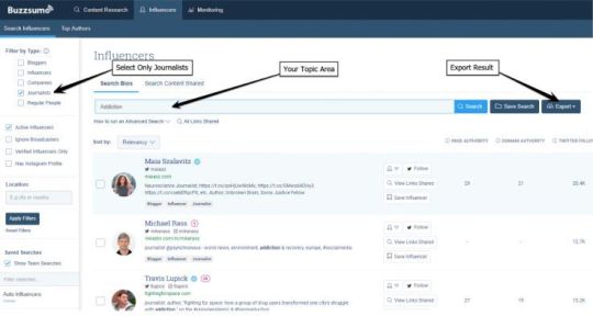
Using Buzzsumo to understand journalist influencer networks on any topic
First, you want to figure out who your topc influencers are your a topic. A very handy feature of Buzzsumo is its “influencers” tool. You can locate it on the influences tab, then follow these steps:
Select only “Journalists.” This will limit the result to only the Twitter accounts of those known to be reporters and journalists of major publications. Bloggers and lower authority publishers will be excluded.
Search using a topical keyword. If it is straightforward, one or two searches should be fine. If it is more complex, create a few related queries, and collate the twitter accounts that appear in all of them. Alternatively, use the Boolean "and/or" in your search to narrow your result. It is critical to be sure your search results are returning journalists that as closely match your target criteria as possible.
Ideally, you want at least 100 results. More is generally better, so long as you are sure the results represent your target criteria well.
Once you are happy with your search result, click export to grab a CSV.
The next step is to grab all of the people each of these known journalist influencers follows — the goal is to understand which of these 100 or so influencers impacts the other 100 the most. Additionally, we want to find people outside of this group that many of these 100 follow in common.
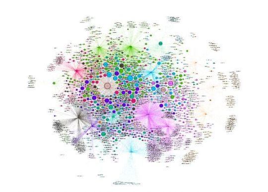
To do so, we leveraged Twint, a handy Twitter scraper available on Github to pull all of the people each of these journalist influencers follow. Using our scraped data, we built an edge list, which allowed us to visualize the result in Gephi.
Here is an interactive version for you to explore, and here is a screenshot of what it looks like:
This graph shows us which nodes (influencers) have the most In-Degree links. In other words: it tells us who, of our media influencers, is most followed.
These are the top 10 nodes:
@maiasz
Radley Balko (@radleybalko) Opinion journalist, Washington Post
@johannhari101
@davidkroll
@narcomania
@milbank
@samquinones7
@felicejfreyer
@jeannewhalen
@ericbolling
Who is the most influential?
Using the “Betweenness Centrality” score given by Gephi, we get a rough understanding of which nodes (influencers) in the network act as hubs of information transfer. Those with the highest "Betweenness Centrality" can be thought of as the “connectors” of the network. These are the top 10 influencers:
Maia Szalavitz (@maiasz) Neuroscience Journalist, VICE and TIME
Radley Balko (@radleybalko) Opinion journalist, Washington Post
Johann Hari (@johannhari101) New York Times best-selling author
David Kroll (@davidkroll) Freelance healthcare writer, Forbes Heath
Max Daly (@Narcomania) Global Drugs Editor, VICE
Dana Milbank (@milbank)Columnist, Washington Post
Sam Quinones (@samquinones7), Author
Felice Freyer (@felicejfreyer), Boston Globe Reporter, Mental health and Addiction
Jeanne Whalen (@jeannewhalen) Business Reporter, Washington Post
Eric Bolling (@ericbolling) New York Times best-selling author
@maiasz, @davidkroll, and @johannhari101 are standouts. There's considerable overlap between the winners in "In-Degree" and "Betweenness Centrality" but they are still quite different.
What else can we learn?
The middle of the visualization holds many of the largest sized nodes. The nodes in this view are sized by "In-Degree." The large, centrally located nodes are disproportionately followed by other members of the graph and enjoy popularity across the board (from many of the other influential nodes). These are journalists commonly followed by everyone else. Sifting through these centrally located nodes will surface many journalists who behave as influencers of the group initially pulled from BuzzSumo.
So, if you had a campaign about a niche topic, you could consider pitching to an influencer surfaced from this data —according to our the visualization, an article shared in their network would have the most reach and potential ROI
Using Gdelt to find the most influential websites on a topic with in-context link analysis
The first example was a great way to find the best journalists in a niche to pitch to, but top journalists are often the most pitched to overall. Often times, it can be easier to get a pickup from less known writers at major publications. For this reason, understanding which major publishers are most influential, and enjoy the widest syndication on a specific theme, topic, or beat, can be majorly helpful.
By using Gdelt’s massive and fully comprehensive database of digital news stories, along with Google BigQuery and Gephi, it is possible to dig even deeper to yield important strategic information that will help you prioritize your content pitching.
We pulled all of the articles in Gdelt’s database that are known to be about a specific theme within a given timeframe. In this case (as with the previous example) we looked at "behaviour health." For each article we found in Gdelt’s database that matches our criteria, we also grabbed links found only within the context of the article.
Here is how it is done:
Connect to Gdelt on Google BigQuery — you can find a tutorial here.
Pull data from Gdelt. You can use this command: SELECT DocumentIdentifier,V2Themes,Extras,SourceCommonName,DATE FROM [gdelt-bq:gdeltv2.gkg] where (V2Themes like '%Your Theme%').
Select any theme you find, here — just replace the part between the percentages.
To extract the links found in each article and build an edge file. This can be done with a relatively simple python script to pull out all of the <PAGE_LINKS> from the results of the query, clean the links to only show their root domain (not the full URL) and put them into an edge file format.
Note: The edge file is made up of Source-->Target pairs. The Source is the article and the Target are the links found within the article. The edge list will look like this:
Article 1, First link found in the article.
Article 1, Second link found in the article.
Article 2, First link found in the article.
Article 2, Second link found in the article.
Article 2, Third link found in the article.
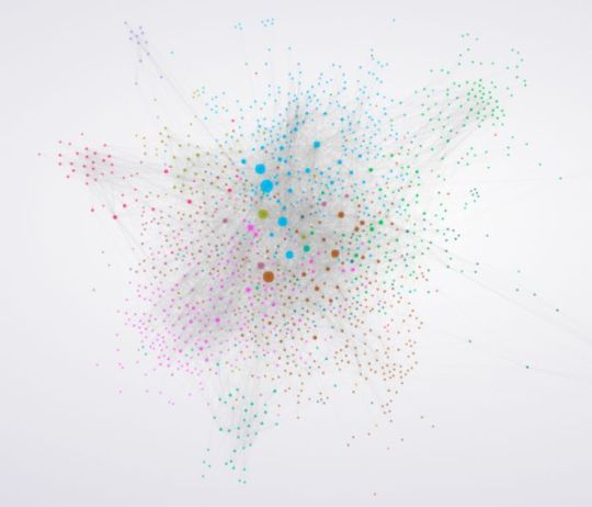
From here, the edge file can be used to build a network visualization where the nodes publishers and the edges between them represent the in-context links found from our Gdelt data pull around whatever topic we desired.
This final visualization is a network representation of the publishers who have written stories about addiction, and where those stories link to.
What can we learn from this graph?
This tells us which nodes (Publisher websites) have the most In-Degree links. In other words: who is the most linked. We can see that the most linked-to for this topic are:
tmz.com
people.com
cdc.gov
cnn.com
go.com
nih.gov
ap.org
latimes.com
jamanetwork.com
nytimes.com
Which publisher is most influential?
Using the "Betweenness Centrality" score given by Gephi, we get a rough understanding of which nodes (publishers) in the network act as hubs of information transfer. The nodes with the highest "Betweenness Centrality" can be thought of as the "connectors" of the network. Getting pickups from these high-betweenness centrality nodes gives a much greater likelihood of syndication for that specific topic/theme.
Dailymail.co.uk
Nytimes.com
People.com
CNN.com
Latimes.com
washingtonpost.com
usatoday.com
cvslocal.com
huffingtonpost.com
sfgate.com
What else can we learn?
Similar to the first example, the higher the betweenness centrality numbers, number of In-degree links, and the more centrally located in the graph, the more “important” that node can generally be said to be. Using this as a guide, the most important pitching targets can be easily identified.
Understanding some of the edge clusters gives additional insights into other potential opportunities. Including a few clusters specific to different regional or state local news, and a few foreign language publication clusters.
Wrapping up
I’ve outlined two different techniques we use at Fractl to understand the influence networks around specific topical areas, both in terms of publications and the writers at those publications. The visualization techniques described are not obvious guides, but instead, are tools for combing through large amounts of data and finding hidden information. Use these techniques to unearth new opportunities and prioritize as you get ready to find the best places to pitch the content you’ve worked so hard to create.
Do you have any similar ideas or tactics to ensure you're pitching the best writers and publishers with your content? Comment below!
Sign up for The Moz Top 10, a semimonthly mailer updating you on the top ten hottest pieces of SEO news, tips, and rad links uncovered by the Moz team. Think of it as your exclusive digest of stuff you don't have time to hunt down but want to read!
0 notes
Text
Advanced Linkbuilding: How to Find the Absolute Best Publishers and Writers to Pitch
Posted by KristinTynski
In my last post, I explained how using network visualization tools can help you massively improve your content marketing PR/Outreach strategy —understanding which news outlets have the largest syndication networks empowers your outreach team to prioritize high-syndication publications over lower syndication publications. The result? The content you are pitching enjoys significantly more widespread link pickups.
Today, I’m going to take you a little deeper — we'll be looking at a few techniques for forming an even better understanding of the publisher syndication networks in your particular niche. I've broken this technique into two parts:
Technique One — Leveraging Buzzsumo influencer data and twitter scraping to find the most influential journalists writing about any topic
Technique Two — Leveraging the Gdelt Dataset to reveal deep story syndication networks between publishers using in-context links.
Why do this at all?
If you are interested in generating high-value links at scale, these techniques provide an undeniable competitive advantage — they help you to deeply understand how writers and news publications connect and syndicate to each other.
In our opinion at Fractl, data-driven content stories that have strong news hooks, finding writers and publications who would find the content compelling, and pitching them effectively is the single highest ROI SEO activity possible. Done correctly, it is entirely possible to generate dozens, sometimes even hundreds or thousands, of high-authority links with one or a handful of content campaigns.
Let's dive in.
Using Buzzsumo to understand journalist influencer networks on any topic
First, you want to figure out who your topc influencers are your a topic. A very handy feature of Buzzsumo is its “influencers” tool. You can locate it on the influences tab, then follow these steps:
Select only “Journalists.” This will limit the result to only the Twitter accounts of those known to be reporters and journalists of major publications. Bloggers and lower authority publishers will be excluded.
Search using a topical keyword. If it is straightforward, one or two searches should be fine. If it is more complex, create a few related queries, and collate the twitter accounts that appear in all of them. Alternatively, use the Boolean "and/or" in your search to narrow your result. It is critical to be sure your search results are returning journalists that as closely match your target criteria as possible.
Ideally, you want at least 100 results. More is generally better, so long as you are sure the results represent your target criteria well.
Once you are happy with your search result, click export to grab a CSV.
The next step is to grab all of the people each of these known journalist influencers follows — the goal is to understand which of these 100 or so influencers impacts the other 100 the most. Additionally, we want to find people outside of this group that many of these 100 follow in common.
To do so, we leveraged Twint, a handy Twitter scraper available on Github to pull all of the people each of these journalist influencers follow. Using our scraped data, we built an edge list, which allowed us to visualize the result in Gephi.
Here is an interactive version for you to explore, and here is a screenshot of what it looks like:
This graph shows us which nodes (influencers) have the most In-Degree links. In other words: it tells us who, of our media influencers, is most followed.
These are the top 10 nodes:
@maiasz
Radley Balko (@radleybalko) Opinion journalist, Washington Post
@johannhari101
@davidkroll
@narcomania
@milbank
@samquinones7
@felicejfreyer
@jeannewhalen
@ericbolling
Who is the most influential?
Using the “Betweenness Centrality” score given by Gephi, we get a rough understanding of which nodes (influencers) in the network act as hubs of information transfer. Those with the highest "Betweenness Centrality" can be thought of as the “connectors” of the network. These are the top 10 influencers:
Maia Szalavitz (@maiasz) Neuroscience Journalist, VICE and TIME
Radley Balko (@radleybalko) Opinion journalist, Washington Post
Johann Hari (@johannhari101) New York Times best-selling author
David Kroll (@davidkroll) Freelance healthcare writer, Forbes Heath
Max Daly (@Narcomania) Global Drugs Editor, VICE
Dana Milbank (@milbank)Columnist, Washington Post
Sam Quinones (@samquinones7), Author
Felice Freyer (@felicejfreyer), Boston Globe Reporter, Mental health and Addiction
Jeanne Whalen (@jeannewhalen) Business Reporter, Washington Post
Eric Bolling (@ericbolling) New York Times best-selling author
@maiasz, @davidkroll, and @johannhari101 are standouts. There's considerable overlap between the winners in "In-Degree" and "Betweenness Centrality" but they are still quite different.
What else can we learn?
The middle of the visualization holds many of the largest sized nodes. The nodes in this view are sized by "In-Degree." The large, centrally located nodes are disproportionately followed by other members of the graph and enjoy popularity across the board (from many of the other influential nodes). These are journalists commonly followed by everyone else. Sifting through these centrally located nodes will surface many journalists who behave as influencers of the group initially pulled from BuzzSumo.
So, if you had a campaign about a niche topic, you could consider pitching to an influencer surfaced from this data —according to our the visualization, an article shared in their network would have the most reach and potential ROI
Using Gdelt to find the most influential websites on a topic with in-context link analysis
The first example was a great way to find the best journalists in a niche to pitch to, but top journalists are often the most pitched to overall. Often times, it can be easier to get a pickup from less known writers at major publications. For this reason, understanding which major publishers are most influential, and enjoy the widest syndication on a specific theme, topic, or beat, can be majorly helpful.
By using Gdelt’s massive and fully comprehensive database of digital news stories, along with Google BigQuery and Gephi, it is possible to dig even deeper to yield important strategic information that will help you prioritize your content pitching.
We pulled all of the articles in Gdelt’s database that are known to be about a specific theme within a given timeframe. In this case (as with the previous example) we looked at "behaviour health." For each article we found in Gdelt’s database that matches our criteria, we also grabbed links found only within the context of the article.
Here is how it is done:
Connect to Gdelt on Google BigQuery — you can find a tutorial here.
Pull data from Gdelt. You can use this command: SELECT DocumentIdentifier,V2Themes,Extras,SourceCommonName,DATE FROM [gdelt-bq:gdeltv2.gkg] where (V2Themes like '%Your Theme%').
Select any theme you find, here — just replace the part between the percentages.
To extract the links found in each article and build an edge file. This can be done with a relatively simple python script to pull out all of the <PAGE_LINKS> from the results of the query, clean the links to only show their root domain (not the full URL) and put them into an edge file format.
Note: The edge file is made up of Source-->Target pairs. The Source is the article and the Target are the links found within the article. The edge list will look like this:
Article 1, First link found in the article.
Article 1, Second link found in the article.
Article 2, First link found in the article.
Article 2, Second link found in the article.
Article 2, Third link found in the article.
From here, the edge file can be used to build a network visualization where the nodes publishers and the edges between them represent the in-context links found from our Gdelt data pull around whatever topic we desired.
This final visualization is a network representation of the publishers who have written stories about addiction, and where those stories link to.
What can we learn from this graph?
This tells us which nodes (Publisher websites) have the most In-Degree links. In other words: who is the most linked. We can see that the most linked-to for this topic are:
tmz.com
people.com
cdc.gov
cnn.com
go.com
nih.gov
ap.org
latimes.com
jamanetwork.com
nytimes.com
Which publisher is most influential?
Using the "Betweenness Centrality" score given by Gephi, we get a rough understanding of which nodes (publishers) in the network act as hubs of information transfer. The nodes with the highest "Betweenness Centrality" can be thought of as the "connectors" of the network. Getting pickups from these high-betweenness centrality nodes gives a much greater likelihood of syndication for that specific topic/theme.
Dailymail.co.uk
Nytimes.com
People.com
CNN.com
Latimes.com
washingtonpost.com
usatoday.com
cvslocal.com
huffingtonpost.com
sfgate.com
What else can we learn?
Similar to the first example, the higher the betweenness centrality numbers, number of In-degree links, and the more centrally located in the graph, the more “important” that node can generally be said to be. Using this as a guide, the most important pitching targets can be easily identified.
Understanding some of the edge clusters gives additional insights into other potential opportunities. Including a few clusters specific to different regional or state local news, and a few foreign language publication clusters.
Wrapping up
I’ve outlined two different techniques we use at Fractl to understand the influence networks around specific topical areas, both in terms of publications and the writers at those publications. The visualization techniques described are not obvious guides, but instead, are tools for combing through large amounts of data and finding hidden information. Use these techniques to unearth new opportunities and prioritize as you get ready to find the best places to pitch the content you’ve worked so hard to create.
Do you have any similar ideas or tactics to ensure you're pitching the best writers and publishers with your content? Comment below!
Sign up for The Moz Top 10, a semimonthly mailer updating you on the top ten hottest pieces of SEO news, tips, and rad links uncovered by the Moz team. Think of it as your exclusive digest of stuff you don't have time to hunt down but want to read!
from The Moz Blog https://ift.tt/2NunVpF
http://www.webmasterforum.ws/long-tail-pro-review-platinum-discount
0 notes
Text
Advanced Linkbuilding: How to Find the Absolute Best Publishers and Writers to Pitch
Posted by KristinTynski
In my last post, I explained how using network visualization tools can help you massively improve your content marketing PR/Outreach strategy —understanding which news outlets have the largest syndication networks empowers your outreach team to prioritize high-syndication publications over lower syndication publications. The result? The content you are pitching enjoys significantly more widespread link pickups.
Today, I’m going to take you a little deeper — we’ll be looking at a few techniques for forming an even better understanding of the publisher syndication networks in your particular niche. I’ve broken this technique into two parts:
Technique One — Leveraging Buzzsumo influencer data and twitter scraping to find the most influential journalists writing about any topic
Technique Two — Leveraging the Gdelt Dataset to reveal deep story syndication networks between publishers using in-context links.
Why do this at all?
If you are interested in generating high-value links at scale, these techniques provide an undeniable competitive advantage — they help you to deeply understand how writers and news publications connect and syndicate to each other.
In our opinion at Fractl, data-driven content stories that have strong news hooks, finding writers and publications who would find the content compelling, and pitching them effectively is the single highest ROI SEO activity possible. Done correctly, it is entirely possible to generate dozens, sometimes even hundreds or thousands, of high-authority links with one or a handful of content campaigns.
Let’s dive in.
Using Buzzsumo to understand journalist influencer networks on any topic
First, you want to figure out who your topc influencers are your a topic. A very handy feature of Buzzsumo is its “influencers” tool. You can locate it on the influences tab, then follow these steps:
Select only “Journalists.” This will limit the result to only the Twitter accounts of those known to be reporters and journalists of major publications. Bloggers and lower authority publishers will be excluded.
Search using a topical keyword. If it is straightforward, one or two searches should be fine. If it is more complex, create a few related queries, and collate the twitter accounts that appear in all of them. Alternatively, use the Boolean “and/or” in your search to narrow your result. It is critical to be sure your search results are returning journalists that as closely match your target criteria as possible.
Ideally, you want at least 100 results. More is generally better, so long as you are sure the results represent your target criteria well.
Once you are happy with your search result, click export to grab a CSV.
The next step is to grab all of the people each of these known journalist influencers follows — the goal is to understand which of these 100 or so influencers impacts the other 100 the most. Additionally, we want to find people outside of this group that many of these 100 follow in common.
To do so, we leveraged Twint, a handy Twitter scraper available on Github to pull all of the people each of these journalist influencers follow. Using our scraped data, we built an edge list, which allowed us to visualize the result in Gephi.
Here is an interactive version for you to explore, and here is a screenshot of what it looks like:
This graph shows us which nodes (influencers) have the most In-Degree links. In other words: it tells us who, of our media influencers, is most followed.
These are the top 10 nodes:
@maiasz
Radley Balko (@radleybalko) Opinion journalist, Washington Post
@johannhari101
@davidkroll
@narcomania
@milbank
@samquinones7
@felicejfreyer
@jeannewhalen
@ericbolling
Who is the most influential?
Using the “Betweenness Centrality” score given by Gephi, we get a rough understanding of which nodes (influencers) in the network act as hubs of information transfer. Those with the highest “Betweenness Centrality” can be thought of as the “connectors” of the network. These are the top 10 influencers:
Maia Szalavitz (@maiasz) Neuroscience Journalist, VICE and TIME
Radley Balko (@radleybalko) Opinion journalist, Washington Post
Johann Hari (@johannhari101) New York Times best-selling author
David Kroll (@davidkroll) Freelance healthcare writer, Forbes Heath
Max Daly (@Narcomania) Global Drugs Editor, VICE
Dana Milbank (@milbank)Columnist, Washington Post
Sam Quinones (@samquinones7), Author
Felice Freyer (@felicejfreyer), Boston Globe Reporter, Mental health and Addiction
Jeanne Whalen (@jeannewhalen) Business Reporter, Washington Post
Eric Bolling (@ericbolling) New York Times best-selling author
@maiasz, @davidkroll, and @johannhari101 are standouts. There’s considerable overlap between the winners in “In-Degree” and “Betweenness Centrality” but they are still quite different.
What else can we learn?
The middle of the visualization holds many of the largest sized nodes. The nodes in this view are sized by “In-Degree.” The large, centrally located nodes are disproportionately followed by other members of the graph and enjoy popularity across the board (from many of the other influential nodes). These are journalists commonly followed by everyone else. Sifting through these centrally located nodes will surface many journalists who behave as influencers of the group initially pulled from BuzzSumo.
So, if you had a campaign about a niche topic, you could consider pitching to an influencer surfaced from this data —according to our the visualization, an article shared in their network would have the most reach and potential ROI
Using Gdelt to find the most influential websites on a topic with in-context link analysis
The first example was a great way to find the best journalists in a niche to pitch to, but top journalists are often the most pitched to overall. Often times, it can be easier to get a pickup from less known writers at major publications. For this reason, understanding which major publishers are most influential, and enjoy the widest syndication on a specific theme, topic, or beat, can be majorly helpful.
By using Gdelt’s massive and fully comprehensive database of digital news stories, along with Google BigQuery and Gephi, it is possible to dig even deeper to yield important strategic information that will help you prioritize your content pitching.
We pulled all of the articles in Gdelt’s database that are known to be about a specific theme within a given timeframe. In this case (as with the previous example) we looked at “behaviour health.” For each article we found in Gdelt’s database that matches our criteria, we also grabbed links found only within the context of the article.
Here is how it is done:
Connect to Gdelt on Google BigQuery — you can find a tutorial here.
Pull data from Gdelt. You can use this command: SELECT DocumentIdentifier,V2Themes,Extras,SourceCommonName,DATE FROM [gdelt-bq:gdeltv2.gkg] where (V2Themes like ’%Your Theme%’).
Select any theme you find, here — just replace the part between the percentages.
To extract the links found in each article and build an edge file. This can be done with a relatively simple python script to pull out all of the <PAGE_LINKS> from the results of the query, clean the links to only show their root domain (not the full URL) and put them into an edge file format.
Note: The edge file is made up of Source–>Target pairs. The Source is the article and the Target are the links found within the article. The edge list will look like this:
Article 1, First link found in the article.
Article 1, Second link found in the article.
Article 2, First link found in the article.
Article 2, Second link found in the article.
Article 2, Third link found in the article.
From here, the edge file can be used to build a network visualization where the nodes publishers and the edges between them represent the in-context links found from our Gdelt data pull around whatever topic we desired.
This final visualization is a network representation of the publishers who have written stories about addiction, and where those stories link to.
What can we learn from this graph?
This tells us which nodes (Publisher websites) have the most In-Degree links. In other words: who is the most linked. We can see that the most linked-to for this topic are:
tmz.com
people.com
cdc.gov
cnn.com
go.com
nih.gov
ap.org
latimes.com
jamanetwork.com
nytimes.com
Which publisher is most influential?
Using the “Betweenness Centrality” score given by Gephi, we get a rough understanding of which nodes (publishers) in the network act as hubs of information transfer. The nodes with the highest “Betweenness Centrality” can be thought of as the “connectors” of the network. Getting pickups from these high-betweenness centrality nodes gives a much greater likelihood of syndication for that specific topic/theme.
Dailymail.co.uk
Nytimes.com
People.com
CNN.com
Latimes.com
washingtonpost.com
usatoday.com
cvslocal.com
huffingtonpost.com
sfgate.com
What else can we learn?
Similar to the first example, the higher the betweenness centrality numbers, number of In-degree links, and the more centrally located in the graph, the more “important” that node can generally be said to be. Using this as a guide, the most important pitching targets can be easily identified.
Understanding some of the edge clusters gives additional insights into other potential opportunities. Including a few clusters specific to different regional or state local news, and a few foreign language publication clusters.
Wrapping up
I’ve outlined two different techniques we use at Fractl to understand the influence networks around specific topical areas, both in terms of publications and the writers at those publications. The visualization techniques described are not obvious guides, but instead, are tools for combing through large amounts of data and finding hidden information. Use these techniques to unearth new opportunities and prioritize as you get ready to find the best places to pitch the content you’ve worked so hard to create.
Do you have any similar ideas or tactics to ensure you’re pitching the best writers and publishers with your content? Comment below!
Sign up for The Moz Top 10, a semimonthly mailer updating you on the top ten hottest pieces of SEO news, tips, and rad links uncovered by the Moz team. Think of it as your exclusive digest of stuff you don’t have time to hunt down but want to read!
Advanced Linkbuilding: How to Find the Absolute Best Publishers and Writers to Pitch published first on http://goproski.com/
0 notes
Text
Advanced Linkbuilding: How to Find the Absolute Best Publishers and Writers to Pitch
Posted by KristinTynski
In my last post, I explained how using network visualization tools can help you massively improve your content marketing PR/Outreach strategy —understanding which news outlets have the largest syndication networks empowers your outreach team to prioritize high-syndication publications over lower syndication publications. The result? The content you are pitching enjoys significantly more widespread link pickups.
Today, I’m going to take you a little deeper — we’ll be looking at a few techniques for forming an even better understanding of the publisher syndication networks in your particular niche. I’ve broken this technique into two parts:
Technique One — Leveraging Buzzsumo influencer data and twitter scraping to find the most influential journalists writing about any topic
Technique Two — Leveraging the Gdelt Dataset to reveal deep story syndication networks between publishers using in-context links.
Why do this at all?
If you are interested in generating high-value links at scale, these techniques provide an undeniable competitive advantage — they help you to deeply understand how writers and news publications connect and syndicate to each other.
In our opinion at Fractl, data-driven content stories that have strong news hooks, finding writers and publications who would find the content compelling, and pitching them effectively is the single highest ROI SEO activity possible. Done correctly, it is entirely possible to generate dozens, sometimes even hundreds or thousands, of high-authority links with one or a handful of content campaigns.
Let’s dive in.
Using Buzzsumo to understand journalist influencer networks on any topic
First, you want to figure out who your topc influencers are your a topic. A very handy feature of Buzzsumo is its “influencers” tool. You can locate it on the influences tab, then follow these steps:
Select only “Journalists.” This will limit the result to only the Twitter accounts of those known to be reporters and journalists of major publications. Bloggers and lower authority publishers will be excluded.
Search using a topical keyword. If it is straightforward, one or two searches should be fine. If it is more complex, create a few related queries, and collate the twitter accounts that appear in all of them. Alternatively, use the Boolean “and/or” in your search to narrow your result. It is critical to be sure your search results are returning journalists that as closely match your target criteria as possible.
Ideally, you want at least 100 results. More is generally better, so long as you are sure the results represent your target criteria well.
Once you are happy with your search result, click export to grab a CSV.
The next step is to grab all of the people each of these known journalist influencers follows — the goal is to understand which of these 100 or so influencers impacts the other 100 the most. Additionally, we want to find people outside of this group that many of these 100 follow in common.
To do so, we leveraged Twint, a handy Twitter scraper available on Github to pull all of the people each of these journalist influencers follow. Using our scraped data, we built an edge list, which allowed us to visualize the result in Gephi.
Here is an interactive version for you to explore, and here is a screenshot of what it looks like:
This graph shows us which nodes (influencers) have the most In-Degree links. In other words: it tells us who, of our media influencers, is most followed.
These are the top 10 nodes:
@maiasz
Radley Balko (@radleybalko) Opinion journalist, Washington Post
@johannhari101
@davidkroll
@narcomania
@milbank
@samquinones7
@felicejfreyer
@jeannewhalen
@ericbolling
Who is the most influential?
Using the “Betweenness Centrality” score given by Gephi, we get a rough understanding of which nodes (influencers) in the network act as hubs of information transfer. Those with the highest “Betweenness Centrality” can be thought of as the “connectors” of the network. These are the top 10 influencers:
Maia Szalavitz (@maiasz) Neuroscience Journalist, VICE and TIME
Radley Balko (@radleybalko) Opinion journalist, Washington Post
Johann Hari (@johannhari101) New York Times best-selling author
David Kroll (@davidkroll) Freelance healthcare writer, Forbes Heath
Max Daly (@Narcomania) Global Drugs Editor, VICE
Dana Milbank (@milbank)Columnist, Washington Post
Sam Quinones (@samquinones7), Author
Felice Freyer (@felicejfreyer), Boston Globe Reporter, Mental health and Addiction
Jeanne Whalen (@jeannewhalen) Business Reporter, Washington Post
Eric Bolling (@ericbolling) New York Times best-selling author
@maiasz, @davidkroll, and @johannhari101 are standouts. There’s considerable overlap between the winners in “In-Degree” and “Betweenness Centrality” but they are still quite different.
What else can we learn?
The middle of the visualization holds many of the largest sized nodes. The nodes in this view are sized by “In-Degree.” The large, centrally located nodes are disproportionately followed by other members of the graph and enjoy popularity across the board (from many of the other influential nodes). These are journalists commonly followed by everyone else. Sifting through these centrally located nodes will surface many journalists who behave as influencers of the group initially pulled from BuzzSumo.
So, if you had a campaign about a niche topic, you could consider pitching to an influencer surfaced from this data —according to our the visualization, an article shared in their network would have the most reach and potential ROI
Using Gdelt to find the most influential websites on a topic with in-context link analysis
The first example was a great way to find the best journalists in a niche to pitch to, but top journalists are often the most pitched to overall. Often times, it can be easier to get a pickup from less known writers at major publications. For this reason, understanding which major publishers are most influential, and enjoy the widest syndication on a specific theme, topic, or beat, can be majorly helpful.
By using Gdelt’s massive and fully comprehensive database of digital news stories, along with Google BigQuery and Gephi, it is possible to dig even deeper to yield important strategic information that will help you prioritize your content pitching.
We pulled all of the articles in Gdelt’s database that are known to be about a specific theme within a given timeframe. In this case (as with the previous example) we looked at “behaviour health.” For each article we found in Gdelt’s database that matches our criteria, we also grabbed links found only within the context of the article.
Here is how it is done:
Connect to Gdelt on Google BigQuery — you can find a tutorial here.
Pull data from Gdelt. You can use this command: SELECT DocumentIdentifier,V2Themes,Extras,SourceCommonName,DATE FROM [gdelt-bq:gdeltv2.gkg] where (V2Themes like ‘%Your Theme%’).
Select any theme you find, here — just replace the part between the percentages.
To extract the links found in each article and build an edge file. This can be done with a relatively simple python script to pull out all of the <PAGE_LINKS> from the results of the query, clean the links to only show their root domain (not the full URL) and put them into an edge file format.
Note: The edge file is made up of Source–>Target pairs. The Source is the article and the Target are the links found within the article. The edge list will look like this:
Article 1, First link found in the article.
Article 1, Second link found in the article.
Article 2, First link found in the article.
Article 2, Second link found in the article.
Article 2, Third link found in the article.
From here, the edge file can be used to build a network visualization where the nodes publishers and the edges between them represent the in-context links found from our Gdelt data pull around whatever topic we desired.
This final visualization is a network representation of the publishers who have written stories about addiction, and where those stories link to.
What can we learn from this graph?
This tells us which nodes (Publisher websites) have the most In-Degree links. In other words: who is the most linked. We can see that the most linked-to for this topic are:
tmz.com
people.com
cdc.gov
cnn.com
go.com
nih.gov
ap.org
latimes.com
jamanetwork.com
nytimes.com
Which publisher is most influential?
Using the “Betweenness Centrality” score given by Gephi, we get a rough understanding of which nodes (publishers) in the network act as hubs of information transfer. The nodes with the highest “Betweenness Centrality” can be thought of as the “connectors” of the network. Getting pickups from these high-betweenness centrality nodes gives a much greater likelihood of syndication for that specific topic/theme.
Dailymail.co.uk
Nytimes.com
People.com
CNN.com
Latimes.com
washingtonpost.com
usatoday.com
cvslocal.com
huffingtonpost.com
sfgate.com
What else can we learn?
Similar to the first example, the higher the betweenness centrality numbers, number of In-degree links, and the more centrally located in the graph, the more “important” that node can generally be said to be. Using this as a guide, the most important pitching targets can be easily identified.
Understanding some of the edge clusters gives additional insights into other potential opportunities. Including a few clusters specific to different regional or state local news, and a few foreign language publication clusters.
Wrapping up
I’ve outlined two different techniques we use at Fractl to understand the influence networks around specific topical areas, both in terms of publications and the writers at those publications. The visualization techniques described are not obvious guides, but instead, are tools for combing through large amounts of data and finding hidden information. Use these techniques to unearth new opportunities and prioritize as you get ready to find the best places to pitch the content you’ve worked so hard to create.
Do you have any similar ideas or tactics to ensure you’re pitching the best writers and publishers with your content? Comment below!
Sign up for The Moz Top 10, a semimonthly mailer updating you on the top ten hottest pieces of SEO news, tips, and rad links uncovered by the Moz team. Think of it as your exclusive digest of stuff you don’t have time to hunt down but want to read!
from https://dentistry01.wordpress.com/2019/02/25/advanced-linkbuilding-how-to-find-the-absolute-best-publishers-and-writers-to-pitch/
0 notes
Text
Advanced Linkbuilding: How to Find the Absolute Best Publishers and Writers to Pitch
Posted by KristinTynski
In my last post, I explained how using network visualization tools can help you massively improve your content marketing PR/Outreach strategy —understanding which news outlets have the largest syndication networks empowers your outreach team to prioritize high-syndication publications over lower syndication publications. The result? The content you are pitching enjoys significantly more widespread link pickups.
Today, I’m going to take you a little deeper — we'll be looking at a few techniques for forming an even better understanding of the publisher syndication networks in your particular niche. I've broken this technique into two parts:
Technique One — Leveraging Buzzsumo influencer data and twitter scraping to find the most influential journalists writing about any topic
Technique Two — Leveraging the Gdelt Dataset to reveal deep story syndication networks between publishers using in-context links.
Why do this at all?
If you are interested in generating high-value links at scale, these techniques provide an undeniable competitive advantage — they help you to deeply understand how writers and news publications connect and syndicate to each other.
In our opinion at Fractl, data-driven content stories that have strong news hooks, finding writers and publications who would find the content compelling, and pitching them effectively is the single highest ROI SEO activity possible. Done correctly, it is entirely possible to generate dozens, sometimes even hundreds or thousands, of high-authority links with one or a handful of content campaigns.
Let's dive in.
Using Buzzsumo to understand journalist influencer networks on any topic
First, you want to figure out who your topc influencers are your a topic. A very handy feature of Buzzsumo is its “influencers” tool. You can locate it on the influences tab, then follow these steps:
Select only “Journalists.” This will limit the result to only the Twitter accounts of those known to be reporters and journalists of major publications. Bloggers and lower authority publishers will be excluded.
Search using a topical keyword. If it is straightforward, one or two searches should be fine. If it is more complex, create a few related queries, and collate the twitter accounts that appear in all of them. Alternatively, use the Boolean "and/or" in your search to narrow your result. It is critical to be sure your search results are returning journalists that as closely match your target criteria as possible.
Ideally, you want at least 100 results. More is generally better, so long as you are sure the results represent your target criteria well.
Once you are happy with your search result, click export to grab a CSV.
The next step is to grab all of the people each of these known journalist influencers follows — the goal is to understand which of these 100 or so influencers impacts the other 100 the most. Additionally, we want to find people outside of this group that many of these 100 follow in common.
To do so, we leveraged Twint, a handy Twitter scraper available on Github to pull all of the people each of these journalist influencers follow. Using our scraped data, we built an edge list, which allowed us to visualize the result in Gephi.
Here is an interactive version for you to explore, and here is a screenshot of what it looks like:
This graph shows us which nodes (influencers) have the most In-Degree links. In other words: it tells us who, of our media influencers, is most followed.
These are the top 10 nodes:
@maiasz
Radley Balko (@radleybalko) Opinion journalist, Washington Post
@johannhari101
@davidkroll
@narcomania
@milbank
@samquinones7
@felicejfreyer
@jeannewhalen
@ericbolling
Who is the most influential?
Using the “Betweenness Centrality” score given by Gephi, we get a rough understanding of which nodes (influencers) in the network act as hubs of information transfer. Those with the highest "Betweenness Centrality" can be thought of as the “connectors” of the network. These are the top 10 influencers:
Maia Szalavitz (@maiasz) Neuroscience Journalist, VICE and TIME
Radley Balko (@radleybalko) Opinion journalist, Washington Post
Johann Hari (@johannhari101) New York Times best-selling author
David Kroll (@davidkroll) Freelance healthcare writer, Forbes Heath
Max Daly (@Narcomania) Global Drugs Editor, VICE
Dana Milbank (@milbank)Columnist, Washington Post
Sam Quinones (@samquinones7), Author
Felice Freyer (@felicejfreyer), Boston Globe Reporter, Mental health and Addiction
Jeanne Whalen (@jeannewhalen) Business Reporter, Washington Post
Eric Bolling (@ericbolling) New York Times best-selling author
@maiasz, @davidkroll, and @johannhari101 are standouts. There's considerable overlap between the winners in "In-Degree" and "Betweenness Centrality" but they are still quite different.
What else can we learn?
The middle of the visualization holds many of the largest sized nodes. The nodes in this view are sized by "In-Degree." The large, centrally located nodes are disproportionately followed by other members of the graph and enjoy popularity across the board (from many of the other influential nodes). These are journalists commonly followed by everyone else. Sifting through these centrally located nodes will surface many journalists who behave as influencers of the group initially pulled from BuzzSumo.
So, if you had a campaign about a niche topic, you could consider pitching to an influencer surfaced from this data —according to our the visualization, an article shared in their network would have the most reach and potential ROI
Using Gdelt to find the most influential websites on a topic with in-context link analysis
The first example was a great way to find the best journalists in a niche to pitch to, but top journalists are often the most pitched to overall. Often times, it can be easier to get a pickup from less known writers at major publications. For this reason, understanding which major publishers are most influential, and enjoy the widest syndication on a specific theme, topic, or beat, can be majorly helpful.
By using Gdelt’s massive and fully comprehensive database of digital news stories, along with Google BigQuery and Gephi, it is possible to dig even deeper to yield important strategic information that will help you prioritize your content pitching.
We pulled all of the articles in Gdelt’s database that are known to be about a specific theme within a given timeframe. In this case (as with the previous example) we looked at "behaviour health." For each article we found in Gdelt’s database that matches our criteria, we also grabbed links found only within the context of the article.
Here is how it is done:
Connect to Gdelt on Google BigQuery — you can find a tutorial here.
Pull data from Gdelt. You can use this command: SELECT DocumentIdentifier,V2Themes,Extras,SourceCommonName,DATE FROM [gdelt-bq:gdeltv2.gkg] where (V2Themes like '%Your Theme%').
Select any theme you find, here — just replace the part between the percentages.
To extract the links found in each article and build an edge file. This can be done with a relatively simple python script to pull out all of the <PAGE_LINKS> from the results of the query, clean the links to only show their root domain (not the full URL) and put them into an edge file format.
Note: The edge file is made up of Source-->Target pairs. The Source is the article and the Target are the links found within the article. The edge list will look like this:
Article 1, First link found in the article.
Article 1, Second link found in the article.
Article 2, First link found in the article.
Article 2, Second link found in the article.
Article 2, Third link found in the article.
From here, the edge file can be used to build a network visualization where the nodes publishers and the edges between them represent the in-context links found from our Gdelt data pull around whatever topic we desired.
This final visualization is a network representation of the publishers who have written stories about addiction, and where those stories link to.
What can we learn from this graph?
This tells us which nodes (Publisher websites) have the most In-Degree links. In other words: who is the most linked. We can see that the most linked-to for this topic are:
tmz.com
people.com
cdc.gov
cnn.com
go.com
nih.gov
ap.org
latimes.com
jamanetwork.com
nytimes.com
Which publisher is most influential?
Using the "Betweenness Centrality" score given by Gephi, we get a rough understanding of which nodes (publishers) in the network act as hubs of information transfer. The nodes with the highest "Betweenness Centrality" can be thought of as the "connectors" of the network. Getting pickups from these high-betweenness centrality nodes gives a much greater likelihood of syndication for that specific topic/theme.
Dailymail.co.uk
Nytimes.com
People.com
CNN.com
Latimes.com
washingtonpost.com
usatoday.com
cvslocal.com
huffingtonpost.com
sfgate.com
What else can we learn?
Similar to the first example, the higher the betweenness centrality numbers, number of In-degree links, and the more centrally located in the graph, the more “important” that node can generally be said to be. Using this as a guide, the most important pitching targets can be easily identified.
Understanding some of the edge clusters gives additional insights into other potential opportunities. Including a few clusters specific to different regional or state local news, and a few foreign language publication clusters.
Wrapping up
I’ve outlined two different techniques we use at Fractl to understand the influence networks around specific topical areas, both in terms of publications and the writers at those publications. The visualization techniques described are not obvious guides, but instead, are tools for combing through large amounts of data and finding hidden information. Use these techniques to unearth new opportunities and prioritize as you get ready to find the best places to pitch the content you’ve worked so hard to create.
Do you have any similar ideas or tactics to ensure you're pitching the best writers and publishers with your content? Comment below!
Sign up for The Moz Top 10, a semimonthly mailer updating you on the top ten hottest pieces of SEO news, tips, and rad links uncovered by the Moz team. Think of it as your exclusive digest of stuff you don't have time to hunt down but want to read!
0 notes
Photo

Have you checked out our exclusive online exhibition for David Kroll’s show “Fragile Nature”? The exhibition can now be virtually viewed from the comfort and safety of your own home—link in bio! • • • #contemporary #art #contemporaryart #davidkroll #paintings #flattenthecurve #contemporaryrealism #eggs #birds #pottery #egret #stilllife #stilllifepainting #fish #koifish #landscapepainting #oilpainting #birdsnest #egretsofinstagram #egrets #robinsegg #map #homeiswheretheartis #shoplocal #supportlocal #supportthearts #seattleartist https://www.instagram.com/p/B--U6zondpx/?igshid=160fvqxad3uax
#contemporary#art#contemporaryart#davidkroll#paintings#flattenthecurve#contemporaryrealism#eggs#birds#pottery#egret#stilllife#stilllifepainting#fish#koifish#landscapepainting#oilpainting#birdsnest#egretsofinstagram#egrets#robinsegg#map#homeiswheretheartis#shoplocal#supportlocal#supportthearts#seattleartist
1 note
·
View note
Text
Advanced Linkbuilding: How to Find the Absolute Best Publishers and Writers to Pitch
Posted by KristinTynski
In my last post, I explained how using network visualization tools can help you massively improve your content marketing PR/Outreach strategy —understanding which news outlets have the largest syndication networks empowers your outreach team to prioritize high-syndication publications over lower syndication publications. The result? The content you are pitching enjoys significantly more widespread link pickups.
Today, I’m going to take you a little deeper — we'll be looking at a few techniques for forming an even better understanding of the publisher syndication networks in your particular niche. I've broken this technique into two parts:
Technique One — Leveraging Buzzsumo influencer data and twitter scraping to find the most influential journalists writing about any topic
Technique Two — Leveraging the Gdelt Dataset to reveal deep story syndication networks between publishers using in-context links.
Why do this at all?
If you are interested in generating high-value links at scale, these techniques provide an undeniable competitive advantage — they help you to deeply understand how writers and news publications connect and syndicate to each other.
In our opinion at Fractl, data-driven content stories that have strong news hooks, finding writers and publications who would find the content compelling, and pitching them effectively is the single highest ROI SEO activity possible. Done correctly, it is entirely possible to generate dozens, sometimes even hundreds or thousands, of high-authority links with one or a handful of content campaigns.
Let's dive in.
Using Buzzsumo to understand journalist influencer networks on any topic
First, you want to figure out who your topc influencers are your a topic. A very handy feature of Buzzsumo is its “influencers” tool. You can locate it on the influences tab, then follow these steps:
Select only “Journalists.” This will limit the result to only the Twitter accounts of those known to be reporters and journalists of major publications. Bloggers and lower authority publishers will be excluded.
Search using a topical keyword. If it is straightforward, one or two searches should be fine. If it is more complex, create a few related queries, and collate the twitter accounts that appear in all of them. Alternatively, use the Boolean "and/or" in your search to narrow your result. It is critical to be sure your search results are returning journalists that as closely match your target criteria as possible.
Ideally, you want at least 100 results. More is generally better, so long as you are sure the results represent your target criteria well.
Once you are happy with your search result, click export to grab a CSV.
The next step is to grab all of the people each of these known journalist influencers follows — the goal is to understand which of these 100 or so influencers impacts the other 100 the most. Additionally, we want to find people outside of this group that many of these 100 follow in common.
To do so, we leveraged Twint, a handy Twitter scraper available on Github to pull all of the people each of these journalist influencers follow. Using our scraped data, we built an edge list, which allowed us to visualize the result in Gephi.
Here is an interactive version for you to explore, and here is a screenshot of what it looks like:
This graph shows us which nodes (influencers) have the most In-Degree links. In other words: it tells us who, of our media influencers, is most followed.
These are the top 10 nodes:
@maiasz
Radley Balko (@radleybalko) Opinion journalist, Washington Post
@johannhari101
@davidkroll
@narcomania
@milbank
@samquinones7
@felicejfreyer
@jeannewhalen
@ericbolling
Who is the most influential?
Using the “Betweenness Centrality” score given by Gephi, we get a rough understanding of which nodes (influencers) in the network act as hubs of information transfer. Those with the highest "Betweenness Centrality" can be thought of as the “connectors” of the network. These are the top 10 influencers:
Maia Szalavitz (@maiasz) Neuroscience Journalist, VICE and TIME
Radley Balko (@radleybalko) Opinion journalist, Washington Post
Johann Hari (@johannhari101) New York Times best-selling author
David Kroll (@davidkroll) Freelance healthcare writer, Forbes Heath
Max Daly (@Narcomania) Global Drugs Editor, VICE
Dana Milbank (@milbank)Columnist, Washington Post
Sam Quinones (@samquinones7), Author
Felice Freyer (@felicejfreyer), Boston Globe Reporter, Mental health and Addiction
Jeanne Whalen (@jeannewhalen) Business Reporter, Washington Post
Eric Bolling (@ericbolling) New York Times best-selling author
@maiasz, @davidkroll, and @johannhari101 are standouts. There's considerable overlap between the winners in "In-Degree" and "Betweenness Centrality" but they are still quite different.
What else can we learn?
The middle of the visualization holds many of the largest sized nodes. The nodes in this view are sized by "In-Degree." The large, centrally located nodes are disproportionately followed by other members of the graph and enjoy popularity across the board (from many of the other influential nodes). These are journalists commonly followed by everyone else. Sifting through these centrally located nodes will surface many journalists who behave as influencers of the group initially pulled from BuzzSumo.
So, if you had a campaign about a niche topic, you could consider pitching to an influencer surfaced from this data —according to our the visualization, an article shared in their network would have the most reach and potential ROI
Using Gdelt to find the most influential websites on a topic with in-context link analysis
The first example was a great way to find the best journalists in a niche to pitch to, but top journalists are often the most pitched to overall. Often times, it can be easier to get a pickup from less known writers at major publications. For this reason, understanding which major publishers are most influential, and enjoy the widest syndication on a specific theme, topic, or beat, can be majorly helpful.
By using Gdelt’s massive and fully comprehensive database of digital news stories, along with Google BigQuery and Gephi, it is possible to dig even deeper to yield important strategic information that will help you prioritize your content pitching.
We pulled all of the articles in Gdelt’s database that are known to be about a specific theme within a given timeframe. In this case (as with the previous example) we looked at "behaviour health." For each article we found in Gdelt’s database that matches our criteria, we also grabbed links found only within the context of the article.
Here is how it is done:
Connect to Gdelt on Google BigQuery — you can find a tutorial here.
Pull data from Gdelt. You can use this command: SELECT DocumentIdentifier,V2Themes,Extras,SourceCommonName,DATE FROM [gdelt-bq:gdeltv2.gkg] where (V2Themes like '%Your Theme%').
Select any theme you find, here — just replace the part between the percentages.
To extract the links found in each article and build an edge file. This can be done with a relatively simple python script to pull out all of the <PAGE_LINKS> from the results of the query, clean the links to only show their root domain (not the full URL) and put them into an edge file format.
Note: The edge file is made up of Source-->Target pairs. The Source is the article and the Target are the links found within the article. The edge list will look like this:
Article 1, First link found in the article.
Article 1, Second link found in the article.
Article 2, First link found in the article.
Article 2, Second link found in the article.
Article 2, Third link found in the article.
From here, the edge file can be used to build a network visualization where the nodes publishers and the edges between them represent the in-context links found from our Gdelt data pull around whatever topic we desired.
This final visualization is a network representation of the publishers who have written stories about addiction, and where those stories link to.
What can we learn from this graph?
This tells us which nodes (Publisher websites) have the most In-Degree links. In other words: who is the most linked. We can see that the most linked-to for this topic are:
tmz.com
people.com
cdc.gov
cnn.com
go.com
nih.gov
ap.org
latimes.com
jamanetwork.com
nytimes.com
Which publisher is most influential?
Using the "Betweenness Centrality" score given by Gephi, we get a rough understanding of which nodes (publishers) in the network act as hubs of information transfer. The nodes with the highest "Betweenness Centrality" can be thought of as the "connectors" of the network. Getting pickups from these high-betweenness centrality nodes gives a much greater likelihood of syndication for that specific topic/theme.
Dailymail.co.uk
Nytimes.com
People.com
CNN.com
Latimes.com
washingtonpost.com
usatoday.com
cvslocal.com
huffingtonpost.com
sfgate.com
What else can we learn?
Similar to the first example, the higher the betweenness centrality numbers, number of In-degree links, and the more centrally located in the graph, the more “important” that node can generally be said to be. Using this as a guide, the most important pitching targets can be easily identified.
Understanding some of the edge clusters gives additional insights into other potential opportunities. Including a few clusters specific to different regional or state local news, and a few foreign language publication clusters.
Wrapping up
I’ve outlined two different techniques we use at Fractl to understand the influence networks around specific topical areas, both in terms of publications and the writers at those publications. The visualization techniques described are not obvious guides, but instead, are tools for combing through large amounts of data and finding hidden information. Use these techniques to unearth new opportunities and prioritize as you get ready to find the best places to pitch the content you’ve worked so hard to create.
Do you have any similar ideas or tactics to ensure you're pitching the best writers and publishers with your content? Comment below!
Sign up for The Moz Top 10, a semimonthly mailer updating you on the top ten hottest pieces of SEO news, tips, and rad links uncovered by the Moz team. Think of it as your exclusive digest of stuff you don't have time to hunt down but want to read!
0 notes
Text
Advanced Linkbuilding: How to Find the Absolute Best Publishers and Writers to Pitch
Posted by KristinTynski
In my last post, I explained how using network visualization tools can help you massively improve your content marketing PR/Outreach strategy —understanding which news outlets have the largest syndication networks empowers your outreach team to prioritize high-syndication publications over lower syndication publications. The result? The content you are pitching enjoys significantly more widespread link pickups.
Today, I’m going to take you a little deeper — we’ll be looking at a few techniques for forming an even better understanding of the publisher syndication networks in your particular niche. I’ve broken this technique into two parts:
Technique One — Leveraging Buzzsumo influencer data and twitter scraping to find the most influential journalists writing about any topic
Technique Two — Leveraging the Gdelt Dataset to reveal deep story syndication networks between publishers using in-context links.
Why do this at all?
If you are interested in generating high-value links at scale, these techniques provide an undeniable competitive advantage — they help you to deeply understand how writers and news publications connect and syndicate to each other.
In our opinion at Fractl, data-driven content stories that have strong news hooks, finding writers and publications who would find the content compelling, and pitching them effectively is the single highest ROI SEO activity possible. Done correctly, it is entirely possible to generate dozens, sometimes even hundreds or thousands, of high-authority links with one or a handful of content campaigns.
Let’s dive in.
Using Buzzsumo to understand journalist influencer networks on any topic
First, you want to figure out who your topc influencers are your a topic. A very handy feature of Buzzsumo is its “influencers” tool. You can locate it on the influences tab, then follow these steps:
Select only “Journalists.” This will limit the result to only the Twitter accounts of those known to be reporters and journalists of major publications. Bloggers and lower authority publishers will be excluded.
Search using a topical keyword. If it is straightforward, one or two searches should be fine. If it is more complex, create a few related queries, and collate the twitter accounts that appear in all of them. Alternatively, use the Boolean “and/or” in your search to narrow your result. It is critical to be sure your search results are returning journalists that as closely match your target criteria as possible.
Ideally, you want at least 100 results. More is generally better, so long as you are sure the results represent your target criteria well.
Once you are happy with your search result, click export to grab a CSV.

The next step is to grab all of the people each of these known journalist influencers follows — the goal is to understand which of these 100 or so influencers impacts the other 100 the most. Additionally, we want to find people outside of this group that many of these 100 follow in common.
To do so, we leveraged Twint, a handy Twitter scraper available on Github to pull all of the people each of these journalist influencers follow. Using our scraped data, we built an edge list, which allowed us to visualize the result in Gephi.
Here is an interactive version for you to explore, and here is a screenshot of what it looks like:

This graph shows us which nodes (influencers) have the most In-Degree links. In other words: it tells us who, of our media influencers, is most followed.
These are the top 10 nodes:
@maiasz
Radley Balko (@radleybalko) Opinion journalist, Washington Post
@johannhari101
@davidkroll
@narcomania
@milbank
@samquinones7
@felicejfreyer
@jeannewhalen
@ericbolling
Who is the most influential?
Using the “Betweenness Centrality” score given by Gephi, we get a rough understanding of which nodes (influencers) in the network act as hubs of information transfer. Those with the highest “Betweenness Centrality” can be thought of as the “connectors” of the network. These are the top 10 influencers:
Maia Szalavitz (@maiasz) Neuroscience Journalist, VICE and TIME
Radley Balko (@radleybalko) Opinion journalist, Washington Post
Johann Hari (@johannhari101) New York Times best-selling author
David Kroll (@davidkroll) Freelance healthcare writer, Forbes Heath
Max Daly (@Narcomania) Global Drugs Editor, VICE
Dana Milbank (@milbank)Columnist, Washington Post
Sam Quinones (@samquinones7), Author
Felice Freyer (@felicejfreyer), Boston Globe Reporter, Mental health and Addiction
Jeanne Whalen (@jeannewhalen) Business Reporter, Washington Post
Eric Bolling (@ericbolling) New York Times best-selling author
@maiasz, @davidkroll, and @johannhari101 are standouts. There’s considerable overlap between the winners in “In-Degree” and “Betweenness Centrality” but they are still quite different.
What else can we learn?
The middle of the visualization holds many of the largest sized nodes. The nodes in this view are sized by “In-Degree.” The large, centrally located nodes are disproportionately followed by other members of the graph and enjoy popularity across the board (from many of the other influential nodes). These are journalists commonly followed by everyone else. Sifting through these centrally located nodes will surface many journalists who behave as influencers of the group initially pulled from BuzzSumo.
So, if you had a campaign about a niche topic, you could consider pitching to an influencer surfaced from this data —according to our the visualization, an article shared in their network would have the most reach and potential ROI
Using Gdelt to find the most influential websites on a topic with in-context link analysis
The first example was a great way to find the best journalists in a niche to pitch to, but top journalists are often the most pitched to overall. Often times, it can be easier to get a pickup from less known writers at major publications. For this reason, understanding which major publishers are most influential, and enjoy the widest syndication on a specific theme, topic, or beat, can be majorly helpful.
By using Gdelt’s massive and fully comprehensive database of digital news stories, along with Google BigQuery and Gephi, it is possible to dig even deeper to yield important strategic information that will help you prioritize your content pitching.
We pulled all of the articles in Gdelt’s database that are known to be about a specific theme within a given timeframe. In this case (as with the previous example) we looked at “behaviour health.” For each article we found in Gdelt’s database that matches our criteria, we also grabbed links found only within the context of the article.
Here is how it is done:
Connect to Gdelt on Google BigQuery — you can find a tutorial here.
Pull data from Gdelt. You can use this command: SELECT DocumentIdentifier,V2Themes,Extras,SourceCommonName,DATE FROM [gdelt-bq:gdeltv2.gkg] where (V2Themes like ‘%Your Theme%’).
Select any theme you find, here — just replace the part between the percentages.
To extract the links found in each article and build an edge file. This can be done with a relatively simple python script to pull out all of the <PAGE_LINKS> from the results of the query, clean the links to only show their root domain (not the full URL) and put them into an edge file format.
Note: The edge file is made up of Source–>Target pairs. The Source is the article and the Target are the links found within the article. The edge list will look like this:
Article 1, First link found in the article.
Article 1, Second link found in the article.
Article 2, First link found in the article.
Article 2, Second link found in the article.
Article 2, Third link found in the article.
From here, the edge file can be used to build a network visualization where the nodes publishers and the edges between them represent the in-context links found from our Gdelt data pull around whatever topic we desired.
This final visualization is a network representation of the publishers who have written stories about addiction, and where those stories link to.

What can we learn from this graph?
This tells us which nodes (Publisher websites) have the most In-Degree links. In other words: who is the most linked. We can see that the most linked-to for this topic are:
tmz.com
people.com
cdc.gov
cnn.com
go.com
nih.gov
ap.org
latimes.com
jamanetwork.com
nytimes.com
Which publisher is most influential?
Using the “Betweenness Centrality” score given by Gephi, we get a rough understanding of which nodes (publishers) in the network act as hubs of information transfer. The nodes with the highest “Betweenness Centrality” can be thought of as the “connectors” of the network. Getting pickups from these high-betweenness centrality nodes gives a much greater likelihood of syndication for that specific topic/theme.
Dailymail.co.uk
Nytimes.com
People.com
CNN.com
Latimes.com
washingtonpost.com
usatoday.com
cvslocal.com
huffingtonpost.com
sfgate.com
What else can we learn?
Similar to the first example, the higher the betweenness centrality numbers, number of In-degree links, and the more centrally located in the graph, the more “important” that node can generally be said to be. Using this as a guide, the most important pitching targets can be easily identified.
Understanding some of the edge clusters gives additional insights into other potential opportunities. Including a few clusters specific to different regional or state local news, and a few foreign language publication clusters.
Wrapping up
I’ve outlined two different techniques we use at Fractl to understand the influence networks around specific topical areas, both in terms of publications and the writers at those publications. The visualization techniques described are not obvious guides, but instead, are tools for combing through large amounts of data and finding hidden information. Use these techniques to unearth new opportunities and prioritize as you get ready to find the best places to pitch the content you’ve worked so hard to create.
Do you have any similar ideas or tactics to ensure you’re pitching the best writers and publishers with your content? Comment below!
Sign up for The Moz Top 10, a semimonthly mailer updating you on the top ten hottest pieces of SEO news, tips, and rad links uncovered by the Moz team. Think of it as your exclusive digest of stuff you don’t have time to hunt down but want to read!
0 notes
Text
Advanced Linkbuilding: How to Find the Absolute Best Publishers and Writers to Pitch
Posted by KristinTynski
In my last post, I explained how using network visualization tools can help you massively improve your content marketing PR/Outreach strategy —understanding which news outlets have the largest syndication networks empowers your outreach team to prioritize high-syndication publications over lower syndication publications. The result? The content you are pitching enjoys significantly more widespread link pickups.
Today, I’m going to take you a little deeper — we'll be looking at a few techniques for forming an even better understanding of the publisher syndication networks in your particular niche. I've broken this technique into two parts:
Technique One — Leveraging Buzzsumo influencer data and twitter scraping to find the most influential journalists writing about any topic
Technique Two — Leveraging the Gdelt Dataset to reveal deep story syndication networks between publishers using in-context links.
Why do this at all?
If you are interested in generating high-value links at scale, these techniques provide an undeniable competitive advantage — they help you to deeply understand how writers and news publications connect and syndicate to each other.
In our opinion at Fractl, data-driven content stories that have strong news hooks, finding writers and publications who would find the content compelling, and pitching them effectively is the single highest ROI SEO activity possible. Done correctly, it is entirely possible to generate dozens, sometimes even hundreds or thousands, of high-authority links with one or a handful of content campaigns.
Let's dive in.
Using Buzzsumo to understand journalist influencer networks on any topic
First, you want to figure out who your topc influencers are your a topic. A very handy feature of Buzzsumo is its “influencers” tool. You can locate it on the influences tab, then follow these steps:
Select only “Journalists.” This will limit the result to only the Twitter accounts of those known to be reporters and journalists of major publications. Bloggers and lower authority publishers will be excluded.
Search using a topical keyword. If it is straightforward, one or two searches should be fine. If it is more complex, create a few related queries, and collate the twitter accounts that appear in all of them. Alternatively, use the Boolean "and/or" in your search to narrow your result. It is critical to be sure your search results are returning journalists that as closely match your target criteria as possible.
Ideally, you want at least 100 results. More is generally better, so long as you are sure the results represent your target criteria well.
Once you are happy with your search result, click export to grab a CSV.
The next step is to grab all of the people each of these known journalist influencers follows — the goal is to understand which of these 100 or so influencers impacts the other 100 the most. Additionally, we want to find people outside of this group that many of these 100 follow in common.
To do so, we leveraged Twint, a handy Twitter scraper available on Github to pull all of the people each of these journalist influencers follow. Using our scraped data, we built an edge list, which allowed us to visualize the result in Gephi.
Here is an interactive version for you to explore, and here is a screenshot of what it looks like:
This graph shows us which nodes (influencers) have the most In-Degree links. In other words: it tells us who, of our media influencers, is most followed.
These are the top 10 nodes:
@maiasz
Radley Balko (@radleybalko) Opinion journalist, Washington Post
@johannhari101
@davidkroll
@narcomania
@milbank
@samquinones7
@felicejfreyer
@jeannewhalen
@ericbolling
Who is the most influential?
Using the “Betweenness Centrality” score given by Gephi, we get a rough understanding of which nodes (influencers) in the network act as hubs of information transfer. Those with the highest "Betweenness Centrality" can be thought of as the “connectors” of the network. These are the top 10 influencers:
Maia Szalavitz (@maiasz) Neuroscience Journalist, VICE and TIME
Radley Balko (@radleybalko) Opinion journalist, Washington Post
Johann Hari (@johannhari101) New York Times best-selling author
David Kroll (@davidkroll) Freelance healthcare writer, Forbes Heath
Max Daly (@Narcomania) Global Drugs Editor, VICE
Dana Milbank (@milbank)Columnist, Washington Post
Sam Quinones (@samquinones7), Author
Felice Freyer (@felicejfreyer), Boston Globe Reporter, Mental health and Addiction
Jeanne Whalen (@jeannewhalen) Business Reporter, Washington Post
Eric Bolling (@ericbolling) New York Times best-selling author
@maiasz, @davidkroll, and @johannhari101 are standouts. There's considerable overlap between the winners in "In-Degree" and "Betweenness Centrality" but they are still quite different.
What else can we learn?
The middle of the visualization holds many of the largest sized nodes. The nodes in this view are sized by "In-Degree." The large, centrally located nodes are disproportionately followed by other members of the graph and enjoy popularity across the board (from many of the other influential nodes). These are journalists commonly followed by everyone else. Sifting through these centrally located nodes will surface many journalists who behave as influencers of the group initially pulled from BuzzSumo.
So, if you had a campaign about a niche topic, you could consider pitching to an influencer surfaced from this data —according to our the visualization, an article shared in their network would have the most reach and potential ROI
Using Gdelt to find the most influential websites on a topic with in-context link analysis
The first example was a great way to find the best journalists in a niche to pitch to, but top journalists are often the most pitched to overall. Often times, it can be easier to get a pickup from less known writers at major publications. For this reason, understanding which major publishers are most influential, and enjoy the widest syndication on a specific theme, topic, or beat, can be majorly helpful.
By using Gdelt’s massive and fully comprehensive database of digital news stories, along with Google BigQuery and Gephi, it is possible to dig even deeper to yield important strategic information that will help you prioritize your content pitching.
We pulled all of the articles in Gdelt’s database that are known to be about a specific theme within a given timeframe. In this case (as with the previous example) we looked at "behaviour health." For each article we found in Gdelt’s database that matches our criteria, we also grabbed links found only within the context of the article.
Here is how it is done:
Connect to Gdelt on Google BigQuery — you can find a tutorial here.
Pull data from Gdelt. You can use this command: SELECT DocumentIdentifier,V2Themes,Extras,SourceCommonName,DATE FROM [gdelt-bq:gdeltv2.gkg] where (V2Themes like '%Your Theme%').
Select any theme you find, here — just replace the part between the percentages.
To extract the links found in each article and build an edge file. This can be done with a relatively simple python script to pull out all of the <PAGE_LINKS> from the results of the query, clean the links to only show their root domain (not the full URL) and put them into an edge file format.
Note: The edge file is made up of Source-->Target pairs. The Source is the article and the Target are the links found within the article. The edge list will look like this:
Article 1, First link found in the article.
Article 1, Second link found in the article.
Article 2, First link found in the article.
Article 2, Second link found in the article.
Article 2, Third link found in the article.
From here, the edge file can be used to build a network visualization where the nodes publishers and the edges between them represent the in-context links found from our Gdelt data pull around whatever topic we desired.
This final visualization is a network representation of the publishers who have written stories about addiction, and where those stories link to.
What can we learn from this graph?
This tells us which nodes (Publisher websites) have the most In-Degree links. In other words: who is the most linked. We can see that the most linked-to for this topic are:
tmz.com
people.com
cdc.gov
cnn.com
go.com
nih.gov
ap.org
latimes.com
jamanetwork.com
nytimes.com
Which publisher is most influential?
Using the "Betweenness Centrality" score given by Gephi, we get a rough understanding of which nodes (publishers) in the network act as hubs of information transfer. The nodes with the highest "Betweenness Centrality" can be thought of as the "connectors" of the network. Getting pickups from these high-betweenness centrality nodes gives a much greater likelihood of syndication for that specific topic/theme.
Dailymail.co.uk
Nytimes.com
People.com
CNN.com
Latimes.com
washingtonpost.com
usatoday.com
cvslocal.com
huffingtonpost.com
sfgate.com
What else can we learn?
Similar to the first example, the higher the betweenness centrality numbers, number of In-degree links, and the more centrally located in the graph, the more “important” that node can generally be said to be. Using this as a guide, the most important pitching targets can be easily identified.
Understanding some of the edge clusters gives additional insights into other potential opportunities. Including a few clusters specific to different regional or state local news, and a few foreign language publication clusters.
Wrapping up
I’ve outlined two different techniques we use at Fractl to understand the influence networks around specific topical areas, both in terms of publications and the writers at those publications. The visualization techniques described are not obvious guides, but instead, are tools for combing through large amounts of data and finding hidden information. Use these techniques to unearth new opportunities and prioritize as you get ready to find the best places to pitch the content you’ve worked so hard to create.
Do you have any similar ideas or tactics to ensure you're pitching the best writers and publishers with your content? Comment below!
Sign up for The Moz Top 10, a semimonthly mailer updating you on the top ten hottest pieces of SEO news, tips, and rad links uncovered by the Moz team. Think of it as your exclusive digest of stuff you don't have time to hunt down but want to read!
0 notes
Text
Advanced Linkbuilding: How to Find the Absolute Best Publishers and Writers to Pitch
Posted by KristinTynski
In my last post, I explained how using network visualization tools can help you massively improve your content marketing PR/Outreach strategy —understanding which news outlets have the largest syndication networks empowers your outreach team to prioritize high-syndication publications over lower syndication publications. The result? The content you are pitching enjoys significantly more widespread link pickups.
Today, I’m going to take you a little deeper — we'll be looking at a few techniques for forming an even better understanding of the publisher syndication networks in your particular niche. I've broken this technique into two parts:
Technique One — Leveraging Buzzsumo influencer data and twitter scraping to find the most influential journalists writing about any topic
Technique Two — Leveraging the Gdelt Dataset to reveal deep story syndication networks between publishers using in-context links.
Why do this at all?
If you are interested in generating high-value links at scale, these techniques provide an undeniable competitive advantage — they help you to deeply understand how writers and news publications connect and syndicate to each other.
In our opinion at Fractl, data-driven content stories that have strong news hooks, finding writers and publications who would find the content compelling, and pitching them effectively is the single highest ROI SEO activity possible. Done correctly, it is entirely possible to generate dozens, sometimes even hundreds or thousands, of high-authority links with one or a handful of content campaigns.
Let's dive in.
Using Buzzsumo to understand journalist influencer networks on any topic
First, you want to figure out who your topc influencers are your a topic. A very handy feature of Buzzsumo is its “influencers” tool. You can locate it on the influences tab, then follow these steps:
Select only “Journalists.” This will limit the result to only the Twitter accounts of those known to be reporters and journalists of major publications. Bloggers and lower authority publishers will be excluded.
Search using a topical keyword. If it is straightforward, one or two searches should be fine. If it is more complex, create a few related queries, and collate the twitter accounts that appear in all of them. Alternatively, use the Boolean "and/or" in your search to narrow your result. It is critical to be sure your search results are returning journalists that as closely match your target criteria as possible.
Ideally, you want at least 100 results. More is generally better, so long as you are sure the results represent your target criteria well.
Once you are happy with your search result, click export to grab a CSV.
The next step is to grab all of the people each of these known journalist influencers follows — the goal is to understand which of these 100 or so influencers impacts the other 100 the most. Additionally, we want to find people outside of this group that many of these 100 follow in common.
To do so, we leveraged Twint, a handy Twitter scraper available on Github to pull all of the people each of these journalist influencers follow. Using our scraped data, we built an edge list, which allowed us to visualize the result in Gephi.
Here is an interactive version for you to explore, and here is a screenshot of what it looks like:
This graph shows us which nodes (influencers) have the most In-Degree links. In other words: it tells us who, of our media influencers, is most followed.
These are the top 10 nodes:
@maiasz
Radley Balko (@radleybalko) Opinion journalist, Washington Post
@johannhari101
@davidkroll
@narcomania
@milbank
@samquinones7
@felicejfreyer
@jeannewhalen
@ericbolling
Who is the most influential?
Using the “Betweenness Centrality” score given by Gephi, we get a rough understanding of which nodes (influencers) in the network act as hubs of information transfer. Those with the highest "Betweenness Centrality" can be thought of as the “connectors” of the network. These are the top 10 influencers:
Maia Szalavitz (@maiasz) Neuroscience Journalist, VICE and TIME
Radley Balko (@radleybalko) Opinion journalist, Washington Post
Johann Hari (@johannhari101) New York Times best-selling author
David Kroll (@davidkroll) Freelance healthcare writer, Forbes Heath
Max Daly (@Narcomania) Global Drugs Editor, VICE
Dana Milbank (@milbank)Columnist, Washington Post
Sam Quinones (@samquinones7), Author
Felice Freyer (@felicejfreyer), Boston Globe Reporter, Mental health and Addiction
Jeanne Whalen (@jeannewhalen) Business Reporter, Washington Post
Eric Bolling (@ericbolling) New York Times best-selling author
@maiasz, @davidkroll, and @johannhari101 are standouts. There's considerable overlap between the winners in "In-Degree" and "Betweenness Centrality" but they are still quite different.
What else can we learn?
The middle of the visualization holds many of the largest sized nodes. The nodes in this view are sized by "In-Degree." The large, centrally located nodes are disproportionately followed by other members of the graph and enjoy popularity across the board (from many of the other influential nodes). These are journalists commonly followed by everyone else. Sifting through these centrally located nodes will surface many journalists who behave as influencers of the group initially pulled from BuzzSumo.
So, if you had a campaign about a niche topic, you could consider pitching to an influencer surfaced from this data —according to our the visualization, an article shared in their network would have the most reach and potential ROI
Using Gdelt to find the most influential websites on a topic with in-context link analysis
The first example was a great way to find the best journalists in a niche to pitch to, but top journalists are often the most pitched to overall. Often times, it can be easier to get a pickup from less known writers at major publications. For this reason, understanding which major publishers are most influential, and enjoy the widest syndication on a specific theme, topic, or beat, can be majorly helpful.
By using Gdelt’s massive and fully comprehensive database of digital news stories, along with Google BigQuery and Gephi, it is possible to dig even deeper to yield important strategic information that will help you prioritize your content pitching.
We pulled all of the articles in Gdelt’s database that are known to be about a specific theme within a given timeframe. In this case (as with the previous example) we looked at "behaviour health." For each article we found in Gdelt’s database that matches our criteria, we also grabbed links found only within the context of the article.
Here is how it is done:
Connect to Gdelt on Google BigQuery — you can find a tutorial here.
Pull data from Gdelt. You can use this command: SELECT DocumentIdentifier,V2Themes,Extras,SourceCommonName,DATE FROM [gdelt-bq:gdeltv2.gkg] where (V2Themes like '%Your Theme%').
Select any theme you find, here — just replace the part between the percentages.
To extract the links found in each article and build an edge file. This can be done with a relatively simple python script to pull out all of the <PAGE_LINKS> from the results of the query, clean the links to only show their root domain (not the full URL) and put them into an edge file format.
Note: The edge file is made up of Source-->Target pairs. The Source is the article and the Target are the links found within the article. The edge list will look like this:
Article 1, First link found in the article.
Article 1, Second link found in the article.
Article 2, First link found in the article.
Article 2, Second link found in the article.
Article 2, Third link found in the article.
From here, the edge file can be used to build a network visualization where the nodes publishers and the edges between them represent the in-context links found from our Gdelt data pull around whatever topic we desired.
This final visualization is a network representation of the publishers who have written stories about addiction, and where those stories link to.
What can we learn from this graph?
This tells us which nodes (Publisher websites) have the most In-Degree links. In other words: who is the most linked. We can see that the most linked-to for this topic are:
tmz.com
people.com
cdc.gov
cnn.com
go.com
nih.gov
ap.org
latimes.com
jamanetwork.com
nytimes.com
Which publisher is most influential?
Using the "Betweenness Centrality" score given by Gephi, we get a rough understanding of which nodes (publishers) in the network act as hubs of information transfer. The nodes with the highest "Betweenness Centrality" can be thought of as the "connectors" of the network. Getting pickups from these high-betweenness centrality nodes gives a much greater likelihood of syndication for that specific topic/theme.
Dailymail.co.uk
Nytimes.com
People.com
CNN.com
Latimes.com
washingtonpost.com
usatoday.com
cvslocal.com
huffingtonpost.com
sfgate.com
What else can we learn?
Similar to the first example, the higher the betweenness centrality numbers, number of In-degree links, and the more centrally located in the graph, the more “important” that node can generally be said to be. Using this as a guide, the most important pitching targets can be easily identified.
Understanding some of the edge clusters gives additional insights into other potential opportunities. Including a few clusters specific to different regional or state local news, and a few foreign language publication clusters.
Wrapping up
I’ve outlined two different techniques we use at Fractl to understand the influence networks around specific topical areas, both in terms of publications and the writers at those publications. The visualization techniques described are not obvious guides, but instead, are tools for combing through large amounts of data and finding hidden information. Use these techniques to unearth new opportunities and prioritize as you get ready to find the best places to pitch the content you’ve worked so hard to create.
Do you have any similar ideas or tactics to ensure you're pitching the best writers and publishers with your content? Comment below!
Sign up for The Moz Top 10, a semimonthly mailer updating you on the top ten hottest pieces of SEO news, tips, and rad links uncovered by the Moz team. Think of it as your exclusive digest of stuff you don't have time to hunt down but want to read!
0 notes
Last Seen Blogs

ceaselesslyinlove
we must simply have courage and be kind

13iamlucky13
Tsuruno Yui Deserves Better

bobman07
Bobby

crewman50
AsianBelles

friendofcrow
𝙈𝘼𝙂𝙕