#did i really just spend the past like 2 years drawing a whole two iterations of the same three characters
Text
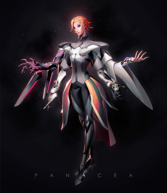
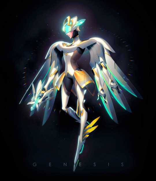
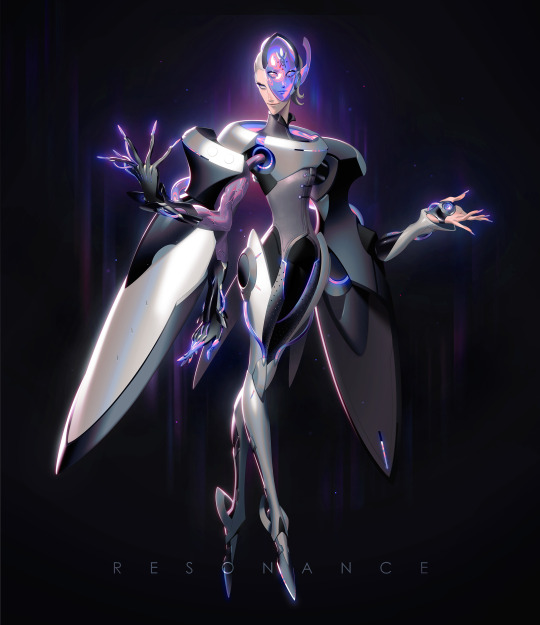


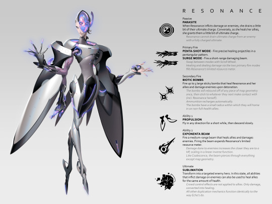
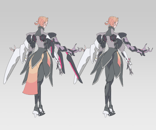
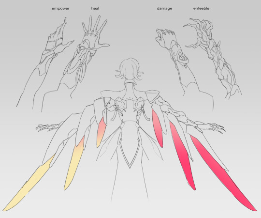
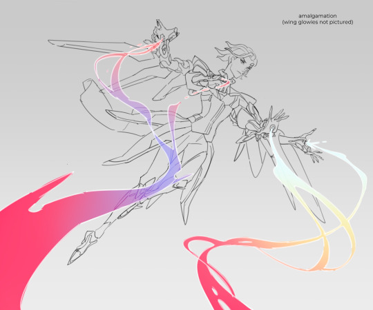

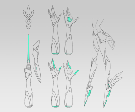

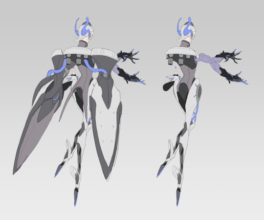
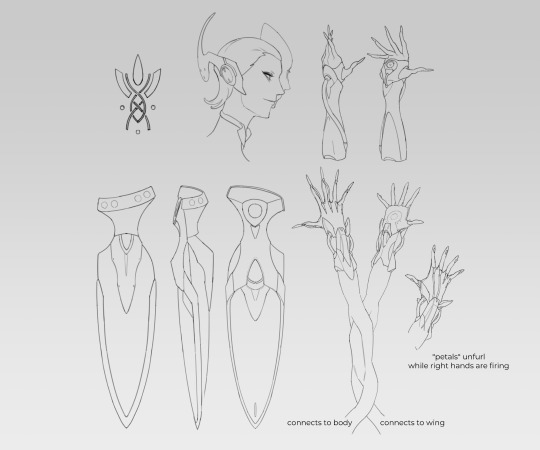


Mercy/Moira/Echo fusions, Overwatch 2 skins edition👼🧬🕊️
thank you steven universe thank you pokemon fandom for the chronic fusion brainworms!
anyway i still have this old video detailing Resonance’s abilities, although it uses her old kit and body style. the voice and sfx still hold up though!
#mercy#moira#echo#overwatch#overwatch 2#moira o'deorain#angela ziegler#overwatch fusion#panacea#genesis#resonance#my art#did i really just spend the past like 2 years drawing a whole two iterations of the same three characters#mess#Youtube
318 notes
·
View notes
Text
"You're Her Type": Anna and Eve and the Garden of Evil (+ how Eve and Villanelle learn and love)
hello everybody i have had more wine so now you're going to be subjected to my Opinions. today, we are going to be talking about eve and anna, specifically in the context of their respective relationships with villanelle. i believe that, as we wind up to another season finale, and our characters make some pretty defining choices about one another, this is a comparison that killing eve invites -- it's no coincidence that after six episodes of relative radio silence on the matter, konstantin returned anna to the show's discourse in 2x07. so buckle up.
a little signposting: first we're going to break down how eve and villanelle engage with the idea of love, then contrast anna and eve's moral frameworks, and then finally explore how anna and eve have gone from almost mirror images of one another to completely divorced in villanelle's mind, and why that's a good thing. i will try and keep this shit concise, but y'all know how these turn out.

now as i've mentioned before, killing eve is a precarious cantilever of parallels. eve/villanelle are obviously our most important and riveting example of this -- initially, they have their resemblance, but we watch as they slowly and softly kill their old selves until they complement each other seamlessly. but eve/anna is a crucial secondary parallel because it contextualises the primary; it situates villanelle and eve's mutual obsession.
i believe that as we progress through our formative years, the people around us provide us with experiences and patterns that teach us how to love, and what to expect from love. this can sometimes set us up for life (leaving us with a model that drives us to seek out healthy and productive dynamics), but sometimes, it means we don't know how to recognise or cultivate genuine affection, and we get trapped in damaging cycles. i've said before that i think eve sits on the psychopathy spectrum, but i also think that growing up, she had strong examples of relationships, which is why she is such an accomplished long-term chameleon -- she was able to maintain a marriage and friendships. yes, this was partially through self-repression, but at a base level, eve has the formulae to pass in these typical emotional environments.

villanelle, on the other hand? anna tells eve that villanelle's father was a drunk, and her mother passed away. i doubt that villanelle had ANY actual relationships, let alone good ones, with family. she's exceptionally intelligent and a very fast learner (which anna asserts and we have confirmed on-screen almost every episode), and she's versatile. this is why she's able to craft and adopt the perfect character/personality for a particular situation -- she's built up a repertoire of dialects, micro-expressions, cue responses, etc. that allow her to smoothly navigate short-term interactions (e.g. with Sebastian, with Gemma). but prior to anna, villanelle has no people she can invest in and expect a returned investment, so she's never had the opportunity to develop skills beyond the superficial. she gets what she wants through charisma, a calculated blend of innocence and sex appeal, and transactions (i do this, you do that).

but then villanelle meets anna, and undoubtedly forms an imprint on her of some kind, as her first "reciprocal" relationship -- the first adult to treat villanelle like she has value. obviously, the ethics of student/teacher affair are EXTREMELY dicey, but getting into that discourse will take us outside my intended scope.
so here's how eve and anna differ.
1) proximity. villanelle and anna are together all the time, and this gives rise to their relationship. villanelle and eve, in the first season, are almost always apart. initially, their fascination is at least partly driven by mystery. it's not a "crime of opportunity". this is pretty much the most difficult long-distance mess imaginable. essentially, villanelle and eve both take an active role -- they pursue each other deliberately -- rather than a passive one. it's not a matter of convenience.
2) commitment. for anna, villanelle was an avenue of tourism, a compartment kept self-contained which anna could visit to re-explore youth and sexuality. but villanelle was not allowed to bleed into the rest of her life; anna wanted to keep job-husband-image just-so while also having villanelle when desired (cake had and eaten too). eve's whole life, however, orbits villanelle. her husband, her friends, her job -- these are discarded as acceptable sacrifices on the path to villanelle, rather than prioritised. while anna (potentially due to guilt) idealises the memory of her husband, eve considers niko disposable, and is a clearer iteration of herself without him.
3) psychology. anna is inarguably fucked up (she had an affair with her STUDENT), but i don't think she registers as a psychopath. she displays empathy, remorse, reticence to cause harm. eve? villanelle kind of nailed it with the "like us" thing.
and this brings us to how anna and eve each fit into villanelle's life, and way of life.
im making an absolute reach of a biblical reference with my title, but if for a minute we did position anna/eve as adam/eve, we end up with two items of real relevance. firstly, that eve is the one who takes the bite of the apple, and secondly, that eve is created from anna/adam.
the apple as we know is symbolic of the temptation of sin. eve eats, and is cast from paradise forever. what i love about this, though, is that our eve isn't cast from paradise, she's cast from prison. eve's boring office job in witness coordination, her stale marriage, her enactment of normality day in, day out -- it isn't a utopia, not by any stretch. and i think that's only really starkly apparent to eve after all those trappings are gone; once she feels "wide awake", she realises exactly how long and how deeply she's been asleep.
but anna?
anna doesn't give in, or rather, she doesn't give in enough. she sleeps with villanelle, and spends time with villanelle, but when she's confronted with villanelle's capacity for violence, she retreats. she calls the police and cuts villanelle out of her life (which im obviously not going to criticise her for; it's a justifiable response), although it's too late by then. she's stranded in this halfway purgatory -- a woman whose adolescent lover murdered her husband; a woman who isn't good but won't commit to being bad, CAN'T commit. anna is undoubtedly morally grey, but (and bear with me here, because i can't think of a better way to articulate this) anna is kind of weak. she never had the guts to look at her situation for what it was, to bother to try and see villanelle beyond what she wanted her to be. she was using villanelle -- someone she could feel good about helping while simultaneously bringing excitement to her mundane life -- and set her back down when villanelle became too much trouble.
what we and Villanelle learn from this is that certain parts of who she is are attractive (irresistibly so) to other people, and others are repellent.

which obliquely brings me to the second point, that eve is created from anna. as early as 1x02, we have our attention directed to the physical similarities between anna and eve, which is perhaps part of the initial draw to eve for villanelle, but we also have their differences immediately emphasised. eve is unique from the outset, because these repellent qualities -- the enjoyment of destruction, the dramatic flair, the violence, the efficiency -- are what excite her about villanelle in the first place. villanelle's beauty/charm/off-beat humour/loyalty all come into the picture later. at the beginning, there's just a string of bodies, and that's what sucks eve in. don't get me wrong, i think it's very much villanelle's personality that eve is obsessed with -- we could see her professional but lack of personal interest in the Ghost -- but she has always understood villanelle in the context of her darkness. it never surprises her, only intrigues her.
in 1x08, we have a number of direct comparisons between anna and eve, or at least, the show recreates the same situations with each of them and watches them respond entirely differently.
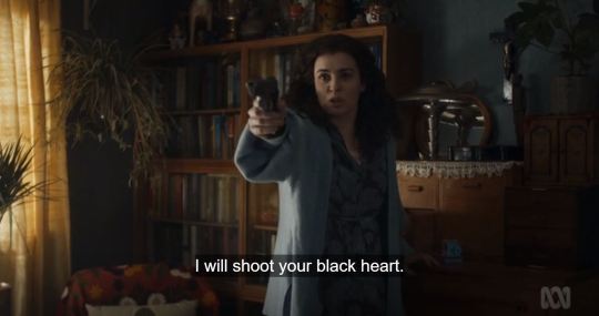

we have anna pulling the gun on villanelle. the entire time, villanelle is relaxed, stating outright that anna doesn't have what it takes to shoot. she waits her out. she has no intentions of killing anna, even though she tells irina, "i don't love her anymore." we'll come back to the significance of that statement.
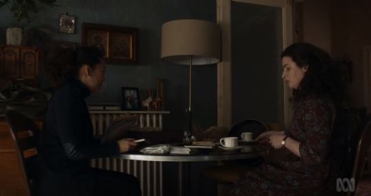
later, in the tea room, eve has a gun levelled at villanelle, but again, villanelle is certain she won't fire. eve admits that no, she can't use the gun, but rather than turn it on herself as anna did, she makes villanelle an offer: come with me; it can be just the two of us, and we can talk. in a high stress environment, eve's response is to treat villanelle like a person, not a weapon or a thing.


so villanelle runs.
and that brings us to their final interaction of the season, when they meet in villanelle's paris apartment. as they lie together on the bed, eve pulls the knife, and villanelle tells her, "you can't."

this is where eve cleaves distinctly and irreversibly from anna in villanelle's mind. like i said, a fraction of eve's initial appeal is her similarity to anna, although it's also obvious that villanelle is very much attracted to eve in her own right (in 2x03, she calls the woman she sleeps with "eve" and not "anna"). but then in 1x04, eve gets out of the car to face villanelle, and villanelle has dinner with her in 1x05, and eve begins to overwrite anna in villanelle's mind.
how can we be sure of this? because in 1x08, when villanelle is sneaking past anna and irina in the apartment, she pauses and stares, even though it's vital that she get to her passport quickly. what's notable about this particular moment is that this is the only shot where anna could easily be mistaken for eve. this is what prompts villanelle to linger for that extra beat.

so we have that initial similarity, then a merging, then an overtaking. but when eve stabs villanelle, she becomes removed entirely from anna in villanelle's mind. she goes from "you're like anna" to "you're more interesting than anna" to just "eve".
because along many other things, eve has the capacity to surprise villanelle. she doesn't take the easy or the expected choice. not only does she understand villanelle's language of extremities and violence, she speaks it. this is what villanelle means by "like us" in 2x07; she and eve are more similar than they are different.
and now we're circling back to villanelle's defence to irina -- "i don't love her anymore!" obviously, this line carries all kinds of implications, but the most critical is that villanelle conceptualises herself as someone capable of love. she doesn't say "i don't like her anymore" or "i don't want her anymore" or "i'm not obsessed with her anymore". she chooses and uses "love".

with anna, though, it never could be a mutual, reciprocal love, because she and villanelle don't mean the same thing when they use that word. they have fundamentally different understandings of what love means. so even though, ostensibly, it seems like villanelle broke her learned pattern by seeking anna out, she actually perpetuated it -- anna is another authority-position adult who discards villanelle, who misunderstands her and pushes her away (again, fair enough; villanelle is very complicated and dangerous).
but eve? look at eve's initial constructions of love. she loved bill, but remains infatuated with his murderer. she loved niko, but when he questioned her rather than supported her, she discarded him too, and went from upset to acceptance in a matter of DAYS after what was presumably a 15yrs+ partnership.

and then look at her with villanelle. it's not conventional or healthy, but they have a much more compatible interpretation of interpersonal relationships. they're both quite manipulative, but they don't see this as an issue -- the manipulations are a means to the end of helping the other. villanelle is very transactional (she sends eve clothes and perfume, wants to make her favourite recipes), but eve responds very well to the expressing affection through gifts and gestures; far less well when niko and kenny try to show care by giving eve instructions or suggestions. they each romanticise eve stabbing villanelle ("i think about it all the time"), yet neither of them believed villanelle would go through with the hit on eve, because violence plays a deliberate, rather than random, role in their dynamic, which they both comprehend innately. eve stabbed villanelle to assert their equality; she probably did it because villanelle's first response was to say, "you can't", and eve needed to prove she could. but they're on different terms by the time they meet again, and harming each other is no longer a productive currency, no longer has purpose; instead, they hurt others, and help each other, as a way of affirming the growth of their connection.

for eve and villanelle alike, the other represents a deviation from their established learned patterns, but an important choice for them personally. eve isn't going for the stable, normal relationship that she's been brought up to seek out; instead, she's gravitating towards the possibility of someone who embraces her complexity and darkness, and will give her space and means to explore and express herself. and villanelle isn't recreating a nonreciprocal relationship where she is used/enjoyed and then discarded; she's chosen someone who has the potential to be longer-term, who genuinely cares about her holistically.
from where we're standing before the finale, it looks like they may learn to "love" each other, in the way they are each capable of. villanelle and eve aren’t a relationship that can exist in heaven, because they’re not people of paradise; whether they’re the apples or the snakes or the gods in this equation, the pertinent fact is that are each other’s gateways into a world that fits them, and gives them what they need. is that fucked up? absolutely. is it kind of nice? I think so. it’s certainly gripping as all hell to watch.
xx. see y’all on the other side if we survive tomorrow’s episode.
#villanevest#villanevest writes#villainever writes#killing eve#ke#killing eve analysis#ke analysis#ke essays#villanelle#eve polastri#anna killing eve#anna leonova#villanelle x eve#eve x villanelle#killing eve s1#killing eve s2
549 notes
·
View notes
Photo

Product Design at the Boeing Company w/ Liz Juhnke
The first airplane successfully flown 115-years-ago by Wilbur and Orville Wright in Kitty Hawk, North Carolina has always inspired me. To this day, inventors and engineers are still pushing aerodynamics to the limit with modern aircraft that ultimately provide safe transport from airport to airport. Not all landings go smoothly; I witnessed some terrifying landings in Germany due to crosswinds. How do pilots combat that? Integrated but complex interface systems and user/computer experience.
“Boeing has some of the most complex systems in the world. And for a good reason—hundreds of thousands of human lives are in our hands every day.”
— Liz Juhnke, Data Scientist & Product Designer, Boeing
Today, I have the absolute pleasure of chatting with Liz Juhnke, the Senior Product Designer and Data Scientist for The Boeing Company.
Ben Libby: You absolutely love what you do. How did you get started? How long have you been doing it? Were you a nerd in high school?
Liz Juhnke: I’ve always loved computers. In high school, I was the co-editor-in-chief for the yearbook, and I digitally cut all the music for my drill team (upgrading us from cassettes). I went into college intent on studying oncology, but chemistry quickly weeded me out. Next, I tried computer science. I understood the concepts but didn’t quite feel like I fit in. Then, I tried Informatics. As luck would have it, I found my people. We are the extroverted engineers.
I was attracted to the technology aspect and how Informatics focuses on people and how they think. While I’ve learned over 10 different programming languages, I don’t particularly love coding. I would rather be talking with real people about their problems and needs, and visually validating solutions.
Ben: Data science and designer infographics go really well together. Have you ever given data science to a graphic designer so he/she could build/design an infographic?
Liz: Hmmm, well, Data Science and User Centered Design (UCD) skills do go hand in hand. I’ve been uniquely fortunate to study both. UCD skills help build context around a user population and a problem. Assuming that you have access to related data, the data science methods help you more quickly come to insights and/or recommendations about something. However, it’s only worth spending the time and money if you’re going to take action on the results.
If I were on a business operations team, it would definitely be good to work with someone who has an eye for design to make sure the business information I was providing was coming across as accurate, easy to read, and unbiased. The value of combining the two disciplines is more about what the data is saying and that it’s easily understood.
In my line of work, I work closely with data scientists to develop features. Consider the Amazon “recommended items for you” feature. Data Science works on figuring out what items are related to the product you’re looking at. It’s my job to figure out how you would best recognize and understand those recommendations, and how you could most easily take action (purchase!).
Ben: Human Computer Interaction (HCI)—do you think there are two different sides of this, such as one part being the psychology behind the interface and the other visuals that stimulate the brain?
Liz: Essentially! Psychology is the study of the mind—how humans understand and interact with the world. The mind dictates user behavior, motivation, emotion, reaction, perception, and on and on! HCI takes this study and applies it to all things technology. The user’s mental models are shaped by the user's past experiences and learning. All of these fascinating user characteristics is what UX professionals seek to understand! When I put a design in front of you, I'm using a visual to validate my assumptions about your expectations. I am seeking to learn your problems, needs, and triggers for action. I am seeking to understand what will motivate you to choose my particular call to action. Visuals are more than just pretty pictures that stimulate the brain. Visuals are a huge part of this quest because they bring teams to a shared understanding of a solution. Prototypes are so powerful because we are talking about something concrete, and iterating on it together based on our own ideas instead of talking at each other abstractly.
Ben: What’s one insanely complicated design challenge you faced (that’s not confidential), how did you approach it, and what were the results?
Liz: Boeing has some of the most complex systems in the world. And for a good reason—hundreds of thousands of human lives are in our hands every day. I am fortunate to be able to sink my teeth into some really high visibility engineering challenges with the best folks. It’s been an awesomely diverse range of projects too, from standard web apps to RFID scanners and HoloLens concepts.
A recent design challenge was for the safety of our mechanics at the Delivery Centers, where finishing touches are put on our beautiful planes, and loose ends are tied. This means they could be working on literally any system. They are also working in one of the most hazardous environments in the world—a powered plane. If you imagine what it would take to replace the garbage disposal in your house by yourself, you have an idea of what our mechanics might be tasked with day-to-day.
I was asked to help evaluate the safety of our Lock Out Tag Out Try Out (LOTO) program. This rigorous process ensures that the plane can be fully powered so that some mechanics can work/test in one area of the plane, while other systems are “de-energized” so other mechanics can work on other areas safely. Needless to say, it’s complicated! I gave a paper at MIT last year on our evaluation process using STPA. All rigorous processes come with cognitive friction, so I set out with my team to discover what was causing the friction and how we could minimize it.
Observation is king. Step one is always to understand your end user’s environment, tasks, and concerns. I brought a user-centered aspect to the safety analysis. During the research study, I was also tasked with hosting monthly check-ins with the LOTO focals. This ended up being an excellent forum for focals to bring up concerns in a safe place. This feedback ultimately helped me build trust with the mechanics that would later evolve into user adoption of the prototype we built for them to manage production operations better!
Ben: You’ve been with Boeing for a long time, have you picked out your favorite airplane they’ve produced over the years? (I’m totally going with the B-2 Stealth Bomber, I want a ride someday.) When you retire, do you think Boeing will let you take home one of their airplanes (if you had room in your garage)?
Liz: Haha. Yes, eight years has really flown by! I love summers in Seattle, and during Seafair, the Blue Angels always put on an amazing show. Top Gun is also one of my favorite movies. So naturally, the F-18 is one of my favorite products. I hate to “choose sides” amongst our commercial fleet because they are all amazing planes, but I really love the 787. The Hazardous Energy project allowed me to spend a lot of quality time with the mechanics and the planes. On the 787, almost all of the circuit breakers are digital—accessed from the flight deck with computer-like, multi-function displays. 787s are also really impressive with electronically dimmable windows.
Ben: For those wanting to get into Human-Computer Interaction and User Experience, what would your advice be? Any great books that you have on your shelf?
Liz: The Bible for the Boeing Product Design practice right now is Lean UX. During the past year, we’ve put an extra focus on lean design and doing just the right amount of design and research. It’s been a challenge for me being classically trained in whole systems design. However, it’s helping me to laser focus on listening to users and making sure that the feedback and ideas are coming from their side of the screen. Other books we love: Communicating the UX Vision, Just Enough Research, Don’t Make Me Think, Start with Why, Creative Confidence (also David Kelley's TED talk is amazing).
If you’re just starting college and think this might be a possible career, check out the Informatics program at UW or a similar school. If you like computers and people, telling stories, drawing and communicating visually; if you are fascinated with how the mind works, how people interact with technology and how you might be able to make people’s lives easier—this might be the career for you. Alternatively, some aspects of the job, which David Kelley mentions in Creative Confidence, are scary: working in the messy unknown, talking to strangers, losing control of what you want in favor of what end users need, public speaking, being artistic, creative, and sharing incomplete work. If these are situations where you would not run out the door screaming, you might be able to thrive in this job!
Things I’m doing to build my design career—engaging with my peers on the Seattle Designers Slack channel, following a lot of companies and colleagues who post great articles on LinkedIn, and attending local meetups (my favorite is the Design Thinking Seattle Meetup)
So many great opportunities for Product Designers are out there right now. If you are seeking that dream job, make sure to verify that it aligns with your core design values. For me, right now, a fulfilling job looks like making end users more productive, faster, smarter and happier through productivity tools. I believe my fulfillment comes from building great relationships and delighting users. Delight is a Zen state that few designers stick around long enough to achieve—delight is a state far past useful and usable that most product managers fail to prioritize because those features are not “must haves.” We are advocates for the end users. No one else will advocate for delight.
Thank you for encouraging my behavior.
Connect with Liz on LinkedIn or at a Design Thinking Meetup!
Liz Juhnke is a recognized thought leader in human-computer interaction and mobile design. Her specialty is making interfaces invisible, deciphering user expectations and managing emotions. At present, Liz is focusing on growing the user experience capability at Boeing by pairing with product designers from around the company to collaborate on designs in their new Digital Transformation Environment. She also leads the Boeing User Experience Community of Excellence, hosting monthly learnings and community usability consultations. She has delivered numerous web and mobile productivity tools and facilitated many “Design Thinking Workshops” for teams across major Boeing programs, including Commercial Aircraft, Manufacturing and Quality, Regulatory Administration, IT, and Rotorcraft.
0 notes
Text
Top 30 Anticipated at Essen Spiel 2019 (#30-21)
Welcome to my Top 30 list for Essen Spiel! I wanted to do a shorter list than Gen Con, but what can I say? When there are over 1,100 games on the SPIEL ‘19 Preview List (found at www.boardgamegeek.com --thanks to W. Eric Martin for putting the list together!), then it’s no wonder that I couldn’t trim it down. However, since I had more time to put this list together than I did for Gen Con, I’m actually putting games in order from my least-to-most excited about. Keep in mind that I haven't played any of these games before. My impressions are based on information found on BGG and Youtube. All pictures found in this blog post were taken from BGG. Thanks to the people who posted photos of these games. Now, without further ado, let’s take a look at the list.
30. Pangea - Coming from Redimp Games, Aleksander Jagodziński is the designer/graphic artist, joined by Joanna Kwaśniak for the artwork. Speaking of which, the art looks fantastic! Player pieces look like fossils encapsulated in different colored rocks. The player boards feature realistic creatures that could easily pass as some long-forgotten evolutionary species that predate dinosaurs.

In this game, 1-4 players will spend 1-1.5 hours evolving and migrating their creatures across Earth in an effort to survive the catastrophic event at the end of the game. I believe there are a few different catastrophes, such as a giant meteor, to give the game more variability from play to play.
Although the game looks beautiful, I have reservations about how much I would enjoy gameplay. I like the sound of researching the time track to try to figure out where on the board the disaster will hit, but the main mechanism is area control. In general, area control isn't my favorite game mechanism. I also worry that the game might be too heavy for my tastes. Boardgamegeek (BGG) weights it at 3.5/5. In the past, I've found that my gaming group always acts interested in heavy games, but then they seldom hit the table. At the end of the day, I'm left wondering if this is a game with cool components but just so-so gameplay for my personal taste.
29. The Aquicorn Cove board game - Based on Katie O'Neill's graphic novel, she's listed as the artist for this board game, which I think is pretty cool. I like it when original content creators get involved with other iterations of their work. The publisher is Renegade Game Studios, and a team of designers worked on it: Ben Eisner, Tim Eisner, Steve Ellis II, and Tyler Tinsley.

There isn't much information on BGG about this game (for instance, there's no estimated time length or age range listed), but what caught my eye is the environmental theme and the fact that it's co-op. I like that this game is about being good stewards of the earth, highlighting human interaction with an aquatic environment. The main question I have about this game is the audience--is it a family game geared toward younger kids, or is it challenging enough for adults to enjoy, too?
28. Greenville 1989 - Designed by Florian Fay with art by David Sitbon, this looks like a darker version of Mysterium. This game is for 3-6 players in 20-45 min. and is published by Sorry We Are French. I noticed the recommended age group is age 16+, and I believe this rating is due to some graphic game content.
In this cooperative game, players have experienced a supernatural event and must describe their location, so their friends can find them. The card art evokes horror/suspense.
For example, a card might depict a creepy clown or zombie arms reaching out to grab you.

Whenever players don't guess the correct location, that character gets pulled closer to the void on the game board. If a character is lost, all players lose because this is a co-op. Together you stand, divided, you fall.
27. Race for the Chinese Zodiac - Designed by Christina Ng Zhen Wei and Yeo Keng Leong with artwork by Ray Toh, this is a racing game for 3-5 players in 40-70 min. There are two publishers listed, Starting Player and Simply Complex. I'm not sure if it's because it's an Asian game and has to go through different distributors to reach a worldwide market.
I dig the theme here. Players are animals of the Chinese zodiac, racing to be the first to reach the Heavenly Palace. Whoever comes in first will be honored as the first in the twelve-year zodiac cycle. Players simultaneously play 2 cards from their hand in order to make progress in the race. There are a couple of YouTube videos out there to help learn how the game plays (look up Heavy Cardboard and/or Jon Gets Games).
The main reason this game doesn't rank higher on my list is because my main gaming partner and I have had bad-to-neutral experiences with other popular racing games. I suspect you need higher play counts to properly enjoy most racing games.
26. AVGhost: Paranormal Investigation - Published by Mystical Games, the designers are Beatriz Alvarez and Pablo Miras, and the artists are Henning Ludvigsen, Pablo Miras, Jarrod Owen, and Nicoleta Stavarache. This horror-themed game is for 1-4 cooperative players age 16+ and takes 1.5-3 hours to play. It's a move and explore game that seems similar to Mansions of Madness (2nd ed.), but darker. Again, note the age limit.
The twist is that every character pawn has a flashlight. This game is meant to be played with the lights off. There are different flashlight lenses that will change the light's color. I think to get rid of certain spooks or to find certain clues, you have to have the right colored flashlight equipped. It seems cool, but I worry it might be a gimmick game only to be played once for novelty. Also, I'm not really a fan of horror, despite how many horror/suspense games have made it onto my list this year. What can I say? I can't get enough of co-op, and horror seems to be the popular theme for cooperative games this year. Maybe it's the success of Stranger Things and the revival of It. Who knows? I'd say it's because Essen Spiel falls close to Halloween, but that's true every year.
25. Chakra - Published by Blam! and designed by Luka Krleza with art from Claire Conan, this is going to draw eyes to the table. The gems are so shiny, the player boards are colorful and pretty. This game supports 2-4 players and takes about half an hour to play.


I'm hesitant about this game because respected board game reviewer, Tom Vasel, posted a critical review of this game on YouTube. His main complaint is that you can spend the whole game getting chakras aligned on your player board (ie. getting 3 of the same gem color lined up in a row), just to find out after the fact that the particular chakras you aligned aren't as valuable as another color you could've pursued. This makes winning feel more luck-based than skill-driven. If your opponent happened to get lucky in completing higher-valued chakras than you, you have no way to mitigate that. Despite Tom's valid critique, I would try out this game if I had the opportunity. I'm always looking for eye-catching games with simple rules that I can play with friends who aren't yet familiar with modern board games.
24. 50 Clues: The Pendulum of the Dead - Next up is the first of many "escape room in a box" type of games that made my list. "Escape" puzzle games is a fairly new genre that has taken tabletop enthusiasts by storm! This one appears to be self-published by Jeppe Norsker under Norsker Games. It supports 1-5 players age 16+ and takes about an hour and a half to play.
This is the first of a trilogy of games that should be played in order. It has adult content that can be very, very dark, so you if you're squeamish about violence, don't pick this one up. I have no experience with the game, but another reviewer on BGG who has played it warns that the content can be too heavy for some people. He wrote, "One of my co-players ended up leaving the table in the middle of playing the second story-box, and they did not want to return for the third. I have never seen this strong of an emotional reaction to a board game (not even playing This War of Mine)" (https://www.boardgamegeek.com/thread/2273440/review-escape-room-enthusiast). In case you aren't familiar with it, This War of Mine is about living in a war-torn country, so that should give you an indication of how dark this game can get. I consider myself to be the type of person who doesn't prefer violent/dark/scary content, but because this is an escape game and it has a rich storyline, I'm curious about it. I realize I've been warned, yet I'm still drawn to it!
23. It's a Wonderful World - This card drafting game for 1-5 players is created by Frédéric Guérard, illustrated by Anthony Wolff, and published by La Boîte de Jeu. It takes about 30 min. to an hour to play. I'm guessing it only stretches to an hour with 5 people or one analysis paralysis (AP) prone player. I like card drafting and engine building, although my spouse tends to beat me at this style of gameplay. I like the sound of the campaign mode, but from the BGG description, it sounds like you would have to buy expansions to play it.
22. Skytopia: In the Circle of Time - Published by Cosmodrome Games, designed by Ivan Lashin, and illustrated by Timofey Mazurenk and Andrey Pervukhin, this game supports 2-4 players and takes 40-60 min. to play.
Honestly, the only reason this game is on my list is because it has a big golem on the cover that reminds me of Century: Golem Edition. Kudos to the artists for grabbing my attention!

As far as gameplay goes, I don't have enough details, but I know it's a worker placement card game with a clock/rondel that determines cost of the cards. It's hard for me to judge this game because there's so little information. Even in terms of images on BGG, there's only the cover art! I'd be cautious with this one due to lack of information.
21. Rolled West - This is a roll and write game set in the same universe as Gold West. One of the illustrators, Adam P. McIver, is the original artist for Gold West, but this time around he's joined by artist, Ariel Seoane. The publisher is the same, Tasty Minstrel Games (TMG). TMG is known for high production games, such as Orléans, Yokohama, and Chimera Station, but they've had misses, too. They were criticized for the artistic direction they took in the reprinting of Colosseum. The designer for this game is Daniel Newman, who didn't design Gold West. Originally, I was more excited about this game, but I saw mixed reviews from Tantrum House on YouTube (https://youtu.be/zGNnZ40om5s), so I've tempered my enthusiasm.
That concludes my bottom 30. Stay tuned for my next post as I count down to my #1 most anticipated game at Essen Spiel 2019!
0 notes
Text
15 Questions To Ask Your Next Potential Employer
15 Questions To Ask Your Next Potential Employer
Robert Hoekman Jr
2019-09-20T12:30:59+02:002019-09-20T10:34:39+00:00
In my book “Experience Required”, I encourage in-house UX professionals to leave companies who refuse to advance their UX intelligence and capability. There are far too many companies these days who understand the value of UX to waste your time being a martyr for one who will only frustrate you. Your best chance of doing a good job is to avoid a bad position.
Smartly, during a recent Q&A about the book, an audience member asked how we can avoid taking these jobs in the first place. What kinds of questions, he wondered, can you ask during an interview to spot red flags before the company stabs the whole flagpole into your sacred UX heart?
Know What You Want To Know
There’s the usual stuff, sure, such as asking why the position you’re applying for is currently open. What the company’s turnover rate is like. Why that turnover rate is so low or high. A little Googling will easily enough net you a decent list of broad questions you can ask any employer.
But what you really want is to get UX-specific. You want to hone in on precisely what your life might be like should you take the position.
Your best chance of doing a good job is to avoid a bad position.
“
Sadly, I lacked a great answer at the time to the question about interview questions, so I let it eat at me until I woke up at three a.m two days later and started writing notes. That morning, I emailed my reply to the moderator.
Ask A Great Question, Then Shut Up
To devise the list below, I considered what kinds of things I’d wish a company knew and understood about UX prior to working with them. I can operate in all kinds of situations—as a UX and process innovation consultant, this has been my job, and pleasure, for nearly 13 years now—but I want to know from the start, every time, that the effort will be set up for success. These questions aim to uncover the dirty details that will tell me what I’m walking into.
Much like a good validation session or user interview, these questions are open-ended and designed to draw out thoughtful, long-winded responses. (One-word answers are useless.) I strongly recommend that when and if you ask them, you follow each question with a long, stealthy vow of silence. People will tell you all about who they are if you just shut up long enough to hear them do it. Stay quiet for at least ten seconds longer than you think is reasonable and you’ll get the world.
People will tell you all about who they are if you just shut up long enough to hear them do it.
“
I’d ask these questions of as many individuals as possible. Given that tech interviews are often hours-long and involve many interviewers, you should be able to grab yourself a wealth of good answers before you head out the door to process and sleep.
If, on the contrary, you are given too little time to ask all these questions, prioritize the ones you’re personally most concerned about, and then consider that insufficient interview time might be a red flag.
Important: The key to the answers you receive is to read between the lines. Listen to what is said, note what is not said, and decide how to interpret the answers you get. I’ve included some red flags to watch out for along with each question below.
The Questions
Let’s get right to it.
1. How does this company define UX? As in, what do you believe is the purpose, scope, and result of good UX work?
Intent
Literally every person on Earth who is asked this question will give a slightly, or wildly, different answer than you expect or hope for. At the very least, the person interviewing you should have an opinion. They should have a sense of how the company views UX, what the various UX roles have to offer, and what effect they should have.
Red Flag(s)
The UX team has a very limited role, has no real influence, and the team, for the most part, is stretched so thin you could put them on a cracker.
2. How do the non-UX people on your product team currently participate in UX decisions?
Follow-ups: Describe a recent example of this kind of participation. What was the UX objective? How was that objective vetted as a real need? What did you do to achieve the objective, step-by-step? How did it turn out? What did you learn?
Intent
Find out how the entire product team approaches UX and how collaborative and supportive they might be in acquiring and acting on good research insights.
Red Flag(s)
They don’t participate in UX decisions.
3. What UX roles exist in the organization, and what do they do?
Intent
Determine where you’ll fit in, and how difficult it might be for you to gain influence, experience, or mentorship (depending on what you’re after). Also, build on the previous question about who does what and how.
Red Flag(s)
UX people at the company are heavily skilled in graphic design, and not so skilled in strategy. The current team members have limited influence. Your role will be similar. Strategy is handled by someone else, and it trickles down to the UX team for execution.
4. Who is your most experienced UX person and in what ways does that experience separate them from others?
Intent
Determine the range of UX intelligence on the team from highest to lowest. Is the person at the top whip-smart and a fantastic leader? Does that person mentor the others and make them better?
Red Flag(s)
The interviewer cannot articulate what makes that person better or more compelling than others. If they can’t answer this question, you’re speaking to someone who has no business making a UX hiring decision. Ask to speak to someone with more inside knowledge.
Noteworthy, but not necessarily a red flag: If you learn that the most experienced person on the team is actually someone with a very sleight skill set, this can mean either there’s room for you to become an influencer, or the company puts so little value on UX that they’ve selected only employees with a small view of UX. The latter could mean you’ll spend all your time trying to prove the value of bigger UX involvement and more strategic work. You may like that sort of thing. I do. This would not be a red flag for me. It might be for you.
5. What are the company’s plans for UX long-term? (Expand it? Reduce it? How so, and why? Is there a budget for its expansion? Who controls it and how is it determined?)
Intent
Map out your road for the next couple of years. Can you rise into the role you want? Or will you be stuck in a cul-de-sac with zero chance of professional growth?
Red Flag(s)
We plan to keep doing exactly what we do now, and what we do now is pretty boring or weak. Also, we have no budget—like, ever—so if you want to bring in a consultant, attend a seminar, hire another person, or run a comprehensive usability study with outside customers, well, good luck with that.
6. How do UX professionals here communicate their recommendations?
Follow-up: How could they improve?
Intent
Learn how they do it now, and more importantly, whether or not it works.
Red Flag(s)
The interviewer has no answer, or—far worse—has an anti-answer that involves lots of arm-waving and ideas falling on deaf ears. The former can, again, mean the interviewer has no business interviewing a UX candidate. The latter can mean the UX team is terrible at communicating and selling its ideas. While this can be overcome with your much better communication skills, it will almost certainly mean the company has some baggage to wade through. Poor experiences in the past will put other product team members on defense. You’ll have to play some politics and work extra heard on building rapport to get anywhere.
7. Who tends to offer the most resistance to UX recommendations and methods and why?
Follow-up: And how much power does that person have?
Intent
This person will either give you the most grief or will give you the great opportunity to improve your communication skills (remember: design is communication!). Knowing who it is up front and how that person operates can tell you what the experience will be like.
Red Flag(s)
Executives, because they distrust UX. If you lack support at the top, it will be a daily struggle to achieve anything substantive.
8. What do UX practitioners here do to advance their values and methods beyond project work? Please be specific.
Intent
See how motivated the UX team is to perpetuate UX values to the rest of the company and improve how the team works.
Red Flag(s)
They don’t.
9. What do you think they should do differently? Why?
Intent
Discover how your interviewer feels about UX. This is, after all, a person who has a say in hiring you. Presumably, this person will be a big factor in your success.
Red Flag(s)
Keep their noses out of product development, stop telling the engineers what to do (speaks to perception of pushy UX people).
10. Describe a typical project process. (How does it start? What happens first? Next? And then?)
Intent
Find out if there is a process, what it looks like, and how well it aligns with your beliefs as a UX professional.
Red Flag(s)
You’ll be assigned projects from the top. You’ll research them, design a bunch of stuff in a vacuum with no way to validate and without any iteration method, and then you’ll hand all your work to the Engineering team, who will then have a thousand questions because you never spoke to each other until just now.
Bonus Question
How and when does the team try to improve on its process? (If it doesn’t, let’s call that a potential red flag as well.)
11. How has your company learned from its past decisions, and what have you done with those learnings?
Intent
UX is an everlasting experiment. Find out if this company understands it’s supposed to learn from the work and become smarter as a result.
Red Flag(s)
No examples, no thoughts.
12. If this is an agency who produces work for clients: What kind of support or backup does this agency provide for its UX recommendations, and how much power does the UX group have to push back against wrongheaded client ideas?
Follow-ups: How does the team go about challenging those ideas? Provide a recent example.
Intent
Find out how often you’ll be thrown under the proverbial bus when a client pushes back against what you know to be the right approach to a given problem. Your job will be to make intelligence-based recommendations; don’t torture yourself by working with people who refuse to hear them.
Red Flag(s)
The interviewer says the agency does whatever the clients demand. You will be a glorified wireframe monkey with no real power to change the world for the better.
13. How does the company support the UX group’s work and methods?
Intent
Determine how the company as a whole thinks about UX, both as a team and a practice. Is UX the strange alien in the corner of the room, or is it embraced and participated in by every product team member?
Red Flag(s)
UX is a strange alien. Good luck getting anyone to listen to you.
14. What design tools (software) does your team use and why?
Follow-ups: How receptive are people to trying new tools? How does evolution happen?
Intent
Know what software you should be familiar with, why the team uses it, and how you might go about introducing new tools that could be better in some situations.
Red Flag(s)
Gain insight into how the team thinks about the UI portion of the design process. Does it start with loose ideas drawn on napkins and gradually move toward higher-quality? Or does it attempt to start with perfection and end up throwing out a lot of work? (See the next question for more on this.)
15. Does a digital design start low-fi or high-fi, and what is the thinking behind this approach?
Follow-up: If you start lo-if, how does a design progress?
Intent
You can waste a lot of hours on pixel-perfect work you end up throwing out. A company who burns through money like that is also going to be the first one to cut staff when things get tight. No idea should be carried through to its pixel-perfect end until it’s been collaborated on and vetted somehow, so you want to know that the company is smart enough to start lo-fidelity and move gradually to hi-fidelity. Hi-fi work should be the result of validation and iteration, not the start of it. A lo-fi > hi-fi process mitigates risk.
Red Flag(s)
All design work starts and ends in Photoshop or Sketch, and is expected to be 100% flawless and final before anyone sees what you’ve produced.
Running The Interview
In an unrelated Q&A years ago, a hiring manager asked how to spot a good UX professional during an interview. I answered that he should look for the person asking all the questions. I repeated this advice in Experience Required.
Now you can be the one asking all the questions.
And in doing so, not only will you increase your odds of being offered the gig, you’ll know long before the offer shows up whether to accept it.
If you, dear reader, have more ideas on how to scavenger-hunt a company’s red flags, we’re all ears. Tell us about it in the comments below.

(cc, il)
0 notes
Note
hi!! i just found you while poking around for gobelins students on twitter and i love your art, congratulations on passing!! i was wondering if you have any advice on the written exam or tips on how to prepare for it? i heard that the written exam can be given in english if french isn't your first language...
I’ll try to be very concise about this andmaybe pin it to my profile because I was in your shoes exactly a year ago, andif I made it here I think you have a considerable chance of making it too as long as you’re willing to put work into it. I want totell you what I wish I had been told.
Disclaimer: I’m definitely not the best personto ask. I’m self-taught and my situation may and will differ a lot from yours,but on top of that, bear in mind Gobelins has a ~5% admission rate. During theinterview I shared room with a person who had a stunning portfolio and had been doing two years of prepclasses to get in Gobelins specifically and didn’t get in. I don’t even understand what brought me in, but I will try to at least give you a detailedguide of what *I* did to prepare.
Important: READ THE “MODALITÉSD'ADMISSION” DOCUMENT THREE TIMES AT LEAST. It has so much usefulinformation and so many points you can’t afford to skip. If your French isflaky, ask for a friend who speaks it fluently to help you out. You *must*understand it fully if you want to get in and avoid needless calls to theschool.
Also, keep an eye on the website often. Allthe information I provide here vis a vis dates only applies to a time periodthat’s already gone and I can’t predict if the dates will be exactly the sameevery year, so double check for yourself!
French
If you don’t speak French now start asap, anddo your Duolingo and “Apprendre le Français avec TVMonde” exercisesevery day. The lessons for the 4-year program are in French and while they canbe understanding with foreigners I just strongly recommend for the sake ofcommon sense that you pick up the language, just to make the most of the chanceif you’re given it.
However, you can def do the written exam in English! The exam will be printed and handed to you in both languages, it’s not so much a test to see your writing skills (ironically) than it is to prove your drawing ones.
If you pass that first round, while they won’t require any certification, they *will* test how good you are understanding and responding in French during the interview process of the second round.
I also recommend you take special conversational classeswith a private teacher or with a French speaker the couple of weeks before theoral exam to really gain fluidity, it makes a difference.
Mental Health
Preparing for all this will be sustainedstress over a long period of time. While it’ll be intensive and will demand alot of you, bear in mind that a mentality of “every minute I spend notworking on this is a minute lost” is only going to harm you. It’s alrightto take breaks, have a social life, and space for leisure while you do prepwork. It’s alright to not be drawing every single hour and rest your mind soyou can go back to work with all your might.
Try to be demanding and to pushyourself out of your comfort zone, but do it at your own pace and alwaysleaving space for breaks and stuff that will take your mind away from it whenyou need to, like friends, videogames, or just drawing for fun. A healthy business to leisure ratio is always between ½ and 2/3.
Meditate if you can, too, just 10-15 minutesevery day. I recommend the Headspace app and it has helped me keep my coolduring really tense moments.
Open Days
Go to the open days at Gobelins in January ifyou can! I took a plane for the weekend just to go, it was expensive but Ireally, really do not regret it. Here’s why:
DONOT MISS THE FIRST DAY. They hold portfolio reviews and while you may not haveyours ready just yet, it’s the perfect chance to get an insider point of viewof how well you’re doing right now and how far from your goal you are. Make aprovisional one (or do like I did and just make a tumblr blog and throw inwhatever you’d want them to assess) and arrive early to ask for a spot at thequeue.
Youget to talk to other first-year students, who will showcase their portfolio andanswer all your questions about the admission process, the school and whateverother questions you may have.
Youget to attend conferences where they explain each of their programs in detail,and the head of the department will also answer all yourquestions.
Admissions usually open right in the middle of the open days. By all means grab a seat at the computer room and save yourself a spot in the exam process asap.
Also,if you’re a foreigner like me, you should totally go to the international classand see if you can spot somebody from your same country (or who at least speaksyour language) to hang out with for a bit.
Site note: That international class is adirect entry to 3rd year specifically for English-speaking students who alreadyhave animation experience. I didn’t apply for that so I can’t tell you muchabout it, but it’s definitely worth checking out if you want in, they say it’seasier than the main track, too.
Preparing for the written exams
First off, draw every day. Even if it’s notprep work or studies all the time, you can indulge in your OCs, OTPs, whatevermakes your heart race, but draw it and do it every day. It doesn’t have to beideal or finished either, but what really matters is that you get used todrawing a lot and make a habit of it. Quantity, consistency and speed areimportant skills for animators to have as I’ve been told and they will be looking for it since one of the parts of the inteview includes evaluating how much paper you’ve filled in a year.
Grab all the exams you can get a hold of fromthe Gobelins site and do them in the specified time (they’re on the Concepteuret Realisateur de Film d'Animation class page). When you’re done with that do themagain. Ask for feedback from your teachers and improve on them. Take aperspective book (I recommend “Perspective for Comic Artists”), take a gesturedrawing book (“The Vilppu Drawing Manual” or “Gesture drawingfor animation”), take a storyboarding and character design class (I tookSchoolism’s, which are 15$/month per class, it’s very affordable) and that’llgive you a good frame of reference. And when you’re done with the exams andknow them by heart, make your own exercises. Then do the exams again. Andalways ask for feedback, critique to train yourself against every weak pointthat you don’t want the jury to catch you doing when you do the actual exam.
Sign up for figure drawing class right now,with or without teacher (I signed up to an art club without one), the soonerthe better, and go there frequently, once or twice per week, to the short posessessions (up to 15 minutes per pose, 2 to 5 minutes would be ideal). Don’tbother doing portraits or long poses because again, what you want is to producea lot, fast. Put a lot of focus on gesture drawing, movement and speed. It’llnot only be a big chunk of your portfolio if you do pass the first round, butit hones your draftsmanship like no other exercise. You can additionally trainat home with websites like QuickPoses or the New Masters Academy figure drawingvideos, but I’d really want to stress that live models work so much bettersince they force you to interpret a 3D person.
Go to your local zoo as well, once a week oronce a fortnight, and do animal studies. If you can bring a friend it’ll help alot making it more fun but try to get used to drawing shapes that are nothuman. Understand their anatomy and try to apply what you’re learning aboutgesture from the figure drawing classes.
Draw in the street, in museums, go to a placethat inspires you or that you find curious and draw it. Draw the people topractice your characterization and caricature skills. Draw buildings to showyour perspective skills. And just whatever catches your eye. Environments and perspective are important and I strongly recommend you start by drawing from observation.
If you have a cool idea in mind or find agood exercise on tumblr to try that isn’t this, do it! The teachers appreciateinterest in several fields and if you can showcase that you’re a curiousstudent with plenty of interests they’ll consider you more seriously. I didconcept art and digital painting on the side and it ended up being a mainthing of my personal project.
And finally, go to @gobelins andraid it for advice, it’s a great point of reference to start with as well. Goto the current @crfa20 and past CRFA blogs to see what the students are up to if youwant inspo and check their profiles too.
Do this for the whole year.
Admissions open inJanuary and the earlier you can sign in the better (especially if you are aforeigner like me, you must get the equivalence with French studies recognizedofficially asap, it usually takes a while to get and it’s necessary).
On a side note, for the written exam, simplifyyour tools. You don’t have much time to elaborate or fix your mistakes so Iwould recommend you do your practice with pens (so you get used to not erasinglines and being confident with your strokes) and pencils (especially if you canget both regular, mechanical and color pencils to layer your drawings forcomplex exercises like perspective). During the exam don’t even think aboutbringing pens in case you do make mistakes you need to erase though, they arejust really good training.
Side note: if you can, all this while, make space for personal projects.Nothing that you must finish, but just produce a lot of your own content. Pick apodcast and do visual development for it, do fanart, iterate on a movie’s shots, developyour own stories through visual storytelling, do character design, storyboards,comics. Steal ideas if you must to get the creative juices flowing (but don’tpost it or pretend they are your own :V). Get acquainted with projects, explore a fewideas so that the moment you’re out of the exam room when you’re done with thewritten exam you not only have a deck of projects to choose from but are alsoacquainted with the process of carrying one forward (and also have a littlework already done).
Preparing for the oral exam
The oral exam consists of 3 parts.
A first part in which you’re not present, andthe jury will judge your portfolio, sketchbooks and demo reel without you for 30 minutes.
A second part, where you must introduce thejury to an original personal project of your own made for the admissionprocess, and defend it (in French).
A third part, where the jury will just ask youquestions (they’re usually very friendly) and judge your viability as a futureclassmate. Just be yourself!
The portfolio should just have your best, besweet, short and to the point. There is a limit of 40 pages including coversand the personal project so choose your best pieces from between your projectsand your practice. It should also cover three main points
Your skillset, which should be covered byyour studies, schoolwork, observation work and partly (but not mainly) the rest of your artwork.
Your capacity for creation and personal vision(aka what your interests are as an artist), which should be covered by the restof your artwork and other projects of your own.
Your capacity to convey and develop ideas, messages andstories through visual narration, which should be your main, personal project.
I recommend you throw in both sketches andunfinished stuff along with your most detailed and refined pieces so the jurycan have a good idea of your process, your way of solving problems and how faryour skills go. Storyboards, animatics and comics will always be a positivesince you’re aiming to study a medium that is sequential.
Also, if you can, pick other students’ portfolios for reference. They don’t need to be Gobelins or even students though, if you find a good philosophy to build your portfolio around, by all means go for it. It’ll give you a good idea of what needs to be there and what can be left out.
Lastly, while they stress that you *don’t* need toknow animation to get in since that’s what you’re applying to, you can bring ina 2-minute demo reel. I made mine with an animatic and a few animationexercises on my own, but I want to repeat what they told me, the intentionisn’t to show how good you are at it already (then what can they teach you?)but to show that you’re interested in the medium and are eager to learn.
Final note
You’re applying for an animation school, keepthat in mind always. An animator is not an illustrator or a concept artist(even if they can easily become one), and what sets them apart in my opinion is the focus on speed, gesture, quantity, and most importantly, making drawings that feel alive andthat tell something. Understand the craft, ask other animators, read books onanimation, anything you can get your hands on will help.
One of the points that I feel are the mostimportant about all this is included in the Modalités d'Admission text, whichsays that they look into a quality that would literally translate to “opennessof spirit”. I think that speaks for how open minded you are to new ideas,to working with others, to learning and to considering new points of view.
Again I don’t have all the answers, but if youare “open of spirit” and really make an effort to dive into theanimation world, look for resources and friends in this world I’m certainyou’ll find them.
28 notes
·
View notes
Text
Welcome To Your New Toronto Realty Blog!
TorontoRealtyBlog
Well, first thing’s first – how the hell am I going to write my “teaser” in one or two short lines? Brevity has never been, nor ever will become, an attribute of mine. That space above the fold was always my opportunity to lead, engage, attract, tease, trick, or regale!
Alas, I’ll just have to make do with a smaller introduction which makes the whole site look a lot cleaner!
And that’s really what the new layout was about; making things look a bit cleaner.
Or should I say, a little more 2018, and a little less 2006.
I’ve never been one to accept change.
Whether it was moving houses when I was 12-years-old (even though I was moving to a house twice as large, in a better area), or switching from a Blackberry to an iPhone (why did I wait so long?), or downloading the MLS app on my phone and scrapping the keychain-authenticator (I was the very last TREB agent to do this), or even switching from a paper/padfolio day-planner to an online calendar…………which I have yet to do…
…I have never been good with change.
My beloved Toronto Realty Blog, which many of you might find zero fault with, has looked old, stale, and outdated for quite some time.
I brought a new layout online in the summer of 2016, but as I was told by many, it was basically just the same red and white version iteration as before, with a few subtle changes, a bit of moving column A to column B, and removing the disastrous colours in the “TRB Channels” I had below the fold.
I suppose I’ve come a long way since 2007.
Here’s my very first masthead:
And then my “updated” second version:
Wow, they’re just, like, so different!
But that is what used to represent change to me.
I started the blog in June of 2007, and within months, I already had major formatting issues.
On Internet Explorer (this was before Google Chrome and Firefox got a bigger market share, not to mention Mac users), which back at the time represented about 60% of my users, the masthead would not display properly, and was actually showing at the bottom of the blog……….for about 12 months.
Yes, 12 months. Before I finally thought, “I wonder if anybody other than the guy I found on Craigslist, and paid $500 to, could work on my website.”
The masthead and the menu bar running across the top of the home page were both lost below sea. But it didn’t seem to matter, because my following was somewhat underground back then. People seemed to like the imperfection of the site, as it almost underscored how rare it was to find a licensed real estate agent opining about shady developers, or misleading sales tactics.
But eventually, as I said, I had to get the site fixed.
And that’s where the beautiful second version of TRB, that you see above, came into play. Oh, just so different from the first! But at least everything was in the right place.
And this was well before you’d ever access a website on your phone. My 2008 Blackberry could barely load the blog. All the users were on desktops.
But the second version was cleaner overall, and oh – the new logo! Yes! I finally decided to scrap the puffy, orange, first-font-I-randomly-chose lettering, and get a logo.
I had this idea that I was “putting my stamp” on the city, and I thought this looked really cool:
Just as my Mom told me I was cool in Grade 9, when I sat home instead of going to parties, I told myself this was cool in 2008-09 when I had some random part-timer in my office draw it, likely in Paint.
It wasn’t until the summer of 2013 that I made another change.
Raise your hand if you’ve been around since this version:
In hindsight, it looks awful, right?
But at the time, it was supposed to be a “window into my mind.”
Coffee, a blackberry, keys on the desk, and old-fashioned paper day-planner, all strewn across a hardwood floor, in a city where everybody seemed to be obsessed with hardwood floors.
The “Top Posts Of The Month” was a leading feature, since I was starting to see 20-30 comments with regularity, and I felt that more people were coming back to read what others were saying.
Eventually I grew tired of this, and wanted something cleaner, which was ironic, given the whole idea behind this layout was to “jazz it up.”
When I launched the new version somewhere around 2014, I was surprised by the response! Readers were actually telling me they like the old version, which made me realize that I wasn’t the only one averse to change.
The new version was cleaner, and easier to navigate, with way more features, and it had multiple ways to find the same thing, no matter what you were looking for.
But as I would soon learn, and as I fully expect with today’s new launch, readers just don’t like change!
Here’s the 2014 version:
Of course the top wasn’t cut off, but my archives are only so perfect.
So compare this to the wood-flooring-version, and how can somebody say they don’t like it?
Well, like I said, the consensus always seems to be, “What you had before was fine. Why bother changing?”
Then in 2016, for some odd reason, I decided to launch a “new” layout, that was more of the same:
That’s the site you all knew and (hopefully) loved, until this week.
Boy, it really really was similar to the 2014 version.
In any event, this time around, I really wanted to get with the times.
I wanted something that made me uncomfortable, and I found it during my first meeting with my team – when I said, “Not a chance,” and walked out.
And that’s when I knew it made sense.
I had to change. I had to get more modern.
And I had to risk being “too salesy,” as a close friend of mine called the mock-up when I showed it to him two months ago.
But you know what? It’s out of necessity.
Would you believe it if I told you that many people who email me don’t know I’m a real estate agent?
True story.
I get a slew of emails every week, and not just from buyers and sellers who want to be come clients. I get at least 2-3 people who are looking to get into real estate and want advice, I get 2-3 people who had interesting experiences in real estate and want to share, I get 2-3 people who know I’m a real estate agent, and used another agent for their transaction, but are really hoping I’ll spend some time to consider their situation and give them advice, and then, above all else, I always get at least one email from somebody who needs my help, pleads with me to call or email, and then is surprised to find out I’m a real estate agent.
Just last Friday, I spoke to a woman who was asking for advice on two condos in her target area, and eventually said, “My Realtor thinks the maintenance fees aren’t a problem in either building.” I told her, “You should have mentioned you’re working with a Realtor, because I don’t want to interfere.” She said, “Oh, I didn’t know you were a Realtor.”
Yes. Really. This does happen.
So because I knew I was going to write this blog when the new site launched this week, I asked her, “What did you think this site was?’
She said, “Well, I was just Googling ‘maintenance fees’ and I found it, so, I dunno, I guess I thought it was like a public support page?”
What the hell is a public support page? Is that even a thing?
So yes, you could label TRB V6.0 “more salesy,” but not because I am trying to attract more business, but because I think people should know who I am, what I do, what services I provide, etc. Just like any business, selling any good or service.
But that’s just me being self-conscious. Overall, I love the new look and feel. It’s very modern, sleek, dare I speak the over-used buzz-word, “sharp,” and above all – clean.
The blog itself won’t change in format.
New posts will still be published every Monday, Wednesday, and Friday, with Pick5 on Thursday.
The big changes are in the form of additions to the site, specifically new features.
First and foremost, we have a listings portal. This is, like what you will find online, 100% up-to-date and complete. And like what you will find online – it doesn’t take 24 hours to populate new listings, like the archaic www.realtor.ca that CREA shoves down our throats.
It’s a pretty sad state of affairs when a wee-blogger like myself has new listings posted before our public MLS, but that’s a topic for another day.
The listings will have sales trends for each neighbourhood and/or building in which that listing resides, as well as amenity information, open house info, etc.
I’ve also scrapped a few features, starting with “ASK TRB,” which was my previous brainchild, thinking that readers would take the opportunity to start their own thread. But as you saw from last Friday’s blog about “MLS Musings,” when the readers want to start a thread – they just do it in the current blog!
I also scrapped the “Featured Listings,” ie. the Hot House of The Week, Hot Loft of The Week, etc. I deliberately have not updated this section since January, because I wanted to see how long it would take for a reader to email me, since readers will literally email me when I’ve used a semi-colon incorrectly. But guess what? Nobody emailed me! So it’s like I thought: nobody uses that feature.
Many of the regular readers will be VERY happy to see that I’ve re-ordered the comments section, so that the first comment appears, well, first, and subsequent comments below. This was a major sticking point back in the summer of 2016 when I first launched, although part of me thinks you’ll all be so used to it, that you’ll complain now that I’ve switched it back.
But the big addition to TRB is something that no other real estate agent in Toronto can offer.
I call it the “Data Hub.”
Let’s say that I wanted to know the average price of a 3-bedroom, 2-bathroom, semi-detached house that sold specifically in the “Danforth Village” community of TREB District “E03,” between January 1st, 2018, and March 31st, 2018.
Right now, I would go to the back-end of MLS (which of course you guys don’t have), and I would search accordingly.
I would then copy and paste all those sales into Microsoft Excel, clean the data and use the AVERAGE function on the “Sold Price” column.
That’s a lot of work.
And it’s work that you guys can’t do.
But what if you could?
Folks, let me introduce you to the TRB Data Hub.
I will admit that the functionality takes some getting used to (ie. holding CTRL to select multiple sections, using the map versus using the auto-complete for areas, etc), but give it a shot, and play around with it.
Over the next two months, I want you guys to use this feature, and give me your feedback.
As it stands now, we have only “Beds,” “Baths,” and “Parking” for the drop-down options, but as I said – we’re working on it.
We plan to add features as we move along, but wanted to get this launched for you folks to play around with.
As cheezy as this might sounds, I view Toronto Realty Blog as a community that I have built over eleven years, and many of the readers and users have been around for a long, long time. I value the input of the readers more than you’ll ever understand. I might write the blogs, but it’s the users that truly make TRB all that it is.
So that’s it, folks.
I welcome your feedback, even if you liked the previous version more, which is what everybody has said after every change.
The post Welcome To Your New Toronto Realty Blog! appeared first on Toronto Realty Blog.
Originated from https://ift.tt/2matAnR
0 notes
Link
This whole thing started about 5 years ago and I was inspired to rehash the journey when I happened upon a post I’d made back in Dec. 2012 on the Fires of Heaven gaming forums. tl;dr - So, after nearly 5 years of failing at SASS, within two months we did $147,000 in sales and if nothing changes (even if we don’t add a single customer) we’ll do a little over $350,000 in sales next year. Given, our current sales are more like cash advances, but it’s still cash-in-hand. Also, we’re currently in talks with another company that wants to test our product with one of their crews, and if they buy in, it would push our sales to over $1,000,000 next year. In my business plan, I’d assumed we’d need at least 50 companies in our system to hit that number in sales, but we could potentially do with 3 and within the first year of actual sales. PART 1To give some context, LL is a SASS product in the timber industry and at this point we’ve spent over 4 years pursuing it. We spent the first 3 years with one guy and pushed out a web app and two android apps, which eventually sputtered, and 1.5 more years going back to the drawing board, raising startup capital, and doing things “the right way”. In other posts on Fires of Heaven I’d mentioned that our developer for LL had overcommitted himself and was moving slowly. This trend continued and really never remedied itself. I think this occurred because of two major issues that I’m sure most startups make: We hired poorlyOur developer already had an app on the market that was bringing him cashflow, so he didn’t need our app to be successful. He was already content and that’s bad.We traded him equity up front in exchange for his time, which created a huge issue six months into development, where he was less-and-less motivated to work. He was already vested and wasn’t getting paid, so it’s understandable. Giving up leverage up front is bad. Don’t reward people for doing nothing, reward them for doing good somethings.He was a back-end-only guy, who tried to wear the designer hat, didn’t ask for help when he needed it, and made way too many executive decisions. He was sort of a loner who didn’t work/communicate well with others. He was a nice guy, but lacked process and the ability to communicate.He didn’t develop on a framework, which bit us on the ass over-and-over again. Spaghetti code is bad. We didn’t spend enough time planningI took our developers word on a lot of stuff and chose to be lazy instead of being diligent and checking up on the software’s progress. This was exacerbated by his lack of willingness to communicate and propensity to get red-faced if he was questioned.We didn’t integrate the design/development process until later in the dev process, which should’ve been done up front. It also tangled up in our hire, where our developer refused any changes and took any suggestions as a direct insult.Which, ultimately left us with an interface of Frankenstein proportions.Scope creep. When you don’t have a design and someone’s building software based on assumptions and what you tell him, you’re going to have scope creep. You’re going to have some much mf’ing scope creep you’ll think it’ll never end. It won’t. The first mistake lended itself to the second mistake. I still remember the day we met with our developer for the first time, presented our site-map and a simple user-flow, asked if he had any questions, and he responded, “Nope. I got it! I’ll get started right away.” I still remember being shocked and confused by the response. “Really? You don’t have a single question? This is pretty extensive software…” I do, however, remember my Dad being impressed and excited by the response, which I think was due to his lack of knowledge around software design/dev more than anything. This sort of shoot-from-the-hip attitude quickly became the norm and about a year later we were trying and failing to onboard our first customer. I think it was around the Summer of 2014. My Dad and our developer went to meet the customer in person and get him started. Everyone was excited and I was waiting to get a phone call talking about a successful launch. To make a long story short, our developer couldn’t even get him signed up. To this day I cannot comprehend how this even happens, but I’ll point again to #2 on the “major issues” docket. About 6 months prior to this we’d totally redesigned the site and hired a front-end guy to come in a put the UI together. Before this, the software was a total clusterf*$ and nearly impossible to navigate, so it was a necessity. I spent a lot of time with a designer getting everything right and then again with the front end guy to get it translated. Once we got it into the hands of our developer, he totally half-assed the integration. I was pissed. When I called him on it he was legitimately shocked. I couldn’t believe it. He insisted that he’d done his best, wasn’t a designer, wasn’t a front end guy, and had been left holding the bag to get everything done and out the door while my Dad and I twiddled our thumbs. Mind you he never asked for help or direction during the integration, did it all in one foul swoop, and then cried foul when I got pissed. It was at this moment that I knew we were fucked. I guess what I felt in that moment was the same feeling people get when they realize they’re in a shitty relationship for the first time. And I was most certainly in a shitty relationship. If I questioned his design choices, he’d get mad and say he wasn’t a designer. When I presented him with designs, he’d half-bake them into the software no-questions-asked and then get mad when I questioned them. The weirdest one was the whole design thing, because he would consistently emphasize the fact that he wasn’t a designer or a front end guy and then lose his mind if I was critical of design choices or front end dev choices he’d unilaterally made. Anyways, I realized that this was a bad cycle that was only going to repeat itself. After the failed launch, I upped my cries for parting ways with the developer, which had only been subtle asides in conversation up until this point. It probably took 3-4 months for my Dad to get onboard with the idea. You see he’d been the one going to the developers house everyday to motivate him to work, make sure things were getting done and hold him accountable. I’m not shitting you. My Dad went to his house everyday, because if he didn’t, nothing would get done. Work only got done when my Dad was there. So, he went nearly everyday when there were a million other things he could’ve/should’ve been doing. My Dad didn’t want to split with the developer, because he felt like we’d come so far and actually had something going. FOMO is very real. I mean we had an MVP of sorts and people wanted to use it. It drove him (and me) crazy that it was always so close to being finished, yet so far due to design flaws in the system (like the fact that we couldn’t sign up our first customer). I told my Dad, as many times as it took, and it took several, “Look, I get it. We’ve come a long way and we kind of have a system here, but we tried to launch it with someone and he couldn’t even get them signed up! What’s going to happen the next time? Why would we expect things to go differently in the future? He’s not even developing on a platform and every time we scale the software gets worse. If we don’t do something different we’re going to hurt our reputation and never recover.” My Dad’s fear was valid. The longer you take to release something, the more opportunity you have to lose that opportunity. But, the risk to move forward with our developer was too great. So, we split ways and started looking for funding. Our last conversation with the developer was pretty brutal. He sent an email to me and my Dad because he hadn’t heard from us in a few weeks and that was unusual. The irony that he was reaching out to us, for the first time, at the end of everything, isn’t lost on me. And my Dad being the honorable and incredibly nice guy he is, thought we should at least talk to him and tell him where we were. It didn’t go well and got pretty heated with me being pissed at the progress of the software and the failed onboarding of our first customer, and him playing the blame game and pointing fingers. Ultimately, he refused to give us the software, the domain, or anything that we’d worked on over the past 3 years. For what it’s worth, on top of the total shitshow that our dev cycle was, our developer was going through a divorce, so I’m sure that added to his woes and created issues that wouldn’t have otherwise existed. When it was all-said-and-done I think we were out $15k-$20k over a couple of years, which isn’t all that bad considering. And we also had a really good idea of what we needed to build, since we'd iterated like 3 times. We’d built a couple of mobile apps based on user feedback and they were really good prototypes. We’d also attended a couple of big industry meetings in 2013/2014 to get a feel for demand and there was definitely a growing need for what we wanted to build. PART 2.1In December 2015 we raised $70,000 from friends and family. We got $50,000 from one of my Dad’s friends in the industry and $20,000 from my uncle. I realize that a lot of this stuff, like fundraising for instance, I just kind of blow over like it isn’t a big deal, which I guess it kind of is. So, feel free to ask questions in the comments and I’ll try to get to them. For some background on how we got funded, it's pretty simple. My Dad was talking to his buddy about the app, who’d previously seen the prototype and mentioned we needed money. He made an offer for $50k right there. I recently asked him why he did it and he said, "Ya know. I've been in this industry for a long time and I know something special when I see it. I'm not getting any younger and my son's gonna need something to work on and I think this could be it." Not a standard response, I know. For the other $20k we set up a meeting with my uncle and told him we probably needed another $50k. He ended up giving us the twenty, so we made it work. Having learned a few lessons from our previous experience, I went ahead and redesigned the software up front, so that we’d have something to give our new developer when we found him. I spent about 3 months working with a buddy on our previous software to turn it into something better. The biggest challenge was that I didn’t have anything to use as a base, because our previous developer refused to hand over the software, kept the domain, and was obviously super uncooperative. So, we had to use our previous designs and make assumptions about how the minute details worked. I own a small software design/dev company as my main gig and have a lot of relationships with folks in the industry, some who are pretty well known (which was my main context for knowing our original developer was a baddy) and started reaching out to them to see if they knew any Ruby developers that they’d recommend (I liked Ruby because of its ability to scale). I eventually got connected to a guy I’ll refer to as The Unicorn and he was interested in working with us, since he’d just finished a project. There’s generally three things that come into play when a project works out: - Timing - Is it the right time for the market? Is it the right time for the people involved? Am I busy with too much other stuff? - Belief - Does the industry believe in my product? Do I believe in my product? Do the people working on the product believe in the product (generally because the industry believe in it)? - Budget - Do I have the money to do this? Can I get the money to do this? Is there money out there to do this? He committed to work for a couple days a week at $150/hr and figured he’d have our app up and running in about 6 months, which he did and it was. So, by June of 2016, we finally had a functional MVP with an infinitely better UI/UX (I’d made the decision not to hire a front end dev to save money, but since then we’ve released a new version of the site that has a front ender's touch on it, which I will always do in the future). It was a pretty cool feeling to see it working and to have it be a relatively painless process to get it there. I kind of felt like what I’d imagine a victim of domestic violence feels like when they find Prince Charming. Can things really go this easily? Is this real life? WTF? Considering how hard the past couple of years had been, it was a welcome surprise. The Unicorn did a bangup job and there was really only one occasion where scope-creep became an issue and we had to have a come-to-Jesus moment about communicating scope and work. In July of 2016 we got a booth at an industry trade show for our sale’s maiden voyage. We got a ton of looks and probably left with about 10-15 good leads. I was pumped! And as we were walking out the door at the end of the two-day conference, a congressman came up to my Dad and said that his company might be interested in taking a look at what we had and wanted to setup a meeting. After weeks of post-trade show back-and-forth, we set a meeting for December 2016. Nothing really got done between July 2016 and the meeting date, because at that point we were out of money and none of the leads from the conference had panned out. And with no money in the bank and no customers to get feedback from, we just sat and waited. It sucked. PART 2.2Actually, I take that back, we didn’t work on the software, but other stuff did happen. After seeing the feedback and buzz the software generated at the conference, The Unicorn got interested in getting vested with the company. He’d obviously proven his ability to get shit done, so my Dad wanted to have a conversation with him regarding vestment and what it would take to get him on board. We eventually reached the agreement that he would work at half his hourly rate ($75/hr) and use the other half to generate equity and become vested after 2 years, so 5% equity at a $2,225,000 valuation. Around this same time that company I mentioned earlier in the prologue, who actually had plans to test our software with 15 of their crews, got acquired for like $9b, which ruined a great opportunity for us. They had a great culture and would’ve launched us into orbit, but it wasn’t meant to be. Womp womp! PART 2.3By the time December finally rolled around I was beside myself with anticipation. One full year had passed since we’d raised money to get this thing going and it was moving at an agonizingly slow pace (we hadn’t raised all that much capital after all, so we couldn’t just throw money at it). Money really does speed up the process. Without getting too deep into the weeds the meeting went really well. The company we met with is probably the most reputable in my state and is to our industry what Jordan’s are to sneakerheads. They loved what we had and it was a super encouraging meeting. They wanted us to come back again in February and present our software to their whole organization. They’re owned by some of their employees and wanted to get the nod from everyone involved. So, again nothing happens for another two months and we revisit the situation in February. This time the meeting went even better and their employees were even more pumped about the software than we’d thought they would be. We had a post-meeting-meeting with the owner to talk shop and the details. I told him it’d take us about six months and $107,000 (will probably end up taking $60k) to customize the software for their company, which didn’t seem to phase him. So, I wrote up a contract on the spot, which we both signed, shook hands, and walked out the door with a $17,000 check; payment 1 of 6. I had The Unicorn snap a pic of the two of us shaking hands. I’ll probably frame it and bottle the tears I’m going to shed every time I look at it. I actually could’ve walked out of there with nothing. After we shook on the deal he said, “Alright, well I guess we’ll just mail you the check.” And I asked, “Could we just get a check right now?” He smiled, shrugged, and then nodded in agreement and told his accounting to go print out a check. Leaving with that check made it feel 10x more real for me and The Unicorn. Asking that simple question taught me a huge lesson--You don’t get what you don’t ask for! As a side note, after The Unicorn came on board we attended most meetings together. This was less of a proactive decision and more the result of me making myself more involved in the design/dev stuff, because I was not going to repeat the past. My Dad spent more time getting us the leads to make the sales, and less time in the day-to-day, since he’s got 25 years in the biz. He’s our “gray hair” and if you’re young you need a gray hair. Otherwise, people don’t trust you as much or something? With renewed hope and excitement we immediately roared back into gear and got an iOS app designed (for data entry in the field) and developed, and started working on the MVP again. However, more bumps in the road presented themselves. After such positive meetings in December and February it kind of threw me off when the owner of the company completely stopped being responsive. We didn’t receive our next check in March and it took me being super pushy to get a second check by April. In May, after another no-show check, we pretty much stopped working again, because we weren’t sure where we stood or if we still had a deal. I even asked another business owner for advice on how to approach the matter. To make a long and drawn out story short. The owner of the company had been super preoccupied with other businesses he owns and had told the other employee-owners to take the reigns, but they didn’t, which left him on the hook and out of touch. It was an incredibly stressful time for me, since I wasn’t sure if his lack of response indicated some deeper discontent on his part. Ultimately, he was still excited about the software and in June of this year we secured the rest of the money, a $67,000 check, and plan to launch with 30 of their crews in January 2018. By this time a year had passed since our last state tradeshow and it was time to attend again. This time, with a real customer in our books, I had way more confidence and the conference felt a lot more fun than it had the year before. Another side note concerning sales. During the 2016 tradeshow I was super stressed out and hated it. I think it was partly due to the pressure of having unproven software and partly due to the fact that I don’t really like the idea of convincing people to buy something they know nothing about and might not even want. However, when you get your first customer, selling starts to feel a lot less like “selling” and a lot more like you’re providing people with something they need. It really comes down to your belief in what you’re doing. You should never try to convince a customer to buy if they don’t want to, because if you’re a genuine believer in your product, others will become believers too. After the first day of the conference, I ended up at the bar of our hotel with a couple other vendors who I’d befriended from previous events (one of the clients from my other company is in this industry, so I’d run into people here-and-there). The bar closed around 10:30PM and we were pretty much the last people in there and decided to call it a night to get ready for another early morning. The only other people in there were two dudes sitting at the bar and as soon as we got up to leave one of the bar-guys yelled, “You guys want a water moccasin shot?” We replied, “No, it’s getting late and I think we’re gonna go to bed.” Bar guys yells, “What are yall? A bunch of pussies”? We all look at each other half-laughing, and shrug, and walk over to the bar. We take the water moccasin shots and then some other kind of fruity pink shots. Apparently this dude has been tipping well, because the bartender was happy to keep the bar open. Somehow, because things started to blur, it comes up that I have some software for tracking stuff in the industry, so he starts describing an app he wants. And I’m shocked. No, I’m floored. He’s literally describing one of the first smartphone apps we built that got rejected by the industry, because it was too future forward (basically everyone we showed it to said it wouldn’t work because reasons). I laughed and said, “Dude! I built that two years ago and no one wanted it, so we had to build something different.” He slapped his knee and said, “Well I want it! How much can I get it for?” I pitched him my starting price and he immediately countered at half, which is what I actually wanted, and responded, “Deal!” We shook hands and he proceeded to tell us the most ridiculous and hilarious stories I’ve ever heard in my life. It was actually a really fun night. I walked back into the hotel room around 1AM and woke my Dad up carrying on about the deal we’d just struck up. He had been asleep, but woke up laughing because I was being ridiculous, due to the excitement (shots). He was happy to be woken up too, considering the context, and excited about another potential customer. The sales cycle on this deal was exponentially shorter than the first and we launched with them on September 15th, two months after we first met. They fronted us $40,000 to get additional iOS functionality developed, and will use/pay for our standard system until March/April 2018 when I think we can get the app done. So, after nearly 5 years of failing at this, within two months we did $147,000 in sales and if nothing changes (even if we don’t add a single customer) we’ll do a little over $350,000 in sales next year. Given, these sales are more like cash advances, but it’s still cash-in-hand. Also, we’re currently in talks with another company that wants to test it with one of their crews, and if they buy in, it would push our sales to over $1,000,000 next year. In my business plan, I’d assumed we’d need at least 50 companies in our system to hit that number in sales, but we could potentially do with 3 and within the first year of actual sales.
0 notes
Text
6 Tips When You’re Stuck with a Deadline
(Image: wan mohd)
Are you currently stuck trying to meet a deadline? Do you feel like nothing is moving even though you’ve been spending days and weeks on this task?
If so, welcome to development hell. In the past 9 months, I’ve been stuck in development hell working on the latest upgrade for Be a Better Me in 30 Days Program. When you’re stuck working on a project, it can feel like the most debilitating thing, because nothing seems to move no matter what you do. Here are my 6 tips to get through this difficult period!
1. Chunk it down
It’s easy to feel intimidated by a project task when it’s a very abstract task, like “write a book” or “write a thesis.” Chunk down the task such that it becomes a series of very simple action steps. After all, our goals are really the sum of a hundred different action steps, strung together to create the final outcome. When you dream, think of your visionary goal; but you execute, think of the tiny baby steps you need to take.
So for example, if you are currently working on a presentation, break it down into little steps. Maybe your presentation has 4 sections, and each section has 3 sub-sections. Create a simple outline of what to do, then work on Section 1.1 first. Focus on Section 1.1 and only Section 1.1, and don’t worry about the other parts. If you find the task too intimidating still, break it down further. Keep breaking it down until you don’t feel intimidated by the task anymore, then focus on the immediate baby step. Before you know it, you’ll be at the last stage of your goal!
2. Simplify
Are you a perfectionist? Well I am, and as a perfectionist I have a habit of overcomplicating my tasks (don’t we all??). After working on countless projects in my business, I’ve learned that when you increase the number of variables in a goal by two times, you don’t just increase the complexity of the project by two times — you increase it by an exponential factor. Instead of trying to do every single thing, keep only the things that serve a role and that add actual value to the project.
For example, when I was working on the website redesign for PE last year, I realized that many elements of the old layout required frequent maintenance. Also, every time I introduce a new feature to the site, there is always the risk of something else breaking down the road, because so many things on the web are heavily interdependent nowadays.
I decided to make things simple — create a layout that’s easy to read, and cut out anything non-essential to that. With that I eliminated the sidebar, switched to a very minimalistic black & white look, switched from WordPress multi-site to the standard site installation, removed all popups, and removed other “nice to have” but draining elements. I also removed the blog comments and forums which were taking up a lot of my time while adding little value to PE readers. After a week, I completed the new layout, and this simplification means that I now spend much less time maintaining the site each month.
As much as possible, simplify. Use the 80/20 rule to help you. What are the 20% key tasks that make the biggest difference in your goal? Focus on them disproportionately. Cut down as much of the unimportant stuff as you can. The more you cut down, the more time you have for the most important parts of your goal, the greater the impact.
3. Delegate and Get Help
Often times we think that we need to do everything alone. You don’t have to. Unless this is a goal that you 100% need to do by yourself — like a school assignment, though you can still consult your professors — try and see if you can delegate or ask for help, especially for the parts you are stuck in.
For example, online businesses have become incredibly complex in the last few years. While it was possible for me to do everything alone in the past, there are too many moving parts today for me to take care of them alone. After being stuck in development hell for many of my business plans, I realized that I needed to outsource parts of my business to specialized service providers, even if I need to pay more. From using specialized all-in-one shopping cart services to upgrading to a better host to using a third-party course portal solution, doing these has freed up significant amounts of my time and worry. Instead of spending countless late nights fixing problems, I can now get back to what matters — helping others grow and solve their problems. In fact, I wish I sought for help right from the start!
If there’s something you are not sure about, ask for help. Consult experts who have experience in this field. Get advice from people who know what they are doing. Consider hiring someone to help you. Even if you don’t know anyone, there’s really no excuse — there are many Facebook groups today for all topics imaginable — business, book writing, video creation, training — and many users are quite helpful in giving advice. Simply search a topic, look for the groups that fit you, and click “Join.” I have learned a lot from just reading people’s comments in Facebook groups. Don’t feel like you need to do this alone, because you are not alone. There are many people willing to help, if you’d just let them.
4. Get a change in environment
Sometimes if you’ve been stuck for a while, maybe it’s the environment stifling you. Getting a change in environment, talking to different people, and hanging out in different social groups can give you different inspiration.
As a writer, the environment greatly affects me and my writing. I’ve learned, through trial and error, that being in nature greatly fuels my writing, while being in a stifling environment restricts my thoughts and flow. I know that when I’m stuck writing and rewriting the same thing, it usually means that I need a change in environment, and doing the same thing (trying to push through with my writing despite my lack of inspiration) is just a waste of time.
Similarly, if you are working on a creative project — a drawing, a comic, a book, a course training, web design — get a change of space. Find ways to feel positively inspired. Try a different routine, visit different places, and hang out in a different environment. Do this until you find a space that helps you create quickly and easily, then recreate this in your work/home environment as much as you can.
If you’re suffering from writer’s block, check out my podcast on How to Overcome Writer’s Block [PEP008].
5. Create a first draft
If you’re stuck with too many considerations, create a first draft version first. A first draft is a bare bones version of what you’re trying to create — stripped to the bare essentials. Instead of trying to create a perfect output the first time round which is actually impossible, aim for a lousy, crappy version.
The way I launched my blog from the start was I simply wrote and posted articles that I felt would change people’s lives. I planned what I was going to write and reviewed my posts before posting anything, but I didn’t spend weeks or months perfecting my work beforehand. When I look back, I cringe at some of my past articles, which is partly why I’ve been revising my old articles in the past 1-2 years. But it’s precisely from allowing myself to post imperfect pieces of work that I could grow and build PE to where it is today. If I kept obsessing over that perfect first article or first 10 articles, I don’t think I would have launched my blog even today.
Let go of the details, and just aim to get a first draft out first. If you’re developing a software, work on a simple prototype first. If you’re writing a book, write the simplest manuscript you can. You can always add the details in the second, third, and fourth iterations.
6. Don’t neglect your health
Last but not least, don’t neglect your health. Maintain a healthy work rhythm, where you have a list of things you don’t compromise on such as your sleep, rest/break times, and meal times. Don’t skip your meals, shower, and sleep even if you feel like it. Don’t work until you feel exhausted — rather, set a clear cutoff, like stopping work at 8pm or 2 hours before you sleep.
This is important because you are the heart and hardware of your project. When you neglect the heart and hardware, you compromise on your project output. While you may feel that you are spending less time on work since you are taking time out for rest and all, after a few weeks you will see that your output starts to change from short-term to long-term focused, and you start to work smarter because you have the mind space to do so. That’s because work tends to expand to fill the time available for completion (Parkinson’s Law). Allocating an infinite timeline often decreases per hour productivity rather than help you get more done. By safeguarding the key pockets of your life — self, rest, relationships — you gain way more in return than spending 100% of time on just work, which interestingly ripples back and helps you 10X your output.
Read:
Law of Diminishing Returns
The 8 Habits of Highly Productive People
New Release of Be a Better Me in 30 Days Program!
After MANY months of hard work, I’ve finally launched the upgraded version of Be a Better Me in 30 Days Program, my 30-day character transformation program! The material has been hugely upgraded, with the guidebook expanding from 230 pages to 308 pages, over 100 participant verbatims added in, workbook updated, and many parts heavily rewritten.
For those of you who have purchased/upgraded, thank you! I love reading updates from you guys, and here’s a lovely note from Sarah who did 30BBM way back in 2012:
Dear Celes, thank you so much! I just bought the new edition. Last night I re-read my whole 30BBM workbook from 2012. So much has changed since then! I completed my PhD, married my boyfriend whom I mentioned so much in my previous 30BBM run, and have had a very happy few years working in university teaching and researching in Japan and then again back home in the UK. I can’t wait to start 30BBM again as I work on my next challenge — securing a permanent job in a very unstable sector. Thank you, Celes.
THANK YOU Sarah and for all of you who have been reading PE all these years!
If you haven’t gotten the program, read about 30BBM here, read the FAQs, or head straight to checkout.
For recent customers (2016 to July 2017), I’ve sent out the email on how to get the upgraded version of 30BBM on Aug 1. Check your mailbox for the email titled: “New Release: Be a Better Me in 30 Days Program.” If it’s not in your inbox, please check your spam folder.
For past 30DLBL/30BBM buyers (pre-2016), you can upgrade your 30DLBL/30BBM upgrade for a small upgrade fee, as detailed in my Aug 1 email. I’ve extended the upgrade window to 30 August. Both programs have been hugely improved with improved writing, and an addition of over 140 pages and 200 hand-picked verbatims/user results. Please upgrade before then as upgrade requests will not be handled after 30 August!
Thank you to everyone who has purchased the upgraded 30BBM — enjoy the program and your character transformation journey! Any questions on 30BBM, let me know here!
The post 6 Tips When You’re Stuck with a Deadline is first published on Personal Excellence.
from Personal Excellence http://ift.tt/2gV6PQF
0 notes
Text
Welcome To Your New Toronto Realty Blog!
TorontoRealtyBlog
Well, first thing’s first – how the hell am I going to write my “teaser” in one or two short lines? Brevity has never been, nor ever will become, an attribute of mine. That space above the fold was always my opportunity to lead, engage, attract, tease, trick, or regale!
Alas, I’ll just have to make do with a smaller introduction which makes the whole site look a lot cleaner!
And that’s really what the new layout was about; making things look a bit cleaner.
Or should I say, a little more 2018, and a little less 2006.
I’ve never been one to accept change.
Whether it was moving houses when I was 12-years-old (even though I was moving to a house twice as large, in a better area), or switching from a Blackberry to an iPhone (why did I wait so long?), or downloading the MLS app on my phone and scrapping the keychain-authenticator (I was the very last TREB agent to do this), or even switching from a paper/padfolio day-planner to an online calendar…………which I have yet to do…
…I have never been good with change.
My beloved Toronto Realty Blog, which many of you might find zero fault with, has looked old, stale, and outdated for quite some time.
I brought a new layout online in the summer of 2016, but as I was told by many, it was basically just the same red and white version iteration as before, with a few subtle changes, a bit of moving column A to column B, and removing the disastrous colours in the “TRB Channels” I had below the fold.
I suppose I’ve come a long way since 2007.
Here’s my very first masthead:
And then my “updated” second version:
Wow, they’re just, like, so different!
But that is what used to represent change to me.
I started the blog in June of 2007, and within months, I already had major formatting issues.
On Internet Explorer (this was before Google Chrome and Firefox got a bigger market share, not to mention Mac users), which back at the time represented about 60% of my users, the masthead would not display properly, and was actually showing at the bottom of the blog……….for about 12 months.
Yes, 12 months. Before I finally thought, “I wonder if anybody other than the guy I found on Craigslist, and paid $500 to, could work on my website.”
The masthead and the menu bar running across the top of the home page were both lost below sea. But it didn’t seem to matter, because my following was somewhat underground back then. People seemed to like the imperfection of the site, as it almost underscored how rare it was to find a licensed real estate agent opining about shady developers, or misleading sales tactics.
But eventually, as I said, I had to get the site fixed.
And that’s where the beautiful second version of TRB, that you see above, came into play. Oh, just so different from the first! But at least everything was in the right place.
And this was well before you’d ever access a website on your phone. My 2008 Blackberry could barely load the blog. All the users were on desktops.
But the second version was cleaner overall, and oh – the new logo! Yes! I finally decided to scrap the puffy, orange, first-font-I-randomly-chose lettering, and get a logo.
I had this idea that I was “putting my stamp” on the city, and I thought this looked really cool:
Just as my Mom told me I was cool in Grade 9, when I sat home instead of going to parties, I told myself this was cool in 2008-09 when I had some random part-timer in my office draw it, likely in Paint.
It wasn’t until the summer of 2013 that I made another change.
Raise your hand if you’ve been around since this version:
In hindsight, it looks awful, right?
But at the time, it was supposed to be a “window into my mind.”
Coffee, a blackberry, keys on the desk, and old-fashioned paper day-planner, all strewn across a hardwood floor, in a city where everybody seemed to be obsessed with hardwood floors.
The “Top Posts Of The Month” was a leading feature, since I was starting to see 20-30 comments with regularity, and I felt that more people were coming back to read what others were saying.
Eventually I grew tired of this, and wanted something cleaner, which was ironic, given the whole idea behind this layout was to “jazz it up.”
When I launched the new version somewhere around 2014, I was surprised by the response! Readers were actually telling me they like the old version, which made me realize that I wasn’t the only one averse to change.
The new version was cleaner, and easier to navigate, with way more features, and it had multiple ways to find the same thing, no matter what you were looking for.
But as I would soon learn, and as I fully expect with today’s new launch, readers just don’t like change!
Here’s the 2014 version:
Of course the top wasn’t cut off, but my archives are only so perfect.
So compare this to the wood-flooring-version, and how can somebody say they don’t like it?
Well, like I said, the consensus always seems to be, “What you had before was fine. Why bother changing?”
Then in 2016, for some odd reason, I decided to launch a “new” layout, that was more of the same:
That’s the site you all knew and (hopefully) loved, until this week.
Boy, it really really was similar to the 2014 version.
In any event, this time around, I really wanted to get with the times.
I wanted something that made me uncomfortable, and I found it during my first meeting with my team – when I said, “Not a chance,” and walked out.
And that’s when I knew it made sense.
I had to change. I had to get more modern.
And I had to risk being “too salesy,” as a close friend of mine called the mock-up when I showed it to him two months ago.
But you know what? It’s out of necessity.
Would you believe it if I told you that many people who email me don’t know I’m a real estate agent?
True story.
I get a slew of emails every week, and not just from buyers and sellers who want to be come clients. I get at least 2-3 people who are looking to get into real estate and want advice, I get 2-3 people who had interesting experiences in real estate and want to share, I get 2-3 people who know I’m a real estate agent, and used another agent for their transaction, but are really hoping I’ll spend some time to consider their situation and give them advice, and then, above all else, I always get at least one email from somebody who needs my help, pleads with me to call or email, and then is surprised to find out I’m a real estate agent.
Just last Friday, I spoke to a woman who was asking for advice on two condos in her target area, and eventually said, “My Realtor thinks the maintenance fees aren’t a problem in either building.” I told her, “You should have mentioned you’re working with a Realtor, because I don’t want to interfere.” She said, “Oh, I didn’t know you were a Realtor.”
Yes. Really. This does happen.
So because I knew I was going to write this blog when the new site launched this week, I asked her, “What did you think this site was?’
She said, “Well, I was just Googling ‘maintenance fees’ and I found it, so, I dunno, I guess I thought it was like a public support page?”
What the hell is a public support page? Is that even a thing?
So yes, you could label TRB V6.0 “more salesy,” but not because I am trying to attract more business, but because I think people should know who I am, what I do, what services I provide, etc. Just like any business, selling any good or service.
But that’s just me being self-conscious. Overall, I love the new look and feel. It’s very modern, sleek, dare I speak the over-used buzz-word, “sharp,” and above all – clean.
The blog itself won’t change in format.
New posts will still be published every Monday, Wednesday, and Friday, with Pick5 on Thursday.
The big changes are in the form of additions to the site, specifically new features.
First and foremost, we have a listings portal. This is, like what you will find online, 100% up-to-date and complete. And like what you will find online – it doesn’t take 24 hours to populate new listings, like the archaic www.realtor.ca that CREA shoves down our throats.
It’s a pretty sad state of affairs when a wee-blogger like myself has new listings posted before our public MLS, but that’s a topic for another day.
The listings will have sales trends for each neighbourhood and/or building in which that listing resides, as well as amenity information, open house info, etc.
I’ve also scrapped a few features, starting with “ASK TRB,” which was my previous brainchild, thinking that readers would take the opportunity to start their own thread. But as you saw from last Friday’s blog about “MLS Musings,” when the readers want to start a thread – they just do it in the current blog!
I also scrapped the “Featured Listings,” ie. the Hot House of The Week, Hot Loft of The Week, etc. I deliberately have not updated this section since January, because I wanted to see how long it would take for a reader to email me, since readers will literally email me when I’ve used a semi-colon incorrectly. But guess what? Nobody emailed me! So it’s like I thought: nobody uses that feature.
Many of the regular readers will be VERY happy to see that I’ve re-ordered the comments section, so that the first comment appears, well, first, and subsequent comments below. This was a major sticking point back in the summer of 2016 when I first launched, although part of me thinks you’ll all be so used to it, that you’ll complain now that I’ve switched it back.
But the big addition to TRB is something that no other real estate agent in Toronto can offer.
I call it the “Data Hub.”
Let’s say that I wanted to know the average price of a 3-bedroom, 2-bathroom, semi-detached house that sold specifically in the “Danforth Village” community of TREB District “E03,” between January 1st, 2018, and March 31st, 2018.
Right now, I would go to the back-end of MLS (which of course you guys don’t have), and I would search accordingly.
I would then copy and paste all those sales into Microsoft Excel, clean the data and use the AVERAGE function on the “Sold Price” column.
That’s a lot of work.
And it’s work that you guys can’t do.
But what if you could?
Folks, let me introduce you to the TRB Data Hub.
I will admit that the functionality takes some getting used to (ie. holding CTRL to select multiple sections, using the map versus using the auto-complete for areas, etc), but give it a shot, and play around with it.
Over the next two months, I want you guys to use this feature, and give me your feedback.
As it stands now, we have only “Beds,” “Baths,” and “Parking” for the drop-down options, but as I said – we’re working on it.
We plan to add features as we move along, but wanted to get this launched for you folks to play around with.
As cheezy as this might sounds, I view Toronto Realty Blog as a community that I have built over eleven years, and many of the readers and users have been around for a long, long time. I value the input of the readers more than you’ll ever understand. I might write the blogs, but it’s the users that truly make TRB all that it is.
So that’s it, folks.
I welcome your feedback, even if you liked the previous version more, which is what everybody has said after every change.
The post Welcome To Your New Toronto Realty Blog! appeared first on Toronto Realty Blog.
Originated from https://ift.tt/2matAnR
0 notes
Last Seen Blogs

foodaholicgujju-blog
foodblogger

antichrist-angel
now shes doing it all the time ⎕

gwryan77
GW Ryan

deverodesign
Devero Design

dinhhoangss-blog
Untitled