#edited the contrast and brightness a bit to be more accurate to the real photo
Text

from shirley barber's jewels of fairyland collection
#my first time using my printers scanner : )#edited the contrast and brightness a bit to be more accurate to the real photo#shirley barber#bugblock
84 notes
·
View notes
Note
how do you get your traditional art to retain its color once you photograph it?? Everything looks so vibrant and well lit it’s honestly incredible.
I was originally going to have a straight forward answer, but I think this is a good opportunity for me to share how I go about preparing my artworks for social media.
Disclaimer! I'm not an expert in photo manipulation. This is what I learned after doing some research and experimenting.
Capturing the artwork
I have to be transparent though that I do not photograph my work, I scan it! I use a CanoScan LiDE220. I've had it for 6 years. This is why I am able to retain the artwork's texture. However, the result of the scan is very washed out, and is not accurate to the artwork's actual colors. Example below:

The left image is the raw result from the scanner, while the right is an edited version that I have posted. As seen, the left image is washed out. So, to the best of my ability, I change different parameters of the image to get the closest to the real artwork. I use photoshop to edit the image, but it is possible to do it in any photo manipulation software (or you can get a cracked ver-)
Editing the photo
1) Levels

Levels is where you manipulate the values of the image. The left is for your lightest values, and the right is for the darkest values. Moving the left slider alters the lightest values of the image. Moving the middle slider alters your middle values, and same goes for the right slider for the darkest values. I often slide the middle slider to the right to darken the image. I hardly touch the other two. Alternatively, you can use Curves to darken the image, it is a more intricate version of Levels and gives you the most control. I am not super familiar with it, so I cannot talk about it.
2) Hue and Saturation
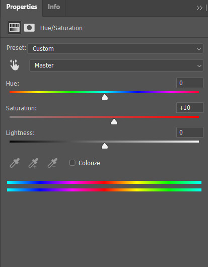
Hue controls the most dominant color of your image. Saturation controls the intensity of the colors in your image. I often bump up the saturation of my images. There are times I also alter lightness just ta bit for sketch sheets, to slightly washout colors (mainly the yellow of the paper)
3) Color Balance
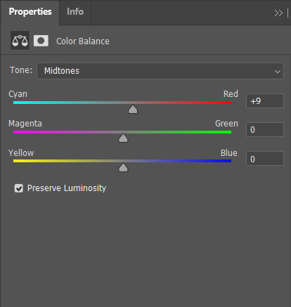
Color balance indicates which of the colors in each slide is more intense globally. Meaning that if you put the slider closer to blue, then all yellow tones will be washed out. Sometimes the Hue and Saturation sliders aren't enough, so I use Color Balance to tweak it a bit.
4) Brightness and Contrast

Brightness refers to how light or dark the piece is overall. Contrast refers to the difference of the lightest and darkest values. I often use this when manipulating sketches, this is to make the inks pop out more.
Other stuff that might be relevant
every piece has it's own set parameters, I eyeball everything lol. I do not have any "set values"
If there is a specific part of the image that needs editing, I "Mask" that part of the image out. Meaning that only a specific part of the image will be altered. Masking does not permanently change the image, so you can easily delete it if needed. Crash course in "Masking": the visibility of the image is set in black and white. The black parts of the mask is hidden, while the white is seen (Image below.) So for example here, only the white parts will be affected by the color balance

as much as my scanner is helpful, it cannot scan large pieces. One of the largest sizes I am able to scan is A4. So, I have only been using that size or smaller. If you want to invest in a scanner, you should consider the sizes of paper you often use. You can also "stitch" the artwork together (i believe photoshop has this, but it might be a hassle. I can't speak about this because I haven't tried it.)
If you are doing paintings on a canvas, you will have to photograph it There is no other way around lol, paintings like those are really photographed. Professional artists either have their own photoshoot set, or they find a place where they can have it photographed.
Sticky notes, or paper with luminosity aren't picked up by the scanner. I've been struggling with this one for awhile lmao. Altering it with the aforementioned steps alone don't give the result I want. I use layer modes too. Still currently experimenting. Example is below, original is a neon orange sticky note.
(original scan)

(altered with brightness/contrast, darken layer mode w/ orange, and vibrance)

ANYWAY!!! This is a master post of how I currently go around my works. Very lengthy, but I hope it helps someone!
#art tips#photoshop tutorial#art tutorial#photoshop#art help#image manipulation#traditional art#danee answers#danee talks#anon ask
104 notes
·
View notes
Photo


Crappy to snappy - DA:O Edition
So I’m probably not alone with my eternal frustration with the lack of a DA:I style flycam for Origins. (But I won’t complain bc hey, I don’t know how to make one, either, and I’m just grateful that we have one for Inquisition. If it was possible for Origins, I’m sure someone would have made it by now.)
But never fear! Even a less-than-optimal screenshot can be made to look loads better with a few easy Photoshop tricks. (Unfortunately PS is what I’m mostly familiar with, so that’s what I’ll be focusing on.)
1. The lighting - The first thing I did here was adjust the brightness and the contrast by A LOT. Don’t worry if it looks a little weird, I usually apply multiple adjustment layers until I get the desired look.
2. Color lookup layers - Since I have discovered these, my life has become an endless parade of joy and amusement (slight overstatement here). You will find them among the adjustment layers. Feel free to play with their opacity, layer more on top of each other... They are super fun! I think I used Crisp Winter and Futuristic Bleak here, and took the opacity down a peg.
3. Eyes - I like to emphasise them a little, but not so that they end up looking like an anime protagonist. I choose a saturated version of their eye colour, draw it on a new layer, play with the blending modes a little and dial back the opacity where it becomes super subtle. (Overlay and Color are good blend modes for this, but I tend to just play around until I find one that works!)
4. Focus distance - So in Inquisition, you could just use the flycam to control this, but what happens when you don’t have one? (This works for ppl playing DA:I on consoles, as well!) What I do is, I duplicate my original layer (bc I’m super paranoid and I never do anything that’s not a mask without a copy of my original layer), I select everything I want to be blurred, copy the selection, and apply a Gaussian blur filter. If you have different objects at different distances (like the pile of books vs. the background here), group them roughly by distance, and apply different amounts of blur. So the pile of books was selected separately, and I applied a filter with a lower amount of blur, then i selected the rest of the background and applied more blur. This looks roughly equivalent to how it would look on a real photo. And since it’s a blur effect, you don’t have to be super accurate with it! You can always go over the edges with the blur tool, set to a small brush size, and make more precise adjustments (like I did here around the areas of Adra’s hair).
5. Small corrections - I kind of dislike the sunken-in cheeks look DA:O tends to give my characters (I might just suck at character creation), so I selected the offending part of Adrahel’s face, copied the selection, and used the Warp tool to nudge it to my liking. It was easier in my case since the contrast between his hair and face is strong, it might take a bit of trial and error for other people.
6. Shadows and highlights - So this is the most fun part for me, where I get to pretend I can draw! I always say that a nice soft brush with a low opacity can solve almost any problem. I use different layers for the different parts - this bit is pretty much like contouring, so people who use makeup might find it pretty easy! I usually take a look at where the light already hits different parts of the face, and just add a little extra. I usually focus on highlighting the lips, adding some exra shadow under them to make them look more defined, and adding shadows under the eyes (makes my usually very twinky-looking PCs seem a little bit more worn and realistic). Here I also added a little bit of shadow to Adra’s jaw (I know elves with facial hair are not really A Thing but I still think it makes him look less like he just escaped from a Thedosian boy band).
7. Other stuff - I like vignettes, sue me! I simply use the Inner shadow blending option for the vignette. To give the text a darker backdrop, I use a rectangle with a gradient fill (black to transparent), and as usual I choose the blend mode that seems to work best (here it was Color Burn I think). Then I choose a font - that is obviously totally down to everyone’s personal taste (this one here is called White Angelica).
And that’s it! Here’s a gif of the whole process:

5 notes
·
View notes
Text
Why Do Photographers Spend So Much on Monitors?
One of the most important tools in a photographer’s toolkit is something many may be surprised by – a color-accurate monitor. But why are they so expensive, and why should a photographer spend so much on one?
Regardless of the camera system, lighting brand, and type of lenses that a photographer has in their hands, in the age of digital photography, having a top-tier monitor that is calibrated precisely is integral to creating a perfect image. Editing a true-to-life reproduction of the colors seen through the lens will require a display that can show the full spectrum of colors to ensure that the photos being worked on are not off-balanced and over or under-saturated. A lower-end monitor will not be able to render the colors in the high contrast zones of an image, leaving creatives at risk of their images looking “off” when printed or seen on different higher-end devices.
Speaking from personal experience, there is no worse feeling after having finished editing an image to present to the world only to discover the skin tones and colors look entirely off once it is displayed on devices other than your own screen.
An example of an unintentionally oversaturated image | David Crewe
This is why finding a professional-grade display that has been designed with photo and/or video editing in mind is critical to creative work. These monitors will ensure the screen has uniform brightness and color precision edge to edge, and typically are larger to allow for a wider viewing angle and more screen space to truly “pixel-peep” the image being worked on.
If the work is being done on a large, calibrated, and color-accurate monitor, photographers can be at ease knowing that the images they produce will look consistent from their screens to the printed page.
While the video below from Linus Tech Tips mainly focuses on a specific monitor, Linus does make some good points about why a color-accurate monitor is necessary to begin with. For example, he says that “there are two types of displays: Those for consuming content and those for creating it.”
The key difference between them is the Color Gamut they can display.
youtube
Effectively, most consumer-grade displays have a limited sRBG (Standard Red Green Blue) color space available. To put it in a visual perspective, think of the whole color spectrum like a rainbow, and sRGB is a small sampling of the available colors. As we explore higher-quality displays, they start adding more and more colors to that selection.
As an example, Linus explains that a monitor that supports the DCI-P3 color space can display a color gamut about 25% wider than a normal sRGB monitor, allowing for smoother transitions between colors.
The problem that pops up from these color space variances though, is when an image or video is created using one color space (DCI-P3) and then is displayed on a device that does not support it. In those cases, we end up with visuals that are oversaturated and have unnatural and blotchy-looking colors.
For creatives, it is critical to ensure the colors on the screen look accurate to the way the camera captured it so that it will look right on a big print and high-fidelity screen. Colorists who work in cinema will often require the best screens available which can easily break $35,000 each. Granted, that kind of budget is out of range for most freelance artists but there are still many viable options for photographers and videographers sitting around the $5,000 and under range.
But why should photographers spend money on expensive color-accurate monitors if they can’t control what their clients are using to view those same pictures? This is a common question, but the answer is pretty straightforward. Basically, if a photographer knows that the colors are correct and accurate to the creative vision, they know how it is supposed to look and can be confident in that. If a client isn’t using a good display and asks questions about the color, the photographer can then know that their view is correct and can help either guide the client to a way to calibrate their devices to see it correctly or assure the client that the colors are correct when viewed on a proper display or printed.
Basically, it comes down to confidence that you as the photographer and creator are right and gives you the right perspective to help guide the client in the right direction.
Some Things to Look For In A Great Monitor
Panel Technology
While the technology is changing rapidly, the safe bet is to focus on a display with a good quality IPS (In-Plan Switching) panel as they provide some of the best support for various color spaces, contrast ratios, and color shifting. Additionally, if the plan is to make prints, a 10-bit panel that can support Adobe RGB will provide the best color reproductions and print simulations possible. The “bit depth” in display context, refers to the range, or colors, it can display. The more bits per channel means more colors a screen can display, and with 10 bits you end up with about a billion colors.
An 8-bit monitor, or 8-bit with Frame Rate Control (FRC) simply cannot achieve that level of color depth. Some can get close, but oftentimes users are left with very noisy transitions between the colors. For example, an 8-bit display will show 256 different shades of color per color channel, whereas a 10-bit monitor gives 1024 different shades per color channel.
OLED (organic light-emitting diode) displays are some of the best-looking and extremely color-accurate that can be found for consumer use. They are also getting more affordable, though they are still quite expensive. Many laptops, tablets, and smartphones now use OLED displays, but they aren’t perfect: they can suffer from what is colloquially referred to as “burn in” but is more accurately described as pixel burnout. Basically, OLEDs can control each sub-pixel individually which means that blacks can be truly black (since the display can actually fully turn pixels off when they aren’t in use) and colors can be exceedingly accurate, but the technology wears out over time, exacerbated by how bright the display is set — brighter means faster burnout.
For now, we recommend most stay away from OLEDs as a daily-driver display for photo editing. OLEDs are fantastic especially for televisions, but there is still some debate as to whether they are a good choice for computers that tend to have a lot of static elements on the display, especially for those who don’t like the idea of having to buy a new one every year or two.
youtube
Screen Size and Resolution
As a visual creative, the goal is to be able to see your work as large as possible, while still having room for all of the toolbars and plugins to edit the work. A minimum size of 24 inches is universally recommended, but obviously with more screen size comes more real estate to work with, especially if it is capable of displaying in 4K or higher.
Color Space and Accuracy
There are a lot of variables within this category, but one of the most important is the Delta E-Value, which is the measurement of how well the human eye perceives color differences. To meet critical color needs, the Delta E numbers represent how well a displayed color on a screen correlates to the “perfect” color value. Therefore, the lower the number, the better the true-color reproduction.
Calibration
Most high-end monitors will ship “factory-calibrated” including a calibration report, but like everything we use, things wear out and change over time. So users should re-calibrate their screens often regularly to ensure the most accurate colors are being displayed. Investing in a calibration tool from Datacolor or X-Rite will allow users to ensure their screens are in peak performance levels, as well as providing detailed reports of the actual visible colors and accuracy being provided through the screens.
DataColor
The Bottom Line
A high-quality monitor is critical for the final appearance of any images or video files being worked on. As such, most professional photographers will spend top dollar to ensure they have a screen and system that can display those colors as accurately as possible so they can share their creations with the world with the best possible accuracy. The advanced panel technology displays will provide higher image clarity and quality, providing editors with much more creative control. If your work involves photo editing and you don’t use a monitor capable of displaying the right colors accurately, it’s probably time to think about investing in a monitor that features the mentioned factors.
On that note, if you’re not sure where to start when it comes to selecting a monitor, make sure to check out our suggestions for the best monitors for photography and photo editing. That list is regularly updated and provides several categories that should give just about any photographer a solid set of options for selecting the monitor that’s right for them.
Image credits: Unless otherwise noted, photos by DL Cade for PetaPixel.
from PetaPixel https://ift.tt/3kZrFSi
0 notes
Text
Macbook Offline Netflix

Macbook Offline Netflix Review
Netflix Offline On Macbook
Inspire your students with thousands of free teaching resources including videos, lesson plans, and games aligned to state and national standards. Netflix is a video on demand we site which was put up on August 29, 1997, by Marc Randolph and Reed Hastings in California. Netflix is pretty much the online version of a local theater. People go there to watch movies, anime all over again, without having any restrictions on snacks not being allowed and chill.
Macbook Offline Netflix Review
Best apps live in Setapp
Replace Mac defaults and discover new gems in one suite.
If you use a MacBook, MacBook Air, or MacBook Pro for work, you’ve certainly thought about getting an external monitor at some point. Which is a 100% correct idea. Spending eight-plus hours every day hunched over the laptop on your desk won’t do your health any good long term. So a high-quality monitor is a must.
Naturally, the first thing that comes to mind here is the iconic Apple Cinema Display, which embellished the desks of most creatives for nearly over a decade. This Mac monitor was, however, updated in 2011 with the now ubiquitous Apple Thunderbolt Display.
Apple’s first Thunderbolt monitor was a beautiful and sturdy 27-inch LED screen. But after a few weak updates, it too, unfortunately, got discontinued in 2016 without any immediate successor. Although it’s possible to buy an Apple Thunderbolt Display secondhand today, it’s not a really good idea, since its specifications are quite outdated. Finally, in 2019, Apple released its brand new Thunderbolt 3 monitor — Apple Pro Display XDR.
Enhance your design with Setapp
Installing PIP on Linux Operating system is a bit different as compared to Mac and Windows. You need to check first if the Python is already installed or not. But if your Linux distro came with Python already installed, you should be able to install PIP using your system’s package manager. Before we start with how to install pip for Python on macOS, let’s first go through the basic introduction to Python. Python is a widely-used general-purpose, high-level programming language. Python is a programming language that lets you work quickly and integrate systems more efficiently. Modern Mac systems come with Python and PIP already installed. However, this version of Python tends to be outdated and not the best choice for serious Python development. It's highly recommended that you install a more current version of Python and PIP. Follow the instructions on the page and then after successfully downloading Pip3, run python3 get-pip.py in your terminal This will install pip3 into your laptop and then you can check the. Install python and pip mac.
Install a bunch of best design apps — all in one. Setapp will help you create, edit, and share visuals at little cost.
What’s Good And Bad About Apple Pro Display XDR
Unlike all previous Apple monitors, Apple Pro Display XDR is positioned as the ultimate creative machine in the top price bracket, starting at $4,999 for the base model. Wow.
What do you get for that price? The specs are truly outstanding. Let’s start with the 32-inch Retina 6K display, delivering up to 1600 nits of brightness (compared to about 300 in regular monitors), a 1,000,000:1 contrast ratio, and close to a billion colors. The dynamic range of this Apple screen is so broad that it far surpasses HDR (high dynamic range) and reaches XDR (extreme dynamic range).
Overall, Apple Pro Display XDR is stunning and can not only be used for Mac Pro but also be a great companion MacBook Pro display or even an extra iMac external monitor. The only downside is, of course, the price. While, $4,999 is what you start with, you could pay $5,999 for a model with nano-textured glass and $999 more for a Pro stand.
The top-tier cost of the Apple monitor 2019 model makes sense for professionals who rely on accurate color representation in their daily work, but seems to be overkill for almost everyone else. Luckily, there are lots of non-Apple displays on the market today as well. Why not explore some more options?
Close competitor: Dell UltraSharp 32-inch 8K Monitor
Those who really like Apple Display Pro but wished for a higher resolution at just a bit of a lower price would really love Dell’s 8K monitor. The same 32 inches here deliver a breathtaking 7,680 x 4,320 resolution. Although the contrast ratio is only 1,300:1 compared to Mac display’s 1,000,000:1.
While MSRP on Dell’s monitor is set at $4,999, most retailers sell them for somewhere between $3,499 and $3,899. Thus the screen fits in the niche between Apple 5K monitor that iMac has and Apple Display Pro XDR, and is also targeted at creative professionals.
Ultrawide: LG 34-inch 5K Nano LED Monitor
Free tetris for mac downloads. If you don’t need an 8K monitor (there’s in fact not much content yet made for 8K) and really enjoy having lots of screen real estate, why not take a look at LG’s 34-inch UltraWide 5K display.
This Thunderbolt 3 monitor features two HDMI, two USB-As, and one DisplayPort ports, as well as a headphone jack to make a perfect MacBook Pro display. The screen has an impressive 60 Hz refresh rate and 600 nits of brightness. All in all, a good investment at $1,499 MSRP.
Workhorse: LG 24-inch UltraFine 4K Monitor
Download word 2019 cracked. When you just need a monitor that does its job really well, look no further than LG’s 24” UltraFine 4K.
Besides giving you a beautiful 4K picture, this screen features three USB-C ports for all your external devices and 85 W power supply to become the perfect Mac display for any need. The price is reasonable too, somewhere around $700–800.
On budget: BenQ 27-inch GW Series Monitor
Some of you will see the prices above and go into shock mode — after all, you just wanted something simple to get the job done, not spend a laptop-worthy sum on a Mac monitor.
In this case, what you need is a BenQ GW Series display. Its 27-inch LED screen has a 2560 x 1440 resolution that gives you 77% more working space than regular HD monitors — certainly good enough for all everyday needs. The most impressive part, however, is the price. BenQ GW Series is one of the most affordable Mac displays and retails for just about $280.
So, here you go, the choice is yours, whether you’re ready to go all in with the Apple screen, take it down a notch with Dell, embrace the UltraWide with 34-inch LG, get to work with UltraFine 24-inch LG, or save some money and settle for 27-inch BenQ.
But since you’re interested in great Apple displays intended mostly for designers and creative professionals, it might be that you could benefit from a few essential apps that any designer would go crazy about.

Essential creative apps for every designer
It’s no secret that all designers cherish the typography on their Macs. Sadly, the built-in Font Book utility comes up short a lot. The absence of a customizable display of fonts and live comparisons make it hard to choose the perfect font. That’s where designers should try Typeface.
Typeface is a simple app that does a lot — giving you full control over how your collection of fonts is displayed. Mix system and custom fonts together, write any phrase to test the one you need, and group the best ones to use in a client project, all with ease.
Netflix Offline On Macbook
Aquarelo is another tool every designer needs, but not every designer knows exist. When beginning work on any project, it’s not too hard to come up with two primary colors. What’s much more difficult is to create a full palette out of them. Aquarelo does exactly that, giving you an easy way to generate up to 15 gradations between any colors, which you can input directly with HEX codes or using a color picker.
Goldie App is a must for those obsessed with grids. This tiny menu bar utility lets you create designs that follow the most perfect golden ratio. You can use presets or calculate your own grids in seconds, and Goldie always remains just a click away.
Luminar Flex helps those who would like to spend less time fine-tuning every photo in Photoshop or Apple Photos. It’s an essential plugin that leverages the power of AI to make perfect edits, beautiful filters, and automated workflows. Just a few quick steps and your whole day of shooting is perfectly corrected for exposure, contrast, and color.
Finally, Folio is the cornerstone of every design process — offering detailed version control in one place. No more multiple files saved on different Macs across the whole team. With Folio, everyone knows the exact workflow, can resolve conflicts quickly, and save the precious files that would otherwise be lost.
Simply keeping these five apps on your Mac will considerably simplify your working life: fonts in one place, grid tools handy, colors made for you, photographs edited, and everything version controlled.
Best of all, you can try Typeface, Goldie App, Aquarelo, Luminar Flex, and Folio absolutely free for seven days via Setapp, a platform with more than 200 apps that every Mac user would find incredibly helpful, whether it’s related to design, writing, managing, or even optimizing your own Mac. Just visit Setapp’s website and see for yourself!
Setapp lives on Mac and iOS. Please come back from another device.
Meantime, prepare for all the awesome things you can do with Setapp.
Read on
Sign Up
Setapp uses cookies to personalize your experience on our website. By continuing to use this site, you agree to our cookie policy.
0 notes
Text
Voigtlander Nokton 21mm F1.4 Aspherical Review
Voigtlander sells its Nokton 21mm F1.4 mirrorless lens in two versions—one for Leica M cameras for $1,049, and another for Sony E models for a bit more, $1,199. Both sport the same optical formula, but there are some cosmetic and technical differences that separate them. Regardless of the camera you pair it with, the Nokton combines a very wide angle with an f/1.4 aperture and offers loads of character.
Throwback Fit and Finish
The Nokton 21mm F1.4 looks and feels a bit different depending on which version you buy. We tested the M-mount edition, which works natively with Leica rangefinder cameras, giving it some time on an older Leica M (Typ 240) camera body and, via an adapter, a Sony a7C.
The version of the lens sold for E-mount cameras looks a bit different, but houses the same optical formula. It focuses a little closer, and includes electronics so it triggers focus assists automatically, and also records the set aperture, options you don't get with the Leica M edition. Of course, it costs more, and it can't be used on M cameras.
The optics required to net a wide 21mm focal length and bright f/1.4 aperture are on the large side—as are both editions of the lens. The M comes in at about 2.7 by 2.7 inches (HD), while the Sony E version sports the same diameter, but is a little longer (3.1 inches). Each weighs a bit over a pound and supports 62mm threaded filters.
Regardless of the edition you buy, you'll get a lens housed in a metal barrel, finished in piano black. The manual focus ring offers an ample grip, alternating between curved finger hold valleys and ridged peaks. Aperture control is manual too—with the M lens you get third-stop adjustment, while the E lens can be set to turn freely (for video) or with detents (for photography).
Dust and splash protection is omitted from both versions of the lens. It's not something we've come to expect for M lenses, but is a standard feature for Sony glass, including the autofocusing FE 20mm F1.8 G.
Rangefinder or Mirrorless?
Using wide lenses with a rangefinder camera is a bit of a chore. Photographers still cling to models like the Leica M10-R because of its optical viewfinder and double-image manual focus patch, but the viewfinder doesn't show as wide a view of the world as a 21mm lens. For most M cameras, that means you'll need to use the main viewfinder to focus, and an accessory finder to get a properly framed image.
There are some older 35mm film models, notably the Voigtlander Bessa R4, with extra-wide viewfinders that show the 21mm angle of view; I didn't get to try the Nokton with an R4, but the viewfinder blockage is likely substantial. If you're an R4 owner, you know the drill.
It's not an absolute necessity. You can always eyeball it, use the entirety of the viewfinder, and enjoy images that show a bit more of the world than your eye sees through camera optics. You'll have to deal with a partially obstructed view, though—the lens itself juts into and blocks a good portion of the viewfinder.
To frame images accurately, you'll need to add an external viewfinder. With any M camera, film or digital, an optical accessory finder is an option, but you'll still need to switch your eye from one finder to another to go between focus and framing. While you can get pretty close using the distance scale on the lens to estimate focus distance by eye at narrow apertures and with further subjects, working up close or making photos at f/1.4 really requires precise focus.
Some digital M models also support electronic viewfinders. The add-on option for my aging Typ 240 isn't very good by modern standards, but M10 models support a much clearer add-on EVF.
When you use the lens with a mirrorless camera—you can put the M-mount version on any mirrorless system with a $20 adapter—you'll use an electronic viewfinder full-time, of course. I went this route when testing the M lens, using the Sony a7C as my camera in the field.
Close focus isn't a strong point for most rangefinder lenses. The M version of the Nokton focuses to about 20 inches (0.5-meter), but M cameras can't actually check focus through the viewfinder that close—rangefinder coupling doesn't work any closer than 27.6 inches (0.7m).
The Sony E edition focuses closer—rangefinder coupling isn't a concern after all. It can lock onto subjects at 9.8 inches (0.25m).
In the Lab
I tested the Nokton with the 60MP a7R IV and software from Imatest, an application that measures resolution, distortion, and vignetting—all characteristics of note for a wide-angle lens.
At f/1.4, the pair nets very good resolution through much of the frame (4,100 lines), but edges lag behind quite a bit. Field curvature comes into play—our resolution tests are shot at fairly close distance with a flat target.
This leads to muddy results in lab tests. In the real world, much of your frame will be naturally defocused at f/1.4, and while you can expect subjects framed off-center to show less contrast and detail than those near center, it never limited my choice of framing.
Central resolution is excellent at f/2 (4,625 lines), and field curvature lessens as you narrow the aperture and increase depth of field. For landscape use, the Nokton delivers excellent results from center to edge at f/5.6 through f/11.
Images are softer at f/16, a result of optical diffraction. With some lenses you'll need to live with that to get defined sunstars, but the Nokton draws sharp sunstars by f/8. By virtue of its 12-blade design, the aperture draws stars with 12 points when stopped down.
There is some distortion, a complex mustache pattern that's a little tricky to compensate for on your own, but can be addressed via software; Adobe includes a correction profile for the Nokton for photographers who process images in Lightroom. If you're thinking about the lens for architectural work, keep this in mind. For day-to-day imaging, the effect is modest to the point where you won't notice it.
You're certain to take note of the vignette. Corners are visibly dimmed at f/1.4 and f/2, and while the effect is lessened at f/2.8 onward, it's never really gone. It's something that you can compensate for when processing your photos with relative ease.
Wide Aperture Sets It Apart
A lens this wide and this bright, with full-frame support, is a rara avis. While it's fairly common to find 24mm F1.4 lenses, the Voigtlander Nokton is one of only two in-production 21mm F1.4 lenses for the sensor format.
The other, the Leica Summilux-M 21mm F1.4 ASPH., is a direct competitor, also available in M-mount. It's significantly more expensive, $8,295, nearly eight times that of the Nokton. I've not had the opportunity to use it, though, and its asking price is high, even for Leica.
Voigtlander also still sells the Ultron 21mm F1.8 in M-mount for around $900. It's been on the market for some time—we reviewed it six years ago—but it remains an appealing option if you want to spend a bit less.
Leica M photographers are locked into manual focus lenses, but Sony owners thinking about the E-mount edition will also want to mull the Sony FE 20mm F1.8 G. Its styling is more modern—it sports a composite polycarbonate barrel and autofocus, after all—and its optics are outstanding. The FE 20mm F1.8 G may not scratch specific itches, though. Photographers who prefer the handling and aesthetics of purely mechanical, manual focus lenses are likely to prefer the Nokton.
0 notes
Text
Canon EOS Rebel T5i EF-S 18-55 IS STM Kit

#gallery-3 {
margin: auto;
}
#gallery-3 .gallery-item {
float: left;
margin-top: 10px;
text-align: center;
width: 33%;
}
#gallery-3 img {
border: 2px solid #cfcfcf;
}
#gallery-3 .gallery-caption {
margin-left: 0;
}
/* see gallery_shortcode() in wp-includes/media.php */

Canon EOS Rebel T5i EF-S 18-55 IS STM Kit

Canon EOS Rebel T5i EF-S 18-55 IS STM Kit

Canon EOS Rebel T5i EF-S 18-55 IS STM Kit
Canon EOS Rebel T5i EF-S 18-55 IS STM Kit

Canon EOS Rebel T5i EF-S 18-55 IS STM Kit
Canon EOS Rebel T5i EF-S 18-55 IS STM Kit

Canon EOS Rebel T5i EF-S 18-55 IS STM Kit
Renew Your Creative Soul

Photo enthusiasts rejoice! The new flagship of the spectacular Rebel Line, the EOS Rebel T5i, is here to renew your artistic side with amazing imaging features and full-featured functionality. Users will be impressed at how simple and intuitive it is to create breathtaking photos with ease. The incredible image quality and performance starts with an 18.0 Megapixel CMOS (APS-C) sensor and Canon's superb DIGIC 5 Image Processor. Combined with an extensive ISO range of 100–12800 (expandable to 25600 in H mode), the EOS Rebel T5i boasts crisp, detailed images, even in low-light situations. Continuous shooting speed of up to 5.0 fps allows for fast action capture. 9 cross-type AF focus points help ensure crisp focus throughout the frame, and the Hybrid CMOS AF system enables speedy and accurate autofocus when shooting in Live View mode. In addition, the camera is compatible with Canon STM lenses for smooth, quiet AF performance. And the performance doesn't stop with photos. EOS Full HD Movie mode with Movie Servo AF makes shooting high-quality movies easy, and the brilliant Vari-angle Touch Screen 3.0-inch Clear View LCD monitor II makes composing fun. Seven Creative Filters, now viewable in real time, puts composition control directly in your hands and is just one of the many features of the EOS Rebel T5i that is sure to renew your creative soul.
Amazing Capture and Processing Power.
18.0 Megapixel CMOS (APS-C) sensor
The EOS Rebel T5i features Canon's amazing 18.0 Megapixel CMOS (Complementary Metal Oxide Semiconductor) sensor. Perfect for enlargements or for cropping detailed portions of the composition, the camera's sensor captures images with exceptional clarity and tonal range. This first-class sensor features many of the same technologies used by professional Canon cameras to maximize each pixel's light-gathering efficiency and has center pixels that aid in the EOS Rebel T5i's accurate AF performance. This APS-C size sensor creates an effective 1.6x field of view (compared to 35mm format).
14-bit A/D Conversion
With 14-bit analog-to-digital conversion, the EOS Rebel T5i captures and records images with remarkable gradations and detail in subtle tones and colors, resulting in more realistic and detailed images. By recording up to 16,384 colors per channel, the EOS Rebel T5i ensures that the fine detail found in subjects like foliage, sky and water are preserved and recorded with a tremendous level of accuracy, ensuring gorgeous results.
ISO 100–12800 and expandable to 25600 in H mode
Thanks to its DIGIC 5 Image Processor, the EOS Rebel T5i features an expanded ISO range of ISO 100–12800 (expandable to 25600 in H mode) that makes shooting possible in situations previously unthinkable without flash. The EOS Rebel T5i, with the DIGIC 5 Image Processor's remarkable noise-reduction technology, performs brilliantly in low-light shooting. Used with one of Canon's EF or EF-S lenses with Optical Image Stabilizer, the EOS Rebel T5i can record beautiful images even when light sources are scarce.
DIGIC 5 Image Processor
The EOS Rebel T5i's DIGIC 5 Image Processor works with the camera's CMOS sensor to deliver images with incredible detail in more situations, without the need for artificial light sources. With the power of the DIGIC 5 Image Processor, the EOS Rebel T5i can achieve higher ISO sensitivity, can shoot up to 5.0 fps continuously and can even perform advanced functions like HDR Backlight Control, art filters, lens correction and much more. The camera's brilliant imaging core supercharges every facet of still and moving image capture.
The Speedy Rebel!
High-speed continuous shooting
The EOS Rebel T5i can shoot up to 5.0 frames per second, continuously. Thanks to the enhanced shutter mechanism, mirror drive, and camera sensor, the EOS Rebel T5i is ready for action; whether capturing that perfect expression, the game's winning goal, or the bride walking down the aisle, the EOS Rebel T5i delivers the speed and performance to guarantee results.
Enhanced AF Systems Tailored for Perfect Stills and Video.

Exceptional autofocus performance and Hybrid CMOS AF
The EOS Rebel T5i is equipped with AF features that ensure speedy, accurate and continuous AF every time. When shooting through the viewfinder, the EOS Rebel T5i has advanced autofocus with a 9-point, all cross-type AF system (including a high-precision dual-cross f/2.8 center point) for accurate focus whether the camera is oriented in portrait or landscape position. An AI Servo AF system achieves and maintains consistent focus with an exceptional degree of reliability.
The EOS Rebel T5i also features Canon's amazing Hybrid CMOS AF System, perfect for shooting photos and video in Live View. This system combines two distinct AF technologies, phase, and contrast detection AF, for speedier and more accurate focus. These complementary focusing systems are aided by pixels on the camera's CMOS sensor that assist in predicting the subject location, making continuous focus tracking quick and accurate in video recording while enhancing focusing speed.
True HD Performance, Rebel Simplicity.

EOS Full HD Movie Mode with Movie Servo AF
The EOS Rebel T5i offers easy-to-use, professional video capture without compromise. Capable of shooting in a number of recording sizes and frame rates, the EOS Rebel T5i is the new standard for performance, quality and simplicity. The EOS Rebel T5i enables easy manual control of exposure, focus and Live View features, even in-camera editing! Movie Servo AF allows continuous autofocus tracking of moving subjects while recording video. When shooting video with one of Canon's STM lenses, such as the new EF-S 18–55mm f/3.5–5.6 IS STM, Movie Servo AF takes advantage of the lens' stepping motor for smooth and quiet continuous AF. With an STM lens attached, the EOS Rebel T5i is the standard for SLR moviemaking performance!
Resolution & Recording Sizes
Frame Rates
Full HD
1920 x 1080
16:9 format
30 fps (29.97)
25 fps – PAL standard
24 fps (23.976)
HD
1280 x 720
16:9 format
60 fps (59.94)
50 fps – PAL standard
Standard Definition (SD)
640 x 480
30 fps (29.97)
25 fps – PAL standard
Built-in stereo microphone, manual audio level adjustment
The EOS Rebel T5i has an internal stereo microphone for improved audio capture and a wind filter feature to reduce wind noise when shooting outdoors. Sound recording levels can be manually (up to 64 different levels) or automatically controlled. A built-in attenuator is also provided to reduce audio clipping. For more advanced audio recording, the EOS Rebel T5i is compatible with many third-party electret condenser microphones with a 3.5mm diameter plug.
Video Snapshot
With the Video Snapshot feature, the EOS Rebel T5i can capture short video clips (of 2, 4 or 8 seconds) then combine them automatically into one video file as a snapshot or highlights "album". With no editing needed after shooting, the compiled video is perfect for sharing online or displaying directly on an HDTV via the camera's HDMI port. Additionally, stills can be recorded during video shooting simply by pressing the camera's shutter button. During playback, video clips in an album can be reordered or deleted.
Sharp and Clear, with Tactile Controls.

Vari-angle Touch Screen 3.0-inch Clear View LCD monitor II with multi-touch operation and Touch AF
The EOS Rebel T5i comes with a Vari-angle Touch Screen 3.0-inch Clear View LCD monitor II. Using capacitive technology similar to today's popular mobile devices, this screen is touch-sensitive and delivers intuitive touch panel operation. Two-finger touch gestures can be used for zooming or changing images. Menu and quick control settings can be accessed, and focus point and shutter release can be activated with the touch of a fingertip using Touch AF. Displaying fine detail (at approximately 1.04 million dots), this screen is perfect for composing and reviewing images. Thanks to a solid construction between the monitor's resin-coated cover and the liquid crystal display, reflections are minimized, and the display can be viewed, without glare, from any number of angles. The LCD's surface is treated with a smudge-resistant coating to minimize fingerprints and maintain a bright, clear image display.
Complex Functions Made Simple.
Scene Intelligent Auto mode
The EOS Rebel T5i features Scene Intelligent Auto mode, which incorporates a number of Canon technologies to deliver the best possible exposure. Joining Picture Style Auto, Automatic Lighting Optimizer, Automatic White Balance, Autofocus, and Automatic Exposure, Scene Intelligent Auto mode analyzes the image, accounting for faces, colors, brightness, moving objects, contrast, even whether the camera is handheld or on a tripod, and then chooses the exposure and enhancements that bring out the best in any scene or situation.
Amazing Effects for Dramatic and Gorgeous Results.
Handheld Night Scene mode
Accessible right on the EOS Rebel T5i's Mode Dial, Handheld Night Scene mode captures nightscapes with bright highlights and detailed dark areas, delivering results previously impossible without the use of a tripod. By shooting and combining four consecutive shots at a shutter speed fast enough to avoid camera shake, the EOS Rebel T5i's Handheld Night Scene mode makes dramatic nighttime photography simple.
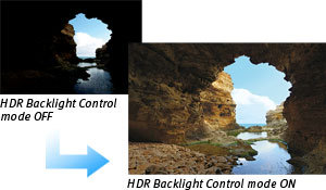
HDR Backlight Control mode
The EOS Rebel T5i's HDR Backlight Control mode ensures that backlit subjects are not recorded too darkly. By shooting three consecutive shots at different exposures (underexposed, correctly exposed and overexposed) and then combining the images, the final result maintains detail in both the shadow and highlight areas, ensuring the backlit subject is properly exposed.
Seven Creative Filters that can be displayed in real time
To add to the fun and creative possibilities available with the EOS Rebel T5i, the camera has seven different creative filters that can dramatically alter the mood and visual effect of any particular scene. Creative Filters include Grainy Black and White, Soft Focus, Fisheye Effect, Toy Camera Effect, Miniature Effect, Art Bold Effect, and Water Painting Effect. Each effect can be applied in three different levels (low, standard and strong), and easily previewed on the LCD panel in Live View. Since the filters can be applied to the image after shooting, it's easy to try several effects on the same shot during post-process.
Cleaner Images, Even at High ISO.
Multi Shot Noise Reduction
To enhance its already admirable high ISO shooting capabilities, the EOS Rebel T5i features an intelligent Multi Shot Noise Reduction tool that reduces noise even further than the camera's sensor and the DIGIC 5 Image Processor do. With Multi Shot Noise Reduction activated, the camera takes four consecutive shots, merges and aligns them. This eliminates more noise than the Rebel's traditional Noise Reduction filter, with little or no apparent resolution loss. Moving subjects are even optimized to minimize subject blur! Thanks to this clever feature, high ISO shooting has never looked better.
Flexible and Reliable Recording.
Compatibility with SD/SDHC/SDXC memory cards, including Ultra High-Speed cards
The EOS Rebel T5i uses popular SD, SDHC, SDXC, and is even compatible with Ultra High Speed (UHS-I), memory cards. Compact and available in large capacities, SD, SDHC, and SDXC memory cards are a perfect complement to the camera's compact design.
Additionally, the EOS Rebel T5i is compatible with Eye-Fi* SD cards, which are outfitted with a Wi-Fi® transmitter (IEEE 802.11b/g) and an internal antenna for wireless, high-speed transfer of images. With an Eye-Fi card installed, the EOS Rebel T5i can display the Eye-Fi's connection status and error notes with ease, for fully functional wireless uploading of images directly from the camera.
* Canon cameras are not guaranteed to support Eye-Fi card functions, including wireless transfer. In case of an issue with the Eye-Fi card, please consult with the card manufacturer. The use of Eye-Fi cards may not be available outside the United States and Canada; please contact the card manufacturer for territory availability.
A Comprehensive System of Optics Perfect For Video and Stills.
Compatible with EF and EF-S lenses
The EOS Rebel T5i is compatible with all Canon lenses in the EF lineup, including compact and lightweight EF-S lenses, ranging from ultra-wide angle to super telephoto lenses and including the STM series optimized for video shooting. Canon lenses employ advanced optical expertise and micron-precision engineering to deliver outstanding performance and deliver beautiful results. Special technologies like Canon's Optical Image Stabilizer help to minimize the effect of camera shake, effectively adding up to four stops of light; STM lenses even feature a stepping motor for smooth and quiet continuous autofocus while capturing video. With an array of lenses perfect for travel, sports, still life and everything in between, photographers can truly maximize the quality and performance of their EOS Rebel T5i.
More Features for Increased Versatility.
Lens Aberration Correction
The EOS Rebel T5i features lens correction tools that compensate for lens characteristics that can affect overall image quality. The EOS Rebel T5i's Peripheral Illumination Correction feature corrects light falloff in the corner of the image according to the characteristics of the lens being used. It even has correction data for a number of popular lenses stored in its memory. With the EOS Rebel T5i's chromatic aberration correction tool, distracting color fringing can be corrected at the time of the shooting.
Feature Guide
To help explain the specific function of features found on the EOS Rebel T5i, the Feature Guide displays a simple description helpful in determining the applicability for the situation at hand. It is displayed in each shooting mode, during mode dial operations, and for Quick Control screen functions. It appears automatically when a function is selected – a lifesaver when trying to determine the best mode or function for the next picture. The feature guide works automatically by default and can be disabled easily through the camera's menu.
GPS Compatible
With the optional GPS Receiver GP-E2 attached to the hot shoe or the digital terminal, the EOS Rebel T5i can record location, including latitude, longitude, and altitude, and has the ability to track the trajectory of movement with its logging function. An electric compass records the camera's orientation during each shot, and world time information is recorded through GPS syncing.
JPEG Resizing
To create images suitable for sharing by email or online, the EOS Rebel T5i can resize JPEG files, in-camera, of varying pixels (aspect ratio cannot be changed, only the image size can be decreased) while leaving the original image untouched.
Photobook Set-up
Photographers can share their images in book form with the EOS Rebel T5i's convenient Photobook Set-up feature. Users can easily choose specific images, images in a folder and even all images, then specify their sequence and layout. The results can be printed in book form with ease.
Image Rating
To help organize images recorded to the camera's storage, the EOS Rebel T5i makes it simple to rate individual images from one star to five. Therefore, image browsing, printing, and slide shows can be based upon those ratings.
Scene Mode Position
Newly featured on the EOS Rebel T5i, the SCN setting on the Mode dial activates a choice of scenes on the menu screen for quick access to features like Night Portrait, HDR Backlight Control, Handheld Night Scene and more.
18 MP APS-C CMOS sensor
5 FPS continuous shooting,Dimensions (W x H x D):Approx. 5.2 x 3.9 x 3.1 in;Approx. 133.1 x 99.8 x 78.8mm
9 point AF system, all cross type
ISO 100-12800 (expandable to 25600)
1080 (30, 25, 24 fps) and 720 (60, 50 fps) HD video (29min limit, H.264 format)
3" articulating touch panel LCD screen with 1,040,000 dots
Read the full article
0 notes
Text
FCPX 10.4 Color Tools
This update brings us some cool stuff: 360 video, advanced color grading, high dynamic range support, HEVC support, updated audio plugins, XML 1.7 and more.
As I suppose there’s gonna be tons of articles covering everything new in a global manner, I wanted to focus in just the color tools. That in itself is just enough to make an extensive post.
To talk about FCPX 10.4 color tools we first need to talk about some concepts.
Rec2020

Color space defines the amount of colors and saturation these can have in the image. In the image above it’s represented what the human eye can see. We are moving from rec709 (small triangle) that is defining HD broadcast to rec2020 (big triangle). What it means is that now we’ll have more reds, greens and blues and they can now reach higher saturation levels which translates in richer and more vibrant images that match better real life colors. FCPX 10.3 already brought rec2020, also called Wide Color Gammut (WCG). We set the color space in the inspector at the library level.
HDR
Then we have HDR or High Dynamic Range. HDR describes video having a dynamic range greater than that of standard-dynamic-range video (SDR video). SDR video, when using a conventional gamma curve and a bit depth of 8-bits per sample, has a dynamic range of about 6 stops. In camera Log modes allow us to retain higher stops of light and high end cameras are capable today to capture 14-16 stops of light but we are limiting how this information is being displayed to us because of SDR limitations. It has been the standard for the last 50 years or so when displays where not capable of today’s levels of brightness. It established a minimum and maximum of brightness. Those levels define total darkness (0 nits) and maximum brightness (100 nits). The big problem with this standard has been the compression of highlights, the difference between the sun, a white car, a puffy cloud and a sheet of paper under a bright sunny day have been in the top 15% of that scale when in real life they are pretty spread out in an imaginary scale. Also the scale for the darkest part of the image is very compressed and there’s small room for deep and rich shadows.
Well, HDR brings us a wider scale. We go from 100 nits to 10000 nits for maximum brightness, and from 8-bits to 12-bits (for Dolby Vision, an HDR PQ format). That’s 100 brighter than today’s broadcast standard. When HDR content is displayed on a 2,000 nits display with a bit depth of 10-bits per sample it has a dynamic range of 17.6 stops. But hold on, there’s no monitor capable of displaying 10000 nits yet. What we are doing at the moment is master at 1000 nits (what the majority of actual HDR TVs are capable of displaying at the moment). That’s still 10 times brighter than SDR. If you want to know more about HDR and PQ (Perceptual Quantizer) I recommend this short video made by Apple (it’s also transcribed in there in case you prefer to read)
In FCPX we set up SDR or HDR spaces in the inspector at the project level.

When we change to Rec2020 PQ the scopes are gonna change scale from SDR to HDR going from 0 to 10K nits.

Media gets auto tagged to the right color space on import but in case it’s wrong we can always change it in the inspector settings.

Mixed color space clips get properly scaled (automagically) in a non matching color space project or can be changed from one format to another with some new tools (read bellow in HDR Conversions), so mixing PQ with HLG and SDR in an SDR or HDR timeline is not a problem.
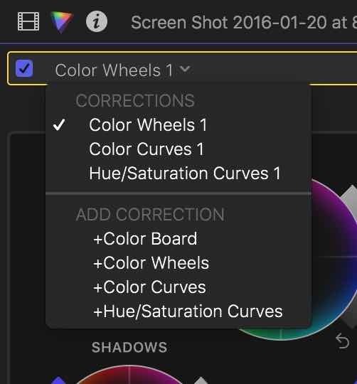
Color Plugins
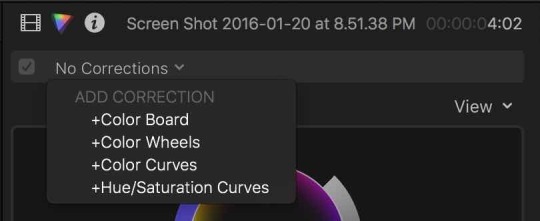
We have new tools! Wheels, Color Curves, Hue/ Saturation Curves, Custom LUT and HDR conversion plugins are finally here.

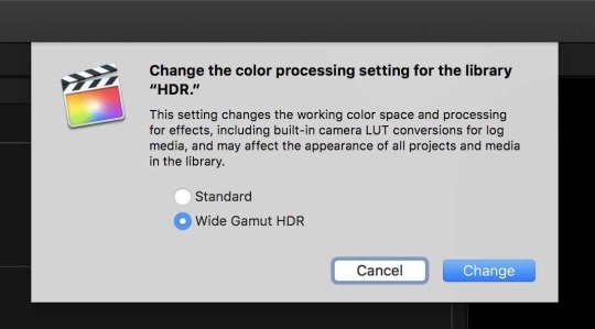
They are accessible thru the effects browser under the color category or directly in the inspector in their own Color Panel (the icon that looks like the first image of the post, or slice of pizza). The old Color Board shortcut, command+6, opens it too.

In the color panel we can do everything color related (except one thing, we’ll get there later, see Conclusion at the bottom). There’s no limit to the amount of corrections we can add to a clip so possibilities are endless.
There’s also the option to add them via shortcut if we assign them in the Command Editor. I recommend creating a special Color keyboard layout and change to it when we start coloring, if not we are gonna have to create complicated shortcuts with multiple modifier keys that are difficult to remember.

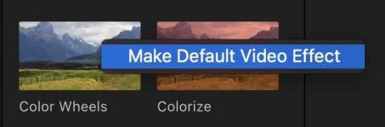
Color Wheels
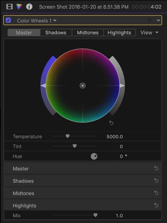
Yes, they are back!!! The color wheels are the universal UI for color. They allow us to change hue, saturation and luminance in one place (no more switching between panels). We have the 3 wheels for adjusting shadows midtones and highlights (lift, gamma, gain) separately. There’s a 4th wheel for overall adjustments. The wheels are placed in order so you would first adjust exposure and color cast with the master wheel and then move to shadows and highlights to add contrast and finally get to the midtones to get to the final tweaks.

There’s also the possibility to enter numeric values for everything to make precise adjustments if we expand the bottom controls to reveal the rest of the UI after the wheels.
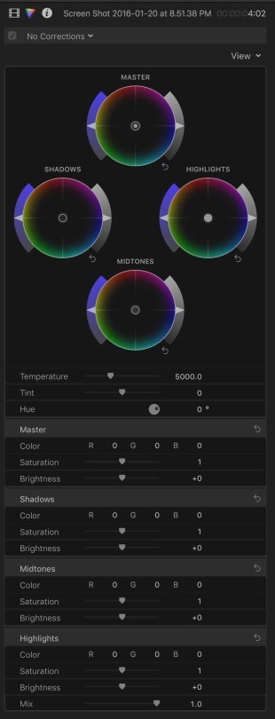
All digits can be clicked and dragged to change values, type numbers directly to input the desired value or use up/down arrows to increase/decrease in steps.
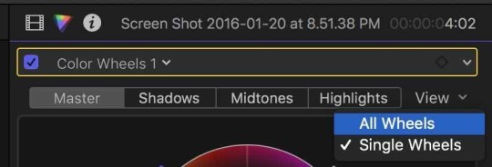
It takes a big chunk of the inspector but we have the option to show only one wheel at a time to have a simplified UI by changing the view to single wheels.
The corrections can be keyframed at the top next to the name of the current active correction. Only 2 keyframes are needed to change several values at a time, no need to keyframe each value separately.
We can make secondary corrections by selecting parts of the image using shape masks or color selections clicking the icon next to the keyframe icon. Secondary selections are not new but the good thing is that now we can stay in the color panel to do all this, before it was Color Board <-> Inspector dance. We can also select inside or outside of this selection and have different adjustments for each one in the same correction instance.

We can add as may selections as we want, add separate keyframes to animate and manage them all at the bottom of the color UI.
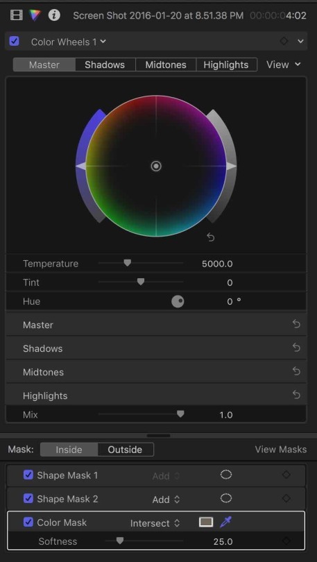

No, they haven’t got rid of the color board, it’s still there for its fans and it’s still the default color correction. We can change that in the preferences so when the color panel opens the chosen default correction will be the always ready to go.

Curves
Curves are here too. And I love them.
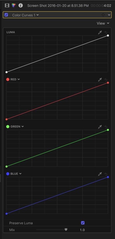
There’s separate Luma and RGB curves. They can be masked and keyframes too. And they also have the same options to display all them or just one at a time for a simplified view or to save screen real estate in small laptops.


What’s interesting is that the RGB curves are not fixed to be just Red, Green and Blue, meaning that we can change any of them to the color we want to affect.

That way we select orange to make accurate skin tone correction or cyan to correct the sky without having to make a secondary color selection first.
Also there’s an eye dropper for each one to click the image in the viewer to add points at that luma level or to change the curve to the clicked value.
Hue/Saturation Curves
We have the typical hue vs hue, hue vs sat, hue vs luma, luma vs sat, sat vs sat, and a special orange vs sat to adjust skin tones.

Again they can be keyframed, use eye dropper to select and at points to the hue, luma or saturation area we want to change, add secondaries with windows or color selections and inside outside corrections for those selections are also possible.
LUT Tool
Simple and needed tool to load LUTs to a clip (or compound clip or adjustment layer) to change the way it looks. It has selectable input and output color spaces.
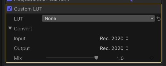
LUTs are selected via file browser so you can have them organized in folders in the finder, no need to preload them anywhere like some 3rd party plugins. It also remembers recent ones.

HDR Conversions
This is very Apple. They added this simple tool that allows us to change any clip from one format to another and it’s pretty accurate. It also can be used to set the HDR nit level (like the maximum level of an audio mix) using the Peak Brightness slider.
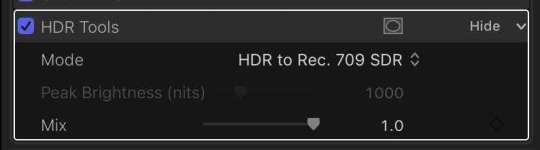

Really powerful but stupid simple.
Things To Remember
There’s the menu at the top of the Color Panel to add corrections, it also let’s us to jump from one correction to another (also by assignable shortcuts, previous and next correction).
You can assign any of the new color plugins to be your default effect and access it with the default effect shortcut, Option+E.
Thaw way you can use CMD+6 to open the Color Panel with the defined default correction (curves fro example) and assign Color Wheels with OPT+E, in case you don’t want to go crazy creating an extensive modified keyboard layout.
If you have a bunch of corrections applied to one clip, you can double click to one from the inspector list and jump straight to it in the Color Panel.
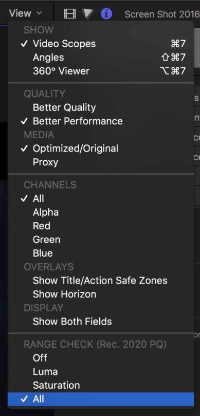
There’s the rage check at the bottom of the viewer options menu to show excess Luma and/or saturation and it has beed updated to HDR support too.
Conclusion
Beefy color update. It brings needed tools for almost everybody and other ones that maybe not a lot of people today (HDR). It also brings some “Apple” approach for things making them vey simple and easy to use like the Orange/Saturation curve aimed to skin tones or the simplicity of the HDR conversion tool.
There’s a lot digest. And more:
360 video.
Send your iMovie for iOS project directly to Final Cut Pro for advanced editing, audio work, and finishing.
Import, playback, and editing of High Efficiency Video Coding (HEVC, also known as H.265) video clips and High Efficiency Image Format (HEIF) photos from Apple devices.
Send to Compressor to export video projects in the HEVC format
Adjust audio using effects plug-ins from Logic Pro X with redesigned, resizable interfaces.
Support for Canon Cinema RAW Light format with additional software from Canon.
Faster Optical Flow analysis using Metal 2.
Support for NFS-based libraries and media.
XML 1.7 with support for new color grading controls, 360 VR effects, and HDR.
Important things for color that I’m still missing are:
Renaming corrections, so we can label them to what they do for example (like “Contrast”, “Skin Tone Fix”, “Vignette”, “Look”).
Reordering of corrections in the Color Panel (not only in the effects inspector). This is the only color thing we can’t do in the Color Panel.
Link for the Color Curves (Luma/RGB) so when you add a point to one it adds them in the others.
Control surfaces support. Like via MIDI or other kind of protocol where we can change values via hardware wheels, buttons and knobs like the Tangent devices or other.
I hope these come soon.
Enjoy!
0 notes
Text
AOC CU34G2X Review: 34 Inches, 1440p, 144Hz, Less Than $500
If you’ve been in the market for an ultrawide but don’t want to give up your resolution or refresh rate, AOC might just have the answer. The CU34G2X is 34 inches, 1440p, 144Hz, and tops it off with adaptive sync, all for less than $500. But is there a catch? I’ve spent more than two weeks using it as my daily driver and have the answer — and the results may surprise you. This is our review.
Specifications
Current Price: $449
Monitor color: Black Red
Monitor size: 34 inch
Resolution: 3440x1440
Refresh rate: 144Hz
Response time (mprt): 1 ms
Panel type: VA
Backlight: WLED
Aspect ratio: 21:9
Brightness: 300
Contrast (dynamic): 80M:1
Pixel pitch: 0.23175
Active Screen Area: 797.22 x 333.72
Viewing Angle (CR10): 178/178 º
Colors: 16.7 Million
Bezel type: Frameless
Connections Signal input: HDMI 2.0 x 2, DisplayPort 1.4 x 2
DisplayPort Version: 1.4
USB Input: USB 3.2 (Gen1) x 4
Audio output: Headphone out (3.5mm)
Curved screen: Yes
Whats in the box HDMI Cable: 1.8 m
Displayport Cable: 1.8 m
Power shuko c5 Cable: 1.8 m
Ergonomics Swivel: -30°±2°~+30±2° °
Tilt: -5±2°~+23±2° °
Ergonomic height amount: 130mm
Base removal
Vesa: 100x100
Power Power supply: Internal
Power Consumption On: 37W watt
Power Consumption Standby: <0.5W watt
Warranty period: 3 Years
Ask anyone who games on an ultrawide and they’ll tell you the same thing: it’s a game-changer. The extra screen real estate makes a huge difference in how immersive games feel to play, especially if the monitor has a curve like the AOC CU34G2X. Game support has also ticked up so much that I haven’t found a major game to be unplayable or poorly scaled in quite a long time. The wider space also works wonders for content creation — 16:9 feels downright cramped in Adobe Premiere now!
The AOC CU34G2X comes to market at $449 and offers an impressive set of specs. This is a full 1440p ultrawide (3440x1440) that also features deep 1500R curves and fast 144Hz refresh rate. On top of that, the panel actually comes in with a greater color depth than originally reported when the two monitors in this line were announced. Instead of being limited to 8-bit color depth, a quick dip into the Nvidia Control Panel shows that you can actually set it to 10-bit, Full RGB without needing to lower any other settings. That’s impressive and also a bit curious; why wouldn’t AOC by selling this more? I have an unproven idea, which I’ll get to in a little bit.
The CU34G2X uses a VA panel, which I’m happy to see. VA panels tend to represent a nice middle ground between TN and IPS displays, balancing out color and response time. The display is certified to cover 119% of the SRGB color spectrum and 88% of the Adobe RGB spectrum. It also features a 3000:1 contrast ratio, which is typical of VA gaming panels. In fact, the CU34G2X comes pre-calibrated from the factory and AOC includes a certification sheet right in the box. It’s a nice touch that I liked seeing. I would still lean toward a dedicated IPS panel for professional content creation due to its improved color accuracy, but the results here are great for gaming and work well for hobbyist content creation.
That said, I found the display to be a bit dim out of the box with the factory calibration. To achieve proper calibration, the brightness needed to be set at about 60%, which was too dim for my liking. Thankfully, it supports multiple profiles, so for gaming I can opt for a bright and vibrant preset and for photo or video editing, I can swap to a flatter, more accurate profile.
AOC quotes the monitor as having a 1ms response time, which is competitive with some of the fastest TN monitors used in eSports tournaments. I don’t have a way to test that personally, but our colleagues at PCMonitors.info found a response time just over 5ms, even with Adaptive Sync turned on. That figure matches up with my own selection of tests. Running the monitor through Lagom’s Response Time Test, I observed minor color shifting in the top two boxes, which is indicative of minor, but present, latency in light to dark shifting and vice versa. Likewise, the Test UFO Ghosting Test showed minor trails akin to other 4-5ms gaming monitors I’ve tested, like the Massdrop Vast (my previous daily driver).
As you can tell from the picture above, turning the Overdrive setting to Medium definitely helped. The CU34G2X also features a Motion Blur Reduction setting which achieves a very similar effect. Turning it onto strong resulted in artifacting, so I left it on Medium. During games, I wasn’t able to observe any ghosting whatsoever.
The panel itself is incredibly spacious. The 34 inch screen size is generous and is more than enough room for immersive gaming or even mimicking having a dual monitor setup. You can resize windows to fill each half, but the display also supports Picture in Picture (PIP) and Picture By Picture (PBP) to monitor two video sources at once or use a single display for your gaming PC and console, for example. It also adopts the “frameless design” which trades big plastic bezels for a quarter inch of black space around the picture and succeeds in making the monitor feel more generous.
The CU23G2X also supports HDR content within windows and even within a picture setting. This is another feature that AOC isn’t upselling but is clearly part of its core design. Turning on HDR locks out many customization settings, like color balance and contrast, but each can still be adjusting using Nvidia and AMD’s control panels if you choose. That said, peak brightness tops out at 300-nits and without local dimming, this isn’t a “true” HDR experience.
Still, I turned it on, left it on, and am happy it’s there. Why? Number one, there is some behind the scenes manipulation going on that saturates colors in games and plays with contrast in a way that elevates the experience. Second, being able to enable HDR in Windows brings up whites in a way that not only makes them more crisp but makes the whole screen feel brighter. It’s not “true” HDR, but it’s better than SDR any day of the week. As an added extra you find only after plugging in? It’s an unexpected extra.
Having tested several of these monitors and researched many more, I can also say that this combination of features has historically been fairly rare. 300-nits brightness is fairly standard, if a bit brighter, than last generation’s 34-inch ultrawides. 144Hz, Freesync, and even having the option for HDR are definitely improvements over what the monitor industry offered for this price even one year ago. For a display of this size, you can’t expect the world without paying a hefty premium, but the trade-offs in picture quality and brightness are really fairly minor for all that you’re actually getting.
Around the back, you’ll find two DisplayPort 1.4 connections and a pair of HDMI 2.0s. There’s also a headphone jack (no speakers) and four USB connections for your peripherals. The yellow USB port also supports fast charging for your modern smartphone. The stand is decent and offers height, rotation, and tilt, and snaps in place without the need to screw it into the panel. It also supports the VESA 100 mounting standard if you’re rather put it on an arm or third-party stand.
Usage Impressions
So let’s get into the heart of this review: what is it like for gaming?
Before having the CU34G2X in for testing, I had been using the Massdrop Vast, which is very similar on paper. It’s also a curved, true 1440p monitor, if slightly larger at 35 inches. It featured an identical peak brightness of 300-nits and also had FreeSync/G-Sync support. The big difference was in refresh rate. The Vast was capped at 100Hz while the AOC peaked out at 144Hz. I expected a modest upgrade.
Comparatively, the CU34G2X has turned out to be a much better monitor. The hidden benefits of 10-bit full RGB color and HDR were immediately elevating. It also proved to have a higher consistent brightness across the board, which allowed the display to offer better vibrancy and pop. Most importantly, the jump to 144Hz was a big jump and easily the high point of the whole experience.
Gaming on the CU34G2X is smooth and fluid. The bulk of my testing was with Doom Eternal and it perfectly exemplified why a high refresh rate is worth paying extra for. The frenetic, demon slaying action was a perfect match for the monitor. Using my 2080 Ti, the sense of motion and flow were definitely enhanced. The CU34G2X offered the best ultrawide experience I’ve ever had under $500. For gaming, it’s a bargain winner.
A Strange Problem That Seems to Be Solved
BUT… and this is a big but, it wasn’t without one major flaw which may now be a thing of the past. About once every 45 minutes, the screen would go black for 1-2 seconds before flashing back on. This was incredibly frustrating. In doing some research, I found that I wasn’t alone and it seemed to be related to G-Sync and its 48-144Hz default range. I believe that because disabling G-Sync completely removes the problem. But, that also makes the monitor much less appealing for gamers with Nvidia graphics cards. Instead, I followed a suggestion and tweaked the range to 52-144Hz. Small enough where I never noticed it and the problem was suddenly solved for my gaming. Strangely, it continued to happen in large Zoom conference calls of 15-20 people.
I’ve heard G-Sync. I’ve heard that it’s related to Low Framerate Compensation and how Nvidia’s drivers interpret that. I’ve wondered if it could be related to bandwidth over DisplayPort. I can’t say for sure.
What I can say is that, as of today, that problem appears to be fixed with the latest Nvidia driver update. I’ve set the G-Sync range back to stock and haven’t had it happen at all since and I’m going on six hours of straight use without a single flash. I will update this review should the flash come back.
Final Thoughts
The AOC CU34G2X wasn’t without its issues. The brightness is a little low at 300-nits, and that flashing would have warranted an RMA if it didn’t seem to be fixed. With it seeming to be eliminated, however, the CU34G2X becomes one of the best ultrawides you can buy under $500. Full 10-bit color, HDR support, and 144Hz at 3440x1440 makes for an outstanding gaming experience.
When it comes to ultrawides, you should go in with your eyes open. True, 1000-nit HDR is going to be incredibly expensive when it’s finally available. The same is true with FALD. Even jumping to 400-nits is will cost hundreds of dollars more. Given the low cost of the CU34G2X, I can accept some growing pains and a bit less brightness.
Overall, though I’m not more pleased than ever with the flashing issue seeming to be gone, I would still recommend Nvidia users wait a few days. Should it resurface, I will update this review and its score. If it doesn’t, at least in my case, a simple driver release was all that was needed to correct it.
0 notes
Quote
There are so many new technologies and innovations coming that I think if you are considering buying a laptop right now it may be worth holding off for a month. So, let me show you why
More Tech News For You:
Google Pixelbook Go M3 Chromebook Laptop
Acer Predator Helios 300 PH315 Gaming Laptop
Tesla Model 3 Version 10 Software Update is Extremely Amazing
No: 1
We've got new screens coming this is the MSI creator 17. it's the first laptop in the world with a mini LED display. I had a bit of a play with it at CES and it's incredibly bright up to 1000 nits.
it's also 4k, supports display HDR 1000 and we get great contrast and accurate colors. Basically, we've gone from hundreds of LEDs in an LCD screen to thousands of LEDs. Now I've only had a quick hands-on and I can't wait to test it properly against an OLED screen.
Although right now nothing can match no LEDs contrast and deep blacks. So, for me and you these new mini LED Screens will be great for Photo and Video editing.
Especially if you're working with HDR content for using outdoors or in bright conditions as well as playing games again especially if this supports HDR.
There's also micro-LED technology which is different from mini LED in so much. That basically every single pixel has its own LED.
So, it goes a step further but right now we're only really seeing this with super high-end or concept 8k TVs from lights of Samsung.
Although there are rumors that apples working with micro LEDs for their next-gen MacBook Pros. coming back to mini LED though, LG actually unveiled a new mini LED a.k TV at this year's CES with up to 4000 nits of brightness clearly. There's a lot of potential with these new screens.
No: 2
Moving on a new year means new processors and in 2020 laptop CPUs are likely to get a serious boost.
Thanks to Intel's 10th gen h-series chips and aim these 4000 series chips both offering up to 8 cores and 16 threads,
it is worth remembering though the new processors don't usually make a huge difference to gaming performance.
That mostly comes down to the graphics card but for multitasking, for video editing, for rendering 3d work that's of stuff this could actually be a serious upgrade.
we'll see the first laptops with these chips coming out from March including the new ROG Zephyrus g14 which according to Asus will be the world's most powerful 14-inch laptop with a custom AMD 4800 HS and RTX 2060 graphics card.
No: 3
Another reason laptops will be getting a lot better this year is with upgraded graphics Tech. the latest rumors suggest we're gonna see Nvidia's new RTX super series of cards coming to laptops.
This isn't confirmed just yet but from what I've been hearing and reading is chances are coming pretty soon. for example, a leaked slide found by a notebook check suggests the new cards will come in standard and max-q flavors. so we're expecting super variants of 1650 maybe 1660 as well as the 2060 2017 and 2018 cards. and each model will have a parallel max-q version which is slightly underclocked and less powerful for use in thin and light laptops.
A listing for the 2080 supermax cue with eight gigs of DDR 6 Ram showed up on gig benches OpenCL database with results that put it around the same performance as a desktop our TX 2070 or a GTX 280 Ti. which is pretty impressive given this is a max cue card for laptops. as for the ranger of rule, I'm expecting the same can I boost we got on the desktop super card. so anywhere between 5 and 15 percent. nothing earth-shattering but it all adds up I suspect we'll also see Nvidia's URT x3000 series of cards like the 3070 and the 3080 coming this year, probably around the summertime.
Although that will be for desktop PCs only for this year and then chances are that will come to laptops in 2021. as I say this isn't a hundred percent confirmed right now. but from the leaks we've seen and also from talking with various brands like MSI at CES who were kind of worried about what graphics cards were coming in their new GS 66 stealth and GE 66 Raider. suggests we'll probably be seeing laptops with these new cards sort of in late q1 this year. just in the past week or so, I've seen reports of new Nvidia MX 330 and MX 350 graphics chips. now the only information so far is coming from drivers but interestingly it looks like these will be based on Nvidia Zolder Pascal architecture.
which we last saw in the GTX 10 series and existing MX series models and leaks suggest the MX 350 will have around 65% more Cuda cores compared to the previous MX 250. so pretty much from all angles from the integrated chips and processors to these new low power MX graphics chips to the new RC X super cards. this is gonna be a big upgrade in the graphics department for laptops this year.
No: 4
we've got Intel's project Athena Innovation Program. which is kind of like ultrabook 2.0 and you standard the meet certain specs for thin and light high-performance laptops. So, we saw a few laptops that made the grade in 2019 like the Dell XPS 13 to 1 and Lenovo yoga C 940 but 2020 looks like the a will finally get a lot more choice. Intel promising around 50 new models for this year including the likes of the standard XPS 13, the Asus wear 3 and even the Samsung Galaxy Chromebook.
why is that exciting though well the guarantees that you'll get either an i5 i7 or i9 processor at least 8 gigs of ram and at least 256 gigs of fast SSD storage as well as a thin and light design at least a ATP touchscreen, fast Wi-Fi, 6 Thunderbolt 3 fast charging plus at least nine hours of battery life in real-world use. other perks include a backlit keyboard precision touchpad and fingerprint or face recognition for logging in.
Athena certified laptops will come with intel's engineered for mobile performance ticker. although unfortunately, this doesn't apply to AMD based models. So, you have to do a bit more to see how those models compare in any case. the idea is to help make buying a new laptop a little bit more straightforward. although for now, it seems to be quite high-end on the premium soft side of things. hopefully, that'll trickle down to better specs mid-range or budget laptops but it is a good start.
No: 5
Now Intel's woes aren't limited to just a resurgent AMD Qualcomm's new Snapdragon 7 C and 8 C chips our laptop class processors for Windows 10 on arm. and they could shake up the mobile laptop space thanks to massive battery life Solar performance and 5g LTE connectivity. So, the chips are based on the ARM architecture which is similar to the process as you get on your smartphone.
The main issue though is that the on compatible with a lot of software that's made for regular Windows.
last year's Microsoft Surface pro X was an ARM-based convertible tablet which was thin and light and had a great battery life thanks mainly to the processor.
There's also already been a couple of education-based laptops with the 7c coming in around $300 and I reckon we could see a Microsoft Surface go to with one of these new chips at some point. This could give budget Chromebooks a good run for their money of course expect to pay more for a 5g or LTE connected version of the laptop but if you're looking for a really thin light sort of travel laptop then this can be really worth considering.
No: 6
One laptop trend that I loved at CES this year is the new design concepts. we saw a couple of dual screen designs last year like the Asus Zenbook Pro which I loved but this year looks even more exciting.
some of them are single-fold L devices like the Lenovo 13-inch x1 fold and concept designs like Intel's Horseshoe Bend and Dell's concept. these work like tablets when unfolded and mini laptops when flexed and can also fall flat like a conventional clamshell machine. these seem like they might be great all the Wan devices especially for people who work on the go.
Although like Samsung's Galaxy fold I'm slightly concerned about the durability of the folding mechanism and the screen. then the second screen device is like Dell's concept Jewett and Microsoft Surface near.
Microsoft has also built Windows 10 eggs just for these new dual-screen devices. So, hopefully, it's implementation doesn't feel like an afterthought. some clamshell laptops are also getting second smaller screens which are good for multitasking to say having your Premiere Profiles there or watching a YouTube video or twitch stream. in any case, it feels like we're only just starting out with these new formats and I can't wait to see what else 2020 has in store.
No:7
Last but not least if you're a Mac user and maybe you've been eyeing up the new MacBook Pro 16.it It's a little bit, too big or just way too expensive because it does cost a lot of money. then while it's not confirmed I would bet that we're gonna see a new 14 inch MacBook Pro this year an updated version of the 13 inch modern with the better keyboard, new processor, new graphics and the crazy good speakers.
I think for a lot of people an updated 14 inch MacBook pro would be sort of the sweet spot when it comes to Apple laptops. So, fingers crossed we see that maybe in the summer of this year.
So, lots of exciting new laptops are coming which is why I think it's best to hold off right now.
I'm buying a new one because either you'll get more for your money very soon or you'll be able to get last year's models at a discount. maybe you can find a good deal on them so either way, as I say new graphics, new processors, new screens, new form factors maybe a new MacBook this year can be pretty exciting for laptops.
http://getotheoffer2.blogspot.com/2020/02/reasons-dont-buy-laptop-now.html
0 notes
Text
How does Google's Pixel 4 smartphone camera compare to the iPhone 11 Pro?
Shot through a shop window, the Pixel 4 handles the shiny, golden surfaces and contrasty pools of light very nicely. (Stan Horaczek/)
At its recent product announcement event in New York City, Google showed off a handful of new gear. But, the company dedicated considerable time—and presumably money spent to hire iconic portrait photographer Annie Leibovitz—showing off the Pixel 4 smartphone’s new camera. That emphasis makes sense. Consumers still indicate that photo quality is one of the most-important factors they use to pick a new device. And Google is coming off of a very strong showing in the Pixel 3, which was (at least as far as I was concerned at the time) the absolute best smartphone camera.
The Pixel 4 adds some more AI-powered smarts, relying increasingly on its software to determine the overall look of the final image. And while the camera has some moments where it’s truly excellent, I ran into a few growing pains as Google tries to calculate its way to perfect photos.
What's new?
The Pixel is about average when it comes to quickness in capturing photos. It took me roughly five tries before I got the timing right and caught the person up front with a punch extended. (Stan Horaczek/)
On paper, the Pixel 4’s camera doesn’t seem all that different from the hardware that came before it. The primary exception is the notable addition of a telephoto lens, which Google intends to improve performance specifically when it comes to zooming and portrait mode. The shooter’s competition, however, is stiffer this year: Apple seems to have corrected some the over-zealous HDR tech that made iPhone XS images look unrealistic and unnatural at times, and the Cupertino company promises to further improve the iPhone 11 Pro’s already-very-good camera when its detail-enhancing Deep Fusion tech arrives in the next iOS update.
Image quality
This scene is a great space to test HDR. There's natural light coming in through the archway and artificial light overhead. The Pixel 4 does a really excellent job of bringing up the shadows near the door while keeping the colors accurate to the scene as it looked in real life. If you wanted to edit the photo, it's a great, neutral starting point. But, it also looks fine the way it is. (Stan Horaczek/)
Google doesn’t pull punches when it comes to computational photography, which relies more on processing power and algorithms than pure hardware performance. The company makes it abundantly clear that the software magic that happens during and after you press the shutter has become extremely important in determining the look of the final image.
Like almost every smartphone camera at this point, pressing the shutter doesn’t simply take one photo. Instead, it captures a burst and combines information from those images into one finished file. This “smart HDR” tech does a lot of good: It can prevent highlights from getting blown out, or flatten out a super-contrasty scene that could lose crucial details. But, as with iPhone 11 Pro, it can be unpredictable.
These Bananas at Whole Foods illustrate the difference between the Pixel 4 (left) and the iPhone 11 Pro (right). The Pixel's image doesn't crank the contrast as much and the tones look smoother overall. If you weren't comparing them side-by-side, however, they're both totally acceptable. (Stan Horaczek/)
In good conditions shooting with the main wide-angle camera, I prefer the images that come out of the Pixel 4 to those from the iPhone 11 Pro. It’s close, but the Pixel’s camera still feels more neutral and natural to me. I don’t notice the HDR effect that can make subjects look unrealistic—and sometimes even cartoonish—as much as I do with the iPhone. This is especially useful for users who edit their photos after taking them (something very few typical users do).
The focusing on the Pixel 4 is impressive. It grabbed onto the pizza cutter through this window reflection. (Stan Horaczek/)
Google made a few welcome improvements to its overall HDR experience as well. When you tap the screen to focus on an object in the image, two sliders now pop up for adjusting the brightness of the scene. One slider affects the overall exposure (how bright or dark everything looks) in the scene, while the other simply affects the shadows. That second slider is extremely useful. It allows you to do things like taking silhouette photos in which the subject is virtually blacked out while the background (usually the bright sky) stays properly exposed.
The first shot in this series was the default with no adjustments. In the second shot, I raised the overall brightness, which drew out detail from the leaves, but blew out the sky. In the third shot, I used the shadows slider to raise the shadow levels to bring up the leaves a bit while the sky remained mostly unchanged. (Stan Horaczek/)
You can also achieve the opposite effect in which you can brighten up a dark foreground subject without blowing out a bright sky in the background. In a situation like the one pictured below, you’d typically lose some of those nice yellow leaf details to shadow unless you brightened the whole image and blew out the sky. Adjusting the shadow slider allows you to bring up the exposure on the leaves while leaving the sky alone.
That slider is one of my favorite additions to the Pixel 4 camera, and it’s a trend I’d love to see continue as we go forward into the future of HDR all the time on everything.
When the shooting conditions get tricky, however, the Pixel 4 has some real quirks.
The flickr effect
Most artificial lighting flickers, but your brain does a good job of making the glow seem continuous. The pulsing effect, however, is more difficult for digital cameras to negate, and the Pixel 4 seems to have more trouble in this arena than its competition.
In the video above, you’ll notice some dark bands going across the image. This kind of thing isn’t out-of-the-ordinary with artificial light sources, which have a generally imperceptible flicker to coincide with the 60 Hz electrical current flowing through them. Dedicated digital cameras, however, typically have “flicker detection” to help combat it, and even the iPhone 11 Pro does a better job of mitigating the effect.
The effect isn't always so pronounced. In this image, you can clearly see dark bands running across the map in the center of the image that's illuminated by the artificial light overhead. Light coming in through the window and door pushed the shutter speed to 1/217th of a second, which is too fast to negate the banding effect. (Stan Horaczek/)
With the Pixel 4, I noticed it in a variety of locations and artificial light sources. It’s subtle, most of the time, but if you have a bright light source in the frame of the picture or video, it can push the shutter speed faster than 1/60th of a second, which is when the bands start to creep in.
When I switched to a manual camera mode in the Lightroom app and used a slower shutter speed, it disappeared. In scenes like this, the iPhone seems to use its HDR+ tech to keep at least one frame in the mix with a shutter speed slow enough to stop this from happening. Once I figured out the circumstances that brought it on, I shot the example below, which shows it very clearly.
The image on the right came from the iPhone 11 Pro Max, while the image on the left—which very clearly displays the banding problem—comes from the Pixel 4. Looking at the metadata, the iPhone claims a shutter speed of 1/60th of a second, where as the Pixel's shutter speed was faster than 1/250th of a second, which explains why it's so visible in the Pixel photo, but not the iPhone frame. Presumably, this is the kind of thing Google can fix down the road by adjusting the way in which the HDR capture process works. (Stan Horaczek/)
The flaw isn’t a deal breaker since it only appears in specific circumstances, but it’s very annoying when it does.
White balancing act
Shot on a cloudy day in the shadows with lots of yellow in the frame, I'd fully expect this picture to come out too blue. The Pixel did a solid job, however. (Stan Horaczek/)
Another area where our brains and eyes routinely outperform cameras: color balance. If you’re in a room with both artificial light and a window, the illumination may look fairly consistent to your eye, but render as orange and blue, respectively, to a camera.
Smartphones often try to split the difference when it comes to white balance unless you mess with it on your own. The Pixel 4, however, analyzes the scene in front of it and uses AI to try and recognize important objects in the frame. So, if it notices a face, it will try and get the white balance right on the person. That’s a good tactic.
Under artificial light, the color balance changes frequently when the camera moves subtly. (Stan Horaczek/)
Generally, I think the Pixel 4 does an excellent job when it comes to white balance, except when it gets it very wrong. Move around the iPhone 11 Pro camera, and the scene’s overall color cast tends to stay mostly consistent. Do the same with the Pixel 4, and its overall white balance can shift drastically, even when you only slightly move the camera. Above, the grid-style screenshot show a series of photos I took in succession under unchanging conditions. I moved the phone subtly as I shot, and you can see the really profound color shift. Again, this primarily happens when shooting under artificial light.
As long as you pay attention and notice the change before snapping the shot, it’s totally fine and the Pixel does a great job. It’s also easy to correct later on if you’re willing to open an editing app. But, on a few occasions, I ended up with a weirdly yellow photo I didn’t expect.
Telephoto lens
Portrait mode and a backlit beard make for quite the scene. (Stan Horaczek/)
The new telephoto lens is roughly twice the focal length of the Pixel’s standard camera, which effectively gives you a 2x optical zoom. It has an f/2.4 aperture, compared to the improved f/2.0 (lower numbers let in more light) portrait lens on the iPhone 11 Plus. It’s only a fraction of a stop, however, so it’s unlikely to make a huge impact, but it’s a reminder that Apple has been doing telephoto lenses for some time now and is already refining while Google is just getting started.
You get more accurate colors and more details out of the Pixel 4 (left) then you do out of the iPhone 11 Pro (right) when zoomed in to 8x. The iPhone actually allows you to go a little more to 10x if you don't mind the lower-quality image. (Stan Horaczek/)
Like we said earlier, the telephoto lens counts zooming as one of its primary functions. The phone gives you the option to zoom up to 8x by combining digital and optical technology. Google claims pinching to get closer now actually gives you better image quality than simply taking a wider photo and cropping in, which has historically provided better results. I found this statement accurate. “Zooming” has come a long way on smartphone cameras, but you shouldn’t expect magic. You’ll still end up with ugly choppy “artifacts” in the images that look like you’ve saved and re-saved the photo too many times as a JPEG.
When you peep at the images on a smaller screen, like Instagram, however, they look impressive, and that’s ultimately probably the most important display condition for a smartphone camera in 2019.
If you zoom a lot, the Pixel beats the iPhone on the regular. It’s even slightly easier to hold steady due to the improved images stabilization system when you’re zoomed all the way to 8x.
Portrait mode
The Pixel 4's portrait mode really shines when you shy away from the standard up-close headshot. (Stan Horaczek/)
The other big draw of the telephoto lens comes in the form of improved portrait mode. Even with the single lens on the Pixel 3, Google already did a very impressive job faking the background blur that comes from shallow depth of field photography. Predictably, adding a second lens to let it better calculate depth in a scene improves its performance.
If you really want to notice the jump, try shooting a larger object or a person from farther back than the simple head-and-torso shot for which portrait mode was originally developed. Using portrait mode for larger objects is a new skill for the Pixel 4 and it does a good job of mitigating the inherent limitations of the tech. Any weirdness or artifacts like oddly-sharp areas or rogue blobs of blur typically tend to show up around the edges of objects or in fine details like hair or fur. The closer you get to your subject, the harder you’re making the camera work and the more likely you are to notice something weird or out of place.
The iPhone 11 Pro (left) does a better job with the tricky edges in the subject's hair, but the Pixel 4 (right), produces a more natural image because it's not adding any simulated lighting effects like Apple does. (Stan Horaczek/)
Overall, the Pixel 4’s portrait mode looks more natural than the iPhone 11 Pro, but it struggles more with edges and stray hairs. In headshots, the areas around the hair typically give away the Pixel 4’s tricks right away. (The iPhone 11 Pro gets around those edge issues by adding a “dreamy” blur across most of the image.) The Pixel’s overall colors and contrast are generally better because they don’t try to emulate different types of lighting like the iPhone does. But, when you get a truly ugly edge around a subject’s face or hair with the Pixel 4, it can quickly ruin the effect.
Here are some portrait mode shots (and a dedicated camera picture) edited with Lightroom. The iPhone 11 Pro (left) raised the blacks on the sweatshirt as part of its simulated lighting mode. The Pixel 4 (center) had some trouble with the whispy edges of the hair. The dedicated camera (right) was a Sony A7R with a 50mm lens and preserves the highlights in the hair better and blows the fake bokeh effect out of the water. (Stan Horaczek/)
If you’re only posting your portrait mode shot on Instagram, those rough edges may not really play for your followers. Viewing them on a laptop screen or larger, however, makes them obvious.
The 100 percent crop (screen captured from Lightroom) shows how differently the iPhone 11 Pro (left) and the Pixel 4 (right) handle tricky, but attractive lighting conditions. This kind of light is amazing with a dedicated camera. (Stan Horaczek/)
The Pixel 4 does give you almost immediate access to both the fake blur images and the regular photo in your library. Portrait mode takes a few seconds to process, so you can’t see those immediately. Considering the amount of processing it’s doing, that’s understandable—and also the case with the iPhone—but if you’re trying to nail exactly the right expression, you can’t really check your results in real time.
Night Sight
Night Sight brightened up this extremely dark scene and kept the colors—the greens bushes in particular—from looking cartoonish and oversaturated. (Stan Horaczek/)
When Google debuted its impressive low-light shooting mode, Night Sight, in the Pixel 3, it was incredibly impressive. Google has clearly continued to refine its performance and, even with the iPhone 11 Pro adding its own version of the tech, the Pixel 4 still maintains a considerable advantage.
You’ll still have to swipe over to the Night Sight mode in order to enable it, as opposed to the iPhone, which springs it on you automatically when it thinks the conditions are right. I like having more control over what I’m doing, so I prefer the Pixel’s approach, especially since these night modes require long exposures that can result in blurry photos if you—or the objects in the scene—can’t hold still.
Compared to the iPhone’s Night Mode, the Night Sight’s colors are more accurate and the scenes just look more natural. Ultimately, this one will come down to personal preference, but I prefer the Pixel 4’s results over the iPhone 11 Pro’s.
During the camera presentation, Google flat-out said that it hopes you’ll only use the camera “flash” as a flashlight. I abided by this rule. The flash is not good, just like every smartphone camera flash photo that came before it. It’s useful if you really need it—especially if you don’t mind converting images to black and white after the fact—but you can ultimately just leave it turned off forever.
As an addition to Night Sight, Google also added functionality that makes it easier to shoot night sky photos that show off stars and the Milky Way—if you know what you’re doing. I didn’t test this feature because I didn’t have access to truly dark sky, and the weather hasn’t really cooperated. If you’re planning to use this feature, you should plan to use a tripod—or at least balance the phone on a stable object—since it still requires long exposures. Ultimately, I love that the company added this feature and I look forward to seeing what people create with it, but it’s a specialized thing that I imagine most users won’t try more than a few times.
The case of the missing super-wide-angle lens
The regular wide-angle lens is good for walking around shots like this one, but there were instances when I really missed the super-wide that the iPhone 11 now offers. If I were to finish this photo, I'd straighten it and probably make it black and white. But, since it's a sample image, this is the unedited version. (Stan Horaczek/)
When the Pixel 3 shipped without a telephoto lens, I didn’t really miss it. I do, however, have to wonder why Google would ship the Pixel 4 without the super-wide lens found on the iPhone 11 Pro and other high-end smartphones.
The super-wide is easy to abuse if the unique perspective blinds you to the inherent distortion and overall just kinda wacky perspective it offers. But, there are times when it comes in really handy. If you’re trying to shoot a massive landscape without creating a panorama, or you’re just taking a photo in really tight quarters, the extra width makes a tangible difference.
Ultimately, I advocate that people do the vast majority of their shooting with the standard wide-angle camera no matter which phone they choose, because the overall performance and image quality are typically far better than the other lenses. But, I like options, and a super-wide lens lets you achieve a perspective you physically can’t get by simply backing up.
So, what's the best smartphone camera?
If you're curious what the Pixel 4's actual bokeh looks like, check out the blobs of blur on the right side of this photo. (Stan Horaczek/)
The Pixel 4 has left us in a tough situation. The image quality, color reproduction, and detail are really excellent—most of the time. The quirks that pop up, however, really do have a tangible effect on the overall usability of the camera as a whole. If you’re the type of shooter who is careful to pay attention to your scene and edits your photos after you shoot, then the Pixel is the best option for the most part. The more neutral colors and contrast take edits better than those on iPhone files, which come straight out of the camera looking more processed.
Ultimately, though, we’re in a time when smartphone camera quality has largely leveled off. I haven’t mentioned the Samsung cameras in this review for the most part, because I find their files overly processed with too much sharpening and aggressive contrast and saturation levels. But, a large contingent of people like that. At this point, there isn’t enough difference between overall performance and image quality on the Pixel 4 to jump ship from your preferred platform—only to eek out a slight edge on images that come straight out of the camera.
from Popular Photography | RSS https://ift.tt/2PczNQ8
0 notes
Text
BenQ SW2700PT: AdobeRGB You Can Afford
For the past two months I’ve been testing the 27″ BenQ SW2700PT QHD (2560 x 1440 pixels) monitor. Viewing my images on its screen, I am continually amazed that so many photographers out there are willing to spend thousands of dollars on cameras that eek out slightly more dynamic range and color depth than previous generations, and then view their images on narrow-gamut sRGB monitors with mediocre color accuracy (that includes you, Mac users). Part of the problem is that wide-gamut AdobeRGB monitors used to be quite expensive, but that’s no longer true: the 27″ BenQ SW2700PT monitor offers 99% of the AdobeRGB gamut with excellent accuracy and costs about $550.
Is it worth it for the non-professional, though? If you’re a serious, passionate photographer, then the answer is yes, though you’ll need to care enough about your images to add a little extra complexity to your workflow[3. The details are beyond the scope of what I can include in a monitor review, but there are plenty of good books and videos out there on color management. At the very least, you’ll need to get familiar with Photoshop/Lightroom/Affinity Photo’s color settings, and be comfortable switching between AdobeRGB and sRGB when you’re outputting for the web or narrow-gamut print. This monitor makes the switching of your hardware easy with the quick control pad.].
In the Box
Like most professional photography monitors, the BenQ ships with a screen hood to protect the screen from glare and color shifts caused by stray light. Additionally, it comes with a puck-shaped quick control pad that allows you to easily change color modes (AdobeRGB, sRGB, monochrome) and make changes to the monitor’s settings.
[/media-credit] The control-puck, seen here in its recessed dock, connects to the bottom of the monitor with a wire, which is not show here. You can put it wherever is most convenient on your desktop.
You’ll also find the expected assortment of cables: power, USB, and DisplayPort. As was the case with the SW271, unfortunately, the monitor only ships with a DisplayPort to mini-DisplayPort cable, which is useless if your graphics card has full-size DisplayPort sockets, since the monitor only has a full-size Display port socket, too. I hope that in the future they decide to include a standard DisplayPort to Displayport cable.
Display Performance
[media-credit id=1 align=”alignright” width=”264″][/media-credit]
The Colors
For about a month, I had the SW2700 set up next to the more expensive SW271 (the major difference being 4K resolution), and straight out of the box, the color reproduction from these monitors was almost identical. Like the SW271, the SW2700PT gave me gorgeous, accurate colors, particularly noticeable in blues and greens, but there were also significant improvements in the skin tones.
[/media-credit] While calibrating the monitor with my Spider5Pro, the display registered 99% of the AdobeRGB gamut.
[media-credit id=1 align=”alignright” width=”300″][/media-credit]
It’s was no surprise that the two monitors matched so nicely straight out of the box; both ship pre-calibrated and a calibration report greets you as soon as you open the packaging. The ΔE[2. Delta-E is a measurement of color accuracy, where 0.0 is perfectly matching, and 2.0 is the smallest difference that is indistinguishable to the human eye.] numbers were not quite as small as those of the SW271, but I couldn’t see a difference visually. The average ΔEs were 1.69. I achieved this result by using the quickest of the calibration procedures; using a longer one may have provided better results, but this was good enough for my purposes. You can see the complete chart, below:
General Results
Report summary
Passed
Fri Mar 30 13:20:48 2018
Manufacturer
BENQ
Model
SW2700
Serial Number
ECH01958SL0
Profile
SW2700 1_D65_AdobeRGB_L160_G22_2018-03-30T19.53.26Z.icm
Target
D65
Test
Measured
Status
Average ΔE
1.69
Passed
Maximum ΔE
2.52
Passed
Target
Measured
Color
Index
RGB
L*a*b*
L*a*b*
xyY
ΔE
0
255 255 255
100.00 0.00 0.00
100.00 -0.39 2.48
0.3164 0.3336 157.10
2.41
1
241 241 241
95.63 0.00 0.00
95.93 0.51 -2.00
0.3099 0.3250 141.14
2.05
2
228 228 228
91.20 0.00 0.00
91.51 0.93 -2.27
0.3099 0.3241 125.07
2.52
3
216 216 216
86.71 0.00 0.00
87.23 0.99 -2.18
0.3100 0.3240 110.73
2.51
4
203 203 203
82.14 0.00 0.00
82.90 0.48 -2.07
0.3093 0.3244 97.35
2.15
5
190 190 190
77.49 0.00 0.00
78.15 0.76 -1.96
0.3098 0.3242 84.01
2.21
6
171 171 171
70.54 0.00 0.00
71.16 0.49 -1.72
0.3097 0.3246 66.64
1.86
7
149 149 149
62.60 0.00 0.00
62.83 0.46 -1.72
0.3093 0.3241 49.31
1.79
8
128 128 128
53.98 0.00 0.00
54.64 0.37 -1.41
0.3096 0.3245 35.48
1.60
9
96 96 96
40.67 0.00 0.00
41.57 0.61 -1.42
0.3095 0.3232 19.20
1.82
10
64 64 64
26.09 0.00 0.00
27.13 -0.14 -1.21
0.3067 0.3235 8.08
1.43
11
42 42 42
15.44 0.00 0.00
15.99 -0.51 -0.56
0.3069 0.3266 3.30
1.00
12
255 0 0
61.42 89.56 75.15
61.26 89.83 74.64
0.6389 0.3308 46.83
0.29
13
0 255 0
83.30 -137.97 90.83
83.41 -128.00 91.25
0.2105 0.7112 99.75
1.68
14
0 0 255
32.98 80.31 -109.38
32.94 80.29 -109.46
0.1502 0.0605 11.90
0.05
It’s also worth mentioning that the SW2700PT uses 14-bit 3D look-up tables for processing color. The screen panel itself is, according to BenQ, a 10-bit, non-flickering panel (many consumer monitors are 8-bit, or 7-bit with FRC).
The Backlight & Screen Surface
I was very impressed by the smooth, even backlight of the SW2700. There were no apparent bright spots or bleeding around the edge, though a photograph in low light did turn up a very slight amount of bleed in the bottom center of the screen. Again, it was not visible during real-world use. Similarly, I photographed a white screen and didn’t detect any dark regions, color shifts, or ripples.
The surface of the screen has a nice, light matte finish to reduce reflections and glare. I didn’t encounter any problems with it: no color shifts at odd viewing angles, and the finish was not so heavy as to reduce the depth of blacks. Contrast was good.
Hardware Design
The BenQ SW2700 is a monitor designed for working professionals, and it shows. It’s not flashy looking like a Mac: the finish is simply flat black, with a very thin bezel and a nicely dim power-button. Also unlike Mac monitors, the monitor stand is very flexible, allowing you to adjust the height of the monitor from just a few inches above your desktop to about ten inches, and you can turn the screen from horizontal to vertical orientation for editing portraits or other vertical images. Because there’s so much movement possible with the screen, BenQ very cleverly built a carrying handle into the top of the base’s tower, making it relatively easy to move the monitor around on your desktop. There’s also a VESA mount if you want to use dual monitors or a wall-mount.
Although it looks like dark, brushed aluminum, the base of the monitor is actually covered with a textured plastic shell. It looks nice, but basic. Where the stand’s vertical column attaches to the base place, there’s a round recess that fits the puck-shaped quick control pad. The pad itself has a chrome band around the top, but is otherwise identical to the one that ships with the SW271.
The included (but optional) monitor shade is also black. The interior surfaces of the hood are lined in black velvet, keeping all light reflections to a minimum. If you work in an excessively bright area (I did for my first month of testing), a monitor hood makes a big difference.
[media-credit id=1 align=”aligncenter” width=”740″][/media-credit]
On the left side of the bezel, an SD card reader and two USB ports can be easily reached (especially if you’re not using the monitor hood), which is a significant improvement over the more expensive SW271.
Working With the Monitor : General Opinions
Side by side, the biggest difference between this monitor and the SW271 is that the pixels are actually visible on the SW2700. The experience is very similar to using a 23″ 1080p monitor: the pixels are not prominent, but they’re visible. If we do the math, the QHD screen of the SW2700 has slightly better pixel density than a 23″ 1080p monitor (109 ppi vs 96 ppi), but it’s not a huge difference, whereas a 27″ 4K monitor has a pixel pitch of about 163 ppi.
If you are passionate about photography, and the colors that you capture matter to you, do yourself a favor and get an accurate, AdobeRGB monitor like the BenQ sw2700PT.
This also means that programs designed for 23-24″ 1080p monitors will still look good on a QHD 27″ screen. The text should be legible, icons should not be too small to click on, etc.
Of course, if you’re working with 4K video, you’ll want to get a 4K monitor, but if you’re a photographer simply looking for a little more screen real-estate, a QHD is a good choice, and a clear steup up from a 27″ 1080p monitor.
Unfortunately, since I don’t work with video or play movies on my workstation, I didn’t test out the HDR capabilities of the monitor.
Price
The BenQ SW2700 currently costs $550 on Amazon, but it can also be purchased at places like B&H Photo for the same price. If this doesn’t sound like a great deal, you’re probably not comparing it to other AdobeRGB monitors. Eizo’s 27 inch wide-gamut monitors run around $2500 for QHD panels. The Asus PG278QR is sRGB only and costs $100 more than the BenQ, and while monitors like the Dell Ultrasharp U2717D ($379) look good at first, it only covers 99% of the sRGB gamut, and many other features are lower spec to match (8-bit color rather than 10-bit, no HDR, etc).
Conclusion
Over the years, I’ve used quite a few different monitors, including Eizo and NEC professional monitors, and the BenQ SW2700PT matches or exceeds the performance that I’d have expected from those more expensive brands.
And I’ll say this again: many people will tell you that you shouldn’t get a wide-gamut (AdobeRGB) monitor like SW271 unless you print with an inkjet, because most online printing companies (Shutterfly, Miller’s, etc) only accept photos as sRGB files, and everything posted to the internet will have to be sRGB, too. While this is true and practical advise, there is a certain amount of joy as a photographer in seeing your photographs displayed in beautiful, wide-gamut color. I love looking through my images in Lightroom and working on them in Photoshop (or equivalent programs) and seeing them with all of the greens and blues that get clipped out when using sRGB monitors. At least half of the photos that I shoot are not professional; they’re for myself. And if I’m shooting for my own enjoyment, I want to really enjoy my images with the best color possible. If you are passionate about photography, and the colors that you capture matter to you, do yourself a favor and get an accurate, AdobeRGB monitor like the BenQ sw2700PT.
Unless a 4K monitor is necessary for their workflow, I recommend the SW2700PT even to people who don’t think they need it. If you’re a professional and you know what you need, then rest assured: the BenQ SW2700PT will give it to you. If you need a 4K monitor, the BenQ SW271 is a great choice, too (see my review of that model).
[media-credit id=1 align=”aligncenter” width=”740″][/media-credit]
BenQ SW2700PT Monitor Review: Wide Gamut, Accurate AdobeRGB Color BenQ SW2700PT: AdobeRGB You Can Afford For the past two months I've been testing the 27" BenQ SW2700PT QHD (2560 x 1440 pixels) monitor.
0 notes
Photo
Samsung Notebook 9 review http://ift.tt/2sLZqx0
The Samsung Notebook 9 is an unassuming little laptop. At first glance, it looks like every other silvery-gray laptop on the market. Yet between its ultra-light build and surprisingly robust internals, our Samsung Notebook 9 review unit has all the markings of a business traveler or student laptop.
Weighing in at just 1.8 pounds, it features an Intel Core i7-7500U processor, 16GB of RAM, and a 256GB SSD for $1,200. That’s not a bad price, but it’s high enough that the Notebook 9 faces some stiff competition from some of the best laptops on the market today. Let’s see how it stacks up.
A bit too ultralight
An ultra-portable laptop should be the kind of thing you can just toss in a bag and forget about, and Samsung’s Notebook 9 takes that sentiment to the extreme. It’s so light it feels fake — like an empty plastic shell.
That would be a pleasant surprise if not for some unpleasant consequences of the ultra-light build. The chassis has a troubling amount of flex, while the body feels flimsy, and a bit hollow at first blush. Apply even slight pressure to the lid or bottom of the notebook and the body bows inward quite a bit.
Bill Roberson/Digital Trends
Bill Roberson/Digital Trends
Bill Roberson/Digital Trends
Bill Roberson/Digital Trends
The chassis is made of aluminum and magnesium, which accounts for its super-light feel. It should be durable in the long run, but it doesn’t feel like it will be. The body scuffs easily and seems like it belongs on a much cheaper laptop. That’s a problem. A durable laptop that feels fragile doesn’t provide much comfort, and most people have come to expect solid feel from any PC sold for more than $1,000.
This notebook’s price tag is problematic for many reasons, and build quality is chief among them. When you pick it up and interact with it in any way, the Notebook 9 doesn’t feel like it’s worth $1,200.
It’s telling that the Notebook 9 shares much of its design language with the Samsung Chromebook Pro, a $450 laptop that somehow feels more substantial and premium than the Notebook 9 at around a third of the price. We understand the desire to have a uniform design language among many products, but Samsung’s taking that to the extreme.
Needs more USB Type-C
The Samsung Notebook 9 sports an acceptable number of ports for a laptop of its size. It has two USB 3.0 ports, one USB Type-C port, an AC jack, a headphone jack, an HDMI port, and a microSD card slot. That’s a more versatile set of ports than you’d get on Apple’s 13-inch MacBook Pro, with its two USB Type-C ports. It’s not bad, but it’s still a little less than you’d get with a notebook like the Dell XPS 13
During our tests, ports were never in short supply. There are just enough for most people, but the elimination of the AC jack would have been a pleasant surprise. The Samsung Notebook 9 can already charge via USB Type-C, so the AC jack seems pointless when the chassis could have fit another USB Type-C port.
Soft touch
Keyboard size is always going to be a bit of an issue for a small laptop, but the Samsung Notebook 9 does an admirable job of giving you enough space to type without feeling cramped. There’s enough room to stretch out your hands, and the keys offer a pleasant 1.5mm of key travel. Each key stroke is smooth, with a soft bottoming action.
Conversely, the MacBook Pro 13 has a shorter key travel but stronger “click” sensation, while the Dell XPS 13 and 15 both find a nice middle-ground between tactile feedback and key travel, combining the best of both worlds.
Touchpads are easier to judge and less subjective than keyboards. They’re either good or bad, without much middle ground. Thankfully, the Samsung Notebook 9 makes up for its soft keyboard with a quick and responsive trackpad. It’s a little small, as we found ourselves hitting the edges when scrolling through documents or spreadsheets, but it gets the job done. Windows Precision Trackpad support means you’ll find the usual multi-touch gestures work just as well as they do on any other Windows laptop.
There are two left and right click areas on the bottom edge of the trackpad, in the place of physical buttons. Each one is responsive, but clicking the trackpad anywhere but the southern-most edge requires a fair amount of pressure.
The Samsung Notebook 9 also includes another welcome feature — a fingerprint sensor. Embedded right beside the right-hand Shift key, it offers another level of security for this little ultra-portable laptop. Using Windows Hello to save and manage your biometrics is easy, painless, and quick to set up. The sensor itself works well, but sometimes you’ll have to tap it couple extra times to get it to work.
1080p isn’t dead, yet
While 4K laptops are becoming more and more common, the Samsung Notebook 9 proves that the 1080p standard still has some life in it. At 13.3 inches, the Notebook 9 is too small to make use of a 4K or 1440p panel. At this size, 1080p looks crisp.
Our review unit’s display was bright and colorful, even with a middling contrast ratio of 550:1. Looking at how it stacks up to its nearest competitors, it’s clear this display isn’t the best of the bunch, but it scores well in a few important metrics.
Looking at contrast ratio alone, it’s the lowest performer of the bunch. The Surface Pro and MacBook Pro 13 lead the pack, but that shouldn’t be a surprise. Both product lines are known for their impeccable display quality. The XPS 13 leads the Samsung Notebook 9 by a fair margin, but let’s dig into gamut and color accuracy before we pass judgment.
When it comes to the finicky AdobeRGB scale, the Notebook 9 is neck-and-neck with all but the MacBook Pro 13 and its factory-calibrated display. Hitting 73 percent of the AdobeRGB scale is average for laptop displays. For most people, that means it’s capable of reproducing wide variety of colors, but not quite as many as a professional-grade display can.
Moving on to color accuracy, the Notebook 9 pulls ahead of all but the MacBook Pro 13, and just obliterates the Dell XPS 13. That’s pretty impressive. What does that mean? The figures in the graph here illustrate just how accurately each device’s display renders colors.
Samsung Notebook 9 NP900X3N-K04 Compared To
Toshiba Portege Z30-C1310
Asus ZenBook UX305
Acer Aspire R13
Toshiba Kirabook (2014)
Asus Zenbook UX301LA
Origin EON13-S
Samsung ATIV Book 7
Dell XPS 13
ASUS Zenbook Prime UX32VD
Acer Aspire S5
Sony Vaio S Premium 13.3-inch
Lenovo IdeaPad U310
HP Folio 13
Asus Zenbook UX31
Sharp M4000
A score of 1.0 is pretty much perfect, and anything lower means the average color error is imperceptible to the human eye. The Notebook 9’s score of 1.74 isn’t perfect, but it’s good enough for most applications other than high-sensitivity photo editing. Photos, movies, and games look great with vivid yet realistic colors that seem to leap off the screen.
Flat and hollow
Your phone probably has better sound than this laptop. The downward-firing speakers in the Samsung Notebook 9 are stereotypically bad. They’re too quiet when they’re quiet, they’re too loud when they’re loud, and sound lacks any real definition or texture.
These speakers aren’t good enough for anything beyond the occasional YouTube video. They crush the life out of everything — music, TV shows, movies. Plan to connect headphones or external speakers when using this laptop.
Hidden talents
The Samsung Notebook 9 is small, but it performs. Hiding inside that unassuming exterior is an Intel Core i7-7500U. That’s not the fastest CPU on the market, but it’s becoming more and more common on ultra-light notebooks, and for good reason. It’s a workhorse.
Looking at raw performance in Geekbench, the Samsung Notebook 9 and Dell XPS 13 are within inches of each other, and they should be — they’re running the same processor. On single and multi-core performance, both laptops perform well, but not quite as well as the Microsoft Surface Pro with its i7-7660U.
All three outperform the 2016 MacBook Pro 13, but it’s worth noting Apple has recently updated the MacBook Pro lineup with 7th-generation Intel Core i5 and i7 CPUs, like those in the other competitors here.
Moving on to a real-world test, our Handbrake benchmark provides a good example of how these processors stack up to one another by re-encoding the same 4K video file. The Samsung Notebook 9 took about 20 minutes to complete the encode, while the Dell XPS 13 came in a little under with 19 minutes, and the MacBook Pro 13 took about 24 minutes to complete the encode.
However, the new Microsoft Surface Pro — with its slightly quicker Intel Core i7-7660U — managed to complete the benchmark in just 13 minutes. That’s a sizable difference, and impressive considering the Surface Pro is a tablet.
SATA, in 2017?
You know that part in every rom-com when the two leads end up hating each other for a while? Welcome to that part of this review. The hard drive performance results aren’t pretty.
With its SATA3 256GB SSD, the Notebook 9 barely manages half the sequential read speeds of its nearest competitors, and third of their write speeds. This is a bit confusing, because Samsung manufactures some of the quickest solid-state drives on the market today, but opted not to include one in the Notebook 9. We had the same problem with Samsung’s Galaxy Book.
The MacBook Pro 13 comes flying out of the gate with its 1,826 megabytes per second read speed and 1,289MB/s write speed. The Surface Pro and Dell XPS 13 are a bit slower, but still quick. The Surface managed a read speed of 1,104MB/s, and a write speed of 936MB/s, to the XPS 13’s 1,193MB/s read speed, and 608MB/s write speed.
In practice, it means moving files around is going to take a bit longer on the Samsung Notebook 9 than it would any of these competitors. It’s a good example of why the Notebook 9’s price point is problematic.
Even with an Intel Core i7-7500U processor, the added cost puts it in competition with premium-grade laptops like the MacBook Pro 13 and XPS 13, which feature quicker hardware in other important areas — like hard drive performance.
No fun and games
This isn’t a gaming machine. Okay, well, some games work — Hearthstone runs all right. So does Civilization VI, with the settings turned all the way down. It’s unfortunate, but it’s no surprise. The Samsung Notebook 9 features on-board Intel HD 620 graphics, which provide enough horsepower for low-intensity gaming, but little else.
Looking at the 3DMark tests, you can see all these mobile computers are on the same footing. The Surface Pro has a bit of a leg up on the Notebook 9 and the XPS 13 on account of its slightly more powerful GPU — Intel’s Iris Plus Graphics 640.
On a real-world gaming test using the low-impact Civilization VI, the Notebook 9 hit a barely playable 12 FPS on medium settings. To be fair, the Surface Pro didn’t perform well either, managing 16 FPS on the same settings.
Keep that cord handy
The star of Samsung’s show is its lightweight chassis, which makes the Notebook 9 among the easiest laptops to carry around all day. It’s small enough to fit in almost any bag, and light enough that you might forget it’s there. At 1.8 pounds, it’s a full pound lighter than a Dell XPS 13, and instead closer to the Microsoft Surface Pro – without a Type Cover attached.
However, the weight comes at a cost. Maintaining such a trim figure means one important component got cut down to size — the battery. The Samsung Notebook 9 features a 30 watt-hour battery, which is small, even for a laptop of this size.
Looking at the test results, it’s clear that the Samsung Notebook 9 isn’t an all-day performer, but there’s a silver lining. Sort of. It has fast charging! Okay, a bigger battery would’ve been better, but at least the Notebook 9 will go from zero to 100 in roughly 30 minutes.
Still, looking at the battery power you get from the XPS 13 with its 60 watt-hour battery, and the MacBook Pro 13 with Touch Bar and its 49 watt-hour battery, the Samsung Notebook 9 falls behind considerably. At best, we got about five and a half hours out of a single charge, while the Surface Pro and MacBook Pro 13 each managed to last a bit over 10 hours. That’s a pretty sizable performance gap, one you’d definitely notice during an average workday.
Software
The Samsung Notebook 9 comes bundled with a few Samsung-branded utilities that don’t add much to your overall experience, but at least they’re unobtrusive. They’re there if you want them, but they don’t nag you or auto-run in the background. The Notebook 9 does have one piece of bloatware that does though – the dreaded McAfee trial. Just disable that guy, rip it out by the root, salt the earth, and you’re good to go. Or just uninstall it from the Windows uninstall utility.
Warranty
The Samsung Notebook 9 is covered by a one-year standard warranty covering parts and labor for any manufacturer defects. Given how light and insubstantial it feels, you’ll want to make sure you keep your warranty info handy.
Our Take
The Samsung Notebook 9 is a good laptop. It’s powerful enough to keep up with intense multi-tasking, and light enough that carrying it around is an absolute joy — once you get past the initial shock of how light it is. That said, it’s far from perfect, so let’s break it down.
Is there a better alternative?
Yes, and that’s the biggest problem the Samsung Notebook 9 faces. At $1,200 its in competition with some of the best laptops and tablets on the market today. That includes the MacBook Pro 13, Dell XPS 13 and, most recently, the Surface Pro.
If durability and longevity are your primary concerns, then the MacBook Pro 13 or Dell XPS 13 might be better choices — both feature robust build-quality and better-than-average battery life. For pure portability, the Surface Pro makes a good case for itself as a solid 2-in-1 with some unique features – like the Surface Pen.
How long will it last?
Samsung says the Notebook 9’s chassis is built from aluminum and magnesium, which means it should be more durable than it seems but our time with it didn’t inspire confidence. Yet we worry about how the laptop’s thin chassis panels will hold up over time. Even if they prove resilient, the fact they feel so weak is a problem.
However, its internals are powerful enough to stand up to the next couple rounds of operating system updates and should have no trouble keeping up with standard productivity apps for the next few years.
Battery life will be the real issue. It’s already a problem, and as the battery ages, endurance will take a hit. That may result in a laptop that struggles to last beyond four or five hours.
Should you buy it?
Probably not. If you need a laptop, not a tablet, and weight is a primary concern, then the Samsung Notebook 9 beats out any of its competitors by a huge margin. However, if you can stand a little extra weight in return for improved battery life, hard disk speed, and build quality, then you should take another look at the Dell XPS 13, MacBook Pro 13, or the new Surface Pro. We think most people will prefer better performance and battery life over less weight.
Pre-order Samsung’s slim Notebook 9 Pro 2-in-1 at Best Buy on June 11
Samsung’s new Notebook 9 Pro 2-in-1 is its first S Pen-equipped notebook
0 notes
Text
Wall designing image editing service
See on Scoop.it - Real estate image editing services, real estate photo editing company
Wall designing image editing service for the property interior image is for to make your dull real estate business into most successful. Compare with the good quality of the property structures and it lifetime the strong impression is important. Most probably the peoples are like the colorful, brightness, awesome look from the real estate buildings and properties. Some of the little bit amounts of the peoples are searching the good appearance of the interior designs. So that ‘Real estate image editing service’ providing this service to make your normal sales level of your real estate property selling business into most advanced successful position. Wall designing image editing service is nothing but making your plain, white colored interior wall designs into most attractive designs with a colorful impression. Wall designing service is for both interior and exterior. For example bed room, waiting room, hall, kitchen if you make something different on that customers can have chance to convert them from visitors to customers. ‘Real estate image editing service’ was doing this with 100% client’s satisfaction by making their business top most position.
How ‘Real estate image editing service’ is best in this service?
‘Real estate image editing service’ is best in this wall designing service by having it creates graphical designers to design the wall with fantastic designs. We are already having the multiple model designs with us and ready to implement it to on the real estate property wall images. Our creators are all well known to make the designs on the wall with perfect matching and accurate fixing the designs on the walls. Wall designing service mot only simply designs the various wall designs on your real estate property images also the process of providing the service with client’s satisfaction quality.
Other services along with this wall designing image editing service:
Wall designing photo editing service having the other editing services like below,
Ø Adjusting the color correction for your property images
Ø Resizing and clipping the images
Ø Adjusting the levels and contrast for your real estate image editing service
Ø Erasing the unwanted parts in your interior real estate images
Ø Apply the cluttering and de-cluttering service to add and erase the required and unwanted furniture images on your real estate property internal images
‘Real estate image editing service’ offering this service with very cheap cost and also the service we are with a free trial to prove ourselves we are more powerful editors.
For more details send mail inquiry to [email protected]
0 notes
Text
4 Steps to Improve Your Photos (and How to Use Tone Curves)
One of the beautiful things about photography is that you can always learn new things and adapt as new technology comes out. For example, the first camera I ever shot on was a 35mm film point and shoot, and now I shoot on a full frame DSLR.
They’re two completely different cameras in terms of size and capability, but the skills and principles to operate both are the same. In this post, I’ll share 4 steps for improving your photos. First, let’s talk about your Histogram and how to use Tone Curves.
Step #1. Learn How to Read Your Histogram
When talking about the technical approach to photography, the histogram is your best friend. It is the easiest way to check how your photograph is exposed. The exposure triangle of shutter speed, aperture and ISO speed all influence how your histogram will appear. (There is a lot of math that goes into the histogram, which we don’t need to get into.)
Before I get too ahead of myself… When you open Lightroom/Photoshop, the Histogram is located in the top right of the screen.
Many would say your histogram would be a perfect bell curve. This means that your shadows, midtones and highlights are all accurately exposed. But, this is never the case and it shouldn’t be (Photographer Matt Granger recently released a great video explaining the histogram). The X axis of the histogram indicates the variation of light while the Y axis is the quantity of light.
To break it down a bit further: the left side of the histogram is your shadows. The middle is your midtones. And the right is your highlights.
Depending on the height of each part of the histogram dictates the exposure of the image. If a peak goes off of the histogram, you will know that your image is too overexposed or too underexposed in certain areas depending on where the peak is. This is called clipping.
Clipping is indicated by those two triangles at the top of the histogram. You can adjust this simply by dragging the peaks back onto the histogram.
An underexposed photo will look like this:
An overexposed photo will look like this:
A really cool tip: If you press the “J” key in Lightroom, it will show you where your image is overexposed/underexposed like the examples below.
When shooting digital I find it easier when in doubt to slightly underexpose rather than overexpose. In other words, expose for the bright areas of the photograph. It is a lot easier to recover details in the shadows rather than in the highlights.
This is where the tone curve in Lightroom/Photoshop come in handy.
Step #2: Learn How to Use Tone Curves
The Tone Curve is arguably one of the most important tools to learn in post processing. The Tone Curve allows you to manipulate the exposure, amount of light and tone of the image. In other words, depending on the curve you make, you can change and manipulate different parts of the image.
When you drag the curve down it brings the exposure down.
When you drag the curve up it brings the exposure up.
To add contrast simply make an “S” curve.
Additionally, another way to add contrast is to use the preset point curve dialog. You are given three options: Linear, Medium Contrast, and Strong Contrast.
The linear preset will give you straight curve no contrast resulting in a very flat image. But, Medium Contrast and Strong Contrast will result in a varied amount of contrast depending on which option you choose.
A very popular manipulation is to mute the blacks, which is done like so:
Depending on how high you bring the end of the curve it will add more fade.
Curves can be broken down even further by manipulating the individual Red, Green, and Blue (RGB) Channels. (Notice how they affect the histogram on the top right)
When you drag the Red Curve down it adds Cyan and when you drag the Red Curve up it adds Red.
When you drag the Green Curve down it adds Green and when you drag the Green Curve up it adds Magenta.
When you drag the Blue Curve down it adds Yellow and when you drag the Blue Curve up it adds Blue.
Have you ever noticed this little dot and wondered what it does?
By hovering over the image it will show you where that area is on the curve. By dragging up and down you can raise and lower the exposure in that region. This little tool will really help you distinguish how different parts in your frame are displayed on the tone curve tool.
Detailed Adjustments
You might be wondering: How do I do small adjustments in the Tone Curve? If you click on the icon in the bottom right of the tone curves box, it will bring up sliders very similar to the ones above in the basic tab.
These sliders will affect the same areas in a more controlled way. You may notice that when you hover over these sliders it illuminates an area around the curve. This is how far you can adjust that area until clipping occurs.
Okay, then you may also be wondering what these three sliders are under the curve?
Those sliders indicate how much control the shadows, midtones and highlights have the on image.
The default is set to 25 (Shadows), 50 (Midtones), 75 (Highlights).
When these sliders are adjust left or right it gives more or less control to that slider.
For example, if I slide the shadows all the way to the right, They will have more power in the image than the midtones and highlights making the image darker. If I shift the highlights to the left, it increase the power of the highlights.
Tone Curve Presets
Once you have adjusted the RGB Tone Curves to your liking. You can create a Tone Curve Presets.
You can do this by clicking on the “+” located to the right on the Presets dialog.
Then deselect everything but “Tone Curve”, this will ensure that when you activate the preset only the tone curve is impacted.
This cool trick can dramatically increase the pace of your workflow in Lightroom. I have many different tone curve presets that I use.
By hovering over these tone curve presets, you can see how it impacts the image in the Navigator window before you apply it.
Also, here’s a huge disclaimer: when in Photoshop always work in adjustment layers, which are found here:
These allow you to make changes to your image in a nondestructive manner that you can change as you go. You’ll see what I mean once you start manipulating your images.
Step #3: Learn How to Use Light
Lighting is an essential part of photography to understand. Your understanding of light will shape how you understand your histogram and how edit that with curves in post processing.
The main point I would like to emphasize here is there is no “correct” time of day to shoot and don’t let this deter you from shooting.
Sunrise and sunset are popular times because as the sun goes down the light becomes less harsh giving a nice warm light. If you shoot during harsh sunlight, I would recommend finding some shade or finding a way to diffuse the sunlight. I could talk endlessly about lighting but I’d rather just show you some examples.
Below you will see three photos all taken at different times of the day. The first photo was taken at 2:27 in the afternoon; the sun wasn’t directly in the sky but it was still harsh enough that it caused stark shadows. So we used the cliff wall for shade.
2:27PM 6:40
In the above photo, I exposed for the sunset knowing that I would be able to recover some of the shadow on the subject.
7:00.
In the above photo, I exposed for the subject knowing that as the sun was going down it would be harder to nail the focus.
As you can see, these lighting conditions are vastly different and what you expose for is very important. The last two photos were taken less than 20 minutes apart on the same day on the same ocean front. Due to the setting sun, we were given two very different lighting situations.
Step #4: Learn How YOU Shoot, and Stay Inspired 1. Nowadays, there are so many features on cameras it can be overwhelming.
The main one you should focus on before anything else is the file type. Always shoot RAW.
I didn’t shoot RAW for years and regret it completely. Though shooting in RAW takes up more storage space and requires you to edit, the photos you capture will be so much more crisp and have a higher dynamic range. Also, despite the fact that it takes up more storage, there is no degradation over time which occurs in JPEG files as they’re being edited.
2. Gear. Acquisition. Syndrome.
G.A.S is very real and almost unavoidable. For those of you who don’t know what Gear Acquisition Syndrome (or G.A.S.) is, it is the belief that you need the latest and greatest piece in order to become a better photographer. I can’t tell you how many times I have wanted to pick up a 70-200mm f/2.8 lens or have a Leica as my primary camera even though neither are conducive to my workflow.
It is very easy to blame your lack of gear for your lack of inspiration. Spending thousands of dollars on the latest lens or camera won’t make you a better photographer. Whenever I feel a lack of inspiration to shoot, I always make an effort to either travel to a new place, meet new people, or just carry my camera in my hand with me everywhere. Hopefully, this way you will find yourself fresh and re-energized to keep shooting.
3. Carry your camera with you and shoot as much as possible.
There is no other way to learn than by doing. A painter can’t get better if they never paint. A poet can’t get better if they never write. You get the idea.
Becoming comfortable and confident behind the lens is the most important thing I have learned.
P.S. Having a great backpack has helped me a lot with carrying my camera. Especially while I was a student, being able to have my camera with me at all times really helped keep me inspired. The Brevitē Original Backpack is the perfect bag out there for individuals looking to carry other items such as their laptop and binders as well as their camera gear. If you’re going to be out and about, the Rolltop is a great option to hold a change of clothes and keep it all dry.
About the author: Dylan Kim is a photography enthusiast and a co-founder of Brevitē Camera Backpacks. Brevitē launched back in 2015 and raised more than $38,000 from backers through its Kickstarter campaign. The opinions expressed in this article are solely those of the author. This article was also published here.
from DIYS http://ift.tt/2k5a6B9
0 notes
Text
As a professional photographer I create thousands of images but only a small number ever get a physical print and then mostly it is in magazines or marketing materials from my clients rather than anything I have printed.
I more recently I have been making photo books for weddings. The look on their face when they see a quality photo book, instead of the plastic sheets with loose photos slotted in, they may have been expecting is priceless. I have also printed a couple of portfolio books for myself.
I have used several companies for prints with varying results so when Saal Digital asked me to review their service I thought it was a good opportunity to see what they had to offer.
Summary
[bar title=”Software” progress=”60%”]
[bar title=”Service” progress=”100%”]
[bar title=”Print Quality” progress=”100%”]
[bar title=”Value” progress=”80%”]
Overall I highly recommend Saal Digital. Although the software takes a bit of getting used to the end result is fantastic and the pricing is fair.
Details
The software
The first step in the process of creating a photobook is choosing the images. I always do this in Lightroom. Some companies have a plugin for lightroom so you can author your book directly in there, others require you to upload them to a web app. Saal have their own standalone software you need to download and install.
I prefer the installed software option as having to upload hundreds of megabytes of photos and then navigate through them in your browser is a slow process. Also the standalone software allows more flexibility/features than can be achieved in a lightroom plugin so overall off to a good start.
The software itself seems to be geared towards consumers making family photo albums rather than professional photographers with the default layouts being a bit cheesy for my tastes. Fortunately, you can easily create your own layouts or just hand place everything. The speed at accessing the photos was not as quick as I’d expect considering they were on my local machine so navigation was initially slow. Note that although I am using a powerful PC I have over 100,000 images which is probably more than most so your experience may vary.
The drag and drop interface was fairly intuitive and I had my first pages set up quickly. Adding text overlays is simple enough but you cannot access the fonts on your computer which I think is a missed opportunity for a desktop app. Thankfully, Saal’s selection of fonts should cover most needs with a mix of formal to hand writing style scripts – just avoid comic sans :) .
The Service
Once my masterpiece was complete the ordering process was straightforward. Right within the app you choose your print options including what kind of finish you want (glossy/matte) and if the cover is padded etc. The options will vary depending on what product you are making. There is also extras available like gift boxes. Throughout the process it is very clear what you are ordering, how much it will cost and what the next step is. The final step is uploading the designed photobook and images.
A nice touch is the app lets you either create a PDF or once you have ordered the book can be shared an online for a limited time which you can extend for free when it gets close to expiry. You can view the online version of my photobook here. This is a great option if you have ordered it as a gift but it won’t be delivered on time – you can at least give them a digital copy and let them know it’s on it’s way.
Once complete delivery was quick, shipped within 2 days and received a few days after that.
Print Quality
The print quality is the single most important category for me. If the software service and price is amazing but the print quality is poor then I have no use for it. There is nothing worse than agonising over shooting an editing an image to be sharp and have accurate colours for the printers to return fuzzy off colour images in print. Happily this is where Saal Digital excelled.
Sharpness and detail
The first thing that stands out is how sharp and detailed the images are. Nice crisp images with fine detail in both the shadows and highlights. I went for a glossy finish so in lower lights the images has stronger contrast as the blacks become deeper and have less detail I imagine a matte finish would have less of an issue with this but for the images I was creating they look really good like this anyway. In normal or bright lighting fine detail can be seen throughout. The glossy finish does mean some reflections/shine appears if you have strong uneven lighting around but not enough to disturb you from enjoying the images.
Colour Accuracy
The colours are exactly what I wanted. Accurate skin tones, dresses even lighting with colour gels. The colours are vivid or subdued when they should be with accurate saturation even in the reds which has been a problem for some printers. The blacks and whites are clean and there is no muddying or bleeding of colours I can detect. In fact as a test I used white test which can leads to them being hard to read as the colours bleed into the white area but text was sharp and clear. Very impressed.
Paper, texture and grain
The paper was a medium thickness card – this feels much more solid than some of the paper print books that some cheap photo books use. It isn’t the thickest I’ve seen but it is enough to keep the pages rigid and looks like it will last. Saal Digital do offer a XT version of their book with thicker pages. On the gloss finish there is no texture – it is smooth and slick. The images as mention are crisp and sharp with no pixellation or grain. Printing accross the center fold causes no loss or misalignment in image – the book can lay flat on any page and there is only the slight crease noticable in the center.
Value for money
Saal Digital offer good value for money. The only places I have seen that offer cheaper or larger sizes for one off prints like this at a lower price are no where near the quality of finish. They also have introductory offers for new customers so definitely take advantage of those and get a real bargain.
Conclusion
Saal Digital have impressed me with the quality of of their photobooks. I would trust them with my client work due to the accuracy and sharpness of the print and the quality of the materials used. I am happy to recommend them.
UPDATE: Since writing this review I have revisited the software and see that they offer more layouts depending on the options you choose initially with more available for download.
Review: Saal Digital Photobooks As a professional photographer I create thousands of images but only a small number ever get a physical print and then mostly it is in magazines or marketing materials from my clients rather than anything I have printed.
0 notes
Last Seen Blogs

doumiaojiang
抖喵酱

kayle-the-kawaii
The taking-candy grumpy hedgie

moonlightbae86
sweet like candy

iamxrejeanp
phoenix alexandrite

kawaiipatoot
existentially tired