#just looking at different interior design styles and architecture + history behind each one
Text
what if i actually went into interior design or culinary school 🥴
#pp#i know theres no way i wouldve anyways bc i dont think id be able to survive off of that type of income but i wonder what it would be like#i think my most memorable hs class besides my stem ones was interior design bc it was so easy and actually interesting to me#just looking at different interior design styles and architecture + history behind each one#i guess its good that im just keeping these as hobbies/interests bc i still get so much joy looking at interior ig pages and cookbooks#i used to have this weird complex where No one else was allowed to bake only me and id get really competitive about it? and i think at one#point my brother was trying to egg me on about it in recent years bc he started making pastry stuff and honestly. i dont even care anymore#realized that i just like baking/cooking bc i like making things with my hands and i like eating lol#i just wish i had the concentration and time like i did before to make new things/the billion recipes i have bookmarked
5 notes
·
View notes
Text
Emblem Of A Better Germany?
In 2014, at the 14th Venice Architecture Biennial, Alex Lehnerer and Savvas Ciriacidis placed the armoured limousine once used by then Federal Chancellor Helmut Kohl in front of the German Pavilion.
Read also “The Invisible Church”, “What Fundamentals? Revisiting Treasures in Disguise: The Ominous Ruins of Montenegrin Modernism” and “The Greek Experiment”
It was a black Mercedes-Benz car with its famous star that added the air of a different era, the Federal Republic of Germany before the fall of the Wall, when its capital was Bonn on the Rhine River in West Germany, and not Berlin. Placed before the steps of the monumental façade of the German pavilion, once build as the Bavarian pavilion and then decisively altered by Nazi Germany in 1938, every German visitor would read this car as a sign, an emblem of what came to be known as “Made in Germany”, high quality cars, machines, and other industrial goods that were seen as responsible for the so-called “Wirtschaftswunder” (economic miracle) after WWII, the economic rebuilding of West Germany.
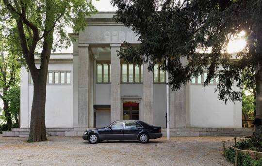
On the one hand, this car is a desirable object, vintage and expensive. In my family, you knew you had made it when you could afford a Mercedes-Benz. You could tell, when my parents bought their first Mercedes-Benz, they were full of pride. And they still drive the same car and feel the same way about it, although now it’s a rather old car.
On the other hand, you could also read the continuities of 20th century German history into this juxtaposition of car and pavilion. Because what is the link between the Nazi façade and the later car? You might answer this question with the seamless integration of Nazis in German politics and business and the financial gains of many German companies (including Daimler-Benz) during the Nazi period thanks to forced labor, expropriation, and simple opportunism. The juxtaposition places you, at least as a German, between guilt and pride, haunting memories and desire.
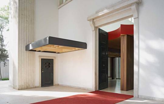
Adjacent to the left of the big front door of the German pavilion in Venice, the visitor was greeted by an elegant section of a roof jutting out above a much smaller door. It was a hint that the interior of the pavilion was taken over by another structure, a partial replica of the former Chancellor’s residence in the former capital of the country formerly known as West Germany. A somewhat nostalgic remnant of a bygone past, a country and political system that were fundamentally altered by the fall of the Berlin Wall and the reunification of Germany. It was the Germany I was born into, with Bonn being the capital until 1999 and the Chancellor’s residence – or Kanzlerbungalow (‘Chancellor’s bungalow’) – constantly in the news. As much as it was nostalgic, Lehnerer and Ciriacidis’ pavilion had an uncanny feeling to it. Inside and outside were suddenly called into question, different times collapsed into each other, with the democratic bungalow inserted into the Nazi pavilion. Or was the story told more complex than that, as with the car parked in front of the pavilion? The story was, for sure, one about architectural representation.
The Chancellor’s bungalow was built in 1964 by the architect Sep Ruf for Ludwig Erhard, the second Chancellor of West Germany. Erhard was the German politician who stood like no other for the ‘economic miracle’ of West Germany after WWII. As the Federal Minister of Economic Affairs under Chancellor Konrad Adenauer from 1949 until 1963, when he became Chancellor himself for three rather unlucky years, he promoted what he termed the social market economy and gained widespread popularity with this economic concept. Although Erhard worked for the German state as an economist during the war, he rejected Nazism and was in contact with members of German resistance groups. It seems fitting therefore that as Chancellor he hired the fellow Bavarian Sep Ruf to design the new Chancellors residence in Bonn. Ruf was known for his functional designs in the tradition of the Bauhaus and older modern architects, who had mostly emigrated during the 1930s, like Ludwig Mies van der Rohe. Ruf’s elegant bungalow in Bonn payed homage to designs of the Bauhaus and Mies in particular. The latter’s Barcelona Pavilion, the German Pavilion at the 1929 International Exposition in Barcelona, has often been mentioned as a reference.
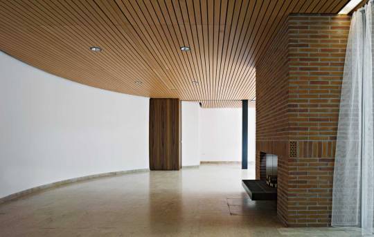
Dining room of the bungalow of the Chancellor in Bonn.
By 1964, Ruf had already worked for the federal government several times. Together with another modernist architect of the postwar period, Egon Eiermann, he had for example built the German pavilion for the world fair in Brussels in 1958. He was, thus, well informed about West Germany’s representational needs. The Chancellor’s bungalow spoke not only of the Bauhaus and the better, modern Germany that was supposed to be represented by buildings in its tradition like those of Ruf, Eiermann and others, but it also established a clear link to modern architecture internationally. Looking at the bungalow, some might be reminded of the famous Case Study Houses at the West Coast of the USA. After all, it was the declared aim of West German politicians to make the Federal Republic part of the Western political sphere (‘Westbindung’, or policy of the alignment with the West). I would guess that these two aspects, the tradition of a better, modern Germany and the alignment with the West, were first and foremost represented by Ruf’s bungalow in Bonn.

The second Chancellor of Germany, Ludwig Erhard.
The third Chancellor, Kurt Georg Kiesinger, took over from Ludwig Erhard in 1966. He was a former member of the NSDAP and disliked the Chancellor’s bungalow for its functional, ‘cold’ design. He had many things altered before he moved in and brought with him antique furniture pieces in stark contrast with Ruf’s modern architecture. Most of the other Chancellor’s after him agreed with Kiesinger’s view on their official residence. They were looking for something more comfortable and cosy (gemütlich). Under Chancellor Helmut Kohl the interiors had changed so fundamentally that it was hard to still see Ruf’s designs behind thick layers of carpet and bulky sofas and chairs. Not to speak of the new 1980s glittery lighting. Although partly preserved in the original building in Bonn, these alterations, additions and layers were not present in Venice.

Prince Philip, Queen Elizabeth II and the ex-Chancellor of Germany Helmut Kohl front of the bungalow of the Chancellor in Bonn.
It was a clearer picture or juxtaposition that Lehnerer and Ciriacidis drew. Only the brief blaze of fire in the Chancellor’s fireplace could have been something of a reminiscence to the other, the not-so-modern, not-so-open, cosy Germany that gathered around home-and-hearth. The Germany I grew up in. Just like the Mercedes-Benz, a fireplace was something quite desirable for the generation of my parents. You had to have one. And now, decades later, my parents even installed a new one. As if you couldn’t or wouldn’t want to live without it. Herman Miller’s Eames Collection that Erhard chose for his initial version of the bungalow at the River Rhine might have always been too expensive for most Germans, but they also represented a certain idea of Germany, like the whole bungalow an internationally oriented, better Germany – and not necessarily the real one. I wonder, does the real, and not the ideal, ever get represented? It might be an interesting task for a future German pavilion at the VAB.
The bungalow of the Chancellor in Bonn.
West Germany claimed the Bauhaus as its heritage since the 1950s, through the founding of the Bauhaus-Archiv in Darmstadt in 1960, countless exhibitions and books and buildings seemingly in its tradition (there were similar efforts in the GDR a little later). 2019, the year of the centenary of its founding, saw the Bauhaus at the height of its representational instrumentalization, it had become a major part of German cultural diplomacy. Yet, the Bauhaus has oscillated between national claims and International Style even before it was closed by the Nazis. This oscillating reception of the Bauhaus was crucial in making sure that the Bauhaus would continue to be productive until today. Looking back in 2020, the German Pavilion at the 14th VAB is also a vivid illustration of the complicated history of the Bauhaus and Germany.
***
VAB 06: Florian Strob

Florian Strob is an author and curator in the fields of architecture, literature and contemporary art. He holds a B.Sc. in Architecture from the Technical University in Berlin and a PhD in Medieval and Modern Languages from the University of Oxford. His main research interests are modern architecture, modern poetry and experimental prose, and the connections between built spaces and text. Florian currently works at the Bauhaus Dessau Foundation, where he curated the exhibit “Bauhaus Buildings Dessau: Originals retold”. For this, Dessau’s Bauhaus buildings, facades and interiors are on exhibit. They have been given a new and coherent narrative through an exclusive series of video clips which set historical images in motion using 2.5D animation. He also organized the international conference “Collecting Bauhaus” in December 2019. He is the head and curator for the Bauhaus residency programme 2020-2022, which invites artists and writers to live, work and exhibit in the historic Masters’ Houses in Dessau. The most recent exhibition in this series, “Gropius House || Fictional. Inge Mahn and Sujata Bhatt”, is on show until 20 September 2020. Most recently, Florian published “Bauhaus Dessau Architecture” (Hirmer 2019), including new photographs by Ostkreuz photographer Thomas Meyer. He is author, editor and contributor of several other books, including “Hiatus. Architekturen für die gebrauchte Stadt” (Birkhäuser 2017) and “Schreiben und Lesen im Zeichen des Todes. Zur späten Prosa von Nelly Sachs” (Winter 2016).
95 notes
·
View notes
Text
Ensuring That You Get Original Italian Marble
https://bhandarimarbleworld.com/ensuring-that-you-get-original-italian-marble/
Italian marble and granite are considered to be one of the finest building materials in the world. Getting Italian marble and granite countertops for your kitchen and the bathrooms is a guaranteed way to give them a luxurious and elegant look. However, not all marble is made equal. We have remained the premier Italian marble supplier in India for many years and we know what makes marble so great. Marble is extracted from quarries. Unlike other construction materials that can be manufactured anywhere in the world, the quality of marble varies based on where it comes from. Italian marble has long been a hallmark of quality simply because it is the highest quality marble possible.
That is why we only pick marble that comes straight from an Italian quarry. Another problem is that there are a lot of fake Italian products available on the market. Usually, you can tell when you have genuine Italian marble in your countertops because it has the touch of quality which other marble doesn’t. It also stands the test of time. Both these things can, however, only be verified after the countertops have been installed and used for some time, and by then it is too late to do anything about it.
If there are two materials that are as integral to a modern home as a kitchen island or a bathroom vanity, it’s stone and marble. They have never been far from homes, of course—just think about cave dwellings—but it seems like today’s necessities of open concept floor plans and natural light must be accompanied by these two features, too. We can’t particularly blame anyone for this fact, either: Marble looks good in just about any capacity, and stone can make almost all spaces more stylish.
But if you don’t have the cash for an oversized Calacatta island, or you’re still hopped up on the terrazzo trend, there are ways to incorporate pieces of marble or stone into your aesthetic on a DIY budget. No matter which ones you choose to try, the results are sure to make the most of a good thing.
What are Most Important Things about Marble & Granite
The most important thing to remember about marble and granite is that they are rocks. You cannot make marble and granite in a factory. This means that the marble and granite have an undeniable link to the land where they are extracted from and not all lands are made equal when it comes to rocks. Marble is found in many places in the world, but Italian marble has been considered the best for centuries due to its unbeatable quality and beauty. You cannot recreate the same marble and granite anywhere else in the world.
Why can you not recreate it?
Well, marble and granite are naturally formed over millions of years of tectonic activity. The only way to recreate natural marble that looks this good would be to literally move mountains and recreate the same conditions that made Italian marble stones. That is why the most luxurious places in the world insist on installing Italian marble for floors and countertops. They know that they cannot get the same quality and beauty from marble formed anywhere else in the world.
Talking About Marble Wall Tiles
Marble wall tiles are a class of their own. Almost every luxury level house or building you enter will have marble wall tiles. Some of the highest-rated hotels in the world advertise the fact that genuine marble was used in the construction of the rooms. If you are looking for Italian granite and marble wall tiles, you have come to the right place. We are based in Kishangarh and have been dealing with both Italian marble and granite for a long time. We know a lot about these tiles, so let us take you through four important things you need to keep in mind when it comes to the wall tiles.
Bhandari Marble World is a directory of the World’s top direct importers of the genuine Italian Marble & Granite in India. We cater to both small individual customers as well as large-volume customers such as wholesalers, distributors, retailers, builders, architects, interior designers, and more.
OUR AIM IS ONE COMPANY-ONE FAMILY
Knowledge, professionalism, and passion have guided the Bhandari family for 387 years toward innovative choices, in keeping with traditional values.
CREATIONS, RETAIL, COMMERCIAL, RESIDENTIAL, WORK-IN-PROGRESS
A highly qualified technical section devoted to design study, development, and carrying-out of projects.
PRODUCTION-MADE IN INDIA
Finest marble, granite, onyx, and stone transformed into true Italian taste and tradition.
STONE STUDIO AVAILABILITY
Let our Stone Studio’s extensive choice of materials inspire you.
While marble is quarried in many countries around the world including Greece, USA, India, Spain, Romania, China, Sweden, and even Germany, there is one country which is generally considered the home of the most high-grade and luxurious marble available – Italy. It’s certainly the country of origin of the most famous marble but what is it that makes Italian marble so highly-sought after? As one of the leading suppliers of this stunning natural stone, we felt obliged to give some insights on why Italian Marble is in such high demand in India.
Below are several reasons behind the popularity of this beautiful natural stone:
History:
Italian marble is steeped in heritage. It was used by esteemed Renaissance artists including Michelangelo and Donatello, who used marble-like Calacatta and Statuario to create some of the world’s most iconic works of art, including the statue of David. Italian marble has been proven to stand the test of time and has stood strong for centuries on many buildings around the world, used both internally and externally.
Heritage:
Another reason Italian marble is considered superior is due to the stone working heritage of the Italian people. They were pioneers in perfecting quarrying methods in ancient times, many of which are still used to this day. The Italian people are considered as purveyors of quality in many fields including fashion, cars, and natural stone like marble! They set high standards for quality control and are considered technical experts when it comes to cutting and carving natural stone.
Stone Quality:
Italian marble is practically peerless in the natural stone world when it comes to its durability, purity, and beauty. It’s synonymous with luxury, elegance, and sophistication and is seen as a symbol of status in residential and commercial buildings around the world.
So, what is the best type of Italian Marble?
Here at Bhandari Marble World in Kishangarh, many customers come to us and ask, “Which is the best kind of Italian marble?”. However, there are way too many variables involved to have a one size fits all answer to this question. It depends on how much traffic the area will receive, whether they’ll be exposed to spills or excessive heat, used indoors or outdoors, which room they will be used in.
Some of our most popular Italian marble in-store are Calacatta, Statuario, and Carrara marble. These stones are ideal for indoor applications and are commonly used as kitchen benchtops, splashback, and bathroom vanities. Much like all-natural stones, they should all be sealed appropriately and maintained with PH neutral detergents that are not abrasive to the surface of the stone. We delve in a little deeper below to find out the difference between each of these natural stones.
CARRARA MARBLE
This is the most common type of natural stone that is quarried in the region it is named after, Carrara in Italy. The background color tends to lean towards a grey or blue-grey finish with more fine, linear striations, and generally a softer and subdued look. Carrara is quarried in abundance and is, therefore, the cheapest material of the three and readily available in the Sydney market in the slab or cut to size tile format.
CALACATTA MARBLE
The rare and luxurious Calacatta stone is similarly quarried in the Carrara region of Italy, more specifically in the Apuan mountains. The stone has a lot more variation in color than the Carrara and is characterized by a pure white to a milky white background with dramatic large veins that range in color from gold to brown to grey. The stone has been quarried for centuries and has been featured in some of the world’s finest hotels, restaurants, and residential homes. There are many selections of Calacatta available in stock at Bhandari Marble and the prices vary greatly depending on the selection chosen.
STATUARIO MARBLE
Much like Calacatta & Carrara marble, Statuario is too quarried in the Carrara region of Italy. The stone has a bright white background and thin to thick grey bold veining so there are greater contrast and not much color variation in this stone. The material is similarly priced to Calacatta due to the lack of supply and extremely high demand. Whether you’re an architect, interior designer, luxury builder, or end-user, call Bhandari Marble or drop into our showroom today and we’ll happily talk through your needs to identify which type of Italian marble is right for your project.
India has long been the seat of glorious architecture and a refined lifestyle. The days of the royals may have been overtaken by the democratic ways of governance but life-style choices of many remain as regal as those good old days. The grandiosity of Indian architecture, its characteristic yet sometimes extravagant opulence in the form of embedded gold, mirrors, and precious jewels and gemstones in wall paintings of the palaces, as in the Amber Palace at Amer, in the state of Rajasthan, have an indelible influence over the world unanimously.
But even in palaces with no gemstone paintings to boast of, the intricate carvings are done in priceless marble, the exquisite Indian marble floorings steal the hearts of the beholder. Be it the Mandu’s Hoshang Shah’s Tomb that inspired the architecture of the Taj Mahal, or The Lake Palace of Udaipur or the lavish Marble Palace of Calcutta, the use of Indian marble has added to their beauty and glory.
But luxury is not all that there is to marble, is it?
The reasons why Indian marble is preferred as the best building material and serves as only the most obvious choice of flooring material are altogether different. Let us separate the gold beads from the sand and figure out the craze behind the usage of Italian marble:
1. Drinking from the Fountain of Youth: Ages Beautifully
Using marble for flooring and other beatific applications is like taking your dream spaces to the fountain of youth and make them not just drink from it but bathe in it. Marble ages beautifully provided you take good care of it. Time to time application of a coat of sealant ensures that the marble maintains its envy-evoking finish. This is undoubtedly a small price to pay for the splendor that you bring home.
2. Marble Always Pays its Debt: Durable
One of the main reasons why marble is preferred is because of its strength and durability that exceeds that of the tiles and other flooring options by a remarkable mark. Though tiles are consistently being improved to bear heavy traffic, their maintenance is more difficult than marble. They never can be carved into something spectacular, unlike marble with which numerous sculpting can be carved in the interiors, as it suits you.
3. Sparkles like Stars: Awesome Finish
The natural finish of Marble is well one of the reasons why we can’t resist their charm. Indian marble is best known for being pure without many variations and veins of mineral impurities running through the surface of the marble. When polished this creates for spaces that sparkle and twinkle from a distance and appear clean as a mirror when seen close by.
4. The Other Road: A Better Option
The market is flooding with newer, technologically enhanced materials that serve as convenient, cost-effective flooring solutions. But, even so, these solutions do not cost much less than the marble and don’t quite have the same durability or the finish and texture as does the nature-created marble. Marble is indeed the better option. For those who incline towards the luxurious side of life, Imported Marble is a fair option. Mesmerizing variants of Indian marble are also quite popular across the world.
5. Bright as a Summer Day: Wizardly White
The specialty of Italian Marble resides in the startling white of the natural stone. With little to no impurities, the white marble mined from various mines in Rajasthan and Madhya Pradesh, Bhandari marble brings you the best of white that brings elegance and chastity to your spaces and captures attention like no other. Available in six variants, one exceeding the quality of the other, these Italian Marble variants are here to set your dream spaces leagues apart.
Italian marble is the soul of beautiful architectural masterpieces across the country and the world. Their worth needs no more praising as their superior quality speaks for itself.
Natural stone is one of the best looks for the exterior of a home. It’s beautiful, luxurious, and it last for years and years. Some of the most notable homes and buildings have been constructed out of natural stone, and they stand the test of time. When choosing the exterior material of your home, it’s important to consider things like climate and the structure of your home – if it is able to support the weight of a stone exterior. But if it can, it is one material that will create a stunning appearance to your home. Most stone types can withstand just about any type of weather element it is exposed to, which only adds to its attractiveness.
The only thing standing in many homeowner’s ways when deciding on the type of exterior for their home is money. Natural stone can be quite a bit pricier than other types of exteriors, but the longevity and durability, along with the beauty that natural stone can offer, can be worth the price in the end. Here are seven different types of natural stone for your home you can choose from. After learning more about natural stones for your home’s exterior, you just may think twice before you agree to anything but stone.
1. QUARTZITE
Quartzite is one of the hardest natural stones and is known as a cleaved stone and offers a rustic type characteristic to the stone. It has a similar look and durability to marble but is different in many ways. One of the quartzite’s greatest qualities is the sparkle that it illuminates at its surface. It’s unique in its look and extremely durable so that you can count on it being as beautiful and in as great condition years down the road, as it was when it was first constructed.
2. TRAVERTINE
Travertine falls into the sedimentary rock category. It’s a type of limestone and develops, and is shaped primarily in natural hot springs. Travertine is known for its small cavities that form naturally, and it is these cavities that help to create this stone’s natural cream-colored tones with little flower-type patterns throughout. When travertine is used for construction purposes, such as on the exterior of homes, builders will often fill these little cavities with grout to help increase the stone’s durability, however, the cavities do make the stone susceptible to stains which may be a concern for some homeowners.
Even so, travertine is one of the most beautiful stones used in home construction, not only on the outside exterior and walkways but on the inside of homes as well. You’ll often see travertine tiled floors, counters, and more on the inside of homes. One reason travertine is favored for homes is the options it offers in colors. Travertine comes in a variety of hues, such as pink, orange, and gray. One thing to consider with this stone for the exterior is its inability to resist heat, making it a poor choice for cold climates.
3. LIMESTONE
Limestone is a great natural stone for using as an exterior stone for your home for many reasons. Limestone is a stone that will weather naturally over the years to give your home a beautifully unique look. Builders like using limestone for the exterior of homes due to its even texture and its ability to sculpt and tailor it easily to fit the look they want it to. As far as durability, Limestone will maintain its integrity for years and years. Despite its durability for the exterior of your home, one place you may want to avoid using it is in your kitchen. Limestone is not a stone to use where it will be put to use in a functional situation, like a kitchen counter. It is a porous stone, meaning it can scratch and stain easily.
5. GRANITE
Granite is one of the hardest natural stones ever found. The only stones known to be harder and more durable are diamonds and sapphires. Granite has the unmistakable flecked mineral colors with a swirled and spattered grainy appearance. It is often used on the exterior of buildings and homes due to its durability and ability to withstand time and age. It is about 20% quartz and can be made into large or small slabs, and can be left in its natural state or polished to a perfect, sleek look. For the exterior of a home, granite can be a smart natural stone to choose if you love the look of a speckled, natural-looking stone. The most popular colors of granite include brown, pink, and black.
6. MARBLE
Marble is one of the most luxurious and most beautiful natural stones known to man. It is also one of the most popular stones used in construction, for both the inside and outside of homes. Marble is commonly seen in homes as flooring, in the kitchen as countertops, and it is also used on the exterior portion of homes as well. When used on the outside of a home, you instantly think of a classy and expensive home. Marble’s smooth and polished texture requires special care when being laid for the exterior of a home, but the beauty and durability that it provides are unsurpassable. Marble is available in a wide array of colors and patterns, from brown to pink, purple, gray, brown, and it’s even found in marbled patterns of mixed hues.
7. SANDSTONE
Sandstone is a rock that develops from sand turning to a stone material hard enough to be used as a building material. The natural rock is a pleasure for builders to work with because of its ease to chisel and cut into just about any shape or size desired. It’s often used when a type of pattern in the exterior surface is desired. One of the most popular traits of this type of stone is its reflective nature. As the sun moves, it causes the surface of the stone to change colors which can create a beautiful look to your home’s exterior. Whatever color you’re looking for for your home’ exterior. Whatever color you’re looking for for your home’s exterior, you are sure to find it when you choose sandstone as your home’s exterior. Choose from white, pink, orange, yellow, and even purple hues.
Combine beauty with Design
When looking for the perfect stone, the first consideration is how it will look. The right stone defines the look of your building, living room, or bathroom. Choose the design, colors, and styles that you desire and gather that information to obtain the first step of your selection.
Durability, Stain and etching
For example, if you’re looking to buy a countertop for your kitchen, one of the main characteristics you might require is durability. In this case, we do not recommend soft finishes, like honed, meaning that the surface of the stone has been ground to a smooth, flat, consistent surface. If you wish to use marble on a well-used kitchen countertop, be sure to seal it properly to inhibit staining agents from being able to seep in. The more absorbent the tile or stone, the more likely it will stain if not sealed. On the other hand, etching is caused by acidic liquids coming in contact with acid-sensitive stones, that’s why Marble is rarely recommended for areas that are subjected to dangerous factors.
Porosity
Staining is linked to porosity—in other words, how much open space exists within the solid matrix of the stone. Thankfully, the high pressures that bind rocks into solid forms tend to squeeze away most of the pore spaces. But different stones have been subjected to different amounts of squeezing, and thus, porosity varies among stone types. Limestone, for instance, is the most absorbent stone due to its high porosity, so it’s not recommended for kitchen countertops, for example. Marble comes next. Granite is the least porous stone, making it the least absorbent and the most suitable for surfaces like countertops.
Hardness, Traffic, and Resistance
For flooring, the stone used needs to be resistant to dirt, to spilling and has to have a certain finish so that it can handle the traffic or usage that it will be subjected to. The softer the stone-marble for example, the more inappropriate it is to use in those areas. Each type of stone has different levels of hardness. Some types of limestones are not recommended to use on surfaces with a lot of traffic because it’s a soft stone. But, for example, a specific limestone can be harder than another. On the other hand, marble is harder than limestone, so it’s more appropriate for surfaces like flooring.
Weather
In some cases, the weather is also an important feature, especially for external cladding and external flooring, such as the building’s façade. When the externals of the buildings are vulnerable to weather conditions, for example, extremely cold, humidity, rain, extremely hot, etc you need to keep in mind the stone’s characteristics for the most suitable option. To make sure what type of stone is suitable, it’s recommended to take the defrost test into account, for example.
So, before going to look for the perfect stone, try and gather as much information on these topics as possible, depending on your project goal. In this way, it’s easier for you and for your suppliers to choose the right stone.
What type of finish should I use?
The surface of natural stone can have a variety of finishes. It is important to choose the right type of stone, depending on your project and the features mentioned above. Using different techniques and mechanical processes, natural stone can be adapted to interior and exterior applications.
For example, soft finishes like honed, flamed, and split, which is more smooth tend to absorb more. So you should avoid them on surfaces with a lot of traffic and in staining areas. This applies, especially to limestones and marbles. This factor also varies with the durability and the porosity of each stone. Each stone has its own characteristics so not all finishes are suitable for every stone. For instance, the flamed finish can only be used on hard stones.
For surfaces subject to other factors, such as the exterior part that is most exposed to erosion, for example, finishes like bush-hammered, honed, sandblasted, or brushed are recommended. The polished finish consists of brushing the slab with a range of brushes and the result is a slightly undulating surface. For this reason, it is suitable for surfaces like bathrooms and kitchen tops, because it doesn’t absorb as many impurities as other finishes.
Why Marble Stone is Great
The three keystones from which you’ll browse for your kitchen worktops are granite, marble, and quartz. Today, we want to sing the praises of marble stone for kitchen worktops. While each stone has its benefits for different kitchen designs and concepts, we will look at the times that marble is the top dog! Consumers often associate marble with traditional kitchen concepts. However, just take a quick look through the marble library and you’ll find varieties that work for modern and contemporary styles.
An Elegant Stone
There’s a reason that marble has been used for hundreds of years in grand homes, palaces, and temples. It possesses a timeless elegance which is truly striking. Why is this, though? Well, whether the variety of marble that you select is white or colored, the crystallization within the slab gives the stone a unique iridescence. Even if space is already bathed in natural light, this reflective stone widens the perspectives of a room. For darker or smaller kitchens, the brightness of marble stone makes space appear brighter and larger.
Beautiful Shapes
While some see the relative softness of marble against granite and quartz as a disadvantage, we see the benefits. By no means is marble a soft material, but as it is more porous than granite and quartz, it is easier to cut, form, and shape. So you’ll find that you have more options of kitchen worktop edging when you choose marble. Or perhaps your kitchen design features more ambitious shapes or angles than a standard square layout. As marble is so much more workable, it can be shaped to create perfectly fitting, and even artistic worktop features.
Practical Benefits
With such diversity of marble available, there is likely to be a stone within your price range. This is great in making it accessible. Whether a budget is extensive or limited, you can choose from local to exotic, and abundant to rare varieties of stone. Whichever range you choose, you will find that the surface will withstand daily pressures far better than many alternative materials. There’s a reason that ancient sculptures and monuments are fashioned from marble and have stood the test of time!
Colors and Patterns
Why is it, then, that marble forms in so many colors and patterns? It’s all to do with the minerals and sediments found in different parts of the world. In magnesium or silica-rich conditions, green varieties form. Then the quantity of clay, iron oxide, and silt combinations vary hues and veining. So every slab within every variety brings a distinctive look to your kitchen.
Tips on Marble Stone for Kitchen Worktops
Protection
Sealed marble is heat resistant. This makes it unbeatably cool to the touch – perfect if you like to bake! However, it is porous, so is not immune to damage from high temperatures. For this reason, ensure that you protect your marble with a pot stand or hot plate to take pans and dishes. Similarly, don’t chop food directly on the surface as it may scratch. A rustic butcher’s block can bring a great contrast to your marble
When You Do Business with Us, You Won’t Only Get the Best Price for The Most Luxurious Home Building Materials Like White Italian Marble and Granite, But You’ll Also Get the Most Caring and Professional Customer Service Throughout the Entire Process! We’ll Won’t Be Satisfied Until You’re Satisfied.
ADDED BY EXPERT AND EXPORT TEAM OF BHANDARI MARBLE WORLD KISHANGARH RAJASTHAN 305801.
1 note
·
View note
Text
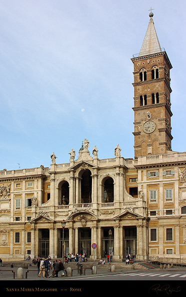
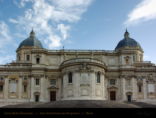
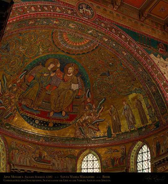
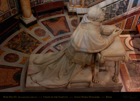
Santa Maria Maggiore
Within walking distance from the Colosseum, the Basilica of Santa Maria Maggiore is one of the first basilicas erected in Rome. The exterior of the church is filled with mosaics surrounded by baroque loggia and standing right behind the façade is the tallest Campanile in Rome, which is not baroque, but Romanesque (mostly). The entire exterior of the church is very much sculptural more than it is architectural which is not surprising at this point since everyone in Rome tended to mix all forms of create exceptional building programs. As you enter, you are already met with a darkly decorated ceiling inside the hallway that leads into the church. The interior of the church consists of three naves divided by two Ionian columns, a marble pavement, side chapels and one lavish gold ceiling. The mosaics are the most dynamic feature of the church and one can only imagine what the church must look during mass, especially with the coffered ceiling bouncing back light coming from the high windows. Going to the front of the basilica, you see a spectacular mosaic in the apse that depicts Jesus and Mary with the apostles, much smaller, in the background. But I think the most moving part of the basilica would have to be the papal altar beneath the apse because right beneath this altar is a statue of a figure, a pope, kneeling and praying to Christ. The church is a bit different because of the combination of art styles but its just as magnificent because of the scale of it, especially the nave at the center. It’s a sophisticated program made of simple elements from very different styles and periods of history that somehow come together to balance each other out instead of making the building look like a jumble of random designs.

2 notes
·
View notes
Text
Contact
Address: 493 Franklin St, Napa, CA 94559
Phone: 707-637-8059
Website URL:
http://www.dorisleslieblau.com
Category:
Rug Store
About US
Antique rugs are not just a great floor covering, but a real piece of history too. Every antique rug we sell has a story behind it. Learning about where your particular rug came from, the approximate year it was crafted, and other details can be a lot of fun. This also turns the rug into a great conversation piece in your home. We have antique rugs that come in a variety of different shapes and sizes, and each one is going to have a beautifully unique design that you will absolutely love.
Vintage rugs also come in a variety of styles that you can choose from. Vintage rugs were first made around 1920, and continued for many years. These rugs typically use very intricate weaving techniques, and offer truly breathtaking colors and patterns that help to set them apart from any other options you will see. If this is the type of design you are looking for, you won’t find a better selection anywhere in Napa, CA
At Doris Leslie Blau, we have an enduring commitment to offering our clientele a diverse selection of the highest quality antique carpets and exclusive custom designed rugs. We have served as purveyors and trusted advisors to designers for over 45 years. We pride ourselves on bridging the gap between art, design and architecture by making rugs a key element of interior design through our quest for superior quality, while providing the highest standards of service.
Related Searches
Moroccan rug, modern rugs, blue rug, antique rugs, vintage rugs, oushak rugs, contemporary rugs, square rugs, mid century modern rugs, persian carpet, art deco rug, indian rugs, scandinavian rugs, tabriz rug, antique oriental rugs, oversized area rugs, khotan, extra large rugs, Napa, CA.
Additional Details
Hours: Mon-Sat 9 a.m – 5 p.m
Payment Method: Cash, check, all cc.
Social Profiles
https://www.facebook.com/Antique-Vintage-Rugs-by-Doris-Leslie-Blau-457180874854768
https://twitter.com/antique_by
https://www.pinterest.com/vintageblauca/
https://www.instagram.com/vintageblauca/
GMB Listing
https://goo.gl/maps/iwQ2vcKAFXigEk296
1 note
·
View note
Note
Why are so many mormon temples in old Gothic architecture?
I don’t actually think there are any temples, much less many, built in the Gothic style of architecture? like, some huge parts of Gothic architecture are the immensity of the interior space (those vaulted ceilings!), the interplay of light you see in stained glass, and the intricacy and dizzying detail seen in the gargoyles and carvings of saints:

Mormon temples don’t really do this! Indeed a large number of them, built from the same basic blueprint during the 1990s, follow what’s maybe the least? Gothic design possible:

(this is Anchorage, Alaska, by the way)
When you talk about “Gothic” Mormon temples, I have to assume you’re talking about the four temples built in Utah during the nineteenth century: St. George, Logan, Manti, and especially Salt Lake:

St. George doesn’t look Gothic; it looks like you stuck some medieval ramparts on the roof of a New England colonial church. Those ramparts and the slight buttresses that descend from them are kind of like the contemporaneous Gothic Revival style, but only in the same way that Star Wars is kind of like Star Trek because they both happen in space and have “star” in the title–if you squint, some of the same elements are there, but they’re really not used in a way that fits the Neo-Gothic style.

Logan is more explicitly medieval-esque: it’s got those rook turrets, and the revealed stone (not the architect’s original intent!) leaves it looking more like a castle. The ramparts also look more elaborate than St. George’s, although I’m not entirely sure that’s not another accident of the paint wearing off. But it’s still too blocky and not nearly pointy enough to count as Gothic! That might be different if the towers ended in spires and not barn toppers, but they don’t.

Manti is really close in design to Logan, but it comes out looking much more European. That’s not because it’s Gothic Revival; instead, I’d pin it on the more understated side of the Baroque Revival which is basically to say: it looks like a French chateau.

If you were going to pin down any Mormon temple as being Gothic or Gothic Revival, your best option would be Salt Lake. If you made that case, you’d have the Wikipedia page on Gothic Revival architecture agreeing with you, which isn’t nothing. But look at literally every other example of the Neo-Gothic style on that wiki page: they’re all a lot more complicated and intricate than the straight-forward, bold, iconic profile the Salt Lake Temple cuts. It’s got the spires you see in Gothic architecture, but much more square than usual. Gothic cathedrals want to dazzle you, but this temple just wants to awe you; it’s playing a different game.
Now’s a good time to talk about interiors:


Almost all of the space in a Gothic cathedral is taken up by one giant room in the shape of a cross. The largest section of this room, the nave, is where the laypeople sit to watch the priest at the altar placed in the crossing; the choir sits behind there. The only meaningful subdivisions of this giant liturgical space are the smaller chapels often stuffed along the walls of the nave and in the transepts, and even they’re still contained in this one big room.

Contrast that with the way the interior of the Salt Lake Temple is set up, as seen in this cutaway model. You don’t walk in and get struck by the immensity of one giant space. Instead, rooms required for each element of the ordinances performed in the temple are kind of just crammed wherever they’ll fit; the only controlling idea behind the use of space is that each of the successive endowment rooms is placed higher than the next. The only large room in the temple is the top-floor assembly hall, which is more a vestigial element from the pre-endowment plans for Kirtland and Nauvoo than an essential part of the building. Gothic cathedrals are built for large, public liturgy; temples are built for smaller, more private liturgy. (It’s also worth noting here that the interior decor of the Salt Lake Temple is not mimicking Gothic Revival either; in the places where it’s not just murals, it’s much more imitative of Rococo).
So, if no Mormon temples are really Gothic, what are they? That’s a hard question because all of them really are architectural mutts (and I mean that in the best possible way). Truman Angell, the architect behind three of these temples (he didn’t do Manti), did go on a mission to Europe to review architecture (including Gothic and Gothic Revival buildings) but he “was generally neither very impressed by nor very interested in the great buildings of Britain and France…Angell’s taste in architecture seems to have been firmly set in favor of American simplicity,” a fact that’s reflected in the way his temples mute and assimilate their European elements into an eclectic, simple, and unique style. They’re not really classifiable as any one thing.
(special thanks to @justthatspiffy, who’s taken more than the one semester and couple hundred wiki crawls that make up the sum total of my art history knowledge, and who was invaluable in hashing out the architecture terminology so I didn’t make an entire fool out of myself with it)
80 notes
·
View notes
Text
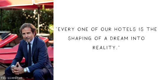
Independent Minds: Pau Guardans, Único Hotels
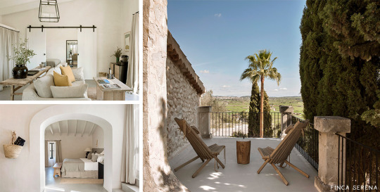
Born and bred in Barcelona, the rich cultural heritage of the Catalan capital runs in the blood of Pau Guardans, owner of Único Hotels. With a penchant for the Art Deco era, Guardans has carefully cultivated his own Spanish empire of reimagined early 20th century buildings in Barcelona and Madrid, which have been elegantly modernised whilst keeping the glamour of the roaring twenties very much alive. Taking a more serene step into Balearic island life with his latest venture in Mallorca, the Único Hotels portfolio is proving to be just as panoramic as its hotels’ views.

From Grand Hotel Central in the arty El Born district of Barcelona, The Principal Madrid Hotel on the edge of fashionable Gran Vía, and Hotel Único Madrid taking prime position in the prestigious Salamanca district, to the white-washed walls of Finca Serena in the bucolic Mallorcan countryside, Guardans has not only selected some of the most sought-after Spanish destinations, but made his hotels landmarks in their own right.
Neoclassical columns, sweeping staircases, and marble mosaic floors sit beside contemporary, cosmopolitan design details to create the signature Único urban grandeur. Paring this back slightly to reflect the rustic simplicity of rural Mallorca, the natural fabrics and neutral interiors of Finca Serena still bear the effortless style and sophistication inherent in all Único properties.
What does being ‘Independently Minded’ as an hotel owner mean to you?

Luxury is defined in many different ways: attention to detail, things being done well, and of course, looking after our guests in ways that are unique and inimitable. Each hotel and every destination has unique characteristics and experiences that can be adapted to fit guests’ needs. Because of this, we shy away from standardisation and one size fits all, and instead offer a management style that creates bespoke hotel experiences for each individual guest.
What was the inspiration behind your hotels, and where do you continue to find sources of inspiration?
Every one of our hotels is the shaping of a dream into reality. Behind every project is imagination, enthusiasm, passion and a deep desire to share our own experiences with our guests: a passion for travel, the discovery of new things and a love of beauty.
How do you think your hotels stand apart from other boutique hotels?
A hotel should be faithful to its personality. The identity it is given by its location and architecture, its history and the local community, ultimately shapes its destiny. This combination, if you nurture and care for it, is inimitable and above all, completely authentic.
If you only had 24 hours to get a taste for the Único experience, what would you recommend a guest must do?
Get to know the team at the hotel. Discover the immediate neighbourhood. Seek the things that are authentic to place. A hotel is a doorway into a world of experiences specific to that destination. Everything should become a memory you will cherish forever: the food, the cocktails, well-being and of course, exceptional service and décor.
How would you describe your own perfect luxury experience?
Every day I become more frustrated with pretension, artifice and the homogenisation of everything. I place most value in discovering something artistic, simple but well made (it doesn’t have to be perfect, but it should be beautiful) and in honouring the person that made it. For me, this is ‘authentic luxury’.
Do you have a vision for the future of your hotels?
Every day can be a new experience. Our passion for this never rests, so we are able to offer our guests new possibilities every day. Just as the seasons change, so too do our tastes and expectations. The only constant for us is to maintain excellence throughout.
The post Independent Minds: Pau Guardans, Único Hotels appeared first on Small Luxury Hotels.
from Small Luxury Hotels https://ift.tt/2JkRcVT
Publish First on
0 notes
Text
Making Minimalism Functional in Web Design

Today, great design isn’t just about conveying the right amount of information in a certain number of pages.
There’s more to creating the perfect website than experimenting with visuals and sound. Designers need to think carefully about how each element of their site impacts the overall user experience.
After all, with billions of websites available to explore, it takes something truly immersive to convince your client’s audience that they should stay on their pages. The more convenient and attractive your websites are, the more likely it is that visitors will want to stick around.
Minimalism, one of the more popular styles of web design from the last few years, can sometimes assist designers in making attractive and effective websites more functional.
The less clutter and confusion there is on a page, the easier it is to navigate.
So, how do you embrace the benefits of functional minimalism?
Understanding Functional Minimalism
Many webs designers are convinced that minimalism is all about aesthetics.
They see a website like Hugeinc.com and assume that the minimalist appearance is all about making the website as attractive as possible.

However, the underlying ideas of minimalism in web design go much deeper than this. The history of minimalist design begins with Japanese culture. Japan has long focused on balancing simplicity and beauty with its architecture, interior design, and even graphic design. In the Western world, minimalism got its day in the sun in the web design environment, after customers endured years of cluttered and complicated web pages with difficult navigation, overwhelming information and clashing graphics.
Designers began to experiment with the idea that less really could be more — particularly when it came to the digital landscape.
The Functional Rules of Minimalist Web Design
For a while, minimalism was the most popular style for a website. During 2018, in particular, minimalist web design soared to the top of the designer demand list, as companies fell in love with a combination of white space, simple navigation and bold text.
While now, there are other design trends stepping into the industry, designers can still benefit from exploring some of the essential rules of functional minimalism. After all, visual complexity has been proven to damage a person’s perception of a website.
Additionally, a study conducted by the EyeQuant group found that a clean and simple design can lead to a lower bounce rate. Minimalism gives viewers less to contend with on a page, which can allow for a simpler and more straightforward experience. Additionally, a clean website can also drive additional benefits, including faster loading times, better responsivity between screen sizes and more.
Because you’re only using a few images and well-spaced text, you can even experiment with different strategies, like graphics and dynamic fonts. Look at the Manuel Rueda website, for instance, it’s a great example of how a minimalist design can be brimming with activity.

So, how can any designer use the principles of functional minimalism?
1. Focus on the Essentials
First, just like when designing a landing page, designers need to ensure that they’re concentrating only on the elements in the page that really need to be there.
This means removing anything on the website that doesn’t support the end-goals of the specific page that the viewer is using. Any pictures, background noise, buttons, or even navigation features that aren’t going to support the initial experience that the visitor needs, must go.
Think about what’s going to distract your visitors from the things that are important and concentrate on giving everything a purpose. For instance, the Plus63.org website instantly introduces the visitors to the purpose of the website, then allows users to scroll down to get more information. The data is spread clearly through the home page, pulling the viewer into a story.

2. Embrace the Positives of Negative Space
Negative space is one of the fundamental components of good minimalist web design.
Every part of a good website doesn’t need to be filled with noise to make a difference. White, or negative space can help to give your viewer the room they need to fully understand the experience that they’re getting.
From a functional perspective, it’s the difference between placing someone in an overflowing storage container and asking them to find what they need or placing them in a room where items are carefully spaced out, labelled, and waiting for discovery.
The Hatchinc.co website uses negative space to ensure that information is easy to consume. You can find the different pages of the site easily, the social media buttons, and the newsletter subscription tool. Plus, you get a chance to see some of the work behind the site.

3. Make it Obvious
One of the biggest problems that consumers have encountered in recent years, is the concept of “choice overload”.
Whether you’re in a store, or on a website, you’re never sure what to do first. Do you check out the blog posts on the site to learn more about the authority of the company? Do you visit the “About” page, to see where the brand come from? Do you head to their product pages?
As a designer, functional minimalism can help you to make it obvious what your audience should do next. As soon as you arrive on the AYR.com website, you’re not overwhelmed with choice. You can either head to your bag, “shop now”, or check the menu.

Since the “Shop Now” CTA is the biggest and most compelling, the chances are that most visitors will click that first, increasing the company’s chance of conversions.
4. Simplify the Navigation (But Don’t Hide It)
The AYR.com example above brings us to another concept of functional minimalism.
While minimalism and simplicity aren’t always the same thing, they should go hand-in-hand. When you’re designing for functional minimalism, you should be concentrating on helping visitors to accomplish tasks as quickly and easily as possible, without distraction.
That means that rather than overwhelming your audience with a huge selection of pages that they can visit at the top or side of the screen, it may be worth looking into simpler navigation options. A single menu icon that expands into a full list of items remains a popular design choice – particularly in the era of mobile web design.
For instance, look at the simple menu on newvision-opticien.com.

With this basic approach, designers can ensure that visitors are more likely to click through to the pages that their clients want their customers to visit. They can still find what they need in the menu, but it’s not taking up space on the page, or distracting them.
5. Set Great Expectations with the Top of the Screen
Functional minimalism can also help today’s designers to more quickly capture the attention of their visitors from the moment they click into a website.
The content that’s visible at the top of the page for your visitors is what will encourage them to take the next step in their online experience. Make sure that you’re providing something that keeps your audience interested and gives them the information they need.
That way, you’ll lower the risk of high bounce rates for your clients, while also taking advantage of minimalism’s ability to deliver quick access to information for your audience.
At the top of the page, the Kerem.co website instantly introduces the visitor into what the website is all about, and what they should do next.

You can even deliver more information in one chunk at the top of the page, without cluttering the environment, by using good UI animation.
Consider implementing a slideshow of pictures that flip from one image to the next, or a font section that dynamically changes as your audience has chance to read each sentence.
6. Use Functional Minimalism in the Right Spaces
Remember, functional minimalism isn’t just for home pages.
Depending on what you want to accomplish for your client, you could also embed the components of minimalism into landing pages, portfolios, and squeeze pages too.
After all, when there’s less clutter and confusion on a page to distract a potential audience, there’s a greater chance that your visitors will scroll to the bottom of the page and complete a conversion. For instance, look at how simple and attractive the Muzzleapp.com landing page is.

The page provides useful information and tells customers exactly what they need to do next. There’s no confusion, no complexity, and nothing to hold visitors back.
Just be careful. While functional minimalism can be very useful, it won’t be right for every website. A lack of elements can be harmful to websites that rely heavily on content. That’s because low information density will force your user to scroll excessively for the content that they need. Using functional minimalism correctly requires a careful evaluation of where this technique will be the most suitable.
Minimalism Can be Functional
A minimalist design isn’t just an aesthetic choice. The right aspects of minimalism can simplify interfaces on the web by eliminating unnecessary elements and reducing content that doesn’t support an end goal.
The key is to ensure that you’re focusing on a combination of aesthetics and usability when creating the right design. An easy-to-navigate and beautiful website can be a powerful tool for any business.
Source
from Webdesigner Depot https://ift.tt/3mkFZ63
from Blogger https://ift.tt/3oes0jB
0 notes
Text
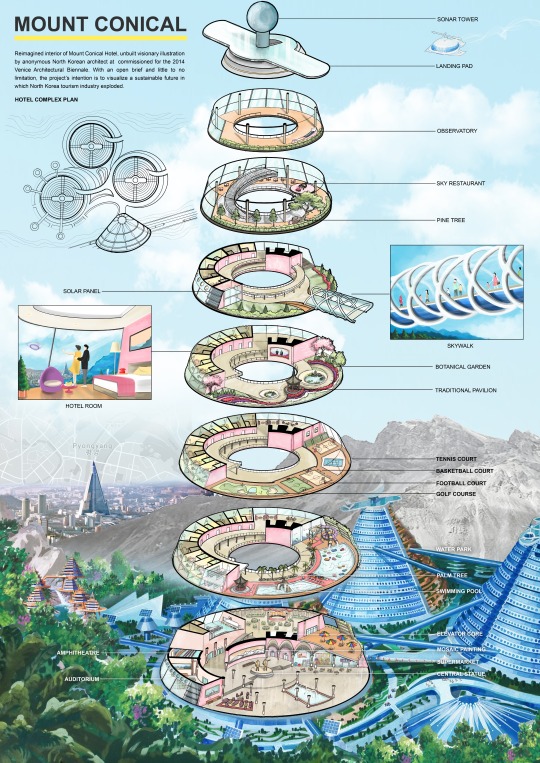
Meta-Modernist Architecture
I begin the project with a case study of a visionary drawing produced by an anonymous North Korean architect of the Mt. Conical hotel which was produced as a one-off and its interior was never drawn.
Taking inspiration from a real unfinished North Korean project, the Ryugyong Hotel located in Pyongyang that was meant to become the country’s greatest social condensing space that would come to represent their sense of power, historical culture and technological advancement.
I re-imagined a new interior for the Mt. Conical hotel by taking inspiration from different existing North Korean public spaces and combined them into one single building and illustrate the new design in the similar visual aesthetic.
One technique that North Korean architects like to use as a way to preserve their historical culture among their modern architecture rather clearly is the inclusion of a small pavilion in traditional Korean style that is usually inaccessible and way too small to access which I ensure to include.

Close-up illustration of the sky tunnel
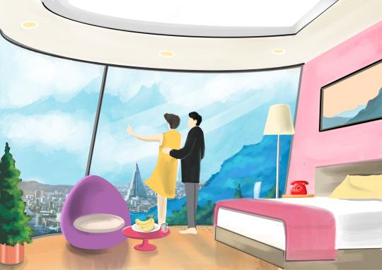
Interior illustration of the hotel room
Moving forward with this project, I decided to look into local contemporary issues in which I could adapt the previously mentioned concept of social condensation and the imitation of the pavilion which I found to be interesting and find ways in which I could adapt and form my own project.
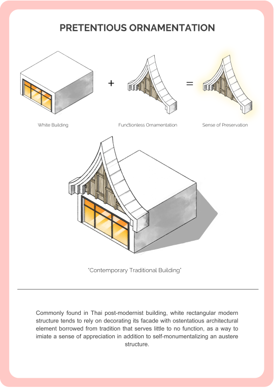
Skeuomorphism is the term used to describe the practice of creating an imitation of an object that is copied or borrowed from another context and in most cases, this imitation provides no practical function other than creating a visual familiarity.
Skeuomorphism also exists within the world of Thai contemporary architecture typically in the form of a physical imitation or adaptation of traditional architectural elements that is borrowed from history. While in some cases, this architectural practice is one way of preserving valuable historical architecture, the issue arises when skeuomorphism becomes simply a practice of copying the appearance of the original as a way to mask and monumentalize an austere box building that lies behind without providing any additional benefit other than being decorative.


So I decided to write a Manifesto about the Thai Metamodernist Architecture, simply on the spectrum, the Functional and Anti-decorative modernist would be on the left and the Decorative post-modernist would be on the right. And since I believe that the decorative are also important, I decided to challenge the question of
“How could we bring back traditional architectural elements but redesign them so that they can be functional and relevant to our contemporary lifestyle other than being just decorative while maintaining a recognizable design language.”
The Metamodernist Architecture would exists in the middle of the spectrum.


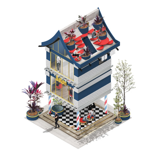
Beginning the design, I decided to first look into the Thai traditional architecture and extracted them into 3 main parts being the Pitched roof (the Head), the Living Unit (the Body) and the Stilts (the Legs).
And look into ways I could redesign them so that they become functional. Beginning with the pitched roof, I explore the different ways I could use its sloping quality and transform them into usable space. Which I developed them into these early sketches

Before I further develop those sketches, I question myself this, “What would be the reason for the existence of this architecture apart from providing space for someone to live and use to space, So I think it would be interesting that these Thai Metamodernist building, the functional yet decorate and preservative architecture could also stand as a symbol in contrast with the existing modernist and postmodernist social condensing architecture within Thailand.
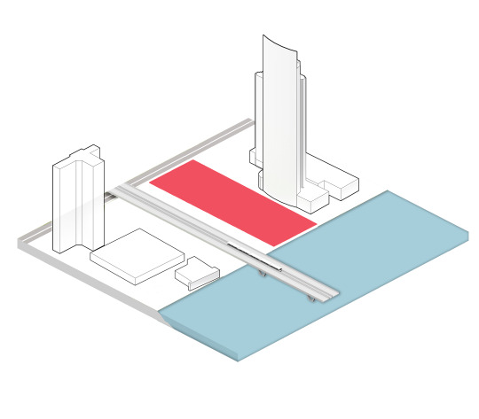
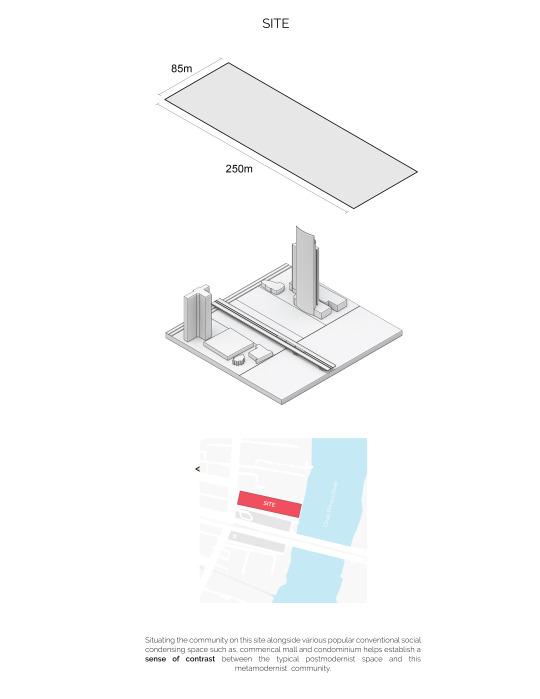
And the place that is most abundant with these architecture is along Chao Phraya river of Bangkok, ranging from modernist high-rise condominium and public commercial mall, these are all conventional social condensing spaces that are full of Skeuomorphism architecture that I mentioned earlier.
So I want to establish my project as a social condensing community (relink back to the topic extracted from the North Korean project) that will establish an ironic contrast between those that exist near it. So I decided to choose this particular site along the Chao Phraya river.

Developing further from those sketches, I look into ways I could combine them into a building. And decide to create a basic catalogue that follows the same extraction of the roof, the living unit and, the stilts. That the resident of my community could choose from.
So then I need to develop a building protocol that would restrict and govern the development of each building on the site in order to establish some kind of uniformity and equality as well.

The building protocol basically determines that each resident is given a 9x9m plot of land and they could only occupy 30 PERCENT of the site as a building while they could modify the remaining land however they want. Stilts on the ground floor and the pitched roof will ensure a consistent design language throughout the community. Each resident is given the freedom to choose the program of their building.


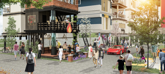
The goal of this strict building protocol is to create a social condensing space that makes space very limited and sought after which in turns would allow the creation of businesses that would potentially fulfill those needs. For instance, given the small plot, if one would not want to sacrifice their yard, or part of their ground space for a parking space, then they would need to rely on other businesses within the site like a hydraulic parking building for example.

In the case of future development, I also need to create a development protocol that would govern changes through time. So if a building were to be built higher, the pitched roof cannot be demolished while its function can change. If buildings were to merge, at equal height the pitched roof can also be merged providing larger functional space.

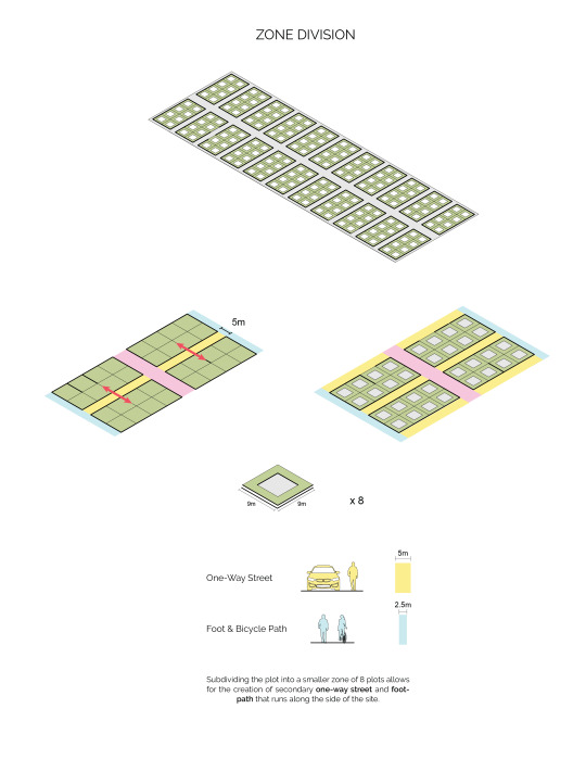
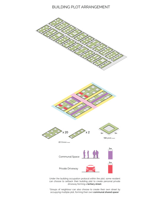
Zooming out I also create a site protocol that would determine how each plot would populate the site. After dividing the site to provide spaces for two-way street, a secondary one-way street and, foot-path. This division would equate to about 168 plots on the site with a total of 22 zones each containing 8 plots.
And as you can see highlighted in red, given the building protocol, residents can choose to transform their ground floor into a private driveway which creates a tertiary personal street. In some cases, each zone can also decide to collectively setback their building in a way that would create their own shared street.
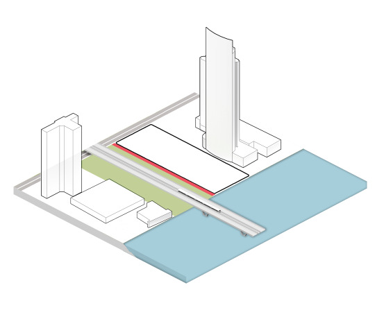
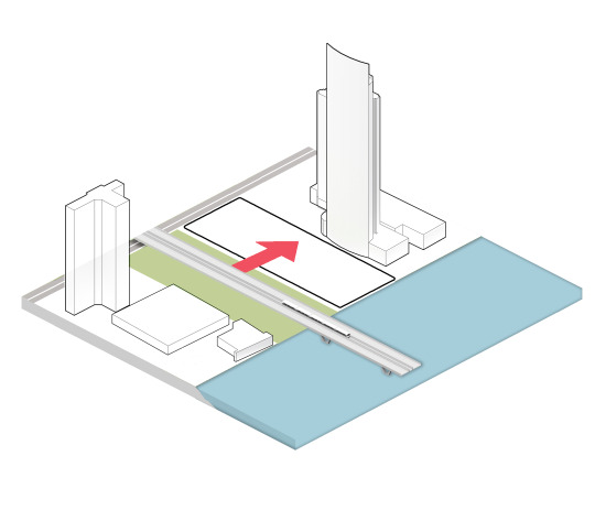
Lastly in order to establish an urban relationship, the site is located next a park that is divided with a small walled alleyway so I decided to form a park continuation on to the site which will be beneficial for businesses in the community.


0 notes
Photo


Three berries, Ten centuries: While I was eating local and organic blackberries, I was astonished by the amount of color they release in different shades. If there’s one natural pigment that has the richest color on earth, it should be a blackberry. I went old fashion and classic as berries have long story in the English history, I was inspired by Victorian dresses in there massive volumes and various colors. It was a pure British illustration.Nine is after eight:Following up with the same gallery experience, I encountered a different emerging art, it was the first time I was introduced to tape art. In this type of art, the main tools are tapes and a sharp edges. I was attracted by this art not only because its novelty but also for its green and eco-friendly impact. I support all activities that lead to the enhancement of standards of living, when arts and social responsibility are combined, what more can you ask for ? Here’s a trough back post on the first sketch project I ever made. I started a year ago and considered it seriously in February 2017.
The idea behind the project is to bring the inspirations acquainted into the world of fashion in the form of illustrations. Here is where the project got the Diary part, it is the personal and motivating events that breaks mundane routine and gives meaning to life. A lot of the original inspiration sources were ordinary objects that are encountered on a daily basis, but it is all about that sudden moments when their hidden beauty is realized.
I set another goal too, I wanted to practice sketching and illustrating while I was carried away in my study. The influence of the university was quite obvious, mainly it was the reason behind looking for beauty and vitality in boring things. I believe that the harder the pressure, the more creative a person can be, as it is the only way of expressing inner thoughts ans escaping realty in a productive manner. I have provided lively pictures and color palettes for each design on my Instagram account when doing the project @officialdesignbm and make sure you visit the hashtag on the photos.
BM Sketch Diary has been conducted in 4 months and 16 sketches were achieved in its lifetime. this give an average of a sketch a week, which might seem reasonable for many, a massive achievement for others.
Before going through the story behind each illustration, I just realized how accurate my memory is. who said diaries should be written on papers! they can take the best form their creator would like them to be, a story, a sketch, a quote or even a single symbol!
Starting with the first sketch- Robe dancing robe:
In the outdoor gallery at KSU I came across a marvelous painting by one of the Art college students. mainly the blue colored background was the attraction sign for me, in the second glance I noticed a couple of performers presenting their Robe Dancing play. the softness and silkiness of the scene are the prominent elements of the painting and therefore my design.

The second, Armani couldn’t wait longer:
It was my first go in reading an article in French. Since I am interested in fashion, I came across an interview report by a French magazine hosting my design idol Armani and talking about the new property in Paris. To tell the truth, I didn’t get the most of the report but I got the sense of Armani’s attitude towards Paris city and its inhabitants. Since Armani is famous for his tailored jacket designs, I knew that this is going to be the core element. the other touches were inspired by the details of the interior design of the property as well as Armani’s description of Parisian women in red shoes reported in the article.

The challenge of the third:
This dress summarizes my night out with a friend of mine (who is an artist). sitting around in a cafe is just not our thing, on that day, we came up with a fun game where we scrolled our Pinterest pages and chose a picture randomly to be our subject of sketch. It happened to be an interior design photo for a pink room with hexagons all around, both of us went to the modern and architectural side instead of the rosy and girly aspect. check my friend’s account @badoor_sab on Instagram.

Art is LITERALLY everywhere, fourth sketch:
At very late night and under creepy lights, I was playing with my headset wires. I kept wrapping them around and around until I made a spaceship-like folds, the neon ombre reflected by the lights on the white wire and gave the shape a more astronomy vibe. I personally love this design as it allowed me to express who I am as a designer, under no limitations nor expectations.

The fifth, the trolls feast:
After I watched Trolls by Dreamworks, I could say it changed my life forever!
The amount of energy, optimism, music and colors were powerful enough to switch sadness to infinite happiness. Actually I watched Trolls 3 Times in English and once in French, I just couldn't get enough of it. Therefore, doing only one sketch or project can’t be satisfying, so I made an illustration for this project and two independent projects as well.

The sixth is for my nephew:
My nephew plays a big role in my life, he enables me to see the world from a child’s perspective. On one day, he was wearing a country-style jacket in white, brown and red with white fur. He hanged it against my father’s clothes, which made the size contrast appears drastic and interesting. I attended an equestrienne event in the same week, I got the country vibes going for a few days until I decided to make it the inspiration of that week’s sketch. The colors were obtained from my nephew’s jacket and the design silhouette has a horse riding element.

The futuristic seventh generation:
Walking down the corridors of my university, and looking down to the floor, I looked eagerly for the first time at the repetitive patterns of the tiles on the ground telling myself how ignorant I was. I believe the lightening on that day made all the difference and enhanced the texture of the gray blocks. After doing a couple of “wearable” outfits in the diary, I decided to go Avant-garde this time. I used the floor print to create texture and translate the patterns into pleats to give it the futuristic spirit, whereas I kept the bottom safe with a flowy movement.

The eighth art:
While visiting an art gallery, I came across an artist that has a mind blowing concept. He was an abstract artist who transforms traditional camel flock into super contemporary scenery. I loved his contrast idea and contrast colors, so I dedicated this sketch as a contribution of his work. check his work at @fahad.alnaymah

Nine is after eight:
Following up with the same gallery experience, I encountered a different emerging art, it was the first time I was introduced to tape art. In this type of art, the main tools are tapes and a sharp edges. I was attracted by this art not only because its novelty but also for its green and eco-friendly impact. I support all activities that lead to the enhancement of standards of living, when arts and social responsibility are combined, what more can you ask for ?

Three berries, Ten centuries:
While I was eating local and organic blackberries, I was astonished by the amount of color they release in different shades. If there’s one natural pigment that has the richest color on earth, it should be a blackberry. I went old fashion and classic as berries have long story in the English history, I was inspired by Victorian dresses in there massive volumes and various colors. It was a pure British illustration.
coming up is the rest of the designs, review of the project and a hint of the next one.
#fashion#illustration#design#art#armani#future#berry#british#french#paris#project#diary#BM_sketch_diary
1 note
·
View note
Text

We are in awe by the latest developments at ANA (All Nippon Airways). The airline has just announced its collaboration with famed architect Kengo Kuma and leading British designers Acumen to roll out a total of twelve completely redesigned Boeing 777-300ER aircraft in time for the Tokyo 2020 games.
youtube
The first redesigned (premium-heavy) aircraft will serve the Tokyo/Haneda-London route (NH211/NH212) starting from August 2 and over the course of 2 months becoming a daily feature on the city pair.

The five-year project has seen Kuma refine the design and colour palette to be reflective of a modern Japan, however, the main design architecture was brought to life by Acumen, and the cross-continental approach has delivered a truly impressive product which raises the bar, especially in the business class cabin. The entire ANA customer and brand experience has been looked at, including the design of all the seating, galley entrance areas, social spaces and cabin interior design across all four cabin classes.

“Our partnerships with Mr. Kuma and Acumen illustrate that ANA has sought out the input of the most influential voices in the design community for these innovative new cabin designs,” said Hideki Kunugi, Executive Vice President of ANA.

“In 2010, we were the first in Japan to introduce the full flat seat with all aisle access and in order for ANA to continue to lead and set the global standard for comfort and convenience, we knew that it would be necessary to integrate the latest insights from design professionals as we sought to redesign the flight experience and elevate every aspect of travel for our passengers.”
Introducing “The Suite” First Class Cabin

Eagle eyed avgeeks will notice these new First Class seats aren’t actually new, in fact, the same seat is available on ANA’s flying Honu’s. However, the entire design palette of the 777 now blends seamlessly and seems to make more sense visually here than on the Hawaiian inspired A380.

Designed with impeccable attention to detail, The Suite has been influenced by luxury Japanese hotels (there is a hint of AmanTokyo here) and is the most spacious fully enclosed seating ever seen on an ANA aircraft, and with only 8 seats, this is an intimate and perfectly formed cabin.

While still inherently ‘boxy’ this reflects Japanese clean utilitarian design. What really stands out though are the luxury dark wood veneers, the addition of privacy-enhancing doors and a MASSIVE 43 inch monitor that is the world’s first 4K personal monitor on a commercial airliner.
“The Room” Business Class Seat

At the heart of ANA’s new product investment is a brand new seat design for Business Class called THE Room which is modelled on the Safran Fusio seat, in fact ANA is the launch carrier of this seat model.

Inspired by modern, multifunctional Japanese living spaces, The Room offers for the first time flexible doors for personal privacy that can also be adjusted to share the space with fellow travel companions – from dining together with the family to conducting meetings with colleagues.

New to ANA, The Room is a forward-rear facing seat concept, offering a revolutionary change in space and comfort for ANA Business Class customers. Similar in approach to the earlier incarnation of the SIA seat, the product offers one of the widest Business Class seating environments in the world – with a wide sofa which is double the width to previous Business Class seating.

The whole design places emphasis on minimisation and de-cluttering, with discrete areas for all personal belongings, and deep blue accent hues precisely placed inside each compartment.

The seat has a keen residential feel to it, thanks to the warm finishes that Kengo Kuma has introduced including three different wood finishes inspired by modern Japanese homes – Rosewood, Light Japanese Ash and Dark Japanese Ash.
New Premium Economy and Economy Class Seat

Although the Business Class cabin takes up much of the aircraft, there is still a premium economy cabin too, which is small and intimate, but no less impressive. While the seats aren’t different, to celebrate the rich and magnificent history of Japan, the new Premium Economy and Economy Class upholstery has been redesigned with Japanese patterns which tell a story known as “The Journey”

Traditional prints include tatami mat pattern which represents a Japanese welcome, and an arrow design taken from the Yagasuri pattern to suggest movement and direction.

These non-repeating patterns mean each seat cover, across the Premium Economy and Economy seats will be completely unique. Passengers traveling in Premium Economy and Economy Class will also enjoy an enhanced flight experience thanks to improved touch screen monitors and headrests that are adjustable along six distinct axes. These are the same upgrades recently installed on ANA’s Boeing 787-10 aircraft.
Going behind the Japanese inspired journey

To celebrate the rich and magnificent history of Japan, Acumen developed digital versions of traditional Japanese patterns to create a story through the seat cover upholstery. The Journey concept starts by capturing the pre-travel anticipation with a modern interpretation of a traditional Japanese cloud pattern; followed by a tatami mat pattern which represents a Japanese welcome and an arrow design taken from the Yagasuri pattern to suggest movement and direction; the falling Sakura (cherry blossom) signifies your arrival in Japan and a time to celebrate life with family and friends.

These non-repeating patterns mean each seat cover across the Premium Economy and Economy seats will be unique. The new seat designs in these classes also feature six-way adjustable headrests to improve passenger comfort.
To complement the radically enhanced seating areas, Acumen also created a new welcome experience for all ANA customers with an enhanced galley design – designed to be of similar style of a luxury Japanese hotel reception. Building on the Omotenashi philosophy of Japanese hospitality, the galleys now feature welcome monitors, enhanced lighting and decorative blinds to be used during boarding.
The new look and feel of this area reflects Kengo Kuma’s architectural approach and incorporates natural colours and materials such as wood and basalt slate stone, while using back-lit panels that resemble traditional Japanese hand-made paper (known as ‘washi’).
The Big Picture
ANA launches breathtaking new luxury cabins in collaboration with famed Japanese architect and British design team, Acumen We are in awe by the latest developments at ANA (All Nippon Airways). The airline has just announced its collaboration with famed architect Kengo Kuma and leading British designers Acumen to roll out a total of twelve completely redesigned Boeing 777-300ER aircraft in time for the Tokyo 2020 games.
#2020#777#acumen#All Nippon#All Nippon airways#ana#Business class#Designer#Economy#first class#HND-LHR#japan#LHR-HND#Premium Economy#retrofit#Tokyo#upgrade
0 notes
Text
On Diversity: A Snapshot of My America
My main job is taking pictures of homes for real estate agents. While most of the homes I photograph are in the upper-middle to high-end price range, I do take pictures in what can be described as blue-collar, working class areas. One of my shoots yesterday was in one of these neighborhoods. A neighborhood where the average home price is below the local median average. A neighborhood where people take pride in their homes even when they don't always have the time or money to make them look as nicely as they want. It was in just such a neighborhood that I was reminded not only what has always made America great but just how wrong and dangerous modern-day conservatives are to what really makes America great.
As I pulled up to the house, it looked like a thousand others in the area, a nicely landscaped Cape Cod with an American flag softly waving in the breeze from a pole in the front yard and a black Ford F-250 parked in the driveway. I fully expected the owners to be the typical white, blue-collar working class people who heavily dominate this particular part of town. When they opened the door, all I could think of was, “Never judge a book by its cover.” Instead of the white, blue-collar worker I'd expected to see, I was kindly greeted by a Muslim woman in her early 40s wearing a hijab. She introduced me to her equally kind husband and the two of them proceeded to be more friendly and helpful than any home sellers I've interacted with in months. They offered me water. They offered me coffee. They offered me cake. They moved with me from room-to-room making sure bedspreads were straight, pillows were fluffed, blinds were pulled, lights were on... Usually, I cannot stand sellers even in the house when I take pictures, let alone bird dogging me. If other sellers were as nice and helpful as this couple, I'd completely change this attitude.
While how they treated and helped me stood out, I still couldn't stop thinking about the contrast of the “book” and the “cover.” While the outside of their home said, “All-American,” the artwork, paint colors, Qurans, and back addition with Arabic seating area of the the inside said, “All-Muslim.” As I was going from room-to-room taking pictures, I kept thinking about the contrast of the home's external to internal characteristics. I've shot many a home where the outside was very traditional but the inside was very contemporary. The outside not jibing with the inside is nothing new. However, this was very different. This wasn't a contrast between architectural/design styles. The more I thought about this particular contrast, the more I loved it. I loved the blending of cultures because this is exactly what America is supposed to represent. From China Town in San Francisco to the Polish part of Detroit to the Irish parts of Boston to the Mexican neighborhoods of Los Angeles, America stands for people coming from other lands, becoming part of the whole but still maintaining a love and appreciation of their heritage.
If all I had experienced was the contrast of the exterior to the interior of the home, that would have been more than enough to reaffirm my faith in what America is supposed to represent. What happened as I was taking the exterior shots took these feelings of diversity, what America really represents, and just how dangerous and evil the rightwing hate machine are to the entire system.
While I was outside taking pictures, the owners came out to make sure things were picked up. While they were in the front of the house straitening out a couple of chairs on the front porch, a couple of their neighbors who were out in their yards doing work came over to chat. By the time I worked my way around to the front of the house, standing on the front sidewalk were the Muslim owners, an African-American man in his early 30s, and an older white man in his late 60s having a conversation that ranged from landscaping to auto repair to kids/grandkids to restaurant suggestions. If I described the scene and read you the text of the entire conversation with a Texas accent, it would read like a “King of The Hill” script.
What really struck me wasn't the nature of their conversation, it was very similar to ones I heard growing up in rural Idaho. It was very similar to ones I've heard in the neighborhoods of Chicago. It was very similar to conversations that take place every day across the country from Girdwood Alaska to Mobile Alabama. In spite of the diversity of the participants-their ages, their religions, their cultures, their backgrounds..., they had fundamental experiences, wants, needs, desires... in common. What struck me was this scene being played out in an average-sized town in the Rust Belt is the direct opposite of what the right-wing and white nationalist hate machines spew out non-stop every day.
The scene I witnessed is what America really is all about and what modern-day conservatives and their very overlapping Venn Diagram counterparts, white supremacists fear the most. They fear this kind of neighborly camaraderie. They fear that diversity really isn't a problem because they are beholden to their ignorant beliefs and hate that have been passed down to them by their ancestors and meticulously cultivated by fear mongers and grifters. White flight didn't happen because minorities moving into predominately white areas caused problems. White flight happened because whites were afraid of people that didn't look like them, didn't have familiar sounding names, had different points of view. When white flight wasn't an option, whites hemmed minorities into very specific areas through redlining policies and practices.
The racist and bigoted fears Donald Trump tapped into to win the election are based on lies about minorities and about the natural status of whites. The scene I witnessed on the sidewalk of a quiet, little neighborhood was perfectly natural. It was a scene that is played out across the country every day between neighbors. When it played out between only whites the reason isn't because minorities don't know how or want to participate but because they haven't been welcomed to the neighborhood/town. The wants, needs, fears, concerns... of people who have similar economic situations don't vary from one another very much. This isn't a revelation. Many studies have been done showing that people who live in multi-cultural, diverse areas are much more tolerant and have less racist/bigoted views than those who live in less diverse areas. People exposed to other cultures and heritages are not as overly protective of their own.
As much as I admire and appreciate people celebrating their heritage, it is something I've never personally experienced. I'm an Anglo-Saxon mutt. My heritage is mostly English and Scottish and my ancestors came to America many, many generations ago. I personally feel no love or bond with this heritage. I feel closer to the culture and people of Japan from living there for two years than I do to my Western European roots. This could be because I truly lived and experienced the one and not the other. The Japanese culture is more ingrained into my psychological matrix than something I only have a distant genetic connection to.
Like all people and cultures, the Japanese have great traits and serious flaws. Because I'm a pragmatist at heart, the one trait they have that I admired the most is their ability, as a culture, to take an idea or behavior from another culture that is good, incorporate it into their own culture while not losing who they truly are. I call this Ala Carte Culture. You pick and choose what you like from other cultures, leave the bad aspects of these cultures behind, and absorb the good into your own culture in a way that doesn't diminish who you are.
A good example of this in Japan can be found in the saying, “In Japan, you are born a Shinto, married a Christian, and buried a Buddhist.” When I first heard this saying, being a typical American, I couldn't wrap my brain around it. Imagine someone in America telling you, “My kids will be born Jewish, married Lutheran, and buried Mormon.” If someone told you this, you'd stare at them wondering what the hell they were talking about. In Japan, their phrase gets no such reaction from other Japanese. It is accepted as being true. “In Japan, you are born a Shinto, married a Christian, and buried a Buddhist,” bothered me for months until someone explained it to me. “Shintoism celebrates being born. Christianity celebrates getting married. Buddhism celebrates death. The best celebrations and parties are what the Japanese adopted into their culture for each of these events.”
I love this idea. Why not take the best of other cultures and incorporate it into your own? It's an idea that should fit perfectly with a country like America which was founded on cultural diversity. If a homogeneous, often isolated country like Japan can do this, a country that is the “Great Melting Pot of The World” should not only be able to do this easily, it should be aggressively doing it. Unfortunately, the open, diverse, all people are created equal society is the one resistant to learning from other cultures and the where the dominant group fears and demonizes those outside their group who want to honor, cherish, and incorporate the best parts of their own cultures.
This resistance and fear of other ideas and cultures are at the root of America's long, unjustifiable history of racism and bigotry. “If it's white, it's right,” is the default mindset for white America. Who is allowed to be called “white” has been arbitrary throughout our history. Jews were once not considered white. Neither were Italians. Neither were Germans. Neither were the Irish. Only once a group has been accepted as “white” are their cultural ideas and celebrations accepted. White suburbia now doesn't give a second thought to their kids celebrating St. Patrick's Day at school but if the school decided to celebrate Kwanzaa with as much enthusiasm, they'd lose their damn minds. Irish-Americans love and honor their heritage to the same degree as Mexican-Americans, Muslim-Americans, African-Americans... The main reason we, as a country, don't care about or think twice about Irish-Americans or other “white” nationalities celebrating their heritage is because they have been accepted into the “white club.” Celebrating and honoring one's heritage isn't the problem for racists and bigots. It's who gets to do it.
In the America that claims to be the “Great Melting Pot,” where for the first time in history a government was formed on the idea that all people are created equal, where diversity is supposed to be our greatest strength, the tableau I witnessed represented everything America can and should be. It was also stark counter-evidence to one of the main claims of white nationalists and the right wing that multi-culturalism can't work because non-whites won't/can't assimilate. There are many problems with this claim: 1-it presumes white culture is the dominant one that everyone must assimilate to; 2-the entire notion of “white culture” is riddled with problems; 3-the evidence in diverse areas completely contradicts it.
My America is what I witnessed the other day on a sidewalk in a Rust Belt city. My America isn't afraid of others celebrating their heritage. My America isn't white-centric. My America is the real America and no one will ever convince me otherwise. The youth of my America know and feel this better than my peers. This gives me hope for my children. If only my generation gives them the opportunity to live up to what it means to be a real American better than my generation.

85 notes
·
View notes
Link
Taking the kids out for a day to some place where they can freely enjoy themselves is a very important thing to do for every parent. Not only does it provides the children with sometime to play or connect with nature, it also brings about a great time for the entire family. Every city has its own spots that one can choose to visit with the kids and Bangalore has some special destinations too. In this article, we will list out some of the 25 Best Places To Visit In Bangalore With Kids. Also read Best Fun Things To Do With Kids In Chennai, Kolkata, Delhi, Pune.
Lalbagh Botanical Gardens – Best Places To Visit In Bangalore With Family
The garden was set up way back in 1760 by a ruler of Mysore and today it a major centre for study and conservation of plant species. It is a very well maintained garden with pathways leading through the multiple trees and greenery making it a great place to introduce children with the concepts of ecology. There is also a diamond shaped glass house in the centre, which is an added attraction. In January or August, you will enjoy a visual treat of the “Flower Show” – a spectacular pretension of a variety of blooms in South India. It is believed Lal Bagh was started by emperor Haider Ali of Mysore, which got completed by his son, Tipu Sultan.
Timings: 6:00 AM to 7:00 PM.
Entry fees: INR 10.00 per person
Contact: 080 2657 0181
Address: Mavalli, Bengaluru, Karnataka 560004
Innovative Film City – 25 Best Places To Visit In Bangalore With Kids
This place is a combination of a movie studio and an amusement park, making it a favourite destination of adults and kids alike. The 50+ acres Film City has various entertaining sections like the Cartoon City, Aqua Kingdom, Dinosaur Park, Haunted Mansion, Miniature City, Louis Tussaud’s Wax Museum and many more, which will give the kids a lot of fun and excitement. There are also options of fun activities like go carting and having a delicious dinner with the family after all the fun.
Timings: 10:00 AM to 7:00 PM.
Entry fees: INR 599.00 per person before 3 PM and INR 399.00 per person after 3 PM
Contact: 080 2209 9999
Address: 24 & 26, Kiadb Estates, birmangla cross, Bidali, Peenya, Bengaluru, Karnataka 562109.
Cubbon Park – Best Places To Visit In Bangalore In The Evening
This large park is located in the heart of the city and is an ideal place to visit if you want to take your kids close to nature. The greenery and the tall tress bring about a calm ambience to this place and there are enough open spaces for the kids to play and have fun.
Timings: 6:00 AM to 6:00 PM. Closed on Mondays and second Tuesdays of a month
Entry fees: Free
Address: Kasturba Road, Behind High Court of Karnataka, Ambedkar Veedhi, Sampangi Rama Nagar, Bengaluru, Karnataka 560001.
Play Factory – Best Play Area In Bangalore For Kids
If you are looking for a place for your child to enjoy playing some games, this is a world-class playing arena that has a variety of arrangements for games. There are a variety of indoor and outdoor games your child can enjoy including a restaurant for some delightful dishes. The special kid’s zone also has the first indoor trampoline park of India
Address: 2, 7, Hosur Rd, Opp. BMW Showroom, Pragathi Nagar, Electronic City, Bengaluru, Karnataka 560100
Timings: 9:00 AM to 9:00 PM.
Entry fees: INR 100.00 per person and activity charges are separate.
Contact: 080 2852 8555
Nandi Hills – Best Places To Visit Near Bangalore
Nandi Hills, a “Paradise Of Clouds” is an age-old attraction fantastic for trail, nature and hiking lovers. Constructed by Tipu Sultan decades ago, is famous for the Nandi Temple. A great Children’s Day Out weekend getaway with kids. Since the hill is over 1,100 meters high, trekking with infants and toddlers may not be feasible.
Address: Chikkaballapur, about 60km from Bangalore
Top Attractions: Tipu’s Summer Palace & Tipu’s Drop
Timings: Open on all days. Closes at 6pm.
Tipu Sultan’s Summer Palace – Best Palace In Bangalore
Tipu Sultan’s Summer Palace is an enthralling amalgamation of Indo-Islamic architecture. All photography enthusiasts will love to soak into history and can capture the beautiful life-sized portraits & paintings like the “Replica of Tipu’s Tiger“. Relive the royal life of the kings with palatial mammoth pathways and sink into the quaint beauty.
Address: Tippu Sultan Palace Rd, Chamrajpet, Bengaluru, Karnataka 560018
Timings: 8:30am to 5:30am. Open on all days.
Entry fee: Rs.15 per for Indians, Rs.200 per person for foreign nationals.
Inorbit Mall – Best Fun Things To Do With Kids In Bangalore
Located at Whitefield, Inorbit Mall offers a plethora of options for shopping & entertainment. “That Awesome Place” & “Time Zone” are one of the Best Play Areas in Bengaluru all kids will love.
Time Zone Review
It is one of the most popular simulation games, arcade games and kids play area. It is also located at Orion Mall and Forum Mall. Ideal for children aged 1-12 years. Pay per use of individual games.
Awesome Place Review
Awesome Place is open at 4 locations – Elements Mall, Royal Meenakshi Mall, VR Bangalore & Forum Mall. Awesome Place is a breakout studio designed specially for families to hang out together with their kids. It has a Play Zone attached to a trendy cafe so kids can have a blast playing, while parents can take a break or catch up with friends over coffee. They also offer weekly hobby classes for kids. You can also throw your child’s “Awseome” Birthday party at the “Awesome Place” with prior booking.
Address: Whitefield, Bangalore
Timings: 11am to 9:30pm. Open on all days.
Snow World – Best Kid Friendly Places In Bangalore
You do not have to plan a trip to Ooty or Shimla this year. Experience winter and snow in Bangalore all through the year! Just at Rs.400 per person for a session, Snow World is loved by all young and old. Sliding, snowball competitions, climbing a snow-clad mountain are some exciting activities offered at the Snow City. Enjoy the chill at -5 to -10 degrees to break the summer heat.
Address: Jayamahal, Fun World Complex, Opposite TV Tower, J C Nagar, Bengaluru, Karnataka 560006, India.
Contact Number – 080-2355-0000 / 078-2955-0000
Timings: Open on all days. Open from 10am upto 8.30pm.
Government Museum – Best Museum In Bangalore
This is a large museum consisting of 18 galleries, each of which have their own specialities. The various collections from various ages are ideal for children to discover that past treasures of our civilization. The park attached with the museum is very well maintained and offers a nice environment to relax.
Timings: Tuesday to Sunday- 10:00 AM to 5:00 PM.
Entry fees: INR 10.00 per adult and INR 5.00 per child
Contact: 0821 242 4673
Address: 3, Kasturba Rd, Ambedkar Veedhi, Sampangi Rama Nagar, Bengaluru, Karnataka 560001.
Smaaash – 25 Best Places To Visit In Bangalore With Kids
With its well-designed and planned interiors, this is a great place for kids as well as adults to have some futuristic fun. From dodgeball to dashing cars to laser maze and Jurassic escape, kids will find a great variety of options to enjoy in here. After they get tired, you can also enjoy some food and beverage in the restaurant section.
Address: 1MG, 2nd Floor, Lido Mall Trinity Circle, MG Road Opposite Taj Vivanta, Bengaluru, Karnataka 560008
Timings: Sun to Thurs: 11:00 am to 11:00 pm, Fri to Sat: 11:00 am to 1:00 am
Entry fees: Different sets of packages exist.
Contact: 086601 44879
Bannerghatta National Park – Best Places To Visit In Bangalore In 1 Day
Established in 1974, this National park constitutes of an area of 731.88 Ha and is the perfect place for family trips from the city. A safari in this forest to view tigers and lions in the wilderness will be a memorable adventure for the kids. There are also other zones like the zoo, butterfly park and the rescue centre. A popular tourist destinations in the whole country, home several endangered species of flora and fauna is an ideal excursion for wildlife enthusiasts and nature lovers.
Timings: 9:00 AM to 4:30 PM. Tuesdays closed.
Entry fees: INR 280.00 per adult and INR 140.00 per child on weekends and holidays. INR 260.00 per adult and INR 130.00 per child on other days. Free for children below five years.
Contact: 088844 14268
Address: Bannerghatta Rd, Bannerughatta, Bengaluru, Karnataka 560083
Kidz Mania – 25 Best Places To Visit In Bangalore In The Evening
This indoor playing zone in Bangalore allows the kids to have fun and interact with each other in a great atmosphere. Created on an ocean-based theme, it has a wide range of soft-play activities for kids between 6 months to 10 years of age. While keeping things exciting at one hand, it also ensures hygiene and safety on the other.
Address: No 3980, 3981, 80 Feet Rd, 1st phase Girinagar, 4th Phase Girinagar, Banashankari 3rd Stage, Banashankari, Bengaluru, Karnataka 560085.
Timings: 11:00 AM to 8:30 PM.
Entry fees: Starts at INR 150.00.
Contact: 070225 63014
Iskcon Temple – Best Temples In Bangalore
Well, can temples be mentioned among the “top place to visit with kids”? Why not? Certainly, if we can introduce our children to all the fun activities, rich heritage, history & luxury, why not our culture, mythology and beliefs? Inaugurated in 1997, this one in Bangalore is one of the largest Iskcon temples in the world. It may look like a big-fat Indian wedding cake but it has the substance to match the style. Lavish decorations, devotion of the devotees, the chants (Hare Rama Hare Rama, Rama Rama Hare Hare. Hare Krishna Hare Krishna, Krishna Krishna Hare Hare) & the fascinating ceremonies taking place are enthralling. Buy your child a flute, a poster or a souvenir as a remembrance
Address: Hare Krishna Hill, Chord Rd, Rajaji Nagar, Bengaluru, Karnataka 560010
Timings: Open 7.15am-1pm and 4.15-8.20pm Mon to Fri.
7.15am-8.30pm Sat & Sun.
Shivoham Temple Bengaluru – Best Shiva Temple In India
Built in 1995, this is one of the biggest and most revered Shiva Temples in India. Shivoham Temple boasts of a Lord Shiva statue standing 65 feet tall and a Lord Ganesha statue standing 32 feet tall. Carved in white marble, and placed in an artificial pool of water symbolizing Lord Shiva’s natural habitat, this temple is visited by all pilgrims travelling to Bangalore. chanting of mantras & Aarti every evening is a grand affair. Want to make a wish? Drop a coin into the wish pool and make a wish! Maybe you’ll see it come true!
Address: #97 Old Airport Rd, Ramagiri, Murgesh Pallya, Bengaluru 560017, India (Kemp Fort Mall)
Timings: Open 7am to 9pm on all days.
Entry Fees – Not applicable. But you pay for attractions or ceremonies taking place inside.
Visvesvaraya Industrial and Technical Museum – Best Educational Field Trip For Kids In Bangalore
This was inaugurated in 1962 over an area of 4000 sq. metres and is a great place for kids to view various industrial models and engines. This place also holds a replica of the Wright Brother “Kitty Hawk” plane constructed in a 1:1 scale, which also has a flight simulator that the visitors can experience and enjoy. This is a great place with vibrant shades of colours, ideally above age 10 and allow them to soak in the knowledge.
Timings: 9:30 AM to 6:00 PM. Deepavali and Ganesh Chaturthi closed.
Entry fees: INR 50.00 per person for general visitors. Free for children below five years of age.
Contact: 080-22866200
Address: Near Chinna Swamy Stadium, Kasturba Road, Ambedkar Veedhi, Bengaluru, Karnataka 560001.
Girias Children’s Explorium – Best Educational Fun Things To Do With Kids In Bangalore
Spread across 25000sqft, Girias Explorium is one of the most unique museums for kids which can accomodate upto 300 kids. It offers wet play area, sand pits, painting, imaginative play area, climbing nets and more which are divided in 6 galleries with 75+ exhibits. Children above 1year can now CREATE(for the artsy-craftsy creative kids), SPLASH(go wet and wild), BUILD(for the lil’ engineers), INVENT(for the lil’ Einsteins to flex their brains), EXPLORE(climb through) & LIVE(models capturing the real world) with the various fabulous activities in the arena. Definitely one of the best indoor play areas for kids.
Timings – 10.30am – 8.00pm on Mom-Thu. Upto 9pm on Fri-Sun.
Entry Fees – Weekdays – Rs.600 for child. Rs.200 for adult. Weekends – Rs.750 for child. Rs. 250 for adult.
Address – 526, Amarjyothi Layout, Inner Ring Road, Domlur, Opp Embassy Golf Link Business Park.
Contact number – 9591600007
HAL Aerospace Museum – Exciting Places To Visit With Children In Bengaluru
HAL is a one of a kind museum set up in 2001 over a huge area of 4 acres. There are two large halls, focusing on the history of aviation and display of various types of aircraft engines, including real ones. The kids will surely enjoy the various actual aircrafts in display in the outdoor area. The “Flight Simulator” is the best attraction.
Timings: 9:00 AM to 5:00 PM.
Entry fees: INR 30.00 per person for adults and INR 20.00 per person for children
Contact: 080 2231 8341
Address: Near HAL Police Station, HAL Old Airport Rd, Marathahalli, Bengaluru, Karnataka 560037.
Jawahar Bal Bhawan – Best Place To Visit in Bangalore With Family
This is located adjacent to the Cubbon park, over an area of 12.5 acres. It has various recreational arrangements that the children will enjoy, like the toy train, boating facilities, an aquarium and various other equipment. The place also holds other creative activities to enhance the creative elements in the children.
Timings: 10:30 AM to 10:00 PM. 9:30 AM to 10:00 PM on Saturday and Sunday. Monday closed.
Entry fees: INR 10.00 per person.
Contact: 080 2286 4189
Address: Kasturba Road, Sampangi Rama Nagar, Ambedkar Veedhi, Bengaluru, Karnataka 560001.
Funky Monkeys – Best Indoor Play Area For Kids In Bangalore
Funky Monkeys is an indoor play area that’s become popular in many cities like Mumbai & Chennai. Toddlers from 6months to 10years. Spread across 4000sqft, this play area can keep the young minds busy on a sunny or a rainy day! children love exploring new play areas & Funky Monkeys is one of the children’s favourite hangout places for even Celebrity kids.
Timings – 10.30am – 8.30pm
Entry Fees – Rs.450 on Mon-Thu. Rs.550 on Fri-Sun.
Address – Level 4, 1 MG Road Mall, Trinity Circle, Opp. Taj Vivanta, M.G. Road, Bengaluru 560008/
Contact Number – 080 2208 6595/96/97
The National Gallery of Modern Art
A fine collection of paintings and artworks are housed in this property which spans over 3.5 acres. This is a great place to introduce children to some of the best artists of the country and also to play a game of art detective with them. This game teaches the child and the parents, some interesting facts about a painting in an entertaining fashion.
Timings: 10:00 AM to 5:00 PM. Closed on Mondays and National Holidays.
Entry fees: INR 20.00 per person.
Contact: 080 2234 2338
Address: 49, Palace Road, Manikyavelu Mansion, Bengaluru, Karnataka 560052.
Lumbini Gardens – Best Garden In Bangalore
It is another nicely planned family entertainment park with boating facilities and a wavepool for children to enjoy. One can enjoy sitting on the lakeside while viewing the beautiful landscaping or take the kids to the various amusement rides that are available. There is also a floating restaurant for the family to enjoy a lunch or dinner.
Timings: 11:00 AM to 7:00 PM.
Entry fees: INR 50.00 per person.
Contact: 093434 44646
Address: Nagawara Lake, Ring Road, Hebbal, Bengaluru, Karnataka 560045.
Fun World – Best Amusement Park In Bangalore
This is one of the best amusement parks in the city and is an ideal place for the kids to enjoy themselves. It was set up in the early 90s and has come a long way since then and has become a favourite destination in the city for fun seekers. There are various types of rides including a water park and a snow city, which are great entertainment providers for kids.
Timings: 11:00 AM – 7:30 PM (Fun World). 11:00 AM – 4:30 PM (Water World).11:00 AM – 8:00 PM (Wow World).
Entry fees: Starts from INR 700.00 per person.
Contact: 0 8431110000
Address: Palace Grounds, Jayamahal Main Rd, Opposite TV Tower, J C Nagar, Bengaluru, Karnataka 560006.
Wonderla Park – Best Amusement Park In India
With more than 60 rides and a great pool, this is one of the best amusement parks in Bangalore. There are special zones and rides for kids, which will make this a non-stop fun ride for them. There are also plenty of restaurants to ensure some great gastronomic delights for the entire family.
Timings: 11:00 AM to 6:00 PM in weekdays and 11:00 AM to 7:00 PM on weekends and holidays
Entry fees: Starting from INR 770.00 per adult and INR 770.00 per child.
Contact: 80 2201 0333
Address: 28th km, Mysore Road, Bangalore 562109.
Source: https://confusedparent.in/25-best-places-to-visit-in-bangalore-with-kids/
0 notes
Text
The Medieval Charm of Lucerne, Switzerland
On the shores of Lake Lucerne, within sights of mounts Pilatus and Rigi, lies the charming medieval city of Lucerne. Out of all the places that Rebecca and I visited within the Swiss Alps, this German-speaking village was probably our favorite.
A shout out goes to Pius Hofer for providing us these gracious accommodations through Airbnb.
Our little Alpine adventure began here in the upstairs apartment of this charming farmhouse. Even though we were close to the city, we were far enough removed to enjoy the peace and serenity of the Swiss countryside.
This skylight in the livingroom brightened the apartment and offered an amazing view of the surrounding Alps.
We awoke to a light snowfall on our little farm outside Lucerne.
A view of the garden outside our kitchen window.
The view from our balcony was phenomenal!
The historic Chapel Bridge (“Kapellbrücke”) in Lucerne, Switzerland
The Chapel Bridge was built for pedestrians to cross the Reuss River when traveling to and from Lucerne. Having been erected in the year 1333 A.D., this is the oldest surviving wooden bridge in all of Europe. The tower pictured just behind the bridge, pre-dating the structure by about 30 years, has been used as a torture chamber, a prison, and a hold for the town’s treasury.
Rebecca is all bundled up at the Chapel Bridge in Lucerne.
These ancient painting inside the bridge’s interior depict colorful scenes of the local history.
These pictures, taken from inside the Chapel Bridge, reveal Lucerne’s fascinating riverwalk.
A view of the Lucerne on the Reuss River.
Rebecca wore her red boxing gloves just in case we ran into some riffraff along the river.
The tallest structure seen in this photo is the Jesuit Church, opened in 1677.
Medieval Lucerne is full of both Romanesque and Gothic styles of architecture.
Big John poses for a colorful photo at this neo-Rennaissance water fountain .
This fountain, named the Fritschi, was built in 1918 and is said to have been built over the body of a legendary 15th century character. Knowing that, I’m glad I didn’t take any sips of the water.
Inside Kornmarkt (Old Town), Lucerne
Lucerne is one of the major marketplaces for Swiss watches, with dozens of different brands to offer its visitors.
This recently renovated church, St. Peter’s Chapel, was built in the 12th century. It is the oldest place of worship still operating in Lucerne.
The Mr. Pickwick Hotel and Pub offers its guests a fantastic selection of British cuisine and beers.
More of Lucerne’s medieval charm can be seen adorning the walls of the various structures and businesses.
The restaurant, Fritschi, situated in the old town of Lucerne serves traditional Switzerland meals.
Rebecca is all smiles at the Lindt chocolate shop in Lucerne.
This shop boasts a literal wall of flowing chocolate!
Lucerne offers diverse restaurants and pubs for every variety of visitor to its city.
Even Big John, an international man of mystery, sports a scarf from time to time.
The restaurant, Valentino, is housed in the famous “Hotel Linde”. The Italian diner serves its patrons a “special class” of spaghetti and pizza.
Rebecca finds imported Thai food at the Hotel Krone.
So, after exploring the city for a few hours it was nearing lunch and Rebecca and I were famished. While in the Old Town we happened to come across a menu displayed in the window of the Hotel Krone. To our surprise and delight, the hotel restaurant listed both red and green curry on their lunch menu. Anybody that really knows Rebecca, knows how much she loves Thai curry. Without a second thought on the matter, we quickly entered the establishment and found us a seat near the window. The hotel restaurant, although beautifully arranged, was deserted inside with the exception of a single woman working inside of a small kitchen at the back of the room.
Shortly after taking our seats, the woman emerged from the kitchen and took our order. It wasn’t that long after that we observed the same woman exiting through the front doors of the hotel and go scurrying down the street. Rebecca joked that she was probably going to get our food from some place else. I had a good laugh at the thought of it.
Not fifteen minutes later we observed the woman through our window as she returned to the hotel carrying numerous styrofoam containers. The woman reentered the hotel, walked straight through the lobby and disappeared into the kitchen. Shortly thereafter, when she approached our table carrying our hot platters of Thai curry, she hadn’t the faintest look of suspicion on her face. Although the food was a bit pricey, it was very delicious and the atmosphere inside the hotel restaurant was nice, quiet and clean. After enjoying our meal, the only questions in our minds was where had the food come from? It certainly wasn’t prepared in their small kitchen in the back.
Our great mystery didn’t remain unsolved for too long. After finishing our meal at the Hotel Krone we walked just a few hundred feet when we came across the Asian takeaway pictured above. I entered inside and asked the lady working there if she had just prepared an order of Thai curry for the Hotel Krone. The woman smiled, said that she did, and asked how we enjoyed the food. I told her that we enjoyed the food immensely. However, I informed her that the next time we had a craving for Thai food, we would get it directly from the source for a much cheaper price.
The Weinmarkt fountain in the Baroque Square of Lucerne
Rebecca strikes a pose at a Lucerne lamppost.
More photos of the Baroque square in Lucerne.
Big John standing on the steps leading up to the Church of St. Leodegar.
The Church of St. Leodegar is a Roman Catholic Church built from 1633 to 1639 on the foundation of a Roman basilica that had burnt to the ground in 1633. This church was one of the few built north of the Alps during the Thirty Years War and one of the largest of German late renaissance period.
These fascinating statues, guarding the doors of this church, are just a small part of Lucerne’s medieval charm.
I have no idea what one might find inside of Lucerne’s Ass-Bar!
Despite their ancient appearance, all water fountains in Lucerne are deemed quite safe for drinking.
It wouldn’t be right to travel all the way to Switzerland and not sample as many chocolates as possible.
Lucerne has quite the selection of refreshing ciders and delicious lagers.
I would recommend the Eichhoff lager even without the cool squirrel imprinted on each can.
I’m so sorry that I missed the wedding of this beautiful couple!
My little “Swiss Miss” is already making friends inside the city!
I just love these old cuckoo clocks and hope to own one someday.
Bucherer stores are located in some of the best-known and most beautiful shopping and downtown areas in Switzerland. The main Bucherer house is located in Lucerne.
This five-star-hotel, the Schweizerhof Luzern, is situated right on the shores of Lake Lucerne and only a stone’s throw from the city centre of Lucerne. It has been managed by the Hauser family for over 150 years.
The Hotel Chateau Gütsch, pictured on this hilltop above the city, is a 19th century fairy-tale castle.
This grand hotel offers visitors a beautiful view of Lucerne, Lake Lucerne and the alpine mountains of central Switzerland.
Just another example of the beautiful water fountains one might discover while roaming about in Lucerne.
A glimpse of Lucerne’s ancient walls and towers can be seen on the hill pictured in the background.
Rebecca enters through Lucerne’s medieval city walls.
Big John at the Lion Monument in Lucerne
The Lion Monument, or the Lion of Lucerne, was designed by Bertel Thorvaldsen and hewn from the rock in 1820–21 by Lukas Ahorn. It commemorates the Swiss Guards who were massacred in 1792 during the height of the French Revolution.
On the busy docks of the scenic Lake Lucerne
Hustle and bustle amidst the splendor of Lucerne, Switzerland
The Reuss River Needle Dam in Lucerne
This picture of the needle dam is probably one of the best pictures I took while visiting Lucerne. If you agree, then I guess I saved the best for last. I hope you enjoyed visiting my post as Rebecca and I explored the medieval city of Lucerne. For more of our adventures in Switzerland, please click on the following link to Zermatt and the Matterhorn. Explore this and much, much more at Big John’s Adventures in Travel!
Happy travels,
Big John
0 notes
Last Seen Blogs

e1astic-heart
my own saviour

galcake534
Mercury May Destroys Hot Space

tonoescapes
peanuts

odysseyestates
Odyssey Estates

syarakusblog
頓珍漢写楽