#paper marbling
Photo

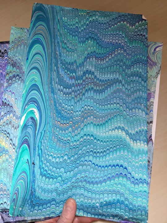
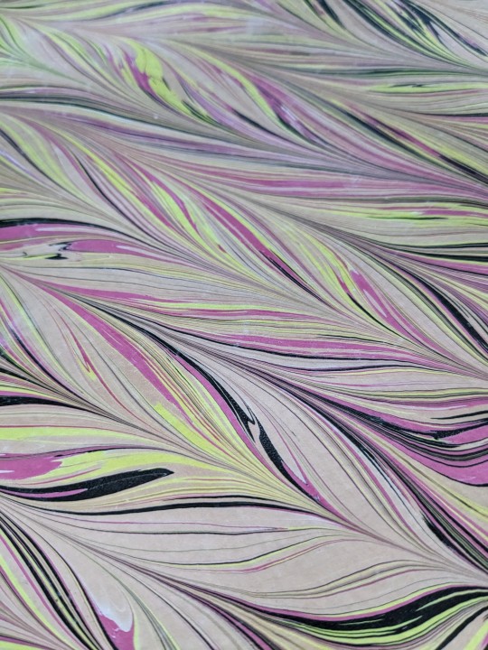
Many books decorate their endpapers with paper marbling, a method of using color patterns floating in liquid to dye paper. This particularly vibrant example is from a copy of Linnaea entomologica bd.8.
Full text here.
3K notes
·
View notes
Text


Marbled Monday
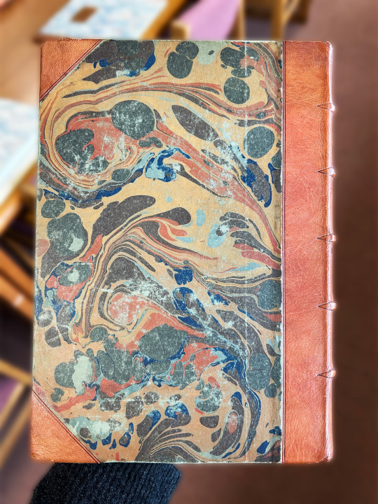
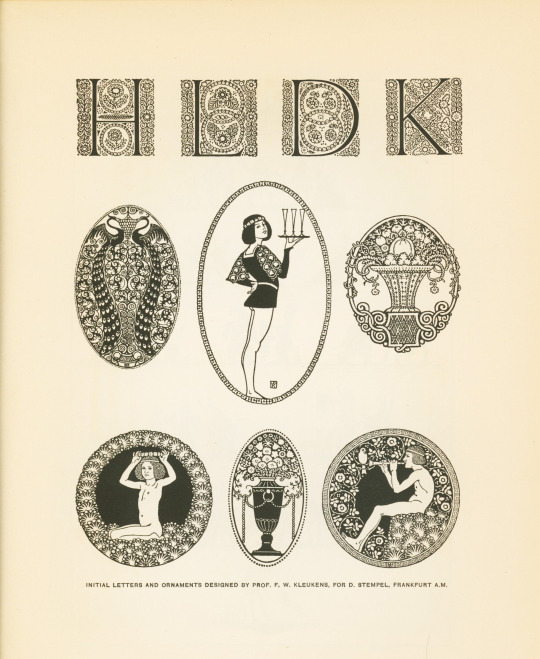
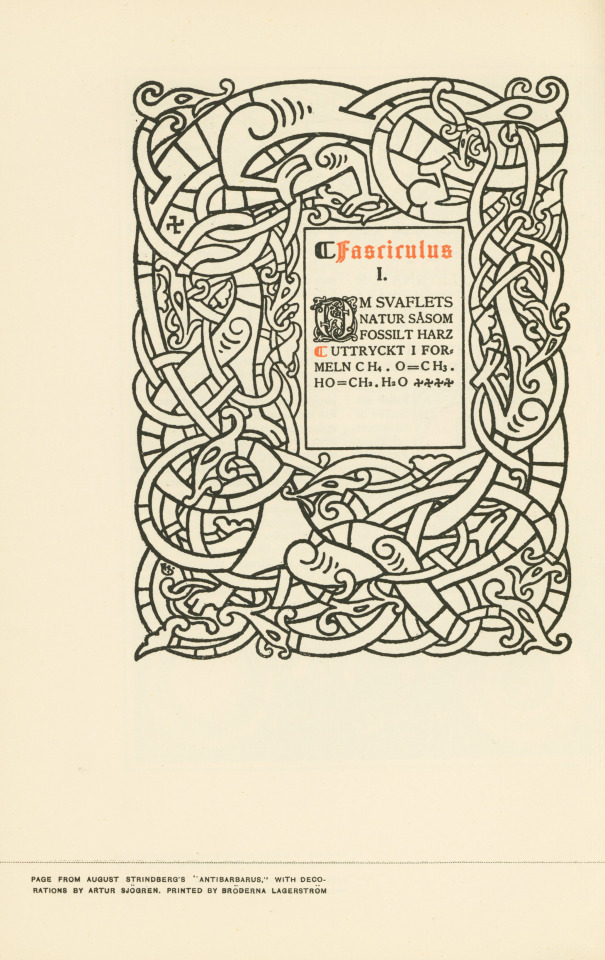
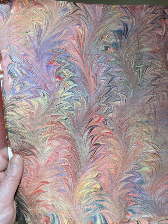
This week's Marbled Monday is all about The Art of the Book! The Art of the Book: A Review of Some Recent European and American Work in Typography, Page Decoration & Binding was created by Charles Holme and published in New York and London by "The Studio" Ltd. in 1914. It includes examples of many different contemporary trends and styles and elements of book design, some of which are shown here.
It also includes a lovely binding with some interesting marbled paper. It is half bound in leather with marbled paper over boards. I say the marbling is interesting because it doesn't really follow an established pattern. It's most nearly a Turkish or stone pattern, but includes some irregular swirling that was done with a stylus. The colors are a great contrasting mix of light and dark blue, orange, and brownish maroon. The light blue is actually just the color of the paper itself, which we can tell because of the wear to the cover where it has worn through the marbling.
View more Marbled Monday posts.
-- Alice, Special Collections Department Manager
#Marbled Monday#Art of the Book#Charles Holme#The Studio#marbling#paper marbling#marbled paper#Turkish patter#stone pattern
76 notes
·
View notes
Text
I did some paper marbling yesterday and not everything turned out the way I wanted but this one. This is for binding a cannibalism/vore fic. I am so pleased.
#paper marbling#I mean I wouldn't have objected if the yellow paint had actually showed up but you know what#I love it#spanish wave pattern this is in fact 2d
64 notes
·
View notes
Text

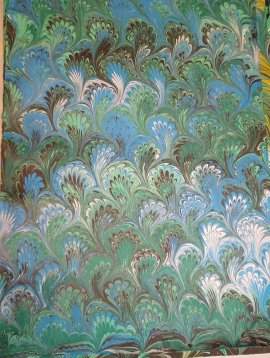
Thrilled with these Italian Peacocks. Whenever I marble I just immediately want to do it again.
30 notes
·
View notes
Text
We've been posting materials for #MarbledMonday for years, but for the first time ever, we get to post our own work. On Saturday, Jim Downey of Legacy Bookbindery led students, faculty members and librarians in a paper marbling workshop. Watch the video to see what we learned!
#marbled monday#marbled paper#paper marbling#bookhistory#special collections#rare books#university of missouri#mizzou#libraries#kelli h
70 notes
·
View notes
Text
Swirls and wiggles!
Peacocks and thistles!

36 notes
·
View notes
Photo

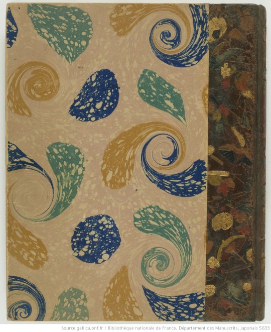
Decorative front and back covers and end paper taken from ‘Album de surimono’ after Kitagawa Utamaro, Katsushika Hokusai, Totoya Hokkei.
Published 1890-1930.
Bibliothèque nationale de France. Département des Manuscrits.
221 notes
·
View notes
Note
Re: printer paper being nice for bookbinding...
So you specifically said not to do this but...
1)using plain printer paper is totally fine for books if that's what you have access to. It's what I started with and some people just stick with it.
2)most of us who get really serious into it get custom cut paper to be short grain as it should be. We get 11x17 paper cut into 8.5x11 so the grain is correct. Most Renegade Bindery people in the US get it from Church paper, and they've added a listing to their website for it. And it's nice paper. (Hammermill cream typically.)
Nooo don't encourage me! Danger, danger!
As punishment you get to see the results of me going to poke around in my old college work.

Here's a little book I probably made after somehow acquiring a colour inkjet printer. The colours have held up well after 25 years!
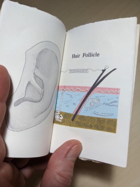
The interior consists of anatomical clip art. Why? I dunno. If I pretend to be an art historian of myself, I could say I was making a prescient statement about computers taking over everything including our bodies, but honestly I was probably just having a laugh with the extensive clip art collection that had come with my.. WordPerfect? or Corel Draw? software.
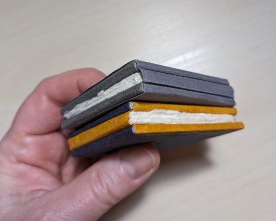
Two little books with non-adhesive bindings and rather nice Japanese paper.

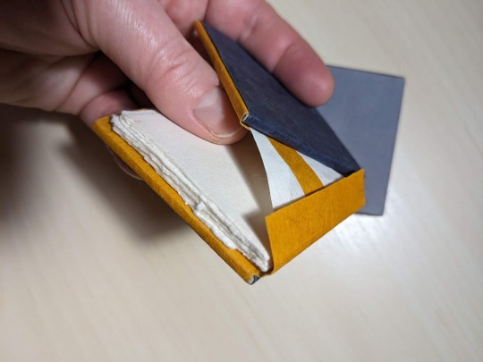
The covers stay on via paper tabs.


Here's a set of two books with covers made from hand-dyed/patterned fabric from my textiles classes. The covers are again attached with paper tabs that I made into a decorative element.
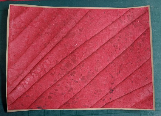
More handmade paper. It's unsized and feels like quality paper towels. Looks like dried flower petals aren't an acid-free material and the colour didn't hold up :P

cool little triple-fold guy.

Hand-marbled paper... I was really into purple and teal in combination.... It was like 1997
Bonus: me snarking on "AI" technology, before the turn of the century. Plus ça change? Unfortunately, the computer didn't do a bad enough job to be funny.

#my art#my REALLY OLD art#bookbinding#non-adhesive binding#paper marbling#long post#i also have a set of snarky greeting cards that are pretty good#those were from a class called Printed Matters#the professor was one of the OG 1970s hippie artist guys that gave the school its reputation#we all got a 'high pass' grade as long as we made... anything at all#and showed up to class
37 notes
·
View notes
Text


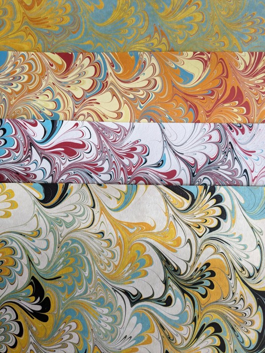
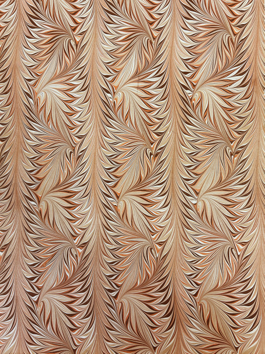
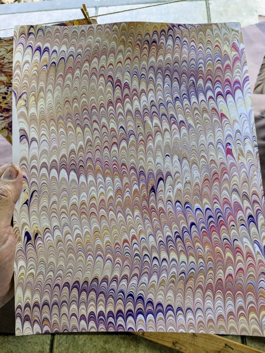
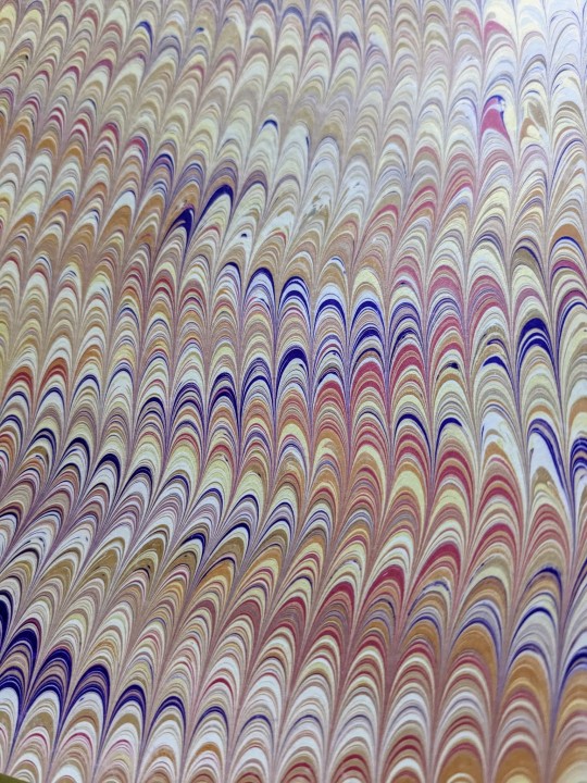
Yellow and orange Waved Gelgit marbled paper. Marbled with black, red, orange, yellow, white, metallic gold, metallic white and turpentine spots on top. Only 10 sheets available! Signed and dated. Base paper is cream, 80 gsm, long grain. Sheet size is 66 x 94 cm (26" x 37").
Available next July 24th at 12 UTC.
Home | Renato Crepaldi Hand Marbled Papers (bigcartel.com)
#renato crepaldi#marbled paper#bookbinding#decorativepaper#handmade#surface design#pattern#interior design#papercraft#handcrafted#paper marbling#papier#paper#papelmarmorizado#papelmarmolado#cartamarmorizzata
54 notes
·
View notes
Text

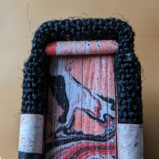


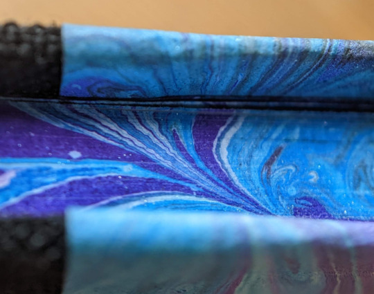

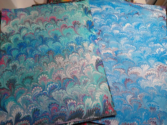
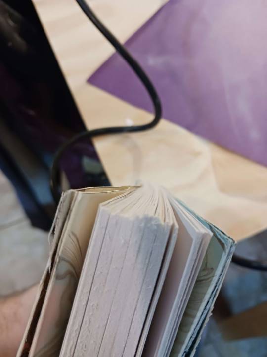
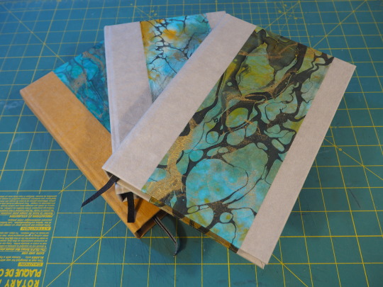
Rather than work on any of the projects I've currently got in progress (some languishing for over a year now), I spent the end of last week making two new little books.
Very much inspired by some books I saw in a shop window (next to a $450 copying press) and the replenishing of carrageenan appropriate for marbling (that "food safe" stuff I bought on Amazon did not work). My marbling remains iffy as I continue to try and branch out beyond the inks my Jacquard kit came with, so the consistency of design is weak and the pattern not the one I aspired to. BUT! I really do like the results!
Marbled textblock edges, endpapers, headbands, and cover papers are the "same" pattern for each book, one a blue/purple/white swirl and the other a pale red, red/black splotchy/swirl -- both kissed with a hint of sparkle from the Pearlescent White Liquid Acrylic ink I recently picked up.
MmMMmMmm... I do so love my macro shots of marbling....
#marbling both sides of the paper was an interesting experience -- worked better than expected#(you'd think it'd be 'too much' but at this scale & with the corners done in black it's not!)#will certainly be trying this again - especially as (if?) my marbling improves 🤞#will have another post later about contents & full scale shots#macro mondays#macro photography#little book#little books#bookbinding#marbling#paper marbling
79 notes
·
View notes
Text
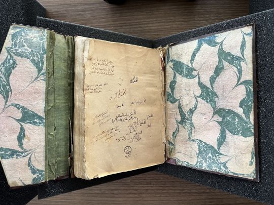
Marbled Monday, lining the boards on the cover of Isl Ms 490, a 19c copy of a Maghribi commentary on al-Tirmidhī’s (d.892) Shamā’il ✨ Browse the description and images of the entire manuscript online
#marbled monday#marbled paper#marbled#marbling#paper marbling#ebru#ebrusanatı#آبرو#آبرو باد#ابر و باد#الايبرو#ابرو باد#special collections#archives#libraries#special collections libraries#islamic manuscripts#libraries and archives#manuscripts#المخطوطات العربية#yazmalar#yazma eserler#المخطوطات#المخطوطات الاسلامية#manuscript illumination#manuscript culture#maghrib#المغرب#north africa#arts of the book
47 notes
·
View notes
Text


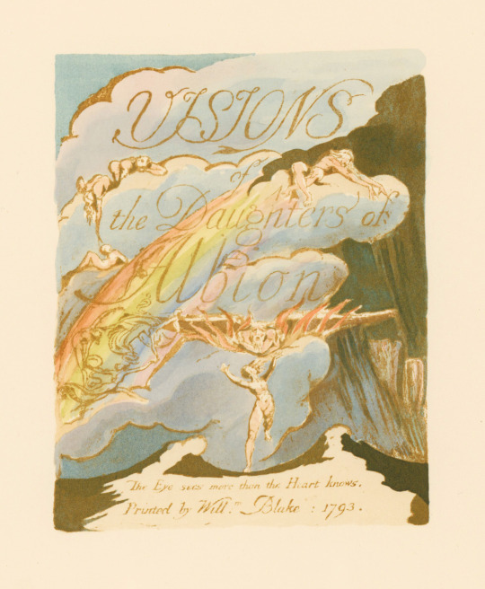

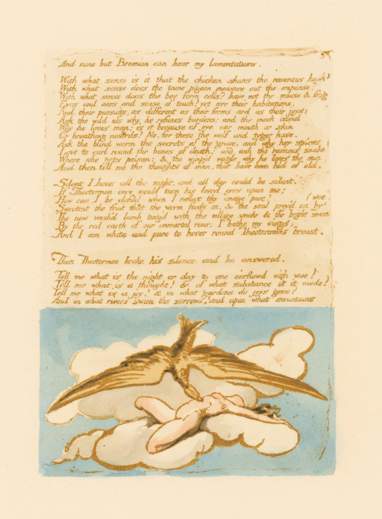

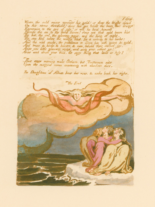

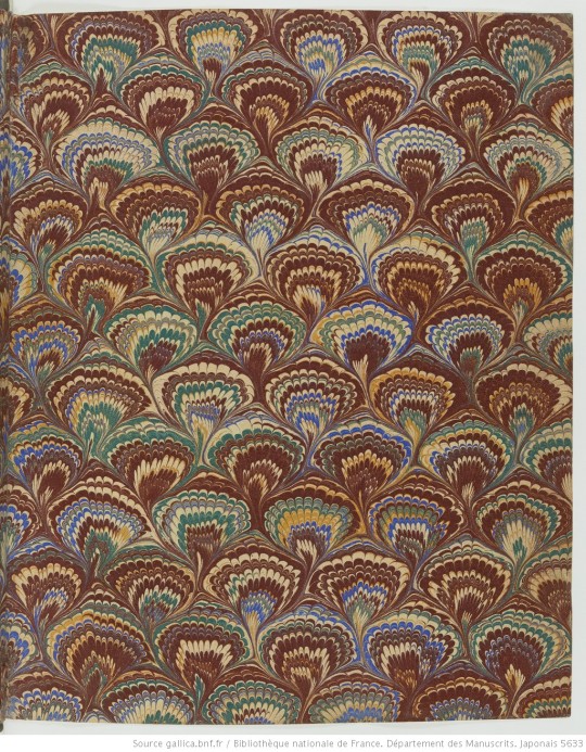
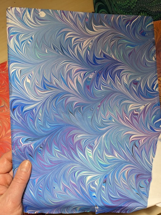
Marbled Monday
This week for Marbled Monday we return to the work of William Blake as published by the Trianon Press and the William Blake Trust. The poem is Visions of the Daughters of Albion, which was first published by William Blake in 1793 with his own illustrations. This Trianon Press edition was published in 1959 and is a facsimile of the original, meaning it was reproduced as closely as possible, including Arches pure rag paper made to match that which was used by Blake. The paper also features a watermark of Blake's monogram in the lower corner of every sheet.
The edition is quarter-bound in orange leather and orange, brown, and tan marbled paper. The paper is a really interesting pattern, similar to Cockerell's Octopus or Whirl pattern. It is difficult to tell who did the marbling because it isn't stated in the colophon, but it is possibly by French marbler Michel Duval, who the Trianon Press used frequently for their marbled papers. It could also be by Cockerell, but seems less likely judging by the number of mentions of Duval in the finding aid for the Trianon Press Archives at UC Santa Cruz.
View more Marbled Monday posts.
View more posts about the Trianon Press.
-- Alice, Special Collections Department Manager
#Marbled Monday#Trianon Press#William Blake#Michel Duval#marbling#paper marbling#marbled paper#Visions of the Daughters of Albion#octopus#whirl
54 notes
·
View notes
Text


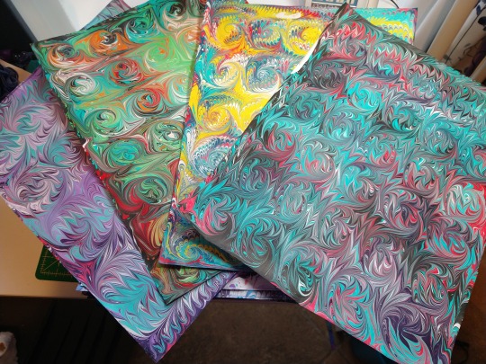
hiii i've put together some sets of the marbled paper scans i've made over the last couple of years and have uploaded them to my ko-fi!!
they're free and you're welcome to use them for basically any kind of art.
#j: art#j: art resources#j: marbling#marbled paper#paper marbling#design resources#craft supplies#arts and crafts#textures#putting the matchablossom one together really makes me want to give that colourway another shot so badly#reblogs would mean the world#also i typed the terms up while in the haze of period pain meds and im fgsfhdfh a+ work on the ai one there jess
25 notes
·
View notes
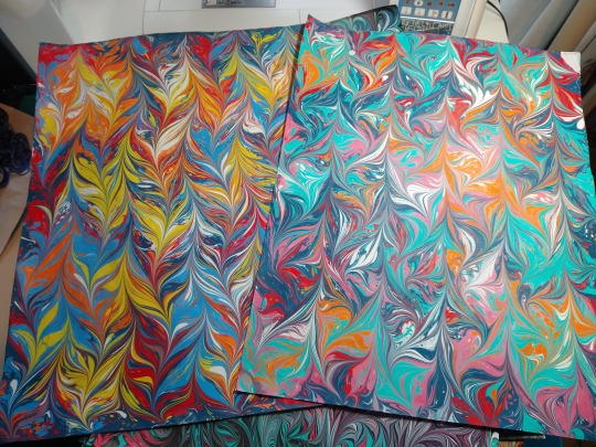
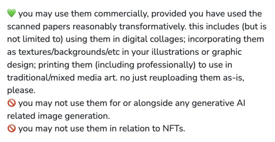
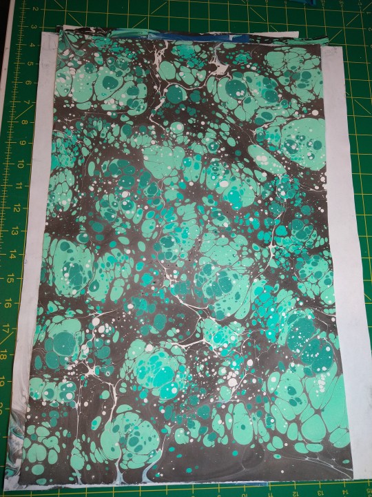
Text
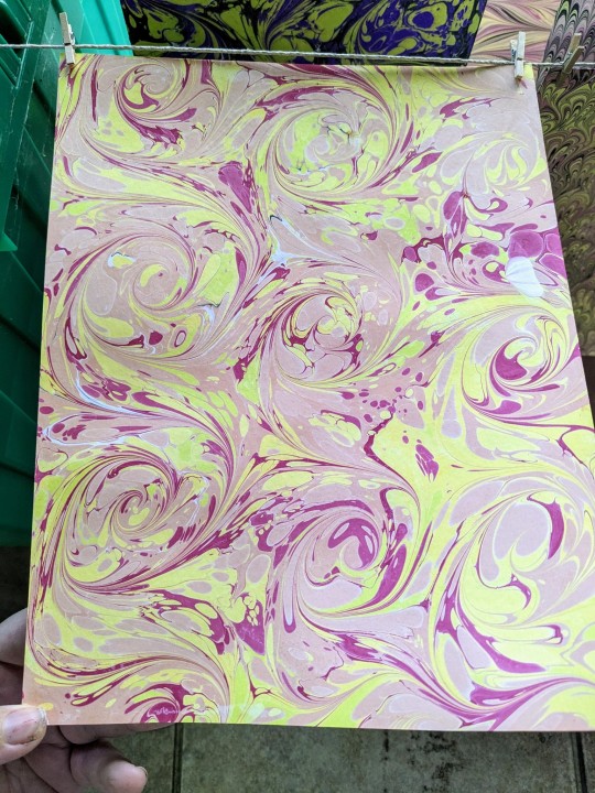
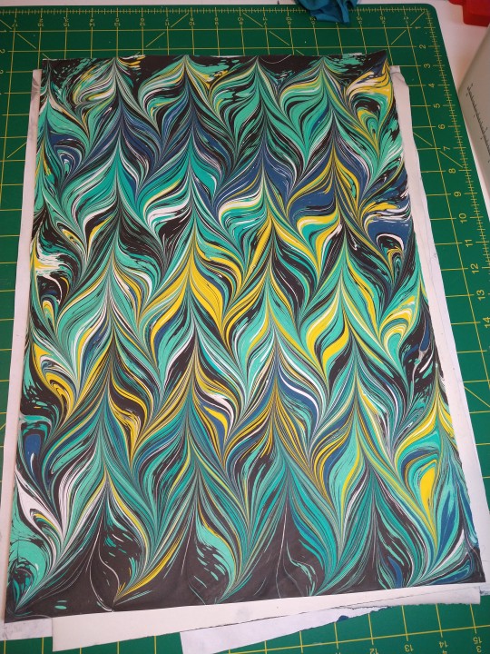
Got back into marbling today after a very long time of not marbling. The peacock pattern (photo number 2) isn't quite right. My rake is too long for my pan which meant I couldn't be smooth with the zigzags but I think it still looks cool.
22 notes
·
View notes
Text
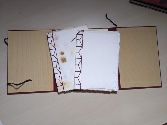
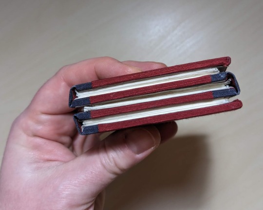
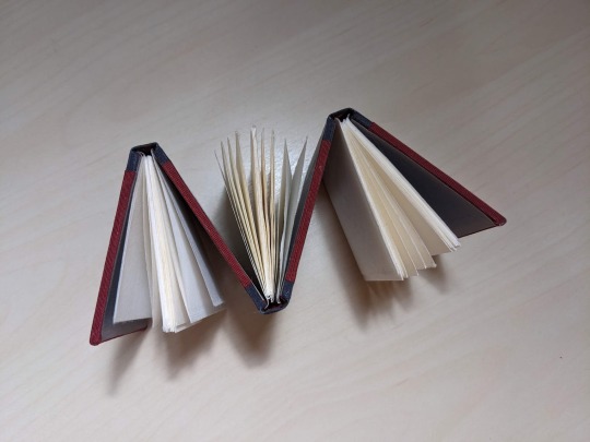
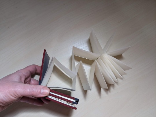
Big Bookbinding Weekend
My fiancee was out of town so I spent the time binding up a storm...

Decided to test out edge sanding to see if it was better than using my french paring knife...
Before

Not bad, but it made a HUGE mess and some dust got trapped in the textblocks.
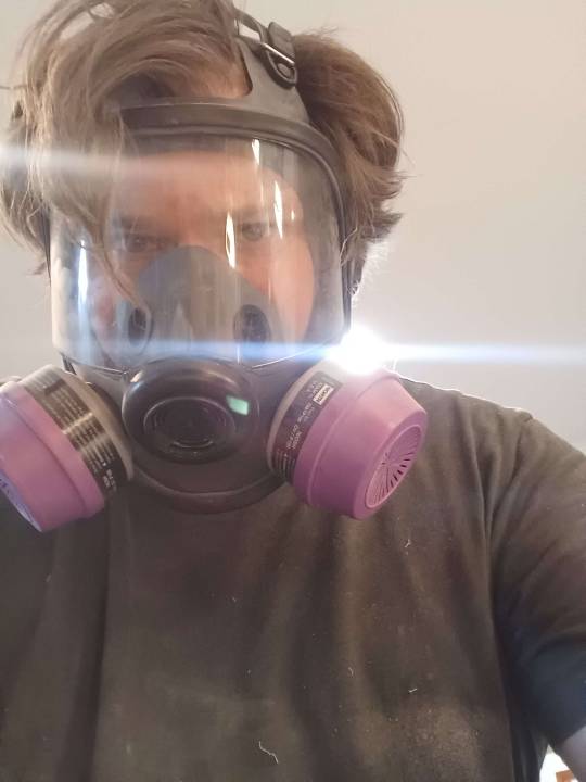
Also put a little jig I made for trimming corners to the test.

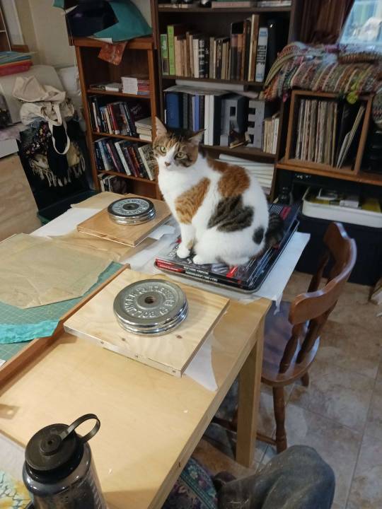
Kira, helping press the notebooks.
And the finished notebooks:

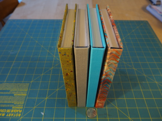
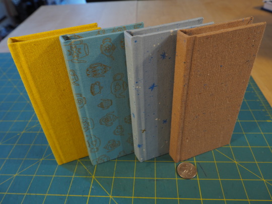
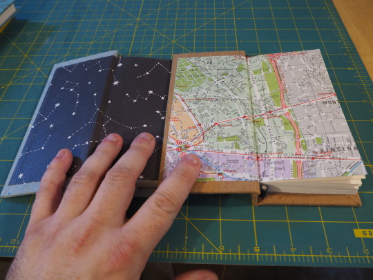
I think they turned out really well, they'll be going up on my Etsy site this weekend. @ StrangeAeonBindery.etsy.com
#bookbinding#book tumblr#books#late night crafting#crafting#bindery#bookmaking#bookworm#etsyseller#Cat Helpers#marbled paper#paper marbling
19 notes
·
View notes
Last Seen Blogs

um-pouco-da-asia-blog
Mochilão

sketchyjellyfish21
sketchy_jellyfish
thesupercorpband
TheLezRevenge

a-court-of-bookss
shhh...imreading
templar6
Who Cares Alot