#so it's mostly traditional but the text had to be scanned and edited in/colored in photoshop and the gray was also done digitally
Photo

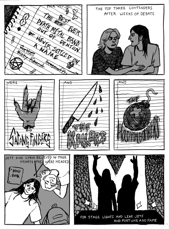

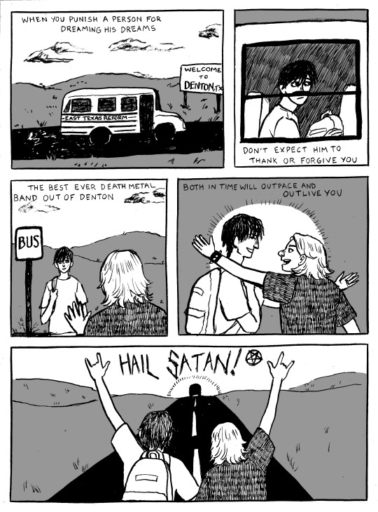
The Best Ever Death Metal Band in Denton
This comic was done for a school assignment. It’s a couple years old now, but it’s still one of my favorite things I’ve made, and I have the lyrics of this song permanently burned into my brain because of it.
#illustration#comics#the mountain goats#the best ever death metal band in denton#traditional#digital#all the lines including the text and the panels were done on paper in india ink#so it's mostly traditional but the text had to be scanned and edited in/colored in photoshop and the gray was also done digitally
7K notes
·
View notes
Photo
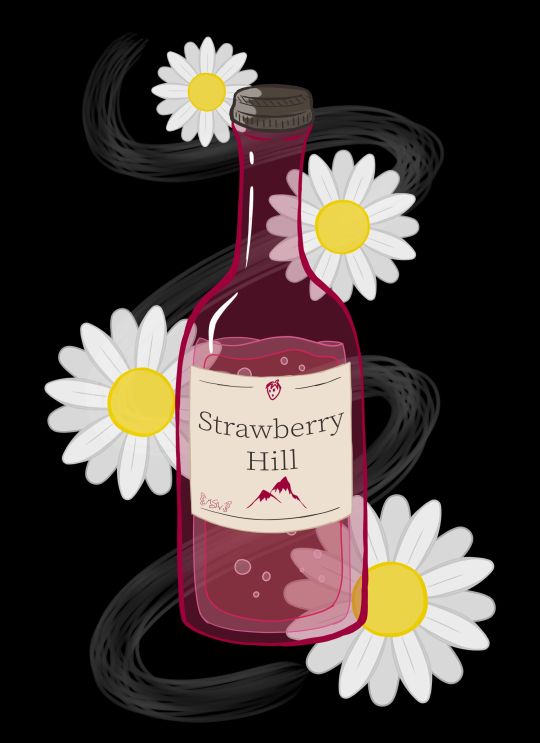
Daises on Strawberry Hill
Well, this looks a bit different from my usual content, doesn't it?
Full disclosure that this art was made primarily as art inspired by one of my favorite books of all time (seriously, I have three different editions of this thing)--Looking for Alaska by John Green--as an excuse to talk about the new Hulu series of the same name that's based on the book.
Because if you know me at all, you know I am notoriously hard on book-to-screen adaptions, particularly those based on books I love as if they were family members.
And originally, this description was going to include a pretty blow-by-blow, lengthy review of my thoughts on the series. However, it's been quite a while since I first started trying to type out said review, and frankly, I've decided instead to, after I talk about the art, to just give some general, spoiler-free thoughts; the most important opinions I have on the series and leave it at that. I am still planning on completing and putting my full-length, in-depth thoughts out, but that'll be at some other time. Perhaps I'll put them in a journal/blog post instead of adding to the description here. Whatever happens, I'll update this description so that those who are interested in my deep-dive can find it when the time comes.
That said, let's talk about the artwork now :)
LfA isn't a fantasy or sci-fi book, so it doesn't have any cool dramatic scenes or neato devices/objects that have a lot of significance to the plot that would be fun to draw, which is why I never made any fan art or inspired-by-art for it before. But I really wanted an excuse to talk about the series, and so I pondered what symbols or imagery the series might have that I could make into art, even if none of it was terribly relevant to the plot or exciting on its own.
This led me to the cheap wine that's mentioned a few times throughout the book: Strawberry Hill. Drawing just a bottle of wine seemed kind of boring and not very specific to the book/series, so I ended up adding in some white daisies since white flowers and daises specifically do have some significance to the plot. (In a way, they're a bit of a crux to it, at least for a key epiphany moment.)
Originally, I was going to make this piece traditionally, and I did start with a traditional sketch of the wine bottle and one daisy to use as a template for more to follow. However, I pretty quickly got the idea for doing something more line-art heavy on a black background, as the cover for the book is black and the sort of chalkboard/blacklight look I was picturing in my head seemed fitting for the tone of the story, and despite my best efforts I couldn't think of a way/combination of media to accomplish what I wanted traditionally without also giving myself a major headache and making the project take infinitely longer than I wanted it to.
So while I stalled in production, I ended up on my tablet for something else and figure I'd scan in my sketches and maybe make a line art to print off and manipulate into what I wanted traditionally later. But then, just as I started working on that, I figured, "You know what, if I'm going to go through all of the trouble to ink/line this digitally and I wanted it to be more line-focused anyway, I might as well take a crack at just doing the full artwork digitally. I'll get the lines done either way, and if it doesn't work out then at least I can say I tried, I know some of what not to do, and I end up with a digital mock-up for the final version."
Fortunately, things ended up working out much better than I expected.
I purposefully wasn't too fussy about the lines, partly because I just didn't have the patience at the time to be super precise about it, and also because for this specific project I kind of liked the idea of a more doodle-ish look (even though it's not super doodle-y in the final product). This also made things move a lot faster, which was nice and pretty satisfying.
I started with the wine bottle from my sketch, including trying a new liquid drawing technique I half picked up from an art Youtuber I just recently started following that makes drawing liquid in a style similar to this look like a lot of fun. I knew I wanted the bottle to be mostly transparent/just lines, so the goal here was more about getting the wine bottle shape/structure familiar enough than it was about anything else.
The label took a bit more though since in my mind, ever since I read the book, I had a pretty specific image of a pinkish bottle with a yellowish liquid and this cream-colored label with dark brown/sepia text, and I had not previously considered the label into that whole primarily line-focused image in my mind. So in the end, I decided the label would be solid so I could get the proper imagery across and the text and stuff could still be seen properly.
Additionally, you'll notice I couldn't help myself being a little on-the-nose and sticking a tiny strawberry and mountain/hill on the label for good measure and to fill some space without having to look up wine bottle references just to stare at the labels for a ridiculous amount of time.
The daises were also infinitely easier to do digitally since I could just copy, paste, and rotate first the petals to make one flower, and then copy, paste, rotate that one flower a few more times, instead of having to draw individual petals and flowers every time. This also gave me a little more freedom in that I could re-size the flowers pretty easily to make it more visually interesting than just a bunch of flowers that were all the same size.
All that ended up being less line-focused than I originally intended, but I acknowledged that happening as I worked, and I'm not upset about the shift in focus. I think what I ended up with still has about the same visual impact I was hoping for, and that's all I really wanted anyway.
And as sort of the icing on the cake, I ended up adding in that wisp/smoke trail in the background because of 1. It seemed kind of empty and unfinished with just the flowers and wine bottle and 2. When I tried adding a green vine to fix that issue, it just wasn't working for me. That's when I realized I could have a stronger reference to the book by putting something similar to smoke in the background since the original cover of the book has a smoke plume front-and-center. It took a few tries and some tweaking to get something I was happy with on that front, but I am so glad I stuck with the idea. It just adds something I can't quite place that the piece really needed before.
The content is pretty different for me--I don't drink and I don't really endorse the idea--and the style is a little beyond my usual realms, but I do really like how it turned out. I feel like it's done well enough that you can appreciate the symbols and references if you know the book, but it also works as just a kitsch art piece if you're completely unfamiliar with the source material too.
I don't think it's super accurate to when a bottle of the stuff shows up in the Hulu series, but it was on screen so briefly and my mind was focusing on other aspects while I was watching, so I didn't get a super good look at it. But I still think it'll suffice well enough despite that.
I'm happy with how it turned out, and that's all that really matters, right?
Now, then, as for the thoughts I have on the Hulu series that I think need to be shared sooner rather than later.
I'll start by going on record to say, as someone that is notoriously hard on book-to-screen adaptions, that I did actually like the LfA series pretty good. I'd say it's about a 7 out of 10, which an exceptionally good score coming from me. It's not my most favorite show of all time, but it's notably better than "just okay," which is historically the highest praise I've ever been able to give a book-to-screen adaption. It had its faults and things I would've done differently if it were up to me, but fortunately, it did an infinitely better job than I was expecting.
My main issues, as with all book-to-screen adaptions, come in the form of some of the changes that were made between the book and the screen. Fortunately, this time around the problems I do have are not egregious offenders. Most changes that were made still make sense within the story and while the overall message isn't quite the same as the book, it didn't totally squander what the book was trying to say. All of which are problems that most book-to-screen adaptions suffer from horribly.
And while I won't talk too much at length about this (that's for the long-form review later ) I think this has a lot to do with the series being roughly 7-8 hours of content, as opposed to the either extremely rushed 2-hours-or-less a movie would've been, or the more-time-than-we-know-what-to-do-with 13+ hours of...certain book-to-screen adaptions that failed miserably at their job. (*cough* 13 Reasons Why *cough*)
As I said, it's not perfect, but I do think as far as allotted time and time-management that they hit something of a sweet spot so that they'd have enough time to give the plot the room it needs to breathe without having so much time that they have to start making stuff up to fill it all.
The other thing I'd like to point out is that, honestly, they did what 13 Reasons Why wanted to do way better than that series could ever hope to. They told the story of teenagers experiencing darker themes and elements of life so much more tactfully, and, in my opinion, more realistically. And they didn't wait for a controversy to spike and then do something about it--they didn't bank on the publicity of a controversy. Right from episode one, every episode starts with a warning that this series is meant for an adult audience (because of its themes) and viewer discretion is advised. And at the end of every episode, as the series does featuring smoking and drinking on more than one occasion, they provide resources to visit if you or someone you know has a problem with either of those things.
I don't know if the people at Hulu saw what happened to Netflix with 13 RW and learned from their mistakes or if they just knew better, but either way, I'm so glad it was handled so much better, regardless of why or how it happened.
As far as recommendations, if you're a John Green and/or Looking for Alaska book fan, I'd say it's definitely worth the watch. For outside viewers...I think you have to really be into the YA drama scene to appreciate it. Just be prepared for some more adult content than you might typically find in a YA movie. It's all done pretty tastefully and the majority isn't there senselessly; most of it serves some kind of purpose to the story, which is why it doesn't bother me (a very prude-ish person) all that much.
I think that's everything I feel like needs to be said right now about the series until I can get the long-form review finished. (It's maybe 1/3 of the way done currently...and already getting on the long side )
I have to admit, this does make me more hopeful for the future of book-to-screen adaptions, at least those that end up being handled the way this one was. In fact, I'm actually really hoping that if Turtles All the Way Down, John Green's newest book, ever sees a screen adaption that it's handled in a series form and is done at least as well as LfA was. Time will tell, I suppose.
In fact, I believe any day now, Let it Snow, a book that John Green wrote 1/3 of is supposed to have its movie adaption dropped on Netflix. I'm not super confident in Netflix's handling of adaptions for reasons mentioned earlier, but maybe just maybe it'll be okay?
____
Artwork © me, MysticSparkleWings
I do not own Looking for Alaska and/or associated content
____
Where to find me & my artwork:
My Website | Commission Info + Prices | Ko-Fi | dA Print Shop | RedBubble | Twitter | Tumblr | Instagram
#lookingforalaska#johngreen#hulu#hulu series#lfa#lfa hulu#book#book adaptation#fan art#art#digital art#photoshop#photoshopcc
2 notes
·
View notes
Last Seen Blogs

schumipng
schumi.png

eddielovr
lex
yarichinbitclub
𝗬𝗮𝗿𝗶𝗰𝗵𝗶𝗻☆𝗕𝗶𝘁𝗰𝗹𝘂𝗯
miguelmarias
Miguel Marías
animecelesti
ANIME CELESTI .