#I hate my own art
Text

Banan
#regretevator#regretevator art#doodle#art#shitty doodle#my shitty art#regretevator fanart#roblox regretevator#regretevator roblox#roblox fanart#roblox art#regretevator jeremy#jeremy regretevator#jeremy#I frickin hate it#I hate my own art#When the world's colide and the days are dark#You may have my number you can take my name#But you'll never have my heartttttt#When the sky falls#And it crumbles#We will stand talllll#Face it all together#Where you go I go#What you see I see#I'm you
17 notes
·
View notes
Text
Your art never needs to be perfect, or like anybody else's. As long as you like what you made, it's enough.
Art is how you express what's inside.
3 notes
·
View notes
Photo

Wow!! look at him!! this is, something!!! its certainly here <3333
3 notes
·
View notes
Text
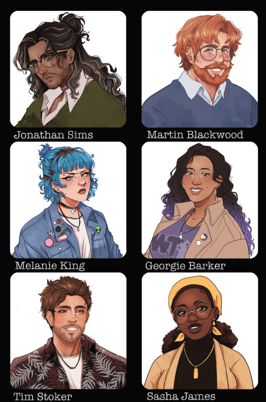
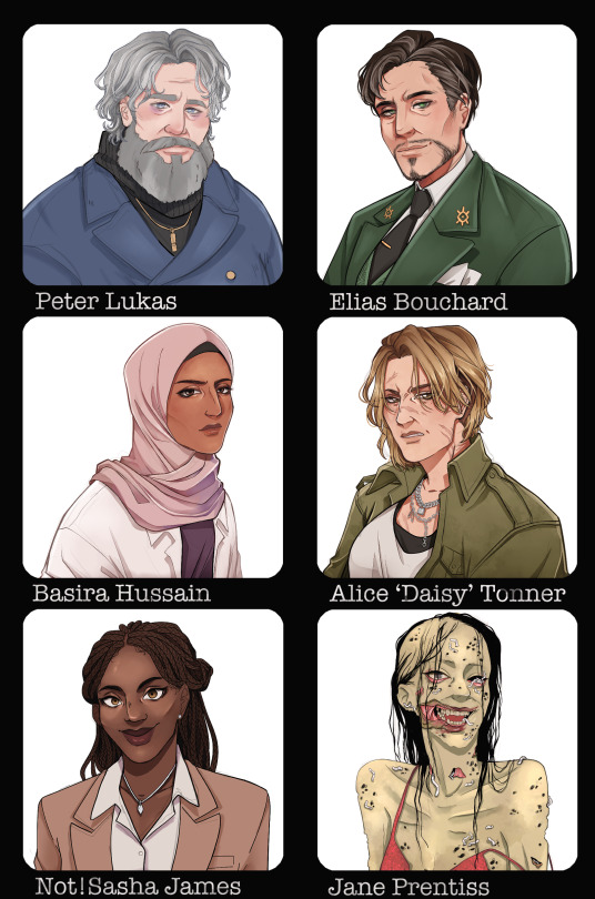
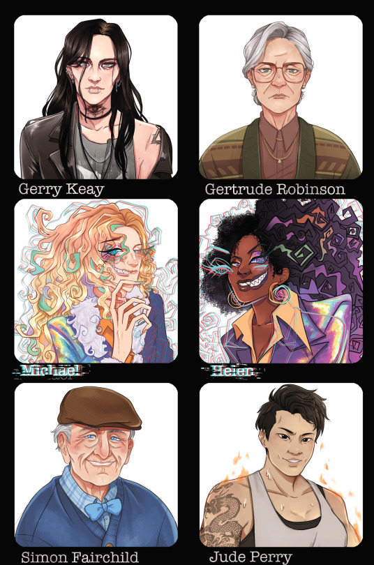
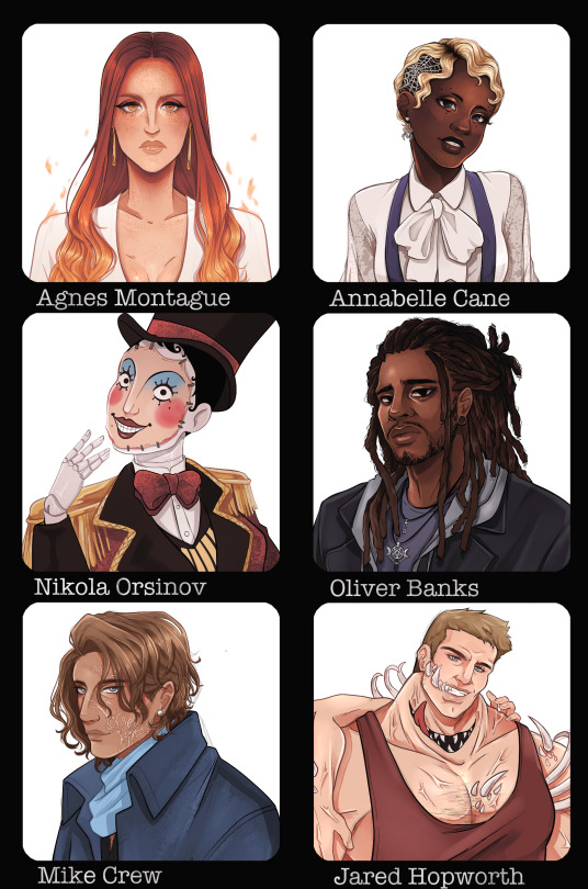
After slowly chipping away at this for a while, I'm finally done drawing the cast of The Magnus Archives!
#the magnus archives#tma fanart#tma#the magnus archives fanart#this was a great art exercise for improvement. i learnt a lot#will eventually do protocol since i already have a few ideas in mind#jonathan sims#martin blackwood#peter lukas#elias bouchard#melanie king#georgie barker#basira hussain#daisy tonner#tim stoker#sasha james#jane prentiss#gerard keay#gerry keay#gertrude robinson#agnes montague#annabelle cane#michael distortion#helen distortion#nikola orsinov#oliver banks#simon fairchild#jude perry#mike crew#please keep in mind these are only my headcanons and while they may not align with your own that does not warrant any hate
5K notes
·
View notes
Text
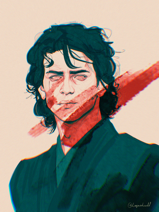
i have failed you.
#anakin skywalker#star wars#darth vader#star wars revenge of the sith#hate this but im sick and this is all i have in me#back on my star wars bs#sw#star wars the clone wars#art#digital art#sketch#wip#sw tcw#tcw#DUDE I SPELT MY OWN SIGNATURE WRONG#revenge of the sith
4K notes
·
View notes
Note
Please elaborate on your twst Pokémon headcannons I’m very interested
I had planned on drawing everyone for this (I made a LIST!) but it. hasn't been going well. 💀 soooo here's what I have so far!
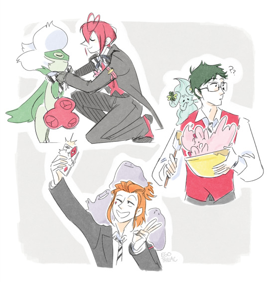
Riddle - Roserade (I was going with 'no legendaries', otherwise I would've given him a Shaymin) (and I don't think Togedemaru is actually a hedgehog or I would've given him one of those too) (...they kind of do fit though. hmm.)
Trey - Alcremie (clover/mint cream + strawberry/ruby cream)
Cater - DITTO SQUAD! DITTO SQUAD! DITTO SQUAD!
Ace - Impidimp (I feel like there's probably a better one for him, but I can't think of it)
Deuce - Scraggy (meanwhile I KNOW deep in my heart that this is true)

Leona - Pyroar (but like. a nasty Pyroar. just a grizzly old Pyroar with the shittiest attitude imaginable. they pretend to hate each other but secretly they are a bonded pair, do not separate)
#art#twisted wonderland#pokemon#poketwst#i'm trying not to pressure myself too much art-wise right now#but i would like to do more of the characters!#(especially considering this started with my insistence that malleus would have a dragapult)#gotta draw something i don't immediately hate first ᕕ( ᐛ )ᕗ#ANYWAY enough art angst!#i'm not aiming for full teams or delving too deep into lore or anything#just one or two per character that i think fit!#i was pretty torn on leona for a while because pyroar is at once the obvious choice but also. not really?#(i did consider luxray and ultimately decided it doesn't really fit either)#but i kind of love Nasty Lionboy's Nasty Pyroar#i think there's probably some. like. ~royal tradition~ that they all bond with this one specific breeding line or whatever#and leona deliberately chose just the absolute worst one#took one look at this shitty rude pokemon and immediately went 'that one'#falena was like 'are...are you SURE' and leona cops an attitude like 'i'm choosing my OWN pokemon you're not my DAD'#as pyroar is actively attempting to eat him#actually it probably tried to eat kifaji first and that's when leona decided he liked it#me: this is just for funsies i'm not doing lore (writes a whole fanfic in the tags)
3K notes
·
View notes
Text
People go on about good healthy queer rep but I cannot express how much I want unhealthily devoted queer rep. Raise your lover from the dead no matter the cost. Kill to get them to safety. Trade your soul for theirs. Die to reunite with them. I want gothic hyper-devotion codependent lovers
#I'm listening to music rn its giving me illnesses#Alda rambling#Please. Must I draw my own art? Must I write my own narratives?#Shout out to the Arcana for giving me the crazy devotion dating sim love I needed#Like *to me* it's more queer#The 'you're the only one it's only you and I will do whatever it takes even when people hate me for it's
81K notes
·
View notes
Text
I think 90% of my gripes with how modern anime looks comes down to flat color design/palettes.
Non-cohesive, washed-out color palettes can destroy lineart quality. I see this all the time when comparing an anime's lineart/layout to its colored/post-processed final product and it's heartbreaking. Compare this pre-color vs. final frame from Dungeon Meshi's OP.


So much sharpness and detail and weight gets washed out and flattened by 'meh' color design. I LOVE the flow and thickness and shadows in the fabrics on the left. The white against pastel really brings it out. Check out all the detail in their hair, the highlights in Rin's, the different hues to denote hair color, the blue tint in the clothes' shadows, and how all of that just gets... lost. It works, but it's not particularly good and does a disservice to the line-artist.
I'm using Dungeon Meshi as an example not because it's bad, I'm just especially disappointed because this is Studio Trigger we're talking about. The character animation is fantastic, but the color design is usually much more exciting. We're not seeing Trigger at their full potential, so I'm focusing on them.
Here's a very quick and messy color correct. Not meant to be taken seriously, just to provide comparison to see why colors can feel "washed out." Top is edit, bottom is original.
You can really see how desaturated and "white fluorescent lighting" the original color palettes are.
[Remember: the easiest way to make your colors more lively is to choose a warm or cool tint. From there, you can play around with bringing out complementary colors for a cohesive palette (I warmed Marcille's skintone and hair but made sure to bring out her deep blue clothes). Avoid using too many blend mode layers; hand-picking colors will really help you build your innate color sense and find a color style. Try using saturated colors in unexpected places! If you're coloring a night scene, try using deep blues or greens or magentas. You see these deep colors used all the time in older anime because they couldn't rely on a lightness scale to make colors darker, they had to use darker paints with specific hues. Don't overthink it, simpler is better!]
#not art#dungeon meshi#rant#i'm someone who can get obsessive over colors in my own art#will stare at the screen adjusting hues/saturation for hours#luckily i've gotten faster at color picking#but yeah modern anime's color design is saddening to me. the general trend leans towards white/grey desaturated palettes#simply because they're easier to pick digitally#this is not the colorists fault mind you. the anime industry's problems are also labor problems. artists are severely underpaid#and overworked. colorists literally aren't paid enough to do their best#there isn't a “creative drought” in the anime industry. this trend is widespread across studios purely BECAUSE it's not up to individuals#until work conditions improve anime will unfortunately continue to miss its fullest potential visually#don't even GET ME STARTED ON THE USE OF POST-PROCESSING FILTERS AND LIGHTING IN ANIME THOUGH#SOMEONE HOLD ME BACK. I HATE LENS FLARES I HATE GRADIENT SHADING I HATE CHROMATIC ABBERATION AND BLUR
2K notes
·
View notes
Text
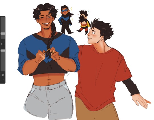
his biggest fan is in fact his own little brother
#tim drake#dick grayson#nightwing#robin#dc#catman's art#im on the roof and i needed to do a vent drawing where i adore my own brother but i also wish im close to him like before#im jealous of them. i really am.#i hate where i am right now. i wish i can talk like a normal person instead of being intimidated by him.#anyways its cold tonight and the wind’s lovely <3
2K notes
·
View notes
Text

english translation book 5 baby we are in the ‘people assuming kid form hua cheng is xie lian’s son’ era 🔥🔥🔥 / follow for more hualian silliness
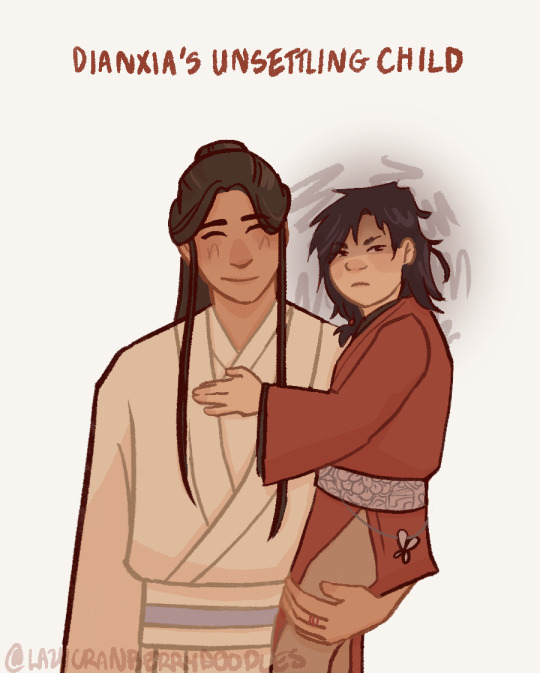
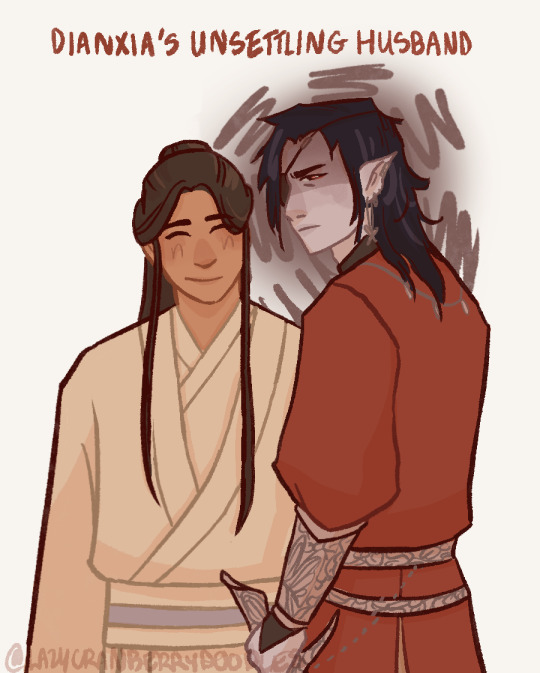
#so the part of the book where kid hua cheng suddenly sits bolt upright#because he senses something in the room#and this 7 year old is just 👁️👁️ and radiating immense killing intent#hes so fucking funny 😭#i love him being weird and strange and offputting#‘dianxia why does the high schooler that hangs around your house sometimes have glowing red eyes and know things he definitely shouldnt#and crush things into dust with his bare hands and seem to hate the sun an-‘ mind your own fucking business#drawing baby hc was so much fun i hope i do it again soon#the secret is that xie lian is JUST as deeply weird as his husband but in a less obvious and threatening manner.#guy who has to keep his internal monologue internal because he is thinking things like “wouldnt wanna get choked by those hands!”#out of every god character he is the one who seems to have changed the most from immortality#dying presumably hundreds of times and being alone for hundreds of years does something to your brain#“xiao hua why does your cultivator talk weird and wear the same clothes and eat the same food and-” HE IS AUTISTIC!!!! AND JADED BY THE#PASSAGE OF CENTURIES!!! YOULL NEVER KNOW WHICH IS WHICH!!#my art#tgcf#tian guan ci fu#hualian#hua cheng#xie lian#art#tgcf meme#mxtx#天官赐福#lmao#hob#heaven official's blessing#the people have spoken...
3K notes
·
View notes
Text
I cant stop day dreaming about Toxi and Gin Christmas wallpapers ideas for my phone hhhhh
1 note
·
View note
Text
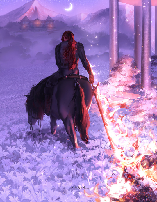
Home was the only place left.
Prints
#something about diluc coming home after 4 years just beyond exhausted everything no longer in his control severely wounded#trodding on his horse through his cecilia garden during the wee hours of the morning. adelinde will surely get a scare. oh well.#bending canon that he had his vision. anyway. wanted to make a piece that had some vague storytelling behind#it for the viewer to come up with their own assumptions#is the blood on his arm his or an enemy’s??? it’s up to you#i started this painting august 18th of 2022 lawllll i hated every moment of it but godbless it’s done#diluc#my art#genshin impact#diluc ragnvindr#diluc fanart#shoutout to my right arm for referencing the awkward angle of holding the sword#nice thing that i’m muscled ❤️❤️❤️
2K notes
·
View notes
Text
who up sqlointing they peter rn

apotheosis 12 spoilers below cut
literally finished drawing this right when he died like what the hell dude 😭 im literally so afraid to start the finale tho dude 13 pt2 alr made me cry 😭
#peter sqloint my shining star#he means the world to me actually#jrwi peter#peter sqloint#jrwi exandroth#ur telling me ive been spelling it xandroth this whole time. What the fuck#xandroth is so much cooler#im making my own tag.#jrwi xandroth#that feels right#all this work just to question whether this even counts as Xandroth fanart. who gaf hashtag xandroth jrwi#jrwi apotheosis#just roll with it apotheosis#jrwi fanart#jrwishow#jrwi show#jrwi podcast#jrwi#just roll with it fanart#just roll with it#fanart#digital art#digitalart#doodle#art#my art#i literallt had to redo all my tags and reenact my bullshit which made it feel. Significantly less funny than when it was genuine#but thats ok. tumblr just hates me
773 notes
·
View notes
Text
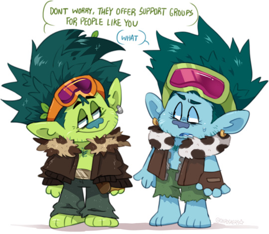
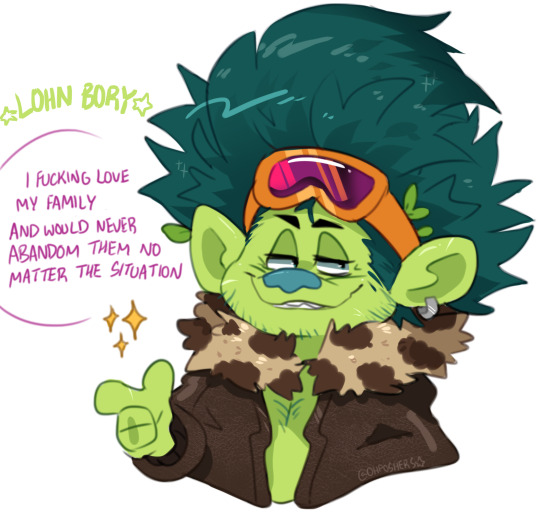

my friend Lunch is obsessed with JD's concept design so she decided he's the Mario to JD's Wario and his name is Lohn Bory anyway do i draw them kissing or no
#im gonna kms#i hate trolls#i might be obsessed with lohn bory#trolls#trolls band together#he gets his own tag#lohn bory trolls#john dory trolls#my art
926 notes
·
View notes
Text

whoopsie doopsie my hand slipped
anyway click for better quality
#shows up out of nowhere drops toxic middle aged men yaoi and leaves again#toxic middle aged men have me in an iron grip#i guess one could say dont mess with the ringmaster in his own circus#or something#idk im still shaking from being excited about hazbin hotel#if you wanna yell with me about hazbin hotel feel free#hazbin hotel#alastor#alastor hazbin hotel#lucifer#lucifer morningstar#lucifer hazbin hotel#radioapple#radio apple#appleradio#apple radio#lord i hate tagging art#my art
521 notes
·
View notes
Text

new year’s eve hawkins fair and they’re on guard duty together
#icb i say i hate comic pages and here i am doing it for FUN and my own entertainment ugh#also alas i still love them a Regular Amount#(too much for my own sanity sigh)#so i made them kiss#at new years eve#steddie#steve x eddie#steve harrington#eddie munson#steddie fanart#stranger things#stranger things fanart#stranger things 4#art#fanart
6K notes
·
View notes
Last Seen Blogs

fitundheil
Unbetitelt
chica-cristiana-mmm
El cielo es mi hogar

carianna
`
doctorrush-blog
Sass and Condescension