#digital art tutorial
Photo


quick tutorial on how I shade with solid black (a lot of people ask, hope this helps)
prints | patreon
11K notes
·
View notes
Text
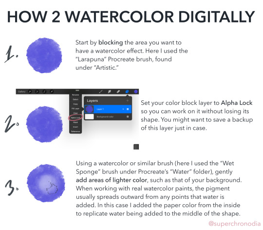
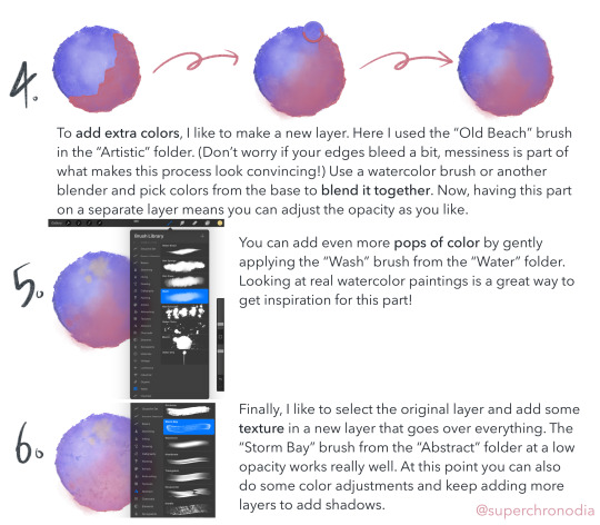
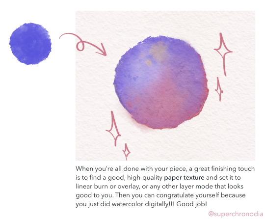
super epic watercolor tutorial
#casey art#art tutorial#digital art tutorial#digital watercolor#procreate tutorial#wahoo I’ve never done anything like this b4#if you use this lmk! or tag me or whatever#there’s a version with alt text on my twitter as well#update 3/12 DON’T copy my tags
10K notes
·
View notes
Photo
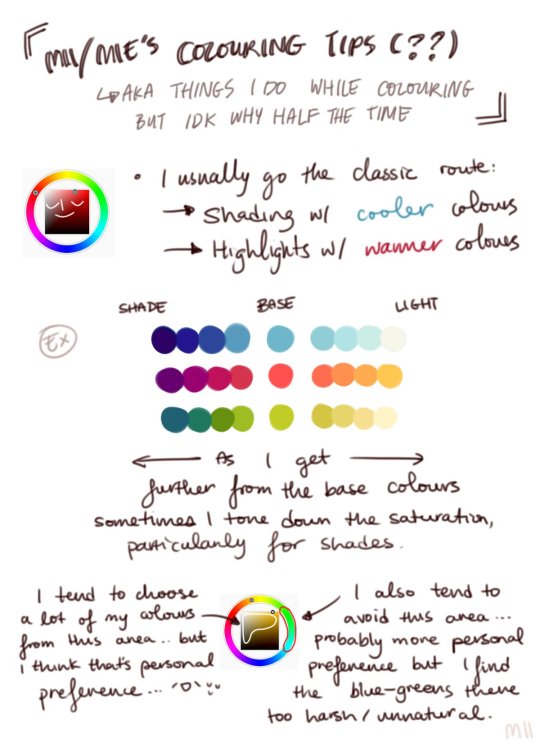

Digital Coloring Tutorial by Mii
5K notes
·
View notes
Text
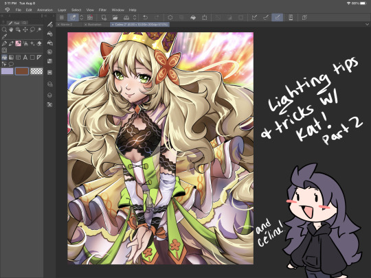
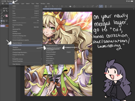
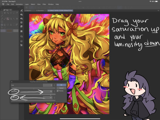
I’ve got 2 more lighting tips today: first one is something I call “soft rendering.” It gives that fuzzy, 90’s anime feel! I hope you all enjoy it! I’ll post the second lighting tip tonight!


#smkittykat#smkittykat art tips and tricks#digital art#art ref#art reference#art tips#artists on instagram#artists on tumblr#artists on twitter#digital art tutorial#art tutorial
484 notes
·
View notes
Photo
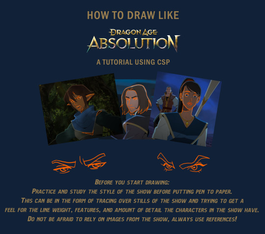

Dragon Age Absolution tutorial!
Note: All you will need to draw this is a tapered pen and a pen with no pen pressure for lines.
Here is a link for the brush I used for lines: Download
Written Steps in the Read More!
Before you start drawing:
Practice and study the style of the show before putting pen to paper. This can be in the form of tracing over stills of the show and trying to get a feel for the line weight, features, and amount of detail the characters in the show have. Do not be afraid to rely on images from the show, always use references!
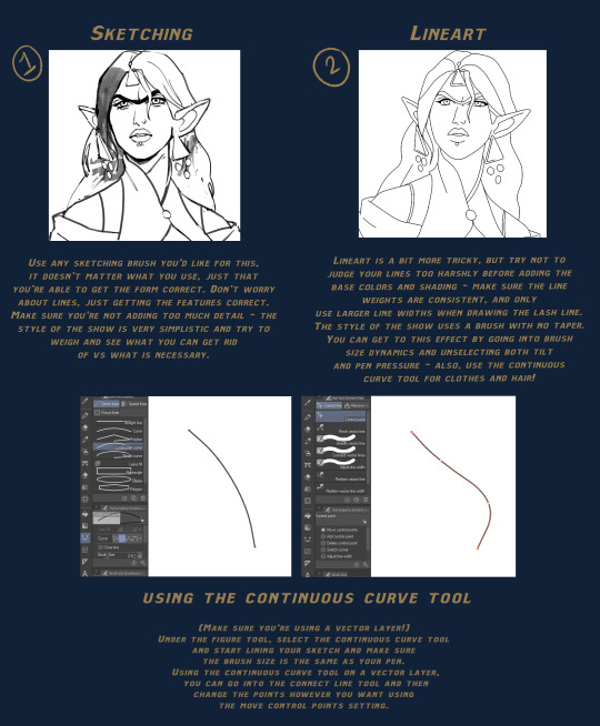
Steps:
Sketching - Use any sketching brush you’d like for this, it doesn’t matter what you use, just that you’re able to get the form correct. Don’t worry about lines, just getting the features correct. Make sure you’re not adding too much detail - the style of the show is very stylized and try to weigh and see what you can get rid of vs what is necessary.
Lineart - Lineart is a bit more tricky, but try not to judge your lines too harshly before adding the base colors and shading - make sure the line weights are consistent, and only use larger line widths when drawing the lash line. The style of the show uses a brush with no taper. You can get to this effect by going into brush size dynamics and unselecting both tilt and pen pressure - also, use the continuous curve tool for clothes and hair!
Continuous Lines - (Make sure you’re using a vector layer!) Under the figure tool, select the continuous curve tool and start lining your sketch and make sure the brush size is the same as your pen. Using the continuous curve tool on a vector layer, you can go into the connect line tool and then change the points however you want using the move control points setting.
Flat colors - For flat colors, it may be helpful to place or paint your background first to get a sense of lighting and tint. Feel free to adjust and use color balance, the style of DA Absolution uses solid and saturated colors.
Cell shading - Now - for cell shading, use a solid tapered pen on a clipping mask above your colors. For highlights, set the layer mode to Add (Glow) and adjust opacity and color as necessary. For shadows, use either multiply or soft light layer with a darker color to create dimension - as before, adjust opacity and color as necessary. Try to keep the shapes sharp, but if the edges are too rough, use a small amount of blur.
Final Touches - Using a black tapered pen, create shadows around the folds of clothes, the chin or jaw, and hair - add highlights in the same method as before for smaller details and add a shine to the eyes and lips. If the image is pixelated, use a small amount of blur - and you’re done!
#step by step#art help#art tutorial#digital art tutorial#clip studio paint#dragon age absolution#da absolution#dragon age#dragon age fanart#long post#brushes#resources#bioware
1K notes
·
View notes
Text


#Digital Art#Digital Painting#How To Paint Skin#Skin Tones#Art Tutorial#Digital Art Tutorial#Iridescent Skin#Holographic Skin
129 notes
·
View notes
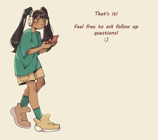
Note
Would you be able to do a tutorial on your coloring/rendering process? Love your art!
Thank you! 💛 It was pretty fun to make actually! (It's a bit long tho)
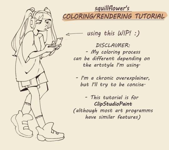


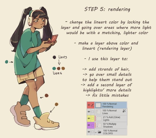
If you're curious about my brushes, I have a separate post about it under #art tips
I thought about doing a video but there would have been so much rambling.
#art tips#digital art#tutorial#art tutorial#coloring#rendering#clip studio paint#digital art tutorial#answered#anon ask
822 notes
·
View notes
Text
youtube
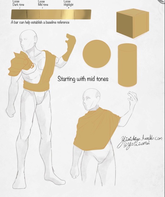
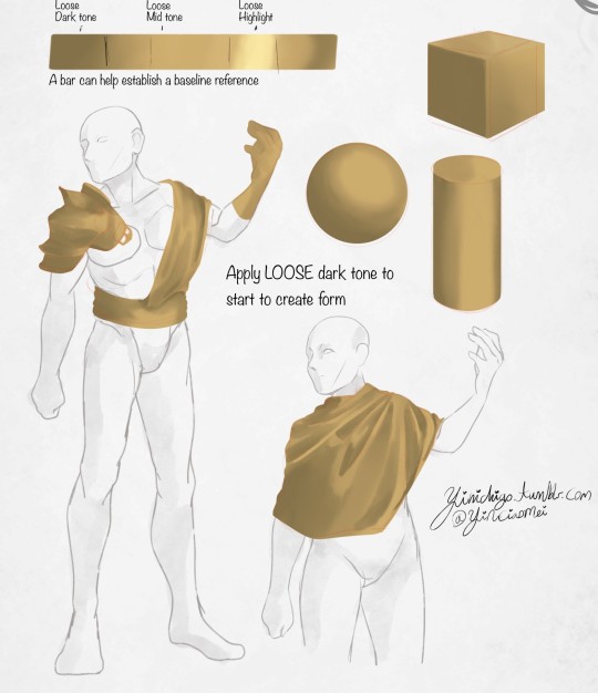
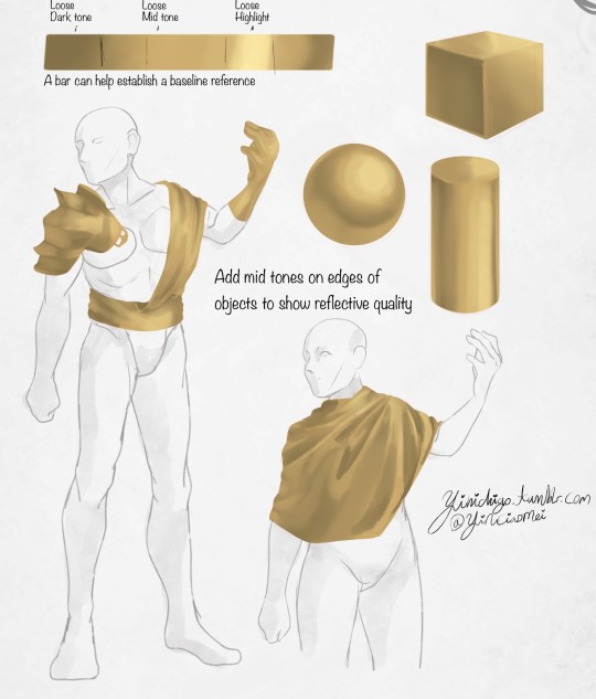
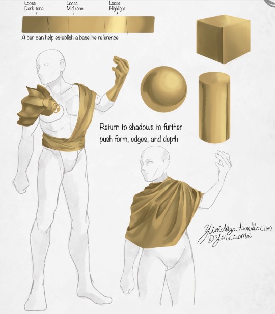
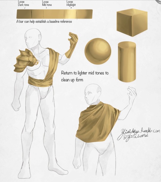
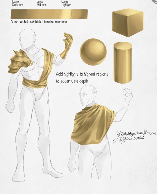
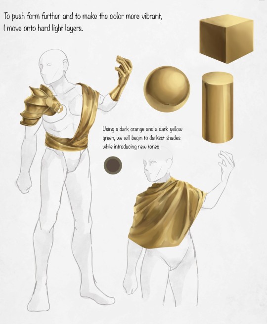
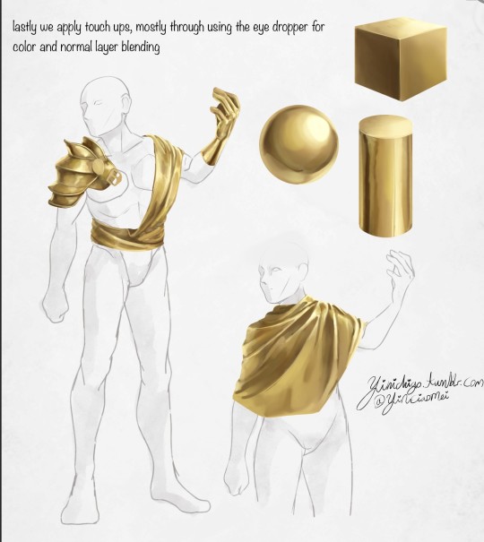
I made a tutorial!
This was requested of me a while ago, so apologies for the wait! In this video I cover my entire process when it comes to coloring/drawing gold. I did my best to explain in-depth and detail how light, shadows, contrast, and color work together to create a polished gold look, applicable to any metal in art. Hopefully it's not too difficult to follow and I hope it helps!
--
ko-fi / patreon
twitter / youtube
#jaskdraws#art tutorial#how to color#gold reference#how to gold#coloring gold#coloring metal#gold tutorial#metal tutorial#digital art tutorial#artist#coloring reference#Youtube
89 notes
·
View notes
Note
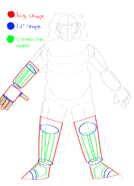
Jealous of how gracefully you draw mecha stuff,,, do you have any... Advice or tips or?
Howdy-do ! I can certainly try to explain my process !
With mech, I always start with an idea first, and I draw it how I usually do it— Like say, Mephisto's prosthetics ! The first step is to just draw regular limbs first and figure out the individual parts. This is the "it does not need to look good it just has to exist first" stage, and you're basically just doing what you know. [Four limbed Mephisto jumpscare]

Now, you're gonna take these shapes and try to see exactly how they join together and bend. I like doing it by taking everything apart in 3 groups- The big shape (The "flesh" if you will, basically everything you see on the outside), the lil shape (Articulations for the big shape, basically what allows it to move) and the connectors (The skeleton for how your big shape is going to be structured ! it defines how lifelike or how robotlike your character will feel depending on how bendy or stiff). The simpler everything is, the better for stylizing !
Looking at ball jointed dolls and other such puppet characters has really helped me understand anatomy as a whole, but it's been especially helpful to robots since it has that certain natural stiffness to it, which I personally find crucial in robot designs. Here it is applied to the diagram !
Then, you're gonna wanna refine these shapes into something more cohesive ! Really string everything together with the same principles, but a little more stylization. These still look like limbs, but you can see exactly how they bend and stay in place through the exposed articulations. Just remember to keep it all relatively straight-edged and using of the skeleton to make sure you don't get too organic looking ! Mech is about geometric designs most of all !
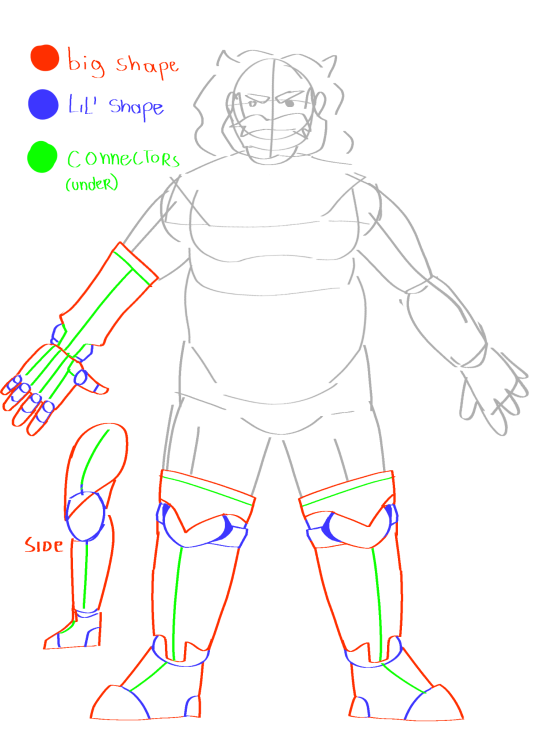
And finally, once you feel it looks good, you go back in again and carve out your detail ! Add some stuff to that guy ! Make him look more interesting !
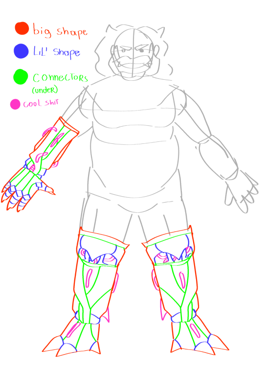
AND you still get to follow principles ! How fun is that !!!
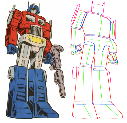
The best way to practice this method imo is to just trace over robots you know and love. Transformers especially is a really good source of inspo for me, since they're made with toy features in mind and therefore allow for greater range of movement. You can do it to basically anything though ! Even more humanoid looking bots ! Here's two I did on Optimus prime and Fl4k from BL3!

A really good tutorial on this stuff is How to think when you draw: by TheEtheringtonBrothers on DA. Seriously, their stuff is highly informative, and they do a better job explaining than I ever could ahaha. They've got a bunch of tutorials with really good breakdowns of fundamentals and all that stuff up on their pages too, so I highly reccomend you check em out !
But yeah, most of all, practice is your friend. Observe how other people stylize machines and try to replicate it, read up on tutorials, see real life machines, get inspired by your favorite cartoon robots— It's all part of the process ! Like with anything in art, you need to crack a whole lot of eggs beforee you finally learn how to make an omelet you like, but whats most important is that you make an omelet at all. Some stuff is gonna burn or turn out not how you wanted it, and that is also normal, so you need to learn to embrace it and keep on going !
Happy drawins ! Here's a peepaw seal of approval just for trying :]
#audience participation#original art#my art#artists on tumblr#digital art#art#sketch art#tutorial#digital art tutorial#art tutorial#mech#mecha#how to draw#myart#my artwork#my art stuff#oc: mephisto
93 notes
·
View notes
Text
I love the wet edges effect in PS but it's hard to use if you use layer masks or want to do shading separate from markings etc. because it gets lost quickly. I accidentally stumbled on this easy workaround you can do at the end. It helps to start with a textured, varying-opacity brush but it looks cool on hard edged cel shading also.
IDK if this filter exists outside PS but if it does I'd imagine it can be used the same way.
117 notes
·
View notes
Text
Hiya!!
A Friend wanted some help figuring out shiny things so I made a quick tutorial to help him get started!!
This just covers the basics and doesn't account for textures like the weave of a fabric or abrasion of metal but should at least be a good starting point!


49 notes
·
View notes
Text
How to draw Stylized Headshot Step by step :

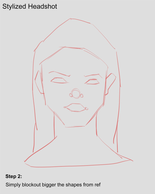
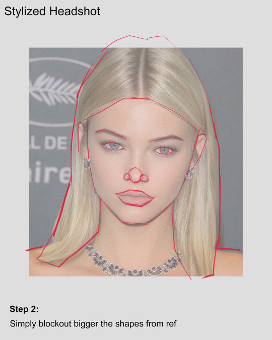


Hey! It's been a whileeeee.....and i came up with headshot tutorial since I've been working on my 3D project. I didn't get much time to make 2D fan arts like before. Well, i guess the time I'm investing into building my 3D portfolio and it gave me huge improvement in my art skills.
Hope you guys having a good time :) 🤟
#art#drawing#portrait art#art tutorial#drawing tutorials#tutorial#how to draw#How to#drawing tips#art tips#portrait painting#digital art tutorial#digital art#sketching tips#sketch#anatomy drawing#drawing ref#artists on tumblr#artwork#drawing reference#art reference#art tutorials#tumblr draw#stylized#stylized character#stylized portrait
101 notes
·
View notes
Text
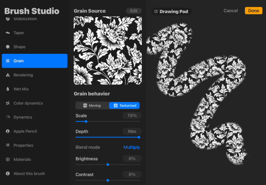
I just figured out how to make texture and pattern brushes on procreate. i am unstoppable now.
in case youre wondering btw, if you download or draw an image (png works best for patterns, but if you want a texture it will use the color values for the opacity which you can invert as needed)…
1. make a new pen
2. go to grain
3. grain source > edit > import > photo > choose the img you want to use
4. OPTIONAL: adjust the other grain settings if needed
5. OPTIONAL: shape > shape source > edit > import (if you need to change the brush shape)
Example with a brush i made with a jacquard pattern stock image i found on google images then edited to remove background & watermark
26 notes
·
View notes
Photo

Layer Effects Tutorial by Robin
#art#layer techniques#digital art#digital art tutorial#layer effects#rockinrobin#blending layers#layer effect tutorial#digital art techniques
6K notes
·
View notes
Text
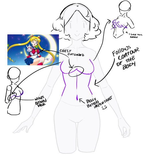

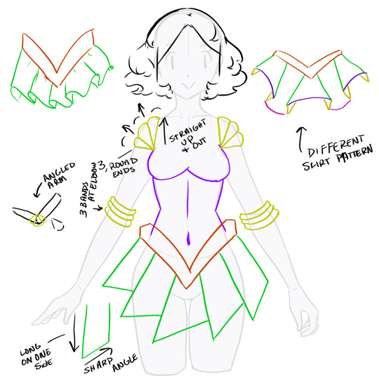


I made a lil tutorial on how I draw the sailor scout outfits. Pls enjoy
63 notes
·
View notes
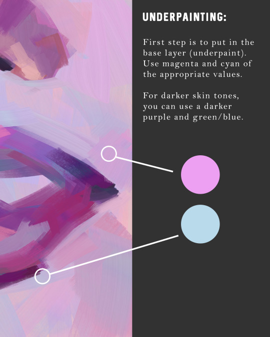
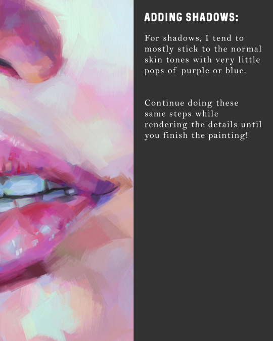
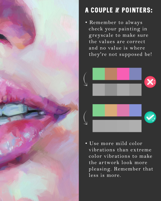
Text

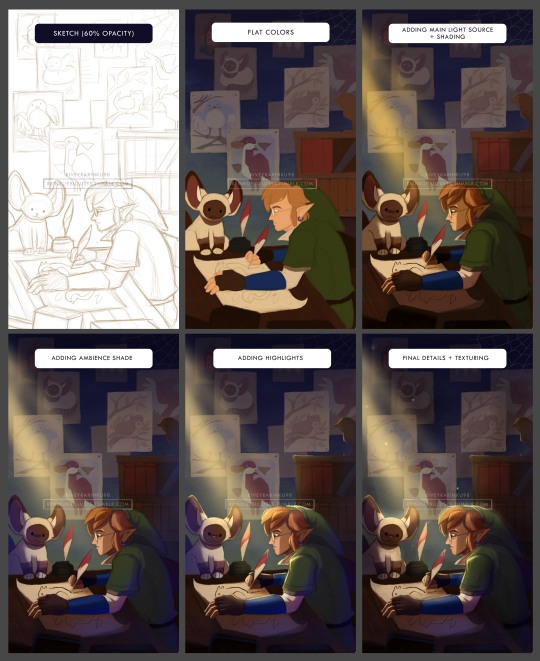
This is the rendering process of my digital painting! I usually prioritize the main point of interest (as it saves more time too) and always keeping the sketch layer visible, since I really liked the sketchy look which gives the illusion to look like a traditional drawing.
I had tons of fun making this, and I feel sometimes that explaining the creative process is more fun rather than the finished drawing. It's kinda giving me the same vibe as a chef explaining and preparing for a fine dining meal tho.
And sorry if some parts are hard to understand, as I also wanted to make a simpler guide on digital painting in future posts!
Here's the TL;DR version if you just wanna observe the visuals :D
#art progress#digital art tutorial#digital painting#the legend of zelda#skyward sword#legend of zelda#skyward sword link#remlit#2024art
20 notes
·
View notes
Last Seen Blogs
fragmentos-meu-caos-diario
Fragmentos: Meu Caos Diário

amorypalabras
All you need is love
tpols
little light.
ravey-b
Reveries of a Fallen Angel