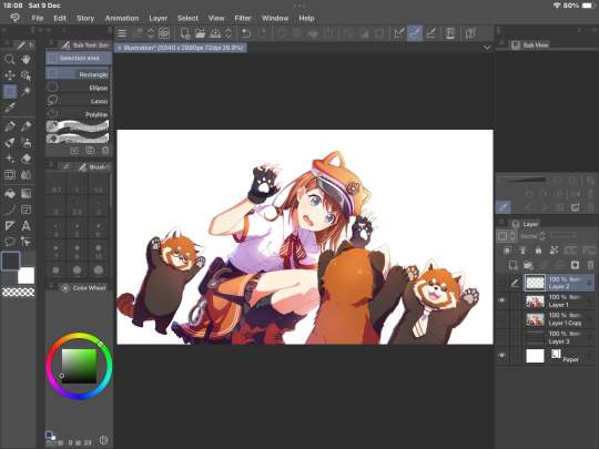
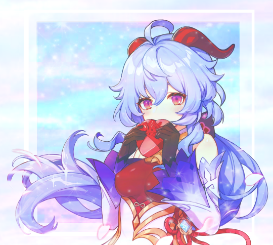
#editing tutorial
Text

jelly text tutorial! (works with shapes as well)
what you need: ibis paint x, premium or free version doesnt matter
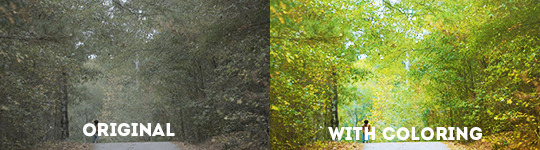
step 1: color
yes we're starting with color! I highly suggest using multiple colors for a prettier finish. I prefer parallel gradiation but as long as its blurry anything should look nice. pick analogous colors for the best result.

step 2: write the text or draw/import the shape.
as it says! if youre drawing it, make sure its on a new layer above the gradient! I suggest using rounder, bubblier fonts/shapes, one of my favorites to use is starborn on all uppercase. the color you use does not matter as it will be the background color in a short bit
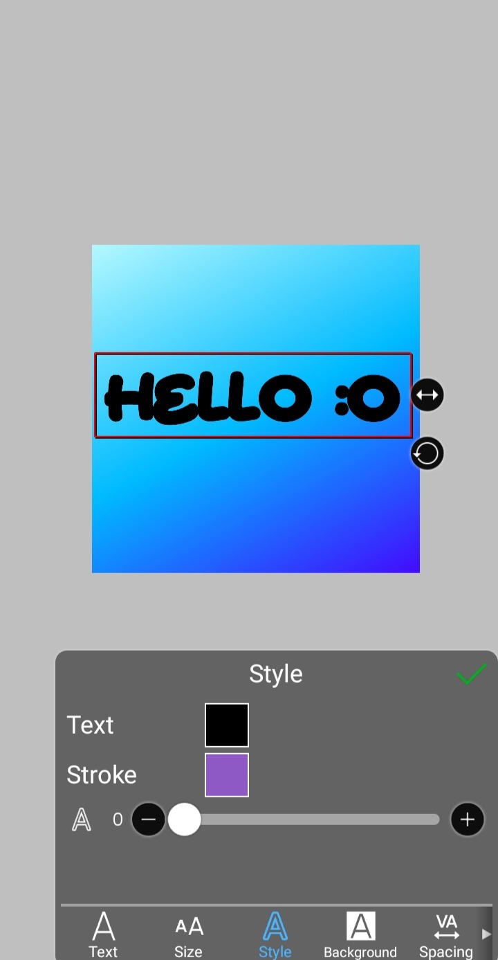
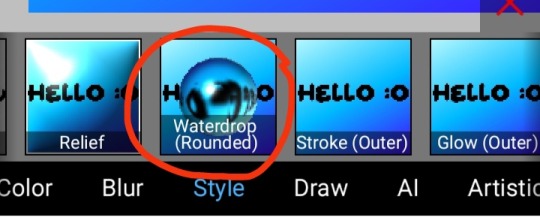
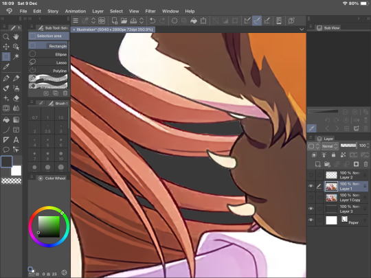
step 3, the jellificationing
this little friend called "water drop (rounded)" in effects under style is your best pal. its here to help you and make the process so much easier.
so just press it and fiddle around with it until you're happy with the result.
step 4 (optional): refracting
to help it make look more 'realistic' I tend to add another layer of the water drop. to do this I simply copy the previous one and go do the same effect on the top layer
step 4.5: tips
you need to make sure the refractive index for the second one is turned down all the way, or itll look weird, streaky, etc. make sure the highlight and highlight size settings are lower than the previous time you used this effect. and make sure the little sun symbol (the light source) is on the edge of the opposite direction of the previous time you used the effect. so if the first layer of jelliness had the light source coming from the top right, the second layer should br on the very edge of the bottom left.

step 5: begone, background
yeah, we're done with that, this will also be the big reveal of the final image

and then you just crop to fit and then save as a transparent
bam! heres the final thing!

I dont know how good I am at explaining but I hope this helped! if youre confused dont be afraid to ask!
#🌫️ i know what you dread | creations#rentry#rentry inspo#rentry resources#editing resources#editing#editing tutorial#edit tutorial#edit resources#rentry decor#rentry graphics#carrd resources#web graphics
344 notes
·
View notes
Text
♡⃞ㅤㅤhow to add a stroke effect to transparent gifs in photopea!
✚𓈒 (explained by an IDIOT that's super duper bad an explaning things)
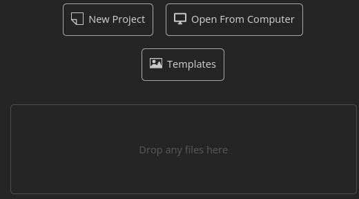
first, open up your gif! you can either open it by clicking the "open from computer" button and or the "drop any files here" button.
For this tutorial, I will be using this gif as an example!

now that you have opened up your gif, look over to the side pannel.

this is what I'm talking about!
now, click the "eff"/"effect" button, its next to the chain button!
after you click the effect button, you will see this pannel!
now, click the "stroke" button, after you click the stroke button, you will see this pannel!

you can change the color, size, and blend mode of your stroke! after you play around with your settings, just hit the "OK" button
after you press okay, you should get a little something like this:
if you like your results, then export your gif!
and tada!! your done! here's my result:

#𝒢𝜚 𝐦inty 𓈒✚ ˘ ˘ ⁾#photopea#photopeablr#photopea help#tutorials#photopea tutorial#editing help#editing tutorial
143 notes
·
View notes
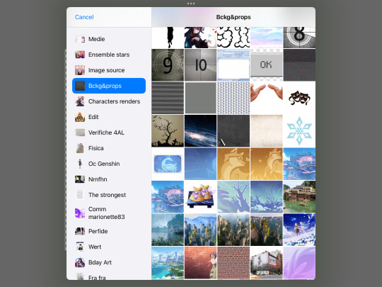
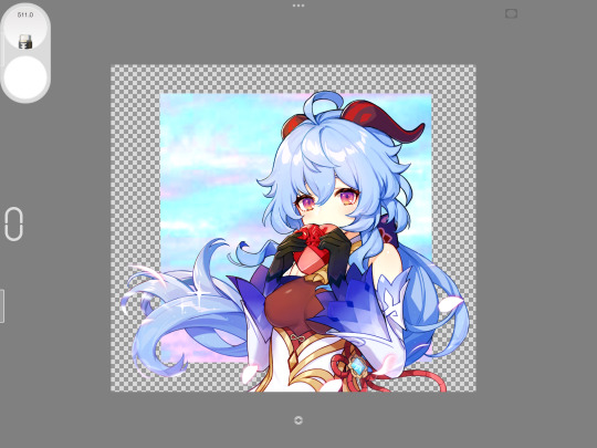
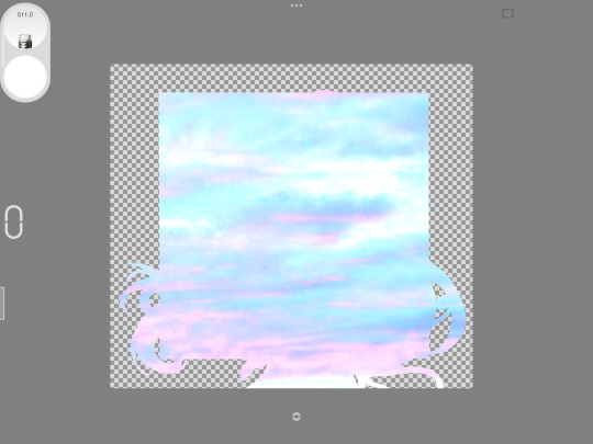
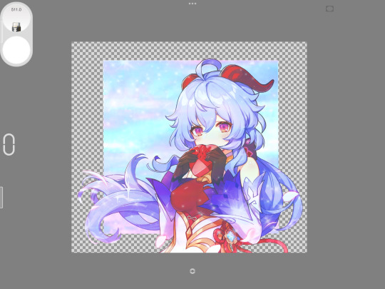
Text
How to make transparent/renders!
so, we asked if y’all wanted to see us make this, so here we are.
we’ve been making transparents for like. a year? we have a lot of practice, but we also aren’t perfect lmao. so take all this with a pinch of salt.
What do you need?
~ some sort of art program (we use clip studio)
~ something to draw on (eg, a phone, tablet or pc)
~ a steady hand or a compatible pen with your chosen device
we use our ipad with a knock off apple pencil and we’ve also used a drawing tablet with our pc before. both are your best options tbh, but don’t let your tools hold you back.
Part 1: preparation

1) we’re going to use a pjsk card as an example, because, duh. we went for this new minori card, which we downloaded off of sekai.best, which is a good website to find leaked cards. otherwise, download them off the wiki.
1.5) if it downloads as a webp, google a webp to png converter and use that before the next steps.
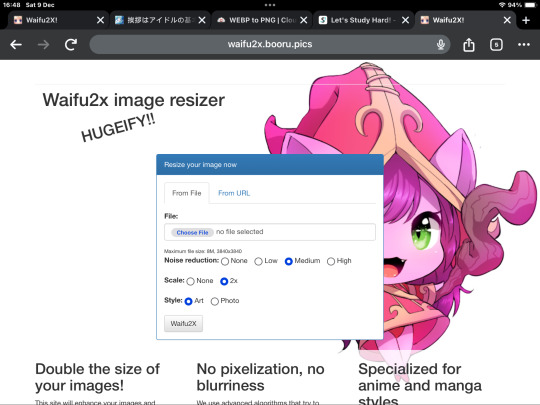
2) (optional) we resize our images using the website, waifu2x before we start. this just makes them slightly better quality and stuff.
Part 2: the meat of it

1) open the image in your program of choice. make sure the program has these options: layers, select and inverse select, and I’d recommend using a high stabilisation pen setting.
2) next, outline the entirety of the character in a bright colour. we use green, because it stands out the best on most things. this can take a hot second, but it’s the best option for a clean transparent. do this on a separate layer, that way you can erase any mistakes before cutting into the image.
2.5) you can also use the lasso tool to skip the outline section. go around as close as you can to the edge, but not completely, and then move on to the next part.
3) on your outline layer, select the inside with the magic wand tool. then, invert selection. this selects the area outside of your transparent.
4) use the cut option to then remove the selected background. then, delete or cover the green layer. you can stop here if you like, but for a higher quality, continue onto the next parts.
Part 3: clean up

1) if you zoom in, you’ll see lots of small lines and dots left over from the previous steps. the best and most effective way to get rid of these is to go through and carefully erase them.
2) we check it both on dark grey and white backgrounds to make sure we don’t miss anything. make sure to zoom out regularly to make sure the lines are straight.
3) this is mostly trial and error. this part comes with practice, but you get the hang of it with time, honestly same with the outline.
mini tips:
make sure to erase all parts, including between hair, smaller areas, etc.
don’t worry too much about it being perfect, nobody will notice if you miss a couple spots (trust us).
zoom in and out a lot, focus more on the things that are visible zoomed out than the parts zoomed in.
when in doubt, use a soft brush to erase any weird parts, especially items in the foreground and such.
100 notes
·
View notes
Note
How do you get your lighting so scrumptious in edits?
Lighting tutorial under the cut (it's long lol) I use photoshop + topaz clean btw :)
This will be our starting pic!! I use @hazelminesims photoshop action (all in one) to get the smoothening and overall base done first.
First step to colograding is using the 'Camera Raw Filter' in photoshop and adjusting the tint and curves tools. I generally like a greener, more cool toned color for pictures.
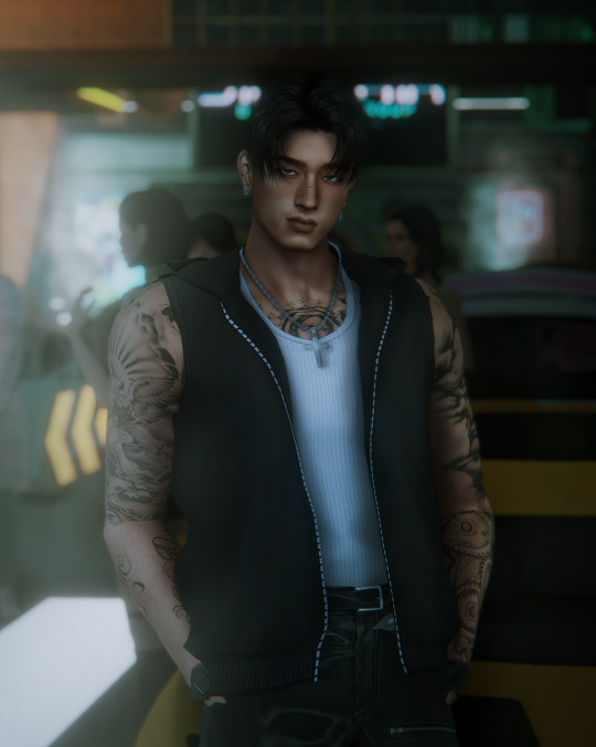
2. Now for the shadows on the sim! I make a new layer, set to 'Multiply' and use a soft brush at around 25-40% opacity with the color Black. I generally will add shadows to the parts of the body that are being 'covered' (neck, side of the nose, forehead, insides of arms and clothes). *If you use reshade/ gshade and have the mxao filter on, mimic where that filter adds shadows and either enhance it or add it in photoshop!*

3. In a new 'Multiply' layer, I do the same thing with the background. I darken the elements in the back to emphasize that my sim is in the forefront of the shot. TIP: don't add shadow to the light sources (neon signs, lights in the background) ! We actually want to enhance those.
4. Make a new layer, set to 'Pin light' at 100%. Grab a soft brush and highlight those light sources in the back. You can go crazy here, just take the Eyedropper tool to color match the highlights you want to emphasize. It might look a bit much right now, but we can tone this down by decreasing the layer opacity, Gaussian blurring the layer, and erasing any excess highlights if we want.
5. Now we add highlights to the sim. I make a new layer, set to 'Soft light' at 100% opacity, and with the white color, I highlight the sims body and clothes. (Now we want to add light to the 'raised areas' such as the center of the forehead, nose bridge, chin, chest, and arms). I also like to highlight any jewelry (necklace and belt buckle).
On a separate new layer, set to 'Vivid Light', I changed the brush colors to the ones in the background light sources (I used blue, yellow, and purple.) I'll go over the outlines of the sim's body with these colors (shoulders and arms, hair, side of face and neck.)
If you ever feel like you've gone overboard, just lower the opacity of the highlight layers and Gaussian blur them!
6. After you've messed around with the highlights, add the finishing touches. Usually once I merged all the layers I would go over with the Dodge and Burn tools to enhance the contrasts even more. I also recommend downloading and using LUTs for photoshop (I just use any free ones I find online).
83 notes
·
View notes
Note
Hiii! I was wondering if you do any editing to your pictures besides using reshade !! I love how your screenshots look <3
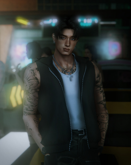
Hello! My editing is pretty simple. I use Adobe Photoshop 2021, Topaz Clean and Analog Effex Pro plugins.
First I crop my picture and run all-in-one action from this pack to make it look crisp and smooth like this:
next I apply Analog Effex Pro 2 plugin (i play around with different filters from picture to picture depending on what I want to achieve so i don't have any go-to presets). It's such a lifesaver tool providing a wide rage of editing options. I go with basic adjustments, film type, and dust and scratches to get smthn like this:
At this point if I feel like going extra I may apply color grading or use some @wooldawn's actions

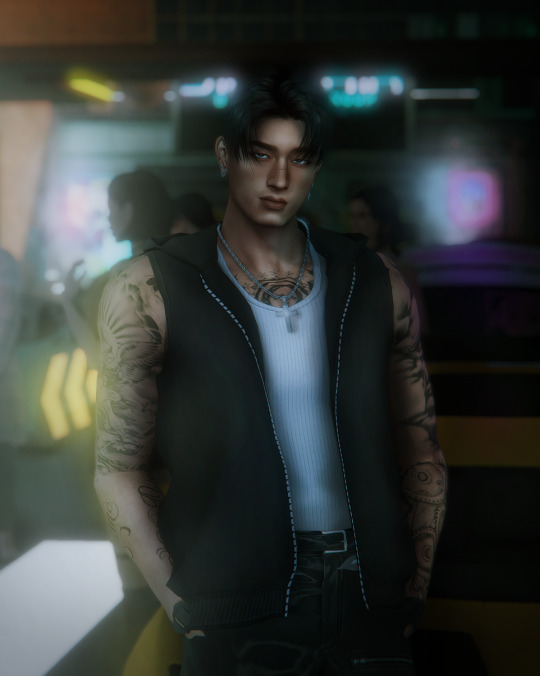
For an outdoor shot that would be it, but if the picture was taken indoors like this one I enhance lighting by, well, paining it. Here's what I do: first create an empty layer, fill with color black and change blending mode to soft light. Then take large soft brush (color white), paint areas where you imagine the light source is and apply gaussian blur (set the radius to high values to make the edge of dark and light areas smooth). Lower the opacity to 15-30%

Here's what I get in the end. Hope that was helpful
74 notes
·
View notes
Text
bringing back old editing styles: picspams
hi everyone ~
so i’ve been on tumblr since forever and took a break and then recently came back! however i'm still very much stuck with 2012 tumblr trends (lol) when graphics and picspams were just *chefs kiss*
i know trends change and all buttttt i really miss the creativity and beauty of picspams and graphics so...here is a picspam tutorial for y’all! stay tuned for more tutorials to come!

step 1: pick your screencaps
make sure they’re high quality
colorful/vibrant already
easy to mask (masking is really important here)
also figure out what color scheme you want to do! personally i like to organize it by warm colors on one side and cool colors on the other side but you can mix and match like this picspam
step 2: cropping
you can def choose whatever sizes you’d like but for my picspams each cap is 270px by 150px and the full size is 540px by 600px
step 3: getting textures
ok this is where the fun starts! although colorings are important, textures i'd argue are even more important and can elevate your picspam to a whole new level! and can even be used as a coloring (will explain later)
light leak textures / gradient textures such as:
textured textures (yes you read that right lol) such as:

step 4: base coloring
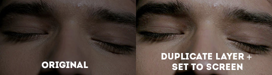
always start off with a base coloring on your cap which essentially just needs to be things like brightness, contrast, and/or vibrance etc. also a neat trick i learned is duplicating the cap layer and setting it to screen which can be used as a base coloring
example of duplicating layer + setting it to screen (it just brightens a bit)
step 5: the colorful coloring
so here is an example of taking a dull cap and making it super duper colorful <3
here are all the adjustments used:
vibrance: +100 (adjust as needed for your particular cap)
selective color: this is REALLY important so based on the color you want to bring out click that selective color. so for this cap i wanted to bring out yellows so i clicked the yellow tab and set it to +100
basic brightness/contrast. i usually like to add more contrast as it makes colors pop
another selective color layer
then a layer of a soft brush of yellow or a light leak on the corner and i set it to screen (screen is your bff here)
and then a few more layers of color balance, i just shifted it to be more cyan so i can bring out some greens + brightness etc,
this is what I mean by soft brush or light leak (adjust colors as needed):
step 6: coloring but also using textures

for this, same as before, have a base coloring and i also added a layer of solid yellow color and set it to ‘color burn’ so you don't even need to color anything!! the layer of yellow + color burn or even dark, multiply etc will do that for you
next, slap on a texture of your choice and set it to multiply and you’re done
tips:
always always use a mask on every layer so you can easily erase adjustments where it shouldn't be
if you want to add more colors use gradient map and set it from black to whatever color you want and then set it to soft light or screen and adjust opacity as needed
selective color if your bff here
light leaks go a long way! using light leaks or just soft brushes and setting it to screen or soft light make picspams pretty :)
use topaz labs if possible to sharpen! it just looks super clean
color fill is also great to use to make a cap more warm or cool toned
you can use light leaks, gradient textures, gradient maps, or solid colors and set it to multiply for a hassle-free quick coloring
this is my first tutorial so apologies if it doesn't make sense! im happy to answer questions just shoot me a message <3
and don’t forget to tag me in your creations folks! i'd love to see them
~farah
#picspam tutorial#editing tutorial#graphic tutorial#photoshop tutorial#pscentral#allresources#lydstilinsk#scottstiles#just tagging some mutuals :)) in case y'all wanna share <3#tutorials*
394 notes
·
View notes
Note
Hi! So i recently had a request for a pastel edit and i just couldn't pastel it. I have made pastel edits in the past but i just. Forgot how??? Soo, if its alright, could i please ask you to make a tutorial on how to pastel edits 😭
Sure thing!
I’m not an expert but here some things I always do when making pastels!
Ps: these are just tips, I’m no expert, and this is my idea of pastel! If you don’t like it it’s ok obv!
Step 1: Prepare
Before getting to the actual editing I like to have things ready to start (like a painter has their colours ready before beginning)
Ready your resources
I always like to have some “props” like object transparents and decorations that fit a certain aesthetic ready to use so that I don’t have to look for it while I have my creative juices going. I can like go wild with it. I have like folders for backgrounds, pre-made layers and such.
I’d say it’s a good thing to have like stuff like that in general. I usually associate flowers and like cute stuff with my pastel edits, for example.
And ofc the transparents of the character. It’s kinda bothersome having to look for them while you’re editing in my opinion and if you’re custom making it I suggest making it in another file, just to be sure.

Choose your palette
Pastel edits usually have one very simple palette or some light gradients so I think you should choose what kind of pastel colours we’re talking about in an edit.
I usually choose the subject and the render I want and start from there, lightening the colours if needed.
Of course, you can also use contrasting colours, although I wouldn’t use them too much in a pastel edit cause the contrast would… idk uhm not fit in with the light pastel feels you want to give?
Tip: if you want to keep consistency try to choose very similar images (from a colour point of view, so like not a super light one and one in the dark)!

Step 2
Edit
Pretty basic, I know.
Like organise things and layers however you want them before turning it into a proper pastel!
Tip: some nice elements to put that kinda give that dreamy pastel vibes (imo) are clouds and flowers and such so yeah! Or whatever you feel like obvs!
Step 3
Make it pastel
There are many ways.
Usually I put a pastel background (just plain colours) and then a foreground (could be a gradient if you’d like) at low transparency (so that it doesn’t cover anything too much.
If you don’t want to lighten the lines of the edit, you can save it and then change it’s colours manually.
Then I usually put some faded foregrounds on (usually I exclude the character to make it clearer).
The from them see if you like it.
I also suggest some glitters, not too much though. But some glitter never hurt nobody, right?
I think it gives the edit a dreamy effect if put strategically.
And… yeah that’s it.
I hope it was useful!
24 notes
·
View notes
Text
shading and lighting tutorial!
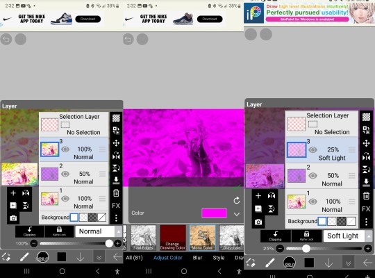
this was requested by an anon. a little before we start! i use procreate on my ipad pro with an apple pencil. unfortunately procreate is the only program i know but i imagine similar features exist in other programs as well. i feel like i need to say that i am in no way an expert on shading and i know it's not always accurate. also if you end up using this tutorial in some of your edits please feel free to tag me, i would love to see it! if i've missed something or if i explained something badly don't be afraid to ask me about it. okay long post ahead!
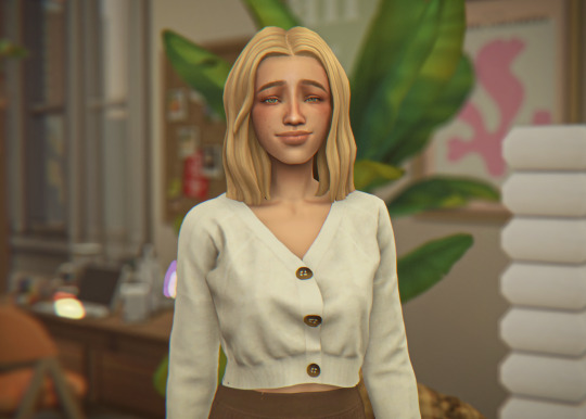
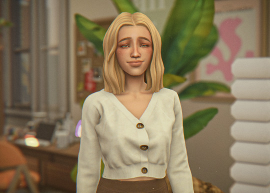
so i'm going to just make a little simple edit of my girl. this is a screenshot taken from cas that has the sunscreen filter on it from the built in windows photo editor on 20% intensity.
now i've added my normal little touch ups that i usually do, eyelashes, catch lights and highlights as well as touching up her scars. everything is painted with the soft airbrush except for some highlights that are painted with the 2B compressed charcoal brush. before adding highlights however you should figure out where you want the light to come from. i've drawn a little ugly sun for you to see where i've placed my light.
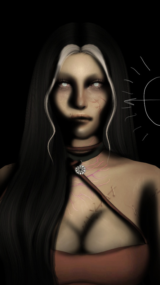
now i use the soft airbrush and paint with black where the shadows would be. if i would have fixed up the hair (which i didn't for this one because it's my least favorite part and i didn't have the energy) i would have made sure to make the shadow layer behind the hair ones since i think it looks better if the hair isn't shaded the way the face is. then i blend all of the black out with the smudge tool with the soft airbrush so it looks a little softer.
then change the layer to soft light and change the opacity to 60% and voilà! you have soft shadows! if some shadows still look to harsh for your liking just go back in with the smudge tool a little more.


now do a layer on top of everything and kind of circle the part you want lit up the most with black again, smudge it and set the layer to soft light at 60% opacity.


this step is not a must, i don't do it very often anymore but if you want some extra color or light you can do this. choose a color you want your light source to be. i tend to feel like intense colors look the best. paint it where you want the light to come from, then use the gaussian blur tool until your satisfied.
now you can leave it in the normal layer setting or play around a bit with different ones until you find something that you feel fits. for this one i decided on using the difference layer setting on 70% opacity.


a step i always almost forget is shading the eyes! to do that you just repeat the normal shadow process. paint it black, smudge and put the layer to soft light on 60% opacity. it adds so much, i highly recommend this step! now you're done with the first part. now save it as an image and start a new canvas with that image.


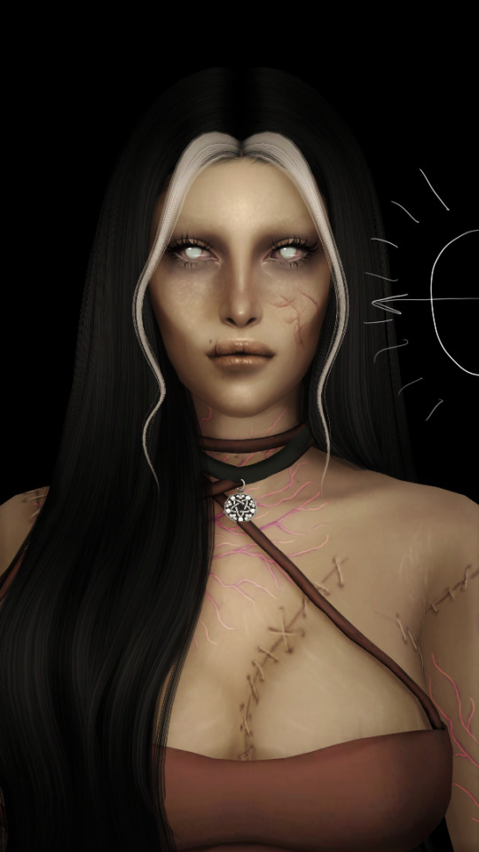
if you want to use gaussian, motion or perspective blur now would be the time. i didn't for this one but i almost always do. this next step is also totally optional. we are going to use chromatic aberration in the displace setting on 90% opacity and slightly pull it to the side. then use the normal chromatic aberration between 5-10%. it just adds a lot of fun and weird color that i just love and makes the edit look so much more alive. then use sharpen, i usually do 10-15%. and after that use bloom. my edits are almost always dark so i use a lot of it. i think i did 35% for this one to give it a little glow. then use noise. my go to is 3% on max octaves. then go into hue, saturation, brightness and change the saturation to 55% (you can do however much you want but these are my go to's) and brightness to 49%.

now go into curves and play around. i always make the gamma brighter but the colors i play around with so much.

completely optional again but i've recently started to add a gradient map, especially instant or noir. for this one i used noir on 20%. and that's it, we are done!
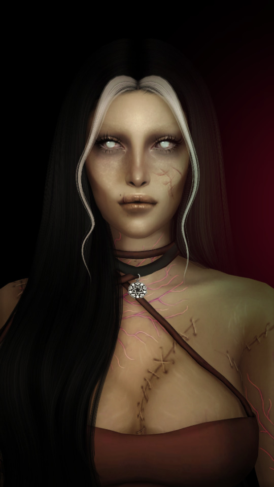
before/after.
hopefully this is understandable and helpful. have fun!!
128 notes
·
View notes
Text
🩷 BALSAM MOODBOARD - TUTORIAL 🩷
type: gif songboard
apps used: ibisPaint X, GridArt Collage Maker, CapCut, Ezgif
filter tutorial under cut!
So there were three different kinds of filters i used - ones for the characters, ones for the flowers, and ones for the additional images.
🩷 Character filters 🩷
First, i imported the card into ibis and increased the saturation by 34%. This is the base- I do not use the card that is not saturated again. Then duplicate that layer.

Keeping the bottom-most layer as it is, i used the mono color filter, and used purple, because I wanted the moodboard to be purple. Set the purple mono color layer's opacity to 50%.

I think it's important to note: the purple I used is within ibis's preset colors, all of which have their saturation and lightness at 100%. Only the hue is different between all of the preset colors (excluding the skin tones).
After this, I duplicate the base layer again, and move it above the purple mono color layer. I use the mono color filter again, but this time with a character color- except they're not *actually* character image colors. They're still the preset ones on ibis. I thought that if I used actual character colors it might look less cohesive. For Mizuki, i used magenta, orange for Akito, yellow for Tsukasa, blue for Kaito, and another layer of purple for Rui.
After this, I set the uppermost layer's blending mode to soft light.
I then crop them 1:1. I use my gallery's crop options, but there are hundreds of other ways to do it. this step is optional, i do it because I don't like resizing the images in the actual collage software.
🩷 Flower filters 🩷
This one is much simpler. I import the already cropped photo, duplicate it, mono color purple, and set the mono color layer to 50%.

🩷 Additional image filters 🩷
The idea behind adding these was that I'd choose pictures that in some way or another represent Rui's relationship with the other 4 characters. The example used here is for him and Mizuki. The same colors were used as the "character colors" in the character filters.
Duplicate the layer, use the mono color filter. I used magenta again because this is also a representation of Mizuki. Set the mono color layer to 50% opacity.

Duplicate the base again, use mono color filter with purple, and set the purple mono color layer opacity to 50%, and its blending mode to color dodge.

All the images in the moodboard used a purple color dodge overlay. However, i made some minor adjustments.
With Akito and Tsukasa's images, because yellow (and orange, because they're so similar) directly contrasts purple, overlaying them on one another makes it look a little muddled.
So with Tsukasa's, i added another mono color purple layer at 50% opacity, and for Akito, i added a layer from the canvas (if your editing software of choice doesn't have this option you can just export the image and import it as another layer), decreased the lightness by 25%, and added another mono color purple layer at 20% opacity.

🩷 Collage settings, addition of lyrics, and creation of the gif 🩷
Normally, my settings for moodboard margins in this particular app are 17 between the images and 8 on the surrounding border. The border around the images is set at 5. However, for songboards, because I put lyrics in the margins, i set the margins between the images as 20 and the surrounding margin at 10.

Images probably won't make this next part any clearer, so I won't use them here.
I just import the moodboard into ibis, copy and paste the japanese lyrics from the vocaloid lyrics wiki into a text box on ibis, and then arrange them in the margins how I like. Sometimes I change the formatting, add punctuation, etc etc.
To make it a gif, i save each board individually, then import them all into CapCut. When you import several images at once, it keeps them at a constant length. I export that as a video, then import that video into another CapCut project, and adjust the speed to my liking. I then export that, and import it into Ezgif's video to gif function. When exporting the gif and the video, i try to keep the framerate low and the quality high.
That's all- happy editing.
6 notes
·
View notes
Text
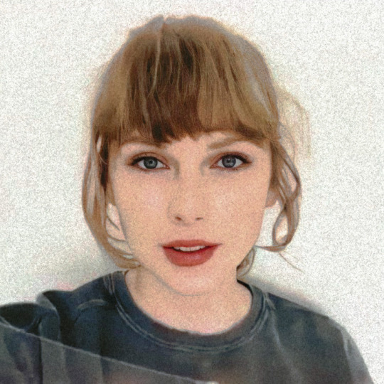

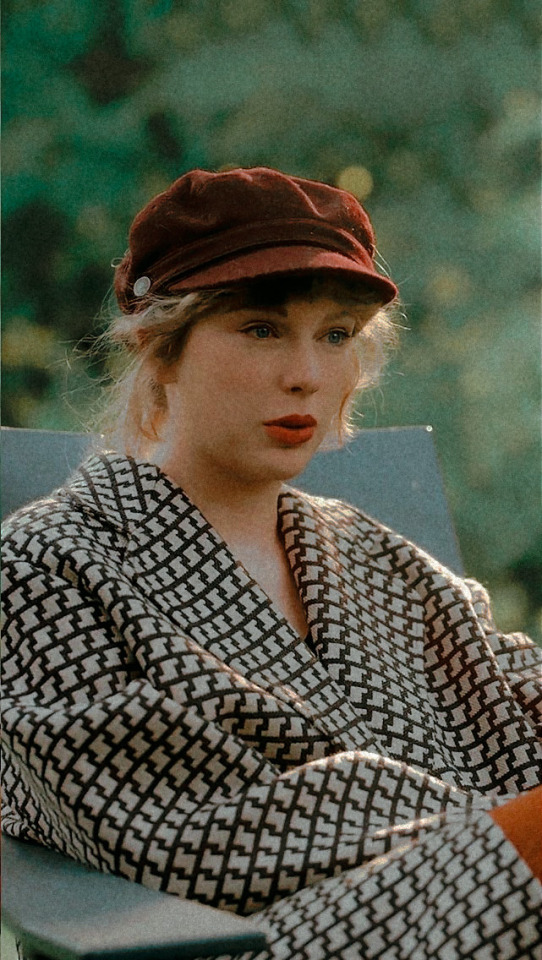

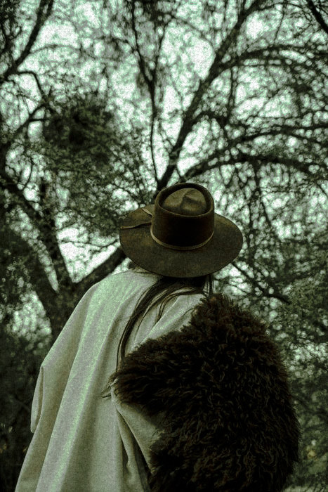

And the skeletons in both our closets
Plotted hard to mess this up
And the old men that I've swindled
Really did believe I was the one
And the ladies lunching have their stories about
When you passed through town
But that was all before I locked it down
Now you hang from my lips
Like the Gardens of Babylon
With your boots beneath my bed
Forever is the sweetest con
I've had some tricks up my sleeve
Takes one to know one
You're a cowboy like me
-cowboy like me
#editing tutorial#polarr filter#editing needs#polarr code#polarr codes#polarr filters#edit needs#edits#taylor swift#editing#polarr#edit#photo#art#filter#filtered#filters#soft#rp#debut#cowboy like me#evermore ts#evermore
12 notes
·
View notes
Note
HOOWWW do you get your photos to look THAT amazing!!!???
[THIS IS OUTDATED]
hi! first of all, thank you so much, that means a lot <3
secondly, there's a few steps:
In Game:
I use the graphics overhaul by simp4sims, it might look intimidating but its really simple if you follow the instructions!
I use Sunblind lighting overhaul by softerhaze for pretty lighting in game.
In the photos you've seen so far I use a very edited version of the daisies reshade by breezytrait bc for ages I couldn't get my MXAO to work in reshade.
I've fixed that now (thanks to littlemisslollipops recent YT video lol) so I just use a slightly edited vers now (which you'll see as I post more)
Photoshop:
I use these photoshop templates by aliennooboo to get the shape of the post.
I use the colour pop action by lemonpixel but undo the top two overlays so its more subtle.
Then I tweak the brightness / contour & colour balance to bring back some of the cyan / blue in the photo
I use DeNoise & choose the ISO 400 one (literally no clue tbh, just makes it look smoother)
my favourite bit! I use Topaz Clean & the first Cartoon filter on 1 to achieve that smooth, cartoonish, almost painted look to my posts!
Finally, I add things like speech / thought bubbles, icons, and doodles to make it more fun!
I used this template by simpastels to make my NSB banner bc fiddling with dimensions gives me a headache <3
hope this helps love!
#Anonymous#asks#editing tutorial#ig#listen im not original#i just use templates and other ppls pretty actions and reshades#but i still really appreciate the love!#im inspired by a lot of amazing accounts that have gorgeous pics#i had to edit this bc im dumb and forgot literally the most important part of my editing process lmao#topaz clean my beloved#junimoosims
8 notes
·
View notes
Note
hi love! i legit just found your page yet i'm absolutely BLOWN AWAY by your edits, oh my gosh :O i love the gif you posted about your editing process and i was wondering if you'd be willing to post the different pictures in it side by side so i could more easily see the process? if that's too tedious that's totally okay and i completely understand :) thank you for reading dear, have a great day!! <3 (the post i'm talking about is post/683152127057641473)

Hello anon!
Thank you so much for the kind words! I’m so happy you like my edits and are interested in the process (truly my favorite thing to talk about)
I’m gonna number each part of the process, I tend to save a picture after I think I made significant enough changes and then continue so idk how organized this will be but I’ll happily upload a progress video of another edit if you or others are interested! Also for reference, I edit mostly in Procreate
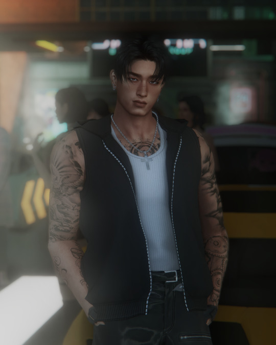
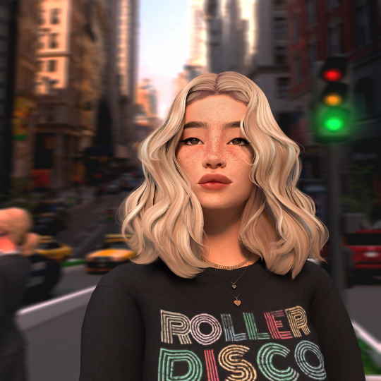
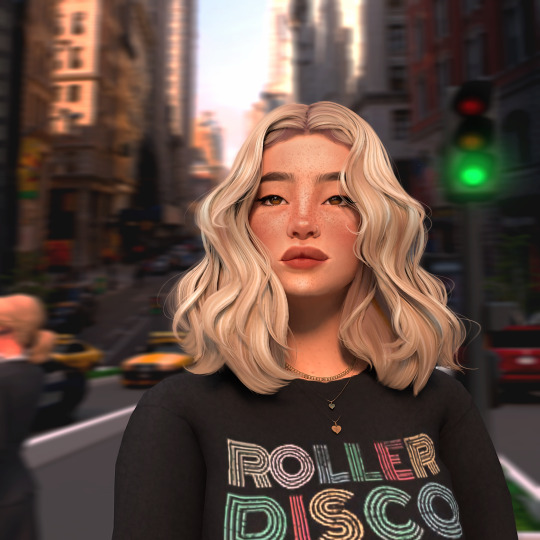
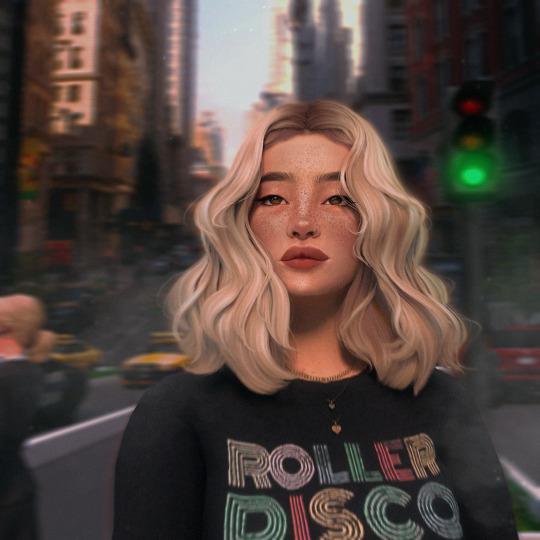
1. Picture one is the render fresh from Blender! I immediately notice clipping issues I wanna fix and elements from the Sims that didn’t translate well into blender (like her nose and lip presets)
2. This shot is after I brought it into Photoshop and used my basic actions (topaz clean, smart sharpen, and camera raw filter). This is also where I separate the subject from the background for easy editing, and blur the background (I usually use tilt and field blur, I also added motion to this one since she’s in a bustling city)
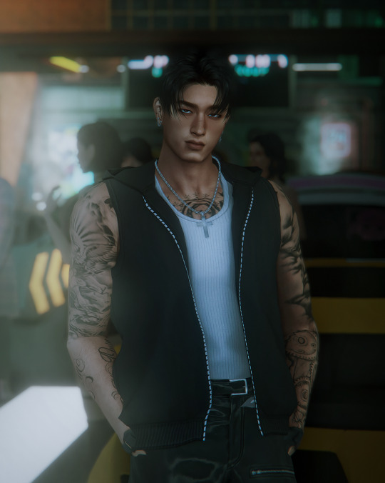
3. I’m in Procreate now and use the start (and early motivation and excitement) to get the fixing work done. Smoothing the harsh lines of the clipping with the smudge tool and parts of her face that don’t look right with Liquify
4. The fun parts begin and I get started on drawing the hair (I also smudge the hair underneath to blend better with the hair I draw on) and begin pulling colors from her skin and drawing on top of them with a noise brush for texture. I made some adjustments to the background and the lighting as well since I was focusing on the skin and wanted the lighting just right
5. This was when the skin got FUN because I added the blushing and started really going ham on the cheek bones and her freckles. Fixed her features some more with liquify and really made sure the hair blended with the background as I drew a lot of it in myself. (At this point in the process I was both so in love with her and so fucking tired I knew I should stop before I went too far lol)
6. And then the final adjustments were made! I use Curves at the start, then I move on to using a Gradient Map to adjust contrast, and my favorite parts are using blurs and Ambient Occlusion to really make everything blend seamlessly. I love adding fog to my shots, it blends the subject with the background and really adds a more natural touch to the setting. I color the fog to match the mood, in this case a very desaturated blue. Final touch is sharpening the image and adding noise for that real picture effect I love. (Both the background and the subject get different levels of noise as well)
I don’t know for sure but I believe the time it took to finish her took about 5 hours total, and I hope this gives some insight into what I do! I’d be happy to answer any more editing questions, it’s truly my favorite part! Thank you again for reaching out and I hope you have the best day too! You definitely made mine ☺️
#seriously I will answer any and all editing questions#fucking love this shit#anon#LOVELY anon#asks#editing tips#editing tutorial#tutorial#sims 4 process#process#ts4 process
60 notes
·
View notes
Text
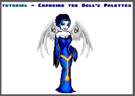


download Gimp here.
this doll was made on Dollzmania Gothmaker.
#tutorial#gimp#editing tutorial#tips#dollmaker#dollz#art tips#art tutorial#gimp tutorial#dollzmania#goth#pagedoll#edit#mspaint#paint#colorful#colors#rainbow
5 notes
·
View notes
Text
yo, i heard you want to know how to make your own light leak / film burn. i got the recipe, follow me:
step 1: select gradients
step 2: select any gradient with 2 colors or remove the others colors.
step 3: change one color to black and the other one to the color you want the light to be
step 4: drag the black near to the other color, but pls adjust it according to how large you want your leak
step 5 (optional): add a new color on the left a little bit brighter than your leak
step 6 (optional): add a dust overlay and grain
#filter polarr#polarr#polarr filter#code filter#filter code#filtros polarr#polarr code#code polarr#polarr style#style polarr#tutorial polarr#polarr tutorial#tutorial#editing tutorial#editing#photo edit#photo edit tutorial
2 notes
·
View notes
Note
Hi Kara, do you mind sharing your editing process and tips on lighting. Thanks.
Hello! I don't mind at all. So for editing, I use the happy pills PSD which I made into a lut for GShade to make editing easier and to have a bright game. Then I use photoshop to sharpen/crop and adjust brightness/color if needed. I crop 800 width/height varies but usually 600 or 700 and I use the clean & clear action to sharpen/smooth.
Vanilla

Gshade/with Happy Pills < This is what my game looks like

After sharpening/cropping.

As far as lighting goes. I use Carl's seasons tuner and usually have it set to always sunny because I hate the gloomy cloudy weather for screenshots, but didn't want to disable the Seasons expansion pack. It still shows the weather on the calendar, so I'll turn it off if I want my sims to enjoy rain or snow. :) For indoors I always use this lighter brighter saucer in every room to brighten things up.
I hope that helps. :)
16 notes
·
View notes
Photo

Reply Icons Tutorial
reply icons can be hard to get right, so i wanted to make this to help. i hope this helps anyone who is just now learning, or anyone who wants to brush up on their skills.
i am using photoshop in this tutorial, but many of these things can be recreated in other programs/websites.
Step 1: getting your base ready!

1. start with a base in whatever program you use. i use a 1080 x 400 px canvas.
2. a central piece is common. i’m using a 360 x 360 px rectangle. make this any colour as it will probably be covered up anyway. use the rectangle tool, or the marquee tool to achieve this.
3. adjust the placement of the central piece as needed. i centre it in the middle.
optional - save this for future use on your computer. you can use it for any other future reply icons you make.
Step 2: find your character and aesthetic!
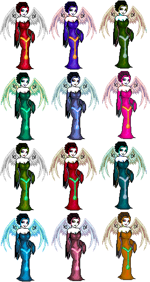
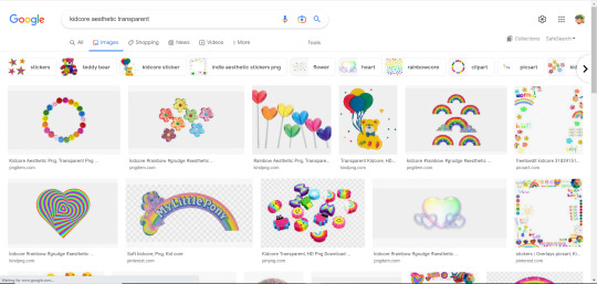
1. depending on whether this is a request, or for your own use, you might be able to pick what you want to do. for this, i picked kidcore xinyan reply icons to make.
2. websites like google, pinterest and tumblr are great for finding inspiration, or even flat out telling you what an aesthetic is, if you haven’t encountered it before.
Step 3: find your character transparents!
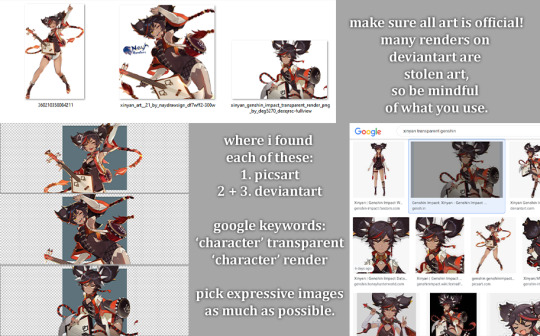
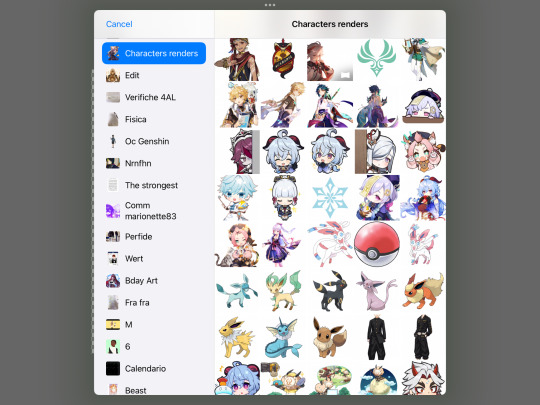
1. google the character you are making reply icons for! the best keywords to find the usable ones are ‘transparent’ and ‘render’. you can also use the fandom’s wiki. make sure to put the links to one side, so you can credit when you post the reply icons.
optional: so when you download images of wikia, you end up with a webp file, which can’t be imported into most things. use this website to convert them to png.
2. now import them into your file! place them as you would on an icon. you can either clipping mask them to the middle elements, or leave them be.
Step 3: gather your other elements!
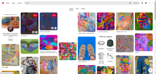
1. pick your background! i tend to use pinterest for this, as they have a lot of options. search your aesthetic, or theme, and pick an image that fits what you want.
2. find your elements! i tend to search up “’aesthetic’ transparent” or specific things i think might fit.
Step 4: start placing your elements!

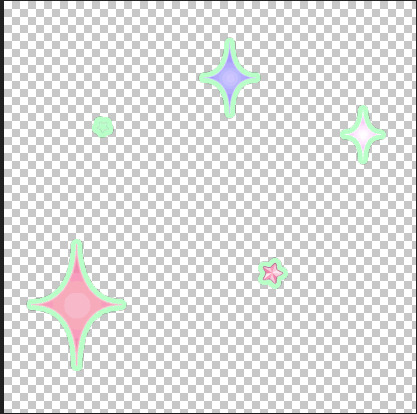
1. i picked these stars and this background. the star border i used is one from my favourite transparent folder, and i no longer have the link for it, my apologies.
2. try not to overcrowd it. i think this setup is fine, but you can always add more, or less, depending on your own preference.
3. try to keep things on the bottom of the icon. i’ve found this works better.
Step 5: adjust as needed, + save!
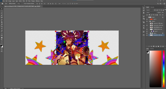
1. i added a bright saturation layer at about 55% opacity. by this point, i had added all the other elements to a folder, so i used a clipping mask to make sure it didn’t mess with the transparency.
2. now, if you’re happy with your work, save it! i tend to ‘quick export as png’ and put it into my editing folder.
and here is the finished reply icon!:

109 notes
·
View notes
Last Seen Blogs
zacian6
I post whatever I like
straysinfiltrator
Queen Meve Is The Hero I Needed Since I Was Five
lemon-advice
When Life Gives You Lemons
poly-star-trio
maryo but if he was named randy
yanyanimagines
Never Ever Gonna Forget You~