#i practically HAVE at this point
Note
logurt for the ship bingo?
HERES WHAT I NEED YOU TO UNDERSTAND OK HERES WHAT I NEED YOU TO GET. THEY ARE IT FOR ME MAN.
I can [and have!!!] written fucking ESSAYS about the sheer closeness and intimacy and romance of their relationship like. This isnt even from a tee hee theyre cute lense from a motherfucking STORYTELLING/WRITING PERSPECTIVE they just make sense!! Like i mean for fucks sake logan straight up compared how he felt abt kurt to how he felt about JEAN could you get anymore fuckin real than that???? And like that aside theres so much trust and affection and respect for one another and theyve both straight up said that they make each other feel human. FEEL HUMAN are you fucking kidding me????
And like whats cool is that their relationship is both a close close close friendship and the most loving tender bullshit youve ever seen and you cant separate one from the other bc theyre both big chunks of how they interact
Theres all these little tells that say so much abt the depth of their feelings for one another and it makes me want to gnaw on the walls like man its been decades. I think we can let them kiss now
#i have mice in my brain about these men#and yknow what im gonna say it theyre THE most compelling love interests for one another#bc like i said theres so much evidence in the comics [wolverine issue 6 alone is practically a thesis]#and the way their relationship could be written and how it could pan out???? i could write a novel babes i really could#i practically HAVE at this point#anyway. i think they should kiss w tongue and have crazy gay sex and retire to some little cabin in the woods together#thats my thoughts on them#[comm noise]#ask games#sorry dude. im a monster about these guys
6 notes
·
View notes
Text
Prompt 126
You know what would be hilarious?
Constantine comes into one of those meetings as he sometimes does every blue moon. Though the proper word would be storms into a meeting and practically slams a whole stack of papers down.
“Can someone bloody explain to me why the American-fucking-government is trying to go to war with the fucking Infinite Realms?!”
The Justice League is of course alarmed and confused- and also John weren’t you in Hell?! Yeah, he was, where the fuck do you think he found out about this?
Now if you’ll excuse him he’s going back to the House of Mysteries with his now haunted trench coat. John, John Constantine what the fuck do you mean by that? No don’t just leave, don’t leave this mess just for them- JOHN!
#dpxdc#dcxdp#prompts#John: Trenchcoats haunted#JL: What#John as a giggle comes out from beneath his coat: Trenchcoats haunted#John got a get out of hell free card via Clockwork seeing an Opportunity for good timeline#And hey his favorite ghostlings also get a mentor now#John: I did not ask for 5+ children#Clockwork: Too bad you’re now their human caretaker have fun#The GIW were getting Bad#Like bad enough Sam and Tucker are practically full ghost now#Team Phantom pointing at the skrunkly sad trenchcoat man: New Dad Acquired#Constantine in Hell: What#Clockwork: Hello new son here are papers with proof of everything and can you tell the speedsters to stop thanks#Constantine now out of Hell: W h a t
2K notes
·
View notes
Text
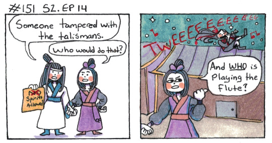
Unsolved Mysteries.
[First] Prev <–-> Next
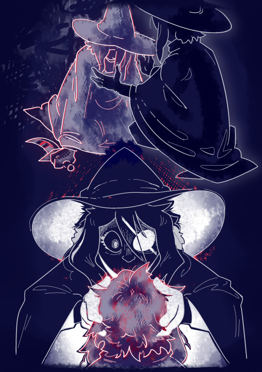
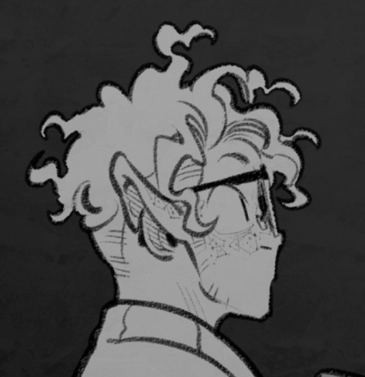
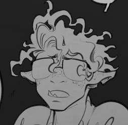
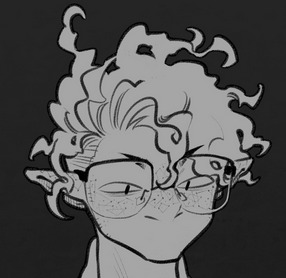
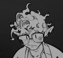
#poorly drawn mdzs#mdzs#lan wangji#jiang cheng#wei wuxian#Spoilers: It was Wei Wuxian the whole time!#Once again this one was on the chopping block but I saved it for just a better comic flow.#Admittedly I do have a critique of the pacing here. Namely that we really should have ended the flashback when WWX fell.#And then gone back to present time for a bit - or even go to a different flashback.#The sense of time passing isn't as strong as it *could* be.#We get *told* three months pass and that they've been looking for WWX. But to the audience it's been...15 min.#Less than seven minutes if you count the flute playing.#This guy when through a whole aesthetic and persona shift in less time than it takes to walk through a corn field.#Guy who listened to less than half an emo album and dyed all his clothes black. And jorted all his jeans.#Timeskips can be sudden and work out just fine! I personally feel like this one would be stronger with better pacing.#Feel free to disagree with me!#In case anyone is wondering why JC and LWJ are still holding hands: 1) Haunted house episode.#2) I needed to practice drawing hand holding at some point. Might as well get the rough and sloppy ones out with these two.
994 notes
·
View notes
Text
no, but really, we need to talk about the casual objectification that has become the fallback discourse of the internet: if you're pretty and dressed nicely, you're a slut. and if you're even vaguely outside of their body standard, you're fucking disgusting.
too-frequently, people position sex workers as being "the problem". they sneer you're addicted to pornography, you don't know what a real woman looks like. but real women are in pornography. the real bodies on display are not the issue here: the issue is that other people feel extremely confident when commenting on someone's physique.
2000's super-thin is slowly worming its way back into the public ideal. recently i saw someone get told to "go for a run", despite the fact she was on the thinner side of average. not that it would ever be appropriate to say that: but it's kind of like sticker shock when you see it. people think that is fat? holy shit. do they just have no idea about things?
but what are you going to do about it? that's the problem, right. because chances are - you're a normal person. we can say normalize carrying fat on your body, but we are not the billion-dollar diet industry. we are not the billion-dollar fashion industry. we are just, like. people. who are trying to make content on the internet, without being treated shittily.
as someone who has been on both sides of things: you are treated better when you are thin and pretty. this is statistically correct. i am not saying that you cannot be bullied for being thin; i'm saying there are objective institutional biases against certain bodytypes. there are videos of men and women who lost weight all saying: i now know for a fact exactly how much worse you're treated. in the comments, some asshole inevitably says something akin to you deserved to be dehumanized when you were fat.
which means that ... the easiest thing to do is be pretty and thin. it is the path of least resistance, because of course it is, because any time you post a picture of yourself without a thigh gap, someone immediately comments something like you need to try a diet.
the other half is also dehumanizing though, huh, just in a different way. when i put on makeup and nice clothes, i am told i slept my way to the top as a professional. do you know how many women in STEM have told me they purposefully dress to "unimpress" because they already struggle to be taken seriously and if they're ever considered pretty - it for some reason takes away from their authority.
so they make it seem like it's your fault. you, existing in a body - it's your fault! if you didn't want shitty comments, don't have a body. they position us against each other like chess pieces; vying for male attention we don't even need.
and i can be an authority on this unless you think i'm fat and unattractive. when i am pretty and thin, i'm an activist. when i am just a normal person who makes a good point: i am immediately dismissed. nobody fucking believes you if you're not seen as attractive. you literally lose value. you cease to exist.
but the whole time, it feels like - is anyone actually grounded the fuck in reality? the line of "pretty and thin" keeps shifting. nobody seems to understand what "a normal weight" even looks like, because it's not something that exists - you cannot tell a person's health by looking at their body. even if you think you could tell that, even if you're sure a person is dangerously overweight - people are not your dolls. they do not need to be dressed up or displayed properly to soothe your aesthetics. you aren't concerned for them, you're stealing their agency. you don't get to say if they're "allowed" to take pictures and post them on the internet - you don't get to tell them how to exist.
people hide behind "the obesity epidemic" without any actual qualifications. they crow things about "normalizing unhealthiness".
but it's bullshit. i have visible abs. there is a pair of parallel lines on my body, even when i'm relaxed; where my obliques meet my abdominal wall. i am proud of this because it means i'm strong, because i overcame an eating disorder only to be ripped as fuck. it is genetic and physical luck that i even get any definition, i'm pleased as punch.
but it does mean that my abdominal wall sticks out a little bit. the other day i posted a video of myself dancing, and, for a moment, my shirt slipped. you could see a little bit of my stomach. i was cartwheeling to the floor. moments before this, i'd had my foot over my head.
a guy slid into my DMs. a row of vomiting emojis prefaced: you should really lose some weight before you think about dancing.
i stared at it for a long time. there was a time when i would have been triggered by this, where it would have encouraged me to starve myself. i would have ignored the fact i'm flexible, agile, good at jumping: i would have lost the weight for a stranger's passing comment. i would have found myself and my body fucking disgusting.
and for what? to please what? because why? so that he can exist in this world without an unchallenged eyeball? what would my self-hatred even accomplish? usually i write paragraphs. obviously. on this particular occasion, in this body i've been at war with for ages: i just felt exhausted.
it shouldn't be even worth saying. it shouldn't be hard to explain. all of this emotional turmoil when he cannot even comprehend the most basic truth: i am not an object on display for him.
#spilled ink#writeblr#warm up#like if im getting fatshamed. babe......... wake up#is there fat on my body? yes :)#btw this behavior wouldn't be okay even if I WAS overweight!!! that is my point!!!#it is both that people have no idea what weight is supposed to look like#and even if they DID... they do not seem to understand that PEOPLE ARE NOT DOLLS#YOU DO NOT GET TO TELL THEM HOW TO EXIST#if you respond anything akin to ''but raquel there IS an obesity epidemic''#you're blocked and reported.#go fucking DONATE TO A FOOD BANK THEN. volunteer in a food desert. start a free fitness program#GO GET A DEGREE AS A MEDICAL PROFESSIONAL AND PRACTICE IN NUTRITION IN UNDERPRIVILEDGED LOCATIONS#FIGURE OUT HOW TO LOWER FOOD COSTS. FIGURE OUT HOW TO NORMALIZE AND STANDARDIZE#ACCESS TO FARM-FRESH FOOD. PROVIDE ACTUAL FREE ACCESS TO OUTSIDE ACTIVITIES#FIGURE OUT HOW TO TEACH PEOPLE HEALTHY CHOICE MAKING WHILE ALSO LOWERING THE COST OF MEALS.#THE AVERAGE GROCERY BILL OF THE AMERICAN CITIZEN HAS QUADRUPILED IN THE LAST YEAR.#SHUT. THE FUCK. UP!!!!!!!!!#you don't want to help these people!!!!!#you want to bully them but still feel like a good person!#you want to be justified in your hatred of an entire CLASS of people!!!#you don't give a fuck about how it makes them feel!!!!#you care ONLY about whether or not YOU get to VIRTUE SIGNAL that YOURE so thin and pretty!!!!#it is BECAUSE of people like you#and the fact you tolerate fatphobia - BECAUSE of that normalization. that men like the one who called me fat#feel like they can get away with it.#bc there's a line for you where you WOULD be okay with it. where if i WASNT thin you'd be okay with it.#which means the line can always be pushed in a certain direction. and it's always going to appeal to male aesthetics.#''well you didn't deserve it'' maybe fucking NOBODY does babe. maybe we should just all agree not to comment on ppls bodies!!
2K notes
·
View notes
Text
one of my favorite things about zedaph is that on a server full of people that find strange and oft-overlooked minecraft mechanics or rare events and then see just how far they can push them in the name of spectacle or efficiency or world-breaking, zed is over here finding these mechanics in order to do the weirdest things he can think of in as entertaining a manner as possible
like i 100% have faith in zedaph's theoretical ability to be just as efficient or spectacular or world-breaking. if he wanted to do that stuff, i trust that he absolutely could. but thats so far from being his priority. instead, hes going to spend around a week of irl time focused entirely on eventually having the good luck to spawn in something insanely rare so that he can convert it into something even rarer, the result of which being something that 99% of the server reacts with complete and utter shock that it even exists in the first place, just because its zany and funny and he wanted to. and i love that
#zedaph#hermitcraft#genuinely i adore the clucky few project im not even done watching the episode and i had to pause and make this post#i saw impulses video first and went ''that HAS to be some sort of datapack or something-''#only to immediately go ''no. no it cant be. because this is zed#and its practically a trademark of his to push the limits of the game as far as possible in the direction least expected#not for the purpose of efficiency or spectacle or intimidation or whatever like some players who push limits#but purely for the purpose of making something so funny you cant help but laugh at whats going on#and maybe being a bit impressed that he ever thought of it in the first place''#at which point i went ''holy shit. since its zed doing this. somehow he ACTUALLY got a villager on a chicken. with no cheats. thats INSANE'#i was relieved when i checked my subscriptions to see what the next video i had to watch was and saw he would be next in line#bc if i had to sit through 19 other hermits videos before i could watch his and find out what the fuck he was doing i would have been so sa#sidenote but i feel like a zed video where he interacts with this many other people all in the same video is so rare#idk i didnt watch season 9 and i know he started collabing a lot more w/ other hermits then#so maybe its not nearly as rare these days#but like the last one that *i* saw where he interacted with this many people at once was towards the end of season 8#when all the people he experimented on earlier in the season came back to experiment on him#and like i would like zeds videos with or without the collabs. but its a lot of fun to see him interact with people#so its very cool to me when he does it with a lot of people all in the same video
725 notes
·
View notes
Text
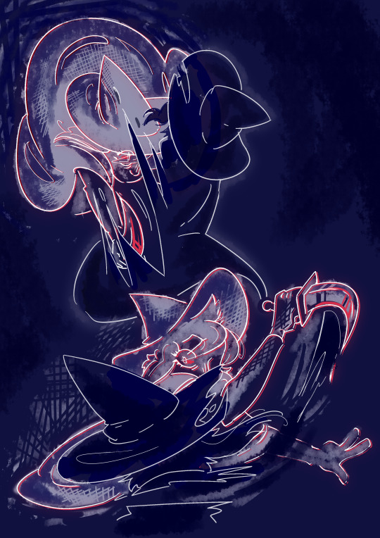
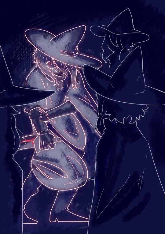
someone
#act 5 my beloved my beloathed#at this point in the game i think my brain was a bit fried cos i legit forgot how stories happen and was like yep this is how i die#made it so i straight up exploded afterwards lol just inconsolable#mal du pays#is me when i fucking gets you#cracking open a boy with the cold ones#oh to have your head grabbed in a vice grip by your inner demons <3#isat spoilers#like kinda big ones#isat siffrin#isat mal du pays#in stars and time#some pose practice kinda got away from me#turns out if you change up how you sketch it can make you a bit looser with it which was nice c:#in this case i sketched with light colour on a dark background#my art
917 notes
·
View notes
Text
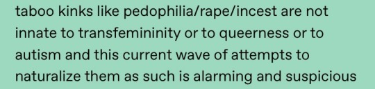
it will never stop being funny/sad seeing a different transmisogynistic transfem make this same tired ass post every other year and inevitably attract insane transmisogynists calling random trans women pedophiles and predatory in the notes for talking about consensual kink she enjoys with her lovers or whatever else, never makes it clearer that the point is transmisogyny and apologizing/making space for it because those people are always tolerated whereas trans women asking if someone reblogging from someone they don’t know is always a tacit show of universal support are blocked. it’s an intellectually dishonest misportrayal of what some transfems say (who is saying these things you’re claiming to are being ‘inherently linked to transfeminity’? is that what’s actually being said? what does this statement do if not just accuse a voiceless group of trans women of being pedophilic incestous Evils?) that directly likens many to apologizing for and normalizing pedophilia, playing off the readers bias to see trans women as predators despite the reality that this “normalization” is only really happening for cnc and incest rp kinks and barely at that. you’re not making it out of the pit
#and this have to be said but cnc kinks and such are literally fine when practiced safely with consenting adults just like other sex#like please god you’re being so reactionary!#*shouldn’t have to be said#it’s so frustrating because i remember doing it when i was a teen and didn’t know better but fuck!!#you have to learn better at some point you have to learn to care about trans women#kvetching
489 notes
·
View notes
Text
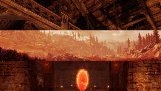
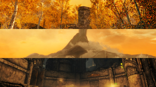

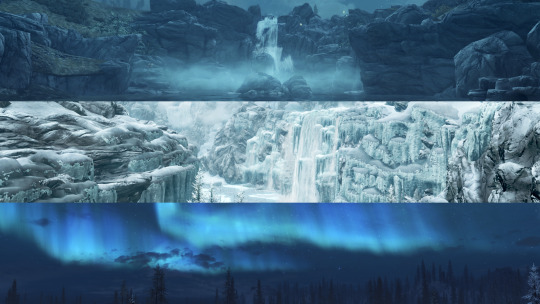
Skyrim screenshot edits I made awhile back
#happy birthday tes!!! (im totally not posting a things thats been in my drafts for awhile because i didnt realize this was coming up)#mine#tes#skyrim#tes v skyrim#the elder scrolls#skyrim screenshots#i literally have like 60 of these screenshot edits that i use to practice photo editing. one of my comfort hobbies#and ive only edited the skyrim ones. i have hundreds of screenshots i plan on getting to of the other games at some point
423 notes
·
View notes
Text
2/3 of da way thru lots goin on with this guy also
#fantasy high#riz gukgak#have actually decided I will simply not go back and fix the grayscale mistakes I made and then spotted taking these caps#it is what it is. striving for perfect continuity with this design is futile. we practice radical acceptance (throws up in mouth a little b#the freckles also kinda make him look like he's blushing all the time... it kinda fits bc this little guy is so easily flustered#gods I like him so much. case in point Im drawing all this#only! six more panels to go!! this next stretch is gonna be Interesting. but the end is in sight!
393 notes
·
View notes
Text
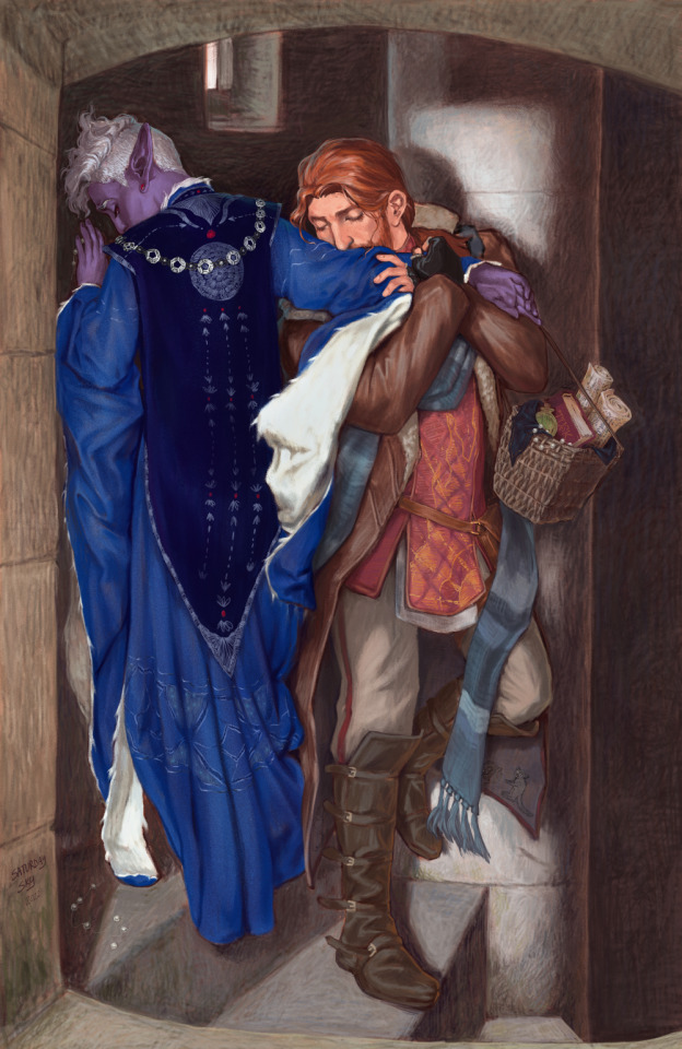
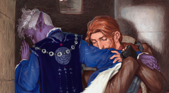
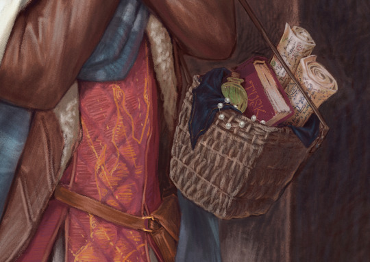
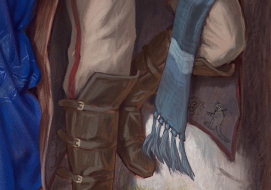
The Meeting on the Turret Stairs but Make It Shadowgast
After more than a year, this painting is done! This is one of my favorite paintings, and it was wonderful to reimagine it to suit one of my favorite pairings. :D This is by far the most I have ever worked on a painting, and I learned so much while making it. Please enjoy all the details I crammed in there to find.
Some close-ups under the cut!
And where it started, the original painting and the sketch:
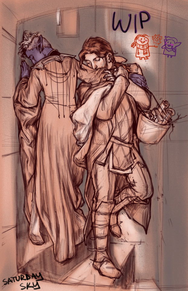
Cheers, all 🥂💜🧡
#i'll admit it. through brute force - aka choosing pictures where i need to draw it - i have come to a point where clothes are fun to draw#i have evolved beyond my clothing-hating potato-sack-drawing ways#practicing sucked the whole way through but now i can draw many different varieties of potato sacks! progress 😎#my art#shadowgast#essek thelyss#critical role#the meeting on the turret stairs#critical role fanart
8K notes
·
View notes
Text
why Aurora's art is genius
It's break for me, and I've been meaning to sit down and read the Aurora webcomic (https://comicaurora.com/, @comicaurora on Tumblr) for quite a bit. So I did that over the last few days.
And… y'know. I can't actually say "I should've read this earlier," because otherwise I would've been up at 2:30-3am when I had responsibilities in the morning and I couldn't have properly enjoyed it, but. Holy shit guys THIS COMIC.
I intended to just do a generalized "hello this is all the things I love about this story," and I wrote a paragraph or two about art style. …and then another. And another. And I realized I needed to actually reference things so I would stop being too vague. I was reading the comic on my tablet or phone, because I wanted to stay curled up in my chair, but I type at a big monitor and so I saw more details… aaaaaand it turned into its own giant-ass post.
SO. Enjoy a few thousand words of me nerding out about this insanely cool art style and how fucking gorgeous this comic is? (There are screenshots, I promise it isn't just a wall of text.) In my defense, I just spent two semesters in graphic design classes focusing on the Adobe Suite, so… I get to be a nerd about pretty things…???
All positive feedback btw! No downers here. <3
---
I cannot emphasize enough how much I love the beautiful, simple stylistic method of drawing characters and figures. It is absolutely stunning and effortless and utterly graceful—it is so hard to capture the sheer beauty and fluidity of the human form in such a fashion. Even a simple outline of a character feels dynamic! It's gorgeous!
Though I do have a love-hate relationship with this, because my artistic side looks at that lovely simplicity, goes "I CAN DO THAT!" and then I sit down and go to the paper and realize that no, in fact, I cannot do that yet, because that simplicity is born of a hell of a lot of practice and understanding of bodies and actually is really hard to do. It's a very developed style that only looks simple because the artist knows what they're doing. The human body is hard to pull off, and this comic does so beautifully and makes it look effortless.
Also: line weight line weight line weight. It's especially important in simplified shapes and figures like this, and hoo boy is it used excellently. It's especially apparent the newer the pages get—I love watching that improvement over time—but with simpler figures and lines, you get nice light lines to emphasize both smaller details, like in the draping of clothing and the curls of hair—which, hello, yes—and thicker lines to emphasize bigger and more important details and silhouettes. It's the sort of thing that's essential to most illustrations, but I wanted to make a note of it because it's so vital to this art style.
THE USE OF LAYER BLENDING MODES OH MY GODS. (...uhhh, apologies to the people who don't know what that means, it's a digital art program thing? This article explains it for beginners.)
Bear with me, I just finished my second Photoshop course, I spent months and months working on projects with this shit so I see the genius use of Screen and/or its siblings (of which there are many—if I say "Screen" here, assume I mean the entire umbrella of Screen blending modes and possibly Overlay) and go nuts, but seriously it's so clever and also fucking gorgeous:
Firstly: the use of screened-on sound effect words over an action? A "CRACK" written over a branch and then put on Screen in glowy green so that it's subtle enough that it doesn't disrupt the visual flow, but still sticks out enough to make itself heard? Little "scritches" that are transparent where they're laid on without outlines to emphasize the sound without disrupting the underlying image? FUCK YES. I haven't seen this done literally anywhere else—granted, I haven't read a massive amount of comics, but I've read enough—and it is so clever and I adore it. Examples:


Secondly: The beautiful lighting effects. The curling leaves, all the magic, the various glowing eyes, the fog, the way it's all so vividly colored but doesn't burn your eyeballs out—a balance that's way harder to achieve than you'd think—and the soft glows around them, eeeee it's so pretty so pretty SO PRETTY. Not sure if some of these are Outer/Inner Glow/Shadow layer effects or if it's entirely hand-drawn, but major kudos either way; I can see the beautiful use of blending modes and I SALUTE YOUR GENIUS.
I keep looking at some of this stuff and go "is that a layer effect or is it done by hand?" Because you can make some similar things with the Satin layer effect in Photoshop (I don't know if other programs have this? I'm gonna have to find out since I won't have access to PS for much longer ;-;) that resembles some of the swirly inner bits on some of the lit effects, but I'm not sure if it is that or not. Or you could mask over textures? There's... many ways to do it.
If done by hand: oh my gods the patience, how. If done with layer effects: really clever work that knows how to stop said effects from looking wonky, because ugh those things get temperamental. If done with a layer of texture that's been masked over: very, very good masking work. No matter the method, pretty shimmers and swirly bits inside the bigger pretty swirls!
Next: The way color contrast is used! I will never be over the glowy green-on-black Primordial Life vibes when Alinua gets dropped into that… unconscious space?? with Life, for example, and the sharp contrast of vines and crack and branches and leaves against pitch black is just visually stunning. The way the roots sink into the ground and the three-dimensional sensation of it is particularly badass here:

Friggin. How does this imply depth like that. HOW. IT'S SO FREAKING COOL.
A huge point here is also color language and use! Everybody has their own particular shade, generally matching their eyes, magic, and personality, and I adore how this is used to make it clear who's talking or who's doing an action. That was especially apparent to me with Dainix and Falst in the caves—their colors are both fairly warm, but quite distinct, and I love how this clarifies who's doing what in panels with a lot of action from both of them. There is a particular bit that stuck out to me, so I dug up the panels (see this page and the following one https://comicaurora.com/aurora/1-20-30/):

(Gods it looks even prettier now that I put it against a plain background. Also, appreciation to Falst for managing a bridal-carry midair, damn.)
The way that their colors MERGE here! And the immense attention to detail in doing so—Dainix is higher up than Falst is in the first panel, so Dainix's orange fades into Falst's orange at the base. The next panel has gold up top and orange on bottom; we can't really tell in that panel where each of them are, but that's carried over to the next panel—

—where we now see that Falst's position is raised above Dainix's due to the way he's carrying him. (Points for continuity!) And, of course, we see the little "huffs" flowing from orange to yellow over their heads (where Dainix's head is higher than Falst's) to merge the sound of their breathing, which is absurdly clever because it emphasizes to the viewer how we hear two sets of huffing overlaying each other, not one. Absolutely brilliant.
(A few other notes of appreciation to that panel: beautiful glows around them, the sparks, the jagged silhouette of the spider legs, the lovely colors that have no right to make the area around a spider corpse that pretty, the excellent texturing on the cave walls plus perspective, the way Falst's movements imply Dainix's hefty weight, the natural posing of the characters, their on-point expressions that convey exactly how fuckin terrifying everything is right now, the slight glows to their eyes, and also they're just handsome boys <3)
Next up: Rain!!!! So well done! It's subtle enough that it never ever disrupts the impact of the focal point, but evident enough you can tell! And more importantly: THE MIST OFF THE CHARACTERS. Rain does this irl, it has that little vapor that comes off you and makes that little misty effect that plays with lighting, it's so cool-looking and here it's used to such pretty effect!
One of the panel captions says something about it blurring out all the injuries on the characters but like THAT AIN'T TOO BIG OF A PROBLEM when it gets across the environmental vibes, and also that'd be how it would look in real life too so like… outside viewer's angle is the same as the characters', mostly? my point is: that's the environment!!! that's the vibes, that's the feel! It gets it across and it does so in the most pretty way possible!
And another thing re: rain, the use of it to establish perspective, particularly in panels like this—

—where we can tell we're looking down at Tynan due to the perspective on the rain and where it's pointing. Excellent. (Also, kudos for looking down and emphasizing how Tynan's losing his advantage—lovely use of visual storytelling.)
Additionally, the misting here:

We see it most heavily in the leftmost panel, where it's quite foggy as you would expect in a rainstorm, especially in an environment with a lot of heat, but it's also lightly powdered on in the following two panels and tends to follow light sources, which makes complete sense given how light bounces off particles in the air.
A major point of strength in these too is a thorough understanding of lighting, like rim lighting, the various hues and shades, and an intricate understanding of how light bounces off surfaces even when they're in shadow (we'll see a faint glow in spots where characters are half in shadow, but that's how it would work in real life, because of how light bounces around).
Bringing some of these points together: the fluidity of the lines in magic, and the way simple glowing lines are used to emphasize motion and the magic itself, is deeply clever. I'm basically pulling at random from panels and there's definitely even better examples, but here's one (see this page https://comicaurora.com/aurora/1-16-33/):

First panel, listed in numbers because these build on each other:
The tension of the lines in Tess's magic here. This works on a couple levels: first, the way she's holding her fists, as if she's pulling a rope taut.
The way there's one primary line, emphasizing the rope feeling, accompanied by smaller ones.
The additional lines starbursting around her hands, to indicate the energy crackling in her hands and how she's doing a good bit more than just holding it. (That combined with the fists suggests some tension to the magic, too.) Also the variations in brightness, a feature you'll find in actual lightning. :D Additional kudos for how the lightning sparks and breaks off the metal of the sword.
A handful of miscellaneous notes on the second panel:
The reflection of the flames in Erin's typically dark blue eyes (which bears a remarkable resemblance to Dainix, incidentally—almost a thematic sort of parallel given Erin's using the same magic Dainix specializes in?)
The flowing of fabric in the wind and associated variation in the lineart
The way Erin's tattoos interact with the fire he's pulling to his hand
The way the rain overlays some of the fainter areas of fire (attention! to! detail! hell yeah!)
I could go on. I won't because this is a lot of writing already.
Third panel gets paragraphs, not bullets:
Erin's giant-ass "FWOOM" of fire there, and the way the outline of the word is puffy-edged and gradated to feel almost three-dimensional, plus once again using Screen or a variation on it so that the stars show up in the background. All this against that stunning plume of fire, which ripples and sparks so gorgeously, and the ending "om" of the onomatopoeia is emphasized incredibly brightly against that, adding to the punch of it and making the plume feel even brighter.
Also, once again, rain helping establish perspective, especially in how it's very angular in the left side of the panel and then slowly becomes more like a point to the right to indicate it's falling directly down on the viewer. Add in the bright, beautiful glow effects, fainter but no less important black lines beneath them to emphasize the sky and smoke and the like, and the stunningly beautiful lighting and gradated glows surrounding Erin plus the lightning jagging up at him from below, and you get one hell of an impactful panel right there. (And there is definitely more in there I could break down, this is just a lot already.)
And in general: The colors in this? Incredible. The blues and purples and oranges and golds compliment so well, and it's all so rich.
Like, seriously, just throughout the whole comic, the use of gradients, blending modes, color balance and hues, all the things, all the things, it makes for the most beautiful effects and glows and such a rich environment. There's a very distinct style to this comic in its simplified backgrounds (which I recognize are done partly because it's way easier and also backgrounds are so time-consuming dear gods but lemme say this) and vivid, smoothly drawn characters; the simplicity lets them come to the front and gives room for those beautiful, richly saturated focal points, letting the stylized designs of the magic and characters shine. The use of distinct silhouettes is insanely good. Honestly, complex backgrounds might run the risk of making everything too visually busy in this case. It's just, augh, so GORGEOUS.
Another bit, take a look at this page (https://comicaurora.com/aurora/1-15-28/):

It's not quite as evident here as it is in the next page, but this one does some other fun things so I'm grabbing it. Points:
Once again, using different colors to represent different character actions. The "WHAM" of Kendal hitting the ground is caused by Dainix's force, so it's orange (and kudos for doubling the word over to add a shake effect). But we see blue layered underneath, which could be an environmental choice, but might also be because it's Kendal, whose color is blue.
And speaking off, take a look at the right-most panel on top, where Kendal grabs the spear: his motion is, again, illustrated in bright blue, versus the atmospheric screened-on orange lines that point toward him around the whole panel (I'm sure these have a name, I think they might be more of a manga thing though and the only experience I have in manga is reading a bit of Fullmetal Alchemist). Those lines emphasize the weight of the spear being shoved at him, and their color tells us Dainix is responsible for it.
One of my all-time favorite effects in this comic is the way cracks manifest across Dainix's body to represent when he starts to lose control; it is utterly gorgeous and wonderfully thematic. These are more evident in the page before and after this one, but you get a decent idea here. I love the way they glow softly, the way the fire juuuust flickers through at the start and then becomes more evident over time, and the cracks feel so realistic, like his skin is made of pottery. Additional points for how fire begins to creep into his hair.
A small detail that's generally consistent across the comic, but which I want to make note of here because you can see it pretty well: Kendal's eyes glow about the same as the jewel in his sword, mirroring his connection to said sword and calling back to how the jewel became Vash's eye temporarily and thus was once Kendal's eye. You can always see this connection (though there might be some spots where this also changes in a symbolic manner; I went through it quickly on the first time around, so I'll pay more attention when I inevitably reread this), where Kendal's always got that little shine of blue in his eyes the same as the jewel. It's a beautiful visual parallel that encourages the reader to subconsciously link them together, especially since the lines used to illustrate character movements typically mirror their eye color. It's an extension of Kendal.
Did I mention how ABSOLUTELY BEAUTIFUL the colors in this are?
Also, the mythological/legend-type scenes are illustrated in familiar style often used for that type of story, a simple and heavily symbolic two-dimensional cave-painting-like look. They are absolutely beautiful on many levels, employing simple, lovely gradients, slightly rougher and thicker lineart that is nonetheless smoothly beautiful, and working with clear silhouettes (a major strength of this art style, but also a strength in the comic overall). But in particular, I wanted to call attention to a particular thing (see this page https://comicaurora.com/aurora/1-12-4/):

The flowing symbolic lineart surrounding each character. This is actually quite consistent across characters—see also Life's typical lines and how they curl:

What's particularly interesting here is how these symbols are often similar, but not the same. Vash's lines are always smooth, clean curls, often playing off each other and echoing one another like ripples in a pond. You'd think they'd look too similar to Life's—but they don't. Life's curl like vines, and they remain connected; where one curve might echo another but exist entirely detached from each other in Vash's, Life's lines still remain wound together, because vines are continuous and don't float around. :P
Tahraim's are less continuous, often breaking up with significantly smaller bits and pieces floating around like—of course—sparks, and come to sharper points. These are also constants: we see the vines repeated over and over in Alinua's dreams of Life, and the echoing ripples of Vash are consistent wherever we encounter him. Kendal's dream of the ghost citizens of the city of Vash in the last few chapters is filled with these rippling, echoing patterns, to beautiful effect (https://comicaurora.com/aurora/1-20-14/):

They ripple and spiral, often in long, sinuous curves, with smooth elegance. It reminds me a great deal of images of space and sine waves and the like. This establishes a definite feel to these different characters and their magic. And the thing is, that's not something that had to be done—the colors are good at emphasizing who's who. But it was done, and it adds a whole other dimension to the story. Whenever you're in a deity's domain, you know whose it is no matter the color.
Regarding that shape language, I wanted to make another note, too—Vash is sometimes described as chaotic and doing what he likes, which is interesting to me, because smooth, elegant curves and the color blue aren't generally associated with chaos. So while Vash might behave like that on the surface, I'm guessing he's got a lot more going on underneath; he's probably much more intentional in his actions than you'd think at a glance, and he is certainly quite caring with his city. The other thing is that this suits Kendal perfectly. He's a paragon character; he is kind, virtuous, and self-sacrificing, and often we see him aiming to calm others and keep them safe. Blue is such a good color for him. There is… probably more to this, but I'm not deep enough in yet to say.
And here's the thing: I'm only scratching the surface. There is so much more here I'm not covering (color palettes! outfits! character design! environment! the deities! so much more!) and a lot more I can't cover, because I don't have the experience; this is me as a hobbyist artist who happened to take a couple design classes because I wanted to. The art style to this comic is so clever and creative and beautiful, though, I just had to go off about it. <3
...brownie points for getting all the way down here? Have a cookie.
#aurora comic#aurora webcomic#comicaurora#art analysis#...I hope those are the right tags???#new fandom new tagging practices to learn ig#much thanks for something to read while I try to rest my wrists. carpal tunnel BAD. (ignore that I wrote this I've got braces ok it's fine)#anyway! I HAVE. MANY MORE THOUGHTS. ON THE STORY ITSELF. THIS LOVELY STORY#also a collection of reactions to a chunk of the comic before I hit the point where I was too busy reading to write anything down#idk how to format those tho#...yeet them into one post...???#eh I usually don't go off this much these days but this seems like a smaller tight-knit fandom so... might as well help build it?#and I have a little more time thanks to break so#oh yes also shoutout to my insanely awesome professor for teaching me all the technical stuff from this he is LOVELY#made an incredibly complex program into something comprehensible <3#synapse talks
752 notes
·
View notes
Text
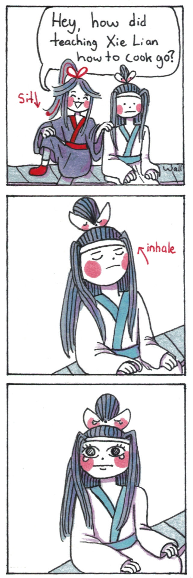
Lan Wangji might be an unstoppable force, but Xie Lian has 800+ years of practice of being an immovable object.
(poll results here for context)
#poorly drawn mdzs#mdzs#wei wuxian#lan wangji#bonus comic#The most resounding conclusion the community came to agree on is thar Xie Lian is bad at cooking on purpose#and is stubborn to the point of refusing to let go of this feature (not a bug) of himself.#though if you practice being bad at something on purpose you do just…get bad.#Poor lan wangji probably had to watch him do horrendous food crimes in the kitchen.#crushing eggs in his fists and throwing it into the bowl or pan (shell and all).#Burning water. Throwing in ingredients based on the roll of a dice. Putting in leaves and cool rocks he found.#He is living his best life mind you. And I think as long as he is happy then let him make his potions.#This is *his* version of art therapy. It just shouldnt be fed to anyone.#lwj would probably try to make it more theraputic after realizing that the bad cooking skills were on purpose. But even then XL is a rock.#he will not do anything he does not want to. Including processing feelings.#Don't idealize that btw. You will do yourself no favours by ignoring hard emotions. Love and peace everypony; Its a hard world out there.#Hua Cheng and wwx hung out during all of this and have since become hunting buddies.#Sometimes its birds sometimes it's each other. For sport.
3K notes
·
View notes
Text
Listen. LISTEN, the longer I spend in the academic world, I am more convinced that describing Judaism and Jews as a religion/ethnic grope/ethnoreligion is unhelpful outside of Academic circles.
The best way to explain Judaism is using the tribe model. A lot of times Judaism is a community first and a religion second, i.e., your level of religiousness is rarely a thing that alienate you from the community.
Think of other tribes, like the Sámi, Aboriginal Australians, Māori, Yurok, Inuit ect. Each have their own unique religion, but we do not think of them as a religious group, because the tribal identity is more important, and the religion is considered part of the culture, not the opposite.
IMORTANT SIDENOTE: I am aware that many of those tribes, and other tribes have a big chunk of Christians in them, usually more Christians than those who follow the indigenous religion of the tribe. BUT for the sake of discussion, I am equating Judaism to the section that does follow the indigenous religion of the tribe.
So, despite the fact that the religious structures of Judaism is very integral to Judaism, it is partly because of the community based focus of Judaism. The most basic example is the Minyan, the fact that prayer is preferred to be done in a group. Or the fact that the Sader is meant to be a celebrated in a group. and so on.
SO, ethnoreligion is a great academic term, but for outside that world? A tribe is a much better term to explain Judaism.
#jumblr#judaism#ethnoreligion#the problem of using academic terms outside academia is that they require the ACADEMIC CONTEXT#and I found that presenting Jews as a tribe makes a lot of the comparison to Christianity go away#and helps explain the solidarity a lot of Jews find toward other indigenous tribes#because we have a lot in common#the Jewish tribe is just far more spread out than most tribes#yes#this is an oversimplification#but sometimes you have to do it in order to get the point#Judaism is a closed practice#just like the faith of many other tribes
1K notes
·
View notes
Photo

i genuinely do love everyone’s commitment to ianthe’s high-waisted leather pants but i feel like the batshit outfits she was assembling out of valancy’s wardrobe in htn also deserve acknowledgement
#my art#tlt#the locked tomb#ianthe tridentarius#rip me for actually drawing the details in the bedroom and then deciding it looked better darkened practically to the point you cant#see any of them.#but anyway. i am a supporter of ianthe's terrible ill-fitting skirt and shirtwaist looks.#also i think she wears thick socks because despite being a necromancer she doesn't get any circulation in her feet. those are just her vibes#the quote in the second one is from pg 209 of htn btw :)#she didn't have the bone arm yet
5K notes
·
View notes
Text
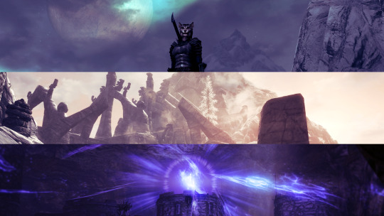
"Halsin shouldn't be that big or muscular or look middle aged because he's an elf and the lore sa-"
I actually think he should be bigger and look more middle aged, personally.
#BG3 Musing#Halsin Posting#the man has been non-stop stressed for a century like i'm surprised that didn't prematurely age him MORE#i think he *should* have silver hairs peppered throughout from the endless stress he's been under#and be built like a professional strong man with a significant healthy layer of fat because he *hibernates* and is *practically strong*#and because he says he likes sweet things and doesn't find any point in denying himself things he likes#so you're telling me that man is chiseled and cut like an unhealthy bodybuilder?#no i don't think so#'elf lore says-' this game is literally all about curbing your expectations when it comes to what people are 'meant' to be#elf lore says a lot of things that halsin fits *to a t* - his appearance being out of the 'norm' is not a flaw#but it doesn't matter then does it? only when he physically fits the species paradigm?#'that's not how elf aging works!' why not? you've seen how human's age yeah? different people age in different ways#you can line up ten 50 year olds next to one another and not a single one of them will look the same#the thing is that under every single umbrella there is diversity of experience#people will look and age differently from others - that's just how life and genetic diversity *works*#anyway this is a gripe at two different things at once don't mind me
586 notes
·
View notes
Text
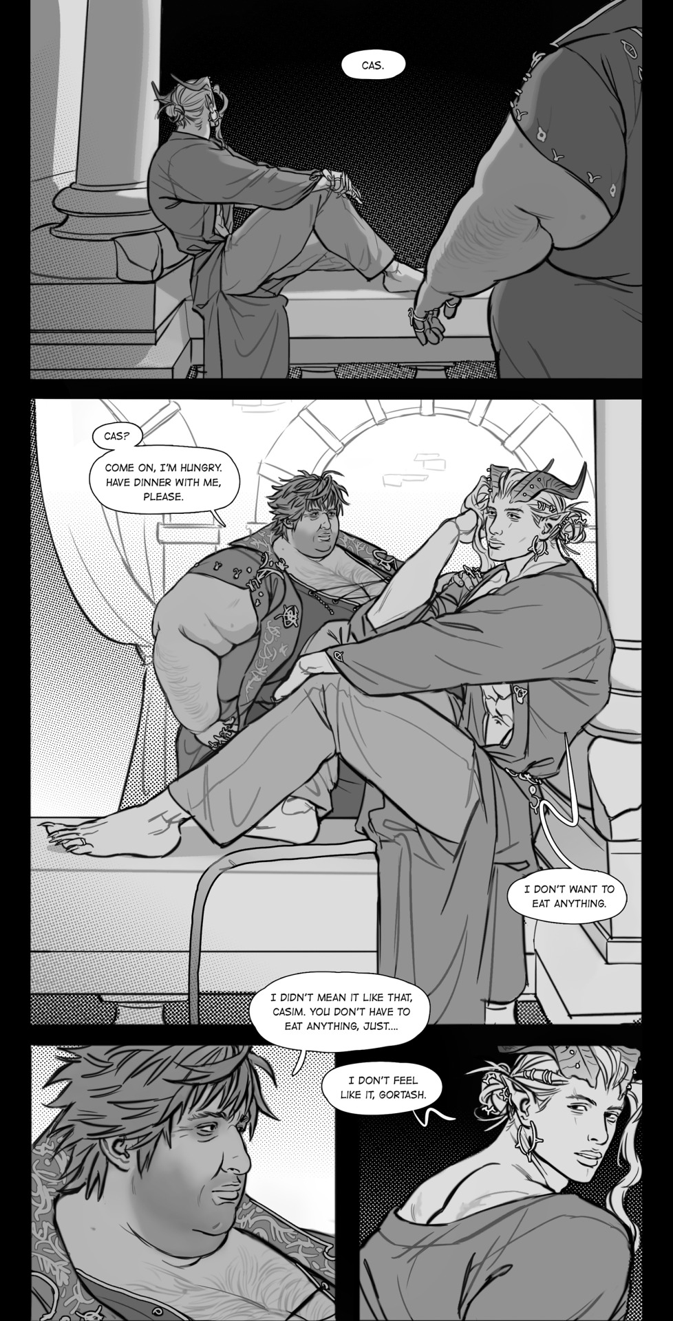
#art tag#gortcas#casim carnarvon#sorry guys proper context some other time maybe idk how to do it right now so no caption it is🤕#the tldr is that Gortash offhandedly talked about how Cas can make him as fat as he pleases but really it wont make him him his#basically that he only allows Cas to have his way but hes still in full control#which is true yes and Cas knows that to an extent but its not something he wants to hear#because Cas very much holds onto the hope that Gortash will be his forever at some point. phsyically#because again. Cas won't ever believe just words he simply is unable to even if Gortash could never love anyone else#at the same time while yes he obviously enjoys the whole weight gain he does not consider his own enjoyment a good reason to do things#Cas is someone that very much disregards his own enjoyment of things as well as his wellbeing#Cas is just pulling away instead of acting mad in an obvious way. hes sticking around but hes not feeding or teasing him about his weight#and Gortash? is now left with not knowing how to fix it since Cas isnt acting as he usually does when hes hurt or mad. hes still there#and day after day passes where he yearns to have it back. practically begging Cas to continue so he can prove his devotion#prove that he mustve been wrong with his comment. that Cas can push his body as far as he wants to and he'll be his in the end#thx for reading my tags guys maybe i can share more about this scene some other time🙂↕️ for now just have the art
307 notes
·
View notes
Last Seen Blogs

freshmanphotografer-blog
Freshman Photografer
killaway-3-tenno
Killaway & Tenno

shinsaga23
Host: Carl

quecomico
QueComico.com

chocolaterebate
ChocolateRebate