#icons para wattpad
Text
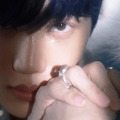
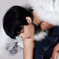


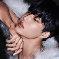
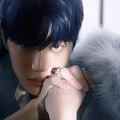


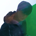
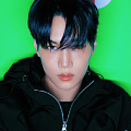
These are the 120x120 icons that I’ve made, but I don’t own the credits of the pictures. Please, don’t repost (especially as yours) neither re-edit.
Like or reblog if you saved/enjoyed it!
Find more through my tags.
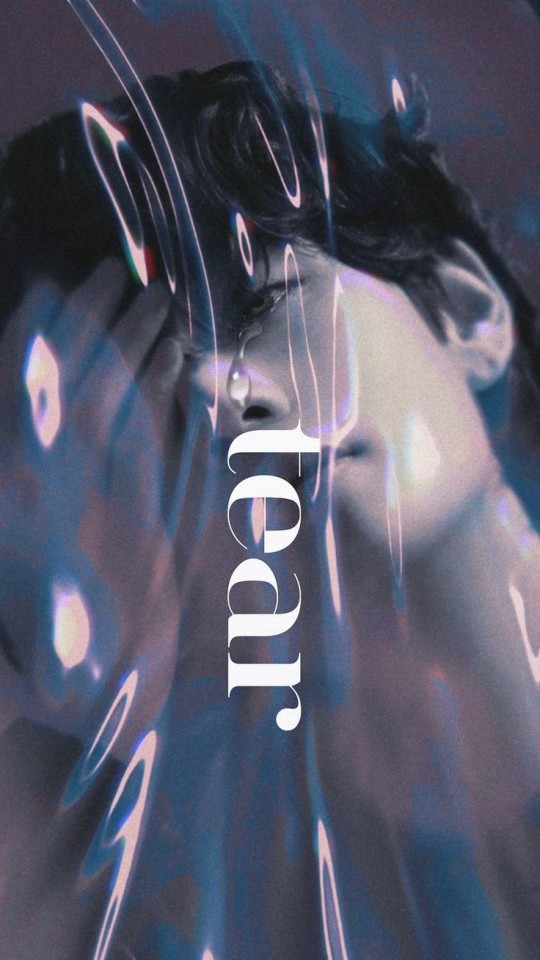
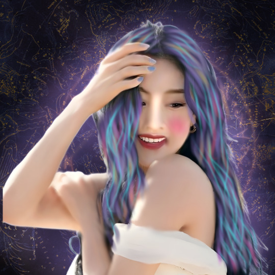
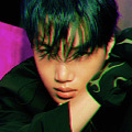
KAI 카이 'Rover' The 3rd Mini Album (Teaser Images 2)
#icons#kai rover#kai layouts#kai angel photoshoot#kai ep rover#icons kpop#120x120 icons#120x120#icons para spirit#icons para wattpad#dhxzs#kai from exo
72 notes
·
View notes
Text

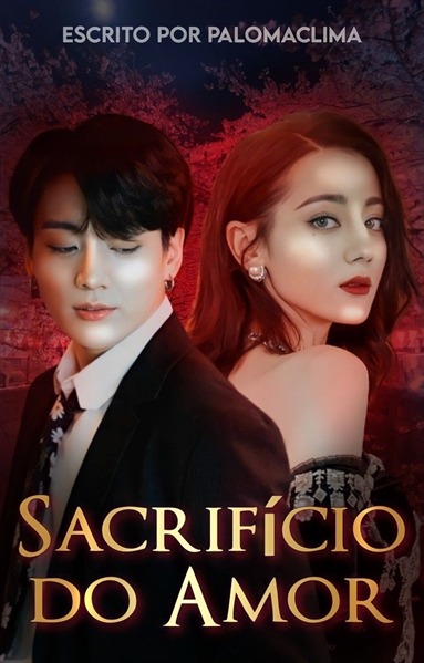
⌗ baboZeira chata.
23/05/24 – para doação.
se inspirou? então de os créditos. (linhazinhas insp nas da @.chanyouchan)
GENTE!!!! o correto é BABOSEIRA, mas enquanto fazia a capa pensei num plot engraçadinho e q fez sentido e combinou com a vibe da capa, me deixem 😭 não sou burra 💘
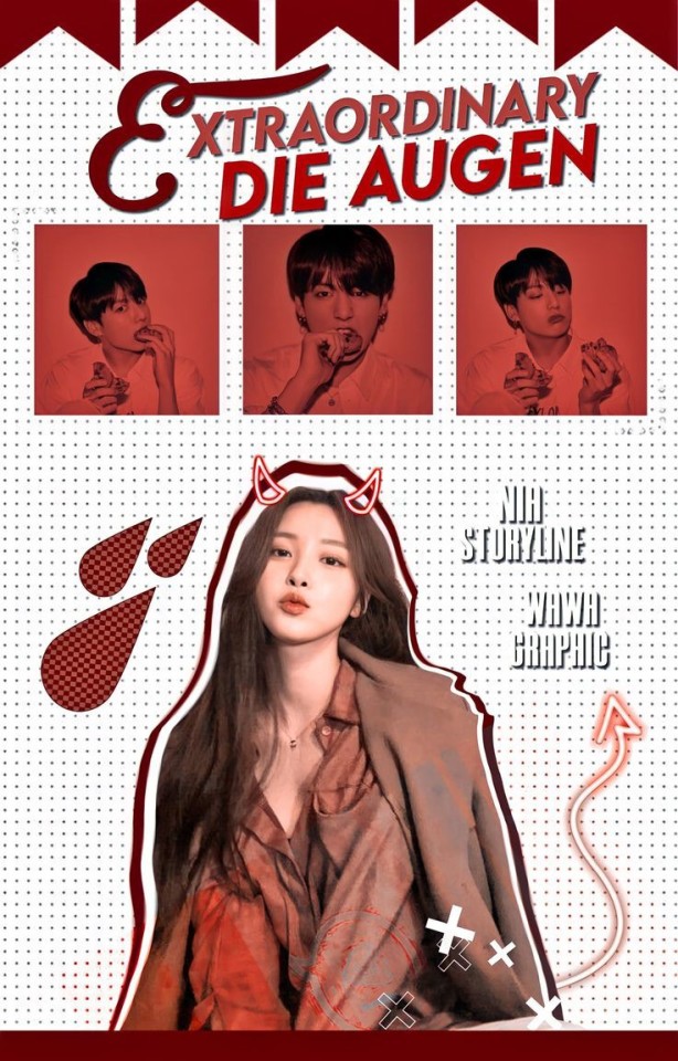
#design simples#design#capa de fanfic#capa#capa para fanfic#capa simples#spirit fanfics#xuggi#capa de natal#capa png#capa de fic#capa para fic#capa para doação#doacao#capista de doação#capista#capa divertida#capa com gif#capa para wattpad#capa para spirit#aespa edits#aespa icons#aespa#capa para social spirit#capa cômica#capa clean#capa colorida#capa colagem
112 notes
·
View notes
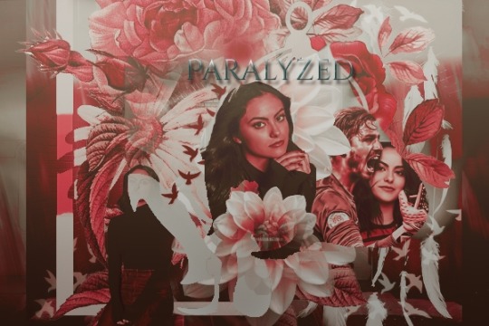
Text
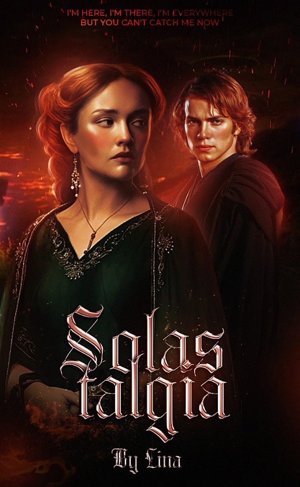
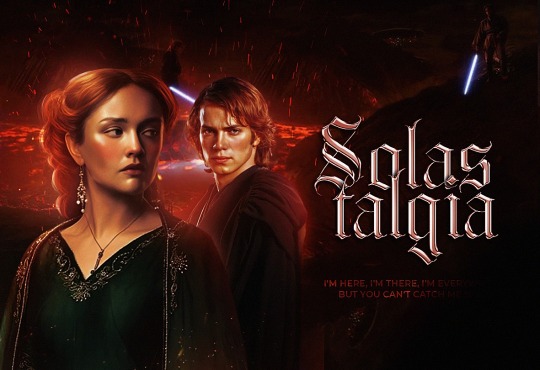
▸ SALASTALGIA, Anakin Skywalker
30 notes
·
View notes
Text
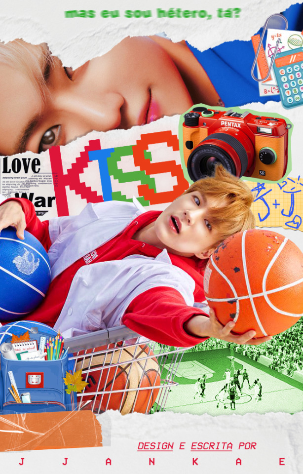
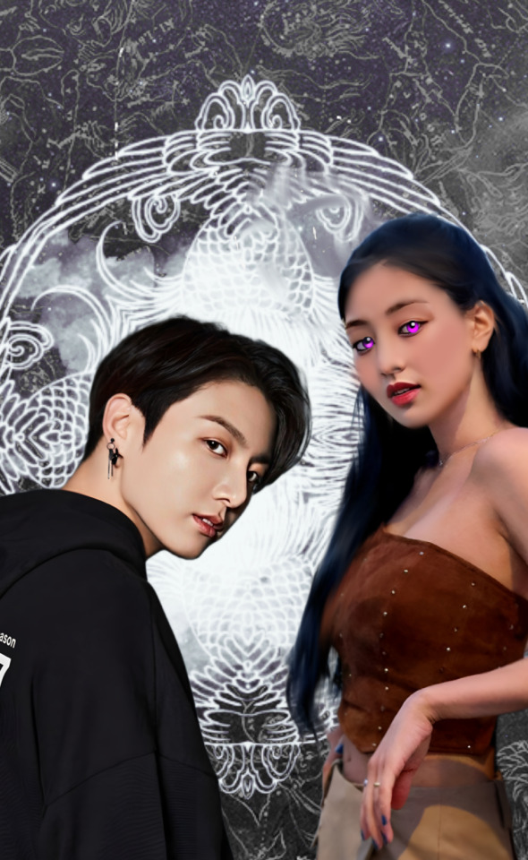
kiss cam | nomin | wattpad
#capa para fanfic#edit#design#kpop#capa#icon#capa para fic#fanfic#capa para spirit#capa fanfic#capa de fic#capa de fanfic#capa spirit#nct#nct dream#nomin#jeno#jaemin#capa divertida#capa wattpad#wattpad#wattpad cover
50 notes
·
View notes
Text
Things graphic designer should know. 1 pt.
a unprofessional graphic designer telling you some knowledge and information about graphic design.
for only wattpad users. :(
For a cover, we use "512x800", for the banners in the stories they are more diverse and depend on your preference, but the most used and basic is "1280x475", then we go to the profile design,
there an icon of "500x500" is used and a "1920x600" banner. Many more graphics are used, but these are the main ones. The icon size also works for Instagram. There are many more graphics, but for these, there are no stipulated measures, I'll talk about them later.
Multiples of these can also be used for higher quality.
[photo]
fortunately, I found what is written in the second picture. Let me write it systematically.
The first says; 300x300 ( icon )
The second; is 500x500 ( story ad )
The third; is a 700x100 or 800x200 ( banner )
Fourth; 441x ---- ( thread )
The fifth; is 512x800 ( cover )
Sixth; 800x600 ( is like the banner but with more images, I think. )
The seventh; 1920x600 ( profile header )
The eighth; 1500x2100 ( Movie Poster )
the ninth; 600x2400 ( Bookmark )
I tried to get as clear as possible but if you have any sources that can be used for this then, please comment about it.
Now, let's talk about the type of covers;
I have taken several covers and I have grouped them by type, to explain myself better.
The type of cover varies depending on the preference of the writer, and what the story is about. Because of course, you can't use a pastel cover for a police and horror story, no.
The main covers are what we call minimalist -they should not be confused with typographic covers-, the simple and the manipulated ones. However, these three cover subtypes vary and I am here to tell you about every one of them.
It should be noted that not all of them are called the way I am going to say them, in some places
they are called different.
Let's start with the saturated style cover, also known as the collage or comic type.

In this style of covers, the saturation of colors is the center and the star, it has striking fonts and characters between and cut.
It is usually used for stories in the genre of comedy, drama, romantic drama, romantic comedy, and all its derivatives. However, he shines in comedy.
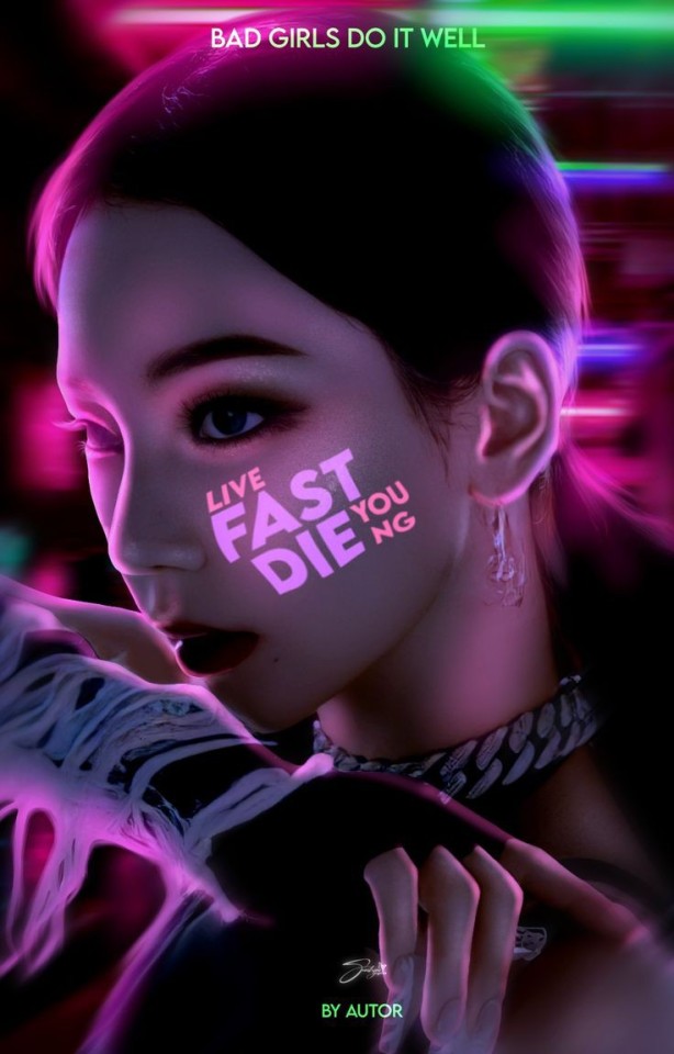

The light or neon style is a style where bright and striking colors are the center of attention, brightness, and contrasts that will make you freak out and leave you speechless, it is a style with great attention to detail.

The minimalist typographic style is nothing more than a photograph with a monochrome background where the contrasting color is the title. Simple.
2 pt., 3 pt., 4 pt.
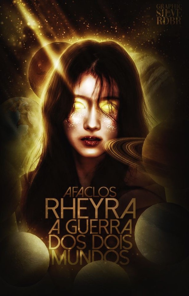
#graphic design#kpop graphics#aesthetic#editingresources#kpop moodboard#kpopmanip#packpng#png#resources#kpop icons#wattpad books#cover wattpad#capa para wattpad#editorial design#capa de fanfic#design simples
34 notes
·
View notes
Text
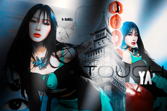
touch ya
feita em: 18.04.2024
obs: qualquer inspiração, credite-me, por favor!
spirit ✩ port
formulário de doação de capas
#social#capa design#capa fanfic#elly#design#newpost#fanfic#babell#spirit#capa para fanfic#capa#capa divertida#capa clean#capa dark#capa de spirit#capa para spirit#capa manipulada#capa de fic#capa para fic#capa para social spirit#capa para doação#capa para wattpad#giselle#aespa#aespa mv#aespa winter#aespa ningning#ning yizhuo#aespa icons#aespa karina
9 notes
·
View notes
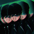
Text

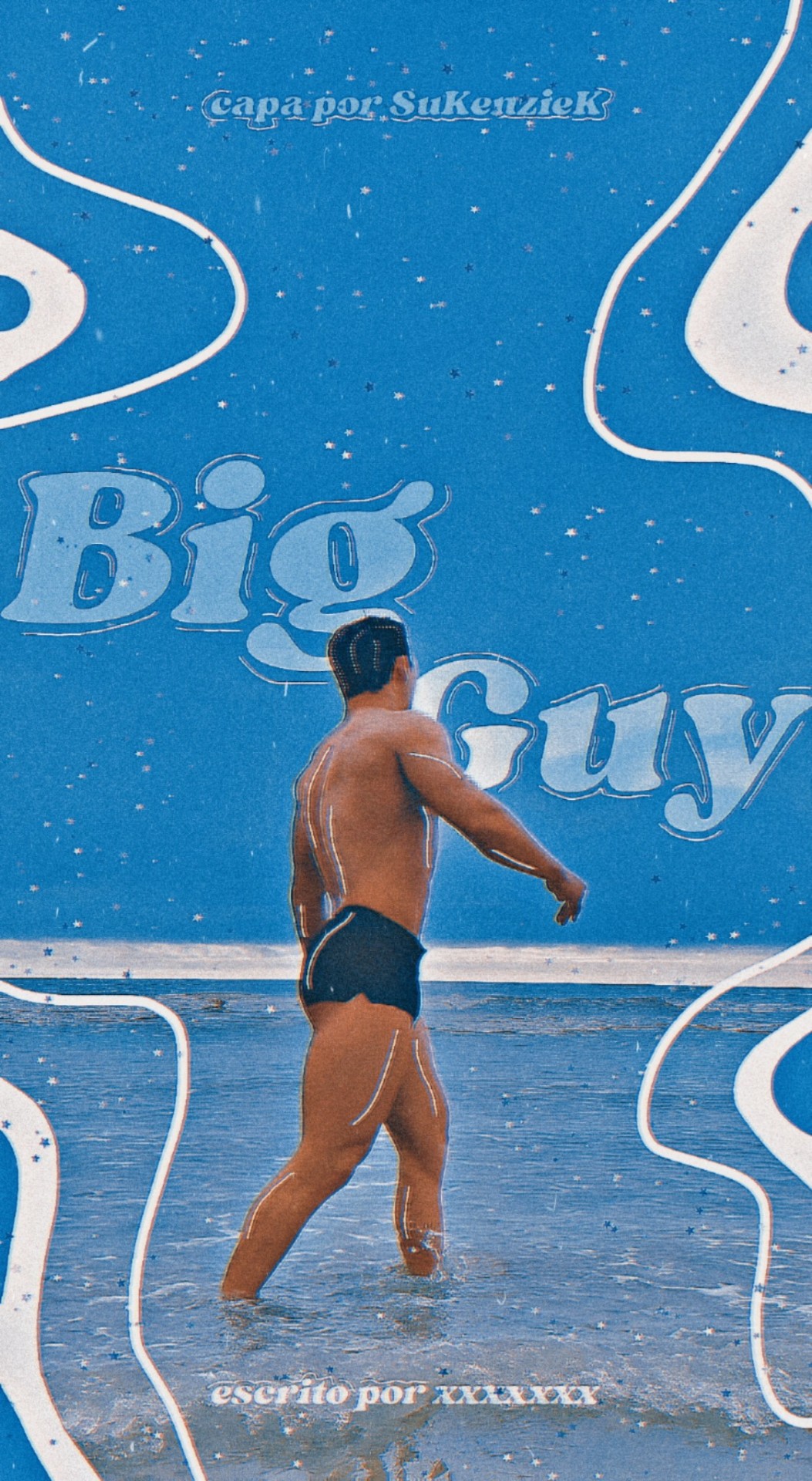
• Original - Wonho [TESTE]
- icons do nosso amado Wonho ₁₂₀.₁₂₀
• Big Guy - Wonho [TESTE]
⠀⠀⠀⠀⠀⠀⠀⠀⠀⠀⚠️Apenas treinamento⚠️
#kpop#capa de fanfic#capa para spirit#capa para fanfic#capa para fic#fanfic#spirit fanfics#sukenziek#capa para wattpad#wattpad#wonho#wonho monsta x#icons#kpop icons#kpop idol
15 notes
·
View notes
Text
#capa para fanfic#fanfic#minsung#editorial design#stray kids#wattpad#han jisung#jeongin#skz#skz imagines#kpop icons#kpop#fandom#skz stay
9 notes
·
View notes
Text


Minhas capas até agora .
Eu abro o pedidos para capa agora
3 notes
·
View notes
Text
Eu consegui minha copia de Thirsty Sword Lesbians!!! estou feliz para caramba hahaha, eu estava obcecada procurando esse jogo por todo lado, estava até mesmo buscando versões piratas porque eu absolutamente queria esse jogo e não tenho o dinheiro para comprar ele (15 dolares em reais fica meio caro demais para mim), por sorte a Evil Hat está meio que dando uma quantia limitada de copias do itch.io e quando vi isso fiquei louca de felicidade, resgatei o pdf, a expanção e também o apocalypse keys, que parece bem legal também.

Eu quero muito jogar esse jogo, tipo, muito mesmo, mas eu não tenho um grupo para jogar e nem sei como procurar um, além do tempo que preciso para poder jogar e isso também está em falta, mas eu quero demais jogar esse jogo!!! AAAAAAAAAAAAAAAA!!!! Uma pena que nunca tive uma fase de rpg de mesa quando mais nova, talvez isso me desse uma facilidade de procurar grupos para jogar, mas eu nem sabia que eles existiam hahaha, só conhecia os digitais e agora eu quero começar o hobby mas não sei como, infelizmente.
#Thirsty Sword Lesbians#RPG#TTRPG#Quero demais jogar esse jogo#ele é tão incrivel#vou ficar lendo o livro#talvez usar ele para escrever algo no futuro#e postar no wattpad ou spirit#mas eu também quero jogar#muito#tenho o pdf do Lancer rpg também#e 2 espansões#também quero jogar demais#estou em planejamento de uma historia de ICON#quero jogar#mas a historia vai vir primeiro
5 notes
·
View notes
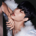
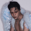
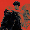
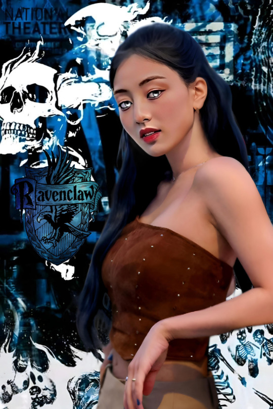
Text


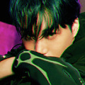


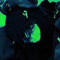


These are the 120x120 icons that I’ve made, but I don’t own the credits of the pictures. Please, don’t repost (especially as yours) neither re-edit.
Like or reblog if you saved/enjoyed it!
Find more through my tags.
KAI 카이 'Rover' The 3rd Mini Album (Teaser Images 3)
#icons#kai layouts#kai edits#kai icons#exo edits#kai ep rover#kai#kai rover#120x120 icons#120x120#icons para spirit#spirit icons#tumblr icons#icons sem psd#icons para wattpad#dhxzs
24 notes
·
View notes
Text


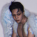
▸capas para wattpad!"
48 notes
·
View notes
Text
❤️🩹 Capinha da nova versão de Someone To Stay, que inicia no capítulo 67.


#actresses#actrees#actriz#emily blunt#emily blunt icons#king of pop#michael jackson#movies#rei do pop#fanfic#wattpad#capas wattpad#capas para fanfic#capa para fic#capa romântica#capa para fanfic
5 notes
·
View notes
Text
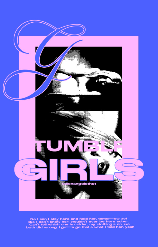
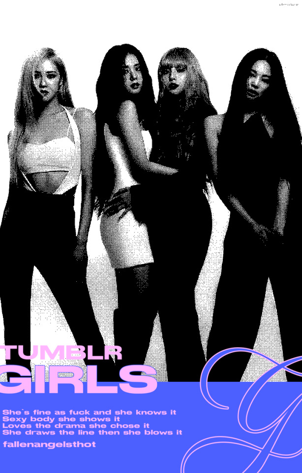

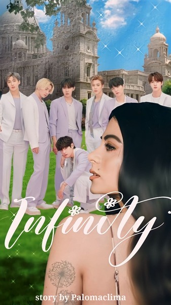
my tumblr girls ; wattpad book covers
#graphic design#kpop graphics#aesthetic#editingresources#kpop moodboard#kpopmanip#packpng#png#resources#kpop icons#capa para fanfic#cover wattpad#capa de fic#capa de fanfic#capa divertida#wattpad books#graphic shop#graphic art#blackpink edits#blue moodboard#black and pink moodboard#pink moodboard#blue and pink moodboard
5 notes
·
View notes
Text

⫘⫘⫘⫘⫘⫘⫘⫘⫘⫘⫘⫘⫘⫘⫘⫘⫘
Inscrições ⬪ blog ⬪ regras
⫘⫘⫘⫘⫘⫘⫘⫘⫘⫘⫘⫘⫘⫘⫘⫘⫘
⬪Setores:
👑Ficwrinter
👑Capistas
👑Betagem
👑Avaliação
👑Trailermaker
⫘⫘⫘⫘⫘⫘⫘⫘⫘⫘⫘⫘⫘⫘⫘⫘⫘
#agustd#minyoongi#dat#king#dagusttwoprojetc#ciclo#livros#fanfic#wattpad#spirit fanfics#capa de fanfic#trailer#trailer bts#trailer para fanfic#betagem#avaliação#fic writing#bts agust d#bts yoongi#bts min yoongi#bts suga#bts army#bts icons#bts
1 note
·
View note
Text
Olá, sou nova no Tumblr e também uma designer iniciante. Mesmo sendo nova nessa área, resolvi tentar fazer comissões porque quero ajudar na renda da minha casa, que não está sendo barata.
WALLPAPER
- CELULAR: R$ 02,50
FANFIC
- SPIRIT: R$ 02,50
- WATTPAD: R$ 02,00
YOUTUBE
-THUMBNAIL: R$ 02,00
-BANNER: R$ 02,00
-ICON: R$ 01,00
Pagamento via Pix.
Portifólio
#design#commisions open#edição#anime#pix#comissão#comissões#capa para fic#capa para fanfic#capa de fanfic#thumbnail#youtube#icon#banner#spirit#wattpad#portifolio
1 note
·
View note
Last Seen Blogs

mnovak20
Untitled

gotitmemmorized
VIII

watersparks357
Unsorted Archive of Watersparks
cousin-possum-kc
Untitled

owl57
Liberal egalitarian and anti‑feminist