#my art changes a lot but that's fine
Text
Process Post
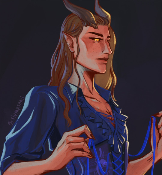
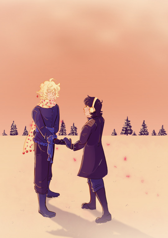
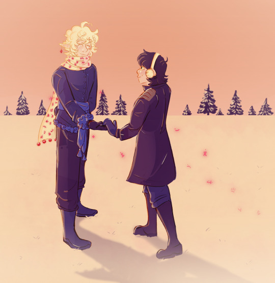
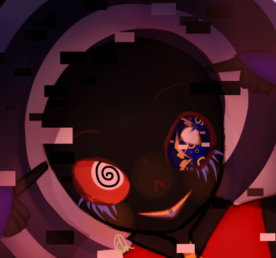
Hi everyone! Here's a process post on my previous Rolan painting study.
Time-lapse from Procreate above.
More details, inspo, references, and writing under the cut:
I haven't drawn or digitally painted in years but Baldur's Gate 3 got me drawing fanart, especially Rolan. I love his design and storyline so much. I draw him almost every day, whether as a warm-up sketch or full illustration - and I can see how much has changed from when I first started drawing him to how I draw him now. More importantly, it's crazy amazing to have found a community because of an NPC. Also, receiving all the love and support here has been crazy wonderful, I read all your reblog tags and they always make my day - thank you sm.
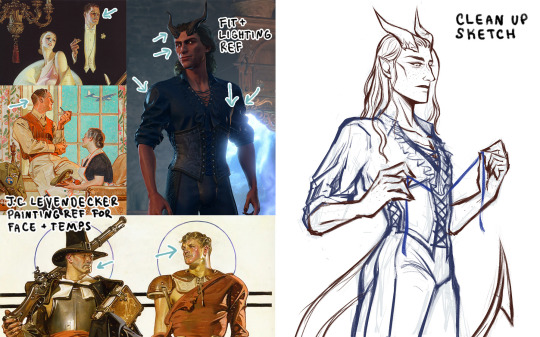
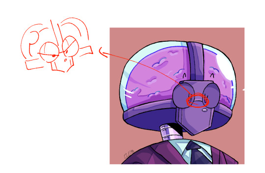
Inspo / ref image board on left, my clean up sketch on right.
Linework and inking are fun for me but I struggle with color, rendering, and digital painting. I find that referencing artists and images helps immensely when I paint, so I often collect images and combine them into a board. J. C. Leyendecker is a big inspo for me, especially his color, mark-making, and poses. I also ref a ton of in-game screenshots, the one above is from @ / emerald_witch9 on twitter. I use the iPad side-by-side window feature so I can look at my image board and Procreate at the same time.
I like painting in this style, but it does take me awhile, so I'm not sure how long I'll continue to paint this way. However, I think it'll help me develop a quicker and more personal sense of render style.
Lastly, here's a detail shot of my paint study because freckles hah.
41 notes
·
View notes
Text
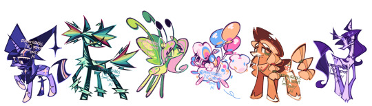
friendship is magic
closeups:
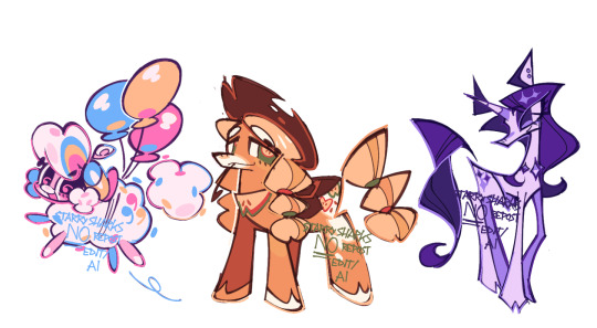
#zeno's art#my little pony#my litte pony friendship is magic#mlp#mlp fim#twilight sparkle#rainbow dash#fluttershy#pinkie pie#applejack#rarity#this was a fun redesign practice#tried to be diverse with body type and species as the og show is pretty limited (i understand why tho)#my personal favorites are rainbow dash and rarity#and twilight. i cooked tbh#i feel like a lot of redesigns just add accessories which is fine but i really wanted to change a lot#some more than others#also dashie is a half zebra and pegasus and fluttershy is half pegasus half those little bug ponies that showed up in one ep#pinkie is a sheep#i might do equestria girl designs and slash or some background pony redesigns#idk#enough ramble
6K notes
·
View notes
Text
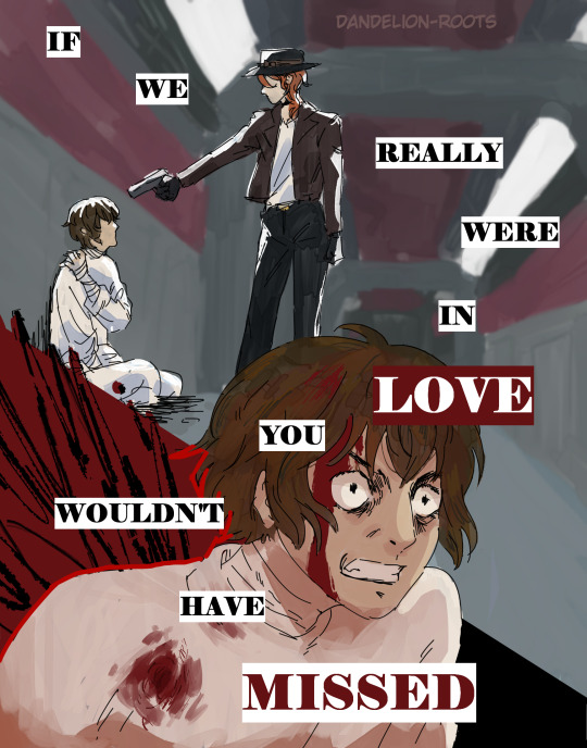
[ID: a digital redraw of the scene where chuuya shoots dazai in the shoulder. on the top of the drawing is chuuya holding a guy to dazai's head in the red and grey hallways of the prison. on the bottom of the drawing is dazai's pained face. the gunshot is shown stylistically as hectic lines behind his bloody shoulder. over the image is half a quote from goncharov that reads 'if we really were in love you wouldn't have missed.' the signature says dandelion-roots. end ID]
This quote from Goncharov (1973) in relation to soukoku has been haunting me from before I even got to that scene in the anime (the full thing is: Katya- Of course we're in love, that's why I tried to shoot you/ Goncharov- If we really were in love you wouldn't have missed). Violence as a tool for communicating emotions, especially love and hatred, especially love and hatred makes me go feral- how could I not think of the iconic quote that says that katya's miss was a sign of a lack of love/a fake love when chuuya didn't miss? Just... losing it over here.
#bsd#bsd s5#bungou stray dogs#soukoku#soukoku fanart#bungou stray dogs season 5#bsd spoilers#dazai osamu#chuuya nakahara#not to tell on myself but i just realized that i. used the wrong screenshot as ref JKDSKDJKDJ i have too many saved. its fine. u get it#just saying it in case anyone was confused#goncharov#also just to be clear if someone didnt understand the caption- i used the quote to be the opposite of what was happening#not to describe what was happening in the scene or to imply that chuuya later not killing dazai was him 'missing'#i get VERY specific imagery in my mind and i disregard everything else#and i do it in the way that would be incredibly confusing to most ppl at first glance. such is the world#im not wordy rn i cant fully describe my feral state after finishing bsd earlier today or this thing. hope u enjoy it anyway!#it was rly fun to do a screenshot redraw the bsd animation crew is so freaking talented and i got to see which colours they used where#i changed them bcs they wouldnt been too desaturated but lots of blues in the bg! colour theory babyyy#and got to play around w csp! fun fun been so long since ive done digital art
923 notes
·
View notes
Text

touched up some daisy, daisy fanart i made at least a year ago but never got to post
#i have so much scattered around but its mostly sketches and i drew them different#way back then#the hev suit was a bit funny before i changed it. i hadnt look at a reference yet lol#ill include a link to the fic in the notes but be aware that its abandoned. but its my favorite fic ever#hlvrai#eyestrain#maybe? idk ppl say bright red is hard to use. looks fine to me but just to be safe#half life vr but the ai is self aware#benrey#gordos freeman#my art#OH FUCK OH SHIT it looks way different on my phone FUCK#i was right to tag eyestrain#but i dont feel like changing the drawing#did noooooot expect this post to get so many notes#i put way more time into the other daisy daisy fanart i posted lol#this one was so old. definitely one of the first times i had drawn them#was not used to drawing facial hair. im still not but now i get that you just kinda fuck around and see what happens#like lots of art goes
285 notes
·
View notes
Text
youtube
A old animatic I made of f!leo comforting/ talking to lil Leo
from like 5 months ago so idk why not post it here *shruges*
#rottmnt#rise of the teenage mutant ninja turtles#rise of the tmnt#rise of the turtles#rottmnt leo#riseofthetmnt#rottmnt future leo#peepaw#peepaw leo#leonardo#animatic#my art#ild old old#Not that old but my arts changed a lot since then so idk#My art#There’s lots of change and fix with this but it’s fine I like it#It’s pretty good for my first animatic#Youtube
235 notes
·
View notes
Text

im so glad we all agree avery has white hairs
#my art#dol#avery the businessperson#ugh the EVERYTHING is so hard to design#i HATE designing. cant even make my own ocs BEE TEE DUBS#i hate colors too#hope this is OKAY#maybe ill change it later im not sure#i wanted to make their hair more Gray but uwwaaaaagghhhh#tried a lot of things#but this seemed to work fine#oh but all white does look kind of awesome#but i dont know#if any of you have any suggestions ill be glad to get them#OH MY GOD. it was so hard not to draw The American Psycho or Hannibal. you dont understand#i dont know how to color the suit so :(
153 notes
·
View notes
Note
tips on how to draw cogs?
truth be told, I haven't drawn many cogs (mainly just one or two), but I will try to answer this as generally as I can!
This is a long post so I'll post this under the cut.
my biggest tip, as well as for anything, is to break down the shapes. If you try to look at everything at once it becomes really easy to overwhelm yourself. Examples will be drawn sketchy, but hopefully the point gets across.
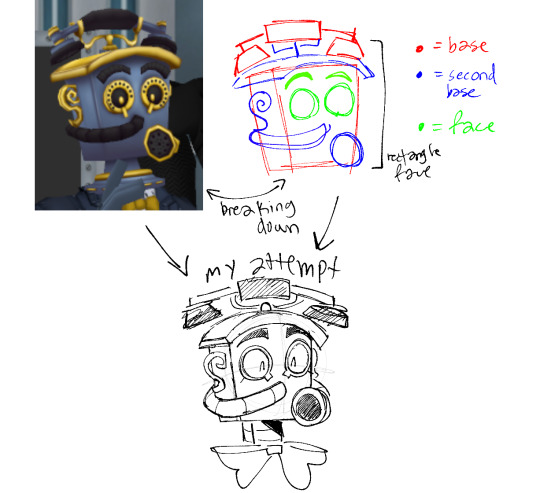
Our first test subject is mouthpiece which I've never actually drawn before [marketable plushies post doesnt count]. as you can see, I tried to break down a lot of the shapes into much more simpler ones. A lot of cogs seem to share some very obvious shapes, probably because a lot of them are object-related (normal cogs included- first that comes to mind are pencil pushers).
You can do this with really ANY character. Here's our second test subject DOPA for another example.
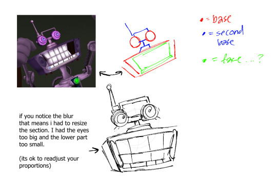
now these are mainly references from the pictures themselves, which are great as a starting point. my other big tip is just to practice. you don't have to do big full pieces every day, but even just little doodles will help you. i think its very rare for anyone do to super good their first time and this goes with anything, even if you're a highly skilled artist.
you've probably also noticed but I've left out details in my examples, such as the little dots on mouthpiece's eye borders. If you feel that adding all the small details would overcrowd your drawing or just not help it, then I think it's fine to leave them out (of course there are always exceptions to this but as a general rule, its ok).
along with removing details, i think adding details also cannot hurt [to an extent]. if there's something you think would look nice then add it. who cares its your drawing have fun. As an example I'll use prethinker. I always add the little line in the middle, which his model doesn't have. But this is also based off of the 1.3 promotional art as well. Another example could be that when I draw misty, I add a line that connects their eyebrows to their eye. idk just feels more robotic to me and i like it
and again as you notice, my drawings are not model accurate. your style is most likely not going to be exactly like the game and that's completely fine. adjust to your liking, interpret as you will. enjoy the process of creation.
And finally, I'll add my little tip for metal coloring. One thing about metal is that usually the lightest highlight is next to the darkest shadow
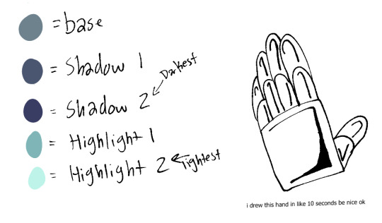
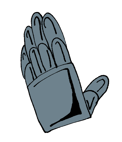
The gif goes as base -> shadow 1 -> shadow 2 -> highlight 1 -> highlight 2 -> cleanup + extra
I like to add a few light marks to indicate scratches. although if you wanted more depth, you'd take the darkest shadow and lightest highlight and put them together like this

often the metallic parts are not the focus of my works so I leave it without. As for the random black marks on the lineart, that just also gives it more depth.
And finally, look at other peoples art. Look at the way they draw and pick out bits and pieces of what you like and try to interpret that in your own style.
ok I think that's all. Hopefully this helped!
#clemask#long post#sorry#these are kind of vague overall art tips rather than specific ones but i think its because a lot of my processes follow the same general ar#tips that i follow#but yeah my general rule is just to practice and observe. there will be things that you change and thats fine#sorry if you wanted a specific cog. if you did you can resend an ask and specify but either way i hope this helps you! or anyone else
28 notes
·
View notes
Text
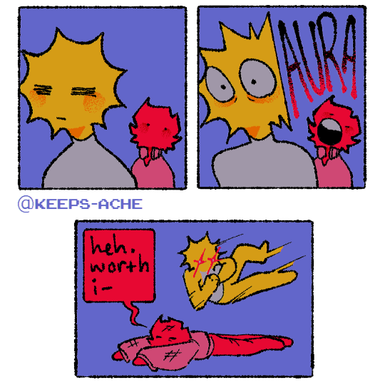
HEY
#art#my art#artists on tumblr#digital art#oc#pink space#i really like the subtract glitch i've been doing recently - so here's some of that again lol :3#the way it interacts with their palettes is so fun i like it a lot ehegh :33#//anyway do you ever consider just tossing out any part the human body you've learned to draw and just drawing dumb little guys with arms#like pipecleaners forever or what hfhs#//oh this is was doobled in traditional originally#i need to digitize more of these. Because#though aura's hair was more extreme in the second panel in that version - i'm tired though and 3 days ago it was the same so no feelings to#change that lol :)#also i didn't shrink the noise enough so it didn't look right - and i was not going to reimport it so Bon Voyage my dude hfhs#was Supposed to fit on a 900x900 canvas but i made the panels a liiiiitle bit too big so it's 950x950#which is Fine it's a round number but it's not a Round-Round number so [gesturing]#1000x1000 was way too big for this little thing so she sits at a pleasant halfway point :>#//anyway i was also up til 3 a.m. last night doing ?? something ?? i genuinely don't even know what lmfhsbvh#nice though maybe my brain'll get a reset lol :3#stay up really late some random nights and jumpstart your brain!! it's foolproof!! never fails!! [<- these statements have not been reviewe#by the FDA or the Center for Sleep Control]#//ANywho now i'm going to be on my way#/oh i also forgot to post the oath n aura refs i made for artfight lol-#i'll prolly put those up w/ the kira and hid ones though :>>#i like to have the whole ensemble :D i Do feel bad when one of them gets left out hghsfh - like forgetting a stuffed animal somewhere#even though they're all together for small portion of the story it still feels off lol#i should prolly introduce the rest of the cast at some point. .... ......... ..........hm yea prolly. maybe one day hfhs#//anyway NOW i'm going i've run out of tag space i think hfhs - toodles !! :>
8 notes
·
View notes
Text
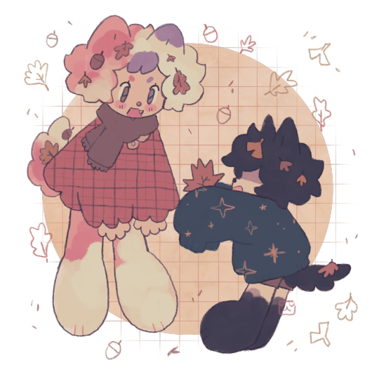
Harvest moon
#I just remembered her fur changes Color with the seasons sooo. heres what her coat looks like in fall changing to winter lol#I had a lot of fun with this one!!!!!#content for my blorbos when my blorbos are my own ocs.. clenches fist#I get oc content but. at what cost#(it’s free time and the opportunity to paint me nails. but it’s fine lol)#my art#myart#my oc#my ocs#Augusta#Vincent#HEHEHE KISSES THEM ON THE HEAD#autumn equinox#autumn#starshadow#sillies family
191 notes
·
View notes
Text
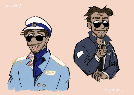
the real reason why they never promoted eyes to lieutenancy is because he woulda' shown up to the function with his sunglasses on and his collar popped like some kind of unprofessional punk
(the real real reason is that he was too damn adhd and a little too graadian for comfort (also the collar thing. that still applies actually.))
#i cant fucking handle this guy#my art#viorel segal#disco elysium#eyes disco elysium#whys he look like this. what the fuck is that.#what is that. why do you look like this.#these r sketchbook doodles transferred to digital and i keep overthinking them like i keep worrying theyre wonk#but i think theyre fine. hes so. jesus fuckfing christ. man. yeah.#the lieutenant uniform uhhhhh i have a better art of kim and jean in their uniforms and ill explain it better then but you just get this fo#for now. but moralintern blue. gold for the royalty. blue scarf and ribbon and belt and cape for the grih. folk symbols r wheat river star#coz each precinct has different ribbon colors and different folk symbols and different colors of the symbols. here the colors r blue for th#river black for the money from the port and red for fraternity. ill have to think about it more in depth so thats subject to change#and uhhhh rcm seal. which is based on the revachol state seal. which is also subject to change. rn is moralintern blue flowers royalty lion#and skua of course.#and red dots for the 6 suns#and the words around it r the RCM name and motto#shoves him in my mouth#also hes like what. 40 something here. hes 5 years older than kim and he was 43 when he died so idk 40 something. early 40s#idfk how to draw older men fr i have to work on that#oh another fun fact i had to digitalize these specifically bc theyre my fave doodles of him#i kept opening up my photo of the sketchpage and STARING at him. ok#thats all#oh wait one more fun fact i did this in between working on my essay. okay now THATS all#i like to say a lot of things. i love to type. ok bye
9 notes
·
View notes
Text
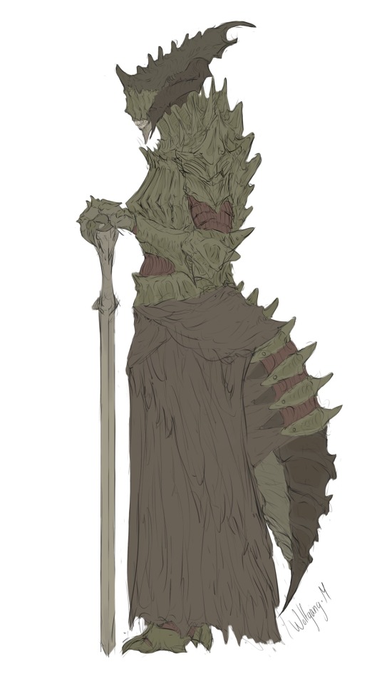
Ru'thûn is no Osmium royal, she has no common blood with the Hive Gods. she comes from no extant Swarm known to the Vanguard, or even most Hive.
her armour is fluted steel, yet coarse like sharkskin. it is older than humanity, and is so deeply impacted into her chitin that tearing it away would flay her hide. within the fine, granulated crevices of her armour are the perfect growing conditions for fatal anaerobes.
(an old side portrait of Ru'thûn from February 2022. reuploaded from my twitter. feel free to click and zoom in.)
#destiny hive#hive oc#oc: Ru'thûn#oh i need a new art tag... um...#blackwax art#i'll xkit a new one later.#ah this is so... there is so much i would change about this.#does not matter right now.#since this is a .png there shouldn't be any loss in quality from my saving it and reuploading here...#i tend not to use my phone like this because of an implicit worry that the image will degrade. i hope it looks fine on desktop.#i can't believe i drew this and two weeks later Witch Queen came out#and the First thing i noticed was that Savathûn had the same heels as Ru'thûn...#the only difference between their shoes is that Ru'thûn does not have the prongs on either side. otherwise it is identical which is funny.#if the background was transparent i would say use this to compare heights since that is what it was meant for.#then again you could just superimpose your own thing onto her.#her neck is craned forward though...#i always say Ru'thûn is 20 (now 22) feet tall withoutn horns because she has no horns adding to her height.#i still do not think her horns or... i forgot the word for her Alien Queen graft... add too much.#a lot of this drawing i would redo... now that i have a nice 3d model to look at perhaps i could do that.#Ru'thûn's graft does flare upwards a little but i don't know how much height that would add.#i think what i will do is get some charts out and then count.#otherwise. for this image. i imagine her full height would be roughly where...#the large gap between the third and fourth spine on her headpiece are (not counting the horn on her forehead).#eugh.
100 notes
·
View notes
Text

Merry Christmas! 🎁🎄
you get art of my old OCs <3
more alt crops under cut
i really like how these turned out despite being a kinda rough/sketchy drawing🥺💖
#original art#my ocs#trita#dungeons and dragons#d&d#my art#shine’s art#these OCs are over 10 years old that’s crazy#they have both changed a lot tho#merry christmas#happy holidays#posting this from my phone because it’s a busy day so hopefully the image quality is fine
11 notes
·
View notes
Text
Emotes of my WoL's I made for me and my friend's server!
From top left to bottom right:
Waga, Lily, Nanami
Y'aela, Lobster, Risé
#everyone but nanami is he/him. nanami is she/her#waga can also use they/them#though he doesnt really care much for either so any is fine!#I think i've only ever really talked about lobster and risé besides lily#y'aela was actually the original lily ajkshsd before fanta#i got attached to him but man... he has changed a LOT#and no. he's not a keeper but a seeker with awful eyes#something akin to a condition or something idk#ask me about any of them if you want! i have so much lore for each of them aksldh#nanami is a reused oc but she has kept much the same abilities and such#i think waga is the one i have the least information about since he's the most recent one lol#(pelase ask me about my oc's lol)#❖ Art#ffxiv art#ff14 art#final fantasy art#ffxiv#ffxiv viera#warrior of light#final fantasy viera#final fantasy 14#ff14#viera#male viera#ffxiv gpose#wol#Lily Oh'fally#Risé Amemiya#Wagashi Konpeito#Y'aela Tia
13 notes
·
View notes
Text
⛵
#I also keep seeing modern au aubrey-maturin art#that makes me wish I could draw and thereby contribute#unfortunately I can't even *write* modern aus generally. but I like transferring character dynamics from place to place in my brain#and I feel like I could do a university AU very nicely if I could do AUs at all#because I have had rowers in my class with as far as I could tell jack's exact personality#(unfortunately it has to be a US university AU because (a) that's what I know and (b) afaik nobody else does randomly assigned roommates)#(and I cannot pass up the opportunity for randomly assigned roommates.#OR RATHER#for 'you seem more or less human - quick let's request each other so we don't have to go into potluck'#I think that works best)#(but maybe they are both international students anyway. that works fine. & therefore extremely alarmed by potluck [can't say they're wrong]#sophie is a sorority girl. english major I think. and I can see her so clearly#(she's the part I want to draw)#she's not that into the high-octane social schedule her sorority expects her to have#but her pushy mother was a member and it is Unthinkable that sophie should not be#and a lot of the other girls are sweet :) so it's fine :) she says#feel like she has roommate issues (unlike her original self she is able to live away from mrs williams so this makes up for that)#so she's always over in jack and stephen's room. people who know her tangentially sometimes gossip about which one she's actually dating#(at that particular moment it is actually neither of them she's just hanging out with stephen)#diana freed from the shackles of 19th century womanhood creates even more and weirder drama than in canon#idk I just want to see the plot of post captain played out over text message#don't ask me HOW idk HOW i just want it#stephen is a biology major/pre-med obvs. if he can survive organic chemistry#jack is some kind of engineering major. I think he'd enjoy that with the math. diana has changed her major 7 times#(I don't know whether to put jack in rotc. I don't think it Actually actually fits - he's in the navy in canon because he's in the navy#not bc he's Inevitably Military In All Worlds. he would not want to do that if he didn't get to sail#but at the same time I find it hard to picture him not belonging to Discipline somehow.#it's more than a disinterested passion for cleanliness that drives him to wash stephen's mug for him that has had coffee and ramen in it#(and NOT in that order)#in the bathroom sink
7 notes
·
View notes
Text
This was drawn to The Mind Electric and you can tell
#this is a fanmade Fresh!Template I made for a rp#He honestly doesn’t feel enough like Template but y’know what? that’s completely fine#TEMPLATE BELONGS TO UNUART ON HERE BTW I DO NOT OWN TEMPLATES CHARACTER#template!error#undertale#I had a lot of fun drawing this#not my artstyle changing for the 10294839th time#I need to get better at drawing in a consistent style#I love Miracle Musical so much#i’m so normal about him i swear#I enjoy template very much#EDIT: TEMPLATES CREATOR IS ACTUALLY UNU-NUNU-ART I DID A MISSPELL BUT DONT WANNA FIX IT SINCE THE TAG WILL MOVE TO THE BOTTOM SUPER SORRY
12 notes
·
View notes
Text

sometimes i think that i should be putting him in more complex compositions and dynamic poses and cool outfits and color palettes and pretty rendering and detailed backgrounds and more characters and story-driven comics and personal meaning
and then im like. that's the fucking devil talking. dailyeca is and always was supposed to be a low maintenance blog where i draw an eca a day and this eca can be the most scribbled motherfucker in da world but as long as there's a daily eca then i've succeeded. when i have time to add cool shit i can absolutely do that but even if he's just a sketched up bust shot at 11:59, i'm doing enough because that's just dailyeca babey.
#eca orichird#daily eca#we do what we can. i am doing enough.#for a lot of other things i always feel the need to make masterpieces; art larger than myself and my scope; something with heart and soul.#dailyeca is truly like. not everything has to be perfect. this is my grimy grumpy little asshat and i can do whatever the fuck i want.#(including cursing because goddamnit i am no one's pure little angel baby anymore. i am not here for your judgement anymore.)#im not trying to impress anyone here. dailyeca has always been art for me first. i never truly announced this blog in the beginning.#if no one looked i'd still do it. i draw this angry lonely boy for me. if other people want to see i appreciate it but that's secondary.#that one tumblr poem post. ''you say 'it’s my villain era''' by ridinkskinned. sometimes i feel like making eca was my villain era.#what i mean is that sometimes people hate things when they hit too close to home. what i mean is when i first made eca i felt repulsed.#i can be angry and rude and imperfect and alone. i don't need to facade or fawn or listen at all times and be the perfect little nobody.#i can be flawed and i can still be important and i can still have a happy ending and have people love me without need to change me.#i wrote that i wanted to draw ecas with more personal meaning but every eca posted is a personal meaning in of itself.#you get it. (you probably don't. but that's fine. that's secondary.) i should work on creator and creation again.
10 notes
·
View notes
Last Seen Blogs
karenfordonte
Caring For Donte

palestinian-fundraising
Just Fundraisers For Palestine
tikkunolamresistance
TIKKUN OLAM!

praisethesun821
Akira Art
maythearo
aron bado (commissions open)