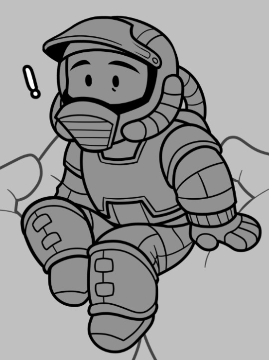
#these are colored and rendered pages from a comic that is not mine
Text

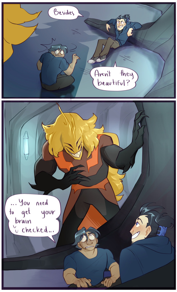
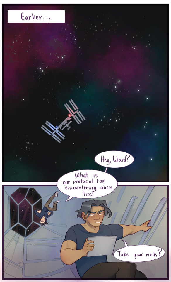
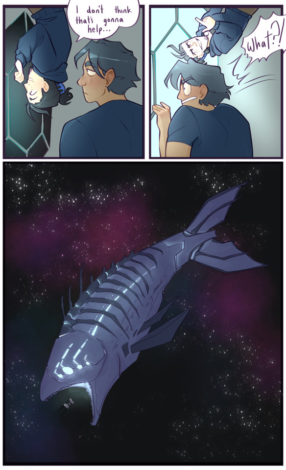

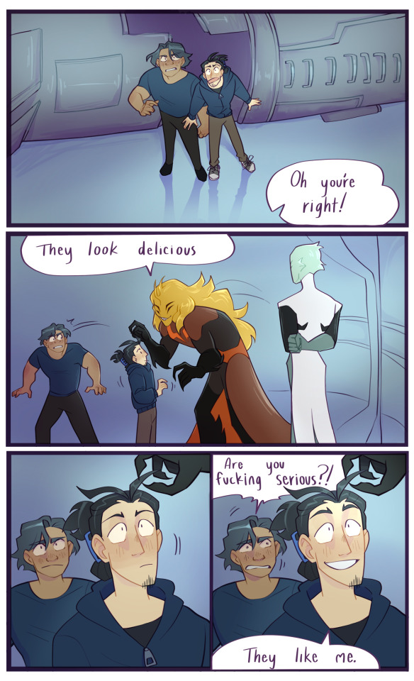
Rendered pages originally drawn by the amazing @somerandomdudelmao !
Check out their work, they’re awesome :)
Origional comic can be found here !
Again, this comic does not belong to me. I simply colored and rendered pages made by the original creator @somerandomdudelmao
#marble sky#these are colored and rendered pages from a comic that is not mine#marble sky comic#comic art
4K notes
·
View notes
Note
Can i ask how u do lineart so well,, it looks so smooth,,
I've always been very big on keeping my lineart clean and smooth! :) I'm very inspired by comic and graphic novel illustration, so naturally, I try to take notes from that sort of aesthetic in a lot of my art.
The short answer is that I just have a lot of practice, and am very picky about how my lineart looks. So, I'll often spend a long time making sure it looks just how I'd like it, before moving on, even if the lines aren't necessarily going to be the focus of the final drawing.
The longer answer kinda depends on what lineart you're asking about! The style of my lineart tends to change to fit whatever mood I'm going for, so I have a lot of different line styles with varying levels of smooth-ness.

On the super-smooth end of the spectrum, we have these bubbly, cartoony lines! These are a pain to draw, to be honest. But they really contribute to giving that cute look :) For these, I used the Clip Studio Paint G-Pen, with some minor adjustments to the settings, mainly so that there's not too much line width variation. The uniform, thick lines are important for this look! :) Drawing in this style really just a lot of trial and error. Usually when doing lineart, I'll erase away at lines to get them to the right thickness, or even just clean up a sketch and call that lineart, rather than doing lines on a new layer. But, that's a lot harder to do when the line thickness has to stay consistent. So, I end up just drawing the same line 7 times over, un-doing my work and re-doing it until i'm satisfied. Again, it's a pain! I used to draw like this a lot more frequently, but I stopped because I found that other approaches are often a lot more satisfying and rewarding. This is still great, for that cutesy look, though.

Next, we have what I would affectionately call my ref sheet lines. As much as it's probably a bad idea, I have a habit of just kinda skipping the lining stage of art. I'll just take my sketch, and tidy it up until it's clean enough. But for a drawing where there's only going to be flat colors, that sort of roughness can look sloppy, In my opinion. So, particularly when doing ref sheets, or other art which I don't intend to render, I will actually go through the effort of fully sketching out my idea and lining on a separate layer. The result is a lot cleaner and more deliberate, and looks a lot nicer when colored! Especially if I take the time to color the lineart :) I also really like doing small details with thin lines, particularly body/facial hair, elastic cuffs on clothing, and the seams of clothes, too. I like drawing those little details a lot, and I think they shine the most in my cleaner line style :D
For this, and for most of my lineart, I use these brushes which you can find on the Clip Studio Asset Store:


I'll bounce back and fourth between these, and Kozmo's Scratchy Scribbler brush, which you can find on Ko-fi!
Additionally, I have a modified G-Pen with a pencil texture that I think I made myself? I don't remember making it, but I also don't know where it came from! So i guess I did, lol.
A little more messy than my ref-sheet lines, we have the line style which you probably see most often on my page. As mentioned before, I usually kinda skip the sketch step for these? I don't encourage that, it's a bad habit of mine. But I make it work! I feel like the best way to explain my process with this is to just offer you a timelapse of my lineart process:
I just kinda... go. and it works out! most of the time. lots of cleanup and tweaking, and as you can see with Bdubs and Etho here, sometimes I do actually just. do a sketch and then line over it. So maybe I have no idea what my own process even is, LOL.


Now, to completely abandon your original question here's how i don't do smooth lineart! :D In this style, for the most part, I ignore the cleanliness of my lines, only really erasing with the lasso fill tool, when lines get too cluttered to actually read. Usually I'll only go for this when I'm already planning on painting over the lines. Because sometimes an idea doesn't need or want clean lines, and sometimes I just want to paint some values or slap some colors together and call it a day. Love my clean lines, but scratchy, messy lines are fun too! :)
Not sure if any of this really explained how i do smooth lineart, but I sure did talk about lineart for a while. I hope you could find something interesting or insightful in here! :) thanks for the ask, and I hope you have a great day <3
#inbox#digital art#art process#timelapse#lineart#another ~1k words on my art process?#yippee!!!#askeliyips#ask
17 notes
·
View notes
Text
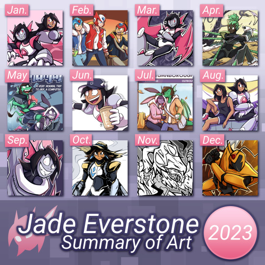
Art Summary 2023
(this post is a mirror of the original on my website - Link)
It's that time of year again.
Another design-y layout. Noticed this year I ended up using a lot more light color schemes than last year. I guess it's because this year I wasn't really feeling the same level of 'edge' and 'excitement'. But that's a point for later on. Before that, let's talk about each piece from this year.
January - Io, meets Io!
The first finished pic of the year. Demonic Io meets Reploid Io! This was made as piece to show off both versions of Io together, and reploid! Io ended up being my PFP on other sites for most of the year.
-
February - XZA hangout
This was part of a Secret Valentines exchange for ssshrimpie on Twitter, featuring X, Zero, and Axl together in a group hangout
-
March - Io Lounge
Render of Io lounging. This was originally a companion piece to my business card design, originally made to be a postcard design that'd serve a similar purpose. But the idea ended up getting canned & this render stuck around as a page header
-
April - Battle with the Lake Demon
This one's a complete reimagining of an older piece of mine for a personal worldbuilding project of mine, spotlighting the main focus of androids hunting demons. Widow, the hunter featured, is about to land the final blow
-
May - PC-Mania!
Highlighting since this was the release of my first webseries, PC-Mania! The story of Jade and Iri, two girlfriends where after their computer breaks in a freak accident they have to get a new one... everything goes wrong. This project has had it's ups and downs since then, mostly suffering from post-graduation fatigue + being unable to rebuild a buffer in time. But It's still ongoing & at the time of writing is looking to be finished in 2024.
Available to read on Comic Fury!
-
June - MECHA-CHUSSETTS MENTIONED
I'm pretty sure this is the only thing I drew during June because I couldn't find anything else other than this pic of Io as your average New Englander. (for the record, Reploid!Io is from Mecha-chussetts… or Mecha-Chuchets as it's spelled in canon)
-
July - Autumn Travels
This year also marks my return to entering zines (the first ones I entered were way back in 2020). I was in two this year; Window to Worlds 2023, and Good Eats: An OC Zine. The one spotlighted is from Window to Worlds & was inspired by fall train trips I did during my time in college.
-
August - Me and Io
A self-indulgent pic of me with Reploid! Io. This was more of a test drive for my set-up at home, since my workspace during college was completely different from what I have at home (even with the upgrades I've made since then).
-
September - Skibidi-IO
brrr skibidi dum dum dum yes YES
Or in other words I joined a Skibidi toilet collab over on Newgrounds & now I have a pic of Io as an evil toilet hellbent on world domination
-
October - Rocket Render
Another snippet from that personal worldbuilding project, this time featuring Rocket, an old android who was built as part of a demon-fighting army, but has since retired to work on a farm and help the surviving populace that way
-
November - 9:15 Slushie
5 shorts about the surreal experience of getting a slushie from the convenience store at night, inspired by surreal experiences of my own. It was a black and white comic that was designed to be a something I could easily run copies of at home.
Available to download on Itch.Io, and read on Newgrounds
-
December - Hornet!
And finally, my piece for the Newgrounds Secret Santa featuring Blaznthekid's OC, Hornet!
-
So, 2023 huh...
Speaking from a personal standpoint, I feel like one hand there was a lot of good that came out of this year for me. I graduated college, I tabled at my first event, I entered 2 zines, I did plenty of comic stuff, and I got back into a hobby after 3 years. But also this year was extremely stressful and demoralizing on many fronts. There's witnessing the industry I went to college for beginning to go under (thanks a lot AI techbros) that started to weigh on me, as well as witnessing & getting reaffirmations on how draconic the art industry is (infact, reading through #comicsbrokeme on twitter reaffirmed my choice to stay indie). But I think a rough post-college transition and struggling to get back on my feet afterwards might've been one of the biggest hurdles in the end.
Think of it like, going from having a studio space and semi-independence & being in contact with IRLs, and then going back home to somewhere better suited to where I was 5+ years ago. Maybe it's because my area's unwalkable, or relationships with my parents have been, wonky to say the least. Or maybe it's the uncertainty of it all. There's a lot.
This year compared to even the rougher parts of 2022 I feel like I've gotten, sadder? & having a lot lower energy. As I hinted at earlier, I think it even shows in my art. I noticed while editing my galleries mid-year that I think I lost some of the 'edge' that my 2022 artwork had. Doesn't mean it's worse, but I do feel it shows the change of energy from past years to now from high-energy to just needing a break.
Last year, I ended on a note about pulling out of pursuing full-time art. Mostly due to realizing how terrible the art world currently is in terms of treating art as "content with value measured by numbers" (ugh...). Though since then, I've decided instead of fully withdrawing from art as a career I'd rather continue to pursue it as a part-time indie artist. Hey, art has always been a dream job after all. Even if I don't want to break into the industry as of now and things are pretty scuffed, I don't think I'd be happy with completely backing out either.
The bigger question now is... what now? I've made loose plans & goals for myself going forward, art-wise I still want to do comics pursue part-time work. But also, I don't really know what the future holds, and that terrifies me. And like last year & the year before it, I don't want to jinx it for myself. Most of my goals for next year are personal & more about continuing to get back on my feet post-college after scrambling and sinking. Some art related, some life related. I don't have to be shooting for the most perfect outcome, I just need to make sure I don't drown.
#art summary#art summary 2023#2023#2023 summary of art#summary of art#everstone art#rambles#also this layout was supposed to be jubeat-inspired but I gave up on the theming halfway through tbh
2 notes
·
View notes
Text
New Thor: Love and Thunder Trailer Breakdown – Gorr, Zeus, Jane, and More!
https://ift.tt/bM4Sk09
It finally happened!
The first Thor: Love and Thunder trailer was all good vibes, man. Bright colors. Taika Waititi’s trademark sense of humor. The promise of the continuing redemption arc of the God of Thunder. An amazing instrumental version of Guns n’ Roses “Sweet Child O’ Mine.”
And the second Thor: Love and Thunder trailer? Well, it has bright colors, that director’s humor (and voice), the aforementioned redemption arc, that killer GnR tune again. But then we get the vibe shift at exactly one minute in, with the long-awaited introduction (and official first look at) Christian Bale as the film’s big villain, Gorr the God-Butcher.
Before we go any further into what that means, you should have a look for yourself:
While there isn’t QUITE as much to unpack here as we did in the other Thor: Love and Thunder trailer, there are still a few things that are worth discussing. Let’s start with the biggest one…
Gorr the God-Butcher
Now, in the comics, Gorr is every bit as intense as that impossibly metal name makes him sound. Gorr here talks about the selfishness of the gods. Why? Because Gorr is a being whose prayers were never answered, who lived a miserable, hard life, and whose family died of starvation and disease while he prayed for salvation. When his “prayers” were answered in the form of a powerful alien sword, he decided to take a, shall we say, proactive approach to getting the gods’ attention.
Oh and that sword? It’s got the even more impossibly metal name of All-Black the Necrosword. I’m not going to explain its history here because it will give me and everyone else a migraine, but needless to say, it has ties to both Venom AND the Celestials (of Eternals fame).
It drinks the blood of the gods he slays and helps him create shadow-berserkers to do his bidding. Pretty sure that’s what those tendrils are above. AND we’re pretty sure that’s what everyone is fighting when Jane Thor first shows up.
ANYWAY, back to our guy…Gorr was created by Jason Aaron and Esad Ribic in 2013, as part of the same Thor series that eventually introduced the Jane Foster Thor to official Marvel Comics continuity. We wrote more about the history of Gorr here. Keep in mind that the main Gorr story in the comics was almost impossibly dark and gruesome, a horror-tinged sword-and-sorcery epic that spanned the cosmos, and in which entire pantheons of gods were, well, butchered at Gorr’s angry hands.
cnx.cmd.push(function() { cnx({ playerId: "106e33c0-3911-473c-b599-b1426db57530", }).render("0270c398a82f44f49c23c16122516796"); });
Hell, they even recreated one page from the comics almost perfectly in both of these trailers, with the shot of the very dead Falligar the Behemoth from Aaron and Ribic’s Thor: God of Thunder #3.
Something tells me we won’t be seeing quite that kind of body count in this film. On the other hand, you don’t bring Thor to Olympus and introduce Zeus unless you need some recognizable god to be butchered and establish Gorr as a credible threat. Which brings us to…
Russell Crowe as Zeus
Russell Crowe is clearly going to have the time of his life in this movie, ain’t he? We’re still holding out hope that this movie also introduces the Marvel version of Hercules somehow. But there’s one small problem here…
Here is King Valkyrie (Tessa Thompson) fighting Gorr…with what appears to be Zeus’ thunderbolt. Ummm…. something tells me we shouldn’t get too attached to Russell Crowe’s Zeus.
Anyway, on to some more cheerful stuff…
Jane Foster as Thor
Interestingly, this trailer puts to rest the theory that Jane could possibly be a variant from another timeline. This is definitely “sacred timeline” Jane, based on her discussion of her history with Thor.
There’s two ways we can read their conversation about how long it has been since they’ve seen each other: one is that Jane is just kind of over Thor. But the other, given the five year gap in their assumptions, is that Jane was indeed a victim of “the snap.”
Also, this isn’t an Easter egg or anything, but it’s pretty clear that Mjolnir can break apart to mess up bad guys’ days in individual pieces.
Thor’s Helmet
OK, so MAYBE this is a reach, but given how shy these movies have been about letting Thor wear a helmet, I’m gonna go for something here. Despite these scenes being next to each other in the trailer, it’s clear that Thor first seeing the other Thor wielding Mjolnir and then discovering it is Jane do not happen in the same battle. In the comics, Thor was depressed over his unworthiness to wield Mjolnir, and pined for it like a lost lover (or an addict) he so desperately wanted to be worthy again. He’s even wearing his costume from The Unworthy Thor era when he first sees her (and his King Thor suit when he exclaims “Jane?” in the trailer’s next shot).
What does this have to do with the helmet? I’d like to think that he sees Jane Thor and at least subconsciously is trying to emulate whatever she has going on in the hopes it will make him, if not more worthy (we established that in Endgame anyway), at least more like “himself.”
Thanos’ Girlfriend?
This shot of Jane is cool enough on its own, but let’s have a look at those statues behind her. On the right we have The Living Tribunal (whose statue also appeared in Loki, and who was glimpsed ever-so-briefly in Doctor Strange in the Multiverse of Madness) and What If…? stalwart Uatu, the Watcher.
On the left, though, things are a little more tricky. Up front, that does appear to be Death. As in the cosmic embodiment of Death. As in, the Jodie Foster to Thanos’ John Hinckley Jr. in the original Infinity Gauntlet comics.
Behind Death? It’s a little harder to tell. That next bust looks kind of like how Jack Kirby drew Zeus in his Thor comics, but it’s hard to tell. No idea who the third figure is in the background. Is this a hall of cosmic deities who Gorr has slain?
Guess we’ll find out when Thor: Love and Thunder opens on July 8.
Spot anything cool that we missed? Got an answer to one of our questions? Let us know in the comments!
The post New Thor: Love and Thunder Trailer Breakdown – Gorr, Zeus, Jane, and More! appeared first on Den of Geek.
from The Latest Comic Reviews & News | Den of Geek https://ift.tt/TojbK8t
0 notes
Photo
Whiskey river, take my mind,
don't let her memory torture me.
Whiskey river, don't run dry,
you're all I got, take care of me.
—“Whiskey River,” Shotgun Willie (1973)
It Keeps Right On a-Hurtin’
#15 - Vegas Outskirts
Collaborative Issue!
Guest Colorist: @malpaislegate / @socksual-innuendos
Archive Links
«« First | « Previous || Next » | Last »»
Read IKROAH on Archive of Our Own
Notes / Original Pencils / Transcript:
Notes:
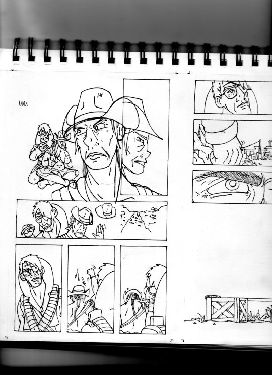
MAN that’s gotta hurt!! Volume 2 kicks off with a bang, literally if you count the gunshot and honorifically if you count Socks’ knockout color job on this issue. Look at those lovingly rendered bullet wounds!! Muah!!!
It’s been a relief having a month off from the comic as I handled a bunch of other things but there’s a lot to look forward to in Volume 2, as you can probably tell from that very forboding fist clench at the end there. Will Agnes and Cass get the revenge they’re looking for? Can they make it big in Vegas? Will it keep right on a-hurtin’? Find out next ish as Cass leads Agnes to meet the first of their new “friends.”
Original Pencils:
The pencils for this issue are like an autopsy report of all the things that can go wrong with your art if you don’t plan ahead and pay attention. Listen, friend, to my tale of woe, and learn from my mistakes so they don’t become yours!
First, you can see a lot of places where there’s floating objects, empty backgrounds, and incomplete heads. Part of this is because I always intended to just copy and paste repeated elements across each panel instead of drawing them multiple times, but other times I was forced to just because of my lack of planning. The top three panels on page two, for example, required me to draw the background I’d use for them on a separate page.
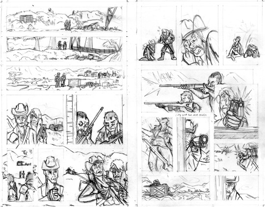
Second, you can probably tell that I actually had to flip the two raiders around in the final lineart because I forgot to keep the hands their were holding their guns in consistent—and since I couldn’t flip the middle panel on the second page without ruining the composition, I decided to flip all of their other appearances so that they’d be lefties. I doubt you even can seamlessly wield those particular guns left-handed.
Third, the size of the cart that Agnes and Cass are kneeling behind changes CONSTANTLY and is dramatically oversized from the third page onward. After inking these pages, it took a lot of work to correct the inks and shrink that cart in each panel, but fortunately it came out looking good.
And finally, I completely redrew the second panel on the fifth page because it wasn’t until I had already handed he pages off to my colorist that I realized having a second profile shot of Cass so soon after a first one was just...redundant and lazy-looking. So I went back to my sketchbook and whipped up a much more unique, striking angle (I also just wasn’t satisfied with the quality of my art on that panel, so I’m very glad I redrew it). But again, my failure to plan ahead bit me in the ass and my redraw attempt wound up taking up a lot more space than I thought it would, so after inking it I had to basically surgically remove it from the other inks.
I’ll be honest with you folks: part of the reason that I work in such simple, thick, high-contrast lineart is because it’s very easy to make corrections and adjustments with stuff you could technically color in Microsoft Paint.
Transcript:
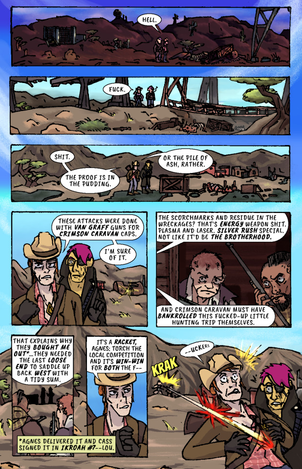
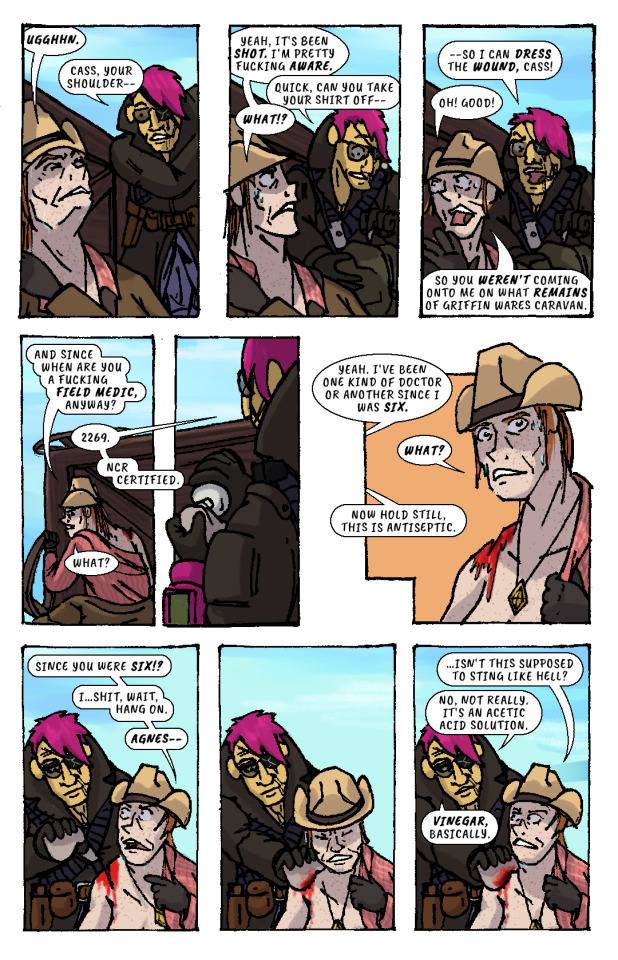
EXT. SOMEWHERE IN THE MOJAVE, morning. AGNES SANDS and ROSE OF SHARON CASSIDY stand over the wreckage of a caravan, scattered over a dirt road.
CASS: Hell.
EXT. SOMEWHERE ELSE IN THE MOJAVE, midday. Looking over a second wrecked caravan, at the bottom of a ditch.
CASS: Fuck.
EXT. PRE-WAR HIGHWAY OUTSIDE OF VEGAS, mid-afternoon. AGNES and CASS survey a third wrecked caravan.
CASS: Shit. The proof is in the pudding. Or the pile of ash, rather. These attacks were done with Van Graff guns for Crimson Caravan caps. I'm sure of it.
As CASS explains her theory to AGNES, a short distance from the caravan two RAIDERS peer at the two of them from inside a barn at a ruined farmstead. They have snake-bite tattoos on the sides of their shaved heads and are holding rifles.
CASS: The scorchmarks and residue in the wreckages? That's energy weapon shit. Plasma and laser. Silver Rush special. Not like it'd be the Brotherhood. And Crimson Caravan must have bankrolled this fucked-up little hunting trip themselves.
The RAIDERS move out from the barn, sneaking up on two passers-by who’ve stopped at the caravan wreckage.
CASS: That explains why they bought me out...they needed the last loose end to saddle up back west with a tidy sum.
(NOTE: *Agnes delivered it and Cass signed it in IKROAH #7—Lou.)
CASS: It's a racket, Agnes: torch the local competition and it's win-win for both the f—
SFX: KRAK
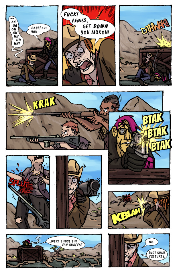
A gunshot rips out from one of the RAIDERS’ rifles and sears across CASS’ shoulder.
CASS (gasping): —uckers.
CASS slumps down beneath the overturned caravan wagon on the road, clutching her shot shoulder.
CASS: —Aaggghghhhhhhh.
AGNES: Cass! Are you—
CASS: Fuck! Agnes, get down you moron!
AGNES ducks behind the cover of the wooden caravan wagon just as another gunshot splinters the top lip of it.
SFX: DTHWAK!
The RAIDERS advance on CASS and AGNES’ position, firing at them from off the road.
SFX: KRAK
AGNES leans over the top of the wagon with her pistol, returning fire.
SFX: BTAK BTAK BTAK
AGNES lands a shot right in one of the RAIDERS’ guts, and she drops her weapon and falls down.
SFX: SPLUT
CASS, leaning out the side of the wagon, takes as careful of aim as she can with her shotgun by holding it with her good arm. Trembling, she fires, connecting with the other RAIDER.
SFX: KBLAM
The would-have-been RAIDERS are dead.
AGNES: ...were those the Van Graffs?
CASS: No. Just some vultures.
CASS leans back behind cover to sit against the bottom of the overturned wagon again, wincing from her shoulder injury.
CASS: Ugghhn.
AGNES (slipping off duffel bag): Cass, your shoulder—
CASS: Yeah, it's been shot. I'm pretty fucking aware.
AGNES (unzipping bag): Quick, can you take your shirt off—
CASS: What!?
AGNES: —so I can dress the wound, Cass!
CASS: Oh! Good! So you weren't coming onto me on what remains of Griffin Wares Caravan.
CASS starts removing her shirt while AGNES produces a bottle of something from her duffel bag, and dampens a rag with its contents.
CASS: And since when are you a fucking field medic, anyway?
AGNES: 2269. NCR Certified.
CASS: What?
AGES: Yeah. I've been one kind of doctor or another since I was six.
CASS: What?
AGNES: Now hold still, this is antiseptic.
CASS: Since you were six!? I...shit, wait, hang on, Agnes—
AGNES pressess the rag onto CASS’ shoulder wound, and CASS winces instinctively. But, confusingly, there isn’t any pain.
CASS: ...isn't this supposed to sting like hell?
AGNES: No, not really. It's an acetic acid solution. Vinegar, basically.
AGNES begins cleaning the wound with the rag.
CASS: I thought you put alcohol on wounds to clean them.
AGNES: That's...a common misconception. It's good for tools, maybe, but too strong for skin. And it can complicate healing if you apply it directly.
CASS: So you're telling me, all my years, I've been wasting good whiskey only making my boo-boos worse?
AGNES: I mean...it's better than nothing in a pinch, but...
CASS: Well, then. Thanks for the lecture, doc. Can you just pass the whiskey anyway? Shoulder still hurts like hell regar—
AGNES hands her the whiskey bottle. She’d already gotten it out.
CASS: —dless. Oh. Thanks.
AGNES unspools a roll of bandages in her hands, then begins wrapping it over CASS’ shoulder and across her chest..
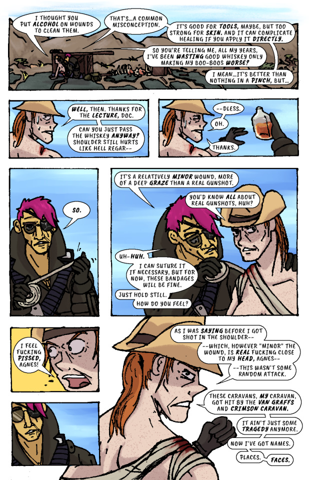
AGNES: So. It's a relatively minor wound, more of a deep graze than a real gunshot.
CASS: You'd know all about real gunshots, huh?
AGNES (unfazed): Uh-huh. I can suture it if necessary, but for now, these bandages will be fine. Just hold still. How do you feel?
CASS: I feel fucking pissed, Agnes!
AGNES recoils, taken aback slightly.
CASS: As I was saying before I got shot in the shoulder—which, however "minor" the wound, is real fucking close to my head, Agnes—this wasn't some random attack. These caravans, my caravan, got hit by the Van Graffs and Crimson Caravan. It ain't just some tragedy anymore. Now I've got names. Places. Faces.
AGNES resumes bandaging CASS.
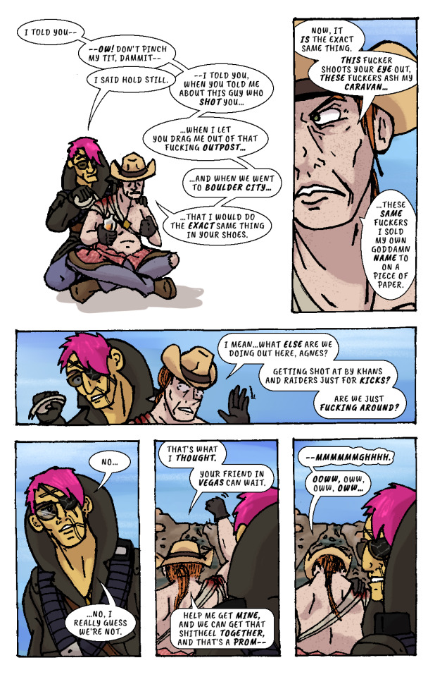
CASS: I told you—ow! Don't pinch my tit, dammit—
AGNES: I said hold still.
CASS: —I told you, when you told me about this guy who shot you...when I let you drag me out of that fucking outpost...and when we went to Boulder City...that I would do the exact same thing in your shoes. Now, it is the exact same thing. This fucker shoots your eye out, these fuckers ash my caravan...these same fuckers I sold my own goddamn name to on a piece of paper. I mean...what else are we doing out here, Agnes? Getting shot at by Khans and Raiders just for kicks? Are we just fucking around?
AGNES finishes bandaging CASS, then leans back, pensive.
AGNES: No...no, I really guess we’re not.
CASS: That's what I thought. Your friend in Vegas can wait. Help me get mine, and we can get that shitheel together, and that's a prom—
CASS raises her arm to shake her fist as she speaks, straining her shoulder injury.
CASS: —mmmmmmghhhh. Ooww, oww, oww, oww...
CASS grabs her shoulder in pain while AGNES looks off in the distance and stands up. She looks out towards the horizon—towards VEGAS, and the pre-war casinos and hotels that still gleam and glitter in blinding sunlight.
Her fist clenches. Her brow furrows. Her body tenses, all over, staring at that city, that place.
The caravan wreckage remains alone on the highway, brahmin bones long picked clean by scavengers.
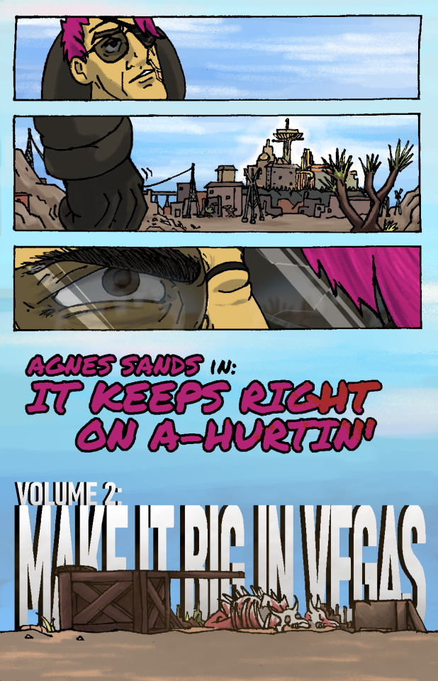
AGNES SANDS IN: IT KEEPS RIGHT ON A HURTIN’
VOLUME 2: MAKE IT BIG IN VEGAS
176 notes
·
View notes
Photo
Mudkip Cedar is so beautiful, isn't she? ;;w;; Such wonderful, bright colors. Was in the mood to draw Cedar and Nauki's baby forms today, feeling a little nostalgic!
So! Some interesting news! Despite The Things We Have not being completed yet (14 pages left to render!), I’ve started to draw Finding Your Roots again! I think after an entire summer of working on the rabbit comic, I got super burnt out? So, I got in the mood to draw some FYR instead, and since I got back to working on it a couple weeks ago, I’ve finished eleven pages! I’m really proud of myself for how easily I’ve jumped back into it, and I’m currently working on drawing the next big battle. >:3 It’s coming out great so far and I’m super excited.
FYR’s third birthday came and went in July. It passed on July 10, specifically, that day three years ago is when I finished the first page of FYR. It was before I even planned on ever releasing the comic publicly. I wasn’t even quite sure whether I wanted to commit to making a Nuzlocke comic or not! And even once I started releasing it, I always had these fears and anxieties over the project. FYR is going to be long, guys. It’s going to be long. We’re seven chapters in and have around 23 to go. Book 2 will probably take me another couple of years to finish, and at that point? The comic might just be halfway done. We’ve got four books to go, book 3 is looking like it’s going to be long. I loved the project so much that the thought of burning out and never finishing it, a fate shared by so many comic artists, was horrifying. It would keep me up at night. I’ve broken into tears from the stress of it. Wooooof, right?
But recently, thankfully… that changed.
I was chatting with my friend @zeropro, who somehow found the right words to encourage me not to view FYR as a goal, but rather a journey. Zero is a really good friend of mine, one of the best friends I’ve ever had in fact, and she would always sit with me and listen when I would vent about the stress of finishing FYR. The last time I vented about it, complaining about how I might be working on this project into my 30s (I’m currently 22), she said this:
“But what’s wrong with working on it late into your thirties, it can just be this constant fun little project that you dip into, a documentation of your growth through your whole artist career. Wouldn’t that be nice? Like a rabbit you can take care of for a long time. Imagine being the author of One Piece or Dragonball, where it’s not about finishing it but keeping it going for as long as people will read it. Isn’t it nice that FYR will at least have an end?
“Comics like TTWH and LL, they are meant to be completed, but FYR and JBN, these projects are here to grow with us, to keep us company through hard times. What’s the rush? I like to think your art style might change even further as FYR goes on! And who knows where you'll take it!
“Every day you get to draw another page is another day you get to draw another page, not one page more of a thousand. Every day as you draw one more page you will end up there, but that’s not the point, it’s what you get to do now.”
And those words… I’m happy to say, they solved the problem!
It’s not that I have to work on FYR for another ten years or so. It’s that I GET to work on FYR for another ten years or so! FYR has been such a stable, comforting presence in my life these past three years, and while I’m excited to some day see it completed, I’m happy to welcome it in my life for a long time coming. I’m the sort of person who is quite terrified of change. The unknown scares me a lot; I’m not good at handling an unknown future where bad things could happen and I have no way to predict or stop it. But FYR will always be around for me. It’ll be a pet I get to take care of for a long time who can never succumb to old age. It’ll be a friend I can trust to be always be around, because I’m the one who controls it! And if I ever want to put it aside for a while to work on other projects, like I did with TTWH, I’m allowed to do that too! Doesn’t matter if it takes me a year or two longer to finish FYR cause I was working on other stuff. FYR will always be around for me, and for you!
I’ve been doing a lot of work on planning future FYR chapters as well. I basically realized that a lot of my plans for the plot’s future, uhhhh, kinda sucked? They weren’t incredibly original, were too plot-focused, and didn’t leave a lot of room for the characters to explore themselves and grow naturally as people. Character focused stories are always better than plot-focused ones!!! So I’m overhauling a lot of my plans for FYR right now, doing some outlining for late Book 2 and Book 3, and restructuring FYR to be a story much more focused on character development and themes. We’re gonna spend less time chasing down villains and more time exploring the characters, their feelings, growth, and identities. I think the changes are going to make FYR a really spectacular experience, a comic that’s incredibly unique. I’m excited to share it with you.
I’m incredibly proud to be the author of FYR. I’m proud to be able to make a comic that’s made so many other people happy. We’ve laughed together, cried together, and we’re telling this story together. I’m not going anywhere. So I hope you’ll stick around, too!
Because this comic is amazing. And it’s only ever going to get even better.
- SPB
41 notes
·
View notes
Text
from AWF: How much input does a writer have over the art of a comic, like the line work and colors? If I'm not mistaken, Evan has done some of her own line work for the issues she's written, more power to her, her art is amazing, but if an issue looks good in terms of colors and shading, so on, how much of that is credible to the writer?
Questions answered by Ian Flynn and Kyle Crouse
Episode link
Ian: Very little, and it depends from project to project, like, way back in the day when we did the Sonic Riders tie in story, I believe I suggested that we try to mimic the art style of that super slick trailer, and Tracy freaking nailed it because Tracy’s a beast there are occasional moments where I will try to be very specific in how I want a panel rendered, or how we can possibly convey certain things, whether it be through flashback, or setting or what have you and it might depend on the ability of the artist, it might depend on the deadline, it might depend on whether or not to licensor wants to do that, so with my scripts, they are more or less the guidelines, the rough blueprints, but I entrust a lot of creative decisions to the artist, because they are the ones realizing it, and sometimes they have a better way of approaching it than I have conceptualized, and it’s even more difficult with something like Drogune where it’s a collaborative effort between me and Adam, where I might have a very clear vision of what I want to do with it, or I’m less certain and I’m relying on him to come up with it, or he may have a different approach to the characters, like, case and point, if you read Drogune: Outlaw, which is the small spin off we did as part of the Shonen Jump contest, the enchentee species, hadn’t really been shown yet and we’ve gone a lot of back and forth on how to design it, and he kinda had final say when designing Echo, and it’s super cool because Adam is a beast, as we’ve established with Tracy already, with the inquisitors, I had a much more pedestrian design than mine, and he took it to completely different places, that were super spooky, and it was great, and it inspired me to invent new stuff within the lore to explain away what he had rendered, so depending on the project, depending on the artist, it can really vary on what comes out
questions can be asked at: [email protected]; On Twitter @BumbleKast; Comments section on any YouTube video; Through Ko-fi support; Patrons can post on Patreon page and the Q&A channel in the Patreon-exclusive Discord
1 note
·
View note
Photo


Today’s impulse buy / read over my lunchbreak was Retcon #1, by the great Toby Cypress, with writing by Matt Nixon, released in September 2017 from Image. It’s some kind of supernatural spy/monster guignol show-- some spy’s gotta kill a guy but doesn’t want to, and there are monsters and a girl throws a pokemon but that kinda gets glossed over immediately, and then that’s sort of the whole issue is just that one scene. The description for the book had this whole elaborate sales pitch but none of that made it into what I read, maybe that only happens in issue 2, who knows, first issues are hard...
But I’m a long, long, long-time sucker for Cypress and his sort of ... the first time I saw his stuff was in like 2001/2002, when he was walking around some con with an early look of some Nightwing pages he was doing, and a friend of mine called it like an “alien reptile invasion” or something like that (I wish I could remember). Sort of a “Everything All at Once, Maximum Volume!” approach that I associate with, I don’t know, the Titmouse artists, if you know that crew, or maybe 1988 Gallery Shows, that sort of thing. Where he’s not trying to ... process just one visual influence; where he’s trying to process like a few at one time, or some sort of super-sensation that he’s getting from the surfaces of entertainment (e.g., a fever dream of pulp covers more than their contents, say). (I wasn’t into that one though that had like 4-5 other people in it and there was that video game... Blue Estate? Blue State? The Bluest State of Blueness? There was a video game? Jesus I have no idea too many years... There were like 4-5 guys trying to do that same thing, and that gang quality on the art just made it all seem like cosplay-for-artists, like a costume ball... it’s that line from the Royal Tennanbaums -- “what characters it’s just a bunch of little kids dressed in animal costumes”, except for artist trying to be like Grindhouse Neo-noir Crime Comic Artists... I think that style, maybe you want to be the only guy on the page...).
Like, he’s doing these rectangles of zipatone in here that are just purely there for like... a layer of discordant information on top of his rendering-- and then his colors are really shouting on top of that, or things can shift suddenly into things that feel like homages but I’m not to sure to what, like ... like that panel of the monster face feels like a foreign movie poster or a colored manga page or some other detritus of pop culture that’s sort of just half-hovering on the edge of my brain, and I have that feeling constantly of “this feels like another thing but I can’t say exactly what, just pop culture, *shrug*”. It’s all very much a Wyld Stallions guitar solo getting wrestled down onto paper, and onto a style where hand-putting-ink-on-paper is already an extremely tangible sensation looking at it... Cypress always just kind of wants to overwhelm the reader, which for me is a lot of fun but boy, that can be a lot. Or maybe it’s not a style where you can just suck down a bunch of comics like that, in a “I got a Wednesday buy pile” fashion-- most industrial comics art sort of have a different value system. Maybe, I don’t know, I don’t read like that anymore, with piles or whatever...
He’s very much the dominant presence in his comics (which appeals a lot to one audience for comics but not others, I guess-- I’ve always found that schism interesting, but that schism I guess is less significant now that other schisms have gotten wider, e.g. kids-oriented vs. adult, foreign vs. American, hentai vs dumb comics that aren’t worth looking at since they don’t have any hentai in them, etc., comics sure fractured). He’s never had a writer who hasn’t been drowned out by the pleasures of just stopping and gawking at his stuff, at least that i can remember at this second, maybe I’m forgetting somebody. But I mean, I just don’t usually like the writing in most comics so I’d probably say that about... maybe EVERY GOOD ARTIST, I don’t know.
And he also tends to seek out like these sort of ... hyper-pulp genre hybrids, mixing espionage and paranormal stuff where I’m probably a little more suspicious of the writing to begin with (there was a Dark Horse book.. White Suits? White Stripes? White Horse? who can remember... I don’t think I liked that one on the story side, I remember disliking that one, but I don’t remember for sure). The results on the reading side can really vary-- Retcon’s better than the other two I’ve mentioned since it seems a little insincere (which I mean in a good way), more playful-- any kind of real pulp that he’s attracted to can have a bad aftertaste that I think you want to be careful about, the source material invariably being kinda a ridiculous presentation of masculinity on some level and... I think recognition of that being kind of a key factor in who’s going to do it well or not. (Weird no-point digression about the Michael Caine movie Pulp deleted).
But anyways, yeah, blah blah blah, I think that one’s some fun stuff to look at. Anyways, it was on sale.
4 notes
·
View notes
Note
Any art tips or advice you wanna give your arty followers? ;3c
I have lots of art tips! Probably too many for one post! Most of my art tips are telling you not to do things that I do myself on a regular basis and then regret.
1.) If you’re making a comic in black and white, don’t shade it as if you did it in color and then desaturated it. Instead, use the black and white and gray shades narratively to emphasize your storytelling. For example: a shocked character is suddenly full white on a black background. A character wearing all white can go into deep grey shadows. A character with dark hair doesnt need to have their hair dark on every panel- the reader remembers that their hair is dark. It’s more important that a panel is legible and serves visual storytelling than it is to always have a characters shirt a consistent % of grey across a page.
1a.) This also is true for comics in color but its harder and I don’t follow my own advice.
2. Thumbnail your pieces/comic pages before you draw them because composition is important. Clumping things together and varying the sizes of the different elements in your pieces makes for a more interesting composition. Organizing your compositions into three main values: black, white, and grey, can help with clarity when you get to the actual drawing/rendering stage.
3. Tracing work you like and doing mastercopies can radically improve your art very quickly. Just don’t post it up being like “this is mine” afterwards.
4. Don’t draw every single detail. Find good shorthands for detailed things and use that instead. DONT BE LIKE ME, A FOOL. A MASOCHIST. WHO ZOOMS IN TO 400% AND DRAWS LIKE 20 DEMONS ON A SINGLE TINY COMIC PANEL
5. Draw backgrounds, draw architecture. Incorporate your characters into those spaces rather than placing them on top.
6. If you get tired of drawing, stop before it starts hurting you. Burn out doesn’t come from working long hours when you’re excited. It comes from forcing yourself to work when you’re not excited.
7. Draw self indulgent stuff. Don’t hold back!
58 notes
·
View notes
Text
S/S ’19 in Review; Presentations and Lookbooks
Back when I first made this blog, I made a promise to myself to review all the collections that made me Feel Things. Of course, that was before the season, and before my list of collections grew to over five dozen. Similarly, it was before NaNoWriMo, where I lost four weeks progress on this blog. After doing a little math, I realized there was no way I would be able to finish all the reviews before couture week kicked off. Considering I want to review all the major couture collections (plus the miscellaneous posts on other topics I wanted to throw in), as well as my current pace, there was no way that was happening.
So here we are; I’m going to attempt to knock out every S/S ’19 collection shown as a presentation or lookbook in this one post. As a separate challenge for myself, I’m also going to try to limit each review to under two-hundred words. It’s an exercise in brevity, the archnemesis in all my writing ventures. Can I do it? Let’s find out!
—PAULE KA
Of the sixty-some-odd collections that made my favorites list this season, Paule Ka ranked last. Not necessarily a bad thing, considering it actually made the list, but not a ringing endorsement. To put it plainly, while I liked some looks, I was indifferent about most. There were a few, such as the ones with the large heart appliqués, that I actively disliked. The bows that are a signature of the brand occasionally tended towards comically large, or even very young, but I’m generally not a fan of large bows anyway. Many of the dresses felt like things I’d seen before…in the Macy’s prom section. But perhaps that is a testament to the influence of brand, which just celebrated its thirtieth anniversary. The looks I did like were the ones that included sheer panels. For example, the grey-and-white dress in the first page of the lookbook, which was an interesting take on the half-cape (even if it did include a big shoulder bow). While the placement of the placement of the sheer panel in looks 16 and 17 might not be practical for a night out, I enjoyed them as well. Paule Ka isn't the most expensive brand on this list, but the clothes fit the pricetag.
—ALEXIS MABILLE
Alexis Mabille's namesake brand inhabits a strange place in my mind. His couture collections veer into saccharine for me; all cloying sweetness with no depth, no edge to balance it out. However, his ready-to-wear collections are more restricted, and that's probably for the best. Not to mention the possibility that individual pieces can be incorporated into less cutesy outfits. This time, it wasn't hard to imagine. The lookbook model wore a reflective shield over her face, adding a delightfully surreal element to the collection. It was still undeniably an Alexis Mabille collection, however. Season after season, Mabille finds new and creative ways to sew a collared button-up or trench coat. The craftsmanship in tailoring deserves special mention, particularly on the pieces where patterns were matched across seams. Looks 1 and 6 used this method to create a beautiful chevron. Unfortunately, the collection suffered from familiar drawbacks in Mabille's work. Some of the satin silk pieces felt...off in a way I can't accurately describe. Look 24 throws a lot at you in terms of pieces and color. However, I would consider wearing each of the pieces individually.
—ELLERY
Of the designers on this list, Kym Ellery's concept was probably the most, well, conceptual. Literally; it was inspired by Paul Kos' conceptual piece "Sound of Ice Melting". Like the artwork that inspired it, this collection was meant to be perceived through multiple means. The campaign, film, and presentation were all meant to be part of the collection itself, not just a way to advertise the pieces within it. So what does this mean for the clothes themselves? On one hand, aside from the occasional shared design element, there aren't too many obvious themes. The looks covered many occasions and styles - from casual sportswear to sparkling crop tops that would be perfect for a night out. However, all the pieces look like they could belong in the closet of the same woman. While the garments were more individually-focused than others on this list, they are also some of the most wearable. My only major complaint is for the lookbook itself. Some of the poses, as well as the bright lighting on lighter fabrics, made it difficult to see the clothes. And, trust me, I wanted to see the clothes.
—NABIL NAYAL
Nabil Nayal has been designing for over a decade now. He's won all kinds of awards, dressed everyone from Florence Welch to Rhianna, and collaborated with both Christopher Bailey at Burberry and Karl Lagerfeld at Chanel. Yet this is the first year I've heard of him, and that's a shame. All his artist statements and biographies mention his love of English history - particularly the Elizabethan era. He even earned his Ph.D. in the university where this collection was presented. That inspiration was quite literal in this collection. Prints included both original transcripts of famous Queen Elizabeth I speeches to depictions of the queen herself. In other places it was less obvious, such as the front ruffles or frilly collars on everything from shirts to trench coats. Previous collections by Nayal have been more sportswear-focused, but this collection was breezier. At times a little shapeless, the intricate prints and tailoring still made the garments beautiful. The makeup, which mimicked the script print of some pieces, also deserves a mention.
—VERA WANG
From Elizabethan England to pre-revolutionary France. Where Nayal used his source of inspiration quite literally, taking the designs in a modern direction, Vera Wang went futuristic and avant-garde. Her designs are all about shape and volume, and there was a lot to play with in her chosen time period. This mix of past and future was clear from the first look, which included a style of cap sleeves (called "engageantes") popular among King Louis XIV's court, but rendered in black lace on a babydoll dress. Other times, the classic silhouette was used, but recreated with hard lines and sharp edges. Neck ruffles and puffed sleeves abounded, but the little details were also beautiful. There were several versions of seams made up of grommets, which added a hard edge to the romantic, lacy garments. Some of the pieces in the collection might not be the most wearable, but that hardly matters. They're art.
—WENDY NICHOL
Is it possible to exude downtown grunge and uptown glamor at the same time? Wendy Nichol may have just cracked the code. In this collection, she combined clean lines with sheer fabrics to brilliant effect. All the looks in the campaign were styled by the models who wore them, showcasing not only their personalities, but the versatility of the garments. (One of these models happens to be Ilana Glazer, probably most known for her staring role in "Broad City", and a favorite actress of mine.) Some were dressed more casually, in shirt/pants/jacket combos that would be perfect for grabbing lunch with friends at a café. Others wore mini-dresses that looked ready for a night out clubbing. There were also creative takes on this season's staples, like bike shorts and belted blazers. My favorite (look 2), a gauzy black dress, was particularly beautiful; like something a member of the Unseelie Court might wear. Or, you know, me on a Friday night.
#paule ka#alexis mabille#ellery#nabil nayal#vera wang#wendy nichol#ss19#spring summer 2019#blog posts#tfg articles
14 notes
·
View notes
Text
I was tagged by the wonderful @riathedreamer :D
List all the things you’re currently working on in as much or little detail as you’d like, then tag some friends to see what they’re working on. This can be writing, art, vids, gifsets - anything at all!
Lol, oh boy, I’m gonna have to divide this into sections...
Art:
Monster- Chapter 2: I’m currently working on concept art for Chapter 2 of my webcomic “Monster” including character and costume concepts, location concepts, a series trailer, and some things just for fun!
Of the Old Blood: Another chapter 2, I’ve finished the sketches of Grif and Simmons in their version of the “foreign set” (the Bloodborne starter gear) and am currently working on Church’s concept as well as trying to decide what scene I want to draw, there’s a lot XD
Fan Stuff: Got some ideas I’m tossing around for some mini-comics and some collections of themed drawings. My boyfriend challenged me to re-storyboard RWBY episode one XD but idk, think that’s something you guys would like? Or is that a bit of a presumptuous project?
Plus a bunch of miscellaneous stuff!
Writing:
Of the Old Blood: Chapter 2 has been roughed out and is in its revision phase. I still need to add some detailed descriptions of environments and characters, as well as a hard rewrite of a soft nsfw scene that I’m not happy with. After that, it needs a good read through to make sure it flows well and to be sent through Grammarly. It is currently 35 pages long and its current title is “First you will need a contract”
Domesticity: Currently writing chapter three, it’s being held up by a hard rewrite of the opening scene because (awkward cough) it’s my first ever sex scene and it will come as no surprise to anyone that I'm catastrophically self-conscious and thus hate what I wrote! ^///^ Sans the rewrite the chapter is currently five pages long and its wip title is “The date”
Time Will be a Friend of Mine: A wip that I want to get done in time for the @rvbficwars angst week. It's from Grif’s pov and involves the end of season 15, time travel, and SUFFERING. It is currently about 20 pages long.
Let me Make it up to You: Chapter 6 is in its brainstorm stages and has only a wip title “That Soap that Smells like Cake”
Videos:
Let’s Plays: I’m currently doing Let’s Plays on my YT channel for Mass Effect: Andromeda, Hell Blade: Senua’s Sacrifice, and Night in the Woods (In which I do voices for every (and boy do I mean every) character) Not sure what I want to do once I finish one of those but I’m open to suggestions!
Process Videos: I’m trying to decide if I want to do more process videos for my drawings and if so what of? I also need to take ones I already did (Like the Felix one) and re-render them for posting on my active YT since the art only one is used so rarely I figured I should merge them.
Other: So... You know that “Every time they say ‘boy’ in Monster Factory” meme? I miiiiight be working on a version that involves some space boys in color-coded power armor... Mostly because no-one has stopped me yet...
I think that’s everything! o.o Sorry it’s so long! I think I’ll tag: @primtheamazing , @cyborg-sabi , @creatrixanimi , and @the-finalpam ! Plus anyone else who would like to do this! :D
5 notes
·
View notes
Text
#CROPT Post 1: Hands-On (September 12, 2020)
A confession: Neopets is the only reason I have a job. I feel like I’m exactly the right age to have grown up spending countless hours blinking at the Neopets interface, willing myself to understand just what was meant by a long block of HTML. If you’re like me, you remember graduating to Xanga, then MySpace layouts, then the big show: building your own website. I wonder often whatever happened to the pages I designed on Microsoft FrontPage fifteen years ago or the Blogger or Tumblr sites I was so excited to “launch.” I have to believe that they’re all still out there somewhere, locked away to me by chains of broken passwords I swore I’d never forget. In so many ways, that’s where CROPT begins, too.
CROPT asks us to think about what’s inside and behind the infrastructures we take for granted, the systems we use to make ourselves into something else. This post is about part of that infrastructure: the internet. We couldn’t be making CROPT right now, of course, without the internet -- without the thousands of blinking data centers around the world that draw energy and resources and labor to support our Zoom connections, our Tumblr blog, our Google Docs and iMessages and FaceTimes and the countless other tools we use to make creative work.
But what happens when we see the things we’re not supposed to see? What happens when we want to see what data centers and cloud computing demand of land?
In April 2015, Google released a short video introducing a new platform for cloud computing. Set against soaring instrumental pop music, the advertisement showcases several Google employees — nearly all white men — extolling the technical excellence of Google Actual Cloud, “the world’s first cloud offering running on servers in the troposphere, inside actual clouds.” Google Actual Cloud appears as just that: actual white clouds of data floating above crowds of rapturous onlookers. As a throng of awed Googlers assembles under the shadow of Google Actual Cloud, one of the only two speaking women in the video adds that, “I just love that I can see it.”

Of course, Google Actual Cloud is an exceptionally well-branded April Fool’s Day joke, but I’m interested to think about why and how it is so effective. Even as multinational tech corporations like Google engage in concerted public efforts to visibilize the cloud through art projects and splashy employment advertisements, there is still a need for interventions that address the felt effects of our hyper-reliance on the internet,. I think the woman in the video has a point when she says that she loves that she can see “it.”
GOOGLE BOOKS
CRPOT invites us to think about the risks we take when we want to see the violence visited on human bodies in service of the technical infrastructure we take for granted. One site for that kind of seeing is Google Books. Announced in 2004, Google Books is the massive digitization project that made 20 million of books available online. That digitization was done by humans contract workers, bodies that Google attempted to render invisible.
Andrew Norman Wilson, a 2007 Google employee, was shocked when he first realized the cohort of mostly Black and Latinx workers clad in yellow badges he would see each afternoon were actually Google Books digitizers along the fringes of the complex. He writes that his interest began to consume him:
I mined all the information about the yellow badges that I could from Google’s intranet, which led me to the internal name for the team—ScanOps. This class of workers, who left the building much like the industrial proletariat of a bygone era, actually performed the Fordist labor of digitization for Google Books—“scanning” printed matter from the area’s university libraries page by page […] I found some vague meeting notes […] about how they would be excluded from all standard privileges like cafes, bikes, shuttles, and even access to other buildings. […] Why did it seem so secretive?
Norman Wilson’s later project, “Workers Leaving the GooglePlex” attempts to capture the striation and unevenness of Google workers’ status using surveillance camera footage and narration.
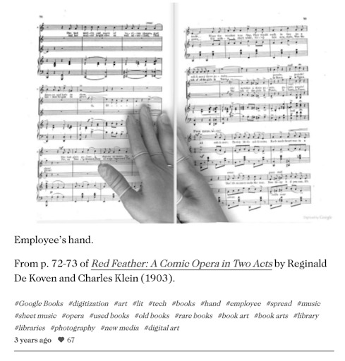
Google Books digitization workers’ bodies do appear materially in the content of many Google Books online scans. The Art of Google Books collects images of the many Google Books scans that include errors, including scans that feature the hands of Google Books workers. These images are captivating, in large part because they represent an intimacy with the ScanOps workers that by Google’s own design was impossible. Vulnerable to the occupational hazard of repetitive assembly-line style labor, bodies refuse erasure in the Google Books corpus, and the unpredictability of those traces renders Google’s lack of commitment to workers legible.
From The Art of Google Books, a scan of Red Feather: A Comic Opera in Two Acts that features the ScanOps team member’s hands.
GOOGLE ARTS
A recent effort on Google’s part to make internet infrastructure both visible and beautiful has been the 2016 Data Center Mural Project. A promotional video depicts several artists creating large-scale murals on the exterior of data centers, with one artist defining his mission as “[making] something joyful and colorful and try to make people happy.” According to the video’s prefatory material, the murals are meant to make data centers, and in turn internet infrastructures and involved labor visible to a broader public. The narration explains that in Google’s large global data center campuses, “the people and machinery work 24/7 to make things run faster, safer and more efficiently. So much goes in to running the internet inside these buildings, we decided it was time to reflect that on the outside.” It is unclear whether such a project’s focus on aesthetics of technological infrastructure does indeed transfer the same positive affect to citizens, observers, or other laborers; but it does call to mind Norman Wilson’s surveillance videos of ScanOps exiting a Google complex. Are workers like the ScanOps team meant to feel joy at the beauty superimposed on infrastructure meant to occlude their very presence? What does that mean for us as users?
0 notes
Text
Adult Coloring Books for Men
I used to be attempting to determine an excellent reward for my dad who’s beginning to have indicators of Alzheimer’s for Christmas and remembered that since he was a child, he beloved to design and paint giant mannequin airplanes… so why not coloring books for males? But in fact, he most likely wasn’t going to benefit from the flowery, tangled kind that I like so I began my search for Coloring Books for Grownup Guys.
Men’s Coloring Books for All Occasions
Intricate Ink Animals in Detail Volume three by Tim Jeffs
Son of a Mother Trucker
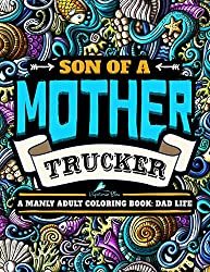
A Manly Adult Coloring Book: Dad Life: Clean Dad Swears & Old Coot-isms: A Unique & Funny Antistress Coloring Gift for Men
Click to Order Amazon US, UK or Canada
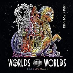
One of the most well-liked books for males in our coloring group proper now could be the most recent one from Kerby Rosanes World inside Worlds.
World Within Worlds
I personally personal this pretty e-book and the largest downside is deciding which cool image to paint first. Paper high quality is nice too.
Click to Order Amazon US, UK or Canada
Dad & Me Coloring Book

I obtained a replica of this lovely e-book and was very impressed with each the illustrations, the standard however principally with the distinctive concept of the softer aspect of fatherhood being present and celebrated all through the e-book. The pages are perforated and TOP sure so it’s great for lefties in addition to those that need to show their creations after you shade them in.
Click to Order Amazon US, UK or Canada
The Men’s Coloring Book by Nathaniel Wake

Nathaniel says it’s a Manly Mans Adult Coloring Book with Cyborg Women, Military Machines, Futuristic Battles, Western Armory, Fish Illustrations and Cars… nonetheless I completely beloved this e-book so that you might need to struggle your feminine vital different for among the illustrations on this e-book.
Click to Order Amazon US, UK or Canada
Mythomorphia: An Extreme Coloring and Search Challenge by Kerby Rosanes

Click to Order on Amazon: US UK Canada or Book Depository
Animorphia
An wonderful coloring e-book for adults that includes the super-detailed animal pictures from artist Kerby Rosanes. Known for his common Sketchy Stories weblog, Kerby works in intricately detailed black and white line to create creatures, characters, patterns, and tiny components to type compositions of mind-boggling complexity. Bring your creativity to finish the breath-taking drawings and discover hidden treasures and creatures scattered all through its pages

Order on Amazon US ~ Amazon UK ~ Amazon Canada ~ Book Depository
Imagimorphia Coloring Book by Kerby Rosanes

Fans of grownup coloring books are invited to enter the extraordinary world of Kerby Rosanes, the illustrator behind the Sketchy Stories weblog and Animorphia, the worldwide phenomenon and New York Times bestseller. In Imagimorphia, animals, and objects morph and explode into astounding element. Bring every intricate picture to life with shade and discover the objects hidden all through the e-book.
Printed on high quality paper, Imagimorphia is a unusual coloring and search e-book for followers of grownup coloring books like no different.
Dad Life – A Manly Adult Coloring Book
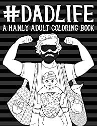
Color in humorous issues that EVERYONE’s Dad says to them.
Click to Order Amazon US, UK or Canada
ColorArt Coloring Book – Real Men Color
This e-book is spiral sure eight half x 11 pages with over 100 pictures to paint in.

Click to Order Amazon US, UK or Canada
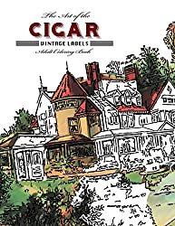
The Art of the Cigar: Vintage Labels Coloring Book
Based on the attractive lithographs of cigar field labels from years passed by. Each of the 40 gorgeous labels is pre-1920 with elegant designs that wrap you within the nostalgia of an age when life was less complicated and folks knew easy methods to benefit from the second. The pages on this e-book are one-sided professionally printed by Vintage Pen Press.
Click to Order Amazon US, UK or Canada
Oldtimer Grayscale Adult Coloring Book for Men
This e-book contains 43 Oldtimer Images of Vintage Rustic Cars, Trucks, Tractors, Tools, Motorcycles and different Things for Men to Color. Creator Timothy Parks has his pictures printed on eight half x 11 paper printed solely on one aspect. He has penned a couple of different coloring books with related themes however this one has the most effective opinions.

Click to Order Amazon US, UK or Canada
Die Hard Coloring Book

If you reside in a home the place Die Hard IS a Christmas film custom, then this coloring e-book is for you. All your favourite scenes and quotes are on this official Die Hard coloring and exercise e-book. This coloring e-book from Harper Design is superb high quality. I obtained a pattern of it from the writer and it’s Coloring Book Addict accepted!
Hans Gruber and his posse crash the Christmas social gathering at Nakatomi and take the tower hostage;John McClane’s limo trip with Argyle;The tension-filled crawl via the constructing vents;John’s morbid message supply to Hans (written on the corpse of one in every of Hans’ males);The well-known bloody footprints;And in fact, John leaping off the Nakatomi tower.
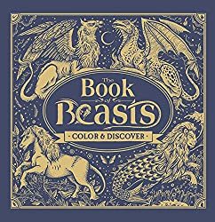
The Book of Beasts
A buddy of mine in Scotland (Kemberlee) ordered this e-book within the UK and he or she couldn’t cease gushing about how fabulous it was. It’s obtained a hardcover with fabulous paper and wonderful illustrations of Dragons of all kinds. Filled with legendary monsters from around the globe, The Book of Beasts will take younger readers on an epic coloring quest via historical lands and lore. As they fill within the pages, kids will encounter creatures from Aboriginal, African, Mesoamerican, Greek, Roman, Indian, Norse, Chinese, and Japanese tales. On the again of every web page, children will discover background on the beasts within the e-book.
Click to ORDER Amazon US ~ Amazon UK ~ Amazon Canada ~ Book Depository
Full Metal Coloring – A Book of Down Range Reflection

Along with the pages to paint, you’ll discover some historic background of the firearms and weapons on every of the pages which had been written by a aggressive shooter and veteran who can be the artist. I’ve a replica of this e-book from the artist and have gifted it to the gun fanatic in my life. Its unique artwork on respectable paper. As at all times use a sheet between your pages to keep away from bleed-through and stress marks.
Click to Order Amazon US
Bennett Klein’s model is very detailed tattoo inked line artwork.
Colour my Sketchbook – DRAGONS by Bennett Klein


The coloured in dragons on this cowl had been executed by members of his Facebook web page linked right here.
Click to order Amazon US Amazon UK Amazon Canada Book Depository
This is simply one of many Bennett Klein Books, discover the remainder right here.
Tattoo Art Coloring Books for Men
The Tattoo Art of Freddy Negrete
I obtained this e-book from the writer and was fairly happy with the number of pictures contained inside. There is so much to select from however most do have a Hispanic, Chicano, Mexican taste to them. There are a lot of the Virgin Mary in addition to Sugar Skulls which make sense culturally. There’s even a sugar cranium Virgin Mary to paint in. As a colorist, most weren’t tremendous detailed so when you choose that kind of coloring e-book this one most likely received’t be your cup of tea, however when you like so as to add your personal patterning or are studying and working towards shading and contouring this e-book is ideal.

Click to Order Amazon US UK or Canada
Kitchen Overlord’s Colorable Compendium of Geek History: An Adult Coloring Book and Companion to the Illustrated Geek Cookbook
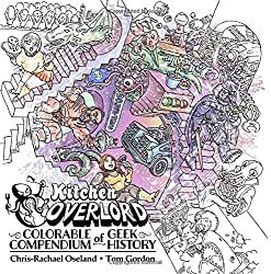
I haven’t seen this one in particular person, however its on my record and from the opinions, it seems enjoyable. “The creators of Kitchen Overlord’s Illustrated Geek Cookbook invite you to paint together with 120 years of geek historical past!
Start with H.G. Wells Time Machine in 1885 and produce the black and white pages to life because the world grows geekier with each decade.
See Cthulhu rise in 1928, shade Captain America in 1941, depart the Shire for Mordor in 1954, boldly go on a 5 12 months mission beginning in 1966, lastly be taught what “inconceivable” means in 1973, struggle Zuul and Gozer in 1984, assist the Scooby gang shield Sunnydale in 1997, turn into a Big Damn Hero in 2002, and assist Ichabod Crane turn into a contemporary man in 2012.
You recover from 50 enjoyable illustrations representing your favourite books, comics, motion pictures, TV, and video games – organized chronologically so you possibly can see how geekdom has developed over greater than a century.”
Click to order AMAZON US AMAZON UK AMAZON CANADA BOOK DEPOSITORY
Guys have a tendency to like Science Fiction so most of the books on my nerds and geeks web page would possibly work for the boys in your record too!
Military Coloring Books for Men
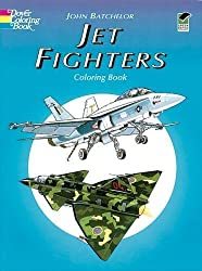
The very first thing to do is work out hobbies and issues that the person in your life is into.. my dad loves airplanes and was within the USAF in order that was my first search. I discovered these two: Airplanes of the Second World War and Jet Fighters. Both are Dover Coloring Books so the worth level is correct, underneath $5.

If you want freebies take a look at the free coloring web page and e-book excepts from Dover too.
Other Military Coloring Books for Men embody:
Many of those navy books additionally work in case your man is a historical past buff.
American Muscle Cars Coloring Books for Men
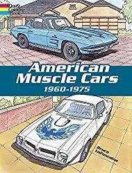
Expertly rendered illustrations of quick, flashy, and highly effective sports activities vehicles, amongst them the 1962 Ford Thunderbird, 1964 Corvette Stingray, 1968 Chevy Impala SS427, 1969 Camaro Z-28, 1970 Ford Torino Fastback, 1971 Mustang Boss 351, 1974 Firebird Trans-Am, and 37 others. For coloring e-book lovers and “muscle car” followers.
Click right here to Order American Muscle Cars Coloring Book
There’s additionally Classic Cars of the 50’s Coloring Book
Luxury Cars Coloring Book
Sports Cars Coloring Book &
History of Trucks
Motorcycles Coloring Book – This assortment chronicles over 100 years of bike historical past with illustrations of 45 precisely detailed fashions, together with Gottlieb Daimler Motor Bicycle (1885), 1913 Royal Enfield, 1947 Indian “Chief,” 1966 BSA A65 Lightning, and the Honda ES21 Future Motorcycle Concept Prototype.
Dover Books has an excellent number of History Coloring Books
Looking for an excellent historic coloring e-book? Dover may also help you add shade to among the most exceptional occasions in historical past! From dinosaurs, the Old West, the Civil War, Native Americans, the house race, American presidents and first women to classic cars and trains, castles and cathedrals, well-known explorers and inventors, historic structure like Famous Buildings of Frank Lloyd Wright and landmarks. Black historical past coloring books function genuine illustrations in regards to the Underground Railroad, the Amistad, Barack Obama, and extra. Each version gives fantastically detailed illustrations and fact-filled captions.
Click right here to see the complete choice.
The Bicycle Coloring Book

This e-book blew me away once I began seeing coloured in photos from it. It is full of cityscapes and countryside illustrations that function a motorbike and a cat. It’s like nothing you’ve ever seen earlier than. The paper is fabulous artwork high quality and the illustrations are one-sided with a middle fold-out part for a big poster-sized creation. On the dealing with aspect of the web page is an illustration of the identical cat you see in every image (generally you must hunt to seek out him) however what’s actually cool in regards to the cat is that once you flip the pages he animates. This will for certain convey you again to your faculty days once you used to make flipbooks. If you’re a bicycle fanatic or the person in your life is, you possibly can’t go fallacious with this coloring e-book. It’s eight.2 x zero.eight x 10.eight inches and has 144 pages.
Click to order Amazon US Amazon UK Amazon Amazon Canada Book Depository
100 Animals by Jade Summer
An Adult Coloring Book with Lions, Elephants, Owls, Horses, Dogs, Cats and extra. 100 pictures printed on one aspect of the web page.

Click to Order Amazon US, UK & Canada
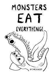
Ill-Gotten Brain Coloring Books by Chris Guest
I wished so as to add a few books from a brand new illustrator that I do know guys will love. Thanks to one in every of my coloring group, Shawn B. for the heads up about his enjoyable books! Meet Chris Guest aka IllGottenBrain. He has 2 books out, Beyond the Fairytale Forest and Monsters Eat Everything that you’re certain to get pleasure from.
His books remind me of Steve Squidoodle’s illustrations too.. enjoyable and funky, verify his work out right here.
Walking Dead Coloring Book
This e-book is completed in a graphic novel model so LOTS of black and background particulars so it’s alongside the strains of a grayscale coloring e-book. The illustrations are from the Walking Dead graphic novels and it’s very detailed. We are hoping they arrive out with one other that follows the TV present a bit extra but when you recognize a Walking Dead addict, this may be an ideal reward.

Click to order Amazon US ~ Amazon UK ~ Amazon Canada ~ Book Depository
Steampunk Devices
Dudes like to tinker with devices so this Steampunk Devices can be an excellent alternative for the artsy man in your purchasing record.
Click to order Amazon US Amazon UK Amazon Canada Book Depository

We discover heaps extra Steampunk and Science Fiction choices for guys right here.
Intricate Ink – Animals in Detail

After seeing colorings from this e-book on Instagram I bought it on Amazon. It’s a greyscale e-book that makes your colorings actually come to life. It’s a hardbound e-book that opens on the prime so nice for left-handed colorists too.
Click to Purchase Amazon US
Lost Ocean by Johanna Basford
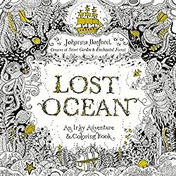
Although Johanna Basford is understood for her fairly flowers and delicate leaves, guys can fall just a little in love along with her illustrations in her third Inky e-book, “Lost Ocean”
Visit coral reefs and barnacle-studded shipwrecks, uncover intricate shells and pirate treasure. Secret Garden and Enchanted Forest followers and newcomers alike will welcome this artistic journey into an inky new world.
Click right here to order Lost Ocean Amazon US Amazon Canada Amazon UK Book Depository
Bugs & Creepy Crawling Coloring Books for Men
Maybe your grown guys nonetheless have that little boy in them that loves spiders and snakes… There are some decisions for them too.
Check out this Complicated Spiders Coloring Book… This distinctive coloring e-book is eight inches broad x 9 inches excessive, it has 25 completely different illustrations of intricately adorned spiders; every illustration is printed within the e-book twice, one on a black background and the identical illustration on a white background with mild grey strains. Lots of spider and bug e-book right here too.

Fantasy and Dragon Coloring Books For Men
Amazon has dozens of Fantasy & Dragon coloring books that guys would possibly like right here.

Funny Coloring Books

Coloring for Grown-Ups: The Adult Activity Book
Electile Disfunction – The Story of the 2016 Presidential Election Coloring Book

Click to Order Amazon US
You can see extra Political Coloring Books right here.
Unicorns Are Jerks: a coloring e-book exposing the chilly, exhausting, sparkly reality

Coloring for Grown-ups – Holiday Fun Book
There are extra right here of the extra “R” rated variations as nicely.
See a big itemizing of our favourite humorous naughty & horny coloring books right here.
Steve MacDonald’s Cityscapes e-book “Fantastic Cities“ will even attraction to the fellows our there with a e-book the place no flowers or fairies are anyplace to be seen. Steve McDonald applies his distinctive photo-based strategy to create lovely, detailed line drawings of wonderful buildings and different constructions from around the globe in Fantastic Structures and his third e-book contains less complicated designs in Fantastic Collections,

Comic Book and Graphic Novel Coloring Books
DC Comics Coloring Book
Featuring iconic paintings by famend comedian artists, DC Comics Coloring Book contains gorgeous line artwork of beloved characters corresponding to Batman, Superman, and Wonder Woman. Click to Order on Amazon
Wonder Woman Coloring Book

This graphic novel options basic illustrations from among the most well-known Wonder Woman artists of all time, together with George Pérez, Jim Lee, Brian Bolland, Amanda Conner, Ross Andru, H.G. Peter, Cliff Chiang, and Phil Jimenez printed on each side of the web page.
Click to Order the Wonder Woman Coloring Book
Coloring DC Batman Hush Volume 1

This grownup coloring e-book options chapters from one of many biggest graphic novels of all-time, BATMAN: HUSH. Illustrated by Jim Lee, identified for his intricate strains and distinctive element, this story is ideal for coloring. Click to Order this totally illustrated Batman graphic novel right here

Civil War – All your favourite Avengers battle on this graphic novel coloring e-book
120 pages of all-out costumed warfare, that includes Steve McNiven’s exquisitely rendered paintings simply ready for you so as to add the colour! Captain America and Iron Man are the feuding Avengers main the 2 sides of heroes that battle it out over the rights and wrongs of Superhuman Registration. Click to order Civil War
Color Your Own Age of Ultron
Color in your favourite Marvel Heros and Sinister Bad guys on this graphic novel. Difficulty ranges from simple to superior so there’s something for each graphic novel fan.
Click to Order Age of Ultron Here.
Color Deadpool Graphic Novel
This e-book contains covers from New Mutants 98, old-fashioned Pool, New Pool, the Daniel Way years, and Deadpool vs; Thanos, carnage, zombies, Cable, and Spider-Man. Click to order Deadpool
Assassins Creed Coloring Book
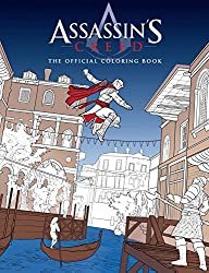
Click to Order Assasins Creed Coloring Book
Guys which are into Science Fiction and Fantasy can discover a big number of SciFi Coloring Books right here.
Steve Squidoodle has a implausible following on Facebook which is the place I found him. Like Bennett Klein, he’s at all times gifting away freebies on his fan web page. Learn extra about Steve Turner the illustrator right here.
Squidoodle’s Book of Fancy Letters – Click to Order
All 26 letters of the alphabet, on single aspect pages with doodles objects to paint in. Taken from the intricate hand-drawn pen drawings of Steve Turner a.ok.a Squidoodle. Each letter is detailed and ornate, with doodled objects starting with that letter.
Each letter sits centrally on the web page, away from the backbone – you possibly can minimize the letters out, shade them and provides them as presents to household or mates. All the pages inside this e-book are taken from the hand-drawn illustrations by Steve Squidoodle Turner. He rigorously chosen objects to be contained in every letter – making it enjoyable for children and adults alike. The A incorporates an astronaut, an apple, an aeroplane, an anchor…. The B incorporates a bee, Big Ben, a beetle, balloons…. you get the concept!!
Squidoodle’s Book of Fancy Letters: An Adult Coloring Book – Click to Order
A Day on the Beach by Squidoodle – Steve Turner
The Natural Atlas by Squidoodle – Steve Turner

Creative Insults for Foul-Mouthed Beasts – A UK Sweary Coloring Book by Squidoodle – Steve Turner
I STRONGLY advocate downloading the Hobby Lobby & Michaels App to your smartphone. That manner you at all times have the coupons with you. Being the clumsy particular person I’m.. I ALWAY neglect the coupons at house or within the different automotive or the opposite purse.. you get me.. proper? You can usually discover artwork provides there for a very good worth with the coupon however most frequently I purchase books and provides on Amazon.
AMAZON PRIME – If you aren’t a member it’s best to look into it.
You get free 2-day transport daily at Amazon with Amazon Prime. You can attempt it for free proper now.
The Amazon Prime membership program gives different particular advantages for simply $99 per 12 months. Members can immediately watch over 40,000 motion pictures and TV episodes and borrow 1000’s of books from the Kindle Owners’ Lending Library.
Have the boys in your record loved coloring books I haven’t listed right here? Please let me know within the feedback beneath or on one in every of my social media accounts.
The post Adult Coloring Books for Men appeared first on XNX Adult Store.
0 notes
Text
Notes On Improvement On Personal Art (Q1-Q2 2020)
I love drawing on the iPad using Procreate.
Dry Ink Brush is my jam. But I discovered this: https://gumroad.com/l/JingsketchBrushes
For JingSketch Brushes, I use different brushes and I’ll expound on this on the FAQS/Resources page once I get to writing it.
I would like to improve on coloring/rendering. I want to use different tones to create super colorful and lively illustrations.
Botanical Illustrations! Plants, flowers and succulents. I really am inspired by botanical illustrators and those who find art in nature. It's just something that I want to embody because nature and plants are great!
Que horror! Drawing the Macabre and the Occult.
I want to combine my love of horror with my love of art. I really want to draw witches. monsters, ghouls and vampires but I'm scared especially when I draw at night.
If ever I go into the comics industry or into sequential art, first thing I'm gonna illustrate are stories about scary things. I guess a perfect niche for me would be scary fiction for middle-grade to YA.
Diversity in drawing. Improve on illustrating people. Not just girls looking to one side.
Be better at human anatomy and figure drawing.
I am going to take Proko's lessons and see what happens.
I want to learn how to animate simple things like wind blowing thru the hair of my characters/fanart. I would also like to animate cute animals and plants.
Hand Lettering. Words. Quotes. Phrases. Improve typography as well as hand lettering.
"Less anime/manga style, more your own style?" I wrote this last year and I think I'm good at drawing in anime/manga style -- it's not necessarily bad to draw that way. I guess if I really do go thru Proko's lessons about fundamentals maybe I can develop a more realistic style.
STYLE. Develop something that is mine. So far, I know my style is very out there, very different every time I try to illustrate something new. But I know now that I am better at digital illustration than traditional illustration. My style is more anime and I like noise in my work. I still haven't figured out how to do shading and highlight. I just try to follow the light source but sometimes I make mistakes and it's kind of difficult. Hence, I really need to practice and get solid fundamentals.
Do I still want to pursue watercolor, gouache and acrylic, oil even? Yes, but — so little time. I still want to try doing watercolor and gouache, I even recently bought brushes from Artwhale and yeah maybe I can do this from time to time.
Not really art-related but I want to journal like a pro. My journal is really bland and I would like to be more crafty about it.
1 note
·
View note
Photo


Jean Leon Huens
Jean-Léon Huens is a Belgian illustrator. His schooling completed, Jean-Léon Huens continued his studies at the Institut Saint-Luc and ends at the top of the Cambre Decorative Arts Institute in Brussels. He illustrated children’s books (edited from the immediate post-war by Casterman and in collaboration with Jeanne Cappe, historian about children books: Cinderella and Other Tales of Perrault, The Little Match Girl, Blondine Bonne-Biche et Beau-Minon), greeting cards and calendars published by and for known printers (including printmaking workshops De Schutter in Antwerp), yet collected.
A part of his work was exhibited at the Museum of the Book of Brussels in 1951 and at the Royal Library in 1977 as part of the exhibition The Illustrated Book in the West from the High Middle Ages to today. Titular of many certificates of merit from the Society of Illustrators of New York in 1962, Jean-Léon Huens as been introduced twenty years after his death in June 2002, in the Hall of Fame of the same company.
Jean-Leon Huens (sometimes abbreviated as Jean Huens) was a Belgian-born artist who did work both in Europe and the United States. He produced many paintings for National Geographic and Reader's Digest, book covers for Dell, and illustrations for Christmas cards, comic book covers, and children's books. He was poised to be a major contributor to Time/Life Books Enchanted World, but passed away after completing only one picture for them. Howard E. Paine, the former Art Director for National Geographic, had this to say about Huens when the artist was inducted into the Society of Illustrators Hall of Fame in 2002:
2002 Hall of Fame Inductee: Jean-Leon Huens
1921-1984
The eyes of Gerardus Mercator; 16th-century Flemish cartographer; look into mine. The bearded old man is surrounded by maps and a globe, and holds in his hand a pair of dividers. His head is tipped slightly, and his eyebrows are raised, as if he has just posed a question about geography or mapmaking, and, like a patient professor, awaits my answer.
I found this portrait in an issue of Penrose Annual and wrote the author to see if the painting could be used in a map exhibit I was designing for the National Geographic Society. He forwarded my request to the artist in Belgium, and in a few days a small envelope arrived on my desk. In it was a postcard-size image of Mercator and a letter from Jean-Leon Huens telling me that this was the original painting and “May I ask you to guard this with your life.” I was amazed that he would dispatch this exquisite little gem across the Atlantic, and to a perfect stranger!
Thus began a collaboration and a friendship that was to last for 17 years.
Generous in many ways, Jean-Leon Huens was most generous in the rich detail that he gave to every painting. Instead of using shortcuts and simplifications, he took great delight in recreating the wood grain in furniture, the texture of clothing, the brickwork of old buildings, the wrinkles of old age. And over all a gentle Flemish light that unified all the elements of these miniature masterpieces.
Huens was a master not only of detail and of lighting, but also of perspective and composition. His panorama of Bethlehem at the time of Christ, painted for Reader’s Digest, compels the eye to wander the streets, rooftops and plazas, and to end up back at the beginning, still wanting to mingle with the more than a hundred people going about their business. The panorama appeared in the book Great People of the Bible and How They Lived. And also as the jacket design.
Huens painted many covers for Reader’s Digest but they appeared in the magzine’s international editions and were rarely seen in the United States. Reader’s Digest also commissioned Huens to make more than a hundred paintings to illustrate Shakespeare’s works. The book unfortunately was never published. Twenty-two of Huens’ paintings were donated to the Society of Illustrators.
Those works in the Society’s collection are small, measuring but 5.25 by 7.25 inches. They are breathtakingly precise glimpses of scenes from Julius Caesar, Hamlet, and Macbeth: Calpurnia, on bended knee, begging Caesar not to leave; Macbeth hiring two wicked knaves to murder Banquo; Hamlet rejecting Ophelia with the line, “Get Thee to a nunnery…”; Macduff holding Macbeth’s severed head.
Had the book been published, these paintings would certainly have enriched the iconography of Shakespeare’s work. But now they are stored in dark archives, seldom exhibited, because of the very light-sensitive nature of Huen’s work.
Huens painted with what he called “water color pencils,” which enabled him to render detail with great precision, later brushing a slight wash of clear water over the areas to blend the colors. He worked from photographs of models in various poses and costumes, often posing himself. His wife Monique—researcher; correspondent, translator, critic and photographer—assisted him throughout his career.
Jean-Leon Huens was born December 1, 1921, in Melsbrock, Belgium. He attended the institute of St. Luc and completed his studies at the Academy of La Cambre, in Brussels. At the end of World War II, while still in his twenties, Huens began illustrating children’s books for publishers such as Casterman, Marabout, Desclee-DeBrouwer and Durendel.
In 1946 Huens and his brother Etienne founded the Historia Society, with the aim of popularizing Belgian history through more than 400 paintings—village scenes, battle scenes, coronations, hangings, and portraits of heroes such as Gerardus Mercator. Huens’ carefully researched paintings were lithographed in full color, each 3.75 x 5.75 inches, and were offered as premiums with packages of tea, chocolate, spices, and biscuits. Like nineteenth-century trade cards, the Historia Society cards are prized collectibles today.
As soon as I saw the Mercator portrait, I knew that Huens could enrich the pages of National Geographic, and in short order he was working on portraits of Copernicus, Kepler, Galileo, Newton, Herschel, Einstein, and Hubble, all of which appeared in the May 1974 issue. A year later, National Geographic published four Huens paintings in a story about Sir Francis Drake, including a heart-stopping view of the Golden Hind in the stormy seas of the Straits of Magellan. He later painted scenes of life in Thrace (ancient Bulgaria), and, for a major article on the Byzantine Empire, two large, fold-out paintings. One, a map of the Byzantine world, was painted as if it were a mosaic assemblage, a self-imposed challenge that he may have regretted, but one he finished flawlessly. The other, an aerial view of ancient Constantinople, is equally powerful.
Huens’ Christmas cards throughout the years, painted in full color, showed Father Time in a wide variety of styles and situations, giving us a peek at Huens overflowing wit and humor. This made him the perfect artist for a Time-Life Books series called The Enchanted World, a set of books about wizards, merlins, magic and mystery. Huens completed but one painting, a promotional piece to help get the series marketed, before he died suddenly on May 24, 1982, in Benissa, Spain.
In his 60 years, Jean-Leon Huens had seen his work heralded throughout Europe, amd had successfully expanded his audience to the United States. Now, 20 years after his death, the Society of Illustrators pays tribute to Jean-Leon Huens by inducting him into its Hall of Fame.


6 notes
·
View notes
Text
These keep getting longer
I think it’s evident at this point that I consider my duty to the prompt filled if the words are mentioned in passing or even implied
tuesjade prompt: art supplies
Jade isn't in the greenhouse or napping in the common room (or even halfway up a tree, which is where you found her last time you went looking) so you check her bedroom, which maybe you should have done first. There she is, flat on her back and flicking pennies at the ceiling. Instead of dropping back down onto her pillow, they settle into orbit around her head like a glittering halo. When you walk in, they fall in a copper shower around her shoulders.
"Jake!” she says from beneath a pile of loose change. “Do you need something?"
"Not need, exactly." You hover at the doorway until she motions for you to come in. "It's more that I'm here to ask you something. You see, Calliope and I have been working on a comic together."
"Oh, is that what you two have been hiding away to work on? We were wondering what you were up to." She sits up and pats the bed. Stray pennies clink and shift. "Can I see it?"
"As a matter of fact, I did bring some samples along." You're a little shy, but if you can't show your fumbling attempts at artwork to your grandmother, who can you trust? Calliope took the reins for most of the first booklet anyway. "Behold!” You hold out the hand-stapled collection of pages with a flourish. “The brand new adventures of our enterprising heroes."
She pages through your first issue, complimenting the art and laughing aloud at your cornier jokes. “My grandpa used to make that exact pun, you know," she says, tapping one speech bubble you were proud of.
"That stroke of genius must be hereditary."
She smiles down at the panel for a moment before turning the page. "Guess so."
“It’s funny,” you say. “Speech bubbles feel so… constrictive, for some reason. I know it’s a function of the medium, but you just can’t fit that many words in. You’d think I’d be used to it, since I’ve read my fair share of the funnies. But I keep thinking, how can they say everything they need to? They have to be so terse. It makes for a lot of revising.”
“You’ll get it with practice,” she promises. “And then we’ll all notice you’re sending us monosyllabic texts!”
When she reaches the end, you clear your throat. "I wanted to ask if you'd like to be a guest artist. We're trying to get as many people as we can for different issues, so it can be a group project." Calliope took a while to sell you on that. Some of your friends are actual artists. Their work will make your scribbles look pitiful. Still, you saw her point in the end. These things are more fun done together. And she's promised to stab people with pencils if they laugh.
"That sounds like a lot of fun. I haven't drawn in..." She shakes her head. "I don't know. A long while! I'm not great at it, but it was a nice way to pass the time."
"Oh grandma, you're being modest. You were always the best at arts and crafts.” Once you’d gotten into some old paints and left a trail of child-sized handprints on the wall. Instead of yelling, your grandmother had handed you a brush, and the two of you had covered the plain surface with a mural of swirling colors and flowers. It was one of the things you missed most when your house exploded. “The things you could do with a magazine collage were sheer magic."
"I don't know about your version of me, but this me is no Picasso." She waves her hands, and a sketchbook appears between them. You’d expect something with glitter or drawings of flowers – Jade is no stranger to the stereotypically “girly” end of accessorizing, even with the deconstructed guts of appliances and a few odds and ends of weaponry stacked up in the corner of her room - but the leather binding is plain and worn. "Here are some things I did before the game."
You open the book to the first page and blink. You know that handwriting. “Is this… mine?”
“Oh, that’s right.” She reaches over you and turns over a big chunk of pages. “This used to be one of my grandfather’s journals. He drew schematics for inventions or sketches of wildlife he’d discovered on his explorations. Sometimes he’d take me out on an “expedition”. He’d take field notes, and I’d imitate him by trying to draw what I saw. That’s how I got started doing art, actually. After he died, I kept it up. Maybe using his book was disrespectful, but…” She shrugs, reaching a page where no more of your – your other self’s – writing is visible. “I always thought he wouldn’t mind.”
The sketchbook feels different in your hands now that you know your alternate self once held it. Heavier. You try to put it out of your mind. You have drawings from the Jade who is right here. Her lines are thick and defined, like a child's crayon drawings. Of course, she would have been a child then. Here's a doodle of a school classroom, with Jade and Bec behind a desk. The other students... They’re not pretty, but one of them has clunky square glasses. Another wears a headband. "Are those John and Rose?"
She laughs. "Yes. They hadn't sent me pictures yet, but I'd seen them in the clouds. I liked hearing about school, even when they complained. They never understood why I pestered them for so many details, but I wanted to imagine myself going too. Maybe they’re right and I wouldn’t have liked it, but I hated having to wait until they came home to tell them something."
Her human faces are clumsy and cartoonish, but she has an eye for rendering detailed objects in perspective. Students like flat paper dolls sit behind three-dimensional desks. "You could be an architect," you say.
"I had a Pictionary modus, so I had to be accurate," she explains. "I was never as good at people. I didn't have anyone to practice with."
You nod, flipping further. "Going off a picture just isn't the same." Here's something different. She's drawn a figure fast asleep. The lines are sketchier and more uncertain, with a realistic softness the other drawings are missing. This time, you’re confident assessing their identity. “You drew John?”
"I tried to get a good look at him while I was dreaming on Prospit," she says. "Then I drew him from memory afterward. I thought about asking him to pose a few times once we were on the battleship, but I couldn't think of a way to ask that wouldn't sound silly."
"So you resorted to candids, did you?" The last few pages of the sketchbook are populated with quick doodles built from lighter lines. The jointed fingers of a carapacian. John with his long windsock hood, gesturing broadly with his hands. Dave, no, it would be Davesprite, hiding a half-smile with one hand. An echidna curled in a tight ball with its tongue poking out. It would set your behind ablaze to say any of them are photorealistic, but you can tell what they're supposed to be.
After those you find renderings of the innards of the battleship, a mess of interlocking pipes and conduits. Now these you'd believe were ripped out of a user's manual. The rest of the pages are blank. "Did they catch on?"
She snatches the sketchbook back. "No, they don't know about it, so don't show them."
"Have you been sketching me at all?" You strike a pose, lifting your chin in the air. "How’s my profile?"
"Stop teasing, I haven't drawn anything in years." The book vanishes, and she puts her hands on her hips. "So you see, I'm not sure I'd be very good at it."
"I'm much worse than you, and I'm one of our lead storyboarders. Calliope insisted she wasn't doing all the visual components. Apparently I'm supposed to "learn" and "grow"." You tug at her elbow until she drops her arms. "Don't you want to learn and grow, Jade? Isn't that what you Space players are all for?"
She puffs out her cheeks. "Fiiiine. I guess I can pick up some colored pencils again."
"There's just one thing..." Oh rats, you hadn't thought of how this would come across. "Our guest artists... policy is that they do the villains. To keep the heroes consistent and all that. Is that ok?" You hurry on. "You could be a werewolf, or a mad professor who gets turned into some creature after exposure to magical radiation. You know, something fun."
She blows her cheeks back out. "Radiation sickness isn't much fun. I might prefer a well-intentioned extremist. Maybe I destroy corporations for harming the environment."
"But..." You hesitate. "Is that a heroic thing to do, when you boil it down? Greater good, and all that. It might be more of an anti-hero occupation, so to speak."
"Not when you're hurting the employees."
"We could convince you to let them go first... No." You shake your head. "It doesn't fit our profile to become anarchists. We'll have to save that for our gritty reboot in a few decades."
"I'll go with something more ethically simple."
"So it's ok with you?"
She pats your hand. "I'm not going to get offended about it. I know I was the bad guy for a while. Pretending to do it again won't hurt me."
"I know I wouldn't want to relive it."
"It was different for you.” She looks down at her hands, and you wonder if she’s remembering them ashen gray. “I didn't have a bunch of people living in my head. After the first moment, it was just me, the worst bits. It's not like you wanted to rip anybody's heart out."
You shudder. Caliborn had shoved you to the back of your mind, where you kept company with a bunch of silly green men and a spooky clown, but you'd caught flashes of the outside world. He was happy leaving you to feel your body's pain. Human hands weren't meant to take that kind of punishment, but the vision-blurring impact hadn't prevented you from seeing one of your best friends die. "Can we talk about something more cheerful?"
Her ears pull back slightly. "I didn't mean to upset you."
"And here I was worried about upsetting *you*.” You laugh. “I guess we know which of us is made of sterner stuff."
"You're pretty tough," she says, poking you in the shoulder. "You're our adventure guy."
"Mostly in comics. My alter ego is much braver than I ever was."
She shakes her head. "They're just made up. You're the real deal. And you made it through the worst a bored comic book writer could ever throw at you."
You tap the cover of your comic book thoughtfully. "We *are* the grittier reboot."
She laughs. “That’s right. We are! So now you can enjoy your… less gritty reboot, if that’s a thing comics do.”
“We could have a beach episode.”
“Name a day, and I’ll take us back over to the island. We’ll make a vacation out of it.”
How will it feel to revisit the place where you grew up? Will it feel like coming home, or more like visiting an old prison cell? Which memories win out – the fond ones or the terrible ones? At least you’d have your grandmother at your side. Maybe that way you won’t keep expecting her to pop out from behind every tree and boulder. “There’s an idea. Your character could be a Captain Nemo type. He had a mysterious island and everything.”
“I have in the past piloted something somewhat like a cool submarine,” she agrees.
“Let’s doodle you a nifty uniform,” you say, and she grins and picks up a pen.
#tuesjade#homestuck/#kat writes fic#they'll get shorter as my list leads me to characters i'm not as familiar with#or... will my lack of confidence w/ their voices make me lean on narration#thus generating more words?#i will have to analyze the data as it is created
12 notes
·
View notes
Last Seen Blogs
daulphinsblume
we go up!
chancekristian2
Let's go on a Quest.

ziegenknecht
Hellfire Club
lucalicatteart
☁ collection of worlds ☁
dreimalfuermich
Dich gibt's nur dreimal für mich