
akaispots
Industry Briefs
Hi. A 2nd year graphic designer who is motivated by design and is willing to be creative.
74 posts
Don't wanna be here? Send us removal request.
Last Seen Blogs
koolzokon
I am Zokon

onecupdepresso
One Cup Depresso ☕
mordu
MIA
sir-awen
just leave me be
a-handful-of-beans
Just Some Stuff
Photo

Link: http://abduzeedo.com/amazing-photoshop-light-effect-10-steps
A photoshop tutorial teaching a lighten effect but the coffee used as an example could be somewhat helpful for an inspirational kick.
2 notes
·
View notes
Text
Printing
My tutor suggested that we should keep some common things in mind when it came to designing and producing it.
Some of those things would included how the design would be printed, what would the design be printed on, coatings, environmental factors,the inks or things concerning the output of colour (i.e. colour compadable printers, spot-colours, PANTONE) or if special inks such as metallic were going to be involved. I was considering using metallic effects for my design at one point. To achieve metallic effects, there is one method called called 'Hot Foil Stamping', where a metallic foil material is stamped onto a design with heated die and pressure. Metallic ink printing does also exist but it is quite costly and does not give a higher shine that compared to what foil stamping can produce.
http://www.printingforless.com/Hot-Foil-Stamping.html
http://www.printpromotionguide.com/blog/how-to-print-metallic-inks.php
http://www.umaxprint.com.au/metallic-printing-business-cards-goldsilver-ink--p332.html (look at quote)
Nowadays, printers have advanced muchely that they are capable of handling more complicated type design printing. But then there are many different types of printing out there as well such as:
Digital - refers to methods of printing from a digital based image directly to various media
Offset - image printed using plates and rubber blankets
Inkjet - commonly used type printing, especially in homes
Laser - laser beam projects an image of the page and allocated ink particles to area marked by laser beam
and some other ones out there such as the traditional lithography and letter press just to name a few.
*wiki*
Printing companies own many of these printing machines as it would be expensive for an individual to own for use and they can also get jobs done alot faster. These companies also offer other services to make certain designs beyond printing abilities possible. Die-cut, perforating and embossing are common ones. Die-cutting is achieved using from rotary blades to a letter-press method (embossing too) to laser cutters.
http://www.afxdigital.com.au/finishing/die-cutting/
http://ohsobeautifulpaper.com/2012/01/the-printing-process-die-cutting/
My design now requires a die-cut so I believe that either laser or the letter-press die-cut method should be quite effective.
Companies also offer scoring and trimming to save time on designs that require to be cut to a certain size (e.g.business cards) or need folding (e.g. brochures).
Some printing companies in australia:
http://www.printingforless.com/Hot-Foil-Stamping.html
http://www.kwikkopy.com.au/?gclid=CLug4bmzj7ICFYRLpgodRz8A3g
http://qprint.net.au/index.php?page=online
http://www.addcolour.com.au/index.html
http://www.bytesncolours.com.au/content/finishing
http://www.artvue.com.au/index.shtml
http://www.printingblue.com.au/
Cost was another issue if we were given a budget so one idea if to make use of an entire sheet of paper. :D
0 notes
Photo
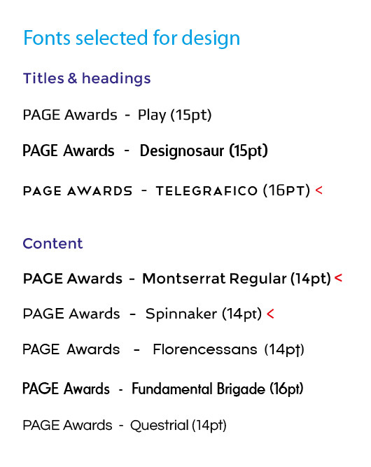
These here are the final few fonts I have selected from 19 fonts that I found that I felt that were closest to fitting in with my design and the font used for the PAGE Awards logo.
For my design, I wanted to find San-serif fonts that were similar to that of the PAGE Awards logo and at the same time, would work with my design. The reason for that was to add a type of consistent balance that was currently working with the shapes in my design and with the PAGE Awards logo. It was amazing how I had come across that many different San-serif style fonts and I applied each of them on my design to see weather they would work or not.
The final ones chosen were 'Telegrafico' for 'Titles/headings' since the corners and negative space of the font seem to relate to the shapes of the design and the style of the font was that of a San-serif so it wasn't straying too far away from the PAGE Awards logo.
'Montserrat Regular' and 'Spinnaker' were chosen for 'Content' as they both worked well with the chosen type face for 'Titles/headings' and were of a good weight for readability (i.e. the anatomy of the font face wasn't to thick or thin, especially when they were reduced in size). 'Montserrat Regular' was used in the certificate while 'Spinnaker' was used for the Event menu/Take-away piece.
The fonts shown with a red arrow-like pointer (<) show the chosen ones. The font have also been marked with a (pt) to show their true appearance.
0 notes
Text
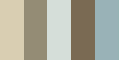
Colours
These are some colour palettes I'de like to try.


0 notes
Photo
LinK: http://www.ultravirgo.com/news/2009/08/american-graphic-design-awards.html
Colours in logo.
Appears to have used a gradient to achieve nice affect but whats clever is that the gradient gives the illusion that the is a fold. Clever idea for a logo.
What I see are rectangle shapes and colour usage since I've been researching examples that can relate and help with my chosen design.
0 notes
Photo

Link: http://www.flickr.com/photos/loro123/7615015870/in/pool-logodesign/
And another example of overlapping ribbons of colour and is used to fill in a silhouette shape of a star. Placing the star on a plane bg makes it eye-candy.
I really do like these style types as it creates new colours but I don't think I can really pull it off since I want to really limit my colour use and to achieve this, I'de need to make the opacity partially transparent.
0 notes
Photo

Link:http://www.flickr.com/photos/bnunesdesigner/7860455860/in/pool-logodesign/
I'm frankly drawn to shapes at the moment.
This looks like a production for a Logo but what has caught my eye is the example located on the bottom left of the example which appears to be made up of shapes and teh colour applied to it to give the logo a more dimensional look or appearence.
What inspires me about this example though is how colour can be applied and used to create dimension.
0 notes
Photo

Link: http://www.flickr.com/photos/phrame/7767834958/in/pool-logodesign/
I don't really know why I chose to use this a inspirational example but it perhaps because I'm drawn to the grunge effect of this piece of work and the fact that I can faintly see triangle shapes, and the direction at which they are positioned, creating a some form of illusion of brightness comming from the centre of the work.
The overall piece is nice to look at but I feel that the title in the middle doesnt sit with the design.
0 notes
Photo

Link: http://www.flickr.com/photos/everydaylifemodern/2819113581/
This example was a brochure design for a museum (exhibition) in London in 2007 but looking at this design sorta reminds me of these particular examples. Its the overlapping ribbons of colour, but these colours seem to be a bit arranged in the rainbow colour form. Its only missing yellow. The overlapping ribbons also create new colours and also outlines new shapes formed. The way the ribbons are arranged in such wavy manner indicates some form of movement or motion.
The arrangement of colours and having such a design for a museum perhaps indicates that the exhibition is based on something colourful.
0 notes
Photo
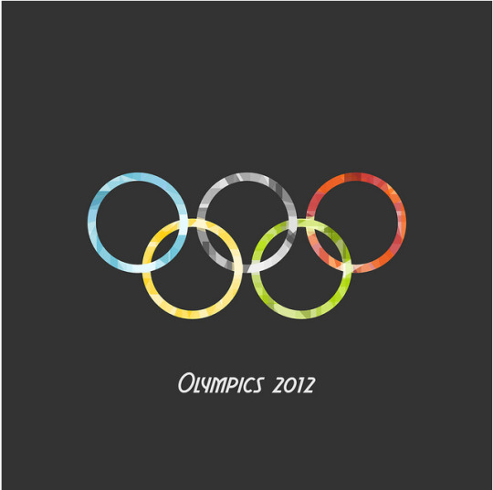
Link: http://www.flickr.com/photos/loro123/7629288058/in/pool-11778883@N00/
This is another Olympic related design I found whilst researching examples to support my current idea.
I really like this one for its unique way of adding colour to the 5 rings. Over lapping colours that are framed with a ring shape or another wya to describe it is the silhouette of the Olympic rings coloured with these overlapping colours.
I have a feeling that this design along with the other Olympic one is inspired by the 2012 London Olympics logo.
1 note
·
View note
Photo

Link: http://www.flickr.com/photos/tsevis/7671548688/in/pool-cmykdesign/
This illustration piece was done for this years' Olympics for the Yahoo site coverage on the Olympics.
It shows these colours working together to form a figure, liveliness or motion and a beautiful image at that when the whole illustration is made up of these shards of shapes. Though, my design is formed from overlapping lines but still has the patterns.
0 notes
Photo

Link: http://www.visualnews.com/2012/06/15/facetted-figure-illustrations-by-giampaolo-miraglia/
Now this is a beauty! Its a illustration that incorporates these shapes, which doing an interesting job of creating these interesting highlights. I don't have many word to describe it as I am at a loss for words at the moment since I'm being intregued by just looking at it. Though the colour scheme seems like a colour combination I might like to try.
0 notes
Photo
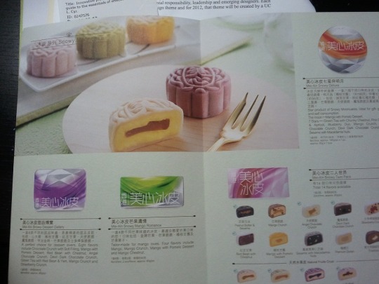
So with this example, in asian culture, the Autumn festival is nearing and around this time of year, mooncakes are being sold. I was shopping for groceries at a asion grocers in Dickson on the weekend and saw a new mooncake product on the shelf. The mooncakes were icecream ones and sounded intriguing to try.
What was also fascinating about this brand was the packaging they used. The pattern is 3D on the tin but it looked a bit like my design.The colour pattern used on the packaging combines an idea,of mine,of making a wavy form while the 3D pattern is the retangle shapes formed.
0 notes
Text
Style and Colour
This is touching upon the banner example I found which looks like this:
Link: http://www.123rf.com/similar-images/14233117
I've come to the stage now of picking some colours but I've also collected a few other examples that were under the same tag as the example above and having a look at how the colours are combined in these examples may help me get a good grasp on how to apply the colour in such a wavy overlapping design that is a little similar to my idea.
0 notes
Text
Banners
Researching banners for me has resulted in my many various forms of banners that I'm now confused as to what 'type' of banner I'm supposed to work on. A horizontal one or vertical one?
Horizontal
Ok, this one is a HORRIBLE example of a event banner in my opinion but I've been trying to find some with and example that has sponsers included.
These ones are a little better despite the picture being a bit blury but one can see the sponsers on the right, right?
Good examples with sponsors aligned horizontally along the bottom, which I want to do if the banner specifications require it to be horizontal.
This one has no sponsors but what I like about it is the vibrant colours and textures used on this banner. Especially how that the texture is a bit grunge like. The colour rand used in here is also varied and the since alot of reds and yellows are used to express 'energy' the blues and greens add some coolness to the energetic and warm colours.
And these are some styles I happen to come across whilst searching. They may help me in getting ideas.
I like this one since it can relate to my design
The example at the bottom has a nice colour cobination.
Vertical
No sponsers but the theme is nice.
It seems as though none of these have any sponsors but the arrangement of the information on them is nice such as the 2nd example above with banners on a wall and have images of artworks printed. I like how the info is placed on a black block at the very bottom, which balances out the design on the size of that banner. And the typeface used is of a thick san-serif which really works with what the banner is trying to promote since the logo on the left works with the chosen typeface and vice-versa.
0 notes