
dcampina
David Campiña
Becoming a UX/UI designer
13 posts
Don't wanna be here? Send us removal request.
Last Seen Blogs
myersnorine
Naughty Nono
myersnorine
Naughty Nono

thecollectedquotes
quotes, writings and poetry i like
minimumwagedbarbie-blog
tell me i'm your national anthem

dreamy-libra
☁️
Text
UX/UI Bootcamp - Week #7 Review: All journeys have ups and downs
This past week has been challenging. I was tasked with bringing to life a B2B SaaS product by myself and presenting it to UX/UI top professionals.
As the week passed by some problems started to arise, most related to my lack of productivity and my headspace this week. Having to quarantine, the lack of socializing, and the pressure of the project itself put me near a burnout that I did not know how to handle.
On the bright side of it, this has been a great opportunity to get to know me better under pressure or in difficult conditions. Now I know more about my flaws, and I can improve them for when, in the future, I face similar situations, handle them better.
For now, it's time to look forward to the last project.
1 note
·
View note
Text
UX/UI Bootcamp - Week #6 Review: The beginning of the end
This week we have been tasked with designing a B2B SaaS product. This is going to be our last and final individual project, in preparation for "the real deal" on weeks 8 and 9.
Among the different problems that companies may face, I chose to tackle the one that is affecting me the most lately: how to manage hybrid work. Since the pandemic upended our lives, employees around the world have settled into remote work. Now, as things start going back to normal, businesses around the world are also starting to think about the longer term, including alternative ways to structure work communication and hours as well as physical presence.
One of the things that I'm finding more difficult in this project is researching the business side of the problem to find opportunities that may satisfy companies and managers. Accessing management staff and inside software or solutions has proven really hard and time-consuming. Even though I'm delayed on my schedule, I had it planned so I can recover and get on track easily during the weekend. Better planning is something I improved on a lot during this boot camp.
We're here. Final solo project. Let's start putting all we know into practice. Jumping to Figma now!
1 note
·
View note
Text
UX/UI Bootcamp - Week #5 Review: Size does matter
Another Sunday, another throwback. This week we went out of the realms of the small screen to redesign a website of a small business or organization. With my colleague we choose to work on BCNCheckpoint's site, a non-profit clinic that focuses on LGBTQ+ sexual health and counseling that has been helping the community since the 90's testing for HIV and other STI's for free. We performed an audit, a tree test, and an open card sorting, and with some benchmarking of similar services and a bit of brainstorming, we came with a responsive redesign for the website. It was fun getting into the code more seriously and counting on the help of the web dev students, it's something that definitely I'll continue exploring in the future.
Now the big project starts! 🚀
2 notes
·
View notes
Text
Remote Contextual Inquiry: What is it and why is it popular?
A contextual inquiry is a mix of a user interview, observation research, and usability testing carried in the real environment of the user. Traditionally the researcher would go to their workplace and observe them as they perform given tasks while asking them questions. This allows you to obtain more context and insights than during a regular interview.
The biggest problem with this method is that it requires being physically present and the workplace, and pandemic aside, it's also not cost-effective. That's why remote contextual inquiries are becoming more and more popular. With this technique, researchers can screen-share with their interviewed users and observe their actions while asking them questions along the way, obtaining the same results but without the hassle of having to be present at their workplace and the cost-saving that this means.
Different from what happens with a business to user service, there are two kinds of users that can provide different perspectives on a B2B product: the business owner or the management team that will decide to implement and pay for that product and the end-user that will be using the solution. It is helpful to conduct this kind of interview with at least one representative of each type to get insights from both sides.
For this individual project I need to develop a B2B SaaS service, and I chose to tackle the trouble that some companies are having adapting their work environments to the new pandemic situation and the new dynamics of work in the office, with hybrid, remote and hot desk work systems raising every day and becoming the norm y the majority of the tech-related companies. To get more insight on how workers and managing teams are solving this problem and identify possible pain points and opportunities for improvement I need no see firsthand how they perform certain tasks related to this topic, as reserving working spots, meeting rooms, and so on. To do this my plan is:
Identify my target users, both management and end-user.
Conduct with them exploratory interviews to get more context.
Once reached the topic of how they perform the previously discussed tasks, ask them if they can show me how, either at that moment or later.
Try to get as much info as possible, identifying pain points and opportunities for improvement.
Process all the raw data in order to get to some research-backed conclusions
0 notes
Text
UX/UI Bootcamp - Week #4 Review: Choose your platform
Another Sunday, another throwback. We're now at the equator of the bootcamp, and it starts to get more and more interesting. This week's individual project consisted of launching an e-learning and subscription-based app in both iOS and Android. We were tasked with conducting competency research and benchmarking to identify features that could be implemented in our solution, as well as factors that could help differentiate us from these other players. As well, we had to develop a brand identity and a design style to complement it, always respecting the basic elements and guidelines of each platform. And all of this in less than a week. Crazy!
It's also been feeling a bit harder lately, but the motivation of doing what I love and seeing myself improving day after day helps me overcome these difficulties and enjoy the journey.

3 notes
·
View notes
Text
@Ironhack UX/UI Bootcamp - Intro to UI design: One design to govern them all
For this 4th week of the Bootcamp, we are tasked with designing an e-learning app to be launched both on iOS and Android systems. In order to understand the difference between Google's Material Design and Apple's Human-Centered Design, I had to do some research and analyze both design standards. Here you will find the top 5 guidelines that affect my ongoing project the most:
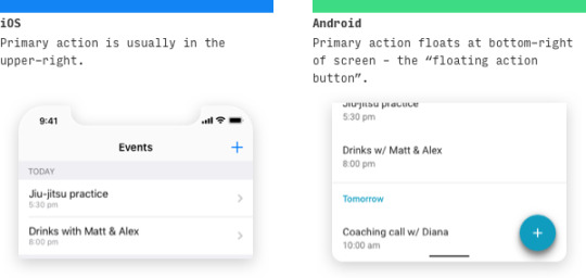
Tab Bar
Bottom navigation bars allow movement between primary destinations in an app, displaying three to five destinations at the bottom of a screen. Different platforms have different rules and they need to be taken into consideration. Tabs usually appear at the top of the screen on Android and the bottom of the screen on iOS. This has been changing since Android 10 introduced gesture navigation, getting closer to what Apple's iOS has been doing for a long time and leaving behind that classic bottom navigation control that left us fiscally a few years ago. Open any Google services app and you will see a clear example of this change.

Action Buttons
Action Buttons are those that communicate actions that users can take. They are typically placed throughout the UI. Buttons should easily discoverable and indicate that they can trigger an action, and both that action and the button's state should be clear. A button’s position and size should scale in relation to its container.
To communicate the key actions of an app Material Design on Android uses Floating Action Buttons, consisting of an icon (sometimes labeled as in Gmail), that floats on top of the main content. On the other hand, the majority of apps on iOS place action buttons on the top title bar. . The text on buttons in Material Design is usually all uppercase. Sometimes we find uppercase button text in native iOS apps too, but most often we find title case.
Touch targets and grids
According to Google's Material Design Guidline, touch targets are the parts of the screen that respond to user input. They extend beyond the visual bounds of an element. Both iOS and Android have slightly different guidelines for touch targets (44px @1x for iOS and 48dp/48px @1x for Android). Material Design Guidelines also suggest aligning all elements to an 8dp square baseline grid.

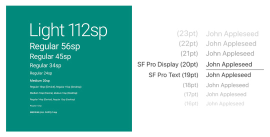
Typography
Historically Apple has used Helvetica Neue, however, in 2015 shifted to Helvetica-inspired San Francisco. Apple restricts the usage of the typeface and only licenses it to registered third-party developers only for the design and development of applications for Apple's platforms. Android on its side has been using Roboto, a neo-grotesque sans-serif typeface family, as the standard system typeface since 2011 on Android 4.0 "Ice Cream Sandwich". The entire font family has been licensed under the Apache license. (Take note Apple!)
The basic size of both the texts are similar, but Material Design android vs iOS has a huge difference in font sizes and their layout. While iOS mainly uses bold type to build the text hierarchy, Android uses more white space between texts.
Side menu
The hamburger menu, or navigation drawer as officially named by Materia Design, helps you save precious screen space, becoming one of the most popular navigation patterns for small and medium screens and a core component on Android. The drawer panel allows you to hide the navigation beyond the left edge of the screen and reveal it only upon a user’s action. The main downside of the hamburger menu is its low discoverability, and it’s not recommended as the main navigation menu, being more suitable for secondary navigation options.

10 notes
·
View notes
Text
The fine art of rethinking
It's really fun to see this kind of video and find the aspects of a design that are not working. Some of them are not as easy to spot through my inexpert eyes, but once pointed and explained they are so obvious!
But what impacted me the most was realizing how color stands more when there are more pixels of it, and how the designer corrects this effect. It's definitely something to keep in mind for the next project. I'll be also trying to read some of his articles on how to up-pop and down-pop text and the difference between HSB and HSL color systems.
youtube
4 notes
·
View notes
Text
UX/UI Bootcamp - Week 3 Review: Life in Technicolor
Without realizing the third week of the Bootcamp has passed, one step closer to the equator. This week's challenge was about integrating a new feature in a well-known app. My teammates and I had to find a way to convert Netflix into a language learning tool. After some research of users, competition, and Netflix itself, we came up with a basic user flow and some wireframes that we gradually converted into hi-fi animated prototypes. This time grayscale was not the endpoint. Finally some good all-fashioned visual design! 🥳 It was a good (and stressful) week, and I'm glad I got to work with my teammates and got the chance to know them better.
5 notes
·
View notes
Text
Learning to see
In order to develop a designer eye, an analytic way of understanding design, you need to train yourself through imitation. By deconstructing, analyzing, and duplicating great examples of design you will understand the decisions behind it. As the article sustains "By observing great examples of design with your own eyes, attempting to duplicate them with your own hand, you will feel, see, and eventually understand the invisible lines behind a great product". Once you understand these decisions, you can apply the same criteria to your creations, progressing and becoming better over and over.
But for judging what is a good or bad design it's important that you look at it with a critical eye, leaving behind your own personal taste or the idea of it being visually appealing. There are many ugly designs that work really well. Take Amazon as an example.
4 notes
·
View notes
Text
UX/UI Bootcamp - Week 2 Review: Sleeping is overrated
Another Sunday another throwback⏪. This week has been challenging for us all, as it was the first project we were doing by ourselves, all alone in the wild UX world, getting into surveys and personas, and understanding the basics of Figma to be ready for next week's hi-fi project.
As for me personally, it's the first week I'm starting to feel the challenge🔥, the pressure of deadlines, and the need for planning. And for this last one I learned an important lesson this week: plan your interviews🗓 and test, so you don't end up waiting around for someone to be available for you.
As a group, it was nice to see how we were all coming closer, helping each other, and giving constructive feedback. It's great knowing you have such an amazing team to work with ⭐.
5 notes
·
View notes
Text
UX/UI Bootcamp - Week 1 Review: Everything is gonna be all right (right?)
⏪ It's Sunday night and it's time to look back to this crazy week (that feels like a month) that just passed and how my life is changing.
It's been all about getting out of my comfort zone 😅. Anyone that knows me knows I'm not a fan of videocalls and my introvert and socially awkward self usually have a hard time meeting new people, even more, when not speaking my language, but I'm lucky⭐ enough I found a nice group of equally excited and motivated sweet people to share my journey with.
This week's group project was about getting into user research 🤓 with the excuse of elaborating a low to medium-fidelity prototype of a basic app user flow. After some interviews and assessing our data throw affinity mapping my fellow groupmates and I came with the idea of gamifiying water intake, as well as offering reminders and alternatives to improve people's water consumption. After some testing, we came with a final design and presented it to our classmates.
It's been nice to be able to work closely with my groupmates in such a productive and nice environment and to see how data and ideas start converting into solutions as you advance in the design process.
In the end, we all survived, becoming better everyday. I look forward to the projects to come! 💪
4 notes
·
View notes
Text
Things become real!
Today was my first boot camp day.🚀 After some introductions and a small ice-breaker (yes, again😂) we got straight into the theory. Today was all about the design process (Desing Thinking and 4D’s) and a baby introduction to heuristics and Jakob Nielsen’s approach with his 10 general principles for interaction design. The most exciting part of the day for me was being able to put it all into practice 🤓 in a group activity, giving me the chance to get to know more of my colleagues and to see some of my classmate’s approaches to it in the debate afterward. Let’s see what tomorrow brings!
6 notes
·
View notes
Text
The journey starts
Hi everyone! 👋 My name is David. I am 28 and from Barcelona, and about to start a UX/UI Bootcamp @ Ironhack. I am currently studying a BA in Graphic Design and wanted to broaden my knowledge and specialize in this field and make it my profession and career.
I am really excited for the things to come, and I'll be sharing here my journey with you all. I hope this becomes a space of encounter, debate, sharing, and mutual feedback.
Be sure to follow ➕ and see you around! 😀
9 notes
·
View notes