kidsintheattic-blog-blog
KIDS IN THE ATTIC
E-MAIL: [email protected]
22 posts
Don't wanna be here? Send us removal request.
Last Seen Blogs
lovesaghost
Anna

beatrix-kid
Geek Sh*t

rainy-poppy
Art and FanArt

dionnespet
Mistresses, TS, Maids, Sissies and Slaves
spider-shoes
I THINK THAT YOU'RE WORTH HOLDING ONTO!!
Text
Plasticharge
2013 We'll post more :)
0 notes
Photo


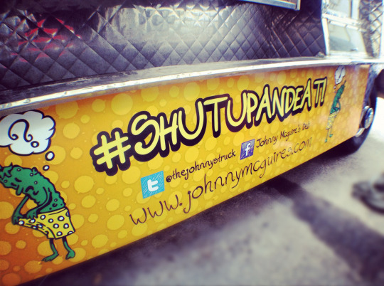
Johnny McGuires came to us a few months ago and told us they had a bought a food truck and were looking to go onto the streets of Vegas to serve us with their huge variety of sandwiches. They had a location at Town Square but closed doors and decided to concentrate on the food truck. Being featured on the Cover of the Las Vegas Weekly as having 1 of the best sandwiches in Las Vegas they wanted to ride on the hype and come full blast with their food truck.
Keith McCoy one of the guys who works over at Johnny McGuires came to us with the ideas and what he was looking to accomplish as far as design goes. We used a orange with a spot pattern that would be noticeable and slapped their logo huge on both sides. They wanted to keep it simple and clean and not too crazy looking driving down the street. The final result was better than what we originally had on our mind, vehicles always tend to look 10x better as soon as they are wrapped.
Johnny McGuires Truck will be at August's First Friday event serving you with some of the best sandwiches in Vegas. Keep an eye out for them as they will be updating you with weekly locations they will be at. We would recommend "The Trucker" or "The Olympian" as your best choices...but thats just our opinion, plus we still have to go through their huge menu list...now #shutupandeat
1 note
·
View note
Photo
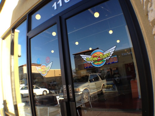


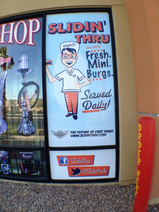
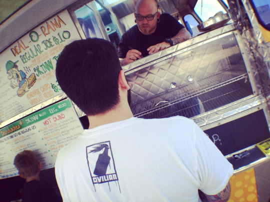
Went down to Slidin' Thru yesterday to see how the new TV menu we designed was lookin. Big Randy showed us a sneak peek of what its going to look like across all the tvs once they decide to change it out.
Over the years working for Slidin' Thru, they have become one of our favorite clients and any project they have we put hard work into making it look the way that their business is represented. We have done shirt designs, menu designs, flyers, uniform design and much more.
Kings of the Mini Burgs with no competition in sight.
www.slidinthru.com
2 notes
·
View notes
Photo

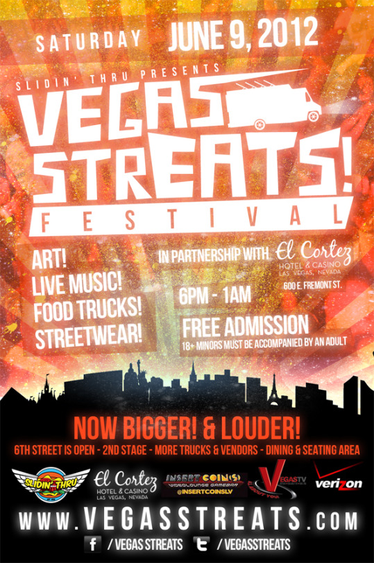


Tomorrow Saturday June 9th, 2012 is Vegas StrEats. A lot of people don't know this but we are the original creators of the Vegas StrEats logo and have always done 95% of all their flyers + other things they need for the monthly festival. Last month they approached that starting June they wanted to do a "Local Artist Shirt Series" and we were chosen to do the first one. We were excited and happy that the guys at StrEats would give us the opportunity so we came up with the idea of a vintage poster shirt design where the focus was on the fonts. Make sure to pick them up because they are limited to only 50 at $15 and they will go fast.
4 notes
·
View notes
Photo


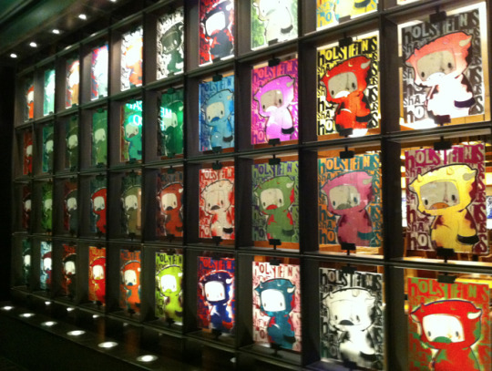

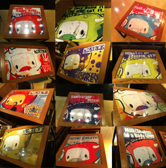

In January we were contracted by Block 16 Hospitality to come up with a new look to their Holsteins Restaurant in The Cosmopolitan and that they were bringing in Juan Muniz to help. We linked up with Juan and talked about some ideas and came up with doing his "Felipe" character which would look great in a cow outfit trying to blend in with the cows. He was in charge of doing 13 pieces to go above the tables and we were in charge of doing all the tables in the lounge + all the front window displays where everybody walks by.
We were not sure first what to do on the windows until Juan sent me over the drawing of the cow character and we liked the idea of a Andy Warhol like piece on all the windows. We went through endless swatches to come up with different color combos for each window and we gave it a hand painted feel to all the designs. In the end all 120 windows came out looking great. Dylan at Block 16 liked the way the windows came out so he asked us to do the tables in the same way but with each table having either a random quote or advertising on of their burgers or shakes. Our favorite one by far was the Captain Hook.
Check out all the photos on our FACEBOOK page and make sure to go down to Holsteins and check it out in person while you grub on some burgers.
2 notes
·
View notes
Photo

DJ Scientific approached us about an idea he had to have a trading card business card to resemble...wait for it...an old school YO! MTV Raps Trading card. The final result came out amazing and brings back memories for all the people who watched the show. DJ Scientific can be seen spinning at Palms Casino. Go show some support and get your trading cards.
321 notes
·
View notes
Photo

Retro Bakery needed a new half page flyer for customers to easily see what they have on the menu and take home for when they want to order some cupcakes. This was the final result for the best cupcake/bakery shop in Las Vegas!
8 notes
·
View notes
Photo

Lets hear from the customer on this work:
"Dangerous Vision is an advertising company started in July 2010. Bringing you the latest in action sports, models, street wear, music and more.Our Day of the Dead sugar skull logo represents the real weeding out the fakes. We asked for a simple but distinguishable design and thats exactly what we got."
0 notes
Photo

We were contacted by DXC to do their Boston, Fort Lauderdale, and Tempe event flyers.
DXC is an event for people who love to trade - sell - buy some dope rare and new kicks. If one rolls through town make sure to attend. www.dunkxchange.com
0 notes
Photo

A few months back Retro Bakery needed some big menus printed up to put up on their walls at their store. They have a great look and they are the Best Bakery in Town! Go visit them! www.RetroBakeryLV.com
1 note
·
View note
Photo
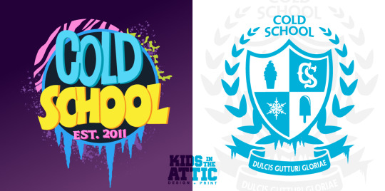
Everybody has seen the generic ice cream trucks around town and their ice cream helps the heat but they are all lame looking. In comes "Cold School" to fill that void. Now great Ice cream with a great look. We designed this school themed logo for them and they also wanted one that looked "academy-ish". Here is the final results. Can you guess what the left logo is based off of?
4 notes
·
View notes
Photo

P.O.L.O aka Poets Only Live Once released a mixtape last week "Versastyles" and we did the artwork for him. He got them pressed up and he is slangin' them for $5. If you don't have a chance to catch him at a show or at an event. Download it here for FREE. Front Cover Photo was taken by www.photofm.com.
4 notes
·
View notes
Photo

Hip-Hop Roots approached us for a Online Flyer + Ticket Design for their Jean Grae show. We saw the tour flyer that was done for their tour by the booking company and it was unacceptable, so we created a whole new design + Logo for their tour. Jean Grae is one of my top favorite artists out there so of course we were more than happy to do this. If you need Online Flyers made hit us up!
0 notes
Photo
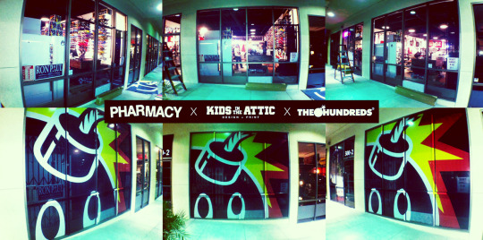
Pharmacy LV needed some Window advertising to let people know they are selling The Hundreds Gear. So we hooked them up with a massive view-thru install on their store front. Came out real good and super noticeable.
9 notes
·
View notes
Photo
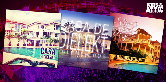
Some Mix Covers we did for DLKTK for his "Casa De Dielekt" series. The 3rd installment was just released for download off of his site and Volumes 1 & 2 are also available there. Go to www.dlktk.com to download them for FREE.
0 notes
Photo

The fellas over at Slidin' Thru needed some mini menus designed and printed so we hooked them up with the order. Here is the final design and to see them in all their printed glory head on over to HQ or at a Slider Truck Location to get a copy.
0 notes
Photo

DLKTK was in need of a pro presskit to send out to potential gigs so we put together a small photoshoot and put this presskit together for him. Go check out his mixes at www.DLKTK.com starting later tonight.
2 notes
·
View notes