#I did not want to colour it so basic flats and layer effects be upon ye
Text

“Janiris. It’s an asari holiday.” […] “It is mainly marked by a feast and the making of flower crowns and necklaces. Then exchanged between friends and lovers.”
The Untamed Effect, Chapter 6 by @thievinghippo
#my art#mdzs#technically mass effect but not really#it’s a mass effect au!!#the way I found this Fic right in the middle of my mass effect hyperfixation era just the perfect recipe for fanart#there were other scenes I really wanted to draw but the brain worms got a hold of paper flower crowns#maybe I’ll do the others we’ll see we’ll see#don’t ask me why I decided to draw a background#I did not want to colour it so basic flats and layer effects be upon ye#oops forgot the other character tags#wangxian#lan wangji#wei wuxian#a yuan#lan sizhui#technically#anyway I was using my comfort brush#to line it hmmmm#I really got to get more painting and shading practice#oh it’s been a while since I drew fanart for a fic tbh I think the last time was maaayyybeee for aftg?#no wait I think I did a CR one tooo#hiiii mutuals who I drew fanart for their fanfics mwah mwah
190 notes
·
View notes
Note
"Seriously I wrote a 2000+ word short story about a Cryptek looking for his Phaeron’s pet scarab that got stolen." WHERE CAN I READ THIS
Here you go. I’ll put it under a read-more so it doesn’t eat up space.
The facility was in an uproar. Sirens wailed, alertingeveryone within the surrounding area of the breach that was currentlyoccurring. Local PDF and members of the Adeptus Mechanicus skittered about inhurried formations, attempting to both lock down the warehouse and subdue theintruder with a flurry of panicked activity that was, said intruder thought,uniquely human.
He was not human, of course, and that fact alone had createdsome of the uproar that was currently raging on around him as he strode slowly,almost leisurely, through the metal-and-concrete confines of the building. Itwould have been quicker, perhaps, to simply exterminate the humans and thenproceed without any of the concurrent ruckus, but he wasn’t one for avoidablekilling.
He was Zahtek of Misaphris, after all, not some jumped-upSautekh lord with an ego complex.
Unlike other Crypteks, Zahtek wasn’t innately stooped andlow-set, instead opting for a deliberately tall, broad frame woven from darkenednecrodermis and highlighted with silvered strands. Excess ornamentation such asthe traditional postiche found uponthe chin of many a Necrontyr of individual rank, had been removed, as had hiscape and pauldron accoutrements. They served as little more than ornamentationon a body that was, in his mind, extravagant enough already. Besides, suchthings had no place in a lab environment where they might snag on equipment.
Which wasn’t to say that he had no interest inindividuality, however, because Zahtek did, like many a Cryptek, enjoy a senseof being outside of the political flow that led even the mightiest crownworldsaround in waltzes of political intrigue and subterfuge.
His aforementioned height and breadth were one such tailoredaspect, serving to both mimic his stature before the biotransferrence and allowhim to stare evenly into the eyes of demanding lords the galaxy across. He knewhow much those with designs of elitism valued something as simple as impositionvia physicality, just as he knew that many a noble had been verticallyempowered by their new, metal bodies.
He rather enjoyed denying them the novelty of both.
Zahtek’s eye was the standard, cyclopean Cryptek affair,although the traditionalist green hue within had been replaced by a flickeringblue-purple that roiled through endless shades and compositions like lightningbehind clouds. The same glow was present through his thick ribcage, shimmeringout from deep within his artificial core in a way that, were he feelingsuitably dramatic, he might say looked soul-like.
His interfacing tail, another component of most Crypteks,was coiled thrice neatly around his waist, which was itself wrapped with aplated, rear-oriented fauld-tasset combination made of smoothly interlinkingplates that flowed like material, halting just below his knees. Designed byZahtek himself and possessing of the ability to displace any kinetic forceevenly throughout its entirety, the garment protected both his legs and alingering sense of modesty he had never been able to get rid of, even aftermillions of solar cycles.
The only item the Cryptek carried was a long staff, tallerthan even his own eight foot height and fashioned from the same dark metal ashe was. An orb, roiling with the same colours of energy held within his body,sat in a cuboid frame at the top end of the weapon, framed on two opposingsides by a pair of long, angular blades that were slanted gently inwards, asthough forming a loose, triangular foci for the sphere in between them.
Zahtek used the staff now to slice off the corner of a largestorage crate, the dark blades soundlessly shearing the corrugated metal ontothe floor. Leaning down, he peered into the now-exposed box, his eye casting astormy glow upon its contents.
He sighed.
Machine parts. Not useful.
Where was it? Who would know-A lasbolt sizzled off his upper arm barely marking it, and he turned to beholdthe source. A human, pale and wide-eyed, clad in a basic uniform, was shakilypointing one of the species’ primitive weapons at him. A laspistol, if hisengramic databanks served him correctly. Basic but quaintly broad in potentialuses, the human weapons of “las” weren’t very good in small numbers. Not thatit would do to tell the human before him such; the poor thing didn’t look likeit could take much more stress before suffering heart failure. Instead hepointed.
“You.” His internal lexicon program, self-tweaked, easilytranslated his words into accented Gothic, his modulator rendering them deepand even, if tragically robotic. “Do you know where I might find-“He was cut off by the human screaming and firing its gun with terrified speedat his head, mostly missing him, though one shot pinged across his eye.
Another sigh, a mildly exasperated wave of his hand, and thegun simply liquefied, dripping apart in the human’s hands in a slurry ofdulled, heatless metal and oozing plastic. The human froze, and they bothwatched with silent attention as the laspistol’s battery pack, still intact,slipped through the human’s fingers and clattered gently to the floor.
Zahtek’s olfactory readouts informed him that the human hadurinated.
“As I was saying, could you perhaps tell me- ah, you’vefainted.” He said to the human, who was indeed currently an unconscious lump onthe facility floor. It wasn’t a lost cause, though; the sounds of booted feetrapidly closing indicated more of them approaching with some haste, no doubtdrawn by the gunfire. Would any of them know?
He highly doubted it.
With a mental command, Zahtek extended his audial receptorsmore widely, sifting through layers of sound data in an attempt to glean thequickest way to complete his mission. Rubber treading upon rockrete and metal,the hum of background machinery and basic environmental controls, the whirr ofmechanised limbs- got you.
Three of them. Partially inorganic. Talking in thatelectronic tongue of theirs – binaric.
A new heading located, the Cryptek started to march determinedlyonwards, around the mass of containers he’d been investigating and onto themain thoroughfare within the warehouse. It was a fairly simple, two levelaffair, with the ground floor being a long maze of stacked boxes and cratesrendered in innumerable sizes, and the upper area little more than an expansivecrisscross of gantries and walkways.
Walkways which, irritatingly, were currently teeming withhumans.
Zahtek assumed they were there to serve as simplisticspotters, designed to report his location to those he sought. Much like withtheir las weapons, he thought, they liked to make up for their individualdeficits with numbers. His theory was proven accurate when, no more than ahandful of steps out from his hiding place, a loud cry went up.
Quite suddenly he was being pelted with volleys of lasfire.
His irritation, an emotion that he quite wished he didn’thave but valued all the same by dint of simply existing at all, was growingwithin him. There weren’t a lot of humans, by his scan approximations, maybetwo dozen, but their erratic volumes of fire were flashing about his head andinterrupting his progress. Myriads of small holes were scored in his chassis,only to be quickly repaired, only to be inflicted again, only to be-
Irritating.
He didn’t want to fight the humans, he wanted to go aroundthem, to the sealed, hydraulic sliding door at the end of the ground floor. Thedoor with the mechanicus humans behind it. The door-
Crack.
Something that was not a lasbolt knocked his head sideways,jarring him out of his internal aggravation. He look up for the source of theimpact just as another one struck his shoulder, jolting him and leaving aswiftly healing crack in his pauldron. There was a human on one of thegantries, dressed in more elaborate clothing. He had a chunky, black firearm inhis hand. He levelled it for another shot, even as the other guns whined andburned at Zahtek’s body.
That was quite enough of that.
He raised his staff and slammed it into the ground, bladedend first.
The effect was instantaneous; as soon as the weapon’s focalorb impacted against the rockrete, shattering it like glass, a violent nimbusof purpled lightning exploded outwards from the point of contact, traversingthe entirety of the warehouse in moments with a low, threatening hum. Theartificial lights on the ceiling detonated as their circuits fused, airpurification units and power boxes overloaded in showers of sparks. The humanswere launched off their feet, propelled by the split-second convulsions oftheir muscles coming into contact with an electrical charge of immense power.Many of their guns blew up in their hands, the battery packs reaching aconductive cooking point instantaneously and melting down in little starburstsof red and orange. Not overly harmful, Zahtek supposed, but it stopped thelittle things from working.
The humans on the upper level had been hurled clear of theirfootholds, tumbling down onto the flat bulks of the containers below withvarying levels of force. He was pleased to note that the one with the largergun had missed the relative safety of such a landing entirely, instead fallinghard onto the floor at an angle that had snapped his neck.
Most of them would live. Some would not. It was more thanmost others would have done for them.
The now-dark building flickered sporadically as remnant arcsof his strike jumped between the metal crates and twisted in the recesses oflight sockets. He pulled his staff free of the ground, now buckled and glowingwhere he’d hit it, and marched as quickly as his legs would allow him to thesealed door.
It was quickly evident the lightning had all but obliteratedthe access panel to the room beyond the door, and for the third time in a shortwhile, Zahtek sighed.
Then, he raised his hand and knocked, calling out in araised voice.
“I’m going to enter now. I would prefer not to fight you.”
The Cryptek pointed his staff at the door.
“I advise standing clear.”
Lightning, honed to amolecular-thin tip, beamed in a jagged line from the tip of his weapon to thelock-seam of the door. Intensely hot, it generated a wash of vibrantly whitesparks that would have seared the retinas of a human into blindness.
Zahtek had the strangest urge to squint.
Layers of metal were burned away effortlessly as he directedthe crackling energy from the base of the door to the very top, analysing thematerial thickness to ensure he didn’t overshoot the mark and bathe the roombeyond in beyond lethal dosages of electricity. He didn’t want to harm hisprize, after all.
When he sensed, rather than saw, that the cutting processwas complete, he dispelled the lightning and wedged his hand into the still-hotmetal where he’d burned the door away from the wall, slicing the lockingmechanisms away so that it sat, heavy but free. Slowly, he pulled, readingrather than feeling information about weight and lode-strain, and altering theamount of force put into the action as required.
Gradually, he slid the door open, forcing it back into itswall recess with a grinding rumble. Only then did he behold the room beyond it.
It wasn’t very big, in all honestly, a few metres squared,more of a vault than anything else. Perhaps, Zahtek though, that’s what it was.Had the humans been hiding from him? He’d just wanted to claim the objectiveand leave. Why were they always so belligerently obtuse?
The humans in question, the three members of the mechanicus,were clearly dead; their bionics and mechanical parts fused and overloaded byhis initial attack in the main room. It was apparent, based on theirhalf-melted clothing and rigidly warped death-poses, that their bodies hadconducted the electricity much more intensely than the regular humans outside,and their hearts and brains had ruptured almost immediately. Zahtek feltsomething akin to regret at the unintended loss of life.
At least it had been quick.
Casting his cyclopean gaze around, the Cryptek felt a stabof concern. If his electricity had reached this far in, did that mean histarget was-?
“Are you in here? Are you… intact?”
He waited a moment, then tried again, grip tightening on hisstaff.
“It is I, Zahtek. I was sent to find you.”
Nothing, not a sound. Zahtek’s shoulders sagged in anincredibly organic manner that the transference hadn’t been able to take fromhim.
He turned to leave.
Then, one of the bodies moved. Zahtek started. He wasentirely certain the human was dead-
A tiny, mechanical chirp, slightly muffled, emanated fromunder the charred cadaver, along with a good deal of metal-on-metal scuffling.Zahtek made a relieved sound, lifting the corpse one-handed and tossing itaside like debris.
“Oh, thank goodness.” He scooped the scarab up, fingersgentle, and held it in front of his face.
It wiggled.
“You have no ideahow worried Lord Amenhotekh was about you!”
#Ask#Anonymous#This was me being caffeinatedly inspired for a couple hours#I know it has some definite repetition issues#It's just a lil piece I did for funsies
57 notes
·
View notes
Text

Producing our Sculpture - Workshop with Martin Copley.
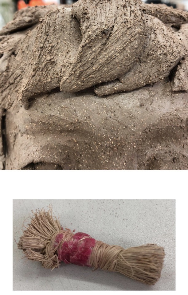
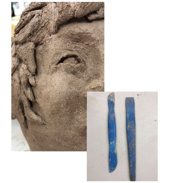
For our ceramics workshops, we worked with sculptor and artist Martin Copley, who specialises in sculpting human heads. He spoke to us about his work and his interests in ceramics, before starting with demonstrating to us how to sculpt a human head of our own.

We began with two balls of clay, slightly larger than the palm of our hand. We rounded these balls of clay and then made a hole with our thumb in the ball, producing what is known as a “pinch pot”, as we made the rim of the pot thinner by pinching and smoothing it out, keeping our thumb inside the pot. Once we had done this to both pots, we could then join the two together, making a ‘peanut’ shape, which we then rolled and smoothed to produce a head shape. Then, we used the crevice between our thumb and forefinger to produce an indent 2 thirds of the way down the head, which when smoothed produced the neck indent. From here, we now had a defined head and neck, and could then go on to build the facial features. To do so, we made a T shape in the centre of the head with our thumb and forefinger, producing two eye sockets and the base of a nose. At this point, we added the eyes - ‘2 eggs�� into the sockets, with ‘2 sausages’ above and below each ‘egg’. Then, we blended in the ‘sausages’, creating eyelids. Next, I built upon the nose, adding more to the bridge of the nose, then going in to add the tip of the nose and adding definition around the corners of the nose - called the ‘ala’. Next, I added two more sausages in the mouth area, with the one on top being longer than the one below, and blended these into the head, adding the philtrum to create lips. Although this was my first attempt at ever sculpting with clay, I didn’t feel as though it was as effective as it could have been and didn’t actually look entirely realistic. The lips seemed too small, and the eyes seemed very wide and close together.

After making the first sculpture, we were then instructed to produce a second head, this time much larger. To start the base of this head, we had to work slightly differently to when we worked on a smaller scale, this time building the height of the head upwards using thick sausages of clay as oppose to using two pinch pots joined together. Once the base of the head was built, the facial features were applied in the same way as explained above. This time, however, I had slightly more experience and understanding than the first, and found working on a larger scale much easier. To improve on my first attempt, I realised the eyes needed to be spaced much further apart, so did this on my larger head, making it look considerably more realistic. I also decided I wasn’t very pleased with the hair on my original sculpture and didn’t feel it looked very realistic, so instead opted for individual waves of hair which I applied, smudged and blended out, and then worked into with the hair making tool. I felt this looked very effective and I believe the hair is my favourite bit of the second piece.
From here, I also questioned Martin on more ways to improve my head and make it look more realistic, to which his response highlighted the fact that my larger head needed tear ducts adding, and the lips didn’t seem very well shaped and therefore decreased the realistic aura of the piece. To fix this, I added another ‘sausage’ above the top lip, blending it into the top lip and ensuring to add the philtrum again, which I was extremely pleased with; and also added the tearducts.
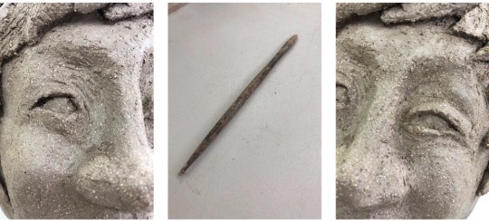
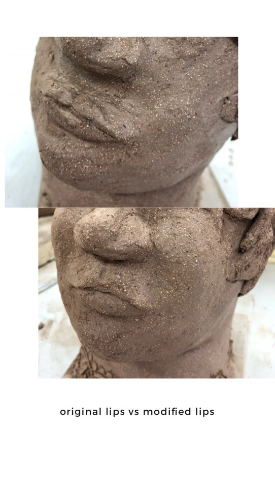
I then also added one more ‘sausage’ above each eyelid as I felt the eyes currently looked too sunken in, and after blending this out I was very pleased with the eyes and felt they looked very realistic. A final mistake I spotted, was that the face of the large head looked too flat, and therefore I added one ball of clay to each cheek and blended out, creating cheek bones. Doing so made the face really effective and I was now very pleased with it. The first image below is before all of these additions, and the one below is once all of these additions were added.

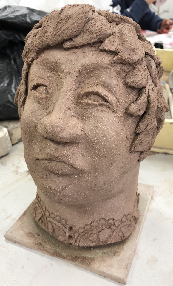
I properly made an attempt at thinning the hair that framed the face as I wanted it to be as realistic as possible and at the moment it looked slightly ‘blocky’, so I used a flat tool and a my finger to rub the clay from the top with the tool beneath, making the clay thinner. Doing so made the effect that the hair wasn’t just stuck to the face, instead it had volume and body of its own.
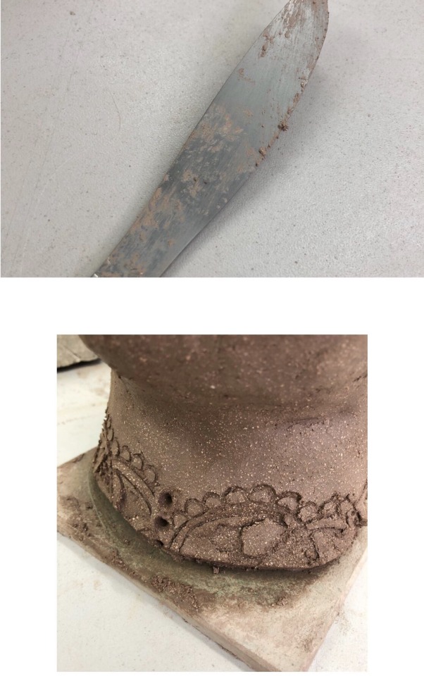
At this point, I asked Martin again for any other advice before I marked it as complete, to which his response was to just clean and neaten up the neck, as the rough edges would break off during the firing process. I cut the rough edges with a knife, producing a clean cut base, and then decided to add a pattern to the base of the neck, replicating a blouse to make the whole piece look more realistic. After adding ‘buttons’, I felt this was very effective and at this point I had completed my final piece.
The difference between my first attempt and second attempt is stark. I was actually very surprised, looking between the two, at how much it is possible to improve in a matter of hours/a day. The comparison can be seen below.

Surprisingly, I enjoyed the process and really enjoyed working at a larger scale. I found the methods of using the ‘sausages’ and ‘eggs’ easy to remember, and working with an artist who was also a teacher was considerably more helpful as he was able to give us helpful tips, ways of remembering things, as well as constructive criticism which allowed us to produce a better, much more realistic outcome. I don’t know whether I will be using clay again in my future development, but I was surprised with how pleased I was with my end result and enjoyed being thrown out of my comfort zone but in a relaxed manner.

Glazing
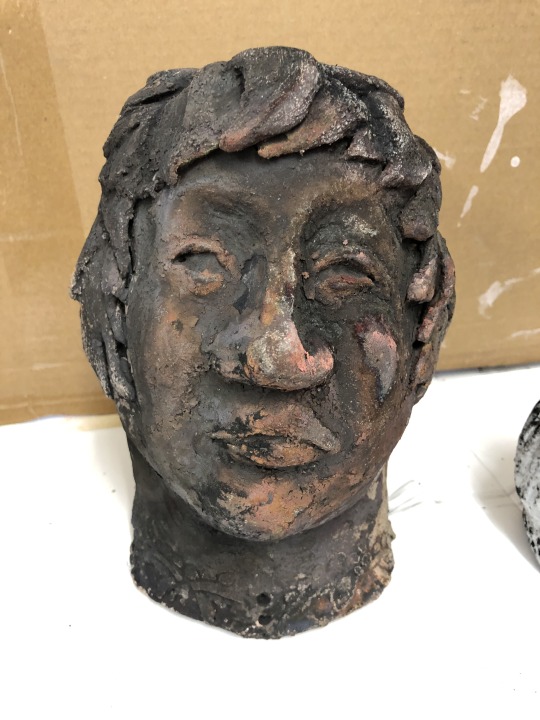
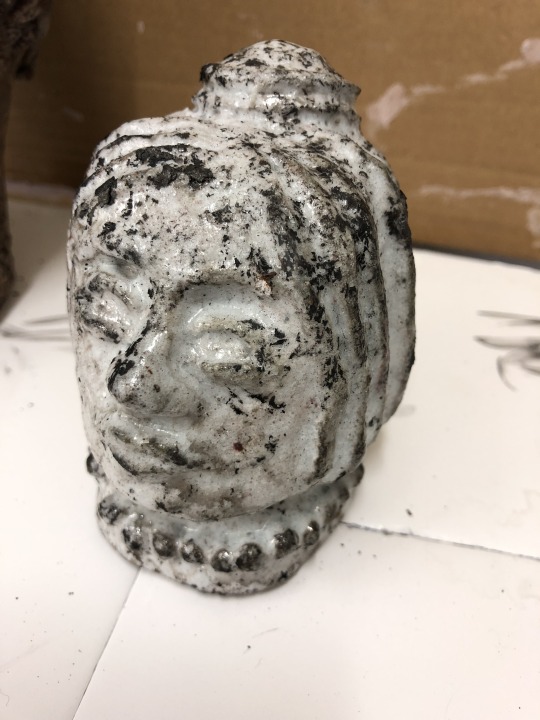
After all of our sculptures were finished, we then had to put them in the kiln to bake. We had the choice of glazing our pieces in black or white, or no glaze at all, which produces a ‘smoked’ black/grey/green colour. I covered my large head in black glaze and the tiny head in white glaze. We then transported them to Martin’s where we fired them in two separate kilns as not to get the glazes mixed up and ruin the colours.
Below is a step by step of the firing process:
After leaving the heads in the kiln, the heads are then taken out of the kiln and are put into an air tight metal case filled with wood shavings.
This sets the wood shavings alight as it removes the oxygen from the copper carbonate, leaving the copper behind.
When removed, they are then placed on the ground and are the correct colour as glazed. For the white glaze they remain white, and for the black glaze they turn a petrol spill colour due to the remaining copper.

Here is another example, this time using the white glaze in the white kiln.

Here is the outcome of my ceramic head workshops. I was more pleased with the black glaze outcome due to the petrol spill finish than I was the white glaze.


Second Workshop - Creating a Sculpture to be Installed in a Specific Location
For the second half of our workshops with Martin, he spoke to us about his inspirations; Sally Matthews’ ceramic installations in Grizedale Forest and the Prague Holocaust Memorial amongst many others. Our next instruction was to produce a sculpture to be ‘installed’ - via Photoshop, in a specific location. I took to Pinterest for inspiration, finding different types of sculpture which I felt were effective. I chose to produce an octopuses tentacle, which I would then edit around a boat in Photoshop, with my initial sketch inserted below.
I sculpted the tentacle, adding the suckers separately and ensuring to blend them properly to prevent them from falling off. Once I had done so, I then dried the sculpture with the hair dryer, as we weren’t going to be firing these small sculptures in the kiln. Unfortunately, once dried, the thin end of the tentacle broke off. I glued this back together using hot glue, but was left with a messy result. Then, I took images of my sculpture, seen below, ready to edit in Photoshop.

From here, I opened the most effective image into Photoshop, alongside an image of a ship wreck that I had previously taken.

On top of this I added an octopus skin texture which I had downloaded from the internet.

Then, I played around with blending modes in the same way I had with the abstract photography edits. I increased the brightness to 130 and the contrast to 100, then added a colour balance layer of 100 red, 83 green and 100 blue. Finally I increased the exposure to 0.28 and the contrast to 21. Now, I was pleased with the blue shade of the tentacle and the blending of the texture, I was able to “superimpose” the tentacle onto my image of the boat.

To start with, I brought the edited tentacle layer into the image, and duplicated this layer, then added a hue/saturation filter to it, removing all the colour from the shape to produce a black shadow. Then, I moved the two into position, removing areas of the shadow which weren’t needed, and adding a shadow from the base of the tentacle.

I realised, however, that due to the boat being on sand and not in water, it wouldn’t have made sense for the tentacle to be coming out of the ground, so I changed my plan, using a water background and adding more shadows in. I was much happier with this outcome, and whilst I felt that the octopus texture was too large, I still felt overall it was effective and I was pleased with the finished piece, seen below.

Life Drawing
To end our ceramics workshops, we finished with a life drawing using clay. Our model sat front on in a comfy chair for 2 hours, while we sculpted her and the chair. Surprisingly, I really enjoyed this and was very pleased with the start I made, however I wish we had had more time with her as I wanted to add details etc, but instead only got the basic chair and figure. Whilst we had the opportunity to carry on sculpting the day later, I didn’t feel as though this was as authentic as I wanted so didn’t add any more without the model present.

1 note
·
View note
Text
Weekend Top Ten #492
Top Ten Team 17 Games
I’d already been thinking a lot about old Amiga games this week, because news came out of the blue that some kind of Zool update was on its way. Now, I really liked Zool back in the day, and I thought that it was fondly remembered, but if the comment section on that Eurogamer article is anything to go by, I seem to be in the minority. I don’t care; Zool rocked and I’m glad he’s on his way back, with his sticky hands and feet and gloriously sugar-coated levels. Frankly, in a world that seems mostly populated by people who spent the entire 1990s playing Metroid or Zelda, I could do with an Amiga renaissance.
This was exacerbated when I discovered that Team 17, beloved purveyor of 16-bit computer classics, has an office in Media City. Quite how this passed me by I do not know (I, er, guess I just didn’t see the Tweets), but all the same it’s very good news; perhaps I’ll stop some of them in the piazza and bore them about the good old days. Especially if they’re, like, 25 or something.
Anyway! All this is a boring preamble to me listing my ten favourite Team 17 games. If you don’t remember, T17 was a major player on the Amiga: tons of classic games, phenomenal graphics, and – something I didn’t quite appreciate properly at the time – a nice Northern sense of humour. I don’t want to do much more preamble, because really I wanna let the games do the talking. One thing I will say, however, is I’ve taken advantage of their more recent moves as a publisher to include some games that they didn’t develop too – because I do feel like they’re really good at picking publishing projects that reflect the core tenets of their “brand”, such as it is (as opposed to Core tenets, which is probably something to do with Chuck Rock).
So here we go: my ten favourite Team 17 games. Enjoy! And bring them all out on the Xbox.

Alien Breed: Tower Assault (1994): the Alien Breed games were almost platform-defining, atmospheric blastathons that evoked the tension and exhilaration of Aliens, with superb (and difficult!) twitchy gameplay. Tower Assault, with its less linear, more explorative gameplay, was the best of the bunch. Back in the day, this was the equivalent of a Mass Effect or BioShock to me: an intense action game coupled with an enjoyable amount of back-and-forth. One thing I’ve always been a bit sad about is never having played the 3D Alien Breed games; I graduated to PC just as they were coming out, and I’m not even certain if they ran on an ordinary A1200. I wonder what they’d be like to play nowadays…?
Worms World Party (2001): how do you differentiate between the Worms games? I mean, I’m old enough to remember the “Total Wormage” demo that marked the first appearance of the little critters. But there was a point there when the gimmicks were still new, but they’d had a couple of releases under their belt, and there was a short run of games that were utterly hilarious, gameplay out the yazoo, and still a slight air of rough-edged weirdness. Can you still get the Yorkshire “Tykes” voice set in new Worms games? I mean, the formula is still unbeatable, but the Golden Age of Worms will be the World Party era for me, when my brother and I played it all the blinkin’ time. Get under that.
Assassin (1992): if Zool was the Amiga’s Sonic, then arguably Assassin was the platform’s equivalent to Strider or Shinobi (er, despite those games actually being released on the Amiga; never mind, just go with me on this). I remember the game mostly for its acrobatic movement, allowing you to climb walls (hey, shades of Zool again!); also, you had a boomerang, which is really cool, apart from when they re-released the game after two years and got rid of the boomerang. Basically, I really dug it for a lot of reasons. I also think it’s the Team 17 game which had an hilarious spoof of the “Reg” ads for Regal cigarettes, a joke I thought was incredibly clever thirty years ago but which I can find no evidence of on the internet.
Body Blows (1993): back when Street Fighter II ruled the world, and everyone was going gaga over the Super Nintendo, the Amiga suffered in comparison; it couldn’t do the multiple parallax layers of animated backgrounds, and most common joysticks didn’t have the button configurations to do the special moves justice. Step up Body Blows, a gorgeous, chunky, responsive fighter that’s still probably my favourite beat-em-up (I’m not the biggest fan of the genre, to be honest). One of the few games I remember really trying really hard to complete it, but I’m pretty sure I never saw the final opponent (some kind of Terminator-style robot, if I remember right). I always wanted the sequel, but never played it.
Yooka-Laylee (2017): feels a bit of a cheat, as this is really a Playtonic game, but they published the physical release, so it counts! And in many ways the cheeky British sensibility of the game fits right into the T17 ethos. I remember getting so excited for this game – I backed it on Kickstarter, in fact – and it didn’t disappoint: a colourful, meaty-looking platformer with a nice line in terrible dad jokes and a slowly-unfolding roster of abilities. It might not quite coalesce the way the old Rare platformers did in the late nineties, but it’s still fun; and it was a very popular game in our house with my wife and daughters.
Superfrog (1993): would probably be higher, as it’s thought of as one of the classics, but it didn’t quite hook me the way it seemed to everyone else. But even back then I could see everything about it that worked even if I didn’t fall in love; a beautiful, colourful world, with a tremendously designed lead character who looked like he’d leaped from a Cosgrove Hall cartoon. It also had a pretty naughty sense of humour. All in all, a good game, and one I’d love to revisit with a more refined palate.
Overcooked (2016): I think I first started to fall in love with this game when I saw it on Go 8-Bit; an anarchic and crazy-looking multiplayer fun-fest. And, sure enough, it’s a delightfully chaotic experience, really funny, with colourful and nicely-designed characters. However, it loses points for being one of those games that give you an odd-numbered Achievement. Multiples of five, people! Multiples of five!
Arcade Pool (1994): this one feels a bit niche, but I loved this back in the day. After the full-3D polygon wonderment of the Archer McClean pool and snooker games, going back to a simplified top-down aesthetic might have felt like a step back, but for me it was an excellent and really, really fun pool game. It’s the sort of experience I’ve chased in years since – a totally hassle-free arcade pool game – but nothing’s quite scratched the same itch (or, at least, the itch I remember, if that makes sense).
Golf With Your Friends (2020): the most recent game on the list, and another one that’s just damn fun. A wild and rather weird crazy golf game, with a succession of increasingly-bonkers courses, but one that’s easy to get into and – yes – persistently entertaining. I started playing it due it being available for cloud streaming on Game Pass, and it’s a pretty good phone game, even if the touch controls don’t give quite the nuance needed for some of the trickier shots. Also it’s worth saying that I am just terrible at the game. Really, the worst.
Project-X (1992): a bit like Superfrog, this is a game I respected rather than adored, hence it being a bit lower on the list. I think the big problem is just that I was utterly shit at it; I mean, I was flat-out rubbish at all these side-scrolling shooters, even if I really wanted to be good. But this game was a stunner way back when, and I think one of the ones that really cemented Team 17’s reputation as a graphical powerhouse of a studio. It also had a tremendous score from Allister Brimble, T17’s resident maestro. It’s funny, because I remember this as being heralded as “the new masterpiece from Team 17” upon its release, but it was actually one of their first titles; so either they hit the ground running or this is one of the games that secured their reputation. Either way, it’s still a classic of its type. And apparently there was a sequel on the PlayStation. You learn something new each day.
So I hope you’ve enjoyed this trip down Commodore Memory Lane. Yes, I know, some of the games are a lot newer than that, but I’m afraid I’ll always think of Team 17 as “an Amiga studio”. They did sterling work back in the day, they really helped define the Amiga and give the platform its own identity, distinct from consoles (even though a lot of their games were, obviously, ported to other systems). And thanks to the success of Worms, they’ve endured, even as most of their contemporaries have fallen by the wayside. And now they’re in Salford! A Yorkshire invasion of Lancashire. What could go wrong?!
1 note
·
View note
Text
Laser Love
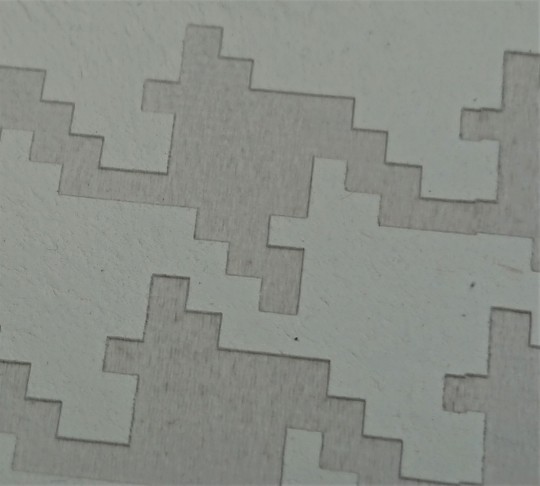
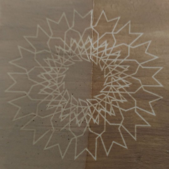
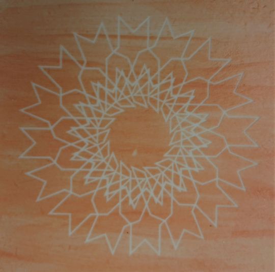
During the infuriating period of so many legs snapping off the extruded cuts, I came upon a revelatory idea for laser etching clay with the available facilities at Uclan. I had used the laser etchers to good effect whilst experimenting on my Surface Pattern course, partly etching mirrored acrylic to create unique effects. Therefore, I surmised, what kind of effect could be achieved on etching directly into clay? I could find no literature in the library but did find an individual online by the name of S.R.G. Bennett who had already attempted the technique at a basic level. Whilst the effect on clay wasn’t dramatic, it definitely made me feel that it was something worthwhile pursuing.
The three images below show Mr. Bennett’s efforts, with the top image being biscuit fired, the second wet clay which was then dried, whilst the third is greenware.


My initial difficulty in making this happen was in getting the laser etching technicians to allow me to put dry clay in the machine as they were deeply concerned as to the safety of the procedure. After consulting with them more, showing them the web page of Mr. Bennett, we agreed on a compromise that they would have a go at etching into clay providing it was bone dry. The resulting effect was very sharp and clear but did not penetrate the surface by a great deal.
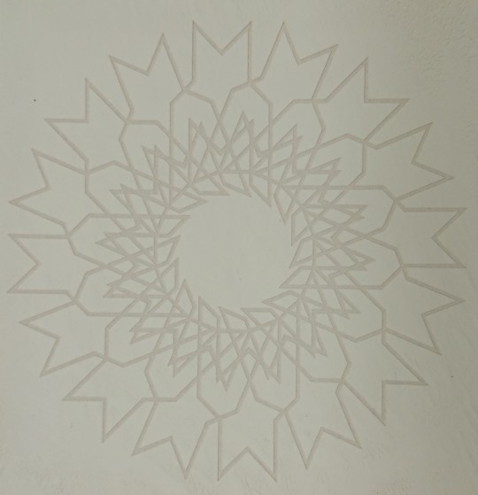
I used Special Porcelain to begin with for its smooth texture because I wanted to see if I could achieve a minimalist unglazed approach to continue with my aesthetic values. The designs were then created in Illustrator and passed onto the technician to do the etching. The results from etching directly into ceramic looked extremely impressive, with remarkably sharp edges to the patterns I had created and decent levels of contrast so that the pattern was quite visible.
After a number of experiments the below settings were found to be the optimum for etching porcelain:
Laser Raster – Ceramic Tile:
Print Resolution 300dpi
Velocity 200mm/s
Maximum Power 45Watts
Minimum Power 10Watts
Please click the link below to view the laser etching machine in action on my first tile:
https://drive.google.com/file/d/1xDWjoTz7k8IMiBRMpLXzDuSQJaQUVPUJ/view
And the results:
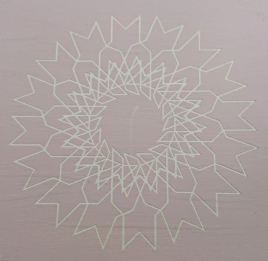
And another deign:

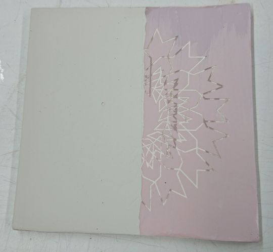
And a disseminated motif design:

Adding to the aforementioned power parameters I attempted direct to clay etching using one, two and three identical passes of the machine. Two passes turned out to be the Goldilocks amount, as one resulted in only a faint imprint, whilst three actually started to cook the clay, to the extents that a very fine layer began to lift and curl like a page from a book! I then dipped the tiles in a clear earthenware glaze and attempted putting a thin celadon glaze with a brush on some, then put them in for high firing.
Generally, I was not too happy with the results of the fired work, as I discovered that my attempts at brushing the glaze on thin just looked patchy on top of the etched pattern – this could possibly be remedied by spraying the glaze on. I also found that one of my tiles buckled/bubbled massively in high-firing (1260 degrees), to the point if forced the impression of the etch out! I wondered if this might be a common issue if I were able to produce more laser-etched tiles. If this turns out to be the case I will look into the possibility of using paper clay. As is pointed out in Interaction in Ceramics (1993), this would create a stronger tile and could also assist in the management of moisture for the tiles.


I have also attempted to find a way of adding pigment into the etch as can be done when using acrylic pigments for etching wood and plastics etc. Obviously acrylic pigment would be futile prior to firing, but after a chance finding unrelated to the technique, I discovered that there was a ceramicist who had achieved a form of pigment infusion utilizing oxides into the etching process. Her resulting pieces were rather excellent in my eyes and would have been somewhat perfect for creating my exacting geometric motifs, but alas, the technicians completely vetoed my ideas because of even greater concerns for safety and ‘flashback’ from the laser nozzle.

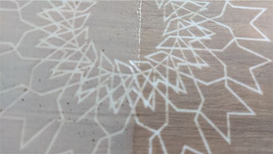
Whilst visiting the Earth & Fire convention I encountered a ceramicist called Chrisoula Konstantakou. She was exhibiting the works that were a result of her Phd in laser-etched ceramics. They differed to my laser experiments in that Chrisoula did not penetrate the surface to any real degree, rather she used the laser to pull out the minerals contained in terracotta clay, creating alternative colours and shades to the surface. The two images below show her work:


After deliberating my laser etching technique and discussing the limitations of using the laser etcher with Dave Binns (it can only etch on flat surfaces, so will only ever be truly applicable to flat tiles which are not particularly economically viable), I came to the conclusion that I would have to change my ideas slightly to accommodate better results and discussed the potential of developing a ‘Laser Sgrafitto’ technique, using slips and clay dyes to produce a thin surface layer that could be removed by the laser etcher. Dave thought that this could actually be a first as he had never seen the technique used anywhere before. Upon doing further research upon this technique, I discovered that it really has never been attempted before, so is obviously something to pursue with vigour!
For my first attempt at this, I mixed crushed porcelain with clay dye and dipped the tiles into the slip. The etchings were good with really sharp and distinctive lines, but not as effective as I had hoped for - I also received an apology as the slip had been chipped on the edges in several places ; ) The problem lay in the fact that the laser still didn’t have enough power to breach the layer of slip, so it was a touch patchy looking, with some areas still not removed. I went back to the technicians with the same design and requested that it be run with two passes of the laser as opposed to the one they thought would suffice originally. This yielded far greater results with precisely defined lines throughout and a good strong contrast between the slip and the etched area:

Returning after Christmas I found that the fired results were good, but wanted to see if the slip needed a glaze on top or not. I half dipped one of the tiles that didn’t have a good etch with a clear glaze to see the results:
I have decided that I prefer the unglazed portion of the tile, as the glaze lends a fuzzy effect that takes away the sharpness of the etching, so left a perfectly etched tile without any glaze - just have to improve my glaze application next!
0 notes
Text
Misandrist
My Role: Director of Photography
Director: Jobe Wolf
Brief Overview of Story: Misandrist is a story about two women who have had enough of men, they take a restaurant hostage to prove a point. The film is set in a theatre style setting, look into ‘Dogville’ by Lars von Trier for a similar style.

Heres a picture of our de-constructed set, ready for Act 2 (Picture by Anthony Dennett)
Pre-Production: During pre-production we discuss the general themes of the film and lined them up with our expectations of what we imagined the final image could be. First and foremost Jobe categorised the film as a Neo-Noir Thriller, this gave us a good base to build the film upon.
For this we wanted a good image to work with in the edit, we wanted good quality and lots of information which is why we chose the Panavision Genesis with the Codex pack. This gave us the option of shooting 1080p 4:4:4 12-bit, which is an incredibly data rich image. The only drawback to the Genesis is that low light quality, well the fact that it has to have a lot of light in order to produce a clear image. If it doesn’t have enough light the image is incredibly noisy.
Similar to Radio City I was torn between two lenses, the Zeiss CP2′s (again with Black Pro Mist filters) or the LOMO lenses. This time I went for the LOMO’s, mainly for the advantage of 27mm lens which I thought would be useful. Someone also pointed out to me that it was a beautiful lens, to which I agreed after testing.
Jobe wanted to had some split focus shots where we had one character in focus in the foreground and one in the background, there are two main ways of doing this. One method is comping two images, once you have a frame locked you leave the camera there and shoot the scene twice with two differing focal points and then comp the images together in post. The other method is split diopters, this is a piece of glass that goes over the lens which changes one half of the images focal point. These are very tricky to get right but a good skill for everyone involved to learn. We went with the diopter option, I like doing this practically. Below is a picture of a split diopter.

(VashiVisuals)
As we knew we wanted a noir feel to the picture I did some research into noir style lighting because I haven’t done it before. I found an article on filmmakeriq.com and it stated that “In Film Noir, the most prominent lights are going to be strong keys and back light. Fill light is not as dominant as we want to exaggerate the contrast and get that low key look.” ("The Basics Of Lighting For Film Noir | Filmmakeriq.Com")
After the research myself and Jobe started going through the blocking for the scene and creating a storyboard so we could get a plan down that everyone could follow. This was also so I could see where the action was going to be so I could assess where I thought the lights needed to go to light the scene.
The film was broken down into 3 clear acts, I will break down the lighting for each act.
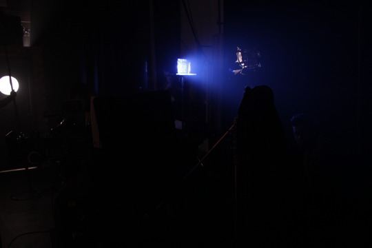
Act1 - This act Jobe wanted each part of the action to be surrounded by complete darkness so for each table we had a Source 4 spotlight rigged directly above and pointing straight down on the table below. This was our main source of light, we used a lighter coloured table to reflect light back into them from underneath, I also used haze to make the shaft of light stand out from the darkness too. I also placed some cyc lights on the floor, which were fed through the dimmer desk. These were shone into the drapes in the background, this helped to lift the amount of light in the scene so we didn’t get as much noise in the final image. In the grade we will bring down these areas to complete blackness.
Act2 - The main source of light in the act was the window, I put a 2.5k HMI through one window, which had blinds on to create the blinds effect over the faces of actors and on the floor too. Alongside this I used a 1.8k HMI through the door window, which had diffusion on, to continue that bright outside look.
I had a Kino with 1/2 CTS (Colour Temperature Straw) on the far side, this was to emulate some of the practical lights from inside and to fill the faces from the other side with a small amount of light. I didn’t want to use the fill too much because I wanted a high contrast ratio in the faces. Again I had cyc lights on the floor, shooting into the drapes around the side to lift the ambient light to reduce noise, we also had one behind the bar to make the bar stand out from the drapes too.
We used a lot of practical lights for this scene, below is a list of where and what we used:
- 5 x 2ft fluorescent tubes with CTO, under the bar top to downlight the bar and behind the hostages to backlight them for closeups.
- 2 x LEDgo panels below the bar shelves to uplight the bottles, create some interest in the background.
- 2 x 2 banks of 100w bulbs in uplight fixtures on the flat above Donny and Magda.
- 4 x 60 w vintage bulbs hanging over the bar, to create interest and backlight character standing at the bar.
- 3 x 60w vintage bulbs hanging in the middle of the set above the girls table (Although we couldn’t adjust these into shot so they were used as ambient in the end)
The following link is to a small video I made out of the lighting tests I did for misandrist, the footage is in black and white because this is how I want my final version of the film to look:
https://youtu.be/F4Mt0HR_XuU
Production: During production we had the camera mainly on the fisher 9 dolly, this was to make it easier and quicker to move into position. We also started with some tracking shots and a 360 degree shot around the table with the two girls on. This was difficult, a good challenge and the results are great!
We had a set back in the first day so we were a little bit behind from there on in, we still got it all shot but were always chasing our tails and maybe didn't have enough time to finesse some shots as I would have liked.
In the first act we had more complicated shots than in the second act, more tracking, the 360 shots and the split diopter shots. This made the first act more challenging, in a good way.
It took us a long time to get the split diopter shots right, you have to line up the edges of the diopter itself in the right place, have the actors at a correct distance apart to get the focus right and not have any part of the actor or prop cross into the other half of frame. I decided that I liked props and actors hands crossing over, I felt it added something to our project that isn’t really done.
Lighting was relatively easy for the first act, the Source 4′s were pre-rigged and fed into the dimmer desk, this gave us control of the intensity but they were in a fixed position. The diopter shots involved having the foreground already lit then at a certain line of dialogue the background Source 4 was raised in intensity to reveal other characters.
In the second act we had to move, lower and change angle of the HMI’s shining through the window depending on shot, we also had to move the Kino inside to help fill the faces. One major mistake I made in pre-production was not testing what we could see through the window in the camera. This set us back a lot of time because we had to blackout some of the stands, other things behind the window to stop it from being in view.
Also, during the second act, I had two silver boxes made which we then shot 2 5k lamps into with a Medium Blue gel these silver boxes were mounted so they could spin. This gave us our police lights that come into the scene at a specific point. There would be a dialogue cue for the sparks on the boxes so they knew when to spin them.
Our police lights in action, this was spinning to create the revolving effect of the light (Picture by Anthony Dennett)
We used a hazer throughout to give the scenes more of an atmosphere and so in certain parts you could see the streaks of light shining through the haze.

Gaffer Dave and the sparks, Connor and Conna, getting the hazer ready for the day ahead( Picture by Anthony Dennett)
A big issue we had was with the green screen when shooting the boys, I’ve never shot green screen in a project before. The issue came when we were using the split diopter against the green screen, there was too much noise in the image which meant keying was difficult. The advise from the VFX team was that we should have shot it in layers, first the background, then the rear action then the foreground. In future I will know this. Check the following post to view a short clip showing the noise, split diopter and green screen.
Results: The final look to the film is close to what I wanted, and to what Jobe wanted. The special shots we used ended up looking great, the 360 shots and the diopter shots.
The footage is looking good in the majority, there are bits that I have re-watched that could be framed slightly nicer and the use of some bounced light just to lift faces in a few shots would have been great.
Below is a link to the video page fro Misandrist’s Facebook page, the trailer is viewable here:
https://www.facebook.com/pg/misandristfilm/videos/?ref=page_internal
The following link is to the picture locked version of the film on Google Drive:
https://drive.google.com/open?id=0B5OozGUVLX26LXc1MC1xRE5Qb1E
What I’ve learnt: I’ve learnt an incredible amount from this experience. Technically, I’ve learnt more about the Genesis camera, LOMO lenses, 360 tracking shots (and cutting them together) and a lot about split diopters too. These will all be very useful skills for the future.
I’ve also learnt about timing and that complicated shots need extra time planning into them, this may sound obvious but an extra 20 minutes planned for can always be a bonus.
Another thing i’ve now got a better understanding of is the amount of light needed for older cameras. They do need a lot to get nice image. Off the back of this I now know that its better to have too much light to then be able to take some away quicker than having not enough light and struggling to pump any more in. This can save time when shooting!
The 180 degree rule was another thing I learnt a lot about. Firstly on the 360 degree shot when we came to finish the move we realised that we needed to be over the correct (by correct I mean opposite) shoulder for it to make sense, otherwise it would look like the characters were both sitting on the same side of the screen. Also, I broke the 180 degree rule with the boys conversation with the waitress. It starts off on one side of the line, looking towards the window and outside, then we switch over to the other side for the conversation with the waitress to include her in the frame. I think I broke it in a way that makes sense to the audience because its almost like a reverse shot so everything is flipped and there is a different background.
I learnt a great deal about green screen and the easiest ways to shoot it, layering images is the easiest way currently, so taking this information forward will be a great help indeed.
Next Time: There are so many things I would like to improve for next time here is a list of them:
- Spend more time testing and refining before the shoot. Test everything even if you’re told its fine!
- Use a better equipped camera for the job. The camera was great but for this low key lighting set-up it struggled in some circumstances. Choose better for the situation.
- Plan in more time for tracking and diopter shot in future, regardless of how easy the shot is.
- Shorter takes. We did a lot of takes that had a lot of dead time in them, Jobe wanted these to get the reactions of all the characters. One or two takes per character was all we really needed though, not every time. This would have sped us up and given us more chance to finesse certain shots.
- Don’t panic. Panicking leads to making mistakes and wasting time, I know there was one point where I started to panic and rushed a few shots. I think you will be able to tell in the edit.
- Shoot the green screen in layers. Background plate, background action, foreground. And make sure there is as little noise as possible in these green screen shots.
-Rely on my Gaffer more. I tried to take on too much and do lighting tasks myself, I should have delegated better to Dave.
Peer Reviews:
Lily (Production Designer) - Josh was a very reliable member of the production team throughout the whole production period. It is important for a DOP and Production Designer to communicate throughout, and Josh definitely made himself available if I ever had any queries or concerns. We agreed from an early stage that the colour palette and minimalist set would work well from the start, and josh was able to determine crucial set marks for tables early on in the set build which was a great help. I would be very happy to work alongside josh in future productions.
Dave (Gaffer) - Josh was DOP for Misandrist, he is always well prepared and knows exactly what he wants. Being a spark at heart, he started to try and help us do our jobs instead of being telling us what to do, so I had to tell him off a couple of times because I didn't want him getting distracted. apart from that he was an absolute joy to work with over the course of this shoot, always working with a smile on his face no matter how challenging the shoot became.
Misandrist Bibliography:
Brown, Blain. Cinematography: Theory And Practice. 2nd ed. Focal Press, 2012. Print.
VashiVisuals. Split Diopter. 2013. Web. 10 Apr. 2017.
"The Basics Of Lighting For Film Noir | Filmmakeriq.Com". Filmmakeriq.com. N.p., 2017. Web. 27 Jan. 2017.
0 notes
Text
New Post has been published on Add Crazy
New Post has been published on https://addcrazy.com/splendor-why-all-of-the-pink-lipstick-women/
Splendor: Why all of the pink lipstick, women?
Looking the Oscars 2017 pink carpet, it turned into obvious that black ladies were embracing the nude lipstick trend. There was lots of understated makeup.
It was a comparison to the non-stop parade of purple lipstick noticed on Kenyan girls each time there is an occasion, crimson carpet or now not. My personal first come upon with lipstick worried a gash of vampy pink, stolen off someone’s dressing table. It slid on my lips results easily, leaving a streak of shade that took all the time to wipe off. I was possibly 9 or 10. It becomes very adult, in the form of the way a girl who entertains and charms male callers might put on. It becomes the instant I realized I had complete lips.
Even as there is a set of budding Kenyan threat takers, there are, in fact, only a few ladies who take Splendor risks. I agree that purple lipstick is a classic. This doesn’t suggest it ought to be the best weapon to reach for in a world where there are infinite opportunities.
Kenyan Splendor traits have a very strong American leaning, prompted by pop and movie star way of life. It helps that they’re so true at breaking down tidbits and sharing Splendor statistics. Currently, we are going via a West Africa, or greater particularly, Nigerian-stimulated Beauty section with dramatic, sculpted, specific before and after appears doing the spherical on social media. As it’s miles, the local fashion look books are caught on the same page, and it is a spectrum of crimson. Red, from the faintest hue to the boldest private coloration of plum, is expected as a 2017 lipstick fashion. Assume it to slowly and regularly pick up followed via a mass eruption. fashion indicates and crimson carpets are preferably the places to pick out trends. They fall flat on ours each single time with the same lip color replicated irrespective of the skin tone. No matter nude being the new red, it has but to be embraced absolutely and done nicely. The ombre fashion wherein two or greater colorings are layered and faintly blended to create depth is reserved for talent exhibit on Instagram, however hardly ever witnessed in real life.
yet darkish skin tones can deal with a whole range of rich pigment. dark skinned women can wear fuchsia, magenta, and shades of orange. With YouTube Splendor vloggers teaching the arena the way to put on make-up, the upward thrust of naturalists growing new seems for themselves and other brown sisters as well as Beauty conscious black women, it’s far clean the worldwide fashion is all about ladies getting into individuality and well past conformity. Basics consisting of lighter sunglasses make lips fuller and darker shades lead them to appear thinner is getting became on its head. African women are deliciously mastering that they do now not must put on secure, light, quite sunglasses of crimson, lip balm and gloss or nothing, however, the purple own family. And, just because a color does now not be just right for you, does no longer suggest you need to throw it out. now not on this age of blendable sun shades.
Why, you ask, does lipstick remember? because the first-rate merchandise for girls of coloration has a tendency to be those made by using women of color. Large brands need to make a bigger effort to embody the complexity of African skin tones, something smooth to figure with the complicated shades of nude, a few with the prestigious capacity to go away us searching like we need to chomp on brains. Whilst women damage rules with something seemingly minimum like disturbing lipstick colorings, they’re in a role to invite for greater of themselves, each other and huge commercial enterprise. Lipstick lets in women to weave inside and out of various personas, experience themselves as amusing, flirty, mysterious, sensual, playful, naughty or quality in a tiny hand-held tube. Except, the identical lipstick has a tendency to look very unique on each lady.
style magazines choose up hair, nail polish, make-up, eyebrow and lipstick traits off the red carpet. This year There was a lot of nude shades and slightly any make-up, a hallmark that the no make-up trend is making a return.
A celeb manicurist recently found out Whilst she works with Oscar nominees and she or he has an experience they may be going to win, she paints their nails nude. Motive being she does now not want the nails to upstage the Oscar statuette within the pix. She did Lupita’s nails the night time she won her pleasant Supporting Actress Oscar.
Oscar pink carpet seems are playfully predicted and anticipated the week before with the aid of fashion magazines, websites, and blogs. That is typically primarily based on an actress’s’ personality and former purple carpet fashion picks. Nobody was given any in their predictions proper.
how to Pick out the pleasant crimson Lipstick
it’s miles very essential to Choose the satisfactory crimson lipstick. women love to position on makeup but While it clashes it may be much less than complimentary. The purpose of wearing these merchandise is to factor out the natural Splendor of the lady’s facial features. simply the right contact at the lips and across the eyes could make any girl appearance beautiful!
girls who’ve olive pores and skin will need sure sunglasses to point out their natural Splendor. Olive colored skin will look extraordinary with some of the hot sun shades of crimson. A bit orange undertone may be the correct contact for women with this kind of pores and skin. wearing the quality crimson lipstick to your olive pores and skin will come up with a horny, even individual, appearance. Coral sunglasses are usually best for women with this form of skin. however, if you have the character to go with it, fiery sunglasses can make you stand out in a crowd. it can have the orange or yellow undertones as well. Without a doubt the darker the skin, the brighter the product may be and nonetheless be very tasteful and beautiful.
girls who’ve faded skin are classified into two lessons. One type of faded look has bluish tones and the other has a warmer tone. For women with cool colors, the fine purple lipstick for them can be sunglasses which might be very close to pinks, blues, teals, or white. Pick out the types which have blue undertones. The lips will not appear like blue, but it will convey a touch of that undertone.
And for ladies whose, faded skin has heat undertones earthy shades can have a wonderful effect. Mustard, terra cotta or rust might be some of the higher shades of reds for them to put on. Deciding on the proper sunglasses will brighten the complete face and change your common appearance. Maximum of the time mauve or berry shades will work well for each of those types.
What approximately the girls who’re extra of a medium tone? What are they alleged to do to look as lovely as the other girls? they may be not out of success; go along with sun shades of brown for the excellent look.
As you could see there definitely is something for everybody with this product line. it is all approximately Deciding on the colours that move quality together with your pores and skin, hair and eyes. Locating the right combination is properly worth the time invested. Attempt a few out, and do no longer be afraid to Attempt a couple that is not normally cautioned for your skin kind. It could be that your complexion can nonetheless take care of the compliment! those are some ideas on the way to find the exceptional pink lipstick to be able to work for you.
https://addcrazy.com/
0 notes
Last Seen Blogs

foreverdreamingofu-blog1
Untitled

linenerve1
The Love of Powell 510

sugraalan-blog
Untitled

ofmalevolence
Faery Queen

our-rang-blog
ARCHIVES of RANG