#and I don’t mean the 3D artists who are thinking they are superior to their seniors oh no
Text
Sometimes I wonder if 2D artists, and I mean the OG’s who’ve been in the industry for awhile, heavily dislike upcoming 3D artist. Cause, let’s be real, 3D and now AI is dominating the industry. The thing is, the art form and technology is evolving and thus we have to with it. It’s only a matter of time when the tools you use now won’t be useful in the near future.
“But the new art/movies are looking boring/too perfect and I dislike 3D” that’s why I think we should learn these tools and use them in a revolutionary way. That’s why I think “Into the Spiderverse” was so successful for example.
#sitting at work all day makes me think things lol#this is particularly not directed at anyone but my endless thoughts#will be making a separate post on that hehe but#I started working at an animation studio where I am only one of the few 3D artists#and we’re all super young#and the reason I studied this was because sadly the 2D art form is dying#hear me out#almost no ‘good’ studio is working like Disney did years ago#now we all use digital#all the artists who wanted to do their work HAD to learn how to animate in 2D#hell even most show today are not animated frame by frame#so yeah I am wondering if these people#(men who are dominating this industry)#dislike 3D artists#who come into such a workplace with this knowledge that they don’t (yet) have#and I don’t mean the 3D artists who are thinking they are superior to their seniors oh no#you should always respect your seniors#but only if they respect you too though#anita rambles#3D Art#2d animation#3d animation
2 notes
·
View notes
Text
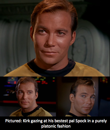
Review: Star Trek - The Original Series 'The Squire of Gothos' (S1 Ep18)
Trelane obviously has done his homework on humans, but he failed to learn the most sacred rule of human civilisation:
You don’t get to pick your own nickname.
It is a depressing thought that an outside vision of Earth would see war as our primary pastime, our way of being. But while Trelane gets the pattern right, he definitely misses the substance. War is not a feeling. It is something that happens to us, but it’s not the complex web of love and fear and hope and anger that constitutes our experience, whether in wartime or peacetime. Even when Trelane gets angry, it’s ultimately a shallow imitation. He says he experienced genuine anger, but for all his dramatics he never accesses the ‘real thing’.
Still, even as the episode positions the crew of the Enterprise as morally superior to Trelane, it does serve to poke holes in the ideology of the Starfleet. The phasers are notable for having a non-lethal setting, but they *can* kill. And Trelane’s demonstration of their power is chilling. Of course, the most disturbing element is Trelane’s giddy enthusiasm as he murders helpless creatures for no reason, when we have seen much more restraint from our heroes even when in direct conflict.
Every episode, the show announces that ‘space is the final frontier’. This statement evokes feelings of adventure and discovery. But, the American frontier was a violent conquest. The mission of the Enterprise, and its calm thoughtful realisation, might seem completely opposite to the lawless brutality of the wild west (that is to say, how it is depicted in film, the real history as I understand it, while very brutal, was much more complicated). However, the essential principles are similar: they are colonisers, never questioning their right to be cover new ground, and to settle wherever they please. Even if it’s relatively bloodless, I’d argue that it’s still violent.
Of course, a frontier does not have to be spatial. The frontier in the Star Trek universe is more one of knowledge (especially as the show so far can’t seem to decide if the ship is exploring mapped or unmapped territory). Acquiring knowledge about other species and planets is sort of gestured at half-heartedly within the plot, but really just like any good science fiction work, Star Trek deals with problems of human nature.
Even in the ostensibly ‘sillier’ episodes such as this one.
Some more thoughts:
I fully expected Desalle to bite it in this episode, he just exudes deadshirt energy and somehow he survived? Somehow everyone survived?
(Well, everyone human. R.I.P. Plum’s ex-girlfriend).
Actually wasn’t that creature the last of its kind? Did Trelane commit genocide??? It certainly fits the theme of the episode.
I noticed that Spock seems more comfortable in his position of authority here. It’s a nice continuation from Galileo Seven.
I love that this show seems fixated on two things: finding any excuse to dress up the women in period outfits, and undressing Kirk as much as possible…
The ending is obviously very similar to Charlie X, thank the PTB for deus ex machina eh? I do think Squire of Gothos is a better episode, although I did actually manage to have sympathy for the highly unlikeable Charlie at the end, who seemed genuinely terrified at going back to a life without love or affection, whereas with Trelane it was just a tantrum at playtime being over. It was appropriate of course, but by that point I was ready for it to be over tbh. I did love the spotlight focussed on Trelane and then slowly disappearing. It was a very appropriate artistic choice for our dramatic antagonist.
Queer Trek Corner:
How does this show keep getting gayer??? I realised I needed a dedicated section to keep my thoughts straight.
Not that my thoughts are ever ‘straight’ of course...
While Spock’s turn-on is obviously Kirk beating him at 3D chess, Kirk’s is evidently Spock delivering sick burns – which he does several times to Trelane in this episode. Here, Kirk gives Spock the most adoring look I have ever seen on a human being I MEAN COME ON THAT IS NOT A HETEROSEXUAL LOOK
And when Trelane attempts to force Kirk’s compliance, from a room full of onlooking crew members, he chooses to threaten Spock.
I’m sorry, it is a truth universally acknowledged that the villain will threaten the hero’s love interest. It’s a tale as old as time.
Now, Spock may not be a helpless damsel
-- I mean except in certain fun role-play situations… too much? --
but the effect is the same.
I think this could easily be one of my favourite episodes of season 1, but time will tell!
Next up: Arena
#star trek#star trek tos#squire of gothos#first time watching#review#spirk#colonialism#frontier what frontier?#join an improv class Trelane
19 notes
·
View notes
Text
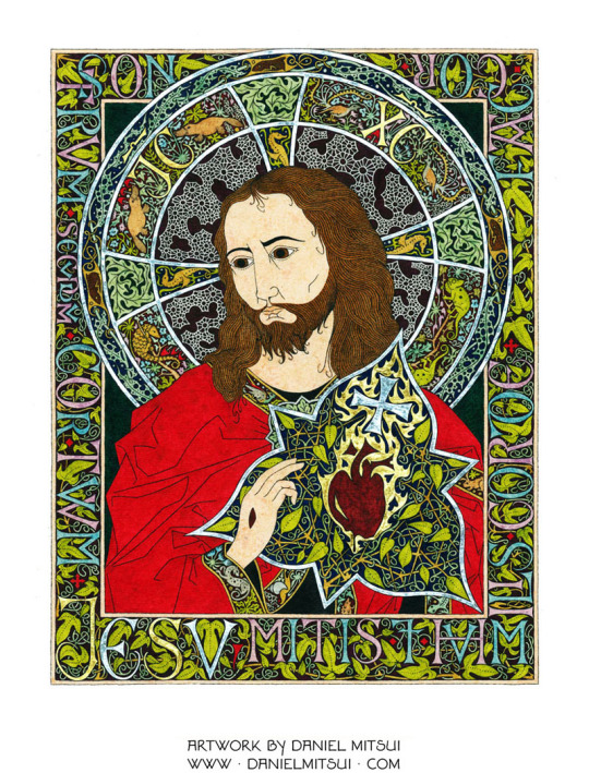
Meet Indiana-based Artist Daniel Mitsui
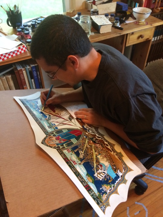
DANIEL PAUL MITSUI is a Hobart, Indiana-based artist specializing in ink drawing on calfskin and paper. His work is mostly religious in subject, inspired by medieval illuminated manuscripts, panel paintings and tapestries. www.danielmitsui.com
CATHOLIC ARTIST CONNECTION: Where are you from originally, and what brought you to Hobart, IN?
DANIEL MITSUI: I was born at Fort Benning, Georgia, where my father was an infantry officer. I grew up in the suburbs of Chicago, and lived in Chicago for most of my adult life. About two and a half years ago, I moved with my wife and four kids to Hobart, Indiana, which is sort of the easternmost edge of Chicagoland.
How do understand your vocation as a Catholic artist?
"Catholic Art" can mean a number of different things: art that happens to be made by a Catholic, whatever it is; art that communicates Catholic ideas and values; art that explicitly treats the Catholic religion as its subject; or art that is considered "sacred" art, meaning that it is intended to communicate religious truth and to assist prayer.
Most of my artwork is of this last kind, so I understand my task as twofold. First, I do my best to follow an established tradition as far as composition and arrangement are concerned. Sacred art should corroborate sacred scripture and liturgy, and the exegesis of the Church Fathers - because it too is a means by which the memory of Jesus Christ's revelation is carried forward through the centuries.
Second, I do my best to make the art as beautiful as possible, because the experience of beauty is a way for men and women in a fallen world to remember dimly the prelapsarian world, and to grow in their desire for reunion with God. As I wrote in one of my lectures:
It is important "not to consider sacred art a completed task, not to consider any historical artifact to be a supreme model to be imitated without improvement. To make art ever more beautiful is not to take it away from its source in history, but to take it back to its source in Heaven. Sacred art does not have a geographic or chronological center; it has, rather, two foci, like a planetary orbit. These correspond to tradition and beauty. One is the foot of the Cross; the other is the Garden of Eden."
I am Catholic, and an artist, so I have no objection to being called a "Catholic artist.” However, I do not want to make an advertisement of my personal faith or piety, to suggest to other Catholics that they ought to buy or commission artwork from me because of the sort of person I am, rather than because of the artwork's own merits. An artist who would make an advertisement of his personal faith or piety has received his reward.
At this time, my personal mission is to complete a large cycle of 235 drawings, together making an iconographic summary of the Old and New Testaments and illustrating the events that are most prominent in sacred liturgy and patristic exegesis. I call this the Summula Pictoria, and I plan to spend the next twelve years of so working to complete it, alongside other commissions. I already have spent more than two years on it, mostly on preliminary research and design work.
Where have you found support in the Church for your vocation as an artist?
The Catholic Church is of course much more than its institutional structures; it is all the faithful. Most of my patronage comes from private individuals rather than parishes and dioceses. I do receive some commissions from ecclesiastical institutions - in 2011 I even completed a large project for the Vatican - but I do not go out of my way to secure them. In ecclesiastical institutions, there tend to be committees involved, and a whole lot of politics; the usual result is that an artist spends time preparing proposals, reserving his most interesting ideas, and just fighting for permission to make the best artwork possible. I feel sorry for artists like architects and sacred musicians who, by the nature of their medium, have to do this. I avoid it whenever possible.
I choose to make artwork that is small enough and inexpensive enough that private individuals can commission and buy it. I think this may be the future of Catholic art patronage; there is not much reason to think that ecclesiastical institutions will be able to provide it much longer. You can look at the demographic changes, at the money lost both through diminishing donations and lawsuits because of clerical scandals, at the amount of artwork already available as salvage from closed parishes - none of this suggests that ecclesiastical institutions will become great patrons of new sacred art any time
soon.
How can the Church be more welcoming to artists?
I think that sacred art should have four qualities: it should be traditional and beautiful, as I said already; and it should be real and interesting.
What the clergy and theologians of the Church could do to help artists is to advance an argument for art that has these qualities. They have not advanced this argument much lately, and a good number of them probably don't even believe it.
By "real" I mean that sacred art ought, at least as an ideal, to be made by real human hands or voices. Music sung or played in person is a different thing, and a better thing, than an electronic recording. A picture drawn by hand is qualitatively superior to picture printed by a computer. There is at least a rule on the books that liturgical music needs to be sung or played live, not off of a CD, but even there a lot of fake things are broadly tolerated: bell sound effects played from speakers in a tower, or synthesizers dressed up in casings to look like pipe organs. Visual artists don't even have this sort of rule in place for them. Printing technology - both 2D and 3D - is now so sophisticated that I worry about it displacing human artists, without the clergy or theologians objecting.
I fear that some time soon, one of the great artistic or architectural treasures of Christianity will be ruined - more completely and irreparably than Notre Dame de Paris - and that in response to demands that it be rebuilt exactly as it was before, living artists will dismissed from the task as untrustworthy. Instead, a computer model will be constructed from the photographic record, and everything will be 3D printed in concrete or faux wood. Once that happens, a precedent is set, and living artists and architects thenceforth will compete, most likely at an economic disadvantage, against computers imitating the old masters.
I don’t oppose reproductions themselves; I have digital prints on display in my own home, and I sell digital prints of my own artwork. I listen to recordings of music. I do oppose the idea that these can, in themselves, provide a sufficient experience of art and music. I oppose the idea that sacred art and music can be fostered through attitudes that would have made their existence impossible in the first place.
By "interesting," I mean that art and music should command attention. So many Catholics have gotten it into their minds that the very definition of prayer or worship is "thinking pious thoughts to oneself.” They close their eyes and obsess about whether they can think those pious thoughts through to a conclusion without noticing anything else. With this mindset, art and music are praised as"prayerful" simply for being easy to ignore. Art or music that are particularly excellent are condemned as "distracting.”
This, really, is wrongheaded. Distractions from prayer are foremost interior, the result of our own loud and busy and selfish thoughts. Sacred art or music that draw us out of our own thoughts, that make us notice their beauty, are fulfilling their purpose; they are bringing us closer to the source of all beauty, God.
I can't remember the last time I heard a living priest of theologian say as much.
How can the artistic world be more welcoming to artists of faith?
I don't really think that it makes sense to speak of an artistic world as opposed to any other world, at least when it comes to sacred art.
This art is meant to be in churches, or in homes, or in any places where people pray - that is to say, anywhere. It belongs to everyone.
I have no objection to seeing my artwork in galleries or museums, but I don't seek out those spaces; I try to make my artwork available to anyone, as directly as possible.
How do you afford housing as an artist?
The medium in which I chose to work - small scale ink drawing - does not require a very large working space, and uses no toxic materials or dangerous equipment. So really, all I need is a room in which to work. It doesn't need to be a space outside the home, or away from my kids.
So affording housing as an artist is, for me, the same as affording housing in general. I moved to my current home after my wife and I decided that our family was too large to stay in apartments any more; we have four children, and wanted a yard of our own for them. We wanted to be near Chicago, but everything on the Illinois side of the border was too expensive. It took about six months of house hunting, and one temporary move, before we found what we wanted, and we had to borrow most of the money to buy it. So I don't know that I should be giving out advice, except perhaps to urban artists who are "apartment poor" like I used to be, not to let that situation go on too long.
I advise any artists who are still early enough in their careers not to be wedded to a particular medium to consider how their choice of medium will affect what sort of living space they will need eventually, especially if they hope to have a family. If you want to paint pictures or make prints that require pigments or chemicals too toxic to have around young children or pregnant women, that is something you should be prepared to deal with in advance.
How do you financially support yourself as an artist?
My artwork is my livelihood. About half of my income is from commissioned drawing, and about half from print sales, licensing and book royalties. I do teach, write and lecture on occasion, but this is not a significant part of my income. I've never had a residency or a grant, and I do not seek them out.
I've had my own website, www.danielmitsui.com, since maybe 2005, and use this as the primary means of displaying, selling and promoting my work.
What are your top 3 pieces of advice for Catholic artists?
In one of my lectures, Heavenly Outlook, I gave three pieces of advice to anyone who want to appreciate or make sacred art, and I will repeat them here:
First, never treat art like data.
Second, be guided by holy writ and by tradition itself: liturgical prayer, the writings of the church fathers and the art of the past.
Third, do not consider sacred art a completed task. Do not consider any historical artifact to be a supreme model to be imitated without improvement.
Please pray for me, and for my family.
#daniel mitsui#hobart#indiana#visual art#artist#catholic#catholic artist#catholic artists#catholic art#art#catholic artist connection
5 notes
·
View notes
Text
Writing in Comic+Illustration
“A picture is worth a thousand words.” I have to admit that’s a pretty cliche starter, but it does help define what writing means in the art community.
One way to define “writing” is to call it a genre.
Genre 101
Before I continue, I want to make sure that you understand what I mean by genre. When I talk about genre I am simply referring to various forms something comes in. For music its different sounds like the genre of jazz or pop. In writing, a genre is a book or a shopping list. Hopefully that clears things up!
When I first began researching various writing genres in the art community I was confused because I thought I was looking for actual written texts like a research paper. Yes, there are the conventional forms of written genre within the art community like a blog, but turns out a genre in the art community simply refers to the art we create!
“I thought art didn’t have writing?”
Comics, manga, anime, ads, posters- those are all forms of genre in the art world. If you are still confused then just think about the different forms that you often see art as.
In our community, the purpose of these different genres vary between the mediums.
Some are for insiders (people who are artists themselves) some genres cater towards outsiders (people who are not artists, but consume and enjoy art).
As an artist, our main focus is to entertain others with the works of art we create. Because the nature of our job focuses on pleasing others, most genres of art are created to be consumed by outsiders.
To illustrate that let’s compare two different kinds of art projects.
Genre 1: Comic Book
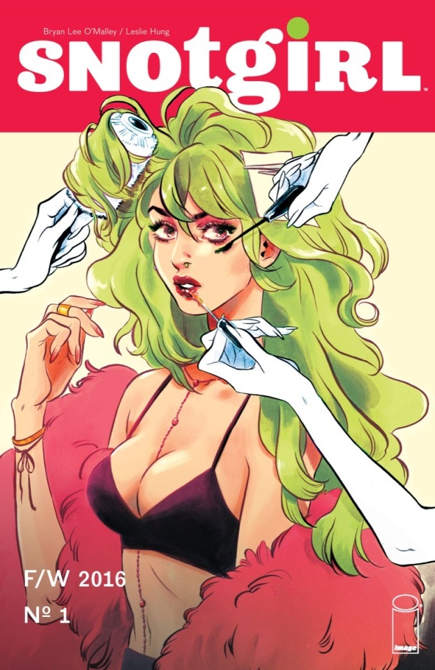
SnotGirl by Bryan Lee O’Mallley/Leslie Hung
Who is it for?
Comic books come in various styles and not just what people typically think like the Marvel comics.
A comic book is written in order to entertain an outsider of the art community. That is not to say that artists do not enjoy comics as well, in fact I’ve included one of my favorites as the example!
Sometimes comics are a single page with multiple panels, and they can span multiple pages and volumes. Snot girl, for example, is currently on its 14th issue!
A comic is a very commonly produced genre. Typically, someone who writes a comic has multiple reasons to do so. Most of the artists have their own story to tell. They have created their own characters, their own world, and have a vision or lesson they want others to see as well.
What’s so special about it?
What’s great about a comic is that there is no right way to do it. Comic artists are tasked with balancing multiple parts of their project. They have to consider:
- the organization of the dialogue
-how they are going to lay out the images/ what geometric shapes the panels will be
-inclusion of sound effects
Don’t forget the art itself! The creator has to make sure they are:
- cohesive
-complete and dynamic illustrations
- they do not clash with the already established panel placement
-establish the tone and mood through colors and lighting
When Less = More
Comic books have the daunting task of developing their writing through narration and dialogue. Write too much and the reading becomes heavy and write too little and the author risks confusion.
Imagine condensing an entire essay into dialogue between characters with limited narration. Writing in comics is an art in-and-of itself.
While the writer of a comic and also be the artist, this isn’t a set rule. Sometimes the author and the illustrator are two separate people or teams!
SnotGirl as a comic book case study:
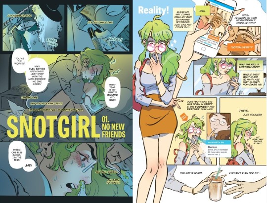
Volume 1, SnotGirl
Analyzing structure
The left page is split into three rectangles and the right page is broken down into multiple squares beside a near full body illustration of the main character, Lottie.
Lottie lives her life as an Instagram model and fashion influencer. The left page introduces us to the real Lottie, a side of her that is disgusting and unkept, snot drizzling out of her nose constantly. The right page shows her in public maintaining an idealized and aesthetic persona.
if you break a page into three sections that means more art needs to go into a single panel. In the middle rectangle her whole body is shown and the bottom panel is largely zoomed into her face. It’s nearly claustrophobic, showing Lottie’s overwhelming insecurities and having the reader up-close to a side of Lottie she wishes to ignore.
On the left page, the dialogue reads as frantic, narcissistic, Lottie is trying to convince herself that she doesn’t feel ugly and that she’s more superior than others.
On the right the multiple squares include more dialogue, space around Lottie, and more zoomed-out compositions (For example, you can see Lottie all the way down to her chest at least four times).
The squares reflect Lottie’s insecurities but they are the problems of her perfect persona: boy troubles, getting coffee, and Instagram profiles. There’s more writing on this page to reflect her more superficial ravings.
Analyzing illustration
Art wise, on the left the colors are grey, dark green or blue, and more cool-toned. In color theory cool tones portray sadder, more serious moods.
The right page which is vibrant and warm-toned, which is supposed to be energetic. If I were to ask you, you might be more attracted to the right side and its happier atmosphere.
These two pages illustrate how color, composition, and organization differ widely to emphasize how the artist wants the reader to feel and understand about the story.
Sounds complicated doesn’t it? The genre of comic books may be common, but it takes a lot of working, planning, and dedication.
Genre #2: Video Game Illustration
Illustration in game

illustration in full

Art by ZAVIR
Aren’t games 3D though?
I know that when most people think about video games the models and backgrounds are in 3-D. Think of Red Dead Redemption 2. While most mainstream games are produced that way, there are still many games who use illustrations like PC click-and-point games, mobile games, and other games use illustration for character sprites. The example I’ve included is from my favorite mobile rhythm game, Cytus II.
For those who don’t play Cytus II, the game revolves around different in-universe musicians who have different songs which the player taps the beat to. For each playable song there is an illustration. (Here’s a link to the hardest song in the game! “Floor is Lava”)
What’s the point of the art?
Most video game illustrators work in backgrounds or character sprites. The illustrations can be single items as well, clarifying items that a character may have picked up in game.
However, to stay relevant to my example I will mainly focus on the aspects of this particular video game illustration.
Cytus II as a case study:
The illustrations in Cytus 2 are meant to:
create further diversity between the different songs
provide the song with a visual outside of the beatmap
By providing the song Extinguisher by Lixound with artwork, it’s not only visually pleasing but adds memorability to the song. People who are fans of the game can now draw fanart of the song.
Differences from comics
there is very little text.
The story or context has to be told by the artist in composition, character pose, and other artistic choices like lighting or colors.
Particularly in Cytus 2, the story the artist tries to tell is set by the sound and “vibe” of the song.
“Extinguisher”, an EDM song, has fast beats and dubstep like qualities as well as a robotic vocal track. It’s chaotic and fast, which could explain why the artist interpreted explosions and a figure that looks like an anarchist.
Why Different Genres Exist: Comics vs Video Game Art
Imagine if a comic was told through dialogue-less illustrations and imagine if video games had backgrounds and illustrations that were formatted like comics.
Visual chaos would ensue. Clashing dialogue, images, colors, and a lack of clarity for what the viewer should be focusing on.
Thank goodness for the different genres of illustration, huh?
1 note
·
View note
Text
#3

I don’t ever remember feeling good. I don’t mean to say that I’ve never had moments of happiness, that I don’t love my friends, that I regret getting married; I’m not denying that I’ve had the opportunity to pursue passions in life, or that I feel incredibly lucky to have led my privileged life. I mean that I wanted to kill myself when I was a really little kid. I suffer from an incredibly detailed long term memory that goes back before I reached the age of two, and what I remember about childhood is the scathing heat of embarrassment, itching under a layer of cold sweat, revulsion at the hideousness and impracticality of my own body, horror at a world that was ugly, dirty, cheap, boring and airless, a world that was all these things and that required mandatory participation, a factory that makes nothing. I vacillated between mindless rage, and violent sobbing, which I indulged on purpose in pursuit of catharsis. There wasn’t much that I wanted, because everything seemed so repulsive. The main thing was that I wanted to be left alone, and unseen. Each morning I would wake up gripped by panic, because I knew that once I left my bedroom to come to breakfast, everyone was going to look at me. It would take me what felt like hours to work up the nerve to open the door, and when I did I would begin to scream “DON’T LOOK AT ME! DON’T LOOK AT ME!” like a toddler version of Frank Booth. It’s pretty hilarious to think about, but the truth is that I still feel like doing that every time I show up somewhere.
My earliest memory is of my mother trying to take my picture. It took place in an apartment I couldn’t exactly place, so at first I thought it must have been a dream. I was very little, but I understood enough about what the camera meant--that I was being stared at. I turned away, and was repositioned; then I tried to run away. My mother chased me, increasingly infuriated, until I was cornered behind the hilariously prison-like bars of my crib, where she could photograph me whether I liked it or not. I eventually found the resulting picture of myself agonizing behind the crib, confirming that I remembered being about one-and-a-half, living in an apartment before the house I grew up in. The memory serves as something like a metaphor for everything I have been afraid of--helplessness, captivity, surveillance, and of course, my mother.
There is no doubt that I had a serious chemical problem that caused my catastrophic rages and suicidal ideation, even so early in life. (I would find out about that...well, just a few years ago) But, lest I fall into the trap that therapy so often creates--the belief that everything that is wrong with you is within your own power to change, that sadness and anger are only the result of your own bad attitude, which just needs an adjustment--I have to admit that there is something within all this about my mother. I have traditionally categorized this particular woe as a void of maternal relationship. My mother and I “didn’t get along” or “didn’t really relate”, and then before I was old enough for us to have our first adult conversation, she was dead. As I teased out some anecdotal details of our absence from each other’s lives with my first therapist, that doctor once started one of our sessions by blithely declaring, “So you say your mother hated you!” Actually I never said that, but thanks for illuminating things so brightly, you...fucking asshole. Ironically, one of the things I didn’t like about this young, attractive, waspy therapist was that her Kelly Bundy-ish work attire made it impossible for me to bring up any anxieties I had around my own attractiveness, or my alienation from the rest of my gender. The alienation from the rest of my gender that had certainly begun with my alienation from my mother.
I don’t remember a single nurturing, initiatory experience with my mother. I had my first period young, and when I naturally went to her for help--well, to be fair, I probably told her that I more or less understood how things went, but I still think we probably should have had a longer conversation than just her telling me not to flush maxi pads down the toilet, and coolly dismissing me. I remember the first time I tried on makeup, her makeup of course; as soon as she spotted me, she asked “Are you wearing makeup?” in this razor sharp tone, and scowled at me until I followed her unspoken instruction to go to the bathroom, wash my face, and send myself to my room. Again, no further discussion of makeup, clothing, or general womanhood issues ensued. Similarly, I remember a day when I had become just old enough to pick out some of my own clothes. We went shopping for underwear, and every model she suggested, I just wanted in black. I didn’t realize what kind of rage this was stoking in her until she suddenly snapped, “DON’T YOU WANT ANYTHING OTHER THAN BLACK?” and spun away from me. I had no idea what rule I was breaking to deserve this, although the truth is that probably some primitive part of me understood that it was kind of a sexual problem. In the following years I developed into a huge comic book nerd, spending almost all my time copying what I didn’t really know were pretty sleazy pinup images of female characters out of X-Men comics. I had an inkling that these were sort of horny-looking, but I was really attracted to the drawings, which were heavily cross-hatched and compulsively detailed, according to the predominant style of the '90s. That kind of intense, microscopic linework has always attracted me, and one day I stupidly asked my mother, an artist herself, what she thought of a certain drawing I was studying. Most unfortunately, it was of the White Queen, a really idiotic character whose costume is essentially lingerie. What really interested me about it was the linework, but my hopes of discussing art were dashed when my mother spat “I THINK IT’S BORDERLINE PORNOGRAPHY!” and promptly stormed off. That probably would have been a pretty good time for her to talk with her insecure, confused eleven year old girlchild about feminism, body positivity, or any of the other facts of being a woman that I desperately needed to hear. I didn’t get any of that either when, around the same time, I started trying to talk to her about feeling fat and ugly, and she just threw a diet book at me. When I remember my mother, I most immediately remember the back of her head.

This all makes my mother sound like some sort of tyrannical throwback housewife, but none one would have told you that about her. Mom was “cool”. A playfully subversive hippie painter from Brown who loved kitsch and camp, she filled our house with old pulp novels, 3D horror comics, bootlegs of Mystery Science Theater 3000, tapes of Warhol’s Frankenstein and Dracula. She was a striking dresser, imperiously intelligent, and brutally funny. She was outrageously popular among everyone who knew her. The strange truth, though, was that while she had the outward appearance of a mischievous hipster on the cutting edge of culture, on the inside she had a rigid resistance to anything she considered psychologically or emotionally abnormal. Sadness and frustration were unacceptable, antisocial qualities, inconveniences that were grounds for rejection. So, as if she’d been cursed by a spiteful witch, instead of having a fun, affectionate, curious, creative mini-me, her first born turned out to be a taciturn suicide case, constantly quivering with fear and rage--the ultimate in uncoolness. I have a recollection of being around 12 and complaining to her about a friend of mine who was (also) sort of a drip and a drama queen. My mother’s advice to me was to say to my difficult friend, “I’m sorry you feel that way,” which is a clever way of expressing sympathy while giving no credit at all to the sources of the person’s pain. Even at that young age, I kind of thought...hey wait a minute, that’s exactly what she’s been saying to me!
Lest anyone think of her as some sort of roundly superior specimen, I can also say that she was sort of a nerd. She had a huge number of allergies, and also asthma, which she passed on to my brother and me. (And ironically, my lifelong snorting and snuffling and sneezing became one of the many things about me that visibly disgusted her) This, combined with my father’s amorphous environmental illnesses (see: the brilliant Todd Haynes movie SAFE), compelled my parents to try to move house. When I was about 11, we moved across our grimy, depressed city to a much bigger house in a nicer neighborhood. Shortly after we got settled, my mother was diagnosed with stage 4 lung cancer. Her doctor’s advice was to go home and make her peace, immediately, but she shocked everyone by surviving for at least another three years. When people hear that, they always respond as if it must have been some sort of beautiful miracle. No one who has lived with the dying could think this. Our lives turned into NIGHT OF THE LIVING DEAD, quickly and consistently, every day a frank, unromantic confrontation with mortality, until it was over.
What could I possibly feel? This person who was a virtual stranger to me, who didn’t like me, who turned into a rotting corpse in front of me, had died in agony. Instead of trying to raise a happy, healthy person, she had sat back expecting me to seduce her, and I had failed. So, I didn’t know what the loss of her really meant. I would never understand anything about maternity, and I would never figure out anything about being a woman that I didn’t ultimately make up for myself. The only thing I really knew about first hand was death. I didn’t understand much of anything about my mother’s actual biological reality, because no one really communicated with me about it, but I knew for sure that the human body is a bunch of bullshit and there is just no reason to be precious about it, ever. Unfortunately, one is never left in dignified solitude with their own interpretation of death. Death is a curse that befalls the living, who are then suddenly and disproportionately responsible for each other’s feelings. This is never more true than when you physically resemble the dead. You become everybody’s confessor, the person with whom they try to relive their experience with the living, and you better be nice about it--even if you are technically more entitled to grief and resentment and anguish than anybody in the room. And of course, this was never more true than with someone who had always frightened me more than my mother: my mother’s mother.

9 notes
·
View notes
Text
Rules For Achieving Online Success
What is this superior with these performers as well as politics? What is really suspect people who pay $100 or more to hear them sing want to check on them utter political perspectives? The audience pays hundreds of thousands of dollars to determine and hear a performer PERFORM. You want to spout politics, run for freakin office, you moron! When performers use a paid venue to play politics usually are very well abusing the paying audience, the venue, the sponsors and everyone connected as their artistic delivery. It's an inappropriate venue and inapproprite behavior to voice your political viewpoint, you jerk! And they wonder individuals boo.
When something interesting is situated your life, tell us about it in your profile sentiment. This is a great way to let your online friends in on what it might become to actually spend time with your. That's the main goal of internet dating isn't it, to find people you'd finally in order to meet and spend time with face-to-face? Anyways, it's usually more fun to listen to a crazy experience you've just had than liposuction costs the same old descriptions person and your cat possess been in your profile for months at the moment.
As a webmaster, protecting yourself from link cheating is very time consuming and inconvenient. Of course, may get check every site you linked to and the business your link has been added to that site. Can be very time consuming, despite a "link checker" tool, and hybrid cars not find your link even can is presently! Or, if 3d issue professional with window 7 full version free download don't find url you can follow i'll carry on with a polite email. And, if will not need get a response within 1 week or two, you can remove their link from your own personal website. Unfortunately, by then you've been promoting the other site(s) at a month additional and getting zero in return. Link unfaithful.
Don't be fooled thinking telling fibs will impress that special someone enough to obtain relationship commenced. it will turn them off! Be your best home.
In Canada, exports are "zero-rated" sales for pcappstore G.S.T. purposes. This means that when you ship a product or service to someone outside Canada, you don't charge H.S.T. Yet, you get to claim (or deduct over the G.S.T. collected by you) all the "input tax credits" (G.S.T. that you paid for business purposes) to make that move. The idea, I suppose, is to encourage forwarding.
Running the fingertips the actual years shaved area is an effective method of ensuring an end thorough gently slice. The sense of touch will alert you to stubble and missed patches it always be difficult to discover in the mirror.
In conclusion: Depending on your own own level of skin sensitivity or pain toleration, texture of hair and rate of hair growth, waxing hair removal may become viable option for you. The look at the links in the resource box for suggestions on the best way to make eating habits study last longer and to determine out an honest supplier for a huge regarding the latest waxing units.
1 note
·
View note
Text
COMPLETED: Mega Man Legends

Move over Sahelanthropus, I got all the walking mechs I need right here.
This game is great!
I BEAT IT!
I think it took about 8 hours (not counting a few reload/restarts here an there). While a few of the games I’ve played recently also took around the same amount of time, I kept feeling...frustrated about my progress. Mega Man Legends, on the other-hand, was a constant joy to play! I’m so blown away by how great this 1997 game is. I could gush over it all day, but Imma try to be focused...
The Story
This is where the game started off light and unimpressive, but ultimately turned out quite well. The story felt very basic: “The world needs crystal energy (refracters), and I play a ‘Digger’ that looks for them be exploring ancient ruins. But while I’m a well-meaning digger, there are ill-meaning pirates to worry about.” While the story wasn’t much, it did present the story very cinematically. The cutscenes told the story the gameplay couldn’t, but they didn’t overwhelm the player like Metal Gear Solid.
The player eventually crash-lands on an island with a city and lots of people. The player may speak with these people, even performing sidequests and developing relationships. The characters aren’t super deep, but they all have some personality and story. It helps build the charm of this world. I really appreciated it.
The antagonists are a family of pirate siblings. Tron Bonne is interesting in that she’s a bit of a brat, but has affections for Mega Man. She’s also moved by his heroism and genuineness. She finds herself emotionally conflicted between her older brother who insists on being “bad” and her feelings for Mega Man that shows there’s a better way to live. Though this is mostly used for comedic effect, it also makes her the most interesting and well-rounded character. At one point, Mega Man thinks he may have killed the pirates (including Tron) in a major battle. The heroes treat this as an unintended tragedy, and do not rejoice in their victory (I love it!), then later, Mega Man finds Tron alive is over-the-moon. She’s put off by it, but conflicted. After Mega Man defeats the trio again, the eldest brother, Tiesel, offers his honorable recognition of Mega Man’s superiority and offers to leave in peace. Tron is surprised and touched, but then it turns out to be a ploy.
It’s all pretty silly but still engaging character development.
The game’s story contains quite a bit of mystery. Why are Reaverbots activating? What’s hidden beneath the island? What’s the connection? It’s revealed that these ancient ruins (which are from a more advanced civilization) actually contain a weapon. This weapon feels that humans are over-populating and that it should purge the island as a population control effort. Mega Man finds this cruel and stops it. In the process, it’s revealed that Mega Man has a deep connection to system that wanted to purge the island. It’s hinted that he may serve some deeper purpose: maybe to act as the moral compass of unfeeling, ant-human protocol? The message I got was that humans destroyed the earth, causing a great flood and societal/technological collapse. So then machines were created to limit human influence, but their purpose is so old and outdated, it’s become an artifact itself.
There’s a fun twist here where Mega Man is captured. But the pirates realize that it’s more important to save the island than defeat Mega Man, so they release him and support his victory against the boss.
It’s still not super deep, but much deeper than I realized. And with all the various characters and personalities, it’s one of the best story experiences I’ve had in a game (though a bit goofy).
The Graphics
Are great! There’s a few issues. I think PS1 games pre-1998 had a different look and feel than post 1998 (and then again, post 2000). It feels like early game artists were still trying to figure out 3D modeling with limited hardware. So a lot of the best known tricks hadn’t been discovered yet. So MML definitely has a few Pre-1997 qualities, but it also has plenty of areas where it really looks great.
The savior is the cartoon-styled graphics. Most characters have solid-color clothes and accessories with few details. Because the art is consistent throughout, it just feels right. And then the facial animations are great. Games like Tomb Raider, Resident Evil, and Metal Gear Solid had in-game cutscenes, but the characters’ faces were unanimated. Sometimes they’d bob their heads to imply speaking--but it was all kinda goofy. MML, on the other hand, included moving mouths and changing face expressions during cutscenes. It really sold the cinematic vibe and is quite impressive for PS1 game.
So even though technical limitations really prevent this game from looking great, the art-direction and advanced facial animations keep this game looking great!
The Gameplay
1. Controls
Unfortunately, the controls kind of suck. Mega Man controls somewhat like a tank. A tank that can move side ways. While games like Mario 64 had free 3D movement with a camera that tried to keep up--MML has a camera that stays firmly facing forward that only rotates when the player rotates MM.
It’s a little off-putting. If I push “down”, MM runs toward the screen: completely facing the opposite direction of the camera. In most 3D platformers, the camera would try to rotate behind the character. Not MM. It keeps facing the same direction. When I stop moving, MM turns back to face the same direction as the camera.
I think they were trying to make shooting and combat easier. And I think their head was in the right place. But it makes the game hard to learn. Still, once you get used to it, it works ok. This is the worst part of the game, but the difficulty is well balanced that I don’t feel punished by the controls.
2. Combat
The combat isn’t super deep, but that also means it’s not overbearing. The combat feels more like Crash Bandicoot, with each enemy having an attack pattern that must be learned and subverted. But mostly, you just got to know when to shoot it. So it keeps the combat accessible while also interesting and mentally challenging. This is better than a lot of American Shooters that just have you fight a variety of projectile based enemies--run, dodge, shoot...
Adding depth to the combat is a cool customizable Buster (gun). You can collect a variety of parts that boost Attack, Range, Attack Speed, and “Reload”. Some parts affect more than 1 stat, allowing the player to try a variety of combinations to boost their effectiveness and compliment their play-style. You may also change configurations based on the boss or enemy type. It’s a simple, and fun system that adds plenty of depth to what could have been a straightforward action title.
What’s also neat about these parts: they’re often rewards for side-quests. Such quests might be rebuilding a clubhouse, participating in game shows, or finding a lost loved-one. It’s great because it provides a lot of bonus quests for the player that meaningful and rewarding both as an experience and on a material level.
The boss fights are also pretty interesting, assuming you’re properly equipped. They can be a bit challenging or confusing, but they’re quite diverse. Maybe you’re defending the town from bull-dozer bots, or engaged in air-to-air battles, there’s plenty of unique experiences. I was especially impressed with the walking-mech battle. I think there’s another boss just as tall, but this involved a very destructible city block. It reminded me of the Sahelanthropus battle of Metal Gear Solid V...or does that battle remind me of this? Either way--it was just more icing on top of a great experience.
3. Adventure/Pacing
I like to differentiate between action and action-adventure. Action, to me, is very linearity and to the point. Action adventure often asks the player to do more than fight their way to the exit, but to discover the path to the exit. Even better, they allow the player to discover much of the game--allowing for maximized freedom in progress.
Zelda Games are often the best examples of letting the player set their own pace and find their own way. Ocarina of Time is a true stand-out here. The game doesn’t tell you want to do, but pushes you in the right directions. Still, you’re not often limited to one set order of events to proceed and can do some quests in any order. Mega Man Legends does this as well.
Once you get past the first hour or so, the game really opens up. There’s people to talk to, secrets to find, and there’s rarely a rush to complete the next objective. You’re free to grind for resources and buy that gun upgrade, or just push through--relying purely on your skill to overcome challenges. But what really makes the game like this work is the “down time”.
Dark Forces 2, Mysteries of the Sith, and Jedi Outcast are fun action games--but there’s only one thing to do: fight your way to the end. Even if there’s sub-objectives to the over-all level, there’s no freedom. While several Mega Man battles take place in the town, the city is usually a place of no combat. But there’s plenty to do, secrets to find, and characters to interact with. And once a dungeon has been defeated, it’s nice to go back and look for secrets or grind. It makes the game way more diverse and I feel more in control as a player.
This is really important. Because the Star Wars games (and even Thief) are sooo straightforward and 1-dimensional, I get fatigued very quickly. And seeing as I like to beat a game before moving on, I get frustrated. I feel like these games are in the way of me finding happiness. Not a good reason to play games. But MML made me happy to play it. Even if I didn’t feel like taking on the next dungeon, I could do side quests or grind on an easier dungeon and not feel like I’ve wasted time. It all helps me succeed in the future. And that gives me joy.
Mega Man Legends is joy!
I started this game way back in 1997 or 1998, and I restarted it many times since. This was the first time I beat it, and I love it--absolutely. Likely a top 10 game for me. I hope to add this to my rotation of games to replay till the end of my days--but then again, I’m curious if Mega Man Legends 2 will outshine it??
#Zach's Game Journal#COMPLETED#Mega Man Legends#PlayStation#PS1#PS1 games#Video Games#Gaming#DuckStation#Emulation
0 notes
Text
The Brilliant Diamond and Shining Pearl situation.
*Op-Ed*
The Hype
Pokemon fans tend to be among some of the most abused fan bases when it comes to classic franchises. Some would say things started going south with the release of Sun and Moon, some would say X and Y, and then, of course, there is the "Gen Wunners," as they're usually called, who tend to believe strictly in gen 1 and 2 superiority. One common thread in all Pokémon discourse is that no Pokémon fan can agree with another what constitutes a "good" Pokémon game looks like.
I was born in 1992, making me the perfect candidate to be a "Gen Wunner," and I technically wear it, while I do resent the title. that is only to preface that when Diamond and Pearl was released, I was in 9th grade and found most of the Sinnoh Pokemon to be overly designed and ugly. But to the generation of Pokemon fans younger than me, Diamond and Pearl is to them what Red and Blue is to me, meaning there are thousands of people in their early 20′s who believe this to be one of the if not the best Pokemon entry and will defend this game at all cost.
So it's 2001, and the Game Boy Advanced just launched, a console incapable of trading with the previous Game Boy. This presented a problem for Gamefreak, with older Pokemon being harder to find in Generation 3′s Ruby and Sapphire, so they made remakes of the first generation of Pokemon games as Fire Red and Leaf Green. This started a trend of remakes, the latest 2014s Omega Ruby and Alpha Sapphire (or technically Lets GO Eevee and Pikachu). This created quite the expectation for several growing early 20 somethings. “Where is my Diamond and Pearl remake?” they collectively asked.
The Announcement
Despite the cynical takes I’ve seen on the Pokemon 25th anniversary "Pokemon Presents," I didn't think it was nearly as bad as they claim it to be. For example, I thought the intro movie was an entertaining and nostalgic look back at almost every Pokemon game in the last 25 years. The attention to detail with the titles they chose to highlight was impressive and almost like a sign that they remember when the series was overall of higher quality. While I am a bit skeptical, another highlight for me was Pokemon Legends Arceus announcement. The idea of an open-world Pokemon Game set in a past version of Sinnoh sounds intriguing, I saw how Gamefreak handled open-world areas in Pokemon Sword and Shield and you can color me unimpressed and apprehensive.
Then they show the highly anticipated and expected, Brilliant Diamond and Shining Pearl. The trailer starts off pretty strong, with a montage of memorable scenes from the original DS game, which in hindsight only made the reveal of the games visuals all the more devastating.
Cut to a shot of the character Dawn in her starting home but wait, what's wrong with Dawn? she is now horribly disfigured. Im usually a fan of “chibi” aesthetics but this one felt immediately lifeless. The character has been foreshortened with the grace of someone using hacksaw for the first time. It seems as if no artistic consideration was put into how these characters would look in this new style. This feeling only grows as you continue to watch the trailer and see how the "chibi" style fared with all of the non-player characters, which, in my opinion, is far worse. It seems as if they were more concerned with making 3D models that matched the origional games sprites that they didnt stop to consider how these models appeared.
Then comes the larger models used in battle, what some people claim to be the remakes saving grace (visually speaking at least). It’s understandable why people claim those models look better than the overworld models, but the improvement is minimal, to say the least. These battle models are larger and more detailed but just as stiff, lifeless and flat as the overworld models. Not to mention the Pokemon are using the same tired models they've been recycling since generation 6 and continue to battle in spaces that remind me of what a low budget high school play looks like.
Besides goofy and awkward walking animation, the trailer doesn't really have much else to say past this point. It really does feel like ILCA said, "you like Diamond and Pearl? here it is again, but we made it ugly".
The Fallout
This is when the situation begins to unfold in different pockets of social media, I primarily experienced it on Twitter. While it did seem like most Pokemon fans were rightfully disappointed in Brilliant Diamond and Shining Pearls appearance, both in terms of technical graphics and art style, it seemed like another group of fans seemed vehemently opposed to any and all criticism of the trailer claiming "we finally got what we wanted"
While it merely comes down to a matter of artistic preference, I don't think it's unreasonable to hold one of the highest-grossing franchises in the world to higher standards. Additionally, this is only one in a long series of disappointment from Pokemon titles, and I liked Pokemon Let's go. Die-hard fans who have been with the franchise from the beginning are scared that they'll never see what they consider to be a high-quality Pokemon game ever again.
Hope?
There might be light at the end of the tunnel after all. Like I previously stated, Pokemon Legends Arceus seems like an intriguing enough concept, although I do remain skeptical. Also, Pokemon Diamond and Pearl were good Pokemon games, so while the art style might look silly and animate stiffly, the general game should be fun.
After all, I am looking forward to playing this game and will more than likely buy it at full price.
0 notes
Text
property search website

Buying Property in Nigeria
Congrats, your reserve funds has collected to a tremendous entirety of cash and as opposed to spend everything, you thought "why not contribute it? Why not verify my future and that of my children?" A superior method to do this is to put resources into land and buy a landed property for sale in your name?
Be that as it may, with the questionable idea of Nigerians, the once simple procedure of verifying property securely has now been made more troublesome and complex than a Rubik's 3D square.
How would you at that point get the ideal property that best suits your taste without managing the bums whose sole point is to deny individuals of their well deserved cash regrettably? It is very basic, take the accompanying aides, and all will be well:
Research
This is the most significant part of obtaining property or doing anything at that. Direct various research to be very much familiar with the happenings in the land area. Whenever progressed admirably, you become all around educated about which zones are acceptable, how much land costs in specific territories, thus considerably more. Along these lines, you can smell a warning ten miles away.
Spending limit
Attempt to make certain of your pocket power before settling on what property to purchase. On the off chance that you expect to raise, say, a cabin with restricted assets, make certain to make a financial limit and buy the things you need reasonably. Try not to buy an excessively costly land that takes up essentially the entirety of your cash and relinquish it consequently making another decent looking area for con artists to abuse.
Know the kind of Property you plan Purchasing
There ought to be an explanation regarding why you expect to buy a specific property, maybe you need a three room level to prepare for your children, or you need a lodge since you are terrified of statures, whatever it is, be free in settling on your choice and remain consistent with it.
Have a Specific region in Mind
Various people have various tastes and purposes behind needing to live in a region. I couldn't imagine anything better than to buy property in Obalende, Egbeda, or Ilorin for reasons most popular to me, I know it's totally unique for you. Be it to be near a family member or for the force supply, pick a territory shrewdly and stick to it.
Meet with House Owners in the Area
Presently isn't an ideal opportunity to be unnecessarily glad and unsettled, you need to cause associates with the individuals in your expected zone, to pose inquiries about the zone, find a good flat to rent pace places are the best to arrange your property, who to manage and who not to, and other related data.
Have a reinforcement
The expression 'don't tie up your assets in one place' helps us to remember the need to have an arrangement B. Consider the possibility that things don't turn out as arranged. What do you do? Change to the arrangement B gave it's anything but a reiteration of plan A.
Be Ready
It is never enough motivation to buy property since every one of your friends are doing it, or your better half bothers about it day by day. In the event that you believe you aren't prepared to buy property, DON'T.
Execute With Trustworthy Persons Only
Despite the fact that it is near difficult to determine what an individual is thinking precisely, it doesn't mean you should attempt your karma with just anyone and perceive how it works out. At the point when you expect to execute with somebody, make requests about him/her to make certain of how dependable the individual is. Notwithstanding, it is ideal to experience go betweens, for example, estateg operators, for increasingly secure exchanges. Search Nigerian Property Websites, for example, this one to guarantee you are executing with trustworthy property specialists.
Installment Method
Try to pay through banks when managing another person, along these lines you have their own data in the event that they choose to denounce any and all authority. Demand bank moves, checks, and other comparative techniques.
Check, Verify, Verify
Check all the pertinent title archives gave over to you to affirm their credibility. The archives are the main verification that privileges of responsibility for property have been moved to you, subsequently ought to be remained careful and unblemished. Reports, for example, the endorsement of possession, Governor's Consent, receipt of installment, study plan, charge authentication, and intensity of lawyer (when managing a broker) ought to be all around investigated to forestall disastrous stories later on.
Reward Point: Employ experts, for example, legal counselors and planners to help affirm the precision of all data and reports gave to you by the land owner. Legal advisors utilized will likewise have the option to help you should any lawful contest identifying with the property emerge later on.
There you have it! Follow the abovementioned, and you are well on your approach to effectively owning your own property in Nigeria! For more information click here =>https://Propertyexpert.ng
0 notes
Text
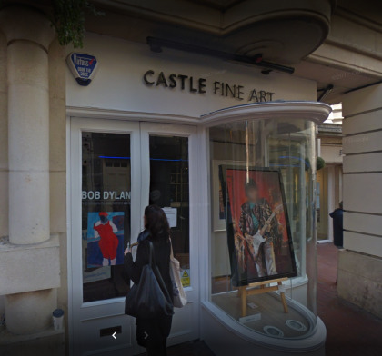
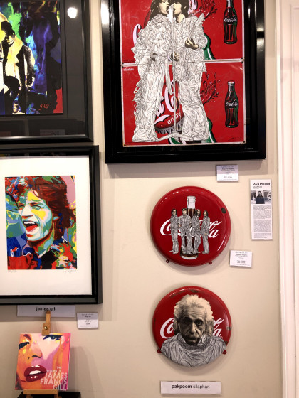
Where can you see Banksy, Damien Hurst, Grayson Perry, Sir Peter Blake, Bob Dylan, Ronnie Wood, and Billy Connolly originals within a few yards of each other in right-on-the-street galleries? Yesterday*, a friend and I went to Brighton.
*Yesterday is now several weeks ago, life having got between me and this write-up.
Castle Fine Art Gallery
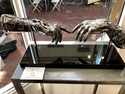
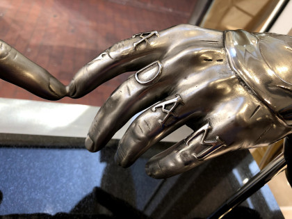
Castle Fine Art is right slap bang in the middle of Brighton near The Lanes, and my goodness I had not expected to see so many originals by ‘names’ from both art and show business. First though were these metal sculptures, each of them different and but one based on the Michelangelo painting ‘Creation of Adam’ c. 1511. By Dan Lane, this one – Modern Relic Arms | Creation of Man – is intricately embellished and looks like the metal or burnished leather of protective armoury. They seem almost wearable.
I found these less attractive, rather saccharine in fact.
I am not really a fan of celebrity-based art, so much of it seems essentially derivative and harking back to those Marilyn Monroe prints by Andy Warhol. Those were nearly sixty years ago, these feel like 21st century children dressed in the same clothes as their great grandparents. There were plenty of them so presumably they sell.
I have no idea what this represents – the ascent of man atop a corkscrew? The title is Devolution and so I am assuming a reference to the impact of alcohol. Perhaps the final figure, swigging from the bottle, is about to fall off the edge.
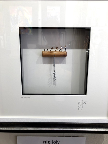
These are also by Nic Joly who seems to be a statements man. I was interested at first in the ‘shop window’ presentation – the piece of art sitting on a platform behind glass as though it would be taken out and wrapped separately for sale. It’s usually the little item in the window you buy, not the shop or its window.

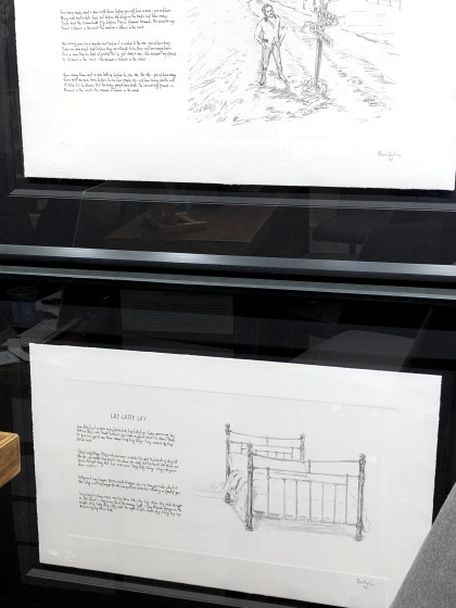
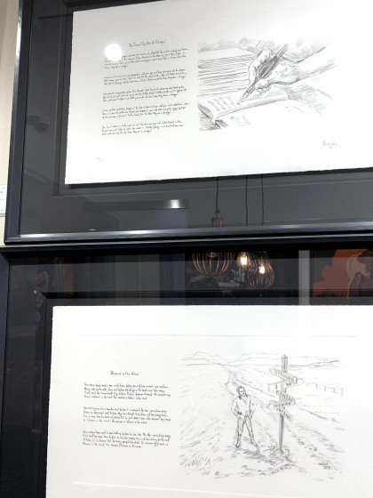
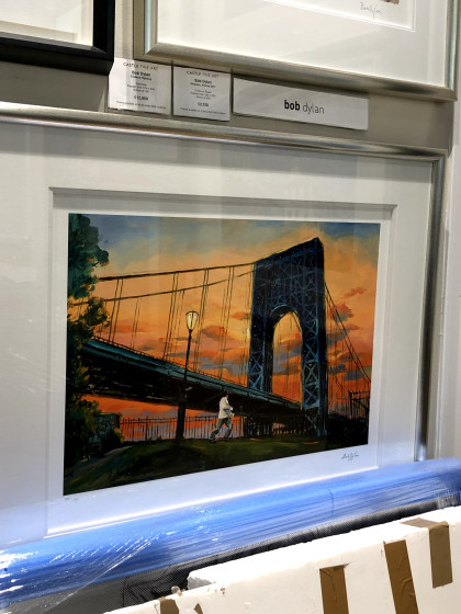
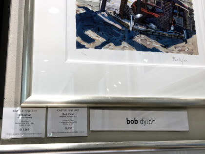
Astonishingly, these are by Bob Dylan who took to illustrating his own songs. Seeing these first, I rather wished he hadn’t. The paintings, on an adjacent wall, I thought were redemptive.
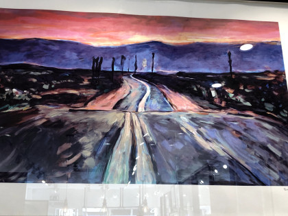
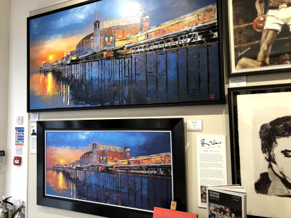
I am a sucker for some drama in colour, and I’m coming to realise that I also favour broad horizons and associated horizontals in landscapes. I believe this comes from watching The Bridge where the production values ran to extraordinarily cinematographic visuals.
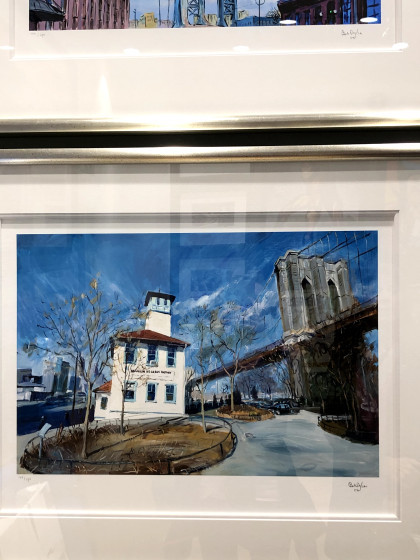
This painting is full of difficult perspectives and planes – the foreground is more or less straight on, the bridge runs from a high close left to a low distant right, and the clouds head very slightly along the other diagonal. So much trouble to get into, making those convincing.
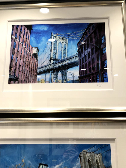
And here’s another with all kinds of tilts and diagonals, all of them ending in a focal point behind the white building which is the only element (almost) straight on vertical and horizontal.
I hadn’t noticed at the time but Dylan must really have a thing about bridges. This one links two tall and intimidating buildings made less so by being quite jauntily coloured.
Sometimes when I look at something, my first thought is that it’s a cheap shot – fur coat and no knickers, as the phrase went in my northern upbringing. It meant all show with nothing substantial underneath although it sometimes seemed to have a more literal application. This is one of those; an original-ish idea with an original-ish execution, and a wholly unoriginal message. Even the artist’s name is a cover – Alex Echo? Really?
These, on the left, are by Paul Kenton who uses an aluminium base for his work – something that was a bit of a theme in a number of other galleries. Aluminium is this season’s go-to support which suggests that using it next year may not be a good move. As for these, again the magpie in me was attracted to the colours while my inner beginner artist fretted over the perspectives I struggle with.
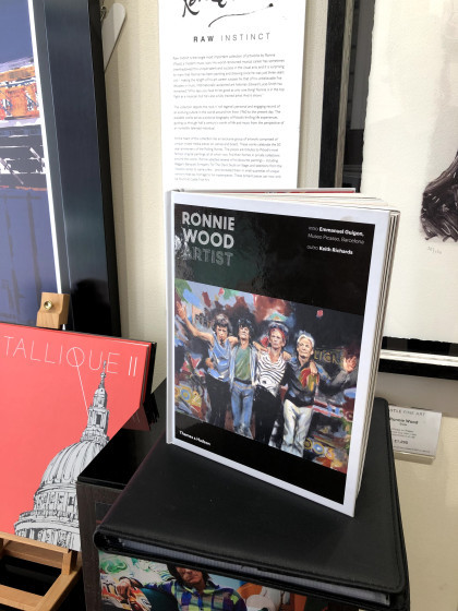
The gallery was very accomodating with regard to photographing their exhibition. The only exclusion was Ronnie Wood’s work, Wood having placed that constraint in the contract. When I asked out of curiosity why that was, the reason seemed to be related to the layers in the works that would not photograph well by visitors, especially through glass, and looking carefully at these elements, I could see his point. There are patches and squares in the mix, textures and scrubbings of colour that would not resolve easily under the casual lens. I don’t know how he made the images and neither did the person I asked. I also don’t know how to judge them. I liked them but are they ‘good’? And by what standard? Would they have achieved prominence if Ronnie Wood had never been a Rolling Stone? Big questions.
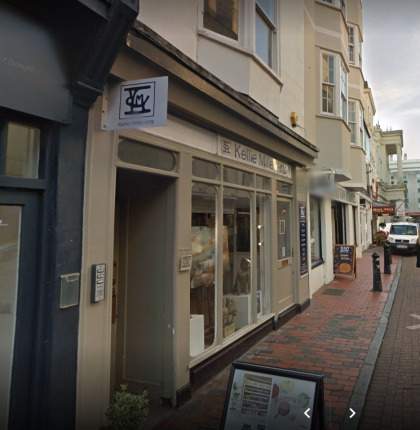
Kellie Miller Gallery
No photography was allowed in this gallery, other than of the 3D (ceramic) pieces which I didn’t find very interesting.
There were some intriguing pieces which appeared to be digital/photographic although the artist had said they were neither. There were no clues as to what the artist’s method might be but if I were to set an anchor point, it would be the colours, size, and orientation of the Kenton pieces above. These are far less direct though; with elements emerging from shadows and shapes resolving only on close inspection. There is a hint of collage but no real indication of that additional slight depth or texture. Perhaps he made these items physically and then printed them so that all the tiny bumps were ironed out. I realise now, too late, that being unable to take a photo means I should take a note, at least of the artist’s name, and I didn’t. When I go back to a new exhibition, I will remind myself that notes were what we made before we made Facebook posts.
The exhibits in a nearby gallery were very varied with some, I thought, verging on the amateur. I’m aware of taking a judgmental stance here that has an unedifying strand of superior attitude beneath it. It requires some thought to recognise that, like fiction, it’s possible to recognise something of quality (although how I judge that is a mystery to me) that I may not like, and to like something that I regard as being targeted at ‘the popular market’. Snobbery? Maybe, but creative products are all judged and the measures we use differ according to our understanding, experience, and motivations. As with Ronnie Wood’s work, I wonder if some accrue value because they have a name while other – better? – works are passed over due to their lack of profile.
These pieces seemed to me to be appealing to a less savvy – some might argue, a less easily fooled – audience. Wall pictures in nice colours that could seem sophisticated. That said, I would be delighted to have something hanging in there because I can be as hypocritical as anyone else with a product to shift.
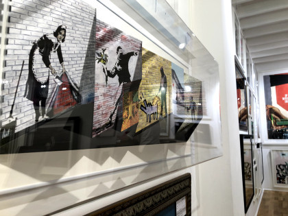
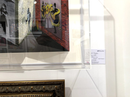
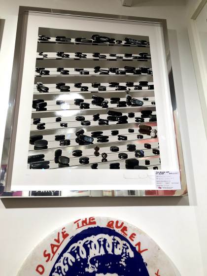
Art Republic
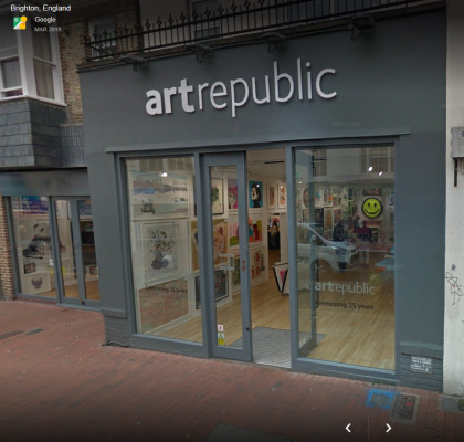
Art Republic is a different matter altogether and without knowing whose work was on show, I immediately felt that here, quality took precedence. The Brighton branch is in Bond Street which is again in the Lanes, and just inside the doors were original pieces by Banksy, Peter Blake, Damien Hirst, and Grayson Perry. This is a street. In a town centre. You just walk in. To say I was taken aback is putting it mildly.
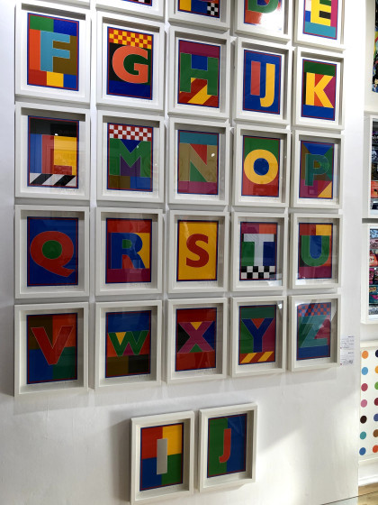
Peter Blake, I think, and while it’s easy to dismiss as ‘just’ alphabet bricks in primary colours, these are designed bricks carefully assembled and mounted in an impactful array. I gather they could be purchased separately.
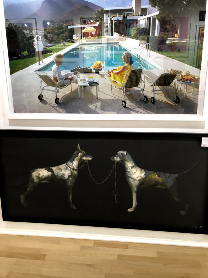
I have no idea who made these but the first struck me for its Hockney-ish colours and subject matter, it’s 1960s Hollywood gloss, and the feel it has of an advert for the aspirational lifestyle. Americans had walk-in fridges before we had fridges at all, we saw them in TV shows while we kept our milk, butter, and cheese in a larder under cloth covers. These were different worlds.
The one beneath is striking for very different reasons – the metallic appearance of the dogs, the stark singular images on the dark ground, the lead of one being held by the other. But look, the one whose lead is being held als has hold of it, and her ears are up, she looks assertive and in control. The other, still holding the far end of the lead, has her ears down and seems to be considering whether or not she has the power over the other dog that she’d imagined. But their coat patterns are flowers; are the dogs are decorative? Statement dogs left to look after each other?
These were being unwrapped when we visited and even though I was given permission to take a photograph them, I decided on an angular shot to defeat plagiarists. This artist – and here we are again, anonymous due to my note-taking deficiencies – places modernistic features in classical style so here are people who seem to come from a film poster but with Brighton pier in the background and cherubic forms in the sky. He also adds dabs of gold colour onto the prints as a final touch. Here, it’s highlighting chips being stolen by Brighton’s ubiquitous and opinionated sea gulls.
Top: Grayson Perry’s detailed, line-based, ambiguous naked figure in a domestic setting full of clutter. It’s like a cartoon; one of those where you have to find the five baskets or ten pieces of fruit. I’m not certain, but it may have become one of the tapestries he produced for a TV documentary a while ago.
By Ian Davenport, this attracted me because it seemed to be taking the mick out of Hirst spots. I have no idea if that’s true, but I like to think there was a subversive plot afoot here. I also like the randomness of the drips and dribbles, to me far preferable to Hirst’s dotted regularity.
Joe Webb’s Transmission shows two lads, looking like young Bowies, using the tin-can-and-string method of communication so many of us thought we’d invented as 1950s kids. Who knew that within our lifetimes we would be watching men walk on the moon and, right now, the Mars 2020 rover being built and live-streamed from NASA’s clean room. This image makes that point, I think.
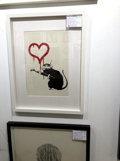
I asked the gallery staff about this and the use by the artist of Banksy’s images in this piece which is actually an expanded folding card. It seems he, Patrick Hughes, knew or worked with a mentor to the group known now as the Young British Artists (YBAs) at Goldsmiths college, who then approached Banksy for permission. I should have asked then if anyone could confirm Banksy is male. There can be no better disguise than everyday sexism – who pays any attention to a woman scoping out suitable walls to paint on?
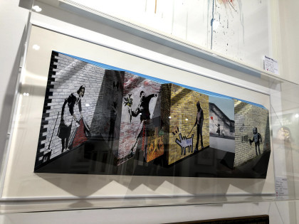
Damien Hirst: in contrast to his spots and dots but clearly along similar lines, this depiction of drugs – pills and capsules – all in black and sitting on glass shelves as if they were shoes on display in a shop seems to point to a commodifying of illness. As a piece of imagery, I think the perspectives and tilted lines, the effect making the mirrored images more prominent lower in the picture and doubling the quantity of pills, has a dramatic effect. I was drawn to it without knowing whose it was, which tells me something about judgment and the internal wrestling that goes on for me about quality versus market price. I saw quality here before I saw market value in a name.
What to say about Soozy Lipsey’s Dead Mice Bunch! For me it was an antidote to some of the more saccharine floral images I had seen in galleries elsewhere, and as a bonus has a skillful combination of line, texture, and a simple limited palette. I might have been tempted to buy that.
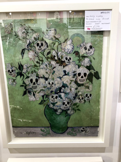
Yep, that’s our man – or woman!
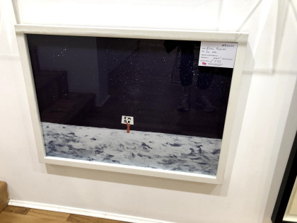
By Euan Roberts, I’m really not sure what this is about but it seems to be saying something about being simultaneously trapped and not in need of assistance – the moon waving not drowning? Who knows, but it has the clean look of a postcard you might write a cryptic message on the back of and send to a knowing friend.
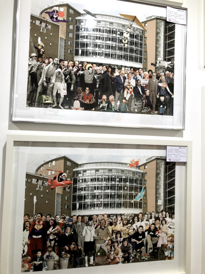
Peter Blake reprising his Sgt Pepper format. At the top is BBC1, and the bottom BBC2. They look like a point in time of popular programming.
Unfortunately, even with zoom I can’t make out the name of the artist but in fact what had intrigued me was the application of colour: the scratches and runs held together by one or two precise marks that contain them. When I can’t get these colours myself, it’s helpful to know that some, like Klimt, use gold leaf.
Magnus Gjoen: The devil hath power to assume a pleasing shape. These look like a form of applique but the artist doesn’t give his technique away. There’s the Victoriana/modern warfare juxtaposition and also, as the title suggests, the knowledge we all have that big money often drives wars. If you are a maker of arms, they will please you when another power likes the look and buys them from you.
I think the card on these top pieces reads Dan Hillier. Photographic, Pythonesque, surreal, with striking diagonals of negative space. I don’t know if they’re drawn, or if they are whether they’re physical or digital but there is an intricacy of pattern and the two together make a separate composition. You would have to have both.
There were other galleries but none that offered the qualities of the ones I have described here. There are many more; Brighton has modern and traditional within walking distance of each other and interspersed with as many coffee shops and restaurants as you can manage. My plan is to visit Kellie Miller and Art Republic again soon, plus some of the ones we didn’t have time for, including the Pavilion which I last visited ‘back when god were a lad’.
Brighton of course, is a gallery in itself.
Footnote: at every gallery I asked about their photography policy before looking at any of the exhibits. Without exception, they were accommodating and clear. Only one had an exclusion and that was on the artist’s instruction.
Brighton galleries Where can you see Banksy, Damien Hurst, Grayson Perry, Sir Peter Blake, Bob Dylan, Ronnie Wood, and Billy Connolly originals within a few yards of each other in right-on-the-street galleries?
0 notes
Text
How to update the classics for modern audiences with Dotemu
From Legacy of Kain to Detective Pikachu
We stay in a time when most individuals forty years outdated and youthful had been introduced up adoring media that was designed to operate as toy commercials, childhood companions, and near-religious texts on the identical time. After I noticed Michael Bay’s Transformers film in theaters all these years in the past, I felt like I used to be seeing a lifelong good friend who I revered with virtually holy ranges of affection “remodeled” right into a crass collection of explosions, butts, and exploding butts. It’s nonetheless the worst time I’ve ever had in a movie show. Any enjoyment I could have derived from the senseless popcorn charms of the movie had been destroyed by my very own expectations.
That is the story of a complete technology of children, now in early or mid maturity, seeing the faces of manufacturers they’d grown to like became one thing else. The Lion King, Pokemon, Thundercats, Mario, She-Ra, and Sonic are only a handful of different +20 12 months outdated franchises which have simply acquired, or are about to obtain, whole make-overs which may be interesting to new audiences, however have left at some prior followers chilly. It does not must be that means although. It is potential to make everybody blissful. Dotemu is proof of that. Their contemporary takes on Wonderboy, Windjammers, and Streets of Rage have been almost universally praised, even when adapting to new mediums and tremendously altering character designs.
I reached out to Cyrille Imbert, CEO of Dotemu, to ask for his or her ideas on 2D vs. 3D animation, retaining the spirit of a franchise with out bringing its dated baggage together with it, and much more. This is what he needed to say.
youtube
What does it take to replace a traditional recreation for contemporary audiences, with no AAA price range to work with, in a means that brings the essence of the supply materials ahead whereas leaving the outdated design choices behind?
It’s a troublesome course of as you may think about. Particularly as even when you attempt to be as impartial and logical as potential, there might be subjective choices. Our greatest solution to keep away from that’s to essentially focus on about all of the design concepts between us but additionally with followers, family and friends and get everybody’s opinion. As followers ourselves, we attempt to get the essence of what makes a traditional recreation nice and to maintain it in any respect price. From there, we attempt to collect info from our personal expertise and from web communities, about what would have been higher or ought to have been prevented within the authentic recreation. We set up a listing of these defaults and see how we are able to change them and whether it is technologically possible.
For Windjammers, the menus from the Neo Geo model had been virtually nonexistent so we thought it could be good to fully redo them, and that will additionally give the chance to present extra choices for gamers to customise their expertise and assist them perceive how you can play. The apparent addition was to have the ability to compete with anybody worldwide as Windjammers is a recreation that reveals its full potential when two human minds problem one another. Nonetheless, we determined to remain true to the unique inventive course in each side: menus, gameplay, advertising and marketing, and so on. It’s quaint, however that is actually what makes this recreation so distinctive as properly. It’s 100% a part of the core expertise and essence of the sport.
It is generally assumed that polygon-based graphics price way more to supply than conventional “dot artwork” sprites, however often one thing like King of Fighters 13 comes alongside to disrupt that notion. It is a good looking recreation that used polygon fashions for the bottom animations for every character earlier than drawing over them with 2D sprites, presumably as a result of animating with polygons was the inexpensive technique. What are the variations within the artistry, and price, behind “dot artwork” graphics, hand drawn animation and polygon-based visuals? Are there methods to mix the strengths of all three visible kinds that carry out the most effective in all of them whereas lowering the over all manufacturing bills?
That’s an excellent query! The reply is complicated because it is dependent upon various factors, the primary one being the gameplay and the digicam. I might say that the most affordable graphics are 2D pixel artwork in low decision, as a result of you may work actually fast and don’t want extra assets than one or two individuals. However certainly, if you get to greater resolutions and full HD in 2D, like LizardCube did for Surprise Boy: The Dragon’s Entice for instance, it turns into tougher and tougher. Certainly, as you’re animating body by body and by hand, you higher be an excellent artist and know the place you’re going. As a result of if you wish to change a colour, add a bit of armor or a tattoo, you’ll must do it yet again. 3D is nearer to sculpture/cease movement. So if you wish to change some elements of your character or object, it’s means simpler as you don’t have to transform every body by hand. Combining two strategies could be a good center floor, however once more, it actually is dependent upon what you’re aiming for by way of international inventive course. It gained’t be as clean as a 2D hand drawn animation, however it should really feel extra alive than primary 3D. I’m not an enormous knowledgeable on that although.
youtube
Enjoying 20-ish 12 months outdated video games like Avenue Fighter III: third Strike, Garou: Mark of the Wolves and Steel Slug three reveals that the craft of 2D animation in video games might have peaked years in the past, at the least in my view. Why do you suppose these three video games have but to be topped, even by the cleaner wanting, however typically much less expressive tiles from fashionable studios? Or do you suppose that the three retro video games I discussed have certainly been outclassed by more moderen titles, and the actual subject is with my rose-tinted glasses for the previous?
These three titles are certainly the most effective references for online game 2D animation, and that is what we love at Dotemu. You can additionally add Castlevania SoTN simply with these masterpieces. These are form of video games that will make no sense to remake graphically. They’re already good. I might say that they haven’t been topped just because they’re on the high, so don’t fear about your glasses! However there are some video games which are very near that degree and Arc System Works are undoubtedly going for it. Try DB Fighters Z, that is actually spectacular, even when it’s not 100% 2). Ori and the Blind Forest, Machinarium or the Vanillaware productions are proofs that we nonetheless have very expert groups doing nice video games. Cuphead is top-notch as properly.
However again within the day, 3D was not an possibility, so when you needed to do the most effective recreation you needed to have the most effective 2D artists. That’s it. That is undoubtedly what we’re going for with Dotemu and The Arcade Crew. We’re in love with stunning 2D animation and we’d like to contribute.
youtube
In the event you may work on any I.P., with an infinite price range, what would you make?
Hardest query ever. There are such a lot of prospects! Currently I’ve been desirous about Legacy of Kain: Blood Omen. It didn’t aged properly graphically however I bear in mind being fascinated by the environment and story of the sport. With stunning 2D HD graphics and fashionable gameplay mechanics it may actually be superior.
I’ve heard from quite a lot of great game artists who’re pretty put off by the look of the subsequent Pokemon film. What’s your tackle the newly launched trailer for Detective Pikachu, and what would have you’ve gotten executed with the artwork course for the movie when you had been in cost?
To be trustworthy, I personally have by no means been an enormous fan of Pokemon, even when I can fully perceive the success of the video games and universe. So I haven’t got a lot of a way for a contemporary tackle that license. We will discuss Star Wars and the current tackle the IP for hours if you need, however I in all probability gained’t be capable of identify greater than three Pokemon. The film seems to be attention-grabbing, however it appears that evidently it actually will get removed from the unique IP and takes quite a lot of liberties with it. It seems to be like a distinct story in a distinct universe, which could be a genius transfer or a complete failure. Pokemon is such a mass-market license, it have to be tremendous onerous to fulfill all of the several types of followers. So long as the IP isn’t just there to promote tickets and merch although, I’d say why not.
You might be logged out. Login | Enroll
Filed beneath…
from SpicyNBAChili.com http://spicymoviechili.spicynbachili.com/how-to-update-the-classics-for-modern-audiences-with-dotemu/
0 notes
Text
Interview with Nines
What does success as an artist mean to you? When will you class yourself as successful?
I guess many people may consider being a successful artist as being a famous or popular artist. Certainly it is an attractive achievement. But when you start working as an artist, at least in my experience, being a successful artist means make a living with your art, not to be well-known. That's in my opinion. Starting studying arts may be an exciting dream coming into truth but as soon as you approach to real labour world, the frustration starts to consume you. Because it is hard, really hard. There are not many jobs, there are many artists, you usually need to be freelance and it's really difficult to live doing arts. Because it is not well-paid usually, clients doesn't realize how much does it worth. Because lack of work or industry (here in Spain specially, art is not the best option to get a job). Because you need to be the best. Very best. Many great artists may not found a proper work even with an amazing portfolio. Many artists may dream working in Pixar or Blizzard. But the reality is that not everybody can do that dream job, and getting popular or living off of that popularity it is not easy to reach.
I don't know how to be popular, neither successful as famous artist. But I know how to be hard worker and professional. Although luck helps a lot too to get a job, life it is not really fair even if you are doing every step correctly and doing your very best. Not always. But sometimes may work, not giving up and trying with patience and a lot of effort. Contacts also help. If people know how do you work, you are not just a good quality artist but a responsible worker, efficient, resolute and professional, they may count on you for work.
Nowadays I am finally working as artist freelance, supplier for an advertising agency after trying so hard, improving my art and professional skills, getting experience and being trusted by workmates who tested me with some work in a tight deadline. I guess I passed the test. My “dream” job would have been working for videogames as concept artist, for example. But working as freelance illustrator and being finally paid as I deserved may make me think that I have been succesful as an artist as I can live from my drawings, even if they are in the shadow.
And, what do you invest into your work? Is it just money, or is it your time, further education and research?
There's a lot of sacrifice to work in arts. It may depend on the artist, in people. Some may need a lot of studies, some may learn on their own. Some may have a better skill than others. But it may be really similar in the end, in general. In my case, for example, there are a lot of invest: money, time, education, research and a lot of will and work, I may add. I've been all my life drawing because it was my passion, but I never thought about it as a job or professional way. I studied Audiovisual Communication Bachelor Degree at University for four years, where I could learn about graphic design, image composition, visual narrative skills etc, and then I studied, meanwhile I was working as graphic designer, Graphic, Artistic and Digital Creation private degree – ESDIP (Professional Drawing Superior High School), for another four years. I had a lot to improve and learn about drawing as art in those years. But all my little salary was just for my education, so I couldn't earn a penny for myself, just it was an inversion for my studies.
So, for now we can see there's a lot of money and time and education invest. I finished my studies in 2014 and I was really looking forward to improve my career and salary getting an good art job. But my applications weren't successful in that time, meanwhile I had to work a lot and being really bad paid as graphic designer (some laboral explotation in Spain it is sadly the “usual” thing since economic crisis). During that time I collaborated in some indie games for free, and I tried to do some commissions and freelance works too, for illustration and 3D, not earning so much, but never giving up and improving my skills.
I left my graphic designer work in the starting of 2016, and from that time until now I had good and bad experiences: bad paid freelance work, 4 dream months working as 2D artist for a unsuccessful smartphone videogame, being unemployed and sending a bunch of portfolios to everything related to arts or design... I was certainly desperate. Until I got this unbelievable chance, because I was so pessimist that I couldn't believe I would ever earn more tan 1000€ per month. And now I get paid enough to live as a decent human being.
So, since I finished University (2009), until now (2018) there's been about 9 years: 5 years of art, 3D and design learning and working in the meantime, and after that another 4 years of self-improvement since I finished art school in 2014, doing several freelance work, self work to test myself and improve my skills and speed, with some temporaty good works in the meantime. May sound really frustrating, but I bet some people were luckier than me and they may got their “stable” well-paid art job sooner. But at least this is my experience.
Furthermore, there's a lot more to pay as freelance! It depends on the country, but you sure need to pay your freelance fee and taxes, beside your equipment among other expenses.
After all this, well, if you can reach it then it is because you really love being artist and you don't defeat yourself until getting it after a really hard way. I would like to sound more opptimistic but the reality is that it is bit hard sacrifice to reach your successful art “dream” job. Anyway, if you want to, you may get it. Just don't give up and keep working hard. That makes the difference of (humble) success.
0 notes
Text
STEPS TO MAKE, Print, And Bind Your Own Books
Print Your Personal High Quality Laser Membership Cards - And Save! Great Printing Outcomes Expect great printing outcomes from your laser beam membership cards. Any 300 dpi or better laser beam printer should present you with quality membership cards. If your printer is better at lower resolution printing, laser membership cards can be a winner for you. Just have your provider print your laser membership card bed sheets with any images or artwork that you need them to - you can still personalize your membership cards on your own printer. You'll conserve a bit less, nevertheless, you still have the advantages of overall lower costs and instant membership cards for each and every member.
Create a personalized salon or gallery wall structure with multiple images. We have an array of layouts and prices to accomodate any space or spending budget. Gently place the photo onto the canvas and easy it out with a popsicle stay, your thumb, credit cards or pan scraper. Take care in smoothing the picture so there are no wrinkles. Change your drawing encounter down onto the timber you want to carve. Consider your burnisher or bone fold and firmly rub the back of the drawing. The pencil will transfer to the wood.
To ensure that framed art photos to enhance a purely contemporary design, they need to replicate these modern values. The focus here ought to be on simplicity; you do not want anything too radiant or showy. Modern art prints such as Tango in Red or Tango Argentina by Misha Lenn offer clean forms with just a splash of color and can become hung as a string on a bare wall. Another great choice is the geometric simpleness of prints such as for example Alfred Gockel's Circle of Love I or Unity by Monica Stewart. Abstract and colorful prints such as for example Rex Ray's Acapulco One can actually add that splash of color that makes a modern decor actually pop.
Now what exactly are some ideas for gifts with these canvases? Well for you personally parents 50th loved-one's birthday take their wedding photo and have it place onto a canvas. You may even consider sepia tone for a special effect for it. They will smile because they fondly think back again to that day. You can now do that by scanning the photo into your personal computer and make a good-resolution digital photo from it.
security protocol setup to audit accounting firms, and this includes reviewing their data centers. For legal reasons publicly traded businesses haven't any choice but to utilize this kind of datacenter, nonetheless it just therefore happens that they taśmy pakowe z nadrukiem are requirements are exactly what I wanted, rigorous and comprehensive. These exhaustive protection audits are administered by the American Institute of Certified Community Accountants and performed by specifically trained CPA companies.
With a superior quality finish off and UV coating, all personalised and photo posters would make a great finishing contact to any special event or occasion. Mix'n'Match any of our Artworks or Rugs to freshen your home for spring! We love mixing prints with hands paints and photographic parts with abstract artwork! Choose any 2 products from our entire collection and see the discount in your cart.
What a great wee guide. Re: papers - supersmooth papers tend to be best as they display the most detail; rough or textured papers tend to lose some details but if you are searching for something a bit more impressionistic or abstract after that that could be cool as well. Printing papers generally can be found (at least in the art store I work!) in cream or white, but popular press (ie v soft) watercolour paper tends to work just as well. Really, you can use anything that will need the ink. Like you I have a tendency to prefer oil-structured inks but that's because I dislike how quickly the water-based ones dry. I have done this sort of issue with school-aged kids before and just used acrylic or even poster paints, occasionally with a little moderate or retarder added to raise the working time.
Hey there! I've been making canvas transfers for a couple of months and just love them! Nevertheless, I've only made 8×10's. I would want to make a 16×20. taśmy z własnym nadrukiem 've been unsuccessful at locating a place that makes oversized laser prints. Any suggestions? I've tried staples but they said it wouldn't be a laser copy and therefore wouldn't work. Thanks!
Printmaking started age range ago using woodcuts. Art prints like this were produced by drawing a sketch on a block of real wood and eliminating all of the parts between the outlines which did Protape not have to be inked. After that ink was rolled on to the solid wood, which would just stick to the raised sections of the block. Finally, the block was pressed onto a sheet of paper to transfer the drawing.
In our blind print lab tests, though no enterprise was a runaway winner, Mpix's photos rated as a least-favorite choice more than any other contender. With image quality that fell below the competition's, plus its lack of support for smartphone-format images and its middle-of-the-street prices, Mpix simply didn't make a compelling choice against our main picks.
Digital cameras have grown to be quite outstanding in the quantity of bang you obtain for your buck and have served as a great equalizer in the manner that photography is no more simply a wealthy mans hobby. Choose your camera system (don't agonize), purchase a few good books and get out now there and use it. Try to discounted those highbrow camera geeks you will discover on any on the web blog and definitely dismiss the greedy camcorder producers cries that larger is better, its not!
Also available are high quality painting replicas from the Impressionist and Renaissance eras. They are enticing choices as well, particularly for individuals who take pleasure in the arts of these periods. Typically free galleries carry this type of artwork, but it can awfully expensive to purchase a piece, as you might understand. With outdoor canvas art, you can enjoy the pieces for much less And you could appreciate museum quality prints in your outdoor haven. Hanging these exclusive outdoor canvases around your patio or on an easel near your garden, gives your sanctuary a designer's touch and is sure to end up being the envy of most your friends and neighbors.
Digital printing is another method that's utilized for t-shirt printing. That is printing technique which is gaining popularity steadily. For printing the t-shirt, it really is stretched on a body below the inkjet printer head. The printing on the garment is done exactly as it really is done on the paper. Inkjet transfer paper can be used for printing the same design on large numbers of garments easily. This technique is good to choose if you want to reproduce particular photographic prints, logos or additional multi-colored images.
Although new, at this time 3D printing is becoming a lucrative business. Businesses are increasing up to provide the 3D Model Printing solutions to performers, engineers, designers, and even consumers. These companies are offering a multitude of options, giving customers and artists a lot of freedoms. For example, artists have a number of choices in size to choose from when it comes right down to 3D Model Printing. Many businesses offer very similar envelope sizes, however, many businesses offer over 50 materials, while some only offer under 10. Most large 3D Model Printing businesses provide a store for performers - a place for artists to create some significant income.
The first part of the process involves laying out a level of ink on your piece of glass. No, you do not apply the ink directly from the tube to the block! Putting the ink on the glass first means taśmy pakowe z nadrukiem that you are after that in a bit of control of the process, which is a pleasant illusion. After that you can work on obtaining a really clean level onto the roller, and then onto the block.
0 notes
Text
Wacom MobileStudio Pro 13 Review
I got to try out the new Wacom MobileStudio Pro for a little while back in October of 2016, but now that I’ve been using it for some real work, it’s time for a full review. I’ll start off right away with letting you know that if your career has anything to do with visual creativity, this is the tool you need. Notice I said tool instead of tablet. That’s because the Wacom MobileStudio Pro is almost entirely designed for creating all the things that everyone else uses in their daily lives. This tablet PC is made for professionals. The “Pro” in this tablet’s name isn’t just tacked on to make it sound better like some other electronic gadget manufacturers do. It is genuinely deserving of the “Pro” moniker.
This tablet isn’t for people who play cartoony games that everyone loves to play on their iPads, it’s for people who create those games. This tablet isn’t for handing to your kids to watch an animated movie in the back seat on a long drive, it’s for the people who create those animated movies. It’s not for taking selfie videos with cute cartoon filter overlays, it’s for the people who design those filters.
If you’re a comic book artist, architect, 3D texture artist, video editor, story board artist, sculptor, fashion designer, animator, engineer, photographer, retoucher, graphic designer, illustrator, or a student trying to learn any of those disciplines, the Wacom MobileStudio Pro is what you’re looking for.
It sounds like the Wacom MobileStudio Pro is a lot like Microsoft’s Surface Pro 4 or Surface Studio, both of which are drewl-worthy products aimed at creative professionals as well. Keep reading to find out why the MobileStudio Pro is a much better choice for digital artists. With all this praise right up front in the intro paragraph, some of you might be ready to find the order button on Wacom’s website, but despite all the power of Wacom’s MobileStudio Pro, there are a few drawbacks that you’ll want to know about, too.
youtube
Specs
The version in this review is the DTHW 1320H model which has the 13.3″
screen, Intel Core i7 CPU, Intel Iris Graphics 550, 512Gb SSD, 16Gb of RAM, and the Intel RealSense 3D model scanning hardware. The is number 4 out of 6 on the scale from cheapest to most expensive in terms of your model choices for the Wacom MobileStudio Pro. If you want to spend less money, the cheapest model has a 13.3″ screen, Core i5 processor with 4Gb RAM, 64Gb SSD, and a regular 8Mp camera. If you want even more power & want to spend more money, there are two models of the larger Wacom MobileStudio Pro 16 which include NVIDIA Quadro GPU hardware. The top of the line model has a Core i7 processor, Nvidia Quadro M1000M 4Gb GPU, 512 Gb SSD, 16Gb RAM, and Intel RealSense 3D scanning camera. Also, the larger 16″ models have 8 programmable hardware buttons in the bezel as opposed to 6 in the smaller 13″ model.
Screen and Pen
If you’re thinking about the Wacom MobileStudio Pro, the biggest selling point is going to be its screen and pen interface. I was fully converted when I first got a Wacom graphics tablet back in the mid 90’s and today using a mouse or trackpad to interact with a computer feels like using a hammer to put together a watch (especially when it comes to design work). The pen-to-screen interface gives you a direct connection for manipulating computer controls. It’s not disconnected like a mouse or trackpad. Furthermore, you can build motor-memory since the location where you place the pen tip is always going to have the same relationship to the dimensions of the screen you’re looking at. That’s never true with a mouse or trackpad so often you’ve got to spend a couple seconds looking at the screen and moving the pointer around to figure out where it is. With a Wacom pen, you place it and it’s there. I can even do this without looking at the screen and have accurate cursor control.
A touch screen also gives you direct interactivity with graphic user interface controls, but fingers are big. Each finger is going to cover from 100-300^2 pixels worth of data and buttons need to be that big to be activated. That’s a huge waste of space and a huge crutch for efficiency.
The Wacom MobileStudio Pro 13 includes the new Wacom Pro Pen 2 and its digitizer supports 8,000 levels of pressure sensitivity, plus pen tilt sensitivity, and pixel level pointing accuracy. You may remember in my Surface Pro 3 review where I compared the pressure sensitivity to the Surface Pro 2 which used Wacom’s digitizer technology as opposed to Microsoft’s new N-Trig based digitizer technology. I said that the Surface Pro 3’s 256 levels of pressure sensitivity wasn’t noticeably different from the Surface Pro 2’s 1024 levels of pressure sensitivity. The Surface Pro 2 used some of Wacom’s older & cheaper digitizer tech, and I have to say that the digitizer tech in the MobileStudio Pro 13 is far superior! Noticeably far superior!
Wacom’s Pro Pen 2 doesn’t require batteries at all. It has two buttons on the side and an eraser. Yes, the buttons are customizable too though they need to be within an inch of the screen to function (no auto-launching OneNote from afar like the Surface Pro 3 can do). It also includes interchangeable pen nibs if you want to change the feel a bit or you wear one out. The pen is so comfortable to hold. The buttons are easy to feel and find. The pen feels like the perfect weight. It makes the Surface Pen feel clunky and cold.
Putting the pen to the screen feels like coming home. The display is so close to the surface, it’s almost like you’re touching the pixels directly. If you look really really closely, yes there’s a bit of space between the top layer and the pixels, but in normal use it’s going to feel like you’re drawing directly to the software’s graphical user interface. The accuracy is excellent as well. Older pen computers often don’t place the pointer quite as precisely on the screen as you would want. Many have digitizers that calculate the positioning in clumps and that’s why some will have a jiggle to the line strokes if you move the pen too slowly. The Wacom MobileStudio Pro actually has pixel-level positioning accuracy and it is awesome. You can hold the pen still on the screen, move it as slightly as you possibly can, and you’ll see the cursor move one pixel in that direction. You are not going to get this level of precision control on any other pen computing device. What about
the corners, you say? Yes, it’s true there is often fall-off of pen accuracy in the corners of the display for many pen digitizers. Wacom solves this by extending the digitizer beyond the display area and deep into the bezel. That brush cursor or pointer is going to remain pixel accurate all along the edges.
Your pointer appears on the screen when the pen tip gets to a little less than an inch from the surface of the screen. At that point, the touch screen is disabled and you can rest your hand on the screen for a stable platform. If your touch screen is not responding to your fingers, that might be why. This range is a lot greater than the vertical range before palm rejection in Microsoft Surface N-Trig technology and that means you’re less likely to invoke touch screen actions accidentally.
The exterior layer of the screen is actually a matte material too. This is much better than those glossy glass screens that you see on things like the Microsoft Surface devices, iPad Pro, Macbook Pro, etc. The matte material doesn’t give off nearly as much glare, which can interfere with your ability to see your work properly. Often you see professional photographers with Macbook Pros covered in a black hood to reduce the glare on those terribly shiny screens. This doesn’t require that kind of work-around as much. The matte finish also reduces the fingerprint grease problem. Yes, you’re still going to get fingerprint grease on the screen when you touch it, but the interference and notice-ability is greatly reduced compared to a glossy glass screen. By the way, you get a nice screen cleaning cloth in the box.
The screen actually subtly flexes when you apply pressure. You might think that would be a durability problem, but bendable things are less breakable. So I’m imagining this won’t shatter as easily as a glass screen. It also feels much more natural to interact with and that’s a huge plus. If you’ve used a Microsoft Surface Pro/Book/Studio or an iPad Pro with Apple Pencil… yeah, they have great pressure sensitivity and you can write on the screen and accurately control the thickness of the stroke, but it still feels like plastic on glass. The Surface Pen variable texture nibs help improve that feeling to some degree, but the Wacom MobileStudio Pro brings the feeling of drawing on a computer to a higher level. It doesn’t feel exactly like writing with a pencil on paper, but the matte screen texture, the flexing, and the practically perfect pen easily offer the best pen interface on the market.
While a precise pen interface is very important to anyone in the visual creative fields, so is color accuracy. The Wacom MobileStudio Pro’s screen does not disappoint. It actually supports 96% of the Adobe RGB 1998 color gamut. That’s a much wider color gamut than the usual sRGB that most computer screens display. Most photographers and print designers are going to want to use this color gamut. For video, the new color gamut standard is heading towards DCI-P3 which extends more into the reds & purple ranges while Adobe RGB extends into the greens & blues. Unfortunately, the Wacom MobileStudio Pro does not have a quick-action button for switching between color gamuts like the Microsoft Surface Studio does.
Hardware & Tactile Buttons
We’ll start with the big silver-rimmed hardware buttons in the side bezel. On the 13″ model, you have 6 flat black buttons while on the 16″ model, you have 8. There’s also a 4 way circular button in the middle that also has a center button and the circle is touch sensitive for scrolling through functions. One some models, the center button within the circle doubles as a fingerprint scanner compatible with Windows Hello. The fingerprint scanner didn’t work at all on my first MobileStudio Pro. Windows 10 kept waiting for a finger appear, but the scanner just wasn’t sensing anything. A replacement MobileStudio Pro fixed that minor issue.
At first I thought that these would be a usability issue since none of these buttons are labelled and I had no clue what any of them would do. However, the Wacom MobileStudio Pro is a device for professionals and as it turns out the unlabelled buttons are much more powerful than first glance. They are all customizable! And the capabilities that you can program into these buttons is practically limitless. You’ll see a lot more info about this below in the software section, so keep reading.
In terms of tactile usability, these hardware buttons are very good. You can see the center button has a small nub on it so that you can easily find it without using your eyes.
The side edges of the tablet PC house some other buttons. Here you see the power switch. It’s not a button that you press but a spring loaded switch that you hold down to power on or off. This slight complexity to the switch makes it difficult to accidentally put the tablet to sleep mode while you’re working, and that’s a very good thing.
On one end of this edge there’s a volume toggle button and another spring-loaded switch. This switch toggles the screen rotation lock on and off. Also notice that all of these buttons on the edge are in a concave recessed area. This makes it difficult to accidentally press them while you’re holding the tablet, and again that’s a very good thing.
Still on this same edge, we’ve also got a 3.5mm audio port, and a full-sized SD card slot. Having the full-sized SD card slot here is fantastic since you can easily start working with photos or videos just shot on a high-end camera without any dongles or adapters.
On the opposite edge you’ve got 3 USB-C ports for peripherals and charging along with a Kensington Security slot for locking the device down. In the above photo, I have the included pen holder mounted inside the Kensington Security slot. Most laptops and tablets that have USB-C ports these days only have one, so it’s great to have 3 here. Everyone says it’s going to be the new standard, but personally I don’t think USB-C is nearly as forward-thinking as it should have been. There are no full USB-A ports on the device and that’s unfortunate since USB-A is still very widely used. You’ll need a USB-A to USB-C adapter (or three) to use most peripherals. The long top & bottom edges simply taper smoothly to a rounded edge. You can also see the 5 Megapixel front-facing HD camera in the middle of the bezel above.
The pen holder is surprisingly well designed. It can hold the pen either vertically for easy access while you’re working, or the pen can be attached horizontally parallel to the edge of the tablet for transport.
On the back you’ll see two big rubber ledges on the sides. Both of these have a tilted lip to them that raises off the back. This lip is inset from the edges so there’s a bit of space there, and the rubber acts as a little foot to set the tablet flat on a table. What’s really genius about this rubber lip is that it also hides vents for the fans. The raised lip keeps the fan airflow going out the sides while it’s sitting on a table and the fact that theses are slightly inset from the edges of the device means your hands aren’t going to cover the vents if you’re holding it. There’s no heat in the middle of the back either, so you can safely keep it on your lap while you draw.
You can also see two big slots on the back here with four screws. Those are for mounting the tablet to a stand that will let you set it up on your desk and tilt it at different angles. Wacom will have a special stand sold separately that should be available in February of 2017.
Also on the back of this model is an Intel RealSense 8 Megapixel 3D scanner and camera. Only two of the MobileStudio Pro models include this 3D scanner while the others have a normal 8 Mp camera. You’ll read more about how this works a little further down the page.
The pen also comes with a heavy duty protective case. The flat end slides out and there’s form-fit padding to hold the Pro Pen 2 securely. On the flat end there’s also a cap that contains replacement pen tips and part of the sliding mechanism has a hole that you can use to remove the pen tip.
Incidentally, Wacom does not include a special keyboard for the MobileStudio Pro. There’s no detachable keyboard case option either. They do make a wireless keyboard for the older Cintiq Companion, but there’s nothing particularly special about it. You can use any Windows-compatible keyboard that you may already have or might like to buy (that includes pretty much all keyboards, even Mac keyboards). Above you see it works fine with Microsoft’s Universal folding keyboard connected via Bluetooth. Wired keyboards would need either a USB-C interface or a USB-C adapter/port-expander.
Software
First of all, the Wacom MobileStudio Pro runs Windows 10 as the operating system. The four most-expensive models come with Windows 10 Professional while the two least-expensive models come with Windows 10 Home edition. Windows 10 is really the only choice for a high-end pen-computer with a touch screen. MacOS has pretty poor support for touch interaction and Apple doesn’t allow anyone else to license the operating system for use on 3rd party hardware anyway. You might be able to “hackintosh” macOS onto the MobileStudio Pro if you’ve got the skills, but Windows 10 has a much better tablet UI and much better handwriting recognition so I wouldn’t recommend that. It’s not really worth it and there isn’t any real advantage.
By default, the MobileStudio Pro loads Windows 10’s desktop mode even though there’s no keyboard or mouse attached. That’s good for people who are familiar with the Windows 95 through Windows 7 style user interface, but personally I highly recommend switching into the Windows 10 tablet mode UI using the quick action center in the bottom right corner button. It’s much more touch-friendly and enables some nice snapping and application closing gestures. I even set the bottom taskbar to auto-hide to make more room for the real programs.
For the most part, the MobileStudio Pro includes generic Windows 10 with no bloatware. There are some default games pinned to the start menu, but those are easy to uninstall. There’s also an “Intel RealSense Camera Calibration Notifier that loads on startup, and if you’re in Tablet Mode, that shows as a big blank white window which is pretty annoying and useless. I disabled it by going to the Task Manager > Startup tab > selecting and and pressing disable. Wacom also included a Wacom Desktop Center app, Wacom control panel, and a first-run experience to introduce you to everything. This is where it gets pretty interesting and if you’ve used professional Wacom pen tablets or pen displays in the past, you probably already know what you’re in for.
Above is the Wacom welcome screen which introduces you to the “ExpressKeys” hardware buttons in the bezel as well as setting up a Wacom Account (not necessary) and calibrating the screen digitizer. It’s not hugely necessary to run the calibration since it’s pretty accurate out of the box, but people often hold the pen differently so it’s good to get it set up for the way you work.
The Wacom Desktop software is basically a dashboard with links to the Wacom Driver control panel, but it also has an interface for checking for driver updates as well as a method of backing up all of your custom settings. That’s going to be important because as you’ll see below, there is a lot that you can do in terms of customizing the Wacom driver software.
Here’s the real meat of Wacom’s software and it is extremely robust. Just about everything imaginable is customizable here. The first row at the top allows you to select which device you’re customizing. I only have the MobileStudio Pro 13 listed here, but if I had another Wacom device like a Cintiq pen display or an Intuos pen tablet plugged in, then it would show there. The 2nd row lists the tools associated with that device. The Wacom MobileStudio Pro has a series of tactile hardware function buttons, so that’s listed first, then touch is listed second, and “Pro Pen 2” is listed third. Selecting one of those will change the options below it for further customization. The third row is labelled “Application” and this is where you can customize the preferences and behavior based on which application is in the foreground. Yes, seriously. The little plus button on the right side of that row is where you can add whichever applications you want. Generally it’s easiest to add the preferences here based on running applications, but you can dig into the file system and select a specific executable if you need to.
So we’ve got customizable settings for the hardware buttons in the bezel, the touch screen gestures, and the pen with its pressure/tilt sensitive tip & eraser plus its dual hardware buttons… AND all of those can be further altered based on which program you’re working with. That’s pretty big, but how customizable are these functions? They are very customizable.
First you’ve got the hardware buttons in the bezel. They’re called “ExpressKeys” in the Wacom software. By default, these are generally assigned to modifier keys such as Alt, Ctrl, Shift, Spacebar, etc. The top button defaults to “Settings” which shows an overlay on the screen pointing out and labeling the functions you currently have assigned to each button. This is extremely useful if you’ve forgotten what you assigned to which button, but if you want to assign that settings button to something else, of course you can do that. By the way, it is possible to press more than one button at the same time, for example when you need to do Ctrl + Alt + Shift to invoke a modification for whatever tool you’re currently using.
The Touch Ring is next. That’s the big circle in the bezel and rubbing your finger around it in a clockwise or counter-clockwise motion will invoke whatever functions you want to assign to those gestures. The ring also has up/down/left/right buttons that can be pressed in order to change the touch ring’s functions on the go. In the above image, you can see that if I press the top of the touch ring, that will set it to scroll/zoom, the right side sets it to cycle between layers, the bottom sets it to change the brush size, and the left side sets it to rotation. All of those default functions don’t work the same way in all programs, so you’ll want to customize them based on your most-used software.
For example, my RAW photo organizational tool of choice is Adobe Bridge, so I customized one of the touch ring functions to increase or decrease the rating level depending on whether I rubbed it clockwise or counterclockwise. The default “speed” for this was too high, so I easily changed the interaction to a slower speed so that I could very accurately set rating levels on selected photos without having a keyboard attached and without having to open menus.
There’s also an “On Screen Controls” tab in the functions section, and this is pretty excellent as well. Basically you can set whatever you want, be it the pen’s hardware button, a bezel button, or a touch gesture… to invoke a radial menu on the screen. And yes, you guessed it, the radial menu can have buttons for whatever you want it to do, and you can make it have different buttons for whichever program you’re using.
That’s not all folks. You can also create any number of custom touch-screen panels with whatever buttons you want to create. Each of those panels can be activated using any of the other custom options in the Wacom Tablet Properties dialog box as well (and that’s a lot).
Next is the touch screen gestures. Naturally, you can disable this completely if you want to use only the system or application built-in touch screen gestures, but you can also add a few gestures here that aren’t commonly used in other programs. Above you can see a listing of all the touch screen gestures that are customizable. The “three finger swipe left/right to navigate” and “four finger swipe left/right to switch applications” gestures can only be enabled or disabled, while all of the others can be completely customized to activate whatever command you want. Again, the default functions are available in all applications until you add another application to the application listing in the 3rd row. Then with that application icon selected in the Wacom Tablet Properties dialog, you can choose completely different touch gesture functions for when that particular application is in use in the foreground. So for example, maybe you’ve written a script for InDesign CC that
converts all text to outlines. You can assign a keyboard shortcut to that script in InDesign, and then assign the “Five Fingers Swipe Down” gesture to that keyboard shortcut when InDesign is active in order to run that script very easily. By the way, if you don’t have a keyboard connected, you can use the “Standard Layout” on-screen keyboard to specify or activate keyboard shortcuts (enabled in the keyboard settings).
The Pro Pen 2 customization options allow you to fine tune the pressure sensitivity as well as customize the two hardware buttons on the pen. There are sliders for most functions, but if you want more granular control over the tip feel, the “customize” button above will give you a pressure sensitivity curve graph. Again, all of this is customizable on both a system-wide and application-specific level.
3D Scanning Camera
Two of the high-end Wacom MobileStudio Pro models include an Intel RealSense 3D camera sensor on the back and they include a 1 year license for Artec Pro 3D model scanning software. This is high-end 3D scanning software that you’d normally use with dedicated handheld 3D scanners like the Eva or Space Spider to create 3D models of things like Arnold Schwarzenegger for Terminator movies, but the software also works with Kinect for Windows and, of course, the Intel Sense 3D camera built into certain Wacom MobileStudio Pro models.
Unfortunately, it is very difficult to get usable results from scanning 3D objects with the Intel Sense 3D camera set-up. It only works on objects between about the size of a basketball up to about the size of a couch. Anything with detail or gaps that are too small (baseball sized?), won’t render very well. You have to get the lighting just right, too. You might be able to get a nice model of relief sculptures on a wall, but a 360 degree view of a model is very tough to scan with this hardware.
The scanner does however automatically add RGB color texture mapping to the 3D object, which again requires your lighting to be just right. It’s not going to be a highly detailed image map though. The results might be good enough for a video game background that nobody’s going to look too closely at, but it’s hard to imagine what else this 3D scanner would be useful for.
Incidentally, the 1 year free subscription to Artec Pro 3D Ultimate Edition should activate automatically when you install the trial on a Wacom MobileStudio Pro who’s serial number indicates that it includes the Intel RealSense 3D camera hardware. This worked perfectly on my first MobileStudio Pro, but it did not recognize the hardware on the 2nd one, so Artec tech support had to enable a 1 year subscription manually.
Personally, I don’t think cameras belong on the back of tablets at all so if Wacom decides to do away with the camera completely on future versions, I don’t think anyone will mind. I know many people even put tape over the front facing cameras on their laptops too. Using a standalone camera or a dedicated 3D scanner would be a much better tool for the job.
Pro Graphics Software
The Wacom MobileStudio Pro doesn’t come with any professional graphics production software, but it’s clearly designed for use with many of them. Most of the default express key and touch ring functions are really made for Adobe Photoshop. So I installed a good number of my favorite graphics, photography, video, and 3D software to see how it worked and to actually use it for some content creation.
Firstly, just about all of the Adobe Creative Cloud 2017 applications work beautifully. GPU acceleration is flawless in Photoshop, Premiere Pro, Illustrator, Bridge, and Lightroom on the Wacom MobileStudio Pro 13’s Intel Iris 550 GPU. Adobe AfterEffects CC 2017 uses the GPU with OpenGL, but it cannot use the GPU for Ray-tracing. If you’re using AfterEffects, you’ll probably want a CUDA compatible GPU and for that, you’ll need the more-expensive Wacom MobileStudio Pro 16 which includes an NVIDIA Quadro M600M 2Gb GPU or a M1000M 4Gb GPU.
In terms of touch screen features, Adobe has made some huge improvements in the last few years to the touch support in many of their high-end Creative Cloud programs. Lightroom now has touch support that works pretty nicely for scrolling, panning, zooming, though you’ll still need the pen for some precision controls. InDesign and Illustrator both include their own full-touch workspaces which have a completely different UI design from the normal workspaces, although they do have many limitations due to their simplicity. Premiere Pro has some great touch gesture options integrated with the various panels. You can scrub playback in the Project panel for selected videos in thumbnail view, you can set in/out points, drag/drop, and even pinch to change the timeline view scale. Photoshop supports multi-touch zoom & panning as well, and they’ve got a new touch panel for modifier keys (though you won’t need that with the MobileStudio’s Express Keys). Of course, Photoshop supports tilt
sensitive controls in the brushes as well as the pressure sensitive control it has supported via Wacom drivers for decades. Incidentally, the Adobe Character Animator CC 2017 Preview does not currently work with any of the hardware cameras on the Wacom MobileStudio Pro 13 at this time, so watch out for that if you like to do real-time character animation.
Capture One is not touch friendly in terms of UI design, but multi-touch panning & zooming works beautifully, as does the Wacom Pro Pen 2 and wow… my photographs look great on this screen!
Corel Painter 2017 is another program that really shines on the Wacome MobileStudio Pro. I’ve been using this paint simulation software since it was Fractal Design Painter 4 back in the mid 1990’s, and it is extremely comprehensive. It’s got some a lot of excruciatingly complicated natural media simulation tools that interact with your chosen paper textures, wet/dry status, brush tilt angle, pressure, bearing, etc. Corel Painter’s multi-touch panning & zooming could use some speed optimization, but the Wacom Pro Pen support is excellent. This program is very powerful though, so it’s easy to get some lag to happen with a complicated brush and a high resolution canvas.
3D animation software like Maya 3D, Lightwave 3D, ZBrush, etc. run pretty nicely, but programs like these are heavily dependent on keyboard shortcuts so the customizable express keys in the bezel may not be enough. The pen works beautifully however, and if you’re a Zbrush user, you’ll especially love the 8000 levels of pressure sensitivity support.
Wacom Link
So far you’ve read about how extremely powerful the Wacom MobileStudio Pro can be as a visual creative tool on its own and it is very powerful, but what if you’ve got a desktop workstation in your office that is just rediculously powerful? As it turns you, you can plug the MobileStudio Pro into another computer and use it as a pen display just like the other normal Cintiq Pen Displays that Wacom makes. You’ll need an accessory called the Wacom Link to do this though. Basically it has two ports on one side that get wired into your big computer, and one port on the other side that plugs into one of the MobileStudio’s USB-C ports. The accessory includes a USB-A cable to go to your PC/Mac, a Mini-DisplayPort to go to your PC/Mac’s GPU card, and a USB-C cable to go to the MobileStudio Pro.
This can come in very handy if you spend most of your time in an office in front of a powerful desktop computer. A few things you need to know however, you will need the Wacom software drivers installed on the PC or Mac that you’re plugging the Mobile Studio into. You’ll also need to plug the Wacom Link USB-C port into the center USB-C port on the MobileStudio Pro. Apparently that one is enabled for the special Pen Display conversion feature.
Incidentally, the Wacom Link also goes the other way, meaning you can plug the MiniDisplay port directly into an external Display if you want your Wacom MobileStudio Pro to drive another monitor. Unfortunately, the Wacom Link is not able to provide electrical power to the MobileStudio Pro at the same time. So you’ll need to connect one of the other USB-C ports on the MobileStudio to the AC adapter and plug that into an electrical outlet. By the way, the SD card reader in the MobileStudio Pro becomes readable on the desktop PC or Mac when connected via the Wacom Link. The MobileStudio Pro’s internet storage does not show up as another drive, but that’s understandable. Being able to access the SD card is still very useful.
Yes, the Wacom Link works fine with a Mac. Wacom’s drivers handle all the pen input capabilities and the MobileStudio Pro’s Express Keys, Touch Ring, and custom on-screen panels are all configurable here.
The Wacom drivers even add a little bit of touch screen support to a connected Mac. Don’t expect to move windows around, launch apps, or access menus with your finger though. You’ll need the pen for that.
You’ll have to tweak the resolution on the Wacom MobileStudio Pro when connected to a Mac as a secondary display too. By default everything shows up extremely tiny. The Mac OS automatic scaling features don’t seem to work very well either.
Of course the Wacom Link works on Windows 7, 8, and 10 as well. I connected it to my HP Z440 Workstation which has quite a few processing advantages over the MobileStudio Pro on it’s own, but obviously it’s not as portable. It took some work to get everything running though. The first 3 USB ports that I plugged the MobileStudio Pro’s Wacom Link into didn’t recognize the hardware quite right. The first 2 didn’t recognize it at all and the 3rd recognized the Express Keys but not the touch screen or pen digitizer. The 4th USB port I tried had everything working perfectly. I’m not sure if this is because I’ve used other Wacom hardware on those other USB ports in the past and didn’t clean out those drivers completely or I have some other USB host driver issues.
When you have the MobileStudio Pro plugged into a desktop PC, the Wacom Tablet Properties on the desktop also show a “Toggle Display” settings tab. You can set the “Toggle Display” command to just about any of the shortcuts, gestures, and hardware keys that are customizable on the Wacom MobileStudio Pro and the settings tab allows you to configure exactly how that behaves. One option toggles between using having the pen control only one display and then both displays via a stretched out pan. This option feels weird because it changes the aspect ratio of the pen digitizer to span two displays. It’s also strange that on my version it toggles between the desktop display and both displays, which is opposite of what I’d expect. I’d want the Wacom MobileStudio display to have a full 1 to 1 relationship. The second option toggles between each display, meaning that the pen can only control one full display at a time. This seems ideal to me, but it also makes it
difficult to move windows between monitors. I wish the Windows 10 “Task View” had multiple monitors listed at the bottom like it does virtual desktops so you could very easily drag/drop windows onto different monitors instead of having to drag windows across the whole screen. Personally I’ve been using the Wacom Link and MobileStudio Pro as a duplicated display instead of an extended display. Yes, some would say that defeats the purpose of having two displays, but in my opinion in beats the learning curve awkwardness of the “toggle display” command in the Wacom software.
Interestingly, via Wacom Link there’s a special display control for specifying the color space and other settings for the MobileStudio while connected as a Pen Display.
Using a Windows 10 desktop tower with the MobileStudio Pro attached via the Wacom Link accessory is the same as if you were using the MobileStudio Pro as a stand-alone tablet. All of the same touch screen gestures work, Windows 10’s touch apps work the same, even the ink input panel shows up. The only difference is that you now have the full power of whatever high-end processors, tons of RAM, and many terabytes of storage you’ve packed into that desktop workstation. I really wish the backup/restore for customized settings would work between devices so that all my Express Keys were the same though!
Battery Life
Yep, this is one spot where the Wacom MobileStudio Pro needs a lot of improvements. With very light use, you could probably get it to last up to 6 hours, but really we’re talking about maybe 3 hours. All of this high-end hardware really eats up the battery, so be prepared to pack the charger or bring a big external battery or buy two MobileStudio Pros. Average phone USB-C chargers don’t work, by the way. You’ll need the big beefy USB-C charger that comes with it.
I really wish this could have had a user-removable battery. It seems like Wacom thought of everything to make this a genuinely useful tool for creative professionals, but its utility is decreased by its short battery life and when that internal battery starts to wear out, it’s going to be even worse. The ability to carry a spare battery and pop it into the tablet as soon as the first battery died would have been a great option.
Pricing and Availability
The Wacom MobileStudio Pro 13 and MobileStudio Pro 16 were released in the fall of 2016, but you may find that some models are still hard to come by. Keep an eye on the Wacom Online Store, Amazon, and high-end photography videography stores like B&H Photo and Adorama.
The DTHW1320T has an Intel Core i5 processor, 64Gb SSD, and 4Gb RAM for about $1500. The DTHW1320L has an Intel Core i5 processor, 128Gb SSD, and 8GB RAM for about $1800. The DTHW1320M has an Intel Core i7 processor with 256Gb SSD and 8Gb RAM for $2000. The DTHW1320H has an Intel Core i7 processor with 512Gb SSD, 16Gb RAM, and the Intel RealSense 3D scanner camera for $2500.
The larger 16″ versions are available in 2 pricing options. The DTHW1620M has an Intel Core i5 processor with NVIDIA Quadro M600M GPU, 256Gb SSD, and 8Gb RAM for $2400. The DTHW1620H has an Intel Core i7 processor with NVIDIA Quadro M1000M GPU, 512Gb SSD, and 16Gb RAM for $3000.
The Wacom Link accessory for plugging the MobileStudio Pro into a desktop computer costs an extra $70 and can be found on the Wacom online store.
Conclusion
There are some good reasons that this review of the Wacom MobileStudio Pro 13 didn’t get published as soon as the tablet was released. First of all, this is a real digital creative’s tool and its extensive set of features requires some time to learn and really understand. Secondly, the first model I got had a couple minor defects. The fingerprint scanner didn’t work and its center USB-C port didn’t work with the Wacom Link hardware. If you look at the reviews on Amazon, you might see some other minor defects noticed by early adopters. For example, some of the hardware buttons may not have activated properly. The dedicated stand still isn’t available either, so there may be some things Wacom is working on. The second device I got fixed all of the fingerprint scanner and Wacom Link problems, but the free year of Artec Studio Ultimate Edition didn’t activate properly. That was fixed pretty easily by Artec tech support though.
The 3D scanner software and fingerprint reader aren’t really integral to what the Wacom MobileStudio Pro is made for though. The real reason for buying a Wacom MobileStudio Pro is its amazing pen interface and screen along with the ability to plug into a high-end workstation while you’re in the office, and throw it in a bag when you’re on the go. The extremely customizable software combined with the hardware express keys interface is another huge selling point. Wacom’s method of making the hardware keys, touch ring, and screen gestures capable of activating any keyboard shortcut in any program is far superior than what Microsoft has done with the Surface Studio and Surface Dial which requires each software developer to add specific controls to the dial. With Wacom’s touch ring (etc.), all I have to do is tell it which keyboard shortcuts to run. Most professional programs have customizable keyboard shortcuts, so the possibilities are really endless. Apple’s
MacBook Pro touch bar has the same limitations whereas each developer needs to actively add support. Wacom’s hardware & touch software already supports everything.
The amazing pen interface, gorgeous screen, and immensely customizable software interface are probably enough to make this tablet worth the price of admission, but for an extra $70, you can plug it into a tower PC (or Mac) and give that premium pen & touch interface an extra boost of let’s say… 44 Intel vPro Xenon cores, a terabyte of RAM, multiple 12Gb GPU’s, or whatever else you want to throw at it.
The Wacom MobileStudio Pro is truely the most professional quality tablet computer on the market today.
Source link
0 notes
Last Seen Blogs

oxyprincess
lilliana

demian-ireland
Demian-Ireland

daieiri
καρδία

sickkillerzach
🔪SickKillerZach💀

johnconnell0
John Connell