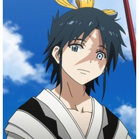
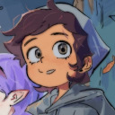
#for how saturated a character they are i kinda feel like i pastelled things too muc and trapped myself with my convoluted layer setup but m
Text

i would take their poison
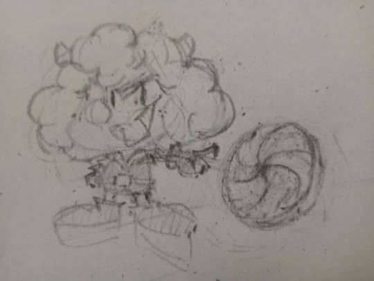
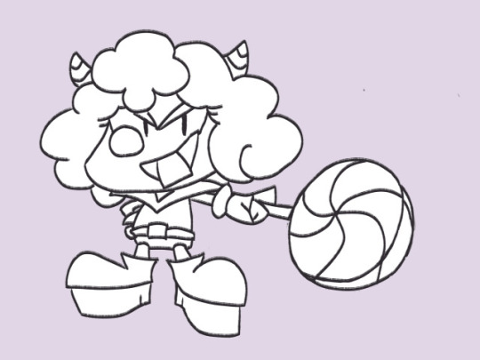
Sketch + Line Art for those Clicking Under the Cut(tm) (archival purposes honestly)
#moshi monsters#sweet tooth moshi monsters#experimentation i am COG AWFUL at digital dear goodness i was playing with coloring and transparency and all those fun digital doodads.#next time i probably wont have black outline or i'll do it differently. or i'll try well. not doing this. it sure was a process im#i'm an amateur everyone who masically only doodles. does the sketch look better than the final. kinda! but thats okay because im learning#and y'know what. sometimes in life you just need to draw faves no consequences#for how saturated a character they are i kinda feel like i pastelled things too muc and trapped myself with my convoluted layer setup but m#it was looking WEIRD with everything at full force#maybe the sparkles look dumb maybe the hair looks dumb and out of place and why i kinda made the lollipop a little funky too#uhh. first digital piece posted... ever?#the arm is SO fucky i am not that was. thats not what perspective is spam#yes this is what i spent a good chunk of today doing after i started working on coloring it and then. decided to go for it.#cooolrs a little inaccurate on the horns and such but man one of the biggest art things was like#i dont have to have everything at their perfect hex codes all the time. this would look way worse if i just. used their standard colors#yeah this is. instead of looking like its forward and to the right it kinda just looks like they have a Bigger hypno-lolly#especialy becase. i did not bother on the gloves and platforms i the sparkles work with 2 kinda sorta but you know#im practicing! i'm learning! i'll get better and learn how to do things more effectively!#anyway. sweet toof#though hey their arm looks even more fucked in the line art and sketch SO#note to future self have a Consistent Line Art Size so that if you feel like the line art looks like shit during coloring you dont have to#gamble on what size it was while changing it#sketch lollipop looks better i should have kept it small. but its fine. we'll get em next time boys (tm)#yes i know my gif post was so fancy and then the drawing is just THIS
19 notes
·
View notes
Text
THE RAMPAGE AND COLOURS PT. 1✨🎨
what is my account but a collection of my thought dumps that makes sense but also doesn't make sense? anyways! i made a list of colours of the rampage in my notes app and its been sitting there for... 7 months...
but! i really like rambling and i want to ramble bout this to you lovely people (or anyone interested enough to read this), i'll try to keep this short and simple❤️ disclaimers, these are all in good fun and are just my opinions. i also don't have access to a ton of exile tribe content, so im basing this of stuff i have watched (pls bear with me🥲)
feel free to share your thoughts. i would love to know what you think :DDD
i'm gonna have to break these up into 2 posts (16 members ahaaaaa) don't know if i'm diligent enough to maintain this one but i'll try my best!!!
likiya - gold (#fdd017)
of course likiya was going to get gold. for me, it's suitable for him because he's the leader. he carries the rampage from exile tribe. plus, he gives me very lion-esque vibes. his presence is strong, powerful. i also debated of a royal blue, but a warmer colour suits likiya. he's like the sun, makes me feel warm inside.
zin - silvery blue (#7f8e99)
several reasons for this one. i wanted the leaders colours to be opposites, so if likiya is the sun, zin is the moon. straight grey/silver didn't suit zin - it's too dull for him, so i opted for a bluer silver that reflects how he makes me feel (also kinda matches his h&l character but we won't look into that). his presence is cooler, but not cold. somehow, his vibe is closer to what i think mountains would feel like.
riku - coral orange (#f2946b)
when i think riku, i think about his beautiful smile and his bright personality. ngl i wanted to give him a yellow adjacent colour too, but i feel like a softer colour closer to orange suits him. it's warm and vibrant but not too summer. i also thought about golden retriever colours but riku, for me at least, has this natural aura that reflects a coral reef on a bright sunny afternoon.
kenta - cool tone black (#121417)
several options were going into kenta's colour choice like white to reflect his invaderz look or a red. but i knew i wanted to stick to a cooler tone colour. kenta has a very black cat energy in my opinion. though he's a ball of chaos and goofs, there are also occasions where he is quite a loner. so, after some thought, i went "well, black is pretty suiting". to me, black has so much potential. it's versatile, it's mysterious, it's kenta.
rui - lilac purple (#b666d2)
well. if you don't think of purple when you think of yonamine rui, i don't even know what to say (joking teehee). the real challenge was deciding which purple suited rui. i thought about inching the colour picker closer to white to give him a less saturated colour to match his softer side, but i realise that rui is vibrant. his dancing, his smile, his everything.
yamasho - pink (#ed93db)
now, if i was going to do this before, yamasho would've been more green for me, or blue. but, i've been really interested in his current venture with new looks and makeup. i really admire yamasho for experimenting with his style, because not only does it suit him, but it's so refreshing to see. his creativity, his boldness. they shine in my mind when i think about yamasho. i thought about a more salmon pink, but this one. it's light but bold, just like he is to me.
kazuma - blood red (#8b0000)
red was my immediate thought when choosing a colour for kazuma. it's the colour for his prince of legend character of course, but it's also the colour of blood, which also makes me associate him with vampires. yes, i know he has been attributed with wolves a lot. however, he has sharper, intimidating features, which immediately makes me attribute him to things like knives, fangs, rubies. kazuma always gave off this overwhelmingly strong red vibe for me. passionate and elegant, but dangerous and intense.
hokuto - pastel yellow (#ebe7a2)
i thought about giving him a pastel pink. the more i think about it, the more i find myself giving hokuto a pastel yellow. maybe it's because a majority of his styles had always given him soft blonde hair. but hokuto reminds me of sun, but more like the sun on a cloudier day, or the way petting a cat feels. his vibes are soft and sunny. sweeter and gentler.
#the rampage from exile tribe#the rampage#exile tribe#hey ldh if u need someone to design a rmpg themed eyeshadow palette or makeup hit me up
23 notes
·
View notes
Text
benny’s rwby rewrite: team RWBY redesigns
hello again! in honor of me actually getting some schoolwork done and subsequently having the time to rewatch the first volume of rwby for writing purposes, i thought i’d get out of the way some design notes that have been living in my head for the main girls. with how important colors and motif are in rwby as a whole, i thought that a little more care could be taken. i’ll go into the volume 1 designs most of all, and outline any consistent changes within the character’s notes. i’ll also go into why i’m changing what i’m changing.
with that, my thoughts as always will be under the cut!
ruby rose:
we’re starting strong with ruby’s design, and god do i have some strong opinions about this girl. let it be known that i actually like ruby’s clothing design: i think i’ve mentioned that i think the contrast of a fluffy petticoat and platform boots with a giant scythe and killing monsters is really interesting. that being said, there’s some fucked up geneology happening in the rose-xiao long family.
a big issue i have with ruby and her family members is the fact that despite the fact that yang and ruby are related through taiyang, neither of them have inherited his skintone. you’d think that with how literally their phenotypes are taken, that ruby wouldn’t be white as snow. with how low-contrast ruby’s design is as a whole, i think that her having darker skin would be welcome. adding the bonus of holy shit, a dark-skinned mixed girl is the protagonist makes me really biased toward this. complexion-wise, she should be somewhere between summer and taiyang, but still visibly darker than someone like weiss.
her hair being naturally black and red is perfectly okay for me. i think that it looks nice, and there’s a lot she can do with it. i can’t really complain about it being in her eyes after gushing over her combat cupcake skirt.
what i can complain about is her lack of pockets. like, she only has one little pouch to carry god knows what in. is she really expecting to be able to carry all of her ammunition in that one little pouch? god no. swap out the pouch for some kind of bag, or better yet, a bandolier of some kind to serve the same asymmetrical purpose that dingy little pocket does.
finally, her eyes. in my ideal world, i would have done something a bit more dramatic to set ruby’s white eyes apart from, say, neo’s grey eyes. maybe making her pupils lighter than black, grey, or even just white. the animators made blake’s pupils smaller to set her apart, why not give ruby’s eyes a little something-something? also, with the contrasting color of her design being either a silver or a white, having her silver eyes be one of the lightest elements of her design is really aesthetically pleasing to me.
weiss schnee:
i’m going to be completely real here, i like weiss’ original design a lot. they really leaned into the weiss part of her: the girl’s white. she’s white as fuck. her dress is white, her little bolero is white, her shoes are white, it’s all white, with just a touch of icy pastel blue to make her feel more cold than sterile. i love it. i’m also a big fan of the other, brighter colors in her design, but i think the introduction of red should have waited a bit longer.
in her introductory outfit, the inside of her bell-sleeved bolero is this blinding, fully-saturated red that is really distracting to the eye. i’d replace this with a blue, sort of like the color of her eyes, and do the same with that little doily piece at the dip in her neckline. i also think that she should have been kept much more symmetrical, the most symmetrical of any of the cast. move that side pony to the center back of her head, put one of those little pouches on each hip, and have her stow her weapon across her back.
also, this isn’t even necessarily a problem, but i think weiss would have benefited from a much more conservative shoe. knowing the schnee family, i don’t they would have found it appropriate for an heiress to be running around in platform heels. i think that pointe shoes, or something familiar, would be really interesting, especially in conjunction with her ballerina aesthetic. her scar can definitely stay as it is; i think it’s both subtle enough to break her symmetry nicely, but also symbolically strong.
also, of all of the characters to give a dramatic haircut, it should have been fucking weiss. i’m all for bi bob blake, but imagine the dramatic potential of weiss just chopping straight through that shit to declare herself independent from her shitdick father. also, i think her hair should be naturally brown, like jacques’ is. the narravite element of her having to tirelessly keep up appearances is really good to me.
blake belladonna:
blake lives in a weird space for me. on the one hand, i would love for her to have dark skin as well, to sort of even the scale in terms of complexion. however, having a dark-skinned woman with literal animal ears being kind of problematic isn’t lost on me. in my opinion, the issue lies in blake being uniquely dark-skinned: in conjunction with ruby and yang, i think that her being dark-skinned is a little less uncomfortable. i think it would also remedy the problem of most of the dark-skinned characters in rwby being either dead or evil, so we’ll make her a bit tan.
with that out of the way, i also really like blake’s design, but she could certainly use some work. she, like many of the other team members, are pretty low-contrast save for the white tube-top thing she had going on. i think the white in her design should be toned down, either to a grey or a purple color. i also think that her arm situation needs to either be long gloves or wrapped-up straps, not both. that motif isn’t anywhere else in her design, and most of the lines are clean and smooth, not all jaggedy like the straps are. keep those bracelets on her upper arms, and make those gloves of hers marksman’s gloves.
i also think that she should wear thigh-high boots. this isn’t just my bias showing; something about the way those boot cuffs cut off the line of her legs is just really irritating to me. have them attach to that swooping vest situation, this is anime, it doesn’t matter how she’d get into them logistically. also, that gradient situation on her is just terrible. having seen a lot of art of her without that gradient has converted me, her design is just so much more clean-looking without it, and blake really reads as someone who should have a much less complex design, opting for clean lines and nice shapes instead of the frills and textures someone like weiss has.
yang xiao long:
i’m gonna start with something i’ve already mentioned: yang should be brown. the fact that she not nary a fucking hair of melanin from her dad is a crime. ideal yang is brown, but so is her hair to start out. i had the idea of rather than her hair being naturally yellow, starting out brown and being bleached in streaks by the heat of her semblance, and as the show goes on, it gets more and more yellow, and eventually even platinum blonde.
with that out of the way, i do not like yang’s initial design. the puffed sleeves don’t make any sense with her as a character, that weird train situation she has on her belt is an affront to god, and why is she just wearing spats? i think that of all of the people to tear, or hell, burn the sleeves clean off of her jacket, it’d be yang. yang is a fuck sleeves kind of girl. she’s a “i flexed the sleeves clean off of my shit” kind of girl. also, she’s gonna wear a tube top and hot pants, but she’s gonna button up her jacket? fucking what? unbutton that shit. she’s a lesbian vest kinda girl. she can keep her little scarf, and her tube top is a look, so it can stay.
i actually really like yang’s boots. i think they compliment her really nicely, and she’s enough of a brute fighting style-wise to warrant those chunky monsters. the mismatched socks and little scarf are cute touches too, but i think the scarf should start out red. the purple can come in later. addressing the spats (bike shorts? spanx?) situation, there’s a very simple solution: give yang jorts. not even a fucking joke, give the woman jorts. look me in the eye and tell me that yang “t-shirt as a bandana” xiao long would not wear jorts. you can’t. it’s impossible. she would wear neon yellow jorts with that ungodly belt situation and i will not compromise this. the overalls she wears in atlas? also jorts. mistral? black, sure, but fucking jorts nonetheless. jort xiao long will outlive me, so help me god.
... i got a bit carried away there, but i hope you enjoyed my thoughts! i may at some point get around to actually drawing these redesigns, so keep an eye out for that in future!
7 notes
·
View notes
Text
me: *evil* maybe if i surround myself with things i’d like to hyperfixate on, i can fool my devious mall crytpid brain into hyperfixating on it
my brain, about to make me hyperfocus on Pretty Cure outfits: i’m about to ruin this enby’s whole career
(I am gonna rant about the Precure outfits tho. Please know that I’ve only watched Smile! and DokiDoki! Precure, so I don’t know a lot about the characters. This isn’t me judging the characters themselves, or the series, I just.. have some criticisms concerning the outfits.)
I absolutely hate most of the KiraKira Precure outfit designs, because the blues for Cure Gelato’s outfit do NOT go together at ALL, like holy hell, the darker blue and the cyan aren’t cohesive, and the yellow accents make it worse. Cure Macaron’s outfit looks like they took several random skirts that didn’t match and smashed them together. And her colour choices would be bad enough if it was just the indigo and the violet, but NOOOO they had to throw in that random raspberry colour, which throws off the WHOLE thing. And Cure Chocolat???? Cure Chocolat’s outfit is just a whole lot of YIKES. There is WAY too much brown for her outfit to look cohesive with the rest of the Precure team, and the sharper edges and jagged shapes don’t go with the rest of the team either.

like... LOOK at this. I don’t have any complaints for Cures Whip and Custard, I think their designs are cute and go well together. AND CURE PARFAIT I DON’T LIKE THE DESIGN OF FOR AN ENTIRELY DIFFERENT REASON, OH MY GOSH

CURE PARFAIT was supposed to be the green Cure. CURE PARFAIT was marketed as a green Cure. And??? There is almost NO green in her outfit. The same thing goes for Cure Milky (Star Twinkle) and Cure Felice (Mahou Tsukai Precure). They were both marketed as green, but what we got was TEAL cures with pink hair and white and yellow accents with maybe a bit of green. It’s frustrating, because the pattern indicates that we’d get a green one every four seasons, every four years but the past 3 have just been teal?? And even going by the usual pattern, we should have gotten a green cure in Healin’ Good Precure, the newest season, but we didn’t. And I understand that green isn’t necessarily an easy colour to work with, but its just... It’s frustrating.

[Cure Felice, left. Cure Milky, right.]
So, with Cure Felice AND cure Parfait, they have light pink hair. I think that’s kinda counterproductive, because that just makes them seem like pink and teal cures. Cure Milky might as well just be blue at this point, honestly. And while we’re on the topic of Star Twinkle,
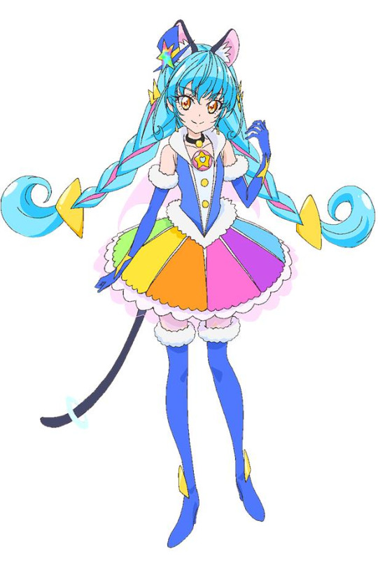
Let’s talk about Cure Cosmo’s design! When she’s by herself, her outfit looks like a normal Precure outfit. However, when she’s in a group shot with the other Star Twinkle Cures, her outfit feels really lackluster and boring. For example:

All the other Cures look perfectly normal, with their usual amount of detailed-ness, but Cosmo... kinda stands out. Is that just me? ALSO. For the most part, I really like the designs for Healin’ Good (Aside from the fact that we didn’t get a green Cure), with the exception of one Cure Sparkle.
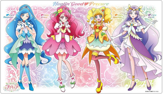
I think that what they originally tried to do with her was break the habit of giving the yellow Cures warmer accents, and went with cooler ones instead. In Sparkle’s case, they went with navy and a blueish green. However, there’s also orange accents in her outfit, so that doesn’t work either. And even if there wasn’t orange, the main yellow in her outfit is too warm for the navy+green to have worked. Besides, the blue kinda offsets Cure Fontaine, in my opinion. Not that Fontaine is the only one there allowed to have blue in her outfit, I just personally think that the blue in Cure Sparkle’s outfit doesn’t work. ALSO, what is with the fluffy petticoats under her skirt?? It doesn’t look right, I don’t think. And the fluffy things are ALSO implemented on her shoulders and in her earrings, too. I like that her earrings are white, they contrast nicely. I think the fluffy parts would have looked better if the rest of them were white, too, and not just her earrings. And I honestly don’t think the blue+green would look bad if they were lighter, too. Also, Cure Sparkle’s socks look really weird. I think they were meant to look like transparent black, but they way they’re coloured makes them look burgundy. And the yellow on her shoes is more saturated than the rest of her outfit, so they stand out, too. The rest of the Healin’ Cures have much lighter colours, so the darker accents on Sparkle’s aren’t.. I don’t know. I don’t like the colour choices for Cure Sparkle.
On the opposite end of the favoritism spectrum is Hugtto Precure!! I absolute adore the designs for this installment, the pastel hair colours are GORGEOUS and all the designs are so different in a good way, and the colour choices are great, and UGH.

Now, one could say there is an issue with Cure Etoile’s [The yellow Cure] blue accents and what I was just saying about how I didn’t like that with Cure Sparkle. However, the blue that was used for Etoile is a much lighter and warmer blue that the one that was used for Sparkle, so they look very different. The warmer blue goes better with the colours used for Etoile. Also, the blue in Etoile’s outfit isn’t accompanied by green, so it fits much better with the rest of the outfit. And I really love how the Hugtto Cures’ outfits have sorta-themes!! Cure Etoile’s got the flight attendant aesthetic, Cure Yell’s a cheerleader, Cure Amour’s got this sick gothloli aesthetic that matches Cure Macherie’s classic lolita theme. And Cure Ange is, well.. Angelic!!
I don’t really have any other criticisms for any of the other Cure’s outfits. Thanks for coming to my TED talk.
#in which i go on a tangent about Precure outfits and colour schemes#precure#kira kira precure a la mode#healin good precure#star twinkle precure#kirakira precure spoilers#healin good spoilers#star twinkle precure spoilers#precure spoilers#cure etoile#cure sparkle#cure milky#cure parfait#cure chocolat#cure gelato#cure macaron#cure cosmo
15 notes
·
View notes
Note
dear Kiw-ii; any tips to paint better? and,, i love ur draws and all your stuff! nwn✨
hmm.. I'm sorry but if I knew how to paint better, I would have already done so by myself 😭 buuut! I will still try to give some advice. I can't guarantee these tips will help :-( but I hope they will! [I just finished typing and be warned, it's a long reply. I'm sorry..]
okay, obviously I won't tell you that generic "draw, draw and draw even more". it's just not a good advice and it's kinda down putting in my opinion?? So instead, I'm gonna tell you this:
1) DON'T stress yourself. The more you are stressing yourself to become better, the more you are likely to fail, especially when you don't meet your expectations and get upset. It's just frustrating. Instead, simply go with the flow, with your own pace.
2) draw spontaneously. just randomly start drawing. no matter on what media. I know that when I just simply scribble around, these sketches turn out to look a lot better and dynamic than those that I'm forcingly planning to draw.
3) mess with different brushes and colors. what I mean by that is to use different techniques and sizes. some people's style matches soft, pastel colors better than bright, saturated colors. It depends on what you prefer. Just experiment and see what looks and works best for you! :-)
4) I personally have never done these things but maybe they will help you(I've also heard that REALLY many people do these things and they all claimed that it helped) so, look up references or tutorials on how to draw things(pls make sure to credit the artists who drew these references or if you directly reference their own art). Depending on what you draw tho. If you draw characters from an existing show, then I would suggest to directly search for official art work of the show, for example, I know Parker Simmons has uploaded character sheets& other reference sheets on how to draw a character. That way, you know exactly how to properly draw the character. And once you memorized how to draw the basics for that character, you can also start experimenting and adding your own style to it as well!
5) try changing the way you start drawing. for example, if you always start drawing the head first and then the body, try doing the opposite first! so instead of drawing the head first, draw the body first. It sometimes feels good to break up your usualy ways of drawing and you might get some creativity boosts too. maybe you even prefer the new way and it's easier for you? who knows! so don't ever be afraid to experiment as much as you want, you can only gain experience and knowledge from it.
6)similar to 1) but I just need to stress this as much as possible: please don't get sad or frustrated when a drawing doesn't turn out as you hoped it to do. Especially not when one only started drawing a while ago. You can only get BETTER with each drawing you make. You know what they say: "You can only improve learn thanks to your mistakes". So be sure to analyze your finished drawing. You can even write down what you want to improve and look at other people's art to see how they have dealt with the the things you struggle with.
so yeah. again, I have no idea myself and I basically just gave you some ideas that seemed logical to me 😅 I'm sure you'll become a great artist cause I feel like you're determined and really do want to improve.. unlike my lazy self •u• Anway, I hope I could at least somehow help you and I'm rlly sorry if my ideas didn't help you or if I was annoying with anything :<
have a nice day!!
10 notes
·
View notes
Note
i guess its compliment hour over here, so i gotta say i've always loved your colors?? its something i struggle with myself and while reading your comic it's all just SO vibrant and inspiring i can feel it even while i'm not looking at it here... do you happen to have any advice for picking colors? can't wait for the next comic update btw!
yall are SO nice to me and I am insufficient in expressing it beyond HEART EMOJIS— ❤❤❤ thank you so much!! ;u;
my artsy talk is under a cut cuz i am again not well acquainted with brevity ghjsghs—
theres a lot I’m still working on learning in art+coloring but coloring is my favorite part!! I honestly just futz around with layers until I feel like it looks Right l ol, I like pink and purple so I use those a lot! and I like limited color schemes so I use repeating colors among groups of characters rather than giving each one a fully unique palette. ik that cause them to stand out a little less but personally I like using shared colors to give a look of unity among characters who have close ties and using more unique/different colors for characters who don’t fit in with that group :V
for picking base color schemes for characters i just use the colors i like and use ones that are just,, magic girl color psychology basically ppfh—like using my ps1983 characters as an example! pastel pink feels soft and comfy with a vibe of healing, and Healing is gonna be a big thing in my comic. blue is elegant and dark blue can feel cold and distant and mysterious, especially when kinda at lower saturation. Bev has got a much more uniform color scheme than the other mcs with it being mostly blue, for that reason :^0 bon wears some muted colors but her shirts tend to be yellow/orange or otherwise bright to help establish her on sight as warm and friendly and bright—all basic color stuff that everyone knows of and uses, whether intentionally or not, but it is effective so i deliberate over em!
and with backgrounds, for my comic I usually do one nicely colored one per page (roughly) and then in the rest of the panels I do it in either monochrome or very limited color just to make the characters stand out more against it. i like how some older cartoons do it, where you might have just blocks of super limited color or monochrome with different saturation as the background and lineart overtop without actually coloring in anything! i think it looks cool lol
and picking color based on mood of the drawing is the obvious one but i have fun with that too! and will just shift the whole palette to one color. ex., I might just color everything using only blue from the start rather than use an overlay or shading of blue and leaving everything else fairly intact. or a more subtle one ive used is, for panels or draws i want to look richer and warmer, I’ll paint a rainbow on top and blur it to heck and lower the opacity a lot ¯\_(ツ)_/¯ most of my techniques dont have a solid basis other than “i think it looks nice!” haha but! for me thats what counts!
thank u again so much for your kind words and support!! and for giving me a chance to talk about art stuff!! 💖💖💖 :,3 I hope you have a wonderful day!
4 notes
·
View notes
Text
OC Design Basics #1 - Colour Palettes
Every part of an original character, fandom or non-fandom, humanoid or animalian, is important to the bigger picture. Your original character is like a mosaic or a puzzle, every piece is crucial to having a “good” character: personality, backstory, relationships, etc., you know the deal. But today we’re going to discuss: the importance of OC design, common mistakes and what you can do to fix them.
Now, this isn’t a post made only to talk about how OC fame/attention is linked to OC design… Which is really isn’t, and I hope that’s clear! This isn’t a tutorial on how to get famous either, but rather a collection of information and tips meant to help you! This is also geared towards a younger audience - so some things are pretty obvious.
Alrighty then, let’s get into this~
Importance of Design
We all know the idiom “don’t judge a book by its cover”: which discourages people to prejudge something’s overall worth from a mere first glance, positive or negative. However, when it comes to characters, you’ll often see the images before you see their biography or information and get to know the nitty-gritty information about them.
It’s pretty superficial, but first impressions can make or break your OC’s popularity and reception, but alas, that is just human nature. If you have a fandom OC; how well your OC’s design blends in with the existing cast, or how much they stand out against them can reel in an intrigued audience. Your OC’s design is just one of many factors which may bring you an audience, or leave you with just a small one - but shove aside that notion and let’s focus on what’s actually important.
A good OC is congruent, with all the little pieces working together naturally to tell your OC’s story and fit with aspects of their personality in a way that doesn’t feel forced. Their appearance should reflect things about them, and give the audience an idea as to what they are like from a first glance or two. It’s a challenge, but as you grow more experienced, it becomes easier. However, some help along the way is always nice, and that’s why we’re here!
In this tip & tutorial post, I’m mostly going to cover more natural colours and make your OC look more, well, “original”! Of course as always, these are just opinions, and you are just as entitled to your own as I am to mine! Also, I’ll be talking about more common mistakes I’ve seen several young artists and creators make, so if you’re new to OC creation, here’s some tips from someone whose been doing too much of this kinda thing!
I will not be covering facial features and shapes here, but perhaps I will in the near future??? This mostly focuses on colours!
For this tutorial, by the way, I used a colouring page found HERE. I’m not entirely sure if this is the original artist, nor is the original artist credited. If you ever find the source and wanna let us here at @oc-rehab-centre know, that’d be just dandy!
Common Mistake #1 - Hair Colours/Styles
If you’ve browsed the undiscovered page of DeviantART, you may find yourself browsing the work of younger creators. It is always wonderful to see young artists working to produce their own characters, but it’s a shame to say that most OC creators can determine or guess your age range and experience from the way you design characters, or perhaps an inability to credit base makers lmao.
What I see a lot on DeviantART when it comes down to hair colour is often… unstimulating. Hair colours like black and oversaturated colours are often used, perhaps due to a lack of understanding the colour wheel of infinite possibilities or how to make colours beyond what they can find in their box of 24 Crayola coloured pencils.

When it comes to OC design, you want to try your best to avoid black and bright, bright colours that are hard on the eyes unless absolutely necessary and essential to your character.
Black hair can easily be substituted for other dark and natural colours, like shades of brown or red. Heck, there are entire charts of natural hair colours online you can browse.
Blinding shades of red, green, blue, etc. can all be made easier on the eyes by simply mellowing or darkening the colour. Perhaps you might settle for pastel hues, or a darker and less saturated tone. Both your eyes and the eyes of your viewers will thank you for making something other than pitch-black or a vibrant hot magenta!
Hopefully this little diagram shows what a difference a bit of playing around with your colour wheel can do! Now time to address another common trope in OC creation when it comes to hair: hair styles.
A very common hairstyle that you see is the hair over one eye. OCs with their bangs draped down over one eye. TV Tropes discusses this infamous design cliche as a way of symbolizing sexuality, shyness, solidarity or powerful [HERE].. However, most OCs with this hairstyle are not always explained and if it is, it’s done poorly, making it seem as though a) the creator was merely going for a run-of-the-mill edgy look with their character OR b) they just can’t draw the other eye.
While having an OC who's a bit on the edgy and badass side is cool and all, it is a trope to avoid. I went through a phase of having my hair over one eye in my elementary days but trust me, it’s not a very practical hairstyle, and it’s certainly not very stylish if your bangs are all scraggly too. If you have chosen this hairstyle to avoid drawing the other eye, just take the leap! You’re not going to improve unless you push yourself to experiment with new hairstyles, of which there are many!
Finding other hairstyles to use for your OC is as simple as browsing the Internet. There are countless of video and written tutorials to watch on how to draw hair styles, all of which are arguably more appealing and interesting than that mock of edgy bangs. If you are striving for an edgy character, there are other ways to show that in their design than simply such an ill-mannered hairstyle!
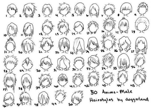
Credit: doggerland
Common Mistake #2 - Eyes/Facial Scars
Much like hair colours, overly-saturated colours can ruin eyes when they seem out of place. You can have an OC with natural coloured hair, a good colour palette and then oh wait - an eye colour that doesn’t really fit. I’ve seen many young creators using eye colours that really don’t exist and look very unnatural, clashing with their character’s design.
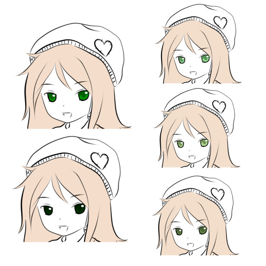
Like with hair, a certain number of natural eye colours exist. Even if you’re bending from natural eye colours, avoid using saturated shades or shades that are just too dark. You can get some nice and more natural colours by playing around with your colour wheel. You can be bold without using such assaulting colours! XD
Another common trope derived from anime and gaming are scars. I know I was mostly going to discuss colours here, but like hairstyles, it’s something worth addressing!Once again, I’m gonna make reference to TV Tropes’ article. The most common scars include:
A cut over one eye
A claw mark (usually three or four even gashes on the chest or face)
Any of the Standard Bleeding Spots
Any scar shaped like an X.
A scar on the face that happened in a sword duel.
Credit: TV Tropes
Regardless of the universe, fandom or non-fandom, scars may add to your character’s story, but it takes a lot to make a scar on the face seem original. I’m personally not a fan of OCs with scars on their face, since it’s often not acknowledged or even drawn in a way that is realistic.
For example, getting slashed across the eye with a sword or blade would not leave a clean scar and a pearly, blinded eye, as we often see in anime. It would look nasty and it would look as disabling as it feels, so when people don’t abide to the very nature of how the human body heals, it irks me a little bit.
My tip here would be to avoid scars that go over the eye unless you’re going to do it right. Research the injuries if you don’t have a weak stomach, and see what injuries like that would really look like. Overall, facial scars are also something you should steer away from. Important scars can go elsewhere, you know! There’s more to your OC’s body than just their face.

Scars also come in more shapes than just 3-4 animal claw marks, burns from abusive parents or straight-lined sword scars. Scars come in different shapes and sizes. Some are hypertrophic/raised while others are flat and just sort of look like birthmarks upon healing. Are you willing to give up your action-packed duel scene and settle for a more realistic scar for your OC? It’ll help in the long run if you’re aiming for accuracy.
Common Mistake #3 - Colour Palettes
Oh goodness you guys have probably heard enough about me yammering about colour. But hey - this tip post is mostly about the importance of colour. This here is the last major tip for designing your OC. This will be the last part of this post, and I apologize for this being a bit of a mess! I was trying to keep this one as general as possible!
ANYWAYS-
Colour palettes are essential to a character! I hope that’s ingrained in your brain at this point because it really is! Their wardrobe should reflect their personality and should be carefully considered as well. Too many times have I seen colour palettes that just do not work at all with the character’s attire nor their apparent personality.
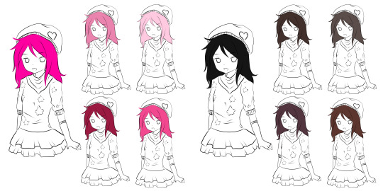
Using the girl who has been our base for examples in this post, let’s take a look at her attire. A baggy hat, a bandanna around her neck, a sweater, fingerless gloves and a layered skirt. This is rather cutesy attire and while perhaps you could argue that a pink and teal getup or an edgelord black and rainbow outfit could work, there are palettes that might fit this character a little better.

Pastel colours fit better with this style of dressing. It feels more correct to have the four palettes on the right than the two on the left. This is the effect your colour choices have on how pleasing your character looks to the eye.
And that is all!
We hope you enjoyed this tip post! Likes, reblogs and follows are always appreciated. Some aspects of OC design were not covered here, especially the important stuff that more experienced creators would’ve wanted to see like how to make face, eye, nose, etc. shapes more unique and clothing design. I’ll try to ensure that gets covered in the future, as I said before, but I hope that those that read this enjoyed it!
4 notes
·
View notes
Last Seen Blogs
pantunfla-fk-blog
✖ P a n t u n f l a ✖

gentcreate
GENTCREATE

slave4asiansuperior
Untitled
madeofpalistromwood
A menace to society