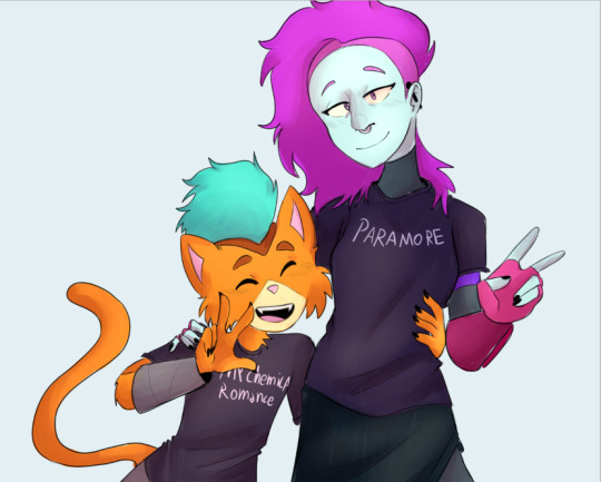
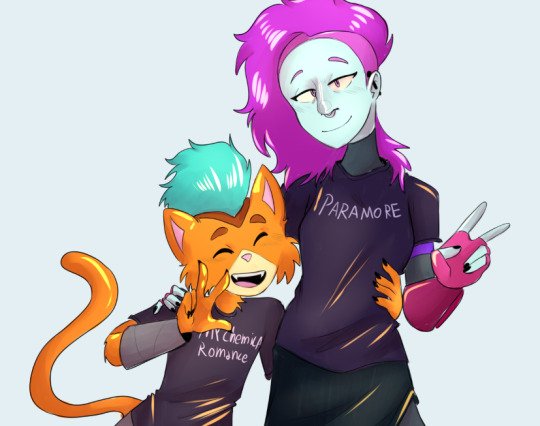
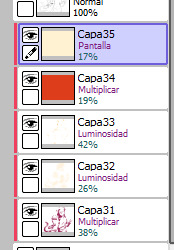
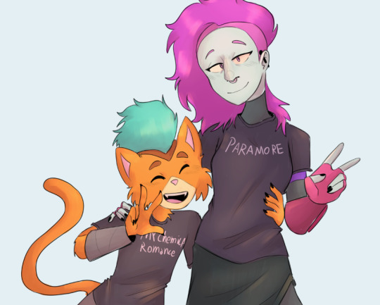
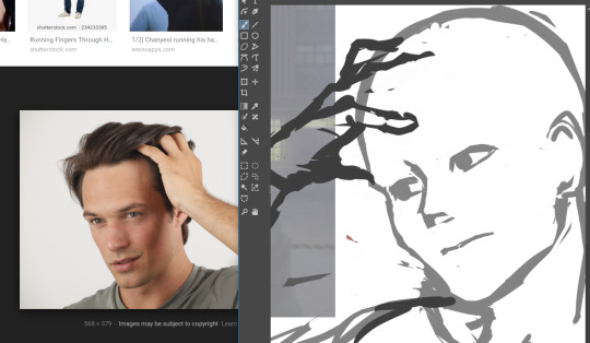
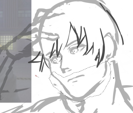
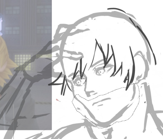
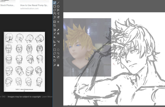
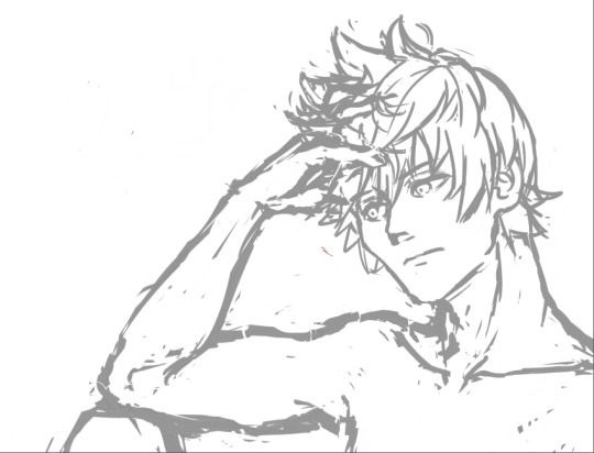
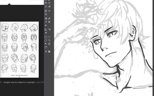
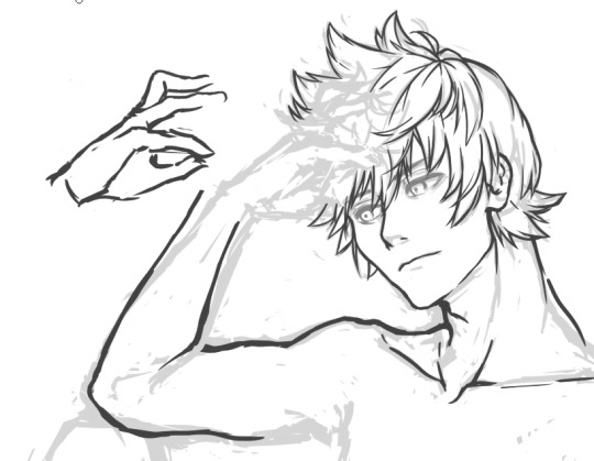
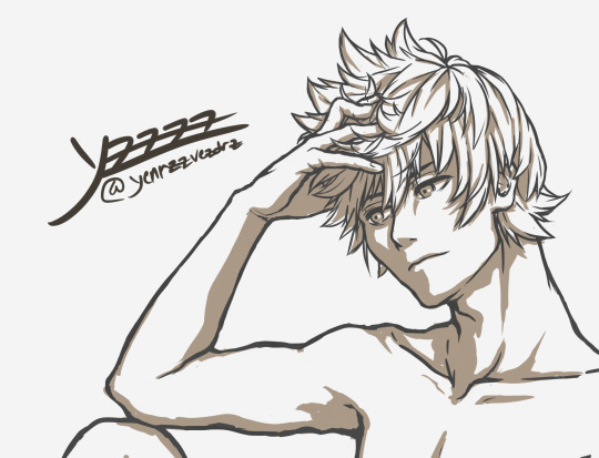
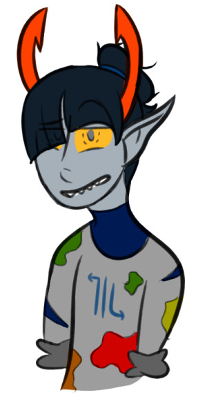
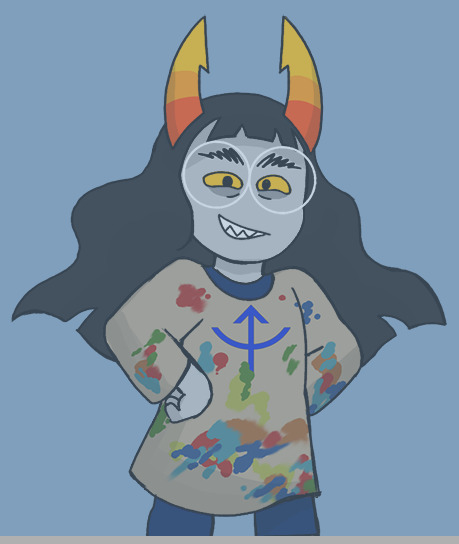
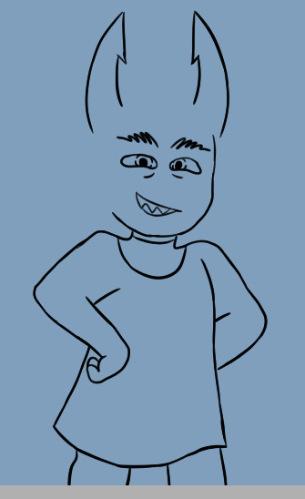
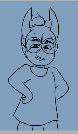
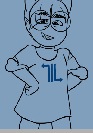
#i lowered the opacity of the lines layer being like alright time to try for that anime 90s style
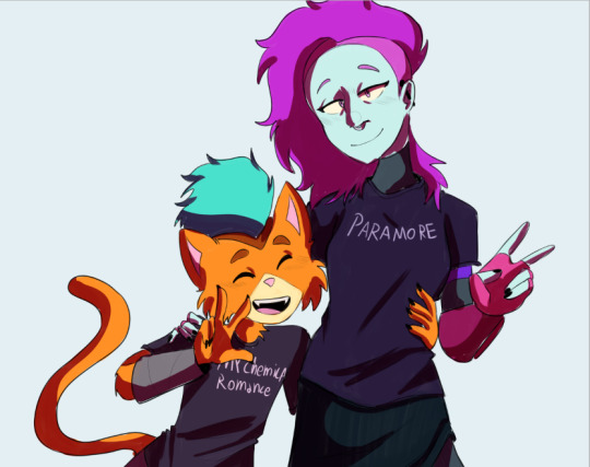
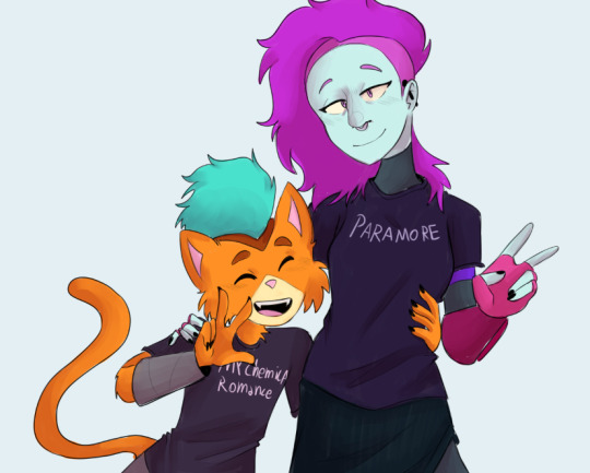
Photo
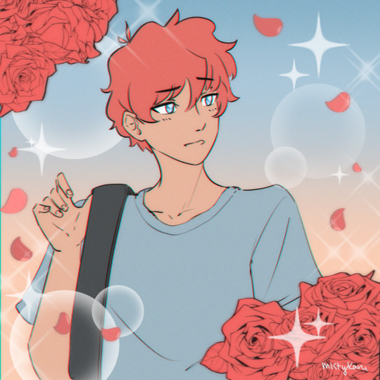
it’s not full ham 90s anime style i was mostly having fun with filters and different decoration brushes lol
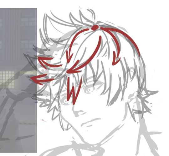
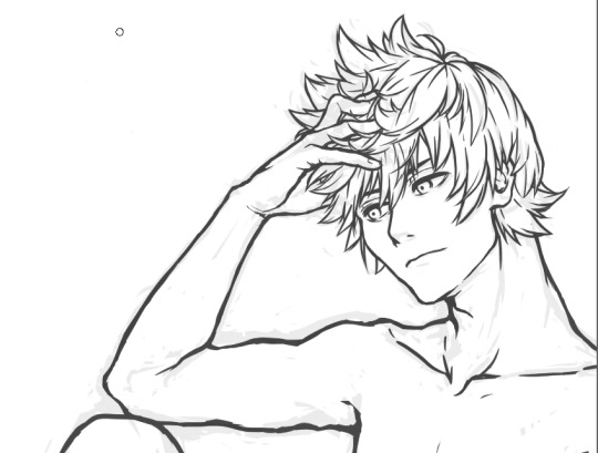
#aftg#the foxhole court#neil josten#all for the game#andreil#bc this is definitely like andrew's shoujo vision of neil at some point idk lmao#i was just going heehee as i drew it#the flowers are stamp brushes everything that is not neil is a stamp brush bc this was very much for funsies#dont come for me#also i am so bad at a 90s anime style listen i've been trying since i was like 8 and that was the kind of art that the sister drew#so this is more my regular stuff but his eyes are colored differently#i lowered the opacity of the lines layer being like alright time to try for that anime 90s style#and i lost all steam so#maybe one day but i make no promises#i'm p sure other people have done the thing anyway so like go look at their stuff#i forgot to google it before i drew this so i actually don't know but i'm sure there must be#update google gave me nothing but i tried one (1) search#can you tell i haven't really spoken to anyone in like a week soz for the fuckin tag waterfall#myart#ashjdfklha i just realized i forgot his scars again lmafuckin o whatever this is a happy shoujo universe neil ok
264 notes
·
View notes
Text
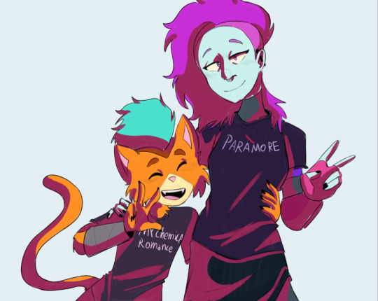
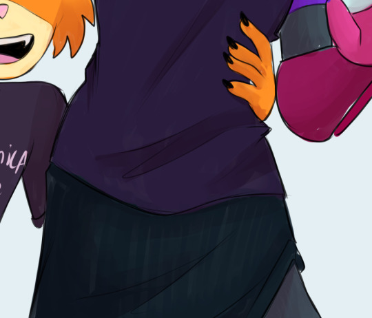
Sunny's unnofficial rendering tutorial because idk why but people say they like how I color
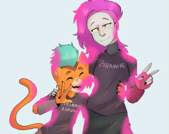
Hey kid. So you got your drawing, right? And you have your flat colors, now you gotta render 'em, right? Then you find that BAM, you have no idea how to make it look cool? Neither do I! But here's what I do (I've been told that my coloring is cool)
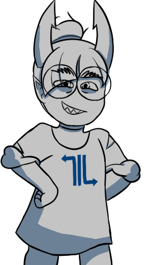
1. Place your flat colors
Imagine these are your flats. A few things: you want your base colors to be all around the same hue, that way they look better together. See how all the blacks, greys and whites are purple/blue-ish? That's on purpose babey! But how do you acheive this? idfk. jk, you have to stay on one (or two) areas of a hue wheel.
This way, all the colors look like, nicer around each other. You're not FORBIDDEN from going outside an area you picked, but you should still try to make sure everything is in the same hue so you have to do less overlay layers later.
(FYI: I do this because it saves me time on rendering. I don't think it's mandatory, there's no rules to art. Go crazy!)
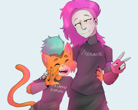
2. Shading
I think shading makes or breaks a drawing. Personally I don't have a lot of rules about it, but there are still tips I can give.
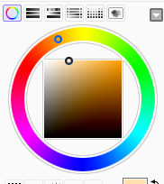
So here's what you gonna do. You're gonna pick a color that's somewhere on the opposite of your main hue, alright? Here, my hue is mostly cold colors, so I'm going to pick a warm tone. You're gonna make sure it's dark enough so it's like, a shade, but not enough so it becomes black when you set the shading layer to multiply.
(Note: I never get this right on the first try)
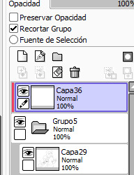
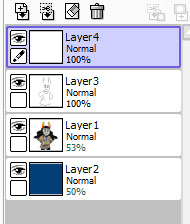
(Another note: as you can see, I have the entire drawing, including the lines, inside a group. Don't worry! I'll explain this later)
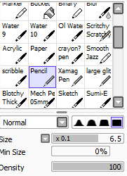
Personally I like to use a paintbrush-esque brush because I like the look of it being hand-painted that it gives my art. Mine is the default paint tool sai brush, but I'll leave the settings down here just in case.
I don't. Really know how to explain the way I shade, I mostly follow the lines I already placed in the lineart phase, and give them depth. I guess my biggest tip would be to FOLLOW THE CLOTHING FOLDS!!!

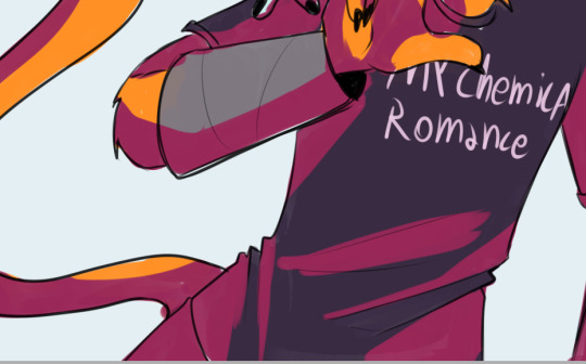
Idk how to explain this. But people always tell me that they like how I shade the clothes, it's because I follow the fold lines I place on the lineart phase! Not only does this give the clothes depth, it also makes shading a lot easier. Follow your lineart, idk what else to tell ya.
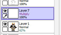
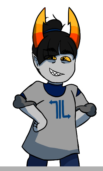
Now you're gonna set the layer to multiply...
And lower the opacity as much as you want until it looks good. No real rules to this, it's kind of depending on the vibe you want your piece to have.

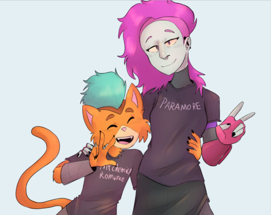
Now, and stay with me here, grab a blending tool, okay? This is the one I use, I have a textured version for when I'm feeling brave, and a regular, flat version (the one I use the most) Here I'll use the flat version.
And. Stay with me here. I want you to blend the FUCK out of this. Just absolutely destroy those borders. Okay? Trust me. If it looks messy you're doing it right. You're gonna want to follow the shape of the shadows tho, this way you don't lose the shape of the objects you're shading.
Woah! Suddenly everything has depth! Let me go back to the clothing folds, because holy shit, the clothing folds.
See how I'm adding depth to the shadows I placed by kinda. Following the line I drew and blending the outside? Idk how to explain this. You blend whatever isn't touching the line, okay? Trust me.
3. Lighting
Ok. I'm holding your hand gently. You have to do lighting on your art, okay? You have to. It adds depth to the shapes and also is sososoososo easy. Here's how. It's so easy.
Grab your airbrush tool. Yes, that one. Hear me out okay?
Pick a light, warm color between yellow and orange.
Stay with me. Make a new layer, set it to whatever lighting mode you prefer. I use luminosity because I live dangerously.
Now.
Airbrush everything that the shadows aren't touching. Yes. I'm serious.
It's gonna look ugly as shit. DON'T BE ALARMED. This is part of the process. I want you to take the blur tool. And blur the ever loving fuck out of this. Just go fucking ham.
Good. You're doing so well. You're being so brave. Now lower the opacity as much as you want, until you like the way it looks.
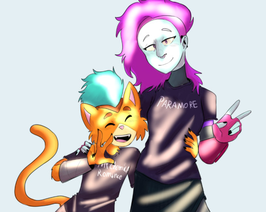
Like so. I also like to add a few brush strokes and blend them on an up-and-down motion for the hair and certain details, but this is optional. Same as before, you're gonna take a (slightly warmer, but still bright color) and make a new layer on luminosity mode.
Take the blending tool and make it small, only slightly bigger than the brush strokes, and blend these lines until they look nice. Adjust the opacity, and voila!

Now, I could stop here. But I'm extra so I keep going.
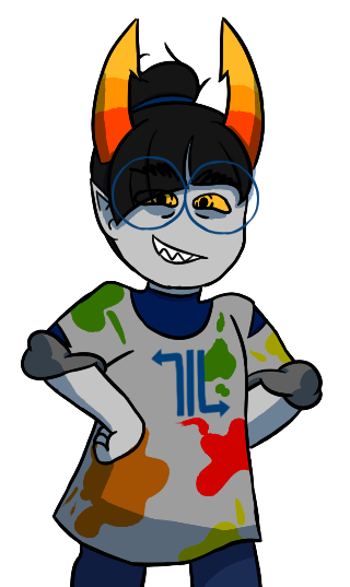
4. The pizzazz
AKA, "Ah fuck the colors don't look the way I wanted them to!"
Do not worry! I have a solution that's almost never failed me.
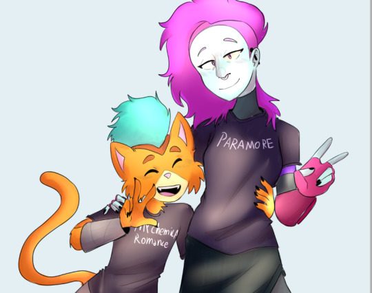
Overlays. Just a whole fuckton of them. I don't really have a method to this, I just kinda try colors and layer modes until something looks good.
For this one, I felt like I wanted the colors to be warmer, so I picked a warm color and overlayed it on multiply. Then, I noticed that the darker colors came out darker than planned, and you couldn't really tell them apart, so I picked a light warm color and overlayed it on screen.
Voila! We're not done! There's one more thing I like to do, and here's where the layer folder comes in!
Remember how I said I keep everything, including the lines in a folder? This is why!
Make a layer that's on top of everything, like this. Pick whatever color you want, make sure it's bright. (Personally I like using pink). Take the airbrush tool again and airbrush whatever edges you want to give a little more pizzazz to.
Blur it as much as you'd like...
And adjust the opacity and layer mode however you like!
5. And done!
Sometimes I add white highlights. Sometimes I add more shading, or more lighting. It depends! But this is the method I use in a nutshell.
Hope you enjoyed it, or at the very least realized idk what the fuck I'm doing!
21 notes
·
View notes
Note
Yo yenrz, I love your work and I was curious if you could show like a step by step process for what you do?
I really need to stop answering asks so quickly I have a LIFe tO LivE
So here’s a step by step blog about how I draw stuffs
Keep in mind that the end piece is still a WIP however. I’ll post it in full later.
Also if you’re asking about how I construct my text blogs I’m sorry I misconstrued the meaning of your message
So let’s start with what kind of brush I use:
I use the default pen brush on a little program called Krita. It’s free if you want to try it out.
Here’s said brush in action:
I always start with a rather huge brush size, since It’s easier to make larger, longer, broader strokes. Also that way I don’t have to constantly change my brush strokes to erase large areas (which happens a lot when you sketch) The main detractor for this method is that you get really messy sketches however >.>
And like most pansies, I don’t go full on black. We artists have too much anxiety to deal with that.

TIME TO DRA-
wait I forgot to put on some music

youtube
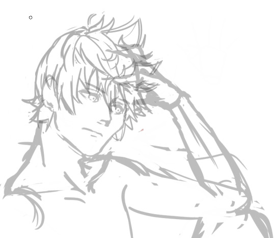
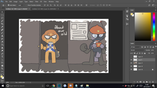
K, so I’m going to be drawing our boy Roxas today because I made a screenshot for the previous text blog I did and I thought he looked really freaking fine in that shot. So I wanted to make a quick body study with facial expressions giving that same kind of edgy mood.
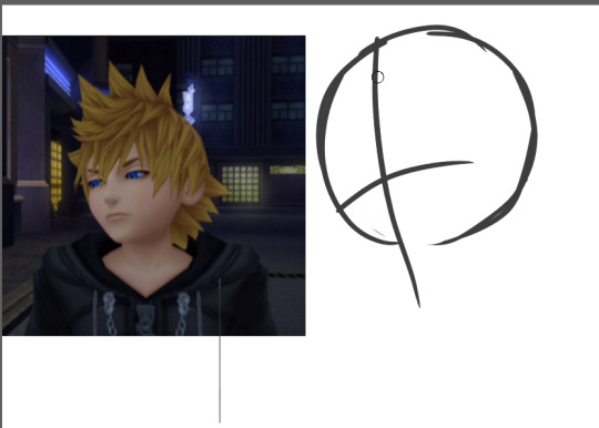
So I first start out with a circle, mapping out the direction that circle is pointing towards.
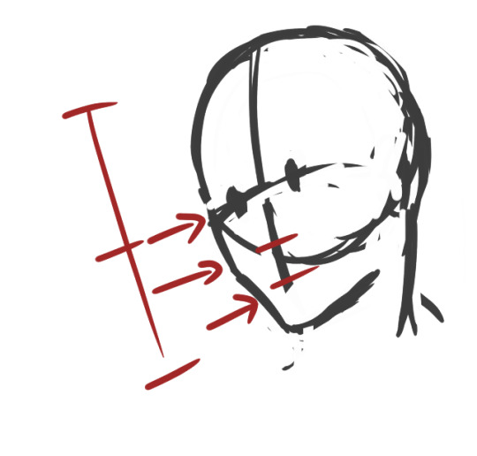
An important thing to keep in mind when drawing ANYTHING, especially if you’re a beginner, always remember to map out where the parts of your face are going to be. That way you don’t get trapped in a rabbit hole getting sucked into drawing your perfect eyes/nose/whatever facial feature and then realize when you zoom out that it looks like your person underwent a botched plastic surgery.
Rules of thumb to keep in mind about faces:
Eyes are at the midway point of your head
Distance between eyes should be about an eye wide
Ears are around the same level of your eyes
CHEEKBONES EXIST and Jawlines are square
So moving on, I go on and start sketching out the pose. Keep in mind that during the process, I usually don’t really know what I’m going for, so I test out different angles and positions and etc.
So while I settle in, I finish deciding how I want the shoulders to look.
But-

I notice something looks…off.
If you’re a beginner, it can be hard to tell when something is wrong with your drawing. Or even worse, you’re an early intermediate and you know something’s wrong but you have no idea how to fix it. And then you start going down a very, very deep rabbit hole trying to fix it and no matter how you fiddle with it…it never quite looks right. Yes I know the struggle.
So here’s the solution:
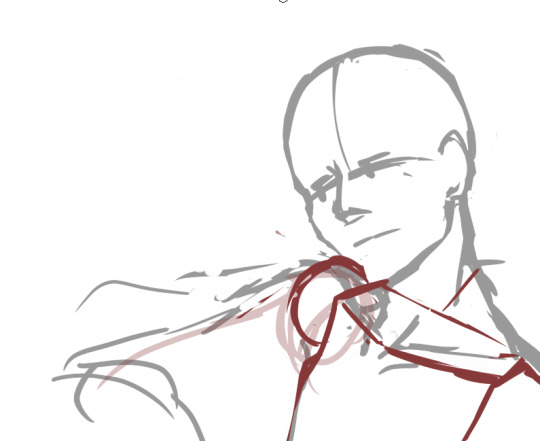
Break down the figure into simple forms. The key to making this work is that you must have ample knowledge of proportions of body parts respective to one another.
So here are rules of thumb for drawing most bodies (teenage or older and your figure isn’t larger or shorter than average)
Each half of the arm is about the length of a single head
The arm should reach to the halfway point between the hip bone and the knee
The torso(from the base of the neck to the pubic bone) is about two heads
Each half of the leg is about the length of the torso starting from the hipbone(not the end of the torso)
Boobs don’t jut out the sides unless you’re drawing really big boobs
Also, in this case, i’m utilizing a bit of foreshortening because the shoulders are in perspective, as in they’re facing away from the viewer a little.
So now it’s time to add the arms and hands. And like any other body part, I break it down to basic forms first (when you become an uber drawing deity, something I’m clearly not, you’ll be used to this and can skip over this step )
Hands are one of the things you see beginner (and even advanced) artists cry about for days. For good reason.
So the basic forms are like this:
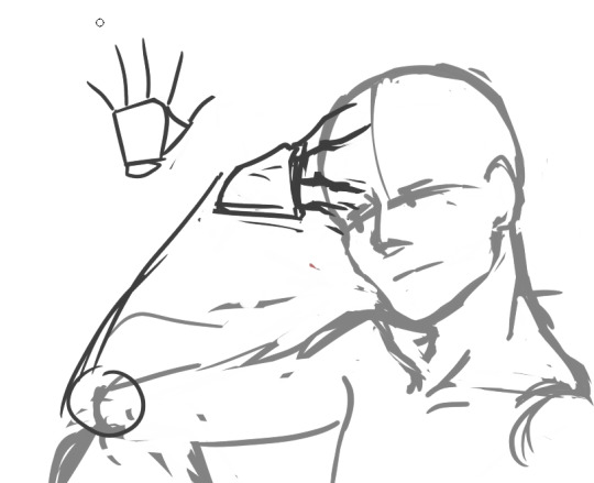
Draw out your fingers as lines first. Also reminder that fingers are three segments long. Not two, which was evil propaganda that I was fed when I only drew anime.
Also and size should be about the length from the chin to a little above the eyebrows
Also I forgot to mention…
ALWAYS CHECK YOUR PROPORTIONS THROUGHOUT DRAWING. ALWAYS.
And once I decided on the placement, I start mapping out the actual shapes.
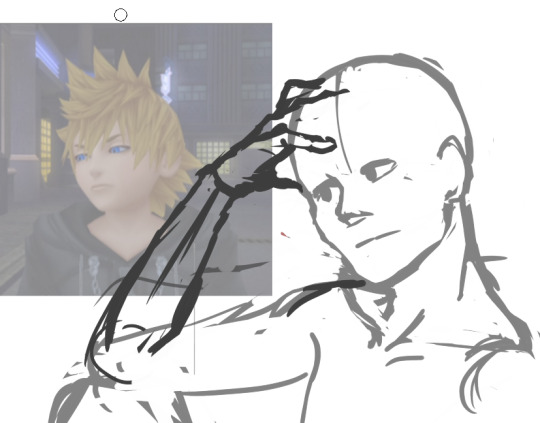
Also I wanted Roxas to look more manly and such so I looked a reference image to make his jawline/cheekbones more manly so yeah
So now that I’ve decided on the overall pose, I start on the details.
Also another rule to draw by that I’ll shove down your throat
DETAILS SHOULD BE YOUR LOWEST PRIORITY WHEN STARTING OUT. Start simple and get the whole form first, then start adding details. This ups your productivity and prevents you from getting lost in rabbit holes
It’s called rendering for a reason.
So I start adding the eyes and such and I’m overall satisfied with the face. And now I get started on the hair on a new layer. I don’t want the face lines to interrupt with drawing the hair, so I lower the opacity of the face layer.
I check how it looks by zooming out to see if everything looks alright. Oh noes he looks a bit too manly
Shrink that seme crap
Much better I know I didn’t follow the meme format shoot me
K now time for the fun part: the hair.
….
I just want to give a moment of silence for all of the times people have suffered from drawing Roxas’s hair.
….
because by golly his hair is the one I see beginners dun goof up the most out of all kh characters.
K moving on, the keyword for Rucksack’s hair is WINDSWEPT. And funny enough, there’s actual logic to how his hair works. Everyone’s hair has a center line/point where said hair flows from, whether it be a part in the hair or a eye of a hurricane thing because I don’t know what the name for that is.
Roxas’s is the latter. Demonstrated below:
See what I mean? It’s like an upside down wave going like whooooosh
Come to think of it, all hair should follow this rule. It should either be flowy or whooshy
Unless you’re Tetsuya Nomura, then you get to break all the rules
like seriously what the fu-
So now that’s done, I go and check for the gazillionth time, mirroring the image to see what I screwed up this time.
Oh noes something’s wrong with that shoulde-
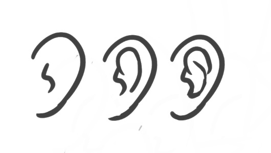
Also I forgot here’s how I draw ears
-r it looks off.
That super spidey sense of knowing something’s wrong with your drawing is there for a reason. Heed its call.
Also if you think there’s nothing wrong with that neck, draw naked people for a couple of months and you’ll see why.
So when something’s wrong you do the usual. Break it down to simple fo-
Or just use a reference.
Looks acceptable now. Time to start the lineart.
Out of personal preference, I like to lower the opacity to
Even as I do the lineart, nothing is set in stone. The sketch, at times, isn’t enough to go off of. So in that case, let’s go back to the reference.
Also I hit a roadblock when drawing the hand so move it out in the open so I can get a clearer look at it.
Also I use my own hand as reference a lot so I accidentally make make my manly men have delicate pansy hands.
This hand pose isn’t natural at all but I’m okay enough at this that I’m able to make it look okay
Study hands kids. They’ll do you good.
….
I forgot to draw him clothes daMMIT
Whatever i’ll just slap some cel-shade lighting on it and call it a day. This is still a WIP so expect a not-naked-Roxas later this week
Thank you for reading! Here’s a link to my twitter, And if you would be so kind, please consider supporting my patreon.
127 notes
·
View notes
Text
How I do my sprite edits!
This is long so!! Read more
First things first. Ya gotta open up this lil dohicky

(Can be replaced by other art programs, dw)
Once ya got this bitch open, you’re gonna open a new heccin canvas
“why tho? we’re doing a sprite edit! shouldnt we open the sprite??”
Well I’ll fuckin tell ya why you silly lil bastard.
We gotta design our bloodswap frist silly!

Now I got this old request, so we’re gonna be makin a cerulean Amisia today.
Get out your trusty sketchin pen (this is mine) and start sketchin!
Important things to remember!!
1. This is a bloodswap! We are not switching Amisia erdehn with an existing cerulean! we are takin out Amisias blue blood, and givin her cerulean instead!!
2. The only time you need to change a swaps horns is if they’re bein turned into a goldblood, or they are being switched away from a goldblood
3. While changing a sign is optional, it always feels more complete when ya do! Leaving the sign the same (imo) makes it seem like you just slapped the new colour onto the troll. In Amisias case, instead of giving her Sagira, we will be giving her Scorra.
Alright now that ya got your sketch (I forgot her glasses-)
now you can open up the sprite.
Now, granted I didn’t change much about her- and thats cause Amisia has one defining character trait (being/atempting to be an artist) thats obvious in her design, that can apply to every caste
It’s what she does with this trait that really changes from caste to caste.
But because of it, this may seem a bit overboard for how simple changin Amisias sprite seems, but when you get more complicated swaps (i.e: purple Tagora) it becomes pretty necessary
Now open up a new heccin layer
colour it cerulean (I change the colour based on the swap m doin, like purple goras background was purple), and lower the opacity. This seems a tad useless, but trust me it makes thing alot easier to make out when you
Also lower Amisias opacity!!!
Selet a pen that you can use to replicate the line style, I use this at different sizes for all of mine
Now you’re gonna line everything in the sprite that doesn’t, or just barely changes- In this case, I’ll be lining everything but the hair, and eyeballing the arms to make them the right size
Now that we got this lil bald cutie, we gotta draw in her hair
So open a new fuckin layer n go in and just fuckin draw that shite in, you can sketch it if you’d like, but I tend to just... draw it in
Now look at that, aint she cute? The hair is where your own personal style is gonna show the most- if you’re like me and learned to draw hair from homestuck, it’ll be barely noticeable. It’s always important to try to replicate the style as much as you can.
Now she needs her symbol, and since this is a simple one, I’m gonna draw it. If you’d rather not, it’s really easy to save/get a screenshot of the sign and remove the background from it, if you want I’ll do a mini tutorial on that but I think it’s self explanitory.
This is the brush I use to draw symbols, it’s a nice, solid square brush
I usually draw it off to the side, then position it where it’s gotta go, use the base sprite to help you position it if you didn’t change it’s location
REALISE YOU FORGOT SOME CLOTHING DETAILS AND FIX IT (this is a very important step)
Now that all the lines are done! we move onto shading and colouring
Now show the base sprite again, and make a new layer set to multiply, you can try to mimic the shading style (like I did with vikare’s sprites) but I prefer not to

While you’re doing the shading, pay attention to the spots you’ve changed, and take a guess at how the original artist would’ve shaded those areas. Successful sprite edits are all about mimicing styles, which can be surprisingly easy.
Now ya get to colour it! (shading and colouring can be done in any order, I just like doing the shading first)
You’re gonna fill that in with grey, and adjust the shading til it looks good against the colour. I find this is easier to do with the cooler colours, but for colours like yellow, I usually have to change the colour of the face shading to a grey (Like yellow Gale)
Now preserve the opacity of that fucker, n colour it all in, using the sprite and your original sketch as a guide
While you’re colouring, you might see that you need to double up the lines, at least I usually need to- So do that if you think ya need it
There we go!
Now gettin the paint splaters, you could just trace em all from Amisias normal sprite... But I don’t think Cerulean Amisia would have that much paint on herself, so I’m just gonna draw it in on my own.
Now once you’re done, you’re gonna crop (if desired) and save it (make sure its transparent!)
And there ya go! We got a lovely Cerulean Amisia!!
Now if you want, you can start thinkin of some slight story for her- though you may have been doin that along the way (Like I usually do) Some stuff I thought of is:
She actually produces art!!
But it’s by making lowbloods do it for her!
She doesnt have much paint on her cause she’s rarely doing the painting, and most mess is cleaned up by her lusus
#Hiveswap#HIveswap friendsim#amisia erdehn#Tutorial#Sprite edit#Bloodswap Amisia#Baizli's sprite edits :0)#Baizli's tut0rials :0)
50 notes
·
View notes
Note
Sorry to bother you, but I was wondering how you did that wiggly effect on your old honeydew n xephos comic? I really liked it n wanted to try it, but it's hard trying to describe it to Google.
EDIt i forgot to put this under a readmore
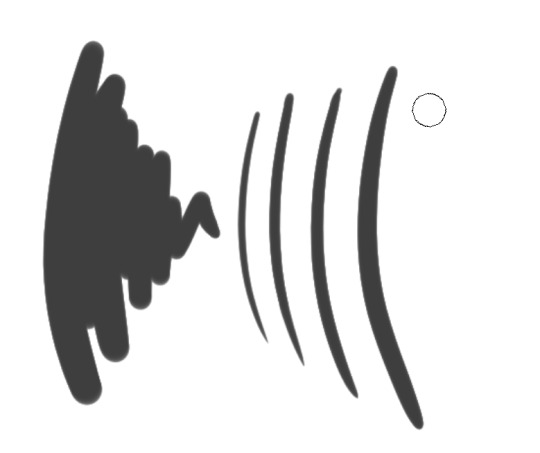
hiya ! it’s no bother to me at all. what i use is photoshop, and i think the term for that kind of animation is .. something to do with boiling? update, i googled it, and i think it’s called a line boil.
i’ve been redoing it recently, and i guess this is really for something i’m just too lazy to finish so i’m alright posting this tiny part from what i was gonna do:

(looking back on it now, that’s not a very good blue, so maybe i’ll fix that - i only got 2 images in before being distracted)

i have a rough idea of what i wanna draw first and just get that down, enough for me to make sense of it (for this specific style of stuff i like .. really mimimalise the detail in the lines i guess?)
so the first step is like.. draw the lines for it. i’d really, really avoid doing intricate linework stuff because the whole thing is like.. you’ve drawn it once, and you’re going to draw it again.
what i generally do next (personally) is put the colours down underneath and then hide the colour layer when i’m done colouring it.

after hiding the colours i lower the opacity of the lines, make a new layer above the lines, and then draw over the lines a second time, taking care to make sure the shape is still recognisable but also not 100% accurate to the layer beneath it
(you can vaguely see the differences here i think, the lighter grey is the first line layer)
after that i put the opacity back up to 100% and hide the first lined layer, put the colours back on, and correct any issues between the colours and the new lines (there’s usually some colours that come out of the lines and although you dont REALLY need to fix them, i just like doing it)
that’s pretty much it, then i go into the whole photoshop animation thing (window -> timeline -> start frame animation)
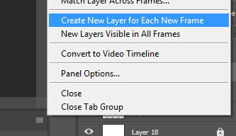
i make sure this is OFF because i’ve already got all the frames i want, and having a bunch of layers with nothing on is .. very distracting.
then i set the loop on the animation to “forever” (the frames are already in there because i’ve already made the image)

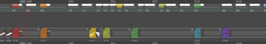
what i have is: the first, original lines visible, the colours visible, and the second line layer hidden
i press the little “new frame” button (the paper thats highlighted slightly in the next pic bc i hovered over it) and press it until i’m on 9 frames

on the 9th frame, i turn the original line layer off, and turn the second line layer on. then i press the new frame button again until i reach 16 total frames.
i preview the animation with the play button and it works as is most of the time, i usually don’t need to fix anything else. congrats i guess: you’ve got a gif, you just need to export it

file -> export -> save for web (legacy) is how i do it, then i press the save button at the bottom and save it as whatever i wanna save the gif as, and then bam, it’s a gif, i guess
i dunno how it works in other programs, sorry, i’m not good at explaining stuff hahah, this is how i do all my gifs though ! including the blinking icons like thhe xephos one i did :0 (albeit like .. doing different animation stuff, not line boiling)

19 notes
·
View notes
Text
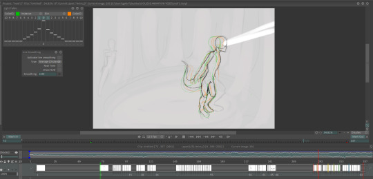
Animation Process - TVPaint
To create my animation I used a software called TVPaint which I bought the license for several years back. I was originally planning on using Adobe Animate but i’d never used it before and didn’t have the time to properly learn how to use it. As well as this, Animate was a vector based program and I wanted to use a bitmap pixel based program instead since i’m more comfortable with those as they allow animation which has more of a hand-drawn look to it.
Upon opening the program I created a canvas that was set to 12.5fps (the same as the animatic) in a size that was the same aspect ratio. I imported all the clips and frames of the animatic in photoshop and adjusted the lengths of them until I was happy with how it looked. After i’d done this, I imported the music track I planned to use into the program. At this point, I could see that the animation would end up being 300+ frames long but I still thought it would be manageable (a poor choice)
Based on the tutorials I had used in the past and research I’d done, I had some idea of how to animate - by doing a combination of two different methods:
The first one is to draw two key frames of the character in different positions, and then fill in the in-between frames. This technique was used the most throughout this. The other technique is to animate one frame after the other to try and get the character into the position you want - I only did this during the end of certain movements.
The program has many features which make it perfect for animation- including:
The ability to colour in frames so then you can match them up with frames on above and below layers.
A range of options for layers - the first one allows you to disable and enable the layer so you can see it, the second one locks it so you can’t change frame lengths etc, the third one enables the light table/onion skinning feature. The fourth one preserves the layer’s transparency so you can colour onto the already drawn area without going over the lines (good for changing the line colour or fill colour of something you’ve drawn. The light table was also especially useful:

The green selected 0 is the current frame, and the vertical slider is the opacity. The other sliders correspond to the surrounding frames and their opacity. The 1s that are selected either side means that those frames are also visible at the same time, but at a much lower opacity. The green and orange colours were very useful as they help to differentiate between the 3 frames on the screen at once (as you can see in the frame below).
How I animated the walking scene:
This and the standing up scene were the two most complicated in the entire animation, which I decided to do first, which was a mistake as I had not had practice in years. As a result of this, I had to do both of them multiple times for several reasons.
With this scene, the first thing I decided to do was to trace over the animatic to get the 6 key movements. This was not the best idea as the animatic was incredibly rough, so I had to try and make the body look as consistent as possible.
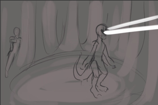
This was one of the badly proportioned animatic drawings that I traced over to get this:
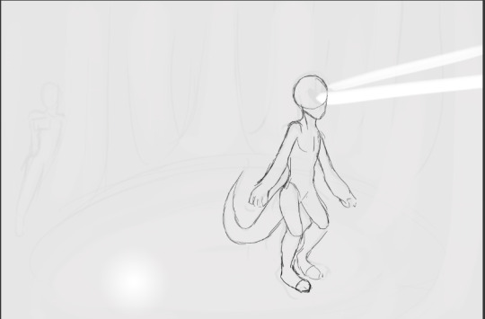
I did a similar thing with the other 6, making sure I had the onion skinning option selected so I could see the proportions of the previous drawing.I then extended the length of these frames so that they each lasted the same duration as the animatic equivalent. To keep track of each keyframe, I colour coded them, along with each point in the animatic. This way, if I made the length of each one shorter to add more inbetween frames, I could always adjust the frames back to the right position.
It was at this point that I made a big mistake- I added in 6 more frames, one between each of the original ones, and drew the midpoint of the movements. This did not work at all as I did not take into account that in the animatic (therefore the frames i’d drawn), the feet do not walk. So by drawing the midpoint of each one, the feet moved across the ground to the next position so the alien appeared to be sliding rather than walking. I drew about 20 extra frames before I realised this problem (the rest of the body was alright though).
I erased the bottom half of the body and had to try and draw the legs in again, actually adding in the individual steps of each foot to make it move.
The final sequence ended up as 46 frames across multiple layers.
While I was actually animating this sequence, I tried to utilise some of the techniques i’d previously learned about timing and movement -
All of these movements look a lot more organic than the circle moving at the same interval the entire time - I decided which one of these to use in certain sections by doing the movement I needed and watching myself, then picking the row which fit the most.
The body was on one layer, the legs were on another layer as this allowed me to refine the actual movement into something I was happy with, and the dead details (horns, hair and eyes) were on another layer.
Originaly, there were several moments in which the character was static for several frames which looked weird to me, so I traced over the static frame as many times as I needed it instead- which took longer but also meant that the character looked like it was alive instead of frozen, which worked really well I think.
(see pt2 for the comparison of versions for this sequence)
0 notes
Last Seen Blogs
spookyfishband
Spookyfish

bonafidesoul
Bonafide Logs
hexymph
EAT ME! LOVE ME! CONSUME ME! DEVOUR ME!

jack-son-art
Jackson.Art

tiffani-krim-top
Тиффани Студия Красоты