#jim sherraden
Text
Jon Langford Interview: Serve the Song
BY JORDAN MAINZER
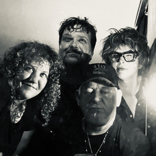
When you ask Jon Langford what he's up to in the near future, he'll likely list a few upcoming concerts and art exhibitions before you realize he's referring to just this upcoming weekend. For the singer-songwriter and painter, the Mekon and Waco Brother, his past, present, and future discography and levels of participation seem just as vast. During his most recent visit to Austin (of which SXSW was a mere part), Langford played twelve shows: four with The Waco Brothers, three with The Far Forlon (his Austin-based band that plays Langford solo and Mekons songs), and five with The Bright Shiners, his new band that just released their debut record, Where It Really Starts (Tiny Global Productions). But Langford views himself as a mere thread rather than the center. "I am lucky to get to work with people more talented than me," he said to me over the phone after returning from SXSW. Sarcasm aside, Where It Really Starts epitomizes that democratic approach. "I love having not all of the responsibility on myself to come up with stuff," Langford said. "It's not a solo album. It's better than that."
The Bright Shiners started when Langford and John Szymanski, his frequent musical partner, attempted to make a duo acoustic guitar record that resulted in some interesting tunes, but not enough to resist contacting singer and keyboard player Alice Spencer. That is, though the Austin-based Spencer played in soul-funk band Shinyribs, Langford and Szymanski were enraptured by her solo work and Mellotron playing. Spencer was on board, and then Langford and Szymanski brought in violinist Tamineh Gueramy. The four wrote the majority of the songs on Where It Really Starts, with Langford concocting first drafts, Spencer arranging, and the group taking them to fruition. The result is easily the most lush music of Langford's career, from the steadily chiming "For The Queen of Hearts" to the dulcet "I Have A Wish".
Where It Really Starts is rich without being overstuffed, a natural combination of layered guitars and vocal harmonies, piano, pedal-affected strings, looped percussion, and of course, Mellotron. In other words, it's folk music with contemporary touches, Langford's storytelling firmly in the present while sometimes sounding appropriately old-timey. His vocal delivery resembles that of a troubadour on the fluttery, swaying "Awake The Land Of The Shadows"; he passionately trills on "Seahouses". And on "Discarded", a duet with Spencer, the two finish each other's sentences like a sardonic country couple. "You can talk about love, you can talk about society," sings Langford, "But when push comes to shove, you wiped the floor with me," responds Spencer, atop brawny, off-kilter horns. "Seahouses" and "Discarded", specifically, contain a multitude of musical ideas Spencer brought to the table, the former's filmic feel and the latter's horns. And even producer Brian Beattie gets his kicks: The album's final track, which sounds like an outtake from or demo of "Discarded", was actually Beattie playing all of the instruments in the studio and recording his half-hearted attempt at the lyrics of "Discarded", which The Bright Shiners found so funny, they decided to put it on the album.
My interview with Langford was not set up through a publicist. I literally said hello to him when I ran into him at The Beer Temple, at which point he mentioned he had a new record coming out that he'd be down to talk about. Two weeks later, we spoke on the phone. He and The Bright Shiners signed a two-album deal with Tiny Global Productions, so you can expect to hear more, but who knows what else--spontaneous or otherwise--Langford will get up to. In the meantime, read our interview below, edited for length and clarity.

Since I Left You: When did The Bright Shiners form, and when did you start writing Where It Really Starts?
Jon Langford: It was more a social thing. We were talking. Alice Spencer was in a band...she's a keyboard player and a very good technical singer. She was doing other solo stuff which was really fascinating. She has a jazz background, but isn't into that virtuoso jazz stuff. We decided to write a few songs with John Szymanski and Tamineh [Gueramy.] John [had] been working with me, and I said to him [about Alice], "This woman's playing a Mellotron." And he said, "We should form a band with her." I didn't know there was such a thing as digital Mellotron. It's really kind of fascinating to me. Most of the songs are co-writes by the whole band. But I was handing over sketches and [Alice] was turning them into fully realized arrangements with vocals.
SILY: Did you come up with the lyrics?
JL: All the lyrics are mine.
SILY: How did you finish the songs? Was that a group effort?
JL: Yeah, the arrangements and the songs. The guy who produced it with us, [Brian Beattie,] had been working with Alice a lot. They'd done a duo together. The studio is called The Wonder Chamber. Alice was doing some recording there and sent me some video. I said, "Where is this? This is fantastic! If we do anything, this is where we should do it."
SILY: Is it in Austin?
JL: Yeah.
SILY: It seems to me that this album, more than your other solo albums, exists in the folk tradition but with more contemporary touches. Maybe that's the digital Mellotron. Would you agree?
JL: Yeah. We just wanted it to be kind of minimal. We started off with acoustic guitars, because John and I had been doing that for quite a while in a duo. We tried to make a record just me and him with acoustic guitar. It was alright, and we had a few ideas, but that's kind of on the backburner.
Music is so inherently collaborative. I've had solo records where I was totally in charge. This is basically something else. The song "Seahouses" was this epic thing Alice came up with based on something I'd sent her. I thought, "I don't remember writing this." It was mind-blowing. So beautiful, so different.
SILY: It definitely is a song that sounds like the seaside.
JL: There's something cinematic about it. I want to bash things down as simply and plainly as possible. That one has some epic moments. It's minimal in the sense that it's not a jam band. It's more like a dub reggae record where you have parts that lock and drive the song along and serve the record. When there's no singing, the parts get kind of detached from it. You can listen to these individual parts. It's getting away from the virtuosity and soloing: Just trying to serve the song.

SILY: Was there anything different this time around that inspired your lyrics?
JL: That's a good question. I'll have to talk to my therapist about that. [laughs] The lyrics are quite personal. They are inspired by the visual art I do. "For The Queen of Hearts", there was a painting called The Queen of Hearts that I made, a country singer that's like a playing card, body on top and repeated underneath. She's got two heads and is singing. The other one is a skull. I thought the song was kind of based on that.
SILY: Are you contextualizing each song with paintings you've done that might have inspired them?
JL: Some of them. "Seahouses", I went to a place called "Seahouses". It's a really dramatic place in the north of England, kind of bleak, pebbles rolling and smashing against each other, permanent and impermanent at the same time. The transitory nature of life and time itself, or something. It sounds really bonkers when I say it like that. [laughs]
Each song, I guess, has its own life. There's a lot of visual stuff in them.
SILY: There seems to be a good mix of songs that are reflective or internal and others more about storytelling, such as "Tell Me Your Story".
JL: I wrote that with a friend in Chicago, Jenny Bienemann. She had a project where she would write haikus and would hand them out to [people] to write a song from it to perform in a concert. There were 15 haikus, and she said, "Pick one you like." I thought "Tell Me Your Story" was fantastic. When you meet someone, you want to find out everything about them.
SILY: When you write or listen to folk music, do you tend to draw parallels between the modern day and the past?
JL: I think I write pretty much in the present. I'm not writing nostalgic or particularly optimistic [songs] anymore. I've tried to temper realism or pessimism.
SILY: A song like "The Emperor's Fiddle", with lines about talking to the dead and necromancing, and a line like, "We have more guns and disease than you can ever use" sounds like something that could be from an old folk song, but you could apply it to the modern day.
JL: You can apply it to the modern day. It's about going up the river and selling the Natives whiskey.
SILY: Why did you choose to throw in an unlisted track at the end that's basically an outtake of "Discarded"?
JL: That's actually Brian Beattie setting up the studio before we even arrived and playing all the instruments himself. [laughs] The first time I sat in the studio properly, he played me that. [laughs] I could have walked out. "Are you taking the piss? Are you making fun of us?" We all find it really amusing. "Is it you...I?" It grew on me in the end. I was like, "It's gotta go on."
SILY: It's like when people leave in studio chatter, but taken to the extreme.
JL: It exists. I don't know what else we were gonna do with it. Put it in a box and bury it somewhere? [laughs]

SILY: Did you do the album art for this?
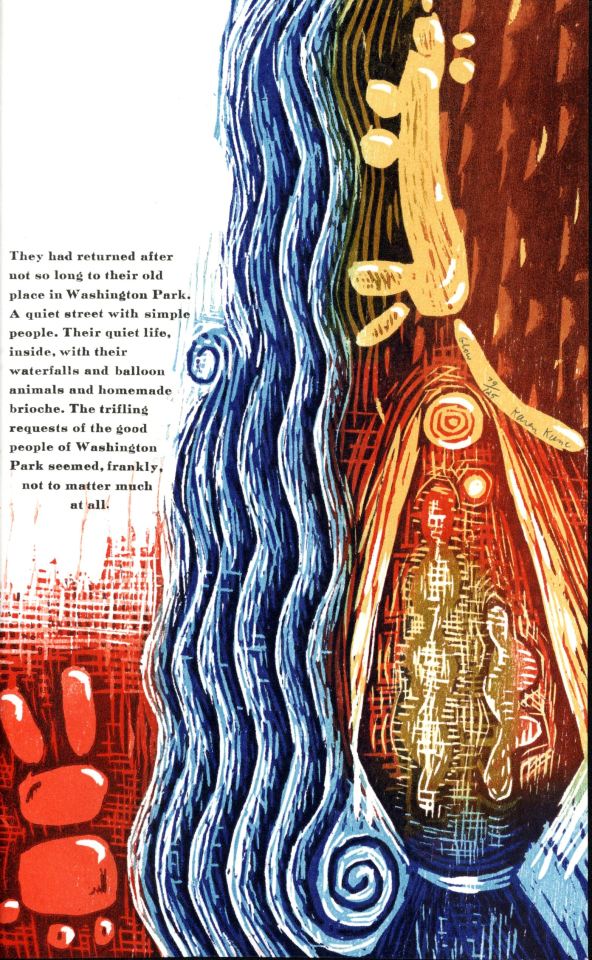
JL: It's a collaboration between me and Jim Sherraden, the master printer at Hatch Show Print in Nashville. It's his woodcuts and my central figures.
SILY: How does it relate to the story of the album?
JL: It's parallel. I started working with him when we started The Bright Shiners. It was work that I was making. The idea of two people with a guitar flying through the air. There's an ethereal nature to a lot of these songs that ties in quite nicely. I like the idea of the printmaking. It's ornate. I like repetition. Mark E. Smith said, "It's not repetition, it's discipline." I find that in a lot of music I like. There doesn't have to be a high point or piano solo for people to show off their virtuosity. I thought that was a good parallel to the album. It can be beautiful and serious, but it doesn't have to be.
SILY: You can apply what Mark E. Smith says to listening, to, especially more repetitious songs that take a level of discipline or commitment, especially when they have abstraction to it.
JL: This is sort of artistic conceit. It wasn't just folk songs. We were definitely thinking about robotic, repetitive things going on. Some sort of hypnotic thing. "A Scale of One to Nine", I just wanted to [write a song] that sounds good when it comes back. [laughs] It's really relentless.
SILY: Any time you include wordless harmonies, it wriggles its way into your head.
JL: I don't like when people ask if I've made a concept record. Every record's a concept record to me. It's not like I've made a rock opera. It's a definable narrative. There's a story.
SILY: For how long have you been playing these songs live?
JL: [For] probably about eight months. After playing [at first], we understood what we wanted, and the writing process became a lot easier. We didn't do a whole album in one sitting, it was about four sittings, a few songs each time, and we got better at working. The song "I Have a Wish" is completely live. We wanted to see what it was like all playing together. It was really beautiful. We knew what we wanted to do. It's a simple song.
SILY: It has a really nice lilting melody.
JL: Alice is a really good singer. Most of the songs are duets. She really listens to phrasing and writes harmonies over the top. A lot of the time she's doing quite odd harmonies that are kind of cool.
SILY: How was it adapting some of the other songs to a live performance?
JL: It was pretty easy with this. We don't try making it sound exactly like the record. We did some gigs with a bass player and percussionist last year. Economically, we can't really do [that all the time]. We need to make it work as a four-piece. John and I have an understanding, telepathically, if I go up the neck, he goes down. The snare drum is often playing more percussively than he is, and he's finding notes that are similar to what's on the record but not exactly. Everybody sings really well, as well. We all sing together. There are beautiful moments. Tamineh uses pedals for the violin, and there are a lot of violin effects she's using. She'll use them in place of electric guitar on the record. Some Mellotron sounds are pretty fantastic. The violin with pedal delays can sound like a whole orchestra.
SILY: Did you put horns on "Discarded"?
JL: We did. Alice wanted to put a Salvation Army [brass] band on a track. I wasn't there when she did it. She got some people from Austin. I mirrored the part she was playing on the Mellotron and made it into something bigger. I wasn't sure about that song.
SILY: Are you always writing songs?
JL: Yep. I haven't for a while. I think when we finished the album, I definitely went through, at the end of last year, a phase where I wasn't doing anything. It's like a muscle. Once you turn it on again, it's like a tap. If you're not writing, you are writing somewhere in your head. A lot of things in the songs seem strange to me now because I didn't know what I meant when I wrote them, but sometimes, when we sing them on stage, I go, "Bloody hell, I wonder whether that's what that means." [laughs] It's kind of revealing tapping into the subconscious. That's where a lot of the stuff gets written.
SILY: Do you find it the same when someone in the audience might ask what something means or say a song means something different to them? Do the songs then change meaning for you?
JL: I kind of like the limitations of being a songwriter in the sense you can try and communicate something, but it might be misconstrued. I think that brings responsibility to what you talk about. It's so boring to set up a message, and say, "This song is about." It's a delicate balance to start writing songs and not be pedantic but still be authentic. Hopefully, people think about what you're singing about.
SILY: Is there anything you've been listening to, watching, or reading lately that's caught your attention?
JL: I listen to a lot of reggae still, but it's not new. I've got a vinyl player in my painting studio. I like that it stops every 25 minutes and you have to go and choose something else. You can't just put on a playlist. A lot of British reggae music from the 70s and 80s which wasn't appreciated at the time but is pretty fucking great. Steel Pulse, Misty in Roots. Bands I saw and played with at the time.
#interviews#jon langford#tiny global productions#john szymanski#alice spencer#tamineh gueramy#the beer temple#jenny bienemann#hatch show print#where it really starts#the mekons#the waco brothers#sxsw#the far forlorn#shinyribs#brian beattie#the bright shiners#the wonder chamber#the queen of hearts#jim sherraden#mark e. smith#salvation army#steel pulse#misty in roots
0 notes
Text
youtube
Watch the 2024 American Climate Leadership Awards for High School Students now: https://youtu.be/5C-bb9PoRLc
The recording is now available on ecoAmerica's YouTube channel for viewers to be inspired by student climate leaders! Join Aishah-Nyeta Brown & Jerome Foster II and be inspired by student climate leaders as we recognize the High School Student finalists. Watch now to find out which student received the $25,000 grand prize and top recognition!
#ACLA24#ACLA24HighSchoolStudents#youtube#youtube video#climate leaders#climate solutions#climate action#climate and environment#climate#climate change#climate and health#climate blog#climate justice#climate news#weather and climate#environmental news#environment#environmental awareness#environment and health#environmental#environmental issues#environmental education#environmental justice#environmental protection#environmental health#high school students#high school#youth#youth of america#school
17K notes
·
View notes
Text
"Why is it that women are chiefly addicted to evil superstitions” [GMS Brief]
[Written Piece: 998 words]
When I started researching the most influential typographers in history, I noticed this was a field dominated in the early ages by men, such John Baskerville, a wealthy industrialist who created Baskerville in 1754; Max Miedinger, the father of Swiss design and creator of Helvetica in 1960 (arguably the most popular type face in the world today) or Stanley Morris, a scholar who designed Times New Roman when he joined The Times in 1929, another unmistakable font around the world.
I thought I would investigate this further and stumbled upon an article titled “Where Are the Women in Type Design” from 2011. It was in reading this article and the comments attached that I realised, it was articles such as this that were damning to the women who are type face designers and have paved the way for graphic design across the globe. The article was a typical ‘victimization’ of females within a ‘male industry’. The writer of this article could not be more wrong, and I therefore chose to highlight the many women in typeface design who have shaped the design world today.
Women have been involved in typography since the creation of manuscripts with nuns producing these as early as 339AD for the Church; typesetting in Italy on the works of Luigi Pulci in 1481; Anna Rugerin’s name appearing on a publication in 1484, the first female to do so and of course, Girolama Cartolari who ran a print shop in Rome 1543 – 1559.

- Details of Gorlama Cartolaris emblem, 1545
Typography is more than words, and when presented in an inventive, expressive or artistic way, becomes one of the most inspiring forms of design. Here are some of the most inspiring women to have contributed to the world of typography as we know it today.
Freda Sack 1951 – 2019
The late Freda Sack was an industry legend, paving the way for typography in the UK and all over the world.
Starting at a Letraset-type studio, Sack mastered her trade-in type & stencil cutting, quickly making her mark, giving the UK commercial landscape a typographical shape with clients such as British Airways, the Yellow Pages and Vauxhall when she went freelance in 1983. Her fascination with typefaces developed her attention to detail and a sharpness of the eye her professional partner, David Quay, coined as “An uncanny skill I have never seen in any other typeface designer”
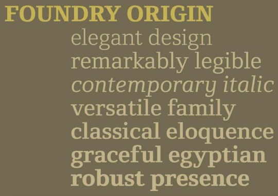
- The Foundry Types font Foundry Origin created by Sack
In 1990, Sack and Quay set up The Foundry Types – an independent type foundry and the first of its kind and with this, the birth of the Foundry typeface family and other experiments celebrating the likes of Bauhaus (’Architypes’ font) and ‘Gridnek’, a collaboration with Wim Crouwel.

- Sack’s modernist font Gridnek designed with Will Crouwel
During the 80’s Sack, worked at Typographic Systems International at the forefront of the ground-breaking Ikarus software – software used to digitize all photographic libraries of typefaces – the invention of the desktop computer made this work vital to the industry.
The more recognition Sack received, the more she wished to encourage and educate others. She spent 15 years at the top of The International Society of Typographic Designers and in this time, expanded international award schemes, student assessment and organized lectures & exhibitions to further promote typography in the world. Many in the typographic industry owe their success to her achievements.
Zuzana Licko
Zuzana Licko was born in Bratislava and moved to the states in the ’60s where she studied Graphic Communication at California’s College of Environmental Design. During the early ’80s, Macintosh invented the first desktop and in 1984, Licko and her partner VanderLans started Emigre, a design company and independent type foundry. They were heavily influenced by the innovative technology and new possibilities available on the Macintosh computer. Emigre become an early adopter of this technology and began to create typefaces and new page layouts for Emigre Magazine.

- Lickos Modula Font
Licko worked methodically and with no real love of calligraphy after struggling with it at school as she was left-handed, she found it easier to create modular typefaces. Licko’s experimental type designs, prominently used for publication design, created a high demand and the library at Emigre grew greatly.

- Licko’s Lunatix Font
Licko’s fonts such as Low-Res, Mr/Mrs. Eaves, Lunatex and Modula became extremely popular in the world of design and saw Licko receive many accolades such as the Chrysler Award for Innovation in Design in 1994, the 1998 Charles Nypels Award for excellence in the field of typography and became a recipient of the 26th Type Directors Club Medal in 2016.
Gail Anderson
Gail Anderson is a graphic designer & educator from the Bronx and is the first generation in her family to receive a formal education, graduating from the NY School of Visual Arts having been taught by Paula Scher. Soon after she worked with Random house Vintage books before becoming the senior art director at Rolling Stone magazine. She then went on to Spotco, an agency specializing in the art of publication for theatre, Broadway and other entertainment arts.

- A poster for Martin Beck Theatre; Illustrator - James Victore
This professional experience gave Anderson a flair for theatrical advertising as well as several awards from The Art Directors Club, the Type Directors Club and AIGA. Anderson's passion for educating continued to see her write several publications such as The Typographic Universe, New Modernist Type & Graphic wit as well as permanent collections at The Cooper Hewitt Design Museum.
- “ The highlight of my year—working with USPS art director Antonio Alcala and Jim Sherraden of Hatch Show Print.” Gail Andersons Blog
Andersons love for typography shines through in every piece of work, her obsessive eye and her fearless approach to design have given her the philosophy “the process has to be fun, and you need to be willing to step out of your comfort zone” and she continues to educate at the School of Visual Arts and her design firm, Anderson Newton Design, continues to provide the graphic design world with experimental, bold and exciting promotional material.
These incredibly driven women have contributed to the beauty of the world around us through typography, graphic design, publication, advertising and of course, each of them has dedicated a lot of their time to further educate future generations on the importance of typography in our creative field.
REFERENCES USED
“Where Are the Women in Type Design” Verena Garlich, Typographica
‘The First Female Typographer’ I Love Typography
‘Freda Sack’ Identifont
‘Freda Sack’ Alphabettes
‘Freda Sack – British type designer and typographer’ The Foundry Types
‘Freda Sack’ International Society of Typographic Designers
‘Freda Sack Obituary’ The Guardian
‘Zuzana Licko’ Emigre
Laura Webber “Women typeface designers” RIT Scholar Works
‘Zuzana Licko’ MyFonts
‘Zuzana Licko’ Adobe Fonts
Gail Anderson, Curly Gail.com
Gail Anderson Biography, Black Arts Story
Anderson Newton Design
5 notes
·
View notes
Photo
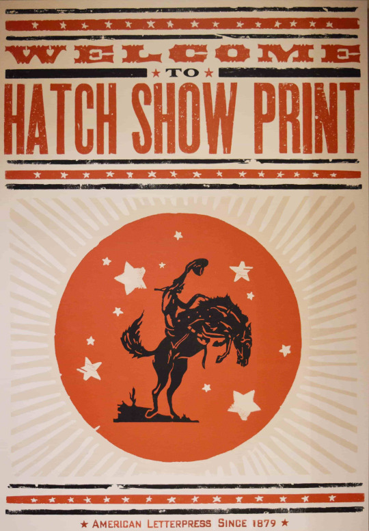
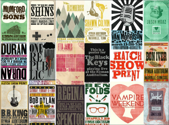
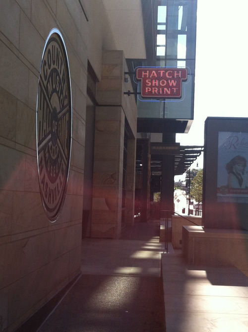
Hatch Show Print, Nashville
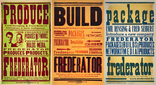
Continuing my tour of classic letterpress poster printers, we move from Globe in Baltimore, southwest a bit to Nashville.
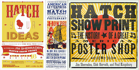
For a quick minute in the late 90s I was on the national board of AIGA, the professional association for design. The one board meeting I attended (I really have little patience for any group that wants me to join) was in Nashville, and everyone (but me) being design professionals wandered out at lunch one day and, lo and behold, stumbled upon one of the greatest design treasures of America, Hatch Show Print, which had been poster central for country music since 1879 (here’s the entire history). Long story short, as posters became an anachronistic way to get people to buy concert tickets (radio and television took over), Hatch fell on hard times, but was rescued to become a non-profit part of the Country Music Hall of Fame.
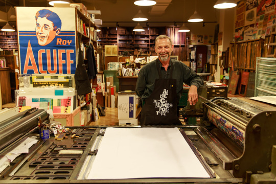
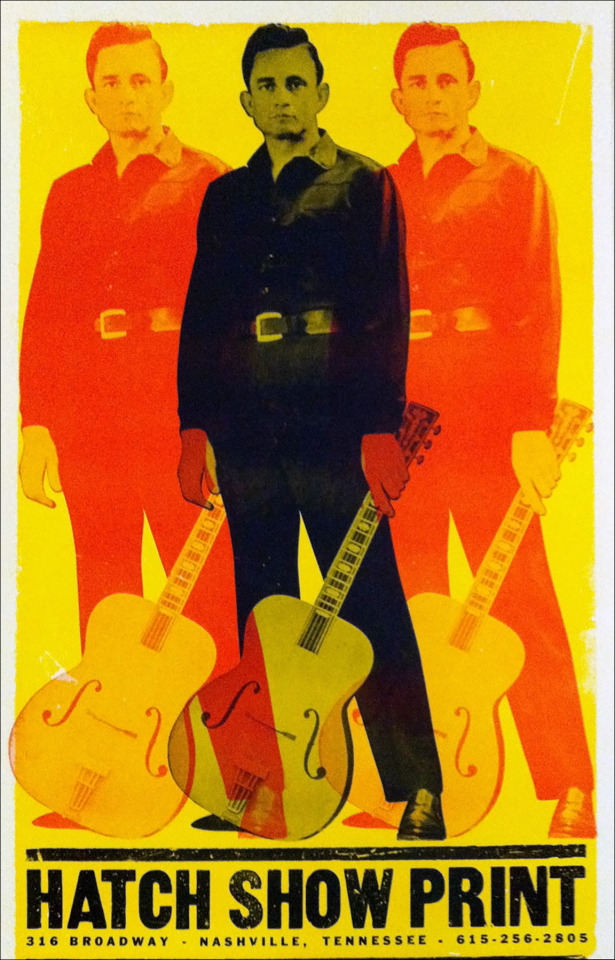
Jim Sherraden at home in Hatch’s former Nashville location.
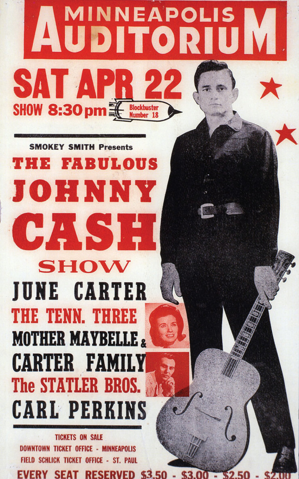
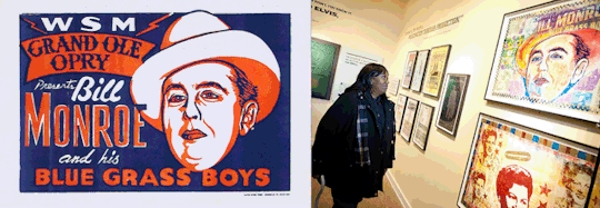
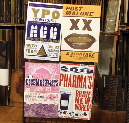
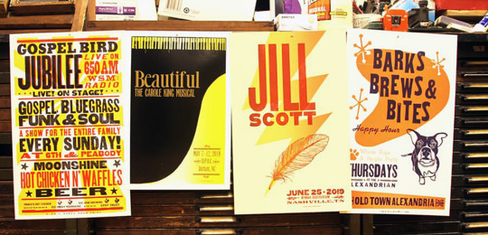
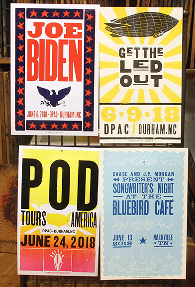
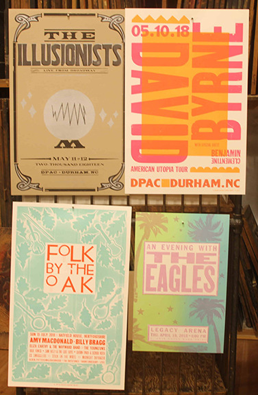
We all met Jim Sherraden, Hatch’s Master Printer and lead designer. Jim was blown away by the international design superstars were so interested in the shop, and the designers were excited by Jim interest in not only the vintage history of Hatch, but his interest in contemporary art and the community of young artisans he’d brought together at Hatch to meld the old and the new. In fact, Jim had made it a personal project to take vintage Hatch art and bring it into the 21st Century, as you see above with Johnny Cash, and below with bluegrass pioneer Bill Monroe. Over the years Hatch has opened itself up to all styles of contemporary musicians and events –from Post Malone to Joe Biden– who revere the hand crafted work from this very American studio. They even did something for [adult swim]’s Sealab 2021 (which I can’t find any image of on the internet).
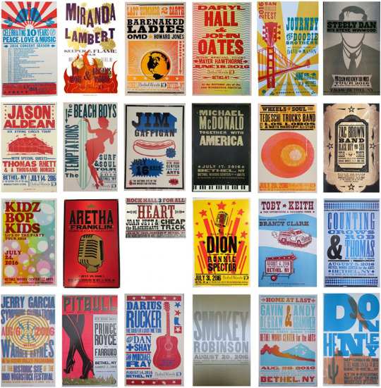
I think it took about 10 minutes for Jim to be booked on a years long national tour of local AIGA chapters to give lectures on the art of letterpress and design at Hatch Show Print. Which led, in turn, to a must have, beautiful book about Hatch.
For Frederator, there was even a better outcome. Over the next couple of years, we made friends with Jim and his team. Hatch made all of our after-party posters and announcements. Score!
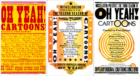
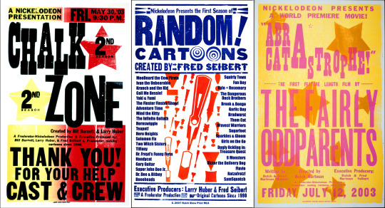
#poster homage#Hatch Show Print#Nashville#poster#posters#Oh Yeah! Cartoons#ChalkZone#Fairly OddParents
10 notes
·
View notes
Photo


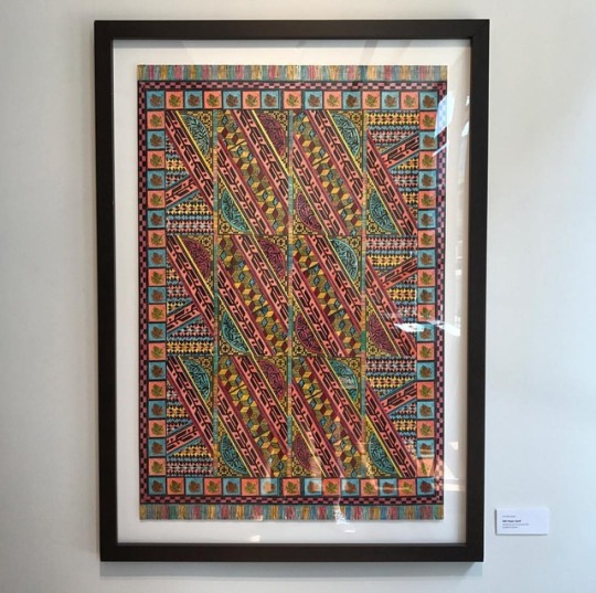
It’s Fine Press Friday!
Getting back to our exploration of books produced at the Minnesota Center for Book Arts (MCBA), today we present another collaborative production, this time on Minnesota writer David Haynes’s text,The Everyday Magic of Walterlee Higgins, published in 1998. Limited to an edition of 125 copies, this publication includes a chapbook designed by Michael Lizama; an accordion structure with text set in Kennerly from M & H Type Foundry, with digital Dollhouse initials rendered in linocuts and additional illustrations by Michael Lazama; and a suite of visual interpretations by ten book artists/printers, all housed in a drop-spine box made by Kent Aldrich and his Nomadic Press. The text, printed by former MCBA Artistic Deirector Mary Jo Pauly, consists of ten sections, and each section is interpreted by an original print designed, printed, signed, and numbered by different artists (view each image separately for the names of the contributing artists shown here).
View more Fine Press Friday posts.

#Fine Press Fridays#Minnesota Center for Book Arts#letterpress#David Haynes#Mary Jo Pauly#Michael Lizama#Kent Aldrich#illustrations
16 notes
·
View notes
Photo
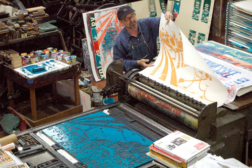
One more from Jim Sherraden at @hatchshowprint in Nashville, TN. 🙌🙌🙌 ------------------------------------ 👉 Follow us for great T-shirts and art. ❤️ Like this photo and support the arts. 👍 Tag @SMASHTRANSIT for a chance to be reposted. 🤘 Tag a friend who you'd like to share this work with. ------------------------------------ Click our bio link for fresh gear! (at Hatch Show Print)
0 notes
Text
youtube
Watch the American Climate Leadership Awards 2024 now: https://youtu.be/bWiW4Rp8vF0?feature=shared
The American Climate Leadership Awards 2024 broadcast recording is now available on ecoAmerica's YouTube channel for viewers to be inspired by active climate leaders. Watch to find out which finalist received the $50,000 grand prize! Hosted by Vanessa Hauc and featuring Bill McKibben and Katharine Hayhoe!
#ACLA24#ACLA24Leaders#youtube#youtube video#climate leaders#climate solutions#climate action#climate and environment#climate#climate change#climate and health#climate blog#climate justice#climate news#weather and climate#environmental news#environment#environmental awareness#environment and health#environmental#environmental issues#environmental justice#environment protection#environmental health#Youtube
16K notes
·
View notes
Text
Jim Sherraden Reflection
On February 19, 2015, Jim Sherraden from Hatch Show Print came to speak at the Gateway Film Center in Columbus, Ohio. He brought some pieces of art that raffled off, and 2 that were auctioned off to donate money to the Mid-Ohio Food Bank, which I thought was very generous of him. He talked about his work at the printing shop, and spoke with so much passion that it inspired me to find my niche like he did. His work relates to design because he always has to strategically plan out his posters (with lots of drafts involved!) before actually printing them. Some key takeaways that I got from him will allow me to become more confident in my design work.
To start off, he talked about how unique his company was. He said ‘technology created for us (Hatch Show Print) a niche market’. Due to my love for calligraphy, and the decline of it, this really gives me hope that I can ‘make it big’ by continuing to improve something that is seen as an old, and lost art. Throughout his speech, he reiterated: ‘You carved them once, you carved them well. You can use them year after year, town after town’. His focus on making good quality wood prints was clearly shown by the motto he lives by (or the company lives by).
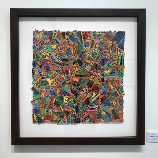
When he said ‘this is how I’m bringing my personality into my poster making, by making wood blocks’, it made me realize that he puts a little piece of himself into the art that he makes. No one is forcing him to make art, but wood block printing is specifically what he fell in love with. When speaking about his quilt block prints, he said, ‘These take forever to do… don’t worry, I enjoy it’. His drive can be shown with how he speaks about his work; it is more like ‘play’ to him. He comes alive when he’s in the shop, because that is an environment in which he is able to thrive.
From getting a glimpse of his world at Hatch Show Print, it opened my eyes to the ‘niche market’ that he has been able to be successful in. In my future design work, I now know how important it is to do research on competitors and see how one can position themselves to be different. In addition, focusing on being the best in a special category of design, like Jim Sherraden does, is the standard that I will set for myself!
1 note
·
View note
Text
Hatch Show Print Talk from Jim Sherraden
Fans of Hatch Show Print take note. Hatch head honcho, Jim Sherraden will be talking about the current Hatch exhibition at Chelsea space, London at 2.30pm this Saturday 16th November. RSVP to the gallery to check availability. http://www.chelseaspace.org
If you can't make the talk, we still recommend getting down to the show as it's really a visual treat.
2 notes
·
View notes
Text
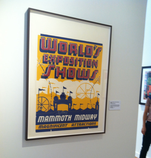
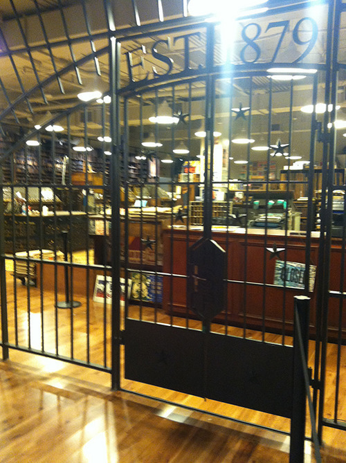
Hatch Show Print Has Moved!
I stopped by Hatch Show Print this morning to check out their new digs in the Country Music Hall of Fame, and to say 'hi' to some old friends. The space is amazing! If you get the chance, stop by and say Hello to Jim & Celene. There are lots of fun activities going on this weekend, don't miss 'em! http://countrymusichalloffame.org/hatch-show-print-is-moving/
So many photos of this sign, now it has a new backdrop.
Congratulations, Celene! You made it!! Let the good times roll.
Stop by and check out the exhibit of work on display by Hatch and Jim Sherraden.
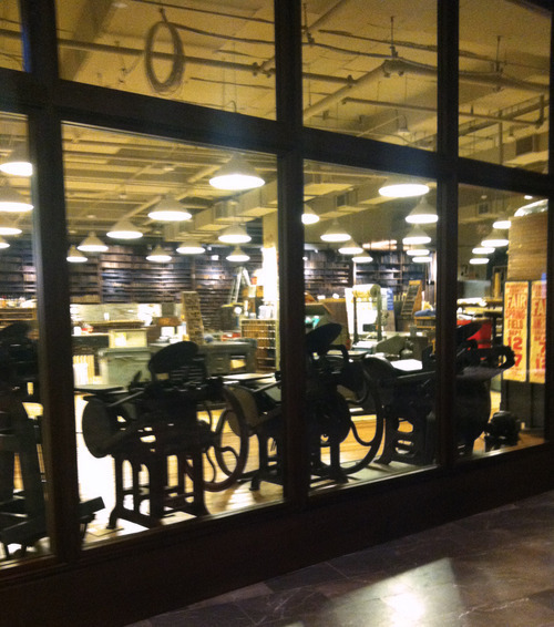
Look at that lineup of old style C&Ps. Lovely!
And last, but not least...JAIL! I'm sure you're thinking, yes...bars are necessary to protect the history of Hatch housed in the HOF. But then there are others who know the truth...some of those printers are crazy!
Congratulations on the new space and wishing you continued success for many years to come!
0 notes
Photo
Jim Sherraden at @hatchshowprint in Nashville, TN. 💪 ------------------------------------ 👉 Follow us for great T-shirts and art. ❤️ Like this photo and support the arts. 👍 Tag @SMASHTRANSIT for a chance to be reposted. 🤘 Tag a friend who you'd like to share this work with. ------------------------------------ Click our bio link for fresh gear! (at Hatch Show Print)
0 notes
Last Seen Blogs

pointlesscoldness
onlyeverything

water-restoration-service
Water Damage Restoration Services in Toronto

timotheegallery
Timothée Chalamet

mouseinthemorgue
Consulting Pathologist
tindra-draws
I draw.