#noimport
Text

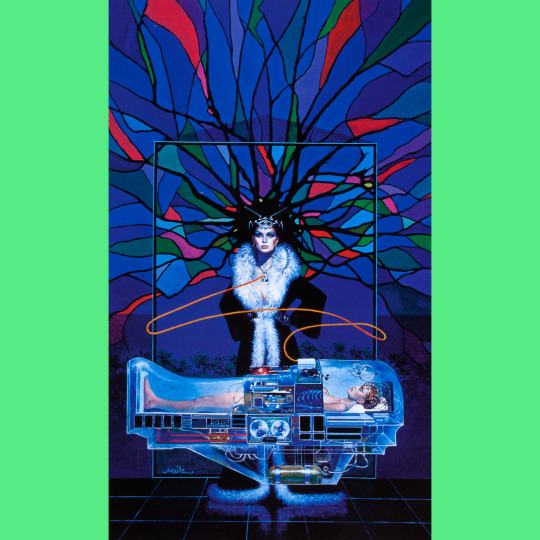
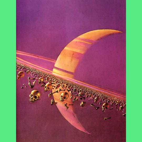
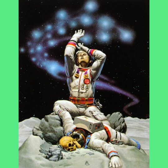
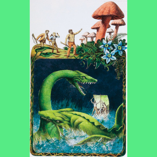
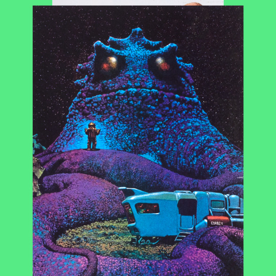
There is, I think, no arguing that contemporary genre art has a character distinct from previous decades. I also think that while there are big shifts in aesthetics somewhat aligning with each decade of the 20th century, here in the 21st things have definitely slowed down — I feel like the look of genre art has fossilized somewhat in the last 20 years. I don’t have a good explanation for why. Sometimes I wonder if I’m blinded by nostalgia, and that there really aren’t any obvious objective differences at all.
Worlds Beyond Time: Sci-Fi Art of the 1970s (2023) is a compelling argument, I think, that there ARE definite differences. The book, by Adam Rowe (and spinning out of his social media accounts dedicated to, well, ’70s science fiction art) looks at both artists and thematic categories of art from the period, mostly from paperback covers, and offers commentary and historical context in the text. The result is startling: a body of work by a variety of artists working in their own styles that nevertheless seems visually unified. With the exception of a couple outliers, this stuff all feels of the ’70s. The fact that there are some inclusions from both the ’60s and ’80s makes this even clearer.
I think the most interesting thing about this is how bizarre some of the ’70s art seems to be. A lot of these artists appear to be entirely off the leash, delivering work they WANTED to produce rather than what they were directed to produce (you can see a shift toward clearly pairing the cover art with the content of the book in the later part of the decade). There was also more money in the work, then, so speed wasn’t quite so big a part of the equation as it is now.
And, greater questions of genre art aside, Worlds Beyond Time is still a mesmerizing collection, worthy of your time even if you just want to feed pictures to your eyeballs.
#roleplaying game#tabletop rpg#dungeons & dragons#rpg#d&d#ttrpg#Science Fiction#Fantasy#Art#noimport
693 notes
·
View notes
Photo
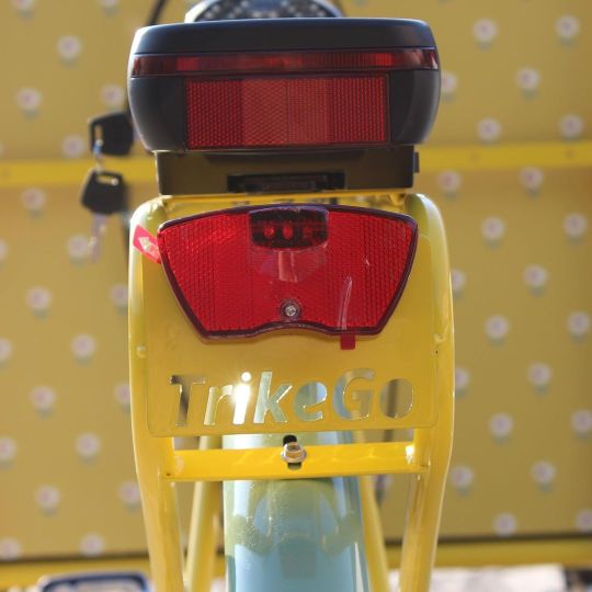
....qualcosa di VERAMENTE NUOVO sta per accadere in città... Noi siamo differenti, vuoi essere “differente” insieme a @trikego_cargobike ? #milanolebela #todocambia #cargobike #revolution #cargobikemum #fase2 #felicità #madeinitaly #noimport (presso Milan, Italy) https://www.instagram.com/p/CAyJZcOATpU/?igshid=1cy2snty4m0cl
0 notes
Video
!!!for sale!!! Sapphire @puffco peak attachment. Honeycombed in nova #uv glass.. has a #magnetic cap that comes off of it. Ready to ship!!! #puffcopeak #puffcolife #peak #puffcopeakattachment #707dabs #follow #followme #magnetic #usa #usa🇺🇸glass #noimport #uvglass #nova #magnets #dontsleep #710society #weshouldsmoke #420nurses #420friendly #420girls #wedontsmokethesame #oprahsbookclub #weedmaps #bestofglass #boroforsale https://www.instagram.com/p/Bowg51hjUuK/?utm_source=ig_tumblr_share&igshid=lhb7lpdd7tw5
#uv#magnetic#puffcopeak#puffcolife#peak#puffcopeakattachment#707dabs#follow#followme#usa#usa🇺🇸glass#noimport#uvglass#nova#magnets#dontsleep#710society#weshouldsmoke#420nurses#420friendly#420girls#wedontsmokethesame#oprahsbookclub#weedmaps#bestofglass#boroforsale
0 notes
Text

This idiot is also from the from the 1983 Arco/Fleetwood toy line vaguely associated with the R-rated fantasy film The Sword and the Sorcerer. I have no idea what it is. It combines the features of a dragon, a unicorn and some sort of finny sea creature. It is probably the toy I own that most looks like a beast of heraldry. I like it. He features a particularly sloppy paint job and the green plastic is a pleasing tone. They say green is calming!
#roleplaying game#tabletop rpg#dungeons & dragons#rpg#d&d#ttrpg#Arco#Fleetwood#Sword And The Sorcerer#noimport
574 notes
·
View notes
Text
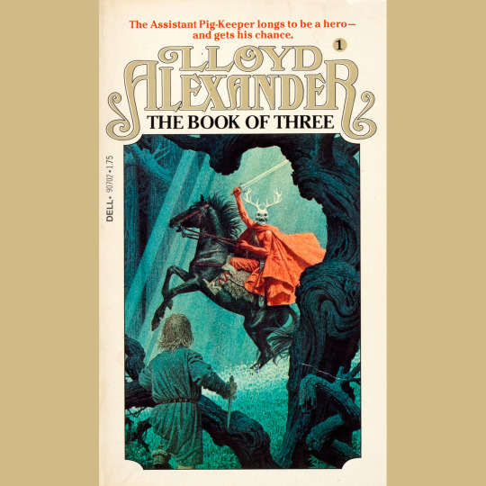
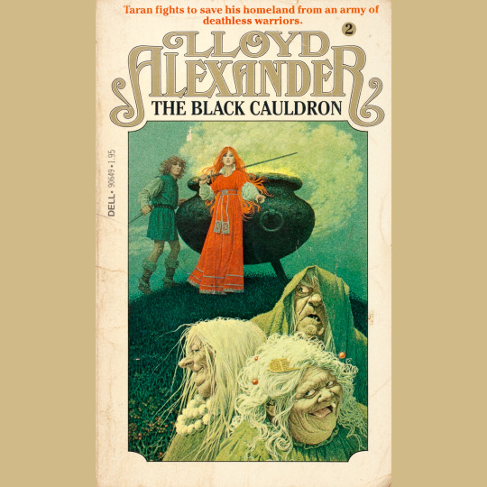
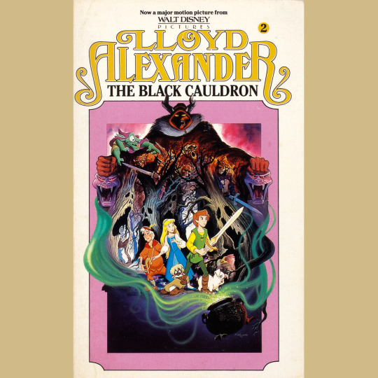
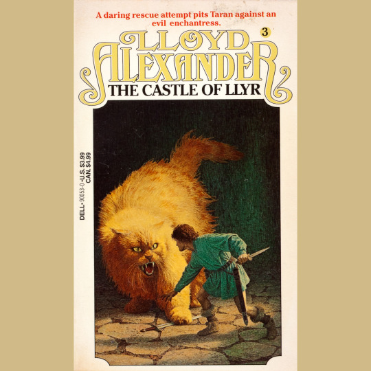

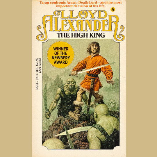
The five-volume Chronicles of Prydain, by Lloyd Alexander, began in 1964 with The Book of Three, and saw new entries — The Black Cauldron, The Castle of Llyr, Taran Wanderer — appear annually until finishing with The High King in 1968. They’re set in a fantasy version of Wales, and draw from Welsh mythology, but the story is very much the tale of an assistant pig-keeper named Taran who, as he grows from boy to man, seeks adventure, finds responsibility and learns the terrible cost of glory. It’s one of the first works of fantasy I read as a kid and honestly, I don’t think any others, except Earthsea, have measured up in terms of emotional weight (and their refusal to indulge in power fantasy or other cliché). I re-read them recently and that remains true. You ought to read them if you haven’t. They’ll change you, I bet.
Anyway. My editions as a kid were the ‘80s Dell Yearlings with the gorgeous cover art by Jean-Leon Huens. I have a deep love for the first cover and its depiction of the Horned King (and am eternally jealous that Tony DiTerlizzi owns the original). The others are pretty great, too. I love that the giant cat is basically a house cat and I love those alien-looking Cauldronborn on the final book’s cover. The Black Cauldron cover is rather new for me; my original had the movie poster for the god awful Disney movie (beautiful, yes, but still awful and utterly lacking the emotional heart of the books). I’m pleased Huens shows Eilonwy, but now I am a little bummed he never painted the bard, Fflewddur Fflam.
#roleplaying game#dungeons & dragons#tabletop rpg#rpg#d&d#ttrpg#Lloyd Alexander#Prydain#Black Cauldron#noimport
412 notes
·
View notes
Text


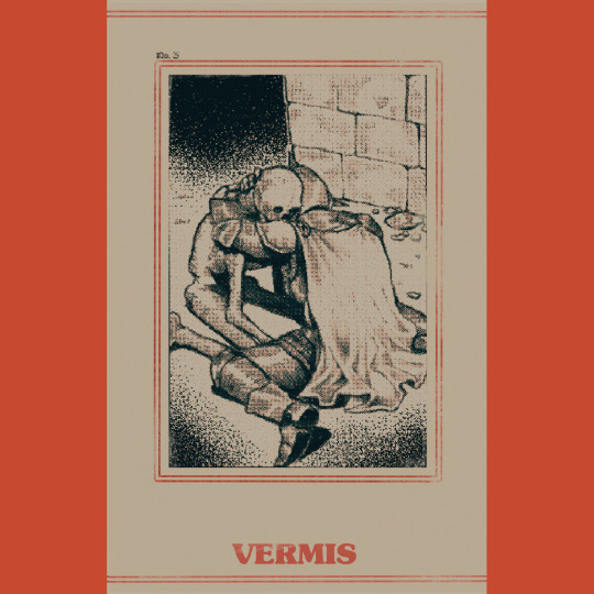

Vermis I (2023) is a narrative art book by @Plastiboo. It’s a gorgeous and darkly layered homage to a variety of influences, new and old — Souls games, old videogames like Shadowgate, more recent ones like Shadow of the Colossus, perhaps Fighting Fantasy gamebooks, perhaps Warhammer. There are many possibilities. And yet it also stands as very much its own thing, a world unto itself. The book’s central question “Which flesh is your flesh?” goes a long way in establishing the sorts of horrors we’ll find on our journey.
There are two things that really make Vermis come to a diseased sort of life. The first is the decision to arrange the book as if it were a strategy guide for a videogame that doesn’t exist. This allows for the introduction of little icons and hints at mechanical systems without committing to building them, which is an enticement to brains like mine to figure out how they MIGHT work. And by providing level maps and strats for boss fights and profiles of magic items, I wind up playing the game on a meta level, reflexively, through the act of reading. This sensation is strange and unique and made for one of the most memorable book-experiences I’ve had in a long time.
The other thing is the texture of the art, the way everything is buried under pixelation, cathode grain, moire ripples and other distortions. It unifies all the book’s visuals in a sort of murkiness that add an almost painful sense of mystery and danger and inscrutability to the narrative.
Vermis is a dark masterpiece of creeping dread, and anyone who tells you it isn’t a game to be played isn’t to be trusted.
390 notes
·
View notes
Text
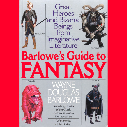
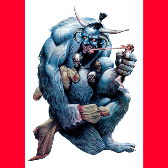
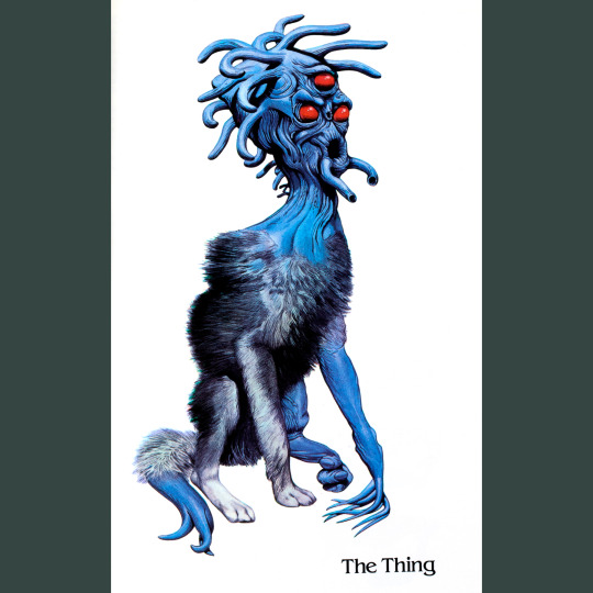
Barlowe's Guide to Extraterrestrials was well received and won a couple of awards (and a second edition, I think in ’87?). It took a little while for the sequel to emerge: Barlowe’s Guide to Fantasy hit shelves in 1996.
Even though I am not super widely read in either fantasy or science fiction, Barlowe’s fantasy book is the one I really vibe on. Maybe because it allows him to do stuff like Grendel from Beowulf and Gorice from The Worm Ouroboros. Wouldn’t have expected Gideon Winter, the antagonist from Peter Straub’s odd novel Floating Dragon to be included, but he was. Other surprises are the Psammead from Five Children and It and the Saw Horse from Oz.
One of the coolest things about these books is the fold-out size comparison charts. I love a good size-comparison (and again, this is a big feature of those Petersen’s Guides for Call of Cthulhu, and I am sure it came directly from here).
397 notes
·
View notes
Text


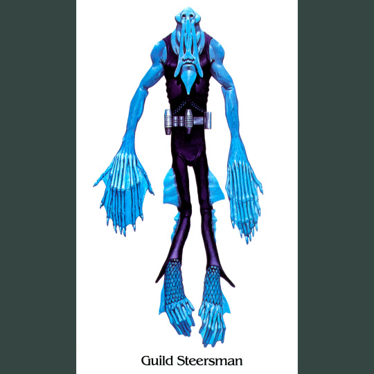
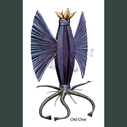
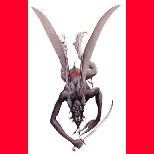
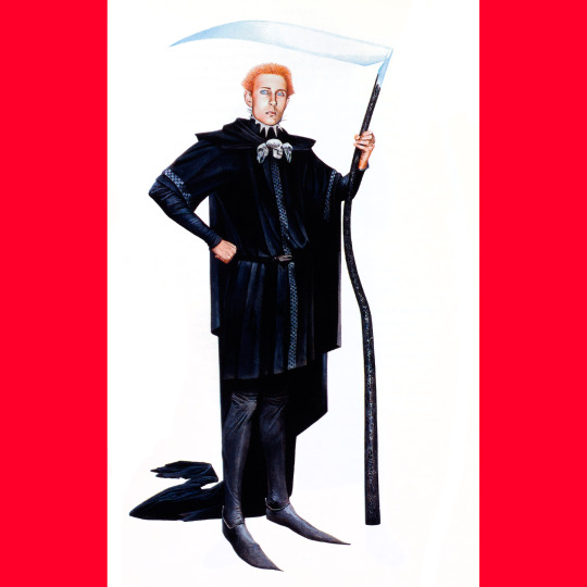
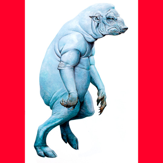
Barlowe's Guide to Extraterrestrials (1979) is a fun little book that looks at aliens from a variety of science fiction stories through the (slightly) in-universe framing of a field guide, complete with notes on ecology and biological functions.
Artist Wayne Barlowe’s selections are an interesting cross-section of the genre (I don’t recognize a lot of them, honestly) and his interpretations (of the ones I do recognize) always walk the fine line between capturing something essential that I pictured in my mind’s eye while also being surprising or unexpected in many ways. Among the beasties I did not photograph are the Overlords from Childhood’s End, the Puppeteers from Ringworld, the Izchel from Wrinkle in Time, the Masters from the Tripod books and Ursula Le Guin’s Athshean.
In a way, the Guide feels like an extension of the larger interest in fantastic art in the ‘70s, embodied most in the Gnomes, Fairies and Giants books. It, and its Fantasy companion (see tomorrow) certainly wouldn’t come out today, but for me, they’re just amazing. They gave Barlowe a whole book to draw monsters and aliens; monster and alien enthusiasts like me got a pile of rad illustrations to look at; and a stack of sci fi writers got low-key advertising for their works. Wins down the line.
Worth mentioning that this is likely a direct inspiration for Call of Cthulhu’s pair of Petersen’s Field Guides (Cthulhu Monsters and Dreamlands), right down to little nuances of layout formatting. I would bet that they were also on someone’s mind when the Ecology articles began to appear in Dragon Magazine (those started in ’83 with the Piercer).
#roleplaying game#tabletop rpg#dungeons & dragons#rpg#d&d#ttrpg#Wayne Barlowe#Barlowes Guide To Extraterrestrials#noimport
329 notes
·
View notes
Text
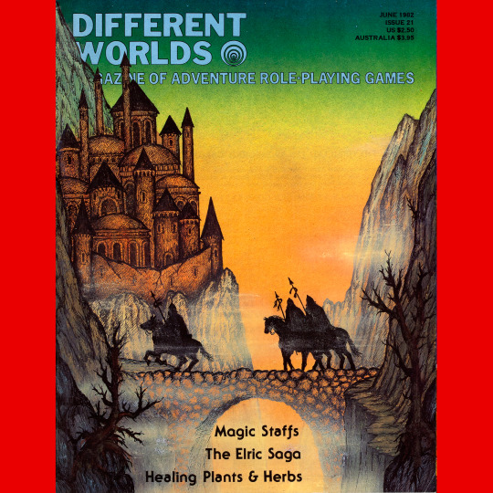
Different Worlds 21 (June, 1982). A two month break! Alan Burton on the cover. Absolutely adore this one. Great color scheme, great composition, very late ‘70s fantasy fan art vibe. There is something in this that reminds me of some of the stranger art in the David Day Tolkien books.
#roleplaying game#dungeons & dragons#tabletop rpg#rpg#d&d#ttrpg#Chaosium#Different Worlds#Alan Burton#noimport
162 notes
·
View notes
Text
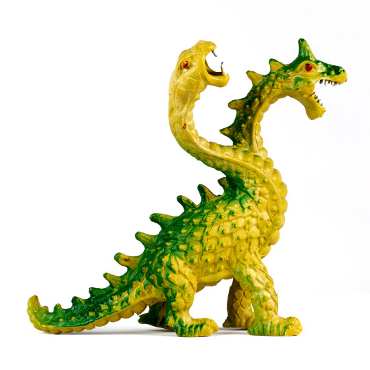
This two-headed dragon was part of the Arco/Fleetwood Toys line that was branded with the logo of the film 1982 The Sword and the Sorcerer (the toys hit shelves in 1983). This has more to do with the financial success of the film, which was a surprise box office hit making something like ten times its budget, and less about how appropriate the R-rated schlock was for kids (answer: not at all appropriate). Anyway, the toy line exists, is great, and at least the larger, hard plastic toys are not reflective of anything in the film. I don’t remember a two-headed dragon, anyway. He DOES remind me a bit of the troll dragon from Willow. He also resembles the design of the much larger two-headed dragon from Imperial Toys, which also came out in 1983. The possibility that one or the other is a knock off of a knock off is just too delightful for my little heart.
Somewhat unrelated, but the staging of one scene in The Sword and the Sorcerer does seem to have influenced one of the arena screens in the 1987 Commodore 64 videogame Barbarian, which has a banging soundtrack you absolutely should listen to.
#roleplaying game#tabletop rpg#dungeons & dragons#rpg#d&d#ttrpg#Arco#Fleetwood#Sword And The Sorcerer#noimport
156 notes
·
View notes
Text
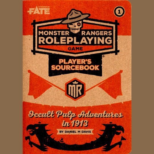
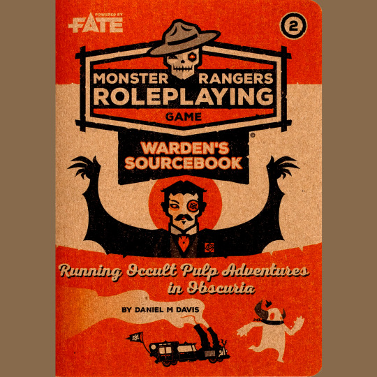
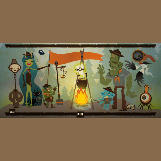
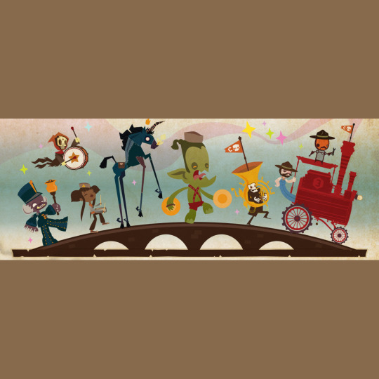
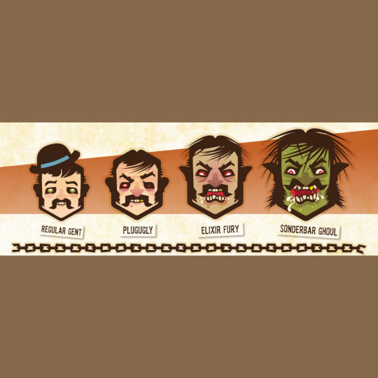


This is Monster Rangers, a two-zine set of delicious aesthetic goodness. It’s designed for Fate (and, as such, is practically system neutral — you wouldn’t have much trouble using this as a campaign frame with an other system if you are, for some reason, Fate-averse).
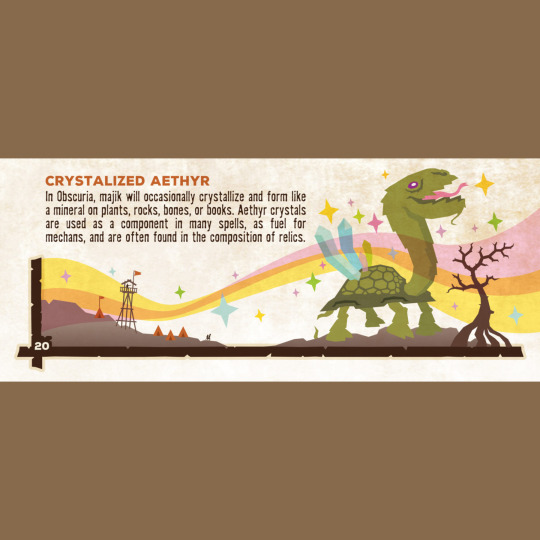
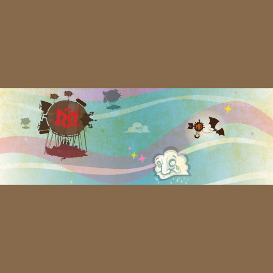
As you can tell from the covers and the art, there is a very particular retro vibe here. The game takes place in an alternate version of the US during the Progressive Era (specifically 1913), and there is a lot of pre-WWI can-do vibe here, overlayed with some touches that also feel like they are inspired by the ‘20s and ‘30s. The normal world is prosperous, but there a places where the world of monsters overlaps conventional reality — Obscuria. There, monsters can accidentally pass over into our reality and, confused, cause all sorts of havoc. Enter the Monster Rangers, an organization dedicated to protecting and helping monsters, primarily through the use of magical merit badges (I fucking love this so much). This reminds me a lot of Vaesen, but without the tragic undercurrents. This set-up is further complicated by Monsterologists, steampunk capitalists who want to capture, experiment on and general exploit errant monsters in the name of profit. They’re the villains, and they earn the title.
That’s the broad strokes, but I bet your gears are already going with ideas. There is a ton of source material — factions galore (there’s a beet magnate who wants to destroy the rangers?!), cultists, ranger traditions, details on ranger headquarters and bases. All of it is wrapped in a golly-gee package that keeps the vibe light. It is emphatically not a horror game — the monsters are our friends! Rather, crappy people are the bad guys, and I can always get down with bopping folks like that in the nose.
187 notes
·
View notes
Text
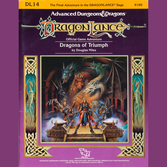
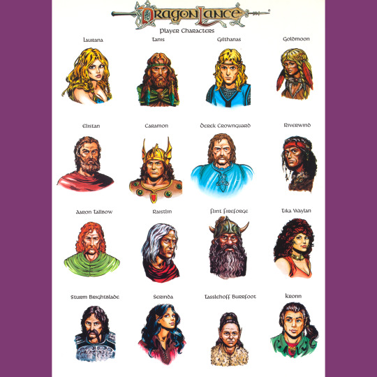


DL14: Dragons of Triumph (1986) marks the end of the the Dragonlance saga and the War of the Lance. It’s full to brimming — three booklets and a map. Some aspects seem rushed. Diana Magnuson’s art in general seems very sketchy here and the recycling of some illustrations from the 1983 Basic Set seems…odd for what should be a big budget, marquee release, the capstone on three years of campaign releases!
It’s interesting too that for all the series’ experiments in narrative and unconventional modes of play, the climax of the story proceeds along pretty typical D&D lines: a big ol’ hexcrawl, some city exploration followed by the final set piece in Takhisis’ temple, a mid-sized dungeon, where players enact the solution they uncovered in D13. There’s plenty of events, too, but the finish is refreshingly uncomplicated, I think? Also, I get WHY the adventures diverge from the novels, but I still miss the big character notes for Sturm, Flint and Raistlin. I don’t know how you keep those in without making a big mess, but I do wish it was a riddle that these folks figured out.
There’s a pile of extra stuff in the form of a sourcebook, a sort of sequel to DL5, which details the world of Krynn in a way that almost but not quite supports further play. That’d have to wait a few more years. There’s also a collection of all the monsters, which, they all appeared elsewhere, but I like it when monsters hang out together.
Also, old saw, but as much as I like this Caldwell cover, I also think it sucks in the way it diminishes the strength of Laurana’s character. Compare to Elmore’s depiction on Winter Night or Parkinson’s fantastic portrait of her standing over Sturm’s corpse. It bums me out on a certain level that she’s chained and pantsless in typical Caldwell fashion on the cover of the finale. Takhisis looks great tho.
#roleplaying game#tabletop rpg#dungeons & dragons#rpg#d&d#ttrpg#Dragonlance#Dragons Of Triumph#DL14#noimport
112 notes
·
View notes
Text
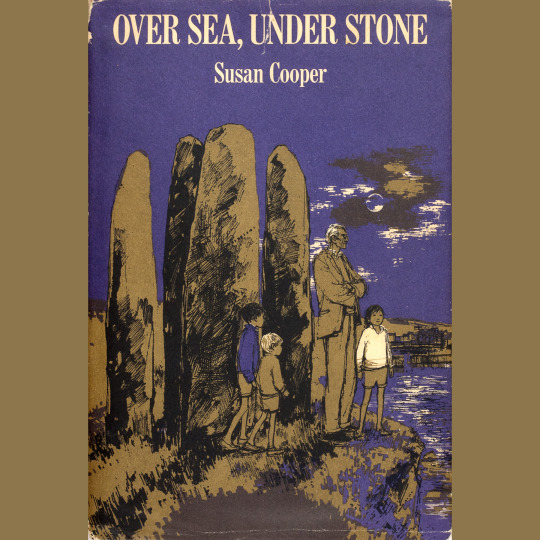


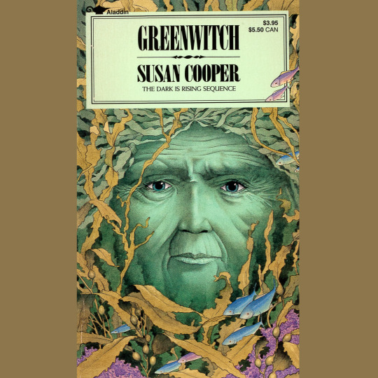
Another of my favorite series of books as a kid, Susan Cooper’s Dark is Rising sequence pairs well with both Weirdstone (and all of Garner’s work) and Prydain — it’s concerned with dual natures, the weight of responsibility, coming of age, the mythic landscape of pagan Britain, King Arthur, Welsh mythology and more.
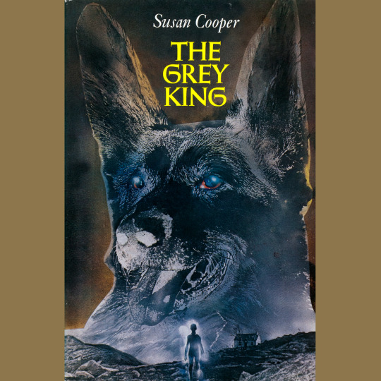
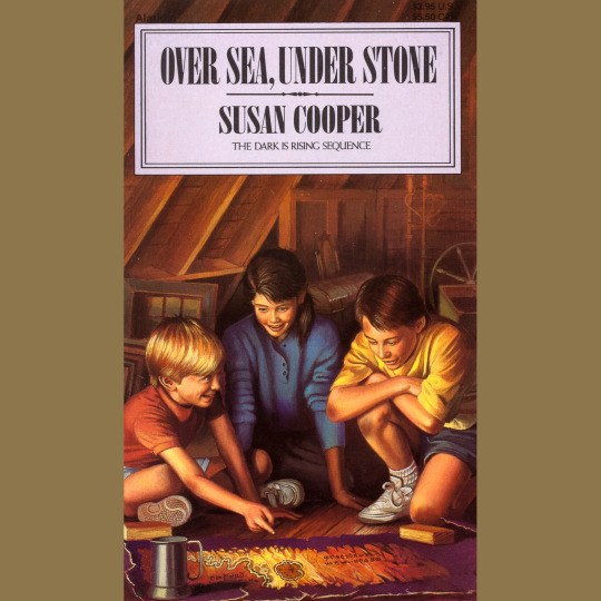
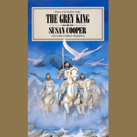
The first novel, Over Sea, Under Stone (1965) is sort of an outlier, written earlier and in the style of a fairly standard children’s mystery in which the Drew siblings — Simon, Jane and Barney — unravel riddles to find something like a grail for someone who seems a lot like Merlin. The supernaturalism rises dramatically in The Dark is Rising (1973), in which 7th son of a 7th son Will Stanton comes into his power and thwarts the first moves of the Dark Rider in what will be the final battle between Light and Dark. Greenwitch (1974) returns to Cornwall and introduces the Drews to Will. Jane takes center stage here, communing with the titular entity, created each year in a folk ritual. It’s almost my favorite of the books, but that honor goes to The Grey King (1975) in which Will vacations in Wales and confronts a terrifying Power that lives in its mountains (this book feels very paired with Garner’s The Owl Service, 1967).
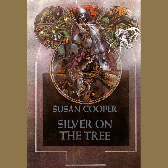
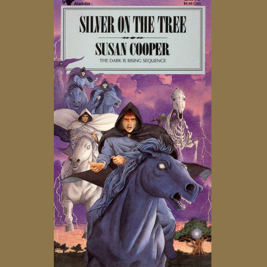
The Silver on the Tree (1977) has all the children and wraps up the battle decisively. The battle is a bit besides the point — it was prophesied the entire time that the Light would win. Rather, its about the journey. When all is said and done, the world is free to make its own way without the interference of cosmic forces and, cruelly, the children forget their magical adventure. Not me, though.
#roleplaying game#tabletop rpg#dungeons & dragons#rpg#d&d#ttrpg#Susan Cooper#The Dark Is Rising#noimport
158 notes
·
View notes
Text
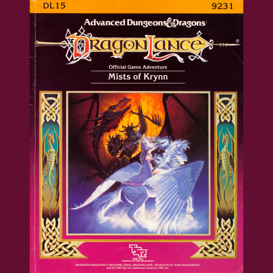
The War of the Lance is over, but the Dragonlance line lives on with DL15: Mists of Krynn (1988, a full two years after DL14). Basically, after the success of the DL-series, TSR wanted to continue making Dragonlance products. The first thing out was Dragonlance Adventures (1987), which opened up the game world to custom character generation. After that, the characters needed something to do, hence this anthology of short adventures (DL16 follows suit as well, but we’ll have to visit that another time — it’s worth the wait, I promise!).
This anthology is a mess. Which is fitting because Dragonlance was always a mess aspiring to ever greater levels of messiness. Taking an ill-advised page from Middle-Earth Roleplaying, the various short scenarios take place in a variety of time periods. During the war, after the war, one right after the Cataclysm. There are Book of Lairs-style monster encounters, too. And the range of levels here is 1 to 15. There’s no through-line. It’s just a bunch of random stuff. A lot of it is undercooked.
Worse, and this is something that generally plagues many Dragonlance products from now through the start of Fifth Age: There is barely any art in this thing, and whats there is just small spot illustrations of items. It’s a big step down. Even the maps are underwhelming. The awesome cover painting by Den Beauvais carries a LOT of the load, but you can’t expect it to carry the entire book!
#tabletop rpg#dungeons & dragons#ttrpg#roleplaying game#rpg#d&d#Dragonlance#DL15#Mists Of Krynn#noimport
116 notes
·
View notes
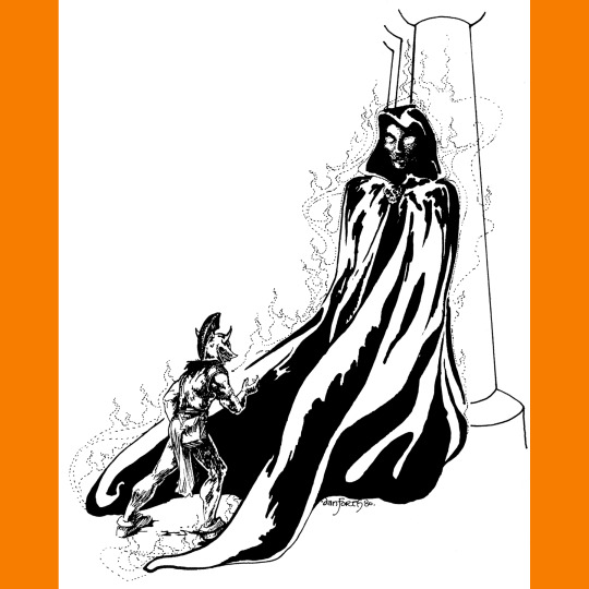
Text


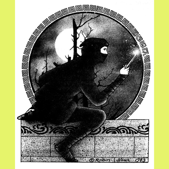

We did a whole episode of the podcast on Swordthrust (1984) last year. That probably tells you something about the adventure’s place in the line. If not, I’ll say it directly: this is probably Role Aids at its weirdest, most experimental and, consequently, at its best.
In short: a titan sleeps atop a high mountain. The party goes in the titan’s ear and explores his brain, looking for a powerful artifact that is calling to them. Inside, there are monsters that have taken up residence, angelic creatures that are manifestations of the titan’s better nature, reptilians that embody his baser impulses, and strange apparitions that are, essentially, his dreams and memories made flesh, making for a very odd variety of environments inside what is supposed to be a complex of ice caves.
All of this is super interesting, especially for the year it was released (compare this to any give Dragonlance module, for instance). It doesn’t go as hard or as bizarre as it could, but that’s OK — it paved the way for plenty of others to get weird (Silent Titans sprints immediately to mind) and leaves plenty of room for the GM to odd it up.
Cover art is another recycled Boris Vallejo, though in this case, the authors incorporated the scene in the adventure — there, this guy is one of the Titan’s dreams who left the brain to live on the mountain and has, essentially, become real. He’s an interesting chap. Interiors are by Robin Wood. She did a lot of Role Aids work and it’s rather variable — I think she was using it as an opportunity to experiment with different styles. These drawings are pretty solid!
#roleplaying game#tabletop rpg#dungeons & dragons#rpg#d&d#ttrpg#Role Aids#Mayfair#Swordthrust#noimport
116 notes
·
View notes
Text
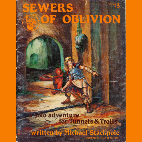
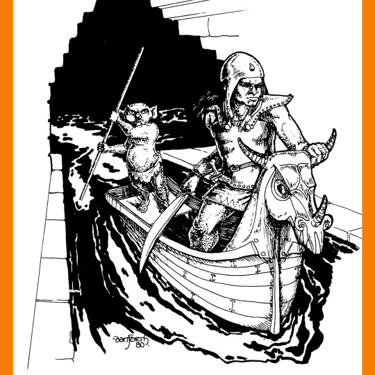
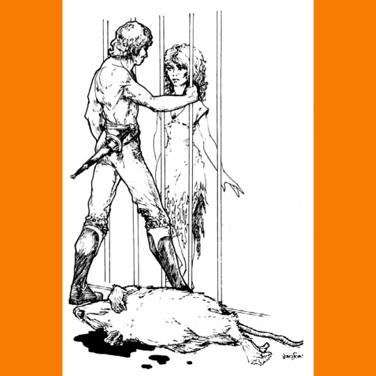
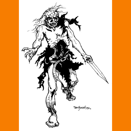
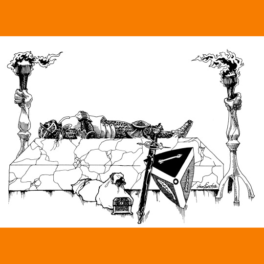
Sewers of Oblivion (1982) is a sort of sequel to my favorite Tunnels & Trolls solo, City of Terrors, in that it takes place under that city. You get mugged, you get pitched into the sewers, and voila. I guess that is one way of limiting your starting equipment. It’s kind of funny that you are expected to take solo characters through gamebook after gamebook, getting more and more stuff, but the later books recognized how impossible it was to balance for all these potential magic items, so they went to greater and more improbable lengths to take all your kit away at the start. The muggers, you’ll be relieved to know, are caught while you are on your sojourn and the city guard has your stuff waiting for you back at the precinct house.
Anyway. Lots of underwater combat here. Lots of potential for catching diseases (there is a two-page appendix full of ‘em to choose from). A surprising number of potential amorous encounters for a sewer adventure, too. You get a guide, which is neat. For the most part, its a by the numbers dungeon crawl. Which is fine, its just a little disappointing after City of Terrors, which so often feels like exploring a bustling, ever-changing city.
Liz Danforth art throughout, and we’re all the better for it. I really love the one of the guy pitching it at that waif over the bleeding corpse of a giant rat. Ah, the romance of the sewers!
#roleplaying game#tabletop rpg#dungeons & dragons#rpg#d&d#ttrpg#Tunnels And Trolls#Sewers Of Oblivion#noimport
140 notes
·
View notes
Last Seen Blogs
sleepinthektchn
Hujan

marauderzx
marauderzx

deliciousduckshepherdbear
Untitled

pidzson
Volumetric Shit Compressor

news-man
ニュース 速報 & みんなの感想